FloTorch
A dark, research-and-product AI interface built on a near-black charcoal canvas (#1d1d1e) with crisp white Inter headlines and a warm torch-orange accent (#f18642). The system reads as enterprise-grade infrastructure software — moody dark bands, low-contrast bordered cards holding feature claims, a glowing product-render hero, and restrained orange CTAs. Brand voltage comes from the orange torch mark and the cinematic dark hero render rather than from broad color use.
---
version: alpha
name: FloTorch-design-analysis
description: "A dark, research-and-product AI interface built on a near-black charcoal canvas (#1d1d1e) with crisp white Inter headlines and a warm torch-orange accent (#f18642). The system reads as enterprise-grade infrastructure software — moody dark bands, low-contrast bordered cards holding feature claims, a glowing product-render hero, and restrained orange CTAs. Brand voltage comes from the orange torch mark and the cinematic dark hero render rather than from broad color use."
colors:
primary: "#f18642"
primary-soft: "#f5b86f"
accent-violet: "#7c3aed"
accent-violet-soft: "#7b5cf6"
accent-blue: "#3898ec"
accent-mint: "#00ffb7"
accent-navy: "#1e1e3a"
ink: "#ffffff"
body: "#cccccc"
muted: "#a6a6a6"
muted-strong: "#606060"
link: "#333333"
canvas: "#1d1d1e"
surface: "#222222"
surface-card: "#262627"
surface-deep: "#0d0d0d"
surface-deepest: "#080707"
black: "#000000"
hairline: "#6b7280"
on-light: "#dddddd"
typography:
display-xl:
fontFamily: "Inter, sans-serif"
fontSize: 55px
fontWeight: 500
lineHeight: 1.2
letterSpacing: -1.1px
display-lg:
fontFamily: "Inter, sans-serif"
fontSize: 46px
fontWeight: 400
lineHeight: 1.1
letterSpacing: -0.91px
title:
fontFamily: "Inter, sans-serif"
fontSize: 19px
fontWeight: 400
lineHeight: 1.2
letterSpacing: 0.3px
body:
fontFamily: "Inter, sans-serif"
fontSize: 13px
fontWeight: 400
lineHeight: 1.7
letterSpacing: 0
button:
fontFamily: "Inter, sans-serif"
fontSize: 15px
fontWeight: 400
lineHeight: 1.5
letterSpacing: 0
rounded:
sm: 8px
md: 11px
lg: 19px
spacing:
xxs: 8px
xs: 10px
sm: 13px
md: 19px
lg: 21px
xl: 33px
xxl: 48px
section: 67px
components:
top-nav:
backgroundColor: "{colors.canvas}"
textColor: "{colors.ink}"
typography: "{typography.button}"
padding: 19px 33px
nav-link:
backgroundColor: transparent
textColor: "{colors.ink}"
typography: "{typography.button}"
button-primary:
backgroundColor: "{colors.primary}"
textColor: "{colors.ink}"
typography: "{typography.button}"
rounded: "{rounded.sm}"
padding: 13px 21px
button-cta-light:
backgroundColor: "{colors.primary-soft}"
textColor: "{colors.canvas}"
typography: "{typography.button}"
rounded: "{rounded.sm}"
padding: 13px 21px
button-outline:
backgroundColor: "{colors.surface}"
textColor: "{colors.ink}"
typography: "{typography.button}"
rounded: "{rounded.sm}"
padding: 13px 21px
button-secondary:
backgroundColor: "{colors.surface}"
textColor: "{colors.ink}"
typography: "{typography.button}"
rounded: "{rounded.sm}"
padding: 13px 21px
hero-band:
backgroundColor: "{colors.canvas}"
textColor: "{colors.ink}"
typography: "{typography.display-xl}"
padding: 67px
eyebrow-label:
backgroundColor: transparent
textColor: "{colors.primary-soft}"
typography: "{typography.title}"
section-band:
backgroundColor: "{colors.surface-deep}"
textColor: "{colors.ink}"
typography: "{typography.display-lg}"
padding: 67px
feature-card:
backgroundColor: "{colors.surface-card}"
textColor: "{colors.ink}"
typography: "{typography.title}"
rounded: "{rounded.md}"
padding: 33px
partner-strip:
backgroundColor: "{colors.surface}"
textColor: "{colors.muted}"
typography: "{typography.body}"
padding: 48px
footer:
backgroundColor: "{colors.surface-deepest}"
textColor: "{colors.muted}"
typography: "{typography.body}"
padding: 48px
footer-link:
backgroundColor: transparent
textColor: "{colors.body}"
typography: "{typography.body}"
---
## Overview
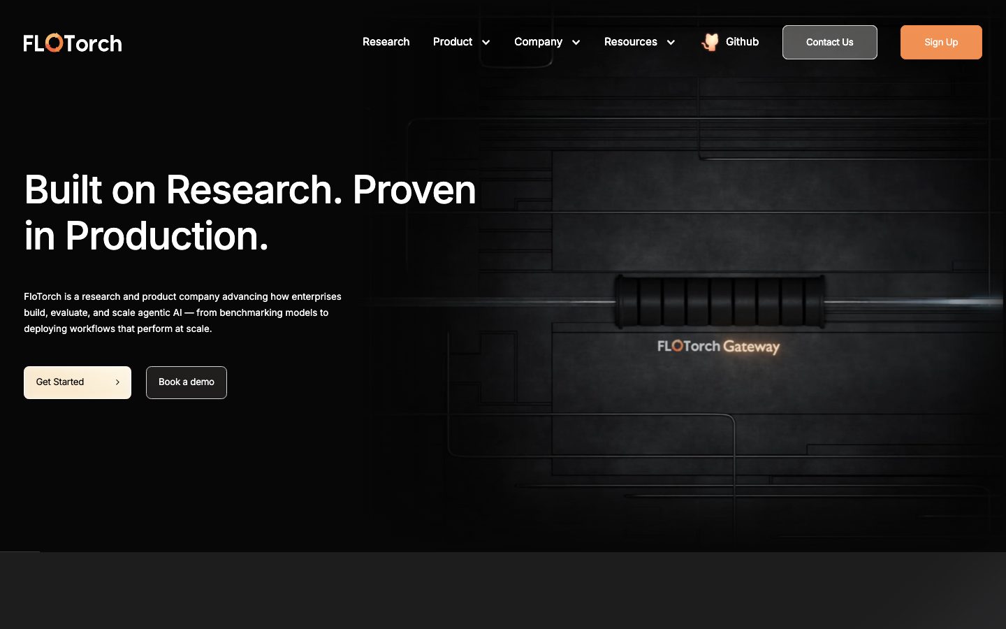
FloTorch's marketing surface is a **dark, enterprise-infrastructure interface** — a near-black charcoal canvas (`{colors.canvas}` — #1d1d1e) with crisp white Inter headlines (`{colors.ink}` — #ffffff) and a single warm torch-orange accent (`{colors.primary}` — #f18642). The system reads as serious AI-platform software: moody dark bands stacked vertically, low-contrast bordered cards holding feature claims, and a cinematic product-render hero ("FLOTorch Gateway") that glows out of the darkness.
The type system is monolithic: **Inter at every level**, no secondary display face. Hierarchy comes from size and weight rather than from a font split — a large 55px medium-weight h1, a 46px regular h2, then small 19px titles and tight 13px body copy with generous 1.7 line-height. Headlines carry negative letter-spacing (-1.1px on h1, -0.91px on h2) which gives the big text a tight, modern, engineered feel.
Brand voltage is concentrated and scarce. The torch-orange (`{colors.primary}`) appears only on the logo mark, the "Sign Up" CTA, feature-card icons, and the eyebrow label — never as a broad fill. Everything else is grayscale charcoal. A handful of additional accents (`{colors.accent-violet}`, `{colors.accent-blue}`, `{colors.accent-mint}`) were measured but appear only in product-render glows and embedded UI fragments, not in the marketing chrome.
**Key Characteristics:**
- Dark charcoal canvas (`{colors.canvas}` — #1d1d1e) throughout — there is no light mode; the entire page is dark, ranging from #1d1d1e down to near-black `{colors.surface-deepest}` (#080707) in lower bands and footer.
- Single typeface — **Inter** — at all roles. Hierarchy from size + weight, not from a display/body font split.
- Torch-orange accent (`{colors.primary}` — #f18642) used sparingly: logo mark, primary CTA, feature-card icons, eyebrow labels.
- Low-contrast bordered feature cards (`{colors.surface-card}` — #262627) arranged in 3-up / 2-up grids, each with a small orange icon, a title, and a short description.
- A cinematic dark hero render — a glowing "FLOTorch Gateway" hardware-style render emerging from the dark canvas, lit with warm + cool rim light.
- Soft-rounded geometry: `{rounded.sm}` (8px) for buttons, `{rounded.md}` (11px) for cards, `{rounded.lg}` (19px) for larger containers.
- White glow shadows (`rgba(255,255,255,0.24) 0 0 8px` — measured) instead of dark drop shadows, since the system can't cast dark shadows on a dark canvas.
- A bordered dual-CTA hero pairing: a light cream `button-cta-light` ("Get Started") next to a dark `button-outline` ("Book a demo").
## Colors
### Brand & Accent
- **Primary** (`{colors.primary}` — #f18642): The torch-orange. The single dominant brand color — used on the logo flame, the "Sign Up" CTA, feature-card icons, and eyebrow labels. Used scarcely, never as a large fill.
- **Primary Soft** (`{colors.primary-soft}` — #f5b86f): A lighter peach-orange used on the cream "Get Started" CTA gradient and on softer icon tints.
- **Accent Violet / Violet Soft** (`{colors.accent-violet}` — #7c3aed, `{colors.accent-violet-soft}` — #7b5cf6): Measured in product-render glows and embedded UI fragments. Not part of the marketing chrome.
- **Accent Blue** (`{colors.accent-blue}` — #3898ec): Measured on link/UI fragments; near-absent from the visible marketing surface.
- **Accent Mint** (`{colors.accent-mint}` — #00ffb7): A high-chroma green measured in the hero render's rim light. Decorative only.
- **Accent Navy** (`{colors.accent-navy}` — #1e1e3a): A deep blue-black used in render gradients and atmospheric backgrounds.
### Surface (all dark)
- **Canvas** (`{colors.canvas}` — #1d1d1e): The default page floor — the hero and primary bands.
- **Surface** (`{colors.surface}` — #222222): Slightly raised band background; secondary-button and partner-strip fills.
- **Surface Card** (`{colors.surface-card}` — #262627): Feature-card background — a hair lighter than canvas for subtle separation.
- **Surface Deep** (`{colors.surface-deep}` — #0d0d0d): Lower-band background that darkens the page as it scrolls.
- **Surface Deepest** (`{colors.surface-deepest}` — #080707): The footer floor and darkest sections.
- **Black** (`{colors.black}` — #000000): Pure-black accents and render shadow zones.
- **Hairline** (`{colors.hairline}` — #6b7280): The faint border tone separating cards and partner-strip dividers on dark surfaces.
### Text
- **Ink** (`{colors.ink}` — #ffffff): All headlines and primary text — maximum contrast on the dark canvas.
- **Body** (`{colors.body}` — #cccccc): Running body copy and footer link text.
- **Muted** (`{colors.muted}` — #a6a6a6): Secondary text — footer body, captions, partner labels.
- **Muted Strong** (`{colors.muted-strong}` — #606060): Tertiary / fine-print text.
- **Link** (`{colors.link}` — #333333): Measured anchor color; appears on low-emphasis inline links.
- **On Light** (`{colors.on-light}` — #dddddd): Light-gray text for use over the cream CTA / lighter surfaces.
## Typography
### Font Family
The system runs a **single typeface — Inter — at every level**. There is no display/body split; the brand voice comes entirely from size, weight, and negative letter-spacing. The fallback stack walks `Inter, -apple-system, BlinkMacSystemFont, "Segoe UI", Roboto, sans-serif`. No licensed or custom typefaces were detected (`fonts_licensed` is empty), so no substitution is required.
Headlines lean on **negative tracking** (-1.1px on h1, -0.91px on h2) and a medium-to-regular weight (500 / 400) — giving the big text a tight, modern, engineered feel rather than a bold marketing shout. Body copy runs small (13px) with a generous 1.7 line-height for legibility on the dark canvas.
### Hierarchy
| Token | Size | Weight | Line Height | Letter Spacing | Use |
|---|---|---|---|---|---|
| `{typography.display-xl}` | 55px | 500 | 1.2 | -1.1px | Hero h1 ("Built on Research. Proven in Production.") — sizes derived (rounded from measured 55.24px) |
| `{typography.display-lg}` | 46px | 400 | 1.1 | -0.91px | Section heads ("Enterprise-Grade AI Gateway…", "Works Seamlessly with Industry Ecosystems") — derived (rounded from 45.71px) |
| `{typography.title}` | 19px | 400 | 1.2 | 0.3px | Feature-card titles, eyebrow labels — derived (rounded from 19.05px) |
| `{typography.body}` | 13px | 400 | 1.7 | 0 | Running body copy, footer text — derived (rounded from 13.33px) |
| `{typography.button}` | 15px | 400 | 1.5 | 0 | Button + nav-link labels — derived (rounded from 15.24px) |
### Principles
Because there is only one typeface, hierarchy must be earned through size and weight contrast. The h1 jump from 55px medium to 13px body is dramatic — that scale gap is the system's primary structuring device. Keep the negative tracking on display sizes; Inter at 55px without -1.1px tracking loses the engineered tightness. Never bump body weight above 400 — the system stays light and editorial in its supporting copy.
### Note on Font Substitutes
No licensed fonts were detected. Inter is open-source (SIL Open Font License) and ships directly — no substitution needed.
## Layout
### Spacing System
- **Base unit:** ~8px, but the measured scale is irregular (Webflow-derived), clustering around 8–48px.
- **Tokens:** `{spacing.xxs}` 8px · `{spacing.xs}` 10px · `{spacing.sm}` 13px · `{spacing.md}` 19px · `{spacing.lg}` 21px · `{spacing.xl}` 33px · `{spacing.xxl}` 48px · `{spacing.section}` 67px.
- **Section padding:** `{spacing.section}` (67px) — the vertical rhythm between major dark bands (derived from the largest measured spacing cluster).
- **Card internal padding:** `{spacing.xl}` (33px) for feature cards.
- **Common rhythm:** the 19px (`{spacing.md}`) value is the single most frequent measured gap — the workhorse spacing for inner element separation.
### Grid & Container
- **Max content width:** ~1200px centered (observed from screenshots; not measured).
- **Hero band:** left-aligned text column (h1 + sub-head + dual CTA) over a full-bleed dark product render that occupies the right two-thirds.
- **Feature grids:** 3-up at desktop with a wrapping 4th/5th card; the lower band uses a 3-up + 2-up mixed grid.
- **Partner strip:** 6 logos in a single horizontal row with hairline dividers.
- **Footer:** multi-column link list (Product / Company / Resources) with a brand + description block at left.
### Whitespace Philosophy
FloTorch uses dark negative space as a compositional tool — the hero render breathes in a large dark field, and feature cards sit in loosely-spaced grids rather than dense packing. The darkness itself functions as whitespace, letting the scarce orange accents and white headlines carry the eye.
## Elevation & Depth
| Level | Treatment | Use |
|---|---|---|
| Flat | No shadow, no border | Hero text, body bands |
| Hairline border | 1px `{colors.hairline}` (#6b7280) outline | Feature cards, partner-strip dividers — separation on the dark canvas |
| Surface step | Lighter charcoal (`{colors.surface-card}` over `{colors.canvas}`) | Cards lift via a subtle background-tone step, not shadow |
| White glow | `rgba(255,255,255,0.24) 0px 0px 8px` (measured) | Soft luminous halo on select interactive / highlighted elements |
| Sharp white edge | `rgb(255,255,255) 0px 4px 4px` (measured) | A crisp white edge-light on a small set of elements |
On a dark canvas, FloTorch can't cast dark drop-shadows, so **depth is signaled by background-tone steps and white glow shadows** rather than conventional shadow. The cinematic hero render carries its own internal lighting (warm rim + cool mint highlights) which reads as the deepest layer of depth on the page.
### Decorative Depth
- The "FLOTorch Gateway" hero render is the dominant depth element — a 3D hardware-style object lit against a dark technical-blueprint background with faint circuit-trace lines.
- Feature-card icons sit in subtly tinted orange treatments that glow slightly against the charcoal cards.
## Shapes
### Border Radius Scale
| Token | Value | Use |
|---|---|---|
| `{rounded.sm}` | 8px | Buttons (Sign Up, Get Started, Book a demo, Contact Us) |
| `{rounded.md}` | 11px | Feature cards (measured 11.43px) — the dominant card radius |
| `{rounded.lg}` | 19px | Larger containers / grouped panels |
### Geometry
Feature cards use the 11px (`{rounded.md}`) radius — soft but restrained, consistent with professional infrastructure software. Buttons sit slightly tighter at 8px. The largest 19px radius appears on bigger grouped panels. Logo and partner marks keep their native artwork geometry within the partner strip.
## Components
### Navigation
**`top-nav`** — Dark nav bar on `{colors.canvas}`. Carries the FLOTorch wordmark + torch-orange flame mark at left, a horizontal menu (Research, Product ▾, Company ▾, Resources ▾, GitHub) center, and a right cluster with a dark `button-outline`-style "Contact Us" and an orange `button-primary` "Sign Up". Menu items use `{typography.button}` (Inter 15px).
**`nav-link`** — Inline transparent menu item, text `{colors.ink}`, type `{typography.button}`. Used for top-nav menu entries and dropdown triggers.
### Buttons
**`button-primary`** — The orange CTA ("Sign Up"). Background `{colors.primary}` (#f18642), text `{colors.ink}`, type `{typography.button}`, rounded `{rounded.sm}` (8px), padding 13px × 21px (derived from measured spacing tokens). The single highest-emphasis action.
**`button-cta-light`** — The cream "Get Started" hero CTA. Light peach gradient surface (`{colors.primary-soft}` — #f5b86f) with dark text (`{colors.canvas}`), rounded `{rounded.sm}`. Paired with `button-outline` in the hero.
**`button-outline`** — The "Book a demo" / dark-secondary button. Background `{colors.surface}` (#222222) with a faint hairline edge, text `{colors.ink}`, rounded `{rounded.sm}`.
**`button-secondary`** — The dark "Contact Us" nav button. Background `{colors.surface}`, text `{colors.ink}`, rounded `{rounded.sm}` — visually paired with the orange Sign Up button in the nav.
### Bands & Sections
**`hero-band`** — The opening dark hero. Left-aligned h1 in `{typography.display-xl}`, a short sub-paragraph in `{typography.body}`, then the dual CTA row (`button-cta-light` + `button-outline`). Background `{colors.canvas}` with the full-bleed product render behind. Vertical padding `{spacing.section}` (67px).
**`eyebrow-label`** — Small uppercase orange kicker text ("REVOLUTIONIZE OPERATIONS WITH AI") sitting above section heads. Transparent background, text `{colors.primary-soft}`, type `{typography.title}` with wide tracking.
**`section-band`** — Lower content bands on `{colors.surface-deep}` (#0d0d0d), darkening the page as it scrolls. Centered h2 in `{typography.display-lg}` with a supporting sub-paragraph.
### Cards & Strips
**`feature-card`** — The core content unit, used in 3-up / 2-up grids ("LLM Routing", "Cache Management", "RAG Pipeline", etc.). Background `{colors.surface-card}` (#262627), 1px `{colors.hairline}` border, rounded `{rounded.md}` (11px), internal padding `{spacing.xl}` (33px), shadow none (measured). Each card carries a small orange icon at top, a title in `{typography.title}`, and a short description in `{typography.body}` (`{colors.muted}`).
**`partner-strip`** — A horizontal logo row ("Works Seamlessly with Industry Ecosystems") showing AWS, Google, Azure, Salesforce, Databricks, and NVIDIA marks. Background `{colors.surface}`, hairline dividers between logos, caption text in `{colors.muted}` (`{typography.body}`).
### Footer
**`footer`** — Near-black footer on `{colors.surface-deepest}` (#080707). Carries the FLOTorch wordmark + "A Fission Labs Company" tagline and a long description paragraph at left in `{colors.muted}`, a "Follow us" social row, and three link columns (Product / Company / Resources). Body text in `{typography.body}`, padding `{spacing.xxl}` (48px).
**`footer-link`** — Inline footer list link, transparent background, text `{colors.body}` (#cccccc), type `{typography.body}`.
## Do's and Don'ts
### Do
- Keep the entire experience dark — `{colors.canvas}` (#1d1d1e) and its darker steps. FloTorch has no light mode.
- Reserve `{colors.primary}` (#f18642) for the logo mark, the primary CTA, feature-card icons, and eyebrow labels. Orange is scarce and high-value.
- Use background-tone steps and white glow shadows for depth — never dark drop-shadows on the dark canvas.
- Keep negative letter-spacing on display headlines (-1.1px / -0.91px). Inter at 55px loses its tightness without it.
- Use `{component.feature-card}` with its hairline border for all feature claims — the faint outline is how cards separate on dark.
- Pair the cream `button-cta-light` with the dark `button-outline` in the hero — the warm/dark contrast is the signature CTA combination.
### Don't
- Don't introduce a light/white page background — the dark canvas is the brand.
- Don't use `{colors.accent-violet}`, `{colors.accent-blue}`, or `{colors.accent-mint}` in marketing chrome; they belong to the product render glows only.
- Don't bump body copy above weight 400 or shrink its 1.7 line-height — body legibility on dark depends on the open leading.
- Don't add a second typeface; Inter carries every role.
- Don't fill large areas with orange — it reads only as an accent, never a surface.
- Don't add hover state styling beyond what the system encodes — document default and active/pressed states only.
## Responsive Behavior
### Breakpoints
| Name | Width | Key Changes |
|---|---|---|
| Mobile | < 768px | Hamburger nav; hero h1 scales down from 55px; product render moves behind / below text; feature grids collapse to 1-up; footer columns stack |
| Tablet | 768–1024px | Top nav tightens; feature cards 2-up; partner strip wraps; hero text column widens over render |
| Desktop | 1024–1440px | Full horizontal nav; 3-up feature cards; partner strip in a single 6-logo row |
| Wide | > 1440px | Same as desktop with more outer breathing room; content caps ~1200px |
(Breakpoint values are inferred from layout, not measured — see Known Gaps.)
### Touch Targets
- `{component.button-primary}` and `{component.button-cta-light}` carry 13px × 21px padding (derived), giving a comfortable tap area.
- Nav links rely on surrounding padding for tap area; exact heights were not measured.
### Collapsing Strategy
- The hero's text-over-render composition collapses so the headline stacks above the product render on mobile.
- Feature grids reduce columns (3 → 2 → 1) rather than scaling cards down.
- The partner strip wraps logos to multiple rows on narrow viewports.
- Footer link columns stack vertically below the brand/description block.
### Image Behavior
- The hero product render is full-bleed and scales with the viewport; its internal lighting stays intact.
- Partner logos retain native aspect ratios and align to the divider grid.
## Iteration Guide
1. Focus on ONE component at a time. Reference its YAML key directly (`{component.feature-card}`, `{component.button-primary}`).
2. Variants of an existing component live as separate entries in `components:`.
3. Use `{token.refs}` everywhere — never inline a hex in a component.
4. Never document hover. Default and Active/Pressed states only.
5. The dark canvas is fixed; orange is scarce. When adding emphasis, reach for size/weight contrast before color.
6. All type is Inter — earn hierarchy through scale, not new faces.
7. Depth comes from tone-steps and white glow, never dark shadow.
## Known Gaps
- **Button measurement anomaly:** the measured `button-primary` reported `radius: 0px` and `padding: 0px`, which conflicts with the visibly rounded, padded CTAs in the screenshots — likely because the styled element is an `<a>`/wrapper rather than the painted `<button>`. Button radius, padding, and the cream/outline variants are documented from screenshot ground-truth plus the measured `{rounded.sm}` and spacing tokens; exact values should be re-measured against the rendered control.
- **Type sizes are derived** (rounded from sub-pixel measurements like 55.24px, 45.71px, 19.05px, 13.33px, 15.24px). Treat the rounded px values as the canonical tokens.
- **Spacing scale is irregular** (Webflow-derived, clustering at 8–48px); the `{spacing.*}` tokens map measured clusters and the 67px section value is the largest observed band gap — finer section rhythm was not isolated.
- Body, link, and muted text colors are mapped from measured neutrals; per-element text-color assignments (e.g., which gray each paragraph uses) were not individually captured.
- Only the landing page was captured; interior pages (Product, Company, Resources, Research) and any form/input surfaces are out of scope and unmeasured.
- Accent colors (`{colors.accent-violet}`, `{colors.accent-blue}`, `{colors.accent-mint}`, `{colors.accent-navy}`) were measured but their exact usage is inferred to be product-render/embedded-UI glow rather than marketing chrome — confirm against live UI fragments.
- Animation, transition timings, and dropdown-menu open states are not in scope.
- Breakpoint widths and touch-target heights are inferred from layout, not measured.
<!-- Documented by duply · real-world design systems as ready-to-use DESIGN.md for AI coding agents · https://duply.ai/flotorch/design-md -->
Color Palette
Accent
Neutrals
Typography
display-xl55px · 500 · 1.2
The quick brown fox jumpsdisplay-lg46px · 400 · 1.1
The quick brown fox jumpstitle19px · 400 · 1.2
The quick brown fox jumpsbody13px · 400 · 1.7
The quick brown fox jumpsbutton15px · 400 · 1.5
The quick brown fox jumpsSpacing & Shape
Spacing
| Name | Value | Preview |
|---|---|---|
| xxs | 8px | |
| xs | 10px | |
| sm | 13px | |
| md | 19px | |
| lg | 21px | |
| xl | 33px | |
| xxl | 48px | |
| section | 67px |
Border Radius
| Name | Value | Preview |
|---|---|---|
| sm | 8px | |
| md | 11px | |
| lg | 19px |
More like this


---
version: alpha
name: FloTorch-design-analysis
description: "A dark, research-and-product AI interface built on a near-black charcoal canvas (#1d1d1e) with crisp white Inter headlines and a warm torch-orange accent (#f18642). The system reads as enterprise-grade infrastructure software — moody dark bands, low-contrast bordered cards holding feature claims, a glowing product-render hero, and restrained orange CTAs. Brand voltage comes from the orange torch mark and the cinematic dark hero render rather than from broad color use."
colors:
  primary: "#f18642"
  primary-soft: "#f5b86f"
  accent-violet: "#7c3aed"
  accent-violet-soft: "#7b5cf6"
  accent-blue: "#3898ec"
  accent-mint: "#00ffb7"
  accent-navy: "#1e1e3a"
  ink: "#ffffff"
  body: "#cccccc"
  muted: "#a6a6a6"
  muted-strong: "#606060"
  link: "#333333"
  canvas: "#1d1d1e"
  surface: "#222222"
  surface-card: "#262627"
  surface-deep: "#0d0d0d"
  surface-deepest: "#080707"
  black: "#000000"
  hairline: "#6b7280"
  on-light: "#dddddd"
typography:
  display-xl:
    fontFamily: "Inter, sans-serif"
    fontSize: 55px
    fontWeight: 500
    lineHeight: 1.2
    letterSpacing: -1.1px
  display-lg:
    fontFamily: "Inter, sans-serif"
    fontSize: 46px
    fontWeight: 400
    lineHeight: 1.1
    letterSpacing: -0.91px
  title:
    fontFamily: "Inter, sans-serif"
    fontSize: 19px
    fontWeight: 400
    lineHeight: 1.2
    letterSpacing: 0.3px
  body:
    fontFamily: "Inter, sans-serif"
    fontSize: 13px
    fontWeight: 400
    lineHeight: 1.7
    letterSpacing: 0
  button:
    fontFamily: "Inter, sans-serif"
    fontSize: 15px
    fontWeight: 400
    lineHeight: 1.5
    letterSpacing: 0
rounded:
  sm: 8px
  md: 11px
  lg: 19px
spacing:
  xxs: 8px
  xs: 10px
  sm: 13px
  md: 19px
  lg: 21px
  xl: 33px
  xxl: 48px
  section: 67px
components:
  top-nav:
    backgroundColor: "{colors.canvas}"
    textColor: "{colors.ink}"
    typography: "{typography.button}"
    padding: 19px 33px
  nav-link:
    backgroundColor: transparent
    textColor: "{colors.ink}"
    typography: "{typography.button}"
  button-primary:
    backgroundColor: "{colors.primary}"
    textColor: "{colors.ink}"
    typography: "{typography.button}"
    rounded: "{rounded.sm}"
    padding: 13px 21px
  button-cta-light:
    backgroundColor: "{colors.primary-soft}"
    textColor: "{colors.canvas}"
    typography: "{typography.button}"
    rounded: "{rounded.sm}"
    padding: 13px 21px
  button-outline:
    backgroundColor: "{colors.surface}"
    textColor: "{colors.ink}"
    typography: "{typography.button}"
    rounded: "{rounded.sm}"
    padding: 13px 21px
  button-secondary:
    backgroundColor: "{colors.surface}"
    textColor: "{colors.ink}"
    typography: "{typography.button}"
    rounded: "{rounded.sm}"
    padding: 13px 21px
  hero-band:
    backgroundColor: "{colors.canvas}"
    textColor: "{colors.ink}"
    typography: "{typography.display-xl}"
    padding: 67px
  eyebrow-label:
    backgroundColor: transparent
    textColor: "{colors.primary-soft}"
    typography: "{typography.title}"
  section-band:
    backgroundColor: "{colors.surface-deep}"
    textColor: "{colors.ink}"
    typography: "{typography.display-lg}"
    padding: 67px
  feature-card:
    backgroundColor: "{colors.surface-card}"
    textColor: "{colors.ink}"
    typography: "{typography.title}"
    rounded: "{rounded.md}"
    padding: 33px
  partner-strip:
    backgroundColor: "{colors.surface}"
    textColor: "{colors.muted}"
    typography: "{typography.body}"
    padding: 48px
  footer:
    backgroundColor: "{colors.surface-deepest}"
    textColor: "{colors.muted}"
    typography: "{typography.body}"
    padding: 48px
  footer-link:
    backgroundColor: transparent
    textColor: "{colors.body}"
    typography: "{typography.body}"
---

## Overview

FloTorch's marketing surface is a **dark, enterprise-infrastructure interface** — a near-black charcoal canvas (`{colors.canvas}` — #1d1d1e) with crisp white Inter headlines (`{colors.ink}` — #ffffff) and a single warm torch-orange accent (`{colors.primary}` — #f18642). The system reads as serious AI-platform software: moody dark bands stacked vertically, low-contrast bordered cards holding feature claims, and a cinematic product-render hero ("FLOTorch Gateway") that glows out of the darkness.

The type system is monolithic: **Inter at every level**, no secondary display face. Hierarchy comes from size and weight rather than from a font split — a large 55px medium-weight h1, a 46px regular h2, then small 19px titles and tight 13px body copy with generous 1.7 line-height. Headlines carry negative letter-spacing (-1.1px on h1, -0.91px on h2) which gives the big text a tight, modern, engineered feel.

Brand voltage is concentrated and scarce. The torch-orange (`{colors.primary}`) appears only on the logo mark, the "Sign Up" CTA, feature-card icons, and the eyebrow label — never as a broad fill. Everything else is grayscale charcoal. A handful of additional accents (`{colors.accent-violet}`, `{colors.accent-blue}`, `{colors.accent-mint}`) were measured but appear only in product-render glows and embedded UI fragments, not in the marketing chrome.

**Key Characteristics:**
- Dark charcoal canvas (`{colors.canvas}` — #1d1d1e) throughout — there is no light mode; the entire page is dark, ranging from #1d1d1e down to near-black `{colors.surface-deepest}` (#080707) in lower bands and footer.
- Single typeface — **Inter** — at all roles. Hierarchy from size + weight, not from a display/body font split.
- Torch-orange accent (`{colors.primary}` — #f18642) used sparingly: logo mark, primary CTA, feature-card icons, eyebrow labels.
- Low-contrast bordered feature cards (`{colors.surface-card}` — #262627) arranged in 3-up / 2-up grids, each with a small orange icon, a title, and a short description.
- A cinematic dark hero render — a glowing "FLOTorch Gateway" hardware-style render emerging from the dark canvas, lit with warm + cool rim light.
- Soft-rounded geometry: `{rounded.sm}` (8px) for buttons, `{rounded.md}` (11px) for cards, `{rounded.lg}` (19px) for larger containers.
- White glow shadows (`rgba(255,255,255,0.24) 0 0 8px` — measured) instead of dark drop shadows, since the system can't cast dark shadows on a dark canvas.
- A bordered dual-CTA hero pairing: a light cream `button-cta-light` ("Get Started") next to a dark `button-outline` ("Book a demo").

## Colors

### Brand & Accent
- **Primary** (`{colors.primary}` — #f18642): The torch-orange. The single dominant brand color — used on the logo flame, the "Sign Up" CTA, feature-card icons, and eyebrow labels. Used scarcely, never as a large fill.
- **Primary Soft** (`{colors.primary-soft}` — #f5b86f): A lighter peach-orange used on the cream "Get Started" CTA gradient and on softer icon tints.
- **Accent Violet / Violet Soft** (`{colors.accent-violet}` — #7c3aed, `{colors.accent-violet-soft}` — #7b5cf6): Measured in product-render glows and embedded UI fragments. Not part of the marketing chrome.
- **Accent Blue** (`{colors.accent-blue}` — #3898ec): Measured on link/UI fragments; near-absent from the visible marketing surface.
- **Accent Mint** (`{colors.accent-mint}` — #00ffb7): A high-chroma green measured in the hero render's rim light. Decorative only.
- **Accent Navy** (`{colors.accent-navy}` — #1e1e3a): A deep blue-black used in render gradients and atmospheric backgrounds.

### Surface (all dark)
- **Canvas** (`{colors.canvas}` — #1d1d1e): The default page floor — the hero and primary bands.
- **Surface** (`{colors.surface}` — #222222): Slightly raised band background; secondary-button and partner-strip fills.
- **Surface Card** (`{colors.surface-card}` — #262627): Feature-card background — a hair lighter than canvas for subtle separation.
- **Surface Deep** (`{colors.surface-deep}` — #0d0d0d): Lower-band background that darkens the page as it scrolls.
- **Surface Deepest** (`{colors.surface-deepest}` — #080707): The footer floor and darkest sections.
- **Black** (`{colors.black}` — #000000): Pure-black accents and render shadow zones.
- **Hairline** (`{colors.hairline}` — #6b7280): The faint border tone separating cards and partner-strip dividers on dark surfaces.

### Text
- **Ink** (`{colors.ink}` — #ffffff): All headlines and primary text — maximum contrast on the dark canvas.
- **Body** (`{colors.body}` — #cccccc): Running body copy and footer link text.
- **Muted** (`{colors.muted}` — #a6a6a6): Secondary text — footer body, captions, partner labels.
- **Muted Strong** (`{colors.muted-strong}` — #606060): Tertiary / fine-print text.
- **Link** (`{colors.link}` — #333333): Measured anchor color; appears on low-emphasis inline links.
- **On Light** (`{colors.on-light}` — #dddddd): Light-gray text for use over the cream CTA / lighter surfaces.

## Typography

### Font Family
The system runs a **single typeface — Inter — at every level**. There is no display/body split; the brand voice comes entirely from size, weight, and negative letter-spacing. The fallback stack walks `Inter, -apple-system, BlinkMacSystemFont, "Segoe UI", Roboto, sans-serif`. No licensed or custom typefaces were detected (`fonts_licensed` is empty), so no substitution is required.

Headlines lean on **negative tracking** (-1.1px on h1, -0.91px on h2) and a medium-to-regular weight (500 / 400) — giving the big text a tight, modern, engineered feel rather than a bold marketing shout. Body copy runs small (13px) with a generous 1.7 line-height for legibility on the dark canvas.

### Hierarchy

| Token | Size | Weight | Line Height | Letter Spacing | Use |
|---|---|---|---|---|---|
| `{typography.display-xl}` | 55px | 500 | 1.2 | -1.1px | Hero h1 ("Built on Research. Proven in Production.") — sizes derived (rounded from measured 55.24px) |
| `{typography.display-lg}` | 46px | 400 | 1.1 | -0.91px | Section heads ("Enterprise-Grade AI Gateway…", "Works Seamlessly with Industry Ecosystems") — derived (rounded from 45.71px) |
| `{typography.title}` | 19px | 400 | 1.2 | 0.3px | Feature-card titles, eyebrow labels — derived (rounded from 19.05px) |
| `{typography.body}` | 13px | 400 | 1.7 | 0 | Running body copy, footer text — derived (rounded from 13.33px) |
| `{typography.button}` | 15px | 400 | 1.5 | 0 | Button + nav-link labels — derived (rounded from 15.24px) |

### Principles
Because there is only one typeface, hierarchy must be earned through size and weight contrast. The h1 jump from 55px medium to 13px body is dramatic — that scale gap is the system's primary structuring device. Keep the negative tracking on display sizes; Inter at 55px without -1.1px tracking loses the engineered tightness. Never bump body weight above 400 — the system stays light and editorial in its supporting copy.

### Note on Font Substitutes
No licensed fonts were detected. Inter is open-source (SIL Open Font License) and ships directly — no substitution needed.

## Layout

### Spacing System
- **Base unit:** ~8px, but the measured scale is irregular (Webflow-derived), clustering around 8–48px.
- **Tokens:** `{spacing.xxs}` 8px · `{spacing.xs}` 10px · `{spacing.sm}` 13px · `{spacing.md}` 19px · `{spacing.lg}` 21px · `{spacing.xl}` 33px · `{spacing.xxl}` 48px · `{spacing.section}` 67px.
- **Section padding:** `{spacing.section}` (67px) — the vertical rhythm between major dark bands (derived from the largest measured spacing cluster).
- **Card internal padding:** `{spacing.xl}` (33px) for feature cards.
- **Common rhythm:** the 19px (`{spacing.md}`) value is the single most frequent measured gap — the workhorse spacing for inner element separation.

### Grid & Container
- **Max content width:** ~1200px centered (observed from screenshots; not measured).
- **Hero band:** left-aligned text column (h1 + sub-head + dual CTA) over a full-bleed dark product render that occupies the right two-thirds.
- **Feature grids:** 3-up at desktop with a wrapping 4th/5th card; the lower band uses a 3-up + 2-up mixed grid.
- **Partner strip:** 6 logos in a single horizontal row with hairline dividers.
- **Footer:** multi-column link list (Product / Company / Resources) with a brand + description block at left.

### Whitespace Philosophy
FloTorch uses dark negative space as a compositional tool — the hero render breathes in a large dark field, and feature cards sit in loosely-spaced grids rather than dense packing. The darkness itself functions as whitespace, letting the scarce orange accents and white headlines carry the eye.

## Elevation & Depth

| Level | Treatment | Use |
|---|---|---|
| Flat | No shadow, no border | Hero text, body bands |
| Hairline border | 1px `{colors.hairline}` (#6b7280) outline | Feature cards, partner-strip dividers — separation on the dark canvas |
| Surface step | Lighter charcoal (`{colors.surface-card}` over `{colors.canvas}`) | Cards lift via a subtle background-tone step, not shadow |
| White glow | `rgba(255,255,255,0.24) 0px 0px 8px` (measured) | Soft luminous halo on select interactive / highlighted elements |
| Sharp white edge | `rgb(255,255,255) 0px 4px 4px` (measured) | A crisp white edge-light on a small set of elements |

On a dark canvas, FloTorch can't cast dark drop-shadows, so **depth is signaled by background-tone steps and white glow shadows** rather than conventional shadow. The cinematic hero render carries its own internal lighting (warm rim + cool mint highlights) which reads as the deepest layer of depth on the page.

### Decorative Depth
- The "FLOTorch Gateway" hero render is the dominant depth element — a 3D hardware-style object lit against a dark technical-blueprint background with faint circuit-trace lines.
- Feature-card icons sit in subtly tinted orange treatments that glow slightly against the charcoal cards.

## Shapes

### Border Radius Scale

| Token | Value | Use |
|---|---|---|
| `{rounded.sm}` | 8px | Buttons (Sign Up, Get Started, Book a demo, Contact Us) |
| `{rounded.md}` | 11px | Feature cards (measured 11.43px) — the dominant card radius |
| `{rounded.lg}` | 19px | Larger containers / grouped panels |

### Geometry
Feature cards use the 11px (`{rounded.md}`) radius — soft but restrained, consistent with professional infrastructure software. Buttons sit slightly tighter at 8px. The largest 19px radius appears on bigger grouped panels. Logo and partner marks keep their native artwork geometry within the partner strip.

## Components

### Navigation

**`top-nav`** — Dark nav bar on `{colors.canvas}`. Carries the FLOTorch wordmark + torch-orange flame mark at left, a horizontal menu (Research, Product ▾, Company ▾, Resources ▾, GitHub) center, and a right cluster with a dark `button-outline`-style "Contact Us" and an orange `button-primary` "Sign Up". Menu items use `{typography.button}` (Inter 15px).

**`nav-link`** — Inline transparent menu item, text `{colors.ink}`, type `{typography.button}`. Used for top-nav menu entries and dropdown triggers.

### Buttons

**`button-primary`** — The orange CTA ("Sign Up"). Background `{colors.primary}` (#f18642), text `{colors.ink}`, type `{typography.button}`, rounded `{rounded.sm}` (8px), padding 13px × 21px (derived from measured spacing tokens). The single highest-emphasis action.

**`button-cta-light`** — The cream "Get Started" hero CTA. Light peach gradient surface (`{colors.primary-soft}` — #f5b86f) with dark text (`{colors.canvas}`), rounded `{rounded.sm}`. Paired with `button-outline` in the hero.

**`button-outline`** — The "Book a demo" / dark-secondary button. Background `{colors.surface}` (#222222) with a faint hairline edge, text `{colors.ink}`, rounded `{rounded.sm}`.

**`button-secondary`** — The dark "Contact Us" nav button. Background `{colors.surface}`, text `{colors.ink}`, rounded `{rounded.sm}` — visually paired with the orange Sign Up button in the nav.

### Bands & Sections

**`hero-band`** — The opening dark hero. Left-aligned h1 in `{typography.display-xl}`, a short sub-paragraph in `{typography.body}`, then the dual CTA row (`button-cta-light` + `button-outline`). Background `{colors.canvas}` with the full-bleed product render behind. Vertical padding `{spacing.section}` (67px).

**`eyebrow-label`** — Small uppercase orange kicker text ("REVOLUTIONIZE OPERATIONS WITH AI") sitting above section heads. Transparent background, text `{colors.primary-soft}`, type `{typography.title}` with wide tracking.

**`section-band`** — Lower content bands on `{colors.surface-deep}` (#0d0d0d), darkening the page as it scrolls. Centered h2 in `{typography.display-lg}` with a supporting sub-paragraph.

### Cards & Strips

**`feature-card`** — The core content unit, used in 3-up / 2-up grids ("LLM Routing", "Cache Management", "RAG Pipeline", etc.). Background `{colors.surface-card}` (#262627), 1px `{colors.hairline}` border, rounded `{rounded.md}` (11px), internal padding `{spacing.xl}` (33px), shadow none (measured). Each card carries a small orange icon at top, a title in `{typography.title}`, and a short description in `{typography.body}` (`{colors.muted}`).

**`partner-strip`** — A horizontal logo row ("Works Seamlessly with Industry Ecosystems") showing AWS, Google, Azure, Salesforce, Databricks, and NVIDIA marks. Background `{colors.surface}`, hairline dividers between logos, caption text in `{colors.muted}` (`{typography.body}`).

### Footer

**`footer`** — Near-black footer on `{colors.surface-deepest}` (#080707). Carries the FLOTorch wordmark + "A Fission Labs Company" tagline and a long description paragraph at left in `{colors.muted}`, a "Follow us" social row, and three link columns (Product / Company / Resources). Body text in `{typography.body}`, padding `{spacing.xxl}` (48px).

**`footer-link`** — Inline footer list link, transparent background, text `{colors.body}` (#cccccc), type `{typography.body}`.

## Do's and Don'ts

### Do
- Keep the entire experience dark — `{colors.canvas}` (#1d1d1e) and its darker steps. FloTorch has no light mode.
- Reserve `{colors.primary}` (#f18642) for the logo mark, the primary CTA, feature-card icons, and eyebrow labels. Orange is scarce and high-value.
- Use background-tone steps and white glow shadows for depth — never dark drop-shadows on the dark canvas.
- Keep negative letter-spacing on display headlines (-1.1px / -0.91px). Inter at 55px loses its tightness without it.
- Use `{component.feature-card}` with its hairline border for all feature claims — the faint outline is how cards separate on dark.
- Pair the cream `button-cta-light` with the dark `button-outline` in the hero — the warm/dark contrast is the signature CTA combination.

### Don't
- Don't introduce a light/white page background — the dark canvas is the brand.
- Don't use `{colors.accent-violet}`, `{colors.accent-blue}`, or `{colors.accent-mint}` in marketing chrome; they belong to the product render glows only.
- Don't bump body copy above weight 400 or shrink its 1.7 line-height — body legibility on dark depends on the open leading.
- Don't add a second typeface; Inter carries every role.
- Don't fill large areas with orange — it reads only as an accent, never a surface.
- Don't add hover state styling beyond what the system encodes — document default and active/pressed states only.

## Responsive Behavior

### Breakpoints

| Name | Width | Key Changes |
|---|---|---|
| Mobile | < 768px | Hamburger nav; hero h1 scales down from 55px; product render moves behind / below text; feature grids collapse to 1-up; footer columns stack |
| Tablet | 768–1024px | Top nav tightens; feature cards 2-up; partner strip wraps; hero text column widens over render |
| Desktop | 1024–1440px | Full horizontal nav; 3-up feature cards; partner strip in a single 6-logo row |
| Wide | > 1440px | Same as desktop with more outer breathing room; content caps ~1200px |

(Breakpoint values are inferred from layout, not measured — see Known Gaps.)

### Touch Targets
- `{component.button-primary}` and `{component.button-cta-light}` carry 13px × 21px padding (derived), giving a comfortable tap area.
- Nav links rely on surrounding padding for tap area; exact heights were not measured.

### Collapsing Strategy
- The hero's text-over-render composition collapses so the headline stacks above the product render on mobile.
- Feature grids reduce columns (3 → 2 → 1) rather than scaling cards down.
- The partner strip wraps logos to multiple rows on narrow viewports.
- Footer link columns stack vertically below the brand/description block.

### Image Behavior
- The hero product render is full-bleed and scales with the viewport; its internal lighting stays intact.
- Partner logos retain native aspect ratios and align to the divider grid.

## Iteration Guide

1. Focus on ONE component at a time. Reference its YAML key directly (`{component.feature-card}`, `{component.button-primary}`).
2. Variants of an existing component live as separate entries in `components:`.
3. Use `{token.refs}` everywhere — never inline a hex in a component.
4. Never document hover. Default and Active/Pressed states only.
5. The dark canvas is fixed; orange is scarce. When adding emphasis, reach for size/weight contrast before color.
6. All type is Inter — earn hierarchy through scale, not new faces.
7. Depth comes from tone-steps and white glow, never dark shadow.

## Known Gaps

- **Button measurement anomaly:** the measured `button-primary` reported `radius: 0px` and `padding: 0px`, which conflicts with the visibly rounded, padded CTAs in the screenshots — likely because the styled element is an `<a>`/wrapper rather than the painted `<button>`. Button radius, padding, and the cream/outline variants are documented from screenshot ground-truth plus the measured `{rounded.sm}` and spacing tokens; exact values should be re-measured against the rendered control.
- **Type sizes are derived** (rounded from sub-pixel measurements like 55.24px, 45.71px, 19.05px, 13.33px, 15.24px). Treat the rounded px values as the canonical tokens.
- **Spacing scale is irregular** (Webflow-derived, clustering at 8–48px); the `{spacing.*}` tokens map measured clusters and the 67px section value is the largest observed band gap — finer section rhythm was not isolated.
- Body, link, and muted text colors are mapped from measured neutrals; per-element text-color assignments (e.g., which gray each paragraph uses) were not individually captured.
- Only the landing page was captured; interior pages (Product, Company, Resources, Research) and any form/input surfaces are out of scope and unmeasured.
- Accent colors (`{colors.accent-violet}`, `{colors.accent-blue}`, `{colors.accent-mint}`, `{colors.accent-navy}`) were measured but their exact usage is inferred to be product-render/embedded-UI glow rather than marketing chrome — confirm against live UI fragments.
- Animation, transition timings, and dropdown-menu open states are not in scope.
- Breakpoint widths and touch-target heights are inferred from layout, not measured.

<!-- Documented by duply · real-world design systems as ready-to-use DESIGN.md for AI coding agents · https://duply.ai/flotorch/design-md -->