Deepgram
A dark, developer-first Voice-AI interface built on a near-black canvas (#0b0b0c) with crisp white display headlines, an electric green-to-cyan gradient accent for brand voltage, and Inter body type. The system reads as confident technical infrastructure — flat dark surfaces, tight 4–8px radii, restrained whitespace, glowing green/blue product-UI fragments embedded in cards, and a strict split between the Roobert display face for headlines and Inter for everything else.
---
version: alpha
name: Deepgram-design-analysis
description: "A dark, developer-first Voice-AI interface built on a near-black canvas (#0b0b0c) with crisp white display headlines, an electric green-to-cyan gradient accent for brand voltage, and Inter body type. The system reads as confident technical infrastructure — flat dark surfaces, tight 4–8px radii, restrained whitespace, glowing green/blue product-UI fragments embedded in cards, and a strict split between the Roobert display face for headlines and Inter for everything else."
colors:
canvas: "#0b0b0c"
surface-dark: "#101014"
surface-elevated: "#2c2c33"
surface-line: "#4e4e52"
on-dark: "#ffffff"
black: "#000000"
ink: "#a9a9ad"
muted: "#88888c"
muted-strong: "#949498"
hairline: "#e1e1e5"
surface-soft-light: "#ededf2"
accent-green: "#13ef95"
accent-green-alt: "#00f099"
accent-green-soft: "#38edac"
accent-green-deep: "#13ef93"
accent-cyan: "#008fc1"
accent-blue: "#149afb"
accent-pink: "#f4008d"
accent-violet: "#b60af5"
accent-indigo: "#201cff"
typography:
display-xl:
fontFamily: "Roobert, Inter, sans-serif"
fontSize: 60px
fontWeight: 700
lineHeight: 1.233
letterSpacing: -1.2px
display-lg:
fontFamily: "Roobert, Inter, sans-serif"
fontSize: 48px
fontWeight: 700
lineHeight: 1.25
letterSpacing: -0.96px
title:
fontFamily: "Inter, sans-serif"
fontSize: 18px
fontWeight: 400
lineHeight: 1.556
letterSpacing: normal
body:
fontFamily: "Inter, sans-serif"
fontSize: 18px
fontWeight: 400
lineHeight: 1.556
letterSpacing: normal
button:
fontFamily: "Inter, sans-serif"
fontSize: 14px
fontWeight: 400
lineHeight: 1.429
letterSpacing: normal
rounded:
xs: 4px
sm: 6px
md: 8px
lg: 16px
xl: 30px
pill: 40px
spacing:
xxs: 4px
xs: 8px
sm: 12px
md: 16px
ml: 20px
lg: 24px
xl: 28px
xxl: 32px
huge: 40px
components:
top-nav:
backgroundColor: "{colors.canvas}"
textColor: "{colors.on-dark}"
typography: "{typography.button}"
button-primary:
backgroundColor: "{colors.on-dark}"
textColor: "{colors.black}"
typography: "{typography.button}"
rounded: "{rounded.md}"
padding: 12px 24px
button-primary-active:
backgroundColor: "{colors.hairline}"
textColor: "{colors.black}"
rounded: "{rounded.md}"
button-outline:
backgroundColor: "{colors.canvas}"
textColor: "{colors.on-dark}"
borderColor: "{colors.accent-green}"
typography: "{typography.button}"
rounded: "{rounded.md}"
padding: 12px 24px
button-outline-active:
backgroundColor: "{colors.surface-dark}"
textColor: "{colors.on-dark}"
borderColor: "{colors.accent-green}"
rounded: "{rounded.md}"
announcement-pill:
backgroundColor: "{colors.surface-elevated}"
textColor: "{colors.on-dark}"
typography: "{typography.button}"
rounded: "{rounded.pill}"
padding: 8px 16px
hero-band:
backgroundColor: "{colors.canvas}"
textColor: "{colors.on-dark}"
typography: "{typography.display-xl}"
padding: 32px
product-tab:
backgroundColor: "{colors.surface-dark}"
textColor: "{colors.muted}"
typography: "{typography.button}"
rounded: "{rounded.md}"
padding: 16px
product-tab-active:
backgroundColor: "{colors.surface-dark}"
textColor: "{colors.on-dark}"
borderColor: "{colors.accent-green}"
typography: "{typography.button}"
rounded: "{rounded.md}"
padding: 16px
demo-console:
backgroundColor: "{colors.surface-dark}"
textColor: "{colors.ink}"
typography: "{typography.body}"
rounded: "{rounded.md}"
padding: 32px
card:
backgroundColor: "{colors.surface-dark}"
textColor: "{colors.ink}"
typography: "{typography.body}"
rounded: "{rounded.xs}"
journey-card:
backgroundColor: "{colors.surface-dark}"
textColor: "{colors.ink}"
typography: "{typography.body}"
rounded: "{rounded.md}"
padding: 32px
testimonial-card:
backgroundColor: "{colors.surface-dark}"
textColor: "{colors.ink}"
typography: "{typography.body}"
rounded: "{rounded.md}"
padding: 24px
input:
backgroundColor: "{colors.surface-dark}"
textColor: "{colors.on-dark}"
typography: "{typography.button}"
rounded: "{rounded.xs}"
padding: 12px 16px
cta-band:
backgroundColor: "{colors.canvas}"
textColor: "{colors.on-dark}"
typography: "{typography.display-lg}"
borderColor: "{colors.accent-cyan}"
rounded: "{rounded.lg}"
padding: 32px
footer:
backgroundColor: "{colors.canvas}"
textColor: "{colors.muted}"
typography: "{typography.button}"
padding: 32px
logo-marquee:
backgroundColor: "{colors.canvas}"
textColor: "{colors.muted}"
---
## Overview
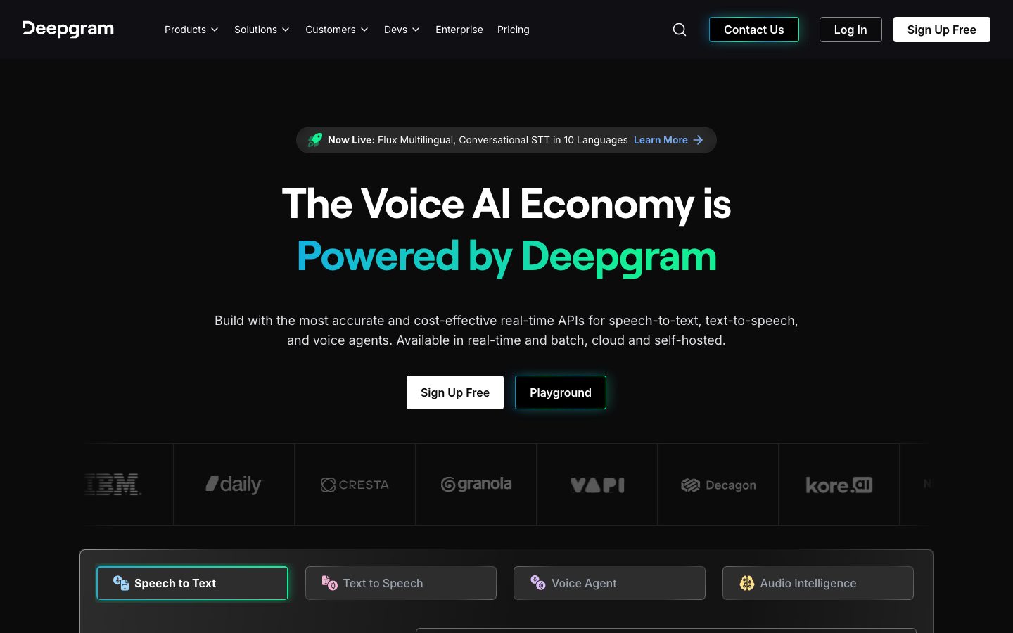
Deepgram's marketing surface is a dark, developer-first Voice-AI interface anchored on a near-black canvas (`{colors.canvas}` — #0b0b0c) with crisp white display headlines (`{colors.on-dark}` — #ffffff) and muted-gray body text (`{colors.ink}` — #a9a9ad). The voice is technical infrastructure: flat dark surfaces, tight corner radii, restrained whitespace, and product-UI fragments (the live transcription console, the unified-API diagram, integration tiles) embedded directly into the page.
Brand voltage is almost entirely chromatic. The signature is an electric green-to-cyan gradient — built from `{colors.accent-green}` (#13ef95), `{colors.accent-green-soft}` (#38edac), `{colors.accent-cyan}` (#008fc1), and `{colors.accent-blue}` (#149afb) — that paints the second line of the hero headline ("Powered by Deepgram"), the active-tab borders, and the soft glows beneath interactive product widgets. A secondary accent set (`{colors.accent-pink}`, `{colors.accent-violet}`, `{colors.accent-indigo}`) appears inside product-UI iconography and node diagrams.
Type voice splits cleanly into two roles: **Roobert** (a geometric grotesque used at weight 700 with negative letter-spacing for h1 and h2) and **Inter** (used for h3, body, buttons, nav, and captions). The display face is condensed and confident; Inter handles all the supporting type at a relaxed 1.556 line-height.
**Key Characteristics:**
- Near-black canvas (`{colors.canvas}` — #0b0b0c) everywhere — the entire site is dark mode, with no light-page bands.
- Roobert display headlines (substituted with Inter 700 here) at 60/48px with negative tracking; the second headline line carries the green→cyan gradient.
- Electric green accent (`{colors.accent-green}` — #13ef95) for active states, focus borders, and glow shadows.
- Flat, low-radius surfaces: `{rounded.xs}` (4px) for cards + inputs, `{rounded.md}` (8px) for buttons + tabs — the dominant measured radius.
- White primary CTA (`{component.button-primary}`) and green-outlined dark secondary CTA (`{component.button-outline}`) sit side-by-side in the hero.
- Product-UI fragments embedded in dark cards — a live "Speak" transcription console, a unified-API node graph, integration logo tiles — carry their own green/blue glow shadows.
- Spacing rhythm is built on a 4px base with a dominant 32px step (`{spacing.xxl}`) for section and card padding.
## Colors
### Brand & Accent
- **Accent Green** (`{colors.accent-green}` — #13ef95): The primary brand accent. Active-tab borders, focus rings, the start of the hero gradient, glow shadows. Near-variants `{colors.accent-green-alt}` (#00f099), `{colors.accent-green-soft}` (#38edac), and `{colors.accent-green-deep}` (#13ef93) appear in gradients and glows.
- **Accent Cyan / Blue** (`{colors.accent-cyan}` — #008fc1, `{colors.accent-blue}` — #149afb): The cool end of the brand gradient — the headline fades green→cyan/blue, and these tones recur in the CTA-band glow border and product diagram nodes.
- **Accent Pink / Violet / Indigo** (`{colors.accent-pink}` — #f4008d, `{colors.accent-violet}` — #b60af5, `{colors.accent-indigo}` — #201cff): A small chromatic set seen inside product-UI iconography (the integration/journey card icons and node graphs). Never used on CTAs.
### Surface
- **Canvas** (`{colors.canvas}` — #0b0b0c): The default page floor for every band.
- **Surface Dark** (`{colors.surface-dark}` — #101014): Cards, inputs, the demo console, tab strips — the standard raised surface.
- **Surface Elevated** (`{colors.surface-elevated}` — #2c2c33): The announcement pill and lightly-raised chips.
- **Surface Line** (`{colors.surface-line}` — #4e4e52): Hairline borders and dividers on dark surfaces.
### Text
- **On Dark** (`{colors.on-dark}` — #ffffff): All display headlines and primary text on the dark canvas.
- **Ink** (`{colors.ink}` — #a9a9ad): Default running body text (the highest-contrast body tone measured against the canvas).
- **Muted** (`{colors.muted}` — #88888c): Secondary text, nav links, footer links, dimmed logo marquee.
- **Muted Strong** (`{colors.muted-strong}` — #949498): Tertiary captions and fine print.
- **Black** (`{colors.black}` — #000000): Text on the white primary CTA.
### Light-surface tokens (used sparingly)
- **Hairline** (`{colors.hairline}` — #e1e1e5) and **Surface Soft Light** (`{colors.surface-soft-light}` — #ededf2): Light tones measured in small amounts — used on the white CTA press state and light-mode iconography fills. There is no full light-mode band in the captured pages.
### Note
No dedicated semantic success/warning/error tokens were measured — see Known Gaps.
## Typography
### Font Family
The system runs **Roobert** for display headlines (h1, h2) and **Inter** for everything else (h3, body, buttons, nav). Roobert is a geometric grotesque used at weight 700 with negative letter-spacing (-0.96 to -1.2px). Inter handles all supporting type at weight 400 with a relaxed 1.556 line-height.
The split is strict:
- Roobert (700, negative tracking) — h1, h2
- Inter (400) — h3, body, buttons, nav
### Hierarchy
| Token | Size | Weight | Line Height | Letter Spacing | Use |
|---|---|---|---|---|---|
| `{typography.display-xl}` | 60px | 700 | 1.233 | -1.2px | Hero h1 ("The Voice AI Economy is / Powered by Deepgram") — Roobert |
| `{typography.display-lg}` | 48px | 700 | 1.25 | -0.96px | Section heads ("A single, unified Voice Agent API") — Roobert |
| `{typography.title}` | 18px | 400 | 1.556 | normal | h3 sub-heads and card titles — Inter |
| `{typography.body}` | 18px | 400 | 1.556 | normal | Default running text, descriptions — Inter |
| `{typography.button}` | 14px | 400 | 1.429 | normal | Button labels, nav links, footer links — Inter |
### Principles
Roobert is the brand voice — every large headline uses it at weight 700 with negative tracking. Inter handles supporting type. Note that the measured h3 and body roles are identical (Inter 18px / 400 / 1.556) — Deepgram does not strongly differentiate sub-heads from body via size or weight; hierarchy below the display level comes from gradient color, position, and spacing rather than type scale.
### Note on Font Substitutes
**Roobert** is a commercial typeface (Displaay Type Foundry) and cannot be shipped freely. If unavailable, **Inter** at weight 700 with ~-0.02em letter-spacing is a usable approximation (and is the fallback declared in the stack). **Geist** or **General Sans** are closer geometric-grotesque alternatives that better preserve Roobert's character. Never claim to ship Roobert without a license.
## Layout
### Spacing System
- **Base unit:** 4px.
- **Tokens:** `{spacing.xxs}` 4px · `{spacing.xs}` 8px · `{spacing.sm}` 12px · `{spacing.md}` 16px · `{spacing.ml}` 20px · `{spacing.lg}` 24px · `{spacing.xl}` 28px · `{spacing.xxl}` 32px · `{spacing.huge}` 40px.
- **Dominant step:** 32px (`{spacing.xxl}`) is by far the most frequent measured value — used for card internal padding, section gaps, and grid gutters.
- **Common micro-spacing:** 12px (`{spacing.sm}`) and 16px (`{spacing.md}`) tie for the next-most-frequent — used for button padding, chip insets, and tight inline gaps.
### Grid & Container
- **Hero:** Centered single-column layout — pill announcement, h1/h2 stack, sub-headline, then a two-button row, all center-aligned.
- **Logo marquee:** Horizontal scrolling row of partner logos in `{colors.muted}` directly below the hero.
- **Product tabs:** A 4-up tab strip (Speech to Text / Text to Speech / Voice Agent / Audio Intelligence) above the live demo console.
- **Journey cards:** 3-up grid at desktop ("Build with APIs" / "Integrate Deepgram" / "Custom models").
- **Testimonials:** 3-up grid of quote cards.
- **Footer:** Multi-column link list (Product / Customers / Solutions / Resources / Developers / Company) over the canvas.
### Whitespace Philosophy
Whitespace is restrained relative to a typical light-mode SaaS site — the dark canvas lets sections sit close together without feeling crowded. The 32px rhythm governs most card and section padding; content reads as dense-but-organized technical infrastructure rather than airy consumer marketing.
## Elevation & Depth
| Level | Treatment | Use |
|---|---|---|
| Flat | No shadow, surface color only | Body sections, nav, footer, most cards |
| Deep drop shadow | `rgba(38,44,52,0.25) 0px 24px 48px -12px` | The dominant measured shadow (56 occurrences) — raised cards, the demo console, journey cards |
| Faint drop shadow | `rgba(38,44,52,0.05) 0px 1px 2px 0px` | Subtle separation on small chips |
| Green/blue glow | `rgba(56,237,172,0.2) 6px 0px 15px`, `rgba(20,154,251,0.2) -6px 0px 15px` | Dual-sided green/blue glow on interactive product widgets (the "Speak" console, active controls) |
| Focus glow | `rgba(17,177,223,0.5) 0px 0px 12px -10px, rgba(15,239,149,0.5) 0px 0px 13px` | Green/cyan focus ring on active inputs and the live mic control |
The elevation philosophy is **flat-dark with chromatic glow** — depth is signaled either by a soft cool drop shadow or, for interactive product moments, by green/blue luminance bleeding from the element edges. There is no neumorphism or heavy layered shadow stacking.
## Shapes
### Border Radius Scale
| Token | Value | Use |
|---|---|---|
| `{rounded.xs}` | 4px | Cards and inputs — the measured default for content surfaces |
| `{rounded.sm}` | 6px | Small chips and minor controls |
| `{rounded.md}` | 8px | Buttons, tabs — the single most frequent measured radius |
| `{rounded.lg}` | 16px | Larger feature/CTA containers |
| `{rounded.xl}` | 30px | Rare large pill-radius elements |
| `{rounded.pill}` | 40px | Announcement pill and fully-rounded chips |
### Geometry
Corners are tight across the system — 4px and 8px dominate, giving the interface a precise, engineered feel. Larger radii (16px+) are reserved for the occasional CTA band or pill. Partner-logo and product-UI iconography retain their own native chrome.
## Components
### Top Navigation
**`top-nav`** — Dark nav bar on `{colors.canvas}` with the Deepgram wordmark at left, a horizontal menu (Products, Solutions, Customers, Devs, Enterprise, Pricing) center-left, a search icon, and a right cluster: "Contact Us" as a `{component.button-outline}` (green border), "Log In", and "Sign Up Free" as a `{component.button-primary}`. Menu items use `{typography.button}` in `{colors.on-dark}` / `{colors.muted}`.
### Buttons
**`button-primary`** — The white primary CTA ("Sign Up Free"). Background `{colors.on-dark}`, text `{colors.black}`, type `{typography.button}` (Inter 14px), rounded `{rounded.md}`. Press state `button-primary-active` shifts background to `{colors.hairline}`.
**`button-outline`** — Dark CTA with a green border ("Contact Us", "Playground"). Background `{colors.canvas}`, text `{colors.on-dark}`, border `{colors.accent-green}`, rounded `{rounded.md}`. Active state `button-outline-active` fills to `{colors.surface-dark}`.
### Pills & Tabs
**`announcement-pill`** — The "Now Live: Flux Multilingual…" banner above the hero. Background `{colors.surface-elevated}`, text `{colors.on-dark}`, rounded `{rounded.pill}` (40px), with an inline "Learn More" link in `{colors.accent-green}`.
**`product-tab`** + **`product-tab-active`** — The 4-up tab strip over the demo console. Inactive: `{colors.surface-dark}` background, `{colors.muted}` label. Active ("Speech to Text"): same surface with a `{colors.accent-green}` border and `{colors.on-dark}` label. Rounded `{rounded.md}`, padding `{spacing.md}`.
### Cards & Containers
**`hero-band`** — Centered hero on `{colors.canvas}`: announcement pill, h1 in `{typography.display-xl}` (white) with the second line in the green→cyan gradient, a `{typography.body}` sub-headline in `{colors.ink}`, then the primary + outline CTA row. Vertical padding `{spacing.xxl}` (32px).
**`demo-console`** — The live interactive console below the product tabs (a "Speak" mic control on the left, a transcription text area on the right with Copy / Download actions). Background `{colors.surface-dark}`, rounded `{rounded.md}`, padding `{spacing.xxl}`. Carries the green/cyan glow + focus-ring shadows when active.
**`journey-card`** — Used in the 3-up "Choose your Voice AI journey" grid. Background `{colors.surface-dark}`, rounded `{rounded.md}`, padding `{spacing.xxl}`. Carries a product-icon cluster at top, a `{typography.title}` heading, a `{typography.body}` description in `{colors.ink}`, and a `{component.button-primary}` at the bottom.
**`testimonial-card`** — Customer-quote card in the "Trusted by startups and enterprises" grid. Background `{colors.surface-dark}`, rounded `{rounded.md}`, padding `{spacing.lg}`. Quote in `{typography.body}` with an avatar + name/role row and partner logo.
**`card`** — The base raised surface. Background `{colors.surface-dark}`, rounded `{rounded.xs}` (4px), no shadow by default (deep cool shadow applied when raised).
### Inputs & Forms
**`input`** — Text input / textarea. Background `{colors.surface-dark}` (#101014), text `{colors.on-dark}`, type `{typography.button}`, rounded `{rounded.xs}` (4px), padding `{spacing.sm}` × `{spacing.md}`. Focus applies the green/cyan glow ring. Used in the demo console and the footer "Work Email" newsletter field.
### CTA / Footer
**`cta-band`** — The pre-footer "Unlock voice AI at scale with an API Call" card. Background `{colors.canvas}` with a soft `{colors.accent-cyan}` glow border, rounded `{rounded.lg}`, padding `{spacing.xxl}`. Carries an h2 in `{typography.display-lg}`, a sub-line, and a "Sign Up Free" + "Get A Demo" button pair.
**`footer`** — Dark footer on `{colors.canvas}`. Multi-column link list in `{colors.muted}` (`{typography.button}`), a social-icon row, a newsletter `{component.input}` + Submit button, and a copyright line in `{colors.muted-strong}`. Padding `{spacing.xxl}`.
**`logo-marquee`** — Horizontal scrolling partner-logo strip (IBM, Daily, Cresta, Granola, Vapi, Decagon, Kore.ai) directly under the hero. Background `{colors.canvas}`, logos dimmed to `{colors.muted}`.
## Do's and Don'ts
### Do
- Keep the entire interface on the dark canvas (`{colors.canvas}` — #0b0b0c). Deepgram is dark-mode throughout.
- Reserve the green→cyan gradient (`{colors.accent-green}` → `{colors.accent-cyan}`) for the brand headline line, active states, and product glows.
- Use Roobert (700, negative tracking) for h1/h2; Inter for everything else. Never blur the boundary.
- Use `{component.button-primary}` (white) for the single most important action and `{component.button-outline}` (green border) for the secondary action beside it.
- Keep radii tight — `{rounded.xs}` (4px) for cards/inputs, `{rounded.md}` (8px) for buttons/tabs.
- Signal active tabs with a `{colors.accent-green}` border, not a fill change.
- Embed real product-UI fragments (the live console, the API node graph) instead of decorative illustration.
### Don't
- Don't introduce a full light-mode band — the system has no white-canvas section in the captured pages.
- Don't put the pink/violet/indigo accents on CTAs; they belong to product iconography only.
- Don't bold display type beyond 700 or drop the negative letter-spacing — Roobert without it reads as off-brand.
- Don't add large radii (16px+) to buttons or content cards; reserve them for CTA bands and pills.
- Don't add hover-state styling beyond the documented active/press states.
- Don't use white (`{colors.on-dark}`) for long-form body copy — running text is `{colors.ink}` (#a9a9ad).
## Responsive Behavior
### Breakpoints
The captured pages confirm a single desktop composition plus a long-scroll full-page render; exact breakpoint pixel values were not measured. The following is the observed collapsing pattern.
| Name | Behavior |
|---|---|
| Mobile | Nav collapses to a compact bar; hero stays centered with h1 reducing in size; product tabs and journey/testimonial grids stack 1-up; footer columns wrap |
| Tablet | Nav stays horizontal but tightens; journey/testimonial grids go 2-up; product tab strip may wrap |
| Desktop | Full horizontal nav, 4-up product tab strip, 3-up journey + testimonial grids |
### Touch Targets
- `{component.button-primary}` and `{component.button-outline}` carry ~12px × 24px padding around a 14px label — comfortably tappable.
- `{component.product-tab}` uses 16px padding, exceeding minimum tap area.
- `{component.input}` height derives from 12px × 16px padding around the 14px label.
### Collapsing Strategy
- Hero stays center-aligned and single-column at all sizes; the CTA pair stacks on narrow screens.
- The logo marquee remains a horizontal scroll strip.
- The demo console and unified-API diagram scale proportionally; the interactive controls stay legible.
- Footer link columns reflow from multi-column to fewer columns to single-column.
## Iteration Guide
1. Focus on ONE component at a time. Reference its YAML key directly (`{component.journey-card}`, `{component.product-tab-active}`).
2. Variants of an existing component (`-active`) live as separate entries in `components:`.
3. Use `{token.refs}` everywhere — never inline hex in components.
4. Never document hover. Default and Active/Pressed states only.
5. Display headlines stay Roobert 700 with negative tracking; body stays Inter 400. The split does not blur.
6. The green→cyan gradient is the scarce signal — apply it to the brand headline line, active borders, and product glows only.
7. Keep the canvas dark; do not introduce a light-mode band casually.
## Known Gaps
- The `button-primary` component returned `radius: 0px` and `padding: 0px` from the measurement pass — almost certainly an extraction artifact (the rendered CTAs in the screenshots are clearly rounded, ~8px). Button radius is documented as `{rounded.md}` from the dominant measured radius + screenshot ground-truth; exact button padding (~12px × 24px) is estimated and should be confirmed.
- **Roobert** is a licensed commercial typeface but was not flagged in `fonts_licensed`; it is documented here with open-source substitutes (Inter 700 / Geist / General Sans). Do not ship Roobert without a license.
- The hero gradient is reconstructed from individually-measured stops (`{colors.accent-green}`, `{colors.accent-green-soft}`, `{colors.accent-cyan}`, `{colors.accent-blue}`); the exact gradient angle and stop positions were not captured (derived).
- No dedicated semantic success / warning / error color tokens were measured — they would need form-validation or status states to confirm.
- h3 and body roles measured identically (Inter 18px / 400 / 1.556); any finer heading-vs-body distinction (e.g., weight or a missing small-caption scale) was not captured.
- Responsive breakpoint pixel values were not measured; the responsive section reflects observed collapsing patterns, not confirmed media-query widths.
- Animation and transition timings (the live "Speak" transcription, marquee scroll, tab switching, glow pulses) are out of scope.
- The accent pink/violet/indigo tones were measured but their precise placement inside product iconography (node graphs, integration tiles) was inferred from screenshots rather than per-element extraction.
<!-- Documented by duply · real-world design systems as ready-to-use DESIGN.md for AI coding agents · https://duply.ai/deepgram/design-md -->
Color Palette
Accent
Neutrals
Typography
display-xl60px · 700 · 1.233
The quick brown fox jumpsdisplay-lg48px · 700 · 1.25
The quick brown fox jumpstitle18px · 400 · 1.556
The quick brown fox jumpsbody18px · 400 · 1.556
The quick brown fox jumpsbutton14px · 400 · 1.429
The quick brown fox jumpsSpacing & Shape
Spacing
| Name | Value | Preview |
|---|---|---|
| xxs | 4px | |
| xs | 8px | |
| sm | 12px | |
| md | 16px | |
| ml | 20px | |
| lg | 24px | |
| xl | 28px | |
| xxl | 32px | |
| huge | 40px |
Border Radius
| Name | Value | Preview |
|---|---|---|
| xs | 4px | |
| sm | 6px | |
| md | 8px | |
| lg | 16px | |
| xl | 30px | |
| pill | 40px |
More like this


---
version: alpha
name: Deepgram-design-analysis
description: "A dark, developer-first Voice-AI interface built on a near-black canvas (#0b0b0c) with crisp white display headlines, an electric green-to-cyan gradient accent for brand voltage, and Inter body type. The system reads as confident technical infrastructure — flat dark surfaces, tight 4–8px radii, restrained whitespace, glowing green/blue product-UI fragments embedded in cards, and a strict split between the Roobert display face for headlines and Inter for everything else."
colors:
  canvas: "#0b0b0c"
  surface-dark: "#101014"
  surface-elevated: "#2c2c33"
  surface-line: "#4e4e52"
  on-dark: "#ffffff"
  black: "#000000"
  ink: "#a9a9ad"
  muted: "#88888c"
  muted-strong: "#949498"
  hairline: "#e1e1e5"
  surface-soft-light: "#ededf2"
  accent-green: "#13ef95"
  accent-green-alt: "#00f099"
  accent-green-soft: "#38edac"
  accent-green-deep: "#13ef93"
  accent-cyan: "#008fc1"
  accent-blue: "#149afb"
  accent-pink: "#f4008d"
  accent-violet: "#b60af5"
  accent-indigo: "#201cff"
typography:
  display-xl:
    fontFamily: "Roobert, Inter, sans-serif"
    fontSize: 60px
    fontWeight: 700
    lineHeight: 1.233
    letterSpacing: -1.2px
  display-lg:
    fontFamily: "Roobert, Inter, sans-serif"
    fontSize: 48px
    fontWeight: 700
    lineHeight: 1.25
    letterSpacing: -0.96px
  title:
    fontFamily: "Inter, sans-serif"
    fontSize: 18px
    fontWeight: 400
    lineHeight: 1.556
    letterSpacing: normal
  body:
    fontFamily: "Inter, sans-serif"
    fontSize: 18px
    fontWeight: 400
    lineHeight: 1.556
    letterSpacing: normal
  button:
    fontFamily: "Inter, sans-serif"
    fontSize: 14px
    fontWeight: 400
    lineHeight: 1.429
    letterSpacing: normal
rounded:
  xs: 4px
  sm: 6px
  md: 8px
  lg: 16px
  xl: 30px
  pill: 40px
spacing:
  xxs: 4px
  xs: 8px
  sm: 12px
  md: 16px
  ml: 20px
  lg: 24px
  xl: 28px
  xxl: 32px
  huge: 40px
components:
  top-nav:
    backgroundColor: "{colors.canvas}"
    textColor: "{colors.on-dark}"
    typography: "{typography.button}"
  button-primary:
    backgroundColor: "{colors.on-dark}"
    textColor: "{colors.black}"
    typography: "{typography.button}"
    rounded: "{rounded.md}"
    padding: 12px 24px
  button-primary-active:
    backgroundColor: "{colors.hairline}"
    textColor: "{colors.black}"
    rounded: "{rounded.md}"
  button-outline:
    backgroundColor: "{colors.canvas}"
    textColor: "{colors.on-dark}"
    borderColor: "{colors.accent-green}"
    typography: "{typography.button}"
    rounded: "{rounded.md}"
    padding: 12px 24px
  button-outline-active:
    backgroundColor: "{colors.surface-dark}"
    textColor: "{colors.on-dark}"
    borderColor: "{colors.accent-green}"
    rounded: "{rounded.md}"
  announcement-pill:
    backgroundColor: "{colors.surface-elevated}"
    textColor: "{colors.on-dark}"
    typography: "{typography.button}"
    rounded: "{rounded.pill}"
    padding: 8px 16px
  hero-band:
    backgroundColor: "{colors.canvas}"
    textColor: "{colors.on-dark}"
    typography: "{typography.display-xl}"
    padding: 32px
  product-tab:
    backgroundColor: "{colors.surface-dark}"
    textColor: "{colors.muted}"
    typography: "{typography.button}"
    rounded: "{rounded.md}"
    padding: 16px
  product-tab-active:
    backgroundColor: "{colors.surface-dark}"
    textColor: "{colors.on-dark}"
    borderColor: "{colors.accent-green}"
    typography: "{typography.button}"
    rounded: "{rounded.md}"
    padding: 16px
  demo-console:
    backgroundColor: "{colors.surface-dark}"
    textColor: "{colors.ink}"
    typography: "{typography.body}"
    rounded: "{rounded.md}"
    padding: 32px
  card:
    backgroundColor: "{colors.surface-dark}"
    textColor: "{colors.ink}"
    typography: "{typography.body}"
    rounded: "{rounded.xs}"
  journey-card:
    backgroundColor: "{colors.surface-dark}"
    textColor: "{colors.ink}"
    typography: "{typography.body}"
    rounded: "{rounded.md}"
    padding: 32px
  testimonial-card:
    backgroundColor: "{colors.surface-dark}"
    textColor: "{colors.ink}"
    typography: "{typography.body}"
    rounded: "{rounded.md}"
    padding: 24px
  input:
    backgroundColor: "{colors.surface-dark}"
    textColor: "{colors.on-dark}"
    typography: "{typography.button}"
    rounded: "{rounded.xs}"
    padding: 12px 16px
  cta-band:
    backgroundColor: "{colors.canvas}"
    textColor: "{colors.on-dark}"
    typography: "{typography.display-lg}"
    borderColor: "{colors.accent-cyan}"
    rounded: "{rounded.lg}"
    padding: 32px
  footer:
    backgroundColor: "{colors.canvas}"
    textColor: "{colors.muted}"
    typography: "{typography.button}"
    padding: 32px
  logo-marquee:
    backgroundColor: "{colors.canvas}"
    textColor: "{colors.muted}"
---

## Overview

Deepgram's marketing surface is a dark, developer-first Voice-AI interface anchored on a near-black canvas (`{colors.canvas}` — #0b0b0c) with crisp white display headlines (`{colors.on-dark}` — #ffffff) and muted-gray body text (`{colors.ink}` — #a9a9ad). The voice is technical infrastructure: flat dark surfaces, tight corner radii, restrained whitespace, and product-UI fragments (the live transcription console, the unified-API diagram, integration tiles) embedded directly into the page.

Brand voltage is almost entirely chromatic. The signature is an electric green-to-cyan gradient — built from `{colors.accent-green}` (#13ef95), `{colors.accent-green-soft}` (#38edac), `{colors.accent-cyan}` (#008fc1), and `{colors.accent-blue}` (#149afb) — that paints the second line of the hero headline ("Powered by Deepgram"), the active-tab borders, and the soft glows beneath interactive product widgets. A secondary accent set (`{colors.accent-pink}`, `{colors.accent-violet}`, `{colors.accent-indigo}`) appears inside product-UI iconography and node diagrams.

Type voice splits cleanly into two roles: **Roobert** (a geometric grotesque used at weight 700 with negative letter-spacing for h1 and h2) and **Inter** (used for h3, body, buttons, nav, and captions). The display face is condensed and confident; Inter handles all the supporting type at a relaxed 1.556 line-height.

**Key Characteristics:**
- Near-black canvas (`{colors.canvas}` — #0b0b0c) everywhere — the entire site is dark mode, with no light-page bands.
- Roobert display headlines (substituted with Inter 700 here) at 60/48px with negative tracking; the second headline line carries the green→cyan gradient.
- Electric green accent (`{colors.accent-green}` — #13ef95) for active states, focus borders, and glow shadows.
- Flat, low-radius surfaces: `{rounded.xs}` (4px) for cards + inputs, `{rounded.md}` (8px) for buttons + tabs — the dominant measured radius.
- White primary CTA (`{component.button-primary}`) and green-outlined dark secondary CTA (`{component.button-outline}`) sit side-by-side in the hero.
- Product-UI fragments embedded in dark cards — a live "Speak" transcription console, a unified-API node graph, integration logo tiles — carry their own green/blue glow shadows.
- Spacing rhythm is built on a 4px base with a dominant 32px step (`{spacing.xxl}`) for section and card padding.

## Colors

### Brand & Accent
- **Accent Green** (`{colors.accent-green}` — #13ef95): The primary brand accent. Active-tab borders, focus rings, the start of the hero gradient, glow shadows. Near-variants `{colors.accent-green-alt}` (#00f099), `{colors.accent-green-soft}` (#38edac), and `{colors.accent-green-deep}` (#13ef93) appear in gradients and glows.
- **Accent Cyan / Blue** (`{colors.accent-cyan}` — #008fc1, `{colors.accent-blue}` — #149afb): The cool end of the brand gradient — the headline fades green→cyan/blue, and these tones recur in the CTA-band glow border and product diagram nodes.
- **Accent Pink / Violet / Indigo** (`{colors.accent-pink}` — #f4008d, `{colors.accent-violet}` — #b60af5, `{colors.accent-indigo}` — #201cff): A small chromatic set seen inside product-UI iconography (the integration/journey card icons and node graphs). Never used on CTAs.

### Surface
- **Canvas** (`{colors.canvas}` — #0b0b0c): The default page floor for every band.
- **Surface Dark** (`{colors.surface-dark}` — #101014): Cards, inputs, the demo console, tab strips — the standard raised surface.
- **Surface Elevated** (`{colors.surface-elevated}` — #2c2c33): The announcement pill and lightly-raised chips.
- **Surface Line** (`{colors.surface-line}` — #4e4e52): Hairline borders and dividers on dark surfaces.

### Text
- **On Dark** (`{colors.on-dark}` — #ffffff): All display headlines and primary text on the dark canvas.
- **Ink** (`{colors.ink}` — #a9a9ad): Default running body text (the highest-contrast body tone measured against the canvas).
- **Muted** (`{colors.muted}` — #88888c): Secondary text, nav links, footer links, dimmed logo marquee.
- **Muted Strong** (`{colors.muted-strong}` — #949498): Tertiary captions and fine print.
- **Black** (`{colors.black}` — #000000): Text on the white primary CTA.

### Light-surface tokens (used sparingly)
- **Hairline** (`{colors.hairline}` — #e1e1e5) and **Surface Soft Light** (`{colors.surface-soft-light}` — #ededf2): Light tones measured in small amounts — used on the white CTA press state and light-mode iconography fills. There is no full light-mode band in the captured pages.

### Note
No dedicated semantic success/warning/error tokens were measured — see Known Gaps.

## Typography

### Font Family
The system runs **Roobert** for display headlines (h1, h2) and **Inter** for everything else (h3, body, buttons, nav). Roobert is a geometric grotesque used at weight 700 with negative letter-spacing (-0.96 to -1.2px). Inter handles all supporting type at weight 400 with a relaxed 1.556 line-height.

The split is strict:
- Roobert (700, negative tracking) — h1, h2
- Inter (400) — h3, body, buttons, nav

### Hierarchy

| Token | Size | Weight | Line Height | Letter Spacing | Use |
|---|---|---|---|---|---|
| `{typography.display-xl}` | 60px | 700 | 1.233 | -1.2px | Hero h1 ("The Voice AI Economy is / Powered by Deepgram") — Roobert |
| `{typography.display-lg}` | 48px | 700 | 1.25 | -0.96px | Section heads ("A single, unified Voice Agent API") — Roobert |
| `{typography.title}` | 18px | 400 | 1.556 | normal | h3 sub-heads and card titles — Inter |
| `{typography.body}` | 18px | 400 | 1.556 | normal | Default running text, descriptions — Inter |
| `{typography.button}` | 14px | 400 | 1.429 | normal | Button labels, nav links, footer links — Inter |

### Principles
Roobert is the brand voice — every large headline uses it at weight 700 with negative tracking. Inter handles supporting type. Note that the measured h3 and body roles are identical (Inter 18px / 400 / 1.556) — Deepgram does not strongly differentiate sub-heads from body via size or weight; hierarchy below the display level comes from gradient color, position, and spacing rather than type scale.

### Note on Font Substitutes
**Roobert** is a commercial typeface (Displaay Type Foundry) and cannot be shipped freely. If unavailable, **Inter** at weight 700 with ~-0.02em letter-spacing is a usable approximation (and is the fallback declared in the stack). **Geist** or **General Sans** are closer geometric-grotesque alternatives that better preserve Roobert's character. Never claim to ship Roobert without a license.

## Layout

### Spacing System
- **Base unit:** 4px.
- **Tokens:** `{spacing.xxs}` 4px · `{spacing.xs}` 8px · `{spacing.sm}` 12px · `{spacing.md}` 16px · `{spacing.ml}` 20px · `{spacing.lg}` 24px · `{spacing.xl}` 28px · `{spacing.xxl}` 32px · `{spacing.huge}` 40px.
- **Dominant step:** 32px (`{spacing.xxl}`) is by far the most frequent measured value — used for card internal padding, section gaps, and grid gutters.
- **Common micro-spacing:** 12px (`{spacing.sm}`) and 16px (`{spacing.md}`) tie for the next-most-frequent — used for button padding, chip insets, and tight inline gaps.

### Grid & Container
- **Hero:** Centered single-column layout — pill announcement, h1/h2 stack, sub-headline, then a two-button row, all center-aligned.
- **Logo marquee:** Horizontal scrolling row of partner logos in `{colors.muted}` directly below the hero.
- **Product tabs:** A 4-up tab strip (Speech to Text / Text to Speech / Voice Agent / Audio Intelligence) above the live demo console.
- **Journey cards:** 3-up grid at desktop ("Build with APIs" / "Integrate Deepgram" / "Custom models").
- **Testimonials:** 3-up grid of quote cards.
- **Footer:** Multi-column link list (Product / Customers / Solutions / Resources / Developers / Company) over the canvas.

### Whitespace Philosophy
Whitespace is restrained relative to a typical light-mode SaaS site — the dark canvas lets sections sit close together without feeling crowded. The 32px rhythm governs most card and section padding; content reads as dense-but-organized technical infrastructure rather than airy consumer marketing.

## Elevation & Depth

| Level | Treatment | Use |
|---|---|---|
| Flat | No shadow, surface color only | Body sections, nav, footer, most cards |
| Deep drop shadow | `rgba(38,44,52,0.25) 0px 24px 48px -12px` | The dominant measured shadow (56 occurrences) — raised cards, the demo console, journey cards |
| Faint drop shadow | `rgba(38,44,52,0.05) 0px 1px 2px 0px` | Subtle separation on small chips |
| Green/blue glow | `rgba(56,237,172,0.2) 6px 0px 15px`, `rgba(20,154,251,0.2) -6px 0px 15px` | Dual-sided green/blue glow on interactive product widgets (the "Speak" console, active controls) |
| Focus glow | `rgba(17,177,223,0.5) 0px 0px 12px -10px, rgba(15,239,149,0.5) 0px 0px 13px` | Green/cyan focus ring on active inputs and the live mic control |

The elevation philosophy is **flat-dark with chromatic glow** — depth is signaled either by a soft cool drop shadow or, for interactive product moments, by green/blue luminance bleeding from the element edges. There is no neumorphism or heavy layered shadow stacking.

## Shapes

### Border Radius Scale

| Token | Value | Use |
|---|---|---|
| `{rounded.xs}` | 4px | Cards and inputs — the measured default for content surfaces |
| `{rounded.sm}` | 6px | Small chips and minor controls |
| `{rounded.md}` | 8px | Buttons, tabs — the single most frequent measured radius |
| `{rounded.lg}` | 16px | Larger feature/CTA containers |
| `{rounded.xl}` | 30px | Rare large pill-radius elements |
| `{rounded.pill}` | 40px | Announcement pill and fully-rounded chips |

### Geometry
Corners are tight across the system — 4px and 8px dominate, giving the interface a precise, engineered feel. Larger radii (16px+) are reserved for the occasional CTA band or pill. Partner-logo and product-UI iconography retain their own native chrome.

## Components

### Top Navigation

**`top-nav`** — Dark nav bar on `{colors.canvas}` with the Deepgram wordmark at left, a horizontal menu (Products, Solutions, Customers, Devs, Enterprise, Pricing) center-left, a search icon, and a right cluster: "Contact Us" as a `{component.button-outline}` (green border), "Log In", and "Sign Up Free" as a `{component.button-primary}`. Menu items use `{typography.button}` in `{colors.on-dark}` / `{colors.muted}`.

### Buttons

**`button-primary`** — The white primary CTA ("Sign Up Free"). Background `{colors.on-dark}`, text `{colors.black}`, type `{typography.button}` (Inter 14px), rounded `{rounded.md}`. Press state `button-primary-active` shifts background to `{colors.hairline}`.

**`button-outline`** — Dark CTA with a green border ("Contact Us", "Playground"). Background `{colors.canvas}`, text `{colors.on-dark}`, border `{colors.accent-green}`, rounded `{rounded.md}`. Active state `button-outline-active` fills to `{colors.surface-dark}`.

### Pills & Tabs

**`announcement-pill`** — The "Now Live: Flux Multilingual…" banner above the hero. Background `{colors.surface-elevated}`, text `{colors.on-dark}`, rounded `{rounded.pill}` (40px), with an inline "Learn More" link in `{colors.accent-green}`.

**`product-tab`** + **`product-tab-active`** — The 4-up tab strip over the demo console. Inactive: `{colors.surface-dark}` background, `{colors.muted}` label. Active ("Speech to Text"): same surface with a `{colors.accent-green}` border and `{colors.on-dark}` label. Rounded `{rounded.md}`, padding `{spacing.md}`.

### Cards & Containers

**`hero-band`** — Centered hero on `{colors.canvas}`: announcement pill, h1 in `{typography.display-xl}` (white) with the second line in the green→cyan gradient, a `{typography.body}` sub-headline in `{colors.ink}`, then the primary + outline CTA row. Vertical padding `{spacing.xxl}` (32px).

**`demo-console`** — The live interactive console below the product tabs (a "Speak" mic control on the left, a transcription text area on the right with Copy / Download actions). Background `{colors.surface-dark}`, rounded `{rounded.md}`, padding `{spacing.xxl}`. Carries the green/cyan glow + focus-ring shadows when active.

**`journey-card`** — Used in the 3-up "Choose your Voice AI journey" grid. Background `{colors.surface-dark}`, rounded `{rounded.md}`, padding `{spacing.xxl}`. Carries a product-icon cluster at top, a `{typography.title}` heading, a `{typography.body}` description in `{colors.ink}`, and a `{component.button-primary}` at the bottom.

**`testimonial-card`** — Customer-quote card in the "Trusted by startups and enterprises" grid. Background `{colors.surface-dark}`, rounded `{rounded.md}`, padding `{spacing.lg}`. Quote in `{typography.body}` with an avatar + name/role row and partner logo.

**`card`** — The base raised surface. Background `{colors.surface-dark}`, rounded `{rounded.xs}` (4px), no shadow by default (deep cool shadow applied when raised).

### Inputs & Forms

**`input`** — Text input / textarea. Background `{colors.surface-dark}` (#101014), text `{colors.on-dark}`, type `{typography.button}`, rounded `{rounded.xs}` (4px), padding `{spacing.sm}` × `{spacing.md}`. Focus applies the green/cyan glow ring. Used in the demo console and the footer "Work Email" newsletter field.

### CTA / Footer

**`cta-band`** — The pre-footer "Unlock voice AI at scale with an API Call" card. Background `{colors.canvas}` with a soft `{colors.accent-cyan}` glow border, rounded `{rounded.lg}`, padding `{spacing.xxl}`. Carries an h2 in `{typography.display-lg}`, a sub-line, and a "Sign Up Free" + "Get A Demo" button pair.

**`footer`** — Dark footer on `{colors.canvas}`. Multi-column link list in `{colors.muted}` (`{typography.button}`), a social-icon row, a newsletter `{component.input}` + Submit button, and a copyright line in `{colors.muted-strong}`. Padding `{spacing.xxl}`.

**`logo-marquee`** — Horizontal scrolling partner-logo strip (IBM, Daily, Cresta, Granola, Vapi, Decagon, Kore.ai) directly under the hero. Background `{colors.canvas}`, logos dimmed to `{colors.muted}`.

## Do's and Don'ts

### Do
- Keep the entire interface on the dark canvas (`{colors.canvas}` — #0b0b0c). Deepgram is dark-mode throughout.
- Reserve the green→cyan gradient (`{colors.accent-green}` → `{colors.accent-cyan}`) for the brand headline line, active states, and product glows.
- Use Roobert (700, negative tracking) for h1/h2; Inter for everything else. Never blur the boundary.
- Use `{component.button-primary}` (white) for the single most important action and `{component.button-outline}` (green border) for the secondary action beside it.
- Keep radii tight — `{rounded.xs}` (4px) for cards/inputs, `{rounded.md}` (8px) for buttons/tabs.
- Signal active tabs with a `{colors.accent-green}` border, not a fill change.
- Embed real product-UI fragments (the live console, the API node graph) instead of decorative illustration.

### Don't
- Don't introduce a full light-mode band — the system has no white-canvas section in the captured pages.
- Don't put the pink/violet/indigo accents on CTAs; they belong to product iconography only.
- Don't bold display type beyond 700 or drop the negative letter-spacing — Roobert without it reads as off-brand.
- Don't add large radii (16px+) to buttons or content cards; reserve them for CTA bands and pills.
- Don't add hover-state styling beyond the documented active/press states.
- Don't use white (`{colors.on-dark}`) for long-form body copy — running text is `{colors.ink}` (#a9a9ad).

## Responsive Behavior

### Breakpoints
The captured pages confirm a single desktop composition plus a long-scroll full-page render; exact breakpoint pixel values were not measured. The following is the observed collapsing pattern.

| Name | Behavior |
|---|---|
| Mobile | Nav collapses to a compact bar; hero stays centered with h1 reducing in size; product tabs and journey/testimonial grids stack 1-up; footer columns wrap |
| Tablet | Nav stays horizontal but tightens; journey/testimonial grids go 2-up; product tab strip may wrap |
| Desktop | Full horizontal nav, 4-up product tab strip, 3-up journey + testimonial grids |

### Touch Targets
- `{component.button-primary}` and `{component.button-outline}` carry ~12px × 24px padding around a 14px label — comfortably tappable.
- `{component.product-tab}` uses 16px padding, exceeding minimum tap area.
- `{component.input}` height derives from 12px × 16px padding around the 14px label.

### Collapsing Strategy
- Hero stays center-aligned and single-column at all sizes; the CTA pair stacks on narrow screens.
- The logo marquee remains a horizontal scroll strip.
- The demo console and unified-API diagram scale proportionally; the interactive controls stay legible.
- Footer link columns reflow from multi-column to fewer columns to single-column.

## Iteration Guide

1. Focus on ONE component at a time. Reference its YAML key directly (`{component.journey-card}`, `{component.product-tab-active}`).
2. Variants of an existing component (`-active`) live as separate entries in `components:`.
3. Use `{token.refs}` everywhere — never inline hex in components.
4. Never document hover. Default and Active/Pressed states only.
5. Display headlines stay Roobert 700 with negative tracking; body stays Inter 400. The split does not blur.
6. The green→cyan gradient is the scarce signal — apply it to the brand headline line, active borders, and product glows only.
7. Keep the canvas dark; do not introduce a light-mode band casually.

## Known Gaps

- The `button-primary` component returned `radius: 0px` and `padding: 0px` from the measurement pass — almost certainly an extraction artifact (the rendered CTAs in the screenshots are clearly rounded, ~8px). Button radius is documented as `{rounded.md}` from the dominant measured radius + screenshot ground-truth; exact button padding (~12px × 24px) is estimated and should be confirmed.
- **Roobert** is a licensed commercial typeface but was not flagged in `fonts_licensed`; it is documented here with open-source substitutes (Inter 700 / Geist / General Sans). Do not ship Roobert without a license.
- The hero gradient is reconstructed from individually-measured stops (`{colors.accent-green}`, `{colors.accent-green-soft}`, `{colors.accent-cyan}`, `{colors.accent-blue}`); the exact gradient angle and stop positions were not captured (derived).
- No dedicated semantic success / warning / error color tokens were measured — they would need form-validation or status states to confirm.
- h3 and body roles measured identically (Inter 18px / 400 / 1.556); any finer heading-vs-body distinction (e.g., weight or a missing small-caption scale) was not captured.
- Responsive breakpoint pixel values were not measured; the responsive section reflects observed collapsing patterns, not confirmed media-query widths.
- Animation and transition timings (the live "Speak" transcription, marquee scroll, tab switching, glow pulses) are out of scope.
- The accent pink/violet/indigo tones were measured but their precise placement inside product iconography (node graphs, integration tiles) was inferred from screenshots rather than per-element extraction.

<!-- Documented by duply · real-world design systems as ready-to-use DESIGN.md for AI coding agents · https://duply.ai/deepgram/design-md -->