Turso
A dark, developer-first database-product interface anchored on a near-black blue-tinted canvas (#0d1318) with a high-voltage mint-teal accent (#4ff7d1) and a magenta primary action (#d946ef). The system reads as modern infrastructure/SaaS — Inter throughout with very heavy, tightly-tracked display headlines, fully pill-shaped buttons and badges, soft 12-16px cards on dark surfaces, and a teal-on-black announcement bar that crowns every page. Brand voltage comes from the mint headline glow and the magenta CTA against the dark canvas.
---
version: alpha
name: Turso-design-analysis
description: A dark, developer-first database-product interface anchored on a near-black blue-tinted canvas (#0d1318) with a high-voltage mint-teal accent (#4ff7d1) and a magenta primary action (#d946ef). The system reads as modern infrastructure/SaaS — Inter throughout with very heavy, tightly-tracked display headlines, fully pill-shaped buttons and badges, soft 12-16px cards on dark surfaces, and a teal-on-black announcement bar that crowns every page. Brand voltage comes from the mint headline glow and the magenta CTA against the dark canvas.
colors:
primary: "#d946ef"
accent: "#4ff7d1"
accent-alt: "#4ff8d2"
ink: "#ffffff"
off-white: "#fafafa"
body: "#d1d5db"
neutral: "#c5cace"
muted: "#9ca3af"
muted-soft: "#6b7280"
hairline: "#374151"
hairline-soft: "#4b5563"
surface-light: "#e5e7eb"
canvas: "#0d1318"
pure-black: "#000000"
surface: "#162129"
surface-elevated: "#18222b"
surface-card: "#121b22"
surface-strong: "#1b252d"
surface-darkest: "#111827"
border-strong: "#293945"
on-primary: "#ffffff"
on-accent: "#000000"
typography:
display-xl:
fontFamily: "Inter, sans-serif"
fontSize: 72px
fontWeight: 800
lineHeight: 1.0
letterSpacing: -1.8px
display-lg:
fontFamily: "Inter, sans-serif"
fontSize: 48px
fontWeight: 600
lineHeight: 1.0
letterSpacing: -1.2px
title-sm:
fontFamily: "Inter, sans-serif"
fontSize: 18px
fontWeight: 600
lineHeight: 1.556
letterSpacing: 0
body:
fontFamily: "Inter, sans-serif"
fontSize: 16px
fontWeight: 500
lineHeight: 1.5
letterSpacing: 0
rounded:
md: 12px
lg: 16px
xl: 24px
pill: 9999px
spacing:
xxs: 4px
xs: 8px
sm: 12px
md: 16px
lg: 24px
xl: 32px
xxl: 40px
huge: 48px
huge-2: 56px
huge-3: 64px
section: 128px
components:
announcement-bar:
backgroundColor: "{colors.accent}"
textColor: "{colors.on-accent}"
typography: "{typography.body}"
padding: 16px
top-nav:
backgroundColor: "{colors.canvas}"
textColor: "{colors.ink}"
typography: "{typography.body}"
button-primary:
backgroundColor: "{colors.primary}"
textColor: "{colors.on-primary}"
typography: "{typography.body}"
rounded: "{rounded.pill}"
padding: 10px 14px
button-cta-accent:
backgroundColor: "{colors.accent}"
textColor: "{colors.on-accent}"
typography: "{typography.body}"
rounded: "{rounded.pill}"
padding: 10px 14px
button-secondary:
backgroundColor: "{colors.surface}"
textColor: "{colors.ink}"
typography: "{typography.body}"
rounded: "{rounded.pill}"
padding: 10px 14px
nav-link:
backgroundColor: transparent
textColor: "{colors.ink}"
typography: "{typography.body}"
badge-accent:
backgroundColor: "{colors.surface}"
textColor: "{colors.accent}"
typography: "{typography.body}"
rounded: "{rounded.pill}"
padding: 8px 16px
badge-primary:
backgroundColor: "{colors.surface-strong}"
textColor: "{colors.primary}"
typography: "{typography.body}"
rounded: "{rounded.pill}"
padding: 8px 16px
card:
backgroundColor: "{colors.surface}"
textColor: "{colors.ink}"
typography: "{typography.title-sm}"
rounded: "{rounded.lg}"
padding: 40px
feature-card:
backgroundColor: "{colors.surface-card}"
textColor: "{colors.ink}"
typography: "{typography.title-sm}"
rounded: "{rounded.md}"
padding: 24px
product-card:
backgroundColor: "{colors.surface-elevated}"
textColor: "{colors.ink}"
typography: "{typography.title-sm}"
rounded: "{rounded.lg}"
padding: 40px
testimonial-card:
backgroundColor: "{colors.surface}"
textColor: "{colors.body}"
typography: "{typography.body}"
rounded: "{rounded.md}"
padding: 24px
sdk-tile:
backgroundColor: "{colors.surface-card}"
textColor: "{colors.ink}"
rounded: "{rounded.md}"
padding: 16px
code-pill:
backgroundColor: "{colors.surface-strong}"
textColor: "{colors.accent}"
typography: "{typography.body}"
rounded: "{rounded.pill}"
padding: 10px 14px
footer:
backgroundColor: "{colors.canvas}"
textColor: "{colors.muted}"
typography: "{typography.body}"
padding: 64px
---
## Overview
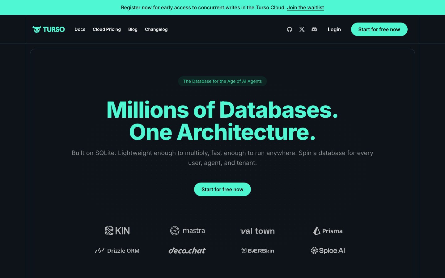
Turso's marketing surface is a dark, developer-first infrastructure interface. The page floor is `{colors.canvas}` (#0d1318) — a near-black with a subtle blue-green tint — and the brand voltage comes from two sources: a high-energy mint-teal accent (`{colors.accent}` — #4ff7d1) used for headlines, badges, and the hero CTA, and a magenta primary (`{colors.primary}` — #d946ef) used on inline action buttons and beta pills. The system reads as confident, technical, and contemporary — the kind of palette that signals "database for the age of AI agents."
Typography is **Inter** end-to-end. The display voice is loud: the hero h1 runs at `{typography.display-xl}` (72px / weight 800 / -1.8px tracking) in mint teal, set in two stacked lines ("Millions of Databases. One Architecture."). Section heads drop to `{typography.display-lg}` (48px / weight 600), and supporting copy runs in `{typography.body}` (16px / weight 500) in a soft neutral gray. The very heavy 800 display weight with tight negative tracking is the signature — Inter pushed to its loudest register.
Shape language is fully rounded: buttons and badges are pill-shaped (`{rounded.pill}`), and content cards use `{rounded.md}` (12px) to `{rounded.lg}` (16px) corners on slightly-lifted dark surfaces. There are no measured shadows — depth is created entirely by surface-tone contrast (cards sit a few luminance steps above the canvas), not by drop shadows.
**Key Characteristics:**
- Dark blue-tinted canvas (`{colors.canvas}` — #0d1318) across every page; the only consistently light element is the teal announcement bar at the very top.
- Mint-teal accent (`{colors.accent}` — #4ff7d1) for hero headlines, badge text, and the primary hero CTA — the dominant brand color.
- Magenta primary (`{colors.primary}` — #d946ef) for inline action buttons ("Create Database", "Read Manual", "Fork Repository") and "BETA" pills — a deliberate second voltage against the teal.
- Inter at weight 800 for display headlines with -1.8px tracking — heavy and tightly set.
- Fully pill-shaped (`{rounded.pill}`) buttons and badges; cards use 12-16px radii.
- Tiered dark surfaces (`{colors.surface}` #162129, `{colors.surface-elevated}` #18222b, `{colors.surface-card}` #121b22, `{colors.surface-strong}` #1b252d) build hierarchy through luminance, not shadow.
- A teal announcement banner (`{colors.accent}` background, black text) crowns the page, advertising waitlists / early access.
- Spacing rhythm is wide: `{spacing.section}` (128px) between major bands, `{spacing.xxl}` (40px) as a frequent layout gap.
## Colors
### Brand & Accent
- **Accent / Mint** (`{colors.accent}` — #4ff7d1): The dominant brand color. Hero headline fill, badge text, the hero "Start for free now" CTA, the announcement bar, inline code-pill text. A near-identical second sampled value `{colors.accent-alt}` (#4ff8d2) appears in the CSS — treat them as the same teal.
- **Primary / Magenta** (`{colors.primary}` — #d946ef): The action color for inline buttons ("Create Database", "Read Manual", "Fork Repository", "Join Discord") and "BETA" pills. Used sparingly against the teal — it's the second brand voltage.
### Surface
- **Canvas** (`{colors.canvas}` — #0d1318): The page floor on every page.
- **Pure Black** (`{colors.pure-black}` — #000000): Used in the announcement bar text and deep contrast zones.
- **Surface** (`{colors.surface}` — #162129): The default raised card / badge background — one step up from the canvas.
- **Surface Elevated** (`{colors.surface-elevated}` — #18222b): The product comparison cards (Turso / Turso Cloud) and feature panels.
- **Surface Card** (`{colors.surface-card}` — #121b22): Inner feature cells and SDK tiles — a slightly darker nested surface.
- **Surface Strong** (`{colors.surface-strong}` — #1b252d): Code pills and stronger-contrast chips.
- **Surface Darkest** (`{colors.surface-darkest}` — #111827): Deep section backgrounds.
- **Border Strong** (`{colors.border-strong}` — #293945): The most visible border tone on dark surfaces — card outlines, dividers.
- **Hairline** (`{colors.hairline}` — #374151) / **Hairline Soft** (`{colors.hairline-soft}` — #4b5563): Subtle 1px dividers and outlines between dark surfaces.
### Text
- **Ink** (`{colors.ink}` — #ffffff): All headlines and high-contrast labels (it is the maximum-contrast text vs the dark canvas).
- **Off-white** (`{colors.off-white}` — #fafafa): Near-white text variant.
- **Body** (`{colors.body}` — #d1d5db): Lighter running text inside cards.
- **Neutral** (`{colors.neutral}` — #c5cace): The hero sub-headline and supporting body copy — a cool gray.
- **Muted** (`{colors.muted}` — #9ca3af) / **Muted Soft** (`{colors.muted-soft}` — #6b7280): Footer links, captions, fine-print.
- **Surface Light** (`{colors.surface-light}` — #e5e7eb): A light gray used for logo wall marks and high-contrast inverted moments.
- **On Primary** (`{colors.on-primary}` — #ffffff): Text on the magenta primary button.
- **On Accent** (`{colors.on-accent}` — #000000): Black text on the teal CTA and announcement bar — the teal is bright enough to demand dark text.
## Typography
### Font Family
The system runs **Inter** exclusively (captured as the bundled web font `__Inter_f367f3`). No second display face is used — hierarchy is built entirely from weight and size. The fallback stack should walk `Inter, -apple-system, BlinkMacSystemFont, "Segoe UI", Roboto, sans-serif`.
### Hierarchy
| Token | Size | Weight | Line Height | Letter Spacing | Use |
|---|---|---|---|---|---|
| `{typography.display-xl}` | 72px | 800 | 1.0 | -1.8px | Hero h1 ("Millions of Databases. One Architecture.") — mint teal |
| `{typography.display-lg}` | 48px | 600 | 1.0 | -1.2px | Section heads ("Why Agents Need a New Database", "Don't just take our word for it") |
| `{typography.title-sm}` | 18px | 600 | 1.556 | 0 | Card titles, product names ("Turso", "Turso Cloud"), feature labels |
| `{typography.body}` | 16px | 500 | 1.5 | 0 | Running text, sub-headlines, nav links, button labels, footer |
### Principles
Display headlines are heavy (800) and tightly tracked (-1.8px) — the loud register of Inter. Section heads soften to weight 600 while keeping the tight negative tracking (-1.2px). Everything below display drops to weight 500-600 with normal tracking, which reads calmly against the loud headlines. Body weight never goes below 500 — the dark canvas needs a little extra stroke weight for legibility.
### Note on Font Substitutes
Inter is open-source (SIL Open Font License) and ships directly — no substitution is required. If a numerically lighter fallback is needed, **Inter Tight** preserves the tight-tracking display feel at smaller sizes.
## Layout
### Spacing System
- **Base unit:** 4px (the smallest measured value; the scale is built on 4/8 multiples with some odd intermediates).
- **Tokens:** `{spacing.xxs}` 4px · `{spacing.xs}` 8px · `{spacing.sm}` 12px · `{spacing.md}` 16px · `{spacing.lg}` 24px · `{spacing.xl}` 32px · `{spacing.xxl}` 40px · `{spacing.huge}` 48px · `{spacing.huge-2}` 56px · `{spacing.huge-3}` 64px · `{spacing.section}` 128px.
- **Most frequent values:** 16px (by far the dominant gap), 40px, and 24px — these carry the card-internal and inter-card rhythm.
- **Section padding:** `{spacing.section}` (128px) between major editorial bands.
- **Card internal padding:** `{spacing.xxl}` (40px) on the large product cards; `{spacing.lg}` (24px) on testimonial and feature cells; `{spacing.md}` (16px) on SDK tiles.
- Intermediate values 10px and 14px appear specifically in button padding (10px × 14px) and small chips — not as general layout spacing.
### Grid & Container
- **Editorial body:** centered single column with a generous outer margin; the hero band uses a thin rounded outline framing the whole hero zone.
- **Product comparison:** 2-up at desktop (Turso vs Turso Cloud), each holding a 2×3 feature grid.
- **Testimonials:** 3-up at desktop.
- **"Turso is the Database for Modern Applications":** 3-up feature columns (AI Agents / Mobile & IoT / Private by Design).
- **SDK tiles:** a multi-column icon grid.
- **Footer:** multi-column link list (Turso Cloud / Turso Database / Company).
### Whitespace Philosophy
The layout breathes generously — 128px between bands, 40px inside the marquee cards. Dark surfaces make the whitespace feel even larger because there's no hard edge between sections. The composition keeps a single loud headline per band followed by a calm gray sub-line and supporting cards.
## Elevation & Depth
| Level | Treatment | Use |
|---|---|---|
| Flat | No shadow — `{colors.canvas}` background | Body sections, top nav, hero band |
| Raised surface | `{colors.surface}` (#162129) — one luminance step up | Cards, badges, testimonial cells |
| Elevated surface | `{colors.surface-elevated}` (#18222b) | Product comparison cards, feature panels |
| Nested surface | `{colors.surface-card}` (#121b22) — slightly darker inset | Inner feature cells, SDK tiles |
| Outlined | 1px `{colors.border-strong}` (#293945) or `{colors.hairline}` border | Hero frame, card outlines, dividers |
No box-shadows were measured (`shadows: []`). Depth in this system is entirely **tonal** — surfaces shift luminance to read as layers, and thin borders in `{colors.border-strong}` define edges. This is a deliberate dark-UI strategy: shadows are nearly invisible on a near-black canvas, so surface-tone contrast does all the elevation work.
### Decorative Depth
- The hero is wrapped in a faint rounded outline (`{colors.border-strong}` family) that frames the headline + CTA + logo wall as one zone.
- 3D rendered database "stack" illustrations (mint/teal toned) appear inside several product and feature cards as glowing artifacts — these are product imagery, not system tokens.
## Shapes
### Border Radius Scale
| Token | Value | Use |
|---|---|---|
| `{rounded.md}` | 12px | Feature cells, SDK tiles, testimonial cards (most frequent card radius) |
| `{rounded.lg}` | 16px | Larger product / content cards |
| `{rounded.xl}` | 24px | Rare — the largest framed container |
| `{rounded.pill}` | 9999px | Buttons, badges, code pills, nav CTA — the most frequent radius overall |
The shape personality is **fully rounded**: pill buttons and badges dominate (the 9999px radius is the single most common measured value), and cards use friendly 12-16px corners. Nothing in the system is sharp-cornered.
### Photography & Logo Geometry
- Customer logo walls (KIN, mastra, val town, Prisma, Drizzle ORM, deco.chat, BÆRSkin, Spice AI) render as monochrome marks in `{colors.surface-light}` / muted gray on the dark canvas.
- Testimonial avatars are small circular photos.
- Product illustrations (database stacks) are teal-toned 3D renders placed inside cards at native ratios.
## Components
### Announcement Bar
**`announcement-bar`** — A full-width teal banner pinned above the nav. Background `{colors.accent}` (#4ff7d1), text `{colors.on-accent}` (#000000), body type. Carries a short message + an underlined inline link ("Register now for early access to concurrent writes in the Turso Cloud. Join the waitlist"). The only consistently bright element on the page.
### Top Navigation
**`top-nav`** — Transparent over the canvas (`{colors.canvas}`), text `{colors.ink}`. Left: the TURSO wordmark + bull logo. Center: text links (Docs, Cloud Pricing, Blog, Changelog) in `{typography.body}`. Right: social icons (GitHub, X, Discord), a "Login" text link, and a teal **`button-cta-accent`** "Start for free now".
**`nav-link`** — Inline nav menu item, transparent background, `{colors.ink}` text, `{typography.body}`.
### Buttons
**`button-cta-accent`** — The hero / nav primary CTA. Background `{colors.accent}` (#4ff7d1), text `{colors.on-accent}` (#000000), `{rounded.pill}`, padding 10px × 14px. The teal-on-black combination is the loudest action signal in the system. (Background-to-text pairing observed from screenshot ground-truth — padding/radius derived from the measured button geometry.)
**`button-primary`** — The magenta inline action button. Background `{colors.primary}` (#d946ef), text `{colors.on-primary}` (#ffffff), `{rounded.pill}`, padding 10px × 14px. Used for "Create Database", "Read Manual", "Fork Repository", "Join Discord". This is the exact measured button (`computed:button`).
**`button-secondary`** — A neutral dark pill button on `{colors.surface}` with `{colors.ink}` text, `{rounded.pill}`, same padding. Used for secondary actions like "Docs & Quickstarts" and "Join 254 others".
### Badges & Pills
**`badge-accent`** — A pill badge with `{colors.surface}` background and `{colors.accent}` text. Used for the hero eyebrow ("The Database for the Age of AI Agents") and "PRODUCTION-READY" / "OPEN SOURCE" status tags. `{rounded.pill}`, padding 8px × 16px.
**`badge-primary`** — A pill badge with `{colors.surface-strong}` background and `{colors.primary}` text. Used for "BETA" and "JOIN COMMUNITY" tags — the magenta variant.
**`code-pill`** — An inline command chip (e.g. `npx turso@latest`). Background `{colors.surface-strong}`, text `{colors.accent}`, `{rounded.pill}`, padding 10px × 14px.
### Cards & Containers
**`card`** — The base raised container. Background `{colors.surface}`, `{rounded.lg}`, padding `{spacing.xxl}` (40px), title in `{typography.title-sm}`. 1px `{colors.border-strong}` outline.
**`product-card`** — The large comparison cards ("Turso" embedded engine vs "Turso Cloud"). Background `{colors.surface-elevated}` (#18222b), `{rounded.lg}`, padding 40px. Holds a status badge, a product name in `{typography.title-sm}`, a body description, an action button, and a 2×3 grid of feature cells.
**`feature-card`** — The inner feature cells (Vector Search, Async Design, Concurrent Writes, Branching, etc.). Background `{colors.surface-card}` (#121b22), `{rounded.md}` (12px), padding `{spacing.lg}` (24px). Small icon + `{typography.title-sm}` label + short description in `{typography.body}`.
**`testimonial-card`** — Customer-quote cells in the "Don't just take our word for it" band. Background `{colors.surface}`, `{rounded.md}`, padding `{spacing.lg}` (24px). Quote in `{colors.body}` text, followed by a circular avatar + name + role.
**`sdk-tile`** — Small square language/integration tiles in the SDK grid. Background `{colors.surface-card}`, `{rounded.md}`, padding `{spacing.md}` (16px). Holds a single monochrome icon.
### Footer
**`footer`** — Page-closing footer on the same dark `{colors.canvas}` (no surface inversion — the whole site is already dark). Text in `{colors.muted}`, links in `{typography.body}`. Multi-column link list (Turso Cloud / Turso Database / Company), the TURSO wordmark, copyright, and a row of social icons. Vertical padding ~64px.
## Do's and Don'ts
### Do
- Keep the canvas dark (`{colors.canvas}` — #0d1318) on every surface. This is a dark-first system; light surfaces appear only as the teal announcement bar.
- Use `{colors.accent}` (mint teal) for the headline fill and the primary hero CTA, and `{colors.primary}` (magenta) for inline action buttons — the two-voltage split is the brand signature.
- Always pair teal backgrounds with black text (`{colors.on-accent}`) and magenta backgrounds with white text (`{colors.on-primary}`).
- Set display headlines in Inter weight 800 with -1.8px tracking — heavy and tight.
- Build elevation through surface tone (`{colors.surface}` → `{colors.surface-elevated}` → `{colors.surface-card}`), not shadows.
- Keep all buttons and badges fully pill-shaped (`{rounded.pill}`) and cards at 12-16px.
- Use `{colors.border-strong}` (#293945) 1px outlines to define card edges on the dark canvas.
### Don't
- Don't introduce drop shadows — the system has none and relies on tonal layering.
- Don't put teal and magenta on the same element; they're peers used in separate roles.
- Don't drop body weight below 500 — thin Inter loses legibility on the dark canvas.
- Don't sharpen corners — nothing in the system is square-cornered.
- Don't use `{colors.accent}` for large background fills beyond the announcement bar and CTA; the teal is a high-voltage accent, not a surface.
- Don't add hover-state styling beyond default and active/pressed.
## Responsive Behavior
### Breakpoints
| Name | Width | Key Changes |
|---|---|---|
| Mobile | < 768px | Hamburger nav; hero h1 scales down from 72px; logo wall stacks 2-up; product cards stack 1-up; testimonials 1-up; footer columns collapse to 1 |
| Tablet | 768–1024px | Tightened horizontal nav; product comparison 1-up or 2-up; testimonials 2-up; feature columns 2-up |
| Desktop | 1024–1440px | Full nav; 2-up product cards; 3-up testimonials and feature columns; full SDK grid |
| Wide | > 1440px | Same as desktop with wider outer margins; content stays centered |
The full-page screenshot confirms a narrow centered editorial column at smaller widths — bands stack vertically and cards reflow to single column while keeping their pill buttons and rounded corners.
### Touch Targets
- `{component.button-primary}` and `{component.button-cta-accent}` use 10px × 14px padding on `{typography.body}` — effective tap height clears comfortable minimums with the pill silhouette.
- Nav links and social icons sit in the 64px nav band.
- SDK tiles are square tap targets sized by the 16px internal padding.
### Collapsing Strategy
- Top nav collapses to a hamburger on mobile.
- The hero frame outline persists but reflows around the stacked headline + CTA.
- Logo wall reflows from 4-up to 2-up.
- Product comparison cards stack vertically; each card's internal 2×3 feature grid collapses to 1-up.
- Footer link columns collapse to a single stacked list.
### Image Behavior
- Database-stack 3D illustrations scale proportionally inside their cards.
- Customer logo marks retain aspect ratio and monochrome treatment.
- Testimonial avatars stay circular at every breakpoint.
## Iteration Guide
1. Focus on ONE component at a time, referencing its YAML key (`{component.product-card}`, `{component.badge-primary}`).
2. Variants (`-active`, `-disabled`) live as separate entries in `components:`.
3. Use `{token.refs}` everywhere — never inline a hex in a component.
4. Document default and active/pressed states only — never hover.
5. Keep the two-voltage rule: teal (`{colors.accent}`) for hero/headline/announcement, magenta (`{colors.primary}`) for inline actions.
6. Elevation is tonal — reach for a higher surface token before inventing a shadow.
7. When in doubt about emphasis: bigger Inter before any color change. The mint headline is already the loudest element.
## Known Gaps
- **Shadows:** `shadows: []` — no box-shadow values were measured. The elevation table is reconstructed from surface-tone differences observed in the captures; if the production CSS uses subtle glows on cards/buttons, they are not captured here.
- **Button typography:** the measured `button-primary` recorded background, color, radius, and padding but no font size/weight — button labels are documented as `{typography.body}` (16px / 500) from the body baseline; the true button type size may be smaller.
- **`button-cta-accent`** (the teal hero/nav CTA): its background-to-text pairing is taken from screenshot ground-truth; padding and radius are derived from the single measured magenta button. The exact teal CTA padding is unconfirmed.
- The two near-identical teal samples (`{colors.accent}` #4ff7d1 and `{colors.accent-alt}` #4ff8d2) likely represent one design value with rounding/antialiasing drift.
- Only `landing` and `pricing` pages were captured; the pricing-page-specific component spec (pricing tier cards, plan tables) was not separately measured and is not documented.
- Animation, transition timings, and any hover-reveal interactions (logo wall, SDK grid, card states) are out of scope.
- Form/input components and their focus/error states were not present in the measured component set.
- Light-on-dark border tokens (`{colors.hairline}`, `{colors.border-strong}`) are inferred as outline roles from frequency data; exact per-component border assignments were not individually measured.
<!-- Documented by duply · real-world design systems as ready-to-use DESIGN.md for AI coding agents · https://duply.ai/turso/design-md -->
Color Palette
Accent
Neutrals
Typography
display-xl72px · 800 · 1
The quick brown fox jumpsdisplay-lg48px · 600 · 1
The quick brown fox jumpstitle-sm18px · 600 · 1.556
The quick brown fox jumpsbody16px · 500 · 1.5
The quick brown fox jumpsSpacing & Shape
Spacing
| Name | Value | Preview |
|---|---|---|
| xxs | 4px | |
| xs | 8px | |
| sm | 12px | |
| md | 16px | |
| lg | 24px | |
| xl | 32px | |
| xxl | 40px | |
| huge | 48px | |
| huge-2 | 56px | |
| huge-3 | 64px | |
| section | 128px |
Border Radius
| Name | Value | Preview |
|---|---|---|
| md | 12px | |
| lg | 16px | |
| xl | 24px | |
| pill | 9999px |
More like this


---
version: alpha
name: Turso-design-analysis
description: A dark, developer-first database-product interface anchored on a near-black blue-tinted canvas (#0d1318) with a high-voltage mint-teal accent (#4ff7d1) and a magenta primary action (#d946ef). The system reads as modern infrastructure/SaaS — Inter throughout with very heavy, tightly-tracked display headlines, fully pill-shaped buttons and badges, soft 12-16px cards on dark surfaces, and a teal-on-black announcement bar that crowns every page. Brand voltage comes from the mint headline glow and the magenta CTA against the dark canvas.

colors:
  primary: "#d946ef"
  accent: "#4ff7d1"
  accent-alt: "#4ff8d2"
  ink: "#ffffff"
  off-white: "#fafafa"
  body: "#d1d5db"
  neutral: "#c5cace"
  muted: "#9ca3af"
  muted-soft: "#6b7280"
  hairline: "#374151"
  hairline-soft: "#4b5563"
  surface-light: "#e5e7eb"
  canvas: "#0d1318"
  pure-black: "#000000"
  surface: "#162129"
  surface-elevated: "#18222b"
  surface-card: "#121b22"
  surface-strong: "#1b252d"
  surface-darkest: "#111827"
  border-strong: "#293945"
  on-primary: "#ffffff"
  on-accent: "#000000"

typography:
  display-xl:
    fontFamily: "Inter, sans-serif"
    fontSize: 72px
    fontWeight: 800
    lineHeight: 1.0
    letterSpacing: -1.8px
  display-lg:
    fontFamily: "Inter, sans-serif"
    fontSize: 48px
    fontWeight: 600
    lineHeight: 1.0
    letterSpacing: -1.2px
  title-sm:
    fontFamily: "Inter, sans-serif"
    fontSize: 18px
    fontWeight: 600
    lineHeight: 1.556
    letterSpacing: 0
  body:
    fontFamily: "Inter, sans-serif"
    fontSize: 16px
    fontWeight: 500
    lineHeight: 1.5
    letterSpacing: 0

rounded:
  md: 12px
  lg: 16px
  xl: 24px
  pill: 9999px

spacing:
  xxs: 4px
  xs: 8px
  sm: 12px
  md: 16px
  lg: 24px
  xl: 32px
  xxl: 40px
  huge: 48px
  huge-2: 56px
  huge-3: 64px
  section: 128px

components:
  announcement-bar:
    backgroundColor: "{colors.accent}"
    textColor: "{colors.on-accent}"
    typography: "{typography.body}"
    padding: 16px
  top-nav:
    backgroundColor: "{colors.canvas}"
    textColor: "{colors.ink}"
    typography: "{typography.body}"
  button-primary:
    backgroundColor: "{colors.primary}"
    textColor: "{colors.on-primary}"
    typography: "{typography.body}"
    rounded: "{rounded.pill}"
    padding: 10px 14px
  button-cta-accent:
    backgroundColor: "{colors.accent}"
    textColor: "{colors.on-accent}"
    typography: "{typography.body}"
    rounded: "{rounded.pill}"
    padding: 10px 14px
  button-secondary:
    backgroundColor: "{colors.surface}"
    textColor: "{colors.ink}"
    typography: "{typography.body}"
    rounded: "{rounded.pill}"
    padding: 10px 14px
  nav-link:
    backgroundColor: transparent
    textColor: "{colors.ink}"
    typography: "{typography.body}"
  badge-accent:
    backgroundColor: "{colors.surface}"
    textColor: "{colors.accent}"
    typography: "{typography.body}"
    rounded: "{rounded.pill}"
    padding: 8px 16px
  badge-primary:
    backgroundColor: "{colors.surface-strong}"
    textColor: "{colors.primary}"
    typography: "{typography.body}"
    rounded: "{rounded.pill}"
    padding: 8px 16px
  card:
    backgroundColor: "{colors.surface}"
    textColor: "{colors.ink}"
    typography: "{typography.title-sm}"
    rounded: "{rounded.lg}"
    padding: 40px
  feature-card:
    backgroundColor: "{colors.surface-card}"
    textColor: "{colors.ink}"
    typography: "{typography.title-sm}"
    rounded: "{rounded.md}"
    padding: 24px
  product-card:
    backgroundColor: "{colors.surface-elevated}"
    textColor: "{colors.ink}"
    typography: "{typography.title-sm}"
    rounded: "{rounded.lg}"
    padding: 40px
  testimonial-card:
    backgroundColor: "{colors.surface}"
    textColor: "{colors.body}"
    typography: "{typography.body}"
    rounded: "{rounded.md}"
    padding: 24px
  sdk-tile:
    backgroundColor: "{colors.surface-card}"
    textColor: "{colors.ink}"
    rounded: "{rounded.md}"
    padding: 16px
  code-pill:
    backgroundColor: "{colors.surface-strong}"
    textColor: "{colors.accent}"
    typography: "{typography.body}"
    rounded: "{rounded.pill}"
    padding: 10px 14px
  footer:
    backgroundColor: "{colors.canvas}"
    textColor: "{colors.muted}"
    typography: "{typography.body}"
    padding: 64px
---

## Overview

Turso's marketing surface is a dark, developer-first infrastructure interface. The page floor is `{colors.canvas}` (#0d1318) — a near-black with a subtle blue-green tint — and the brand voltage comes from two sources: a high-energy mint-teal accent (`{colors.accent}` — #4ff7d1) used for headlines, badges, and the hero CTA, and a magenta primary (`{colors.primary}` — #d946ef) used on inline action buttons and beta pills. The system reads as confident, technical, and contemporary — the kind of palette that signals "database for the age of AI agents."

Typography is **Inter** end-to-end. The display voice is loud: the hero h1 runs at `{typography.display-xl}` (72px / weight 800 / -1.8px tracking) in mint teal, set in two stacked lines ("Millions of Databases. One Architecture."). Section heads drop to `{typography.display-lg}` (48px / weight 600), and supporting copy runs in `{typography.body}` (16px / weight 500) in a soft neutral gray. The very heavy 800 display weight with tight negative tracking is the signature — Inter pushed to its loudest register.

Shape language is fully rounded: buttons and badges are pill-shaped (`{rounded.pill}`), and content cards use `{rounded.md}` (12px) to `{rounded.lg}` (16px) corners on slightly-lifted dark surfaces. There are no measured shadows — depth is created entirely by surface-tone contrast (cards sit a few luminance steps above the canvas), not by drop shadows.

**Key Characteristics:**
- Dark blue-tinted canvas (`{colors.canvas}` — #0d1318) across every page; the only consistently light element is the teal announcement bar at the very top.
- Mint-teal accent (`{colors.accent}` — #4ff7d1) for hero headlines, badge text, and the primary hero CTA — the dominant brand color.
- Magenta primary (`{colors.primary}` — #d946ef) for inline action buttons ("Create Database", "Read Manual", "Fork Repository") and "BETA" pills — a deliberate second voltage against the teal.
- Inter at weight 800 for display headlines with -1.8px tracking — heavy and tightly set.
- Fully pill-shaped (`{rounded.pill}`) buttons and badges; cards use 12-16px radii.
- Tiered dark surfaces (`{colors.surface}` #162129, `{colors.surface-elevated}` #18222b, `{colors.surface-card}` #121b22, `{colors.surface-strong}` #1b252d) build hierarchy through luminance, not shadow.
- A teal announcement banner (`{colors.accent}` background, black text) crowns the page, advertising waitlists / early access.
- Spacing rhythm is wide: `{spacing.section}` (128px) between major bands, `{spacing.xxl}` (40px) as a frequent layout gap.

## Colors

### Brand & Accent
- **Accent / Mint** (`{colors.accent}` — #4ff7d1): The dominant brand color. Hero headline fill, badge text, the hero "Start for free now" CTA, the announcement bar, inline code-pill text. A near-identical second sampled value `{colors.accent-alt}` (#4ff8d2) appears in the CSS — treat them as the same teal.
- **Primary / Magenta** (`{colors.primary}` — #d946ef): The action color for inline buttons ("Create Database", "Read Manual", "Fork Repository", "Join Discord") and "BETA" pills. Used sparingly against the teal — it's the second brand voltage.

### Surface
- **Canvas** (`{colors.canvas}` — #0d1318): The page floor on every page.
- **Pure Black** (`{colors.pure-black}` — #000000): Used in the announcement bar text and deep contrast zones.
- **Surface** (`{colors.surface}` — #162129): The default raised card / badge background — one step up from the canvas.
- **Surface Elevated** (`{colors.surface-elevated}` — #18222b): The product comparison cards (Turso / Turso Cloud) and feature panels.
- **Surface Card** (`{colors.surface-card}` — #121b22): Inner feature cells and SDK tiles — a slightly darker nested surface.
- **Surface Strong** (`{colors.surface-strong}` — #1b252d): Code pills and stronger-contrast chips.
- **Surface Darkest** (`{colors.surface-darkest}` — #111827): Deep section backgrounds.
- **Border Strong** (`{colors.border-strong}` — #293945): The most visible border tone on dark surfaces — card outlines, dividers.
- **Hairline** (`{colors.hairline}` — #374151) / **Hairline Soft** (`{colors.hairline-soft}` — #4b5563): Subtle 1px dividers and outlines between dark surfaces.

### Text
- **Ink** (`{colors.ink}` — #ffffff): All headlines and high-contrast labels (it is the maximum-contrast text vs the dark canvas).
- **Off-white** (`{colors.off-white}` — #fafafa): Near-white text variant.
- **Body** (`{colors.body}` — #d1d5db): Lighter running text inside cards.
- **Neutral** (`{colors.neutral}` — #c5cace): The hero sub-headline and supporting body copy — a cool gray.
- **Muted** (`{colors.muted}` — #9ca3af) / **Muted Soft** (`{colors.muted-soft}` — #6b7280): Footer links, captions, fine-print.
- **Surface Light** (`{colors.surface-light}` — #e5e7eb): A light gray used for logo wall marks and high-contrast inverted moments.
- **On Primary** (`{colors.on-primary}` — #ffffff): Text on the magenta primary button.
- **On Accent** (`{colors.on-accent}` — #000000): Black text on the teal CTA and announcement bar — the teal is bright enough to demand dark text.

## Typography

### Font Family
The system runs **Inter** exclusively (captured as the bundled web font `__Inter_f367f3`). No second display face is used — hierarchy is built entirely from weight and size. The fallback stack should walk `Inter, -apple-system, BlinkMacSystemFont, "Segoe UI", Roboto, sans-serif`.

### Hierarchy

| Token | Size | Weight | Line Height | Letter Spacing | Use |
|---|---|---|---|---|---|
| `{typography.display-xl}` | 72px | 800 | 1.0 | -1.8px | Hero h1 ("Millions of Databases. One Architecture.") — mint teal |
| `{typography.display-lg}` | 48px | 600 | 1.0 | -1.2px | Section heads ("Why Agents Need a New Database", "Don't just take our word for it") |
| `{typography.title-sm}` | 18px | 600 | 1.556 | 0 | Card titles, product names ("Turso", "Turso Cloud"), feature labels |
| `{typography.body}` | 16px | 500 | 1.5 | 0 | Running text, sub-headlines, nav links, button labels, footer |

### Principles
Display headlines are heavy (800) and tightly tracked (-1.8px) — the loud register of Inter. Section heads soften to weight 600 while keeping the tight negative tracking (-1.2px). Everything below display drops to weight 500-600 with normal tracking, which reads calmly against the loud headlines. Body weight never goes below 500 — the dark canvas needs a little extra stroke weight for legibility.

### Note on Font Substitutes
Inter is open-source (SIL Open Font License) and ships directly — no substitution is required. If a numerically lighter fallback is needed, **Inter Tight** preserves the tight-tracking display feel at smaller sizes.

## Layout

### Spacing System
- **Base unit:** 4px (the smallest measured value; the scale is built on 4/8 multiples with some odd intermediates).
- **Tokens:** `{spacing.xxs}` 4px · `{spacing.xs}` 8px · `{spacing.sm}` 12px · `{spacing.md}` 16px · `{spacing.lg}` 24px · `{spacing.xl}` 32px · `{spacing.xxl}` 40px · `{spacing.huge}` 48px · `{spacing.huge-2}` 56px · `{spacing.huge-3}` 64px · `{spacing.section}` 128px.
- **Most frequent values:** 16px (by far the dominant gap), 40px, and 24px — these carry the card-internal and inter-card rhythm.
- **Section padding:** `{spacing.section}` (128px) between major editorial bands.
- **Card internal padding:** `{spacing.xxl}` (40px) on the large product cards; `{spacing.lg}` (24px) on testimonial and feature cells; `{spacing.md}` (16px) on SDK tiles.
- Intermediate values 10px and 14px appear specifically in button padding (10px × 14px) and small chips — not as general layout spacing.

### Grid & Container
- **Editorial body:** centered single column with a generous outer margin; the hero band uses a thin rounded outline framing the whole hero zone.
- **Product comparison:** 2-up at desktop (Turso vs Turso Cloud), each holding a 2×3 feature grid.
- **Testimonials:** 3-up at desktop.
- **"Turso is the Database for Modern Applications":** 3-up feature columns (AI Agents / Mobile & IoT / Private by Design).
- **SDK tiles:** a multi-column icon grid.
- **Footer:** multi-column link list (Turso Cloud / Turso Database / Company).

### Whitespace Philosophy
The layout breathes generously — 128px between bands, 40px inside the marquee cards. Dark surfaces make the whitespace feel even larger because there's no hard edge between sections. The composition keeps a single loud headline per band followed by a calm gray sub-line and supporting cards.

## Elevation & Depth

| Level | Treatment | Use |
|---|---|---|
| Flat | No shadow — `{colors.canvas}` background | Body sections, top nav, hero band |
| Raised surface | `{colors.surface}` (#162129) — one luminance step up | Cards, badges, testimonial cells |
| Elevated surface | `{colors.surface-elevated}` (#18222b) | Product comparison cards, feature panels |
| Nested surface | `{colors.surface-card}` (#121b22) — slightly darker inset | Inner feature cells, SDK tiles |
| Outlined | 1px `{colors.border-strong}` (#293945) or `{colors.hairline}` border | Hero frame, card outlines, dividers |

No box-shadows were measured (`shadows: []`). Depth in this system is entirely **tonal** — surfaces shift luminance to read as layers, and thin borders in `{colors.border-strong}` define edges. This is a deliberate dark-UI strategy: shadows are nearly invisible on a near-black canvas, so surface-tone contrast does all the elevation work.

### Decorative Depth
- The hero is wrapped in a faint rounded outline (`{colors.border-strong}` family) that frames the headline + CTA + logo wall as one zone.
- 3D rendered database "stack" illustrations (mint/teal toned) appear inside several product and feature cards as glowing artifacts — these are product imagery, not system tokens.

## Shapes

### Border Radius Scale

| Token | Value | Use |
|---|---|---|
| `{rounded.md}` | 12px | Feature cells, SDK tiles, testimonial cards (most frequent card radius) |
| `{rounded.lg}` | 16px | Larger product / content cards |
| `{rounded.xl}` | 24px | Rare — the largest framed container |
| `{rounded.pill}` | 9999px | Buttons, badges, code pills, nav CTA — the most frequent radius overall |

The shape personality is **fully rounded**: pill buttons and badges dominate (the 9999px radius is the single most common measured value), and cards use friendly 12-16px corners. Nothing in the system is sharp-cornered.

### Photography & Logo Geometry
- Customer logo walls (KIN, mastra, val town, Prisma, Drizzle ORM, deco.chat, BÆRSkin, Spice AI) render as monochrome marks in `{colors.surface-light}` / muted gray on the dark canvas.
- Testimonial avatars are small circular photos.
- Product illustrations (database stacks) are teal-toned 3D renders placed inside cards at native ratios.

## Components

### Announcement Bar

**`announcement-bar`** — A full-width teal banner pinned above the nav. Background `{colors.accent}` (#4ff7d1), text `{colors.on-accent}` (#000000), body type. Carries a short message + an underlined inline link ("Register now for early access to concurrent writes in the Turso Cloud. Join the waitlist"). The only consistently bright element on the page.

### Top Navigation

**`top-nav`** — Transparent over the canvas (`{colors.canvas}`), text `{colors.ink}`. Left: the TURSO wordmark + bull logo. Center: text links (Docs, Cloud Pricing, Blog, Changelog) in `{typography.body}`. Right: social icons (GitHub, X, Discord), a "Login" text link, and a teal **`button-cta-accent`** "Start for free now".

**`nav-link`** — Inline nav menu item, transparent background, `{colors.ink}` text, `{typography.body}`.

### Buttons

**`button-cta-accent`** — The hero / nav primary CTA. Background `{colors.accent}` (#4ff7d1), text `{colors.on-accent}` (#000000), `{rounded.pill}`, padding 10px × 14px. The teal-on-black combination is the loudest action signal in the system. (Background-to-text pairing observed from screenshot ground-truth — padding/radius derived from the measured button geometry.)

**`button-primary`** — The magenta inline action button. Background `{colors.primary}` (#d946ef), text `{colors.on-primary}` (#ffffff), `{rounded.pill}`, padding 10px × 14px. Used for "Create Database", "Read Manual", "Fork Repository", "Join Discord". This is the exact measured button (`computed:button`).

**`button-secondary`** — A neutral dark pill button on `{colors.surface}` with `{colors.ink}` text, `{rounded.pill}`, same padding. Used for secondary actions like "Docs & Quickstarts" and "Join 254 others".

### Badges & Pills

**`badge-accent`** — A pill badge with `{colors.surface}` background and `{colors.accent}` text. Used for the hero eyebrow ("The Database for the Age of AI Agents") and "PRODUCTION-READY" / "OPEN SOURCE" status tags. `{rounded.pill}`, padding 8px × 16px.

**`badge-primary`** — A pill badge with `{colors.surface-strong}` background and `{colors.primary}` text. Used for "BETA" and "JOIN COMMUNITY" tags — the magenta variant.

**`code-pill`** — An inline command chip (e.g. `npx turso@latest`). Background `{colors.surface-strong}`, text `{colors.accent}`, `{rounded.pill}`, padding 10px × 14px.

### Cards & Containers

**`card`** — The base raised container. Background `{colors.surface}`, `{rounded.lg}`, padding `{spacing.xxl}` (40px), title in `{typography.title-sm}`. 1px `{colors.border-strong}` outline.

**`product-card`** — The large comparison cards ("Turso" embedded engine vs "Turso Cloud"). Background `{colors.surface-elevated}` (#18222b), `{rounded.lg}`, padding 40px. Holds a status badge, a product name in `{typography.title-sm}`, a body description, an action button, and a 2×3 grid of feature cells.

**`feature-card`** — The inner feature cells (Vector Search, Async Design, Concurrent Writes, Branching, etc.). Background `{colors.surface-card}` (#121b22), `{rounded.md}` (12px), padding `{spacing.lg}` (24px). Small icon + `{typography.title-sm}` label + short description in `{typography.body}`.

**`testimonial-card`** — Customer-quote cells in the "Don't just take our word for it" band. Background `{colors.surface}`, `{rounded.md}`, padding `{spacing.lg}` (24px). Quote in `{colors.body}` text, followed by a circular avatar + name + role.

**`sdk-tile`** — Small square language/integration tiles in the SDK grid. Background `{colors.surface-card}`, `{rounded.md}`, padding `{spacing.md}` (16px). Holds a single monochrome icon.

### Footer

**`footer`** — Page-closing footer on the same dark `{colors.canvas}` (no surface inversion — the whole site is already dark). Text in `{colors.muted}`, links in `{typography.body}`. Multi-column link list (Turso Cloud / Turso Database / Company), the TURSO wordmark, copyright, and a row of social icons. Vertical padding ~64px.

## Do's and Don'ts

### Do
- Keep the canvas dark (`{colors.canvas}` — #0d1318) on every surface. This is a dark-first system; light surfaces appear only as the teal announcement bar.
- Use `{colors.accent}` (mint teal) for the headline fill and the primary hero CTA, and `{colors.primary}` (magenta) for inline action buttons — the two-voltage split is the brand signature.
- Always pair teal backgrounds with black text (`{colors.on-accent}`) and magenta backgrounds with white text (`{colors.on-primary}`).
- Set display headlines in Inter weight 800 with -1.8px tracking — heavy and tight.
- Build elevation through surface tone (`{colors.surface}` → `{colors.surface-elevated}` → `{colors.surface-card}`), not shadows.
- Keep all buttons and badges fully pill-shaped (`{rounded.pill}`) and cards at 12-16px.
- Use `{colors.border-strong}` (#293945) 1px outlines to define card edges on the dark canvas.

### Don't
- Don't introduce drop shadows — the system has none and relies on tonal layering.
- Don't put teal and magenta on the same element; they're peers used in separate roles.
- Don't drop body weight below 500 — thin Inter loses legibility on the dark canvas.
- Don't sharpen corners — nothing in the system is square-cornered.
- Don't use `{colors.accent}` for large background fills beyond the announcement bar and CTA; the teal is a high-voltage accent, not a surface.
- Don't add hover-state styling beyond default and active/pressed.

## Responsive Behavior

### Breakpoints

| Name | Width | Key Changes |
|---|---|---|
| Mobile | < 768px | Hamburger nav; hero h1 scales down from 72px; logo wall stacks 2-up; product cards stack 1-up; testimonials 1-up; footer columns collapse to 1 |
| Tablet | 768–1024px | Tightened horizontal nav; product comparison 1-up or 2-up; testimonials 2-up; feature columns 2-up |
| Desktop | 1024–1440px | Full nav; 2-up product cards; 3-up testimonials and feature columns; full SDK grid |
| Wide | > 1440px | Same as desktop with wider outer margins; content stays centered |

The full-page screenshot confirms a narrow centered editorial column at smaller widths — bands stack vertically and cards reflow to single column while keeping their pill buttons and rounded corners.

### Touch Targets
- `{component.button-primary}` and `{component.button-cta-accent}` use 10px × 14px padding on `{typography.body}` — effective tap height clears comfortable minimums with the pill silhouette.
- Nav links and social icons sit in the 64px nav band.
- SDK tiles are square tap targets sized by the 16px internal padding.

### Collapsing Strategy
- Top nav collapses to a hamburger on mobile.
- The hero frame outline persists but reflows around the stacked headline + CTA.
- Logo wall reflows from 4-up to 2-up.
- Product comparison cards stack vertically; each card's internal 2×3 feature grid collapses to 1-up.
- Footer link columns collapse to a single stacked list.

### Image Behavior
- Database-stack 3D illustrations scale proportionally inside their cards.
- Customer logo marks retain aspect ratio and monochrome treatment.
- Testimonial avatars stay circular at every breakpoint.

## Iteration Guide

1. Focus on ONE component at a time, referencing its YAML key (`{component.product-card}`, `{component.badge-primary}`).
2. Variants (`-active`, `-disabled`) live as separate entries in `components:`.
3. Use `{token.refs}` everywhere — never inline a hex in a component.
4. Document default and active/pressed states only — never hover.
5. Keep the two-voltage rule: teal (`{colors.accent}`) for hero/headline/announcement, magenta (`{colors.primary}`) for inline actions.
6. Elevation is tonal — reach for a higher surface token before inventing a shadow.
7. When in doubt about emphasis: bigger Inter before any color change. The mint headline is already the loudest element.

## Known Gaps

- **Shadows:** `shadows: []` — no box-shadow values were measured. The elevation table is reconstructed from surface-tone differences observed in the captures; if the production CSS uses subtle glows on cards/buttons, they are not captured here.
- **Button typography:** the measured `button-primary` recorded background, color, radius, and padding but no font size/weight — button labels are documented as `{typography.body}` (16px / 500) from the body baseline; the true button type size may be smaller.
- **`button-cta-accent`** (the teal hero/nav CTA): its background-to-text pairing is taken from screenshot ground-truth; padding and radius are derived from the single measured magenta button. The exact teal CTA padding is unconfirmed.
- The two near-identical teal samples (`{colors.accent}` #4ff7d1 and `{colors.accent-alt}` #4ff8d2) likely represent one design value with rounding/antialiasing drift.
- Only `landing` and `pricing` pages were captured; the pricing-page-specific component spec (pricing tier cards, plan tables) was not separately measured and is not documented.
- Animation, transition timings, and any hover-reveal interactions (logo wall, SDK grid, card states) are out of scope.
- Form/input components and their focus/error states were not present in the measured component set.
- Light-on-dark border tokens (`{colors.hairline}`, `{colors.border-strong}`) are inferred as outline roles from frequency data; exact per-component border assignments were not individually measured.

<!-- Documented by duply · real-world design systems as ready-to-use DESIGN.md for AI coding agents · https://duply.ai/turso/design-md -->