LaunchDarkly
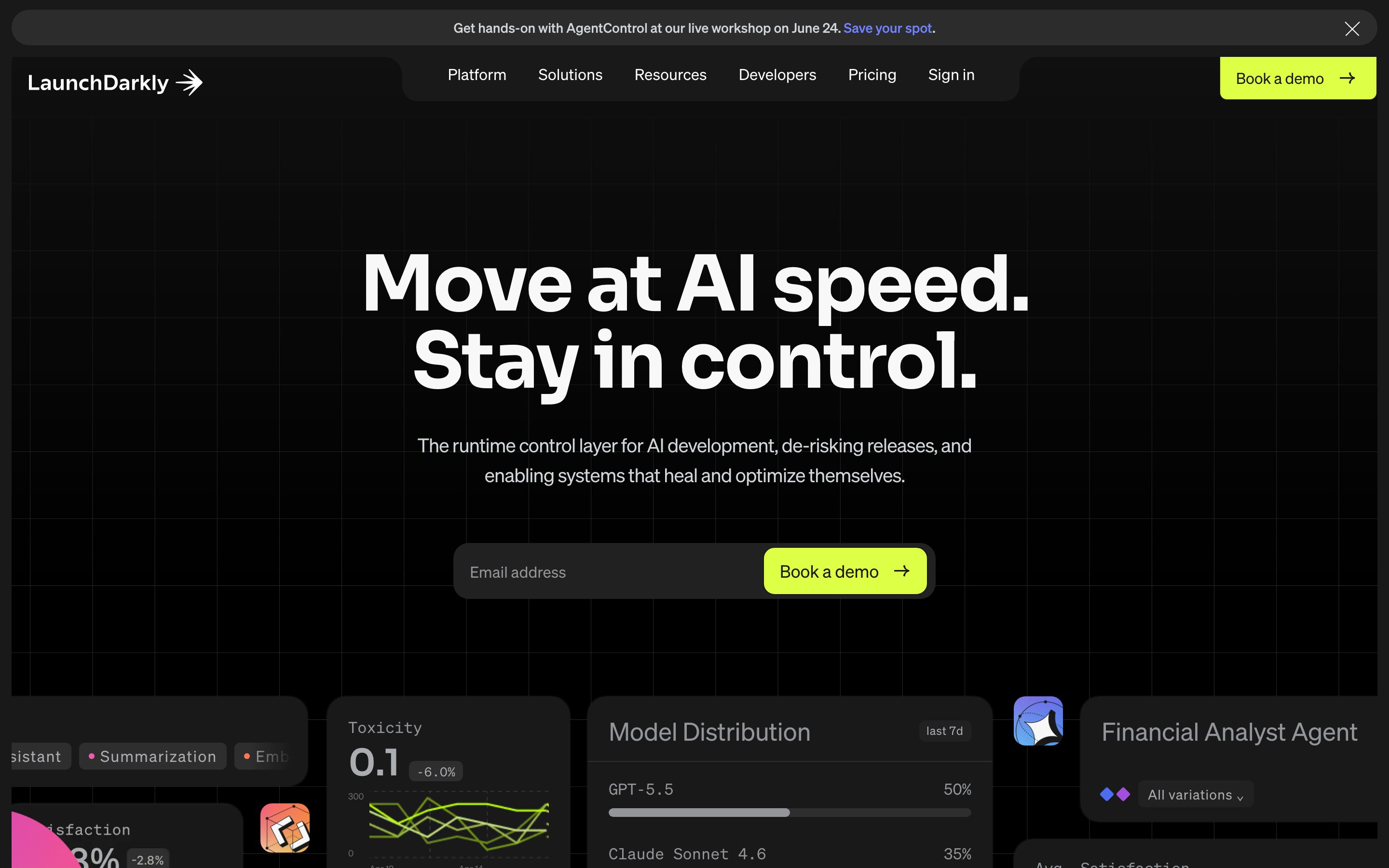
A dark-mode, developer-platform interface anchored on a near-black canvas (#191919) with white display type, electric-blue primary CTAs, and a high-voltage lime-green accent. The system reads as confident, technical, and modern — oversized tightly-tracked display headlines, sharp-cornered (0px) buttons and inputs, soft-rounded dark cards (~20px) holding product-UI fragments, and a spectrum of saturated accent colors (lime, cyan, violet, periwinkle, pink) used on gradient product mockups. Brand voltage comes from the lime "Book a demo" CTA and the bold Söhne-family display type.
---
version: alpha
name: LaunchDarkly-design-analysis
description: A dark-mode, developer-platform interface anchored on a near-black canvas (#191919) with white display type, electric-blue primary CTAs, and a high-voltage lime-green accent. The system reads as confident, technical, and modern — oversized tightly-tracked display headlines, sharp-cornered (0px) buttons and inputs, soft-rounded dark cards (~20px) holding product-UI fragments, and a spectrum of saturated accent colors (lime, cyan, violet, periwinkle, pink) used on gradient product mockups. Brand voltage comes from the lime "Book a demo" CTA and the bold Söhne-family display type.
colors:
  primary: "#405bff"
  ink: "#ffffff"
  canvas: "#191919"
  body: "#212121"
  surface-black: "#000000"
  surface-near-black: "#0c0c0c"
  surface-dark: "#2e2e2e"
  surface-light: "#f8f8f8"
  neutral-dark: "#414042"
  neutral-mid: "#58595b"
  muted: "#939598"
  muted-soft: "#abadb0"
  hairline: "#d1d6d9"
  accent-lime: "#ddff46"
  accent-lime-bright: "#ebff38"
  accent-cyan: "#3dd6f5"
  accent-blue-cyan: "#00bbff"
  accent-violet: "#a34fde"
  accent-periwinkle: "#7084ff"
  accent-pink: "#ff386b"
  on-primary: "#ffffff"
typography:
  h1:
    fontFamily: "Inter, sans-serif"
    fontSize: 80px
    fontWeight: 700
    lineHeight: 1.0
    letterSpacing: -2px
  h2:
    fontFamily: "Inter, sans-serif"
    fontSize: 64px
    fontWeight: 700
    lineHeight: 1.0
    letterSpacing: -3.2px
  h3:
    fontFamily: "Inter, sans-serif"
    fontSize: 32px
    fontWeight: 600
    lineHeight: 1.1
    letterSpacing: -0.65px
  body:
    fontFamily: "Sohne, Inter, sans-serif"
    fontSize: 24px
    fontWeight: 500
    lineHeight: 1.4
    letterSpacing: normal
  button:
    fontFamily: "Sohne, Inter, sans-serif"
    fontSize: 16px
    fontWeight: 400
    lineHeight: 1.5
    letterSpacing: normal
rounded:
  none: 0px
  xs: 2px
  sm: 4px
  md: 6px
  lg: 8px
  xl: 12px
  2xl: 16px
  3xl: 20px
  4xl: 24px
  5xl: 32px
  pill: 999px
spacing:
  xxs: 4px
  xs: 6px
  sm: 8px
  md: 10px
  lg: 12px
  xl: 16px
  xxl: 20px
  xxxl: 24px
  huge: 31px
components:
  button-primary:
    backgroundColor: "{colors.primary}"
    textColor: "{colors.on-primary}"
    typography: "{typography.button}"
    rounded: "{rounded.none}"
    padding: 12px 24px
  button-cta-lime:
    backgroundColor: "{colors.accent-lime}"
    textColor: "{colors.canvas}"
    typography: "{typography.button}"
    rounded: "{rounded.none}"
    padding: 12px 24px
  button-secondary-dark:
    backgroundColor: "{colors.surface-near-black}"
    textColor: "{colors.ink}"
    typography: "{typography.button}"
    rounded: "{rounded.none}"
    padding: 12px 24px
  card:
    backgroundColor: "{colors.canvas}"
    textColor: "{colors.ink}"
    rounded: "{rounded.3xl}"
  card-light:
    backgroundColor: "{colors.surface-light}"
    textColor: "{colors.body}"
    rounded: "{rounded.3xl}"
  input:
    backgroundColor: "{colors.canvas}"
    textColor: "{colors.ink}"
    typography: "{typography.button}"
    rounded: "{rounded.none}"
  top-nav:
    backgroundColor: "{colors.canvas}"
    textColor: "{colors.ink}"
    typography: "{typography.button}"
  hero-band:
    backgroundColor: "{colors.canvas}"
    textColor: "{colors.ink}"
    typography: "{typography.h1}"
  email-capture-pill:
    backgroundColor: "{colors.surface-near-black}"
    textColor: "{colors.muted}"
    typography: "{typography.button}"
    rounded: "{rounded.pill}"
  index-chip:
    backgroundColor: "{colors.surface-dark}"
    textColor: "{colors.ink}"
    typography: "{typography.button}"
    rounded: "{rounded.md}"
  index-chip-active:
    backgroundColor: "{colors.accent-lime}"
    textColor: "{colors.canvas}"
    typography: "{typography.button}"
    rounded: "{rounded.md}"
  filter-pill:
    backgroundColor: "{colors.surface-light}"
    textColor: "{colors.body}"
    typography: "{typography.button}"
    rounded: "{rounded.pill}"
  product-mockup-card:
    backgroundColor: "{colors.canvas}"
    textColor: "{colors.ink}"
    rounded: "{rounded.2xl}"
---

## Overview

LaunchDarkly's marketing surface is a confident, developer-platform interface built on a **near-black canvas** (`{colors.canvas}` — #191919) with **white display type** (`{colors.ink}` — #ffffff). It reads as technical and modern: oversized, tightly-tracked headlines ("Move at AI speed. Stay in control."), sharp-cornered buttons and inputs, and dark soft-rounded cards holding saturated product-UI fragments.

The action layer splits into two voices. The **electric blue** primary (`{colors.primary}` — #405bff) drives the standard CTA (the "Book a demo" submit and cookie-consent buttons), while a high-voltage **lime green** (`{colors.accent-lime}` — #ddff46) carries the marquee nav "Book a demo" pill and active index chips. The lime is the brand's signature jolt against the dark ground.

Display type is large and assertive — h1 at 80px / 700 weight with -2px tracking, h2 at 64px / 700 with an aggressive -3.2px tracking. The system uses **Söhne** (a licensed grotesk, substituted with Inter here) for body and UI; the heading face is a separate display family captured only as a CSS variable. Negative letter-spacing on the display sizes is part of the voice.

Brand voltage on product mockups comes from a full **accent spectrum** — lime, cyan, violet, periwinkle, pink — applied as gradient backgrounds behind embedded product-UI fragments (rollout duration controls, cost dashboards, model-distribution panels). LaunchDarkly shows the actual product chrome at small scale inside cards rather than painting abstract illustrations.

**Key Characteristics:**
- Near-black canvas (`{colors.canvas}` — #191919) with white display type. The whole system is dark-mode-first.
- Electric-blue primary CTA (`{colors.primary}` — #405bff) with **sharp 0px corners** (`{rounded.none}`) — buttons and inputs are square-cut, not rounded.
- High-voltage lime green (`{colors.accent-lime}` — #ddff46) for the signature nav "Book a demo" pill and active index chips.
- Oversized display headlines (80px / 64px, weight 700) with strong negative tracking (-2px / -3.2px).
- Soft-rounded dark cards (`{rounded.3xl}` — 20px) and product-mockup cards (`{rounded.2xl}` — 16px) holding real product-UI fragments on saturated accent gradients.
- A bright "Control every change in production" feature section flips to a light surface (`{colors.surface-light}` — #f8f8f8) — the only light band in an otherwise dark page.
- Filter/category pills use `{rounded.pill}` (999px); product mockup cards use medium-large radii. The mix of sharp (0px) buttons against rounded cards is a deliberate tension.

## Colors

### Brand & Action
- **Primary** (`{colors.primary}` — #405bff): Electric blue. The standard CTA color — "Book a demo" submit, cookie-consent buttons, "Learn about AgentControl" links.
- **Accent Lime** (`{colors.accent-lime}` — #ddff46): The brand jolt. The nav "Book a demo" pill, active index chips, video-play button. **Accent Lime Bright** (`{colors.accent-lime-bright}` — #ebff38) is a near-identical brighter variant used in gradient mockups.
- **On Primary** (`{colors.on-primary}` — #ffffff): Text on the blue primary button.

### Accent Spectrum (Product Mockups)
Used as gradient backgrounds and icon fills behind embedded product-UI fragments — never on hero CTAs:
- **Cyan** (`{colors.accent-cyan}` — #3dd6f5) and **Blue-Cyan** (`{colors.accent-blue-cyan}` — #00bbff)
- **Violet** (`{colors.accent-violet}` — #a34fde) and **Periwinkle** (`{colors.accent-periwinkle}` — #7084ff)
- **Pink** (`{colors.accent-pink}` — #ff386b)

### Surface
- **Canvas** (`{colors.canvas}` — #191919): The default page floor and dark card background.
- **Surface Black** (`{colors.surface-black}` — #000000): The deepest band — top promo bar, full-bleed dark sections.
- **Surface Near-Black** (`{colors.surface-near-black}` — #0c0c0c): The email-capture pill and secondary dark surfaces.
- **Surface Dark** (`{colors.surface-dark}` — #2e2e2e): Inactive index chips, raised dark UI elements.
- **Surface Light** (`{colors.surface-light}` — #f8f8f8): The single light "Control every change" feature band and filter pills.
- **Neutral Dark** (`{colors.neutral-dark}` — #414042) / **Neutral Mid** (`{colors.neutral-mid}` — #58595b): Dividers, secondary UI fills.
- **Hairline** (`{colors.hairline}` — #d1d6d9): Light 1px borders on light-surface elements.

### Text
- **Ink** (`{colors.ink}` — #ffffff): All display headlines and primary text on the dark canvas.
- **Body** (`{colors.body}` — #212121): Running-text color on light surfaces.
- **Muted** (`{colors.muted}` — #939598): Secondary text, sub-headlines, input placeholders.
- **Muted Soft** (`{colors.muted-soft}` — #abadb0): Tertiary text, fine-print on dark surfaces.

No dedicated semantic success/warning/error tokens were measured (validation text in the hero appears in `{colors.accent-pink}`). See Known Gaps.

## Typography

### Font Family
The system runs two families. **Söhne** (the licensed grotesk used for body + UI) and a separate **display heading face** captured only as the CSS variable `headingFont3`. Söhne is licensed and not shippable as a public web font — it is substituted here with **Inter**. The heading family was not resolvable from the analysis, so it too is documented against an Inter substitute (see Known Gaps).

The split is functional:
- Display heading face (substituted Inter, 700 weight, -2 to -3.2px tracking) — h1, h2
- Söhne / Inter substitute (500–600 weight) — h3, body, buttons, nav, captions

### Hierarchy

| Token | Size | Weight | Line Height | Letter Spacing | Use |
|---|---|---|---|---|---|
| `{typography.h1}` | 80px | 700 | 1.0 | -2px | Hero headline ("Move at AI speed. Stay in control.") |
| `{typography.h2}` | 64px | 700 | 1.0 | -3.2px | Section heads ("Ship with AI that does what you expect") |
| `{typography.h3}` | 32px | 600 | 1.1 | -0.65px | Sub-section heads, card titles ("Control every change in production.") |
| `{typography.body}` | 24px | 500 | 1.4 | normal | Hero sub-headline, running text — Söhne (substituted Inter) |
| `{typography.button}` | 16px | 400 | 1.5 | normal | Button labels, nav links — Söhne (substituted Inter) |

### Principles
Display headlines stay at weight 700 with strong negative tracking — the tighter the size grows, the tighter the tracking (h2's -3.2px is more aggressive than h1's -2px). This compression is part of the voice; setting the headlines at normal tracking reads as off-brand. Body and UI type stays at 500/400 weight with normal spacing.

### Note on Font Substitutes
**Söhne** is licensed to LaunchDarkly and not available as a public web font. **Inter** is a usable substitute — for the display headlines, Inter at weight 700 with tightened letter-spacing (-0.03 to -0.05em) approximates the captured tracking signature. **Manrope** weight 700 is another close alternative for the display role. Never claim to ship Söhne.

## Layout

### Spacing System
- **Base unit:** Appears to be a loose 4px-ish grid, but the measured set clusters around `{spacing.xxxl}` (24px, freq 99), `{spacing.xl}` (16px, freq 85), `{spacing.md}` (10px, freq 63), and `{spacing.xs}` (6px, freq 36).
- **Tokens:** `{spacing.xxs}` 4px · `{spacing.xs}` 6px · `{spacing.sm}` 8px · `{spacing.md}` 10px · `{spacing.lg}` 12px · `{spacing.xl}` 16px · `{spacing.xxl}` 20px · `{spacing.xxxl}` 24px · `{spacing.huge}` 31px.
- **Button padding:** 12px × 24px (`{spacing.lg}` × `{spacing.xxxl}`) — the measured primary-button padding.
- **Card / section gutters:** the 16px and 24px tokens dominate inter-element spacing.

### Grid & Container
- **Editorial body:** centered marketing layout; hero is single-column-centered (headline + sub-head + email-capture pill stacked).
- **Feature section:** a two-column split on the light "Control every change" band — index chips + heading on the left, stacked feature rows with product-mockup cards on the right.
- **Logo strip:** horizontal customer-logo row directly below the hero.

(Exact max-width and column counts were not measured — see Known Gaps.)

### Whitespace Philosophy
The page alternates large full-bleed dark bands with one bright light band for contrast. Display headlines are given generous vertical room; the dark "Ship with AI…" band uses deep vertical whitespace around a single centered statement.

## Elevation & Depth

| Level | Treatment | Use |
|---|---|---|
| Flat | No shadow, no border | Dark bands, top nav, hero |
| Inset hairline | `rgba(0,0,0,0) 0px 0px 0px 1px inset` (measured, effectively transparent) | Input / card outline slots |
| Focus ring slot | `rgba(0,0,0,0) 0px 0px 0px 2px` (measured, effectively transparent) | Reserved focus outline |
| Color-block | Saturated accent gradient behind product UI | Product-mockup cards |

The two captured box-shadow values are both fully transparent — the system carries **no visible drop shadows**. Depth comes entirely from **color contrast**: dark cards on the near-black canvas, light cards on dark bands, and saturated accent gradients behind product mockups. This is a flat, color-block elevation philosophy — no soft shadows, no neumorphism.

### Decorative Depth
- Product-UI fragments (rollout-duration panels, cost dashboards, model-distribution tables) carry their own internal chrome and sit on full-bleed accent gradients (lime, violet, orange/pink, cyan, yellow) — these gradients are the depth cue.
- Sparkle/star glyphs appear over mockup cards as a small decorative flourish.

## Shapes

### Border Radius Scale

| Token | Value | Use |
|---|---|---|
| `{rounded.none}` | 0px | Buttons and inputs — square-cut corners (measured) |
| `{rounded.xs}` | 2px | Rare small accents |
| `{rounded.sm}` | 4px | Small inline elements |
| `{rounded.md}` | 6px | Index chips, small controls |
| `{rounded.lg}` | 8px | Small cards, controls |
| `{rounded.xl}` | 12px | Mid cards |
| `{rounded.2xl}` | 16px | Product-mockup cards |
| `{rounded.3xl}` | 20px | Primary card surface (measured) |
| `{rounded.4xl}` | 24px | Large feature cards |
| `{rounded.5xl}` | 32px | Extra-large containers |
| `{rounded.pill}` | 999px | Filter pills, email-capture pill, fully-rounded chips |

The signature tension is **sharp 0px buttons and inputs against soft-rounded cards** (16–24px). The square-cut action elements read as technical/precise; the rounded cards soften the surrounding content.

### Photography / Mockup Geometry
Product-UI fragments inside cards retain their native chrome radii and sit on saturated rectangular gradient panels rounded to `{rounded.2xl}`.

## Components

### Top Navigation

**`top-nav`** — Dark nav bar on `{colors.canvas}`. Carries the "LaunchDarkly →" wordmark at left, a center menu (Platform, Solutions, Resources, Developers, Pricing, Sign in) in `{typography.button}`, and the marquee `{component.button-cta-lime}` "Book a demo" pill at right. A `{colors.surface-black}` promo bar sits above the nav.

### Buttons

**`button-primary`** — The standard CTA. Background `{colors.primary}` (#405bff), text `{colors.on-primary}`, type `{typography.button}`, padding 12px × 24px, **`{rounded.none}` (0px square corners)**. Used for the hero email-capture submit, cookie "Accept/Decline" buttons, and "Learn about AgentControl".

**`button-cta-lime`** — The signature nav CTA. Background `{colors.accent-lime}` (#ddff46), dark text (`{colors.canvas}`), same padding and 0px corners. Reserved for the "Book a demo" pill and active highlights.

**`button-secondary-dark`** — Dark inline submit used inside the hero email-capture pill ("Book a demo →"). Background `{colors.surface-near-black}`, text `{colors.ink}`, 0px corners.

### Cards & Containers

**`card`** — The primary card surface. Background `{colors.canvas}` (#191919), rounded `{rounded.3xl}` (20px), no shadow. Used for dark feature cards ("Control your code in production", "Control your agents in production").

**`card-light`** — The light feature surface used in the "Control every change in production" band. Background `{colors.surface-light}` (#f8f8f8), body text `{colors.body}`, rounded `{rounded.3xl}`.

**`product-mockup-card`** — Cards showing actual product-UI fragments (rollout-duration controls, cost dashboards, model-distribution panels) on saturated accent gradients. Background `{colors.canvas}`, rounded `{rounded.2xl}` (16px). The product UI inside carries its own chrome.

### Inputs & Forms

**`input`** — The email-capture text input. **`{rounded.none}` (0px corners)** (measured), placeholder text in `{colors.muted}`, type `{typography.button}`. Sits inside a near-black rounded email-capture pill.

**`email-capture-pill`** — The hero's email + submit wrapper. Background `{colors.surface-near-black}`, rounded `{rounded.pill}` (999px), holding the square-cut input and dark submit button.

### Chips / Filters

**`index-chip`** — Small numbered step chips (01–05) on the light feature band. Background `{colors.surface-dark}`, text `{colors.ink}`, rounded `{rounded.md}` (6px). **`index-chip-active`** flips to `{colors.accent-lime}` background with dark text.

**`filter-pill`** — Category/feature pills ("Feature Flags", "Targeting & Segments", "Online evals"). Background `{colors.surface-light}`, text `{colors.body}`, rounded `{rounded.pill}`, with a faint `{colors.hairline}` outline.

## Do's and Don'ts

### Do
- Keep the page dark-mode-first: `{colors.canvas}` (#191919) ground with `{colors.ink}` (#ffffff) display type.
- Use `{colors.primary}` (#405bff) for standard CTAs and `{colors.accent-lime}` (#ddff46) for the signature nav "Book a demo" pill and active states.
- Keep buttons and inputs **sharp at 0px** (`{rounded.none}`) — the square cut is intentional.
- Use rounded cards (`{rounded.2xl}` / `{rounded.3xl}`) for content while keeping action elements square — the tension is part of the brand.
- Apply negative letter-spacing on display headlines (-2px h1, -3.2px h2). The compression is the voice.
- Reserve the accent spectrum (cyan, violet, periwinkle, pink, lime gradients) for product-mockup backgrounds — never for hero CTAs.
- Embed real product-UI fragments inside mockup cards rather than abstract illustrations.

### Don't
- Don't put accent-spectrum colors on primary CTAs — the action layer is blue and lime only.
- Don't round buttons or inputs — they are 0px square by measurement.
- Don't add drop shadows; the measured shadows are transparent. Depth comes from color-block contrast.
- Don't set display headlines at normal tracking — they require the negative letter-spacing.
- Don't overuse the single light band — it exists as deliberate contrast against the dark page.
- Don't document hover states — default and active/pressed only.

## Responsive Behavior

The reference captures a desktop layout and a tall scrolling composite. Observed behavior:
- The hero stacks single-column-centered: h1 → sub-headline → email-capture pill.
- The "Control every change" feature band runs a two-column split (index chips + heading left, feature rows + product-mockup cards right) at desktop.
- The customer-logo strip runs horizontally below the hero.

### Touch Targets
- `{component.button-primary}` carries 12px × 24px padding around `{typography.button}` (16px) — comfortable tap area.
- Index chips (`{component.index-chip}`) and filter pills are small; effective tap area depends on surrounding padding.

### Collapsing Strategy
Mobile/tablet breakpoints, nav-collapse behavior, and column-reduction rules were not captured in the analysis — see Known Gaps.

## Iteration Guide

1. Focus on ONE component at a time. Reference its YAML key directly (`{component.card}`, `{component.button-cta-lime}`).
2. Variants (`-active`, `-light`, `-dark`) live as separate entries in `components:`.
3. Use `{token.refs}` everywhere — never inline hex.
4. Never document hover. Default and active/pressed only.
5. Keep the action layer to blue (`{colors.primary}`) and lime (`{colors.accent-lime}`); push the accent spectrum onto mockup gradients.
6. Keep buttons and inputs at `{rounded.none}`; keep content cards rounded.
7. Display headlines stay weight 700 with negative tracking. When in doubt about emphasis: bigger before bolder.

## Known Gaps

- **Heading typeface unresolved:** h1/h2/h3 families were captured only as CSS variable placeholders (`headingFont3`, `bodyFont`) rather than real font names. They are documented against an Inter substitute; the true display face is unknown.
- **Söhne is licensed** to LaunchDarkly and not shippable as a public web font; substituted with Inter (see Typography).
- **No semantic tokens measured:** explicit success/warning/error roles were not extracted. The hero validation message appears in `{colors.accent-pink}` (#ff386b) by observation, but a dedicated error token was not captured.
- **Spacing scale is approximate:** the measured spacing set is dense and irregular (4,5,6,7,8,10,11,12,14,16,18,20,22,24,25,31); the published tokens select the high-frequency values. Exact section padding and grid gutters were not isolated.
- **Box shadows are transparent:** both captured shadow values have 0-alpha, so elevation is documented as color-block only; any real soft shadow on cards was not measured.
- **Layout grid not measured:** max content width, column counts, and breakpoint behavior were not captured; responsive collapse is inferred from screenshots only.
- **Accent gradient stops** behind product mockups are documented as discrete accent hexes; the actual gradient ramps and stop positions were not extracted.
- **Component coverage is partial:** only button, card, and input were machine-measured. Nav, chips, pills, and mockup cards are documented from screenshot ground-truth using measured tokens; their exact padding/heights are estimates.

<!-- Documented by duply · real-world design systems as ready-to-use DESIGN.md for AI coding agents · https://duply.ai/launchdarkly/design-md -->
Color Palette
Accent
Neutrals
Typography
h180px · 700 · 1
The quick brown fox jumpsh264px · 700 · 1
The quick brown fox jumpsh332px · 600 · 1.1
The quick brown fox jumpsbody24px · 500 · 1.4
The quick brown fox jumpsbutton16px · 400 · 1.5
The quick brown fox jumpsSpacing & Shape
Spacing
| Name | Value | Preview |
|---|---|---|
| xxs | 4px | |
| xs | 6px | |
| sm | 8px | |
| md | 10px | |
| lg | 12px | |
| xl | 16px | |
| xxl | 20px | |
| xxxl | 24px | |
| huge | 31px |
Border Radius
| Name | Value | Preview |
|---|---|---|
| none | 0px | |
| xs | 2px | |
| sm | 4px | |
| md | 6px | |
| lg | 8px | |
| xl | 12px | |
| 2xl | 16px | |
| 3xl | 20px | |
| 4xl | 24px | |
| 5xl | 32px | |
| pill | 999px |
More like this


---
version: alpha
name: LaunchDarkly-design-analysis
description: A dark-mode, developer-platform interface anchored on a near-black canvas (#191919) with white display type, electric-blue primary CTAs, and a high-voltage lime-green accent. The system reads as confident, technical, and modern — oversized tightly-tracked display headlines, sharp-cornered (0px) buttons and inputs, soft-rounded dark cards (~20px) holding product-UI fragments, and a spectrum of saturated accent colors (lime, cyan, violet, periwinkle, pink) used on gradient product mockups. Brand voltage comes from the lime "Book a demo" CTA and the bold Söhne-family display type.
colors:
  primary: "#405bff"
  ink: "#ffffff"
  canvas: "#191919"
  body: "#212121"
  surface-black: "#000000"
  surface-near-black: "#0c0c0c"
  surface-dark: "#2e2e2e"
  surface-light: "#f8f8f8"
  neutral-dark: "#414042"
  neutral-mid: "#58595b"
  muted: "#939598"
  muted-soft: "#abadb0"
  hairline: "#d1d6d9"
  accent-lime: "#ddff46"
  accent-lime-bright: "#ebff38"
  accent-cyan: "#3dd6f5"
  accent-blue-cyan: "#00bbff"
  accent-violet: "#a34fde"
  accent-periwinkle: "#7084ff"
  accent-pink: "#ff386b"
  on-primary: "#ffffff"
typography:
  h1:
    fontFamily: "Inter, sans-serif"
    fontSize: 80px
    fontWeight: 700
    lineHeight: 1.0
    letterSpacing: -2px
  h2:
    fontFamily: "Inter, sans-serif"
    fontSize: 64px
    fontWeight: 700
    lineHeight: 1.0
    letterSpacing: -3.2px
  h3:
    fontFamily: "Inter, sans-serif"
    fontSize: 32px
    fontWeight: 600
    lineHeight: 1.1
    letterSpacing: -0.65px
  body:
    fontFamily: "Sohne, Inter, sans-serif"
    fontSize: 24px
    fontWeight: 500
    lineHeight: 1.4
    letterSpacing: normal
  button:
    fontFamily: "Sohne, Inter, sans-serif"
    fontSize: 16px
    fontWeight: 400
    lineHeight: 1.5
    letterSpacing: normal
rounded:
  none: 0px
  xs: 2px
  sm: 4px
  md: 6px
  lg: 8px
  xl: 12px
  2xl: 16px
  3xl: 20px
  4xl: 24px
  5xl: 32px
  pill: 999px
spacing:
  xxs: 4px
  xs: 6px
  sm: 8px
  md: 10px
  lg: 12px
  xl: 16px
  xxl: 20px
  xxxl: 24px
  huge: 31px
components:
  button-primary:
    backgroundColor: "{colors.primary}"
    textColor: "{colors.on-primary}"
    typography: "{typography.button}"
    rounded: "{rounded.none}"
    padding: 12px 24px
  button-cta-lime:
    backgroundColor: "{colors.accent-lime}"
    textColor: "{colors.canvas}"
    typography: "{typography.button}"
    rounded: "{rounded.none}"
    padding: 12px 24px
  button-secondary-dark:
    backgroundColor: "{colors.surface-near-black}"
    textColor: "{colors.ink}"
    typography: "{typography.button}"
    rounded: "{rounded.none}"
    padding: 12px 24px
  card:
    backgroundColor: "{colors.canvas}"
    textColor: "{colors.ink}"
    rounded: "{rounded.3xl}"
  card-light:
    backgroundColor: "{colors.surface-light}"
    textColor: "{colors.body}"
    rounded: "{rounded.3xl}"
  input:
    backgroundColor: "{colors.canvas}"
    textColor: "{colors.ink}"
    typography: "{typography.button}"
    rounded: "{rounded.none}"
  top-nav:
    backgroundColor: "{colors.canvas}"
    textColor: "{colors.ink}"
    typography: "{typography.button}"
  hero-band:
    backgroundColor: "{colors.canvas}"
    textColor: "{colors.ink}"
    typography: "{typography.h1}"
  email-capture-pill:
    backgroundColor: "{colors.surface-near-black}"
    textColor: "{colors.muted}"
    typography: "{typography.button}"
    rounded: "{rounded.pill}"
  index-chip:
    backgroundColor: "{colors.surface-dark}"
    textColor: "{colors.ink}"
    typography: "{typography.button}"
    rounded: "{rounded.md}"
  index-chip-active:
    backgroundColor: "{colors.accent-lime}"
    textColor: "{colors.canvas}"
    typography: "{typography.button}"
    rounded: "{rounded.md}"
  filter-pill:
    backgroundColor: "{colors.surface-light}"
    textColor: "{colors.body}"
    typography: "{typography.button}"
    rounded: "{rounded.pill}"
  product-mockup-card:
    backgroundColor: "{colors.canvas}"
    textColor: "{colors.ink}"
    rounded: "{rounded.2xl}"
---

## Overview

LaunchDarkly's marketing surface is a confident, developer-platform interface built on a **near-black canvas** (`{colors.canvas}` — #191919) with **white display type** (`{colors.ink}` — #ffffff). It reads as technical and modern: oversized, tightly-tracked headlines ("Move at AI speed. Stay in control."), sharp-cornered buttons and inputs, and dark soft-rounded cards holding saturated product-UI fragments.

The action layer splits into two voices. The **electric blue** primary (`{colors.primary}` — #405bff) drives the standard CTA (the "Book a demo" submit and cookie-consent buttons), while a high-voltage **lime green** (`{colors.accent-lime}` — #ddff46) carries the marquee nav "Book a demo" pill and active index chips. The lime is the brand's signature jolt against the dark ground.

Display type is large and assertive — h1 at 80px / 700 weight with -2px tracking, h2 at 64px / 700 with an aggressive -3.2px tracking. The system uses **Söhne** (a licensed grotesk, substituted with Inter here) for body and UI; the heading face is a separate display family captured only as a CSS variable. Negative letter-spacing on the display sizes is part of the voice.

Brand voltage on product mockups comes from a full **accent spectrum** — lime, cyan, violet, periwinkle, pink — applied as gradient backgrounds behind embedded product-UI fragments (rollout duration controls, cost dashboards, model-distribution panels). LaunchDarkly shows the actual product chrome at small scale inside cards rather than painting abstract illustrations.

**Key Characteristics:**
- Near-black canvas (`{colors.canvas}` — #191919) with white display type. The whole system is dark-mode-first.
- Electric-blue primary CTA (`{colors.primary}` — #405bff) with **sharp 0px corners** (`{rounded.none}`) — buttons and inputs are square-cut, not rounded.
- High-voltage lime green (`{colors.accent-lime}` — #ddff46) for the signature nav "Book a demo" pill and active index chips.
- Oversized display headlines (80px / 64px, weight 700) with strong negative tracking (-2px / -3.2px).
- Soft-rounded dark cards (`{rounded.3xl}` — 20px) and product-mockup cards (`{rounded.2xl}` — 16px) holding real product-UI fragments on saturated accent gradients.
- A bright "Control every change in production" feature section flips to a light surface (`{colors.surface-light}` — #f8f8f8) — the only light band in an otherwise dark page.
- Filter/category pills use `{rounded.pill}` (999px); product mockup cards use medium-large radii. The mix of sharp (0px) buttons against rounded cards is a deliberate tension.

## Colors

### Brand & Action
- **Primary** (`{colors.primary}` — #405bff): Electric blue. The standard CTA color — "Book a demo" submit, cookie-consent buttons, "Learn about AgentControl" links.
- **Accent Lime** (`{colors.accent-lime}` — #ddff46): The brand jolt. The nav "Book a demo" pill, active index chips, video-play button. **Accent Lime Bright** (`{colors.accent-lime-bright}` — #ebff38) is a near-identical brighter variant used in gradient mockups.
- **On Primary** (`{colors.on-primary}` — #ffffff): Text on the blue primary button.

### Accent Spectrum (Product Mockups)
Used as gradient backgrounds and icon fills behind embedded product-UI fragments — never on hero CTAs:
- **Cyan** (`{colors.accent-cyan}` — #3dd6f5) and **Blue-Cyan** (`{colors.accent-blue-cyan}` — #00bbff)
- **Violet** (`{colors.accent-violet}` — #a34fde) and **Periwinkle** (`{colors.accent-periwinkle}` — #7084ff)
- **Pink** (`{colors.accent-pink}` — #ff386b)

### Surface
- **Canvas** (`{colors.canvas}` — #191919): The default page floor and dark card background.
- **Surface Black** (`{colors.surface-black}` — #000000): The deepest band — top promo bar, full-bleed dark sections.
- **Surface Near-Black** (`{colors.surface-near-black}` — #0c0c0c): The email-capture pill and secondary dark surfaces.
- **Surface Dark** (`{colors.surface-dark}` — #2e2e2e): Inactive index chips, raised dark UI elements.
- **Surface Light** (`{colors.surface-light}` — #f8f8f8): The single light "Control every change" feature band and filter pills.
- **Neutral Dark** (`{colors.neutral-dark}` — #414042) / **Neutral Mid** (`{colors.neutral-mid}` — #58595b): Dividers, secondary UI fills.
- **Hairline** (`{colors.hairline}` — #d1d6d9): Light 1px borders on light-surface elements.

### Text
- **Ink** (`{colors.ink}` — #ffffff): All display headlines and primary text on the dark canvas.
- **Body** (`{colors.body}` — #212121): Running-text color on light surfaces.
- **Muted** (`{colors.muted}` — #939598): Secondary text, sub-headlines, input placeholders.
- **Muted Soft** (`{colors.muted-soft}` — #abadb0): Tertiary text, fine-print on dark surfaces.

No dedicated semantic success/warning/error tokens were measured (validation text in the hero appears in `{colors.accent-pink}`). See Known Gaps.

## Typography

### Font Family
The system runs two families. **Söhne** (the licensed grotesk used for body + UI) and a separate **display heading face** captured only as the CSS variable `headingFont3`. Söhne is licensed and not shippable as a public web font — it is substituted here with **Inter**. The heading family was not resolvable from the analysis, so it too is documented against an Inter substitute (see Known Gaps).

The split is functional:
- Display heading face (substituted Inter, 700 weight, -2 to -3.2px tracking) — h1, h2
- Söhne / Inter substitute (500–600 weight) — h3, body, buttons, nav, captions

### Hierarchy

| Token | Size | Weight | Line Height | Letter Spacing | Use |
|---|---|---|---|---|---|
| `{typography.h1}` | 80px | 700 | 1.0 | -2px | Hero headline ("Move at AI speed. Stay in control.") |
| `{typography.h2}` | 64px | 700 | 1.0 | -3.2px | Section heads ("Ship with AI that does what you expect") |
| `{typography.h3}` | 32px | 600 | 1.1 | -0.65px | Sub-section heads, card titles ("Control every change in production.") |
| `{typography.body}` | 24px | 500 | 1.4 | normal | Hero sub-headline, running text — Söhne (substituted Inter) |
| `{typography.button}` | 16px | 400 | 1.5 | normal | Button labels, nav links — Söhne (substituted Inter) |

### Principles
Display headlines stay at weight 700 with strong negative tracking — the tighter the size grows, the tighter the tracking (h2's -3.2px is more aggressive than h1's -2px). This compression is part of the voice; setting the headlines at normal tracking reads as off-brand. Body and UI type stays at 500/400 weight with normal spacing.

### Note on Font Substitutes
**Söhne** is licensed to LaunchDarkly and not available as a public web font. **Inter** is a usable substitute — for the display headlines, Inter at weight 700 with tightened letter-spacing (-0.03 to -0.05em) approximates the captured tracking signature. **Manrope** weight 700 is another close alternative for the display role. Never claim to ship Söhne.

## Layout

### Spacing System
- **Base unit:** Appears to be a loose 4px-ish grid, but the measured set clusters around `{spacing.xxxl}` (24px, freq 99), `{spacing.xl}` (16px, freq 85), `{spacing.md}` (10px, freq 63), and `{spacing.xs}` (6px, freq 36).
- **Tokens:** `{spacing.xxs}` 4px · `{spacing.xs}` 6px · `{spacing.sm}` 8px · `{spacing.md}` 10px · `{spacing.lg}` 12px · `{spacing.xl}` 16px · `{spacing.xxl}` 20px · `{spacing.xxxl}` 24px · `{spacing.huge}` 31px.
- **Button padding:** 12px × 24px (`{spacing.lg}` × `{spacing.xxxl}`) — the measured primary-button padding.
- **Card / section gutters:** the 16px and 24px tokens dominate inter-element spacing.

### Grid & Container
- **Editorial body:** centered marketing layout; hero is single-column-centered (headline + sub-head + email-capture pill stacked).
- **Feature section:** a two-column split on the light "Control every change" band — index chips + heading on the left, stacked feature rows with product-mockup cards on the right.
- **Logo strip:** horizontal customer-logo row directly below the hero.

(Exact max-width and column counts were not measured — see Known Gaps.)

### Whitespace Philosophy
The page alternates large full-bleed dark bands with one bright light band for contrast. Display headlines are given generous vertical room; the dark "Ship with AI…" band uses deep vertical whitespace around a single centered statement.

## Elevation & Depth

| Level | Treatment | Use |
|---|---|---|
| Flat | No shadow, no border | Dark bands, top nav, hero |
| Inset hairline | `rgba(0,0,0,0) 0px 0px 0px 1px inset` (measured, effectively transparent) | Input / card outline slots |
| Focus ring slot | `rgba(0,0,0,0) 0px 0px 0px 2px` (measured, effectively transparent) | Reserved focus outline |
| Color-block | Saturated accent gradient behind product UI | Product-mockup cards |

The two captured box-shadow values are both fully transparent — the system carries **no visible drop shadows**. Depth comes entirely from **color contrast**: dark cards on the near-black canvas, light cards on dark bands, and saturated accent gradients behind product mockups. This is a flat, color-block elevation philosophy — no soft shadows, no neumorphism.

### Decorative Depth
- Product-UI fragments (rollout-duration panels, cost dashboards, model-distribution tables) carry their own internal chrome and sit on full-bleed accent gradients (lime, violet, orange/pink, cyan, yellow) — these gradients are the depth cue.
- Sparkle/star glyphs appear over mockup cards as a small decorative flourish.

## Shapes

### Border Radius Scale

| Token | Value | Use |
|---|---|---|
| `{rounded.none}` | 0px | Buttons and inputs — square-cut corners (measured) |
| `{rounded.xs}` | 2px | Rare small accents |
| `{rounded.sm}` | 4px | Small inline elements |
| `{rounded.md}` | 6px | Index chips, small controls |
| `{rounded.lg}` | 8px | Small cards, controls |
| `{rounded.xl}` | 12px | Mid cards |
| `{rounded.2xl}` | 16px | Product-mockup cards |
| `{rounded.3xl}` | 20px | Primary card surface (measured) |
| `{rounded.4xl}` | 24px | Large feature cards |
| `{rounded.5xl}` | 32px | Extra-large containers |
| `{rounded.pill}` | 999px | Filter pills, email-capture pill, fully-rounded chips |

The signature tension is **sharp 0px buttons and inputs against soft-rounded cards** (16–24px). The square-cut action elements read as technical/precise; the rounded cards soften the surrounding content.

### Photography / Mockup Geometry
Product-UI fragments inside cards retain their native chrome radii and sit on saturated rectangular gradient panels rounded to `{rounded.2xl}`.

## Components

### Top Navigation

**`top-nav`** — Dark nav bar on `{colors.canvas}`. Carries the "LaunchDarkly →" wordmark at left, a center menu (Platform, Solutions, Resources, Developers, Pricing, Sign in) in `{typography.button}`, and the marquee `{component.button-cta-lime}` "Book a demo" pill at right. A `{colors.surface-black}` promo bar sits above the nav.

### Buttons

**`button-primary`** — The standard CTA. Background `{colors.primary}` (#405bff), text `{colors.on-primary}`, type `{typography.button}`, padding 12px × 24px, **`{rounded.none}` (0px square corners)**. Used for the hero email-capture submit, cookie "Accept/Decline" buttons, and "Learn about AgentControl".

**`button-cta-lime`** — The signature nav CTA. Background `{colors.accent-lime}` (#ddff46), dark text (`{colors.canvas}`), same padding and 0px corners. Reserved for the "Book a demo" pill and active highlights.

**`button-secondary-dark`** — Dark inline submit used inside the hero email-capture pill ("Book a demo →"). Background `{colors.surface-near-black}`, text `{colors.ink}`, 0px corners.

### Cards & Containers

**`card`** — The primary card surface. Background `{colors.canvas}` (#191919), rounded `{rounded.3xl}` (20px), no shadow. Used for dark feature cards ("Control your code in production", "Control your agents in production").

**`card-light`** — The light feature surface used in the "Control every change in production" band. Background `{colors.surface-light}` (#f8f8f8), body text `{colors.body}`, rounded `{rounded.3xl}`.

**`product-mockup-card`** — Cards showing actual product-UI fragments (rollout-duration controls, cost dashboards, model-distribution panels) on saturated accent gradients. Background `{colors.canvas}`, rounded `{rounded.2xl}` (16px). The product UI inside carries its own chrome.

### Inputs & Forms

**`input`** — The email-capture text input. **`{rounded.none}` (0px corners)** (measured), placeholder text in `{colors.muted}`, type `{typography.button}`. Sits inside a near-black rounded email-capture pill.

**`email-capture-pill`** — The hero's email + submit wrapper. Background `{colors.surface-near-black}`, rounded `{rounded.pill}` (999px), holding the square-cut input and dark submit button.

### Chips / Filters

**`index-chip`** — Small numbered step chips (01–05) on the light feature band. Background `{colors.surface-dark}`, text `{colors.ink}`, rounded `{rounded.md}` (6px). **`index-chip-active`** flips to `{colors.accent-lime}` background with dark text.

**`filter-pill`** — Category/feature pills ("Feature Flags", "Targeting & Segments", "Online evals"). Background `{colors.surface-light}`, text `{colors.body}`, rounded `{rounded.pill}`, with a faint `{colors.hairline}` outline.

## Do's and Don'ts

### Do
- Keep the page dark-mode-first: `{colors.canvas}` (#191919) ground with `{colors.ink}` (#ffffff) display type.
- Use `{colors.primary}` (#405bff) for standard CTAs and `{colors.accent-lime}` (#ddff46) for the signature nav "Book a demo" pill and active states.
- Keep buttons and inputs **sharp at 0px** (`{rounded.none}`) — the square cut is intentional.
- Use rounded cards (`{rounded.2xl}` / `{rounded.3xl}`) for content while keeping action elements square — the tension is part of the brand.
- Apply negative letter-spacing on display headlines (-2px h1, -3.2px h2). The compression is the voice.
- Reserve the accent spectrum (cyan, violet, periwinkle, pink, lime gradients) for product-mockup backgrounds — never for hero CTAs.
- Embed real product-UI fragments inside mockup cards rather than abstract illustrations.

### Don't
- Don't put accent-spectrum colors on primary CTAs — the action layer is blue and lime only.
- Don't round buttons or inputs — they are 0px square by measurement.
- Don't add drop shadows; the measured shadows are transparent. Depth comes from color-block contrast.
- Don't set display headlines at normal tracking — they require the negative letter-spacing.
- Don't overuse the single light band — it exists as deliberate contrast against the dark page.
- Don't document hover states — default and active/pressed only.

## Responsive Behavior

The reference captures a desktop layout and a tall scrolling composite. Observed behavior:
- The hero stacks single-column-centered: h1 → sub-headline → email-capture pill.
- The "Control every change" feature band runs a two-column split (index chips + heading left, feature rows + product-mockup cards right) at desktop.
- The customer-logo strip runs horizontally below the hero.

### Touch Targets
- `{component.button-primary}` carries 12px × 24px padding around `{typography.button}` (16px) — comfortable tap area.
- Index chips (`{component.index-chip}`) and filter pills are small; effective tap area depends on surrounding padding.

### Collapsing Strategy
Mobile/tablet breakpoints, nav-collapse behavior, and column-reduction rules were not captured in the analysis — see Known Gaps.

## Iteration Guide

1. Focus on ONE component at a time. Reference its YAML key directly (`{component.card}`, `{component.button-cta-lime}`).
2. Variants (`-active`, `-light`, `-dark`) live as separate entries in `components:`.
3. Use `{token.refs}` everywhere — never inline hex.
4. Never document hover. Default and active/pressed only.
5. Keep the action layer to blue (`{colors.primary}`) and lime (`{colors.accent-lime}`); push the accent spectrum onto mockup gradients.
6. Keep buttons and inputs at `{rounded.none}`; keep content cards rounded.
7. Display headlines stay weight 700 with negative tracking. When in doubt about emphasis: bigger before bolder.

## Known Gaps

- **Heading typeface unresolved:** h1/h2/h3 families were captured only as CSS variable placeholders (`headingFont3`, `bodyFont`) rather than real font names. They are documented against an Inter substitute; the true display face is unknown.
- **Söhne is licensed** to LaunchDarkly and not shippable as a public web font; substituted with Inter (see Typography).
- **No semantic tokens measured:** explicit success/warning/error roles were not extracted. The hero validation message appears in `{colors.accent-pink}` (#ff386b) by observation, but a dedicated error token was not captured.
- **Spacing scale is approximate:** the measured spacing set is dense and irregular (4,5,6,7,8,10,11,12,14,16,18,20,22,24,25,31); the published tokens select the high-frequency values. Exact section padding and grid gutters were not isolated.
- **Box shadows are transparent:** both captured shadow values have 0-alpha, so elevation is documented as color-block only; any real soft shadow on cards was not measured.
- **Layout grid not measured:** max content width, column counts, and breakpoint behavior were not captured; responsive collapse is inferred from screenshots only.
- **Accent gradient stops** behind product mockups are documented as discrete accent hexes; the actual gradient ramps and stop positions were not extracted.
- **Component coverage is partial:** only button, card, and input were machine-measured. Nav, chips, pills, and mockup cards are documented from screenshot ground-truth using measured tokens; their exact padding/heights are estimates.

<!-- Documented by duply · real-world design systems as ready-to-use DESIGN.md for AI coding agents · https://duply.ai/launchdarkly/design-md -->