Huly
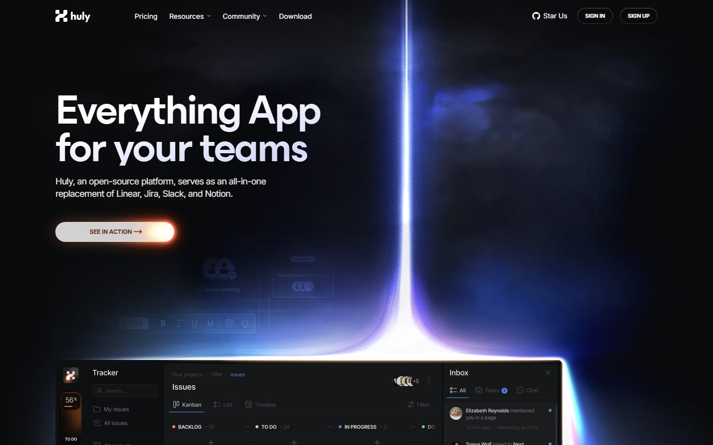
A cinematic, dark-mode developer-product interface anchored on a near-black cosmic canvas (#090a0c) with a luminous blue-to-lavender light beam as the hero centerpiece. The system reads as ambitious, technical, and premium open-source — oversized condensed display headlines with aggressive negative tracking, pill-shaped buttons, glowing CTA treatments, and real product-UI chrome (the Huly tracker/inbox) shown directly in the hero. Brand voltage comes from the light-beam imagery and the orange-glow CTA against an otherwise monochrome dark surface, with alternating dark and light editorial bands down the page.
---
version: alpha
name: Huly-design-analysis
description: A cinematic, dark-mode developer-product interface anchored on a near-black cosmic canvas (#090a0c) with a luminous blue-to-lavender light beam as the hero centerpiece. The system reads as ambitious, technical, and premium open-source — oversized condensed display headlines with aggressive negative tracking, pill-shaped buttons, glowing CTA treatments, and real product-UI chrome (the Huly tracker/inbox) shown directly in the hero. Brand voltage comes from the light-beam imagery and the orange-glow CTA against an otherwise monochrome dark surface, with alternating dark and light editorial bands down the page.

colors:
  canvas: "#090a0c"
  surface-dark: "#0b0d10"
  surface-elevated: "#18191b"
  surface-soft: "#2d2f31"
  surface-light: "#e5e7eb"
  surface-light-soft: "#d9d9d9"
  hairline: "#303236"
  hairline-light: "#d1d5db"
  neutral-strong: "#61656b"
  ink: "#ffffff"
  ink-dark: "#0b0d10"
  ink-slate: "#374151"
  ink-indigo: "#111827"
  body: "#95979e"
  muted: "#9ca3af"
  muted-soft: "#797d86"
  on-primary: "#ffffff"
  accent-lavender: "#dcdbff"
  accent-blue: "#5683da"
  accent-orange: "#ff8964"
  accent-orange-deep: "#5a250a"
  black: "#000000"

typography:
  display-xl:
    fontFamily: "Huly Display, Inter, sans-serif"
    fontSize: 84px
    fontWeight: 600
    lineHeight: 0.9
    letterSpacing: -3.36px
  display-lg:
    fontFamily: "Huly Display, Inter, sans-serif"
    fontSize: 80px
    fontWeight: 600
    lineHeight: 0.8
    letterSpacing: -4px
  title-md:
    fontFamily: "Huly Display, Inter, sans-serif"
    fontSize: 28px
    fontWeight: 400
    lineHeight: 1.0
    letterSpacing: -0.56px
  body-md:
    fontFamily: "Inter, sans-serif"
    fontSize: 18px
    fontWeight: 400
    lineHeight: 1.375
    letterSpacing: -0.72px
  button:
    fontFamily: "Inter, sans-serif"
    fontSize: 14px
    fontWeight: 400
    lineHeight: 1.5
    letterSpacing: 0

rounded:
  xs: 4px
  sm: 6px
  md: 8px
  ml: 10px
  lg: 12px
  xl: 14px
  card: 30px
  full: 9999px

spacing:
  xxs: 6px
  xs: 8px
  sm: 10px
  md: 12px
  lg: 16px
  xl: 20px
  xxl: 24px

components:
  top-nav:
    backgroundColor: "{colors.canvas}"
    textColor: "{colors.ink}"
    typography: "{typography.button}"
  button-primary:
    backgroundColor: "{colors.surface-elevated}"
    textColor: "{colors.on-primary}"
    typography: "{typography.button}"
    rounded: "{rounded.full}"
    padding: 12px
  button-secondary:
    backgroundColor: transparent
    textColor: "{colors.on-primary}"
    typography: "{typography.button}"
    rounded: "{rounded.full}"
    padding: 12px
  button-cta:
    backgroundColor: "{colors.surface-light}"
    textColor: "{colors.ink-dark}"
    typography: "{typography.button}"
    rounded: "{rounded.full}"
    padding: 12px
  nav-link:
    backgroundColor: transparent
    textColor: "{colors.ink}"
    typography: "{typography.button}"
  hero-band:
    backgroundColor: "{colors.canvas}"
    textColor: "{colors.ink}"
    typography: "{typography.display-xl}"
  section-dark:
    backgroundColor: "{colors.canvas}"
    textColor: "{colors.ink}"
    typography: "{typography.display-lg}"
  section-light:
    backgroundColor: "{colors.surface-light}"
    textColor: "{colors.ink-dark}"
    typography: "{typography.display-lg}"
  feature-card:
    backgroundColor: "{colors.black}"
    textColor: "{colors.ink}"
    typography: "{typography.title-md}"
    rounded: "{rounded.xl}"
    padding: 24px
  product-ui-card:
    backgroundColor: "{colors.surface-dark}"
    textColor: "{colors.body}"
    rounded: "{rounded.lg}"
  icon-button-round:
    backgroundColor: "{colors.surface-soft}"
    textColor: "{colors.ink}"
    rounded: "{rounded.full}"
  avatar-circle:
    backgroundColor: "{colors.surface-soft}"
    textColor: "{colors.ink}"
    rounded: "{rounded.full}"
  feature-label:
    backgroundColor: transparent
    textColor: "{colors.body}"
    typography: "{typography.body-md}"
  footer:
    backgroundColor: "{colors.canvas}"
    textColor: "{colors.hairline}"
    typography: "{typography.body-md}"

---

## Overview

Huly's marketing surface is a cinematic dark-mode developer-product interface built on a near-black cosmic canvas (`{colors.canvas}` — #090a0c). The hero centerpiece is a vertical light beam that explodes from a horizon line, washing blue-to-lavender (`{colors.accent-blue}` — #5683da, `{colors.accent-lavender}` — #dcdbff) across an otherwise monochrome dark field. Real product chrome — the Huly tracker, kanban board, and inbox panels — is shown directly beneath the hero rather than abstracted into illustration.

The type voice is dominated by a **custom condensed display face** (captured under the obfuscated build name `__esbuild_b38aaf` and documented here as "Huly Display"). It runs at extreme scale (84px h1, 80px h2) with weight 600 and aggressive negative tracking (-3.36px to -4px) and ultra-tight leading (0.8–0.9). Body and UI copy fall to **Inter** at 18px / 14px. The contrast between huge condensed display and modest Inter body is the system's primary editorial tension.

Component voltage comes from two places: the **orange-glow CTA** (the "SEE IN ACTION" pill, washed in `{colors.accent-orange}` — #ff8964 and `{colors.accent-orange-deep}` — #5a250a glow) and the **embedded product UI** shown at scale. Buttons are pill-shaped (`{rounded.full}`). The page alternates between dark bands (`{colors.canvas}`) and light bands (`{colors.surface-light}` — #e5e7eb) as it scrolls — "Unmatched productivity" and "Work together" sit on light, "Sync with GitHub" returns to near-black.

**Key Characteristics:**
- Near-black cosmic canvas (`{colors.canvas}` — #090a0c) with a luminous blue/lavender light-beam as the hero's defining image.
- Oversized custom condensed display type — 84px / 80px at weight 600 with -3.36 to -4px tracking and sub-1.0 line-height. The single loudest brand signal.
- Pill-everything geometry — buttons, avatars, icon buttons, and tag chips use `{rounded.full}` (9999px). Cards round at `{rounded.xl}` (14px) or `{rounded.card}` (30px).
- The orange-glow CTA — a light pill (`{colors.surface-light}`) wrapped in an `{colors.accent-orange}` halo, the only warm color in an otherwise cool-monochrome system.
- Real product UI fragments (tracker / kanban / inbox) shown directly beneath the hero — Huly shows the product, not a painting of it.
- Alternating dark/light editorial bands down the page give the long scroll a deliberate rhythm.
- Inter handles all body and UI copy at 18px (body) and 14px (buttons/nav); the display face is reserved for headlines only.

## Colors

### Brand & Accent
- **Accent Blue** (`{colors.accent-blue}` — #5683da): The cool light-beam tone and small in-product accents (status dots, links inside the product UI).
- **Accent Lavender** (`{colors.accent-lavender}` — #dcdbff): The pale top of the hero light-beam gradient and the lighter wash on display headlines.
- **Accent Orange** (`{colors.accent-orange}` — #ff8964): The signature warm glow around the primary CTA pill — the only warm color in the system.
- **Accent Orange Deep** (`{colors.accent-orange-deep}` — #5a250a): The darker edge of the CTA glow gradient.

### Surface
- **Canvas** (`{colors.canvas}` — #090a0c): The default page floor and the dark editorial bands.
- **Surface Dark** (`{colors.surface-dark}` — #0b0d10): Slightly raised dark panels and the embedded product-UI background.
- **Surface Elevated** (`{colors.surface-elevated}` — #18191b): Raised dark controls — the "Sign Up" pill and small chips.
- **Surface Soft** (`{colors.surface-soft}` — #2d2f31): Round icon buttons and avatar fills on dark.
- **Black** (`{colors.black}` — #000000): The feature-card fills inside the light "Unmatched productivity" band (black-on-light contrast).
- **Surface Light** (`{colors.surface-light}` — #e5e7eb): The light editorial bands ("Unmatched productivity", "Work together") and the CTA pill fill.
- **Surface Light Soft** (`{colors.surface-light-soft}` — #d9d9d9): A secondary light panel tone.
- **Hairline** (`{colors.hairline}` — #303236): The dominant border / divider tone on dark surfaces; also the measured anchor-link color.
- **Hairline Light** (`{colors.hairline-light}` — #d1d5db): Divider tone on light bands.

### Text
- **Ink** (`{colors.ink}` — #ffffff): Headlines and primary text on dark surfaces.
- **Ink Dark** (`{colors.ink-dark}` — #0b0d10): Headlines and primary text on light bands.
- **Ink Indigo** (`{colors.ink-indigo}` — #111827): A darker slate used for emphasis text on light.
- **Ink Slate** (`{colors.ink-slate}` — #374151): Secondary text on light bands.
- **Body** (`{colors.body}` — #95979e): Default running-text on dark.
- **Muted** (`{colors.muted}` — #9ca3af): Secondary / supporting text.
- **Muted Soft** (`{colors.muted-soft}` — #797d86): Tertiary captions and fine print.
- **Neutral Strong** (`{colors.neutral-strong}` — #61656b): Low-emphasis labels and disabled-feeling text.
- **On Primary** (`{colors.on-primary}` — #ffffff): Text on dark pill buttons.

No dedicated semantic success/warning/error tokens were measured — see Known Gaps.

## Typography

### Font Family
The display face was captured under an obfuscated build identifier (`__esbuild_b38aaf`) and is documented here as **"Huly Display"** — a tightly-tracked condensed geometric face used for h1/h2/h3 only. Because the literal build name is not a distributable web font, treat "Huly Display" as the brand display role and substitute when it is unavailable. Body and UI text run **Inter** (captured as `__Inter_f367f3`).

The split is strict:
- Huly Display (600 weight for h1/h2, 400 for h3, -0.56 to -4px tracking) — headlines only.
- Inter (400 weight, 18px body / 14px UI) — paragraphs, buttons, nav, labels.

### Hierarchy

| Token | Size | Weight | Line Height | Letter Spacing | Use |
|---|---|---|---|---|---|
| `{typography.display-xl}` | 84px | 600 | 0.9 | -3.36px | Hero h1 ("Everything App for your teams") — Huly Display |
| `{typography.display-lg}` | 80px | 600 | 0.8 | -4px | Section heads ("Unmatched productivity", "Sync with GitHub") — Huly Display |
| `{typography.title-md}` | 28px | 400 | 1.0 | -0.56px | Sub-section heads / large supporting lines — Huly Display |
| `{typography.body-md}` | 18px | 400 | 1.375 | -0.72px | Default running-text and feature descriptions — Inter |
| `{typography.button}` | 14px | 400 | 1.5 | 0 | Buttons, nav links, small labels — Inter |

### Principles
The display face is the brand voice — every large headline uses it at its measured negative tracking. The combination of weight 600, sub-1.0 line-height, and -3.36 to -4px letter-spacing produces the dense, monumental headline block that defines the page; loosening any of these reads as off-brand. Body copy never adopts the display face, and headlines never fall back to Inter.

Note the unusually large negative tracking on body too (-0.72px at 18px) — Huly tightens type globally, not only on headlines.

### Note on Font Substitutes
"Huly Display" is delivered as an obfuscated, build-bundled font and is not published as a public web font. A usable open-source substitute is **Inter** at weight 600 with roughly -0.04em letter-spacing, or **Anton** / **Archivo Narrow** weight 700 if the condensed character is essential. None reproduce the exact letterforms, but Inter 600 preserves the weight + tight-tracking signature for the display roles. Inter is shipped directly for all body and UI roles.

## Layout

### Spacing System
- **Base unit:** approximately 4–6px (the measured scale is dense and not a strict 4px multiple set).
- **Tokens:** `{spacing.xxs}` 6px · `{spacing.xs}` 8px · `{spacing.sm}` 10px · `{spacing.md}` 12px · `{spacing.lg}` 16px · `{spacing.xl}` 20px · `{spacing.xxl}` 24px.
- **Most frequent values:** 8px and 10px (both measured 19×) dominate inline gaps; 12px and 20px are the common padding steps.
- **Card internal padding:** `{spacing.xxl}` (24px) on feature cards (derived from the 24px measured step and screenshot ground-truth).

Larger section-level vertical rhythm (the generous gaps between bands visible in the screenshots) was not captured as discrete tokens — see Known Gaps.

### Grid & Container
- **Editorial body:** Hero uses a left-aligned headline + CTA column with the product-UI artifact spanning full width beneath.
- **Feature grids:** "Unmatched productivity" uses a 2×2 black-card grid on the light band; "Sync with GitHub" uses a 3-column feature-label grid on dark.
- **Virtual-office band** ("Work together") uses a centered 3-up feature row.

Exact container max-width and column counts were not measured.

### Whitespace Philosophy
The dark bands lean on negative space and the light-beam imagery to carry the hero; the light bands pack feature cards more densely. The alternation between airy dark and denser light bands paces the long scroll.

## Elevation & Depth

| Level | Treatment | Use |
|---|---|---|
| Flat | No shadow | Body text, nav, dark editorial bands |
| Soft drop | `0 4px 6px rgba(0,0,0,0.15)` | Small raised controls and chips |
| Medium drop | `0 4px 16px rgba(0,0,0,0.35)` | Cards and product-UI panels |
| Deep drop | `0 6px 25px rgba(0,0,0,0.5)` / `0 14px 20px rgba(0,0,0,0.5)` | The hero product-UI artifact lifting off the canvas |
| Glow ring | `0 0 0 6px rgba(255,255,255,0.4)` | Focus / emphasis halo around round controls and selection dots |

The measured shadow set is heavy and dark-tuned — alphas run 0.15 to 0.5 because shadows must register against the near-black canvas. The deep `0 14px 20px rgba(0,0,0,0.5)` and `0 6px 25px rgba(0,0,0,0.5)` treatments float the product-UI mock above the hero floor.

### Decorative Depth
- The hero light-beam is the system's primary depth device — it is an image, not a token, but it functions as the page's main "elevation."
- The white glow ring (`0 0 0 6px rgba(255,255,255,0.4)`) appears on round selection dots and small controls — a soft focus halo rather than a hard outline.
- The CTA pill carries an orange radial glow (`{colors.accent-orange}` → `{colors.accent-orange-deep}`) that reads as emissive rather than as a drop shadow.

## Shapes

### Border Radius Scale

| Token | Value | Use |
|---|---|---|
| `{rounded.xs}` | 4px | Smallest inline accents |
| `{rounded.sm}` | 6px | Small chips / inputs |
| `{rounded.md}` | 8px | Standard small controls (6 measured) |
| `{rounded.ml}` | 10px | Mid panels |
| `{rounded.lg}` | 12px | Product-UI panels and mid cards (7 measured) |
| `{rounded.xl}` | 14px | Feature cards (10 measured — the most common card radius) |
| `{rounded.card}` | 30px | Large rounded containers / image panels (8 measured) |
| `{rounded.full}` | 9999px | Buttons, avatars, icon buttons, tag pills (28 measured — the dominant radius) |

### Photography / Artifact Geometry
Pill geometry (`{rounded.full}`) is the single most frequent radius across the system — every button, avatar, and round icon control uses it. Feature cards settle at `{rounded.xl}` (14px); large image/panel containers use `{rounded.card}` (30px). The embedded product-UI fragments retain their own native chrome radii (`{rounded.lg}`-scale grid cells and panels).

## Components

### Navigation

**`top-nav`** — Transparent-over-canvas nav pinned to the top. Carries the Huly wordmark + logo at left, a horizontal menu (Pricing, Resources, Community, Download) center, and a right cluster with "Star Us" (GitHub), "Sign In" (`{component.button-secondary}`), and "Sign Up" (`{component.button-primary}`). Menu items use `{component.nav-link}` in `{typography.button}` (Inter 14px).

**`nav-link`** — Inline nav menu item, transparent background, `{colors.ink}` text, `{typography.button}`.

### Buttons

**`button-primary`** — The "Sign Up" pill. Background `{colors.surface-elevated}` (#18191b), text `{colors.on-primary}`, type `{typography.button}` (Inter 14px), padding 12px, rounded `{rounded.full}`. A dark pill against the dark canvas, defined by its border and weight.

**`button-secondary`** — The "Sign In" pill. Transparent background, `{colors.on-primary}` text, rounded `{rounded.full}`, same padding as primary. Outline/ghost treatment.

**`button-cta`** — The signature "SEE IN ACTION →" hero CTA. Light pill fill (`{colors.surface-light}`), dark label (`{colors.ink-dark}`), rounded `{rounded.full}`, padding 12px, wrapped in an orange radial glow (`{colors.accent-orange}` → `{colors.accent-orange-deep}`). The only warm-glowing element on the page.

### Cards & Containers

**`hero-band`** — Dark-canvas hero with the light-beam image, the display-xl headline at left, sub-copy in `{typography.body-md}`, and the `{component.button-cta}`. Background `{colors.canvas}`, headline `{typography.display-xl}`.

**`section-dark`** — Dark editorial band (e.g., "Sync with GitHub. Both ways."). Background `{colors.canvas}`, headline `{typography.display-lg}`, supporting text `{colors.body}`.

**`section-light`** — Light editorial band (e.g., "Unmatched productivity", "Work together. Like in the office."). Background `{colors.surface-light}` (#e5e7eb), headline `{typography.display-lg}` in `{colors.ink-dark}`.

**`feature-card`** — Black feature cards used in the 2×2 grid on the light band. Background `{colors.black}`, text `{colors.ink}`, rounded `{rounded.xl}` (14px), padding `{spacing.xxl}` (24px). Carries a bold label (e.g., "Keyboard shortcuts.", "Time-blocking.") followed by a short description.

**`product-ui-card`** — The embedded Huly product chrome (Tracker / Kanban / Inbox) shown beneath the hero. Background `{colors.surface-dark}`, text `{colors.body}`, rounded `{rounded.lg}`. Floats on a deep drop shadow. Shows the real application, not a marketing illustration.

**`feature-label`** — Compact three-up feature blurbs on dark bands (e.g., "Two-way synchronization", "Private tasks"). Transparent background, title in `{typography.body-md}`, description in `{colors.body}`.

### Round Controls & Avatars

**`icon-button-round`** — Circular icon button (e.g., the video-call control cluster on the "Work together" band). Background `{colors.surface-soft}`, icon in `{colors.ink}`, rounded `{rounded.full}`.

**`avatar-circle`** — Circular avatar in the product-UI inbox rows and call cluster. Background `{colors.surface-soft}`, rounded `{rounded.full}`.

### Footer

**`footer`** — Closes the page on the dark canvas. Background `{colors.canvas}`, link/divider text in `{colors.hairline}` (the measured anchor color), body in `{typography.body-md}`.

## Do's and Don'ts

### Do
- Keep the canvas near-black (`{colors.canvas}` — #090a0c). The dark field is what makes the light-beam and orange-glow CTA read.
- Use "Huly Display" (or the documented substitute) for every large headline at weight 600 with its measured negative tracking. The tight, monumental headline block is the brand.
- Reserve the orange glow (`{colors.accent-orange}`) for the primary hero CTA only. It is the single warm accent in a cool-monochrome system.
- Show real product UI (`{component.product-ui-card}`) instead of illustrating features abstractly.
- Use pill geometry (`{rounded.full}`) for buttons, avatars, and round icon controls — it is the dominant measured radius.
- Alternate dark (`{component.section-dark}`) and light (`{component.section-light}`) bands to pace the long scroll.
- Tune shadows to dark-surface alphas (0.15–0.5); lighter shadows disappear on the canvas.

### Don't
- Don't put body copy in the display face, and don't set headlines in Inter — the boundary is strict.
- Don't loosen the display tracking; "Huly Display" at default tracking reads as off-brand.
- Don't introduce additional warm accents — orange is scarce and CTA-only.
- Don't place black `{component.feature-card}` fills on dark bands; they are designed for contrast against the light band.
- Don't document hover states — only default and active/pressed are in scope.

## Responsive Behavior

The two captured pages (landing, pricing) were measured at desktop width only. No breakpoint-specific values were extracted, so the guidance below is structural inference from the screenshots and should be confirmed against live measurement.

### Breakpoints

| Name | Width | Key Changes (inferred) |
|---|---|---|
| Mobile | < 768px | Nav collapses to a menu trigger; hero display-xl scales down from 84px; feature grids collapse to 1-up; product-UI artifact scales / scrolls |
| Tablet | 768–1024px | 2×2 feature grid may collapse to 1-up; 3-up feature-label rows go 2-up |
| Desktop | > 1024px | Full nav, full-scale 84px hero, 2×2 and 3-up grids as measured |

### Touch Targets
- `{component.button-primary}` / `{component.button-secondary}` / `{component.button-cta}` use 12px padding on a pill — confirm they reach 44px effective height at mobile.
- `{component.icon-button-round}` and `{component.avatar-circle}` sizes were not measured.

### Collapsing Strategy
- Hero headline scale and the product-UI artifact are the most likely elements to need responsive scaling.
- Feature grids should reduce column count rather than shrink card content.

Exact responsive values are a Known Gap.

## Iteration Guide

1. Focus on ONE component at a time. Reference its YAML key directly (`{component.feature-card}`, `{component.button-cta}`).
2. Variants (`-active`, `-disabled`) live as separate entries in `components:`.
3. Use `{token.refs}` everywhere — never inline a hex in a component.
4. Never document hover. Default and Active/Pressed only.
5. Headlines stay "Huly Display" 600 with negative tracking; body stays Inter. The boundary does not blur.
6. The orange CTA glow is scarce and intentional — don't multiply it.
7. When adding bands, alternate dark/light to keep the established scroll rhythm.

## Known Gaps

- The display typeface was captured only as an obfuscated build name (`__esbuild_b38aaf`); its true name and license are unknown. `fonts_licensed` was empty, but the obfuscated bundle is not a distributable public font — substitutes are documented in Typography. The real letterforms cannot be guaranteed reproduced.
- `button-primary` was measured with `radius: 0px` and `padding: 12px`, which conflicts with the pill-shaped buttons visible in the screenshots and with the dominant `{rounded.full}` (9999px, measured 28×) radius. The documented pill radius is taken from screenshot ground-truth + the dominant measured radius; the 0px reading is treated as a capture anomaly.
- The `card` component was measured as `radius: 9999px, shadow: none`, likely capturing a pill chip rather than a content card; feature-card radius is documented from the more representative `{rounded.xl}` (14px) measurement.
- The light editorial band background is documented as `{colors.surface-light}` (#e5e7eb) from the measured palette; the exact near-white section fill seen in screenshots was not directly captured and may be lighter.
- No semantic success/warning/error colors were measured; in-product status colors (blue dots, etc.) are approximated by `{colors.accent-blue}`.
- Section-level vertical spacing, container max-widths, and grid column counts were not captured as discrete tokens.
- Responsive breakpoints and touch-target sizes were not measured (desktop capture only).
- The pricing page was captured but produced no distinct component or color measurements beyond the landing page; pricing-specific components (tier cards, toggles) are not documented.
- Animation and transition timings (light-beam motion, CTA glow, product-UI reveals) are out of scope.

<!-- Documented by duply · real-world design systems as ready-to-use DESIGN.md for AI coding agents · https://duply.ai/huly/design-md -->
Color Palette
Accent
Neutrals
Typography
display-xl84px · 600 · 0.9
The quick brown fox jumpsdisplay-lg80px · 600 · 0.8
The quick brown fox jumpstitle-md28px · 400 · 1
The quick brown fox jumpsbody-md18px · 400 · 1.375
The quick brown fox jumpsbutton14px · 400 · 1.5
The quick brown fox jumpsSpacing & Shape
Spacing
| Name | Value | Preview |
|---|---|---|
| xxs | 6px | |
| xs | 8px | |
| sm | 10px | |
| md | 12px | |
| lg | 16px | |
| xl | 20px | |
| xxl | 24px |
Border Radius
| Name | Value | Preview |
|---|---|---|
| xs | 4px | |
| sm | 6px | |
| md | 8px | |
| ml | 10px | |
| lg | 12px | |
| xl | 14px | |
| card | 30px | |
| full | 9999px |
More like this


---
version: alpha
name: Huly-design-analysis
description: A cinematic, dark-mode developer-product interface anchored on a near-black cosmic canvas (#090a0c) with a luminous blue-to-lavender light beam as the hero centerpiece. The system reads as ambitious, technical, and premium open-source — oversized condensed display headlines with aggressive negative tracking, pill-shaped buttons, glowing CTA treatments, and real product-UI chrome (the Huly tracker/inbox) shown directly in the hero. Brand voltage comes from the light-beam imagery and the orange-glow CTA against an otherwise monochrome dark surface, with alternating dark and light editorial bands down the page.

colors:
  canvas: "#090a0c"
  surface-dark: "#0b0d10"
  surface-elevated: "#18191b"
  surface-soft: "#2d2f31"
  surface-light: "#e5e7eb"
  surface-light-soft: "#d9d9d9"
  hairline: "#303236"
  hairline-light: "#d1d5db"
  neutral-strong: "#61656b"
  ink: "#ffffff"
  ink-dark: "#0b0d10"
  ink-slate: "#374151"
  ink-indigo: "#111827"
  body: "#95979e"
  muted: "#9ca3af"
  muted-soft: "#797d86"
  on-primary: "#ffffff"
  accent-lavender: "#dcdbff"
  accent-blue: "#5683da"
  accent-orange: "#ff8964"
  accent-orange-deep: "#5a250a"
  black: "#000000"

typography:
  display-xl:
    fontFamily: "Huly Display, Inter, sans-serif"
    fontSize: 84px
    fontWeight: 600
    lineHeight: 0.9
    letterSpacing: -3.36px
  display-lg:
    fontFamily: "Huly Display, Inter, sans-serif"
    fontSize: 80px
    fontWeight: 600
    lineHeight: 0.8
    letterSpacing: -4px
  title-md:
    fontFamily: "Huly Display, Inter, sans-serif"
    fontSize: 28px
    fontWeight: 400
    lineHeight: 1.0
    letterSpacing: -0.56px
  body-md:
    fontFamily: "Inter, sans-serif"
    fontSize: 18px
    fontWeight: 400
    lineHeight: 1.375
    letterSpacing: -0.72px
  button:
    fontFamily: "Inter, sans-serif"
    fontSize: 14px
    fontWeight: 400
    lineHeight: 1.5
    letterSpacing: 0

rounded:
  xs: 4px
  sm: 6px
  md: 8px
  ml: 10px
  lg: 12px
  xl: 14px
  card: 30px
  full: 9999px

spacing:
  xxs: 6px
  xs: 8px
  sm: 10px
  md: 12px
  lg: 16px
  xl: 20px
  xxl: 24px

components:
  top-nav:
    backgroundColor: "{colors.canvas}"
    textColor: "{colors.ink}"
    typography: "{typography.button}"
  button-primary:
    backgroundColor: "{colors.surface-elevated}"
    textColor: "{colors.on-primary}"
    typography: "{typography.button}"
    rounded: "{rounded.full}"
    padding: 12px
  button-secondary:
    backgroundColor: transparent
    textColor: "{colors.on-primary}"
    typography: "{typography.button}"
    rounded: "{rounded.full}"
    padding: 12px
  button-cta:
    backgroundColor: "{colors.surface-light}"
    textColor: "{colors.ink-dark}"
    typography: "{typography.button}"
    rounded: "{rounded.full}"
    padding: 12px
  nav-link:
    backgroundColor: transparent
    textColor: "{colors.ink}"
    typography: "{typography.button}"
  hero-band:
    backgroundColor: "{colors.canvas}"
    textColor: "{colors.ink}"
    typography: "{typography.display-xl}"
  section-dark:
    backgroundColor: "{colors.canvas}"
    textColor: "{colors.ink}"
    typography: "{typography.display-lg}"
  section-light:
    backgroundColor: "{colors.surface-light}"
    textColor: "{colors.ink-dark}"
    typography: "{typography.display-lg}"
  feature-card:
    backgroundColor: "{colors.black}"
    textColor: "{colors.ink}"
    typography: "{typography.title-md}"
    rounded: "{rounded.xl}"
    padding: 24px
  product-ui-card:
    backgroundColor: "{colors.surface-dark}"
    textColor: "{colors.body}"
    rounded: "{rounded.lg}"
  icon-button-round:
    backgroundColor: "{colors.surface-soft}"
    textColor: "{colors.ink}"
    rounded: "{rounded.full}"
  avatar-circle:
    backgroundColor: "{colors.surface-soft}"
    textColor: "{colors.ink}"
    rounded: "{rounded.full}"
  feature-label:
    backgroundColor: transparent
    textColor: "{colors.body}"
    typography: "{typography.body-md}"
  footer:
    backgroundColor: "{colors.canvas}"
    textColor: "{colors.hairline}"
    typography: "{typography.body-md}"

---

## Overview

Huly's marketing surface is a cinematic dark-mode developer-product interface built on a near-black cosmic canvas (`{colors.canvas}` — #090a0c). The hero centerpiece is a vertical light beam that explodes from a horizon line, washing blue-to-lavender (`{colors.accent-blue}` — #5683da, `{colors.accent-lavender}` — #dcdbff) across an otherwise monochrome dark field. Real product chrome — the Huly tracker, kanban board, and inbox panels — is shown directly beneath the hero rather than abstracted into illustration.

The type voice is dominated by a **custom condensed display face** (captured under the obfuscated build name `__esbuild_b38aaf` and documented here as "Huly Display"). It runs at extreme scale (84px h1, 80px h2) with weight 600 and aggressive negative tracking (-3.36px to -4px) and ultra-tight leading (0.8–0.9). Body and UI copy fall to **Inter** at 18px / 14px. The contrast between huge condensed display and modest Inter body is the system's primary editorial tension.

Component voltage comes from two places: the **orange-glow CTA** (the "SEE IN ACTION" pill, washed in `{colors.accent-orange}` — #ff8964 and `{colors.accent-orange-deep}` — #5a250a glow) and the **embedded product UI** shown at scale. Buttons are pill-shaped (`{rounded.full}`). The page alternates between dark bands (`{colors.canvas}`) and light bands (`{colors.surface-light}` — #e5e7eb) as it scrolls — "Unmatched productivity" and "Work together" sit on light, "Sync with GitHub" returns to near-black.

**Key Characteristics:**
- Near-black cosmic canvas (`{colors.canvas}` — #090a0c) with a luminous blue/lavender light-beam as the hero's defining image.
- Oversized custom condensed display type — 84px / 80px at weight 600 with -3.36 to -4px tracking and sub-1.0 line-height. The single loudest brand signal.
- Pill-everything geometry — buttons, avatars, icon buttons, and tag chips use `{rounded.full}` (9999px). Cards round at `{rounded.xl}` (14px) or `{rounded.card}` (30px).
- The orange-glow CTA — a light pill (`{colors.surface-light}`) wrapped in an `{colors.accent-orange}` halo, the only warm color in an otherwise cool-monochrome system.
- Real product UI fragments (tracker / kanban / inbox) shown directly beneath the hero — Huly shows the product, not a painting of it.
- Alternating dark/light editorial bands down the page give the long scroll a deliberate rhythm.
- Inter handles all body and UI copy at 18px (body) and 14px (buttons/nav); the display face is reserved for headlines only.

## Colors

### Brand & Accent
- **Accent Blue** (`{colors.accent-blue}` — #5683da): The cool light-beam tone and small in-product accents (status dots, links inside the product UI).
- **Accent Lavender** (`{colors.accent-lavender}` — #dcdbff): The pale top of the hero light-beam gradient and the lighter wash on display headlines.
- **Accent Orange** (`{colors.accent-orange}` — #ff8964): The signature warm glow around the primary CTA pill — the only warm color in the system.
- **Accent Orange Deep** (`{colors.accent-orange-deep}` — #5a250a): The darker edge of the CTA glow gradient.

### Surface
- **Canvas** (`{colors.canvas}` — #090a0c): The default page floor and the dark editorial bands.
- **Surface Dark** (`{colors.surface-dark}` — #0b0d10): Slightly raised dark panels and the embedded product-UI background.
- **Surface Elevated** (`{colors.surface-elevated}` — #18191b): Raised dark controls — the "Sign Up" pill and small chips.
- **Surface Soft** (`{colors.surface-soft}` — #2d2f31): Round icon buttons and avatar fills on dark.
- **Black** (`{colors.black}` — #000000): The feature-card fills inside the light "Unmatched productivity" band (black-on-light contrast).
- **Surface Light** (`{colors.surface-light}` — #e5e7eb): The light editorial bands ("Unmatched productivity", "Work together") and the CTA pill fill.
- **Surface Light Soft** (`{colors.surface-light-soft}` — #d9d9d9): A secondary light panel tone.
- **Hairline** (`{colors.hairline}` — #303236): The dominant border / divider tone on dark surfaces; also the measured anchor-link color.
- **Hairline Light** (`{colors.hairline-light}` — #d1d5db): Divider tone on light bands.

### Text
- **Ink** (`{colors.ink}` — #ffffff): Headlines and primary text on dark surfaces.
- **Ink Dark** (`{colors.ink-dark}` — #0b0d10): Headlines and primary text on light bands.
- **Ink Indigo** (`{colors.ink-indigo}` — #111827): A darker slate used for emphasis text on light.
- **Ink Slate** (`{colors.ink-slate}` — #374151): Secondary text on light bands.
- **Body** (`{colors.body}` — #95979e): Default running-text on dark.
- **Muted** (`{colors.muted}` — #9ca3af): Secondary / supporting text.
- **Muted Soft** (`{colors.muted-soft}` — #797d86): Tertiary captions and fine print.
- **Neutral Strong** (`{colors.neutral-strong}` — #61656b): Low-emphasis labels and disabled-feeling text.
- **On Primary** (`{colors.on-primary}` — #ffffff): Text on dark pill buttons.

No dedicated semantic success/warning/error tokens were measured — see Known Gaps.

## Typography

### Font Family
The display face was captured under an obfuscated build identifier (`__esbuild_b38aaf`) and is documented here as **"Huly Display"** — a tightly-tracked condensed geometric face used for h1/h2/h3 only. Because the literal build name is not a distributable web font, treat "Huly Display" as the brand display role and substitute when it is unavailable. Body and UI text run **Inter** (captured as `__Inter_f367f3`).

The split is strict:
- Huly Display (600 weight for h1/h2, 400 for h3, -0.56 to -4px tracking) — headlines only.
- Inter (400 weight, 18px body / 14px UI) — paragraphs, buttons, nav, labels.

### Hierarchy

| Token | Size | Weight | Line Height | Letter Spacing | Use |
|---|---|---|---|---|---|
| `{typography.display-xl}` | 84px | 600 | 0.9 | -3.36px | Hero h1 ("Everything App for your teams") — Huly Display |
| `{typography.display-lg}` | 80px | 600 | 0.8 | -4px | Section heads ("Unmatched productivity", "Sync with GitHub") — Huly Display |
| `{typography.title-md}` | 28px | 400 | 1.0 | -0.56px | Sub-section heads / large supporting lines — Huly Display |
| `{typography.body-md}` | 18px | 400 | 1.375 | -0.72px | Default running-text and feature descriptions — Inter |
| `{typography.button}` | 14px | 400 | 1.5 | 0 | Buttons, nav links, small labels — Inter |

### Principles
The display face is the brand voice — every large headline uses it at its measured negative tracking. The combination of weight 600, sub-1.0 line-height, and -3.36 to -4px letter-spacing produces the dense, monumental headline block that defines the page; loosening any of these reads as off-brand. Body copy never adopts the display face, and headlines never fall back to Inter.

Note the unusually large negative tracking on body too (-0.72px at 18px) — Huly tightens type globally, not only on headlines.

### Note on Font Substitutes
"Huly Display" is delivered as an obfuscated, build-bundled font and is not published as a public web font. A usable open-source substitute is **Inter** at weight 600 with roughly -0.04em letter-spacing, or **Anton** / **Archivo Narrow** weight 700 if the condensed character is essential. None reproduce the exact letterforms, but Inter 600 preserves the weight + tight-tracking signature for the display roles. Inter is shipped directly for all body and UI roles.

## Layout

### Spacing System
- **Base unit:** approximately 4–6px (the measured scale is dense and not a strict 4px multiple set).
- **Tokens:** `{spacing.xxs}` 6px · `{spacing.xs}` 8px · `{spacing.sm}` 10px · `{spacing.md}` 12px · `{spacing.lg}` 16px · `{spacing.xl}` 20px · `{spacing.xxl}` 24px.
- **Most frequent values:** 8px and 10px (both measured 19×) dominate inline gaps; 12px and 20px are the common padding steps.
- **Card internal padding:** `{spacing.xxl}` (24px) on feature cards (derived from the 24px measured step and screenshot ground-truth).

Larger section-level vertical rhythm (the generous gaps between bands visible in the screenshots) was not captured as discrete tokens — see Known Gaps.

### Grid & Container
- **Editorial body:** Hero uses a left-aligned headline + CTA column with the product-UI artifact spanning full width beneath.
- **Feature grids:** "Unmatched productivity" uses a 2×2 black-card grid on the light band; "Sync with GitHub" uses a 3-column feature-label grid on dark.
- **Virtual-office band** ("Work together") uses a centered 3-up feature row.

Exact container max-width and column counts were not measured.

### Whitespace Philosophy
The dark bands lean on negative space and the light-beam imagery to carry the hero; the light bands pack feature cards more densely. The alternation between airy dark and denser light bands paces the long scroll.

## Elevation & Depth

| Level | Treatment | Use |
|---|---|---|
| Flat | No shadow | Body text, nav, dark editorial bands |
| Soft drop | `0 4px 6px rgba(0,0,0,0.15)` | Small raised controls and chips |
| Medium drop | `0 4px 16px rgba(0,0,0,0.35)` | Cards and product-UI panels |
| Deep drop | `0 6px 25px rgba(0,0,0,0.5)` / `0 14px 20px rgba(0,0,0,0.5)` | The hero product-UI artifact lifting off the canvas |
| Glow ring | `0 0 0 6px rgba(255,255,255,0.4)` | Focus / emphasis halo around round controls and selection dots |

The measured shadow set is heavy and dark-tuned — alphas run 0.15 to 0.5 because shadows must register against the near-black canvas. The deep `0 14px 20px rgba(0,0,0,0.5)` and `0 6px 25px rgba(0,0,0,0.5)` treatments float the product-UI mock above the hero floor.

### Decorative Depth
- The hero light-beam is the system's primary depth device — it is an image, not a token, but it functions as the page's main "elevation."
- The white glow ring (`0 0 0 6px rgba(255,255,255,0.4)`) appears on round selection dots and small controls — a soft focus halo rather than a hard outline.
- The CTA pill carries an orange radial glow (`{colors.accent-orange}` → `{colors.accent-orange-deep}`) that reads as emissive rather than as a drop shadow.

## Shapes

### Border Radius Scale

| Token | Value | Use |
|---|---|---|
| `{rounded.xs}` | 4px | Smallest inline accents |
| `{rounded.sm}` | 6px | Small chips / inputs |
| `{rounded.md}` | 8px | Standard small controls (6 measured) |
| `{rounded.ml}` | 10px | Mid panels |
| `{rounded.lg}` | 12px | Product-UI panels and mid cards (7 measured) |
| `{rounded.xl}` | 14px | Feature cards (10 measured — the most common card radius) |
| `{rounded.card}` | 30px | Large rounded containers / image panels (8 measured) |
| `{rounded.full}` | 9999px | Buttons, avatars, icon buttons, tag pills (28 measured — the dominant radius) |

### Photography / Artifact Geometry
Pill geometry (`{rounded.full}`) is the single most frequent radius across the system — every button, avatar, and round icon control uses it. Feature cards settle at `{rounded.xl}` (14px); large image/panel containers use `{rounded.card}` (30px). The embedded product-UI fragments retain their own native chrome radii (`{rounded.lg}`-scale grid cells and panels).

## Components

### Navigation

**`top-nav`** — Transparent-over-canvas nav pinned to the top. Carries the Huly wordmark + logo at left, a horizontal menu (Pricing, Resources, Community, Download) center, and a right cluster with "Star Us" (GitHub), "Sign In" (`{component.button-secondary}`), and "Sign Up" (`{component.button-primary}`). Menu items use `{component.nav-link}` in `{typography.button}` (Inter 14px).

**`nav-link`** — Inline nav menu item, transparent background, `{colors.ink}` text, `{typography.button}`.

### Buttons

**`button-primary`** — The "Sign Up" pill. Background `{colors.surface-elevated}` (#18191b), text `{colors.on-primary}`, type `{typography.button}` (Inter 14px), padding 12px, rounded `{rounded.full}`. A dark pill against the dark canvas, defined by its border and weight.

**`button-secondary`** — The "Sign In" pill. Transparent background, `{colors.on-primary}` text, rounded `{rounded.full}`, same padding as primary. Outline/ghost treatment.

**`button-cta`** — The signature "SEE IN ACTION →" hero CTA. Light pill fill (`{colors.surface-light}`), dark label (`{colors.ink-dark}`), rounded `{rounded.full}`, padding 12px, wrapped in an orange radial glow (`{colors.accent-orange}` → `{colors.accent-orange-deep}`). The only warm-glowing element on the page.

### Cards & Containers

**`hero-band`** — Dark-canvas hero with the light-beam image, the display-xl headline at left, sub-copy in `{typography.body-md}`, and the `{component.button-cta}`. Background `{colors.canvas}`, headline `{typography.display-xl}`.

**`section-dark`** — Dark editorial band (e.g., "Sync with GitHub. Both ways."). Background `{colors.canvas}`, headline `{typography.display-lg}`, supporting text `{colors.body}`.

**`section-light`** — Light editorial band (e.g., "Unmatched productivity", "Work together. Like in the office."). Background `{colors.surface-light}` (#e5e7eb), headline `{typography.display-lg}` in `{colors.ink-dark}`.

**`feature-card`** — Black feature cards used in the 2×2 grid on the light band. Background `{colors.black}`, text `{colors.ink}`, rounded `{rounded.xl}` (14px), padding `{spacing.xxl}` (24px). Carries a bold label (e.g., "Keyboard shortcuts.", "Time-blocking.") followed by a short description.

**`product-ui-card`** — The embedded Huly product chrome (Tracker / Kanban / Inbox) shown beneath the hero. Background `{colors.surface-dark}`, text `{colors.body}`, rounded `{rounded.lg}`. Floats on a deep drop shadow. Shows the real application, not a marketing illustration.

**`feature-label`** — Compact three-up feature blurbs on dark bands (e.g., "Two-way synchronization", "Private tasks"). Transparent background, title in `{typography.body-md}`, description in `{colors.body}`.

### Round Controls & Avatars

**`icon-button-round`** — Circular icon button (e.g., the video-call control cluster on the "Work together" band). Background `{colors.surface-soft}`, icon in `{colors.ink}`, rounded `{rounded.full}`.

**`avatar-circle`** — Circular avatar in the product-UI inbox rows and call cluster. Background `{colors.surface-soft}`, rounded `{rounded.full}`.

### Footer

**`footer`** — Closes the page on the dark canvas. Background `{colors.canvas}`, link/divider text in `{colors.hairline}` (the measured anchor color), body in `{typography.body-md}`.

## Do's and Don'ts

### Do
- Keep the canvas near-black (`{colors.canvas}` — #090a0c). The dark field is what makes the light-beam and orange-glow CTA read.
- Use "Huly Display" (or the documented substitute) for every large headline at weight 600 with its measured negative tracking. The tight, monumental headline block is the brand.
- Reserve the orange glow (`{colors.accent-orange}`) for the primary hero CTA only. It is the single warm accent in a cool-monochrome system.
- Show real product UI (`{component.product-ui-card}`) instead of illustrating features abstractly.
- Use pill geometry (`{rounded.full}`) for buttons, avatars, and round icon controls — it is the dominant measured radius.
- Alternate dark (`{component.section-dark}`) and light (`{component.section-light}`) bands to pace the long scroll.
- Tune shadows to dark-surface alphas (0.15–0.5); lighter shadows disappear on the canvas.

### Don't
- Don't put body copy in the display face, and don't set headlines in Inter — the boundary is strict.
- Don't loosen the display tracking; "Huly Display" at default tracking reads as off-brand.
- Don't introduce additional warm accents — orange is scarce and CTA-only.
- Don't place black `{component.feature-card}` fills on dark bands; they are designed for contrast against the light band.
- Don't document hover states — only default and active/pressed are in scope.

## Responsive Behavior

The two captured pages (landing, pricing) were measured at desktop width only. No breakpoint-specific values were extracted, so the guidance below is structural inference from the screenshots and should be confirmed against live measurement.

### Breakpoints

| Name | Width | Key Changes (inferred) |
|---|---|---|
| Mobile | < 768px | Nav collapses to a menu trigger; hero display-xl scales down from 84px; feature grids collapse to 1-up; product-UI artifact scales / scrolls |
| Tablet | 768–1024px | 2×2 feature grid may collapse to 1-up; 3-up feature-label rows go 2-up |
| Desktop | > 1024px | Full nav, full-scale 84px hero, 2×2 and 3-up grids as measured |

### Touch Targets
- `{component.button-primary}` / `{component.button-secondary}` / `{component.button-cta}` use 12px padding on a pill — confirm they reach 44px effective height at mobile.
- `{component.icon-button-round}` and `{component.avatar-circle}` sizes were not measured.

### Collapsing Strategy
- Hero headline scale and the product-UI artifact are the most likely elements to need responsive scaling.
- Feature grids should reduce column count rather than shrink card content.

Exact responsive values are a Known Gap.

## Iteration Guide

1. Focus on ONE component at a time. Reference its YAML key directly (`{component.feature-card}`, `{component.button-cta}`).
2. Variants (`-active`, `-disabled`) live as separate entries in `components:`.
3. Use `{token.refs}` everywhere — never inline a hex in a component.
4. Never document hover. Default and Active/Pressed only.
5. Headlines stay "Huly Display" 600 with negative tracking; body stays Inter. The boundary does not blur.
6. The orange CTA glow is scarce and intentional — don't multiply it.
7. When adding bands, alternate dark/light to keep the established scroll rhythm.

## Known Gaps

- The display typeface was captured only as an obfuscated build name (`__esbuild_b38aaf`); its true name and license are unknown. `fonts_licensed` was empty, but the obfuscated bundle is not a distributable public font — substitutes are documented in Typography. The real letterforms cannot be guaranteed reproduced.
- `button-primary` was measured with `radius: 0px` and `padding: 12px`, which conflicts with the pill-shaped buttons visible in the screenshots and with the dominant `{rounded.full}` (9999px, measured 28×) radius. The documented pill radius is taken from screenshot ground-truth + the dominant measured radius; the 0px reading is treated as a capture anomaly.
- The `card` component was measured as `radius: 9999px, shadow: none`, likely capturing a pill chip rather than a content card; feature-card radius is documented from the more representative `{rounded.xl}` (14px) measurement.
- The light editorial band background is documented as `{colors.surface-light}` (#e5e7eb) from the measured palette; the exact near-white section fill seen in screenshots was not directly captured and may be lighter.
- No semantic success/warning/error colors were measured; in-product status colors (blue dots, etc.) are approximated by `{colors.accent-blue}`.
- Section-level vertical spacing, container max-widths, and grid column counts were not captured as discrete tokens.
- Responsive breakpoints and touch-target sizes were not measured (desktop capture only).
- The pricing page was captured but produced no distinct component or color measurements beyond the landing page; pricing-specific components (tier cards, toggles) are not documented.
- Animation and transition timings (light-beam motion, CTA glow, product-UI reveals) are out of scope.

<!-- Documented by duply · real-world design systems as ready-to-use DESIGN.md for AI coding agents · https://duply.ai/huly/design-md -->