Trigger.dev
A dark-mode, developer-platform interface built on a near-black canvas (#121317) with bright lime-green primary CTAs and a green-to-purple brand gradient. The system reads as confident modern devtool — code blocks shown directly inline, tight 4px-radius surfaces, pill-shaped status badges and category chips, Satoshi display headlines paired with Geist UI/body text. Brand voltage comes from the lime-green action color and accent trio (lime, electric purple, magenta-pink) glowing against deep neutral surfaces.
---
version: alpha
name: Trigger.dev-design-analysis
description: A dark-mode, developer-platform interface built on a near-black canvas (#121317) with bright lime-green primary CTAs and a green-to-purple brand gradient. The system reads as confident modern devtool — code blocks shown directly inline, tight 4px-radius surfaces, pill-shaped status badges and category chips, Satoshi display headlines paired with Geist UI/body text. Brand voltage comes from the lime-green action color and accent trio (lime, electric purple, magenta-pink) glowing against deep neutral surfaces.
colors:
accent: "#9c9af2"
accent-lime: "#a8ff53"
accent-lime-soft: "#afec73"
accent-pink: "#e888f8"
accent-blue: "#2563eb"
canvas: "#121317"
surface: "#000000"
surface-deep: "#15171a"
surface-raised: "#1a1b1f"
surface-raised-alt: "#1c1e21"
ink: "#ffffff"
body: "#d7d9dd"
body-soft: "#d4d4d4"
neutral: "#b5b8c0"
neutral-light: "#e5e7eb"
muted: "#878c99"
muted-strong: "#6b7280"
subtle: "#5f6570"
hairline: "#3b3e45"
on-accent: "#111827"
typography:
display:
fontFamily: "Satoshi, Inter, sans-serif"
fontSize: 60px
fontWeight: 600
lineHeight: 1.0
letterSpacing: normal
title-lg:
fontFamily: "Satoshi, Inter, sans-serif"
fontSize: 24px
fontWeight: 600
lineHeight: 1.333
letterSpacing: normal
title-md:
fontFamily: "Satoshi, Inter, sans-serif"
fontSize: 20px
fontWeight: 600
lineHeight: 1.4
letterSpacing: normal
title-sm:
fontFamily: "Satoshi, Inter, sans-serif"
fontSize: 18px
fontWeight: 600
lineHeight: 1.556
letterSpacing: normal
body:
fontFamily: "Geist, system-ui, sans-serif"
fontSize: 16px
fontWeight: 500
lineHeight: 1.5
letterSpacing: normal
button:
fontFamily: "Geist, system-ui, sans-serif"
fontSize: 14px
fontWeight: 400
lineHeight: 1.429
letterSpacing: normal
rounded:
sm: 4px
md: 6px
full: 9999px
spacing:
xxs: 4px
xs: 6px
sm: 8px
md: 12px
lg: 16px
xl: 24px
xxl: 28px
xxxl: 32px
huge: 40px
section-sm: 48px
section: 64px
section-lg: 80px
components:
top-nav:
backgroundColor: "{colors.canvas}"
textColor: "{colors.body}"
typography: "{typography.button}"
nav-link:
backgroundColor: transparent
textColor: "{colors.body}"
typography: "{typography.button}"
button-cta:
backgroundColor: "{colors.accent-lime}"
textColor: "{colors.on-accent}"
typography: "{typography.button}"
rounded: "{rounded.sm}"
padding: 4px 8px
button-ghost:
backgroundColor: transparent
textColor: "{colors.body}"
typography: "{typography.button}"
rounded: "{rounded.sm}"
padding: 4px 8px
pill-badge:
backgroundColor: "{colors.surface}"
textColor: "{colors.body}"
typography: "{typography.button}"
rounded: "{rounded.full}"
padding: 8px 16px
category-chip:
backgroundColor: "{colors.surface-raised}"
textColor: "{colors.body}"
typography: "{typography.button}"
rounded: "{rounded.sm}"
padding: 8px 12px
code-block:
backgroundColor: "{colors.surface}"
textColor: "{colors.body}"
typography: "{typography.button}"
rounded: "{rounded.sm}"
padding: 24px
feature-card:
backgroundColor: "{colors.surface-deep}"
textColor: "{colors.body}"
typography: "{typography.title-sm}"
rounded: "{rounded.sm}"
padding: 24px
status-card:
backgroundColor: "{colors.surface-raised-alt}"
textColor: "{colors.body}"
typography: "{typography.body}"
rounded: "{rounded.sm}"
padding: 16px
hero-band:
backgroundColor: "{colors.canvas}"
textColor: "{colors.ink}"
typography: "{typography.display}"
padding: 80px
footer:
backgroundColor: "{colors.canvas}"
textColor: "{colors.muted}"
typography: "{typography.body}"
padding: 64px
---
## Overview
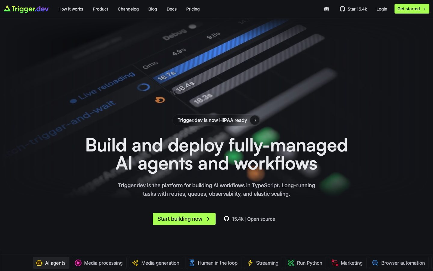
Trigger.dev's marketing surface is a dark-mode developer-platform interface — a near-black canvas (`{colors.canvas}` — #121317) anchoring bright lime-green CTAs (`{colors.accent-lime}` — #a8ff53) and an accent trio of lime, electric purple (`{colors.accent}` — #9c9af2), and magenta-pink (`{colors.accent-pink}` — #e888f8). The system reads as a confident, engineered devtool: code shown directly inline, dense feature grids, pill-shaped status badges, and product UI artifacts (task queues, run timelines, agent diagrams) embedded as evidence rather than decoration.
Type voice splits into two roles: **Satoshi** (the geometric display face — used for h1 through h4 headlines at weight 600) and **Geist** (Vercel's open-source UI sans — used for body copy, buttons, nav, and code-adjacent labels at weight 400–500). The headline h1 lands at 60px with a tight 1.0 line-height, giving the hero a compact, assertive block of display type.
Component voltage comes from **real product chrome shown at small scale** — task-queue lists, run-status pills, agent-orchestration diagrams, and TypeScript code blocks rendered directly into the marketing flow. The brand logo runs a green-to-purple gradient that previews the accent system: lime is the action color, purple and pink are the chromatic seasoning that glows against the deep neutral surfaces.
**Key Characteristics:**
- Dark canvas (`{colors.canvas}` — #121317) with stacked near-black surfaces (`{colors.surface}` #000000, `{colors.surface-deep}` #15171a, `{colors.surface-raised}` #1a1b1f) — depth is built from subtle value steps, not shadows.
- Lime-green primary CTA (`{colors.accent-lime}` — #a8ff53) with dark text (`{colors.on-accent}` — #111827, derived as the on-accent text color from the measured navy accent). The button is tight: `{rounded.sm}` (4px), 4px × 8px padding.
- Satoshi display headlines at 600 weight; Geist for everything else. The h1 (`{typography.display}`) is 60px with a compact 1.0 line-height.
- Pill-shaped badges (`{rounded.full}`) for status flags like "Trigger.dev is now HIPAA ready" and run-state chips inside product UI.
- Category chips along the bottom of the hero (`AI agents`, `Media processing`, `Streaming`, etc.) — small `{rounded.sm}` chips on `{colors.surface-raised}`.
- Accent trio used sparingly: lime for action, purple (`{colors.accent}`) for brand/links, pink (`{colors.accent-pink}`) for section labels and accents inside product diagrams. Blue (`{colors.accent-blue}` — #2563eb) appears inside product UI fragments (timelines, charts).
- Tight radius system: `{rounded.sm}` (4px) for almost everything, `{rounded.full}` for pills and badges. Cards stay sharp and engineered, not soft.
- Single, near-invisible drop shadow in the system — depth is overwhelmingly carried by surface-value layering on the dark canvas.
## Colors
### Brand & Accent
- **Accent / Purple** (`{colors.accent}` — #9c9af2): The most frequent accent (294 occurrences). Used for the purple half of the logo gradient, inline links, and brand moments.
- **Accent Lime** (`{colors.accent-lime}` — #a8ff53): The action color. Primary CTAs ("Start building now", "Get started") and the green half of the logo gradient.
- **Accent Lime Soft** (`{colors.accent-lime-soft}` — #afec73): A slightly muted lime used for secondary green text and labels (e.g. "No servers to manage").
- **Accent Pink** (`{colors.accent-pink}` — #e888f8): Section labels and magenta accents inside product diagrams.
- **Accent Blue** (`{colors.accent-blue}` — #2563eb): Appears inside product UI fragments — run timelines, bar charts, and status highlights. Not used on marketing CTAs.
### Surface
- **Canvas** (`{colors.canvas}` — #121317): The default page floor — a deep cool-neutral near-black.
- **Surface** (`{colors.surface}` — #000000): True black, used for code blocks and pill badges that sit darker than the canvas.
- **Surface Deep** (`{colors.surface-deep}` — #15171a): Low-contrast card surface, just a step above canvas.
- **Surface Raised** (`{colors.surface-raised}` — #1a1b1f): Category chips and raised UI tiles.
- **Surface Raised Alt** (`{colors.surface-raised-alt}` — #1c1e21): Status cards and nested panels.
- **Hairline** (`{colors.hairline}` — #3b3e45): The 1px divider tone on dark surfaces — card outlines, table dividers, chip borders.
### Text
- **Ink** (`{colors.ink}` — #ffffff): Hero headlines and highest-emphasis text.
- **Body** (`{colors.body}` — #d7d9dd): Default running-text color — the most frequent text tone (1408 occurrences).
- **Body Soft** (`{colors.body-soft}` — #d4d4d4): A barely-distinct softer body tone for secondary paragraphs.
- **Neutral** (`{colors.neutral}` — #b5b8c0): Mid-emphasis labels.
- **Neutral Light** (`{colors.neutral-light}` — #e5e7eb): Near-white labels inside product UI.
- **Muted** (`{colors.muted}` — #878c99): Secondary headings, sub-text, low-contrast headers.
- **Muted Strong** (`{colors.muted-strong}` — #6b7280): Tertiary text, fine-print.
- **Subtle** (`{colors.subtle}` — #5f6570): The faintest text tone — captions and disabled labels.
- **On Accent** (`{colors.on-accent}` — #111827): Dark navy text placed on the lime-green CTA. (derived — measured as an accent color and assigned as the button label tone from screenshot ground-truth.)
## Typography
### Font Family
The system runs **Satoshi** (a geometric display sans, variable weight) for headlines h1–h4, and **Geist** (Vercel's open-source UI sans) for body, buttons, navigation, and code-adjacent labels. Neither face was flagged as licensed in the analysis: Satoshi is freely distributable via Fontshare, and Geist is open-source under the SIL Open Font License. The fallback stacks walk `Inter, sans-serif` for Satoshi and `system-ui, sans-serif` for Geist.
The split is functional:
- Satoshi (display, 600 weight) — h1, h2, h3, h4
- Geist (body + UI, 400–500 weight) — paragraphs, buttons, nav, labels
### Hierarchy
| Token | Size | Weight | Line Height | Letter Spacing | Use |
|---|---|---|---|---|---|
| `{typography.display}` | 60px | 600 | 1.0 | normal | Hero h1 ("Build and deploy fully-managed AI agents and workflows") — Satoshi |
| `{typography.title-lg}` | 24px | 600 | 1.333 | normal | h3 section heads ("How it works", "Deploy and scale to any size") — Satoshi |
| `{typography.title-md}` | 20px | 600 | 1.4 | normal | h2 sub-heads — Satoshi |
| `{typography.title-sm}` | 18px | 600 | 1.556 | normal | h4 card titles, feature labels — Satoshi |
| `{typography.body}` | 16px | 500 | 1.5 | normal | Default running-text — Geist |
| `{typography.button}` | 14px | 400 | 1.429 | normal | Button labels, nav links, chip labels, code captions — Geist |
### Principles
Satoshi carries the brand voice — every display headline uses it at weight 600. Geist handles all supporting type. The boundary is strict: never set body copy in Satoshi, never set a display headline in Geist. Note the measured oddity that h2 (20px) renders smaller than h3 (24px) — heading sizes here are role-named in markup, not a strict descending visual scale, so choose the type token by intended size rather than by HTML tag.
### Note on Font Substitutes
Both faces are freely available, so no substitution is strictly required. If Satoshi is unavailable, **Inter** at weight 600 is a usable approximation (Satoshi is more geometric; the substitution preserves weight). If Geist is unavailable, the platform default `system-ui` stack carries body and UI text without visible disruption.
## Layout
### Spacing System
- **Base unit:** ~4px, with a strong secondary cluster at 12px (the single most frequent value, 218 occurrences) and 8px (132 occurrences).
- **Tokens:** `{spacing.xxs}` 4px · `{spacing.xs}` 6px · `{spacing.sm}` 8px · `{spacing.md}` 12px · `{spacing.lg}` 16px · `{spacing.xl}` 24px · `{spacing.xxl}` 28px · `{spacing.xxxl}` 32px · `{spacing.huge}` 40px · `{spacing.section-sm}` 48px · `{spacing.section}` 64px · `{spacing.section-lg}` 80px.
- **Component padding:** `{spacing.md}` (12px) and `{spacing.sm}` (8px) dominate internal padding — tight, dense, devtool-grade.
- **Section rhythm:** `{spacing.section}` (64px) and `{spacing.section-lg}` (80px) between major bands. Larger measured values (160px, 192px) appear once each as outer hero/section breathing room.
### Grid & Container
- **Hero:** Single centered column — full-width background artifact behind a centered headline + sub-line + CTA stack.
- **Feature grids:** Multi-column at desktop (the "Build invincible AI apps" row runs 4-up agent-pattern cards; the "All the tools you need to ship" band runs 3-column link lists: Development / Production / Observability).
- **Product bands:** Mixed 2-up split layouts (task-queue panel left, headline + copy right).
- **Footer:** Multi-column link list at desktop.
### Whitespace Philosophy
Trigger.dev uses a dense, information-forward rhythm — internal padding stays tight (8–12px) so product UI, code, and feature lists read at high density, while section gaps (64–80px) keep the bands legibly separated. The result reads as engineered-and-substantial rather than airy-marketing.
## Elevation & Depth
| Level | Treatment | Use |
|---|---|---|
| Flat (canvas) | `{colors.canvas}` — no border, no shadow | Body sections, top nav, hero |
| Surface step | Darker/lighter near-black fill (`{colors.surface}`, `{colors.surface-deep}`, `{colors.surface-raised}`) | Cards, code blocks, chips, panels — depth by value, not shadow |
| Hairline | 1px `{colors.hairline}` (#3b3e45) border | Card outlines, chip borders, table dividers |
| Subtle drop shadow | `rgba(0,0,0,0.05) 0px 1px 2px` (the single measured shadow) | Rare — applied to one elevated element |
The elevation philosophy is **value-layered dark mode**: the system stacks near-black surfaces (#000000 → #15171a → #1a1b1f → #1c1e21) on the #121317 canvas to build depth, reinforced by 1px hairline borders. Drop shadows are essentially absent — only one faint shadow was measured across all pages.
### Decorative Depth
- The hero background carries a blurred product screenshot (run timeline with "Live reloading", "trigger-and-wait" labels) softened behind the headline — depth from photographic blur, not a system token.
- Product UI fragments (task queues, run charts) carry their own internal chrome and accent colors (blue bars, lime/pink status pills) — these are product, shown as content.
## Shapes
### Border Radius Scale
| Token | Value | Use |
|---|---|---|
| `{rounded.sm}` | 4px | The dominant radius (91 occurrences) — buttons, cards, code blocks, category chips, feature tiles |
| `{rounded.md}` | 6px | Rare (2 occurrences) — occasional inputs / nested elements |
| `{rounded.full}` | 9999px | Pill badges ("HIPAA ready"), status chips, circular icon containers |
### Geometry
The system is sharp and engineered — almost everything sits at `{rounded.sm}` (4px), with `{rounded.full}` reserved for pill-shaped status badges and circular avatar/icon containers. There is no large card radius; the visual register stays precise rather than soft consumer-app.
## Components
### Top Navigation
**`top-nav`** — Dark nav bar on `{colors.canvas}`. Carries the Trigger.dev wordmark + gradient logo at left, a horizontal menu (How it works, Product, Changelog, Blog, Docs, Pricing) center-left, and a right-side cluster: Discord/GitHub star count, "Login" `{component.nav-link}`, and a lime `{component.button-cta}` ("Get started"). Menu items use `{typography.button}` (Geist 14px / 400) in `{colors.body}`.
**`nav-link`** — Inline text link, transparent background, `{colors.body}` text. Used for "Login" and menu items.
### Buttons
**`button-cta`** — The signature primary CTA. Background `{colors.accent-lime}` (#a8ff53), dark text `{colors.on-accent}` (#111827, derived), type `{typography.button}`, padding 4px × 8px, rounded `{rounded.sm}` (4px). Used for "Start building now", "Get started". A small chevron sits to the right of the label.
**`button-ghost`** — Transparent button with `{colors.body}` text, same tight padding (4px × 8px) and `{rounded.sm}` radius. This is the measured generic button (no fill, light-gray label) — used for secondary/utility actions and link-style buttons.
### Badges & Chips
**`pill-badge`** — Fully-rounded status flag (`{rounded.full}`) on `{colors.surface}` (#000000). Used for the hero announcement pill ("Trigger.dev is now HIPAA ready" with a circular chevron) and for run-state pills inside product UI. Text in `{colors.body}`, type `{typography.button}`.
**`category-chip`** — Small `{rounded.sm}` chip on `{colors.surface-raised}` (#1a1b1f) used in the hero's bottom capability row (AI agents, Media processing, Media generation, Human in the loop, Streaming, Run Python, Marketing, Browser automation). Each chip carries a colored icon + `{typography.button}` label in `{colors.body}`. Padding 8px × 12px.
### Cards & Containers
**`hero-band`** — Full-width hero on `{colors.canvas}` with a blurred product screenshot behind a centered headline (`{typography.display}` in `{colors.ink}`), sub-line in `{colors.body}`, and the `{component.button-cta}`. Generous vertical padding (~80px).
**`feature-card`** — Used in feature/agent-pattern grids ("Autonomous agent", "Prompt chaining", "Routing", "Parallelization"). Background `{colors.surface-deep}`, rounded `{rounded.sm}`, internal padding `{spacing.xl}` (24px). Carries a small diagram, a `{typography.title-sm}` title, and a body description + "View example" link.
**`status-card`** — A panel showing real product UI (task queues with run-state pills, alert/error rows, version lists). Background `{colors.surface-raised-alt}` (#1c1e21), rounded `{rounded.sm}`, padding `{spacing.lg}` (16px). The product chrome inside carries its own accent pills (lime/pink/blue states).
**`code-block`** — Inline TypeScript snippet shown directly in the marketing flow (the agent code example, the SDK example near "Reliable by default"). Background `{colors.surface}` (#000000), monospaced product code, rounded `{rounded.sm}`, padding `{spacing.xl}` (24px). Text in `{colors.body}` with syntax color from product chrome.
### Footer
**`footer`** — Dark footer on `{colors.canvas}` closing each page. Multi-column link list in `{colors.muted}` body text (`{typography.body}`), wordmark at top-left. Vertical padding ~64px. The footer stays on the same dark canvas as the body — there is no light-to-dark inversion because the whole system is dark.
## Do's and Don'ts
### Do
- Reserve `{colors.accent-lime}` (#a8ff53) for primary CTAs only. Lime is the single action color — everything else is neutral or seasoned with purple/pink.
- Use Satoshi for every display headline and Geist for body + UI. Never blur the boundary.
- Build depth from surface-value steps (#000000 → #15171a → #1a1b1f → #1c1e21) on the #121317 canvas, reinforced with 1px `{colors.hairline}` borders — not from shadows.
- Show real product UI and TypeScript code inside cards. Trigger.dev demonstrates the platform with actual run timelines, queues, and code, not marketing illustrations.
- Keep radius tight: `{rounded.sm}` (4px) for cards/buttons/chips, `{rounded.full}` for status pills only.
- Use the accent trio sparingly — purple (`{colors.accent}`) for brand/links, pink (`{colors.accent-pink}`) for section labels, blue (`{colors.accent-blue}`) inside product charts.
### Don't
- Don't put accent colors (purple, pink, blue) on the primary CTA — the action layer is lime-only.
- Don't bold display weight past 600 or set body in Satoshi.
- Don't add large card radii — the system is sharp at 4px; soft rounding reads as off-brand.
- Don't rely on drop shadows for elevation — the system carries exactly one faint shadow; depth is value-layered.
- Don't choose a type token by HTML heading tag alone (h2 measures smaller than h3 here) — pick by intended visual size.
- Don't add hover-state styling beyond default and active/pressed.
## Responsive Behavior
### Breakpoints
The analysis captured desktop renders only; breakpoint values were not measured. The following is inferred from the captured layout structure and should be confirmed against a live mobile capture.
| Name | Width | Key Changes (inferred) |
|---|---|---|
| Mobile | < 768px | Hamburger nav; hero headline scales down from 60px; feature grids collapse to 1-up; category-chip row wraps or scrolls; footer columns stack |
| Tablet | 768–1024px | Top nav tightens; feature grids 2-up; product split-panels stack |
| Desktop | 1024–1440px | Full top-nav; multi-column feature/tool grids; 2-up product bands |
| Wide | > 1440px | Same as desktop with more outer breathing room |
### Touch Targets
- `{component.button-cta}` measured at 4px × 8px padding — visually compact; effective tap area should be enlarged on touch surfaces to meet 44px minimums.
- `{component.category-chip}` (8px × 12px padding) and `{component.nav-link}` similarly run tight; confirm tap targets on mobile.
### Collapsing Strategy
- Top nav collapses to a hamburger menu at mobile widths.
- The hero capability chip row (8 chips) wraps or becomes horizontally scrollable on narrow screens.
- Multi-column feature/tool-list bands reduce columns rather than scaling cards.
- Code blocks and product UI panels retain their internal layout and scroll horizontally if needed.
### Image Behavior
- The hero background product screenshot is blurred and cropped behind the headline; it scales with the band.
- Product UI fragments and code blocks keep native proportions; their containers resize.
## Iteration Guide
1. Focus on ONE component at a time. Reference its YAML key directly (`{component.button-cta}`, `{component.feature-card}`).
2. Variants of an existing component (`-active`, `-disabled`, `-focused`) live as separate entries in `components:`.
3. Use `{token.refs}` everywhere — never inline hex.
4. Never document hover. Default and Active/Pressed states only.
5. Display headlines stay Satoshi 600; body + UI stays Geist. The split does not blur.
6. Lime is the only action color. Don't introduce other accents at the CTA layer.
7. When in doubt about emphasis: a brighter text tone (`{colors.body}` → `{colors.ink}`) before a heavier weight.
## Known Gaps
- The measured `card` component reported `background #000000`, `radius 9999px`, `shadow none` — a 9999px radius on a black surface most likely captured a circular icon container or pill badge rather than a rectangular content card. Card geometry is documented from screenshot ground-truth as `{rounded.sm}`; the pill radius is preserved as `{component.pill-badge}`.
- The measured `button-primary` reported only a light-gray text color (#d7d9dd), 4px radius, and 4px × 8px padding with no background — captured as `{component.button-ghost}`. The visible lime CTA's background and dark text color are documented from screenshots; `{colors.on-accent}` (#111827) is assigned as the CTA label tone (derived from a measured accent value).
- Letter-spacing measured as "normal" across all type roles; no explicit tracking values were captured.
- Only one box-shadow was measured (`rgba(0,0,0,0.05) 0 1px 2px`); the element it applies to was not resolved.
- Responsive breakpoints, mobile layouts, and touch-target sizes were not measured (desktop captures only) — the Responsive section is inferred.
- Animation and transition timings (run-status updates, the "How it works" player, hover reveals) are out of scope.
- Form/input states (text inputs, focus, validation) were not extracted — the pages captured contain no sign-up form chrome beyond CTAs.
- Exact accent usage inside product UI fragments (blue charts, pink/lime status pills) reflects product chrome shown as content and may not map to marketing-surface tokens.
<!-- Documented by duply · real-world design systems as ready-to-use DESIGN.md for AI coding agents · https://duply.ai/trigger/design-md -->
Color Palette
Accent
Neutrals
Typography
display60px · 600 · 1
The quick brown fox jumpstitle-lg24px · 600 · 1.333
The quick brown fox jumpstitle-md20px · 600 · 1.4
The quick brown fox jumpstitle-sm18px · 600 · 1.556
The quick brown fox jumpsbody16px · 500 · 1.5
The quick brown fox jumpsbutton14px · 400 · 1.429
The quick brown fox jumpsSpacing & Shape
Spacing
| Name | Value | Preview |
|---|---|---|
| xxs | 4px | |
| xs | 6px | |
| sm | 8px | |
| md | 12px | |
| lg | 16px | |
| xl | 24px | |
| xxl | 28px | |
| xxxl | 32px | |
| huge | 40px | |
| section-sm | 48px | |
| section | 64px | |
| section-lg | 80px |
Border Radius
| Name | Value | Preview |
|---|---|---|
| sm | 4px | |
| md | 6px | |
| full | 9999px |
More like this


---
version: alpha
name: Trigger.dev-design-analysis
description: A dark-mode, developer-platform interface built on a near-black canvas (#121317) with bright lime-green primary CTAs and a green-to-purple brand gradient. The system reads as confident modern devtool — code blocks shown directly inline, tight 4px-radius surfaces, pill-shaped status badges and category chips, Satoshi display headlines paired with Geist UI/body text. Brand voltage comes from the lime-green action color and accent trio (lime, electric purple, magenta-pink) glowing against deep neutral surfaces.
colors:
  accent: "#9c9af2"
  accent-lime: "#a8ff53"
  accent-lime-soft: "#afec73"
  accent-pink: "#e888f8"
  accent-blue: "#2563eb"
  canvas: "#121317"
  surface: "#000000"
  surface-deep: "#15171a"
  surface-raised: "#1a1b1f"
  surface-raised-alt: "#1c1e21"
  ink: "#ffffff"
  body: "#d7d9dd"
  body-soft: "#d4d4d4"
  neutral: "#b5b8c0"
  neutral-light: "#e5e7eb"
  muted: "#878c99"
  muted-strong: "#6b7280"
  subtle: "#5f6570"
  hairline: "#3b3e45"
  on-accent: "#111827"
typography:
  display:
    fontFamily: "Satoshi, Inter, sans-serif"
    fontSize: 60px
    fontWeight: 600
    lineHeight: 1.0
    letterSpacing: normal
  title-lg:
    fontFamily: "Satoshi, Inter, sans-serif"
    fontSize: 24px
    fontWeight: 600
    lineHeight: 1.333
    letterSpacing: normal
  title-md:
    fontFamily: "Satoshi, Inter, sans-serif"
    fontSize: 20px
    fontWeight: 600
    lineHeight: 1.4
    letterSpacing: normal
  title-sm:
    fontFamily: "Satoshi, Inter, sans-serif"
    fontSize: 18px
    fontWeight: 600
    lineHeight: 1.556
    letterSpacing: normal
  body:
    fontFamily: "Geist, system-ui, sans-serif"
    fontSize: 16px
    fontWeight: 500
    lineHeight: 1.5
    letterSpacing: normal
  button:
    fontFamily: "Geist, system-ui, sans-serif"
    fontSize: 14px
    fontWeight: 400
    lineHeight: 1.429
    letterSpacing: normal
rounded:
  sm: 4px
  md: 6px
  full: 9999px
spacing:
  xxs: 4px
  xs: 6px
  sm: 8px
  md: 12px
  lg: 16px
  xl: 24px
  xxl: 28px
  xxxl: 32px
  huge: 40px
  section-sm: 48px
  section: 64px
  section-lg: 80px
components:
  top-nav:
    backgroundColor: "{colors.canvas}"
    textColor: "{colors.body}"
    typography: "{typography.button}"
  nav-link:
    backgroundColor: transparent
    textColor: "{colors.body}"
    typography: "{typography.button}"
  button-cta:
    backgroundColor: "{colors.accent-lime}"
    textColor: "{colors.on-accent}"
    typography: "{typography.button}"
    rounded: "{rounded.sm}"
    padding: 4px 8px
  button-ghost:
    backgroundColor: transparent
    textColor: "{colors.body}"
    typography: "{typography.button}"
    rounded: "{rounded.sm}"
    padding: 4px 8px
  pill-badge:
    backgroundColor: "{colors.surface}"
    textColor: "{colors.body}"
    typography: "{typography.button}"
    rounded: "{rounded.full}"
    padding: 8px 16px
  category-chip:
    backgroundColor: "{colors.surface-raised}"
    textColor: "{colors.body}"
    typography: "{typography.button}"
    rounded: "{rounded.sm}"
    padding: 8px 12px
  code-block:
    backgroundColor: "{colors.surface}"
    textColor: "{colors.body}"
    typography: "{typography.button}"
    rounded: "{rounded.sm}"
    padding: 24px
  feature-card:
    backgroundColor: "{colors.surface-deep}"
    textColor: "{colors.body}"
    typography: "{typography.title-sm}"
    rounded: "{rounded.sm}"
    padding: 24px
  status-card:
    backgroundColor: "{colors.surface-raised-alt}"
    textColor: "{colors.body}"
    typography: "{typography.body}"
    rounded: "{rounded.sm}"
    padding: 16px
  hero-band:
    backgroundColor: "{colors.canvas}"
    textColor: "{colors.ink}"
    typography: "{typography.display}"
    padding: 80px
  footer:
    backgroundColor: "{colors.canvas}"
    textColor: "{colors.muted}"
    typography: "{typography.body}"
    padding: 64px
---

## Overview

Trigger.dev's marketing surface is a dark-mode developer-platform interface — a near-black canvas (`{colors.canvas}` — #121317) anchoring bright lime-green CTAs (`{colors.accent-lime}` — #a8ff53) and an accent trio of lime, electric purple (`{colors.accent}` — #9c9af2), and magenta-pink (`{colors.accent-pink}` — #e888f8). The system reads as a confident, engineered devtool: code shown directly inline, dense feature grids, pill-shaped status badges, and product UI artifacts (task queues, run timelines, agent diagrams) embedded as evidence rather than decoration.

Type voice splits into two roles: **Satoshi** (the geometric display face — used for h1 through h4 headlines at weight 600) and **Geist** (Vercel's open-source UI sans — used for body copy, buttons, nav, and code-adjacent labels at weight 400–500). The headline h1 lands at 60px with a tight 1.0 line-height, giving the hero a compact, assertive block of display type.

Component voltage comes from **real product chrome shown at small scale** — task-queue lists, run-status pills, agent-orchestration diagrams, and TypeScript code blocks rendered directly into the marketing flow. The brand logo runs a green-to-purple gradient that previews the accent system: lime is the action color, purple and pink are the chromatic seasoning that glows against the deep neutral surfaces.

**Key Characteristics:**
- Dark canvas (`{colors.canvas}` — #121317) with stacked near-black surfaces (`{colors.surface}` #000000, `{colors.surface-deep}` #15171a, `{colors.surface-raised}` #1a1b1f) — depth is built from subtle value steps, not shadows.
- Lime-green primary CTA (`{colors.accent-lime}` — #a8ff53) with dark text (`{colors.on-accent}` — #111827, derived as the on-accent text color from the measured navy accent). The button is tight: `{rounded.sm}` (4px), 4px × 8px padding.
- Satoshi display headlines at 600 weight; Geist for everything else. The h1 (`{typography.display}`) is 60px with a compact 1.0 line-height.
- Pill-shaped badges (`{rounded.full}`) for status flags like "Trigger.dev is now HIPAA ready" and run-state chips inside product UI.
- Category chips along the bottom of the hero (`AI agents`, `Media processing`, `Streaming`, etc.) — small `{rounded.sm}` chips on `{colors.surface-raised}`.
- Accent trio used sparingly: lime for action, purple (`{colors.accent}`) for brand/links, pink (`{colors.accent-pink}`) for section labels and accents inside product diagrams. Blue (`{colors.accent-blue}` — #2563eb) appears inside product UI fragments (timelines, charts).
- Tight radius system: `{rounded.sm}` (4px) for almost everything, `{rounded.full}` for pills and badges. Cards stay sharp and engineered, not soft.
- Single, near-invisible drop shadow in the system — depth is overwhelmingly carried by surface-value layering on the dark canvas.

## Colors

### Brand & Accent
- **Accent / Purple** (`{colors.accent}` — #9c9af2): The most frequent accent (294 occurrences). Used for the purple half of the logo gradient, inline links, and brand moments.
- **Accent Lime** (`{colors.accent-lime}` — #a8ff53): The action color. Primary CTAs ("Start building now", "Get started") and the green half of the logo gradient.
- **Accent Lime Soft** (`{colors.accent-lime-soft}` — #afec73): A slightly muted lime used for secondary green text and labels (e.g. "No servers to manage").
- **Accent Pink** (`{colors.accent-pink}` — #e888f8): Section labels and magenta accents inside product diagrams.
- **Accent Blue** (`{colors.accent-blue}` — #2563eb): Appears inside product UI fragments — run timelines, bar charts, and status highlights. Not used on marketing CTAs.

### Surface
- **Canvas** (`{colors.canvas}` — #121317): The default page floor — a deep cool-neutral near-black.
- **Surface** (`{colors.surface}` — #000000): True black, used for code blocks and pill badges that sit darker than the canvas.
- **Surface Deep** (`{colors.surface-deep}` — #15171a): Low-contrast card surface, just a step above canvas.
- **Surface Raised** (`{colors.surface-raised}` — #1a1b1f): Category chips and raised UI tiles.
- **Surface Raised Alt** (`{colors.surface-raised-alt}` — #1c1e21): Status cards and nested panels.
- **Hairline** (`{colors.hairline}` — #3b3e45): The 1px divider tone on dark surfaces — card outlines, table dividers, chip borders.

### Text
- **Ink** (`{colors.ink}` — #ffffff): Hero headlines and highest-emphasis text.
- **Body** (`{colors.body}` — #d7d9dd): Default running-text color — the most frequent text tone (1408 occurrences).
- **Body Soft** (`{colors.body-soft}` — #d4d4d4): A barely-distinct softer body tone for secondary paragraphs.
- **Neutral** (`{colors.neutral}` — #b5b8c0): Mid-emphasis labels.
- **Neutral Light** (`{colors.neutral-light}` — #e5e7eb): Near-white labels inside product UI.
- **Muted** (`{colors.muted}` — #878c99): Secondary headings, sub-text, low-contrast headers.
- **Muted Strong** (`{colors.muted-strong}` — #6b7280): Tertiary text, fine-print.
- **Subtle** (`{colors.subtle}` — #5f6570): The faintest text tone — captions and disabled labels.
- **On Accent** (`{colors.on-accent}` — #111827): Dark navy text placed on the lime-green CTA. (derived — measured as an accent color and assigned as the button label tone from screenshot ground-truth.)

## Typography

### Font Family
The system runs **Satoshi** (a geometric display sans, variable weight) for headlines h1–h4, and **Geist** (Vercel's open-source UI sans) for body, buttons, navigation, and code-adjacent labels. Neither face was flagged as licensed in the analysis: Satoshi is freely distributable via Fontshare, and Geist is open-source under the SIL Open Font License. The fallback stacks walk `Inter, sans-serif` for Satoshi and `system-ui, sans-serif` for Geist.

The split is functional:
- Satoshi (display, 600 weight) — h1, h2, h3, h4
- Geist (body + UI, 400–500 weight) — paragraphs, buttons, nav, labels

### Hierarchy

| Token | Size | Weight | Line Height | Letter Spacing | Use |
|---|---|---|---|---|---|
| `{typography.display}` | 60px | 600 | 1.0 | normal | Hero h1 ("Build and deploy fully-managed AI agents and workflows") — Satoshi |
| `{typography.title-lg}` | 24px | 600 | 1.333 | normal | h3 section heads ("How it works", "Deploy and scale to any size") — Satoshi |
| `{typography.title-md}` | 20px | 600 | 1.4 | normal | h2 sub-heads — Satoshi |
| `{typography.title-sm}` | 18px | 600 | 1.556 | normal | h4 card titles, feature labels — Satoshi |
| `{typography.body}` | 16px | 500 | 1.5 | normal | Default running-text — Geist |
| `{typography.button}` | 14px | 400 | 1.429 | normal | Button labels, nav links, chip labels, code captions — Geist |

### Principles
Satoshi carries the brand voice — every display headline uses it at weight 600. Geist handles all supporting type. The boundary is strict: never set body copy in Satoshi, never set a display headline in Geist. Note the measured oddity that h2 (20px) renders smaller than h3 (24px) — heading sizes here are role-named in markup, not a strict descending visual scale, so choose the type token by intended size rather than by HTML tag.

### Note on Font Substitutes
Both faces are freely available, so no substitution is strictly required. If Satoshi is unavailable, **Inter** at weight 600 is a usable approximation (Satoshi is more geometric; the substitution preserves weight). If Geist is unavailable, the platform default `system-ui` stack carries body and UI text without visible disruption.

## Layout

### Spacing System
- **Base unit:** ~4px, with a strong secondary cluster at 12px (the single most frequent value, 218 occurrences) and 8px (132 occurrences).
- **Tokens:** `{spacing.xxs}` 4px · `{spacing.xs}` 6px · `{spacing.sm}` 8px · `{spacing.md}` 12px · `{spacing.lg}` 16px · `{spacing.xl}` 24px · `{spacing.xxl}` 28px · `{spacing.xxxl}` 32px · `{spacing.huge}` 40px · `{spacing.section-sm}` 48px · `{spacing.section}` 64px · `{spacing.section-lg}` 80px.
- **Component padding:** `{spacing.md}` (12px) and `{spacing.sm}` (8px) dominate internal padding — tight, dense, devtool-grade.
- **Section rhythm:** `{spacing.section}` (64px) and `{spacing.section-lg}` (80px) between major bands. Larger measured values (160px, 192px) appear once each as outer hero/section breathing room.

### Grid & Container
- **Hero:** Single centered column — full-width background artifact behind a centered headline + sub-line + CTA stack.
- **Feature grids:** Multi-column at desktop (the "Build invincible AI apps" row runs 4-up agent-pattern cards; the "All the tools you need to ship" band runs 3-column link lists: Development / Production / Observability).
- **Product bands:** Mixed 2-up split layouts (task-queue panel left, headline + copy right).
- **Footer:** Multi-column link list at desktop.

### Whitespace Philosophy
Trigger.dev uses a dense, information-forward rhythm — internal padding stays tight (8–12px) so product UI, code, and feature lists read at high density, while section gaps (64–80px) keep the bands legibly separated. The result reads as engineered-and-substantial rather than airy-marketing.

## Elevation & Depth

| Level | Treatment | Use |
|---|---|---|
| Flat (canvas) | `{colors.canvas}` — no border, no shadow | Body sections, top nav, hero |
| Surface step | Darker/lighter near-black fill (`{colors.surface}`, `{colors.surface-deep}`, `{colors.surface-raised}`) | Cards, code blocks, chips, panels — depth by value, not shadow |
| Hairline | 1px `{colors.hairline}` (#3b3e45) border | Card outlines, chip borders, table dividers |
| Subtle drop shadow | `rgba(0,0,0,0.05) 0px 1px 2px` (the single measured shadow) | Rare — applied to one elevated element |

The elevation philosophy is **value-layered dark mode**: the system stacks near-black surfaces (#000000 → #15171a → #1a1b1f → #1c1e21) on the #121317 canvas to build depth, reinforced by 1px hairline borders. Drop shadows are essentially absent — only one faint shadow was measured across all pages.

### Decorative Depth
- The hero background carries a blurred product screenshot (run timeline with "Live reloading", "trigger-and-wait" labels) softened behind the headline — depth from photographic blur, not a system token.
- Product UI fragments (task queues, run charts) carry their own internal chrome and accent colors (blue bars, lime/pink status pills) — these are product, shown as content.

## Shapes

### Border Radius Scale

| Token | Value | Use |
|---|---|---|
| `{rounded.sm}` | 4px | The dominant radius (91 occurrences) — buttons, cards, code blocks, category chips, feature tiles |
| `{rounded.md}` | 6px | Rare (2 occurrences) — occasional inputs / nested elements |
| `{rounded.full}` | 9999px | Pill badges ("HIPAA ready"), status chips, circular icon containers |

### Geometry
The system is sharp and engineered — almost everything sits at `{rounded.sm}` (4px), with `{rounded.full}` reserved for pill-shaped status badges and circular avatar/icon containers. There is no large card radius; the visual register stays precise rather than soft consumer-app.

## Components

### Top Navigation

**`top-nav`** — Dark nav bar on `{colors.canvas}`. Carries the Trigger.dev wordmark + gradient logo at left, a horizontal menu (How it works, Product, Changelog, Blog, Docs, Pricing) center-left, and a right-side cluster: Discord/GitHub star count, "Login" `{component.nav-link}`, and a lime `{component.button-cta}` ("Get started"). Menu items use `{typography.button}` (Geist 14px / 400) in `{colors.body}`.

**`nav-link`** — Inline text link, transparent background, `{colors.body}` text. Used for "Login" and menu items.

### Buttons

**`button-cta`** — The signature primary CTA. Background `{colors.accent-lime}` (#a8ff53), dark text `{colors.on-accent}` (#111827, derived), type `{typography.button}`, padding 4px × 8px, rounded `{rounded.sm}` (4px). Used for "Start building now", "Get started". A small chevron sits to the right of the label.

**`button-ghost`** — Transparent button with `{colors.body}` text, same tight padding (4px × 8px) and `{rounded.sm}` radius. This is the measured generic button (no fill, light-gray label) — used for secondary/utility actions and link-style buttons.

### Badges & Chips

**`pill-badge`** — Fully-rounded status flag (`{rounded.full}`) on `{colors.surface}` (#000000). Used for the hero announcement pill ("Trigger.dev is now HIPAA ready" with a circular chevron) and for run-state pills inside product UI. Text in `{colors.body}`, type `{typography.button}`.

**`category-chip`** — Small `{rounded.sm}` chip on `{colors.surface-raised}` (#1a1b1f) used in the hero's bottom capability row (AI agents, Media processing, Media generation, Human in the loop, Streaming, Run Python, Marketing, Browser automation). Each chip carries a colored icon + `{typography.button}` label in `{colors.body}`. Padding 8px × 12px.

### Cards & Containers

**`hero-band`** — Full-width hero on `{colors.canvas}` with a blurred product screenshot behind a centered headline (`{typography.display}` in `{colors.ink}`), sub-line in `{colors.body}`, and the `{component.button-cta}`. Generous vertical padding (~80px).

**`feature-card`** — Used in feature/agent-pattern grids ("Autonomous agent", "Prompt chaining", "Routing", "Parallelization"). Background `{colors.surface-deep}`, rounded `{rounded.sm}`, internal padding `{spacing.xl}` (24px). Carries a small diagram, a `{typography.title-sm}` title, and a body description + "View example" link.

**`status-card`** — A panel showing real product UI (task queues with run-state pills, alert/error rows, version lists). Background `{colors.surface-raised-alt}` (#1c1e21), rounded `{rounded.sm}`, padding `{spacing.lg}` (16px). The product chrome inside carries its own accent pills (lime/pink/blue states).

**`code-block`** — Inline TypeScript snippet shown directly in the marketing flow (the agent code example, the SDK example near "Reliable by default"). Background `{colors.surface}` (#000000), monospaced product code, rounded `{rounded.sm}`, padding `{spacing.xl}` (24px). Text in `{colors.body}` with syntax color from product chrome.

### Footer

**`footer`** — Dark footer on `{colors.canvas}` closing each page. Multi-column link list in `{colors.muted}` body text (`{typography.body}`), wordmark at top-left. Vertical padding ~64px. The footer stays on the same dark canvas as the body — there is no light-to-dark inversion because the whole system is dark.

## Do's and Don'ts

### Do
- Reserve `{colors.accent-lime}` (#a8ff53) for primary CTAs only. Lime is the single action color — everything else is neutral or seasoned with purple/pink.
- Use Satoshi for every display headline and Geist for body + UI. Never blur the boundary.
- Build depth from surface-value steps (#000000 → #15171a → #1a1b1f → #1c1e21) on the #121317 canvas, reinforced with 1px `{colors.hairline}` borders — not from shadows.
- Show real product UI and TypeScript code inside cards. Trigger.dev demonstrates the platform with actual run timelines, queues, and code, not marketing illustrations.
- Keep radius tight: `{rounded.sm}` (4px) for cards/buttons/chips, `{rounded.full}` for status pills only.
- Use the accent trio sparingly — purple (`{colors.accent}`) for brand/links, pink (`{colors.accent-pink}`) for section labels, blue (`{colors.accent-blue}`) inside product charts.

### Don't
- Don't put accent colors (purple, pink, blue) on the primary CTA — the action layer is lime-only.
- Don't bold display weight past 600 or set body in Satoshi.
- Don't add large card radii — the system is sharp at 4px; soft rounding reads as off-brand.
- Don't rely on drop shadows for elevation — the system carries exactly one faint shadow; depth is value-layered.
- Don't choose a type token by HTML heading tag alone (h2 measures smaller than h3 here) — pick by intended visual size.
- Don't add hover-state styling beyond default and active/pressed.

## Responsive Behavior

### Breakpoints
The analysis captured desktop renders only; breakpoint values were not measured. The following is inferred from the captured layout structure and should be confirmed against a live mobile capture.

| Name | Width | Key Changes (inferred) |
|---|---|---|
| Mobile | < 768px | Hamburger nav; hero headline scales down from 60px; feature grids collapse to 1-up; category-chip row wraps or scrolls; footer columns stack |
| Tablet | 768–1024px | Top nav tightens; feature grids 2-up; product split-panels stack |
| Desktop | 1024–1440px | Full top-nav; multi-column feature/tool grids; 2-up product bands |
| Wide | > 1440px | Same as desktop with more outer breathing room |

### Touch Targets
- `{component.button-cta}` measured at 4px × 8px padding — visually compact; effective tap area should be enlarged on touch surfaces to meet 44px minimums.
- `{component.category-chip}` (8px × 12px padding) and `{component.nav-link}` similarly run tight; confirm tap targets on mobile.

### Collapsing Strategy
- Top nav collapses to a hamburger menu at mobile widths.
- The hero capability chip row (8 chips) wraps or becomes horizontally scrollable on narrow screens.
- Multi-column feature/tool-list bands reduce columns rather than scaling cards.
- Code blocks and product UI panels retain their internal layout and scroll horizontally if needed.

### Image Behavior
- The hero background product screenshot is blurred and cropped behind the headline; it scales with the band.
- Product UI fragments and code blocks keep native proportions; their containers resize.

## Iteration Guide

1. Focus on ONE component at a time. Reference its YAML key directly (`{component.button-cta}`, `{component.feature-card}`).
2. Variants of an existing component (`-active`, `-disabled`, `-focused`) live as separate entries in `components:`.
3. Use `{token.refs}` everywhere — never inline hex.
4. Never document hover. Default and Active/Pressed states only.
5. Display headlines stay Satoshi 600; body + UI stays Geist. The split does not blur.
6. Lime is the only action color. Don't introduce other accents at the CTA layer.
7. When in doubt about emphasis: a brighter text tone (`{colors.body}` → `{colors.ink}`) before a heavier weight.

## Known Gaps

- The measured `card` component reported `background #000000`, `radius 9999px`, `shadow none` — a 9999px radius on a black surface most likely captured a circular icon container or pill badge rather than a rectangular content card. Card geometry is documented from screenshot ground-truth as `{rounded.sm}`; the pill radius is preserved as `{component.pill-badge}`.
- The measured `button-primary` reported only a light-gray text color (#d7d9dd), 4px radius, and 4px × 8px padding with no background — captured as `{component.button-ghost}`. The visible lime CTA's background and dark text color are documented from screenshots; `{colors.on-accent}` (#111827) is assigned as the CTA label tone (derived from a measured accent value).
- Letter-spacing measured as "normal" across all type roles; no explicit tracking values were captured.
- Only one box-shadow was measured (`rgba(0,0,0,0.05) 0 1px 2px`); the element it applies to was not resolved.
- Responsive breakpoints, mobile layouts, and touch-target sizes were not measured (desktop captures only) — the Responsive section is inferred.
- Animation and transition timings (run-status updates, the "How it works" player, hover reveals) are out of scope.
- Form/input states (text inputs, focus, validation) were not extracted — the pages captured contain no sign-up form chrome beyond CTAs.
- Exact accent usage inside product UI fragments (blue charts, pink/lime status pills) reflects product chrome shown as content and may not map to marketing-surface tokens.

<!-- Documented by duply · real-world design systems as ready-to-use DESIGN.md for AI coding agents · https://duply.ai/trigger/design-md -->