
CardsAgainstHumanity
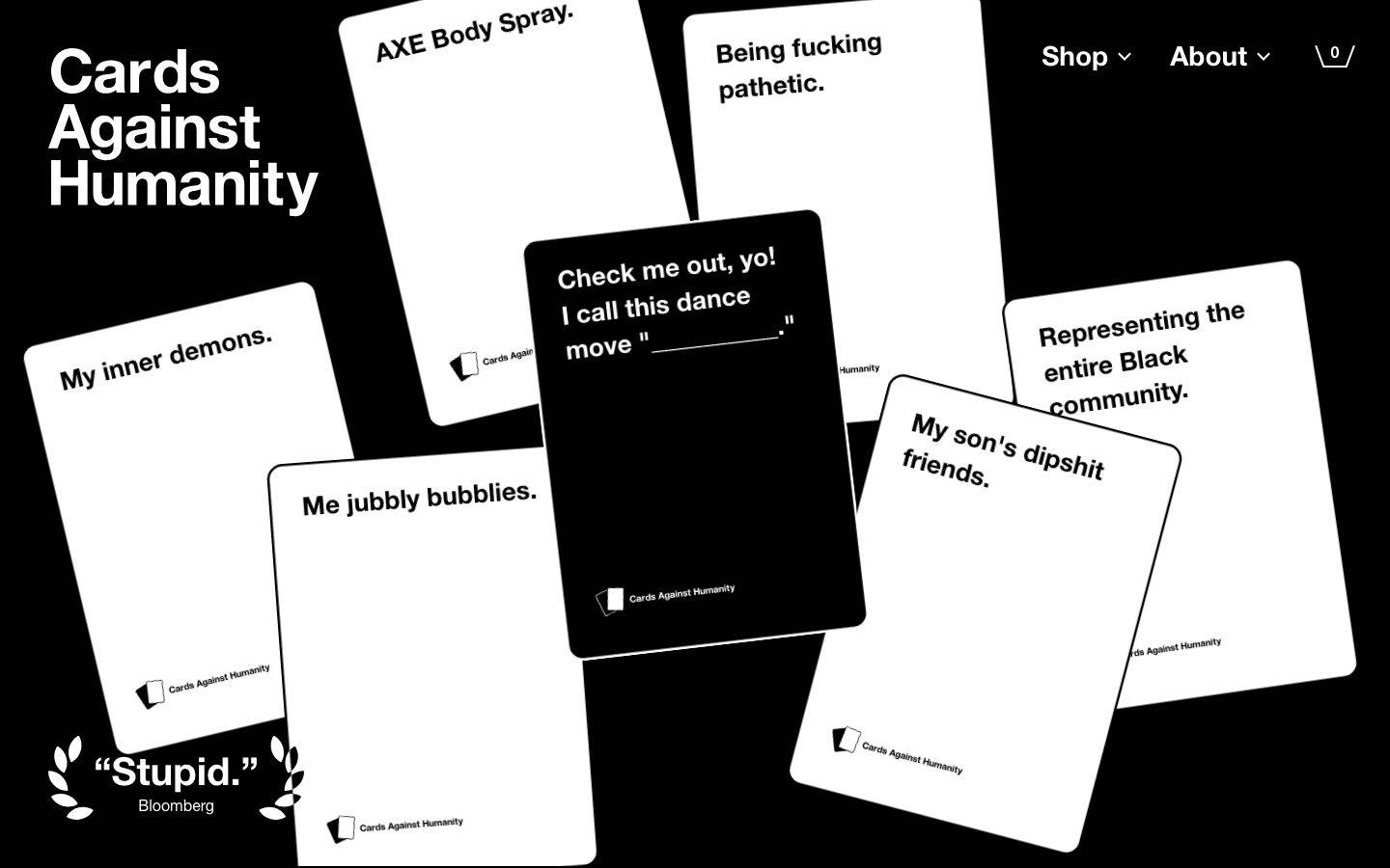
A deliberately anti-design, high-contrast interface built almost entirely from pure black canvas and pure white ink, with heavy Helvetica Neue set at extreme weights. Brand voltage comes from a scatter of loud pastel/primary accent cards (red, purple, gold, blue, yellow) used as content blocks rather than chrome, and from the party-game's own black-and-white playing cards shown directly on the landing surface. The tone is blunt, editorial, and intentionally crude — sharp-cornered content, oversized 800-weight headlines, and a monochrome shell that lets the occasional color block shout.
Works withClaude CodeCursorCodexGemini CLICopilotv0LovableBoltWindsurfReplit
---
version: alpha
name: CardsAgainstHumanity-design-analysis
description: "A deliberately anti-design, high-contrast interface built almost entirely from pure black canvas and pure white ink, with heavy Helvetica Neue set at extreme weights. Brand voltage comes from a scatter of loud pastel/primary accent cards (red, purple, gold, blue, yellow) used as content blocks rather than chrome, and from the party-game's own black-and-white playing cards shown directly on the landing surface. The tone is blunt, editorial, and intentionally crude — sharp-cornered content, oversized 800-weight headlines, and a monochrome shell that lets the occasional color block shout."

colors:
  ink: "#ffffff"
  canvas: "#000000"
  neutral: "#808080"
  accent-red: "#fe2f2f"
  accent-coral: "#ff6b6b"
  accent-purple: "#7333f1"
  accent-lavender: "#ede5ff"
  accent-gold: "#d7b73b"
  accent-yellow: "#fffe5b"
  accent-blue: "#1b5bff"
  accent-sky: "#a0e9ff"
  accent-mint: "#b1ffc5"
  accent-green: "#82ffa2"
  accent-lime: "#b4ff91"
  accent-pink: "#ffa0f0"
  accent-orange: "#ff9559"

typography:
  display:
    fontFamily: "Helvetica Neue LT, Helvetica Neue, Helvetica, Arial, sans-serif"
    fontSize: 80px
    fontWeight: 800
    lineHeight: 1.0
    letterSpacing: normal
  lead:
    fontFamily: "Helvetica Neue LT, Helvetica Neue, Helvetica, Arial, sans-serif"
    fontSize: 40px
    fontWeight: 800
    lineHeight: 1.05
    letterSpacing: normal
  heading:
    fontFamily: "Helvetica Neue LT, Helvetica Neue, Helvetica, Arial, sans-serif"
    fontSize: 20px
    fontWeight: 400
    lineHeight: 1.3
    letterSpacing: normal
  button:
    fontFamily: "Helvetica Neue LT, Helvetica Neue, Helvetica, Arial, sans-serif"
    fontSize: 14px
    fontWeight: 800
    lineHeight: 2.0
    letterSpacing: normal

rounded:
  none: 0px
  xs: 10px
  sm: 13px
  md: 20px
  lg: 28px
  xl: 32px
  xxl: 38px
  huge: 64px
  mega: 80px

spacing:
  xxs: 10px
  xs: 12px
  sm: 20px
  md: 30px
  lg: 40px
  xl: 50px
  xxl: 60px
  huge: 90px
  section: 160px

components:
  button-primary:
    backgroundColor: "{colors.canvas}"
    textColor: "{colors.ink}"
    typography: "{typography.button}"
    rounded: "{rounded.lg}"
    padding: 0px 15px
  button-secondary:
    backgroundColor: "{colors.ink}"
    textColor: "{colors.canvas}"
    typography: "{typography.button}"
    rounded: "{rounded.lg}"
    padding: 0px 15px
  card:
    backgroundColor: "{colors.ink}"
    textColor: "{colors.canvas}"
    rounded: "{rounded.none}"
  card-inverse:
    backgroundColor: "{colors.canvas}"
    textColor: "{colors.ink}"
    rounded: "{rounded.none}"
  input:
    backgroundColor: "{colors.canvas}"
    textColor: "{colors.ink}"
    typography: "{typography.heading}"
    rounded: "{rounded.none}"
  nav-link:
    backgroundColor: transparent
    textColor: "{colors.ink}"
    typography: "{typography.heading}"
  faq-row:
    backgroundColor: "{colors.canvas}"
    textColor: "{colors.ink}"
    typography: "{typography.heading}"
---

## Overview

Cards Against Humanity's landing page is a study in deliberate anti-design: it is essentially two colors — pure white ink (`{colors.ink}` — #ffffff) on pure black canvas (`{colors.canvas}` — #000000) — set in heavy **Helvetica Neue**. There is no gradient softening, no glassmorphism, no elevation theater. The page reads as blunt, editorial, and self-aware, matching the brand's crude comedic voice.

The type does the shouting. Section headlines run at `{typography.display}` (80px / weight 800) — "Buy the game.", "Steal the game.", "Your dumb questions." — while intro copy sits at an oversized `{typography.lead}` (40px / 800). Supporting nav and FAQ rows drop to `{typography.heading}` (20px / 400). The extreme weight contrast (800 for headlines, 400 for supporting text) is the entire typographic system.

Color enters only as **content blocks** — never as chrome. The "Buy the game" carousel and "Stuff we've done" grid are built from loud saturated cards: `{colors.accent-yellow}` (#fffe5b), `{colors.accent-lavender}` (#ede5ff), `{colors.accent-blue}` (#1b5bff), `{colors.accent-red}` (#fe2f2f), `{colors.accent-purple}` (#7333f1). These bright rectangles interrupt the black-and-white shell like the game's own irreverence bursting through.

The literal game cards — white cards with black text, one black card with white text — are scattered across the hero. They are the brand's own product artwork functioning as the hero graphic; they carry their own rounded corners as product images, distinct from the site's sharp-cornered content blocks.

**Key Characteristics:**
- Pure black canvas (`{colors.canvas}` — #000000) with pure white ink (`{colors.ink}` — #ffffff). Maximum contrast, zero softening.
- Helvetica Neue everywhere, at two extremes — weight 800 for headlines/lead, weight 400 for supporting text.
- Oversized display type: `{typography.display}` at 80px for every section head.
- Color used as content blocks only (product cards, "Stuff we've done" cards) — never on the shell or navigation.
- Sharp corners on content sections and inputs (`{rounded.none}` — 0px) — the anti-design signature.
- Pill-shaped primary CTA (`{rounded.lg}` — 28px) as the one rounded element in the interactive layer.
- Borders rendered as 2px inset box-shadows rather than CSS borders (measured: `rgb(0,0,0) 0px 0px 0px 2px inset` and its white variant).
- The party game's own black/white playing cards used as hero artwork.

## Colors

### Core (the shell)
- **Ink** (`{colors.ink}` — #ffffff): The dominant text and border color. All headlines, body copy, nav, FAQ text. The single most frequent color in the system (measured frequency 787).
- **Canvas** (`{colors.canvas}` — #000000): The page floor. Also the fill of `{component.button-primary}`. Second most frequent (frequency 482).
- **Neutral** (`{colors.neutral}` — #808080): The only gray in the system — used for muted fine-print / secondary labels (e.g. the "Bloomberg" attribution, small captions).

### Accent Blocks
Accents appear as saturated content cards, badges, and inline highlight artwork — never on the navigation or default buttons. They are the brand's chromatic release valve against the monochrome shell.

- **Accent Red** (`{colors.accent-red}` — #fe2f2f): The most frequent accent (frequency 46) — "Black Friday" card, inline "Download: Click here!" tag, highlight labels.
- **Accent Purple** (`{colors.accent-purple}` — #7333f1) and **Accent Lavender** (`{colors.accent-lavender}` — #ede5ff): The "full-tuition scholarship for women" card and its soft-tint pairing.
- **Accent Gold** (`{colors.accent-gold}` — #d7b73b): A muted mustard accent used on card labels.
- **Accent Yellow** (`{colors.accent-yellow}` — #fffe5b): The "Play CAH with your kids" / Family Edition card and the "Holy fuck we had some deals" card.
- **Accent Blue** (`{colors.accent-blue}` — #1b5bff) and **Accent Sky** (`{colors.accent-sky}` — #a0e9ff): The "big hole in the ground" card and the pale card background at the carousel's left edge.
- **Accent Coral** (`{colors.accent-coral}` — #ff6b6b), **Accent Mint** (`{colors.accent-mint}` — #b1ffc5), **Accent Green** (`{colors.accent-green}` — #82ffa2), **Accent Lime** (`{colors.accent-lime}` — #b4ff91), **Accent Pink** (`{colors.accent-pink}` — #ffa0f0), **Accent Orange** (`{colors.accent-orange}` — #ff9559): The low-frequency "sticker" palette — the green "Free Download now!" starburst, the pink expansion card, and small illustration accents. Each appears 1-5 times.

There is no measured semantic (success/warning/error) palette — the brand does not use color for state, only for editorial personality.

## Typography

### Font Family
The entire system runs **Helvetica Neue LT** (the linotype cut of Helvetica Neue), with a fallback stack of `Helvetica Neue, Helvetica, Arial, sans-serif`. There is exactly one typeface across the whole page — the personality comes from weight and size, not from mixing families.

### Hierarchy

| Token | Size | Weight | Line Height | Letter Spacing | Use |
|---|---|---|---|---|---|
| `{typography.display}` | 80px | 800 | 1.0 | normal | Section headlines — "Buy the game.", "Steal the game.", "Your dumb questions." (measured on h2) |
| `{typography.lead}` | 40px | 800 | 1.05 | normal | Oversized intro / body copy blocks — the "Cards Against Humanity is a fill-in-the-blank party game" paragraph (measured on body text) |
| `{typography.heading}` | 20px | 400 | 1.3 | normal | Nav items, FAQ rows, sub-labels, secondary text (measured on h1 and h3) |
| `{typography.button}` | 14px | 800 | 2.0 | normal | Button labels — heavy weight, tall line-height (measured on button) |

### Principles
The system's expression is **weight, not variety**. Headlines and lead copy hammer weight 800; everything supporting drops to 400. There is no middle weight (500/600) and no italics in the measured set. Line-height compresses as size grows — 1.0 at 80px, 1.05 at 40px, 1.3 at 20px — so big headlines set tight and dense.

Note the measured anomaly: the visually largest element on the page (the "Cards Against Humanity" wordmark) was measured on h1 at 20px / 400, while the 80px display weight was captured on h2. Report reflects measured DOM roles; the giant wordmark is likely a styled heading or image outside the measured h1 role (see Known Gaps).

### Note on Font Substitutes
Helvetica Neue LT is a licensed commercial typeface and is not free to redistribute as a web font. It was **not** flagged in `fonts_licensed`, but for open-source builds substitute **Arial** (near-metrically identical, ships everywhere) or **Inter** / **Roboto** at weights 400 and 800 to preserve the extreme-weight contrast that carries the design.

## Layout

### Spacing System
- **Base rhythm:** the dominant measured gap is 12px (frequency 183), with 30px (frequency 59) as the secondary rhythm.
- **Tokens:** `{spacing.xxs}` 10px · `{spacing.xs}` 12px · `{spacing.sm}` 20px · `{spacing.md}` 30px · `{spacing.lg}` 40px · `{spacing.xl}` 50px · `{spacing.xxl}` 60px · `{spacing.huge}` 90px · `{spacing.section}` 160px.
- **Micro-spacing:** `{spacing.xs}` (12px) is the universal internal gap — button/label padding, tight stacks.
- **Section padding:** `{spacing.section}` (160px, frequency 3) sets the largest vertical breaks between major bands; `{spacing.huge}` (90px, frequency 12) handles the common band-to-band rhythm.

### Grid & Container
- **Content column:** editorial copy sits in a narrow centered measure against the black canvas (see "Steal the game." band).
- **Card carousels/grids:** the "Buy the game" carousel is a horizontal scroller of full-bleed color cards; "Stuff we've done" is a 3-up card grid.
- **FAQ:** a full-width single-column list of `{component.faq-row}` items divided by hairlines.

### Whitespace Philosophy
Whitespace is used at two extremes: dense inside typographic blocks (compressed line-heights, tight 12px gaps) and generous between bands (up to 160px). The black canvas itself functions as negative space — the absence of color IS the layout breathing room.

## Elevation & Depth

The system has essentially **no elevation** — no drop shadows, no blur, no layered surfaces. The only measured shadows are 2px inset outlines used as borders:

| Treatment | Value | Use |
|---|---|---|
| Flat | No shadow | All content cards (`{component.card}` measured shadow: none), sections, hero |
| Inset border (dark) | `rgb(0,0,0) 0px 0px 0px 2px inset` (frequency 8) | 2px black outlines on light elements / dividers |
| Inset border (light) | `rgb(255,255,255) 0px 0px 0px 2px inset` (frequency 1) | 2px white outline — the outlined "Expand All" pill / cart chip on black |

Depth comes purely from **color contrast** — a bright yellow card on black canvas reads as "in front" without any shadow. The overlapping hero playing-cards create the only literal layering, and that stacking is baked into the product artwork, not the CSS surface system.

## Shapes

### Border Radius Scale

| Token | Value | Use |
|---|---|---|
| `{rounded.none}` | 0px | Content cards, inputs, section blocks — the sharp-corner anti-design signature (measured on card + input) |
| `{rounded.xs}` | 10px | Minor rounded elements (frequency 2) |
| `{rounded.sm}` | 13px | Most common rounded value (frequency 14) — small chips / product-card artwork corners |
| `{rounded.md}` | 20px | Medium rounded blocks (frequency 11) |
| `{rounded.lg}` | 28px | Primary CTA pill radius (measured on button-primary) |
| `{rounded.xl}` | 32px | Larger rounded cards (frequency 3) |
| `{rounded.xxl}` | 38px | Large rounded panels (frequency 6) |
| `{rounded.huge}` | 64px | Extra-large rounded surfaces (frequency 5) |
| `{rounded.mega}` | 80px | Maximum measured radius (frequency 2) |

The system is intentionally split-brained on corners: **content sections and inputs are hard 0px**, while the interactive/CTA layer and product-card artwork carry generous rounding (13-80px). The contrast between the sharp editorial blocks and the pill buttons is deliberate.

### Photography / Card Geometry
The hero's Cards Against Humanity playing cards are product images with their own rounded corners (game-card proportions, roughly 5:7). They carry the CAH wordmark + card-back icon at bottom-left. These are content, not chrome — the site's own content blocks are sharp-cornered.

## Components

### Buttons

**`button-primary`** — The default CTA. Fill `{colors.canvas}` (#000000), label `{colors.ink}` (#ffffff) in `{typography.button}` (Helvetica 14px / 800), rounded `{rounded.lg}` (28px) into a pill, padding 0 × 15px. Used for "Buy Family Edition", "Buy Expansions", "Download Files". On the light color cards it reads as a black pill; on the black canvas it needs a surrounding light surface to register.

**`button-secondary`** — The inverted pill (measured from the white 2px-inset outline treatment). Fill `{colors.ink}` (#ffffff), label `{colors.canvas}` (#000000), same `{typography.button}`, `{rounded.lg}` pill. Used for the outlined/white "Expand All" control at the bottom of the FAQ. *(derived: color inversion inferred from the white inset-border shadow + screenshot ground-truth; exact padding not separately measured.)*

### Cards & Containers

**`card`** — The bright content card used in the "Buy the game" carousel and "Stuff we've done" grid. Sharp corners `{rounded.none}` (0px), no shadow (measured). Background is one of the accent hues (`{colors.accent-yellow}`, `{colors.accent-lavender}`, `{colors.accent-blue}`, etc.), text set in the contrasting `{colors.canvas}` or `{colors.ink}`. Each card carries a small pill label at top, a heavy headline, and a `{component.button-primary}` or "Read →" link.

**`card-inverse`** — The default black content section (intro band, FAQ band). Fill `{colors.canvas}`, text `{colors.ink}`, sharp `{rounded.none}` corners. This is the shell's baseline block.

### Inputs & Forms

**`input`** — The email-capture field ("Email Address"). Sharp corners `{rounded.none}` (0px, measured), text in `{typography.heading}`, paired with a circular arrow submit control. Bordered with the measured 2px inset outline rather than a CSS border.

### Navigation

**`nav-link`** — Top-nav items ("Shop", "About") and the cart chip. Transparent background, `{colors.ink}` text in `{typography.heading}` (20px / 400). Dropdown carets accompany "Shop" and "About".

### FAQ

**`faq-row`** — A full-width accordion row in the "Your dumb questions." band. Fill `{colors.canvas}`, text `{colors.ink}` in `{typography.heading}`, with a `+` affordance at the right and a 2px hairline divider between rows. Collapsed by default; "Expand All" (`{component.button-secondary}`) opens the full set.

## Do's and Don'ts

### Do
- Keep the shell pure black-and-white. Color belongs only on content cards and stickers, never on nav or the base surface.
- Use weight to create hierarchy — 800 for headlines and lead copy, 400 for everything supporting. This IS the type system.
- Set section headlines huge (`{typography.display}` — 80px) with tight line-height (1.0). Big and blunt is on-brand.
- Keep content blocks and inputs sharp-cornered (`{rounded.none}`). The hard edges are the anti-design point.
- Use accent hues as loud, unapologetic full-bleed card fills — let one bright rectangle interrupt the monochrome.
- Reserve the pill radius (`{rounded.lg}`) for buttons — the one rounded shape in the interactive layer.

### Don't
- Don't add drop shadows, gradients, or elevation effects. The system is flat by design; contrast does the depth.
- Don't soften the black canvas to a dark gray or the white ink to off-white. Maximum contrast is the identity.
- Don't introduce a second typeface or mid-range weights (500/600). Helvetica at 400 and 800 only.
- Don't round the content cards or inputs — sharp corners are intentional.
- Don't spread accent colors onto navigation, buttons, or body text. Color is content, not chrome.
- Don't document hover states — default and pressed/active only.

## Responsive Behavior

### Breakpoints
Only a `landing` page at desktop width was captured; breakpoints are inferred from the two provided screenshots (wide desktop hero + a narrower full-page composite).

| Name | Behavior (observed) |
|---|---|
| Desktop | Full hero with scattered overlapping playing-cards, horizontal nav ("Shop", "About", cart), 3-up "Stuff we've done" grid, horizontal "Buy the game" carousel |
| Narrow / mobile | Hero cards compress into a tighter overlapping cluster; the "Cards Against Humanity" wordmark stacks to three lines; nav tightens; card grids reduce columns; FAQ stays single-column full-width |

### Touch Targets
- `{component.button-primary}` uses `{typography.button}` with 2.0 line-height, giving a tall tappable pill; horizontal padding is only 15px so labels stay short.
- `{component.faq-row}` rows span full width — large tap targets by construction.
- Exact minimum touch-target dimensions were not measured (see Known Gaps).

### Collapsing Strategy
- The "Buy the game" carousel is horizontally scrollable and shows partial cards at the edges at all widths.
- Card grids reduce column count on narrow screens rather than shrinking type.
- Section headlines at 80px will need to scale down on mobile (not separately measured — see Known Gaps).

## Iteration Guide

1. Focus on ONE component at a time. Reference its YAML key directly (`{component.card}`, `{component.button-primary}`).
2. Variants of a component (`-secondary`, `-inverse`) live as separate entries in `components:`.
3. Use `{token.refs}` everywhere — never inline a hex in a component.
4. Never document hover. Default and Active/Pressed only.
5. Hierarchy is created by weight and size, not by color or family — bigger/heavier Helvetica before anything else.
6. Color is a content decision, not a chrome decision. Add accent hues as card fills, never to the shell.
7. When adding surfaces, keep them flat — reach for contrast, not shadow, to signal separation.

## Known Gaps

- Only the `landing` page was captured; interior pages (Shop, About, product detail) and their component variants are out of scope.
- The oversized "Cards Against Humanity" wordmark in the hero was not captured under the measured h1 role (h1 measured at 20px / 400); its true size, weight, and whether it is text or an image are unconfirmed.
- Mobile/tablet type scaling and exact breakpoint widths are inferred from screenshots, not measured — responsive font sizes for the 80px display role are unknown.
- Two low-frequency accents captured in analysis (`#fffd6d` — a second light yellow, and `#fff1f1` — a near-white pink) were folded into the closest documented hues; their exact roles are unconfirmed.
- Borders are implemented as 2px inset box-shadows; no separate border-color/width token set was measured, so border styling is documented under Elevation rather than as its own token group.
- `{component.button-secondary}` color inversion is derived from the single white inset-shadow measurement plus screenshot ground-truth; its padding and height were not independently measured.
- No animation, carousel-transition, or accordion-expand timings were captured.
- No semantic state palette (success/warning/error) was measured — the brand appears not to use color for UI state.
- Helvetica Neue LT is a licensed typeface not flagged in `fonts_licensed`; open-source substitutes are documented in Typography but the licensed original is assumed shipped in production.

<!-- Documented by Duply · real-world design systems as ready-to-use DESIGN.md for AI coding agents · https://duply.ai/cardsagainsthumanity/design-md -->
Color Palette
Accent
Neutrals
Typography
display80px · 800 · 1
The quick brown fox jumpslead40px · 800 · 1.05
The quick brown fox jumpsheading20px · 400 · 1.3
The quick brown fox jumpsbutton14px · 800 · 2
The quick brown fox jumpsSpacing & Shape
Spacing
| Name | Value | Preview |
|---|---|---|
| xxs | 10px | |
| xs | 12px | |
| sm | 20px | |
| md | 30px | |
| lg | 40px | |
| xl | 50px | |
| xxl | 60px | |
| huge | 90px | |
| section | 160px |
Border Radius
| Name | Value | Preview |
|---|---|---|
| none | 0px | |
| xs | 10px | |
| sm | 13px | |
| md | 20px | |
| lg | 28px | |
| xl | 32px | |
| xxl | 38px | |
| huge | 64px | |
| mega | 80px |
FAQ
- What colors does CardsAgainstHumanity use?
- CardsAgainstHumanity's core palette includes #ffffff, #000000, #808080, #fe2f2f, #ff6b6b. The full color set with usage roles (canvas, ink, surfaces, accent, semantic) is documented in the CardsAgainstHumanity DESIGN.md.
- What font does CardsAgainstHumanity use?
- CardsAgainstHumanity's primary typeface is Helvetica Neue LT. The complete type scale (sizes, weights, line-height and letter-spacing per role), with an open substitute where the original is licensed, is documented in the DESIGN.md.
- What is the CardsAgainstHumanity design system?
- A deliberately anti-design, high-contrast interface built almost entirely from pure black canvas and pure white ink, with heavy Helvetica Neue set at extreme weights. Brand voltage comes from a scatter of loud pastel/primary accent cards (red, purple, gold, blue, yellow) used as content blocks
Get this as a working kit
CardsAgainstHumanity Launch Kit + DESIGN.md
$299$225
One-time payment
- A complete production-stack template, styled like CardsAgainstHumanity, fully built and wired.
- One-time payment and the codebase is yours. No platform fees, no subscription.
Open it with Claude Code, Cursor, or any coding agent and build in plain language, then ship a complete web app.
- Your private DESIGN.md
- Marketing pages, blog, SEO & legal
- Email capture, newsletter & contact
- Accept payments (Stripe)
- Analytics (GA4 + PostHog)
- One-click deploy
- Auth, login & roles
- A full app dashboard, when you grow
More like this
---
version: alpha
name: CardsAgainstHumanity-design-analysis
description: "A deliberately anti-design, high-contrast interface built almost entirely from pure black canvas and pure white ink, with heavy Helvetica Neue set at extreme weights. Brand voltage comes from a scatter of loud pastel/primary accent cards (red, purple, gold, blue, yellow) used as content blocks rather than chrome, and from the party-game's own black-and-white playing cards shown directly on the landing surface. The tone is blunt, editorial, and intentionally crude — sharp-cornered content, oversized 800-weight headlines, and a monochrome shell that lets the occasional color block shout."

colors:
  ink: "#ffffff"
  canvas: "#000000"
  neutral: "#808080"
  accent-red: "#fe2f2f"
  accent-coral: "#ff6b6b"
  accent-purple: "#7333f1"
  accent-lavender: "#ede5ff"
  accent-gold: "#d7b73b"
  accent-yellow: "#fffe5b"
  accent-blue: "#1b5bff"
  accent-sky: "#a0e9ff"
  accent-mint: "#b1ffc5"
  accent-green: "#82ffa2"
  accent-lime: "#b4ff91"
  accent-pink: "#ffa0f0"
  accent-orange: "#ff9559"

typography:
  display:
    fontFamily: "Helvetica Neue LT, Helvetica Neue, Helvetica, Arial, sans-serif"
    fontSize: 80px
    fontWeight: 800
    lineHeight: 1.0
    letterSpacing: normal
  lead:
    fontFamily: "Helvetica Neue LT, Helvetica Neue, Helvetica, Arial, sans-serif"
    fontSize: 40px
    fontWeight: 800
    lineHeight: 1.05
    letterSpacing: normal
  heading:
    fontFamily: "Helvetica Neue LT, Helvetica Neue, Helvetica, Arial, sans-serif"
    fontSize: 20px
    fontWeight: 400
    lineHeight: 1.3
    letterSpacing: normal
  button:
    fontFamily: "Helvetica Neue LT, Helvetica Neue, Helvetica, Arial, sans-serif"
    fontSize: 14px
    fontWeight: 800
    lineHeight: 2.0
    letterSpacing: normal

rounded:
  none: 0px
  xs: 10px
  sm: 13px
  md: 20px
  lg: 28px
  xl: 32px
  xxl: 38px
  huge: 64px
  mega: 80px

spacing:
  xxs: 10px
  xs: 12px
  sm: 20px
  md: 30px
  lg: 40px
  xl: 50px
  xxl: 60px
  huge: 90px
  section: 160px

components:
  button-primary:
    backgroundColor: "{colors.canvas}"
    textColor: "{colors.ink}"
    typography: "{typography.button}"
    rounded: "{rounded.lg}"
    padding: 0px 15px
  button-secondary:
    backgroundColor: "{colors.ink}"
    textColor: "{colors.canvas}"
    typography: "{typography.button}"
    rounded: "{rounded.lg}"
    padding: 0px 15px
  card:
    backgroundColor: "{colors.ink}"
    textColor: "{colors.canvas}"
    rounded: "{rounded.none}"
  card-inverse:
    backgroundColor: "{colors.canvas}"
    textColor: "{colors.ink}"
    rounded: "{rounded.none}"
  input:
    backgroundColor: "{colors.canvas}"
    textColor: "{colors.ink}"
    typography: "{typography.heading}"
    rounded: "{rounded.none}"
  nav-link:
    backgroundColor: transparent
    textColor: "{colors.ink}"
    typography: "{typography.heading}"
  faq-row:
    backgroundColor: "{colors.canvas}"
    textColor: "{colors.ink}"
    typography: "{typography.heading}"
---

## Overview

Cards Against Humanity's landing page is a study in deliberate anti-design: it is essentially two colors — pure white ink (`{colors.ink}` — #ffffff) on pure black canvas (`{colors.canvas}` — #000000) — set in heavy **Helvetica Neue**. There is no gradient softening, no glassmorphism, no elevation theater. The page reads as blunt, editorial, and self-aware, matching the brand's crude comedic voice.

The type does the shouting. Section headlines run at `{typography.display}` (80px / weight 800) — "Buy the game.", "Steal the game.", "Your dumb questions." — while intro copy sits at an oversized `{typography.lead}` (40px / 800). Supporting nav and FAQ rows drop to `{typography.heading}` (20px / 400). The extreme weight contrast (800 for headlines, 400 for supporting text) is the entire typographic system.

Color enters only as **content blocks** — never as chrome. The "Buy the game" carousel and "Stuff we've done" grid are built from loud saturated cards: `{colors.accent-yellow}` (#fffe5b), `{colors.accent-lavender}` (#ede5ff), `{colors.accent-blue}` (#1b5bff), `{colors.accent-red}` (#fe2f2f), `{colors.accent-purple}` (#7333f1). These bright rectangles interrupt the black-and-white shell like the game's own irreverence bursting through.

The literal game cards — white cards with black text, one black card with white text — are scattered across the hero. They are the brand's own product artwork functioning as the hero graphic; they carry their own rounded corners as product images, distinct from the site's sharp-cornered content blocks.

**Key Characteristics:**
- Pure black canvas (`{colors.canvas}` — #000000) with pure white ink (`{colors.ink}` — #ffffff). Maximum contrast, zero softening.
- Helvetica Neue everywhere, at two extremes — weight 800 for headlines/lead, weight 400 for supporting text.
- Oversized display type: `{typography.display}` at 80px for every section head.
- Color used as content blocks only (product cards, "Stuff we've done" cards) — never on the shell or navigation.
- Sharp corners on content sections and inputs (`{rounded.none}` — 0px) — the anti-design signature.
- Pill-shaped primary CTA (`{rounded.lg}` — 28px) as the one rounded element in the interactive layer.
- Borders rendered as 2px inset box-shadows rather than CSS borders (measured: `rgb(0,0,0) 0px 0px 0px 2px inset` and its white variant).
- The party game's own black/white playing cards used as hero artwork.

## Colors

### Core (the shell)
- **Ink** (`{colors.ink}` — #ffffff): The dominant text and border color. All headlines, body copy, nav, FAQ text. The single most frequent color in the system (measured frequency 787).
- **Canvas** (`{colors.canvas}` — #000000): The page floor. Also the fill of `{component.button-primary}`. Second most frequent (frequency 482).
- **Neutral** (`{colors.neutral}` — #808080): The only gray in the system — used for muted fine-print / secondary labels (e.g. the "Bloomberg" attribution, small captions).

### Accent Blocks
Accents appear as saturated content cards, badges, and inline highlight artwork — never on the navigation or default buttons. They are the brand's chromatic release valve against the monochrome shell.

- **Accent Red** (`{colors.accent-red}` — #fe2f2f): The most frequent accent (frequency 46) — "Black Friday" card, inline "Download: Click here!" tag, highlight labels.
- **Accent Purple** (`{colors.accent-purple}` — #7333f1) and **Accent Lavender** (`{colors.accent-lavender}` — #ede5ff): The "full-tuition scholarship for women" card and its soft-tint pairing.
- **Accent Gold** (`{colors.accent-gold}` — #d7b73b): A muted mustard accent used on card labels.
- **Accent Yellow** (`{colors.accent-yellow}` — #fffe5b): The "Play CAH with your kids" / Family Edition card and the "Holy fuck we had some deals" card.
- **Accent Blue** (`{colors.accent-blue}` — #1b5bff) and **Accent Sky** (`{colors.accent-sky}` — #a0e9ff): The "big hole in the ground" card and the pale card background at the carousel's left edge.
- **Accent Coral** (`{colors.accent-coral}` — #ff6b6b), **Accent Mint** (`{colors.accent-mint}` — #b1ffc5), **Accent Green** (`{colors.accent-green}` — #82ffa2), **Accent Lime** (`{colors.accent-lime}` — #b4ff91), **Accent Pink** (`{colors.accent-pink}` — #ffa0f0), **Accent Orange** (`{colors.accent-orange}` — #ff9559): The low-frequency "sticker" palette — the green "Free Download now!" starburst, the pink expansion card, and small illustration accents. Each appears 1-5 times.

There is no measured semantic (success/warning/error) palette — the brand does not use color for state, only for editorial personality.

## Typography

### Font Family
The entire system runs **Helvetica Neue LT** (the linotype cut of Helvetica Neue), with a fallback stack of `Helvetica Neue, Helvetica, Arial, sans-serif`. There is exactly one typeface across the whole page — the personality comes from weight and size, not from mixing families.

### Hierarchy

| Token | Size | Weight | Line Height | Letter Spacing | Use |
|---|---|---|---|---|---|
| `{typography.display}` | 80px | 800 | 1.0 | normal | Section headlines — "Buy the game.", "Steal the game.", "Your dumb questions." (measured on h2) |
| `{typography.lead}` | 40px | 800 | 1.05 | normal | Oversized intro / body copy blocks — the "Cards Against Humanity is a fill-in-the-blank party game" paragraph (measured on body text) |
| `{typography.heading}` | 20px | 400 | 1.3 | normal | Nav items, FAQ rows, sub-labels, secondary text (measured on h1 and h3) |
| `{typography.button}` | 14px | 800 | 2.0 | normal | Button labels — heavy weight, tall line-height (measured on button) |

### Principles
The system's expression is **weight, not variety**. Headlines and lead copy hammer weight 800; everything supporting drops to 400. There is no middle weight (500/600) and no italics in the measured set. Line-height compresses as size grows — 1.0 at 80px, 1.05 at 40px, 1.3 at 20px — so big headlines set tight and dense.

Note the measured anomaly: the visually largest element on the page (the "Cards Against Humanity" wordmark) was measured on h1 at 20px / 400, while the 80px display weight was captured on h2. Report reflects measured DOM roles; the giant wordmark is likely a styled heading or image outside the measured h1 role (see Known Gaps).

### Note on Font Substitutes
Helvetica Neue LT is a licensed commercial typeface and is not free to redistribute as a web font. It was **not** flagged in `fonts_licensed`, but for open-source builds substitute **Arial** (near-metrically identical, ships everywhere) or **Inter** / **Roboto** at weights 400 and 800 to preserve the extreme-weight contrast that carries the design.

## Layout

### Spacing System
- **Base rhythm:** the dominant measured gap is 12px (frequency 183), with 30px (frequency 59) as the secondary rhythm.
- **Tokens:** `{spacing.xxs}` 10px · `{spacing.xs}` 12px · `{spacing.sm}` 20px · `{spacing.md}` 30px · `{spacing.lg}` 40px · `{spacing.xl}` 50px · `{spacing.xxl}` 60px · `{spacing.huge}` 90px · `{spacing.section}` 160px.
- **Micro-spacing:** `{spacing.xs}` (12px) is the universal internal gap — button/label padding, tight stacks.
- **Section padding:** `{spacing.section}` (160px, frequency 3) sets the largest vertical breaks between major bands; `{spacing.huge}` (90px, frequency 12) handles the common band-to-band rhythm.

### Grid & Container
- **Content column:** editorial copy sits in a narrow centered measure against the black canvas (see "Steal the game." band).
- **Card carousels/grids:** the "Buy the game" carousel is a horizontal scroller of full-bleed color cards; "Stuff we've done" is a 3-up card grid.
- **FAQ:** a full-width single-column list of `{component.faq-row}` items divided by hairlines.

### Whitespace Philosophy
Whitespace is used at two extremes: dense inside typographic blocks (compressed line-heights, tight 12px gaps) and generous between bands (up to 160px). The black canvas itself functions as negative space — the absence of color IS the layout breathing room.

## Elevation & Depth

The system has essentially **no elevation** — no drop shadows, no blur, no layered surfaces. The only measured shadows are 2px inset outlines used as borders:

| Treatment | Value | Use |
|---|---|---|
| Flat | No shadow | All content cards (`{component.card}` measured shadow: none), sections, hero |
| Inset border (dark) | `rgb(0,0,0) 0px 0px 0px 2px inset` (frequency 8) | 2px black outlines on light elements / dividers |
| Inset border (light) | `rgb(255,255,255) 0px 0px 0px 2px inset` (frequency 1) | 2px white outline — the outlined "Expand All" pill / cart chip on black |

Depth comes purely from **color contrast** — a bright yellow card on black canvas reads as "in front" without any shadow. The overlapping hero playing-cards create the only literal layering, and that stacking is baked into the product artwork, not the CSS surface system.

## Shapes

### Border Radius Scale

| Token | Value | Use |
|---|---|---|
| `{rounded.none}` | 0px | Content cards, inputs, section blocks — the sharp-corner anti-design signature (measured on card + input) |
| `{rounded.xs}` | 10px | Minor rounded elements (frequency 2) |
| `{rounded.sm}` | 13px | Most common rounded value (frequency 14) — small chips / product-card artwork corners |
| `{rounded.md}` | 20px | Medium rounded blocks (frequency 11) |
| `{rounded.lg}` | 28px | Primary CTA pill radius (measured on button-primary) |
| `{rounded.xl}` | 32px | Larger rounded cards (frequency 3) |
| `{rounded.xxl}` | 38px | Large rounded panels (frequency 6) |
| `{rounded.huge}` | 64px | Extra-large rounded surfaces (frequency 5) |
| `{rounded.mega}` | 80px | Maximum measured radius (frequency 2) |

The system is intentionally split-brained on corners: **content sections and inputs are hard 0px**, while the interactive/CTA layer and product-card artwork carry generous rounding (13-80px). The contrast between the sharp editorial blocks and the pill buttons is deliberate.

### Photography / Card Geometry
The hero's Cards Against Humanity playing cards are product images with their own rounded corners (game-card proportions, roughly 5:7). They carry the CAH wordmark + card-back icon at bottom-left. These are content, not chrome — the site's own content blocks are sharp-cornered.

## Components

### Buttons

**`button-primary`** — The default CTA. Fill `{colors.canvas}` (#000000), label `{colors.ink}` (#ffffff) in `{typography.button}` (Helvetica 14px / 800), rounded `{rounded.lg}` (28px) into a pill, padding 0 × 15px. Used for "Buy Family Edition", "Buy Expansions", "Download Files". On the light color cards it reads as a black pill; on the black canvas it needs a surrounding light surface to register.

**`button-secondary`** — The inverted pill (measured from the white 2px-inset outline treatment). Fill `{colors.ink}` (#ffffff), label `{colors.canvas}` (#000000), same `{typography.button}`, `{rounded.lg}` pill. Used for the outlined/white "Expand All" control at the bottom of the FAQ. *(derived: color inversion inferred from the white inset-border shadow + screenshot ground-truth; exact padding not separately measured.)*

### Cards & Containers

**`card`** — The bright content card used in the "Buy the game" carousel and "Stuff we've done" grid. Sharp corners `{rounded.none}` (0px), no shadow (measured). Background is one of the accent hues (`{colors.accent-yellow}`, `{colors.accent-lavender}`, `{colors.accent-blue}`, etc.), text set in the contrasting `{colors.canvas}` or `{colors.ink}`. Each card carries a small pill label at top, a heavy headline, and a `{component.button-primary}` or "Read →" link.

**`card-inverse`** — The default black content section (intro band, FAQ band). Fill `{colors.canvas}`, text `{colors.ink}`, sharp `{rounded.none}` corners. This is the shell's baseline block.

### Inputs & Forms

**`input`** — The email-capture field ("Email Address"). Sharp corners `{rounded.none}` (0px, measured), text in `{typography.heading}`, paired with a circular arrow submit control. Bordered with the measured 2px inset outline rather than a CSS border.

### Navigation

**`nav-link`** — Top-nav items ("Shop", "About") and the cart chip. Transparent background, `{colors.ink}` text in `{typography.heading}` (20px / 400). Dropdown carets accompany "Shop" and "About".

### FAQ

**`faq-row`** — A full-width accordion row in the "Your dumb questions." band. Fill `{colors.canvas}`, text `{colors.ink}` in `{typography.heading}`, with a `+` affordance at the right and a 2px hairline divider between rows. Collapsed by default; "Expand All" (`{component.button-secondary}`) opens the full set.

## Do's and Don'ts

### Do
- Keep the shell pure black-and-white. Color belongs only on content cards and stickers, never on nav or the base surface.
- Use weight to create hierarchy — 800 for headlines and lead copy, 400 for everything supporting. This IS the type system.
- Set section headlines huge (`{typography.display}` — 80px) with tight line-height (1.0). Big and blunt is on-brand.
- Keep content blocks and inputs sharp-cornered (`{rounded.none}`). The hard edges are the anti-design point.
- Use accent hues as loud, unapologetic full-bleed card fills — let one bright rectangle interrupt the monochrome.
- Reserve the pill radius (`{rounded.lg}`) for buttons — the one rounded shape in the interactive layer.

### Don't
- Don't add drop shadows, gradients, or elevation effects. The system is flat by design; contrast does the depth.
- Don't soften the black canvas to a dark gray or the white ink to off-white. Maximum contrast is the identity.
- Don't introduce a second typeface or mid-range weights (500/600). Helvetica at 400 and 800 only.
- Don't round the content cards or inputs — sharp corners are intentional.
- Don't spread accent colors onto navigation, buttons, or body text. Color is content, not chrome.
- Don't document hover states — default and pressed/active only.

## Responsive Behavior

### Breakpoints
Only a `landing` page at desktop width was captured; breakpoints are inferred from the two provided screenshots (wide desktop hero + a narrower full-page composite).

| Name | Behavior (observed) |
|---|---|
| Desktop | Full hero with scattered overlapping playing-cards, horizontal nav ("Shop", "About", cart), 3-up "Stuff we've done" grid, horizontal "Buy the game" carousel |
| Narrow / mobile | Hero cards compress into a tighter overlapping cluster; the "Cards Against Humanity" wordmark stacks to three lines; nav tightens; card grids reduce columns; FAQ stays single-column full-width |

### Touch Targets
- `{component.button-primary}` uses `{typography.button}` with 2.0 line-height, giving a tall tappable pill; horizontal padding is only 15px so labels stay short.
- `{component.faq-row}` rows span full width — large tap targets by construction.
- Exact minimum touch-target dimensions were not measured (see Known Gaps).

### Collapsing Strategy
- The "Buy the game" carousel is horizontally scrollable and shows partial cards at the edges at all widths.
- Card grids reduce column count on narrow screens rather than shrinking type.
- Section headlines at 80px will need to scale down on mobile (not separately measured — see Known Gaps).

## Iteration Guide

1. Focus on ONE component at a time. Reference its YAML key directly (`{component.card}`, `{component.button-primary}`).
2. Variants of a component (`-secondary`, `-inverse`) live as separate entries in `components:`.
3. Use `{token.refs}` everywhere — never inline a hex in a component.
4. Never document hover. Default and Active/Pressed only.
5. Hierarchy is created by weight and size, not by color or family — bigger/heavier Helvetica before anything else.
6. Color is a content decision, not a chrome decision. Add accent hues as card fills, never to the shell.
7. When adding surfaces, keep them flat — reach for contrast, not shadow, to signal separation.

## Known Gaps

- Only the `landing` page was captured; interior pages (Shop, About, product detail) and their component variants are out of scope.
- The oversized "Cards Against Humanity" wordmark in the hero was not captured under the measured h1 role (h1 measured at 20px / 400); its true size, weight, and whether it is text or an image are unconfirmed.
- Mobile/tablet type scaling and exact breakpoint widths are inferred from screenshots, not measured — responsive font sizes for the 80px display role are unknown.
- Two low-frequency accents captured in analysis (`#fffd6d` — a second light yellow, and `#fff1f1` — a near-white pink) were folded into the closest documented hues; their exact roles are unconfirmed.
- Borders are implemented as 2px inset box-shadows; no separate border-color/width token set was measured, so border styling is documented under Elevation rather than as its own token group.
- `{component.button-secondary}` color inversion is derived from the single white inset-shadow measurement plus screenshot ground-truth; its padding and height were not independently measured.
- No animation, carousel-transition, or accordion-expand timings were captured.
- No semantic state palette (success/warning/error) was measured — the brand appears not to use color for UI state.
- Helvetica Neue LT is a licensed typeface not flagged in `fonts_licensed`; open-source substitutes are documented in Typography but the licensed original is assumed shipped in production.

<!-- Documented by Duply · real-world design systems as ready-to-use DESIGN.md for AI coding agents · https://duply.ai/cardsagainsthumanity/design-md -->