Netflix
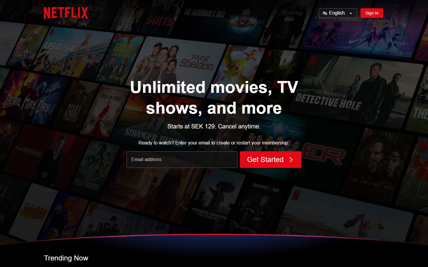
A cinematic, full-bleed dark interface built on a pure-black canvas with a single high-voltage red CTA (#e50914) and white type. The landing surface layers a dimmed mosaic of title artwork behind a centered hero headline + email-capture row, then drops into stacked dark bands — a trending carousel, feature cards, and a flat-row FAQ accordion — all closed by a low-contrast link-grid footer. Brand energy comes entirely from the red action color and the bold white display headline against black; there is no secondary accent in play.
---
version: alpha
name: Netflix-design-analysis
description: A cinematic, full-bleed dark interface built on a pure-black canvas with a single high-voltage red CTA (#e50914) and white type. The landing surface layers a dimmed mosaic of title artwork behind a centered hero headline + email-capture row, then drops into stacked dark bands — a trending carousel, feature cards, and a flat-row FAQ accordion — all closed by a low-contrast link-grid footer. Brand energy comes entirely from the red action color and the bold white display headline against black; there is no secondary accent in play.

colors:
  primary: "#e50914"
  ink: "#ffffff"
  canvas: "#000000"
  surface: "#232323"
  surface-muted: "#2d2d2d"
  surface-deep: "#161616"
  surface-soft: "#262626"
  surface-strong: "#414141"
  neutral-line: "#353535"
  neutral-line-soft: "#2b2b2b"
  neutral-line-alt: "#3f3f3f"
  accent: "#ffff00"

typography:
  display:
    fontFamily: "sans-serif"
    fontSize: 56px
    fontWeight: 700
    lineHeight: 1.25
    letterSpacing: normal
  button:
    fontFamily: "sans-serif"
    fontSize: 24px
    fontWeight: 500
    lineHeight: 1.0
    letterSpacing: normal
  body:
    fontFamily: "sans-serif"
    fontSize: 16px
    fontWeight: 400
    lineHeight: 1.5
    letterSpacing: normal

rounded:
  xs: 2px
  sm: 4px
  md: 8px
  lg: 16px

spacing:
  xxs: 4px
  xs: 8px
  sm: 12px
  md: 16px
  lg: 22px
  xl: 24px
  xxl: 36px
  huge: 100px
  section: 148px

components:
  top-nav:
    backgroundColor: transparent
    textColor: "{colors.ink}"
    typography: "{typography.body}"
  button-primary:
    backgroundColor: "{colors.primary}"
    textColor: "{colors.ink}"
    typography: "{typography.button}"
    rounded: "{rounded.sm}"
    padding: 12px 24px
  button-sign-in:
    backgroundColor: "{colors.primary}"
    textColor: "{colors.ink}"
    typography: "{typography.body}"
    rounded: "{rounded.sm}"
    padding: 4px 16px
  email-input:
    backgroundColor: transparent
    textColor: "{colors.ink}"
    typography: "{typography.body}"
    rounded: 0px
    padding: 12px 16px
  language-selector:
    backgroundColor: transparent
    textColor: "{colors.ink}"
    typography: "{typography.body}"
    rounded: "{rounded.sm}"
    padding: 4px 12px
  trending-card:
    backgroundColor: "{colors.surface-deep}"
    textColor: "{colors.ink}"
    rounded: "{rounded.md}"
  feature-card:
    backgroundColor: "{colors.surface-deep}"
    textColor: "{colors.ink}"
    typography: "{typography.body}"
    rounded: "{rounded.lg}"
    padding: 24px
  faq-row:
    backgroundColor: "{colors.surface}"
    textColor: "{colors.ink}"
    typography: "{typography.button}"
    rounded: "{rounded.xs}"
    padding: 22px 24px
  footer:
    backgroundColor: "{colors.canvas}"
    textColor: "{colors.ink}"
    typography: "{typography.body}"
    padding: 36px
---

## Overview

Netflix's acquisition landing surface is a cinematic, full-bleed dark interface anchored on pure black (`{colors.canvas}` — #000000) with a single high-voltage red action color (`{colors.primary}` — #e50914) and white text (`{colors.ink}` — #ffffff). The page opens on a dimmed mosaic of title artwork behind a centered hero — a bold white display headline, a one-line price note, and an email-capture row with a red "Get Started" button — then descends through stacked dark bands: a "Trending Now" ranked carousel, a four-up feature-card grid, a flat-row FAQ accordion, a repeated email-capture CTA, and a low-contrast link-grid footer.

The system is functionally monochrome at the action layer: there is exactly one brand color (Netflix red) and one text color (white) doing the heavy lifting against black. The only other measured chromatic value is a faint yellow (`{colors.accent}` — #ffff00) appearing once — it is not part of the working palette and should not be treated as a system accent.

Type voice is simple and confident: a single sans-serif family runs the whole page across three measured roles — a heavy 56px/700 display headline, a 24px/500 button label, and a 16px/400 body size. There is no serif, no second family, no custom display treatment in the captured data.

Component voltage comes from contrast: the red CTA pops against black, the white headline sits over a darkened artwork mosaic, and supporting surfaces step through a tight ramp of near-black grays (`{colors.surface-deep}` #161616 → `{colors.surface}` #232323 → `{colors.surface-strong}` #414141). The FAQ accordion rows use the brightest of these grays (#232323) so they read as tappable bands against the black page.

**Key Characteristics:**
- Pure-black canvas (`{colors.canvas}` — #000000) for the entire page; every surface above it is a near-black gray.
- One red CTA (`{colors.primary}` — #e50914), `{rounded.sm}` (4px) corners, used for both the small "Sign In" nav button and the large "Get Started" submit button.
- A single bold white display headline (`{typography.display}` — 56px / 700) carries the hero; everything else is white body or button type.
- Hero email-capture row: a transparent square-cornered input (`{component.email-input}`, radius 0px) sitting beside the red button.
- "Trending Now" ranked carousel with large numerals behind `{rounded.md}` (8px) artwork tiles.
- Four-up feature cards with `{rounded.lg}` (16px) corners on a dark surface.
- Flat FAQ accordion rows in `{colors.surface}` (#232323) with `+` expand affordances and minimal `{rounded.xs}` (2px) corners.
- Tight near-black gray ramp for surfaces: #161616, #232323, #2d2d2d, #353535, #414141.

## Colors

### Brand & Action
- **Primary** (`{colors.primary}` — #e50914): Netflix red. The single action color — used on the "Sign In" nav button and the large "Get Started" submit buttons. It is the only saturated color in the working palette.
- **Accent** (`{colors.accent}` — #ffff00): A faint yellow measured a single time (frequency 1). It is not a system accent and should not be applied to CTAs, type, or surfaces. Documented here only because it was captured.

### Text
- **Ink** (`{colors.ink}` — #ffffff): All text — headline, body copy, button labels, nav links, footer links. White is the universal type color against the dark surfaces.

### Surface
- **Canvas** (`{colors.canvas}` — #000000): The page floor and footer background.
- **Surface Deep** (`{colors.surface-deep}` — #161616): The darkest near-black gray — used for trending-card and feature-card backgrounds that sit just above the canvas.
- **Surface** (`{colors.surface}` — #232323): The most frequent gray (frequency 25) — the FAQ accordion row background. Bright enough to read as a distinct tappable band against black.
- **Surface Soft** (`{colors.surface-soft}` — #262626): A near-twin of surface, used for nested fills.
- **Surface Muted** (`{colors.surface-muted}` — #2d2d2d): Mid-step gray for secondary fills.
- **Surface Strong** (`{colors.surface-strong}` — #414141): The lightest gray in the ramp (frequency 10) — borders, dividers, and raised edges.
- **Neutral Line** (`{colors.neutral-line}` — #353535), **Neutral Line Soft** (`{colors.neutral-line-soft}` — #2b2b2b), **Neutral Line Alt** (`{colors.neutral-line-alt}` — #3f3f3f): Low-frequency divider/edge tones inside the gray ramp.

There are no semantic success/warning/error colors in the measured data — the landing surface carries no validation states in scope.

## Typography

### Font Family
The measured family across every role is a generic `sans-serif`. Netflix's production brand face is **Netflix Sans**, but it was not captured as a named family in this analysis and is not flagged as licensed in the source data — so the system is documented faithfully as `sans-serif`. For implementation, a safe open stack of **Helvetica Neue, Arial, sans-serif** approximates the measured generic sans-serif without claiming the proprietary face. See Known Gaps.

### Hierarchy

| Token | Size | Weight | Line Height | Letter Spacing | Use |
|---|---|---|---|---|---|
| `{typography.display}` | 56px | 700 | 1.25 | normal | Hero headline ("Unlimited movies, TV shows, and more") |
| `{typography.button}` | 24px | 500 | 1.0 | normal | "Get Started" button label; FAQ row question text |
| `{typography.body}` | 16px | 400 | 1.5 | normal | Body copy, sub-headlines, nav links, footer links, input placeholder |

### Principles
The captured data shows a deliberately small type system: one heavy display weight for the single hero headline, one medium weight at 24px for prominent interactive labels (button + FAQ question), and one regular body size for everything else. The hierarchy is carried by size and weight contrast against black, not by family or color shifts — all text is white.

### Note on Font Substitutes
Netflix Sans is the brand's production typeface but was not captured here (the computed family resolved to generic `sans-serif`). Use **Helvetica Neue / Arial** as the substitute stack — it preserves the neutral grotesque character of the measured generic sans-serif. Do not claim to ship Netflix Sans unless it is properly licensed and loaded.

## Layout

### Spacing System
- **Base unit:** 4px.
- **Tokens:** `{spacing.xxs}` 4px · `{spacing.xs}` 8px · `{spacing.sm}` 12px · `{spacing.md}` 16px · `{spacing.lg}` 22px · `{spacing.xl}` 24px · `{spacing.xxl}` 36px · `{spacing.huge}` 100px · `{spacing.section}` 148px.
- **Most frequent steps:** 12px (frequency 28) and 16px (frequency 26) dominate component-internal padding and gaps; 24px (frequency 20) handles card and section gutters.
- **Section rhythm:** `{spacing.section}` (148px) and `{spacing.huge}` (100px) are the large vertical separators between major bands (hero → trending → features → FAQ → footer).
- **Button padding:** 12px × 24px (the measured `{component.button-primary}` padding).
- **FAQ row padding:** 22px × 24px (the measured `{spacing.lg}` vertical step gives the rows their tall, tappable height).

### Grid & Container
- **Hero:** Centered single-column stack — headline, price note, prompt line, then a horizontal input + button row, all centered over the full-bleed artwork mosaic.
- **Trending carousel:** Horizontal 5-up ranked row of artwork tiles with oversized rank numerals, scrollable via an edge arrow.
- **Feature grid:** 4-up at desktop, dark cards with icon-bottom layout.
- **FAQ:** Single-column stack of full-width accordion rows.
- **Footer:** 4-column link grid with a contact line above and a language selector below.

### Whitespace Philosophy
The page uses generous large-band separation (100–148px) between sections but tight internal spacing (12–24px) inside components. The black canvas itself acts as negative space — content sits in dark gray blocks that float on black, and the spacing between those blocks does the visual chunking.

## Elevation & Depth

| Level | Treatment | Use |
|---|---|---|
| Flat-on-black | No shadow — dark gray surface on black canvas | Feature cards, FAQ rows, trending tiles |
| Soft glow | `rgb(128, 128, 128) 0px 0px 5px 0px` — a faint gray ambient glow | Single measured shadow; used as a subtle lift on one raised element |
| Artwork dim layer | Full-bleed title mosaic darkened behind the hero | Hero background only |

The single measured shadow is a soft, spread-less gray glow (`0px 0px 5px`) rather than a directional drop shadow — consistent with a dark UI where elevation is signaled by surface lightness (the gray ramp) more than by cast shadows. Most surfaces are flat; depth comes from stepping up the near-black gray ramp (#000000 → #161616 → #232323 → #414141).

### Decorative Depth
- The hero's full-bleed artwork mosaic is darkened with an overlay so the white headline stays legible — the dimmed imagery is content/decoration, not a system token.
- A faint magenta-to-blue gradient hairline curves across the bottom edge of the hero band (visible in the screenshots); it is a decorative divider and was not captured as a token.

## Shapes

### Border Radius Scale

| Token | Value | Use |
|---|---|---|
| `{rounded.xs}` | 2px | FAQ accordion rows — near-square corners (frequency 23) |
| `{rounded.sm}` | 4px | Buttons (primary CTA, Sign In), language selector |
| `{rounded.md}` | 8px | Trending carousel artwork tiles (most frequent radius, frequency 44) |
| `{rounded.lg}` | 16px | Feature cards |

### Square Inputs
The email-capture input (`{component.email-input}`) is measured at **0px radius** — perfectly square corners — a deliberate contrast to the 4px-rounded button sitting beside it. This square/rounded pairing is a signature of the hero capture row.

### Photography Geometry
Trending-carousel artwork tiles use `{rounded.md}` (8px) corners. The hero mosaic behind the headline is full-bleed with no corner treatment.

## Components

### Navigation

**`top-nav`** — Transparent bar over the hero artwork. The red Netflix wordmark sits at top-left; a language selector and the "Sign In" button sit at top-right. Text in `{colors.ink}`, body type.

**`language-selector`** — A small transparent control with `{colors.ink}` label and a dropdown chevron, `{rounded.sm}` corners, 4px × 12px padding. Appears in both the top nav and the footer.

### Buttons

**`button-primary`** — The signature red CTA. Background `{colors.primary}` (#e50914), label `{colors.ink}` (#ffffff), type `{typography.button}` (24px / 500), `{rounded.sm}` (4px) corners, padding 12px × 24px. Used for the large "Get Started" submit button in both the hero and pre-footer capture rows, with a trailing chevron.

**`button-sign-in`** — The compact red nav button. Same `{colors.primary}` background and `{colors.ink}` label, `{rounded.sm}` corners, smaller padding (4px × 16px) and `{typography.body}` size. A scaled-down sibling of the primary CTA.

### Inputs

**`email-input`** — The email-capture field. Transparent background with a `{colors.ink}` placeholder ("Email address"), `{typography.body}` text, **0px radius** (measured square corners), padding 12px × 16px. Outlined by a thin light border. Pairs directly with `{component.button-primary}` in the capture rows.

### Cards & Containers

**`trending-card`** — Artwork tile in the "Trending Now" carousel. Background `{colors.surface-deep}` (#161616), `{rounded.md}` (8px) corners, holding portrait title artwork with a large outlined rank numeral overlapping its left edge.

**`feature-card`** — Used in the "More Reasons to Join" 4-up grid. Background `{colors.surface-deep}` (#161616), text `{colors.ink}`, `{typography.body}` copy, `{rounded.lg}` (16px) corners, 24px internal padding. A bold sub-head sits at the top, descriptive body below, and a small color icon anchored bottom-right. (The production cards carry a subtle dark-purple gradient fill — see Known Gaps.)

**`faq-row`** — Full-width accordion row in the "Frequently Asked Questions" stack. Background `{colors.surface}` (#232323), text `{colors.ink}`, question type `{typography.button}` (24px / 500), `{rounded.xs}` (2px) near-square corners, padding 22px × 24px. A large `+` icon at the right indicates expandability.

### Footer

**`footer`** — Black footer (`{colors.canvas}` — #000000) closing the page. Opens with an underlined "Questions? Contact us." line, then a 4-column grid of underlined `{colors.ink}` link text (`{typography.body}`), followed by a `{component.language-selector}` and a fine-print reCAPTCHA notice. Padding around 36px. The footer shares the canvas color — there is no surface inversion since the whole page is already black.

## Do's and Don'ts

### Do
- Reserve `{colors.primary}` (#e50914) for actions only — the "Sign In" and "Get Started" buttons. Red is the single action signal.
- Keep all text white (`{colors.ink}`). The hierarchy is carried by size and weight, not color.
- Pair the square `{component.email-input}` (0px radius) with the 4px-rounded `{component.button-primary}` in capture rows — the square/rounded contrast is intentional.
- Use the near-black gray ramp (#161616 → #232323 → #414141) to separate surfaces from the canvas; let surface lightness do the elevation work.
- Use `{rounded.md}` (8px) for artwork tiles and `{rounded.lg}` (16px) for feature cards; keep FAQ rows at `{rounded.xs}` (2px) so they read as crisp bands.
- Separate major bands with large vertical rhythm (`{spacing.huge}` 100px / `{spacing.section}` 148px) and keep internal padding tight (12–24px).

### Don't
- Don't treat `{colors.accent}` (#ffff00) as a system color — it was measured once and is not part of the palette.
- Don't introduce a second action color; Netflix red is the only CTA color.
- Don't put display weight (700) anywhere except the hero headline — keep prominent labels at the 24px / 500 button role.
- Don't round the email input — it is measured square (0px). Don't round buttons beyond `{rounded.sm}` (4px).
- Don't use heavy directional drop shadows — the one measured shadow is a soft gray glow; depth is communicated by the gray ramp.
- Don't lighten the canvas; the entire page (including the footer) sits on pure black.

## Responsive Behavior

### Breakpoints
The capture covers a single landing page at one desktop width, so breakpoint behavior is inferred from layout structure rather than measured at multiple widths. Documented conservatively:

| Name | Width | Key Changes (inferred) |
|---|---|---|
| Mobile | < 768px | Hero stack stays centered; headline scales down from 56px; email row stacks input above button; feature grid 4-up → 1-up; footer 4-col → 2-up |
| Tablet | 768–1024px | Feature grid 4-up → 2-up; trending carousel scrolls horizontally |
| Desktop | > 1024px | Full 4-up feature grid, 5-up trending carousel, 4-column footer (as captured) |

Exact breakpoint widths and per-width type scaling were not measured — see Known Gaps.

### Touch Targets
- `{component.button-primary}` with 12px × 24px padding and 24px label comfortably exceeds 44px height.
- `{component.faq-row}` at 22px × 24px padding gives a tall, full-width tap target.
- `{component.button-sign-in}` is compact (4px × 16px padding) — its effective height is smaller; verify it meets minimum touch sizing on small screens.

### Collapsing Strategy
- The hero email-capture row collapses from horizontal (input beside button) to vertical (input above button) on narrow screens.
- The feature grid reduces column count rather than shrinking cards.
- The trending carousel relies on horizontal scroll with an edge arrow at all widths.
- The footer link grid wraps from 4 columns down to 2, then 1.

### Image Behavior
- The hero artwork mosaic is full-bleed and darkened at every width to preserve headline legibility.
- Trending-carousel artwork tiles keep portrait aspect ratios with `{rounded.md}` corners.

## Iteration Guide

1. Focus on ONE component at a time. Reference its YAML key directly (`{component.faq-row}`, `{component.button-primary}`).
2. Variants of an existing component (`-active`, `-disabled`) live as separate entries in `components:`.
3. Use `{token.refs}` everywhere — never inline hex in a component.
4. Never document hover. Default and Active/Pressed states only.
5. Red is the only action color; white is the only text color. Don't blur this.
6. Surface depth comes from the gray ramp, not from shadows — step the gray, don't cast.
7. When emphasizing, use the 56px display weight sparingly — it belongs to the hero headline only.

## Known Gaps

- **Font family unresolved:** Every typography role resolved to a generic `sans-serif`; the actual brand face (Netflix Sans) was not captured as a named family. The Helvetica Neue / Arial substitute stack is documented as an approximation, not a confirmed match.
- **Limited type roles:** Only three type roles were measured (h1/display, h3/body, button). Intermediate heading sizes, the trending rank numeral style, footer fine-print size, and FAQ body size were not separately captured.
- **Active/pressed states:** No interactive state colors (button press, input focus, FAQ expanded) were extracted — only default appearances are documented.
- **Feature-card gradient:** The screenshots show feature cards with a dark-purple gradient fill, but only the solid near-black `{colors.surface-deep}` (#161616) was measured; the gradient is documented as a visual observation, not a token.
- **Hero divider gradient:** The magenta-to-blue curved hairline at the base of the hero is visible but was not captured as a token.
- **Single shadow only:** One box-shadow was measured (`rgb(128,128,128) 0px 0px 5px 0px`); its exact element binding and any other elevation treatments are unconfirmed.
- **Responsive widths:** Only one desktop capture exists; breakpoint widths, mobile type scaling, and collapse behavior are inferred from layout structure, not measured.
- **Single page captured:** Only the logged-out landing page was analyzed; the authenticated app (browse grid, player, profile chooser) is out of scope.
- **Accent #ffff00:** Measured a single time with no clear element binding; excluded from the working palette pending confirmation.

<!-- Documented by duply · real-world design systems as ready-to-use DESIGN.md for AI coding agents · https://duply.ai/netflix/design-md -->
Color Palette
Accent
Neutrals
Typography
display56px · 700 · 1.25
The quick brown fox jumpsbutton24px · 500 · 1
The quick brown fox jumpsbody16px · 400 · 1.5
The quick brown fox jumpsSpacing & Shape
Spacing
| Name | Value | Preview |
|---|---|---|
| xxs | 4px | |
| xs | 8px | |
| sm | 12px | |
| md | 16px | |
| lg | 22px | |
| xl | 24px | |
| xxl | 36px | |
| huge | 100px | |
| section | 148px |
Border Radius
| Name | Value | Preview |
|---|---|---|
| xs | 2px | |
| sm | 4px | |
| md | 8px | |
| lg | 16px |
More like this


---
version: alpha
name: Netflix-design-analysis
description: A cinematic, full-bleed dark interface built on a pure-black canvas with a single high-voltage red CTA (#e50914) and white type. The landing surface layers a dimmed mosaic of title artwork behind a centered hero headline + email-capture row, then drops into stacked dark bands — a trending carousel, feature cards, and a flat-row FAQ accordion — all closed by a low-contrast link-grid footer. Brand energy comes entirely from the red action color and the bold white display headline against black; there is no secondary accent in play.

colors:
  primary: "#e50914"
  ink: "#ffffff"
  canvas: "#000000"
  surface: "#232323"
  surface-muted: "#2d2d2d"
  surface-deep: "#161616"
  surface-soft: "#262626"
  surface-strong: "#414141"
  neutral-line: "#353535"
  neutral-line-soft: "#2b2b2b"
  neutral-line-alt: "#3f3f3f"
  accent: "#ffff00"

typography:
  display:
    fontFamily: "sans-serif"
    fontSize: 56px
    fontWeight: 700
    lineHeight: 1.25
    letterSpacing: normal
  button:
    fontFamily: "sans-serif"
    fontSize: 24px
    fontWeight: 500
    lineHeight: 1.0
    letterSpacing: normal
  body:
    fontFamily: "sans-serif"
    fontSize: 16px
    fontWeight: 400
    lineHeight: 1.5
    letterSpacing: normal

rounded:
  xs: 2px
  sm: 4px
  md: 8px
  lg: 16px

spacing:
  xxs: 4px
  xs: 8px
  sm: 12px
  md: 16px
  lg: 22px
  xl: 24px
  xxl: 36px
  huge: 100px
  section: 148px

components:
  top-nav:
    backgroundColor: transparent
    textColor: "{colors.ink}"
    typography: "{typography.body}"
  button-primary:
    backgroundColor: "{colors.primary}"
    textColor: "{colors.ink}"
    typography: "{typography.button}"
    rounded: "{rounded.sm}"
    padding: 12px 24px
  button-sign-in:
    backgroundColor: "{colors.primary}"
    textColor: "{colors.ink}"
    typography: "{typography.body}"
    rounded: "{rounded.sm}"
    padding: 4px 16px
  email-input:
    backgroundColor: transparent
    textColor: "{colors.ink}"
    typography: "{typography.body}"
    rounded: 0px
    padding: 12px 16px
  language-selector:
    backgroundColor: transparent
    textColor: "{colors.ink}"
    typography: "{typography.body}"
    rounded: "{rounded.sm}"
    padding: 4px 12px
  trending-card:
    backgroundColor: "{colors.surface-deep}"
    textColor: "{colors.ink}"
    rounded: "{rounded.md}"
  feature-card:
    backgroundColor: "{colors.surface-deep}"
    textColor: "{colors.ink}"
    typography: "{typography.body}"
    rounded: "{rounded.lg}"
    padding: 24px
  faq-row:
    backgroundColor: "{colors.surface}"
    textColor: "{colors.ink}"
    typography: "{typography.button}"
    rounded: "{rounded.xs}"
    padding: 22px 24px
  footer:
    backgroundColor: "{colors.canvas}"
    textColor: "{colors.ink}"
    typography: "{typography.body}"
    padding: 36px
---

## Overview

Netflix's acquisition landing surface is a cinematic, full-bleed dark interface anchored on pure black (`{colors.canvas}` — #000000) with a single high-voltage red action color (`{colors.primary}` — #e50914) and white text (`{colors.ink}` — #ffffff). The page opens on a dimmed mosaic of title artwork behind a centered hero — a bold white display headline, a one-line price note, and an email-capture row with a red "Get Started" button — then descends through stacked dark bands: a "Trending Now" ranked carousel, a four-up feature-card grid, a flat-row FAQ accordion, a repeated email-capture CTA, and a low-contrast link-grid footer.

The system is functionally monochrome at the action layer: there is exactly one brand color (Netflix red) and one text color (white) doing the heavy lifting against black. The only other measured chromatic value is a faint yellow (`{colors.accent}` — #ffff00) appearing once — it is not part of the working palette and should not be treated as a system accent.

Type voice is simple and confident: a single sans-serif family runs the whole page across three measured roles — a heavy 56px/700 display headline, a 24px/500 button label, and a 16px/400 body size. There is no serif, no second family, no custom display treatment in the captured data.

Component voltage comes from contrast: the red CTA pops against black, the white headline sits over a darkened artwork mosaic, and supporting surfaces step through a tight ramp of near-black grays (`{colors.surface-deep}` #161616 → `{colors.surface}` #232323 → `{colors.surface-strong}` #414141). The FAQ accordion rows use the brightest of these grays (#232323) so they read as tappable bands against the black page.

**Key Characteristics:**
- Pure-black canvas (`{colors.canvas}` — #000000) for the entire page; every surface above it is a near-black gray.
- One red CTA (`{colors.primary}` — #e50914), `{rounded.sm}` (4px) corners, used for both the small "Sign In" nav button and the large "Get Started" submit button.
- A single bold white display headline (`{typography.display}` — 56px / 700) carries the hero; everything else is white body or button type.
- Hero email-capture row: a transparent square-cornered input (`{component.email-input}`, radius 0px) sitting beside the red button.
- "Trending Now" ranked carousel with large numerals behind `{rounded.md}` (8px) artwork tiles.
- Four-up feature cards with `{rounded.lg}` (16px) corners on a dark surface.
- Flat FAQ accordion rows in `{colors.surface}` (#232323) with `+` expand affordances and minimal `{rounded.xs}` (2px) corners.
- Tight near-black gray ramp for surfaces: #161616, #232323, #2d2d2d, #353535, #414141.

## Colors

### Brand & Action
- **Primary** (`{colors.primary}` — #e50914): Netflix red. The single action color — used on the "Sign In" nav button and the large "Get Started" submit buttons. It is the only saturated color in the working palette.
- **Accent** (`{colors.accent}` — #ffff00): A faint yellow measured a single time (frequency 1). It is not a system accent and should not be applied to CTAs, type, or surfaces. Documented here only because it was captured.

### Text
- **Ink** (`{colors.ink}` — #ffffff): All text — headline, body copy, button labels, nav links, footer links. White is the universal type color against the dark surfaces.

### Surface
- **Canvas** (`{colors.canvas}` — #000000): The page floor and footer background.
- **Surface Deep** (`{colors.surface-deep}` — #161616): The darkest near-black gray — used for trending-card and feature-card backgrounds that sit just above the canvas.
- **Surface** (`{colors.surface}` — #232323): The most frequent gray (frequency 25) — the FAQ accordion row background. Bright enough to read as a distinct tappable band against black.
- **Surface Soft** (`{colors.surface-soft}` — #262626): A near-twin of surface, used for nested fills.
- **Surface Muted** (`{colors.surface-muted}` — #2d2d2d): Mid-step gray for secondary fills.
- **Surface Strong** (`{colors.surface-strong}` — #414141): The lightest gray in the ramp (frequency 10) — borders, dividers, and raised edges.
- **Neutral Line** (`{colors.neutral-line}` — #353535), **Neutral Line Soft** (`{colors.neutral-line-soft}` — #2b2b2b), **Neutral Line Alt** (`{colors.neutral-line-alt}` — #3f3f3f): Low-frequency divider/edge tones inside the gray ramp.

There are no semantic success/warning/error colors in the measured data — the landing surface carries no validation states in scope.

## Typography

### Font Family
The measured family across every role is a generic `sans-serif`. Netflix's production brand face is **Netflix Sans**, but it was not captured as a named family in this analysis and is not flagged as licensed in the source data — so the system is documented faithfully as `sans-serif`. For implementation, a safe open stack of **Helvetica Neue, Arial, sans-serif** approximates the measured generic sans-serif without claiming the proprietary face. See Known Gaps.

### Hierarchy

| Token | Size | Weight | Line Height | Letter Spacing | Use |
|---|---|---|---|---|---|
| `{typography.display}` | 56px | 700 | 1.25 | normal | Hero headline ("Unlimited movies, TV shows, and more") |
| `{typography.button}` | 24px | 500 | 1.0 | normal | "Get Started" button label; FAQ row question text |
| `{typography.body}` | 16px | 400 | 1.5 | normal | Body copy, sub-headlines, nav links, footer links, input placeholder |

### Principles
The captured data shows a deliberately small type system: one heavy display weight for the single hero headline, one medium weight at 24px for prominent interactive labels (button + FAQ question), and one regular body size for everything else. The hierarchy is carried by size and weight contrast against black, not by family or color shifts — all text is white.

### Note on Font Substitutes
Netflix Sans is the brand's production typeface but was not captured here (the computed family resolved to generic `sans-serif`). Use **Helvetica Neue / Arial** as the substitute stack — it preserves the neutral grotesque character of the measured generic sans-serif. Do not claim to ship Netflix Sans unless it is properly licensed and loaded.

## Layout

### Spacing System
- **Base unit:** 4px.
- **Tokens:** `{spacing.xxs}` 4px · `{spacing.xs}` 8px · `{spacing.sm}` 12px · `{spacing.md}` 16px · `{spacing.lg}` 22px · `{spacing.xl}` 24px · `{spacing.xxl}` 36px · `{spacing.huge}` 100px · `{spacing.section}` 148px.
- **Most frequent steps:** 12px (frequency 28) and 16px (frequency 26) dominate component-internal padding and gaps; 24px (frequency 20) handles card and section gutters.
- **Section rhythm:** `{spacing.section}` (148px) and `{spacing.huge}` (100px) are the large vertical separators between major bands (hero → trending → features → FAQ → footer).
- **Button padding:** 12px × 24px (the measured `{component.button-primary}` padding).
- **FAQ row padding:** 22px × 24px (the measured `{spacing.lg}` vertical step gives the rows their tall, tappable height).

### Grid & Container
- **Hero:** Centered single-column stack — headline, price note, prompt line, then a horizontal input + button row, all centered over the full-bleed artwork mosaic.
- **Trending carousel:** Horizontal 5-up ranked row of artwork tiles with oversized rank numerals, scrollable via an edge arrow.
- **Feature grid:** 4-up at desktop, dark cards with icon-bottom layout.
- **FAQ:** Single-column stack of full-width accordion rows.
- **Footer:** 4-column link grid with a contact line above and a language selector below.

### Whitespace Philosophy
The page uses generous large-band separation (100–148px) between sections but tight internal spacing (12–24px) inside components. The black canvas itself acts as negative space — content sits in dark gray blocks that float on black, and the spacing between those blocks does the visual chunking.

## Elevation & Depth

| Level | Treatment | Use |
|---|---|---|
| Flat-on-black | No shadow — dark gray surface on black canvas | Feature cards, FAQ rows, trending tiles |
| Soft glow | `rgb(128, 128, 128) 0px 0px 5px 0px` — a faint gray ambient glow | Single measured shadow; used as a subtle lift on one raised element |
| Artwork dim layer | Full-bleed title mosaic darkened behind the hero | Hero background only |

The single measured shadow is a soft, spread-less gray glow (`0px 0px 5px`) rather than a directional drop shadow — consistent with a dark UI where elevation is signaled by surface lightness (the gray ramp) more than by cast shadows. Most surfaces are flat; depth comes from stepping up the near-black gray ramp (#000000 → #161616 → #232323 → #414141).

### Decorative Depth
- The hero's full-bleed artwork mosaic is darkened with an overlay so the white headline stays legible — the dimmed imagery is content/decoration, not a system token.
- A faint magenta-to-blue gradient hairline curves across the bottom edge of the hero band (visible in the screenshots); it is a decorative divider and was not captured as a token.

## Shapes

### Border Radius Scale

| Token | Value | Use |
|---|---|---|
| `{rounded.xs}` | 2px | FAQ accordion rows — near-square corners (frequency 23) |
| `{rounded.sm}` | 4px | Buttons (primary CTA, Sign In), language selector |
| `{rounded.md}` | 8px | Trending carousel artwork tiles (most frequent radius, frequency 44) |
| `{rounded.lg}` | 16px | Feature cards |

### Square Inputs
The email-capture input (`{component.email-input}`) is measured at **0px radius** — perfectly square corners — a deliberate contrast to the 4px-rounded button sitting beside it. This square/rounded pairing is a signature of the hero capture row.

### Photography Geometry
Trending-carousel artwork tiles use `{rounded.md}` (8px) corners. The hero mosaic behind the headline is full-bleed with no corner treatment.

## Components

### Navigation

**`top-nav`** — Transparent bar over the hero artwork. The red Netflix wordmark sits at top-left; a language selector and the "Sign In" button sit at top-right. Text in `{colors.ink}`, body type.

**`language-selector`** — A small transparent control with `{colors.ink}` label and a dropdown chevron, `{rounded.sm}` corners, 4px × 12px padding. Appears in both the top nav and the footer.

### Buttons

**`button-primary`** — The signature red CTA. Background `{colors.primary}` (#e50914), label `{colors.ink}` (#ffffff), type `{typography.button}` (24px / 500), `{rounded.sm}` (4px) corners, padding 12px × 24px. Used for the large "Get Started" submit button in both the hero and pre-footer capture rows, with a trailing chevron.

**`button-sign-in`** — The compact red nav button. Same `{colors.primary}` background and `{colors.ink}` label, `{rounded.sm}` corners, smaller padding (4px × 16px) and `{typography.body}` size. A scaled-down sibling of the primary CTA.

### Inputs

**`email-input`** — The email-capture field. Transparent background with a `{colors.ink}` placeholder ("Email address"), `{typography.body}` text, **0px radius** (measured square corners), padding 12px × 16px. Outlined by a thin light border. Pairs directly with `{component.button-primary}` in the capture rows.

### Cards & Containers

**`trending-card`** — Artwork tile in the "Trending Now" carousel. Background `{colors.surface-deep}` (#161616), `{rounded.md}` (8px) corners, holding portrait title artwork with a large outlined rank numeral overlapping its left edge.

**`feature-card`** — Used in the "More Reasons to Join" 4-up grid. Background `{colors.surface-deep}` (#161616), text `{colors.ink}`, `{typography.body}` copy, `{rounded.lg}` (16px) corners, 24px internal padding. A bold sub-head sits at the top, descriptive body below, and a small color icon anchored bottom-right. (The production cards carry a subtle dark-purple gradient fill — see Known Gaps.)

**`faq-row`** — Full-width accordion row in the "Frequently Asked Questions" stack. Background `{colors.surface}` (#232323), text `{colors.ink}`, question type `{typography.button}` (24px / 500), `{rounded.xs}` (2px) near-square corners, padding 22px × 24px. A large `+` icon at the right indicates expandability.

### Footer

**`footer`** — Black footer (`{colors.canvas}` — #000000) closing the page. Opens with an underlined "Questions? Contact us." line, then a 4-column grid of underlined `{colors.ink}` link text (`{typography.body}`), followed by a `{component.language-selector}` and a fine-print reCAPTCHA notice. Padding around 36px. The footer shares the canvas color — there is no surface inversion since the whole page is already black.

## Do's and Don'ts

### Do
- Reserve `{colors.primary}` (#e50914) for actions only — the "Sign In" and "Get Started" buttons. Red is the single action signal.
- Keep all text white (`{colors.ink}`). The hierarchy is carried by size and weight, not color.
- Pair the square `{component.email-input}` (0px radius) with the 4px-rounded `{component.button-primary}` in capture rows — the square/rounded contrast is intentional.
- Use the near-black gray ramp (#161616 → #232323 → #414141) to separate surfaces from the canvas; let surface lightness do the elevation work.
- Use `{rounded.md}` (8px) for artwork tiles and `{rounded.lg}` (16px) for feature cards; keep FAQ rows at `{rounded.xs}` (2px) so they read as crisp bands.
- Separate major bands with large vertical rhythm (`{spacing.huge}` 100px / `{spacing.section}` 148px) and keep internal padding tight (12–24px).

### Don't
- Don't treat `{colors.accent}` (#ffff00) as a system color — it was measured once and is not part of the palette.
- Don't introduce a second action color; Netflix red is the only CTA color.
- Don't put display weight (700) anywhere except the hero headline — keep prominent labels at the 24px / 500 button role.
- Don't round the email input — it is measured square (0px). Don't round buttons beyond `{rounded.sm}` (4px).
- Don't use heavy directional drop shadows — the one measured shadow is a soft gray glow; depth is communicated by the gray ramp.
- Don't lighten the canvas; the entire page (including the footer) sits on pure black.

## Responsive Behavior

### Breakpoints
The capture covers a single landing page at one desktop width, so breakpoint behavior is inferred from layout structure rather than measured at multiple widths. Documented conservatively:

| Name | Width | Key Changes (inferred) |
|---|---|---|
| Mobile | < 768px | Hero stack stays centered; headline scales down from 56px; email row stacks input above button; feature grid 4-up → 1-up; footer 4-col → 2-up |
| Tablet | 768–1024px | Feature grid 4-up → 2-up; trending carousel scrolls horizontally |
| Desktop | > 1024px | Full 4-up feature grid, 5-up trending carousel, 4-column footer (as captured) |

Exact breakpoint widths and per-width type scaling were not measured — see Known Gaps.

### Touch Targets
- `{component.button-primary}` with 12px × 24px padding and 24px label comfortably exceeds 44px height.
- `{component.faq-row}` at 22px × 24px padding gives a tall, full-width tap target.
- `{component.button-sign-in}` is compact (4px × 16px padding) — its effective height is smaller; verify it meets minimum touch sizing on small screens.

### Collapsing Strategy
- The hero email-capture row collapses from horizontal (input beside button) to vertical (input above button) on narrow screens.
- The feature grid reduces column count rather than shrinking cards.
- The trending carousel relies on horizontal scroll with an edge arrow at all widths.
- The footer link grid wraps from 4 columns down to 2, then 1.

### Image Behavior
- The hero artwork mosaic is full-bleed and darkened at every width to preserve headline legibility.
- Trending-carousel artwork tiles keep portrait aspect ratios with `{rounded.md}` corners.

## Iteration Guide

1. Focus on ONE component at a time. Reference its YAML key directly (`{component.faq-row}`, `{component.button-primary}`).
2. Variants of an existing component (`-active`, `-disabled`) live as separate entries in `components:`.
3. Use `{token.refs}` everywhere — never inline hex in a component.
4. Never document hover. Default and Active/Pressed states only.
5. Red is the only action color; white is the only text color. Don't blur this.
6. Surface depth comes from the gray ramp, not from shadows — step the gray, don't cast.
7. When emphasizing, use the 56px display weight sparingly — it belongs to the hero headline only.

## Known Gaps

- **Font family unresolved:** Every typography role resolved to a generic `sans-serif`; the actual brand face (Netflix Sans) was not captured as a named family. The Helvetica Neue / Arial substitute stack is documented as an approximation, not a confirmed match.
- **Limited type roles:** Only three type roles were measured (h1/display, h3/body, button). Intermediate heading sizes, the trending rank numeral style, footer fine-print size, and FAQ body size were not separately captured.
- **Active/pressed states:** No interactive state colors (button press, input focus, FAQ expanded) were extracted — only default appearances are documented.
- **Feature-card gradient:** The screenshots show feature cards with a dark-purple gradient fill, but only the solid near-black `{colors.surface-deep}` (#161616) was measured; the gradient is documented as a visual observation, not a token.
- **Hero divider gradient:** The magenta-to-blue curved hairline at the base of the hero is visible but was not captured as a token.
- **Single shadow only:** One box-shadow was measured (`rgb(128,128,128) 0px 0px 5px 0px`); its exact element binding and any other elevation treatments are unconfirmed.
- **Responsive widths:** Only one desktop capture exists; breakpoint widths, mobile type scaling, and collapse behavior are inferred from layout structure, not measured.
- **Single page captured:** Only the logged-out landing page was analyzed; the authenticated app (browse grid, player, profile chooser) is out of scope.
- **Accent #ffff00:** Measured a single time with no clear element binding; excluded from the working palette pending confirmation.

<!-- Documented by duply · real-world design systems as ready-to-use DESIGN.md for AI coding agents · https://duply.ai/netflix/design-md -->