Y42
A dark, cinematic data-orchestration interface built on a near-black canvas (#111114) with a single vivid lavender-purple CTA, Inter typography at medium weight with tight negative tracking, and large pill-shaped buttons. The system reads as confident developer-platform SaaS — space-black backdrop with a faint starfield, product-UI screenshots shown directly in-page, glowing accent shadows on hero artifacts, and squared (0px-radius) screenshot containers. Brand voltage comes from the oversized "The Data Must Flow." display headline and the lone purple action color against an otherwise monochrome dark palette.
---
version: alpha
name: Y42-design-analysis
description: "A dark, cinematic data-orchestration interface built on a near-black canvas (#111114) with a single vivid lavender-purple CTA, Inter typography at medium weight with tight negative tracking, and large pill-shaped buttons. The system reads as confident developer-platform SaaS — space-black backdrop with a faint starfield, product-UI screenshots shown directly in-page, glowing accent shadows on hero artifacts, and squared (0px-radius) screenshot containers. Brand voltage comes from the oversized \"The Data Must Flow.\" display headline and the lone purple action color against an otherwise monochrome dark palette."
colors:
accent: "#a8a4fd"
accent-deep: "#111827"
ink: "#f2f2f2"
body: "#c6c5c5"
muted: "#bebdbf"
muted-soft: "#9ca3af"
neutral-mid: "#515151"
neutral-slate: "#4b5563"
neutral-steel: "#374151"
canvas: "#111114"
surface: "#18171c"
surface-elevated: "#171717"
surface-strong: "#404040"
hairline: "#515151"
hairline-soft: "#404040"
light-100: "#ffffff"
light-200: "#f2f1f1"
light-300: "#ebebeb"
light-400: "#e5e5e5"
light-500: "#d4d4d4"
light-600: "#d1d5db"
on-accent: "#f2f2f2"
on-dark: "#f2f2f2"
typography:
display:
fontFamily: "Inter, sans-serif"
fontSize: 78px
fontWeight: 500
lineHeight: 1.051
letterSpacing: -1.95px
h2:
fontFamily: "Inter, sans-serif"
fontSize: 48px
fontWeight: 500
lineHeight: 1.167
letterSpacing: -0.72px
h3:
fontFamily: "Inter, sans-serif"
fontSize: 36px
fontWeight: 500
lineHeight: 1.222
letterSpacing: -0.36px
body:
fontFamily: "Inter, sans-serif"
fontSize: 22px
fontWeight: 400
lineHeight: 1.364
letterSpacing: -0.11px
button:
fontFamily: "Inter, sans-serif"
fontSize: 14px
fontWeight: 400
lineHeight: 1.286
letterSpacing: 0
rounded:
md: 8px
lg: 12px
pill: 999px
full: 1000px
spacing:
xxs: 8px
xs: 12px
sm: 16px
md: 20px
lg: 24px
xl: 32px
xxl: 48px
xxxl: 64px
section: 72px
section-lg: 128px
section-xl: 160px
gutter-wide: 224px
components:
top-nav:
backgroundColor: "{colors.canvas}"
textColor: "{colors.body}"
typography: "{typography.button}"
button-primary:
backgroundColor: "{colors.accent}"
textColor: "{colors.on-accent}"
typography: "{typography.button}"
rounded: "{rounded.pill}"
padding: 8px 16px
button-secondary:
backgroundColor: transparent
textColor: "{colors.ink}"
typography: "{typography.button}"
rounded: "{rounded.pill}"
padding: 8px 16px
nav-link:
backgroundColor: transparent
textColor: "{colors.body}"
typography: "{typography.button}"
hero-band:
backgroundColor: "{colors.canvas}"
textColor: "{colors.ink}"
typography: "{typography.display}"
padding: 72px
product-screenshot-card:
backgroundColor: "{colors.surface}"
textColor: "{colors.ink}"
rounded: "{rounded.md}"
feature-card:
backgroundColor: "{colors.surface}"
textColor: "{colors.ink}"
typography: "{typography.body}"
rounded: "{rounded.md}"
padding: 24px
integration-status-card:
backgroundColor: "{colors.surface-elevated}"
textColor: "{colors.ink}"
rounded: "{rounded.md}"
padding: 16px
status-badge:
backgroundColor: transparent
textColor: "{colors.accent}"
typography: "{typography.button}"
rounded: "{rounded.md}"
padding: 8px 12px
pill-tab:
backgroundColor: "{colors.surface}"
textColor: "{colors.body}"
typography: "{typography.button}"
rounded: "{rounded.pill}"
padding: 8px 16px
card:
backgroundColor: "{colors.surface}"
textColor: "{colors.ink}"
rounded: "{rounded.md}"
footer:
backgroundColor: "{colors.canvas}"
textColor: "{colors.muted}"
typography: "{typography.button}"
padding: 72px
---
## Overview
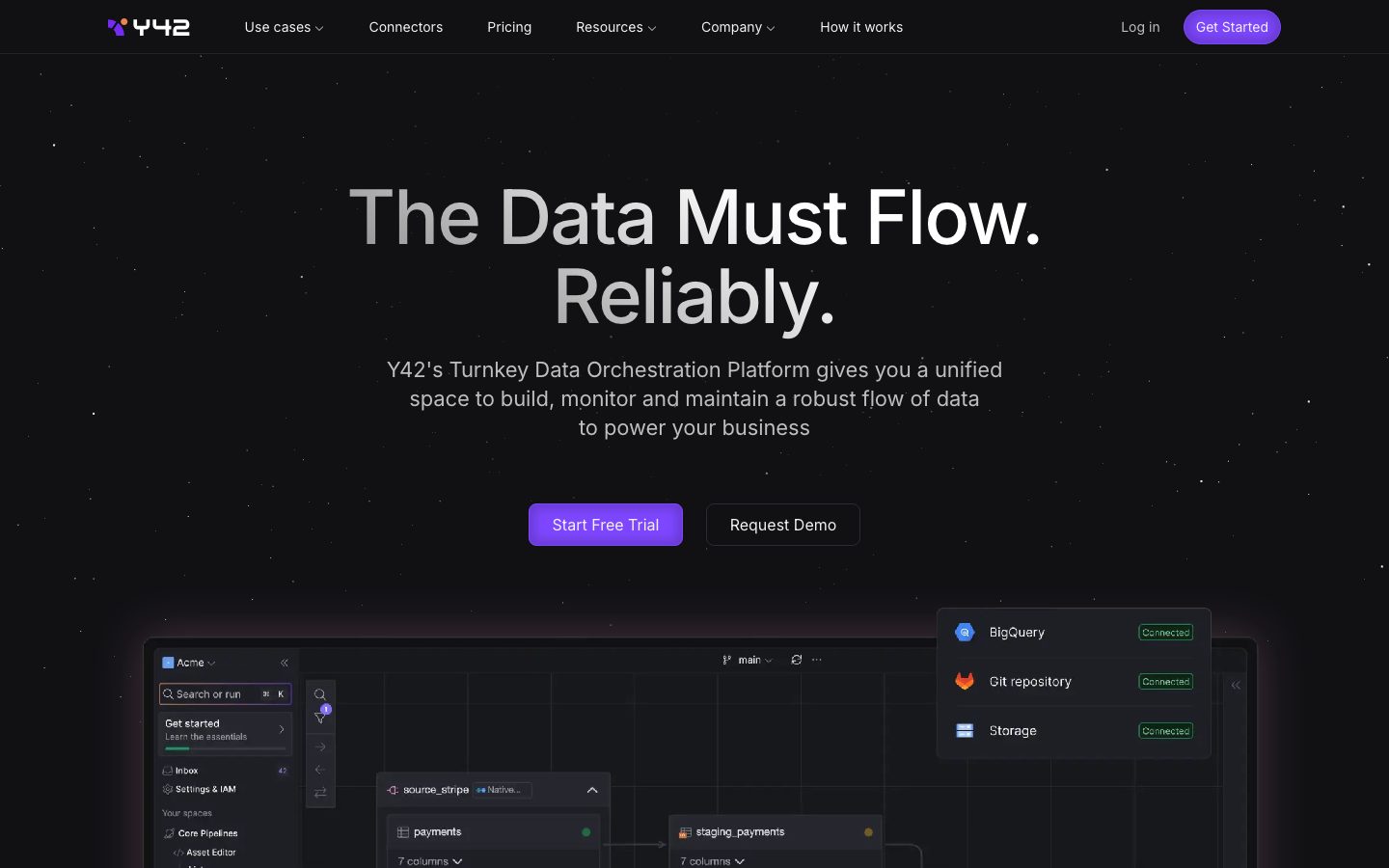
Y42's marketing surface is a dark, cinematic developer-platform interface built on a near-black canvas (`{colors.canvas}` — #111114) with a faint starfield backdrop and a single vivid lavender-purple action color (`{colors.accent}` — #a8a4fd). The system reads as confident, technical SaaS — space-black backdrop, oversized medium-weight Inter headlines, and product-UI screenshots (pipeline editors, connector grids, query consoles) shown directly inside the page rather than illustrated.
The brand voltage is built from two moves: an oversized **display headline** ("The Data Must Flow. Reliably.") rendered in Inter at 78px / weight 500 with aggressive -1.95px tracking, and a lone purple CTA against an otherwise fully monochrome dark palette. Everything else — body copy, nav links, secondary buttons — stays in grayscale, so the purple "Start Free Trial" pill carries all the chromatic energy.
Type is a single family: **Inter** throughout (the analyzer captured `__Inter_f367f3`, Next.js's hashed Inter binding). Display sizes run weight 500 with negative letter-spacing that scales down with size (-1.95px at 78px → -0.11px at 22px body). Body copy is unusually large at 22px / weight 400 — generous, readable, and confident on the dark field.
Component voltage comes from **real product UI fragments shown in-page** — the hero anchors on a large pipeline-editor screenshot with floating "Connected" status cards (BigQuery, Git repository, Storage), and lower bands show connector grids, monitoring gauges, and query consoles at small scale. These screenshot containers are squared (0px radius, per the measured `card` component) — they read as raw product chrome dropped onto the canvas.
**Key Characteristics:**
- Near-black canvas (`{colors.canvas}` — #111114) carrying a faint decorative starfield (scattered 1px dots rendered via stacked box-shadows in `{colors.light-200}`, `{colors.light-300}`, `{colors.neutral-mid}`).
- Single accent color (`{colors.accent}` — #a8a4fd) reserved exclusively for the primary CTA and small highlight moments. Everything else is grayscale.
- Inter at medium weight (500) for all headlines with tight negative tracking; body copy at a large 22px / 400.
- Pill-shaped buttons (`{rounded.pill}` — 999px) — both the purple primary and the outlined secondary use the full pill radius.
- Product-UI screenshots embedded directly in-page with squared (0px) corners — the product chrome IS the marketing imagery.
- Glowing accent shadows on hero artifacts — a multi-layer purple + orange glow (`rgba(110,69,227,0.25)` / `rgba(250,151,97,0.25)`, both derived from the captured box-shadow) frames the hero pipeline screenshot.
- Radius is restrained: `{rounded.md}` (8px) is the dominant card/container radius, `{rounded.pill}` (999px) for buttons and tabs.
## Colors
### Accent
- **Accent** (`{colors.accent}` — #a8a4fd): The single brand color — a lavender-purple. Used on the primary CTA pill ("Start Free Trial", "Get Started"), small highlight text, and accent moments inside product UI. Against the monochrome dark field this is the only chromatic voltage in the system.
- **Accent Deep** (`{colors.accent-deep}` — #111827): A very dark blue-slate used in deeper UI chrome and gradient transitions near the canvas floor.
Note: the live primary button renders a deeper, more saturated purple than `{colors.accent}` (a glow layer in the captured hero shadow reads as `rgba(110,69,227,…)` ≈ #6e45e3 — derived). Only `{colors.accent}` (#a8a4fd) was captured as a solid fill, so the button references it; see Known Gaps.
### Text
- **Ink** (`{colors.ink}` — #f2f2f2): All headlines and primary text — a soft off-white, never pure white, so the type sits gently on the black canvas.
- **Body** (`{colors.body}` — #c6c5c5): Default running-text on dark surfaces — a mid-light gray.
- **Muted** (`{colors.muted}` — #bebdbf): Secondary/low-contrast body text, sub-headings.
- **Muted Soft** (`{colors.muted-soft}` — #9ca3af): Tertiary text — captions, eyebrow labels, fine print.
- **Neutral Mid** (`{colors.neutral-mid}` — #515151): The most frequent neutral — borders, dividers, dimmed icons, starfield dots.
### Surface
- **Canvas** (`{colors.canvas}` — #111114): The default page floor — near-black with a faint blue cast.
- **Surface** (`{colors.surface}` — #18171c): Feature cards, product-screenshot containers, pill-tab fills.
- **Surface Elevated** (`{colors.surface-elevated}` — #171717): Nested cards inside product UI, the floating "Connected" status cards.
- **Surface Strong** (`{colors.surface-strong}` — #404040): Stronger fills and elevated chrome on the dark field.
- **Hairline** (`{colors.hairline}` — #515151) / **Hairline Soft** (`{colors.hairline-soft}` — #404040): The 1px divider tones on dark surfaces.
### Neutral Slate Family
- **Neutral Slate** (`{colors.neutral-slate}` — #4b5563), **Neutral Steel** (`{colors.neutral-steel}` — #374151): Mid-dark grays used in product-UI chrome and secondary surfaces.
### Light Family (product-UI & starfield)
A set of near-white grays used inside light product-UI fragments and the decorative starfield dots: `{colors.light-100}` (#ffffff), `{colors.light-200}` (#f2f1f1), `{colors.light-300}` (#ebebeb), `{colors.light-400}` (#e5e5e5), `{colors.light-500}` (#d4d4d4), `{colors.light-600}` (#d1d5db). These appear inside embedded screenshots and as scattered starfield points, never as primary page surfaces.
## Typography
### Font Family
The system runs **Inter** for everything — display headlines, body, buttons, nav. The analyzer captured the family as `__Inter_f367f3`, which is Next.js's hashed local binding for Inter loaded via `next/font`. Inter is open-source (SIL Open Font License), so it ships as-is — no substitute required. A safe fallback stack is `Inter, -apple-system, BlinkMacSystemFont, "Segoe UI", Roboto, sans-serif`.
The single-family discipline means hierarchy is carried entirely by **size, weight, and letter-spacing** rather than typeface contrast:
- Display / headings: weight 500, negative tracking
- Body: weight 400, near-zero tracking
- Buttons: weight 400, normal tracking
### Hierarchy
| Token | Size | Weight | Line Height | Letter Spacing | Use |
|---|---|---|---|---|---|
| `{typography.display}` | 78px | 500 | 1.051 | -1.95px | Hero h1 ("The Data Must Flow. Reliably.") |
| `{typography.h2}` | 48px | 500 | 1.167 | -0.72px | Section heads ("Your data flows are fragmented…") |
| `{typography.h3}` | 36px | 500 | 1.222 | -0.36px | Sub-section heads, large card titles |
| `{typography.body}` | 22px | 400 | 1.364 | -0.11px | Default running-text — unusually large and generous |
| `{typography.button}` | 14px | 400 | 1.286 | 0 (normal) | Button labels, nav links, captions, footer text |
### Principles
The whole hierarchy lives in one weight pair: 500 for anything heading-scale, 400 for everything else. Y42 never goes to 600/700 — the medium weight at large size is what makes the display read as calm-confident rather than shouting.
Negative letter-spacing scales with size and is part of the voice: -1.95px at the 78px display tightens the headline into a dense, cinematic block; it relaxes to near-zero by body size. Setting the display at default tracking would read as off-brand.
Body copy at 22px is deliberately large — paragraphs breathe on the dark canvas and the generous size compensates for the lower contrast of `{colors.body}` (#c6c5c5) on black.
### Note on Font Substitutes
Inter is fully open-source, so no substitution is needed. If a sans is unavailable for any reason, **Inter Variable** or the system `-apple-system` stack at the same weights and tracking preserves the look.
## Layout
### Spacing System
- **Base unit:** 4px (most tokens are multiples of 4).
- **Tokens:** `{spacing.xxs}` 8px · `{spacing.xs}` 12px · `{spacing.sm}` 16px · `{spacing.md}` 20px · `{spacing.lg}` 24px · `{spacing.xl}` 32px · `{spacing.xxl}` 48px · `{spacing.xxxl}` 64px · `{spacing.section}` 72px · `{spacing.section-lg}` 128px · `{spacing.section-xl}` 160px · `{spacing.gutter-wide}` 224px.
- **Most frequent values:** 16px (gap/padding workhorse), 24px, and 12px dominate the small-scale rhythm.
- **Section rhythm:** Large vertical gaps (72px, 128px, 160px, and a 224px outer gutter appearing 6×) separate the long-scroll editorial bands — the page is generously spaced, giving each band room against the dark field.
### Grid & Container
- **Hero:** Centered single-column composition — display headline, sub-paragraph, and a two-button row stacked and centered, with the large product screenshot anchored below.
- **Feature grids:** 3-up at desktop ("Plug-and-play" / "One platform. Zero hassle." / "Built-in monitoring capabilities").
- **Problem grid:** 4-up at desktop (Tedious / Unpredictable / Wasteful / Expensive).
- **Footer:** 4-column link list (Product / Use Cases / Resources / Company) with the Y42 wordmark + social row at left.
### Whitespace Philosophy
Y42 uses large vertical whitespace between bands (72–160px) and lets the dark canvas do most of the framing. Content is centered and uncrowded — each band carries one heading + supporting cards or one large product screenshot. The generosity reads as a premium, engineered platform.
## Elevation & Depth
| Level | Treatment | Use |
|---|---|---|
| Flat | No shadow, no border | Body bands, nav, footer — depth comes from surface-color steps (canvas → surface → surface-elevated) |
| Inset frame | `rgba(0,0,0,0.2) 0px 0px 12px 4px inset` | Inner shadow on embedded product-screenshot containers |
| Accent glow | Inset dark + `rgba(250,151,97,0.25)` orange glow + `rgba(110,69,227,0.25)` purple glow | The hero pipeline screenshot and key product artifacts — a multi-layer colored glow that lifts the screenshot off the black canvas |
| Starfield | Stacked tiny box-shadows in `{colors.light-200}`, `{colors.light-300}`, `{colors.neutral-mid}` scattered across the viewport | Decorative star points on the canvas backdrop |
The elevation philosophy is **glow-based, not shadow-based** — instead of grounding cards with drop shadows on a light page, Y42 lifts artifacts off the black canvas with soft colored glows (purple + orange) and inner-shadow frames. Surface-color stepping (canvas #111114 → surface #18171c → surface-elevated #171717) does the rest of the depth work.
### Decorative Depth
- The starfield is built from stacked single-pixel box-shadows scattered at fixed coordinates across the page (captured values place dots at e.g. 1589px/1471px, 1481px/993px, etc.) — pure CSS decoration, not images.
- The hero artifact's purple/orange glow is the only place chromatic light appears outside the accent CTA — it echoes the brand purple into the product imagery.
## Shapes
### Border Radius Scale
| Token | Value | Use |
|---|---|---|
| `{rounded.md}` | 8px | The dominant radius — feature cards, integration status cards, status badges, most containers |
| `{rounded.lg}` | 12px | Slightly larger panels and nested chrome |
| `{rounded.pill}` | 999px | Primary + secondary buttons, pill-tabs |
| `{rounded.full}` | 1000px | Avatars, fully-round icon chips |
Note: embedded product-screenshot containers measured at **0px radius** (the `card` component) — Y42's screenshots are deliberately squared, reading as raw product chrome rather than rounded marketing cards.
### Photography / Imagery Geometry
Product UI is shown as squared (0px) screenshots framed by inset shadow + accent glow. Logo wall imagery (Cambridge, Kranus, OpenAI, Statsig, Writer, etc.) sits as monochrome marks on the canvas. No rounded photo crops appear in the marketing surface.
## Components
### Top Navigation
**`top-nav`** — Transparent-over-canvas nav pinned to the top. Carries the Y42 wordmark + logo at left (the purple "Y42" mark), a horizontal menu (Use cases, Connectors, Pricing, Resources, Company, How it works) center, and a right cluster with a "Log in" `{component.nav-link}` plus the "Get Started" `{component.button-primary}`. Menu items in `{typography.button}` (Inter 14px / 400), text color `{colors.body}`.
**`nav-link`** — Inline nav items, transparent background, `{colors.body}` text in `{typography.button}`.
### Buttons
**`button-primary`** — The signature CTA. Background `{colors.accent}` (#a8a4fd), text `{colors.on-accent}` (#f2f2f2), type `{typography.button}` (Inter 14px / 400), padding 8px × 16px, fully pill-shaped `{rounded.pill}` (999px). Used for "Start Free Trial" and "Get Started". The only chromatic element in the layout.
**`button-secondary`** — Outlined/ghost button beside the primary ("Request Demo"). Transparent background, `{colors.ink}` text, 1px hairline border in `{colors.hairline}`, same pill radius and padding as primary.
### Cards & Containers
**`hero-band`** — The opening band: centered `{typography.display}` headline, a `{typography.body}` sub-paragraph, and a centered two-button row, with a large product screenshot anchored below. Background `{colors.canvas}`, vertical padding `{spacing.section}` (72px).
**`product-screenshot-card`** — A squared (0px-radius, per the measured `card`) container holding a real Y42 product screenshot (pipeline editor, query console, connector grid). Background `{colors.surface}`, framed with an inset shadow and the accent purple/orange glow. The product chrome IS the imagery.
**`feature-card`** — Used in the 3-up feature grids and 4-up problem grid. Background `{colors.surface}` (#18171c), rounded `{rounded.md}` (8px), padding `{spacing.lg}` (24px). Carries a small icon, a title, and a description in `{typography.body}` / `{colors.body}`.
**`integration-status-card`** — The floating "Connected" cards in the hero (BigQuery, Git repository, Storage). Background `{colors.surface-elevated}` (#171717), rounded `{rounded.md}`, padding `{spacing.sm}` (16px). Each row pairs a service icon + label with a small green "Connected" status badge.
**`card`** — The generic measured container: `{colors.surface}` background, `{rounded.md}` corners, no drop shadow (depth from surface stepping + glow). Note the embedded screenshot variant renders at 0px radius.
### Tabs / Tags
**`pill-tab`** — Pill-shaped selector chips inside product feature sections (e.g., native-compatibility tool tabs, "Interactive tour"). Background `{colors.surface}`, text `{colors.body}`, `{typography.button}`, rounded `{rounded.pill}`, padding 8px × 16px.
**`status-badge`** — Small "Connected" status pill inside integration cards. Transparent/subtle fill, accent-tinted text (`{colors.accent}` family), `{typography.button}`, rounded `{rounded.md}`, padding 8px × 12px.
### Footer
**`footer`** — Canvas-colored footer that closes the page (sitting above a purple/orange horizon glow gradient). Background `{colors.canvas}`, text `{colors.muted}` in `{typography.button}`. 4-column link list (Product / Use Cases / Resources / Company) with the Y42 wordmark + social row at left. Vertical padding `{spacing.section}` (72px).
## Do's and Don'ts
### Do
- Reserve `{colors.accent}` (#a8a4fd) for the primary CTA and rare highlight moments. Y42's action color is purple, and it appears exactly once per band.
- Use Inter at weight 500 for every heading and 400 for everything else. The two-weight discipline is the type system.
- Apply negative letter-spacing on display + heading sizes (-1.95px scaling down to -0.36px). The tight tracking is part of the voice.
- Show real product UI as squared (0px) screenshots framed by inset shadow + accent glow. The product chrome is the marketing imagery.
- Build depth from surface-color steps (canvas → surface → surface-elevated) and soft glows, not heavy drop shadows.
- Use pill-shaped buttons (`{rounded.pill}`) for all CTAs and tabs.
- Keep body copy large (22px) and generously spaced against the dark canvas.
### Don't
- Don't introduce a second accent color. The lone purple against grayscale is the entire chromatic strategy.
- Don't bold headings past weight 500. The medium weight at large scale is what reads as calm-confident.
- Don't round the product screenshots — they're deliberately squared (0px).
- Don't use pure white (#ffffff) for headline text — Y42 uses soft off-white `{colors.ink}` (#f2f2f2) so type rests gently on black.
- Don't drop drop-shadows on cards as the depth cue; use surface stepping and the inset/glow treatment.
- Don't add hover-state styling beyond the documented default and active/pressed treatments.
## Responsive Behavior
### Breakpoints
| Name | Width | Key Changes |
|---|---|---|
| Mobile | < 768px | Hamburger nav; display headline scales down from 78px; hero buttons stack; feature/problem grids collapse to 1-up; footer columns stack |
| Tablet | 768–1024px | Nav tightens; feature grids 2-up; problem grid 2-up; hero screenshot scales proportionally |
| Desktop | 1024–1440px | Full horizontal nav; 3-up feature cards; 4-up problem grid |
| Wide | > 1440px | Same as desktop with the wide outer gutter (`{spacing.gutter-wide}` 224px) giving extra breathing room |
### Touch Targets
- `{component.button-primary}` and `{component.button-secondary}` use 8px × 16px padding at 14px label — small by raw metrics; ensure a minimum 44px effective tap height on touch by adding vertical inset.
- `{component.pill-tab}` and `{component.nav-link}` need expanded tap area on mobile to reach the 44px guideline.
### Collapsing Strategy
- Top nav collapses to a hamburger at mobile.
- The hero's centered headline + button row stacks vertically; the product screenshot scales proportionally and stays legible.
- Feature grids reduce column count (3 → 2 → 1) rather than shrinking cards.
- The starfield backdrop and accent glow scale with the viewport.
### Image Behavior
- Product-UI screenshots retain native aspect ratio; containers resize.
- The hero glow and starfield are CSS-rendered, so they reflow with the page rather than being fixed raster images.
## Iteration Guide
1. Focus on ONE component at a time. Reference its YAML key directly (`{component.feature-card}`, `{component.button-primary}`).
2. Variants of a component (`-active`, `-disabled`, `-focused`) live as separate entries in `components:`.
3. Use `{token.refs}` everywhere — never inline a hex in a component.
4. Never document hover. Default and Active/Pressed states only.
5. Headings stay Inter 500 with negative tracking; body stays Inter 400. Don't blur the two-weight system.
6. The purple accent is scarce by design — one CTA per band. Don't multiply it.
7. When in doubt about emphasis: bigger Inter before bolder Inter.
## Known Gaps
- The live primary button renders a deeper, more saturated purple than the captured solid `{colors.accent}` (#a8a4fd) — a glow layer in the hero box-shadow reads as `rgba(110,69,227,…)` ≈ #6e45e3 (derived). Only #a8a4fd was captured as a solid fill, so the button references it; the exact button background hex was not directly measured.
- Only two components were captured by the analyzer (`button-primary` and a generic `card`); secondary button, nav, feature card, status badge, and pill-tab specs are documented from screenshot ground-truth plus the measured token set. Their exact padding/border values beyond the captured button (8px × 16px) are inferred.
- The card component measured `radius: 0px, shadow: none` — this reflects the squared product-screenshot containers; the rounded feature cards (`{rounded.md}`) seen in screenshots were not separately captured as a distinct component.
- Button background and active/pressed states were not measured (only the `#f2f2f2` text color was captured for `button-primary`); pressed-state treatment is undocumented.
- Light-family grays (#ffffff → #d1d5db) appear inside embedded product UI and the starfield; their exact roles inside the product chrome are out of scope of the marketing surface.
- The starfield and hero glow coordinates are captured as fixed box-shadow values; their animation/parallax behavior (if any) was not extracted.
- Inter was captured via Next.js's hashed `__Inter_f367f3` binding; the exact subset/variable-axis configuration was not measured. No licensed typefaces were flagged (`fonts_licensed` empty).
- Form inputs, dropdown menus (Use cases / Resources / Company), and pricing-table components were present in navigation but not captured as measured tokens.
- The 524px spacing value appeared once and is likely a one-off layout dimension rather than a rhythm token; it is excluded from the spacing scale.
<!-- Documented by duply · real-world design systems as ready-to-use DESIGN.md for AI coding agents · https://duply.ai/y42/design-md -->
Color Palette
Accent
Neutrals
Typography
display78px · 500 · 1.051
The quick brown fox jumpsh248px · 500 · 1.167
The quick brown fox jumpsh336px · 500 · 1.222
The quick brown fox jumpsbody22px · 400 · 1.364
The quick brown fox jumpsbutton14px · 400 · 1.286
The quick brown fox jumpsSpacing & Shape
Spacing
| Name | Value | Preview |
|---|---|---|
| xxs | 8px | |
| xs | 12px | |
| sm | 16px | |
| md | 20px | |
| lg | 24px | |
| xl | 32px | |
| xxl | 48px | |
| xxxl | 64px | |
| section | 72px | |
| section-lg | 128px | |
| section-xl | 160px | |
| gutter-wide | 224px |
Border Radius
| Name | Value | Preview |
|---|---|---|
| md | 8px | |
| lg | 12px | |
| pill | 999px | |
| full | 1000px |
More like this


---
version: alpha
name: Y42-design-analysis
description: "A dark, cinematic data-orchestration interface built on a near-black canvas (#111114) with a single vivid lavender-purple CTA, Inter typography at medium weight with tight negative tracking, and large pill-shaped buttons. The system reads as confident developer-platform SaaS — space-black backdrop with a faint starfield, product-UI screenshots shown directly in-page, glowing accent shadows on hero artifacts, and squared (0px-radius) screenshot containers. Brand voltage comes from the oversized \"The Data Must Flow.\" display headline and the lone purple action color against an otherwise monochrome dark palette."

colors:
  accent: "#a8a4fd"
  accent-deep: "#111827"
  ink: "#f2f2f2"
  body: "#c6c5c5"
  muted: "#bebdbf"
  muted-soft: "#9ca3af"
  neutral-mid: "#515151"
  neutral-slate: "#4b5563"
  neutral-steel: "#374151"
  canvas: "#111114"
  surface: "#18171c"
  surface-elevated: "#171717"
  surface-strong: "#404040"
  hairline: "#515151"
  hairline-soft: "#404040"
  light-100: "#ffffff"
  light-200: "#f2f1f1"
  light-300: "#ebebeb"
  light-400: "#e5e5e5"
  light-500: "#d4d4d4"
  light-600: "#d1d5db"
  on-accent: "#f2f2f2"
  on-dark: "#f2f2f2"

typography:
  display:
    fontFamily: "Inter, sans-serif"
    fontSize: 78px
    fontWeight: 500
    lineHeight: 1.051
    letterSpacing: -1.95px
  h2:
    fontFamily: "Inter, sans-serif"
    fontSize: 48px
    fontWeight: 500
    lineHeight: 1.167
    letterSpacing: -0.72px
  h3:
    fontFamily: "Inter, sans-serif"
    fontSize: 36px
    fontWeight: 500
    lineHeight: 1.222
    letterSpacing: -0.36px
  body:
    fontFamily: "Inter, sans-serif"
    fontSize: 22px
    fontWeight: 400
    lineHeight: 1.364
    letterSpacing: -0.11px
  button:
    fontFamily: "Inter, sans-serif"
    fontSize: 14px
    fontWeight: 400
    lineHeight: 1.286
    letterSpacing: 0

rounded:
  md: 8px
  lg: 12px
  pill: 999px
  full: 1000px

spacing:
  xxs: 8px
  xs: 12px
  sm: 16px
  md: 20px
  lg: 24px
  xl: 32px
  xxl: 48px
  xxxl: 64px
  section: 72px
  section-lg: 128px
  section-xl: 160px
  gutter-wide: 224px

components:
  top-nav:
    backgroundColor: "{colors.canvas}"
    textColor: "{colors.body}"
    typography: "{typography.button}"
  button-primary:
    backgroundColor: "{colors.accent}"
    textColor: "{colors.on-accent}"
    typography: "{typography.button}"
    rounded: "{rounded.pill}"
    padding: 8px 16px
  button-secondary:
    backgroundColor: transparent
    textColor: "{colors.ink}"
    typography: "{typography.button}"
    rounded: "{rounded.pill}"
    padding: 8px 16px
  nav-link:
    backgroundColor: transparent
    textColor: "{colors.body}"
    typography: "{typography.button}"
  hero-band:
    backgroundColor: "{colors.canvas}"
    textColor: "{colors.ink}"
    typography: "{typography.display}"
    padding: 72px
  product-screenshot-card:
    backgroundColor: "{colors.surface}"
    textColor: "{colors.ink}"
    rounded: "{rounded.md}"
  feature-card:
    backgroundColor: "{colors.surface}"
    textColor: "{colors.ink}"
    typography: "{typography.body}"
    rounded: "{rounded.md}"
    padding: 24px
  integration-status-card:
    backgroundColor: "{colors.surface-elevated}"
    textColor: "{colors.ink}"
    rounded: "{rounded.md}"
    padding: 16px
  status-badge:
    backgroundColor: transparent
    textColor: "{colors.accent}"
    typography: "{typography.button}"
    rounded: "{rounded.md}"
    padding: 8px 12px
  pill-tab:
    backgroundColor: "{colors.surface}"
    textColor: "{colors.body}"
    typography: "{typography.button}"
    rounded: "{rounded.pill}"
    padding: 8px 16px
  card:
    backgroundColor: "{colors.surface}"
    textColor: "{colors.ink}"
    rounded: "{rounded.md}"
  footer:
    backgroundColor: "{colors.canvas}"
    textColor: "{colors.muted}"
    typography: "{typography.button}"
    padding: 72px

---

## Overview

Y42's marketing surface is a dark, cinematic developer-platform interface built on a near-black canvas (`{colors.canvas}` — #111114) with a faint starfield backdrop and a single vivid lavender-purple action color (`{colors.accent}` — #a8a4fd). The system reads as confident, technical SaaS — space-black backdrop, oversized medium-weight Inter headlines, and product-UI screenshots (pipeline editors, connector grids, query consoles) shown directly inside the page rather than illustrated.

The brand voltage is built from two moves: an oversized **display headline** ("The Data Must Flow. Reliably.") rendered in Inter at 78px / weight 500 with aggressive -1.95px tracking, and a lone purple CTA against an otherwise fully monochrome dark palette. Everything else — body copy, nav links, secondary buttons — stays in grayscale, so the purple "Start Free Trial" pill carries all the chromatic energy.

Type is a single family: **Inter** throughout (the analyzer captured `__Inter_f367f3`, Next.js's hashed Inter binding). Display sizes run weight 500 with negative letter-spacing that scales down with size (-1.95px at 78px → -0.11px at 22px body). Body copy is unusually large at 22px / weight 400 — generous, readable, and confident on the dark field.

Component voltage comes from **real product UI fragments shown in-page** — the hero anchors on a large pipeline-editor screenshot with floating "Connected" status cards (BigQuery, Git repository, Storage), and lower bands show connector grids, monitoring gauges, and query consoles at small scale. These screenshot containers are squared (0px radius, per the measured `card` component) — they read as raw product chrome dropped onto the canvas.

**Key Characteristics:**
- Near-black canvas (`{colors.canvas}` — #111114) carrying a faint decorative starfield (scattered 1px dots rendered via stacked box-shadows in `{colors.light-200}`, `{colors.light-300}`, `{colors.neutral-mid}`).
- Single accent color (`{colors.accent}` — #a8a4fd) reserved exclusively for the primary CTA and small highlight moments. Everything else is grayscale.
- Inter at medium weight (500) for all headlines with tight negative tracking; body copy at a large 22px / 400.
- Pill-shaped buttons (`{rounded.pill}` — 999px) — both the purple primary and the outlined secondary use the full pill radius.
- Product-UI screenshots embedded directly in-page with squared (0px) corners — the product chrome IS the marketing imagery.
- Glowing accent shadows on hero artifacts — a multi-layer purple + orange glow (`rgba(110,69,227,0.25)` / `rgba(250,151,97,0.25)`, both derived from the captured box-shadow) frames the hero pipeline screenshot.
- Radius is restrained: `{rounded.md}` (8px) is the dominant card/container radius, `{rounded.pill}` (999px) for buttons and tabs.

## Colors

### Accent
- **Accent** (`{colors.accent}` — #a8a4fd): The single brand color — a lavender-purple. Used on the primary CTA pill ("Start Free Trial", "Get Started"), small highlight text, and accent moments inside product UI. Against the monochrome dark field this is the only chromatic voltage in the system.
- **Accent Deep** (`{colors.accent-deep}` — #111827): A very dark blue-slate used in deeper UI chrome and gradient transitions near the canvas floor.

Note: the live primary button renders a deeper, more saturated purple than `{colors.accent}` (a glow layer in the captured hero shadow reads as `rgba(110,69,227,…)` ≈ #6e45e3 — derived). Only `{colors.accent}` (#a8a4fd) was captured as a solid fill, so the button references it; see Known Gaps.

### Text
- **Ink** (`{colors.ink}` — #f2f2f2): All headlines and primary text — a soft off-white, never pure white, so the type sits gently on the black canvas.
- **Body** (`{colors.body}` — #c6c5c5): Default running-text on dark surfaces — a mid-light gray.
- **Muted** (`{colors.muted}` — #bebdbf): Secondary/low-contrast body text, sub-headings.
- **Muted Soft** (`{colors.muted-soft}` — #9ca3af): Tertiary text — captions, eyebrow labels, fine print.
- **Neutral Mid** (`{colors.neutral-mid}` — #515151): The most frequent neutral — borders, dividers, dimmed icons, starfield dots.

### Surface
- **Canvas** (`{colors.canvas}` — #111114): The default page floor — near-black with a faint blue cast.
- **Surface** (`{colors.surface}` — #18171c): Feature cards, product-screenshot containers, pill-tab fills.
- **Surface Elevated** (`{colors.surface-elevated}` — #171717): Nested cards inside product UI, the floating "Connected" status cards.
- **Surface Strong** (`{colors.surface-strong}` — #404040): Stronger fills and elevated chrome on the dark field.
- **Hairline** (`{colors.hairline}` — #515151) / **Hairline Soft** (`{colors.hairline-soft}` — #404040): The 1px divider tones on dark surfaces.

### Neutral Slate Family
- **Neutral Slate** (`{colors.neutral-slate}` — #4b5563), **Neutral Steel** (`{colors.neutral-steel}` — #374151): Mid-dark grays used in product-UI chrome and secondary surfaces.

### Light Family (product-UI & starfield)
A set of near-white grays used inside light product-UI fragments and the decorative starfield dots: `{colors.light-100}` (#ffffff), `{colors.light-200}` (#f2f1f1), `{colors.light-300}` (#ebebeb), `{colors.light-400}` (#e5e5e5), `{colors.light-500}` (#d4d4d4), `{colors.light-600}` (#d1d5db). These appear inside embedded screenshots and as scattered starfield points, never as primary page surfaces.

## Typography

### Font Family
The system runs **Inter** for everything — display headlines, body, buttons, nav. The analyzer captured the family as `__Inter_f367f3`, which is Next.js's hashed local binding for Inter loaded via `next/font`. Inter is open-source (SIL Open Font License), so it ships as-is — no substitute required. A safe fallback stack is `Inter, -apple-system, BlinkMacSystemFont, "Segoe UI", Roboto, sans-serif`.

The single-family discipline means hierarchy is carried entirely by **size, weight, and letter-spacing** rather than typeface contrast:
- Display / headings: weight 500, negative tracking
- Body: weight 400, near-zero tracking
- Buttons: weight 400, normal tracking

### Hierarchy

| Token | Size | Weight | Line Height | Letter Spacing | Use |
|---|---|---|---|---|---|
| `{typography.display}` | 78px | 500 | 1.051 | -1.95px | Hero h1 ("The Data Must Flow. Reliably.") |
| `{typography.h2}` | 48px | 500 | 1.167 | -0.72px | Section heads ("Your data flows are fragmented…") |
| `{typography.h3}` | 36px | 500 | 1.222 | -0.36px | Sub-section heads, large card titles |
| `{typography.body}` | 22px | 400 | 1.364 | -0.11px | Default running-text — unusually large and generous |
| `{typography.button}` | 14px | 400 | 1.286 | 0 (normal) | Button labels, nav links, captions, footer text |

### Principles
The whole hierarchy lives in one weight pair: 500 for anything heading-scale, 400 for everything else. Y42 never goes to 600/700 — the medium weight at large size is what makes the display read as calm-confident rather than shouting.

Negative letter-spacing scales with size and is part of the voice: -1.95px at the 78px display tightens the headline into a dense, cinematic block; it relaxes to near-zero by body size. Setting the display at default tracking would read as off-brand.

Body copy at 22px is deliberately large — paragraphs breathe on the dark canvas and the generous size compensates for the lower contrast of `{colors.body}` (#c6c5c5) on black.

### Note on Font Substitutes
Inter is fully open-source, so no substitution is needed. If a sans is unavailable for any reason, **Inter Variable** or the system `-apple-system` stack at the same weights and tracking preserves the look.

## Layout

### Spacing System
- **Base unit:** 4px (most tokens are multiples of 4).
- **Tokens:** `{spacing.xxs}` 8px · `{spacing.xs}` 12px · `{spacing.sm}` 16px · `{spacing.md}` 20px · `{spacing.lg}` 24px · `{spacing.xl}` 32px · `{spacing.xxl}` 48px · `{spacing.xxxl}` 64px · `{spacing.section}` 72px · `{spacing.section-lg}` 128px · `{spacing.section-xl}` 160px · `{spacing.gutter-wide}` 224px.
- **Most frequent values:** 16px (gap/padding workhorse), 24px, and 12px dominate the small-scale rhythm.
- **Section rhythm:** Large vertical gaps (72px, 128px, 160px, and a 224px outer gutter appearing 6×) separate the long-scroll editorial bands — the page is generously spaced, giving each band room against the dark field.

### Grid & Container
- **Hero:** Centered single-column composition — display headline, sub-paragraph, and a two-button row stacked and centered, with the large product screenshot anchored below.
- **Feature grids:** 3-up at desktop ("Plug-and-play" / "One platform. Zero hassle." / "Built-in monitoring capabilities").
- **Problem grid:** 4-up at desktop (Tedious / Unpredictable / Wasteful / Expensive).
- **Footer:** 4-column link list (Product / Use Cases / Resources / Company) with the Y42 wordmark + social row at left.

### Whitespace Philosophy
Y42 uses large vertical whitespace between bands (72–160px) and lets the dark canvas do most of the framing. Content is centered and uncrowded — each band carries one heading + supporting cards or one large product screenshot. The generosity reads as a premium, engineered platform.

## Elevation & Depth

| Level | Treatment | Use |
|---|---|---|
| Flat | No shadow, no border | Body bands, nav, footer — depth comes from surface-color steps (canvas → surface → surface-elevated) |
| Inset frame | `rgba(0,0,0,0.2) 0px 0px 12px 4px inset` | Inner shadow on embedded product-screenshot containers |
| Accent glow | Inset dark + `rgba(250,151,97,0.25)` orange glow + `rgba(110,69,227,0.25)` purple glow | The hero pipeline screenshot and key product artifacts — a multi-layer colored glow that lifts the screenshot off the black canvas |
| Starfield | Stacked tiny box-shadows in `{colors.light-200}`, `{colors.light-300}`, `{colors.neutral-mid}` scattered across the viewport | Decorative star points on the canvas backdrop |

The elevation philosophy is **glow-based, not shadow-based** — instead of grounding cards with drop shadows on a light page, Y42 lifts artifacts off the black canvas with soft colored glows (purple + orange) and inner-shadow frames. Surface-color stepping (canvas #111114 → surface #18171c → surface-elevated #171717) does the rest of the depth work.

### Decorative Depth
- The starfield is built from stacked single-pixel box-shadows scattered at fixed coordinates across the page (captured values place dots at e.g. 1589px/1471px, 1481px/993px, etc.) — pure CSS decoration, not images.
- The hero artifact's purple/orange glow is the only place chromatic light appears outside the accent CTA — it echoes the brand purple into the product imagery.

## Shapes

### Border Radius Scale

| Token | Value | Use |
|---|---|---|
| `{rounded.md}` | 8px | The dominant radius — feature cards, integration status cards, status badges, most containers |
| `{rounded.lg}` | 12px | Slightly larger panels and nested chrome |
| `{rounded.pill}` | 999px | Primary + secondary buttons, pill-tabs |
| `{rounded.full}` | 1000px | Avatars, fully-round icon chips |

Note: embedded product-screenshot containers measured at **0px radius** (the `card` component) — Y42's screenshots are deliberately squared, reading as raw product chrome rather than rounded marketing cards.

### Photography / Imagery Geometry
Product UI is shown as squared (0px) screenshots framed by inset shadow + accent glow. Logo wall imagery (Cambridge, Kranus, OpenAI, Statsig, Writer, etc.) sits as monochrome marks on the canvas. No rounded photo crops appear in the marketing surface.

## Components

### Top Navigation

**`top-nav`** — Transparent-over-canvas nav pinned to the top. Carries the Y42 wordmark + logo at left (the purple "Y42" mark), a horizontal menu (Use cases, Connectors, Pricing, Resources, Company, How it works) center, and a right cluster with a "Log in" `{component.nav-link}` plus the "Get Started" `{component.button-primary}`. Menu items in `{typography.button}` (Inter 14px / 400), text color `{colors.body}`.

**`nav-link`** — Inline nav items, transparent background, `{colors.body}` text in `{typography.button}`.

### Buttons

**`button-primary`** — The signature CTA. Background `{colors.accent}` (#a8a4fd), text `{colors.on-accent}` (#f2f2f2), type `{typography.button}` (Inter 14px / 400), padding 8px × 16px, fully pill-shaped `{rounded.pill}` (999px). Used for "Start Free Trial" and "Get Started". The only chromatic element in the layout.

**`button-secondary`** — Outlined/ghost button beside the primary ("Request Demo"). Transparent background, `{colors.ink}` text, 1px hairline border in `{colors.hairline}`, same pill radius and padding as primary.

### Cards & Containers

**`hero-band`** — The opening band: centered `{typography.display}` headline, a `{typography.body}` sub-paragraph, and a centered two-button row, with a large product screenshot anchored below. Background `{colors.canvas}`, vertical padding `{spacing.section}` (72px).

**`product-screenshot-card`** — A squared (0px-radius, per the measured `card`) container holding a real Y42 product screenshot (pipeline editor, query console, connector grid). Background `{colors.surface}`, framed with an inset shadow and the accent purple/orange glow. The product chrome IS the imagery.

**`feature-card`** — Used in the 3-up feature grids and 4-up problem grid. Background `{colors.surface}` (#18171c), rounded `{rounded.md}` (8px), padding `{spacing.lg}` (24px). Carries a small icon, a title, and a description in `{typography.body}` / `{colors.body}`.

**`integration-status-card`** — The floating "Connected" cards in the hero (BigQuery, Git repository, Storage). Background `{colors.surface-elevated}` (#171717), rounded `{rounded.md}`, padding `{spacing.sm}` (16px). Each row pairs a service icon + label with a small green "Connected" status badge.

**`card`** — The generic measured container: `{colors.surface}` background, `{rounded.md}` corners, no drop shadow (depth from surface stepping + glow). Note the embedded screenshot variant renders at 0px radius.

### Tabs / Tags

**`pill-tab`** — Pill-shaped selector chips inside product feature sections (e.g., native-compatibility tool tabs, "Interactive tour"). Background `{colors.surface}`, text `{colors.body}`, `{typography.button}`, rounded `{rounded.pill}`, padding 8px × 16px.

**`status-badge`** — Small "Connected" status pill inside integration cards. Transparent/subtle fill, accent-tinted text (`{colors.accent}` family), `{typography.button}`, rounded `{rounded.md}`, padding 8px × 12px.

### Footer

**`footer`** — Canvas-colored footer that closes the page (sitting above a purple/orange horizon glow gradient). Background `{colors.canvas}`, text `{colors.muted}` in `{typography.button}`. 4-column link list (Product / Use Cases / Resources / Company) with the Y42 wordmark + social row at left. Vertical padding `{spacing.section}` (72px).

## Do's and Don'ts

### Do
- Reserve `{colors.accent}` (#a8a4fd) for the primary CTA and rare highlight moments. Y42's action color is purple, and it appears exactly once per band.
- Use Inter at weight 500 for every heading and 400 for everything else. The two-weight discipline is the type system.
- Apply negative letter-spacing on display + heading sizes (-1.95px scaling down to -0.36px). The tight tracking is part of the voice.
- Show real product UI as squared (0px) screenshots framed by inset shadow + accent glow. The product chrome is the marketing imagery.
- Build depth from surface-color steps (canvas → surface → surface-elevated) and soft glows, not heavy drop shadows.
- Use pill-shaped buttons (`{rounded.pill}`) for all CTAs and tabs.
- Keep body copy large (22px) and generously spaced against the dark canvas.

### Don't
- Don't introduce a second accent color. The lone purple against grayscale is the entire chromatic strategy.
- Don't bold headings past weight 500. The medium weight at large scale is what reads as calm-confident.
- Don't round the product screenshots — they're deliberately squared (0px).
- Don't use pure white (#ffffff) for headline text — Y42 uses soft off-white `{colors.ink}` (#f2f2f2) so type rests gently on black.
- Don't drop drop-shadows on cards as the depth cue; use surface stepping and the inset/glow treatment.
- Don't add hover-state styling beyond the documented default and active/pressed treatments.

## Responsive Behavior

### Breakpoints

| Name | Width | Key Changes |
|---|---|---|
| Mobile | < 768px | Hamburger nav; display headline scales down from 78px; hero buttons stack; feature/problem grids collapse to 1-up; footer columns stack |
| Tablet | 768–1024px | Nav tightens; feature grids 2-up; problem grid 2-up; hero screenshot scales proportionally |
| Desktop | 1024–1440px | Full horizontal nav; 3-up feature cards; 4-up problem grid |
| Wide | > 1440px | Same as desktop with the wide outer gutter (`{spacing.gutter-wide}` 224px) giving extra breathing room |

### Touch Targets
- `{component.button-primary}` and `{component.button-secondary}` use 8px × 16px padding at 14px label — small by raw metrics; ensure a minimum 44px effective tap height on touch by adding vertical inset.
- `{component.pill-tab}` and `{component.nav-link}` need expanded tap area on mobile to reach the 44px guideline.

### Collapsing Strategy
- Top nav collapses to a hamburger at mobile.
- The hero's centered headline + button row stacks vertically; the product screenshot scales proportionally and stays legible.
- Feature grids reduce column count (3 → 2 → 1) rather than shrinking cards.
- The starfield backdrop and accent glow scale with the viewport.

### Image Behavior
- Product-UI screenshots retain native aspect ratio; containers resize.
- The hero glow and starfield are CSS-rendered, so they reflow with the page rather than being fixed raster images.

## Iteration Guide

1. Focus on ONE component at a time. Reference its YAML key directly (`{component.feature-card}`, `{component.button-primary}`).
2. Variants of a component (`-active`, `-disabled`, `-focused`) live as separate entries in `components:`.
3. Use `{token.refs}` everywhere — never inline a hex in a component.
4. Never document hover. Default and Active/Pressed states only.
5. Headings stay Inter 500 with negative tracking; body stays Inter 400. Don't blur the two-weight system.
6. The purple accent is scarce by design — one CTA per band. Don't multiply it.
7. When in doubt about emphasis: bigger Inter before bolder Inter.

## Known Gaps

- The live primary button renders a deeper, more saturated purple than the captured solid `{colors.accent}` (#a8a4fd) — a glow layer in the hero box-shadow reads as `rgba(110,69,227,…)` ≈ #6e45e3 (derived). Only #a8a4fd was captured as a solid fill, so the button references it; the exact button background hex was not directly measured.
- Only two components were captured by the analyzer (`button-primary` and a generic `card`); secondary button, nav, feature card, status badge, and pill-tab specs are documented from screenshot ground-truth plus the measured token set. Their exact padding/border values beyond the captured button (8px × 16px) are inferred.
- The card component measured `radius: 0px, shadow: none` — this reflects the squared product-screenshot containers; the rounded feature cards (`{rounded.md}`) seen in screenshots were not separately captured as a distinct component.
- Button background and active/pressed states were not measured (only the `#f2f2f2` text color was captured for `button-primary`); pressed-state treatment is undocumented.
- Light-family grays (#ffffff → #d1d5db) appear inside embedded product UI and the starfield; their exact roles inside the product chrome are out of scope of the marketing surface.
- The starfield and hero glow coordinates are captured as fixed box-shadow values; their animation/parallax behavior (if any) was not extracted.
- Inter was captured via Next.js's hashed `__Inter_f367f3` binding; the exact subset/variable-axis configuration was not measured. No licensed typefaces were flagged (`fonts_licensed` empty).
- Form inputs, dropdown menus (Use cases / Resources / Company), and pricing-table components were present in navigation but not captured as measured tokens.
- The 524px spacing value appeared once and is likely a one-off layout dimension rather than a rhythm token; it is excluded from the spacing scale.

<!-- Documented by duply · real-world design systems as ready-to-use DESIGN.md for AI coding agents · https://duply.ai/y42/design-md -->