GSAP
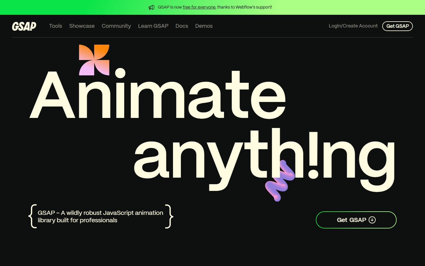
A dark, high-contrast developer-brand interface built on a near-black canvas (#0e100f) with warm cream ink (#fffce1) and oversized Mori display type. The system reads as confident, playful, and engineering-led — enormous wordmark-scale headlines, a tight monochrome core punctuated by a vivid multi-hue accent set (orange, lime-green, pink, violet, cyan) drawn from GSAP's plugin branding, square/no-radius primary CTAs alongside fully-pill outline buttons, and decorative 3D gradient shapes floating over the hero. Brand voltage comes from scale and the saturated accent palette, not from surface variety.
---
version: alpha
name: GSAP-design-analysis
description: A dark, high-contrast developer-brand interface built on a near-black canvas (#0e100f) with warm cream ink (#fffce1) and oversized Mori display type. The system reads as confident, playful, and engineering-led — enormous wordmark-scale headlines, a tight monochrome core punctuated by a vivid multi-hue accent set (orange, lime-green, pink, violet, cyan) drawn from GSAP's plugin branding, square/no-radius primary CTAs alongside fully-pill outline buttons, and decorative 3D gradient shapes floating over the hero. Brand voltage comes from scale and the saturated accent palette, not from surface variety.

colors:
  ink: "#fffce1"
  canvas: "#0e100f"
  on-primary: "#7c7c6f"
  accent-stone: "#bbbaa6"
  accent-pink: "#fec5fb"
  accent-orange: "#ff8709"
  accent-green: "#0ae448"
  accent-violet: "#9d95ff"
  accent-cyan: "#00bae2"
  accent-lime: "#abff84"
  neutral-black: "#000000"

typography:
  h1:
    fontFamily: "Mori, sans-serif"
    fontSize: 32px
    fontWeight: 400
    lineHeight: 1.15
    letterSpacing: normal
  h2:
    fontFamily: "Mori, sans-serif"
    fontSize: 24px
    fontWeight: 400
    lineHeight: 1.15
    letterSpacing: normal
  h3:
    fontFamily: "Mori, sans-serif"
    fontSize: 18.72px
    fontWeight: 400
    lineHeight: 1.15
    letterSpacing: normal
  h4:
    fontFamily: "Mori, sans-serif"
    fontSize: 18px
    fontWeight: 600
    lineHeight: 1.2
    letterSpacing: -0.18px
  body:
    fontFamily: "Mori, sans-serif"
    fontSize: 14px
    fontWeight: 400
    lineHeight: 1.4
    letterSpacing: -0.14px
  button:
    fontFamily: "Mori, sans-serif"
    fontSize: 18px
    fontWeight: 600
    lineHeight: 1.05
    letterSpacing: -0.18px

rounded:
  sm: 7px
  md: 8px
  pill: 100px

spacing:
  xxs: 5px
  xs: 7px
  sm: 8px
  base: 10px
  md: 16px
  lg: 18px
  xl: 24px

components:
  top-nav:
    backgroundColor: "{colors.canvas}"
    textColor: "{colors.ink}"
    typography: "{typography.body}"
  button-primary:
    backgroundColor: transparent
    textColor: "{colors.on-primary}"
    typography: "{typography.button}"
    rounded: "{rounded.pill}"
    padding: 16px 0px
  button-get-gsap:
    backgroundColor: transparent
    textColor: "{colors.ink}"
    typography: "{typography.button}"
    rounded: "{rounded.pill}"
    padding: 16px 0px
  nav-pill:
    backgroundColor: transparent
    textColor: "{colors.ink}"
    typography: "{typography.body}"
    rounded: "{rounded.pill}"
  input:
    backgroundColor: "{colors.canvas}"
    textColor: "{colors.ink}"
    typography: "{typography.body}"
    rounded: "{rounded.md}"
  hero-band:
    backgroundColor: "{colors.canvas}"
    textColor: "{colors.ink}"
    typography: "{typography.h1}"
  announcement-bar:
    backgroundColor: "{colors.accent-green}"
    textColor: "{colors.neutral-black}"
    typography: "{typography.body}"
  feature-row:
    backgroundColor: "{colors.canvas}"
    textColor: "{colors.ink}"
    typography: "{typography.body}"
  category-badge:
    backgroundColor: "{colors.accent-pink}"
    textColor: "{colors.neutral-black}"
    typography: "{typography.body}"
    rounded: "{rounded.pill}"
  tag-link:
    backgroundColor: transparent
    textColor: "{colors.ink}"
    typography: "{typography.body}"
    rounded: "{rounded.pill}"

---

## Overview

GSAP's marketing surface is a dark, engineering-confident interface — a near-black canvas (`{colors.canvas}` — #0e100f) carrying warm cream ink (`{colors.ink}` — #fffce1) and enormous Mori display headlines that fill the viewport ("Animate anyth!ng"). The system reads as a developer-tool brand that's both serious and playful: the type is oversized to wordmark scale, the surface stays resolutely monochrome, and color enters only through a vivid multi-hue accent set tied to GSAP's individual plugins (Scroll, SVG, Text, UI).

Type is single-family: **Mori** runs every role — headlines, body, buttons. There is no serif/sans split and no secondary face. Hierarchy is built through scale and weight (400 for display and body, 600 for h4 and button labels) rather than family contrast. The headline weight stays light (400) even at hero scale, which gives GSAP its distinctive airy, geometric display voice.

Brand voltage comes from two places: **scale** (the hero headline dwarfs everything else on the page) and the **accent palette** — a saturated spread of orange (`{colors.accent-orange}`), lime-green (`{colors.accent-green}` / `{colors.accent-lime}`), pink (`{colors.accent-pink}`), violet (`{colors.accent-violet}`), and cyan (`{colors.accent-cyan}`). These appear as floating 3D gradient shapes over the hero, as plugin section labels, and as the bright-green announcement bar pinned to the top of the page. The core surface stays monochrome; the accents are scarce, deliberate sparks.

**Key Characteristics:**
- Dark canvas (`{colors.canvas}` — #0e100f) with warm cream ink (`{colors.ink}` — #fffce1) — not pure black/white, slightly warmed on both ends.
- Single typeface **Mori** across all roles. Display stays light-weight (400) even at large size; UI labels and h4 go to 600.
- Oversized hero headline that fills the viewport — the headline IS the hero artifact.
- A saturated accent set used for plugin labels, floating decorative 3D shapes, and the announcement bar — never on the core surface.
- A bright lime-green announcement bar (`{colors.accent-green}`) pinned to the very top.
- Pill-radius outline buttons (`{rounded.pill}` — 100px) for "Get GSAP", alongside square (0px radius) primary button geometry measured on the underlying button element.
- Curly-brace decorative framing around the tagline block — a code-syntax visual nod.
- Plugin section labels color-coded: Scroll (violet), SVG (orange), Text (violet/blue), UI Interactions (cyan).

## Colors

### Core
- **Canvas** (`{colors.canvas}` — #0e100f): The universal page floor — a warm near-black. Every band sits on this; there is no light mode in the captured surface.
- **Ink** (`{colors.ink}` — #fffce1): All headlines and primary text — a warm off-white cream, the dominant high-contrast foreground.
- **On Primary** (`{colors.on-primary}` — #7c7c6f): Measured button label color — a muted olive-gray. Used as the de-emphasized text tone on the primary button element.
- **Neutral Black** (`{colors.neutral-black}` — #000000): Used as text-on-accent (e.g., dark labels on the green announcement bar and bright accent badges).

### Accent
GSAP's accent set maps to its plugin family and floating decorative shapes. It is scarce on the core surface — these are sparks, not fills.
- **Orange** (`{colors.accent-orange}` — #ff8709): SVG plugin label, hero gradient shape.
- **Green** (`{colors.accent-green}` — #0ae448): The announcement bar background and "Get GSAP" border glow.
- **Lime** (`{colors.accent-lime}` — #abff84): Lighter green accent, gradient transitions.
- **Pink** (`{colors.accent-pink}` — #fec5fb): "Animate Anything" badge fill, hero gradient shape.
- **Violet** (`{colors.accent-violet}` — #9d95ff): Scroll / Text plugin labels, floating shapes.
- **Cyan** (`{colors.accent-cyan}` — #00bae2): UI Interactions plugin label, checkered gradient shape.
- **Stone** (`{colors.accent-stone}` — #bbbaa6): A muted warm-gray accent — the most-frequent accent in the measure; used for secondary text and de-emphasized UI tones.

## Typography

### Font Family
The system runs a single typeface — **Mori** — across every role. Mori is a geometric sans (commercially licensed by Pangram Pangram); the fallback stack walks `sans-serif`. There is no secondary family: hierarchy comes from size and weight, not face contrast.

Display roles (h1–h3) hold weight **400** — light even at hero scale, which is what gives GSAP its airy geometric headline voice. UI roles (h4, button) step up to **600** with slight negative tracking (-0.18px). Body sits at 400 / 14px with -0.14px tracking.

### Hierarchy

| Token | Size | Weight | Line Height | Letter Spacing | Use |
|---|---|---|---|---|---|
| `{typography.h1}` | 32px | 400 | 1.15 | normal | Hero headline ("Animate anyth!ng") — rendered at viewport scale via fluid sizing |
| `{typography.h2}` | 24px | 400 | 1.15 | normal | Section heads, large intro paragraphs |
| `{typography.h3}` | 18.72px | 400 | 1.15 | normal | Sub-section heads |
| `{typography.h4}` | 18px | 600 | 1.2 | -0.18px | Plugin labels, emphasized list titles |
| `{typography.body}` | 14px | 400 | 1.4 | -0.14px | Running text, nav links, descriptions |
| `{typography.button}` | 18px | 600 | 1.05 | -0.18px | Button labels |

### Principles
One family, scale-driven hierarchy. Keep display weight light (400) even when the headline is enormous — this is the signature. Step to 600 only for compact UI labels and buttons. Negative tracking (-0.14 to -0.18px) tightens the UI sizes; display sizes stay at normal tracking.

### Note on Font Substitute
**Mori** is a commercially licensed typeface and cannot be shipped freely. The closest open-source substitute is **Space Grotesk** (geometric, similar proportion and aperture) at the same weights; **Hanken Grotesk** or **General Sans** (free for personal/eval use) are alternatives. Match the light display weight (400) and the slight negative tracking on UI sizes to preserve the voice. (derived substitution — the rendered family is the licensed Mori.)

## Layout

### Spacing System
- **Tokens (measured):** `{spacing.xxs}` 5px · `{spacing.xs}` 7px · `{spacing.sm}` 8px · `{spacing.base}` 10px · `{spacing.md}` 16px · `{spacing.lg}` 18px · `{spacing.xl}` 24px.
- The most-frequent measured gaps are 10px (base unit) and 16px (md), with 24px (xl) for larger separations. The scale is not a clean 4/8 grid — it clusters around 5, 7–8, 10, 16, 18, 24px.
- Section-scale vertical rhythm between large bands was not cleanly measured (the long-scroll captures are dominated by full-height animated sections) — see Known Gaps.

### Grid & Container
- Marketing content is left-aligned within a wide container on desktop; the hero headline spans nearly the full width.
- Plugin feature rows (Scroll / SVG / Text / UI) render as a left gradient-shape thumbnail + right label + description + outline link — a consistent two-column row repeated down the page.
- Top nav is a single horizontal row: wordmark left, primary menu center-left, account + "Get GSAP" cluster right.

### Whitespace Philosophy
GSAP leans on dramatic scale and dark negative space. The hero headline consumes most of the viewport; the supporting tagline and CTA sit small beneath it. Below the fold, plugin feature rows are spaced generously down a tall dark column. The contrast between enormous display type and small UI text is itself the layout device.

## Elevation & Depth

No box-shadow tokens were measured (`shadows: []`). The system gets its depth from **color and decorative 3D objects**, not from shadow elevation:

| Level | Treatment | Use |
|---|---|---|
| Flat | No shadow, no border | All bands, nav, body sections — everything sits flat on the dark canvas |
| Border glow | 1px accent border (e.g. green on "Get GSAP") | Outline buttons read as elevated via stroke, not shadow |
| Decorative 3D | Floating gradient shapes (orange/pink pinwheel, violet ribbon, gradient spheres) | Hero and plugin thumbnails — pseudo-3D rendered objects float over the flat canvas |

### Decorative Depth
The hero carries floating 3D gradient artifacts — an orange-to-pink pinwheel and a violet ribbon — positioned over and behind the headline. Plugin rows use gradient spheres and a cyan checkered cube as thumbnails. These objects supply all the visual depth; the surfaces themselves stay flat.

## Shapes

### Border Radius Scale

| Token | Value | Use |
|---|---|---|
| `{rounded.sm}` | 7px | Occasional small element rounding |
| `{rounded.md}` | 8px | Cards / thumbnails / general rounded containers (most frequent measured radius) |
| `{rounded.pill}` | 100px | "Get GSAP" outline button, nav account pill, category badges |

### Note on Square Geometry
The primary button element itself measured a **0px radius** (square) with `16px 0px` padding — distinct from the visible pill-radius "Get GSAP" outline button. The system mixes fully-pill outline CTAs with square underlying button geometry; both coexist. (See Known Gaps — the 0px measure may reflect an unstyled inner element.)

### Decorative Geometry
Gradient decorative objects are organic/3D (pinwheel, ribbon, spheres, checkered cube) and don't follow the radius scale — they're rendered artwork, not UI containers.

## Components

### Navigation

**`top-nav`** — Horizontal nav on `{colors.canvas}`. GSAP wordmark at left (bold italic display logotype), primary menu (Tools, Showcase, Community, Learn GSAP, Docs, Demos) in `{typography.body}` cream ink, and a right cluster with "Login/Create Account" text and a pill-bordered "Get GSAP" button. A 1px hairline divider sits below the nav row.

**`announcement-bar`** — A bright lime-green (`{colors.accent-green}`) bar pinned above the nav, carrying dark text ("GSAP is now free for everyone, thanks to Webflow's support!") in `{typography.body}` with `{colors.neutral-black}` text. The single highest-saturation surface on the page.

**`nav-pill`** — Pill-radius (`{rounded.pill}`) bordered container used for the nav "Get GSAP" / account elements. Transparent fill, cream ink text.

### Buttons

**`button-get-gsap`** — The marquee CTA. Transparent fill with a pill (`{rounded.pill}`) border that carries a green glow, cream ink label in `{typography.button}` (Mori 18px / 600), and a download glyph. Padding `16px 0px` (measured). Used in nav and beside the hero tagline.

**`button-primary`** — The underlying primary button element measured a transparent fill, `{colors.on-primary}` (#7c7c6f) muted label, `16px 0px` padding, and 0px radius. Documented from measure; visually presented as the pill outline CTA above.

**`tag-link`** — Small outline "Explore Scroll / Explore SVG / Explore Text / Explore UI" links inside plugin rows. Transparent fill, cream ink text, pill radius.

### Badges

**`category-badge`** — Solid accent-fill pill ("Animate Anything" rendered on `{colors.accent-pink}`), dark `{colors.neutral-black}` text, `{typography.body}`, `{rounded.pill}`. Plugin section labels reuse this pattern in their respective accent hues.

### Inputs

**`input`** — Text input on `{colors.canvas}`, cream ink text, `{typography.body}`. Measured radius 0px on the raw element; `{rounded.md}` documented as the system's general container radius. Field styling beyond radius was not captured (the landing/pricing pages expose few forms).

### Sections

**`hero-band`** — Full-viewport dark band carrying the oversized `{typography.h1}` headline ("Animate anyth!ng"), floating 3D gradient shapes, a curly-brace-framed tagline block ("GSAP – A wildly robust JavaScript animation library built for professionals") in `{typography.body}`, and the `{component.button-get-gsap}` CTA.

**`feature-row`** — Repeated plugin row (Scroll, SVG, Text, UI Interactions): a gradient-shape thumbnail at left, a color-coded `{typography.h4}` label, a `{typography.body}` description, and a `{component.tag-link}`. Each row's label uses a different accent (`{colors.accent-violet}`, `{colors.accent-orange}`, `{colors.accent-cyan}`).

## Do's and Don'ts

### Do
- Keep the surface on `{colors.canvas}` (#0e100f) with `{colors.ink}` (#fffce1) text — warm near-black + warm cream is the core contrast.
- Let scale carry the hierarchy. Make the hero headline enormous and keep its weight light (400).
- Use the accent palette as scarce, color-coded plugin sparks and decorative 3D shapes — never as a body fill.
- Reserve the bright green (`{colors.accent-green}`) for the announcement bar and CTA glow.
- Use a single family (Mori / substitute) everywhere; build hierarchy with size + weight only.
- Frame the tagline with the curly-brace device — it's the code-syntax brand nod.

### Don't
- Don't introduce a second typeface. The system is single-family by design.
- Don't bold the display headlines beyond 400 — heavy display weight breaks the airy voice.
- Don't fill large surfaces with accent color; accents stay as labels, badges, and floating shapes.
- Don't add drop shadows — depth comes from the 3D gradient objects, not elevation.
- Don't add hover-state styling beyond default and pressed.
- Don't mix warm cream ink with a pure-white (#ffffff) — the off-white #fffce1 is deliberate.

## Responsive Behavior

### Breakpoints
Two capture widths were observed (a wide desktop landing and a narrow mobile-proportioned long-scroll). Exact breakpoint pixel values were not measured — the following is inferred from the two captures.

| Name | Behavior |
|---|---|
| Mobile | Hero headline reflows to two stacked lines and scales down; nav likely collapses; plugin rows stack thumbnail-over-text; tagline + CTA stack vertically |
| Desktop | Full horizontal nav, hero headline at maximum viewport scale, plugin rows as thumbnail-left / text-right two-column |

### Touch Targets
- `{component.button-get-gsap}` carries generous vertical padding (16px) for a comfortable tap target.
- Nav links sit in `{typography.body}` (14px) — small; tap spacing relies on surrounding padding.

### Collapsing Strategy
- The oversized hero headline scales fluidly with the viewport — it remains the dominant element at every width.
- Plugin feature rows reduce to single-column stacks on narrow viewports (thumbnail above label/description).
- The announcement bar and nav remain pinned at the top across widths.

### Image Behavior
- Decorative 3D gradient objects scale and reposition relative to the headline; they're rendered artwork, not framed images.

## Iteration Guide

1. Focus on ONE component at a time and reference its YAML key (`{component.feature-row}`, `{component.button-get-gsap}`).
2. Variant states (`-active`, `-disabled`) live as separate `components:` entries.
3. Use `{token.refs}` everywhere — never inline a hex in a component.
4. Document default and active/pressed only — never hover.
5. Display headlines stay Mori 400 at large scale; UI labels step to 600. Don't blur the weights.
6. Accents stay scarce and color-coded to plugins; the core surface stays monochrome dark.
7. When in doubt about emphasis: scale the headline up before reaching for an accent color.

## Known Gaps

- **Mori is a licensed typeface** and is not shipped freely; an open-source substitute (Space Grotesk / General Sans) is documented in Typography. Exact licensing terms are out of scope.
- The h1 measured **32px**, but the reference screenshots show a hero headline rendered at viewport scale (hundreds of px). The measured value likely reflects a base/fallback computed size before fluid `clamp()` scaling; the true rendered display size was not captured.
- **No shadow tokens** were measured (`shadows: []`) — elevation treatment beyond border strokes could not be confirmed.
- **Button geometry conflict:** the primary button element measured `radius: 0px` while the visible "Get GSAP" CTA is a 100px pill. The 0px likely reflects an unstyled inner button element; the pill is the presented form. Background color of the primary button was not measured — documented as `transparent` from screenshot ground-truth.
- **Section-scale spacing** (vertical rhythm between major bands) was not cleanly extracted; the measured spacing tokens cover component-level padding/gap only.
- **Input styling** beyond radius (border, focus state, fill) was not captured — the landing/pricing pages expose few form fields.
- **Accent role mapping** (which hue belongs to which plugin) is inferred from screenshots; exact CSS variable assignments were not extracted.
- **Animation/transition timings** — GSAP's own scroll-driven and reveal animations — are core to the live site but out of scope for a static token extraction.
- Breakpoint pixel values are inferred from two capture widths, not measured.

<!-- Documented by duply · real-world design systems as ready-to-use DESIGN.md for AI coding agents · https://duply.ai/gsap/design-md -->
Color Palette
Accent
Neutrals
Typography
h132px · 400 · 1.15
The quick brown fox jumpsh224px · 400 · 1.15
The quick brown fox jumpsh318.72px · 400 · 1.15
The quick brown fox jumpsh418px · 600 · 1.2
The quick brown fox jumpsbody14px · 400 · 1.4
The quick brown fox jumpsbutton18px · 600 · 1.05
The quick brown fox jumpsSpacing & Shape
Spacing
| Name | Value | Preview |
|---|---|---|
| xxs | 5px | |
| xs | 7px | |
| sm | 8px | |
| base | 10px | |
| md | 16px | |
| lg | 18px | |
| xl | 24px |
Border Radius
| Name | Value | Preview |
|---|---|---|
| sm | 7px | |
| md | 8px | |
| pill | 100px |
More like this


---
version: alpha
name: GSAP-design-analysis
description: A dark, high-contrast developer-brand interface built on a near-black canvas (#0e100f) with warm cream ink (#fffce1) and oversized Mori display type. The system reads as confident, playful, and engineering-led — enormous wordmark-scale headlines, a tight monochrome core punctuated by a vivid multi-hue accent set (orange, lime-green, pink, violet, cyan) drawn from GSAP's plugin branding, square/no-radius primary CTAs alongside fully-pill outline buttons, and decorative 3D gradient shapes floating over the hero. Brand voltage comes from scale and the saturated accent palette, not from surface variety.

colors:
  ink: "#fffce1"
  canvas: "#0e100f"
  on-primary: "#7c7c6f"
  accent-stone: "#bbbaa6"
  accent-pink: "#fec5fb"
  accent-orange: "#ff8709"
  accent-green: "#0ae448"
  accent-violet: "#9d95ff"
  accent-cyan: "#00bae2"
  accent-lime: "#abff84"
  neutral-black: "#000000"

typography:
  h1:
    fontFamily: "Mori, sans-serif"
    fontSize: 32px
    fontWeight: 400
    lineHeight: 1.15
    letterSpacing: normal
  h2:
    fontFamily: "Mori, sans-serif"
    fontSize: 24px
    fontWeight: 400
    lineHeight: 1.15
    letterSpacing: normal
  h3:
    fontFamily: "Mori, sans-serif"
    fontSize: 18.72px
    fontWeight: 400
    lineHeight: 1.15
    letterSpacing: normal
  h4:
    fontFamily: "Mori, sans-serif"
    fontSize: 18px
    fontWeight: 600
    lineHeight: 1.2
    letterSpacing: -0.18px
  body:
    fontFamily: "Mori, sans-serif"
    fontSize: 14px
    fontWeight: 400
    lineHeight: 1.4
    letterSpacing: -0.14px
  button:
    fontFamily: "Mori, sans-serif"
    fontSize: 18px
    fontWeight: 600
    lineHeight: 1.05
    letterSpacing: -0.18px

rounded:
  sm: 7px
  md: 8px
  pill: 100px

spacing:
  xxs: 5px
  xs: 7px
  sm: 8px
  base: 10px
  md: 16px
  lg: 18px
  xl: 24px

components:
  top-nav:
    backgroundColor: "{colors.canvas}"
    textColor: "{colors.ink}"
    typography: "{typography.body}"
  button-primary:
    backgroundColor: transparent
    textColor: "{colors.on-primary}"
    typography: "{typography.button}"
    rounded: "{rounded.pill}"
    padding: 16px 0px
  button-get-gsap:
    backgroundColor: transparent
    textColor: "{colors.ink}"
    typography: "{typography.button}"
    rounded: "{rounded.pill}"
    padding: 16px 0px
  nav-pill:
    backgroundColor: transparent
    textColor: "{colors.ink}"
    typography: "{typography.body}"
    rounded: "{rounded.pill}"
  input:
    backgroundColor: "{colors.canvas}"
    textColor: "{colors.ink}"
    typography: "{typography.body}"
    rounded: "{rounded.md}"
  hero-band:
    backgroundColor: "{colors.canvas}"
    textColor: "{colors.ink}"
    typography: "{typography.h1}"
  announcement-bar:
    backgroundColor: "{colors.accent-green}"
    textColor: "{colors.neutral-black}"
    typography: "{typography.body}"
  feature-row:
    backgroundColor: "{colors.canvas}"
    textColor: "{colors.ink}"
    typography: "{typography.body}"
  category-badge:
    backgroundColor: "{colors.accent-pink}"
    textColor: "{colors.neutral-black}"
    typography: "{typography.body}"
    rounded: "{rounded.pill}"
  tag-link:
    backgroundColor: transparent
    textColor: "{colors.ink}"
    typography: "{typography.body}"
    rounded: "{rounded.pill}"

---

## Overview

GSAP's marketing surface is a dark, engineering-confident interface — a near-black canvas (`{colors.canvas}` — #0e100f) carrying warm cream ink (`{colors.ink}` — #fffce1) and enormous Mori display headlines that fill the viewport ("Animate anyth!ng"). The system reads as a developer-tool brand that's both serious and playful: the type is oversized to wordmark scale, the surface stays resolutely monochrome, and color enters only through a vivid multi-hue accent set tied to GSAP's individual plugins (Scroll, SVG, Text, UI).

Type is single-family: **Mori** runs every role — headlines, body, buttons. There is no serif/sans split and no secondary face. Hierarchy is built through scale and weight (400 for display and body, 600 for h4 and button labels) rather than family contrast. The headline weight stays light (400) even at hero scale, which gives GSAP its distinctive airy, geometric display voice.

Brand voltage comes from two places: **scale** (the hero headline dwarfs everything else on the page) and the **accent palette** — a saturated spread of orange (`{colors.accent-orange}`), lime-green (`{colors.accent-green}` / `{colors.accent-lime}`), pink (`{colors.accent-pink}`), violet (`{colors.accent-violet}`), and cyan (`{colors.accent-cyan}`). These appear as floating 3D gradient shapes over the hero, as plugin section labels, and as the bright-green announcement bar pinned to the top of the page. The core surface stays monochrome; the accents are scarce, deliberate sparks.

**Key Characteristics:**
- Dark canvas (`{colors.canvas}` — #0e100f) with warm cream ink (`{colors.ink}` — #fffce1) — not pure black/white, slightly warmed on both ends.
- Single typeface **Mori** across all roles. Display stays light-weight (400) even at large size; UI labels and h4 go to 600.
- Oversized hero headline that fills the viewport — the headline IS the hero artifact.
- A saturated accent set used for plugin labels, floating decorative 3D shapes, and the announcement bar — never on the core surface.
- A bright lime-green announcement bar (`{colors.accent-green}`) pinned to the very top.
- Pill-radius outline buttons (`{rounded.pill}` — 100px) for "Get GSAP", alongside square (0px radius) primary button geometry measured on the underlying button element.
- Curly-brace decorative framing around the tagline block — a code-syntax visual nod.
- Plugin section labels color-coded: Scroll (violet), SVG (orange), Text (violet/blue), UI Interactions (cyan).

## Colors

### Core
- **Canvas** (`{colors.canvas}` — #0e100f): The universal page floor — a warm near-black. Every band sits on this; there is no light mode in the captured surface.
- **Ink** (`{colors.ink}` — #fffce1): All headlines and primary text — a warm off-white cream, the dominant high-contrast foreground.
- **On Primary** (`{colors.on-primary}` — #7c7c6f): Measured button label color — a muted olive-gray. Used as the de-emphasized text tone on the primary button element.
- **Neutral Black** (`{colors.neutral-black}` — #000000): Used as text-on-accent (e.g., dark labels on the green announcement bar and bright accent badges).

### Accent
GSAP's accent set maps to its plugin family and floating decorative shapes. It is scarce on the core surface — these are sparks, not fills.
- **Orange** (`{colors.accent-orange}` — #ff8709): SVG plugin label, hero gradient shape.
- **Green** (`{colors.accent-green}` — #0ae448): The announcement bar background and "Get GSAP" border glow.
- **Lime** (`{colors.accent-lime}` — #abff84): Lighter green accent, gradient transitions.
- **Pink** (`{colors.accent-pink}` — #fec5fb): "Animate Anything" badge fill, hero gradient shape.
- **Violet** (`{colors.accent-violet}` — #9d95ff): Scroll / Text plugin labels, floating shapes.
- **Cyan** (`{colors.accent-cyan}` — #00bae2): UI Interactions plugin label, checkered gradient shape.
- **Stone** (`{colors.accent-stone}` — #bbbaa6): A muted warm-gray accent — the most-frequent accent in the measure; used for secondary text and de-emphasized UI tones.

## Typography

### Font Family
The system runs a single typeface — **Mori** — across every role. Mori is a geometric sans (commercially licensed by Pangram Pangram); the fallback stack walks `sans-serif`. There is no secondary family: hierarchy comes from size and weight, not face contrast.

Display roles (h1–h3) hold weight **400** — light even at hero scale, which is what gives GSAP its airy geometric headline voice. UI roles (h4, button) step up to **600** with slight negative tracking (-0.18px). Body sits at 400 / 14px with -0.14px tracking.

### Hierarchy

| Token | Size | Weight | Line Height | Letter Spacing | Use |
|---|---|---|---|---|---|
| `{typography.h1}` | 32px | 400 | 1.15 | normal | Hero headline ("Animate anyth!ng") — rendered at viewport scale via fluid sizing |
| `{typography.h2}` | 24px | 400 | 1.15 | normal | Section heads, large intro paragraphs |
| `{typography.h3}` | 18.72px | 400 | 1.15 | normal | Sub-section heads |
| `{typography.h4}` | 18px | 600 | 1.2 | -0.18px | Plugin labels, emphasized list titles |
| `{typography.body}` | 14px | 400 | 1.4 | -0.14px | Running text, nav links, descriptions |
| `{typography.button}` | 18px | 600 | 1.05 | -0.18px | Button labels |

### Principles
One family, scale-driven hierarchy. Keep display weight light (400) even when the headline is enormous — this is the signature. Step to 600 only for compact UI labels and buttons. Negative tracking (-0.14 to -0.18px) tightens the UI sizes; display sizes stay at normal tracking.

### Note on Font Substitute
**Mori** is a commercially licensed typeface and cannot be shipped freely. The closest open-source substitute is **Space Grotesk** (geometric, similar proportion and aperture) at the same weights; **Hanken Grotesk** or **General Sans** (free for personal/eval use) are alternatives. Match the light display weight (400) and the slight negative tracking on UI sizes to preserve the voice. (derived substitution — the rendered family is the licensed Mori.)

## Layout

### Spacing System
- **Tokens (measured):** `{spacing.xxs}` 5px · `{spacing.xs}` 7px · `{spacing.sm}` 8px · `{spacing.base}` 10px · `{spacing.md}` 16px · `{spacing.lg}` 18px · `{spacing.xl}` 24px.
- The most-frequent measured gaps are 10px (base unit) and 16px (md), with 24px (xl) for larger separations. The scale is not a clean 4/8 grid — it clusters around 5, 7–8, 10, 16, 18, 24px.
- Section-scale vertical rhythm between large bands was not cleanly measured (the long-scroll captures are dominated by full-height animated sections) — see Known Gaps.

### Grid & Container
- Marketing content is left-aligned within a wide container on desktop; the hero headline spans nearly the full width.
- Plugin feature rows (Scroll / SVG / Text / UI) render as a left gradient-shape thumbnail + right label + description + outline link — a consistent two-column row repeated down the page.
- Top nav is a single horizontal row: wordmark left, primary menu center-left, account + "Get GSAP" cluster right.

### Whitespace Philosophy
GSAP leans on dramatic scale and dark negative space. The hero headline consumes most of the viewport; the supporting tagline and CTA sit small beneath it. Below the fold, plugin feature rows are spaced generously down a tall dark column. The contrast between enormous display type and small UI text is itself the layout device.

## Elevation & Depth

No box-shadow tokens were measured (`shadows: []`). The system gets its depth from **color and decorative 3D objects**, not from shadow elevation:

| Level | Treatment | Use |
|---|---|---|
| Flat | No shadow, no border | All bands, nav, body sections — everything sits flat on the dark canvas |
| Border glow | 1px accent border (e.g. green on "Get GSAP") | Outline buttons read as elevated via stroke, not shadow |
| Decorative 3D | Floating gradient shapes (orange/pink pinwheel, violet ribbon, gradient spheres) | Hero and plugin thumbnails — pseudo-3D rendered objects float over the flat canvas |

### Decorative Depth
The hero carries floating 3D gradient artifacts — an orange-to-pink pinwheel and a violet ribbon — positioned over and behind the headline. Plugin rows use gradient spheres and a cyan checkered cube as thumbnails. These objects supply all the visual depth; the surfaces themselves stay flat.

## Shapes

### Border Radius Scale

| Token | Value | Use |
|---|---|---|
| `{rounded.sm}` | 7px | Occasional small element rounding |
| `{rounded.md}` | 8px | Cards / thumbnails / general rounded containers (most frequent measured radius) |
| `{rounded.pill}` | 100px | "Get GSAP" outline button, nav account pill, category badges |

### Note on Square Geometry
The primary button element itself measured a **0px radius** (square) with `16px 0px` padding — distinct from the visible pill-radius "Get GSAP" outline button. The system mixes fully-pill outline CTAs with square underlying button geometry; both coexist. (See Known Gaps — the 0px measure may reflect an unstyled inner element.)

### Decorative Geometry
Gradient decorative objects are organic/3D (pinwheel, ribbon, spheres, checkered cube) and don't follow the radius scale — they're rendered artwork, not UI containers.

## Components

### Navigation

**`top-nav`** — Horizontal nav on `{colors.canvas}`. GSAP wordmark at left (bold italic display logotype), primary menu (Tools, Showcase, Community, Learn GSAP, Docs, Demos) in `{typography.body}` cream ink, and a right cluster with "Login/Create Account" text and a pill-bordered "Get GSAP" button. A 1px hairline divider sits below the nav row.

**`announcement-bar`** — A bright lime-green (`{colors.accent-green}`) bar pinned above the nav, carrying dark text ("GSAP is now free for everyone, thanks to Webflow's support!") in `{typography.body}` with `{colors.neutral-black}` text. The single highest-saturation surface on the page.

**`nav-pill`** — Pill-radius (`{rounded.pill}`) bordered container used for the nav "Get GSAP" / account elements. Transparent fill, cream ink text.

### Buttons

**`button-get-gsap`** — The marquee CTA. Transparent fill with a pill (`{rounded.pill}`) border that carries a green glow, cream ink label in `{typography.button}` (Mori 18px / 600), and a download glyph. Padding `16px 0px` (measured). Used in nav and beside the hero tagline.

**`button-primary`** — The underlying primary button element measured a transparent fill, `{colors.on-primary}` (#7c7c6f) muted label, `16px 0px` padding, and 0px radius. Documented from measure; visually presented as the pill outline CTA above.

**`tag-link`** — Small outline "Explore Scroll / Explore SVG / Explore Text / Explore UI" links inside plugin rows. Transparent fill, cream ink text, pill radius.

### Badges

**`category-badge`** — Solid accent-fill pill ("Animate Anything" rendered on `{colors.accent-pink}`), dark `{colors.neutral-black}` text, `{typography.body}`, `{rounded.pill}`. Plugin section labels reuse this pattern in their respective accent hues.

### Inputs

**`input`** — Text input on `{colors.canvas}`, cream ink text, `{typography.body}`. Measured radius 0px on the raw element; `{rounded.md}` documented as the system's general container radius. Field styling beyond radius was not captured (the landing/pricing pages expose few forms).

### Sections

**`hero-band`** — Full-viewport dark band carrying the oversized `{typography.h1}` headline ("Animate anyth!ng"), floating 3D gradient shapes, a curly-brace-framed tagline block ("GSAP – A wildly robust JavaScript animation library built for professionals") in `{typography.body}`, and the `{component.button-get-gsap}` CTA.

**`feature-row`** — Repeated plugin row (Scroll, SVG, Text, UI Interactions): a gradient-shape thumbnail at left, a color-coded `{typography.h4}` label, a `{typography.body}` description, and a `{component.tag-link}`. Each row's label uses a different accent (`{colors.accent-violet}`, `{colors.accent-orange}`, `{colors.accent-cyan}`).

## Do's and Don'ts

### Do
- Keep the surface on `{colors.canvas}` (#0e100f) with `{colors.ink}` (#fffce1) text — warm near-black + warm cream is the core contrast.
- Let scale carry the hierarchy. Make the hero headline enormous and keep its weight light (400).
- Use the accent palette as scarce, color-coded plugin sparks and decorative 3D shapes — never as a body fill.
- Reserve the bright green (`{colors.accent-green}`) for the announcement bar and CTA glow.
- Use a single family (Mori / substitute) everywhere; build hierarchy with size + weight only.
- Frame the tagline with the curly-brace device — it's the code-syntax brand nod.

### Don't
- Don't introduce a second typeface. The system is single-family by design.
- Don't bold the display headlines beyond 400 — heavy display weight breaks the airy voice.
- Don't fill large surfaces with accent color; accents stay as labels, badges, and floating shapes.
- Don't add drop shadows — depth comes from the 3D gradient objects, not elevation.
- Don't add hover-state styling beyond default and pressed.
- Don't mix warm cream ink with a pure-white (#ffffff) — the off-white #fffce1 is deliberate.

## Responsive Behavior

### Breakpoints
Two capture widths were observed (a wide desktop landing and a narrow mobile-proportioned long-scroll). Exact breakpoint pixel values were not measured — the following is inferred from the two captures.

| Name | Behavior |
|---|---|
| Mobile | Hero headline reflows to two stacked lines and scales down; nav likely collapses; plugin rows stack thumbnail-over-text; tagline + CTA stack vertically |
| Desktop | Full horizontal nav, hero headline at maximum viewport scale, plugin rows as thumbnail-left / text-right two-column |

### Touch Targets
- `{component.button-get-gsap}` carries generous vertical padding (16px) for a comfortable tap target.
- Nav links sit in `{typography.body}` (14px) — small; tap spacing relies on surrounding padding.

### Collapsing Strategy
- The oversized hero headline scales fluidly with the viewport — it remains the dominant element at every width.
- Plugin feature rows reduce to single-column stacks on narrow viewports (thumbnail above label/description).
- The announcement bar and nav remain pinned at the top across widths.

### Image Behavior
- Decorative 3D gradient objects scale and reposition relative to the headline; they're rendered artwork, not framed images.

## Iteration Guide

1. Focus on ONE component at a time and reference its YAML key (`{component.feature-row}`, `{component.button-get-gsap}`).
2. Variant states (`-active`, `-disabled`) live as separate `components:` entries.
3. Use `{token.refs}` everywhere — never inline a hex in a component.
4. Document default and active/pressed only — never hover.
5. Display headlines stay Mori 400 at large scale; UI labels step to 600. Don't blur the weights.
6. Accents stay scarce and color-coded to plugins; the core surface stays monochrome dark.
7. When in doubt about emphasis: scale the headline up before reaching for an accent color.

## Known Gaps

- **Mori is a licensed typeface** and is not shipped freely; an open-source substitute (Space Grotesk / General Sans) is documented in Typography. Exact licensing terms are out of scope.
- The h1 measured **32px**, but the reference screenshots show a hero headline rendered at viewport scale (hundreds of px). The measured value likely reflects a base/fallback computed size before fluid `clamp()` scaling; the true rendered display size was not captured.
- **No shadow tokens** were measured (`shadows: []`) — elevation treatment beyond border strokes could not be confirmed.
- **Button geometry conflict:** the primary button element measured `radius: 0px` while the visible "Get GSAP" CTA is a 100px pill. The 0px likely reflects an unstyled inner button element; the pill is the presented form. Background color of the primary button was not measured — documented as `transparent` from screenshot ground-truth.
- **Section-scale spacing** (vertical rhythm between major bands) was not cleanly extracted; the measured spacing tokens cover component-level padding/gap only.
- **Input styling** beyond radius (border, focus state, fill) was not captured — the landing/pricing pages expose few form fields.
- **Accent role mapping** (which hue belongs to which plugin) is inferred from screenshots; exact CSS variable assignments were not extracted.
- **Animation/transition timings** — GSAP's own scroll-driven and reveal animations — are core to the live site but out of scope for a static token extraction.
- Breakpoint pixel values are inferred from two capture widths, not measured.

<!-- Documented by duply · real-world design systems as ready-to-use DESIGN.md for AI coding agents · https://duply.ai/gsap/design-md -->