
ThoughtLab
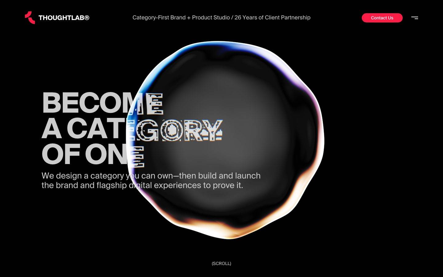
A stark, black-canvas agency landing page built for maximum type impact — oversized bold display headlines in light gray sit against pure black, punctuated by a single glowing, iridescent gradient orb that overlaps the headline as the page's signature visual device. The palette is almost fully achromatic (black canvas, gray ink, white accents) with one hot-pink/red brand accent driving the CTA and logo mark, plus two rare secondary hues glimpsed only in the orb's rim gradient. This is a confident, editorial, dark-mode-first system with flat geometry (no shadow, no rounding beyond a single pill button) and very few structural components — most of the page's voltage comes from typography scale and the orb graphic rather than component variety.
---
version: alpha
name: ThoughtLab-design-analysis
description: "A stark, black-canvas agency landing page built for maximum type impact — oversized bold display headlines in light gray sit against pure black, punctuated by a single glowing, iridescent gradient orb that overlaps the headline as the page's signature visual device. The palette is almost fully achromatic (black canvas, gray ink, white accents) with one hot-pink/red brand accent driving the CTA and logo mark, plus two rare secondary hues glimpsed only in the orb's rim gradient. This is a confident, editorial, dark-mode-first system with flat geometry (no shadow, no rounding beyond a single pill button) and very few structural components — most of the page's voltage comes from typography scale and the orb graphic rather than component variety."

colors:
  primary: "#fc1c46"
  canvas: "#000000"
  ink: "#cccccc"
  ink-strong: "#ffffff"
  ink-faint: "#333333"
  muted: "#4c4c4c"
  surface-soft: "#f2f2f2"
  accent-blue: "#1199ff"
  accent-yellow: "#ffff00"

typography:
  display-xl:
    fontFamily: "system-ui, -apple-system, sans-serif"
    fontSize: 90.9504px
    fontWeight: 700
    lineHeight: 0.917
    letterSpacing: -0.0199em
  title-md:
    fontFamily: "system-ui, -apple-system, sans-serif"
    fontSize: 27px
    fontWeight: 400
    lineHeight: 1.2
    letterSpacing: 0
  body-xl:
    fontFamily: "system-ui, -apple-system, sans-serif"
    fontSize: 72px
    fontWeight: 400
    lineHeight: 1.0
    letterSpacing: 0
  button:
    fontFamily: "system-ui, -apple-system, sans-serif"
    fontSize: 14.4px
    fontWeight: 400
    lineHeight: 1.25
    letterSpacing: 0

rounded:
  none: 0px
  xs: 2px
  pill: 9999px

spacing:
  xxs: 4px
  xs: 9px
  sm: 22px
  md: 43px
  lg: 54px
  xl: 86px
  xxl: 108px
  section: 198px
  hero: 288px
  mega: 522px

components:
  top-nav:
    backgroundColor: "{colors.canvas}"
    textColor: "{colors.ink}"
    typography: "{typography.button}"
  button-primary:
    backgroundColor: "{colors.primary}"
    textColor: "{colors.ink-strong}"
    typography: "{typography.button}"
    rounded: "{rounded.pill}"
  logo-mark:
    backgroundColor: transparent
    textColor: "{colors.primary}"
  hamburger-icon:
    backgroundColor: transparent
    textColor: "{colors.ink-strong}"
  card:
    backgroundColor: "{colors.canvas}"
    textColor: "{colors.ink}"
    rounded: "{rounded.none}"
  input:
    backgroundColor: transparent
    textColor: "{colors.ink}"
    rounded: "{rounded.none}"
---

## Overview

ThoughtLab's landing page is a single, high-contrast type moment: an all-black canvas (`{colors.canvas}` — #000000) carrying oversized, bold display type in light gray ink (`{colors.ink}` — #cccccc), with the wordmark and micro-copy in pure white (`{colors.ink-strong}` — #ffffff). The only color event on the page is a hot-pink/red brand accent (`{colors.primary}` — #fc1c46) that appears on the "Contact Us" pill button and the small flame-shaped logo mark — everything else is grayscale.

The page's centerpiece is a large, glassy, gradient-rimmed orb that overlaps the hero headline ("BECOME A CATEGORY OF ONE"), with rim colors sweeping through blue, violet, and warm orange. This orb is a decorative, animated graphic rather than a UI component — its rim hints at the two rare secondary hues captured in the data (`{colors.accent-blue}` and `{colors.accent-yellow}`), which otherwise appear nowhere else on the page.

Structurally, the system is extremely flat: no shadows beyond one faint gray glow, no border radius beyond a single pill button and a barely-there 2px radius, and no rounded cards. Type carries almost the entire hierarchy — a massive 90px+ display weight for the hero line, a mid-size 27px weight for secondary headings, and a small 14.4px button label. This is a studio/agency site built to feel like a manifesto: black page, giant type, one glowing artifact, one pink CTA.

**Key Characteristics:**
- Black canvas (`{colors.canvas}` — #000000) with light-gray ink (`{colors.ink}` — #cccccc) for all major text — a near-monochrome, dark-mode-only system.
- One brand accent (`{colors.primary}` — #fc1c46) reserved for the CTA button and the logo mark's flame icon. Nothing else on the page uses it.
- A single decorative gradient orb overlapping the hero headline — the system's signature visual device, not a reusable component.
- Flat geometry throughout: `{rounded.none}` (0px) on cards and inputs, a single pill button at `{rounded.pill}` (9999px), and a near-imperceptible `{rounded.xs}` (2px) used somewhere in the UI chrome.
- Display type is very large (90.9504px) at weight 700 with a tight line-height (0.917) and slightly negative tracking (-0.0199em) — built for headline impact, not readability at small sizes.
- Very few structural components were measurable from the single captured landing page — this is a thin, hero-driven design system rather than a full component library.

## Colors

### Brand & Accent
- **Primary** (`{colors.primary}` — #fc1c46): The only saturated color on the page. Used on the "Contact Us" button and the small logo icon. Reserved exclusively for the primary action and brand mark — never used decoratively elsewhere.
- **Accent Blue** (`{colors.accent-blue}` — #1199ff): A rare secondary hue (frequency 1 in the capture), visible only in the cool half of the hero orb's rim gradient.
- **Accent Yellow** (`{colors.accent-yellow}` — #ffff00): Another rare secondary hue (frequency 1), likely a highlight glint inside the orb's gradient sweep. Neither secondary accent was observed on any text, button, or UI chrome.

### Surface
- **Canvas** (`{colors.canvas}` — #000000): The page background — this system is dark-mode by default, not a light theme with a dark section.
- **Surface Soft** (`{colors.surface-soft}` — #f2f2f2): A near-white surface value captured once in the page's CSS; not visibly used in the captured hero viewport — likely belongs to an off-screen or below-the-fold section (see Known Gaps).

### Text
- **Ink** (`{colors.ink}` — #cccccc): The dominant text color — used for the hero headline and body copy. Measured as the max-contrast color against the black canvas.
- **Ink Strong** (`{colors.ink-strong}` — #ffffff): Pure white, used for the "THOUGHTLAB®" wordmark and the hamburger-menu icon strokes — a higher-contrast tier above default ink.
- **Ink Faint** (`{colors.ink-faint}` — #333333): A rare, low-contrast dark neutral (frequency 1) — likely a border or disabled-state hint not directly visible in the captured hero.
- **Muted** (`{colors.muted}` — #4c4c4c): A mid-gray, likely used for secondary/tertiary text or dividers elsewhere on the page beyond the captured hero.

## Typography

### Font Family
The measured CSS reports the family token as `sui`, which reads as a truncated capture of the `system-ui` generic keyword rather than a named custom typeface — **derived**: this is interpreted here as `system-ui, -apple-system, sans-serif`, since "sui" is not a resolvable font name and no `@font-face` or webfont was flagged (`fonts_licensed` is empty). There is no licensed/custom typeface to substitute — the system is built on the visitor's native UI sans-serif stack.

### Hierarchy

| Token | Size | Weight | Line Height | Letter Spacing | Use |
|---|---|---|---|---|---|
| `{typography.display-xl}` | 90.9504px | 700 | 0.917 | -0.0199em | Hero headline ("BECOME A CATEGORY OF ONE") |
| `{typography.title-md}` | 27px | 400 | 1.2 | 0 | Secondary headings (h2/h4 slots) |
| `{typography.body-xl}` | 72px | 400 | 1.0 | 0 | A large running-text/stat block — see note below |
| `{typography.button}` | 14.4px | 400 | 1.25 | 0 | "Contact Us" button label; also used here as the closest measured match for the top-nav micro-copy ("Category-First Brand + Product Studio…") — **derived** approximation, since nav text was not separately measured |

### Principles
The display role is the entire brand voice: enormous size (90.9504px), heavy weight (700), a tight line-height under 1.0, and slight negative tracking — built to be read as a poster headline rather than a paragraph. The mid-tier heading role drops all the way to 27px at regular weight 400 with no negative tracking, a steep jump rather than a smooth scale — there is no intermediate step measured between the two.

### Note on the `body-xl` role
The measured "body" role is unusually large (72px, weight 400, line-height 1.0) — larger than what appears as the visible intro paragraph in the reference screenshot (which reads closer to the `title-md` 27px size). This is documented as measured rather than corrected, but it likely reflects a large stat/number element elsewhere on the page rather than the visible hero sub-headline. See Known Gaps.

## Layout

### Spacing System
- **Tokens:** `{spacing.xxs}` 4px · `{spacing.xs}` 9px · `{spacing.sm}` 22px · `{spacing.md}` 43px · `{spacing.lg}` 54px · `{spacing.xl}` 86px · `{spacing.xxl}` 108px · `{spacing.section}` 198px · `{spacing.hero}` 288px · `{spacing.mega}` 522px.
- **Base rhythm:** `{spacing.xs}` (9px) is by far the most frequent measured gap (50 occurrences) — this is the system's true micro-rhythm unit, used for tight internal gaps (icon-to-label, inline nav items).
- **Section spacing:** Large vertical bands use `{spacing.section}` (198px), `{spacing.hero}` (288px), and `{spacing.mega}` (522px) — these large values point to a page built from a small number of very tall, full-viewport sections rather than dense stacked content.

### Grid & Container
- **Header row:** Logo left, centered micro-copy, CTA + hamburger right — a simple three-zone flex row, not a dense multi-column grid.
- **Hero:** Left-aligned text block (headline + sub-line) overlapping a right-of-center decorative orb graphic; the orb is positioned absolutely and bleeds into the text column.
- Only one page (`landing`) was captured, so a full multi-section grid system cannot be confirmed — see Known Gaps.

### Whitespace Philosophy
Whitespace here is used for drama, not density: a small handful of very large section gaps (`{spacing.hero}`, `{spacing.mega}`) frame a single hero statement, while a very tight micro-unit (`{spacing.xs}` 9px) holds inline elements close together. There is a large gap between the small and large ends of the scale with few intermediate steps — consistent with a page built around one dominant hero moment rather than a dense content grid.

## Elevation & Depth

| Level | Treatment | Use |
|---|---|---|
| Flat | No shadow, no border | Page background, headline text, nav row |
| Card (flat) | No shadow, `{rounded.none}` corners | The one measured `card` component — 0px radius, no shadow |
| Soft glow | `rgb(128,128,128) 0px 0px 5px 0px` | A single faint gray glow captured once — likely used behind the hero orb graphic or as a subtle focus ring |

The elevation philosophy is **maximally flat** — there is no card-lift, no drop-shadow system, no layered surfaces. The one piece of "depth" in the entire capture is the soft gray glow, and the visual richness of the page instead comes from the animated gradient orb, which is a bespoke graphic rather than a systematized elevation token.

## Shapes

### Border Radius Scale

| Token | Value | Use |
|---|---|---|
| `{rounded.none}` | 0px | Cards, text inputs, and (per the raw button measurement) the base button box — the system defaults to square corners |
| `{rounded.xs}` | 2px | A near-imperceptible radius captured once — likely a minor UI chrome detail (e.g. a focus outline or small tag) |
| `{rounded.pill}` | 9999px | The "Contact Us" CTA button, which renders as a full pill in the reference screenshot |

### Decorative Geometry
The hero's gradient orb is the system's one signature shape: a large, irregular, glass-like sphere with a glowing multi-hue rim (blue → violet → warm orange, touching the measured `{colors.accent-blue}` and `{colors.accent-yellow}` hues at its edges). It is rendered as an animated graphic overlapping the headline text, not as a reusable UI shape — treat it as bespoke hero art rather than a token-driven component.

## Components

### Navigation

**`top-nav`** — Black background (`{colors.canvas}`), flex row: logo mark + wordmark at left, a centered one-line micro-copy ("Category-First Brand + Product Studio / 26 Years of Client Partnership") in `{colors.ink}`, and a right-side cluster of `{component.button-primary}` + `{component.hamburger-icon}`. Text approximated to `{typography.button}` (14.4px) — derived, since the nav copy itself was not separately measured.

**`logo-mark`** — A small flame/droplet icon rendered in `{colors.primary}` (#fc1c46), paired with the "THOUGHTLAB®" wordmark in `{colors.ink-strong}` (#ffffff).

**`hamburger-icon`** — Two horizontal white (`{colors.ink-strong}`) strokes at the far right of the nav, transparent background, no visible container.

### Buttons

**`button-primary`** — The "Contact Us" CTA. Background `{colors.primary}` (#fc1c46), text `{colors.ink-strong}` (white), rounded `{rounded.pill}` (9999px) per screenshot ground-truth. Note: the raw computed-style capture for this element reported `radius: 0px, padding: 0px, color: #000000`, which conflicts with the visibly pill-shaped, pink, padded button in the reference screenshots — this measurement is treated as an analyzer artifact (see Known Gaps) and the documented values instead follow the screenshot plus the independently measured 9999px radius token.

### Cards & Inputs

**`card`** — Flat surface: background `{colors.canvas}`, text `{colors.ink}`, `{rounded.none}` corners, no shadow. This is the only structural container measured on the page; no distinct content cards were visible in the captured hero viewport.

**`input`** — `{rounded.none}` corners, background transparent, text `{colors.ink}`. No text-input field was visible in the captured hero; this entry documents the one measured `input` radius token for future form surfaces.

### Decorative

**Hero orb** — Not a token-driven component; a large animated gradient sphere overlapping the headline, rendered with a glass-like dark core and a glowing rim sweeping through cool and warm hues. Treat as bespoke hero art per page, not a reusable UI element.

## Do's and Don'ts

### Do
- Keep the canvas black (`{colors.canvas}`) and text in `{colors.ink}` / `{colors.ink-strong}` — this is a dark-mode-only system, not a light theme with a dark section.
- Reserve `{colors.primary}` (#fc1c46) exclusively for the primary CTA and the logo mark. It should never appear as a background fill, card accent, or secondary button color.
- Keep corners flat (`{rounded.none}`) everywhere except the single pill CTA button (`{rounded.pill}`). Rounding anything else breaks the system's flat, editorial geometry.
- Let the hero display type (`{typography.display-xl}`) carry the page's visual weight — size and weight are the hierarchy tool here, not color.
- Treat the gradient orb as one-per-hero bespoke art, not a repeatable UI pattern.

### Don't
- Don't introduce new saturated accent colors. `{colors.accent-blue}` and `{colors.accent-yellow}` were observed only inside the orb's gradient rim — never on text, buttons, or UI chrome.
- Don't add shadows or card elevation beyond the single measured soft-glow value. The system reads as intentionally flat.
- Don't round cards, inputs, or the nav — `{rounded.none}` is the default; only the CTA button breaks it.
- Don't shrink the hero display type's negative tracking to zero — the -0.0199em tightening is part of the headline's poster-like character.
- Don't reuse the exact `{typography.body-xl}` (72px) role for standard paragraph copy without checking against the visible intro line, which reads visually closer to `{typography.title-md}` (27px) — see Known Gaps.

## Responsive Behavior

Only a single desktop-width landing page capture was analyzed, so breakpoint behavior, touch-target sizing, and collapsing strategy were **not measured**. The hamburger icon present in the nav (`{component.hamburger-icon}`) strongly implies a collapsible mobile menu, but its opened/mobile state was not captured. No tablet or mobile screenshots were supplied.

## Iteration Guide

1. Focus on ONE component at a time. Reference its YAML key directly (`{component.button-primary}`, `{component.card}`).
2. Keep the palette disciplined: canvas + ink do the heavy lifting; `{colors.primary}` is a scarce, single-use accent; the two secondary accent hues stay inside decorative art only.
3. Preserve the flat-geometry rule: `{rounded.none}` is default; `{rounded.pill}` is reserved for the primary CTA; `{rounded.xs}` is a minor exception, not a pattern to expand.
4. Use `{spacing.xs}` (9px) as the micro-rhythm unit for tight inline gaps; reserve `{spacing.hero}` / `{spacing.mega}` for full-viewport section breaks, not card padding.
5. Never document hover. Default and Active/Pressed states only — and note that no active/pressed state was measurable in this capture at all (see Known Gaps).
6. Before adding new typography roles, re-verify against a real paragraph in context — the `{typography.body-xl}` role's unusually large size should be confirmed against additional page captures before treating it as the default body-copy size.

## Known Gaps

- Only the `landing` page (hero viewport) was captured. No interior pages, forms, footer, or scrolled-past sections were analyzed — the component library documented here is necessarily thin.
- The `button-primary` raw computed-style capture (`radius: 0px, padding: 0px, color: #000000`) directly conflicts with the screenshot's visible pink pill button. This is treated as an analyzer artifact (likely matching an unstyled or hidden button

<!-- Documented by Duply · real-world design systems as ready-to-use DESIGN.md for AI coding agents · https://duply.ai/thoughtlab/design-md -->
Color Palette
Accent
Neutrals
Typography
Spacing & Shape
Spacing
| Name | Value | Preview |
|---|---|---|
| xxs | 4px | |
| xs | 9px | |
| sm | 22px | |
| md | 43px | |
| lg | 54px | |
| xl | 86px | |
| xxl | 108px | |
| section | 198px | |
| hero | 288px | |
| mega | 522px |
Border Radius
| Name | Value | Preview |
|---|---|---|
| none | 0px | |
| xs | 2px | |
| pill | 9999px |
FAQ
- What colors does ThoughtLab use?
- ThoughtLab's core palette includes #fc1c46, #000000, #cccccc, #ffffff, #333333. The full color set with usage roles (canvas, ink, surfaces, accent, semantic) is documented in the ThoughtLab DESIGN.md.
- What font does ThoughtLab use?
- ThoughtLab's primary typeface is system-ui. The complete type scale (sizes, weights, line-height and letter-spacing per role), with an open substitute where the original is licensed, is documented in the DESIGN.md.
- What is the ThoughtLab design system?
- A stark, black-canvas agency landing page built for maximum type impact — oversized bold display headlines in light gray sit against pure black, punctuated by a single glowing, iridescent gradient orb that overlaps the headline as the page's signature visual device. The palette is almost fully
Get this as a working kit
- A complete production-stack template, styled like ThoughtLab, fully built and wired.
- One-time payment and the codebase is yours. No platform fees, no subscription.
Open it with Claude Code, Cursor, or any coding agent and build in plain language, then ship a complete web app.
- Your private DESIGN.md
- Marketing pages, blog, SEO & legal
- Email capture, newsletter & contact
- Accept payments (Stripe)
- Analytics (GA4 + PostHog)
- One-click deploy
- Auth, login & roles
- A full app dashboard, when you grow
More like this

---
version: alpha
name: ThoughtLab-design-analysis
description: "A stark, black-canvas agency landing page built for maximum type impact — oversized bold display headlines in light gray sit against pure black, punctuated by a single glowing, iridescent gradient orb that overlaps the headline as the page's signature visual device. The palette is almost fully achromatic (black canvas, gray ink, white accents) with one hot-pink/red brand accent driving the CTA and logo mark, plus two rare secondary hues glimpsed only in the orb's rim gradient. This is a confident, editorial, dark-mode-first system with flat geometry (no shadow, no rounding beyond a single pill button) and very few structural components — most of the page's voltage comes from typography scale and the orb graphic rather than component variety."

colors:
  primary: "#fc1c46"
  canvas: "#000000"
  ink: "#cccccc"
  ink-strong: "#ffffff"
  ink-faint: "#333333"
  muted: "#4c4c4c"
  surface-soft: "#f2f2f2"
  accent-blue: "#1199ff"
  accent-yellow: "#ffff00"

typography:
  display-xl:
    fontFamily: "system-ui, -apple-system, sans-serif"
    fontSize: 90.9504px
    fontWeight: 700
    lineHeight: 0.917
    letterSpacing: -0.0199em
  title-md:
    fontFamily: "system-ui, -apple-system, sans-serif"
    fontSize: 27px
    fontWeight: 400
    lineHeight: 1.2
    letterSpacing: 0
  body-xl:
    fontFamily: "system-ui, -apple-system, sans-serif"
    fontSize: 72px
    fontWeight: 400
    lineHeight: 1.0
    letterSpacing: 0
  button:
    fontFamily: "system-ui, -apple-system, sans-serif"
    fontSize: 14.4px
    fontWeight: 400
    lineHeight: 1.25
    letterSpacing: 0

rounded:
  none: 0px
  xs: 2px
  pill: 9999px

spacing:
  xxs: 4px
  xs: 9px
  sm: 22px
  md: 43px
  lg: 54px
  xl: 86px
  xxl: 108px
  section: 198px
  hero: 288px
  mega: 522px

components:
  top-nav:
    backgroundColor: "{colors.canvas}"
    textColor: "{colors.ink}"
    typography: "{typography.button}"
  button-primary:
    backgroundColor: "{colors.primary}"
    textColor: "{colors.ink-strong}"
    typography: "{typography.button}"
    rounded: "{rounded.pill}"
  logo-mark:
    backgroundColor: transparent
    textColor: "{colors.primary}"
  hamburger-icon:
    backgroundColor: transparent
    textColor: "{colors.ink-strong}"
  card:
    backgroundColor: "{colors.canvas}"
    textColor: "{colors.ink}"
    rounded: "{rounded.none}"
  input:
    backgroundColor: transparent
    textColor: "{colors.ink}"
    rounded: "{rounded.none}"
---

## Overview

ThoughtLab's landing page is a single, high-contrast type moment: an all-black canvas (`{colors.canvas}` — #000000) carrying oversized, bold display type in light gray ink (`{colors.ink}` — #cccccc), with the wordmark and micro-copy in pure white (`{colors.ink-strong}` — #ffffff). The only color event on the page is a hot-pink/red brand accent (`{colors.primary}` — #fc1c46) that appears on the "Contact Us" pill button and the small flame-shaped logo mark — everything else is grayscale.

The page's centerpiece is a large, glassy, gradient-rimmed orb that overlaps the hero headline ("BECOME A CATEGORY OF ONE"), with rim colors sweeping through blue, violet, and warm orange. This orb is a decorative, animated graphic rather than a UI component — its rim hints at the two rare secondary hues captured in the data (`{colors.accent-blue}` and `{colors.accent-yellow}`), which otherwise appear nowhere else on the page.

Structurally, the system is extremely flat: no shadows beyond one faint gray glow, no border radius beyond a single pill button and a barely-there 2px radius, and no rounded cards. Type carries almost the entire hierarchy — a massive 90px+ display weight for the hero line, a mid-size 27px weight for secondary headings, and a small 14.4px button label. This is a studio/agency site built to feel like a manifesto: black page, giant type, one glowing artifact, one pink CTA.

**Key Characteristics:**
- Black canvas (`{colors.canvas}` — #000000) with light-gray ink (`{colors.ink}` — #cccccc) for all major text — a near-monochrome, dark-mode-only system.
- One brand accent (`{colors.primary}` — #fc1c46) reserved for the CTA button and the logo mark's flame icon. Nothing else on the page uses it.
- A single decorative gradient orb overlapping the hero headline — the system's signature visual device, not a reusable component.
- Flat geometry throughout: `{rounded.none}` (0px) on cards and inputs, a single pill button at `{rounded.pill}` (9999px), and a near-imperceptible `{rounded.xs}` (2px) used somewhere in the UI chrome.
- Display type is very large (90.9504px) at weight 700 with a tight line-height (0.917) and slightly negative tracking (-0.0199em) — built for headline impact, not readability at small sizes.
- Very few structural components were measurable from the single captured landing page — this is a thin, hero-driven design system rather than a full component library.

## Colors

### Brand & Accent
- **Primary** (`{colors.primary}` — #fc1c46): The only saturated color on the page. Used on the "Contact Us" button and the small logo icon. Reserved exclusively for the primary action and brand mark — never used decoratively elsewhere.
- **Accent Blue** (`{colors.accent-blue}` — #1199ff): A rare secondary hue (frequency 1 in the capture), visible only in the cool half of the hero orb's rim gradient.
- **Accent Yellow** (`{colors.accent-yellow}` — #ffff00): Another rare secondary hue (frequency 1), likely a highlight glint inside the orb's gradient sweep. Neither secondary accent was observed on any text, button, or UI chrome.

### Surface
- **Canvas** (`{colors.canvas}` — #000000): The page background — this system is dark-mode by default, not a light theme with a dark section.
- **Surface Soft** (`{colors.surface-soft}` — #f2f2f2): A near-white surface value captured once in the page's CSS; not visibly used in the captured hero viewport — likely belongs to an off-screen or below-the-fold section (see Known Gaps).

### Text
- **Ink** (`{colors.ink}` — #cccccc): The dominant text color — used for the hero headline and body copy. Measured as the max-contrast color against the black canvas.
- **Ink Strong** (`{colors.ink-strong}` — #ffffff): Pure white, used for the "THOUGHTLAB®" wordmark and the hamburger-menu icon strokes — a higher-contrast tier above default ink.
- **Ink Faint** (`{colors.ink-faint}` — #333333): A rare, low-contrast dark neutral (frequency 1) — likely a border or disabled-state hint not directly visible in the captured hero.
- **Muted** (`{colors.muted}` — #4c4c4c): A mid-gray, likely used for secondary/tertiary text or dividers elsewhere on the page beyond the captured hero.

## Typography

### Font Family
The measured CSS reports the family token as `sui`, which reads as a truncated capture of the `system-ui` generic keyword rather than a named custom typeface — **derived**: this is interpreted here as `system-ui, -apple-system, sans-serif`, since "sui" is not a resolvable font name and no `@font-face` or webfont was flagged (`fonts_licensed` is empty). There is no licensed/custom typeface to substitute — the system is built on the visitor's native UI sans-serif stack.

### Hierarchy

| Token | Size | Weight | Line Height | Letter Spacing | Use |
|---|---|---|---|---|---|
| `{typography.display-xl}` | 90.9504px | 700 | 0.917 | -0.0199em | Hero headline ("BECOME A CATEGORY OF ONE") |
| `{typography.title-md}` | 27px | 400 | 1.2 | 0 | Secondary headings (h2/h4 slots) |
| `{typography.body-xl}` | 72px | 400 | 1.0 | 0 | A large running-text/stat block — see note below |
| `{typography.button}` | 14.4px | 400 | 1.25 | 0 | "Contact Us" button label; also used here as the closest measured match for the top-nav micro-copy ("Category-First Brand + Product Studio…") — **derived** approximation, since nav text was not separately measured |

### Principles
The display role is the entire brand voice: enormous size (90.9504px), heavy weight (700), a tight line-height under 1.0, and slight negative tracking — built to be read as a poster headline rather than a paragraph. The mid-tier heading role drops all the way to 27px at regular weight 400 with no negative tracking, a steep jump rather than a smooth scale — there is no intermediate step measured between the two.

### Note on the `body-xl` role
The measured "body" role is unusually large (72px, weight 400, line-height 1.0) — larger than what appears as the visible intro paragraph in the reference screenshot (which reads closer to the `title-md` 27px size). This is documented as measured rather than corrected, but it likely reflects a large stat/number element elsewhere on the page rather than the visible hero sub-headline. See Known Gaps.

## Layout

### Spacing System
- **Tokens:** `{spacing.xxs}` 4px · `{spacing.xs}` 9px · `{spacing.sm}` 22px · `{spacing.md}` 43px · `{spacing.lg}` 54px · `{spacing.xl}` 86px · `{spacing.xxl}` 108px · `{spacing.section}` 198px · `{spacing.hero}` 288px · `{spacing.mega}` 522px.
- **Base rhythm:** `{spacing.xs}` (9px) is by far the most frequent measured gap (50 occurrences) — this is the system's true micro-rhythm unit, used for tight internal gaps (icon-to-label, inline nav items).
- **Section spacing:** Large vertical bands use `{spacing.section}` (198px), `{spacing.hero}` (288px), and `{spacing.mega}` (522px) — these large values point to a page built from a small number of very tall, full-viewport sections rather than dense stacked content.

### Grid & Container
- **Header row:** Logo left, centered micro-copy, CTA + hamburger right — a simple three-zone flex row, not a dense multi-column grid.
- **Hero:** Left-aligned text block (headline + sub-line) overlapping a right-of-center decorative orb graphic; the orb is positioned absolutely and bleeds into the text column.
- Only one page (`landing`) was captured, so a full multi-section grid system cannot be confirmed — see Known Gaps.

### Whitespace Philosophy
Whitespace here is used for drama, not density: a small handful of very large section gaps (`{spacing.hero}`, `{spacing.mega}`) frame a single hero statement, while a very tight micro-unit (`{spacing.xs}` 9px) holds inline elements close together. There is a large gap between the small and large ends of the scale with few intermediate steps — consistent with a page built around one dominant hero moment rather than a dense content grid.

## Elevation & Depth

| Level | Treatment | Use |
|---|---|---|
| Flat | No shadow, no border | Page background, headline text, nav row |
| Card (flat) | No shadow, `{rounded.none}` corners | The one measured `card` component — 0px radius, no shadow |
| Soft glow | `rgb(128,128,128) 0px 0px 5px 0px` | A single faint gray glow captured once — likely used behind the hero orb graphic or as a subtle focus ring |

The elevation philosophy is **maximally flat** — there is no card-lift, no drop-shadow system, no layered surfaces. The one piece of "depth" in the entire capture is the soft gray glow, and the visual richness of the page instead comes from the animated gradient orb, which is a bespoke graphic rather than a systematized elevation token.

## Shapes

### Border Radius Scale

| Token | Value | Use |
|---|---|---|
| `{rounded.none}` | 0px | Cards, text inputs, and (per the raw button measurement) the base button box — the system defaults to square corners |
| `{rounded.xs}` | 2px | A near-imperceptible radius captured once — likely a minor UI chrome detail (e.g. a focus outline or small tag) |
| `{rounded.pill}` | 9999px | The "Contact Us" CTA button, which renders as a full pill in the reference screenshot |

### Decorative Geometry
The hero's gradient orb is the system's one signature shape: a large, irregular, glass-like sphere with a glowing multi-hue rim (blue → violet → warm orange, touching the measured `{colors.accent-blue}` and `{colors.accent-yellow}` hues at its edges). It is rendered as an animated graphic overlapping the headline text, not as a reusable UI shape — treat it as bespoke hero art rather than a token-driven component.

## Components

### Navigation

**`top-nav`** — Black background (`{colors.canvas}`), flex row: logo mark + wordmark at left, a centered one-line micro-copy ("Category-First Brand + Product Studio / 26 Years of Client Partnership") in `{colors.ink}`, and a right-side cluster of `{component.button-primary}` + `{component.hamburger-icon}`. Text approximated to `{typography.button}` (14.4px) — derived, since the nav copy itself was not separately measured.

**`logo-mark`** — A small flame/droplet icon rendered in `{colors.primary}` (#fc1c46), paired with the "THOUGHTLAB®" wordmark in `{colors.ink-strong}` (#ffffff).

**`hamburger-icon`** — Two horizontal white (`{colors.ink-strong}`) strokes at the far right of the nav, transparent background, no visible container.

### Buttons

**`button-primary`** — The "Contact Us" CTA. Background `{colors.primary}` (#fc1c46), text `{colors.ink-strong}` (white), rounded `{rounded.pill}` (9999px) per screenshot ground-truth. Note: the raw computed-style capture for this element reported `radius: 0px, padding: 0px, color: #000000`, which conflicts with the visibly pill-shaped, pink, padded button in the reference screenshots — this measurement is treated as an analyzer artifact (see Known Gaps) and the documented values instead follow the screenshot plus the independently measured 9999px radius token.

### Cards & Inputs

**`card`** — Flat surface: background `{colors.canvas}`, text `{colors.ink}`, `{rounded.none}` corners, no shadow. This is the only structural container measured on the page; no distinct content cards were visible in the captured hero viewport.

**`input`** — `{rounded.none}` corners, background transparent, text `{colors.ink}`. No text-input field was visible in the captured hero; this entry documents the one measured `input` radius token for future form surfaces.

### Decorative

**Hero orb** — Not a token-driven component; a large animated gradient sphere overlapping the headline, rendered with a glass-like dark core and a glowing rim sweeping through cool and warm hues. Treat as bespoke hero art per page, not a reusable UI element.

## Do's and Don'ts

### Do
- Keep the canvas black (`{colors.canvas}`) and text in `{colors.ink}` / `{colors.ink-strong}` — this is a dark-mode-only system, not a light theme with a dark section.
- Reserve `{colors.primary}` (#fc1c46) exclusively for the primary CTA and the logo mark. It should never appear as a background fill, card accent, or secondary button color.
- Keep corners flat (`{rounded.none}`) everywhere except the single pill CTA button (`{rounded.pill}`). Rounding anything else breaks the system's flat, editorial geometry.
- Let the hero display type (`{typography.display-xl}`) carry the page's visual weight — size and weight are the hierarchy tool here, not color.
- Treat the gradient orb as one-per-hero bespoke art, not a repeatable UI pattern.

### Don't
- Don't introduce new saturated accent colors. `{colors.accent-blue}` and `{colors.accent-yellow}` were observed only inside the orb's gradient rim — never on text, buttons, or UI chrome.
- Don't add shadows or card elevation beyond the single measured soft-glow value. The system reads as intentionally flat.
- Don't round cards, inputs, or the nav — `{rounded.none}` is the default; only the CTA button breaks it.
- Don't shrink the hero display type's negative tracking to zero — the -0.0199em tightening is part of the headline's poster-like character.
- Don't reuse the exact `{typography.body-xl}` (72px) role for standard paragraph copy without checking against the visible intro line, which reads visually closer to `{typography.title-md}` (27px) — see Known Gaps.

## Responsive Behavior

Only a single desktop-width landing page capture was analyzed, so breakpoint behavior, touch-target sizing, and collapsing strategy were **not measured**. The hamburger icon present in the nav (`{component.hamburger-icon}`) strongly implies a collapsible mobile menu, but its opened/mobile state was not captured. No tablet or mobile screenshots were supplied.

## Iteration Guide

1. Focus on ONE component at a time. Reference its YAML key directly (`{component.button-primary}`, `{component.card}`).
2. Keep the palette disciplined: canvas + ink do the heavy lifting; `{colors.primary}` is a scarce, single-use accent; the two secondary accent hues stay inside decorative art only.
3. Preserve the flat-geometry rule: `{rounded.none}` is default; `{rounded.pill}` is reserved for the primary CTA; `{rounded.xs}` is a minor exception, not a pattern to expand.
4. Use `{spacing.xs}` (9px) as the micro-rhythm unit for tight inline gaps; reserve `{spacing.hero}` / `{spacing.mega}` for full-viewport section breaks, not card padding.
5. Never document hover. Default and Active/Pressed states only — and note that no active/pressed state was measurable in this capture at all (see Known Gaps).
6. Before adding new typography roles, re-verify against a real paragraph in context — the `{typography.body-xl}` role's unusually large size should be confirmed against additional page captures before treating it as the default body-copy size.

## Known Gaps

- Only the `landing` page (hero viewport) was captured. No interior pages, forms, footer, or scrolled-past sections were analyzed — the component library documented here is necessarily thin.
- The `button-primary` raw computed-style capture (`radius: 0px, padding: 0px, color: #000000`) directly conflicts with the screenshot's visible pink pill button. This is treated as an analyzer artifact (likely matching an unstyled or hidden button

<!-- Documented by Duply · real-world design systems as ready-to-use DESIGN.md for AI coding agents · https://duply.ai/thoughtlab/design-md -->