
CreativeGiants
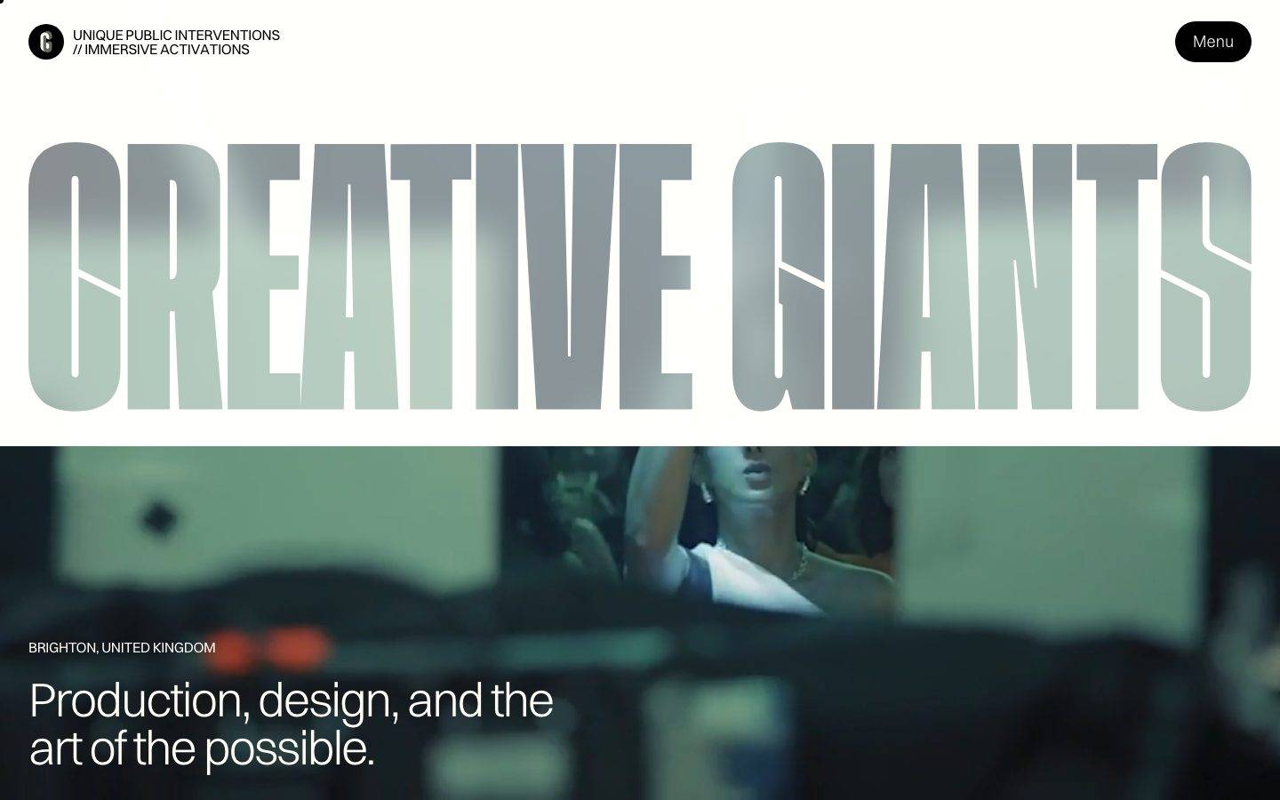
A bold, editorial art-production portfolio built on a warm off-white paper canvas (#fffef7) and pure-black ink, set almost entirely in the light-weight Switzer typeface. The system alternates between airy paper-white bands with an oversized metallic display wordmark and full-bleed black project sections, using sharp-cornered (0px) media cards against fully-pill-rounded black CTAs. Brand voltage comes from scale contrast — giant thin display type over immersive video/photography — and a scarce, saturated multi-hue accent set rather than any single brand color.
Works withClaude CodeCursorCodexGemini CLICopilotv0LovableBoltWindsurfReplit
---
version: alpha
name: CreativeGiants-design-analysis
description: "A bold, editorial art-production portfolio built on a warm off-white paper canvas (#fffef7) and pure-black ink, set almost entirely in the light-weight Switzer typeface. The system alternates between airy paper-white bands with an oversized metallic display wordmark and full-bleed black project sections, using sharp-cornered (0px) media cards against fully-pill-rounded black CTAs. Brand voltage comes from scale contrast — giant thin display type over immersive video/photography — and a scarce, saturated multi-hue accent set rather than any single brand color."

colors:
  primary: "#000000"
  ink: "#000000"
  ink-soft: "#222222"
  body: "#4d4c4a"
  muted: "#666666"
  muted-soft: "#707070"
  disabled: "#aaaaaa"
  hairline: "#dddddd"
  hairline-soft: "#cccccc"
  canvas: "#fffef7"
  surface: "#ffffff"
  surface-soft: "#f5f5f5"
  on-primary: "#fffef7"
  on-dark: "#fffef7"
  accent-blue: "#a5c8eb"
  accent-cyan: "#a5e5eb"
  accent-magenta: "#8a0467"
  accent-green: "#03624c"
  accent-teal: "#103131"
  accent-navy: "#101731"
  accent-pink: "#ffe0e0"
  accent-red: "#a01414"
  accent-mint: "#b0ffb0"

typography:
  display-xl:
    fontFamily: "Switzer, sans-serif"
    fontSize: 64px
    fontWeight: 300
    lineHeight: 1.0
    letterSpacing: -0.04em
  display-lg:
    fontFamily: "Switzer, sans-serif"
    fontSize: 54px
    fontWeight: 300
    lineHeight: 1.0
    letterSpacing: -0.04em
  title:
    fontFamily: "Switzer, sans-serif"
    fontSize: 20px
    fontWeight: 300
    lineHeight: 1.4
    letterSpacing: -0.04em
  body:
    fontFamily: "Switzer, sans-serif"
    fontSize: 18px
    fontWeight: 300
    lineHeight: 1.0
    letterSpacing: normal
  button:
    fontFamily: "Switzer, sans-serif"
    fontSize: 16px
    fontWeight: 300
    lineHeight: 1.0
    letterSpacing: normal

rounded:
  none: 0px
  pill: 1440px
  pill-lg: 1600px

spacing:
  xxs: 6px
  xs: 8px
  sm: 12px
  md: 16px
  lg: 24px
  xl: 32px
  xxl: 48px
  huge: 64px
  xhuge: 80px
  section: 112px
  section-xl: 160px

components:
  button-primary:
    backgroundColor: "{colors.primary}"
    textColor: "{colors.on-primary}"
    typography: "{typography.button}"
    rounded: "{rounded.pill}"
    padding: 14px 20px
  menu-pill:
    backgroundColor: "{colors.primary}"
    textColor: "{colors.on-primary}"
    typography: "{typography.button}"
    rounded: "{rounded.pill}"
    padding: 14px 20px
  logo-badge:
    backgroundColor: "{colors.primary}"
    textColor: "{colors.on-primary}"
    rounded: "{rounded.pill}"
  top-nav:
    backgroundColor: "{colors.canvas}"
    textColor: "{colors.ink}"
    typography: "{typography.button}"
  card:
    backgroundColor: transparent
    rounded: "{rounded.none}"
  input:
    backgroundColor: "{colors.canvas}"
    textColor: "{colors.ink}"
    typography: "{typography.body}"
    rounded: "{rounded.none}"
  project-section-dark:
    backgroundColor: "{colors.ink}"
    textColor: "{colors.on-dark}"
    typography: "{typography.body}"
    rounded: "{rounded.none}"
  hero-wordmark:
    backgroundColor: "{colors.canvas}"
    textColor: "{colors.ink}"
    typography: "{typography.display-xl}"
---

## Overview

CreativeGiants is the portfolio of an experiential art-production studio ("Unique public interventions // immersive activations"), and its marketing surface is built to feel like a printed editorial poster more than a SaaS page. The canvas is a warm off-white paper tone (`{colors.canvas}` — #fffef7) rather than pure white, and the ink is pure black (`{colors.ink}` — #000000). The single most defining move is scale: an oversized `CREATIVE GIANTS` display wordmark rendered edge-to-edge with a metallic/chrome fill, set in the thin light-weight Switzer typeface.

The system runs almost entirely on **one typeface at one weight** — Switzer at weight 300. Headlines, body, buttons, and captions all use it; hierarchy is created through size (54px / 64px display down to 16px buttons) and negative letter-spacing (-0.04em on the display + title roles), never through weight changes. This gives the whole page a light, precise, gallery-catalogue voice.

The page alternates between two surface modes: airy **paper-white bands** (nav, hero wordmark, hero caption over video) and full-bleed **black project sections** (`{colors.ink}`) that carry project cards and immersive photography grids. Media cards are deliberately **sharp-cornered** (`{rounded.none}` — 0px), giving photography a hard editorial frame, while interactive CTAs are **fully pill-rounded** (`{rounded.pill}` — a 1440px radius that resolves to a full pill on any button).

Brand voltage comes from scale contrast and immersive imagery — not from a single accent hue. The measured accent palette is a scattered, saturated set (blue, cyan, magenta, green, teal, navy, pink, red, mint) that surfaces inside project artwork and image tiles rather than in UI chrome.

**Key Characteristics:**
- Warm off-white paper canvas (`{colors.canvas}` — #fffef7) with pure-black ink — never a clinical #ffffff page floor.
- Single-typeface system: Switzer at weight 300 for everything, differentiated only by size and -0.04em tracking on display/title roles.
- Oversized metallic-fill display wordmark (`{component.hero-wordmark}`) spanning the full viewport width.
- Sharp-cornered (`{rounded.none}`) media/project cards paired with fully pill-rounded (`{rounded.pill}`) black CTAs — a hard-frame / soft-button contrast.
- Full-bleed black project sections (`{colors.ink}`) alternating with paper-white bands.
- Scarce, multi-hue accent set that lives inside imagery, not in UI.
- White 1px hairline outline (`rgba(255,255,255,0.2) 0 0 0 1px`) is the only measured shadow — used to edge elements on dark surfaces.

## Colors

### Brand & Action
- **Primary / Ink** (`{colors.primary}` / `{colors.ink}` — #000000): The dominant color — display type, body headlines on light bands, and every pill CTA background. This is a black-and-paper brand at the action layer.
- **On Primary / On Dark** (`{colors.on-primary}` / `{colors.on-dark}` — #fffef7): The paper tone used as text on black CTAs and inside black project sections. Text on dark reuses the canvas tone rather than pure white.

### Surface
- **Canvas** (`{colors.canvas}` — #fffef7): The warm off-white paper page floor and input background.
- **Surface** (`{colors.surface}` — #ffffff): Pure white, used sparingly for neutral fills.
- **Surface Soft** (`{colors.surface-soft}` — #f5f5f5): Very-light gray blocks / dividers.
- **Ink** (`{colors.ink}` — #000000): Full-bleed black project sections and dark bands.

### Text
- **Ink** (`{colors.ink}` — #000000): Headlines and primary text on light bands.
- **Ink Soft** (`{colors.ink-soft}` — #222222): Slightly softened dark text.
- **Body** (`{colors.body}` — #4d4c4a): Running-text tone.
- **Muted** (`{colors.muted}` — #666666) and **Muted Soft** (`{colors.muted-soft}` — #707070): Secondary labels, captions, meta lines (e.g., "PROJECT 01", credit lists).
- **Disabled** (`{colors.disabled}` — #aaaaaa): Low-emphasis / inactive text.

### Hairline
- **Hairline** (`{colors.hairline}` — #dddddd) and **Hairline Soft** (`{colors.hairline-soft}` — #cccccc): 1px divider tones on light surfaces.

### Accents (scarce, image-side)
The measured accent set is a spread of saturated hues that appears inside project artwork, video, and image tiles — never on CTAs or nav. Because no single hue dominates, they are each named by hue:
- **accent-blue** (`{colors.accent-blue}` — #a5c8eb) and **accent-cyan** (`{colors.accent-cyan}` — #a5e5eb): cool pastel tones (the hero video's blue cast, cyan neon signage).
- **accent-magenta** (`{colors.accent-magenta}` — #8a0467), **accent-red** (`{colors.accent-red}` — #a01414), **accent-pink** (`{colors.accent-pink}` — #ffe0e0): warm/hot accents inside imagery.
- **accent-green** (`{colors.accent-green}` — #03624c), **accent-teal** (`{colors.accent-teal}` — #103131), **accent-mint** (`{colors.accent-mint}` — #b0ffb0): green-family tones.
- **accent-navy** (`{colors.accent-navy}` — #101731): deep blue-black.

## Typography

### Font Family
The entire system runs on **Switzer** — a clean, neutral grotesque from Indian Type Foundry / Fontshare — at **weight 300** across every role. Switzer is freely available (open licence via Fontshare), so no substitute is required to ship it faithfully; a safe fallback stack is `Switzer, "Helvetica Neue", Arial, sans-serif`. If Switzer cannot be loaded, **Inter** or **Neue Haas Grotesk** at weight 300 approximate the neutral-grotesque character, though Switzer's slightly wider apertures and the -0.04em tracking are part of the voice.

There is no secondary typeface. Hierarchy is built entirely from **size** and **letter-spacing**, not weight — the design never goes above 300.

### Hierarchy

| Token | Size | Weight | Line Height | Letter Spacing | Use |
|---|---|---|---|---|---|
| `{typography.display-xl}` | 64px | 300 | 1.0 | -0.04em | The giant `CREATIVE GIANTS` wordmark and largest section heads |
| `{typography.display-lg}` | 54px | 300 | 1.0 | -0.04em | Hero caption ("Production, design, and the art of the possible."), h1 |
| `{typography.title}` | 20px | 300 | 1.4 | -0.04em | Sub-heads, project titles (h3) |
| `{typography.body}` | 18px | 300 | 1.0 | normal | Running text, project descriptions |
| `{typography.button}` | 16px | 300 | 1.0 | normal | Pill CTA labels, "Menu" |

### Principles
Everything is Switzer 300 — the light weight is the identity. Never bold the display type to force emphasis; scale up instead. The -0.04em tracking on display and title roles tightens the thin letterforms into a cohesive editorial block; body and button roles drop back to normal tracking for legibility at small sizes. The extremely tight `1.0` line-height on the display roles is intentional — the giant wordmark and hero caption sit as compact typographic blocks with minimal leading.

## Layout

### Spacing System
- **Base unit:** 8px, with a 6px micro-step for tight label gaps.
- **Tokens:** `{spacing.xxs}` 6px · `{spacing.xs}` 8px · `{spacing.sm}` 12px · `{spacing.md}` 16px · `{spacing.lg}` 24px · `{spacing.xl}` 32px · `{spacing.xxl}` 48px · `{spacing.huge}` 64px · `{spacing.xhuge}` 80px · `{spacing.section}` 112px · `{spacing.section-xl}` 160px.
- **Dominant rhythm:** 32px (`{spacing.xl}`) is by far the most frequent spacing value — it is the default gap between blocks and internal card padding.
- **Section rhythm:** `{spacing.section}` (112px) and `{spacing.section-xl}` (160px) drive the large vertical gaps between the paper bands and the black project sections — the page uses generous full-viewport-scale whitespace between bands.

### Grid & Container
- The hero wordmark spans full viewport width edge-to-edge.
- Project sections use an offset editorial layout — title and credit list at left, media card at right — rather than a strict symmetric grid.
- The dark image-gallery section uses a scattered/staggered tile arrangement rather than an aligned grid.

### Whitespace Philosophy
Whitespace is used at editorial scale — huge empty paper expanses (112–160px section gaps) separate bands, letting the oversized display type and full-bleed imagery breathe like poster spreads. Density only rises inside the project credit lists.

## Elevation & Depth

| Level | Treatment | Use |
|---|---|---|
| Flat | No shadow, no border | Paper bands, media cards, black project sections |
| White hairline outline | `rgba(255,255,255,0.2) 0 0 0 1px` | The only measured shadow — a faint 1px edge to separate elements against black surfaces |

The system is essentially **shadowless**. Depth is created by surface-mode contrast (paper-white vs full-bleed black) and by the metallic gradient fill on the display wordmark — not by drop shadows. On dark sections, the faint white 1px outline is the only tool used to delineate edges.

### Decorative Depth
- The `CREATIVE GIANTS` wordmark uses a metallic/chrome gradient fill (a per-letter light-to-dark sweep). This is an image/text-fill effect, not a system token.
- Full-bleed video and photography sit directly behind and beneath type, carrying their own tonal depth.

## Shapes

### Border Radius Scale

| Token | Value | Use |
|---|---|---|
| `{rounded.none}` | 0px | All media/project cards and inputs — hard editorial frames |
| `{rounded.pill}` | 1440px | Pill CTAs, "Menu" button, logo badge — a very large fixed radius that resolves to a full pill on any control |
| `{rounded.pill-lg}` | 1600px | A single larger pill instance (same visual effect) |

The shape language is a deliberate two-pole contrast: **sharp 0px corners on all media** and **full pills on all interactive controls**. There is no intermediate radius in the system. The 1440px / 1600px radii are absolute values that always exceed element height, so both effectively render as full pills (derived interpretation — the large fixed pixel radius is the studio's way of forcing a full-pill on variable-height buttons).

### Photography Geometry
Media is framed with sharp 0px corners at every scale — hero video, project cards, and gallery tiles all use hard rectangles. The circular logo badge (top-left "C") uses the pill radius to render as a full circle.

## Components

### Navigation

**`top-nav`** — A light paper-toned top bar. At left, the circular `{component.logo-badge}` ("C") plus a two-line eyebrow ("UNIQUE PUBLIC INTERVENTIONS // IMMERSIVE ACTIVATIONS") in small uppercase Switzer. At right, the `{component.menu-pill}` toggle. Background `{colors.canvas}`, text `{colors.ink}`.

**`logo-badge`** — A black circular badge holding the "C" wordmark. Background `{colors.primary}`, text `{colors.on-primary}`, rounded `{rounded.pill}` (renders as a full circle).

**`menu-pill`** — The top-right "Menu" toggle. Background `{colors.primary}` (#000000), text `{colors.on-primary}` (#fffef7), type `{typography.button}` (Switzer 16px / 300), rounded `{rounded.pill}`, padding ~14px × 20px (derived — measured 14.08px × 20px).

### Buttons

**`button-primary`** — The signature CTA (e.g., "VIEW ALL PROJECTS"–style actions). Background `{colors.primary}` (#000000), text `{colors.on-primary}` (#fffef7), type `{typography.button}`, rounded `{rounded.pill}`, padding ~14px × 20px (derived — measured 14.08px × 20px). Black-on-paper pill; no secondary or outline button variant was measured.

### Cards & Containers

**`card`** — The media/project card. Sharp corners (`{rounded.none}` — 0px), no shadow, transparent frame. Used to hold project artwork (e.g., "Halo Masterpiece" oil-painting image) and gallery tiles. The card is a hard rectangular frame that lets photography read as-is.

**`project-section-dark`** — A full-bleed black band (`{colors.ink}` — #000000) that hosts project content. Text inverts to `{colors.on-dark}` (#fffef7). Carries a "PROJECT 01" eyebrow in `{colors.muted}`, a project title in `{typography.title}` / `{typography.display-lg}`, a credit list (PRODUCTION / LOCATION / CLIENT), and a `{component.card}` holding the project image. A pager ("[ 1 / 3 ]") and a "VIEW ALL PROJECTS" action sit at the band's baseline.

### Inputs & Forms

**`input`** — Text input on the paper canvas. Background `{colors.canvas}` (#fffef7), text `{colors.ink}`, type `{typography.body}`, rounded `{rounded.none}` (0px — sharp corners, consistent with the media frames). Border/focus treatment was not measured.

### Hero

**`hero-wordmark`** — The oversized `CREATIVE GIANTS` display block. Background `{colors.canvas}`, type `{typography.display-xl}` (Switzer 64px / 300 / -0.04em), rendered edge-to-edge with a metallic gradient fill. Directly below, a full-bleed video band carries the hero caption ("Production, design, and the art of the possible.") in `{typography.display-lg}` over the footage, with a "BRIGHTON, UNITED KINGDOM" location eyebrow in `{colors.on-dark}`.

## Do's and Don'ts

### Do
- Use the warm paper tone `{colors.canvas}` (#fffef7) as the page floor — never swap it for pure #ffffff.
- Keep all type in Switzer at weight 300. Build hierarchy with size and -0.04em tracking, not weight.
- Frame all media with sharp `{rounded.none}` (0px) corners — the hard rectangle is the editorial signature.
- Reserve `{rounded.pill}` for interactive controls only (CTAs, Menu, logo badge).
- Let the accent hues live inside project imagery and video — treat them as content, not UI color.
- Alternate paper-white bands with full-bleed `{colors.ink}` project sections for pacing.
- Use scale (bigger Switzer) to create emphasis, never bolder Switzer.

### Don't
- Don't bold the display type to force hierarchy — the system never goes above weight 300.
- Don't round media cards or inputs — the 0px hard frame is deliberate.
- Don't square off CTAs — buttons are always full pills.
- Don't introduce a single "brand accent" color into the UI chrome; the accents are a scattered image-side set, and the action layer stays black-on-paper.
- Don't add drop shadows — depth comes from surface-mode contrast, not elevation. The only edge treatment is the faint white 1px outline on dark surfaces.
- Don't document hover states — default and active/pressed only.

## Responsive Behavior

The mobile screenshot confirms the layout compresses vertically while preserving all core moves.

### Breakpoints (inferred)

| Name | Width | Key Changes |
|---|---|---|
| Mobile | < 768px | Nav eyebrow shrinks, "Menu" pill stays top-right; the giant wordmark scales down but remains full-width; hero video band and caption stack; project section stays full-bleed black with the credit list and card stacking; gallery tiles scatter vertically |
| Desktop | ≥ 1024px | Full-width wordmark; hero caption overlaid on video; project sections use the offset title-left / media-right editorial layout |

### Touch Targets
- `{component.menu-pill}` and `{component.button-primary}` carry ~14px × 20px padding on the pill; combined with the label height this meets tap-target minimums.
- `{component.logo-badge}` is a compact circular control.

### Collapsing Strategy
- The oversized wordmark scales proportionally to the viewport width rather than wrapping.
- Project sections keep their full-bleed black background at all widths; the offset two-column editorial layout stacks to single-column on mobile.
- The staggered gallery tiles reflow into a narrower vertical scatter on mobile.

### Image Behavior
- Hero video and project photography run full-bleed with sharp 0px corners at every breakpoint.
- The metallic-fill wordmark retains its gradient treatment when scaled down.

## Iteration Guide

1. Focus on ONE component at a time and reference its YAML key directly (`{component.card}`, `{component.button-primary}`).
2. Variants (`-active`, `-disabled`, `-focused`) live as separate entries in `components:`.
3. Use `{token.refs}` everywhere — never inline a hex in a component.
4. Never document hover. Default and Active/Pressed states only.
5. Keep the one-typeface / one-weight rule: Switzer 300 everywhere; scale up before you reach for weight.
6. Maintain the two-pole shape language: 0px on media, full pill on controls.
7. Keep accent hues confined to imagery; the UI stays black-on-paper.

## Known Gaps

- **Switzer** is measured as the sole typeface at weight 300; `fonts_licensed` is empty and Switzer is freely licensed via Fontshare, so it can be shipped directly (a fallback stack and substitutes are noted in Typography for safety).
- Button active/pressed, disabled, secondary, and outline states were not measured — only a single black pill `{component.button-primary}` was captured.
- Input border color, focus state, and placeholder treatment were not extracted (only background #fffef7 and 0px radius are measured).
- Card background is not measured (only `{rounded.none}` radius and no shadow); it is set to `transparent` pending confirmation.
- The 1440px / 1600px radii are absolute pixel values that render as full pills; the intended token intent is inferred (derived).
- The multi-hue accent set is sampled from imagery/video frequency and may represent photographic content rather than deliberate brand tokens; exact usage rules for each hue are unconfirmed.
- Only the landing page was captured; interior project pages, the expanded Menu overlay, and footer were not analyzed.
- Animation, scroll, and video-playback timings are out of scope.
- The metallic/chrome gradient fill on the display wordmark is a text-fill/image effect and is not captured as a token.

<!-- Documented by Duply · real-world design systems as ready-to-use DESIGN.md for AI coding agents · https://duply.ai/creativegiants/design-md -->
Color Palette
Accent
Neutrals
Typography
display-xl64px · 300 · 1
The quick brown fox jumpsdisplay-lg54px · 300 · 1
The quick brown fox jumpstitle20px · 300 · 1.4
The quick brown fox jumpsbody18px · 300 · 1
The quick brown fox jumpsbutton16px · 300 · 1
The quick brown fox jumpsSpacing & Shape
Spacing
| Name | Value | Preview |
|---|---|---|
| xxs | 6px | |
| xs | 8px | |
| sm | 12px | |
| md | 16px | |
| lg | 24px | |
| xl | 32px | |
| xxl | 48px | |
| huge | 64px | |
| xhuge | 80px | |
| section | 112px | |
| section-xl | 160px |
Border Radius
| Name | Value | Preview |
|---|---|---|
| none | 0px | |
| pill | 1440px | |
| pill-lg | 1600px |
FAQ
- What colors does CreativeGiants use?
- CreativeGiants's core palette includes #000000, #000000, #222222, #4d4c4a, #666666. The full color set with usage roles (canvas, ink, surfaces, accent, semantic) is documented in the CreativeGiants DESIGN.md.
- What font does CreativeGiants use?
- CreativeGiants's primary typeface is Switzer. The complete type scale (sizes, weights, line-height and letter-spacing per role), with an open substitute where the original is licensed, is documented in the DESIGN.md.
- What is the CreativeGiants design system?
- A bold, editorial art-production portfolio built on a warm off-white paper canvas (#fffef7) and pure-black ink, set almost entirely in the light-weight Switzer typeface. The system alternates between airy paper-white bands with an oversized metallic display wordmark and full-bleed black project
Get this as a working kit
CreativeGiants Launch Kit + DESIGN.md
$299$225
One-time payment
- A complete production-stack template, styled like CreativeGiants, fully built and wired.
- One-time payment and the codebase is yours. No platform fees, no subscription.
Open it with Claude Code, Cursor, or any coding agent and build in plain language, then ship a complete web app.
- Your private DESIGN.md
- Marketing pages, blog, SEO & legal
- Email capture, newsletter & contact
- Accept payments (Stripe)
- Analytics (GA4 + PostHog)
- One-click deploy
- Auth, login & roles
- A full app dashboard, when you grow
More like this

---
version: alpha
name: CreativeGiants-design-analysis
description: "A bold, editorial art-production portfolio built on a warm off-white paper canvas (#fffef7) and pure-black ink, set almost entirely in the light-weight Switzer typeface. The system alternates between airy paper-white bands with an oversized metallic display wordmark and full-bleed black project sections, using sharp-cornered (0px) media cards against fully-pill-rounded black CTAs. Brand voltage comes from scale contrast — giant thin display type over immersive video/photography — and a scarce, saturated multi-hue accent set rather than any single brand color."

colors:
  primary: "#000000"
  ink: "#000000"
  ink-soft: "#222222"
  body: "#4d4c4a"
  muted: "#666666"
  muted-soft: "#707070"
  disabled: "#aaaaaa"
  hairline: "#dddddd"
  hairline-soft: "#cccccc"
  canvas: "#fffef7"
  surface: "#ffffff"
  surface-soft: "#f5f5f5"
  on-primary: "#fffef7"
  on-dark: "#fffef7"
  accent-blue: "#a5c8eb"
  accent-cyan: "#a5e5eb"
  accent-magenta: "#8a0467"
  accent-green: "#03624c"
  accent-teal: "#103131"
  accent-navy: "#101731"
  accent-pink: "#ffe0e0"
  accent-red: "#a01414"
  accent-mint: "#b0ffb0"

typography:
  display-xl:
    fontFamily: "Switzer, sans-serif"
    fontSize: 64px
    fontWeight: 300
    lineHeight: 1.0
    letterSpacing: -0.04em
  display-lg:
    fontFamily: "Switzer, sans-serif"
    fontSize: 54px
    fontWeight: 300
    lineHeight: 1.0
    letterSpacing: -0.04em
  title:
    fontFamily: "Switzer, sans-serif"
    fontSize: 20px
    fontWeight: 300
    lineHeight: 1.4
    letterSpacing: -0.04em
  body:
    fontFamily: "Switzer, sans-serif"
    fontSize: 18px
    fontWeight: 300
    lineHeight: 1.0
    letterSpacing: normal
  button:
    fontFamily: "Switzer, sans-serif"
    fontSize: 16px
    fontWeight: 300
    lineHeight: 1.0
    letterSpacing: normal

rounded:
  none: 0px
  pill: 1440px
  pill-lg: 1600px

spacing:
  xxs: 6px
  xs: 8px
  sm: 12px
  md: 16px
  lg: 24px
  xl: 32px
  xxl: 48px
  huge: 64px
  xhuge: 80px
  section: 112px
  section-xl: 160px

components:
  button-primary:
    backgroundColor: "{colors.primary}"
    textColor: "{colors.on-primary}"
    typography: "{typography.button}"
    rounded: "{rounded.pill}"
    padding: 14px 20px
  menu-pill:
    backgroundColor: "{colors.primary}"
    textColor: "{colors.on-primary}"
    typography: "{typography.button}"
    rounded: "{rounded.pill}"
    padding: 14px 20px
  logo-badge:
    backgroundColor: "{colors.primary}"
    textColor: "{colors.on-primary}"
    rounded: "{rounded.pill}"
  top-nav:
    backgroundColor: "{colors.canvas}"
    textColor: "{colors.ink}"
    typography: "{typography.button}"
  card:
    backgroundColor: transparent
    rounded: "{rounded.none}"
  input:
    backgroundColor: "{colors.canvas}"
    textColor: "{colors.ink}"
    typography: "{typography.body}"
    rounded: "{rounded.none}"
  project-section-dark:
    backgroundColor: "{colors.ink}"
    textColor: "{colors.on-dark}"
    typography: "{typography.body}"
    rounded: "{rounded.none}"
  hero-wordmark:
    backgroundColor: "{colors.canvas}"
    textColor: "{colors.ink}"
    typography: "{typography.display-xl}"
---

## Overview

CreativeGiants is the portfolio of an experiential art-production studio ("Unique public interventions // immersive activations"), and its marketing surface is built to feel like a printed editorial poster more than a SaaS page. The canvas is a warm off-white paper tone (`{colors.canvas}` — #fffef7) rather than pure white, and the ink is pure black (`{colors.ink}` — #000000). The single most defining move is scale: an oversized `CREATIVE GIANTS` display wordmark rendered edge-to-edge with a metallic/chrome fill, set in the thin light-weight Switzer typeface.

The system runs almost entirely on **one typeface at one weight** — Switzer at weight 300. Headlines, body, buttons, and captions all use it; hierarchy is created through size (54px / 64px display down to 16px buttons) and negative letter-spacing (-0.04em on the display + title roles), never through weight changes. This gives the whole page a light, precise, gallery-catalogue voice.

The page alternates between two surface modes: airy **paper-white bands** (nav, hero wordmark, hero caption over video) and full-bleed **black project sections** (`{colors.ink}`) that carry project cards and immersive photography grids. Media cards are deliberately **sharp-cornered** (`{rounded.none}` — 0px), giving photography a hard editorial frame, while interactive CTAs are **fully pill-rounded** (`{rounded.pill}` — a 1440px radius that resolves to a full pill on any button).

Brand voltage comes from scale contrast and immersive imagery — not from a single accent hue. The measured accent palette is a scattered, saturated set (blue, cyan, magenta, green, teal, navy, pink, red, mint) that surfaces inside project artwork and image tiles rather than in UI chrome.

**Key Characteristics:**
- Warm off-white paper canvas (`{colors.canvas}` — #fffef7) with pure-black ink — never a clinical #ffffff page floor.
- Single-typeface system: Switzer at weight 300 for everything, differentiated only by size and -0.04em tracking on display/title roles.
- Oversized metallic-fill display wordmark (`{component.hero-wordmark}`) spanning the full viewport width.
- Sharp-cornered (`{rounded.none}`) media/project cards paired with fully pill-rounded (`{rounded.pill}`) black CTAs — a hard-frame / soft-button contrast.
- Full-bleed black project sections (`{colors.ink}`) alternating with paper-white bands.
- Scarce, multi-hue accent set that lives inside imagery, not in UI.
- White 1px hairline outline (`rgba(255,255,255,0.2) 0 0 0 1px`) is the only measured shadow — used to edge elements on dark surfaces.

## Colors

### Brand & Action
- **Primary / Ink** (`{colors.primary}` / `{colors.ink}` — #000000): The dominant color — display type, body headlines on light bands, and every pill CTA background. This is a black-and-paper brand at the action layer.
- **On Primary / On Dark** (`{colors.on-primary}` / `{colors.on-dark}` — #fffef7): The paper tone used as text on black CTAs and inside black project sections. Text on dark reuses the canvas tone rather than pure white.

### Surface
- **Canvas** (`{colors.canvas}` — #fffef7): The warm off-white paper page floor and input background.
- **Surface** (`{colors.surface}` — #ffffff): Pure white, used sparingly for neutral fills.
- **Surface Soft** (`{colors.surface-soft}` — #f5f5f5): Very-light gray blocks / dividers.
- **Ink** (`{colors.ink}` — #000000): Full-bleed black project sections and dark bands.

### Text
- **Ink** (`{colors.ink}` — #000000): Headlines and primary text on light bands.
- **Ink Soft** (`{colors.ink-soft}` — #222222): Slightly softened dark text.
- **Body** (`{colors.body}` — #4d4c4a): Running-text tone.
- **Muted** (`{colors.muted}` — #666666) and **Muted Soft** (`{colors.muted-soft}` — #707070): Secondary labels, captions, meta lines (e.g., "PROJECT 01", credit lists).
- **Disabled** (`{colors.disabled}` — #aaaaaa): Low-emphasis / inactive text.

### Hairline
- **Hairline** (`{colors.hairline}` — #dddddd) and **Hairline Soft** (`{colors.hairline-soft}` — #cccccc): 1px divider tones on light surfaces.

### Accents (scarce, image-side)
The measured accent set is a spread of saturated hues that appears inside project artwork, video, and image tiles — never on CTAs or nav. Because no single hue dominates, they are each named by hue:
- **accent-blue** (`{colors.accent-blue}` — #a5c8eb) and **accent-cyan** (`{colors.accent-cyan}` — #a5e5eb): cool pastel tones (the hero video's blue cast, cyan neon signage).
- **accent-magenta** (`{colors.accent-magenta}` — #8a0467), **accent-red** (`{colors.accent-red}` — #a01414), **accent-pink** (`{colors.accent-pink}` — #ffe0e0): warm/hot accents inside imagery.
- **accent-green** (`{colors.accent-green}` — #03624c), **accent-teal** (`{colors.accent-teal}` — #103131), **accent-mint** (`{colors.accent-mint}` — #b0ffb0): green-family tones.
- **accent-navy** (`{colors.accent-navy}` — #101731): deep blue-black.

## Typography

### Font Family
The entire system runs on **Switzer** — a clean, neutral grotesque from Indian Type Foundry / Fontshare — at **weight 300** across every role. Switzer is freely available (open licence via Fontshare), so no substitute is required to ship it faithfully; a safe fallback stack is `Switzer, "Helvetica Neue", Arial, sans-serif`. If Switzer cannot be loaded, **Inter** or **Neue Haas Grotesk** at weight 300 approximate the neutral-grotesque character, though Switzer's slightly wider apertures and the -0.04em tracking are part of the voice.

There is no secondary typeface. Hierarchy is built entirely from **size** and **letter-spacing**, not weight — the design never goes above 300.

### Hierarchy

| Token | Size | Weight | Line Height | Letter Spacing | Use |
|---|---|---|---|---|---|
| `{typography.display-xl}` | 64px | 300 | 1.0 | -0.04em | The giant `CREATIVE GIANTS` wordmark and largest section heads |
| `{typography.display-lg}` | 54px | 300 | 1.0 | -0.04em | Hero caption ("Production, design, and the art of the possible."), h1 |
| `{typography.title}` | 20px | 300 | 1.4 | -0.04em | Sub-heads, project titles (h3) |
| `{typography.body}` | 18px | 300 | 1.0 | normal | Running text, project descriptions |
| `{typography.button}` | 16px | 300 | 1.0 | normal | Pill CTA labels, "Menu" |

### Principles
Everything is Switzer 300 — the light weight is the identity. Never bold the display type to force emphasis; scale up instead. The -0.04em tracking on display and title roles tightens the thin letterforms into a cohesive editorial block; body and button roles drop back to normal tracking for legibility at small sizes. The extremely tight `1.0` line-height on the display roles is intentional — the giant wordmark and hero caption sit as compact typographic blocks with minimal leading.

## Layout

### Spacing System
- **Base unit:** 8px, with a 6px micro-step for tight label gaps.
- **Tokens:** `{spacing.xxs}` 6px · `{spacing.xs}` 8px · `{spacing.sm}` 12px · `{spacing.md}` 16px · `{spacing.lg}` 24px · `{spacing.xl}` 32px · `{spacing.xxl}` 48px · `{spacing.huge}` 64px · `{spacing.xhuge}` 80px · `{spacing.section}` 112px · `{spacing.section-xl}` 160px.
- **Dominant rhythm:** 32px (`{spacing.xl}`) is by far the most frequent spacing value — it is the default gap between blocks and internal card padding.
- **Section rhythm:** `{spacing.section}` (112px) and `{spacing.section-xl}` (160px) drive the large vertical gaps between the paper bands and the black project sections — the page uses generous full-viewport-scale whitespace between bands.

### Grid & Container
- The hero wordmark spans full viewport width edge-to-edge.
- Project sections use an offset editorial layout — title and credit list at left, media card at right — rather than a strict symmetric grid.
- The dark image-gallery section uses a scattered/staggered tile arrangement rather than an aligned grid.

### Whitespace Philosophy
Whitespace is used at editorial scale — huge empty paper expanses (112–160px section gaps) separate bands, letting the oversized display type and full-bleed imagery breathe like poster spreads. Density only rises inside the project credit lists.

## Elevation & Depth

| Level | Treatment | Use |
|---|---|---|
| Flat | No shadow, no border | Paper bands, media cards, black project sections |
| White hairline outline | `rgba(255,255,255,0.2) 0 0 0 1px` | The only measured shadow — a faint 1px edge to separate elements against black surfaces |

The system is essentially **shadowless**. Depth is created by surface-mode contrast (paper-white vs full-bleed black) and by the metallic gradient fill on the display wordmark — not by drop shadows. On dark sections, the faint white 1px outline is the only tool used to delineate edges.

### Decorative Depth
- The `CREATIVE GIANTS` wordmark uses a metallic/chrome gradient fill (a per-letter light-to-dark sweep). This is an image/text-fill effect, not a system token.
- Full-bleed video and photography sit directly behind and beneath type, carrying their own tonal depth.

## Shapes

### Border Radius Scale

| Token | Value | Use |
|---|---|---|
| `{rounded.none}` | 0px | All media/project cards and inputs — hard editorial frames |
| `{rounded.pill}` | 1440px | Pill CTAs, "Menu" button, logo badge — a very large fixed radius that resolves to a full pill on any control |
| `{rounded.pill-lg}` | 1600px | A single larger pill instance (same visual effect) |

The shape language is a deliberate two-pole contrast: **sharp 0px corners on all media** and **full pills on all interactive controls**. There is no intermediate radius in the system. The 1440px / 1600px radii are absolute values that always exceed element height, so both effectively render as full pills (derived interpretation — the large fixed pixel radius is the studio's way of forcing a full-pill on variable-height buttons).

### Photography Geometry
Media is framed with sharp 0px corners at every scale — hero video, project cards, and gallery tiles all use hard rectangles. The circular logo badge (top-left "C") uses the pill radius to render as a full circle.

## Components

### Navigation

**`top-nav`** — A light paper-toned top bar. At left, the circular `{component.logo-badge}` ("C") plus a two-line eyebrow ("UNIQUE PUBLIC INTERVENTIONS // IMMERSIVE ACTIVATIONS") in small uppercase Switzer. At right, the `{component.menu-pill}` toggle. Background `{colors.canvas}`, text `{colors.ink}`.

**`logo-badge`** — A black circular badge holding the "C" wordmark. Background `{colors.primary}`, text `{colors.on-primary}`, rounded `{rounded.pill}` (renders as a full circle).

**`menu-pill`** — The top-right "Menu" toggle. Background `{colors.primary}` (#000000), text `{colors.on-primary}` (#fffef7), type `{typography.button}` (Switzer 16px / 300), rounded `{rounded.pill}`, padding ~14px × 20px (derived — measured 14.08px × 20px).

### Buttons

**`button-primary`** — The signature CTA (e.g., "VIEW ALL PROJECTS"–style actions). Background `{colors.primary}` (#000000), text `{colors.on-primary}` (#fffef7), type `{typography.button}`, rounded `{rounded.pill}`, padding ~14px × 20px (derived — measured 14.08px × 20px). Black-on-paper pill; no secondary or outline button variant was measured.

### Cards & Containers

**`card`** — The media/project card. Sharp corners (`{rounded.none}` — 0px), no shadow, transparent frame. Used to hold project artwork (e.g., "Halo Masterpiece" oil-painting image) and gallery tiles. The card is a hard rectangular frame that lets photography read as-is.

**`project-section-dark`** — A full-bleed black band (`{colors.ink}` — #000000) that hosts project content. Text inverts to `{colors.on-dark}` (#fffef7). Carries a "PROJECT 01" eyebrow in `{colors.muted}`, a project title in `{typography.title}` / `{typography.display-lg}`, a credit list (PRODUCTION / LOCATION / CLIENT), and a `{component.card}` holding the project image. A pager ("[ 1 / 3 ]") and a "VIEW ALL PROJECTS" action sit at the band's baseline.

### Inputs & Forms

**`input`** — Text input on the paper canvas. Background `{colors.canvas}` (#fffef7), text `{colors.ink}`, type `{typography.body}`, rounded `{rounded.none}` (0px — sharp corners, consistent with the media frames). Border/focus treatment was not measured.

### Hero

**`hero-wordmark`** — The oversized `CREATIVE GIANTS` display block. Background `{colors.canvas}`, type `{typography.display-xl}` (Switzer 64px / 300 / -0.04em), rendered edge-to-edge with a metallic gradient fill. Directly below, a full-bleed video band carries the hero caption ("Production, design, and the art of the possible.") in `{typography.display-lg}` over the footage, with a "BRIGHTON, UNITED KINGDOM" location eyebrow in `{colors.on-dark}`.

## Do's and Don'ts

### Do
- Use the warm paper tone `{colors.canvas}` (#fffef7) as the page floor — never swap it for pure #ffffff.
- Keep all type in Switzer at weight 300. Build hierarchy with size and -0.04em tracking, not weight.
- Frame all media with sharp `{rounded.none}` (0px) corners — the hard rectangle is the editorial signature.
- Reserve `{rounded.pill}` for interactive controls only (CTAs, Menu, logo badge).
- Let the accent hues live inside project imagery and video — treat them as content, not UI color.
- Alternate paper-white bands with full-bleed `{colors.ink}` project sections for pacing.
- Use scale (bigger Switzer) to create emphasis, never bolder Switzer.

### Don't
- Don't bold the display type to force hierarchy — the system never goes above weight 300.
- Don't round media cards or inputs — the 0px hard frame is deliberate.
- Don't square off CTAs — buttons are always full pills.
- Don't introduce a single "brand accent" color into the UI chrome; the accents are a scattered image-side set, and the action layer stays black-on-paper.
- Don't add drop shadows — depth comes from surface-mode contrast, not elevation. The only edge treatment is the faint white 1px outline on dark surfaces.
- Don't document hover states — default and active/pressed only.

## Responsive Behavior

The mobile screenshot confirms the layout compresses vertically while preserving all core moves.

### Breakpoints (inferred)

| Name | Width | Key Changes |
|---|---|---|
| Mobile | < 768px | Nav eyebrow shrinks, "Menu" pill stays top-right; the giant wordmark scales down but remains full-width; hero video band and caption stack; project section stays full-bleed black with the credit list and card stacking; gallery tiles scatter vertically |
| Desktop | ≥ 1024px | Full-width wordmark; hero caption overlaid on video; project sections use the offset title-left / media-right editorial layout |

### Touch Targets
- `{component.menu-pill}` and `{component.button-primary}` carry ~14px × 20px padding on the pill; combined with the label height this meets tap-target minimums.
- `{component.logo-badge}` is a compact circular control.

### Collapsing Strategy
- The oversized wordmark scales proportionally to the viewport width rather than wrapping.
- Project sections keep their full-bleed black background at all widths; the offset two-column editorial layout stacks to single-column on mobile.
- The staggered gallery tiles reflow into a narrower vertical scatter on mobile.

### Image Behavior
- Hero video and project photography run full-bleed with sharp 0px corners at every breakpoint.
- The metallic-fill wordmark retains its gradient treatment when scaled down.

## Iteration Guide

1. Focus on ONE component at a time and reference its YAML key directly (`{component.card}`, `{component.button-primary}`).
2. Variants (`-active`, `-disabled`, `-focused`) live as separate entries in `components:`.
3. Use `{token.refs}` everywhere — never inline a hex in a component.
4. Never document hover. Default and Active/Pressed states only.
5. Keep the one-typeface / one-weight rule: Switzer 300 everywhere; scale up before you reach for weight.
6. Maintain the two-pole shape language: 0px on media, full pill on controls.
7. Keep accent hues confined to imagery; the UI stays black-on-paper.

## Known Gaps

- **Switzer** is measured as the sole typeface at weight 300; `fonts_licensed` is empty and Switzer is freely licensed via Fontshare, so it can be shipped directly (a fallback stack and substitutes are noted in Typography for safety).
- Button active/pressed, disabled, secondary, and outline states were not measured — only a single black pill `{component.button-primary}` was captured.
- Input border color, focus state, and placeholder treatment were not extracted (only background #fffef7 and 0px radius are measured).
- Card background is not measured (only `{rounded.none}` radius and no shadow); it is set to `transparent` pending confirmation.
- The 1440px / 1600px radii are absolute pixel values that render as full pills; the intended token intent is inferred (derived).
- The multi-hue accent set is sampled from imagery/video frequency and may represent photographic content rather than deliberate brand tokens; exact usage rules for each hue are unconfirmed.
- Only the landing page was captured; interior project pages, the expanded Menu overlay, and footer were not analyzed.
- Animation, scroll, and video-playback timings are out of scope.
- The metallic/chrome gradient fill on the display wordmark is a text-fill/image effect and is not captured as a token.

<!-- Documented by Duply · real-world design systems as ready-to-use DESIGN.md for AI coding agents · https://duply.ai/creativegiants/design-md -->