Gleap
A quiet, warm-neutral editorial SaaS surface built on an off-white canvas (#f6f6f3) with Switzer typography at a single light weight, near-square white CTA buttons, and product UI shown directly inside flat content cards. The voice is calm and engineering-confident — large low-contrast headlines, generous whitespace, and a restrained accent palette (blue / green / violet / teal / red) that surfaces only inside product chrome and gradient outcome cards, never on primary actions.
---
version: alpha
name: Gleap-design-analysis
description: A quiet, warm-neutral editorial SaaS surface built on an off-white canvas (#f6f6f3) with Switzer typography at a single light weight, near-square white CTA buttons, and product UI shown directly inside flat content cards. The voice is calm and engineering-confident — large low-contrast headlines, generous whitespace, and a restrained accent palette (blue / green / violet / teal / red) that surfaces only inside product chrome and gradient outcome cards, never on primary actions.
colors:
ink: "#292929"
body: "#353535"
link: "#141414"
primary: "#ffffff"
on-primary: "#000000"
canvas: "#f6f6f3"
surface-light: "#edede8"
surface-neutral: "#dbdbd2"
surface-warm: "#d0d0c8"
hairline: "#dddddd"
neutral-300: "#c0c0c0"
neutral-mid: "#c8c8c8"
dark-900: "#191919"
dark-800: "#222222"
dark-700: "#333333"
accent-blue: "#3898ec"
accent-green: "#4cc02b"
accent-red: "#ce1919"
accent-violet: "#7367ff"
accent-teal: "#3bd0c8"
typography:
display:
fontFamily: "Switzer, sans-serif"
fontSize: 45.44px
fontWeight: 400
lineHeight: 1.2
letterSpacing: -0.45px
body:
fontFamily: "Switzer, sans-serif"
fontSize: 19.04px
fontWeight: 400
lineHeight: 1.4
letterSpacing: 0
button:
fontFamily: "sans-serif"
fontSize: 15px
fontWeight: 600
lineHeight: 1.6
letterSpacing: 0
rounded:
none: 0px
xs: 4px
sm: 6px
md: 8px
lg: 10px
xl: 12px
xxl: 14px
xxxl: 30px
huge: 48px
pill: 200px
spacing:
xxs: 4px
xs: 6px
sm: 9px
md: 12px
lg: 15px
xl: 18px
xxl: 24px
xxxl: 36px
section: 48px
wide: 58px
components:
top-nav:
backgroundColor: "{colors.canvas}"
textColor: "{colors.ink}"
typography: "{typography.button}"
padding: 18px 24px
button-primary:
backgroundColor: "{colors.primary}"
textColor: "{colors.on-primary}"
typography: "{typography.button}"
rounded: "{rounded.xs}"
padding: 15px
button-cta-dark:
backgroundColor: "{colors.dark-900}"
textColor: "{colors.primary}"
typography: "{typography.button}"
rounded: "{rounded.pill}"
padding: 15px 24px
text-link:
backgroundColor: transparent
textColor: "{colors.link}"
typography: "{typography.button}"
card-flat:
backgroundColor: "{colors.canvas}"
textColor: "{colors.body}"
typography: "{typography.body}"
rounded: "{rounded.none}"
feature-card:
backgroundColor: "{colors.surface-light}"
textColor: "{colors.body}"
typography: "{typography.body}"
rounded: "{rounded.xl}"
padding: 24px
product-thumb-card:
backgroundColor: "{colors.surface-neutral}"
textColor: "{colors.body}"
rounded: "{rounded.xl}"
padding: 18px
outcome-stat-card:
backgroundColor: "{colors.surface-light}"
textColor: "{colors.ink}"
typography: "{typography.display}"
rounded: "{rounded.xl}"
padding: 24px
pricing-card:
backgroundColor: "{colors.canvas}"
textColor: "{colors.body}"
typography: "{typography.body}"
rounded: "{rounded.xl}"
padding: 24px
pricing-card-featured:
backgroundColor: "{colors.primary}"
textColor: "{colors.ink}"
typography: "{typography.body}"
rounded: "{rounded.xl}"
padding: 24px
badge-pill:
backgroundColor: "{colors.surface-light}"
textColor: "{colors.body}"
typography: "{typography.button}"
rounded: "{rounded.pill}"
padding: 9px 18px
---
## Overview
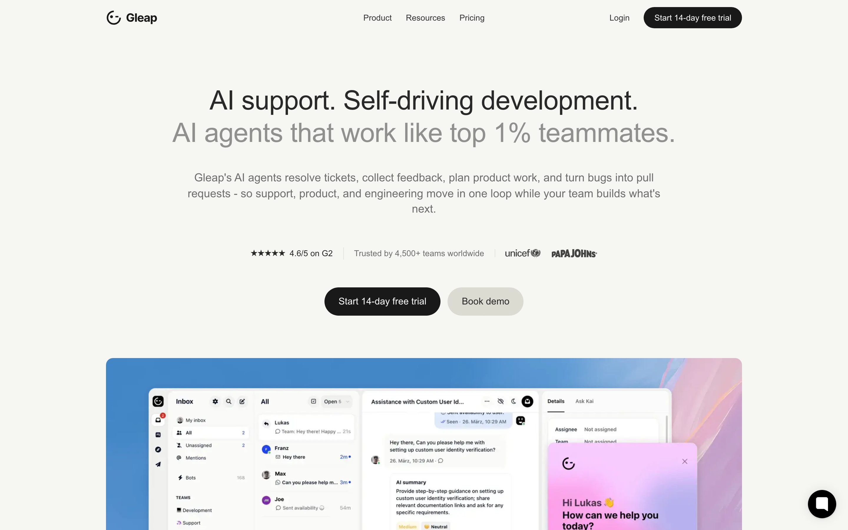
Gleap's marketing surface is a calm, warm-neutral editorial SaaS interface. The page floor is an off-white `{colors.canvas}` (#f6f6f3) — not pure white — and the type system runs a single typeface, **Switzer**, at a light weight (400). The headline voice is large but quiet: `{typography.display}` sits at ~45px in `{colors.ink}` (#292929), a near-black that reads soft against the warm canvas rather than shouting. The result is engineering-confident and understated.
The action layer is deliberately monochrome. The measured primary button is white (`{colors.primary}` — #ffffff) with black text (`{colors.on-primary}` — #000000) and an almost-square corner (~4px). The signature nav CTA inverts to a dark pill (`{component.button-cta-dark}`). Color voltage — blue, green, violet, teal, red — appears only inside embedded product UI fragments and the gradient "outcome" stat cards, never on a primary action.
Like the best product-led marketing sites, Gleap shows the actual product. The hero and the loop sections render real Gleap inbox screens, schedule views, and chat widgets directly inside flat or lightly-tinted cards. Marketing illustration is minimal; the product chrome itself carries the chromatic interest.
**Key Characteristics:**
- Warm off-white canvas (`{colors.canvas}` — #f6f6f3) instead of pure white — a subtle warmth that runs through every band.
- Single typeface — **Switzer** — at weight 400 for both display and body. Low contrast, generous tracking-tightening on headlines (-0.45px, derived from the measured -0.454362px).
- White, near-square primary buttons (`{component.button-primary}`, ~4px radius) plus a dark pill nav CTA (`{component.button-cta-dark}`, `{rounded.pill}` 200px).
- Layered warm-neutral surfaces — `{colors.surface-light}` (#edede8), `{colors.surface-neutral}` (#dbdbd2), `{colors.surface-warm}` (#d0d0c8) — for cards and section blocks.
- Accent palette reserved for product chrome and gradient stat cards: `{colors.accent-blue}` (#3898ec), `{colors.accent-green}` (#4cc02b), `{colors.accent-violet}` (#7367ff), `{colors.accent-teal}` (#3bd0c8), `{colors.accent-red}` (#ce1919).
- Two card radii in play: flat `{rounded.none}` (0px) section cards and soft `{rounded.xl}` (12px) content/feature cards — 12px is the single most frequent radius measured.
- Pill badges and the dark nav CTA use `{rounded.pill}` (200px).
- Spacing rhythm clusters at `{spacing.sm}` (9px), `{spacing.xl}` (18px), and `{spacing.xxl}` (24px) — the three most-measured gaps.
## Colors
### Text & Action
- **Ink** (`{colors.ink}` — #292929): Headlines and max-contrast text. Reads as soft-black on the warm canvas.
- **Body** (`{colors.body}` — #353535): Default running-text — the highest-frequency color in the system (518 occurrences), confirming a body-text-dominant editorial page.
- **Link** (`{colors.link}` — #141414): Inline links and nav items — the darkest neutral, near-black.
- **Primary** (`{colors.primary}` — #ffffff): The primary button surface. White-on-warm-canvas is the action signal.
- **On Primary** (`{colors.on-primary}` — #000000): Text on the white primary button.
### Surface
- **Canvas** (`{colors.canvas}` — #f6f6f3): The page floor — warm off-white.
- **Surface Light** (`{colors.surface-light}` — #edede8): Feature cards, badge pills, light section blocks.
- **Surface Neutral** (`{colors.surface-neutral}` — #dbdbd2): Slightly deeper warm-gray for product thumbnail backgrounds and larger blocks.
- **Surface Warm** (`{colors.surface-warm}` — #d0d0c8): The warmest/deepest neutral block tone.
- **Hairline** (`{colors.hairline}` — #dddddd): Soft 1px dividers and card outlines.
- **Neutral 300 / Mid** (`{colors.neutral-300}` — #c0c0c0, `{colors.neutral-mid}` — #c8c8c8): Tertiary borders, muted iconography, disabled tones.
- **Dark surfaces** (`{colors.dark-900}` — #191919, `{colors.dark-800}` — #222222, `{colors.dark-700}` — #333333): The dark nav CTA and any dark chrome moments (e.g. the inbox panel shown in product screenshots).
### Accent (product chrome + outcome cards only)
- **Blue** (`{colors.accent-blue}` — #3898ec), **Green** (`{colors.accent-green}` — #4cc02b), **Violet** (`{colors.accent-violet}` — #7367ff), **Teal** (`{colors.accent-teal}` — #3bd0c8), **Red** (`{colors.accent-red}` — #ce1919). These surface inside embedded product UI (status dots, agent labels, charts) and as the gradient tints on the outcome stat cards. They never appear on a primary CTA or on body type.
## Typography
### Font Family
The entire system runs **Switzer** — a clean, open-source geometric-humanist sans from Indian Type Foundry, freely available (it is **not** a licensed/proprietary face, so it can ship directly). Switzer is used for both display and body at weight 400, giving the page its low-contrast, even-tone voice. The measured button label falls back to a generic `sans-serif` stack at weight 600.
### Hierarchy
| Token | Size | Weight | Line Height | Letter Spacing | Use |
|---|---|---|---|---|---|
| `{typography.display}` | 45.44px | 400 | 1.2 | -0.45px | h1 and h2 — "AI support. Self-driving development.", section heads, big stat numbers. Letter-spacing -0.45px is derived (rounded from measured -0.454362px). |
| `{typography.body}` | 19.04px | 400 | 1.4 | 0 | Default running text, card descriptions, list items. |
| `{typography.button}` | 15px | 600 | 1.6 | 0 | Button labels, nav links, badge text — the only weight-600 role. |
### Principles
Switzer at 400 carries both headlines and body — Gleap does not lean on bold display weight for emphasis. Hierarchy comes from **size** (45px vs 19px) and **color** (`{colors.ink}` vs `{colors.body}`), not from weight contrast. The single visual exception is the weight-600 button/nav label, which is the system's only "loud" type.
Headlines tighten letter-spacing slightly (-0.45px); body stays at normal tracking. h1 and h2 are measured identical — the system treats them as one display tier and reuses it across hero and section heads.
### Note on Font Substitutes
Switzer is open-source and can be self-hosted directly. If unavailable, **Inter** at weight 400 (with letter-spacing ~-0.01em on display) is the closest substitute; **General Sans** (also ITF) is a near-sibling alternative.
## Layout
### Spacing System
- **Measured tokens:** `{spacing.xxs}` 4px · `{spacing.xs}` 6px · `{spacing.sm}` 9px · `{spacing.md}` 12px · `{spacing.lg}` 15px · `{spacing.xl}` 18px · `{spacing.xxl}` 24px · `{spacing.xxxl}` 36px · `{spacing.section}` 48px · `{spacing.wide}` 58px.
- **Dominant rhythm:** the three highest-frequency gaps are `{spacing.xl}` (18px, 59×), `{spacing.sm}` (9px, 55×), and `{spacing.xxl}` (24px, 51×) — the system breathes on a 9/18/24 cadence.
- **Card internal padding:** `{spacing.xxl}` (24px) on feature, pricing, and outcome cards; `{spacing.xl}` (18px) on tighter product-thumbnail cards.
- **Section padding:** `{spacing.section}` (48px) and `{spacing.wide}` (58px) mark the larger band separations.
### Grid & Container
- Content is centered on a wide marketing column with generous side margins.
- The loop sections ("The bug loop / feature loop / support loop") use a 2-column layout — a sticky text list at left, a stacked column of product cards at right.
- Feature/teammate grids run multi-up (3–4 across) at desktop.
- The pricing grid is 4-up (Starter / Team / Pro / Enterprise) at desktop.
### Whitespace Philosophy
Gleap uses calm, generous whitespace with large quiet headlines floating on the warm canvas. The 9/18/24 spacing cadence keeps the page tight and scannable without feeling dense — copy blocks have room, and product screenshots get full visual prominence inside their cards.
## Elevation & Depth
| Level | Treatment | Use |
|---|---|---|
| Flat | No shadow, no radius (`card-flat`, `{rounded.none}`) | Full-bleed section blocks, the measured baseline card |
| Soft card float | `rgba(16,24,40,0.12) 0px 18px 55px 0px` | Elevated content cards, floating product panels |
| Ambient lift | `rgba(0,0,0,0.15) 0px 1px 3px, rgba(0,0,0,0.1) 0px 0px 20px` | Smaller raised UI fragments, chat widget |
| Heavy modal | `rgba(0,0,0,0.3) 0px 32px 68px 0px` | The cookie-consent / modal dialog overlay |
The elevation philosophy is **soft and diffuse** — large-radius, low-alpha shadows that lift cards gently off the warm canvas. No hard borders carry the weight; the warm-neutral surface ladder (canvas → surface-light → surface-neutral → surface-warm) does most of the depth work, with shadow reserved for genuinely floating elements.
### Decorative Depth
- Outcome stat cards carry soft accent gradients (blue/green/violet/teal tints) bleeding across the surface — the chromatic interest of the page lives here. The base surface is `{colors.surface-light}`; the gradient tints derive from the accent palette and are not flat-color tokens.
- Embedded product screenshots (inbox, chat widget, schedule view) carry their own internal chrome shadows from the product UI itself — these are content, not system tokens.
## Shapes
### Border Radius Scale
| Token | Value | Use |
|---|---|---|
| `{rounded.none}` | 0px | Flat section cards (measured `card` = 0px radius) |
| `{rounded.xs}` | 4px | Primary button (measured 3.75px — `{rounded.xs}` is the rounded approximation) |
| `{rounded.sm}` | 6px | Small inline controls, input fields |
| `{rounded.md}` | 8px | Secondary small surfaces |
| `{rounded.lg}` | 10px | Medium cards |
| `{rounded.xl}` | 12px | Standard content cards, feature cards, pricing cards — the most frequent radius (19×) |
| `{rounded.xxl}` | 14px | Slightly larger card variant |
| `{rounded.xxxl}` | 30px | Large rounded blocks |
| `{rounded.huge}` | 48px | Oversized rounded section container |
| `{rounded.pill}` | 200px | Pill badges, dark nav CTA |
The radius system spans a wide range — from dead-flat 0px section cards to fully-rounded 200px pills — but the working middle is `{rounded.xl}` (12px) for content cards and `{rounded.pill}` for badges and the nav CTA. The near-square primary button (~4px) is a distinct, deliberate choice that contrasts with the rounded pill nav CTA.
### Photography Geometry
Product screenshots sit inside `{rounded.xl}` (12px) card frames. The hero collage of product views uses larger rounded containers. There are no circular avatar treatments measured.
## Components
### Navigation
**`top-nav`** — Sits on the warm `{colors.canvas}` at the top of every page. Carries the Gleap wordmark + logo at left, center menu (Product, Resources, Pricing) in `{typography.button}` weight, and a right cluster with a "Login" `{component.text-link}` and the dark "Start 14-day free trial" CTA. Text in `{colors.ink}`.
### Buttons
**`button-primary`** — The measured primary action. Background `{colors.primary}` (#ffffff), text `{colors.on-primary}` (#000000), type `{typography.button}` (15px / 600), padding 15px, near-square corners `{rounded.xs}` (measured 3.75px). Used for "Start free trial" buttons in the pricing grid and content bands.
**`button-cta-dark`** — The signature nav CTA. Background `{colors.dark-900}` (#191919 — derived mapping from the measured dark-neutral palette to the visible dark pill), text `{colors.primary}` (#ffffff), type `{typography.button}`, fully rounded `{rounded.pill}` (200px). Also appears as the featured "Start free trial" on the Pro pricing tier.
**`text-link`** — Inline link in `{colors.link}` (#141414). Used for "Login" and inline references in body copy.
### Cards & Containers
**`card-flat`** — The measured baseline card: `{rounded.none}` (0px radius), no shadow, on `{colors.canvas}`. Used for full-bleed section blocks where the card edge is invisible against the canvas.
**`feature-card`** — Light-tinted content card on `{colors.surface-light}` (#edede8), rounded `{rounded.xl}` (12px), padding `{spacing.xxl}` (24px). Body copy in `{typography.body}`, `{colors.body}` text. Used in the "Meet your new teammates" and loop sections.
**`product-thumb-card`** — A warmer-gray container (`{colors.surface-neutral}` — #dbdbd2) holding a product screenshot, rounded `{rounded.xl}`, padding `{spacing.xl}` (18px). The image inside carries its own chrome.
**`outcome-stat-card`** — The chromatic "Real outcomes from Gleap customers" cards. Base surface `{colors.surface-light}` with soft accent gradient tints (blue/green/teal — derived from the accent palette), rounded `{rounded.xl}`, padding `{spacing.xxl}`. The big stat number ("50-60%", "<1 day", "10 days") renders in `{typography.display}`, `{colors.ink}`, with a customer logo alongside.
**`pricing-card`** — Standard pricing tier (Starter / Team / Enterprise). Background `{colors.canvas}`, rounded `{rounded.xl}`, padding `{spacing.xxl}`. Plan name + price, a feature checklist in `{typography.body}`, and a `{component.button-primary}` at the bottom.
**`pricing-card-featured`** — The "Pro" tier. Surface lifts to white `{colors.primary}` (#ffffff) with a soft card float shadow and the dark `{component.button-cta-dark}` as its action — the elevation + dark button is the featured signal. Text `{colors.ink}`, padding `{spacing.xxl}`.
### Tags / Badges
**`badge-pill`** — Small pill label ("Support, feedback, roadmap, and code in one loop"). Background `{colors.surface-light}`, text `{colors.body}`, type `{typography.button}`, fully rounded `{rounded.pill}`, padding 9px × 18px.
## Do's and Don'ts
### Do
- Build on the warm `{colors.canvas}` (#f6f6f3), not pure white. The warmth is a defining trait.
- Use Switzer at weight 400 for both display and body. Let size and color — not weight — carry hierarchy.
- Keep the action layer monochrome: white `{component.button-primary}` and dark `{component.button-cta-dark}`. Reserve color for product chrome and outcome cards.
- Apply the slight headline tracking (-0.45px). It keeps the light-weight display tier crisp.
- Use `{rounded.xl}` (12px) for content cards and `{rounded.pill}` for badges and the nav CTA — the two working radii.
- Embed real product screenshots inside `{component.product-thumb-card}` frames rather than drawing marketing illustration.
- Let outcome stat cards carry the accent gradients — they are the page's deliberate chromatic moment.
### Don't
- Don't put accent colors (`{colors.accent-blue}`, `{colors.accent-green}`, etc.) on primary CTAs. The action layer stays black/white.
- Don't reach for bold display weight — there is no measured weight above 600, and that 600 belongs to button/nav labels only.
- Don't mix the near-square button radius (`{rounded.xs}`) with rounded content cards; the contrast between square buttons and rounded cards is intentional.
- Don't use a stark pure-white page background where the warm `{colors.canvas}` is expected.
- Don't add heavy drop shadows; depth is soft, diffuse, and low-alpha.
- Don't document hover state — default and active/pressed only.
## Responsive Behavior
### Breakpoints
Specific breakpoint values were not measured. Based on the captured desktop layout, the expected behavior is:
| Name | Width (assumed) | Key Changes |
|---|---|---|
| Mobile | < 768px | Nav collapses to a menu; hero display scales down; loop sections stack to single column; pricing 4-up → 1-up |
| Tablet | 768–1024px | Multi-up feature grids reduce to 2-up; pricing 4-up → 2-up |
| Desktop | > 1024px | Full top-nav, 2-column loop layout, 3–4-up feature grids, 4-up pricing |
### Touch Targets
- `{component.button-primary}` carries 15px padding around a 15px/1.6 label — comfortably above minimum tap height.
- `{component.button-cta-dark}` uses pill geometry with 15px × 24px padding.
- `{component.text-link}` (Login) sits inside the nav with surrounding spacing.
### Collapsing Strategy
- The 2-column loop sections (sticky text list + product card stack) collapse to a single stacked column on mobile.
- Pricing tiers reduce columns rather than shrinking card content.
- Outcome stat cards become a horizontal carousel (the captured page shows pager controls beneath them).
## Iteration Guide
1. Focus on ONE component at a time. Reference its YAML key directly (`{component.feature-card}`, `{component.pricing-card-featured}`).
2. Variants of an existing component (`-featured`, `-active`, `-disabled`) live as separate entries in `components:`.
3. Use `{token.refs}` everywhere — never inline a hex.
4. Never document hover. Default and Active/Pressed states only.
5. Display and body both stay Switzer 400 — drive hierarchy with size and `{colors.ink}` vs `{colors.body}`, not weight.
6. Keep accent colors out of the action layer; they belong to product chrome and the gradient outcome cards.
7. When choosing a card radius, default to `{rounded.xl}` (12px); reserve `{rounded.none}` for full-bleed blocks and `{rounded.pill}` for badges/CTA.
## Known Gaps
- The dark nav CTA color (`{component.button-cta-dark}` → `{colors.dark-900}` #191919) is a derived mapping: the measured `button-primary` is white-on-black, while the visible "Start 14-day free trial" pill is dark. The exact dark CTA background hex was not isolated by the button selector; #191919 is the closest measured dark-neutral.
- The primary button radius is measured at 3.75px; `{rounded.xs}` (4px) is used as the nearest token approximation.
- The button typography family is measured as a generic `sans-serif` (weight 600), not confirmed as Switzer — it is documented as measured.
- Outcome-card gradient fills are observed in screenshots but are not flat-color tokens; the accent hexes (blue/green/violet/teal) are documented from frequency analysis, and their exact gradient stops/angles are not captured.
- Footer styling, dark-mode product chrome, and the in-app inbox/chat widget surfaces are product UI shown as content, not marketing tokens — their full specs are out of scope.
- Input/form field states, focus states, and animation/transition timings were not measured.
- Exact responsive breakpoints are assumed, not measured; only the desktop capture was analyzed.
- Switzer is open-source and ships directly; no licensed-font substitution is required, but Inter / General Sans are noted as fallbacks.
<!-- Documented by duply · real-world design systems as ready-to-use DESIGN.md for AI coding agents · https://duply.ai/gleap/design-md -->
Color Palette
Accent
Neutrals
Typography
display45.44px · 400 · 1.2
The quick brown fox jumpsbody19.04px · 400 · 1.4
The quick brown fox jumpsbutton15px · 600 · 1.6
The quick brown fox jumpsSpacing & Shape
Spacing
| Name | Value | Preview |
|---|---|---|
| xxs | 4px | |
| xs | 6px | |
| sm | 9px | |
| md | 12px | |
| lg | 15px | |
| xl | 18px | |
| xxl | 24px | |
| xxxl | 36px | |
| section | 48px | |
| wide | 58px |
Border Radius
| Name | Value | Preview |
|---|---|---|
| none | 0px | |
| xs | 4px | |
| sm | 6px | |
| md | 8px | |
| lg | 10px | |
| xl | 12px | |
| xxl | 14px | |
| xxxl | 30px | |
| huge | 48px | |
| pill | 200px |
More like this


---
version: alpha
name: Gleap-design-analysis
description: A quiet, warm-neutral editorial SaaS surface built on an off-white canvas (#f6f6f3) with Switzer typography at a single light weight, near-square white CTA buttons, and product UI shown directly inside flat content cards. The voice is calm and engineering-confident — large low-contrast headlines, generous whitespace, and a restrained accent palette (blue / green / violet / teal / red) that surfaces only inside product chrome and gradient outcome cards, never on primary actions.
colors:
  ink: "#292929"
  body: "#353535"
  link: "#141414"
  primary: "#ffffff"
  on-primary: "#000000"
  canvas: "#f6f6f3"
  surface-light: "#edede8"
  surface-neutral: "#dbdbd2"
  surface-warm: "#d0d0c8"
  hairline: "#dddddd"
  neutral-300: "#c0c0c0"
  neutral-mid: "#c8c8c8"
  dark-900: "#191919"
  dark-800: "#222222"
  dark-700: "#333333"
  accent-blue: "#3898ec"
  accent-green: "#4cc02b"
  accent-red: "#ce1919"
  accent-violet: "#7367ff"
  accent-teal: "#3bd0c8"
typography:
  display:
    fontFamily: "Switzer, sans-serif"
    fontSize: 45.44px
    fontWeight: 400
    lineHeight: 1.2
    letterSpacing: -0.45px
  body:
    fontFamily: "Switzer, sans-serif"
    fontSize: 19.04px
    fontWeight: 400
    lineHeight: 1.4
    letterSpacing: 0
  button:
    fontFamily: "sans-serif"
    fontSize: 15px
    fontWeight: 600
    lineHeight: 1.6
    letterSpacing: 0
rounded:
  none: 0px
  xs: 4px
  sm: 6px
  md: 8px
  lg: 10px
  xl: 12px
  xxl: 14px
  xxxl: 30px
  huge: 48px
  pill: 200px
spacing:
  xxs: 4px
  xs: 6px
  sm: 9px
  md: 12px
  lg: 15px
  xl: 18px
  xxl: 24px
  xxxl: 36px
  section: 48px
  wide: 58px
components:
  top-nav:
    backgroundColor: "{colors.canvas}"
    textColor: "{colors.ink}"
    typography: "{typography.button}"
    padding: 18px 24px
  button-primary:
    backgroundColor: "{colors.primary}"
    textColor: "{colors.on-primary}"
    typography: "{typography.button}"
    rounded: "{rounded.xs}"
    padding: 15px
  button-cta-dark:
    backgroundColor: "{colors.dark-900}"
    textColor: "{colors.primary}"
    typography: "{typography.button}"
    rounded: "{rounded.pill}"
    padding: 15px 24px
  text-link:
    backgroundColor: transparent
    textColor: "{colors.link}"
    typography: "{typography.button}"
  card-flat:
    backgroundColor: "{colors.canvas}"
    textColor: "{colors.body}"
    typography: "{typography.body}"
    rounded: "{rounded.none}"
  feature-card:
    backgroundColor: "{colors.surface-light}"
    textColor: "{colors.body}"
    typography: "{typography.body}"
    rounded: "{rounded.xl}"
    padding: 24px
  product-thumb-card:
    backgroundColor: "{colors.surface-neutral}"
    textColor: "{colors.body}"
    rounded: "{rounded.xl}"
    padding: 18px
  outcome-stat-card:
    backgroundColor: "{colors.surface-light}"
    textColor: "{colors.ink}"
    typography: "{typography.display}"
    rounded: "{rounded.xl}"
    padding: 24px
  pricing-card:
    backgroundColor: "{colors.canvas}"
    textColor: "{colors.body}"
    typography: "{typography.body}"
    rounded: "{rounded.xl}"
    padding: 24px
  pricing-card-featured:
    backgroundColor: "{colors.primary}"
    textColor: "{colors.ink}"
    typography: "{typography.body}"
    rounded: "{rounded.xl}"
    padding: 24px
  badge-pill:
    backgroundColor: "{colors.surface-light}"
    textColor: "{colors.body}"
    typography: "{typography.button}"
    rounded: "{rounded.pill}"
    padding: 9px 18px
---

## Overview

Gleap's marketing surface is a calm, warm-neutral editorial SaaS interface. The page floor is an off-white `{colors.canvas}` (#f6f6f3) — not pure white — and the type system runs a single typeface, **Switzer**, at a light weight (400). The headline voice is large but quiet: `{typography.display}` sits at ~45px in `{colors.ink}` (#292929), a near-black that reads soft against the warm canvas rather than shouting. The result is engineering-confident and understated.

The action layer is deliberately monochrome. The measured primary button is white (`{colors.primary}` — #ffffff) with black text (`{colors.on-primary}` — #000000) and an almost-square corner (~4px). The signature nav CTA inverts to a dark pill (`{component.button-cta-dark}`). Color voltage — blue, green, violet, teal, red — appears only inside embedded product UI fragments and the gradient "outcome" stat cards, never on a primary action.

Like the best product-led marketing sites, Gleap shows the actual product. The hero and the loop sections render real Gleap inbox screens, schedule views, and chat widgets directly inside flat or lightly-tinted cards. Marketing illustration is minimal; the product chrome itself carries the chromatic interest.

**Key Characteristics:**
- Warm off-white canvas (`{colors.canvas}` — #f6f6f3) instead of pure white — a subtle warmth that runs through every band.
- Single typeface — **Switzer** — at weight 400 for both display and body. Low contrast, generous tracking-tightening on headlines (-0.45px, derived from the measured -0.454362px).
- White, near-square primary buttons (`{component.button-primary}`, ~4px radius) plus a dark pill nav CTA (`{component.button-cta-dark}`, `{rounded.pill}` 200px).
- Layered warm-neutral surfaces — `{colors.surface-light}` (#edede8), `{colors.surface-neutral}` (#dbdbd2), `{colors.surface-warm}` (#d0d0c8) — for cards and section blocks.
- Accent palette reserved for product chrome and gradient stat cards: `{colors.accent-blue}` (#3898ec), `{colors.accent-green}` (#4cc02b), `{colors.accent-violet}` (#7367ff), `{colors.accent-teal}` (#3bd0c8), `{colors.accent-red}` (#ce1919).
- Two card radii in play: flat `{rounded.none}` (0px) section cards and soft `{rounded.xl}` (12px) content/feature cards — 12px is the single most frequent radius measured.
- Pill badges and the dark nav CTA use `{rounded.pill}` (200px).
- Spacing rhythm clusters at `{spacing.sm}` (9px), `{spacing.xl}` (18px), and `{spacing.xxl}` (24px) — the three most-measured gaps.

## Colors

### Text & Action
- **Ink** (`{colors.ink}` — #292929): Headlines and max-contrast text. Reads as soft-black on the warm canvas.
- **Body** (`{colors.body}` — #353535): Default running-text — the highest-frequency color in the system (518 occurrences), confirming a body-text-dominant editorial page.
- **Link** (`{colors.link}` — #141414): Inline links and nav items — the darkest neutral, near-black.
- **Primary** (`{colors.primary}` — #ffffff): The primary button surface. White-on-warm-canvas is the action signal.
- **On Primary** (`{colors.on-primary}` — #000000): Text on the white primary button.

### Surface
- **Canvas** (`{colors.canvas}` — #f6f6f3): The page floor — warm off-white.
- **Surface Light** (`{colors.surface-light}` — #edede8): Feature cards, badge pills, light section blocks.
- **Surface Neutral** (`{colors.surface-neutral}` — #dbdbd2): Slightly deeper warm-gray for product thumbnail backgrounds and larger blocks.
- **Surface Warm** (`{colors.surface-warm}` — #d0d0c8): The warmest/deepest neutral block tone.
- **Hairline** (`{colors.hairline}` — #dddddd): Soft 1px dividers and card outlines.
- **Neutral 300 / Mid** (`{colors.neutral-300}` — #c0c0c0, `{colors.neutral-mid}` — #c8c8c8): Tertiary borders, muted iconography, disabled tones.
- **Dark surfaces** (`{colors.dark-900}` — #191919, `{colors.dark-800}` — #222222, `{colors.dark-700}` — #333333): The dark nav CTA and any dark chrome moments (e.g. the inbox panel shown in product screenshots).

### Accent (product chrome + outcome cards only)
- **Blue** (`{colors.accent-blue}` — #3898ec), **Green** (`{colors.accent-green}` — #4cc02b), **Violet** (`{colors.accent-violet}` — #7367ff), **Teal** (`{colors.accent-teal}` — #3bd0c8), **Red** (`{colors.accent-red}` — #ce1919). These surface inside embedded product UI (status dots, agent labels, charts) and as the gradient tints on the outcome stat cards. They never appear on a primary CTA or on body type.

## Typography

### Font Family
The entire system runs **Switzer** — a clean, open-source geometric-humanist sans from Indian Type Foundry, freely available (it is **not** a licensed/proprietary face, so it can ship directly). Switzer is used for both display and body at weight 400, giving the page its low-contrast, even-tone voice. The measured button label falls back to a generic `sans-serif` stack at weight 600.

### Hierarchy

| Token | Size | Weight | Line Height | Letter Spacing | Use |
|---|---|---|---|---|---|
| `{typography.display}` | 45.44px | 400 | 1.2 | -0.45px | h1 and h2 — "AI support. Self-driving development.", section heads, big stat numbers. Letter-spacing -0.45px is derived (rounded from measured -0.454362px). |
| `{typography.body}` | 19.04px | 400 | 1.4 | 0 | Default running text, card descriptions, list items. |
| `{typography.button}` | 15px | 600 | 1.6 | 0 | Button labels, nav links, badge text — the only weight-600 role. |

### Principles
Switzer at 400 carries both headlines and body — Gleap does not lean on bold display weight for emphasis. Hierarchy comes from **size** (45px vs 19px) and **color** (`{colors.ink}` vs `{colors.body}`), not from weight contrast. The single visual exception is the weight-600 button/nav label, which is the system's only "loud" type.

Headlines tighten letter-spacing slightly (-0.45px); body stays at normal tracking. h1 and h2 are measured identical — the system treats them as one display tier and reuses it across hero and section heads.

### Note on Font Substitutes
Switzer is open-source and can be self-hosted directly. If unavailable, **Inter** at weight 400 (with letter-spacing ~-0.01em on display) is the closest substitute; **General Sans** (also ITF) is a near-sibling alternative.

## Layout

### Spacing System
- **Measured tokens:** `{spacing.xxs}` 4px · `{spacing.xs}` 6px · `{spacing.sm}` 9px · `{spacing.md}` 12px · `{spacing.lg}` 15px · `{spacing.xl}` 18px · `{spacing.xxl}` 24px · `{spacing.xxxl}` 36px · `{spacing.section}` 48px · `{spacing.wide}` 58px.
- **Dominant rhythm:** the three highest-frequency gaps are `{spacing.xl}` (18px, 59×), `{spacing.sm}` (9px, 55×), and `{spacing.xxl}` (24px, 51×) — the system breathes on a 9/18/24 cadence.
- **Card internal padding:** `{spacing.xxl}` (24px) on feature, pricing, and outcome cards; `{spacing.xl}` (18px) on tighter product-thumbnail cards.
- **Section padding:** `{spacing.section}` (48px) and `{spacing.wide}` (58px) mark the larger band separations.

### Grid & Container
- Content is centered on a wide marketing column with generous side margins.
- The loop sections ("The bug loop / feature loop / support loop") use a 2-column layout — a sticky text list at left, a stacked column of product cards at right.
- Feature/teammate grids run multi-up (3–4 across) at desktop.
- The pricing grid is 4-up (Starter / Team / Pro / Enterprise) at desktop.

### Whitespace Philosophy
Gleap uses calm, generous whitespace with large quiet headlines floating on the warm canvas. The 9/18/24 spacing cadence keeps the page tight and scannable without feeling dense — copy blocks have room, and product screenshots get full visual prominence inside their cards.

## Elevation & Depth

| Level | Treatment | Use |
|---|---|---|
| Flat | No shadow, no radius (`card-flat`, `{rounded.none}`) | Full-bleed section blocks, the measured baseline card |
| Soft card float | `rgba(16,24,40,0.12) 0px 18px 55px 0px` | Elevated content cards, floating product panels |
| Ambient lift | `rgba(0,0,0,0.15) 0px 1px 3px, rgba(0,0,0,0.1) 0px 0px 20px` | Smaller raised UI fragments, chat widget |
| Heavy modal | `rgba(0,0,0,0.3) 0px 32px 68px 0px` | The cookie-consent / modal dialog overlay |

The elevation philosophy is **soft and diffuse** — large-radius, low-alpha shadows that lift cards gently off the warm canvas. No hard borders carry the weight; the warm-neutral surface ladder (canvas → surface-light → surface-neutral → surface-warm) does most of the depth work, with shadow reserved for genuinely floating elements.

### Decorative Depth
- Outcome stat cards carry soft accent gradients (blue/green/violet/teal tints) bleeding across the surface — the chromatic interest of the page lives here. The base surface is `{colors.surface-light}`; the gradient tints derive from the accent palette and are not flat-color tokens.
- Embedded product screenshots (inbox, chat widget, schedule view) carry their own internal chrome shadows from the product UI itself — these are content, not system tokens.

## Shapes

### Border Radius Scale

| Token | Value | Use |
|---|---|---|
| `{rounded.none}` | 0px | Flat section cards (measured `card` = 0px radius) |
| `{rounded.xs}` | 4px | Primary button (measured 3.75px — `{rounded.xs}` is the rounded approximation) |
| `{rounded.sm}` | 6px | Small inline controls, input fields |
| `{rounded.md}` | 8px | Secondary small surfaces |
| `{rounded.lg}` | 10px | Medium cards |
| `{rounded.xl}` | 12px | Standard content cards, feature cards, pricing cards — the most frequent radius (19×) |
| `{rounded.xxl}` | 14px | Slightly larger card variant |
| `{rounded.xxxl}` | 30px | Large rounded blocks |
| `{rounded.huge}` | 48px | Oversized rounded section container |
| `{rounded.pill}` | 200px | Pill badges, dark nav CTA |

The radius system spans a wide range — from dead-flat 0px section cards to fully-rounded 200px pills — but the working middle is `{rounded.xl}` (12px) for content cards and `{rounded.pill}` for badges and the nav CTA. The near-square primary button (~4px) is a distinct, deliberate choice that contrasts with the rounded pill nav CTA.

### Photography Geometry
Product screenshots sit inside `{rounded.xl}` (12px) card frames. The hero collage of product views uses larger rounded containers. There are no circular avatar treatments measured.

## Components

### Navigation

**`top-nav`** — Sits on the warm `{colors.canvas}` at the top of every page. Carries the Gleap wordmark + logo at left, center menu (Product, Resources, Pricing) in `{typography.button}` weight, and a right cluster with a "Login" `{component.text-link}` and the dark "Start 14-day free trial" CTA. Text in `{colors.ink}`.

### Buttons

**`button-primary`** — The measured primary action. Background `{colors.primary}` (#ffffff), text `{colors.on-primary}` (#000000), type `{typography.button}` (15px / 600), padding 15px, near-square corners `{rounded.xs}` (measured 3.75px). Used for "Start free trial" buttons in the pricing grid and content bands.

**`button-cta-dark`** — The signature nav CTA. Background `{colors.dark-900}` (#191919 — derived mapping from the measured dark-neutral palette to the visible dark pill), text `{colors.primary}` (#ffffff), type `{typography.button}`, fully rounded `{rounded.pill}` (200px). Also appears as the featured "Start free trial" on the Pro pricing tier.

**`text-link`** — Inline link in `{colors.link}` (#141414). Used for "Login" and inline references in body copy.

### Cards & Containers

**`card-flat`** — The measured baseline card: `{rounded.none}` (0px radius), no shadow, on `{colors.canvas}`. Used for full-bleed section blocks where the card edge is invisible against the canvas.

**`feature-card`** — Light-tinted content card on `{colors.surface-light}` (#edede8), rounded `{rounded.xl}` (12px), padding `{spacing.xxl}` (24px). Body copy in `{typography.body}`, `{colors.body}` text. Used in the "Meet your new teammates" and loop sections.

**`product-thumb-card`** — A warmer-gray container (`{colors.surface-neutral}` — #dbdbd2) holding a product screenshot, rounded `{rounded.xl}`, padding `{spacing.xl}` (18px). The image inside carries its own chrome.

**`outcome-stat-card`** — The chromatic "Real outcomes from Gleap customers" cards. Base surface `{colors.surface-light}` with soft accent gradient tints (blue/green/teal — derived from the accent palette), rounded `{rounded.xl}`, padding `{spacing.xxl}`. The big stat number ("50-60%", "<1 day", "10 days") renders in `{typography.display}`, `{colors.ink}`, with a customer logo alongside.

**`pricing-card`** — Standard pricing tier (Starter / Team / Enterprise). Background `{colors.canvas}`, rounded `{rounded.xl}`, padding `{spacing.xxl}`. Plan name + price, a feature checklist in `{typography.body}`, and a `{component.button-primary}` at the bottom.

**`pricing-card-featured`** — The "Pro" tier. Surface lifts to white `{colors.primary}` (#ffffff) with a soft card float shadow and the dark `{component.button-cta-dark}` as its action — the elevation + dark button is the featured signal. Text `{colors.ink}`, padding `{spacing.xxl}`.

### Tags / Badges

**`badge-pill`** — Small pill label ("Support, feedback, roadmap, and code in one loop"). Background `{colors.surface-light}`, text `{colors.body}`, type `{typography.button}`, fully rounded `{rounded.pill}`, padding 9px × 18px.

## Do's and Don'ts

### Do
- Build on the warm `{colors.canvas}` (#f6f6f3), not pure white. The warmth is a defining trait.
- Use Switzer at weight 400 for both display and body. Let size and color — not weight — carry hierarchy.
- Keep the action layer monochrome: white `{component.button-primary}` and dark `{component.button-cta-dark}`. Reserve color for product chrome and outcome cards.
- Apply the slight headline tracking (-0.45px). It keeps the light-weight display tier crisp.
- Use `{rounded.xl}` (12px) for content cards and `{rounded.pill}` for badges and the nav CTA — the two working radii.
- Embed real product screenshots inside `{component.product-thumb-card}` frames rather than drawing marketing illustration.
- Let outcome stat cards carry the accent gradients — they are the page's deliberate chromatic moment.

### Don't
- Don't put accent colors (`{colors.accent-blue}`, `{colors.accent-green}`, etc.) on primary CTAs. The action layer stays black/white.
- Don't reach for bold display weight — there is no measured weight above 600, and that 600 belongs to button/nav labels only.
- Don't mix the near-square button radius (`{rounded.xs}`) with rounded content cards; the contrast between square buttons and rounded cards is intentional.
- Don't use a stark pure-white page background where the warm `{colors.canvas}` is expected.
- Don't add heavy drop shadows; depth is soft, diffuse, and low-alpha.
- Don't document hover state — default and active/pressed only.

## Responsive Behavior

### Breakpoints
Specific breakpoint values were not measured. Based on the captured desktop layout, the expected behavior is:

| Name | Width (assumed) | Key Changes |
|---|---|---|
| Mobile | < 768px | Nav collapses to a menu; hero display scales down; loop sections stack to single column; pricing 4-up → 1-up |
| Tablet | 768–1024px | Multi-up feature grids reduce to 2-up; pricing 4-up → 2-up |
| Desktop | > 1024px | Full top-nav, 2-column loop layout, 3–4-up feature grids, 4-up pricing |

### Touch Targets
- `{component.button-primary}` carries 15px padding around a 15px/1.6 label — comfortably above minimum tap height.
- `{component.button-cta-dark}` uses pill geometry with 15px × 24px padding.
- `{component.text-link}` (Login) sits inside the nav with surrounding spacing.

### Collapsing Strategy
- The 2-column loop sections (sticky text list + product card stack) collapse to a single stacked column on mobile.
- Pricing tiers reduce columns rather than shrinking card content.
- Outcome stat cards become a horizontal carousel (the captured page shows pager controls beneath them).

## Iteration Guide

1. Focus on ONE component at a time. Reference its YAML key directly (`{component.feature-card}`, `{component.pricing-card-featured}`).
2. Variants of an existing component (`-featured`, `-active`, `-disabled`) live as separate entries in `components:`.
3. Use `{token.refs}` everywhere — never inline a hex.
4. Never document hover. Default and Active/Pressed states only.
5. Display and body both stay Switzer 400 — drive hierarchy with size and `{colors.ink}` vs `{colors.body}`, not weight.
6. Keep accent colors out of the action layer; they belong to product chrome and the gradient outcome cards.
7. When choosing a card radius, default to `{rounded.xl}` (12px); reserve `{rounded.none}` for full-bleed blocks and `{rounded.pill}` for badges/CTA.

## Known Gaps

- The dark nav CTA color (`{component.button-cta-dark}` → `{colors.dark-900}` #191919) is a derived mapping: the measured `button-primary` is white-on-black, while the visible "Start 14-day free trial" pill is dark. The exact dark CTA background hex was not isolated by the button selector; #191919 is the closest measured dark-neutral.
- The primary button radius is measured at 3.75px; `{rounded.xs}` (4px) is used as the nearest token approximation.
- The button typography family is measured as a generic `sans-serif` (weight 600), not confirmed as Switzer — it is documented as measured.
- Outcome-card gradient fills are observed in screenshots but are not flat-color tokens; the accent hexes (blue/green/violet/teal) are documented from frequency analysis, and their exact gradient stops/angles are not captured.
- Footer styling, dark-mode product chrome, and the in-app inbox/chat widget surfaces are product UI shown as content, not marketing tokens — their full specs are out of scope.
- Input/form field states, focus states, and animation/transition timings were not measured.
- Exact responsive breakpoints are assumed, not measured; only the desktop capture was analyzed.
- Switzer is open-source and ships directly; no licensed-font substitution is required, but Inter / General Sans are noted as fallbacks.

<!-- Documented by duply · real-world design systems as ready-to-use DESIGN.md for AI coding agents · https://duply.ai/gleap/design-md -->