
EindhovenDesignDistrict
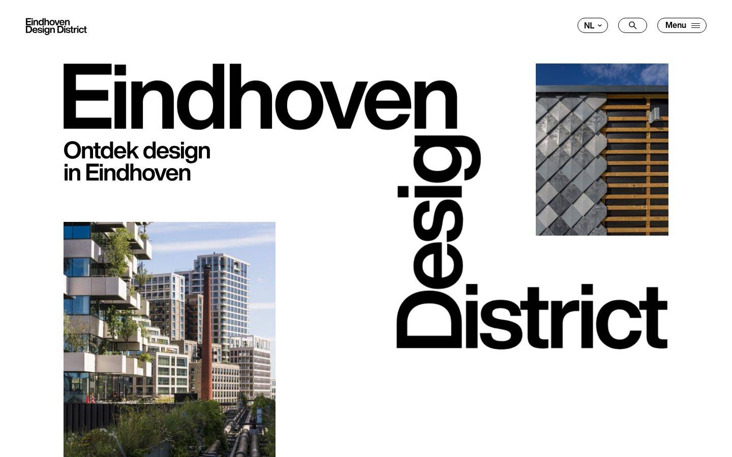
A bold, editorial Dutch design-platform interface built on stark white canvas and pure-black Helvetica typography, punctuated by full-bleed saturated color panels (hot pink, pure red, ultramarine blue) that hold project stories. The system reads as confident, gallery-grade graphic design — oversized geometric headlines, zero border-radius on content surfaces, no shadows, and pill-shaped navigation controls as the only rounded elements. Brand voltage comes entirely from massive black display type and the raw primary-color project blocks, not from decorative effects.
Works withClaude CodeCursorCodexGemini CLICopilotv0LovableBoltWindsurfReplit
---
version: alpha
name: EindhovenDesignDistrict-design-analysis
description: "A bold, editorial Dutch design-platform interface built on stark white canvas and pure-black Helvetica typography, punctuated by full-bleed saturated color panels (hot pink, pure red, ultramarine blue) that hold project stories. The system reads as confident, gallery-grade graphic design — oversized geometric headlines, zero border-radius on content surfaces, no shadows, and pill-shaped navigation controls as the only rounded elements. Brand voltage comes entirely from massive black display type and the raw primary-color project blocks, not from decorative effects."

colors:
  ink: "#000000"
  ink-soft: "#333333"
  ink-softer: "#3e3e3e"
  canvas: "#ffffff"
  on-dark: "#ffffff"
  surface-soft: "#f5f5f5"
  surface: "#e8e8e8"
  surface-strong: "#dfdfdf"
  hairline: "#c7c7c7"
  hairline-strong: "#bfbfbf"
  accent-pink: "#ffc2eb"
  accent-red: "#ff0000"
  accent-blue: "#0f26ed"
  accent-sky: "#1199ff"
  accent-yellow: "#fff500"

typography:
  h2:
    fontFamily: "HelveticaNow, Helvetica Neue, Arial, sans-serif"
    fontSize: 50px
    fontWeight: 600
    lineHeight: 1.0
    letterSpacing: "-0.02em"
  h3:
    fontFamily: "HelveticaNow, Helvetica Neue, Arial, sans-serif"
    fontSize: 35px
    fontWeight: 600
    lineHeight: 1.2
    letterSpacing: "-0.004em"
  h4:
    fontFamily: "HelveticaNow, Helvetica Neue, Arial, sans-serif"
    fontSize: 14px
    fontWeight: 600
    lineHeight: 1.312
    letterSpacing: "normal"
  body:
    fontFamily: "HelveticaNow, Helvetica Neue, Arial, sans-serif"
    fontSize: 35px
    fontWeight: 600
    lineHeight: 1.2
    letterSpacing: "-0.004em"
  button:
    fontFamily: "HelveticaNow, Helvetica Neue, Arial, sans-serif"
    fontSize: 16px
    fontWeight: 600
    lineHeight: 1.15
    letterSpacing: "normal"

rounded:
  none: 0px
  pill: 500px

spacing:
  xxs: 5px
  xs: 10px
  sm: 12px
  md: 20px
  lg: 27px
  xl: 35px
  xxl: 50px

components:
  top-nav:
    backgroundColor: "{colors.canvas}"
    textColor: "{colors.ink}"
    typography: "{typography.button}"
    padding: 20px
  wordmark:
    backgroundColor: transparent
    textColor: "{colors.ink}"
    typography: "{typography.h4}"
  language-selector:
    backgroundColor: "{colors.canvas}"
    textColor: "{colors.ink}"
    typography: "{typography.button}"
    rounded: "{rounded.pill}"
    padding: 12px 20px
  search-button:
    backgroundColor: "{colors.canvas}"
    textColor: "{colors.ink}"
    rounded: "{rounded.pill}"
    padding: 12px
  menu-button:
    backgroundColor: "{colors.canvas}"
    textColor: "{colors.ink}"
    typography: "{typography.button}"
    rounded: "{rounded.pill}"
    padding: 12px 20px
  button-primary:
    backgroundColor: transparent
    textColor: "{colors.ink}"
    typography: "{typography.button}"
    rounded: "{rounded.none}"
    padding: 0px
  button-pill:
    backgroundColor: "{colors.canvas}"
    textColor: "{colors.ink}"
    typography: "{typography.button}"
    rounded: "{rounded.pill}"
    padding: 15px 27px
  link-more:
    backgroundColor: transparent
    textColor: "{colors.ink}"
    typography: "{typography.h4}"
  project-panel-pink:
    backgroundColor: "{colors.accent-pink}"
    textColor: "{colors.ink}"
    typography: "{typography.h2}"
    rounded: "{rounded.none}"
    padding: 50px
  project-panel-red:
    backgroundColor: "{colors.accent-red}"
    textColor: "{colors.accent-blue}"
    typography: "{typography.h2}"
    rounded: "{rounded.none}"
    padding: 50px
  project-panel-blue:
    backgroundColor: "{colors.accent-blue}"
    textColor: "{colors.on-dark}"
    typography: "{typography.h2}"
    rounded: "{rounded.none}"
    padding: 50px
  project-image:
    backgroundColor: "{colors.surface}"
    textColor: "{colors.ink}"
    rounded: "{rounded.none}"
  card:
    backgroundColor: "{colors.canvas}"
    textColor: "{colors.ink}"
    rounded: "{rounded.none}"
  article-card:
    backgroundColor: "{colors.canvas}"
    textColor: "{colors.ink}"
    typography: "{typography.h4}"
    rounded: "{rounded.none}"
  carousel-arrow-button:
    backgroundColor: "{colors.canvas}"
    textColor: "{colors.ink}"
    rounded: "{rounded.pill}"
    padding: 12px
  footer-cta:
    backgroundColor: "{colors.canvas}"
    textColor: "{colors.ink}"
    typography: "{typography.h3}"
    padding: 50px
---

## Overview

Eindhoven Design District is a bold editorial platform for a Dutch design initiative — a stark white canvas (`{colors.canvas}` — #ffffff) carrying pure-black Helvetica display type (`{colors.ink}` — #000000) and full-bleed saturated color panels that hold each project story. The system reads as gallery-grade graphic design: oversized geometric headlines, zero border-radius on content surfaces, no shadows anywhere, and pill-shaped navigation controls as the only rounded moments.

The type voice is monolithic: a single family, **HelveticaNow**, at weight 600 across every role from the 50px section headline down to the 14px meta label. There is no serif, no secondary face, no weight variation — the design leans entirely on scale, negative letter-spacing at display sizes, and raw color contrast for hierarchy.

Brand voltage comes from the **full-bleed project panels** — hot pink (`{colors.accent-pink}`), pure red (`{colors.accent-red}`), and ultramarine blue (`{colors.accent-blue}`) blocks that each pair a large headline + body column with a photograph. The panels tile edge-to-edge with no gutters and no rounding, reading as a stacked poster series rather than a card grid.

**Key Characteristics:**
- Stark white canvas with pure-black type. Contrast is maximal and monochrome at the structural layer.
- One typeface only — HelveticaNow weight 600 everywhere. Hierarchy comes from size (50 → 35 → 16 → 14px), not from weight or family switches.
- Full-bleed saturated project panels in pink / red / blue with zero radius and zero shadow — content surfaces are perfectly square (measured `radius: 0px`).
- Pill controls (`{rounded.pill}` — 500px) are the ONLY rounded elements: the NL language selector, search button, Menu button, and the "Alle projecten" / "Meer over" action buttons.
- Negative letter-spacing on display sizes (h2 -0.02em, h3/body -0.004em) tightens the big Helvetica headlines into dense graphic blocks.
- No elevation system — zero shadows measured across the whole page. Depth is expressed purely through color-block contrast and photography.
- Photographs sit flush inside project panels at native aspect, square-cornered, no frame.
- Rare secondary accents (`{colors.accent-sky}` — #1199ff, `{colors.accent-yellow}` — #fff500) appear only inside photography or micro-details, never as UI surfaces.

## Colors

### Brand & Accent
The system's chromatic energy is concentrated in four saturated accents used as full-panel backgrounds, not as small highlights.
- **Accent Pink** (`{colors.accent-pink}` — #ffc2eb): The most-used panel color (frequency 22). Hosts the "Toolbox bewegingsvrijheid" and "Pretty Plastic" project panels. Text on pink stays `{colors.ink}` black.
- **Accent Red** (`{colors.accent-red}` — #ff0000): Pure red panel behind "Infomarkers Eindhoven Design District". Notably, the headline + body text on the red panel render in `{colors.accent-blue}` (#0f26ed) — a deliberate red/blue clash.
- **Accent Blue** (`{colors.accent-blue}` — #0f26ed): Ultramarine panel behind "Erfgoedputdeksels". Text inverts to `{colors.on-dark}` white.
- **Accent Sky** (`{colors.accent-sky}` — #1199ff): A lighter blue appearing rarely (frequency 2) — inside photography or a minor detail, never a UI surface.
- **Accent Yellow** (`{colors.accent-yellow}` — #fff500): A single measured occurrence — appears only as an incidental (a yellow bench in a project photo). Not a UI token in practice.

### Surface & Neutral
- **Canvas** (`{colors.canvas}` — #ffffff): The default page floor and all editorial bands.
- **Surface Soft** (`{colors.surface-soft}` — #f5f5f5): The barely-tinted band behind the "Artikelen" carousel section.
- **Surface** (`{colors.surface}` — #e8e8e8) / **Surface Strong** (`{colors.surface-strong}` — #dfdfdf): Neutral placeholder / image-loading fills.
- **Hairline** (`{colors.hairline}` — #c7c7c7) / **Hairline Strong** (`{colors.hairline-strong}` — #bfbfbf): Low-frequency divider and border tones on light surfaces.

### Text
- **Ink** (`{colors.ink}` — #000000): The dominant text color (frequency 462 — by far the most-measured value). All headlines, body, labels, buttons.
- **Ink Soft** (`{colors.ink-soft}` — #333333) / **Ink Softer** (`{colors.ink-softer}` — #3e3e3e): Rare secondary text tones for muted meta / fine print.
- **On Dark** (`{colors.on-dark}` — #ffffff): Text on the blue project panel.

## Typography

### Font Family
The entire system runs on **HelveticaNow** at weight 600 — no secondary family, no other weights measured. HelveticaNow is a licensed/proprietary Monotype typeface; it was not flagged in `fonts_licensed`, but it is not freely redistributable, so an open-source substitute must be shipped in production (see note below). The fallback stack walks `Helvetica Neue, Arial, sans-serif`.

Hierarchy is driven by size and letter-spacing alone. Large display roles carry tightened tracking (h2 -0.02em, h3/body -0.004em) so the big Helvetica reads as dense graphic blocks; small roles (h4, button) drop to `normal` spacing.

### Hierarchy

| Token | Size | Weight | Line Height | Letter Spacing | Use |
|---|---|---|---|---|---|
| `{typography.h2}` | 50px | 600 | 1.0 | -0.02em | Project-panel titles ("Toolbox bewegingsvrijheid", "Infomarkers"), section heads ("Projecten") |
| `{typography.h3}` | 35px | 600 | 1.2 | -0.004em | Sub-heads, intro statement, footer CTA head |
| `{typography.body}` | 35px | 600 | 1.2 | -0.004em | Large intro / lead paragraphs (same spec as h3 — the body voice is a big weight-600 statement) |
| `{typography.button}` | 16px | 600 | 1.15 | normal | Button + nav-control labels |
| `{typography.h4}` | 14px | 600 | 1.312 | normal | Meta labels, "Lees meer" links, article category tags, wordmark |

### Principles
There is no light or regular weight anywhere — 600 is the single voice. The design commits fully to Helvetica's neutral geometry, letting size and color do all the hierarchical work. Body copy inside project panels renders at a small size (not separately measured) while the lead/intro paragraphs use the large 35px weight-600 body voice — a deliberately oversized "statement" treatment.

### Note on Font Substitutes
HelveticaNow is a licensed Monotype face and cannot be shipped freely. The closest open-source substitutes are **Inter** at weight 600 with roughly -0.02em tracking on display sizes, or **Helvetica Neue** where already system-licensed. **Roboto** at 500–600 is an acceptable fallback for UI text. Preserve the tight negative letter-spacing on the 50px and 35px roles — it is the strongest part of the type signature.

## Layout

### Spacing System
- **Measured tokens:** `{spacing.xxs}` 5px · `{spacing.xs}` 10px · `{spacing.sm}` 12px · `{spacing.md}` 20px · `{spacing.lg}` 27px · `{spacing.xl}` 35px · `{spacing.xxl}` 50px.
- **Dominant rhythm:** 50px (frequency 15) and 20px (frequency 13) are the two most-used gaps — 50px for major panel padding and section separation, 20px for inline and nav spacing. 27px (frequency 10) and 18px (frequency 9, derived into the `lg`/`md` band) fill the mid range.
- **Panel padding:** ~50px (`{spacing.xxl}`) inside the full-bleed project panels.
- **Control padding:** ~12–20px inside pill buttons and nav controls.

### Grid & Container
- **Project panels:** A repeating two-column split — text column left, photograph right — tiling full-bleed edge-to-edge with no gutters and no radius.
- **Article carousel:** A 3-up horizontal row of article cards inside the `{colors.surface-soft}` band, with `{component.carousel-arrow-button}` prev/next controls.
- **Header:** Wordmark left, controls cluster right (NL selector, search, Menu).

### Whitespace Philosophy
The top of the page is deliberately airy — the hero gives the giant "Eindhoven Design District" wordmark and a single photograph enormous breathing room. Below the fold, the project panels invert this: dense, full-bleed color blocks packed edge-to-edge. The alternation between generous white space and saturated full-bleed blocks is the core layout rhythm.

## Elevation & Depth

| Level | Treatment | Use |
|---|---|---|
| Flat | No shadow, no border | Everything — the entire page (measured `shadows: []`, card `shadow: none`) |
| Color-block | Full-bleed saturated panel | Project panels — contrast, not elevation, creates separation |

The system has **no elevation model at all** — zero shadows were measured. Depth is created exclusively through color-block contrast (a red panel against white against a blue panel) and through photography. This is intentional flat, poster-style graphic design: surfaces are square (`radius: 0px`) and unshaded.

### Decorative Depth
- Photographs supply the only visual texture and depth — building facades, tiled surfaces, manhole covers shot at full-bleed inside panels.
- The oversized hero wordmark ("Eindhoven / Design / District") functions as a graphic element in its own right, overlapping the layout as a typographic backdrop.

## Shapes

### Border Radius Scale

| Token | Value | Use |
|---|---|---|
| `{rounded.none}` | 0px | All content surfaces — project panels, cards, images, `{component.button-primary}` (measured `radius: 0px`) |
| `{rounded.pill}` | 500px | The ONLY rounded elements — NL language selector, search button, Menu button, and "Alle projecten" / "Meer over" pill action buttons (measured, frequency 8) |

The shape language is binary: everything structural is a hard square (0px), and only interactive nav/action controls are fully pilled (500px). There is no intermediate radius — no soft corners on cards or images.

### Photography Geometry
Photographs are square-cornered (0px) and sit flush inside project panels at native aspect ratio, with no frame, border, or shadow. The contrast between the hard-edged photograph and the saturated color field beside it is a defining visual move.

## Components

### Navigation

**`top-nav`** — White header bar. Wordmark ("Eindhoven Design District" in `{typography.h4}`) at left; a right-side control cluster of `{component.language-selector}`, `{component.search-button}`, and `{component.menu-button}`. Background `{colors.canvas}`, padding ~20px.

**`wordmark`** — The stacked two-line "Eindhoven / Design District" lockup in `{colors.ink}`, set in `{typography.h4}` at header scale.

**`language-selector`** — The "NL ⌄" pill. Background `{colors.canvas}`, text `{colors.ink}`, rounded `{rounded.pill}`, padding ~12×20px.

**`search-button`** — Circular/pill search-icon control. Background `{colors.canvas}`, ink icon, rounded `{rounded.pill}`.

**`menu-button`** — The "Menu ☰" pill at top-right. Background `{colors.canvas}`, text `{colors.ink}`, `{typography.button}`, rounded `{rounded.pill}`.

### Buttons & Links

**`button-primary`** — The measured base action element (`color: #000000`, `radius: 0px`, `padding: 0px`) — a square, black-ink text action, rendered as a link-style control. Transparent background, `{typography.button}`.

**`button-pill`** — The prominent rounded action buttons ("Alle projecten", "Meer over Eindhoven Design District", "Ze alle artikelen", "Visit ThisisEindhoven.com"). White fill (`{colors.canvas}`) with ink text, rounded `{rounded.pill}`, padding ~15×27px.

**`link-more`** — The "Lees meer" inline link that appears under each project blurb, prefixed with a small solid square marker. Set in `{typography.h4}`, `{colors.ink}` (or inverted per panel color).

### Project Panels

**`project-panel-pink`** — Full-bleed hot-pink panel (`{colors.accent-pink}`). Text column carries an `{typography.h2}` title, a small-size body blurb, and a `{component.link-more}`, paired with a flush photograph. Zero radius, padding ~50px, ink text.

**`project-panel-red`** — Full-bleed pure-red panel (`{colors.accent-red}`). Distinctively, its title + body render in `{colors.accent-blue}` (#0f26ed) rather than black — a red/blue color clash unique to this panel.

**`project-panel-blue`** — Full-bleed ultramarine panel (`{colors.accent-blue}`). Text inverts to `{colors.on-dark}` white. Same square, shadowless structure.

**`project-image`** — The photograph half of each panel. Square-cornered, native aspect, no border or shadow; neutral `{colors.surface}` fill while loading.

### Cards & Carousel

**`card`** — The measured base card: `{colors.canvas}` background, `{rounded.none}`, no shadow. Fully flat and square.

**`article-card`** — Used in the "Artikelen" carousel inside the `{colors.surface-soft}` band. Photograph on top, a category label ("Interview") + headline in `{typography.h4}`, and a short excerpt below. Square corners, no shadow.

**`carousel-arrow-button`** — Circular prev/next controls at the top-right of the article carousel. Background `{colors.canvas}`, ink chevron, rounded `{rounded.pill}`.

### Footer / CTA

**`footer-cta`** — The closing "Ontdek design in Eindhoven" band on white canvas. Headline in `{typography.h3}`, a short line, and a `{component.button-pill}` ("Visit ThisisEindhoven.com"). Padding ~50px.

## Do's and Don'ts

### Do
- Keep all content surfaces perfectly square (`{rounded.none}` — 0px). Radius belongs only on nav controls and action pills.
- Use the saturated accents (`{colors.accent-pink}`, `{colors.accent-red}`, `{colors.accent-blue}`) as full-bleed panel backgrounds, not as small highlights.
- Invert text color per panel: black on pink, blue on red, white on blue — as measured.
- Keep type to HelveticaNow weight 600 at every level. Drive hierarchy with size and letter-spacing, never with new weights or families.
- Preserve tight negative tracking on the 50px and 35px display roles.
- Keep the page shadowless — separation comes from color-block contrast and full-bleed photography.
- Tile project panels edge-to-edge with no gutters, alternating color and image.

### Don't
- Don't add drop shadows or soft elevation — the system measured zero shadows and stays deliberately flat.
- Don't round content cards or photographs; only `{rounded.pill}` controls are curved.
- Don't introduce a second typeface or a lighter weight — the monolithic Helvetica 600 voice is the identity.
- Don't dilute the accent panels into pastel tints or partial-width blocks; they are full-bleed and fully saturated.
- Don't put an accent panel color on a small button — the accents are surfaces, not UI fills.
- Don't document hover state styling; default + pressed only.

## Responsive Behavior

### Breakpoints
The measured capture is a single desktop landing page, so breakpoints below are inferred from the layout structure (derived — not measured).

| Name | Width | Key Changes (derived) |
|---|---|---|
| Mobile | < 768px | Nav collapses to Menu pill; project panels stack text-over-image single column; article carousel becomes 1-up swipe |
| Tablet | 768–1024px | Two-column project panels tighten; article carousel drops to 2-up |
| Desktop | > 1024px | Full two-column project panels (text + photo); 3-up article carousel; giant hero wordmark at full scale |

### Touch Targets
- `{component.menu-button}`, `{component.language-selector}`, and `{component.button-pill}` carry ~12–20px padding — comfortably tappable.
- `{component.search-button}` and `{component.carousel-arrow-button}` are pill/circular controls; their exact diameter was not measured (see Known Gaps).

### Collapsing Strategy (derived)
- The hero's giant stacked wordmark almost certainly reduces in scale on narrow viewports; the exact mobile display size was not measured.
- Two-column project panels collapse to single-column stacks (text then photo).
- The article carousel reduces visible cards per row rather than shrinking card content.

## Iteration Guide

1. Focus on ONE component at a time. Reference its YAML key directly (`{component.project-panel-red}`, `{component.button-pill}`).
2. Variants of a component live as separate entries in `components:` (e.g., the three `project-panel-*` color variants).
3. Use `{token.refs}` everywhere — never inline a hex; color props resolve to a single `{colors.*}` ref or `transparent`.
4. Never document hover. Default and pressed only.
5. Type stays HelveticaNow 600 across all roles — grow the size before reaching for any other lever.
6. Keep content surfaces at `{rounded.none}`; reserve `{rounded.pill}` for controls only.
7. Never add shadows — the flat, color-block model is the identity.

## Known Gaps

- The giant hero display wordmark ("Eindhoven / Design / District") is visually far larger than the measured 50px `h2` but its font size was not captured; treat it as an oversized graphic headline (size unmeasured).
- Body copy *inside* project panels renders at a small size that was not separately measured — the only measured `body` role is the large 35px lead/intro voice.
- `{component.button-primary}` measured with `padding: 0px` and `radius: 0px`, consistent with a link-styled `<a>` element rather than a filled button; its true tap area is likely defined by surrounding text metrics.
- Exact diameters of `{component.search-button}` and `{component.carousel-arrow-button}` were not measured; padding is estimated.
- HelveticaNow is a licensed Monotype typeface (not flagged in `fonts_licensed` but not freely redistributable) — an open-source substitute is documented and must be shipped in production.
- `{colors.accent-yellow}` (#fff500) and `{colors.accent-sky}` (#1199ff) each appear at very low frequency and may originate from photography rather than the UI palette.
- Responsive breakpoints, mobile nav sheet behavior, and animation/transition timings are inferred or out of scope — only the desktop landing page was captured.
- Focus, error, and disabled states for controls and any form inputs were not present in the captured page.

<!-- Documented by Duply · real-world design systems as ready-to-use DESIGN.md for AI coding agents · https://duply.ai/eindhovendesigndistrict/design-md -->
Color Palette
Accent
Neutrals
Typography
h250px · 600 · 1
The quick brown fox jumpsh335px · 600 · 1.2
The quick brown fox jumpsh414px · 600 · 1.312
The quick brown fox jumpsbody35px · 600 · 1.2
The quick brown fox jumpsbutton16px · 600 · 1.15
The quick brown fox jumpsSpacing & Shape
Spacing
| Name | Value | Preview |
|---|---|---|
| xxs | 5px | |
| xs | 10px | |
| sm | 12px | |
| md | 20px | |
| lg | 27px | |
| xl | 35px | |
| xxl | 50px |
Border Radius
| Name | Value | Preview |
|---|---|---|
| none | 0px | |
| pill | 500px |
FAQ
- What colors does EindhovenDesignDistrict use?
- EindhovenDesignDistrict's core palette includes #000000, #333333, #3e3e3e, #ffffff, #ffffff. The full color set with usage roles (canvas, ink, surfaces, accent, semantic) is documented in the EindhovenDesignDistrict DESIGN.md.
- What font does EindhovenDesignDistrict use?
- EindhovenDesignDistrict's primary typeface is HelveticaNow. The complete type scale (sizes, weights, line-height and letter-spacing per role), with an open substitute where the original is licensed, is documented in the DESIGN.md.
- What is the EindhovenDesignDistrict design system?
- A bold, editorial Dutch design-platform interface built on stark white canvas and pure-black Helvetica typography, punctuated by full-bleed saturated color panels (hot pink, pure red, ultramarine blue) that hold project stories. The system reads as confident, gallery-grade graphic design
Get this as a working kit
EindhovenDesignDistrict Launch Kit + DESIGN.md
$299$225
One-time payment
- A complete production-stack template, styled like EindhovenDesignDistrict, fully built and wired.
- One-time payment and the codebase is yours. No platform fees, no subscription.
Open it with Claude Code, Cursor, or any coding agent and build in plain language, then ship a complete web app.
- Your private DESIGN.md
- Marketing pages, blog, SEO & legal
- Email capture, newsletter & contact
- Accept payments (Stripe)
- Analytics (GA4 + PostHog)
- One-click deploy
- Auth, login & roles
- A full app dashboard, when you grow
More like this
---
version: alpha
name: EindhovenDesignDistrict-design-analysis
description: "A bold, editorial Dutch design-platform interface built on stark white canvas and pure-black Helvetica typography, punctuated by full-bleed saturated color panels (hot pink, pure red, ultramarine blue) that hold project stories. The system reads as confident, gallery-grade graphic design — oversized geometric headlines, zero border-radius on content surfaces, no shadows, and pill-shaped navigation controls as the only rounded elements. Brand voltage comes entirely from massive black display type and the raw primary-color project blocks, not from decorative effects."

colors:
  ink: "#000000"
  ink-soft: "#333333"
  ink-softer: "#3e3e3e"
  canvas: "#ffffff"
  on-dark: "#ffffff"
  surface-soft: "#f5f5f5"
  surface: "#e8e8e8"
  surface-strong: "#dfdfdf"
  hairline: "#c7c7c7"
  hairline-strong: "#bfbfbf"
  accent-pink: "#ffc2eb"
  accent-red: "#ff0000"
  accent-blue: "#0f26ed"
  accent-sky: "#1199ff"
  accent-yellow: "#fff500"

typography:
  h2:
    fontFamily: "HelveticaNow, Helvetica Neue, Arial, sans-serif"
    fontSize: 50px
    fontWeight: 600
    lineHeight: 1.0
    letterSpacing: "-0.02em"
  h3:
    fontFamily: "HelveticaNow, Helvetica Neue, Arial, sans-serif"
    fontSize: 35px
    fontWeight: 600
    lineHeight: 1.2
    letterSpacing: "-0.004em"
  h4:
    fontFamily: "HelveticaNow, Helvetica Neue, Arial, sans-serif"
    fontSize: 14px
    fontWeight: 600
    lineHeight: 1.312
    letterSpacing: "normal"
  body:
    fontFamily: "HelveticaNow, Helvetica Neue, Arial, sans-serif"
    fontSize: 35px
    fontWeight: 600
    lineHeight: 1.2
    letterSpacing: "-0.004em"
  button:
    fontFamily: "HelveticaNow, Helvetica Neue, Arial, sans-serif"
    fontSize: 16px
    fontWeight: 600
    lineHeight: 1.15
    letterSpacing: "normal"

rounded:
  none: 0px
  pill: 500px

spacing:
  xxs: 5px
  xs: 10px
  sm: 12px
  md: 20px
  lg: 27px
  xl: 35px
  xxl: 50px

components:
  top-nav:
    backgroundColor: "{colors.canvas}"
    textColor: "{colors.ink}"
    typography: "{typography.button}"
    padding: 20px
  wordmark:
    backgroundColor: transparent
    textColor: "{colors.ink}"
    typography: "{typography.h4}"
  language-selector:
    backgroundColor: "{colors.canvas}"
    textColor: "{colors.ink}"
    typography: "{typography.button}"
    rounded: "{rounded.pill}"
    padding: 12px 20px
  search-button:
    backgroundColor: "{colors.canvas}"
    textColor: "{colors.ink}"
    rounded: "{rounded.pill}"
    padding: 12px
  menu-button:
    backgroundColor: "{colors.canvas}"
    textColor: "{colors.ink}"
    typography: "{typography.button}"
    rounded: "{rounded.pill}"
    padding: 12px 20px
  button-primary:
    backgroundColor: transparent
    textColor: "{colors.ink}"
    typography: "{typography.button}"
    rounded: "{rounded.none}"
    padding: 0px
  button-pill:
    backgroundColor: "{colors.canvas}"
    textColor: "{colors.ink}"
    typography: "{typography.button}"
    rounded: "{rounded.pill}"
    padding: 15px 27px
  link-more:
    backgroundColor: transparent
    textColor: "{colors.ink}"
    typography: "{typography.h4}"
  project-panel-pink:
    backgroundColor: "{colors.accent-pink}"
    textColor: "{colors.ink}"
    typography: "{typography.h2}"
    rounded: "{rounded.none}"
    padding: 50px
  project-panel-red:
    backgroundColor: "{colors.accent-red}"
    textColor: "{colors.accent-blue}"
    typography: "{typography.h2}"
    rounded: "{rounded.none}"
    padding: 50px
  project-panel-blue:
    backgroundColor: "{colors.accent-blue}"
    textColor: "{colors.on-dark}"
    typography: "{typography.h2}"
    rounded: "{rounded.none}"
    padding: 50px
  project-image:
    backgroundColor: "{colors.surface}"
    textColor: "{colors.ink}"
    rounded: "{rounded.none}"
  card:
    backgroundColor: "{colors.canvas}"
    textColor: "{colors.ink}"
    rounded: "{rounded.none}"
  article-card:
    backgroundColor: "{colors.canvas}"
    textColor: "{colors.ink}"
    typography: "{typography.h4}"
    rounded: "{rounded.none}"
  carousel-arrow-button:
    backgroundColor: "{colors.canvas}"
    textColor: "{colors.ink}"
    rounded: "{rounded.pill}"
    padding: 12px
  footer-cta:
    backgroundColor: "{colors.canvas}"
    textColor: "{colors.ink}"
    typography: "{typography.h3}"
    padding: 50px
---

## Overview

Eindhoven Design District is a bold editorial platform for a Dutch design initiative — a stark white canvas (`{colors.canvas}` — #ffffff) carrying pure-black Helvetica display type (`{colors.ink}` — #000000) and full-bleed saturated color panels that hold each project story. The system reads as gallery-grade graphic design: oversized geometric headlines, zero border-radius on content surfaces, no shadows anywhere, and pill-shaped navigation controls as the only rounded moments.

The type voice is monolithic: a single family, **HelveticaNow**, at weight 600 across every role from the 50px section headline down to the 14px meta label. There is no serif, no secondary face, no weight variation — the design leans entirely on scale, negative letter-spacing at display sizes, and raw color contrast for hierarchy.

Brand voltage comes from the **full-bleed project panels** — hot pink (`{colors.accent-pink}`), pure red (`{colors.accent-red}`), and ultramarine blue (`{colors.accent-blue}`) blocks that each pair a large headline + body column with a photograph. The panels tile edge-to-edge with no gutters and no rounding, reading as a stacked poster series rather than a card grid.

**Key Characteristics:**
- Stark white canvas with pure-black type. Contrast is maximal and monochrome at the structural layer.
- One typeface only — HelveticaNow weight 600 everywhere. Hierarchy comes from size (50 → 35 → 16 → 14px), not from weight or family switches.
- Full-bleed saturated project panels in pink / red / blue with zero radius and zero shadow — content surfaces are perfectly square (measured `radius: 0px`).
- Pill controls (`{rounded.pill}` — 500px) are the ONLY rounded elements: the NL language selector, search button, Menu button, and the "Alle projecten" / "Meer over" action buttons.
- Negative letter-spacing on display sizes (h2 -0.02em, h3/body -0.004em) tightens the big Helvetica headlines into dense graphic blocks.
- No elevation system — zero shadows measured across the whole page. Depth is expressed purely through color-block contrast and photography.
- Photographs sit flush inside project panels at native aspect, square-cornered, no frame.
- Rare secondary accents (`{colors.accent-sky}` — #1199ff, `{colors.accent-yellow}` — #fff500) appear only inside photography or micro-details, never as UI surfaces.

## Colors

### Brand & Accent
The system's chromatic energy is concentrated in four saturated accents used as full-panel backgrounds, not as small highlights.
- **Accent Pink** (`{colors.accent-pink}` — #ffc2eb): The most-used panel color (frequency 22). Hosts the "Toolbox bewegingsvrijheid" and "Pretty Plastic" project panels. Text on pink stays `{colors.ink}` black.
- **Accent Red** (`{colors.accent-red}` — #ff0000): Pure red panel behind "Infomarkers Eindhoven Design District". Notably, the headline + body text on the red panel render in `{colors.accent-blue}` (#0f26ed) — a deliberate red/blue clash.
- **Accent Blue** (`{colors.accent-blue}` — #0f26ed): Ultramarine panel behind "Erfgoedputdeksels". Text inverts to `{colors.on-dark}` white.
- **Accent Sky** (`{colors.accent-sky}` — #1199ff): A lighter blue appearing rarely (frequency 2) — inside photography or a minor detail, never a UI surface.
- **Accent Yellow** (`{colors.accent-yellow}` — #fff500): A single measured occurrence — appears only as an incidental (a yellow bench in a project photo). Not a UI token in practice.

### Surface & Neutral
- **Canvas** (`{colors.canvas}` — #ffffff): The default page floor and all editorial bands.
- **Surface Soft** (`{colors.surface-soft}` — #f5f5f5): The barely-tinted band behind the "Artikelen" carousel section.
- **Surface** (`{colors.surface}` — #e8e8e8) / **Surface Strong** (`{colors.surface-strong}` — #dfdfdf): Neutral placeholder / image-loading fills.
- **Hairline** (`{colors.hairline}` — #c7c7c7) / **Hairline Strong** (`{colors.hairline-strong}` — #bfbfbf): Low-frequency divider and border tones on light surfaces.

### Text
- **Ink** (`{colors.ink}` — #000000): The dominant text color (frequency 462 — by far the most-measured value). All headlines, body, labels, buttons.
- **Ink Soft** (`{colors.ink-soft}` — #333333) / **Ink Softer** (`{colors.ink-softer}` — #3e3e3e): Rare secondary text tones for muted meta / fine print.
- **On Dark** (`{colors.on-dark}` — #ffffff): Text on the blue project panel.

## Typography

### Font Family
The entire system runs on **HelveticaNow** at weight 600 — no secondary family, no other weights measured. HelveticaNow is a licensed/proprietary Monotype typeface; it was not flagged in `fonts_licensed`, but it is not freely redistributable, so an open-source substitute must be shipped in production (see note below). The fallback stack walks `Helvetica Neue, Arial, sans-serif`.

Hierarchy is driven by size and letter-spacing alone. Large display roles carry tightened tracking (h2 -0.02em, h3/body -0.004em) so the big Helvetica reads as dense graphic blocks; small roles (h4, button) drop to `normal` spacing.

### Hierarchy

| Token | Size | Weight | Line Height | Letter Spacing | Use |
|---|---|---|---|---|---|
| `{typography.h2}` | 50px | 600 | 1.0 | -0.02em | Project-panel titles ("Toolbox bewegingsvrijheid", "Infomarkers"), section heads ("Projecten") |
| `{typography.h3}` | 35px | 600 | 1.2 | -0.004em | Sub-heads, intro statement, footer CTA head |
| `{typography.body}` | 35px | 600 | 1.2 | -0.004em | Large intro / lead paragraphs (same spec as h3 — the body voice is a big weight-600 statement) |
| `{typography.button}` | 16px | 600 | 1.15 | normal | Button + nav-control labels |
| `{typography.h4}` | 14px | 600 | 1.312 | normal | Meta labels, "Lees meer" links, article category tags, wordmark |

### Principles
There is no light or regular weight anywhere — 600 is the single voice. The design commits fully to Helvetica's neutral geometry, letting size and color do all the hierarchical work. Body copy inside project panels renders at a small size (not separately measured) while the lead/intro paragraphs use the large 35px weight-600 body voice — a deliberately oversized "statement" treatment.

### Note on Font Substitutes
HelveticaNow is a licensed Monotype face and cannot be shipped freely. The closest open-source substitutes are **Inter** at weight 600 with roughly -0.02em tracking on display sizes, or **Helvetica Neue** where already system-licensed. **Roboto** at 500–600 is an acceptable fallback for UI text. Preserve the tight negative letter-spacing on the 50px and 35px roles — it is the strongest part of the type signature.

## Layout

### Spacing System
- **Measured tokens:** `{spacing.xxs}` 5px · `{spacing.xs}` 10px · `{spacing.sm}` 12px · `{spacing.md}` 20px · `{spacing.lg}` 27px · `{spacing.xl}` 35px · `{spacing.xxl}` 50px.
- **Dominant rhythm:** 50px (frequency 15) and 20px (frequency 13) are the two most-used gaps — 50px for major panel padding and section separation, 20px for inline and nav spacing. 27px (frequency 10) and 18px (frequency 9, derived into the `lg`/`md` band) fill the mid range.
- **Panel padding:** ~50px (`{spacing.xxl}`) inside the full-bleed project panels.
- **Control padding:** ~12–20px inside pill buttons and nav controls.

### Grid & Container
- **Project panels:** A repeating two-column split — text column left, photograph right — tiling full-bleed edge-to-edge with no gutters and no radius.
- **Article carousel:** A 3-up horizontal row of article cards inside the `{colors.surface-soft}` band, with `{component.carousel-arrow-button}` prev/next controls.
- **Header:** Wordmark left, controls cluster right (NL selector, search, Menu).

### Whitespace Philosophy
The top of the page is deliberately airy — the hero gives the giant "Eindhoven Design District" wordmark and a single photograph enormous breathing room. Below the fold, the project panels invert this: dense, full-bleed color blocks packed edge-to-edge. The alternation between generous white space and saturated full-bleed blocks is the core layout rhythm.

## Elevation & Depth

| Level | Treatment | Use |
|---|---|---|
| Flat | No shadow, no border | Everything — the entire page (measured `shadows: []`, card `shadow: none`) |
| Color-block | Full-bleed saturated panel | Project panels — contrast, not elevation, creates separation |

The system has **no elevation model at all** — zero shadows were measured. Depth is created exclusively through color-block contrast (a red panel against white against a blue panel) and through photography. This is intentional flat, poster-style graphic design: surfaces are square (`radius: 0px`) and unshaded.

### Decorative Depth
- Photographs supply the only visual texture and depth — building facades, tiled surfaces, manhole covers shot at full-bleed inside panels.
- The oversized hero wordmark ("Eindhoven / Design / District") functions as a graphic element in its own right, overlapping the layout as a typographic backdrop.

## Shapes

### Border Radius Scale

| Token | Value | Use |
|---|---|---|
| `{rounded.none}` | 0px | All content surfaces — project panels, cards, images, `{component.button-primary}` (measured `radius: 0px`) |
| `{rounded.pill}` | 500px | The ONLY rounded elements — NL language selector, search button, Menu button, and "Alle projecten" / "Meer over" pill action buttons (measured, frequency 8) |

The shape language is binary: everything structural is a hard square (0px), and only interactive nav/action controls are fully pilled (500px). There is no intermediate radius — no soft corners on cards or images.

### Photography Geometry
Photographs are square-cornered (0px) and sit flush inside project panels at native aspect ratio, with no frame, border, or shadow. The contrast between the hard-edged photograph and the saturated color field beside it is a defining visual move.

## Components

### Navigation

**`top-nav`** — White header bar. Wordmark ("Eindhoven Design District" in `{typography.h4}`) at left; a right-side control cluster of `{component.language-selector}`, `{component.search-button}`, and `{component.menu-button}`. Background `{colors.canvas}`, padding ~20px.

**`wordmark`** — The stacked two-line "Eindhoven / Design District" lockup in `{colors.ink}`, set in `{typography.h4}` at header scale.

**`language-selector`** — The "NL ⌄" pill. Background `{colors.canvas}`, text `{colors.ink}`, rounded `{rounded.pill}`, padding ~12×20px.

**`search-button`** — Circular/pill search-icon control. Background `{colors.canvas}`, ink icon, rounded `{rounded.pill}`.

**`menu-button`** — The "Menu ☰" pill at top-right. Background `{colors.canvas}`, text `{colors.ink}`, `{typography.button}`, rounded `{rounded.pill}`.

### Buttons & Links

**`button-primary`** — The measured base action element (`color: #000000`, `radius: 0px`, `padding: 0px`) — a square, black-ink text action, rendered as a link-style control. Transparent background, `{typography.button}`.

**`button-pill`** — The prominent rounded action buttons ("Alle projecten", "Meer over Eindhoven Design District", "Ze alle artikelen", "Visit ThisisEindhoven.com"). White fill (`{colors.canvas}`) with ink text, rounded `{rounded.pill}`, padding ~15×27px.

**`link-more`** — The "Lees meer" inline link that appears under each project blurb, prefixed with a small solid square marker. Set in `{typography.h4}`, `{colors.ink}` (or inverted per panel color).

### Project Panels

**`project-panel-pink`** — Full-bleed hot-pink panel (`{colors.accent-pink}`). Text column carries an `{typography.h2}` title, a small-size body blurb, and a `{component.link-more}`, paired with a flush photograph. Zero radius, padding ~50px, ink text.

**`project-panel-red`** — Full-bleed pure-red panel (`{colors.accent-red}`). Distinctively, its title + body render in `{colors.accent-blue}` (#0f26ed) rather than black — a red/blue color clash unique to this panel.

**`project-panel-blue`** — Full-bleed ultramarine panel (`{colors.accent-blue}`). Text inverts to `{colors.on-dark}` white. Same square, shadowless structure.

**`project-image`** — The photograph half of each panel. Square-cornered, native aspect, no border or shadow; neutral `{colors.surface}` fill while loading.

### Cards & Carousel

**`card`** — The measured base card: `{colors.canvas}` background, `{rounded.none}`, no shadow. Fully flat and square.

**`article-card`** — Used in the "Artikelen" carousel inside the `{colors.surface-soft}` band. Photograph on top, a category label ("Interview") + headline in `{typography.h4}`, and a short excerpt below. Square corners, no shadow.

**`carousel-arrow-button`** — Circular prev/next controls at the top-right of the article carousel. Background `{colors.canvas}`, ink chevron, rounded `{rounded.pill}`.

### Footer / CTA

**`footer-cta`** — The closing "Ontdek design in Eindhoven" band on white canvas. Headline in `{typography.h3}`, a short line, and a `{component.button-pill}` ("Visit ThisisEindhoven.com"). Padding ~50px.

## Do's and Don'ts

### Do
- Keep all content surfaces perfectly square (`{rounded.none}` — 0px). Radius belongs only on nav controls and action pills.
- Use the saturated accents (`{colors.accent-pink}`, `{colors.accent-red}`, `{colors.accent-blue}`) as full-bleed panel backgrounds, not as small highlights.
- Invert text color per panel: black on pink, blue on red, white on blue — as measured.
- Keep type to HelveticaNow weight 600 at every level. Drive hierarchy with size and letter-spacing, never with new weights or families.
- Preserve tight negative tracking on the 50px and 35px display roles.
- Keep the page shadowless — separation comes from color-block contrast and full-bleed photography.
- Tile project panels edge-to-edge with no gutters, alternating color and image.

### Don't
- Don't add drop shadows or soft elevation — the system measured zero shadows and stays deliberately flat.
- Don't round content cards or photographs; only `{rounded.pill}` controls are curved.
- Don't introduce a second typeface or a lighter weight — the monolithic Helvetica 600 voice is the identity.
- Don't dilute the accent panels into pastel tints or partial-width blocks; they are full-bleed and fully saturated.
- Don't put an accent panel color on a small button — the accents are surfaces, not UI fills.
- Don't document hover state styling; default + pressed only.

## Responsive Behavior

### Breakpoints
The measured capture is a single desktop landing page, so breakpoints below are inferred from the layout structure (derived — not measured).

| Name | Width | Key Changes (derived) |
|---|---|---|
| Mobile | < 768px | Nav collapses to Menu pill; project panels stack text-over-image single column; article carousel becomes 1-up swipe |
| Tablet | 768–1024px | Two-column project panels tighten; article carousel drops to 2-up |
| Desktop | > 1024px | Full two-column project panels (text + photo); 3-up article carousel; giant hero wordmark at full scale |

### Touch Targets
- `{component.menu-button}`, `{component.language-selector}`, and `{component.button-pill}` carry ~12–20px padding — comfortably tappable.
- `{component.search-button}` and `{component.carousel-arrow-button}` are pill/circular controls; their exact diameter was not measured (see Known Gaps).

### Collapsing Strategy (derived)
- The hero's giant stacked wordmark almost certainly reduces in scale on narrow viewports; the exact mobile display size was not measured.
- Two-column project panels collapse to single-column stacks (text then photo).
- The article carousel reduces visible cards per row rather than shrinking card content.

## Iteration Guide

1. Focus on ONE component at a time. Reference its YAML key directly (`{component.project-panel-red}`, `{component.button-pill}`).
2. Variants of a component live as separate entries in `components:` (e.g., the three `project-panel-*` color variants).
3. Use `{token.refs}` everywhere — never inline a hex; color props resolve to a single `{colors.*}` ref or `transparent`.
4. Never document hover. Default and pressed only.
5. Type stays HelveticaNow 600 across all roles — grow the size before reaching for any other lever.
6. Keep content surfaces at `{rounded.none}`; reserve `{rounded.pill}` for controls only.
7. Never add shadows — the flat, color-block model is the identity.

## Known Gaps

- The giant hero display wordmark ("Eindhoven / Design / District") is visually far larger than the measured 50px `h2` but its font size was not captured; treat it as an oversized graphic headline (size unmeasured).
- Body copy *inside* project panels renders at a small size that was not separately measured — the only measured `body` role is the large 35px lead/intro voice.
- `{component.button-primary}` measured with `padding: 0px` and `radius: 0px`, consistent with a link-styled `<a>` element rather than a filled button; its true tap area is likely defined by surrounding text metrics.
- Exact diameters of `{component.search-button}` and `{component.carousel-arrow-button}` were not measured; padding is estimated.
- HelveticaNow is a licensed Monotype typeface (not flagged in `fonts_licensed` but not freely redistributable) — an open-source substitute is documented and must be shipped in production.
- `{colors.accent-yellow}` (#fff500) and `{colors.accent-sky}` (#1199ff) each appear at very low frequency and may originate from photography rather than the UI palette.
- Responsive breakpoints, mobile nav sheet behavior, and animation/transition timings are inferred or out of scope — only the desktop landing page was captured.
- Focus, error, and disabled states for controls and any form inputs were not present in the captured page.

<!-- Documented by Duply · real-world design systems as ready-to-use DESIGN.md for AI coding agents · https://duply.ai/eindhovendesigndistrict/design-md -->