Discord
A playful, gaming-first marketing interface built on a deep blurple-navy canvas, anchored by Discord's signature blurple (#5865f2) action color and an ultra-wide, all-caps custom display typeface (ABC Ginto Nord). The system reads as energetic and friendly — bold shouting headlines, big pill-radius CTAs, translucent rounded panels holding bright product mockups with pink/green/mint glows, and a near-monochrome blurple palette punctuated by a wide accent spectrum (mint, purple, pink, fuchsia, sky). Brand voltage comes from the condensed wide caps display face and the saturated gradient product cards rather than from chrome or shadow.
---
version: alpha
name: Discord-design-analysis
description: A playful, gaming-first marketing interface built on a deep blurple-navy canvas, anchored by Discord's signature blurple (#5865f2) action color and an ultra-wide, all-caps custom display typeface (ABC Ginto Nord). The system reads as energetic and friendly — bold shouting headlines, big pill-radius CTAs, translucent rounded panels holding bright product mockups with pink/green/mint glows, and a near-monochrome blurple palette punctuated by a wide accent spectrum (mint, purple, pink, fuchsia, sky). Brand voltage comes from the condensed wide caps display face and the saturated gradient product cards rather than from chrome or shadow.
colors:
primary: "#5865f2"
primary-alt: "#4f51f5"
blurple-light: "#7289da"
ink: "#ffffff"
ink-dark: "#000000"
muted: "#b2b2b2"
muted-soft: "#c7c8ce"
neutral-gray: "#50555f"
canvas-navy: "#1f1d5d"
surface-dark: "#23272a"
surface-dark-elevated: "#2c2f33"
surface-near-black: "#292929"
surface-charcoal: "#333333"
surface-light: "#f6f6f6"
surface-light-alt: "#f7f7f7"
accent-mint: "#15f5ba"
accent-purple: "#b377f3"
accent-pink: "#ff6aef"
accent-fuchsia: "#eb459e"
accent-sky: "#8cd9ff"
typography:
display-xl:
fontFamily: "Abcgintodiscordnord, Archivo, sans-serif"
fontSize: 56px
fontWeight: 700
lineHeight: 0.857
letterSpacing: -0.56px
display-lg:
fontFamily: "Abcgintodiscordnord, Archivo, sans-serif"
fontSize: 36px
fontWeight: 800
lineHeight: 0.93
letterSpacing: -0.36px
body-lg:
fontFamily: "Abcgintodiscord, Inter, sans-serif"
fontSize: 20px
fontWeight: 400
lineHeight: 1.3
letterSpacing: 0.32px
heading-sm:
fontFamily: "Abcgintodiscord, Inter, sans-serif"
fontSize: 16px
fontWeight: 400
lineHeight: 1.25
letterSpacing: 0
button:
fontFamily: "Abcgintodiscord, Inter, sans-serif"
fontSize: 16px
fontWeight: 500
lineHeight: 1.2
letterSpacing: 0
rounded:
md: 12px
lg: 16px
pill-sm: 104px
pill: 120px
spacing:
xxs: 4px
xs: 8px
sm: 10px
md: 12px
lg: 16px
xl: 20px
xxl: 24px
xxxl: 28px
huge: 40px
components:
button-primary:
backgroundColor: "{colors.primary}"
textColor: "{colors.ink}"
typography: "{typography.button}"
rounded: "{rounded.md}"
padding: 10px 16px
button-secondary:
backgroundColor: "{colors.ink}"
textColor: "{colors.ink-dark}"
typography: "{typography.button}"
rounded: "{rounded.pill}"
padding: 10px 16px
top-nav:
backgroundColor: "{colors.canvas-navy}"
textColor: "{colors.ink}"
typography: "{typography.button}"
hero-band:
backgroundColor: "{colors.canvas-navy}"
textColor: "{colors.ink}"
typography: "{typography.display-xl}"
padding: 40px
feature-card:
backgroundColor: "{colors.canvas-navy}"
textColor: "{colors.ink}"
typography: "{typography.display-lg}"
rounded: "{rounded.lg}"
padding: 28px
product-mockup-card:
backgroundColor: "{colors.surface-dark}"
textColor: "{colors.ink}"
rounded: "{rounded.md}"
padding: 16px
marquee-band:
backgroundColor: "{colors.primary}"
textColor: "{colors.ink}"
typography: "{typography.display-lg}"
padding: 24px
cta-band:
backgroundColor: "{colors.canvas-navy}"
textColor: "{colors.ink}"
typography: "{typography.display-lg}"
padding: 40px
footer:
backgroundColor: "{colors.canvas-navy}"
textColor: "{colors.muted}"
typography: "{typography.heading-sm}"
padding: 40px
---
## Overview
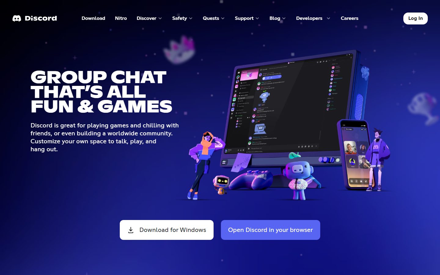
Discord's marketing surface is a playful, gaming-first interface built on a deep blurple-navy canvas (`{colors.canvas-navy}` — #1f1d5d) with white headline type (`{colors.ink}` — #ffffff) and Discord's signature blurple (`{colors.primary}` — #5865f2) as the action color. The system reads as energetic and friendly — it shouts in big all-caps display headlines, uses oversized pill-radius CTAs, and floats translucent rounded panels holding bright product mockups against a starfield gradient.
The type voice is the loudest signal: **ABC Ginto Nord** (measured here as `Abcgintodiscordnord`) is an ultra-wide, geometric display face used at weights 700–800 with negative letter-spacing and very tight line-height (0.857–0.93). Set in all caps, it produces the "GROUP CHAT THAT'S ALL FUN & GAMES" hero wordmark that defines the brand. Supporting copy runs in **ABC Ginto Normal** (`Abcgintodiscord`) at weight 400 — a quieter, friendlier companion.
Component voltage comes from **bright product mockup cards** — actual Discord app chrome, video streams, and channel lists shown inside rounded panels that glow pink, green, and mint. These gradient glows are the system's color spectacle; the underlying palette is otherwise near-monochrome blurple. A wide accent spectrum (`{colors.accent-mint}`, `{colors.accent-purple}`, `{colors.accent-pink}`, `{colors.accent-fuchsia}`, `{colors.accent-sky}`) appears almost entirely inside those product illustrations rather than on chrome.
The whole page stays dark — there is no light-to-dark footer inversion here; the navy canvas carries from hero to footer, occasionally interrupted by a blurple marquee band ("PLAY • CHAT • HANG OUT").
**Key Characteristics:**
- Deep blurple-navy canvas (`{colors.canvas-navy}` — #1f1d5d) with starfield texture, carried from hero through footer. The page never goes light.
- Blurple primary CTA (`{colors.primary}` — #5865f2) with white text, plus a high-contrast white secondary pill (`{colors.ink}` background, `{colors.ink-dark}` text) for the "Download" / "Log In" actions.
- Ultra-wide all-caps custom display face (ABC Ginto Nord) at weights 700–800 with tight line-height and negative tracking. The display type IS the brand.
- Translucent rounded feature panels (`{rounded.lg}` — 16px) holding bright product mockups with pink/green/mint gradient glows.
- Oversized pill-radius (`{rounded.pill}` — 120px) CTA buttons — fully rounded capsules that read as friendly and tappable.
- Near-monochrome blurple chrome punctuated by a saturated accent spectrum that lives inside product illustrations, not on UI.
- A blurple full-bleed marquee band breaks the long scroll with scrolling all-caps verbs.
## Colors
### Brand & Action
- **Primary** (`{colors.primary}` — #5865f2): Discord's signature blurple. The dominant action color — primary CTAs ("Open Discord in your browser"), the marquee band, link accents.
- **Primary Alt** (`{colors.primary-alt}` — #4f51f5): A slightly deeper blurple used for pressed/active states and gradient stops.
- **Blurple Light** (`{colors.blurple-light}` — #7289da): Discord's legacy blurple, used in softer gradient washes and secondary accents.
### Accent Spectrum
Discord's brand is near-monochrome blurple at the chrome layer, but a vivid accent spectrum appears almost exclusively inside the product mockup cards (stream tiles, channel lists, avatar fills):
- **Mint** (`{colors.accent-mint}` — #15f5ba): Green glow on streaming/"same room" cards.
- **Purple** (`{colors.accent-purple}` — #b377f3): Gradient glow and avatar fills.
- **Pink** (`{colors.accent-pink}` — #ff6aef): Bright pink panel glow.
- **Fuchsia** (`{colors.accent-fuchsia}` — #eb459e): Discord's secondary brand pink — badges and highlight moments.
- **Sky** (`{colors.accent-sky}` — #8cd9ff): Light-blue accents inside mockups.
### Surface
- **Canvas Navy** (`{colors.canvas-navy}` — #1f1d5d): The page floor — a deep blurple-navy carried from hero to footer. The closest measured value to the actual gradient canvas; used as the canvas token (derived mapping from the highest-saturation dark accent).
- **Surface Dark** (`{colors.surface-dark}` — #23272a): Discord app-chrome dark — the background of embedded product mockups.
- **Surface Dark Elevated** (`{colors.surface-dark-elevated}` — #2c2f33): Nested panels inside the dark product UI.
- **Surface Near-Black** (`{colors.surface-near-black}` — #292929) / **Surface Charcoal** (`{colors.surface-charcoal}` — #333333): Deeper chrome tones inside product mockups and dropdowns.
- **Surface Light** (`{colors.surface-light}` — #f6f6f6) / **Surface Light Alt** (`{colors.surface-light-alt}` — #f7f7f7): Light panels shown inside certain product mockups (e.g., a light message composer).
### Text
- **Ink** (`{colors.ink}` — #ffffff): All headlines and primary text on the dark canvas.
- **Ink Dark** (`{colors.ink-dark}` — #000000): Dark text on the white secondary button and on any light product panel. (Measured as `body.color` low-contrast text.)
- **Muted** (`{colors.muted}` — #b2b2b2) / **Muted Soft** (`{colors.muted-soft}` — #c7c8ce): Secondary and tertiary text — footer links, captions.
- **Neutral Gray** (`{colors.neutral-gray}` — #50555f): Disabled / very-low-emphasis text inside product UI.
## Typography
### Font Family
The system runs two cuts of Discord's custom **ABC Ginto** family. Display headlines use **ABC Ginto Nord** (captured as `Abcgintodiscordnord`) — an ultra-wide geometric face set in all caps at weights 700–800. Everything else uses **ABC Ginto Normal** (captured as `Abcgintodiscord`) at weights 400–500 — a standard-width companion for body copy, sub-heads, and buttons.
The split is strict and visual:
- ABC Ginto Nord (wide, all-caps, 700–800, negative tracking, tight 0.857–0.93 line-height) — h1 + h2 / shouting headlines.
- ABC Ginto Normal (regular width, 400–500) — body, h3, buttons, nav.
### Hierarchy
| Token | Size | Weight | Line Height | Letter Spacing | Use |
|---|---|---|---|---|---|
| `{typography.display-xl}` | 56px | 700 | 0.857 | -0.56px | Hero h1 ("GROUP CHAT THAT'S ALL FUN & GAMES") — ABC Ginto Nord, all caps |
| `{typography.display-lg}` | 36px | 800 | 0.93 | -0.36px | Section heads ("MAKE YOUR GROUP CHATS MORE FUN"), marquee, CTA band — ABC Ginto Nord |
| `{typography.body-lg}` | 20px | 400 | 1.3 | 0.32px | Hero sub-copy and feature body text — ABC Ginto Normal |
| `{typography.heading-sm}` | 16px | 400 | 1.25 | 0 | h3 / small labels, nav, footer links — ABC Ginto Normal |
| `{typography.button}` | 16px | 500 | 1.2 | 0 | Button + nav labels — ABC Ginto Normal medium |
### Principles
The display face carries the entire brand personality — it is always all-caps, always wide, always tightly leaded so multi-line headlines stack into solid blocks. Display sizes use negative letter-spacing (-0.36 to -0.56px); the very tight sub-1.0 line-height (0.857 / 0.93) is essential to the stacked-caps look and must not be loosened. Body copy in ABC Ginto Normal stays at weight 400 with slightly positive tracking (0.32px) for legibility against the dark canvas.
### Note on Font Substitutes
ABC Ginto Nord and ABC Ginto Normal are commercial typefaces licensed by Discord (ABC Ginto by Dinamo) — they are not available as open web fonts and must not be shipped. For the wide display face, **Archivo Expanded** (weight 700–800) is the closest open-source substitute — wide, geometric, strong in all caps. For body, **Inter** or **Mona Sans** at weights 400–500 approximates ABC Ginto Normal's humanist-geometric body voice. The fallback stacks above encode these substitutes.
## Layout
### Spacing System
- **Base unit:** ~4px, but the scale is loose — measured values cluster at 4, 8, 10, 12, 16, 20, 24, 28, 40 (12px and 16px are the most frequent).
- **Tokens:** `{spacing.xxs}` 4px · `{spacing.xs}` 8px · `{spacing.sm}` 10px · `{spacing.md}` 12px · `{spacing.lg}` 16px · `{spacing.xl}` 20px · `{spacing.xxl}` 24px · `{spacing.xxxl}` 28px · `{spacing.huge}` 40px.
- **Button padding:** 10px × 16px (measured on the primary button).
- **Card internal padding:** `{spacing.xxxl}` (28px) on feature panels; `{spacing.lg}` (16px) inside product mockups (derived from the measured cluster).
- **Section rhythm:** `{spacing.huge}` (40px) is the dominant large-gap value between editorial blocks.
### Grid & Container
- **Editorial body:** Alternating two-column feature rows — text on one side, a product mockup card on the other, flipping left/right down the page.
- **Hero band:** Headline + sub-copy + CTA row on the left, large illustrated product/character composition on the right.
- **Footer:** Multi-column link list (Product / Company / Resources / Policies) above a language selector row.
### Whitespace Philosophy
Discord uses generous vertical breathing room between feature rows so each bright product card gets isolated focus, but headline blocks are deliberately compressed — sub-1.0 line-height stacks all-caps lines into dense, punchy slabs. The contrast between tight type and open layout is part of the energetic voice.
## Elevation & Depth
No box-shadow tokens were measured — the system does not rely on conventional drop shadows for elevation. Depth is built instead from **color and glow**:
| Level | Treatment | Use |
|---|---|---|
| Flat | Navy canvas, no border, no shadow | Page background, nav, footer |
| Translucent panel | Semi-opaque rounded panel over the starfield canvas | Feature card containers |
| Glow elevation | Saturated pink / green / mint radial glow behind product mockups | The primary "lift" mechanism on feature cards |
| Color-block band | Full-bleed blurple band | Marquee divider — color contrast does the depth work |
### Decorative Depth
- Product mockups (Discord app windows, phone screens, stream tiles) carry their own internal chrome and self-shadowing as content — these are not system shadow tokens, they are screenshots of the product.
- Gradient glows (pink #ff6aef, mint #15f5ba, purple #b377f3) bleed out from behind the product cards onto the navy canvas, creating the impression of backlit screens. These glows are the system's signature depth cue.
- A subtle starfield texture sits over the navy canvas throughout, adding atmospheric depth without geometry.
## Shapes
### Border Radius Scale
| Token | Value | Use |
|---|---|---|
| `{rounded.md}` | 12px | Buttons, small product-mockup panels, dropdown surfaces |
| `{rounded.lg}` | 16px | Large translucent feature-card containers |
| `{rounded.pill-sm}` | 104px | Wide pill capsules (slightly smaller of the two measured pill radii) |
| `{rounded.pill}` | 120px | Fully-rounded capsule CTAs — the white "Download" / "Log In" buttons read as full pills |
The radius system is barbell-shaped: small functional rounding at 12–16px for panels and containers, and very large pill radii (104–120px) for capsule buttons. There is no mid-scale — Discord either rounds gently or goes fully capsule.
### Photography & Illustration Geometry
3D character illustrations (the gaming mascots, robots, and avatars) sit on transparent backgrounds and overflow card edges freely — they are not clipped to radius. Product mockup screens retain their native app chrome radii inside the `{rounded.lg}` panels.
## Components
### Navigation
**`top-nav`** — Transparent-over-navy nav pinned to the top. Carries the Discord wordmark + logo at left, a horizontal menu (Download, Nitro, Discover, Safety, Quests, Support, Blog, Developers, Careers) center, and a white "Log In" `{component.button-secondary}` pill at right. Menu items in `{typography.button}` (ABC Ginto Normal 16px / 500). Background `{colors.canvas-navy}`.
### Buttons
**`button-primary`** — The blurple CTA ("Open Discord in your browser"). Background `{colors.primary}` (#5865f2), text `{colors.ink}`, type `{typography.button}`, rounded `{rounded.md}` (12px), padding 10px × 16px (measured). Active state shifts toward `{colors.primary-alt}` (#4f51f5).
**`button-secondary`** — The high-contrast white capsule ("Download for Windows", "Log In"). Background `{colors.ink}` (#ffffff), text `{colors.ink-dark}` (#000000), rounded `{rounded.pill}` (120px) for the full-capsule silhouette, padding 10px × 16px. (Radius mapping derived from the measured pill scale against the screenshot capsule shape.)
### Bands & Cards
**`hero-band`** — The opening band. Navy canvas, h1 in `{typography.display-xl}` all-caps, sub-copy in `{typography.body-lg}`, and a button row pairing `{component.button-secondary}` + `{component.button-primary}`. The right side carries a large 3D product-and-character composition. Vertical padding `{spacing.huge}` (40px).
**`feature-card`** — The alternating feature panels ("MAKE YOUR GROUP CHATS MORE FUN", "STREAM LIKE YOU'RE IN THE SAME ROOM"). Translucent panel on the navy canvas, rounded `{rounded.lg}` (16px), internal padding `{spacing.xxxl}` (28px). Headline in `{typography.display-lg}`, body in `{typography.body-lg}`, paired with a `{component.product-mockup-card}` and a pink/green/mint glow.
**`product-mockup-card`** — A card showing real Discord app chrome (channel lists, video stream tiles, message composers). Background `{colors.surface-dark}` (#23272a), rounded `{rounded.md}` (12px), padding `{spacing.lg}` (16px). The accent spectrum lives here — stream tiles, avatar fills, and status colors carry the mint / pink / purple / fuchsia / sky tones.
**`marquee-band`** — A full-bleed blurple divider band with scrolling all-caps verbs ("PLAY • CHAT • HANG OUT") interleaved with the Discord glyph. Background `{colors.primary}` (#5865f2), text `{colors.ink}`, type `{typography.display-lg}`, vertical padding `{spacing.xxl}` (24px).
**`cta-band`** — The pre-footer closer ("YOU CAN'T SCROLL ANYMORE. BETTER GO CHAT."). Navy canvas, h2 in `{typography.display-lg}`, a centered `{component.button-secondary}`, and a row of 3D character illustrations below. Vertical padding `{spacing.huge}` (40px).
**`footer`** — Multi-column link footer on the same `{colors.canvas-navy}` background (no dark-mode inversion — the page is already dark). Link text in `{colors.muted}`, type `{typography.heading-sm}`. Columns cover Product / Company / Resources / Policies, with a language selector row beneath. Padding `{spacing.huge}` (40px).
## Do's and Don'ts
### Do
- Reserve `{colors.primary}` (#5865f2) for primary CTAs and the marquee band. Blurple is the action color.
- Set every display headline in ABC Ginto Nord (or Archivo Expanded substitute), all caps, weight 700–800, with the tight sub-1.0 line-height. The stacked-caps slab is the brand.
- Keep the accent spectrum (mint, pink, purple, fuchsia, sky) inside product mockups and illustrations. Don't paint chrome with it.
- Use full-pill `{rounded.pill}` capsules for primary marketing CTAs and 12–16px rounding for panels and product cards.
- Build depth with gradient glows behind product cards, not with drop shadows. The system measures zero shadow tokens.
- Pair a high-contrast white `{component.button-secondary}` next to the blurple `{component.button-primary}` in CTA rows.
- Keep the navy canvas continuous top to bottom; break it only with the blurple marquee band.
### Don't
- Don't loosen display line-height — sub-1.0 leading is essential to the stacked all-caps look.
- Don't set body copy in ABC Ginto Nord; the wide display face is headline-only.
- Don't ship ABC Ginto — it is licensed. Use Archivo Expanded + Inter/Mona Sans substitutes.
- Don't introduce a light-mode footer or section. Discord's marketing surface stays dark throughout.
- Don't apply accent-spectrum colors to buttons or nav; the chrome is near-monochrome blurple.
- Don't add heavy drop shadows for elevation — use color glow instead.
## Responsive Behavior
### Breakpoints
Specific breakpoint widths were not measured. From the captured landing screenshots, the inferred behavior is:
| Name | Behavior |
|---|---|
| Mobile | Hero composition stacks below the headline + CTA; feature rows collapse to single-column (text above mockup); nav collapses to a menu trigger; footer columns wrap to fewer columns |
| Tablet | Two-column feature rows tighten; nav menu may condense |
| Desktop | Full horizontal nav; alternating left/right two-column feature rows; large hero composition at right |
### Touch Targets
- `{component.button-primary}` and `{component.button-secondary}` use 10px × 16px padding; effective tap height clears comfortable touch sizing.
- Nav items in `{typography.button}` (16px) sit in a horizontal row on desktop and should expand to full-row targets in the mobile menu.
### Collapsing Strategy
- Alternating feature rows collapse to single-column stacks (headline + body, then product mockup card).
- The hero's text/illustration split stacks vertically on mobile.
- The marquee band's scrolling caps remain full-bleed at all widths.
- Footer link columns reflow from 4-up toward 2-up / 1-up.
### Image Behavior
- 3D character illustrations and product mockups scale proportionally; gradient glows scale with their cards.
- Product mockup chrome stays legible at reduced scale; the navy starfield canvas tiles across all widths.
## Iteration Guide
1. Focus on ONE component at a time, referencing its YAML key directly (`{component.feature-card}`, `{component.marquee-band}`).
2. Variants of an existing component (`-active`, `-disabled`) live as separate entries in `components:`.
3. Use `{token.refs}` everywhere — never inline a hex in a component.
4. Never document hover. Default and Active/Pressed only (primary darkens toward `{colors.primary-alt}` on press).
5. Display headlines stay ABC Ginto Nord all-caps with tight leading; body stays ABC Ginto Normal. The boundary does not blur.
6. The accent spectrum belongs inside product mockups — keep chrome blurple.
7. When in doubt about emphasis: bigger Ginto Nord caps before adding color.
## Known Gaps
- The actual hero/canvas gradient (a blue-to-blurple radial with a starfield) could not be measured as a flat token; `{colors.canvas-navy}` (#1f1d5d) is the closest measured value and is used as the canvas token (derived mapping).
- No shadow tokens were captured (`shadows: []`). The gradient glows behind product cards are visible in screenshots but were not extracted as numeric values — documented qualitatively only.
- Only `button-primary` was measured directly; `button-secondary`, nav, feature-card, marquee, CTA band, and footer specs are reconstructed from screenshot ground-truth plus the measured token sets. Pill radius mapping for capsule buttons is derived from the measured 104/120px radii.
- ABC Ginto Nord / Normal are commercial typefaces (not flagged in `fonts_licensed`, but clearly custom/licensed). Open-source substitutes (Archivo Expanded, Inter/Mona Sans) are documented and must be used in place of the licensed cuts.
- Exact section padding and grid gutters beyond the measured spacing cluster were not captured; large-gap rhythm is documented from the dominant 40px value.
- Breakpoint widths, animation/transition timings (marquee scroll, card reveal), and form/input states were not in scope of the capture.
- The `category-product` page was captured in the manifest but component-level specifics for it were not separately measured; documentation reflects the landing surface.
<!-- Documented by duply · real-world design systems as ready-to-use DESIGN.md for AI coding agents · https://duply.ai/discord/design-md -->
Color Palette
Accent
Neutrals
Typography
display-xl56px · 700 · 0.857
The quick brown fox jumpsdisplay-lg36px · 800 · 0.93
The quick brown fox jumpsbody-lg20px · 400 · 1.3
The quick brown fox jumpsheading-sm16px · 400 · 1.25
The quick brown fox jumpsbutton16px · 500 · 1.2
The quick brown fox jumpsSpacing & Shape
Spacing
| Name | Value | Preview |
|---|---|---|
| xxs | 4px | |
| xs | 8px | |
| sm | 10px | |
| md | 12px | |
| lg | 16px | |
| xl | 20px | |
| xxl | 24px | |
| xxxl | 28px | |
| huge | 40px |
Border Radius
| Name | Value | Preview |
|---|---|---|
| md | 12px | |
| lg | 16px | |
| pill-sm | 104px | |
| pill | 120px |
More like this


---
version: alpha
name: Discord-design-analysis
description: A playful, gaming-first marketing interface built on a deep blurple-navy canvas, anchored by Discord's signature blurple (#5865f2) action color and an ultra-wide, all-caps custom display typeface (ABC Ginto Nord). The system reads as energetic and friendly — bold shouting headlines, big pill-radius CTAs, translucent rounded panels holding bright product mockups with pink/green/mint glows, and a near-monochrome blurple palette punctuated by a wide accent spectrum (mint, purple, pink, fuchsia, sky). Brand voltage comes from the condensed wide caps display face and the saturated gradient product cards rather than from chrome or shadow.
colors:
  primary: "#5865f2"
  primary-alt: "#4f51f5"
  blurple-light: "#7289da"
  ink: "#ffffff"
  ink-dark: "#000000"
  muted: "#b2b2b2"
  muted-soft: "#c7c8ce"
  neutral-gray: "#50555f"
  canvas-navy: "#1f1d5d"
  surface-dark: "#23272a"
  surface-dark-elevated: "#2c2f33"
  surface-near-black: "#292929"
  surface-charcoal: "#333333"
  surface-light: "#f6f6f6"
  surface-light-alt: "#f7f7f7"
  accent-mint: "#15f5ba"
  accent-purple: "#b377f3"
  accent-pink: "#ff6aef"
  accent-fuchsia: "#eb459e"
  accent-sky: "#8cd9ff"
typography:
  display-xl:
    fontFamily: "Abcgintodiscordnord, Archivo, sans-serif"
    fontSize: 56px
    fontWeight: 700
    lineHeight: 0.857
    letterSpacing: -0.56px
  display-lg:
    fontFamily: "Abcgintodiscordnord, Archivo, sans-serif"
    fontSize: 36px
    fontWeight: 800
    lineHeight: 0.93
    letterSpacing: -0.36px
  body-lg:
    fontFamily: "Abcgintodiscord, Inter, sans-serif"
    fontSize: 20px
    fontWeight: 400
    lineHeight: 1.3
    letterSpacing: 0.32px
  heading-sm:
    fontFamily: "Abcgintodiscord, Inter, sans-serif"
    fontSize: 16px
    fontWeight: 400
    lineHeight: 1.25
    letterSpacing: 0
  button:
    fontFamily: "Abcgintodiscord, Inter, sans-serif"
    fontSize: 16px
    fontWeight: 500
    lineHeight: 1.2
    letterSpacing: 0
rounded:
  md: 12px
  lg: 16px
  pill-sm: 104px
  pill: 120px
spacing:
  xxs: 4px
  xs: 8px
  sm: 10px
  md: 12px
  lg: 16px
  xl: 20px
  xxl: 24px
  xxxl: 28px
  huge: 40px
components:
  button-primary:
    backgroundColor: "{colors.primary}"
    textColor: "{colors.ink}"
    typography: "{typography.button}"
    rounded: "{rounded.md}"
    padding: 10px 16px
  button-secondary:
    backgroundColor: "{colors.ink}"
    textColor: "{colors.ink-dark}"
    typography: "{typography.button}"
    rounded: "{rounded.pill}"
    padding: 10px 16px
  top-nav:
    backgroundColor: "{colors.canvas-navy}"
    textColor: "{colors.ink}"
    typography: "{typography.button}"
  hero-band:
    backgroundColor: "{colors.canvas-navy}"
    textColor: "{colors.ink}"
    typography: "{typography.display-xl}"
    padding: 40px
  feature-card:
    backgroundColor: "{colors.canvas-navy}"
    textColor: "{colors.ink}"
    typography: "{typography.display-lg}"
    rounded: "{rounded.lg}"
    padding: 28px
  product-mockup-card:
    backgroundColor: "{colors.surface-dark}"
    textColor: "{colors.ink}"
    rounded: "{rounded.md}"
    padding: 16px
  marquee-band:
    backgroundColor: "{colors.primary}"
    textColor: "{colors.ink}"
    typography: "{typography.display-lg}"
    padding: 24px
  cta-band:
    backgroundColor: "{colors.canvas-navy}"
    textColor: "{colors.ink}"
    typography: "{typography.display-lg}"
    padding: 40px
  footer:
    backgroundColor: "{colors.canvas-navy}"
    textColor: "{colors.muted}"
    typography: "{typography.heading-sm}"
    padding: 40px
---

## Overview

Discord's marketing surface is a playful, gaming-first interface built on a deep blurple-navy canvas (`{colors.canvas-navy}` — #1f1d5d) with white headline type (`{colors.ink}` — #ffffff) and Discord's signature blurple (`{colors.primary}` — #5865f2) as the action color. The system reads as energetic and friendly — it shouts in big all-caps display headlines, uses oversized pill-radius CTAs, and floats translucent rounded panels holding bright product mockups against a starfield gradient.

The type voice is the loudest signal: **ABC Ginto Nord** (measured here as `Abcgintodiscordnord`) is an ultra-wide, geometric display face used at weights 700–800 with negative letter-spacing and very tight line-height (0.857–0.93). Set in all caps, it produces the "GROUP CHAT THAT'S ALL FUN & GAMES" hero wordmark that defines the brand. Supporting copy runs in **ABC Ginto Normal** (`Abcgintodiscord`) at weight 400 — a quieter, friendlier companion.

Component voltage comes from **bright product mockup cards** — actual Discord app chrome, video streams, and channel lists shown inside rounded panels that glow pink, green, and mint. These gradient glows are the system's color spectacle; the underlying palette is otherwise near-monochrome blurple. A wide accent spectrum (`{colors.accent-mint}`, `{colors.accent-purple}`, `{colors.accent-pink}`, `{colors.accent-fuchsia}`, `{colors.accent-sky}`) appears almost entirely inside those product illustrations rather than on chrome.

The whole page stays dark — there is no light-to-dark footer inversion here; the navy canvas carries from hero to footer, occasionally interrupted by a blurple marquee band ("PLAY • CHAT • HANG OUT").

**Key Characteristics:**
- Deep blurple-navy canvas (`{colors.canvas-navy}` — #1f1d5d) with starfield texture, carried from hero through footer. The page never goes light.
- Blurple primary CTA (`{colors.primary}` — #5865f2) with white text, plus a high-contrast white secondary pill (`{colors.ink}` background, `{colors.ink-dark}` text) for the "Download" / "Log In" actions.
- Ultra-wide all-caps custom display face (ABC Ginto Nord) at weights 700–800 with tight line-height and negative tracking. The display type IS the brand.
- Translucent rounded feature panels (`{rounded.lg}` — 16px) holding bright product mockups with pink/green/mint gradient glows.
- Oversized pill-radius (`{rounded.pill}` — 120px) CTA buttons — fully rounded capsules that read as friendly and tappable.
- Near-monochrome blurple chrome punctuated by a saturated accent spectrum that lives inside product illustrations, not on UI.
- A blurple full-bleed marquee band breaks the long scroll with scrolling all-caps verbs.

## Colors

### Brand & Action
- **Primary** (`{colors.primary}` — #5865f2): Discord's signature blurple. The dominant action color — primary CTAs ("Open Discord in your browser"), the marquee band, link accents.
- **Primary Alt** (`{colors.primary-alt}` — #4f51f5): A slightly deeper blurple used for pressed/active states and gradient stops.
- **Blurple Light** (`{colors.blurple-light}` — #7289da): Discord's legacy blurple, used in softer gradient washes and secondary accents.

### Accent Spectrum
Discord's brand is near-monochrome blurple at the chrome layer, but a vivid accent spectrum appears almost exclusively inside the product mockup cards (stream tiles, channel lists, avatar fills):
- **Mint** (`{colors.accent-mint}` — #15f5ba): Green glow on streaming/"same room" cards.
- **Purple** (`{colors.accent-purple}` — #b377f3): Gradient glow and avatar fills.
- **Pink** (`{colors.accent-pink}` — #ff6aef): Bright pink panel glow.
- **Fuchsia** (`{colors.accent-fuchsia}` — #eb459e): Discord's secondary brand pink — badges and highlight moments.
- **Sky** (`{colors.accent-sky}` — #8cd9ff): Light-blue accents inside mockups.

### Surface
- **Canvas Navy** (`{colors.canvas-navy}` — #1f1d5d): The page floor — a deep blurple-navy carried from hero to footer. The closest measured value to the actual gradient canvas; used as the canvas token (derived mapping from the highest-saturation dark accent).
- **Surface Dark** (`{colors.surface-dark}` — #23272a): Discord app-chrome dark — the background of embedded product mockups.
- **Surface Dark Elevated** (`{colors.surface-dark-elevated}` — #2c2f33): Nested panels inside the dark product UI.
- **Surface Near-Black** (`{colors.surface-near-black}` — #292929) / **Surface Charcoal** (`{colors.surface-charcoal}` — #333333): Deeper chrome tones inside product mockups and dropdowns.
- **Surface Light** (`{colors.surface-light}` — #f6f6f6) / **Surface Light Alt** (`{colors.surface-light-alt}` — #f7f7f7): Light panels shown inside certain product mockups (e.g., a light message composer).

### Text
- **Ink** (`{colors.ink}` — #ffffff): All headlines and primary text on the dark canvas.
- **Ink Dark** (`{colors.ink-dark}` — #000000): Dark text on the white secondary button and on any light product panel. (Measured as `body.color` low-contrast text.)
- **Muted** (`{colors.muted}` — #b2b2b2) / **Muted Soft** (`{colors.muted-soft}` — #c7c8ce): Secondary and tertiary text — footer links, captions.
- **Neutral Gray** (`{colors.neutral-gray}` — #50555f): Disabled / very-low-emphasis text inside product UI.

## Typography

### Font Family
The system runs two cuts of Discord's custom **ABC Ginto** family. Display headlines use **ABC Ginto Nord** (captured as `Abcgintodiscordnord`) — an ultra-wide geometric face set in all caps at weights 700–800. Everything else uses **ABC Ginto Normal** (captured as `Abcgintodiscord`) at weights 400–500 — a standard-width companion for body copy, sub-heads, and buttons.

The split is strict and visual:
- ABC Ginto Nord (wide, all-caps, 700–800, negative tracking, tight 0.857–0.93 line-height) — h1 + h2 / shouting headlines.
- ABC Ginto Normal (regular width, 400–500) — body, h3, buttons, nav.

### Hierarchy

| Token | Size | Weight | Line Height | Letter Spacing | Use |
|---|---|---|---|---|---|
| `{typography.display-xl}` | 56px | 700 | 0.857 | -0.56px | Hero h1 ("GROUP CHAT THAT'S ALL FUN & GAMES") — ABC Ginto Nord, all caps |
| `{typography.display-lg}` | 36px | 800 | 0.93 | -0.36px | Section heads ("MAKE YOUR GROUP CHATS MORE FUN"), marquee, CTA band — ABC Ginto Nord |
| `{typography.body-lg}` | 20px | 400 | 1.3 | 0.32px | Hero sub-copy and feature body text — ABC Ginto Normal |
| `{typography.heading-sm}` | 16px | 400 | 1.25 | 0 | h3 / small labels, nav, footer links — ABC Ginto Normal |
| `{typography.button}` | 16px | 500 | 1.2 | 0 | Button + nav labels — ABC Ginto Normal medium |

### Principles
The display face carries the entire brand personality — it is always all-caps, always wide, always tightly leaded so multi-line headlines stack into solid blocks. Display sizes use negative letter-spacing (-0.36 to -0.56px); the very tight sub-1.0 line-height (0.857 / 0.93) is essential to the stacked-caps look and must not be loosened. Body copy in ABC Ginto Normal stays at weight 400 with slightly positive tracking (0.32px) for legibility against the dark canvas.

### Note on Font Substitutes
ABC Ginto Nord and ABC Ginto Normal are commercial typefaces licensed by Discord (ABC Ginto by Dinamo) — they are not available as open web fonts and must not be shipped. For the wide display face, **Archivo Expanded** (weight 700–800) is the closest open-source substitute — wide, geometric, strong in all caps. For body, **Inter** or **Mona Sans** at weights 400–500 approximates ABC Ginto Normal's humanist-geometric body voice. The fallback stacks above encode these substitutes.

## Layout

### Spacing System
- **Base unit:** ~4px, but the scale is loose — measured values cluster at 4, 8, 10, 12, 16, 20, 24, 28, 40 (12px and 16px are the most frequent).
- **Tokens:** `{spacing.xxs}` 4px · `{spacing.xs}` 8px · `{spacing.sm}` 10px · `{spacing.md}` 12px · `{spacing.lg}` 16px · `{spacing.xl}` 20px · `{spacing.xxl}` 24px · `{spacing.xxxl}` 28px · `{spacing.huge}` 40px.
- **Button padding:** 10px × 16px (measured on the primary button).
- **Card internal padding:** `{spacing.xxxl}` (28px) on feature panels; `{spacing.lg}` (16px) inside product mockups (derived from the measured cluster).
- **Section rhythm:** `{spacing.huge}` (40px) is the dominant large-gap value between editorial blocks.

### Grid & Container
- **Editorial body:** Alternating two-column feature rows — text on one side, a product mockup card on the other, flipping left/right down the page.
- **Hero band:** Headline + sub-copy + CTA row on the left, large illustrated product/character composition on the right.
- **Footer:** Multi-column link list (Product / Company / Resources / Policies) above a language selector row.

### Whitespace Philosophy
Discord uses generous vertical breathing room between feature rows so each bright product card gets isolated focus, but headline blocks are deliberately compressed — sub-1.0 line-height stacks all-caps lines into dense, punchy slabs. The contrast between tight type and open layout is part of the energetic voice.

## Elevation & Depth

No box-shadow tokens were measured — the system does not rely on conventional drop shadows for elevation. Depth is built instead from **color and glow**:

| Level | Treatment | Use |
|---|---|---|
| Flat | Navy canvas, no border, no shadow | Page background, nav, footer |
| Translucent panel | Semi-opaque rounded panel over the starfield canvas | Feature card containers |
| Glow elevation | Saturated pink / green / mint radial glow behind product mockups | The primary "lift" mechanism on feature cards |
| Color-block band | Full-bleed blurple band | Marquee divider — color contrast does the depth work |

### Decorative Depth
- Product mockups (Discord app windows, phone screens, stream tiles) carry their own internal chrome and self-shadowing as content — these are not system shadow tokens, they are screenshots of the product.
- Gradient glows (pink #ff6aef, mint #15f5ba, purple #b377f3) bleed out from behind the product cards onto the navy canvas, creating the impression of backlit screens. These glows are the system's signature depth cue.
- A subtle starfield texture sits over the navy canvas throughout, adding atmospheric depth without geometry.

## Shapes

### Border Radius Scale

| Token | Value | Use |
|---|---|---|
| `{rounded.md}` | 12px | Buttons, small product-mockup panels, dropdown surfaces |
| `{rounded.lg}` | 16px | Large translucent feature-card containers |
| `{rounded.pill-sm}` | 104px | Wide pill capsules (slightly smaller of the two measured pill radii) |
| `{rounded.pill}` | 120px | Fully-rounded capsule CTAs — the white "Download" / "Log In" buttons read as full pills |

The radius system is barbell-shaped: small functional rounding at 12–16px for panels and containers, and very large pill radii (104–120px) for capsule buttons. There is no mid-scale — Discord either rounds gently or goes fully capsule.

### Photography & Illustration Geometry
3D character illustrations (the gaming mascots, robots, and avatars) sit on transparent backgrounds and overflow card edges freely — they are not clipped to radius. Product mockup screens retain their native app chrome radii inside the `{rounded.lg}` panels.

## Components

### Navigation

**`top-nav`** — Transparent-over-navy nav pinned to the top. Carries the Discord wordmark + logo at left, a horizontal menu (Download, Nitro, Discover, Safety, Quests, Support, Blog, Developers, Careers) center, and a white "Log In" `{component.button-secondary}` pill at right. Menu items in `{typography.button}` (ABC Ginto Normal 16px / 500). Background `{colors.canvas-navy}`.

### Buttons

**`button-primary`** — The blurple CTA ("Open Discord in your browser"). Background `{colors.primary}` (#5865f2), text `{colors.ink}`, type `{typography.button}`, rounded `{rounded.md}` (12px), padding 10px × 16px (measured). Active state shifts toward `{colors.primary-alt}` (#4f51f5).

**`button-secondary`** — The high-contrast white capsule ("Download for Windows", "Log In"). Background `{colors.ink}` (#ffffff), text `{colors.ink-dark}` (#000000), rounded `{rounded.pill}` (120px) for the full-capsule silhouette, padding 10px × 16px. (Radius mapping derived from the measured pill scale against the screenshot capsule shape.)

### Bands & Cards

**`hero-band`** — The opening band. Navy canvas, h1 in `{typography.display-xl}` all-caps, sub-copy in `{typography.body-lg}`, and a button row pairing `{component.button-secondary}` + `{component.button-primary}`. The right side carries a large 3D product-and-character composition. Vertical padding `{spacing.huge}` (40px).

**`feature-card`** — The alternating feature panels ("MAKE YOUR GROUP CHATS MORE FUN", "STREAM LIKE YOU'RE IN THE SAME ROOM"). Translucent panel on the navy canvas, rounded `{rounded.lg}` (16px), internal padding `{spacing.xxxl}` (28px). Headline in `{typography.display-lg}`, body in `{typography.body-lg}`, paired with a `{component.product-mockup-card}` and a pink/green/mint glow.

**`product-mockup-card`** — A card showing real Discord app chrome (channel lists, video stream tiles, message composers). Background `{colors.surface-dark}` (#23272a), rounded `{rounded.md}` (12px), padding `{spacing.lg}` (16px). The accent spectrum lives here — stream tiles, avatar fills, and status colors carry the mint / pink / purple / fuchsia / sky tones.

**`marquee-band`** — A full-bleed blurple divider band with scrolling all-caps verbs ("PLAY • CHAT • HANG OUT") interleaved with the Discord glyph. Background `{colors.primary}` (#5865f2), text `{colors.ink}`, type `{typography.display-lg}`, vertical padding `{spacing.xxl}` (24px).

**`cta-band`** — The pre-footer closer ("YOU CAN'T SCROLL ANYMORE. BETTER GO CHAT."). Navy canvas, h2 in `{typography.display-lg}`, a centered `{component.button-secondary}`, and a row of 3D character illustrations below. Vertical padding `{spacing.huge}` (40px).

**`footer`** — Multi-column link footer on the same `{colors.canvas-navy}` background (no dark-mode inversion — the page is already dark). Link text in `{colors.muted}`, type `{typography.heading-sm}`. Columns cover Product / Company / Resources / Policies, with a language selector row beneath. Padding `{spacing.huge}` (40px).

## Do's and Don'ts

### Do
- Reserve `{colors.primary}` (#5865f2) for primary CTAs and the marquee band. Blurple is the action color.
- Set every display headline in ABC Ginto Nord (or Archivo Expanded substitute), all caps, weight 700–800, with the tight sub-1.0 line-height. The stacked-caps slab is the brand.
- Keep the accent spectrum (mint, pink, purple, fuchsia, sky) inside product mockups and illustrations. Don't paint chrome with it.
- Use full-pill `{rounded.pill}` capsules for primary marketing CTAs and 12–16px rounding for panels and product cards.
- Build depth with gradient glows behind product cards, not with drop shadows. The system measures zero shadow tokens.
- Pair a high-contrast white `{component.button-secondary}` next to the blurple `{component.button-primary}` in CTA rows.
- Keep the navy canvas continuous top to bottom; break it only with the blurple marquee band.

### Don't
- Don't loosen display line-height — sub-1.0 leading is essential to the stacked all-caps look.
- Don't set body copy in ABC Ginto Nord; the wide display face is headline-only.
- Don't ship ABC Ginto — it is licensed. Use Archivo Expanded + Inter/Mona Sans substitutes.
- Don't introduce a light-mode footer or section. Discord's marketing surface stays dark throughout.
- Don't apply accent-spectrum colors to buttons or nav; the chrome is near-monochrome blurple.
- Don't add heavy drop shadows for elevation — use color glow instead.

## Responsive Behavior

### Breakpoints
Specific breakpoint widths were not measured. From the captured landing screenshots, the inferred behavior is:

| Name | Behavior |
|---|---|
| Mobile | Hero composition stacks below the headline + CTA; feature rows collapse to single-column (text above mockup); nav collapses to a menu trigger; footer columns wrap to fewer columns |
| Tablet | Two-column feature rows tighten; nav menu may condense |
| Desktop | Full horizontal nav; alternating left/right two-column feature rows; large hero composition at right |

### Touch Targets
- `{component.button-primary}` and `{component.button-secondary}` use 10px × 16px padding; effective tap height clears comfortable touch sizing.
- Nav items in `{typography.button}` (16px) sit in a horizontal row on desktop and should expand to full-row targets in the mobile menu.

### Collapsing Strategy
- Alternating feature rows collapse to single-column stacks (headline + body, then product mockup card).
- The hero's text/illustration split stacks vertically on mobile.
- The marquee band's scrolling caps remain full-bleed at all widths.
- Footer link columns reflow from 4-up toward 2-up / 1-up.

### Image Behavior
- 3D character illustrations and product mockups scale proportionally; gradient glows scale with their cards.
- Product mockup chrome stays legible at reduced scale; the navy starfield canvas tiles across all widths.

## Iteration Guide

1. Focus on ONE component at a time, referencing its YAML key directly (`{component.feature-card}`, `{component.marquee-band}`).
2. Variants of an existing component (`-active`, `-disabled`) live as separate entries in `components:`.
3. Use `{token.refs}` everywhere — never inline a hex in a component.
4. Never document hover. Default and Active/Pressed only (primary darkens toward `{colors.primary-alt}` on press).
5. Display headlines stay ABC Ginto Nord all-caps with tight leading; body stays ABC Ginto Normal. The boundary does not blur.
6. The accent spectrum belongs inside product mockups — keep chrome blurple.
7. When in doubt about emphasis: bigger Ginto Nord caps before adding color.

## Known Gaps

- The actual hero/canvas gradient (a blue-to-blurple radial with a starfield) could not be measured as a flat token; `{colors.canvas-navy}` (#1f1d5d) is the closest measured value and is used as the canvas token (derived mapping).
- No shadow tokens were captured (`shadows: []`). The gradient glows behind product cards are visible in screenshots but were not extracted as numeric values — documented qualitatively only.
- Only `button-primary` was measured directly; `button-secondary`, nav, feature-card, marquee, CTA band, and footer specs are reconstructed from screenshot ground-truth plus the measured token sets. Pill radius mapping for capsule buttons is derived from the measured 104/120px radii.
- ABC Ginto Nord / Normal are commercial typefaces (not flagged in `fonts_licensed`, but clearly custom/licensed). Open-source substitutes (Archivo Expanded, Inter/Mona Sans) are documented and must be used in place of the licensed cuts.
- Exact section padding and grid gutters beyond the measured spacing cluster were not captured; large-gap rhythm is documented from the dominant 40px value.
- Breakpoint widths, animation/transition timings (marquee scroll, card reveal), and form/input states were not in scope of the capture.
- The `category-product` page was captured in the manifest but component-level specifics for it were not separately measured; documentation reflects the landing surface.

<!-- Documented by duply · real-world design systems as ready-to-use DESIGN.md for AI coding agents · https://duply.ai/discord/design-md -->