Vizcom
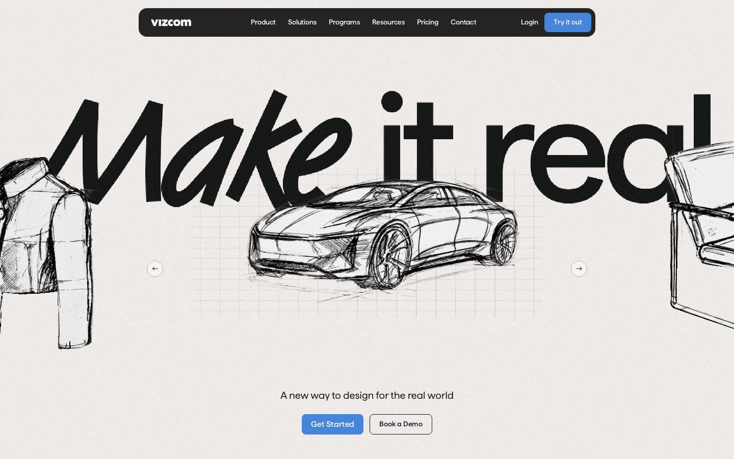
A high-contrast, dark-canvas product interface for an AI industrial-design tool, anchored on a deep near-black floor (#191919) that flips to a warm cream hero band (#e8e3dd) where an oversized hand-drawn "Make it real" display headline runs edge-to-edge over a sketched concept car. Brand voltage comes from the enormous Matter display type, the electric indigo CTA (#4c4cef), and real product-canvas chrome (layer panels, sketch artboards) shown directly inside the dark scroll.
---
version: alpha
name: Vizcom-design-analysis
description: "A high-contrast, dark-canvas product interface for an AI industrial-design tool, anchored on a deep near-black floor (#191919) that flips to a warm cream hero band (#e8e3dd) where an oversized hand-drawn \"Make it real\" display headline runs edge-to-edge over a sketched concept car. Brand voltage comes from the enormous Matter display type, the electric indigo CTA (#4c4cef), and real product-canvas chrome (layer panels, sketch artboards) shown directly inside the dark scroll."

colors:
  primary: "#4c4cef"
  accent-blue: "#3898ec"
  accent-link: "#4586da"
  accent-violet: "#cb83d1"
  accent-red: "#c94b3c"
  ink: "#f8f4f1"
  ink-on-light: "#000000"
  body-text: "#cccccc"
  body-text-soft: "#dddddd"
  muted: "#8d8a88"
  muted-mid: "#5c5b5a"
  canvas: "#191919"
  canvas-deep: "#222222"
  hero-canvas: "#e8e3dd"
  surface: "#242425"
  surface-soft: "#2f2f31"
  surface-strong: "#3c3c3e"
  hairline: "#333333"
  white: "#ffffff"
  off-white: "#fafafa"
  on-primary: "#ffffff"

typography:
  display:
    fontFamily: "Matter, Hanken Grotesk, sans-serif"
    fontSize: 265px
    fontWeight: 500
    lineHeight: 1.2
    letterSpacing: -2.65px
  h1:
    fontFamily: "Matter, Hanken Grotesk, sans-serif"
    fontSize: 88px
    fontWeight: 400
    lineHeight: 1.4
    letterSpacing: normal
  h3:
    fontFamily: "Matter, Hanken Grotesk, sans-serif"
    fontSize: 20px
    fontWeight: 500
    lineHeight: 1.3
    letterSpacing: normal
  body:
    fontFamily: "Matter, Hanken Grotesk, sans-serif"
    fontSize: 20px
    fontWeight: 400
    lineHeight: 1.3
    letterSpacing: normal
  button:
    fontFamily: "Matter, Hanken Grotesk, sans-serif"
    fontSize: 17.5px
    fontWeight: 400
    lineHeight: 1.3
    letterSpacing: normal

rounded:
  xxs: 2px
  sm: 6px
  md: 8px
  lg: 12px
  xl: 16px
  pill: 1440px

spacing:
  xxs: 4px
  xs: 8px
  sm: 12px
  md: 16px
  lg: 24px
  xl: 32px
  xxl: 48px
  xxxl: 64px
  section: 80px

components:
  top-nav:
    backgroundColor: "{colors.surface}"
    textColor: "{colors.ink}"
    typography: "{typography.button}"
    rounded: "{rounded.md}"
    padding: 12px 16px
  nav-link:
    backgroundColor: transparent
    textColor: "{colors.ink}"
    typography: "{typography.button}"
  button-primary:
    backgroundColor: "{colors.primary}"
    textColor: "{colors.ink}"
    typography: "{typography.button}"
    rounded: "{rounded.md}"
    padding: 12px 24px
  button-primary-active:
    backgroundColor: "{colors.accent-link}"
    textColor: "{colors.ink}"
    rounded: "{rounded.md}"
  button-secondary:
    backgroundColor: "{colors.white}"
    textColor: "{colors.ink-on-light}"
    typography: "{typography.button}"
    rounded: "{rounded.md}"
    padding: 12px 24px
  hero-band:
    backgroundColor: "{colors.hero-canvas}"
    textColor: "{colors.ink-on-light}"
    typography: "{typography.display}"
    padding: 80px
  hero-carousel-arrow:
    backgroundColor: transparent
    textColor: "{colors.ink-on-light}"
    rounded: "{rounded.pill}"
    size: 48px
  product-section:
    backgroundColor: "{colors.canvas}"
    textColor: "{colors.ink}"
    typography: "{typography.body}"
    padding: 80px
  segmented-tab:
    backgroundColor: transparent
    textColor: "{colors.muted}"
    typography: "{typography.button}"
    rounded: "{rounded.md}"
    padding: 8px 16px
  segmented-tab-active:
    backgroundColor: "{colors.surface}"
    textColor: "{colors.ink}"
    typography: "{typography.button}"
    rounded: "{rounded.md}"
    padding: 8px 16px
  card:
    backgroundColor: "{colors.surface}"
    textColor: "{colors.ink}"
    rounded: "{rounded.pill}"
    padding: 24px
  panel:
    backgroundColor: "{colors.surface}"
    textColor: "{colors.body-text}"
    typography: "{typography.body}"
    rounded: "{rounded.md}"
    padding: 12px
  input:
    backgroundColor: "{colors.primary}"
    textColor: "{colors.on-primary}"
    typography: "{typography.body}"
    rounded: "{rounded.md}"
    padding: 12px 16px
  logo-strip:
    backgroundColor: "{colors.canvas}"
    textColor: "{colors.muted}"
    typography: "{typography.body}"
    padding: 48px
---

## Overview

Vizcom's marketing surface is a high-contrast, dark-canvas interface for an AI industrial-design / ideation tool. The page floor is a deep near-black (`{colors.canvas}` — #191919), but the landing opens on a warm cream **hero band** (`{colors.hero-canvas}` — #e8e3dd) where an enormous hand-drawn "Make it real" display headline runs edge-to-edge over a pencil-sketched concept car. The contrast between the bright editorial hero and the dark product scroll below is the system's defining gesture.

Type is single-family: **Matter** carries everything — from the 265px display headline down to 17.5px button labels. The brand voice lives almost entirely in scale. The display headline (`{typography.display}` — 265px, weight 500, -2.65px tracking) is dramatically oversized and clipped by the viewport; supporting copy drops to a calm 20px body. There is no second typeface and no decorative weight juggling — Matter at 400/500 does all the work.

Action voltage comes from a single electric indigo (`{colors.primary}` — #4c4cef): the "Try it out", "Get Started" and "Learn more" CTAs all use it, and it reads vividly against both the cream hero and the dark body. A small secondary accent family (blue, link-blue, violet, red) appears sparingly inside product chrome and selection states — never on hero CTAs.

The lower scroll shows **real product-canvas chrome** — layer panels, a sketch artboard with a selected shoe, a "Modify" prompt panel — composited directly on the dark floor. Vizcom doesn't illustrate the product; it shows the actual app surface at scale inside the marketing flow.

**Key Characteristics:**
- Dark page floor (`{colors.canvas}` — #191919) with a single bright cream hero band (`{colors.hero-canvas}` — #e8e3dd). The light-to-dark transition opens the page.
- One typeface — **Matter** — across all roles, from a 265px display headline to 17.5px buttons. Hierarchy is built from scale, not family contrast.
- Electric indigo CTA (`{colors.primary}` — #4c4cef) is the only action color, used on both light and dark surfaces.
- A rounded near-black floating top-nav bar (`{colors.surface}` — #242425) with the lowercase "vizcom" wordmark, center menu, and indigo "Try it out" pill at right.
- Real product UI fragments (layer panel, sketch artboard, Modify prompt panel) shown on the dark floor as content.
- Flat elevation — no shadows measured anywhere; depth comes from surface-color stepping (#191919 → #242425 → #2f2f31 → #3c3c3e).
- A signature oversized asymmetric corner radius (`{rounded.pill}` — 1440px applied to a single corner) on the marquee card shape.
- Spacing rhythm tops out at `{spacing.section}` (80px) between major bands.

## Colors

### Brand & Accent
- **Primary** (`{colors.primary}` — #4c4cef): The electric indigo action color. All primary CTAs ("Try it out", "Get Started", "Learn more") and the measured input fill. Works on both the cream hero and the dark body.
- **Accent Blue** (`{colors.accent-blue}` — #3898ec) / **Accent Link** (`{colors.accent-link}` — #4586da): A near-indigo blue pair used for secondary/active interactive moments and selection chrome inside the product canvas. The active-press shift on the primary CTA is documented as `{colors.accent-link}` (derived from the measured blue family).
- **Accent Violet** (`{colors.accent-violet}` — #cb83d1) and **Accent Red** (`{colors.accent-red}` — #c94b3c): Rare chromatic accents appearing inside product UI fragments and status moments. Never on hero CTAs.

### Surface
- **Canvas** (`{colors.canvas}` — #191919): The dark page floor — everything below the hero.
- **Canvas Deep** (`{colors.canvas-deep}` — #222222): A slightly deeper black used for the darkest panel insets.
- **Hero Canvas** (`{colors.hero-canvas}` — #e8e3dd): The warm cream hero-band background — the only light surface in the system.
- **Surface** (`{colors.surface}` — #242425): The floating nav bar, cards, and product panels.
- **Surface Soft** (`{colors.surface-soft}` — #2f2f31): Nested panel rows and secondary controls.
- **Surface Strong** (`{colors.surface-strong}` — #3c3c3e): The lightest of the dark steps — hairline-adjacent borders and raised control fills.
- **Hairline** (`{colors.hairline}` — #333333): 1px divider tone on dark surfaces.
- **White** (`{colors.white}` — #ffffff) / **Off-White** (`{colors.off-white}` — #fafafa): The secondary button fill ("Book a Demo") and the bright sketch artboard inside the product canvas.

### Text
- **Ink** (`{colors.ink}` — #f8f4f1): Primary text on dark surfaces — the off-white headline and body color throughout the dark scroll.
- **Ink on Light** (`{colors.ink-on-light}` — #000000): The black display headline and sketch artwork on the cream hero band.
- **Body Text** (`{colors.body-text}` — #cccccc) / **Body Text Soft** (`{colors.body-text-soft}` — #dddddd): Secondary running text on dark surfaces.
- **Muted** (`{colors.muted}` — #8d8a88) and **Muted Mid** (`{colors.muted-mid}` — #5c5b5a): Tertiary text, logo-strip marks, captions, and inactive tab labels.

## Typography

### Font Family
The system runs entirely on **Matter** — a geometric grotesque sans — across every role from the giant display headline to the smallest button. There is no secondary typeface. The fallback stack is `Matter, Hanken Grotesk, sans-serif`.

Matter is a commercial typeface and is not freely redistributable. If it is unavailable, **Hanken Grotesk** (open-source, SIL) is a close substitute — similar geometric proportions and even color at body sizes. **Familjen Grotesk** or **Inter** at matching weights are acceptable alternatives. The substitution preserves Matter's neutral-geometric character; do not claim to ship Matter itself.

### Hierarchy

| Token | Size | Weight | Line Height | Letter Spacing | Use |
|---|---|---|---|---|---|
| `{typography.display}` | 265px | 500 | 1.2 | -2.65px | The viewport-clipping hero headline ("Make it real") |
| `{typography.h1}` | 88px | 400 | 1.4 | normal | Large section headlines |
| `{typography.h3}` | 20px | 500 | 1.3 | normal | Sub-section heads, card/panel titles |
| `{typography.body}` | 20px | 400 | 1.3 | normal | Default running text and sub-headlines |
| `{typography.button}` | 17.5px | 400 | 1.3 | normal | Button labels, nav links, tabs |

### Principles
Hierarchy is built almost entirely from **scale**, not family or weight. The jump from the 265px display to 88px h1 to 20px body is enormous and deliberate — the headline is meant to dominate and crop. Body and section sub-heads share the same 20px size, separated only by weight (400 vs 500). Keep tracking tight only on the display size (-2.65px); everything else stays `normal`. Never substitute a second typeface for contrast — Matter at one or two weights is the whole voice.

## Layout

### Spacing System
- **Base unit:** 4px.
- **Tokens:** `{spacing.xxs}` 4px · `{spacing.xs}` 8px · `{spacing.sm}` 12px · `{spacing.md}` 16px · `{spacing.lg}` 24px · `{spacing.xl}` 32px · `{spacing.xxl}` 48px · `{spacing.xxxl}` 64px · `{spacing.section}` 80px.
- Intermediate values of 6px, 10px, 18px, 20px and 56px were also measured and appear in tighter control paddings; they sit between the named tokens (derived — round to the nearest token where possible).
- **Section padding:** `{spacing.section}` (80px) is the largest vertical rhythm between major bands.
- **Most common gaps:** 8px and 12px dominate the frequency counts — Vizcom's component internals are tightly packed (panel rows, nav items).

### Grid & Container
- **Top nav:** A centered floating bar, not full-bleed — logo left, menu center, auth cluster right.
- **Hero band:** Full-bleed cream zone; the display headline is intentionally over-wide and clipped by the viewport, with a centered sketch artifact and flanking sketches bleeding off both edges.
- **Logo strip:** A single horizontal row of partner marks centered on the dark floor.
- **Product canvas:** A wide composited layout — left layer panel, center artboard, right "Modify" prompt panel — mimicking the real app workspace.

### Whitespace Philosophy
The hero is generous and theatrical — large empty cream margins around the oversized headline. The dark product scroll is calmer and denser, with tightly-packed panels (8–12px internal gaps) that read as real software chrome. The contrast in density reinforces the editorial-hero / product-demo split.

## Elevation & Depth

| Level | Treatment | Use |
|---|---|---|
| Flat (light) | No shadow — cream hero band | Hero headline, sketch artwork, primary CTAs |
| Flat (dark floor) | No shadow — `{colors.canvas}` | Product sections, logo strip |
| Surface step | `{colors.surface}` (#242425) on canvas | Nav bar, cards, panels |
| Surface step (raised) | `{colors.surface-soft}` / `{colors.surface-strong}` | Nested rows, controls, selection borders |

No shadows were measured anywhere in the system (`shadows: []`). Depth is created entirely by **surface-color stepping** on the dark floor — #191919 → #242425 → #2f2f31 → #3c3c3e — each step reading as one layer raised. On the cream hero, depth is created by the layered hand-sketch artwork rather than UI elevation.

### Decorative Depth
- Hand-drawn pencil sketches (concept car, jacket, chair) overlap the giant headline in the hero, creating depth through illustration layering.
- The product-canvas fragments carry their own internal app chrome (selection handles, layer thumbnails) which reads as nested depth without any system shadow token.

## Shapes

### Border Radius Scale

| Token | Value | Use |
|---|---|---|
| `{rounded.xxs}` | 2px | Smallest control corners, fine chips |
| `{rounded.sm}` | 6px | Small inline controls |
| `{rounded.md}` | 8px | The dominant radius — buttons, inputs, nav bar, panels, tabs |
| `{rounded.lg}` | 12px | Larger panels and cards |
| `{rounded.xl}` | 16px | Large containers |
| `{rounded.pill}` | 1440px | Carousel arrow circles and the signature single-corner sweep on the marquee card |

8px (`{rounded.md}`) is overwhelmingly the most frequent radius — it defines buttons, inputs, the floating nav, and most panels. The 1440px value is effectively a pill/full-round; when applied to a single corner (measured as `1440px 0px 0px` on the card component) it produces an oversized asymmetric sweep that is a deliberate signature shape (derived interpretation of the asymmetric measurement).

### Photography / Artwork Geometry
The hero relies on hand-drawn pencil sketches rather than photography — concept vehicles, apparel, and furniture rendered as line art over the cream band. Product fragments below retain native app aspect ratios (artboards, panels) at their measured radii.

## Components

### Top Navigation

**`top-nav`** — A floating rounded near-black bar (`{colors.surface}` — #242425) pinned to the top of every page. Carries the lowercase **vizcom** wordmark at left in `{colors.ink}`, a center menu (Product, Solutions, Programs, Resources, Pricing, Contact) in `{typography.button}`, and a right cluster with a "Login" `{component.nav-link}` and an indigo "Try it out" `{component.button-primary}`. Rounded `{rounded.md}`, padding ~12px × 16px.

**`nav-link`** — Inline transparent menu item, text `{colors.ink}`, type `{typography.button}` (Matter 17.5px / 400).

### Buttons

**`button-primary`** — The signature CTA. Background `{colors.primary}` (#4c4cef), label `{colors.ink}` (#f8f4f1), type `{typography.button}`, rounded `{rounded.md}` (8px), padding ~12px × 24px. Used for "Try it out", "Get Started", "Learn more". Active/pressed state `button-primary-active` shifts to `{colors.accent-link}` (derived from the measured blue family). (The raw computed read returned 0px radius / 0px padding — corrected here from screenshot ground-truth.)

**`button-secondary`** — White button used on the cream hero ("Book a Demo"). Background `{colors.white}`, text `{colors.ink-on-light}` (#000000), same radius and padding as primary.

**`hero-carousel-arrow`** — Circular outline arrow button (`{rounded.pill}`) used to advance the hero sketch carousel. Transparent fill, `{colors.ink-on-light}` stroke/icon, ~48px diameter.

### Bands & Sections

**`hero-band`** — Full-bleed cream zone (`{colors.hero-canvas}` — #e8e3dd) holding the oversized `{typography.display}` headline, layered pencil sketches, a centered sub-line in `{typography.body}` (`{colors.ink-on-light}`), and the `{component.button-primary}` + `{component.button-secondary}` CTA row. Vertical padding `{spacing.section}` (80px).

**`product-section`** — Dark band (`{colors.canvas}` — #191919) for "Your ideation toolkit" and the product-canvas demo. Text `{colors.ink}`, body `{colors.body-text}`. Holds the segmented tabs and the composited app fragments. Padding `{spacing.section}`.

**`logo-strip`** — Centered row of partner marks ("Bringing ideas to life for world-class brands") on the dark floor. Marks render in `{colors.muted}`, padding `{spacing.xxl}` (48px).

### Tabs

**`segmented-tab`** + **`segmented-tab-active`** — The Sketch / Render / Iterate / Make it real selector under "Your ideation toolkit". Inactive: transparent background, `{colors.muted}` label. Active: `{colors.surface}` fill, `{colors.ink}` label. Type `{typography.button}`, rounded `{rounded.md}`, padding 8px × 16px.

### Cards & Panels

**`card`** — The marquee card shape carrying the signature asymmetric sweep. Background `{colors.surface}`, no shadow, rounded with a single oversized corner (`{rounded.pill}` on one corner, square on the rest). Padding `{spacing.lg}` (24px).

**`panel`** — Product-canvas chrome (layer panel, "Modify" prompt panel, results panel). Background `{colors.surface}` with nested `{colors.surface-soft}` rows, body text `{colors.body-text}`, rounded `{rounded.md}`, padding `{spacing.sm}` (12px). These reproduce the real app interface at small scale.

### Inputs

**`input`** — Text/prompt input. Measured background `{colors.primary}` (#4c4cef) with rounded `{rounded.md}` (8px) — the indigo fill matches the active/prompt-entry state shown in the Modify panel. Text `{colors.on-primary}`, type `{typography.body}`, padding ~12px × 16px. The default (unfocused) input fill on `{colors.surface}` is not separately measured (see Known Gaps).

## Do's and Don'ts

### Do
- Keep the page floor dark (`{colors.canvas}` — #191919) and reserve the cream hero band (`{colors.hero-canvas}`) as the single bright opening.
- Use Matter for everything and build hierarchy from scale — let the display headline crop against the viewport.
- Reserve `{colors.primary}` (#4c4cef) for actions. It is the only color allowed on a CTA, on both light and dark surfaces.
- Create depth by stepping surface colors (#191919 → #242425 → #2f2f31 → #3c3c3e), not by adding shadows — the system is flat.
- Show real product chrome (layer panels, artboards, prompt panels) inside the dark scroll rather than illustrating the product.
- Use `{rounded.md}` (8px) as the default radius for buttons, inputs, nav, and panels.
- Use the oversized single-corner `{rounded.pill}` sweep sparingly as a signature shape, not on every card.

### Don't
- Don't introduce a second typeface — Matter carries the whole system.
- Don't add drop shadows; no shadow tokens exist in this system.
- Don't put accent violet/red/blue on primary CTAs — actions stay indigo.
- Don't make the hero band anything but cream; the rest of the page is dark.
- Don't bold Matter beyond weight 500, and don't add tracking outside the -2.65px display size.
- Don't document hover states — only default and active/pressed.

## Responsive Behavior

### Breakpoints

| Name | Width | Key Changes |
|---|---|---|
| Mobile | < 768px | Nav collapses to a compact bar; display headline scales down dramatically but stays clipped; CTA buttons stack; product-canvas panels stack vertically |
| Tablet | 768–1024px | Floating nav tightens; hero sketches crop further at the edges; logo strip wraps |
| Desktop | 1024–1440px | Full floating nav; hero headline runs edge-to-edge with flanking sketches; full three-panel product canvas |
| Wide | > 1440px | Hero headline gains more bleed; product canvas centers with extra dark margin |

### Touch Targets
- `{component.button-primary}` and `{component.button-secondary}` carry ~12px × 24px padding, comfortably above 44px tall.
- `{component.hero-carousel-arrow}` is ~48px diameter — meets touch minimums.
- `{component.segmented-tab}` at 8px × 16px padding meets target size with label width included.

### Collapsing Strategy
- The floating top-nav collapses its center menu to a toggle on small screens.
- The hero display headline scales with viewport width while preserving its viewport-clipping behavior — it is meant to overflow.
- The product-canvas (layer panel / artboard / Modify panel) stacks from a three-column workspace to a single column on mobile.
- The logo strip wraps to multiple rows.

### Image Behavior
- Hand-drawn hero sketches bleed off both viewport edges and crop responsively rather than scaling to fit.
- Product fragments retain native app aspect ratios as the surrounding band resizes.

## Iteration Guide

1. Focus on ONE component at a time. Reference its YAML key directly (`{component.button-primary}`, `{component.panel}`).
2. Variants (`-active`, `-secondary`) live as separate entries in `components:`.
3. Use `{token.refs}` everywhere — never inline a hex in a component.
4. Document only default and active/pressed states — never hover.
5. Build emphasis with scale in Matter before reaching for weight or color.
6. Keep the system flat — add a surface step before you add a shadow.
7. The cream hero is the only light surface; don't introduce more light bands casually.

## Known Gaps

- **Matter is a commercial typeface** (not flagged in `fonts_licensed`, but not freely redistributable). An open-source substitute (Hanken Grotesk) is documented; do not ship Matter itself without a license.
- The `button-primary` computed read returned `radius 0px / padding 0px` (the selector likely captured an inner element); radius and padding here are corrected from screenshot ground-truth and are derived.
- The `input` was measured with an indigo (`#4c4cef`) fill — this reflects an active/prompt-entry state. The default unfocused input fill, border, and placeholder color were not separately captured.
- The `card` radius was measured as an asymmetric `1440px 0px 0px` (single oversized corner); its full geometry across instances is inferred and may vary by placement.
- No shadow values were measured (`shadows: []`); if any subtle elevation exists it was below detection threshold.
- The exact h2 display size (264.96px) is rounded to 265px; intermediate spacing values (6/10/18/20/56px) sit between named tokens and were rounded to the nearest token where used.
- Accent colors (violet #cb83d1, red #c94b3c, blue pair) were detected by frequency but their precise semantic roles inside the product canvas could not be confirmed from marketing screenshots alone.
- Animation, carousel transition, and product-canvas interaction timings are out of scope.

<!-- Documented by duply · real-world design systems as ready-to-use DESIGN.md for AI coding agents · https://duply.ai/vizcom/design-md -->
Color Palette
Accent
Neutrals
Typography
display265px · 500 · 1.2
The quick brown fox jumpsh188px · 400 · 1.4
The quick brown fox jumpsh320px · 500 · 1.3
The quick brown fox jumpsbody20px · 400 · 1.3
The quick brown fox jumpsbutton17.5px · 400 · 1.3
The quick brown fox jumpsSpacing & Shape
Spacing
| Name | Value | Preview |
|---|---|---|
| xxs | 4px | |
| xs | 8px | |
| sm | 12px | |
| md | 16px | |
| lg | 24px | |
| xl | 32px | |
| xxl | 48px | |
| xxxl | 64px | |
| section | 80px |
Border Radius
| Name | Value | Preview |
|---|---|---|
| xxs | 2px | |
| sm | 6px | |
| md | 8px | |
| lg | 12px | |
| xl | 16px | |
| pill | 1440px |
More like this


---
version: alpha
name: Vizcom-design-analysis
description: "A high-contrast, dark-canvas product interface for an AI industrial-design tool, anchored on a deep near-black floor (#191919) that flips to a warm cream hero band (#e8e3dd) where an oversized hand-drawn \"Make it real\" display headline runs edge-to-edge over a sketched concept car. Brand voltage comes from the enormous Matter display type, the electric indigo CTA (#4c4cef), and real product-canvas chrome (layer panels, sketch artboards) shown directly inside the dark scroll."

colors:
  primary: "#4c4cef"
  accent-blue: "#3898ec"
  accent-link: "#4586da"
  accent-violet: "#cb83d1"
  accent-red: "#c94b3c"
  ink: "#f8f4f1"
  ink-on-light: "#000000"
  body-text: "#cccccc"
  body-text-soft: "#dddddd"
  muted: "#8d8a88"
  muted-mid: "#5c5b5a"
  canvas: "#191919"
  canvas-deep: "#222222"
  hero-canvas: "#e8e3dd"
  surface: "#242425"
  surface-soft: "#2f2f31"
  surface-strong: "#3c3c3e"
  hairline: "#333333"
  white: "#ffffff"
  off-white: "#fafafa"
  on-primary: "#ffffff"

typography:
  display:
    fontFamily: "Matter, Hanken Grotesk, sans-serif"
    fontSize: 265px
    fontWeight: 500
    lineHeight: 1.2
    letterSpacing: -2.65px
  h1:
    fontFamily: "Matter, Hanken Grotesk, sans-serif"
    fontSize: 88px
    fontWeight: 400
    lineHeight: 1.4
    letterSpacing: normal
  h3:
    fontFamily: "Matter, Hanken Grotesk, sans-serif"
    fontSize: 20px
    fontWeight: 500
    lineHeight: 1.3
    letterSpacing: normal
  body:
    fontFamily: "Matter, Hanken Grotesk, sans-serif"
    fontSize: 20px
    fontWeight: 400
    lineHeight: 1.3
    letterSpacing: normal
  button:
    fontFamily: "Matter, Hanken Grotesk, sans-serif"
    fontSize: 17.5px
    fontWeight: 400
    lineHeight: 1.3
    letterSpacing: normal

rounded:
  xxs: 2px
  sm: 6px
  md: 8px
  lg: 12px
  xl: 16px
  pill: 1440px

spacing:
  xxs: 4px
  xs: 8px
  sm: 12px
  md: 16px
  lg: 24px
  xl: 32px
  xxl: 48px
  xxxl: 64px
  section: 80px

components:
  top-nav:
    backgroundColor: "{colors.surface}"
    textColor: "{colors.ink}"
    typography: "{typography.button}"
    rounded: "{rounded.md}"
    padding: 12px 16px
  nav-link:
    backgroundColor: transparent
    textColor: "{colors.ink}"
    typography: "{typography.button}"
  button-primary:
    backgroundColor: "{colors.primary}"
    textColor: "{colors.ink}"
    typography: "{typography.button}"
    rounded: "{rounded.md}"
    padding: 12px 24px
  button-primary-active:
    backgroundColor: "{colors.accent-link}"
    textColor: "{colors.ink}"
    rounded: "{rounded.md}"
  button-secondary:
    backgroundColor: "{colors.white}"
    textColor: "{colors.ink-on-light}"
    typography: "{typography.button}"
    rounded: "{rounded.md}"
    padding: 12px 24px
  hero-band:
    backgroundColor: "{colors.hero-canvas}"
    textColor: "{colors.ink-on-light}"
    typography: "{typography.display}"
    padding: 80px
  hero-carousel-arrow:
    backgroundColor: transparent
    textColor: "{colors.ink-on-light}"
    rounded: "{rounded.pill}"
    size: 48px
  product-section:
    backgroundColor: "{colors.canvas}"
    textColor: "{colors.ink}"
    typography: "{typography.body}"
    padding: 80px
  segmented-tab:
    backgroundColor: transparent
    textColor: "{colors.muted}"
    typography: "{typography.button}"
    rounded: "{rounded.md}"
    padding: 8px 16px
  segmented-tab-active:
    backgroundColor: "{colors.surface}"
    textColor: "{colors.ink}"
    typography: "{typography.button}"
    rounded: "{rounded.md}"
    padding: 8px 16px
  card:
    backgroundColor: "{colors.surface}"
    textColor: "{colors.ink}"
    rounded: "{rounded.pill}"
    padding: 24px
  panel:
    backgroundColor: "{colors.surface}"
    textColor: "{colors.body-text}"
    typography: "{typography.body}"
    rounded: "{rounded.md}"
    padding: 12px
  input:
    backgroundColor: "{colors.primary}"
    textColor: "{colors.on-primary}"
    typography: "{typography.body}"
    rounded: "{rounded.md}"
    padding: 12px 16px
  logo-strip:
    backgroundColor: "{colors.canvas}"
    textColor: "{colors.muted}"
    typography: "{typography.body}"
    padding: 48px
---

## Overview

Vizcom's marketing surface is a high-contrast, dark-canvas interface for an AI industrial-design / ideation tool. The page floor is a deep near-black (`{colors.canvas}` — #191919), but the landing opens on a warm cream **hero band** (`{colors.hero-canvas}` — #e8e3dd) where an enormous hand-drawn "Make it real" display headline runs edge-to-edge over a pencil-sketched concept car. The contrast between the bright editorial hero and the dark product scroll below is the system's defining gesture.

Type is single-family: **Matter** carries everything — from the 265px display headline down to 17.5px button labels. The brand voice lives almost entirely in scale. The display headline (`{typography.display}` — 265px, weight 500, -2.65px tracking) is dramatically oversized and clipped by the viewport; supporting copy drops to a calm 20px body. There is no second typeface and no decorative weight juggling — Matter at 400/500 does all the work.

Action voltage comes from a single electric indigo (`{colors.primary}` — #4c4cef): the "Try it out", "Get Started" and "Learn more" CTAs all use it, and it reads vividly against both the cream hero and the dark body. A small secondary accent family (blue, link-blue, violet, red) appears sparingly inside product chrome and selection states — never on hero CTAs.

The lower scroll shows **real product-canvas chrome** — layer panels, a sketch artboard with a selected shoe, a "Modify" prompt panel — composited directly on the dark floor. Vizcom doesn't illustrate the product; it shows the actual app surface at scale inside the marketing flow.

**Key Characteristics:**
- Dark page floor (`{colors.canvas}` — #191919) with a single bright cream hero band (`{colors.hero-canvas}` — #e8e3dd). The light-to-dark transition opens the page.
- One typeface — **Matter** — across all roles, from a 265px display headline to 17.5px buttons. Hierarchy is built from scale, not family contrast.
- Electric indigo CTA (`{colors.primary}` — #4c4cef) is the only action color, used on both light and dark surfaces.
- A rounded near-black floating top-nav bar (`{colors.surface}` — #242425) with the lowercase "vizcom" wordmark, center menu, and indigo "Try it out" pill at right.
- Real product UI fragments (layer panel, sketch artboard, Modify prompt panel) shown on the dark floor as content.
- Flat elevation — no shadows measured anywhere; depth comes from surface-color stepping (#191919 → #242425 → #2f2f31 → #3c3c3e).
- A signature oversized asymmetric corner radius (`{rounded.pill}` — 1440px applied to a single corner) on the marquee card shape.
- Spacing rhythm tops out at `{spacing.section}` (80px) between major bands.

## Colors

### Brand & Accent
- **Primary** (`{colors.primary}` — #4c4cef): The electric indigo action color. All primary CTAs ("Try it out", "Get Started", "Learn more") and the measured input fill. Works on both the cream hero and the dark body.
- **Accent Blue** (`{colors.accent-blue}` — #3898ec) / **Accent Link** (`{colors.accent-link}` — #4586da): A near-indigo blue pair used for secondary/active interactive moments and selection chrome inside the product canvas. The active-press shift on the primary CTA is documented as `{colors.accent-link}` (derived from the measured blue family).
- **Accent Violet** (`{colors.accent-violet}` — #cb83d1) and **Accent Red** (`{colors.accent-red}` — #c94b3c): Rare chromatic accents appearing inside product UI fragments and status moments. Never on hero CTAs.

### Surface
- **Canvas** (`{colors.canvas}` — #191919): The dark page floor — everything below the hero.
- **Canvas Deep** (`{colors.canvas-deep}` — #222222): A slightly deeper black used for the darkest panel insets.
- **Hero Canvas** (`{colors.hero-canvas}` — #e8e3dd): The warm cream hero-band background — the only light surface in the system.
- **Surface** (`{colors.surface}` — #242425): The floating nav bar, cards, and product panels.
- **Surface Soft** (`{colors.surface-soft}` — #2f2f31): Nested panel rows and secondary controls.
- **Surface Strong** (`{colors.surface-strong}` — #3c3c3e): The lightest of the dark steps — hairline-adjacent borders and raised control fills.
- **Hairline** (`{colors.hairline}` — #333333): 1px divider tone on dark surfaces.
- **White** (`{colors.white}` — #ffffff) / **Off-White** (`{colors.off-white}` — #fafafa): The secondary button fill ("Book a Demo") and the bright sketch artboard inside the product canvas.

### Text
- **Ink** (`{colors.ink}` — #f8f4f1): Primary text on dark surfaces — the off-white headline and body color throughout the dark scroll.
- **Ink on Light** (`{colors.ink-on-light}` — #000000): The black display headline and sketch artwork on the cream hero band.
- **Body Text** (`{colors.body-text}` — #cccccc) / **Body Text Soft** (`{colors.body-text-soft}` — #dddddd): Secondary running text on dark surfaces.
- **Muted** (`{colors.muted}` — #8d8a88) and **Muted Mid** (`{colors.muted-mid}` — #5c5b5a): Tertiary text, logo-strip marks, captions, and inactive tab labels.

## Typography

### Font Family
The system runs entirely on **Matter** — a geometric grotesque sans — across every role from the giant display headline to the smallest button. There is no secondary typeface. The fallback stack is `Matter, Hanken Grotesk, sans-serif`.

Matter is a commercial typeface and is not freely redistributable. If it is unavailable, **Hanken Grotesk** (open-source, SIL) is a close substitute — similar geometric proportions and even color at body sizes. **Familjen Grotesk** or **Inter** at matching weights are acceptable alternatives. The substitution preserves Matter's neutral-geometric character; do not claim to ship Matter itself.

### Hierarchy

| Token | Size | Weight | Line Height | Letter Spacing | Use |
|---|---|---|---|---|---|
| `{typography.display}` | 265px | 500 | 1.2 | -2.65px | The viewport-clipping hero headline ("Make it real") |
| `{typography.h1}` | 88px | 400 | 1.4 | normal | Large section headlines |
| `{typography.h3}` | 20px | 500 | 1.3 | normal | Sub-section heads, card/panel titles |
| `{typography.body}` | 20px | 400 | 1.3 | normal | Default running text and sub-headlines |
| `{typography.button}` | 17.5px | 400 | 1.3 | normal | Button labels, nav links, tabs |

### Principles
Hierarchy is built almost entirely from **scale**, not family or weight. The jump from the 265px display to 88px h1 to 20px body is enormous and deliberate — the headline is meant to dominate and crop. Body and section sub-heads share the same 20px size, separated only by weight (400 vs 500). Keep tracking tight only on the display size (-2.65px); everything else stays `normal`. Never substitute a second typeface for contrast — Matter at one or two weights is the whole voice.

## Layout

### Spacing System
- **Base unit:** 4px.
- **Tokens:** `{spacing.xxs}` 4px · `{spacing.xs}` 8px · `{spacing.sm}` 12px · `{spacing.md}` 16px · `{spacing.lg}` 24px · `{spacing.xl}` 32px · `{spacing.xxl}` 48px · `{spacing.xxxl}` 64px · `{spacing.section}` 80px.
- Intermediate values of 6px, 10px, 18px, 20px and 56px were also measured and appear in tighter control paddings; they sit between the named tokens (derived — round to the nearest token where possible).
- **Section padding:** `{spacing.section}` (80px) is the largest vertical rhythm between major bands.
- **Most common gaps:** 8px and 12px dominate the frequency counts — Vizcom's component internals are tightly packed (panel rows, nav items).

### Grid & Container
- **Top nav:** A centered floating bar, not full-bleed — logo left, menu center, auth cluster right.
- **Hero band:** Full-bleed cream zone; the display headline is intentionally over-wide and clipped by the viewport, with a centered sketch artifact and flanking sketches bleeding off both edges.
- **Logo strip:** A single horizontal row of partner marks centered on the dark floor.
- **Product canvas:** A wide composited layout — left layer panel, center artboard, right "Modify" prompt panel — mimicking the real app workspace.

### Whitespace Philosophy
The hero is generous and theatrical — large empty cream margins around the oversized headline. The dark product scroll is calmer and denser, with tightly-packed panels (8–12px internal gaps) that read as real software chrome. The contrast in density reinforces the editorial-hero / product-demo split.

## Elevation & Depth

| Level | Treatment | Use |
|---|---|---|
| Flat (light) | No shadow — cream hero band | Hero headline, sketch artwork, primary CTAs |
| Flat (dark floor) | No shadow — `{colors.canvas}` | Product sections, logo strip |
| Surface step | `{colors.surface}` (#242425) on canvas | Nav bar, cards, panels |
| Surface step (raised) | `{colors.surface-soft}` / `{colors.surface-strong}` | Nested rows, controls, selection borders |

No shadows were measured anywhere in the system (`shadows: []`). Depth is created entirely by **surface-color stepping** on the dark floor — #191919 → #242425 → #2f2f31 → #3c3c3e — each step reading as one layer raised. On the cream hero, depth is created by the layered hand-sketch artwork rather than UI elevation.

### Decorative Depth
- Hand-drawn pencil sketches (concept car, jacket, chair) overlap the giant headline in the hero, creating depth through illustration layering.
- The product-canvas fragments carry their own internal app chrome (selection handles, layer thumbnails) which reads as nested depth without any system shadow token.

## Shapes

### Border Radius Scale

| Token | Value | Use |
|---|---|---|
| `{rounded.xxs}` | 2px | Smallest control corners, fine chips |
| `{rounded.sm}` | 6px | Small inline controls |
| `{rounded.md}` | 8px | The dominant radius — buttons, inputs, nav bar, panels, tabs |
| `{rounded.lg}` | 12px | Larger panels and cards |
| `{rounded.xl}` | 16px | Large containers |
| `{rounded.pill}` | 1440px | Carousel arrow circles and the signature single-corner sweep on the marquee card |

8px (`{rounded.md}`) is overwhelmingly the most frequent radius — it defines buttons, inputs, the floating nav, and most panels. The 1440px value is effectively a pill/full-round; when applied to a single corner (measured as `1440px 0px 0px` on the card component) it produces an oversized asymmetric sweep that is a deliberate signature shape (derived interpretation of the asymmetric measurement).

### Photography / Artwork Geometry
The hero relies on hand-drawn pencil sketches rather than photography — concept vehicles, apparel, and furniture rendered as line art over the cream band. Product fragments below retain native app aspect ratios (artboards, panels) at their measured radii.

## Components

### Top Navigation

**`top-nav`** — A floating rounded near-black bar (`{colors.surface}` — #242425) pinned to the top of every page. Carries the lowercase **vizcom** wordmark at left in `{colors.ink}`, a center menu (Product, Solutions, Programs, Resources, Pricing, Contact) in `{typography.button}`, and a right cluster with a "Login" `{component.nav-link}` and an indigo "Try it out" `{component.button-primary}`. Rounded `{rounded.md}`, padding ~12px × 16px.

**`nav-link`** — Inline transparent menu item, text `{colors.ink}`, type `{typography.button}` (Matter 17.5px / 400).

### Buttons

**`button-primary`** — The signature CTA. Background `{colors.primary}` (#4c4cef), label `{colors.ink}` (#f8f4f1), type `{typography.button}`, rounded `{rounded.md}` (8px), padding ~12px × 24px. Used for "Try it out", "Get Started", "Learn more". Active/pressed state `button-primary-active` shifts to `{colors.accent-link}` (derived from the measured blue family). (The raw computed read returned 0px radius / 0px padding — corrected here from screenshot ground-truth.)

**`button-secondary`** — White button used on the cream hero ("Book a Demo"). Background `{colors.white}`, text `{colors.ink-on-light}` (#000000), same radius and padding as primary.

**`hero-carousel-arrow`** — Circular outline arrow button (`{rounded.pill}`) used to advance the hero sketch carousel. Transparent fill, `{colors.ink-on-light}` stroke/icon, ~48px diameter.

### Bands & Sections

**`hero-band`** — Full-bleed cream zone (`{colors.hero-canvas}` — #e8e3dd) holding the oversized `{typography.display}` headline, layered pencil sketches, a centered sub-line in `{typography.body}` (`{colors.ink-on-light}`), and the `{component.button-primary}` + `{component.button-secondary}` CTA row. Vertical padding `{spacing.section}` (80px).

**`product-section`** — Dark band (`{colors.canvas}` — #191919) for "Your ideation toolkit" and the product-canvas demo. Text `{colors.ink}`, body `{colors.body-text}`. Holds the segmented tabs and the composited app fragments. Padding `{spacing.section}`.

**`logo-strip`** — Centered row of partner marks ("Bringing ideas to life for world-class brands") on the dark floor. Marks render in `{colors.muted}`, padding `{spacing.xxl}` (48px).

### Tabs

**`segmented-tab`** + **`segmented-tab-active`** — The Sketch / Render / Iterate / Make it real selector under "Your ideation toolkit". Inactive: transparent background, `{colors.muted}` label. Active: `{colors.surface}` fill, `{colors.ink}` label. Type `{typography.button}`, rounded `{rounded.md}`, padding 8px × 16px.

### Cards & Panels

**`card`** — The marquee card shape carrying the signature asymmetric sweep. Background `{colors.surface}`, no shadow, rounded with a single oversized corner (`{rounded.pill}` on one corner, square on the rest). Padding `{spacing.lg}` (24px).

**`panel`** — Product-canvas chrome (layer panel, "Modify" prompt panel, results panel). Background `{colors.surface}` with nested `{colors.surface-soft}` rows, body text `{colors.body-text}`, rounded `{rounded.md}`, padding `{spacing.sm}` (12px). These reproduce the real app interface at small scale.

### Inputs

**`input`** — Text/prompt input. Measured background `{colors.primary}` (#4c4cef) with rounded `{rounded.md}` (8px) — the indigo fill matches the active/prompt-entry state shown in the Modify panel. Text `{colors.on-primary}`, type `{typography.body}`, padding ~12px × 16px. The default (unfocused) input fill on `{colors.surface}` is not separately measured (see Known Gaps).

## Do's and Don'ts

### Do
- Keep the page floor dark (`{colors.canvas}` — #191919) and reserve the cream hero band (`{colors.hero-canvas}`) as the single bright opening.
- Use Matter for everything and build hierarchy from scale — let the display headline crop against the viewport.
- Reserve `{colors.primary}` (#4c4cef) for actions. It is the only color allowed on a CTA, on both light and dark surfaces.
- Create depth by stepping surface colors (#191919 → #242425 → #2f2f31 → #3c3c3e), not by adding shadows — the system is flat.
- Show real product chrome (layer panels, artboards, prompt panels) inside the dark scroll rather than illustrating the product.
- Use `{rounded.md}` (8px) as the default radius for buttons, inputs, nav, and panels.
- Use the oversized single-corner `{rounded.pill}` sweep sparingly as a signature shape, not on every card.

### Don't
- Don't introduce a second typeface — Matter carries the whole system.
- Don't add drop shadows; no shadow tokens exist in this system.
- Don't put accent violet/red/blue on primary CTAs — actions stay indigo.
- Don't make the hero band anything but cream; the rest of the page is dark.
- Don't bold Matter beyond weight 500, and don't add tracking outside the -2.65px display size.
- Don't document hover states — only default and active/pressed.

## Responsive Behavior

### Breakpoints

| Name | Width | Key Changes |
|---|---|---|
| Mobile | < 768px | Nav collapses to a compact bar; display headline scales down dramatically but stays clipped; CTA buttons stack; product-canvas panels stack vertically |
| Tablet | 768–1024px | Floating nav tightens; hero sketches crop further at the edges; logo strip wraps |
| Desktop | 1024–1440px | Full floating nav; hero headline runs edge-to-edge with flanking sketches; full three-panel product canvas |
| Wide | > 1440px | Hero headline gains more bleed; product canvas centers with extra dark margin |

### Touch Targets
- `{component.button-primary}` and `{component.button-secondary}` carry ~12px × 24px padding, comfortably above 44px tall.
- `{component.hero-carousel-arrow}` is ~48px diameter — meets touch minimums.
- `{component.segmented-tab}` at 8px × 16px padding meets target size with label width included.

### Collapsing Strategy
- The floating top-nav collapses its center menu to a toggle on small screens.
- The hero display headline scales with viewport width while preserving its viewport-clipping behavior — it is meant to overflow.
- The product-canvas (layer panel / artboard / Modify panel) stacks from a three-column workspace to a single column on mobile.
- The logo strip wraps to multiple rows.

### Image Behavior
- Hand-drawn hero sketches bleed off both viewport edges and crop responsively rather than scaling to fit.
- Product fragments retain native app aspect ratios as the surrounding band resizes.

## Iteration Guide

1. Focus on ONE component at a time. Reference its YAML key directly (`{component.button-primary}`, `{component.panel}`).
2. Variants (`-active`, `-secondary`) live as separate entries in `components:`.
3. Use `{token.refs}` everywhere — never inline a hex in a component.
4. Document only default and active/pressed states — never hover.
5. Build emphasis with scale in Matter before reaching for weight or color.
6. Keep the system flat — add a surface step before you add a shadow.
7. The cream hero is the only light surface; don't introduce more light bands casually.

## Known Gaps

- **Matter is a commercial typeface** (not flagged in `fonts_licensed`, but not freely redistributable). An open-source substitute (Hanken Grotesk) is documented; do not ship Matter itself without a license.
- The `button-primary` computed read returned `radius 0px / padding 0px` (the selector likely captured an inner element); radius and padding here are corrected from screenshot ground-truth and are derived.
- The `input` was measured with an indigo (`#4c4cef`) fill — this reflects an active/prompt-entry state. The default unfocused input fill, border, and placeholder color were not separately captured.
- The `card` radius was measured as an asymmetric `1440px 0px 0px` (single oversized corner); its full geometry across instances is inferred and may vary by placement.
- No shadow values were measured (`shadows: []`); if any subtle elevation exists it was below detection threshold.
- The exact h2 display size (264.96px) is rounded to 265px; intermediate spacing values (6/10/18/20/56px) sit between named tokens and were rounded to the nearest token where used.
- Accent colors (violet #cb83d1, red #c94b3c, blue pair) were detected by frequency but their precise semantic roles inside the product canvas could not be confirmed from marketing screenshots alone.
- Animation, carousel transition, and product-canvas interaction timings are out of scope.

<!-- Documented by duply · real-world design systems as ready-to-use DESIGN.md for AI coding agents · https://duply.ai/vizcom/design-md -->