---
version: alpha
name: Ciridae-design-analysis
description: A cinematic, near-black AI-agency landing surface built on a #0b0b0b canvas with white Pragmatica type, copper-lit motion imagery, and fully-pill (1440px radius) outlined buttons. The system reads as premium, restrained, and atmospheric — most of the page is dark void punctuated by a single bright copper light streak, a star-field photographic band, and one cream investor-logo strip. Brand voltage comes from contrast (white-on-near-black), the condensed-grotesque wordmark, and constellation-style glyph marks rather than from accent color.
colors:
ink: "#ffffff"
canvas: "#0b0b0b"
black: "#000000"
surface-card: "#222222"
surface-card-alt: "#272a2a"
surface-strong: "#333333"
cream: "#edebe7"
near-white: "#fafafa"
accent-copper: "#cc6437"
text-soft: "#dddddd"
text-muted: "#cccccc"
text-muted-alt: "#c8c8c8"
text-faint: "#adadad"
text-faint-alt: "#999999"
slate: "#5d6c7b"
link-blue: "#3898ec"
link-blue-strong: "#0082f3"
typography:
heading:
fontFamily: "Pragmatica, Arial, sans-serif"
fontSize: 16px
fontWeight: 400
lineHeight: 1.0
letterSpacing: -0.32px
body:
fontFamily: "Pragmatica, Arial, sans-serif"
fontSize: 16px
fontWeight: 400
lineHeight: 0.9
letterSpacing: -0.32px
button:
fontFamily: "Pragmatica Cond, Arial Narrow, sans-serif"
fontSize: 14px
fontWeight: 400
lineHeight: 1.429
letterSpacing: normal
rounded:
sm: 4px
md: 10px
pill: 1440px
spacing:
xxs: 4px
xs: 8px
sm: 10px
md: 16px
lg: 20px
xl: 24px
xxl: 32px
huge: 40px
components:
button-primary:
backgroundColor: transparent
textColor: "{colors.ink}"
typography: "{typography.button}"
rounded: "{rounded.pill}"
padding: 10px 18px
nav-menu-button:
backgroundColor: transparent
textColor: "{colors.ink}"
typography: "{typography.button}"
rounded: "{rounded.pill}"
padding: 10px 18px
process-card:
backgroundColor: "{colors.surface-card}"
textColor: "{colors.ink}"
typography: "{typography.body}"
rounded: "{rounded.md}"
padding: 24px
step-number-badge:
backgroundColor: "{colors.surface-strong}"
textColor: "{colors.ink}"
typography: "{typography.button}"
rounded: "{rounded.pill}"
padding: 4px 10px
logo-band:
backgroundColor: "{colors.cream}"
textColor: "{colors.canvas}"
typography: "{typography.body}"
padding: 40px
corner-label:
backgroundColor: transparent
textColor: "{colors.ink}"
typography: "{typography.heading}"
---
## Overview
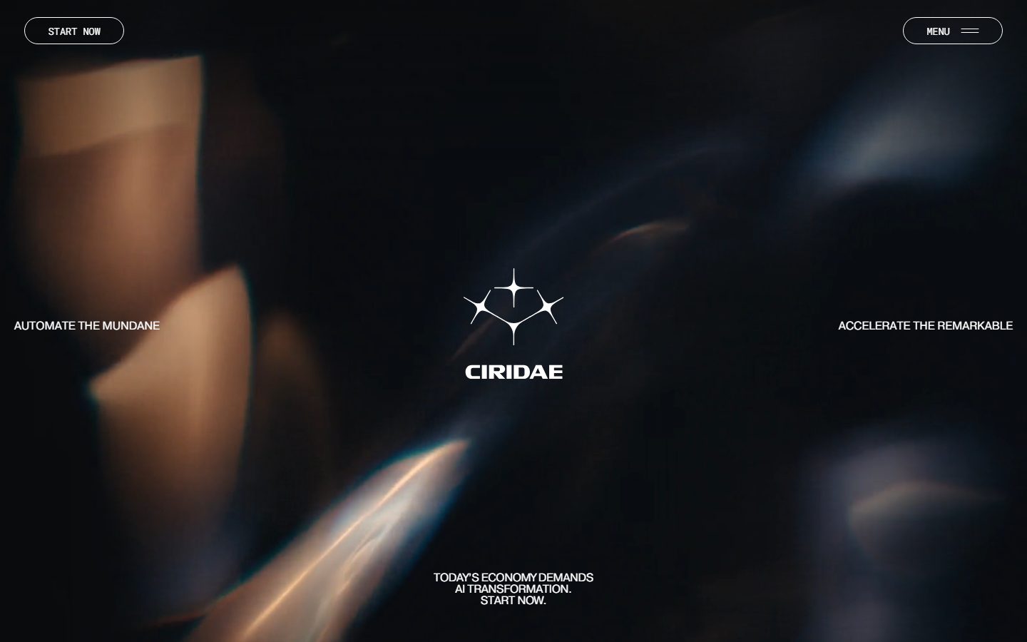
Ciridae's landing surface is a cinematic, near-black agency page — a `{colors.canvas}` (#0b0b0b) void carrying white Pragmatica type (`{colors.ink}` — #ffffff), a single copper-lit motion-blur image in the hero, and a star-field photographic band lower down. The system reads as premium and restrained: most of the page is intentional dark emptiness, broken only by a bright `{colors.accent-copper}` (#cc6437) light streak, one cream investor-logo strip, and constellation-style sparkle glyphs that double as the brand mark.
The type voice is a single grotesque family: **Pragmatica** for headings and body, **Pragmatica Cond** (condensed) for buttons and small UI labels. All measured weights are 400 with negative letter-spacing (-0.32px) on the regular cut. There is no display-weight escalation in the measured data — emphasis comes from scale, all-caps treatment, and white-on-black contrast rather than from bolder weights.
Component voltage comes from **fully-pill outlined buttons** — the measured button radius is 1440px, an effectively infinite pill that wraps the "START NOW" and "MENU" controls into capsule silhouettes. Buttons are transparent-filled with white labels; the system leans on hairline outlines (drawn in screenshots, see Known Gaps) rather than filled backgrounds.
The page alternates between three surface modes: the dominant `{colors.canvas}` near-black void, a single `{colors.cream}` (#edebe7) investor-logo band that briefly inverts the page to light, and dark `{colors.surface-card}` (#222222) process cards in the lower third. The cream band is the only light surface and it visually segments the long-scroll narrative.
**Key Characteristics:**
- Near-black `{colors.canvas}` (#0b0b0b) page floor with white `{colors.ink}` type — the system is essentially monochrome at the content layer.
- Fully-pill buttons at `{rounded.pill}` (1440px measured) — transparent fill, white condensed labels, 10px × 18px padding.
- Pragmatica + Pragmatica Cond grotesque type, weight 400, negative tracking (-0.32px) — clean, slightly technical, no display-weight escalation.
- Copper light streak (`{colors.accent-copper}` — #cc6437) as the hero's only chromatic event — atmospheric, not a UI accent.
- One cream logo band (`{colors.cream}` — #edebe7) that inverts the page to light for the investor strip — the sole light surface.
- Dark process cards (`{colors.surface-card}` — #222222) with rounded `{rounded.md}` (10px) corners hold numbered steps and constellation glyphs.
- Constellation/sparkle glyph marks used as the wordmark device and inside cards — the brand's signature motif.
- Flat depth model — no measured shadows. Separation comes from surface-color contrast, not elevation.
## Colors
### Brand & Atmospheric
- **Accent Copper** (`{colors.accent-copper}` — #cc6437): The hero's lone chromatic event — a warm copper light streak rendered photographically across the dark canvas. It appears as atmosphere/imagery, never as a UI fill or CTA color. Low frequency (measured 13 occurrences) confirms its scarcity.
- **Slate** (`{colors.slate}` — #5d6c7b): A cool blue-gray that appears in the cooler half of the hero motion imagery; pairs against the copper. Atmospheric, not a UI token.
### Surface
- **Canvas** (`{colors.canvas}` — #0b0b0b): The dominant page floor — near-black, present across the hero, narrative bands, and footer.
- **Black** (`{colors.black}` — #000000): A true-black tone used in deep image areas and section seams.
- **Surface Card** (`{colors.surface-card}` — #222222): The dark-gray fill of the numbered process cards in the lower third.
- **Surface Card Alt** (`{colors.surface-card-alt}` — #272a2a): A slightly warmer dark-gray card/section variant.
- **Surface Strong** (`{colors.surface-strong}` — #333333): The lightest of the dark grays — used for small chips, step-number badges, and hairline-adjacent fills.
- **Cream** (`{colors.cream}` — #edebe7): The single light surface — the investor-logo band that inverts the page. Logos render in `{colors.canvas}` against it.
- **Near White** (`{colors.near-white}` — #fafafa): A barely-off-white used in light-band detail.
### Text
- **Ink** (`{colors.ink}` — #ffffff): All headlines, body copy, corner labels, button labels, and the wordmark. The system's primary and dominant text color (measured highest frequency).
- **Text Soft** (`{colors.text-soft}` — #dddddd): Slightly dimmed white for secondary copy.
- **Text Muted** (`{colors.text-muted}` — #cccccc) and **Text Muted Alt** (`{colors.text-muted-alt}` — #c8c8c8): Tertiary body and caption tones.
- **Text Faint** (`{colors.text-faint}` — #adadad) and **Text Faint Alt** (`{colors.text-faint-alt}` — #999999): Fine-print, low-emphasis labels on dark surfaces.
### Accent / Framework
- **Link Blue** (`{colors.link-blue}` — #3898ec) and **Link Blue Strong** (`{colors.link-blue-strong}` — #0082f3): Blue link tones present in the measured CSS at very low frequency (2 occurrences each). These are consistent with Webflow default link styling and are not part of the visible brand palette — see Known Gaps.
## Typography
### Font Family
The system runs a single grotesque family in two cuts: **Pragmatica** (regular) for headings and running text, and **Pragmatica Cond** (condensed) for buttons and small UI labels. Pragmatica is a Helvetica-lineage commercial grotesque — clean, neutral, slightly technical. All measured cuts are weight 400; the system does not escalate to bold weights in the captured data.
The regular cut carries a consistent negative letter-spacing of -0.32px, which tightens the grotesque and gives the wordmark its precise, engineered feel. The condensed cut (buttons) uses normal tracking.
### Hierarchy
| Token | Family | Size | Weight | Line Height | Letter Spacing | Use |
|---|---|---|---|---|---|---|
| `{typography.heading}` | Pragmatica | 16px | 400 | 1.0 | -0.32px | Section headings, card titles, corner labels (h3) |
| `{typography.body}` | Pragmatica | 16px | 400 | 0.9 | -0.32px | Running body copy, narrative paragraphs |
| `{typography.button}` | Pragmatica Cond | 14px | 400 | 1.429 | normal | Button labels, MENU/START NOW, step numbers |
### Principles
The measured type system is unusually flat — headings and body share the same 16px size and 400 weight, separated only by line-height (1.0 vs 0.9) and all-caps treatment in screenshots. Display-scale headlines (the large "CIRIDAE" wordmark, the corner phrases "AUTOMATE THE MUNDANE" / "ACCELERATE THE REMARKABLE") were not captured at their rendered display sizes — they are larger in the screenshots than the measured 16px h3 (see Known Gaps). Emphasis in this system is achieved through scale, uppercase, generous spacing, and white-on-black contrast, not through weight.
### Note on Font Substitutes
**Pragmatica** and **Pragmatica Cond** are commercial typefaces (a Helvetica-family grotesque) and were not flagged in the measured `fonts_licensed` list, but they are not freely redistributable web fonts. If unavailable, substitute **Inter** or **Arial / Helvetica Neue** at weight 400 with -0.02em tracking for the regular cut, and **Archivo Narrow** or **Roboto Condensed** for the condensed (button) cut. These preserve the neutral-grotesque character and the condensed-vs-regular contrast.
## Layout
### Spacing System
- **Base unit:** ~10px is the dominant measured rhythm (highest frequency at 42 occurrences), with a secondary 40px macro step (20 occurrences).
- **Tokens:** `{spacing.xxs}` 4px · `{spacing.xs}` 8px · `{spacing.sm}` 10px · `{spacing.md}` 16px · `{spacing.lg}` 20px · `{spacing.xl}` 24px · `{spacing.xxl}` 32px · `{spacing.huge}` 40px.
- **Button padding:** 10px × 18px (measured) — the 10px vertical / ~18px horizontal pill rhythm.
- **Card padding:** `{spacing.xl}` (24px) for process cards (derived from the measured 24px cluster).
- **Band padding:** `{spacing.huge}` (40px) for the cream logo band and major section seams.
Intermediate values of 30px and 27px appear in the measured data and are documented as gaps rather than tokenized (see Known Gaps).
### Grid & Container
- **Hero:** A centered single-axis composition — wordmark dead-center, two corner phrases pinned left/right at the vertical midline, a bottom-center tagline, and pinned top-left ("START NOW") + top-right ("MENU") controls.
- **Process cards:** A 3-up grid of dark cards ("REDESIGN THE PROCESS" / "AI OPERATES THE BUSINESS" / "HUMANS OPERATE THE AI") with constellation glyphs.
- **Detail band:** A 4-up numbered grid (01–04: AI Operating System / Scheduling / Vendor Management / Customer Order Expediting).
- **Logo bands:** A horizontal investor-logo strip (cream band at top, dark band at footer).
### Whitespace Philosophy
Ciridae uses **negative space as the primary design element**. The hero and several mid-page bands are nearly empty dark void, letting the photographic motion-blur and star-field imagery carry the page. The deliberate emptiness reads as confident and premium — text appears in small, precise clusters surrounded by atmosphere rather than packed into dense layouts.
## Elevation & Depth
| Level | Treatment | Use |
|---|---|---|
| Flat | No shadow, no border | Body sections, hero, corner labels |
| Surface contrast | `{colors.surface-card}` (#222222) on `{colors.canvas}` (#0b0b0b) | Process cards lifted by color difference alone |
| Light inversion | `{colors.cream}` band on dark page | Investor-logo strip — separation by inversion |
| Photographic depth | Motion-blur + star-field imagery | Hero copper streak and night-sky band carry their own atmospheric depth |
The measured `shadows` set is **empty** — there are no box-shadows in the system. Depth is achieved entirely through surface-color contrast (dark card on darker canvas), the cream-band inversion, and photographic atmosphere. This is a flat, contrast-driven elevation model.
### Decorative Depth
- The hero's copper light streak (`{colors.accent-copper}`) and the cool slate haze (`{colors.slate}`) supply all the visual depth in the upper page — the imagery is the elevation.
- Constellation/sparkle glyphs glow against the dark cards, reading as small light sources rather than flat icons.
## Shapes
### Border Radius Scale
| Token | Value | Use |
|---|---|---|
| `{rounded.sm}` | 4px | Small chips, minor UI elements (measured, 7 occurrences) |
| `{rounded.md}` | 10px | Process cards, surface containers (measured, 4 occurrences) |
| `{rounded.pill}` | 1440px | Buttons and capsule controls — effectively-infinite pill (measured, 28 occurrences, the dominant radius) |
The radius story is bimodal: a small 4–10px radius for cards and surfaces, and a fully-pill 1440px radius for every interactive control. There is no mid-range radius — controls are either subtly-rounded rectangles or full capsules.
### Photography Geometry
The hero motion-blur image and the night-sky/lake band run full-bleed edge-to-edge with no rounding. The investor-logo lockups sit flat on the cream band. Constellation glyphs are vector star/sparkle shapes used as the brand device.
## Components
### Buttons
**`button-primary`** — The signature CTA, e.g. "START NOW" pinned top-left in the hero. Transparent fill, white label (`{colors.ink}`), `{typography.button}` (Pragmatica Cond 14px / 400), rounded `{rounded.pill}` (1440px measured), padding 10px × 18px. The capsule silhouette carries a hairline outline in screenshots (border tone not measured — see Known Gaps).
**`nav-menu-button`** — The "MENU ☰" control pinned top-right. Same capsule treatment as `button-primary` — transparent fill, white condensed label, full-pill radius, 10px × 18px padding. Carries a hamburger glyph beside the label.
### Cards & Containers
**`process-card`** — Dark cards used in the 3-up process grid ("REDESIGN THE PROCESS", "AI OPERATES THE BUSINESS", "HUMANS OPERATE THE AI"). Background `{colors.surface-card}` (#222222), white text, rounded `{rounded.md}` (10px), padding `{spacing.xl}` (24px). Each card carries a step-number badge at top, a centered constellation glyph, a heading, and a body paragraph in `{typography.body}`.
**`step-number-badge`** — Small pill chip ("01" / "02" / "03" / "04") sitting at the top of process and detail cards. Background `{colors.surface-strong}` (#333333), white text, `{typography.button}` (condensed), rounded `{rounded.pill}`, padding 4px × 10px.
**`logo-band`** — The investor-logo strip. Background `{colors.cream}` (#edebe7) — the only light surface on the page — with logos rendered in `{colors.canvas}`. Padding `{spacing.huge}` (40px). A second logo strip appears at the footer on the dark canvas.
### Labels
**`corner-label`** — The hero's pinned phrases ("AUTOMATE THE MUNDANE" left, "ACCELERATE THE REMARKABLE" right) and the centered tagline ("TODAY'S ECONOMY DEMANDS AI TRANSFORMATION. START NOW."). Transparent background, white text (`{colors.ink}`), `{typography.heading}`, rendered all-caps with tight tracking. These are positioned at the vertical midline and bottom-center of the hero.
## Do's and Don'ts
### Do
- Keep the page predominantly `{colors.canvas}` (#0b0b0b) near-black. The dark void is the brand — let it dominate.
- Use white `{colors.ink}` for nearly all text. The system is monochrome at the content layer.
- Render every interactive control as a full pill (`{rounded.pill}`) with transparent fill and a white condensed label.
- Reserve `{colors.accent-copper}` and `{colors.slate}` for photographic atmosphere — light streaks, haze, imagery — never for UI fills or CTAs.
- Use the cream band (`{colors.cream}`) sparingly as the single light inversion — for the investor-logo strip only.
- Set body and headings in Pragmatica 400 with -0.32px tracking; set buttons and small labels in Pragmatica Cond.
- Use constellation/sparkle glyphs as the recurring brand device inside cards and the wordmark.
- Lean on negative space — surround small text clusters with atmosphere rather than packing layouts.
### Don't
- Don't introduce box-shadows. The measured system is flat — separate surfaces with color contrast, not elevation.
- Don't escalate type weight beyond 400. Emphasis comes from scale, caps, and contrast.
- Don't use the copper as a button or link color — it is atmospheric imagery, not a UI accent.
- Don't add a second light surface beyond the cream logo band. The inversion is scarce and deliberate.
- Don't use mid-range radii on controls — controls are full pills, surfaces are 4–10px.
- Don't surface the blue link tones (`{colors.link-blue}`, `{colors.link-blue-strong}`) as brand accents — they are framework defaults.
## Responsive Behavior
| Name | Width | Key Changes |
|---|---|---|
| Mobile | < 768px | Corner labels stack/reflow below the centered wordmark; process cards go 1-up; detail grid 1-up; logo bands wrap |
| Tablet | 768–1024px | Process cards 2-up; hero corner phrases tighten toward the wordmark; nav controls stay pinned |
| Desktop | 1024px+ | Full hero with left/right corner phrases at the vertical midline; 3-up process cards; 4-up detail grid |
*Note: Only the desktop landing page was captured. Breakpoint behavior is inferred from the desktop composition and standard responsive patterns — see Known Gaps.*
### Touch Targets
- `{component.button-primary}` and `{component.nav-menu-button}` use 10px × 18px padding around a 14px condensed label; the full-pill capsule shape gives a comfortable tap silhouette, though the measured height is under the WCAG 44px target and would benefit from increased vertical padding on touch.
### Collapsing Strategy
- The hero's three-position text layout (left phrase / center wordmark / right phrase) collapses to a vertical stack on narrow viewports.
- Process and detail card grids reduce columns rather than shrinking cards.
- Full-bleed photographic bands (copper hero, night-sky band) scale proportionally and stay edge-to-edge.
## Iteration Guide
1. Focus on ONE component at a time. Reference its YAML key directly (`{component.process-card}`, `{component.button-primary}`).
2. Variants of a component (`-active`, `-disabled`) live as separate entries in `components:`.
3. Use `{token.refs}` everywhere — never inline a hex.
4. Never document hover. Default and Active/Pressed states only.
5. Keep the page dark-dominant; the cream logo band is the only light surface — don't add more.
6. Buttons are always full pills with transparent fill — preserve the capsule silhouette.
7. When in doubt about emphasis: bigger Pragmatica and more negative space before any weight or color change.
## Known Gaps
- **Display type sizes not measured.** The large "CIRIDAE" wordmark and the all-caps hero phrases ("AUTOMATE THE MUNDANE", "ACCELERATE THE REMARKABLE") render far larger than the measured 16px h3 in screenshots, but only the 16px heading/body and 14px button cuts were captured. Display-scale tokens would need direct measurement.
- **Button border/outline not measured.** The "START NOW" and "MENU" pills clearly carry a hairline outline in screenshots, but no border color or width was extracted. Documented as transparent-fill with a white label only.
- **Pragmatica is a commercial typeface** and was not flagged in `fonts_licensed`; it is not freely redistributable. Open-source substitutes (Inter / Arial for regular, Archivo Narrow / Roboto Condensed for condensed) are documented in the Typography section.
- **Blue link tones** (`{colors.link-blue}` #3898ec, `{colors.link-blue-strong}` #0082f3) and `#ffff00` appear in the CSS at 1–2 occurrences and are consistent with Webflow framework defaults, not visible brand colors. They are documented but flagged as non-brand.
- **Additional measured neutrals** (`#aaadb0`, `#e2e2e2`) appeared at single-occurrence frequency and were not tokenized.
- **Spacing values of 27px and 30px** were measured but not tokenized; the token scale rounds to the dominant 10/16/20/24/32/40 rhythm.
- **Shadows are empty** in the measured data — if any subtle glows exist on the constellation glyphs they are part of the imagery, not system tokens.
- **Only the desktop landing page was captured.** Responsive breakpoints, mobile nav (menu sheet) behavior, and interior/menu pages are inferred or out of scope.
- **Animation and transition timings** (hero motion-blur movement, glyph glow, scroll reveals) are not in scope.
<!-- Documented by duply · real-world design systems as ready-to-use DESIGN.md for AI coding agents · https://duply.ai/ciridae/design-md -->
Color Palette
Accent
Neutrals
Typography
heading16px · 400 · 1
The quick brown fox jumpsbody16px · 400 · 0.9
The quick brown fox jumpsbutton14px · 400 · 1.429
The quick brown fox jumpsSpacing & Shape
Spacing
| Name | Value | Preview |
|---|---|---|
| xxs | 4px | |
| xs | 8px | |
| sm | 10px | |
| md | 16px | |
| lg | 20px | |
| xl | 24px | |
| xxl | 32px | |
| huge | 40px |
Border Radius
| Name | Value | Preview |
|---|---|---|
| sm | 4px | |
| md | 10px | |
| pill | 1440px |
More like this


---
version: alpha
name: Ciridae-design-analysis
description: A cinematic, near-black AI-agency landing surface built on a #0b0b0b canvas with white Pragmatica type, copper-lit motion imagery, and fully-pill (1440px radius) outlined buttons. The system reads as premium, restrained, and atmospheric — most of the page is dark void punctuated by a single bright copper light streak, a star-field photographic band, and one cream investor-logo strip. Brand voltage comes from contrast (white-on-near-black), the condensed-grotesque wordmark, and constellation-style glyph marks rather than from accent color.

colors:
  ink: "#ffffff"
  canvas: "#0b0b0b"
  black: "#000000"
  surface-card: "#222222"
  surface-card-alt: "#272a2a"
  surface-strong: "#333333"
  cream: "#edebe7"
  near-white: "#fafafa"
  accent-copper: "#cc6437"
  text-soft: "#dddddd"
  text-muted: "#cccccc"
  text-muted-alt: "#c8c8c8"
  text-faint: "#adadad"
  text-faint-alt: "#999999"
  slate: "#5d6c7b"
  link-blue: "#3898ec"
  link-blue-strong: "#0082f3"

typography:
  heading:
    fontFamily: "Pragmatica, Arial, sans-serif"
    fontSize: 16px
    fontWeight: 400
    lineHeight: 1.0
    letterSpacing: -0.32px
  body:
    fontFamily: "Pragmatica, Arial, sans-serif"
    fontSize: 16px
    fontWeight: 400
    lineHeight: 0.9
    letterSpacing: -0.32px
  button:
    fontFamily: "Pragmatica Cond, Arial Narrow, sans-serif"
    fontSize: 14px
    fontWeight: 400
    lineHeight: 1.429
    letterSpacing: normal

rounded:
  sm: 4px
  md: 10px
  pill: 1440px

spacing:
  xxs: 4px
  xs: 8px
  sm: 10px
  md: 16px
  lg: 20px
  xl: 24px
  xxl: 32px
  huge: 40px

components:
  button-primary:
    backgroundColor: transparent
    textColor: "{colors.ink}"
    typography: "{typography.button}"
    rounded: "{rounded.pill}"
    padding: 10px 18px
  nav-menu-button:
    backgroundColor: transparent
    textColor: "{colors.ink}"
    typography: "{typography.button}"
    rounded: "{rounded.pill}"
    padding: 10px 18px
  process-card:
    backgroundColor: "{colors.surface-card}"
    textColor: "{colors.ink}"
    typography: "{typography.body}"
    rounded: "{rounded.md}"
    padding: 24px
  step-number-badge:
    backgroundColor: "{colors.surface-strong}"
    textColor: "{colors.ink}"
    typography: "{typography.button}"
    rounded: "{rounded.pill}"
    padding: 4px 10px
  logo-band:
    backgroundColor: "{colors.cream}"
    textColor: "{colors.canvas}"
    typography: "{typography.body}"
    padding: 40px
  corner-label:
    backgroundColor: transparent
    textColor: "{colors.ink}"
    typography: "{typography.heading}"
---

## Overview

Ciridae's landing surface is a cinematic, near-black agency page — a `{colors.canvas}` (#0b0b0b) void carrying white Pragmatica type (`{colors.ink}` — #ffffff), a single copper-lit motion-blur image in the hero, and a star-field photographic band lower down. The system reads as premium and restrained: most of the page is intentional dark emptiness, broken only by a bright `{colors.accent-copper}` (#cc6437) light streak, one cream investor-logo strip, and constellation-style sparkle glyphs that double as the brand mark.

The type voice is a single grotesque family: **Pragmatica** for headings and body, **Pragmatica Cond** (condensed) for buttons and small UI labels. All measured weights are 400 with negative letter-spacing (-0.32px) on the regular cut. There is no display-weight escalation in the measured data — emphasis comes from scale, all-caps treatment, and white-on-black contrast rather than from bolder weights.

Component voltage comes from **fully-pill outlined buttons** — the measured button radius is 1440px, an effectively infinite pill that wraps the "START NOW" and "MENU" controls into capsule silhouettes. Buttons are transparent-filled with white labels; the system leans on hairline outlines (drawn in screenshots, see Known Gaps) rather than filled backgrounds.

The page alternates between three surface modes: the dominant `{colors.canvas}` near-black void, a single `{colors.cream}` (#edebe7) investor-logo band that briefly inverts the page to light, and dark `{colors.surface-card}` (#222222) process cards in the lower third. The cream band is the only light surface and it visually segments the long-scroll narrative.

**Key Characteristics:**
- Near-black `{colors.canvas}` (#0b0b0b) page floor with white `{colors.ink}` type — the system is essentially monochrome at the content layer.
- Fully-pill buttons at `{rounded.pill}` (1440px measured) — transparent fill, white condensed labels, 10px × 18px padding.
- Pragmatica + Pragmatica Cond grotesque type, weight 400, negative tracking (-0.32px) — clean, slightly technical, no display-weight escalation.
- Copper light streak (`{colors.accent-copper}` — #cc6437) as the hero's only chromatic event — atmospheric, not a UI accent.
- One cream logo band (`{colors.cream}` — #edebe7) that inverts the page to light for the investor strip — the sole light surface.
- Dark process cards (`{colors.surface-card}` — #222222) with rounded `{rounded.md}` (10px) corners hold numbered steps and constellation glyphs.
- Constellation/sparkle glyph marks used as the wordmark device and inside cards — the brand's signature motif.
- Flat depth model — no measured shadows. Separation comes from surface-color contrast, not elevation.

## Colors

### Brand & Atmospheric
- **Accent Copper** (`{colors.accent-copper}` — #cc6437): The hero's lone chromatic event — a warm copper light streak rendered photographically across the dark canvas. It appears as atmosphere/imagery, never as a UI fill or CTA color. Low frequency (measured 13 occurrences) confirms its scarcity.
- **Slate** (`{colors.slate}` — #5d6c7b): A cool blue-gray that appears in the cooler half of the hero motion imagery; pairs against the copper. Atmospheric, not a UI token.

### Surface
- **Canvas** (`{colors.canvas}` — #0b0b0b): The dominant page floor — near-black, present across the hero, narrative bands, and footer.
- **Black** (`{colors.black}` — #000000): A true-black tone used in deep image areas and section seams.
- **Surface Card** (`{colors.surface-card}` — #222222): The dark-gray fill of the numbered process cards in the lower third.
- **Surface Card Alt** (`{colors.surface-card-alt}` — #272a2a): A slightly warmer dark-gray card/section variant.
- **Surface Strong** (`{colors.surface-strong}` — #333333): The lightest of the dark grays — used for small chips, step-number badges, and hairline-adjacent fills.
- **Cream** (`{colors.cream}` — #edebe7): The single light surface — the investor-logo band that inverts the page. Logos render in `{colors.canvas}` against it.
- **Near White** (`{colors.near-white}` — #fafafa): A barely-off-white used in light-band detail.

### Text
- **Ink** (`{colors.ink}` — #ffffff): All headlines, body copy, corner labels, button labels, and the wordmark. The system's primary and dominant text color (measured highest frequency).
- **Text Soft** (`{colors.text-soft}` — #dddddd): Slightly dimmed white for secondary copy.
- **Text Muted** (`{colors.text-muted}` — #cccccc) and **Text Muted Alt** (`{colors.text-muted-alt}` — #c8c8c8): Tertiary body and caption tones.
- **Text Faint** (`{colors.text-faint}` — #adadad) and **Text Faint Alt** (`{colors.text-faint-alt}` — #999999): Fine-print, low-emphasis labels on dark surfaces.

### Accent / Framework
- **Link Blue** (`{colors.link-blue}` — #3898ec) and **Link Blue Strong** (`{colors.link-blue-strong}` — #0082f3): Blue link tones present in the measured CSS at very low frequency (2 occurrences each). These are consistent with Webflow default link styling and are not part of the visible brand palette — see Known Gaps.

## Typography

### Font Family
The system runs a single grotesque family in two cuts: **Pragmatica** (regular) for headings and running text, and **Pragmatica Cond** (condensed) for buttons and small UI labels. Pragmatica is a Helvetica-lineage commercial grotesque — clean, neutral, slightly technical. All measured cuts are weight 400; the system does not escalate to bold weights in the captured data.

The regular cut carries a consistent negative letter-spacing of -0.32px, which tightens the grotesque and gives the wordmark its precise, engineered feel. The condensed cut (buttons) uses normal tracking.

### Hierarchy

| Token | Family | Size | Weight | Line Height | Letter Spacing | Use |
|---|---|---|---|---|---|---|
| `{typography.heading}` | Pragmatica | 16px | 400 | 1.0 | -0.32px | Section headings, card titles, corner labels (h3) |
| `{typography.body}` | Pragmatica | 16px | 400 | 0.9 | -0.32px | Running body copy, narrative paragraphs |
| `{typography.button}` | Pragmatica Cond | 14px | 400 | 1.429 | normal | Button labels, MENU/START NOW, step numbers |

### Principles
The measured type system is unusually flat — headings and body share the same 16px size and 400 weight, separated only by line-height (1.0 vs 0.9) and all-caps treatment in screenshots. Display-scale headlines (the large "CIRIDAE" wordmark, the corner phrases "AUTOMATE THE MUNDANE" / "ACCELERATE THE REMARKABLE") were not captured at their rendered display sizes — they are larger in the screenshots than the measured 16px h3 (see Known Gaps). Emphasis in this system is achieved through scale, uppercase, generous spacing, and white-on-black contrast, not through weight.

### Note on Font Substitutes
**Pragmatica** and **Pragmatica Cond** are commercial typefaces (a Helvetica-family grotesque) and were not flagged in the measured `fonts_licensed` list, but they are not freely redistributable web fonts. If unavailable, substitute **Inter** or **Arial / Helvetica Neue** at weight 400 with -0.02em tracking for the regular cut, and **Archivo Narrow** or **Roboto Condensed** for the condensed (button) cut. These preserve the neutral-grotesque character and the condensed-vs-regular contrast.

## Layout

### Spacing System
- **Base unit:** ~10px is the dominant measured rhythm (highest frequency at 42 occurrences), with a secondary 40px macro step (20 occurrences).
- **Tokens:** `{spacing.xxs}` 4px · `{spacing.xs}` 8px · `{spacing.sm}` 10px · `{spacing.md}` 16px · `{spacing.lg}` 20px · `{spacing.xl}` 24px · `{spacing.xxl}` 32px · `{spacing.huge}` 40px.
- **Button padding:** 10px × 18px (measured) — the 10px vertical / ~18px horizontal pill rhythm.
- **Card padding:** `{spacing.xl}` (24px) for process cards (derived from the measured 24px cluster).
- **Band padding:** `{spacing.huge}` (40px) for the cream logo band and major section seams.

Intermediate values of 30px and 27px appear in the measured data and are documented as gaps rather than tokenized (see Known Gaps).

### Grid & Container
- **Hero:** A centered single-axis composition — wordmark dead-center, two corner phrases pinned left/right at the vertical midline, a bottom-center tagline, and pinned top-left ("START NOW") + top-right ("MENU") controls.
- **Process cards:** A 3-up grid of dark cards ("REDESIGN THE PROCESS" / "AI OPERATES THE BUSINESS" / "HUMANS OPERATE THE AI") with constellation glyphs.
- **Detail band:** A 4-up numbered grid (01–04: AI Operating System / Scheduling / Vendor Management / Customer Order Expediting).
- **Logo bands:** A horizontal investor-logo strip (cream band at top, dark band at footer).

### Whitespace Philosophy
Ciridae uses **negative space as the primary design element**. The hero and several mid-page bands are nearly empty dark void, letting the photographic motion-blur and star-field imagery carry the page. The deliberate emptiness reads as confident and premium — text appears in small, precise clusters surrounded by atmosphere rather than packed into dense layouts.

## Elevation & Depth

| Level | Treatment | Use |
|---|---|---|
| Flat | No shadow, no border | Body sections, hero, corner labels |
| Surface contrast | `{colors.surface-card}` (#222222) on `{colors.canvas}` (#0b0b0b) | Process cards lifted by color difference alone |
| Light inversion | `{colors.cream}` band on dark page | Investor-logo strip — separation by inversion |
| Photographic depth | Motion-blur + star-field imagery | Hero copper streak and night-sky band carry their own atmospheric depth |

The measured `shadows` set is **empty** — there are no box-shadows in the system. Depth is achieved entirely through surface-color contrast (dark card on darker canvas), the cream-band inversion, and photographic atmosphere. This is a flat, contrast-driven elevation model.

### Decorative Depth
- The hero's copper light streak (`{colors.accent-copper}`) and the cool slate haze (`{colors.slate}`) supply all the visual depth in the upper page — the imagery is the elevation.
- Constellation/sparkle glyphs glow against the dark cards, reading as small light sources rather than flat icons.

## Shapes

### Border Radius Scale

| Token | Value | Use |
|---|---|---|
| `{rounded.sm}` | 4px | Small chips, minor UI elements (measured, 7 occurrences) |
| `{rounded.md}` | 10px | Process cards, surface containers (measured, 4 occurrences) |
| `{rounded.pill}` | 1440px | Buttons and capsule controls — effectively-infinite pill (measured, 28 occurrences, the dominant radius) |

The radius story is bimodal: a small 4–10px radius for cards and surfaces, and a fully-pill 1440px radius for every interactive control. There is no mid-range radius — controls are either subtly-rounded rectangles or full capsules.

### Photography Geometry
The hero motion-blur image and the night-sky/lake band run full-bleed edge-to-edge with no rounding. The investor-logo lockups sit flat on the cream band. Constellation glyphs are vector star/sparkle shapes used as the brand device.

## Components

### Buttons

**`button-primary`** — The signature CTA, e.g. "START NOW" pinned top-left in the hero. Transparent fill, white label (`{colors.ink}`), `{typography.button}` (Pragmatica Cond 14px / 400), rounded `{rounded.pill}` (1440px measured), padding 10px × 18px. The capsule silhouette carries a hairline outline in screenshots (border tone not measured — see Known Gaps).

**`nav-menu-button`** — The "MENU ☰" control pinned top-right. Same capsule treatment as `button-primary` — transparent fill, white condensed label, full-pill radius, 10px × 18px padding. Carries a hamburger glyph beside the label.

### Cards & Containers

**`process-card`** — Dark cards used in the 3-up process grid ("REDESIGN THE PROCESS", "AI OPERATES THE BUSINESS", "HUMANS OPERATE THE AI"). Background `{colors.surface-card}` (#222222), white text, rounded `{rounded.md}` (10px), padding `{spacing.xl}` (24px). Each card carries a step-number badge at top, a centered constellation glyph, a heading, and a body paragraph in `{typography.body}`.

**`step-number-badge`** — Small pill chip ("01" / "02" / "03" / "04") sitting at the top of process and detail cards. Background `{colors.surface-strong}` (#333333), white text, `{typography.button}` (condensed), rounded `{rounded.pill}`, padding 4px × 10px.

**`logo-band`** — The investor-logo strip. Background `{colors.cream}` (#edebe7) — the only light surface on the page — with logos rendered in `{colors.canvas}`. Padding `{spacing.huge}` (40px). A second logo strip appears at the footer on the dark canvas.

### Labels

**`corner-label`** — The hero's pinned phrases ("AUTOMATE THE MUNDANE" left, "ACCELERATE THE REMARKABLE" right) and the centered tagline ("TODAY'S ECONOMY DEMANDS AI TRANSFORMATION. START NOW."). Transparent background, white text (`{colors.ink}`), `{typography.heading}`, rendered all-caps with tight tracking. These are positioned at the vertical midline and bottom-center of the hero.

## Do's and Don'ts

### Do
- Keep the page predominantly `{colors.canvas}` (#0b0b0b) near-black. The dark void is the brand — let it dominate.
- Use white `{colors.ink}` for nearly all text. The system is monochrome at the content layer.
- Render every interactive control as a full pill (`{rounded.pill}`) with transparent fill and a white condensed label.
- Reserve `{colors.accent-copper}` and `{colors.slate}` for photographic atmosphere — light streaks, haze, imagery — never for UI fills or CTAs.
- Use the cream band (`{colors.cream}`) sparingly as the single light inversion — for the investor-logo strip only.
- Set body and headings in Pragmatica 400 with -0.32px tracking; set buttons and small labels in Pragmatica Cond.
- Use constellation/sparkle glyphs as the recurring brand device inside cards and the wordmark.
- Lean on negative space — surround small text clusters with atmosphere rather than packing layouts.

### Don't
- Don't introduce box-shadows. The measured system is flat — separate surfaces with color contrast, not elevation.
- Don't escalate type weight beyond 400. Emphasis comes from scale, caps, and contrast.
- Don't use the copper as a button or link color — it is atmospheric imagery, not a UI accent.
- Don't add a second light surface beyond the cream logo band. The inversion is scarce and deliberate.
- Don't use mid-range radii on controls — controls are full pills, surfaces are 4–10px.
- Don't surface the blue link tones (`{colors.link-blue}`, `{colors.link-blue-strong}`) as brand accents — they are framework defaults.

## Responsive Behavior

| Name | Width | Key Changes |
|---|---|---|
| Mobile | < 768px | Corner labels stack/reflow below the centered wordmark; process cards go 1-up; detail grid 1-up; logo bands wrap |
| Tablet | 768–1024px | Process cards 2-up; hero corner phrases tighten toward the wordmark; nav controls stay pinned |
| Desktop | 1024px+ | Full hero with left/right corner phrases at the vertical midline; 3-up process cards; 4-up detail grid |

*Note: Only the desktop landing page was captured. Breakpoint behavior is inferred from the desktop composition and standard responsive patterns — see Known Gaps.*

### Touch Targets
- `{component.button-primary}` and `{component.nav-menu-button}` use 10px × 18px padding around a 14px condensed label; the full-pill capsule shape gives a comfortable tap silhouette, though the measured height is under the WCAG 44px target and would benefit from increased vertical padding on touch.

### Collapsing Strategy
- The hero's three-position text layout (left phrase / center wordmark / right phrase) collapses to a vertical stack on narrow viewports.
- Process and detail card grids reduce columns rather than shrinking cards.
- Full-bleed photographic bands (copper hero, night-sky band) scale proportionally and stay edge-to-edge.

## Iteration Guide

1. Focus on ONE component at a time. Reference its YAML key directly (`{component.process-card}`, `{component.button-primary}`).
2. Variants of a component (`-active`, `-disabled`) live as separate entries in `components:`.
3. Use `{token.refs}` everywhere — never inline a hex.
4. Never document hover. Default and Active/Pressed states only.
5. Keep the page dark-dominant; the cream logo band is the only light surface — don't add more.
6. Buttons are always full pills with transparent fill — preserve the capsule silhouette.
7. When in doubt about emphasis: bigger Pragmatica and more negative space before any weight or color change.

## Known Gaps

- **Display type sizes not measured.** The large "CIRIDAE" wordmark and the all-caps hero phrases ("AUTOMATE THE MUNDANE", "ACCELERATE THE REMARKABLE") render far larger than the measured 16px h3 in screenshots, but only the 16px heading/body and 14px button cuts were captured. Display-scale tokens would need direct measurement.
- **Button border/outline not measured.** The "START NOW" and "MENU" pills clearly carry a hairline outline in screenshots, but no border color or width was extracted. Documented as transparent-fill with a white label only.
- **Pragmatica is a commercial typeface** and was not flagged in `fonts_licensed`; it is not freely redistributable. Open-source substitutes (Inter / Arial for regular, Archivo Narrow / Roboto Condensed for condensed) are documented in the Typography section.
- **Blue link tones** (`{colors.link-blue}` #3898ec, `{colors.link-blue-strong}` #0082f3) and `#ffff00` appear in the CSS at 1–2 occurrences and are consistent with Webflow framework defaults, not visible brand colors. They are documented but flagged as non-brand.
- **Additional measured neutrals** (`#aaadb0`, `#e2e2e2`) appeared at single-occurrence frequency and were not tokenized.
- **Spacing values of 27px and 30px** were measured but not tokenized; the token scale rounds to the dominant 10/16/20/24/32/40 rhythm.
- **Shadows are empty** in the measured data — if any subtle glows exist on the constellation glyphs they are part of the imagery, not system tokens.
- **Only the desktop landing page was captured.** Responsive breakpoints, mobile nav (menu sheet) behavior, and interior/menu pages are inferred or out of scope.
- **Animation and transition timings** (hero motion-blur movement, glyph glow, scroll reveals) are not in scope.

<!-- Documented by duply · real-world design systems as ready-to-use DESIGN.md for AI coding agents · https://duply.ai/ciridae/design-md -->