aival
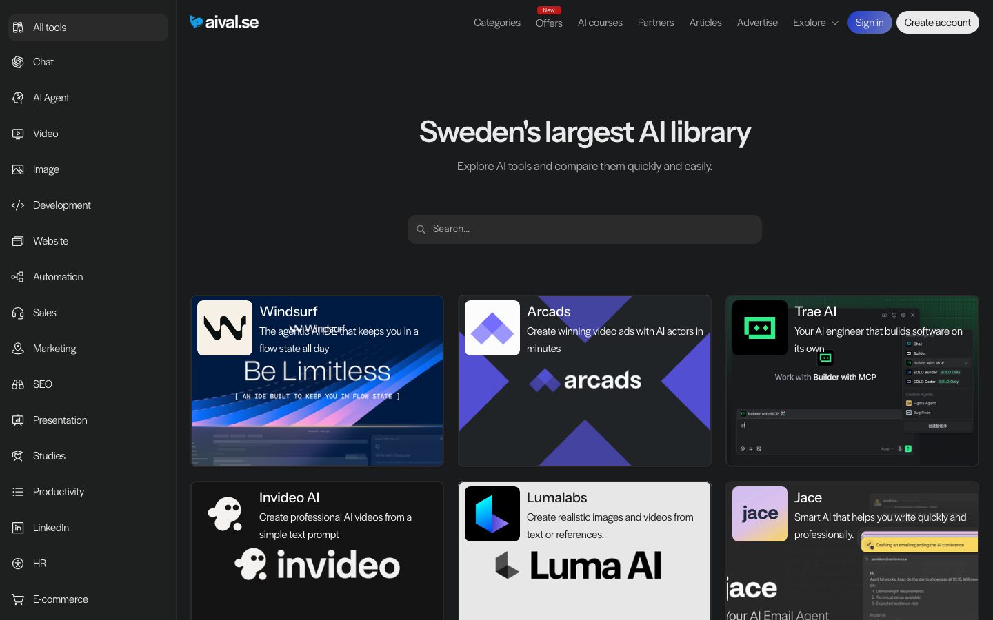
A dark, utility-first directory interface for "Sweden's largest AI library." The system runs on a near-black canvas (#1a1b1c) with a persistent left-rail category sidebar, a centered hero, and a dense grid of dark tool cards. Brand voltage is quiet and functional — light Halyard-style body text on near-black surfaces, an Instrument Sans display headline, and small saturated category badges (green/purple/red) as the only chromatic accents. The aesthetic reads as a no-nonsense aggregator: lots of cards, soft 8px corners, low-contrast hairlines, and a single newsletter close.
---
version: alpha
name: aival-design-analysis
description: "A dark, utility-first directory interface for \"Sweden's largest AI library.\" The system runs on a near-black canvas (#1a1b1c) with a persistent left-rail category sidebar, a centered hero, and a dense grid of dark tool cards. Brand voltage is quiet and functional — light Halyard-style body text on near-black surfaces, an Instrument Sans display headline, and small saturated category badges (green/purple/red) as the only chromatic accents. The aesthetic reads as a no-nonsense aggregator: lots of cards, soft 8px corners, low-contrast hairlines, and a single newsletter close."

colors:
  primary: "#2a2a2a"
  canvas: "#1a1b1c"
  surface: "#1e1f1f"
  surface-alt: "#171717"
  surface-soft: "#1f2021"
  ink: "#eaeaea"
  body: "#aaaaaa"
  muted: "#999999"
  muted-strong: "#888888"
  near-black: "#000000"
  hairline: "#444444"
  white: "#ffffff"
  on-primary: "#ffffff"
  link: "#0000ee"
  accent-purple: "#8a0fba"
  accent-green: "#04782c"
  accent-red: "#bf1919"

typography:
  display:
    fontFamily: "Instrument Sans, sans-serif"
    fontSize: 43px
    fontWeight: 600
    lineHeight: 1.2
    letterSpacing: -0.04em
  body:
    fontFamily: "Halyard Display Book, Figtree, sans-serif"
    fontSize: 16px
    fontWeight: 300
    lineHeight: 1.6
    letterSpacing: -0.01em

rounded:
  xs: 4px
  sm: 8px
  md: 10px
  lg: 12px
  xl: 14px
  xxl: 18px

spacing:
  xxs: 4px
  xs: 6px
  sm: 8px
  md: 10px
  lg: 12px
  xl: 16px
  xxl: 20px
  xxxl: 24px
  huge: 32px
  giant: 64px
  band: 100px

components:
  sidebar-nav:
    backgroundColor: "{colors.canvas}"
    textColor: "{colors.body}"
    typography: "{typography.body}"
    padding: 10px
  sidebar-nav-item-active:
    backgroundColor: "{colors.surface}"
    textColor: "{colors.ink}"
    typography: "{typography.body}"
    rounded: "{rounded.sm}"
    padding: 10px
  top-nav:
    backgroundColor: "{colors.canvas}"
    textColor: "{colors.body}"
    typography: "{typography.body}"
    padding: 20px
  nav-link:
    backgroundColor: transparent
    textColor: "{colors.body}"
    typography: "{typography.body}"
  button-primary:
    backgroundColor: "{colors.primary}"
    textColor: "{colors.on-primary}"
    typography: "{typography.body}"
    rounded: "{rounded.md}"
  button-account-outline:
    backgroundColor: transparent
    textColor: "{colors.ink}"
    typography: "{typography.body}"
    rounded: "{rounded.sm}"
    padding: 10px
  search-input:
    backgroundColor: "{colors.surface}"
    textColor: "{colors.body}"
    typography: "{typography.body}"
    rounded: "{rounded.sm}"
    padding: 12px
  text-input:
    backgroundColor: "{colors.surface}"
    textColor: "{colors.body}"
    typography: "{typography.body}"
    rounded: "{rounded.xs}"
    padding: 12px
  tool-card:
    backgroundColor: "{colors.surface}"
    textColor: "{colors.body}"
    typography: "{typography.body}"
    rounded: "{rounded.sm}"
    padding: 16px
  tool-card-featured:
    backgroundColor: "{colors.surface-alt}"
    textColor: "{colors.body}"
    typography: "{typography.body}"
    rounded: "{rounded.lg}"
    padding: 16px
  badge-new:
    backgroundColor: "{colors.accent-green}"
    textColor: "{colors.white}"
    typography: "{typography.body}"
    rounded: "{rounded.xs}"
    padding: 4px
  badge-discover:
    backgroundColor: "{colors.accent-purple}"
    textColor: "{colors.white}"
    typography: "{typography.body}"
    rounded: "{rounded.xs}"
    padding: 4px
  badge-offer:
    backgroundColor: "{colors.accent-red}"
    textColor: "{colors.white}"
    typography: "{typography.body}"
    rounded: "{rounded.xs}"
    padding: 4px
  newsletter-panel:
    backgroundColor: "{colors.surface}"
    textColor: "{colors.body}"
    typography: "{typography.body}"
    rounded: "{rounded.lg}"
    padding: 32px
  footer:
    backgroundColor: "{colors.canvas}"
    textColor: "{colors.body}"
    typography: "{typography.body}"
    padding: 20px
---

## Overview

aival.se is a dark, utility-first AI-tool directory ("Sweden's largest AI library"). The entire interface sits on a near-black canvas (`{colors.canvas}` — #1a1b1c) with a persistent left-rail category sidebar, a centered hero headline, a single search field, and a dense grid of tool cards. It is an aggregator first and a marketing site second — the design optimizes for scanning many cards, not for editorial drama.

The voice is quiet. Brand voltage does not come from accent color washes or hero illustration; it comes from the **density of the card grid** and the **legibility of light text on dark surfaces**. The only saturated color appears in the small category badges — green ("New"), purple ("Discover"), red ("Offer") — sprinkled on card corners.

Type splits into two roles: **Instrument Sans** at weight 600 with tight -0.04em tracking for the single hero headline, and a light (**weight 300**) Halyard-Display-style body face for everything else — descriptions, nav, labels. The lightness of the body weight against the dark canvas is a defining characteristic; text reads as airy and understated rather than bold.

**Key Characteristics:**
- Near-black canvas (`{colors.canvas}` — #1a1b1c) with subtly lighter card surfaces (`{colors.surface}` — #1e1f1f, `{colors.surface-alt}` — #171717). Elevation is created by tiny surface-tone shifts, not heavy shadows.
- Persistent left sidebar of category links (All tools, Chat, AI Agent, Video, Image, Development…) with the active item highlighted on a `{colors.surface}` block at `{rounded.sm}` (8px).
- A dense responsive grid of dark tool cards, each carrying an app icon, an Instrument-adjacent title in `{colors.ink}`, a light-gray description in `{colors.body}` (#aaaaaa), and an optional corner badge.
- Saturated badge accents are the only chroma: `{colors.accent-green}` (#04782c), `{colors.accent-purple}` (#8a0fba), `{colors.accent-red}` (#bf1919).
- Soft-rounded geometry: 8px (`{rounded.sm}`) dominates (270 measured occurrences) for cards and the search field; 12px (`{rounded.lg}`) for the featured top-row cards and newsletter panel.
- Light body weight (300) with -0.01em tracking; large hero in weight 600. No middle weights observed.
- A single dark newsletter panel closes the page above a minimal text-link footer.

## Colors

### Surface
- **Canvas** (`{colors.canvas}` — #1a1b1c): The page floor and sidebar/footer background.
- **Surface** (`{colors.surface}` — #1e1f1f): Standard tool cards, search input, active sidebar item, newsletter panel. One step lighter than the canvas.
- **Surface Alt** (`{colors.surface-alt}` — #171717): The deeper card tone used on featured/imagery cards; also the source of the card drop-shadow color.
- **Surface Soft** (`{colors.surface-soft}` — #1f2021): A barely-distinct surface variant measured at low frequency — used for nested card chrome.
- **Primary** (`{colors.primary}` — #2a2a2a): The dark filled-button surface (e.g., the "Subscribe" button background).
- **Near-Black** (`{colors.near-black}` — #000000): Deepest fill; used inside icon tiles and the darkest card imagery.

### Text
- **Ink** (`{colors.ink}` — #eaeaea): The highest-contrast text — the hero headline and card titles. This is the closest the system gets to white in running text.
- **Body** (`{colors.body}` — #aaaaaa): Default running-text and card descriptions. Light gray on near-black.
- **Muted** (`{colors.muted}` — #999999) / **Muted Strong** (`{colors.muted-strong}` — #888888): Tertiary labels and fine print.
- **White** (`{colors.white}` / `{colors.on-primary}` — #ffffff): Reserved for badge labels and button text on saturated/dark fills.

### Accent
- **Accent Green** (`{colors.accent-green}` — #04782c): "New" category badges.
- **Accent Purple** (`{colors.accent-purple}` — #8a0fba): "Discover" category badges.
- **Accent Red** (`{colors.accent-red}` — #bf1919): "Offer" category badges.
- **Link** (`{colors.link}` — #0000ee): The default unstyled anchor color measured at very high frequency (817 occurrences). This is largely the browser-default link tone on underlying anchors, not a visible brand blue in most surfaces — see Known Gaps.

### Lines
- **Hairline** (`{colors.hairline}` — #444444): The dim 1px divider/border tone on dark surfaces.

## Typography

### Font Family
The system runs **Instrument Sans** (open-source, Google Fonts) for the single large display headline and a light **Halyard Display Book** weight for all body copy, navigation, and labels. The display face is set at weight 600 with tight -0.04em tracking; the body face is set at an unusually light weight 300 with -0.01em tracking and an airy 1.6 line-height.

### Hierarchy

| Token | Family | Size | Weight | Line Height | Letter Spacing | Use |
|---|---|---|---|---|---|---|
| `{typography.display}` | Instrument Sans | 43px | 600 | 1.2 | -0.04em | The single hero headline ("Sweden's largest AI library") |
| `{typography.body}` | Halyard Display Book | 16px | 300 | 1.6 | -0.01em | Sub-headline, card titles/descriptions, nav, badges, buttons, footer |

Only two type roles were measured. Intermediate sizes (card title vs. sub-head vs. nav) almost certainly differ in the live site but were not captured — see Known Gaps. Do not invent intermediate scale steps; derive cautiously from the two measured anchors.

### Principles
The hero headline is the only place weight 600 appears — everything else stays at the light weight 300. The contrast in the system is built from **size and color**, not weight. Keep card titles in `{colors.ink}` and descriptions in `{colors.body}` to preserve the airy, low-key hierarchy.

### Note on Font Substitutes
**Halyard Display Book** is a licensed commercial typeface (it is not freely redistributable) — it must not be bundled. Substitute with **Figtree** at weight 300 (geometric-humanist, similar open aperture and proportions) or **Mulish** at weight 300 as a second option. Both preserve the light-weight, slightly-condensed character against the dark canvas. **Instrument Sans** is open-source and can ship as-is.

## Layout

### Spacing System
- **No clean single base unit.** Measured spacing clusters around small odd values: `{spacing.md}` 10px (282 occurrences) and `{spacing.xs}` 6px (122) dominate, with `{spacing.xxs}` 4px, `{spacing.sm}` 8px, `{spacing.lg}` 12px common.
- **Tokens:** `{spacing.xxs}` 4px · `{spacing.xs}` 6px · `{spacing.sm}` 8px · `{spacing.md}` 10px · `{spacing.lg}` 12px · `{spacing.xl}` 16px · `{spacing.xxl}` 20px · `{spacing.xxxl}` 24px · `{spacing.huge}` 32px · `{spacing.giant}` 64px · `{spacing.band}` 100px.
- **Card internal padding:** ~`{spacing.xl}` (16px) inside tool cards.
- **Card grid gap:** small (`{spacing.md}`–`{spacing.lg}`, 10–12px) — the grid is tight by design.
- **Section padding:** `{spacing.huge}` (32px) inside the newsletter panel; the largest measured rhythm steps (`{spacing.giant}` 64px, `{spacing.band}` 100px) appear sparingly between major bands.

### Grid & Container
- **Left sidebar:** A persistent fixed-width vertical category rail running the full page height.
- **Main column:** Centered hero (headline + sub-line + search), then a card grid.
- **Card grid:** 3-up at desktop. The top two rows render as larger featured cards (with imagery); below that, a denser 3-up grid of compact tool cards.
- **Footer:** A single inline row of text links (Advertise · Terms · Press · About Us · Contact · My account).

### Whitespace Philosophy
This is a directory, so whitespace is deliberately tight. Cards pack closely with 10–12px gaps; the hero is the only place with generous breathing room. The design favors information density over editorial pacing.

## Elevation & Depth

| Level | Treatment | Use |
|---|---|---|
| Flat | No shadow, surface-tone differentiation only | Sidebar, top nav, footer |
| Tonal card | `{colors.surface}` / `{colors.surface-alt}` lighter than canvas | All tool cards rest on tone shift, not shadow |
| Soft shadow | `rgb(23,23,23) 0px 1px 2px 0px` (measured, 30 occurrences) | Subtle lift on cards and buttons — the dominant elevation token |
| Layered drop | `rgba(0,0,0,0.18) 0 0.6px 0.6px -1.25px, rgba(0,0,0,0.16) 0 2.29px 2.29px -2.5px, rgba(0,0,0,0.06) 0 10px 10px -3.75px` (measured, single use) | One marquee element (newsletter panel / featured card) |
| Inset hairline | `rgba(0,0,0,0.05) 0 0 0 1px inset` (measured, single use) | A subtle inset edge on one input/control |

Elevation is intentionally near-flat. On a dark canvas, the lighter card surface IS the elevation cue; the 1px shadow only barely lifts cards off the floor.

## Shapes

### Border Radius Scale

| Token | Value | Use |
|---|---|---|
| `{rounded.xs}` | 4px | Small badge pills, minor accents (measured once) |
| `{rounded.sm}` | 8px | The dominant radius — tool cards, search field, active sidebar item (270 occurrences) |
| `{rounded.md}` | 10px | Primary button (measured) |
| `{rounded.lg}` | 12px | Featured top-row cards, newsletter panel (31 occurrences) |
| `{rounded.xl}` | 14px | Rare — one element |
| `{rounded.xxl}` | 18px | Rare — two elements, likely circular icon tiles |

### Iconography Geometry
Each tool card carries a square app-icon tile at its top-left, typically rounded to `{rounded.sm}` (8px) — matching the card radius. Some logos render as circles (the apparent source of the 18px outliers).

## Components

### Navigation

**`sidebar-nav`** — The persistent left rail. Background `{colors.canvas}`, light-gray labels in `{colors.body}`, each row an icon + text in `{typography.body}`. Vertical list of ~18 categories (All tools, Chat, AI Agent, Video, Image, Development, Website, Automation, Sales, Marketing, SEO, Presentation, Studies, Productivity, LinkedIn, HR, E-commerce). Internal item padding ~`{spacing.md}` (10px).

**`sidebar-nav-item-active`** — The selected category ("All tools"). Renders on a `{colors.surface}` block, text brightens to `{colors.ink}`, corners `{rounded.sm}` (8px).

**`top-nav`** — Horizontal nav bar across the top of the main column: brand wordmark "aival.se" at left, menu items (Categories, Offers, AI courses, Partners, Articles, Advertise, Explore) center, and the "Sign in" / "Create account" cluster at right. Background `{colors.canvas}`, links in `{typography.body}`.

**`nav-link`** — Inline top-nav menu item, transparent background, `{colors.body}` text.

### Buttons

**`button-primary`** — The dark filled CTA (e.g., "Subscribe"). Background `{colors.primary}` (#2a2a2a), text `{colors.on-primary}` (white — derived; see Known Gaps), type `{typography.body}`, corners `{rounded.md}` (10px).

**`button-account-outline`** — The "Create account" button: transparent fill with a hairline outline, `{colors.ink}` label, `{rounded.sm}` corners, ~`{spacing.md}` padding.

### Inputs

**`search-input`** — The centered hero search field ("Search…"). Background `{colors.surface}`, placeholder/text in `{colors.body}`, a leading magnifier glyph, corners `{rounded.sm}` (8px, derived from screenshot ground-truth — see Known Gaps), padding ~`{spacing.lg}` (12px).

**`text-input`** — The newsletter email field. Background `{colors.surface}`, text `{colors.body}`, corners `{rounded.xs}`. Note: computed `input` border-radius measured at 0px — see Known Gaps.

### Cards

**`tool-card`** — The standard compact directory card. Background `{colors.surface}` (#1e1f1f), corners `{rounded.sm}` (8px), padding ~`{spacing.xl}` (16px). Layout: square app-icon tile top-left, tool name in `{colors.ink}`, a two-line description in `{colors.body}`, and an optional corner badge.

**`tool-card-featured`** — The larger top-row cards (Windsurf, Arcads, Trae AI, Invideo, Lumalabs, Jace). Background `{colors.surface-alt}` (#171717) with embedded product/brand imagery filling the lower portion, corners `{rounded.lg}` (12px). One Lumalabs card inverts to a light surface (`{colors.white}`) — a deliberate single-card highlight.

### Badges

**`badge-new`** — Small "New" / "Ny" pill, background `{colors.accent-green}` (#04782c), white label, `{rounded.xs}` corners, ~`{spacing.xxs}` (4px) padding.

**`badge-discover`** — "Discover" pill, background `{colors.accent-purple}` (#8a0fba), white label.

**`badge-offer`** — "Offer" pill, background `{colors.accent-red}` (#bf1919), white label.

### Closing Bands

**`newsletter-panel`** — The pre-footer "Join our newsletter!" panel. Background `{colors.surface}`, corners `{rounded.lg}` (12px), padding `{spacing.huge}` (32px). Carries a decorative reaching-hand graphic at left, a headline + sub-line, an email `{component.text-input}`, and a `{component.button-primary}` ("Subscribe").

**`footer`** — A minimal inline row of text links on `{colors.canvas}` with `{colors.body}` text in `{typography.body}`, plus social glyphs at right.

## Do's and Don'ts

### Do
- Build elevation from surface tone first (`{colors.canvas}` → `{colors.surface}` → `{colors.surface-alt}`), shadow second. The measured `rgb(23,23,23) 0 1px 2px` is intentionally subtle.
- Keep body copy at the light weight 300 in `{typography.body}`. The airiness is the brand.
- Reserve saturated color for category badges only (`{colors.accent-green}`, `{colors.accent-purple}`, `{colors.accent-red}`). The rest of the system is grayscale-on-dark.
- Use `{rounded.sm}` (8px) as the default radius — it dominates the system. Reserve `{rounded.lg}` (12px) for featured cards and the newsletter panel.
- Differentiate card titles (`{colors.ink}`) from descriptions (`{colors.body}`) — color, not weight, carries the hierarchy.
- Keep the card grid tight (10–12px gaps). This is a directory; density is a feature.

### Don't
- Don't introduce bold body weights. The only weight-600 moment is the hero headline.
- Don't add chromatic surfaces — cards stay in the #171717–#1f2021 dark band. Color belongs on badges, not panels.
- Don't ship the licensed Halyard Display Book font; use Figtree or Mulish at weight 300.
- Don't add heavy drop shadows. The dark theme uses tone shift for depth; large shadows read as foreign.
- Don't document hover states — default + active/pressed only (the active sidebar item is the one captured state).

## Responsive Behavior

### Breakpoints
Only the desktop landing capture was measured; breakpoint values below are inferred from layout structure, not measured.

| Name | Width | Key Changes (inferred) |
|---|---|---|
| Mobile | < 768px | Sidebar likely collapses to a hamburger/drawer; card grid → 1-up; top nav condenses |
| Tablet | 768–1024px | Card grid → 2-up; sidebar may narrow to icons-only |
| Desktop | > 1024px | Full sidebar rail + 3-up card grid (measured layout) |

### Touch Targets
- Sidebar nav rows and top-nav links use ~`{spacing.md}` (10px) padding; effective tap height should be verified against a 44px minimum (not measured).
- Card tiles are large tap targets; badges are decorative, not interactive.

### Collapsing Strategy
- The persistent left sidebar is the primary navigation; on narrow viewports it must collapse to a drawer to free horizontal space for the card grid.
- The featured top-row cards (with imagery) should drop to 1-up before the compact tool cards do.
- The newsletter panel's two-column (graphic + form) layout should stack on mobile.

## Iteration Guide

1. Focus on ONE component at a time. Reference its YAML key directly (`{component.tool-card}`, `{component.badge-discover}`).
2. Variants (e.g., `tool-card-featured`, `sidebar-nav-item-active`) live as separate `components:` entries.
3. Use `{token.refs}` everywhere — never inline a hex.
4. Document default and active/pressed states only; never hover.
5. The system is grayscale-on-dark; color enters only through the three badge accents.
6. Default radius is `{rounded.sm}` (8px); escalate to `{rounded.lg}` only for featured surfaces.
7. When adding text, default to the light body weight; reserve weight 600 for the single hero moment.

## Known Gaps

- **Button text color anomaly:** `button-primary` was measured with `color: #000000` on a `#2a2a2a` background — an unreadable pairing. Screenshots show white button labels, so the documented `textColor: {colors.on-primary}` (#ffffff) is **derived** from screenshot ground-truth; the measured #000000 is likely an SVG/icon artifact.
- **Button padding** measured as `0px` — almost certainly a measurement artifact (the visible buttons have clear internal padding). Real padding/height were not reliably captured.
- **Input radius conflict:** computed `input` border-radius measured at `0px`, but the hero search field reads as rounded (~8px) in the screenshot. `search-input` radius is **derived** at `{rounded.sm}`; the `text-input` (newsletter email) may genuinely be square — both need live confirmation.
- **Link color #0000ee** dominates the color frequency table (817 occurrences) but appears to be the browser-default anchor color on underlying links rather than a visible brand blue; the "Sign in" button's indigo/blue fill was not isolated as a distinct token and is undocumented.
- **Typography scale is incomplete:** only two roles (display 43px / body 16px) were measured. Card titles, sub-headline, nav, and badge label sizes/weights were not captured and were not invented here.
- **Halyard Display Book** is a licensed commercial typeface; open-source substitutes (Figtree / Mulish, weight 300) are documented but the exact metrics will differ.
- **Responsive breakpoints, hover/focus states, animation timings, and the newsletter form's validation states** were not in scope (only the desktop landing page was captured).
- **Spacing has no clean base unit** — the dominant values are 10px and 6px with many odd intermediates; tokens were named from measured clusters, not a derived modular scale.

<!-- Documented by duply · real-world design systems as ready-to-use DESIGN.md for AI coding agents · https://duply.ai/aival/design-md -->
Color Palette
Accent
Neutrals
Typography
display43px · 600 · 1.2
The quick brown fox jumpsbody16px · 300 · 1.6
The quick brown fox jumpsSpacing & Shape
Spacing
| Name | Value | Preview |
|---|---|---|
| xxs | 4px | |
| xs | 6px | |
| sm | 8px | |
| md | 10px | |
| lg | 12px | |
| xl | 16px | |
| xxl | 20px | |
| xxxl | 24px | |
| huge | 32px | |
| giant | 64px | |
| band | 100px |
Border Radius
| Name | Value | Preview |
|---|---|---|
| xs | 4px | |
| sm | 8px | |
| md | 10px | |
| lg | 12px | |
| xl | 14px | |
| xxl | 18px |
More like this


---
version: alpha
name: aival-design-analysis
description: "A dark, utility-first directory interface for \"Sweden's largest AI library.\" The system runs on a near-black canvas (#1a1b1c) with a persistent left-rail category sidebar, a centered hero, and a dense grid of dark tool cards. Brand voltage is quiet and functional — light Halyard-style body text on near-black surfaces, an Instrument Sans display headline, and small saturated category badges (green/purple/red) as the only chromatic accents. The aesthetic reads as a no-nonsense aggregator: lots of cards, soft 8px corners, low-contrast hairlines, and a single newsletter close."

colors:
  primary: "#2a2a2a"
  canvas: "#1a1b1c"
  surface: "#1e1f1f"
  surface-alt: "#171717"
  surface-soft: "#1f2021"
  ink: "#eaeaea"
  body: "#aaaaaa"
  muted: "#999999"
  muted-strong: "#888888"
  near-black: "#000000"
  hairline: "#444444"
  white: "#ffffff"
  on-primary: "#ffffff"
  link: "#0000ee"
  accent-purple: "#8a0fba"
  accent-green: "#04782c"
  accent-red: "#bf1919"

typography:
  display:
    fontFamily: "Instrument Sans, sans-serif"
    fontSize: 43px
    fontWeight: 600
    lineHeight: 1.2
    letterSpacing: -0.04em
  body:
    fontFamily: "Halyard Display Book, Figtree, sans-serif"
    fontSize: 16px
    fontWeight: 300
    lineHeight: 1.6
    letterSpacing: -0.01em

rounded:
  xs: 4px
  sm: 8px
  md: 10px
  lg: 12px
  xl: 14px
  xxl: 18px

spacing:
  xxs: 4px
  xs: 6px
  sm: 8px
  md: 10px
  lg: 12px
  xl: 16px
  xxl: 20px
  xxxl: 24px
  huge: 32px
  giant: 64px
  band: 100px

components:
  sidebar-nav:
    backgroundColor: "{colors.canvas}"
    textColor: "{colors.body}"
    typography: "{typography.body}"
    padding: 10px
  sidebar-nav-item-active:
    backgroundColor: "{colors.surface}"
    textColor: "{colors.ink}"
    typography: "{typography.body}"
    rounded: "{rounded.sm}"
    padding: 10px
  top-nav:
    backgroundColor: "{colors.canvas}"
    textColor: "{colors.body}"
    typography: "{typography.body}"
    padding: 20px
  nav-link:
    backgroundColor: transparent
    textColor: "{colors.body}"
    typography: "{typography.body}"
  button-primary:
    backgroundColor: "{colors.primary}"
    textColor: "{colors.on-primary}"
    typography: "{typography.body}"
    rounded: "{rounded.md}"
  button-account-outline:
    backgroundColor: transparent
    textColor: "{colors.ink}"
    typography: "{typography.body}"
    rounded: "{rounded.sm}"
    padding: 10px
  search-input:
    backgroundColor: "{colors.surface}"
    textColor: "{colors.body}"
    typography: "{typography.body}"
    rounded: "{rounded.sm}"
    padding: 12px
  text-input:
    backgroundColor: "{colors.surface}"
    textColor: "{colors.body}"
    typography: "{typography.body}"
    rounded: "{rounded.xs}"
    padding: 12px
  tool-card:
    backgroundColor: "{colors.surface}"
    textColor: "{colors.body}"
    typography: "{typography.body}"
    rounded: "{rounded.sm}"
    padding: 16px
  tool-card-featured:
    backgroundColor: "{colors.surface-alt}"
    textColor: "{colors.body}"
    typography: "{typography.body}"
    rounded: "{rounded.lg}"
    padding: 16px
  badge-new:
    backgroundColor: "{colors.accent-green}"
    textColor: "{colors.white}"
    typography: "{typography.body}"
    rounded: "{rounded.xs}"
    padding: 4px
  badge-discover:
    backgroundColor: "{colors.accent-purple}"
    textColor: "{colors.white}"
    typography: "{typography.body}"
    rounded: "{rounded.xs}"
    padding: 4px
  badge-offer:
    backgroundColor: "{colors.accent-red}"
    textColor: "{colors.white}"
    typography: "{typography.body}"
    rounded: "{rounded.xs}"
    padding: 4px
  newsletter-panel:
    backgroundColor: "{colors.surface}"
    textColor: "{colors.body}"
    typography: "{typography.body}"
    rounded: "{rounded.lg}"
    padding: 32px
  footer:
    backgroundColor: "{colors.canvas}"
    textColor: "{colors.body}"
    typography: "{typography.body}"
    padding: 20px
---

## Overview

aival.se is a dark, utility-first AI-tool directory ("Sweden's largest AI library"). The entire interface sits on a near-black canvas (`{colors.canvas}` — #1a1b1c) with a persistent left-rail category sidebar, a centered hero headline, a single search field, and a dense grid of tool cards. It is an aggregator first and a marketing site second — the design optimizes for scanning many cards, not for editorial drama.

The voice is quiet. Brand voltage does not come from accent color washes or hero illustration; it comes from the **density of the card grid** and the **legibility of light text on dark surfaces**. The only saturated color appears in the small category badges — green ("New"), purple ("Discover"), red ("Offer") — sprinkled on card corners.

Type splits into two roles: **Instrument Sans** at weight 600 with tight -0.04em tracking for the single hero headline, and a light (**weight 300**) Halyard-Display-style body face for everything else — descriptions, nav, labels. The lightness of the body weight against the dark canvas is a defining characteristic; text reads as airy and understated rather than bold.

**Key Characteristics:**
- Near-black canvas (`{colors.canvas}` — #1a1b1c) with subtly lighter card surfaces (`{colors.surface}` — #1e1f1f, `{colors.surface-alt}` — #171717). Elevation is created by tiny surface-tone shifts, not heavy shadows.
- Persistent left sidebar of category links (All tools, Chat, AI Agent, Video, Image, Development…) with the active item highlighted on a `{colors.surface}` block at `{rounded.sm}` (8px).
- A dense responsive grid of dark tool cards, each carrying an app icon, an Instrument-adjacent title in `{colors.ink}`, a light-gray description in `{colors.body}` (#aaaaaa), and an optional corner badge.
- Saturated badge accents are the only chroma: `{colors.accent-green}` (#04782c), `{colors.accent-purple}` (#8a0fba), `{colors.accent-red}` (#bf1919).
- Soft-rounded geometry: 8px (`{rounded.sm}`) dominates (270 measured occurrences) for cards and the search field; 12px (`{rounded.lg}`) for the featured top-row cards and newsletter panel.
- Light body weight (300) with -0.01em tracking; large hero in weight 600. No middle weights observed.
- A single dark newsletter panel closes the page above a minimal text-link footer.

## Colors

### Surface
- **Canvas** (`{colors.canvas}` — #1a1b1c): The page floor and sidebar/footer background.
- **Surface** (`{colors.surface}` — #1e1f1f): Standard tool cards, search input, active sidebar item, newsletter panel. One step lighter than the canvas.
- **Surface Alt** (`{colors.surface-alt}` — #171717): The deeper card tone used on featured/imagery cards; also the source of the card drop-shadow color.
- **Surface Soft** (`{colors.surface-soft}` — #1f2021): A barely-distinct surface variant measured at low frequency — used for nested card chrome.
- **Primary** (`{colors.primary}` — #2a2a2a): The dark filled-button surface (e.g., the "Subscribe" button background).
- **Near-Black** (`{colors.near-black}` — #000000): Deepest fill; used inside icon tiles and the darkest card imagery.

### Text
- **Ink** (`{colors.ink}` — #eaeaea): The highest-contrast text — the hero headline and card titles. This is the closest the system gets to white in running text.
- **Body** (`{colors.body}` — #aaaaaa): Default running-text and card descriptions. Light gray on near-black.
- **Muted** (`{colors.muted}` — #999999) / **Muted Strong** (`{colors.muted-strong}` — #888888): Tertiary labels and fine print.
- **White** (`{colors.white}` / `{colors.on-primary}` — #ffffff): Reserved for badge labels and button text on saturated/dark fills.

### Accent
- **Accent Green** (`{colors.accent-green}` — #04782c): "New" category badges.
- **Accent Purple** (`{colors.accent-purple}` — #8a0fba): "Discover" category badges.
- **Accent Red** (`{colors.accent-red}` — #bf1919): "Offer" category badges.
- **Link** (`{colors.link}` — #0000ee): The default unstyled anchor color measured at very high frequency (817 occurrences). This is largely the browser-default link tone on underlying anchors, not a visible brand blue in most surfaces — see Known Gaps.

### Lines
- **Hairline** (`{colors.hairline}` — #444444): The dim 1px divider/border tone on dark surfaces.

## Typography

### Font Family
The system runs **Instrument Sans** (open-source, Google Fonts) for the single large display headline and a light **Halyard Display Book** weight for all body copy, navigation, and labels. The display face is set at weight 600 with tight -0.04em tracking; the body face is set at an unusually light weight 300 with -0.01em tracking and an airy 1.6 line-height.

### Hierarchy

| Token | Family | Size | Weight | Line Height | Letter Spacing | Use |
|---|---|---|---|---|---|---|
| `{typography.display}` | Instrument Sans | 43px | 600 | 1.2 | -0.04em | The single hero headline ("Sweden's largest AI library") |
| `{typography.body}` | Halyard Display Book | 16px | 300 | 1.6 | -0.01em | Sub-headline, card titles/descriptions, nav, badges, buttons, footer |

Only two type roles were measured. Intermediate sizes (card title vs. sub-head vs. nav) almost certainly differ in the live site but were not captured — see Known Gaps. Do not invent intermediate scale steps; derive cautiously from the two measured anchors.

### Principles
The hero headline is the only place weight 600 appears — everything else stays at the light weight 300. The contrast in the system is built from **size and color**, not weight. Keep card titles in `{colors.ink}` and descriptions in `{colors.body}` to preserve the airy, low-key hierarchy.

### Note on Font Substitutes
**Halyard Display Book** is a licensed commercial typeface (it is not freely redistributable) — it must not be bundled. Substitute with **Figtree** at weight 300 (geometric-humanist, similar open aperture and proportions) or **Mulish** at weight 300 as a second option. Both preserve the light-weight, slightly-condensed character against the dark canvas. **Instrument Sans** is open-source and can ship as-is.

## Layout

### Spacing System
- **No clean single base unit.** Measured spacing clusters around small odd values: `{spacing.md}` 10px (282 occurrences) and `{spacing.xs}` 6px (122) dominate, with `{spacing.xxs}` 4px, `{spacing.sm}` 8px, `{spacing.lg}` 12px common.
- **Tokens:** `{spacing.xxs}` 4px · `{spacing.xs}` 6px · `{spacing.sm}` 8px · `{spacing.md}` 10px · `{spacing.lg}` 12px · `{spacing.xl}` 16px · `{spacing.xxl}` 20px · `{spacing.xxxl}` 24px · `{spacing.huge}` 32px · `{spacing.giant}` 64px · `{spacing.band}` 100px.
- **Card internal padding:** ~`{spacing.xl}` (16px) inside tool cards.
- **Card grid gap:** small (`{spacing.md}`–`{spacing.lg}`, 10–12px) — the grid is tight by design.
- **Section padding:** `{spacing.huge}` (32px) inside the newsletter panel; the largest measured rhythm steps (`{spacing.giant}` 64px, `{spacing.band}` 100px) appear sparingly between major bands.

### Grid & Container
- **Left sidebar:** A persistent fixed-width vertical category rail running the full page height.
- **Main column:** Centered hero (headline + sub-line + search), then a card grid.
- **Card grid:** 3-up at desktop. The top two rows render as larger featured cards (with imagery); below that, a denser 3-up grid of compact tool cards.
- **Footer:** A single inline row of text links (Advertise · Terms · Press · About Us · Contact · My account).

### Whitespace Philosophy
This is a directory, so whitespace is deliberately tight. Cards pack closely with 10–12px gaps; the hero is the only place with generous breathing room. The design favors information density over editorial pacing.

## Elevation & Depth

| Level | Treatment | Use |
|---|---|---|
| Flat | No shadow, surface-tone differentiation only | Sidebar, top nav, footer |
| Tonal card | `{colors.surface}` / `{colors.surface-alt}` lighter than canvas | All tool cards rest on tone shift, not shadow |
| Soft shadow | `rgb(23,23,23) 0px 1px 2px 0px` (measured, 30 occurrences) | Subtle lift on cards and buttons — the dominant elevation token |
| Layered drop | `rgba(0,0,0,0.18) 0 0.6px 0.6px -1.25px, rgba(0,0,0,0.16) 0 2.29px 2.29px -2.5px, rgba(0,0,0,0.06) 0 10px 10px -3.75px` (measured, single use) | One marquee element (newsletter panel / featured card) |
| Inset hairline | `rgba(0,0,0,0.05) 0 0 0 1px inset` (measured, single use) | A subtle inset edge on one input/control |

Elevation is intentionally near-flat. On a dark canvas, the lighter card surface IS the elevation cue; the 1px shadow only barely lifts cards off the floor.

## Shapes

### Border Radius Scale

| Token | Value | Use |
|---|---|---|
| `{rounded.xs}` | 4px | Small badge pills, minor accents (measured once) |
| `{rounded.sm}` | 8px | The dominant radius — tool cards, search field, active sidebar item (270 occurrences) |
| `{rounded.md}` | 10px | Primary button (measured) |
| `{rounded.lg}` | 12px | Featured top-row cards, newsletter panel (31 occurrences) |
| `{rounded.xl}` | 14px | Rare — one element |
| `{rounded.xxl}` | 18px | Rare — two elements, likely circular icon tiles |

### Iconography Geometry
Each tool card carries a square app-icon tile at its top-left, typically rounded to `{rounded.sm}` (8px) — matching the card radius. Some logos render as circles (the apparent source of the 18px outliers).

## Components

### Navigation

**`sidebar-nav`** — The persistent left rail. Background `{colors.canvas}`, light-gray labels in `{colors.body}`, each row an icon + text in `{typography.body}`. Vertical list of ~18 categories (All tools, Chat, AI Agent, Video, Image, Development, Website, Automation, Sales, Marketing, SEO, Presentation, Studies, Productivity, LinkedIn, HR, E-commerce). Internal item padding ~`{spacing.md}` (10px).

**`sidebar-nav-item-active`** — The selected category ("All tools"). Renders on a `{colors.surface}` block, text brightens to `{colors.ink}`, corners `{rounded.sm}` (8px).

**`top-nav`** — Horizontal nav bar across the top of the main column: brand wordmark "aival.se" at left, menu items (Categories, Offers, AI courses, Partners, Articles, Advertise, Explore) center, and the "Sign in" / "Create account" cluster at right. Background `{colors.canvas}`, links in `{typography.body}`.

**`nav-link`** — Inline top-nav menu item, transparent background, `{colors.body}` text.

### Buttons

**`button-primary`** — The dark filled CTA (e.g., "Subscribe"). Background `{colors.primary}` (#2a2a2a), text `{colors.on-primary}` (white — derived; see Known Gaps), type `{typography.body}`, corners `{rounded.md}` (10px).

**`button-account-outline`** — The "Create account" button: transparent fill with a hairline outline, `{colors.ink}` label, `{rounded.sm}` corners, ~`{spacing.md}` padding.

### Inputs

**`search-input`** — The centered hero search field ("Search…"). Background `{colors.surface}`, placeholder/text in `{colors.body}`, a leading magnifier glyph, corners `{rounded.sm}` (8px, derived from screenshot ground-truth — see Known Gaps), padding ~`{spacing.lg}` (12px).

**`text-input`** — The newsletter email field. Background `{colors.surface}`, text `{colors.body}`, corners `{rounded.xs}`. Note: computed `input` border-radius measured at 0px — see Known Gaps.

### Cards

**`tool-card`** — The standard compact directory card. Background `{colors.surface}` (#1e1f1f), corners `{rounded.sm}` (8px), padding ~`{spacing.xl}` (16px). Layout: square app-icon tile top-left, tool name in `{colors.ink}`, a two-line description in `{colors.body}`, and an optional corner badge.

**`tool-card-featured`** — The larger top-row cards (Windsurf, Arcads, Trae AI, Invideo, Lumalabs, Jace). Background `{colors.surface-alt}` (#171717) with embedded product/brand imagery filling the lower portion, corners `{rounded.lg}` (12px). One Lumalabs card inverts to a light surface (`{colors.white}`) — a deliberate single-card highlight.

### Badges

**`badge-new`** — Small "New" / "Ny" pill, background `{colors.accent-green}` (#04782c), white label, `{rounded.xs}` corners, ~`{spacing.xxs}` (4px) padding.

**`badge-discover`** — "Discover" pill, background `{colors.accent-purple}` (#8a0fba), white label.

**`badge-offer`** — "Offer" pill, background `{colors.accent-red}` (#bf1919), white label.

### Closing Bands

**`newsletter-panel`** — The pre-footer "Join our newsletter!" panel. Background `{colors.surface}`, corners `{rounded.lg}` (12px), padding `{spacing.huge}` (32px). Carries a decorative reaching-hand graphic at left, a headline + sub-line, an email `{component.text-input}`, and a `{component.button-primary}` ("Subscribe").

**`footer`** — A minimal inline row of text links on `{colors.canvas}` with `{colors.body}` text in `{typography.body}`, plus social glyphs at right.

## Do's and Don'ts

### Do
- Build elevation from surface tone first (`{colors.canvas}` → `{colors.surface}` → `{colors.surface-alt}`), shadow second. The measured `rgb(23,23,23) 0 1px 2px` is intentionally subtle.
- Keep body copy at the light weight 300 in `{typography.body}`. The airiness is the brand.
- Reserve saturated color for category badges only (`{colors.accent-green}`, `{colors.accent-purple}`, `{colors.accent-red}`). The rest of the system is grayscale-on-dark.
- Use `{rounded.sm}` (8px) as the default radius — it dominates the system. Reserve `{rounded.lg}` (12px) for featured cards and the newsletter panel.
- Differentiate card titles (`{colors.ink}`) from descriptions (`{colors.body}`) — color, not weight, carries the hierarchy.
- Keep the card grid tight (10–12px gaps). This is a directory; density is a feature.

### Don't
- Don't introduce bold body weights. The only weight-600 moment is the hero headline.
- Don't add chromatic surfaces — cards stay in the #171717–#1f2021 dark band. Color belongs on badges, not panels.
- Don't ship the licensed Halyard Display Book font; use Figtree or Mulish at weight 300.
- Don't add heavy drop shadows. The dark theme uses tone shift for depth; large shadows read as foreign.
- Don't document hover states — default + active/pressed only (the active sidebar item is the one captured state).

## Responsive Behavior

### Breakpoints
Only the desktop landing capture was measured; breakpoint values below are inferred from layout structure, not measured.

| Name | Width | Key Changes (inferred) |
|---|---|---|
| Mobile | < 768px | Sidebar likely collapses to a hamburger/drawer; card grid → 1-up; top nav condenses |
| Tablet | 768–1024px | Card grid → 2-up; sidebar may narrow to icons-only |
| Desktop | > 1024px | Full sidebar rail + 3-up card grid (measured layout) |

### Touch Targets
- Sidebar nav rows and top-nav links use ~`{spacing.md}` (10px) padding; effective tap height should be verified against a 44px minimum (not measured).
- Card tiles are large tap targets; badges are decorative, not interactive.

### Collapsing Strategy
- The persistent left sidebar is the primary navigation; on narrow viewports it must collapse to a drawer to free horizontal space for the card grid.
- The featured top-row cards (with imagery) should drop to 1-up before the compact tool cards do.
- The newsletter panel's two-column (graphic + form) layout should stack on mobile.

## Iteration Guide

1. Focus on ONE component at a time. Reference its YAML key directly (`{component.tool-card}`, `{component.badge-discover}`).
2. Variants (e.g., `tool-card-featured`, `sidebar-nav-item-active`) live as separate `components:` entries.
3. Use `{token.refs}` everywhere — never inline a hex.
4. Document default and active/pressed states only; never hover.
5. The system is grayscale-on-dark; color enters only through the three badge accents.
6. Default radius is `{rounded.sm}` (8px); escalate to `{rounded.lg}` only for featured surfaces.
7. When adding text, default to the light body weight; reserve weight 600 for the single hero moment.

## Known Gaps

- **Button text color anomaly:** `button-primary` was measured with `color: #000000` on a `#2a2a2a` background — an unreadable pairing. Screenshots show white button labels, so the documented `textColor: {colors.on-primary}` (#ffffff) is **derived** from screenshot ground-truth; the measured #000000 is likely an SVG/icon artifact.
- **Button padding** measured as `0px` — almost certainly a measurement artifact (the visible buttons have clear internal padding). Real padding/height were not reliably captured.
- **Input radius conflict:** computed `input` border-radius measured at `0px`, but the hero search field reads as rounded (~8px) in the screenshot. `search-input` radius is **derived** at `{rounded.sm}`; the `text-input` (newsletter email) may genuinely be square — both need live confirmation.
- **Link color #0000ee** dominates the color frequency table (817 occurrences) but appears to be the browser-default anchor color on underlying links rather than a visible brand blue; the "Sign in" button's indigo/blue fill was not isolated as a distinct token and is undocumented.
- **Typography scale is incomplete:** only two roles (display 43px / body 16px) were measured. Card titles, sub-headline, nav, and badge label sizes/weights were not captured and were not invented here.
- **Halyard Display Book** is a licensed commercial typeface; open-source substitutes (Figtree / Mulish, weight 300) are documented but the exact metrics will differ.
- **Responsive breakpoints, hover/focus states, animation timings, and the newsletter form's validation states** were not in scope (only the desktop landing page was captured).
- **Spacing has no clean base unit** — the dominant values are 10px and 6px with many odd intermediates; tokens were named from measured clusters, not a derived modular scale.

<!-- Documented by duply · real-world design systems as ready-to-use DESIGN.md for AI coding agents · https://duply.ai/aival/design-md -->