Temporal
A dark-canvas, developer-first interface for durable-execution infrastructure — near-black
---
version: alpha
name: Temporal-design-analysis
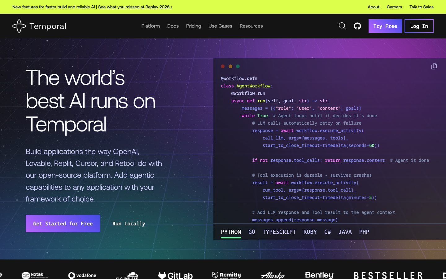
description: A dark-canvas, developer-first interface for durable-execution infrastructure — near-black #141414 floor, near-white Aeonik display headlines set thin (weight 300) with aggressive negative tracking, and a neon accent spectrum (indigo, violet, pink, lime-green, mint) borrowed from terminal/code-editor syntax palettes. The system reads as engineered-and-confident: sharp 0px corners everywhere, a hard offset drop-shadow as the one signature elevation move, real code editors and architecture diagrams shown in-card, and a bright lime promo banner pinned above the nav.
colors:
primary: "#444ce7"
primary-soft: "#7f86f1"
ink: "#f8fafc"
canvas: "#141414"
neutral: "#ffffff"
muted: "#9ca3af"
on-dark-muted: "#92a4c3"
hairline: "#374151"
surface-navy: "#111827"
surface-deep-purple: "#211b4e"
surface-slate: "#d1d5db"
accent-lavender: "#cacbf9"
accent-violet: "#b664ff"
accent-pink: "#ff6bff"
accent-green: "#59fda0"
accent-green-bright: "#1ff1a5"
accent-lime: "#c3ff62"
accent-lime-bright: "#cfff0d"
accent-red: "#ff5555"
shadow-ink: "#000000"
typography:
display:
fontFamily: "Aeonik, Inter, sans-serif"
fontSize: 68px
fontWeight: 300
lineHeight: 1.1
letterSpacing: -2px
body:
fontFamily: "Aeonik, Inter, sans-serif"
fontSize: 14px
fontWeight: 400
lineHeight: 1.429
letterSpacing: 0
button:
fontFamily: "Aeonik, Inter, sans-serif"
fontSize: 16px
fontWeight: 400
lineHeight: 1.5
letterSpacing: 0
rounded:
none: 0px
pill: 9999px
full: 9999px
spacing:
xxs: 4px
xs: 8px
sm: 12px
md: 16px
lg: 24px
xl: 32px
xxl: 48px
section: 64px
section-lg: 96px
components:
top-banner:
backgroundColor: "{colors.accent-lime-bright}"
textColor: "{colors.canvas}"
typography: "{typography.body}"
padding: 16px 24px
top-nav:
backgroundColor: "{colors.canvas}"
textColor: "{colors.ink}"
typography: "{typography.body}"
padding: 24px
button-primary:
backgroundColor: "{colors.primary}"
textColor: "{colors.ink}"
typography: "{typography.button}"
rounded: "{rounded.none}"
button-secondary:
backgroundColor: transparent
textColor: "{colors.ink}"
typography: "{typography.button}"
rounded: "{rounded.none}"
button-text-link:
backgroundColor: transparent
textColor: "{colors.ink}"
typography: "{typography.button}"
nav-link:
backgroundColor: transparent
textColor: "{colors.ink}"
typography: "{typography.body}"
card:
backgroundColor: "{colors.canvas}"
textColor: "{colors.ink}"
rounded: "{rounded.none}"
card-elevated:
backgroundColor: "{colors.neutral}"
textColor: "{colors.canvas}"
rounded: "{rounded.none}"
shadow: 8px 8px 0px 0px {colors.shadow-ink}
feature-card:
backgroundColor: "{colors.canvas}"
textColor: "{colors.ink}"
typography: "{typography.body}"
rounded: "{rounded.none}"
use-case-card:
backgroundColor: "{colors.canvas}"
textColor: "{colors.ink}"
typography: "{typography.body}"
rounded: "{rounded.none}"
padding: 24px
code-block:
backgroundColor: "{colors.surface-deep-purple}"
textColor: "{colors.ink}"
typography: "{typography.body}"
rounded: "{rounded.none}"
diagram-card:
backgroundColor: "{colors.surface-navy}"
textColor: "{colors.accent-green}"
rounded: "{rounded.none}"
promo-band:
backgroundColor: "{colors.accent-violet}"
textColor: "{colors.canvas}"
typography: "{typography.body}"
padding: 48px
input:
backgroundColor: "{colors.neutral}"
textColor: "{colors.canvas}"
typography: "{typography.body}"
rounded: "{rounded.none}"
status-dot:
backgroundColor: "{colors.accent-green}"
textColor: "{colors.canvas}"
rounded: "{rounded.full}"
size: 12px
footer:
backgroundColor: "{colors.canvas}"
textColor: "{colors.muted}"
typography: "{typography.body}"
padding: 64px
---
## Overview
Temporal's marketing surface is a dark, developer-first interface — a near-black canvas (`{colors.canvas}` — #141414) carrying near-white Aeonik display headlines and a neon accent spectrum lifted straight out of a code editor (indigo, violet, pink, mint, lime). It reads as infrastructure-software confident: the product (durable execution) is technical, so the page leans into terminal palettes, in-card code editors, and architecture diagrams rather than soft consumer polish.
The type voice is one family — **Aeonik** — used everywhere. Its signature is the display treatment: 68px at weight **300** (thin/light) with a hard **-2px** letter-spacing. Large, thin, tightly-tracked headlines are the brand's most distinctive move — confident without being heavy. Body text drops to Aeonik 14px / 400, and buttons run Aeonik 16px / 400.
The system is geometrically **sharp** — every measured button, card, and input came back at **0px** radius. The only rounded element is the pill/circle (`{rounded.full}` — 9999px) used for status dots and small indicators. Elevation is similarly distinctive: the one measured shadow is a **hard, un-blurred 8px × 8px black offset** (`8px 8px 0px 0px {colors.shadow-ink}`) — a neo-brutalist "sticker" shadow rather than a soft modern blur.
Brand voltage comes from **product artifacts shown in-card** — a syntax-highlighted code editor (Python / Go / TypeScript / Ruby / C# / Java / PHP tabs) in the hero, and green-wireframe architecture diagrams ("YOUR APPLICATION → Temporal SDK → Temporal Service") in the how-it-works bands. A bright lime promo banner (`{colors.accent-lime-bright}` — #cfff0d) pins above the nav, and a violet promo band (`{colors.accent-violet}`) interrupts the dark scroll.
**Key Characteristics:**
- Dark canvas (`{colors.canvas}` — #141414) with near-white ink (`{colors.ink}` — #f8fafc). The whole page is dark; bright color arrives only via accents and promo bands.
- Aeonik display headlines at weight 300 with -2px tracking — large, thin, precise. The thinness is the signature; never bold the headline.
- Sharp 0px corners on every surface — buttons, cards, inputs, code blocks. No soft radius anywhere except circular status dots.
- A hard offset drop-shadow (`8px 8px 0px 0px` black, no blur) as the single elevation move — neo-brutalist sticker depth.
- A neon syntax-style accent spectrum: indigo `{colors.primary}` (#444ce7), violet `{colors.accent-violet}`, pink `{colors.accent-pink}`, mint `{colors.accent-green}`, lime `{colors.accent-lime}`.
- Real code editors and green-wireframe architecture diagrams embedded in-card — the product is shown, not illustrated.
- A lime promo banner above the nav and a violet promo band mid-scroll punctuate the otherwise monochrome-dark page.
## Colors
### Brand & Accent
- **Primary** (`{colors.primary}` — #444ce7): The indigo action color — primary CTA fills ("Get Started for Free", "Try Free") and the "Log In" outline. derived as the button background from screenshot ground-truth (the measurement captured only the button's text color).
- **Primary Soft** (`{colors.primary-soft}` — #7f86f1): A lighter indigo used for hover-adjacent fills and secondary accent moments.
- **Accent Lavender** (`{colors.accent-lavender}` — #cacbf9): Soft lilac for muted accent text and decorative fills against the dark canvas.
- **Accent Violet** (`{colors.accent-violet}` — #b664ff): The violet promo-band background ("New features for faster build and reliable AI") and gradient illustration accents.
- **Accent Pink** (`{colors.accent-pink}` — #ff6bff): Hot-pink accent in illustrations and code syntax highlights.
- **Accent Green / Green Bright** (`{colors.accent-green}` — #59fda0, `{colors.accent-green-bright}` — #1ff1a5): Mint/terminal green for architecture-diagram wireframes, status dots, inline links, and code syntax.
- **Accent Lime / Lime Bright** (`{colors.accent-lime}` — #c3ff62, `{colors.accent-lime-bright}` — #cfff0d): The bright yellow-green of the top promo banner and active-tab underlines.
- **Accent Red** (`{colors.accent-red}` — #ff5555): Error / "macOS window" dot and warning syntax states.
### Surface
- **Canvas** (`{colors.canvas}` — #141414): The default near-black page floor for every band.
- **Surface Navy** (`{colors.surface-navy}` — #111827): A deeper blue-black used inside diagram cards and dark UI fragments.
- **Surface Deep Purple** (`{colors.surface-deep-purple}` — #211b4e): The hero code-editor backdrop and dark-purple gradient zones.
- **Surface Slate** (`{colors.surface-slate}` — #d1d5db): A light slate used inside light/inverted UI fragments.
- **Neutral** (`{colors.neutral}` — #ffffff): Pure white — input fields and the rare inverted/elevated card.
### Text
- **Ink** (`{colors.ink}` — #f8fafc): All headlines and primary text on the dark canvas — near-white, not pure white.
- **On Dark Muted** (`{colors.on-dark-muted}` — #92a4c3): Cool slate-blue for secondary running text on dark surfaces.
- **Muted** (`{colors.muted}` — #9ca3af): Tertiary text — footer links, captions, fine-print.
- **Hairline** (`{colors.hairline}` — #374151): 1px dividers and card outlines on the dark canvas.
- **Shadow Ink** (`{colors.shadow-ink}` — #000000): Pure black, used only as the hard offset-shadow color and low-contrast text.
## Typography
### Font Family
The system runs a single typeface — **Aeonik** — across display, body, and buttons. Aeonik is a commercial/licensed grotesque from CoType Foundry; it is **not** an open web font and should not be shipped directly. The fallback stack walks `Inter, sans-serif`.
The brand voice is carried entirely by the display treatment rather than by mixing families: large headlines set in **weight 300 (light)** with **-2px** letter-spacing. The thinness + tight tracking is the distinctive move — it reads as engineered and modern.
### Hierarchy
| Token | Size | Weight | Line Height | Letter Spacing | Use |
|---|---|---|---|---|---|
| `{typography.display}` | 68px | 300 | 1.1 | -2px | Hero h1 ("The world's best AI runs on Temporal"), all section headlines (h1/h3 measured identical) — Aeonik Light |
| `{typography.body}` | 14px | 400 | 1.429 | 0 | Default running-text, nav links, captions, footer |
| `{typography.button}` | 16px | 400 | 1.5 | 0 | Button labels |
### Principles
The headline is always thin (weight 300) and always tightly tracked (-2px). Bolding the display type reads as off-brand — the confidence comes from scale and the negative tracking, not from weight. Body stays a compact 14px / 400 — typical of developer-documentation density rather than marketing-spacious copy. Buttons are the only step up in body weight context, at 16px.
### Note on Font Substitutes
Aeonik is licensed and not freely redistributable. Substitute with **Inter** at weight 300 with -0.03em letter-spacing for display headlines — it preserves the thin-and-tight signature, though Inter's humanist forms read warmer than Aeonik's geometric grotesque. **Space Grotesk** (light) is another close alternative for the display role. Use **Inter** 400 for body and buttons.
## Layout
### Spacing System
- **Base unit:** 4px.
- **Tokens:** `{spacing.xxs}` 4px · `{spacing.xs}` 8px · `{spacing.sm}` 12px · `{spacing.md}` 16px · `{spacing.lg}` 24px · `{spacing.xl}` 32px · `{spacing.xxl}` 48px · `{spacing.section}` 64px · `{spacing.section-lg}` 96px.
- **Dominant rhythm:** `{spacing.lg}` (24px) and `{spacing.md}` (16px) are by far the most frequent values (80 and 57 occurrences) — they drive component padding and gutters.
- **Section padding:** `{spacing.section-lg}` (96px) is the major vertical band rhythm; `{spacing.section}` (64px) handles tighter band separation and footer padding.
### Grid & Container
- **Hero:** A two-column split — display headline + sub-copy + button row on the left, in-card code editor on the right.
- **Feature bands:** Single-column copy block paired with an illustration or architecture diagram, alternating left/right alignment down the scroll.
- **Use-case grid:** A multi-column card grid at desktop ("Agents, MCP & AI Pipelines", "Humans-in-the-Loop", "Compensating Patterns", etc.).
- Outer values of 80px, 320px were also measured (single occurrences) — likely a wide hero offset and a large illustration column; treated as one-off layout values rather than tokens.
### Whitespace Philosophy
Bands breathe at 96px, but the copy itself is dense (14px body) — the page balances generous vertical band separation against compact, developer-documentation-style text blocks. Headlines get the air; supporting copy stays tight.
## Elevation & Depth
| Level | Treatment | Use |
|---|---|---|
| Flat | No shadow, no border | Body bands, nav, most cards on the dark canvas |
| Hairline | 1px `{colors.hairline}` (#374151) border | Card outlines, dividers on the dark canvas |
| Hard offset | `8px 8px 0px 0px {colors.shadow-ink}` — un-blurred black offset | The signature "sticker" elevation on `{component.card-elevated}` and select promo/feature artifacts |
The elevation philosophy is **neo-brutalist** — the one measured shadow is a hard black offset with **zero blur**, casting a crisp solid shape down-and-right. There are no soft modern blur shadows in the measured set. Depth comes from this hard offset plus the contrast between the dark canvas and bright accent / white surfaces.
### Decorative Depth
- The hero code editor carries its own faux-macOS window chrome (red/amber/green dots) and syntax coloring — product chrome shown as content, not a system token.
- Architecture diagrams render as green wireframe boxes (`{colors.accent-green}`) on dark surfaces — flat line-art depth, not shadowed.
- Gradient illustration zones (violet → pink → mint) add chromatic depth in feature bands without using shadow tokens.
## Shapes
### Border Radius Scale
| Token | Value | Use |
|---|---|---|
| `{rounded.none}` | 0px | Everything structural — buttons, cards, inputs, code blocks, diagram cards. The system is sharp-cornered by default. |
| `{rounded.pill}` | 9999px | Pill-shaped indicators (where used) |
| `{rounded.full}` | 9999px | Status dots, circular indicators, the macOS window dots |
### Photography Geometry
The system uses very little photography — the Replay 2026 promo band carries rounded-rectangle speaker thumbnails (their native chrome), but the dominant visual content is sharp-cornered code editors, wireframe architecture diagrams, and gradient vector illustrations. Sharp 0px corners are the rule; circles appear only as small status/indicator dots.
## Components
### Top Banner & Navigation
**`top-banner`** — A bright lime promo strip (`{colors.accent-lime-bright}` — #cfff0d) pinned above the nav, dark text (`{colors.canvas}`), carrying a single announcement + inline link ("New features for faster build and reliable AI | See what you missed at Replay 2026 ›"). The lime-on-near-black is the highest-voltage moment on the page.
**`top-nav`** — Dark nav bar on `{colors.canvas}`. Carries the Temporal wordmark + glyph at left, primary menu (Platform, Docs, Pricing, Use Cases, Resources) center, and a right cluster: search icon, GitHub icon, a `{component.button-primary}` ("Try Free"), and a `{component.button-secondary}` outline ("Log In"). Menu items in `{typography.body}`.
**`nav-link`** — Transparent menu item, `{colors.ink}` text, `{typography.body}`.
### Buttons
**`button-primary`** — The signature CTA ("Get Started for Free", "Try Free"). Background `{colors.primary}` (#444ce7, derived from screenshot), text `{colors.ink}`, type `{typography.button}` (Aeonik 16px / 400), rounded `{rounded.none}` (sharp corners). The measured padding came back 0px (see Known Gaps); visually the label sits in a comfortably-padded block.
**`button-secondary`** — Outlined button ("Log In", "Run Locally", "Read Announcement"). Transparent background, `{colors.ink}` text, indigo/ink 1px border, sharp `{rounded.none}` corners, `{typography.button}`.
**`button-text-link`** — Inline text action with no background, `{colors.ink}` text, `{typography.button}`.
### Cards & Containers
**`card`** — Base content card on the dark canvas. Background `{colors.canvas}`, `{colors.ink}` text, sharp `{rounded.none}` corners, no shadow. Often outlined with a 1px `{colors.hairline}` border.
**`card-elevated`** — The neo-brutalist elevated card. Background `{colors.neutral}` (white), dark text, sharp corners, and the hard offset shadow `8px 8px 0px 0px {colors.shadow-ink}`. The solid un-blurred shadow is the system's depth signature.
**`feature-card`** — Used in the "Write code as if failure doesn't exist" / "Create failproof apps" bands. Background `{colors.canvas}`, `{colors.ink}` headline + `{colors.on-dark-muted}` body, paired with a gradient illustration. Sharp corners.
**`use-case-card`** — Cards in the "Common patterns and use cases" grid (Agents/MCP, Humans-in-the-Loop, Compensating Patterns, Long-running Workflows, Order Fulfillment, Durable Ledgers). Background `{colors.canvas}`, hairline outline, sharp `{rounded.none}` corners, internal padding `{spacing.lg}` (24px), small accent icon + title + `{typography.body}` description.
**`code-block`** — The hero code editor and inline code samples. Background `{colors.surface-deep-purple}` (#211b4e), light text `{colors.ink}`, sharp corners, language tab row (PYTHON / GO / TYPESCRIPT / RUBY / C# / JAVA / PHP) with a lime active-tab underline. Syntax tokens use the accent spectrum (pink keywords, mint strings, lavender identifiers). Monospace font is product chrome — not a measured system token (see Known Gaps).
**`diagram-card`** — Green-wireframe architecture diagrams ("YOUR APPLICATION → Temporal SDK → Temporal Service"). Background `{colors.surface-navy}`, line-art in `{colors.accent-green}`, sharp corners. Shows the product topology directly.
**`promo-band`** — The mid-scroll violet interruption band (Replay 2026 announcement). Background `{colors.accent-violet}` (#b664ff), dark text `{colors.canvas}`, padding `{spacing.xxl}` (48px), carrying a headline, body copy, speaker thumbnails, and a `{component.button-secondary}`.
### Inputs
**`input`** — Standard text input. Background `{colors.neutral}` (white), dark text `{colors.canvas}`, sharp `{rounded.none}` corners, `{typography.body}`. The white field stands out sharply against the dark canvas.
### Indicators
**`status-dot`** — Small 12px circle, `{rounded.full}`, filled with `{colors.accent-green}` (or red/amber in the code-editor window chrome). The only consistently-circular element in the system.
### Footer
**`footer`** — Dark footer continuing `{colors.canvas}`, muted text `{colors.muted}`, `{typography.body}`, vertical padding `{spacing.section}` (64px). Carries the logo, navigation columns, and customer logo strip (Kotak, Vodafone, Cloudflare, GitLab, Remitly, Alaska, Bentley, Bestseller).
## Do's and Don'ts
### Do
- Keep the canvas dark (`{colors.canvas}` — #141414) and reserve bright color for accents, promo bands, and in-card product UI.
- Set display headlines in Aeonik weight 300 with -2px tracking. The thinness is the brand — let scale carry emphasis.
- Use sharp `{rounded.none}` (0px) corners on every structural surface. The geometry is deliberately hard-edged.
- Use the hard offset shadow (`8px 8px 0px 0px {colors.shadow-ink}`) sparingly as the signature elevation — solid, un-blurred, down-and-right.
- Show the real product in-card: syntax-highlighted code editors and green-wireframe architecture diagrams, not abstract illustrations.
- Use the lime banner (`{component.top-banner}`) and violet band (`{component.promo-band}`) as deliberate, scarce high-voltage interruptions in the dark scroll.
- Pull syntax accents from the measured neon spectrum (indigo, violet, pink, mint, lime) — they read as terminal/editor-native.
### Don't
- Don't bold the display headline. Aeonik at 300 is the voice; heavier weights read off-brand.
- Don't soften corners. No card, button, or input should pick up a rounded radius — circles are reserved for status dots.
- Don't add soft blurred drop-shadows; the only measured shadow is the hard 8px offset.
- Don't ship Aeonik directly — substitute Inter Light (see Typography). Aeonik is licensed.
- Don't over-light the page. The dark canvas is constant; white surfaces (`{component.input}`, `{component.card-elevated}`) are scarce by design.
- Don't document hover states — default and active/pressed only.
## Responsive Behavior
### Breakpoints
| Name | Width | Key Changes |
|---|---|---|
| Mobile | < 768px | Hamburger nav; hero collapses to single column (headline + copy + buttons, code editor below); display headline scales down from 68px; use-case grid 1-up |
| Tablet | 768–1024px | Nav tightens; hero may stay split or stack; use-case grid 2-up |
| Desktop | 1024–1440px | Full horizontal nav; hero two-column split with in-card code editor; multi-column use-case grid |
| Wide | > 1440px | Same as desktop with additional outer breathing room |
### Touch Targets
- `{component.button-primary}` and `{component.button-secondary}` render as comfortably-padded blocks; measured padding (0px) is unreliable (see Known Gaps), so use a minimum 44px tap height in implementation.
- `{component.nav-link}` items sit in the nav row; ensure 44px+ effective tap area on mobile.
- Code-editor language tabs need horizontal scroll or wrap on narrow viewports.
### Collapsing Strategy
- Top nav collapses to a hamburger sheet below the tablet breakpoint.
- Hero's two-column split stacks to single column — headline + copy first, code editor below.
- Feature bands (copy + illustration/diagram) stack vertically; diagrams scale to fit width.
- Use-case card grid reduces columns rather than shrinking cards.
- The lime `{component.top-banner}` truncates or wraps its inline link on narrow widths.
### Image Behavior
- Code editors and architecture diagrams retain native aspect ratios; their containing cards resize.
- Gradient illustrations scale proportionally.
- Speaker thumbnails in the promo band crop to fixed ratios.
## Iteration Guide
1. Focus on ONE component at a time. Reference its YAML key directly (`{component.code-block}`, `{component.card-elevated}`).
2. Variants of an existing component (`-active`, `-disabled`, `-focused`) live as separate entries in `components:`.
3. Use `{token.refs}` everywhere — never inline a hex.
4. Never document hover. Default and Active/Pressed states only.
5. Display headlines stay Aeonik 300 with -2px tracking. Don't blur the thin-and-tight signature.
6. Corners stay sharp (`{rounded.none}`); the hard offset shadow stays the only elevation move.
7. When in doubt about emphasis: bigger thin headline before a heavier one; brighter accent before more accents.
## Known Gaps
- **`button-primary` background and padding were not cleanly measured** — the component capture returned only the text color (#f8fafc), radius (0px), and padding (0px). The indigo fill (`{colors.primary}` — #444ce7) is derived from screenshot ground-truth, and the 0px padding is implausible for the visibly-padded button; real padding values were not extracted.
- **Only three type roles were measured** (display 68px, body 14px, button 16px). Intermediate heading sizes (h2, sub-heads, eyebrow labels visible in screenshots like "HOW IT WORKS") were not captured and are not tokenized.
- **Aeonik is a licensed typeface**; `fonts_licensed` came back empty in the analysis, but Aeonik is a commercial CoType Foundry face and must be substituted (see Typography). It is documented here despite the empty flag.
- **The code-editor monospace font is not measured** — syntax-highlighted code clearly uses a monospaced face, but no monospace family/size was captured. Treated as product chrome.
- **Only one radius value (9999px) and one shadow value were measured**; all structural radii read as 0px from components. Any additional radii or layered shadows in nested product UI are out of scope.
- **Accent-color roles are inferred** from frequency data and screenshots; the neon spectrum (violet, pink, mint, lime variants) maps to syntax-highlight and illustration usage that may shift between pages.
- **Animation, transition, and the code-editor tab-switching timings** are not in scope.
- **Form/input states beyond the base white field** (focus, error, success) were not extracted — the pricing/sign-up flow would be needed to confirm them.
<!-- Documented by duply · real-world design systems as ready-to-use DESIGN.md for AI coding agents · https://duply.ai/temporal/design-md -->
Color Palette
Accent
Neutrals
Typography
display68px · 300 · 1.1
The quick brown fox jumpsbody14px · 400 · 1.429
The quick brown fox jumpsbutton16px · 400 · 1.5
The quick brown fox jumpsSpacing & Shape
Spacing
| Name | Value | Preview |
|---|---|---|
| xxs | 4px | |
| xs | 8px | |
| sm | 12px | |
| md | 16px | |
| lg | 24px | |
| xl | 32px | |
| xxl | 48px | |
| section | 64px | |
| section-lg | 96px |
Border Radius
| Name | Value | Preview |
|---|---|---|
| none | 0px | |
| pill | 9999px | |
| full | 9999px |
More like this


---
version: alpha
name: Temporal-design-analysis
description: A dark-canvas, developer-first interface for durable-execution infrastructure — near-black #141414 floor, near-white Aeonik display headlines set thin (weight 300) with aggressive negative tracking, and a neon accent spectrum (indigo, violet, pink, lime-green, mint) borrowed from terminal/code-editor syntax palettes. The system reads as engineered-and-confident: sharp 0px corners everywhere, a hard offset drop-shadow as the one signature elevation move, real code editors and architecture diagrams shown in-card, and a bright lime promo banner pinned above the nav.

colors:
  primary: "#444ce7"
  primary-soft: "#7f86f1"
  ink: "#f8fafc"
  canvas: "#141414"
  neutral: "#ffffff"
  muted: "#9ca3af"
  on-dark-muted: "#92a4c3"
  hairline: "#374151"
  surface-navy: "#111827"
  surface-deep-purple: "#211b4e"
  surface-slate: "#d1d5db"
  accent-lavender: "#cacbf9"
  accent-violet: "#b664ff"
  accent-pink: "#ff6bff"
  accent-green: "#59fda0"
  accent-green-bright: "#1ff1a5"
  accent-lime: "#c3ff62"
  accent-lime-bright: "#cfff0d"
  accent-red: "#ff5555"
  shadow-ink: "#000000"

typography:
  display:
    fontFamily: "Aeonik, Inter, sans-serif"
    fontSize: 68px
    fontWeight: 300
    lineHeight: 1.1
    letterSpacing: -2px
  body:
    fontFamily: "Aeonik, Inter, sans-serif"
    fontSize: 14px
    fontWeight: 400
    lineHeight: 1.429
    letterSpacing: 0
  button:
    fontFamily: "Aeonik, Inter, sans-serif"
    fontSize: 16px
    fontWeight: 400
    lineHeight: 1.5
    letterSpacing: 0

rounded:
  none: 0px
  pill: 9999px
  full: 9999px

spacing:
  xxs: 4px
  xs: 8px
  sm: 12px
  md: 16px
  lg: 24px
  xl: 32px
  xxl: 48px
  section: 64px
  section-lg: 96px

components:
  top-banner:
    backgroundColor: "{colors.accent-lime-bright}"
    textColor: "{colors.canvas}"
    typography: "{typography.body}"
    padding: 16px 24px
  top-nav:
    backgroundColor: "{colors.canvas}"
    textColor: "{colors.ink}"
    typography: "{typography.body}"
    padding: 24px
  button-primary:
    backgroundColor: "{colors.primary}"
    textColor: "{colors.ink}"
    typography: "{typography.button}"
    rounded: "{rounded.none}"
  button-secondary:
    backgroundColor: transparent
    textColor: "{colors.ink}"
    typography: "{typography.button}"
    rounded: "{rounded.none}"
  button-text-link:
    backgroundColor: transparent
    textColor: "{colors.ink}"
    typography: "{typography.button}"
  nav-link:
    backgroundColor: transparent
    textColor: "{colors.ink}"
    typography: "{typography.body}"
  card:
    backgroundColor: "{colors.canvas}"
    textColor: "{colors.ink}"
    rounded: "{rounded.none}"
  card-elevated:
    backgroundColor: "{colors.neutral}"
    textColor: "{colors.canvas}"
    rounded: "{rounded.none}"
    shadow: 8px 8px 0px 0px {colors.shadow-ink}
  feature-card:
    backgroundColor: "{colors.canvas}"
    textColor: "{colors.ink}"
    typography: "{typography.body}"
    rounded: "{rounded.none}"
  use-case-card:
    backgroundColor: "{colors.canvas}"
    textColor: "{colors.ink}"
    typography: "{typography.body}"
    rounded: "{rounded.none}"
    padding: 24px
  code-block:
    backgroundColor: "{colors.surface-deep-purple}"
    textColor: "{colors.ink}"
    typography: "{typography.body}"
    rounded: "{rounded.none}"
  diagram-card:
    backgroundColor: "{colors.surface-navy}"
    textColor: "{colors.accent-green}"
    rounded: "{rounded.none}"
  promo-band:
    backgroundColor: "{colors.accent-violet}"
    textColor: "{colors.canvas}"
    typography: "{typography.body}"
    padding: 48px
  input:
    backgroundColor: "{colors.neutral}"
    textColor: "{colors.canvas}"
    typography: "{typography.body}"
    rounded: "{rounded.none}"
  status-dot:
    backgroundColor: "{colors.accent-green}"
    textColor: "{colors.canvas}"
    rounded: "{rounded.full}"
    size: 12px
  footer:
    backgroundColor: "{colors.canvas}"
    textColor: "{colors.muted}"
    typography: "{typography.body}"
    padding: 64px
---

## Overview

Temporal's marketing surface is a dark, developer-first interface — a near-black canvas (`{colors.canvas}` — #141414) carrying near-white Aeonik display headlines and a neon accent spectrum lifted straight out of a code editor (indigo, violet, pink, mint, lime). It reads as infrastructure-software confident: the product (durable execution) is technical, so the page leans into terminal palettes, in-card code editors, and architecture diagrams rather than soft consumer polish.

The type voice is one family — **Aeonik** — used everywhere. Its signature is the display treatment: 68px at weight **300** (thin/light) with a hard **-2px** letter-spacing. Large, thin, tightly-tracked headlines are the brand's most distinctive move — confident without being heavy. Body text drops to Aeonik 14px / 400, and buttons run Aeonik 16px / 400.

The system is geometrically **sharp** — every measured button, card, and input came back at **0px** radius. The only rounded element is the pill/circle (`{rounded.full}` — 9999px) used for status dots and small indicators. Elevation is similarly distinctive: the one measured shadow is a **hard, un-blurred 8px × 8px black offset** (`8px 8px 0px 0px {colors.shadow-ink}`) — a neo-brutalist "sticker" shadow rather than a soft modern blur.

Brand voltage comes from **product artifacts shown in-card** — a syntax-highlighted code editor (Python / Go / TypeScript / Ruby / C# / Java / PHP tabs) in the hero, and green-wireframe architecture diagrams ("YOUR APPLICATION → Temporal SDK → Temporal Service") in the how-it-works bands. A bright lime promo banner (`{colors.accent-lime-bright}` — #cfff0d) pins above the nav, and a violet promo band (`{colors.accent-violet}`) interrupts the dark scroll.

**Key Characteristics:**
- Dark canvas (`{colors.canvas}` — #141414) with near-white ink (`{colors.ink}` — #f8fafc). The whole page is dark; bright color arrives only via accents and promo bands.
- Aeonik display headlines at weight 300 with -2px tracking — large, thin, precise. The thinness is the signature; never bold the headline.
- Sharp 0px corners on every surface — buttons, cards, inputs, code blocks. No soft radius anywhere except circular status dots.
- A hard offset drop-shadow (`8px 8px 0px 0px` black, no blur) as the single elevation move — neo-brutalist sticker depth.
- A neon syntax-style accent spectrum: indigo `{colors.primary}` (#444ce7), violet `{colors.accent-violet}`, pink `{colors.accent-pink}`, mint `{colors.accent-green}`, lime `{colors.accent-lime}`.
- Real code editors and green-wireframe architecture diagrams embedded in-card — the product is shown, not illustrated.
- A lime promo banner above the nav and a violet promo band mid-scroll punctuate the otherwise monochrome-dark page.

## Colors

### Brand & Accent
- **Primary** (`{colors.primary}` — #444ce7): The indigo action color — primary CTA fills ("Get Started for Free", "Try Free") and the "Log In" outline. derived as the button background from screenshot ground-truth (the measurement captured only the button's text color).
- **Primary Soft** (`{colors.primary-soft}` — #7f86f1): A lighter indigo used for hover-adjacent fills and secondary accent moments.
- **Accent Lavender** (`{colors.accent-lavender}` — #cacbf9): Soft lilac for muted accent text and decorative fills against the dark canvas.
- **Accent Violet** (`{colors.accent-violet}` — #b664ff): The violet promo-band background ("New features for faster build and reliable AI") and gradient illustration accents.
- **Accent Pink** (`{colors.accent-pink}` — #ff6bff): Hot-pink accent in illustrations and code syntax highlights.
- **Accent Green / Green Bright** (`{colors.accent-green}` — #59fda0, `{colors.accent-green-bright}` — #1ff1a5): Mint/terminal green for architecture-diagram wireframes, status dots, inline links, and code syntax.
- **Accent Lime / Lime Bright** (`{colors.accent-lime}` — #c3ff62, `{colors.accent-lime-bright}` — #cfff0d): The bright yellow-green of the top promo banner and active-tab underlines.
- **Accent Red** (`{colors.accent-red}` — #ff5555): Error / "macOS window" dot and warning syntax states.

### Surface
- **Canvas** (`{colors.canvas}` — #141414): The default near-black page floor for every band.
- **Surface Navy** (`{colors.surface-navy}` — #111827): A deeper blue-black used inside diagram cards and dark UI fragments.
- **Surface Deep Purple** (`{colors.surface-deep-purple}` — #211b4e): The hero code-editor backdrop and dark-purple gradient zones.
- **Surface Slate** (`{colors.surface-slate}` — #d1d5db): A light slate used inside light/inverted UI fragments.
- **Neutral** (`{colors.neutral}` — #ffffff): Pure white — input fields and the rare inverted/elevated card.

### Text
- **Ink** (`{colors.ink}` — #f8fafc): All headlines and primary text on the dark canvas — near-white, not pure white.
- **On Dark Muted** (`{colors.on-dark-muted}` — #92a4c3): Cool slate-blue for secondary running text on dark surfaces.
- **Muted** (`{colors.muted}` — #9ca3af): Tertiary text — footer links, captions, fine-print.
- **Hairline** (`{colors.hairline}` — #374151): 1px dividers and card outlines on the dark canvas.
- **Shadow Ink** (`{colors.shadow-ink}` — #000000): Pure black, used only as the hard offset-shadow color and low-contrast text.

## Typography

### Font Family
The system runs a single typeface — **Aeonik** — across display, body, and buttons. Aeonik is a commercial/licensed grotesque from CoType Foundry; it is **not** an open web font and should not be shipped directly. The fallback stack walks `Inter, sans-serif`.

The brand voice is carried entirely by the display treatment rather than by mixing families: large headlines set in **weight 300 (light)** with **-2px** letter-spacing. The thinness + tight tracking is the distinctive move — it reads as engineered and modern.

### Hierarchy

| Token | Size | Weight | Line Height | Letter Spacing | Use |
|---|---|---|---|---|---|
| `{typography.display}` | 68px | 300 | 1.1 | -2px | Hero h1 ("The world's best AI runs on Temporal"), all section headlines (h1/h3 measured identical) — Aeonik Light |
| `{typography.body}` | 14px | 400 | 1.429 | 0 | Default running-text, nav links, captions, footer |
| `{typography.button}` | 16px | 400 | 1.5 | 0 | Button labels |

### Principles
The headline is always thin (weight 300) and always tightly tracked (-2px). Bolding the display type reads as off-brand — the confidence comes from scale and the negative tracking, not from weight. Body stays a compact 14px / 400 — typical of developer-documentation density rather than marketing-spacious copy. Buttons are the only step up in body weight context, at 16px.

### Note on Font Substitutes
Aeonik is licensed and not freely redistributable. Substitute with **Inter** at weight 300 with -0.03em letter-spacing for display headlines — it preserves the thin-and-tight signature, though Inter's humanist forms read warmer than Aeonik's geometric grotesque. **Space Grotesk** (light) is another close alternative for the display role. Use **Inter** 400 for body and buttons.

## Layout

### Spacing System
- **Base unit:** 4px.
- **Tokens:** `{spacing.xxs}` 4px · `{spacing.xs}` 8px · `{spacing.sm}` 12px · `{spacing.md}` 16px · `{spacing.lg}` 24px · `{spacing.xl}` 32px · `{spacing.xxl}` 48px · `{spacing.section}` 64px · `{spacing.section-lg}` 96px.
- **Dominant rhythm:** `{spacing.lg}` (24px) and `{spacing.md}` (16px) are by far the most frequent values (80 and 57 occurrences) — they drive component padding and gutters.
- **Section padding:** `{spacing.section-lg}` (96px) is the major vertical band rhythm; `{spacing.section}` (64px) handles tighter band separation and footer padding.

### Grid & Container
- **Hero:** A two-column split — display headline + sub-copy + button row on the left, in-card code editor on the right.
- **Feature bands:** Single-column copy block paired with an illustration or architecture diagram, alternating left/right alignment down the scroll.
- **Use-case grid:** A multi-column card grid at desktop ("Agents, MCP & AI Pipelines", "Humans-in-the-Loop", "Compensating Patterns", etc.).
- Outer values of 80px, 320px were also measured (single occurrences) — likely a wide hero offset and a large illustration column; treated as one-off layout values rather than tokens.

### Whitespace Philosophy
Bands breathe at 96px, but the copy itself is dense (14px body) — the page balances generous vertical band separation against compact, developer-documentation-style text blocks. Headlines get the air; supporting copy stays tight.

## Elevation & Depth

| Level | Treatment | Use |
|---|---|---|
| Flat | No shadow, no border | Body bands, nav, most cards on the dark canvas |
| Hairline | 1px `{colors.hairline}` (#374151) border | Card outlines, dividers on the dark canvas |
| Hard offset | `8px 8px 0px 0px {colors.shadow-ink}` — un-blurred black offset | The signature "sticker" elevation on `{component.card-elevated}` and select promo/feature artifacts |

The elevation philosophy is **neo-brutalist** — the one measured shadow is a hard black offset with **zero blur**, casting a crisp solid shape down-and-right. There are no soft modern blur shadows in the measured set. Depth comes from this hard offset plus the contrast between the dark canvas and bright accent / white surfaces.

### Decorative Depth
- The hero code editor carries its own faux-macOS window chrome (red/amber/green dots) and syntax coloring — product chrome shown as content, not a system token.
- Architecture diagrams render as green wireframe boxes (`{colors.accent-green}`) on dark surfaces — flat line-art depth, not shadowed.
- Gradient illustration zones (violet → pink → mint) add chromatic depth in feature bands without using shadow tokens.

## Shapes

### Border Radius Scale

| Token | Value | Use |
|---|---|---|
| `{rounded.none}` | 0px | Everything structural — buttons, cards, inputs, code blocks, diagram cards. The system is sharp-cornered by default. |
| `{rounded.pill}` | 9999px | Pill-shaped indicators (where used) |
| `{rounded.full}` | 9999px | Status dots, circular indicators, the macOS window dots |

### Photography Geometry
The system uses very little photography — the Replay 2026 promo band carries rounded-rectangle speaker thumbnails (their native chrome), but the dominant visual content is sharp-cornered code editors, wireframe architecture diagrams, and gradient vector illustrations. Sharp 0px corners are the rule; circles appear only as small status/indicator dots.

## Components

### Top Banner & Navigation

**`top-banner`** — A bright lime promo strip (`{colors.accent-lime-bright}` — #cfff0d) pinned above the nav, dark text (`{colors.canvas}`), carrying a single announcement + inline link ("New features for faster build and reliable AI | See what you missed at Replay 2026 ›"). The lime-on-near-black is the highest-voltage moment on the page.

**`top-nav`** — Dark nav bar on `{colors.canvas}`. Carries the Temporal wordmark + glyph at left, primary menu (Platform, Docs, Pricing, Use Cases, Resources) center, and a right cluster: search icon, GitHub icon, a `{component.button-primary}` ("Try Free"), and a `{component.button-secondary}` outline ("Log In"). Menu items in `{typography.body}`.

**`nav-link`** — Transparent menu item, `{colors.ink}` text, `{typography.body}`.

### Buttons

**`button-primary`** — The signature CTA ("Get Started for Free", "Try Free"). Background `{colors.primary}` (#444ce7, derived from screenshot), text `{colors.ink}`, type `{typography.button}` (Aeonik 16px / 400), rounded `{rounded.none}` (sharp corners). The measured padding came back 0px (see Known Gaps); visually the label sits in a comfortably-padded block.

**`button-secondary`** — Outlined button ("Log In", "Run Locally", "Read Announcement"). Transparent background, `{colors.ink}` text, indigo/ink 1px border, sharp `{rounded.none}` corners, `{typography.button}`.

**`button-text-link`** — Inline text action with no background, `{colors.ink}` text, `{typography.button}`.

### Cards & Containers

**`card`** — Base content card on the dark canvas. Background `{colors.canvas}`, `{colors.ink}` text, sharp `{rounded.none}` corners, no shadow. Often outlined with a 1px `{colors.hairline}` border.

**`card-elevated`** — The neo-brutalist elevated card. Background `{colors.neutral}` (white), dark text, sharp corners, and the hard offset shadow `8px 8px 0px 0px {colors.shadow-ink}`. The solid un-blurred shadow is the system's depth signature.

**`feature-card`** — Used in the "Write code as if failure doesn't exist" / "Create failproof apps" bands. Background `{colors.canvas}`, `{colors.ink}` headline + `{colors.on-dark-muted}` body, paired with a gradient illustration. Sharp corners.

**`use-case-card`** — Cards in the "Common patterns and use cases" grid (Agents/MCP, Humans-in-the-Loop, Compensating Patterns, Long-running Workflows, Order Fulfillment, Durable Ledgers). Background `{colors.canvas}`, hairline outline, sharp `{rounded.none}` corners, internal padding `{spacing.lg}` (24px), small accent icon + title + `{typography.body}` description.

**`code-block`** — The hero code editor and inline code samples. Background `{colors.surface-deep-purple}` (#211b4e), light text `{colors.ink}`, sharp corners, language tab row (PYTHON / GO / TYPESCRIPT / RUBY / C# / JAVA / PHP) with a lime active-tab underline. Syntax tokens use the accent spectrum (pink keywords, mint strings, lavender identifiers). Monospace font is product chrome — not a measured system token (see Known Gaps).

**`diagram-card`** — Green-wireframe architecture diagrams ("YOUR APPLICATION → Temporal SDK → Temporal Service"). Background `{colors.surface-navy}`, line-art in `{colors.accent-green}`, sharp corners. Shows the product topology directly.

**`promo-band`** — The mid-scroll violet interruption band (Replay 2026 announcement). Background `{colors.accent-violet}` (#b664ff), dark text `{colors.canvas}`, padding `{spacing.xxl}` (48px), carrying a headline, body copy, speaker thumbnails, and a `{component.button-secondary}`.

### Inputs

**`input`** — Standard text input. Background `{colors.neutral}` (white), dark text `{colors.canvas}`, sharp `{rounded.none}` corners, `{typography.body}`. The white field stands out sharply against the dark canvas.

### Indicators

**`status-dot`** — Small 12px circle, `{rounded.full}`, filled with `{colors.accent-green}` (or red/amber in the code-editor window chrome). The only consistently-circular element in the system.

### Footer

**`footer`** — Dark footer continuing `{colors.canvas}`, muted text `{colors.muted}`, `{typography.body}`, vertical padding `{spacing.section}` (64px). Carries the logo, navigation columns, and customer logo strip (Kotak, Vodafone, Cloudflare, GitLab, Remitly, Alaska, Bentley, Bestseller).

## Do's and Don'ts

### Do
- Keep the canvas dark (`{colors.canvas}` — #141414) and reserve bright color for accents, promo bands, and in-card product UI.
- Set display headlines in Aeonik weight 300 with -2px tracking. The thinness is the brand — let scale carry emphasis.
- Use sharp `{rounded.none}` (0px) corners on every structural surface. The geometry is deliberately hard-edged.
- Use the hard offset shadow (`8px 8px 0px 0px {colors.shadow-ink}`) sparingly as the signature elevation — solid, un-blurred, down-and-right.
- Show the real product in-card: syntax-highlighted code editors and green-wireframe architecture diagrams, not abstract illustrations.
- Use the lime banner (`{component.top-banner}`) and violet band (`{component.promo-band}`) as deliberate, scarce high-voltage interruptions in the dark scroll.
- Pull syntax accents from the measured neon spectrum (indigo, violet, pink, mint, lime) — they read as terminal/editor-native.

### Don't
- Don't bold the display headline. Aeonik at 300 is the voice; heavier weights read off-brand.
- Don't soften corners. No card, button, or input should pick up a rounded radius — circles are reserved for status dots.
- Don't add soft blurred drop-shadows; the only measured shadow is the hard 8px offset.
- Don't ship Aeonik directly — substitute Inter Light (see Typography). Aeonik is licensed.
- Don't over-light the page. The dark canvas is constant; white surfaces (`{component.input}`, `{component.card-elevated}`) are scarce by design.
- Don't document hover states — default and active/pressed only.

## Responsive Behavior

### Breakpoints

| Name | Width | Key Changes |
|---|---|---|
| Mobile | < 768px | Hamburger nav; hero collapses to single column (headline + copy + buttons, code editor below); display headline scales down from 68px; use-case grid 1-up |
| Tablet | 768–1024px | Nav tightens; hero may stay split or stack; use-case grid 2-up |
| Desktop | 1024–1440px | Full horizontal nav; hero two-column split with in-card code editor; multi-column use-case grid |
| Wide | > 1440px | Same as desktop with additional outer breathing room |

### Touch Targets
- `{component.button-primary}` and `{component.button-secondary}` render as comfortably-padded blocks; measured padding (0px) is unreliable (see Known Gaps), so use a minimum 44px tap height in implementation.
- `{component.nav-link}` items sit in the nav row; ensure 44px+ effective tap area on mobile.
- Code-editor language tabs need horizontal scroll or wrap on narrow viewports.

### Collapsing Strategy
- Top nav collapses to a hamburger sheet below the tablet breakpoint.
- Hero's two-column split stacks to single column — headline + copy first, code editor below.
- Feature bands (copy + illustration/diagram) stack vertically; diagrams scale to fit width.
- Use-case card grid reduces columns rather than shrinking cards.
- The lime `{component.top-banner}` truncates or wraps its inline link on narrow widths.

### Image Behavior
- Code editors and architecture diagrams retain native aspect ratios; their containing cards resize.
- Gradient illustrations scale proportionally.
- Speaker thumbnails in the promo band crop to fixed ratios.

## Iteration Guide

1. Focus on ONE component at a time. Reference its YAML key directly (`{component.code-block}`, `{component.card-elevated}`).
2. Variants of an existing component (`-active`, `-disabled`, `-focused`) live as separate entries in `components:`.
3. Use `{token.refs}` everywhere — never inline a hex.
4. Never document hover. Default and Active/Pressed states only.
5. Display headlines stay Aeonik 300 with -2px tracking. Don't blur the thin-and-tight signature.
6. Corners stay sharp (`{rounded.none}`); the hard offset shadow stays the only elevation move.
7. When in doubt about emphasis: bigger thin headline before a heavier one; brighter accent before more accents.

## Known Gaps

- **`button-primary` background and padding were not cleanly measured** — the component capture returned only the text color (#f8fafc), radius (0px), and padding (0px). The indigo fill (`{colors.primary}` — #444ce7) is derived from screenshot ground-truth, and the 0px padding is implausible for the visibly-padded button; real padding values were not extracted.
- **Only three type roles were measured** (display 68px, body 14px, button 16px). Intermediate heading sizes (h2, sub-heads, eyebrow labels visible in screenshots like "HOW IT WORKS") were not captured and are not tokenized.
- **Aeonik is a licensed typeface**; `fonts_licensed` came back empty in the analysis, but Aeonik is a commercial CoType Foundry face and must be substituted (see Typography). It is documented here despite the empty flag.
- **The code-editor monospace font is not measured** — syntax-highlighted code clearly uses a monospaced face, but no monospace family/size was captured. Treated as product chrome.
- **Only one radius value (9999px) and one shadow value were measured**; all structural radii read as 0px from components. Any additional radii or layered shadows in nested product UI are out of scope.
- **Accent-color roles are inferred** from frequency data and screenshots; the neon spectrum (violet, pink, mint, lime variants) maps to syntax-highlight and illustration usage that may shift between pages.
- **Animation, transition, and the code-editor tab-switching timings** are not in scope.
- **Form/input states beyond the base white field** (focus, error, success) were not extracted — the pricing/sign-up flow would be needed to confirm them.

<!-- Documented by duply · real-world design systems as ready-to-use DESIGN.md for AI coding agents · https://duply.ai/temporal/design-md -->