Northflank
A deep-space dark developer-platform interface built on a near-black blue-tinted canvas (#03060e) with a single bright-green primary accent (#2dd881) and a distinctive monospace body voice (JetBrains Mono). The system reads as a serious, engineering-first deployment product — real product UI panels (deployment dashboards, log streams, pipeline diagrams) shown directly inside bordered cards, monospace eyebrow labels, hairline borders, and a multi-hued cyan/blue/green glow used sparingly for depth. Brand voltage comes from the green CTA, the mono type, and the live product chrome rather than from decorative color.
---
version: alpha
name: Northflank-design-analysis
description: A deep-space dark developer-platform interface built on a near-black blue-tinted canvas (#03060e) with a single bright-green primary accent (#2dd881) and a distinctive monospace body voice (JetBrains Mono). The system reads as a serious, engineering-first deployment product — real product UI panels (deployment dashboards, log streams, pipeline diagrams) shown directly inside bordered cards, monospace eyebrow labels, hairline borders, and a multi-hued cyan/blue/green glow used sparingly for depth. Brand voltage comes from the green CTA, the mono type, and the live product chrome rather than from decorative color.
colors:
primary: "#2dd881"
primary-alt: "#01c987"
primary-soft: "#00c896"
accent-cyan: "#01b2e1"
accent-blue: "#425aa3"
accent-blue-bright: "#1b75d0"
link: "#0000ee"
ink: "#ffffff"
on-primary: "#9aa4b2"
body: "#cdd5df"
muted: "#697586"
border: "#364152"
border-soft: "#4b5565"
canvas: "#03060e"
canvas-black: "#000000"
surface: "#070915"
surface-deep: "#0d121c"
surface-navy: "#141c33"
surface-raised: "#181c25"
on-dark-light: "#eef2f6"
typography:
display:
fontFamily: "Inter, sans-serif"
fontSize: 56px
fontWeight: 600
lineHeight: 1.2
letterSpacing: normal
heading:
fontFamily: "Inter, sans-serif"
fontSize: 24px
fontWeight: 600
lineHeight: 1.2
letterSpacing: normal
eyebrow:
fontFamily: "Inter, sans-serif"
fontSize: 14px
fontWeight: 400
lineHeight: 1.41
letterSpacing: normal
body-mono:
fontFamily: "JetBrains Mono, ui-monospace, monospace"
fontSize: 17px
fontWeight: 500
lineHeight: 1.41
letterSpacing: normal
button:
fontFamily: "Inter, sans-serif"
fontSize: 14px
fontWeight: 400
lineHeight: 1.41
letterSpacing: normal
rounded:
xs: 2px
sm: 4px
md: 6px
lg: 8px
pill: 50px
full: 9999px
spacing:
xxs: 4px
xs: 8px
sm: 12px
md: 16px
lg: 20px
xl: 24px
xxl: 32px
xxxl: 48px
section: 64px
section-lg: 80px
components:
top-nav:
backgroundColor: "{colors.canvas}"
textColor: "{colors.body}"
typography: "{typography.button}"
padding: 16px 24px
button-primary:
backgroundColor: transparent
textColor: "{colors.primary}"
typography: "{typography.button}"
rounded: "{rounded.xs}"
padding: 8px 0px
button-secondary:
backgroundColor: transparent
textColor: "{colors.on-primary}"
typography: "{typography.button}"
rounded: "{rounded.xs}"
padding: 8px 0px
nav-button-login:
backgroundColor: "{colors.surface-raised}"
textColor: "{colors.ink}"
typography: "{typography.button}"
rounded: "{rounded.md}"
padding: 8px 16px
nav-button-getstarted:
backgroundColor: "{colors.surface-raised}"
textColor: "{colors.ink}"
typography: "{typography.button}"
rounded: "{rounded.md}"
padding: 8px 16px
keycap-hint:
backgroundColor: "{colors.surface-navy}"
textColor: "{colors.on-primary}"
typography: "{typography.button}"
rounded: "{rounded.sm}"
padding: 4px 6px
badge-pill:
backgroundColor: "{colors.surface}"
textColor: "{colors.body}"
typography: "{typography.eyebrow}"
rounded: "{rounded.full}"
padding: 8px 16px
eyebrow-label:
backgroundColor: transparent
textColor: "{colors.muted}"
typography: "{typography.eyebrow}"
product-card:
backgroundColor: "{colors.surface-deep}"
textColor: "{colors.body}"
typography: "{typography.eyebrow}"
rounded: "{rounded.lg}"
padding: 24px
feature-card:
backgroundColor: "{colors.surface}"
textColor: "{colors.body}"
typography: "{typography.heading}"
rounded: "{rounded.lg}"
padding: 24px
pill-feature-chip:
backgroundColor: "{colors.surface-navy}"
textColor: "{colors.body}"
typography: "{typography.eyebrow}"
rounded: "{rounded.full}"
padding: 8px 16px
tab-rail-item:
backgroundColor: transparent
textColor: "{colors.muted}"
typography: "{typography.button}"
rounded: "{rounded.md}"
padding: 8px 12px
tab-rail-item-active:
backgroundColor: "{colors.surface-raised}"
textColor: "{colors.primary}"
typography: "{typography.button}"
rounded: "{rounded.md}"
padding: 8px 12px
code-panel:
backgroundColor: "{colors.canvas-black}"
textColor: "{colors.body}"
typography: "{typography.body-mono}"
rounded: "{rounded.lg}"
padding: 20px
stat-card:
backgroundColor: "{colors.surface-deep}"
textColor: "{colors.ink}"
typography: "{typography.display}"
rounded: "{rounded.lg}"
padding: 32px
logo-cloud-cell:
backgroundColor: transparent
textColor: "{colors.muted}"
typography: "{typography.eyebrow}"
padding: 16px
footer:
backgroundColor: "{colors.canvas}"
textColor: "{colors.muted}"
typography: "{typography.eyebrow}"
padding: 64px
---
## Overview
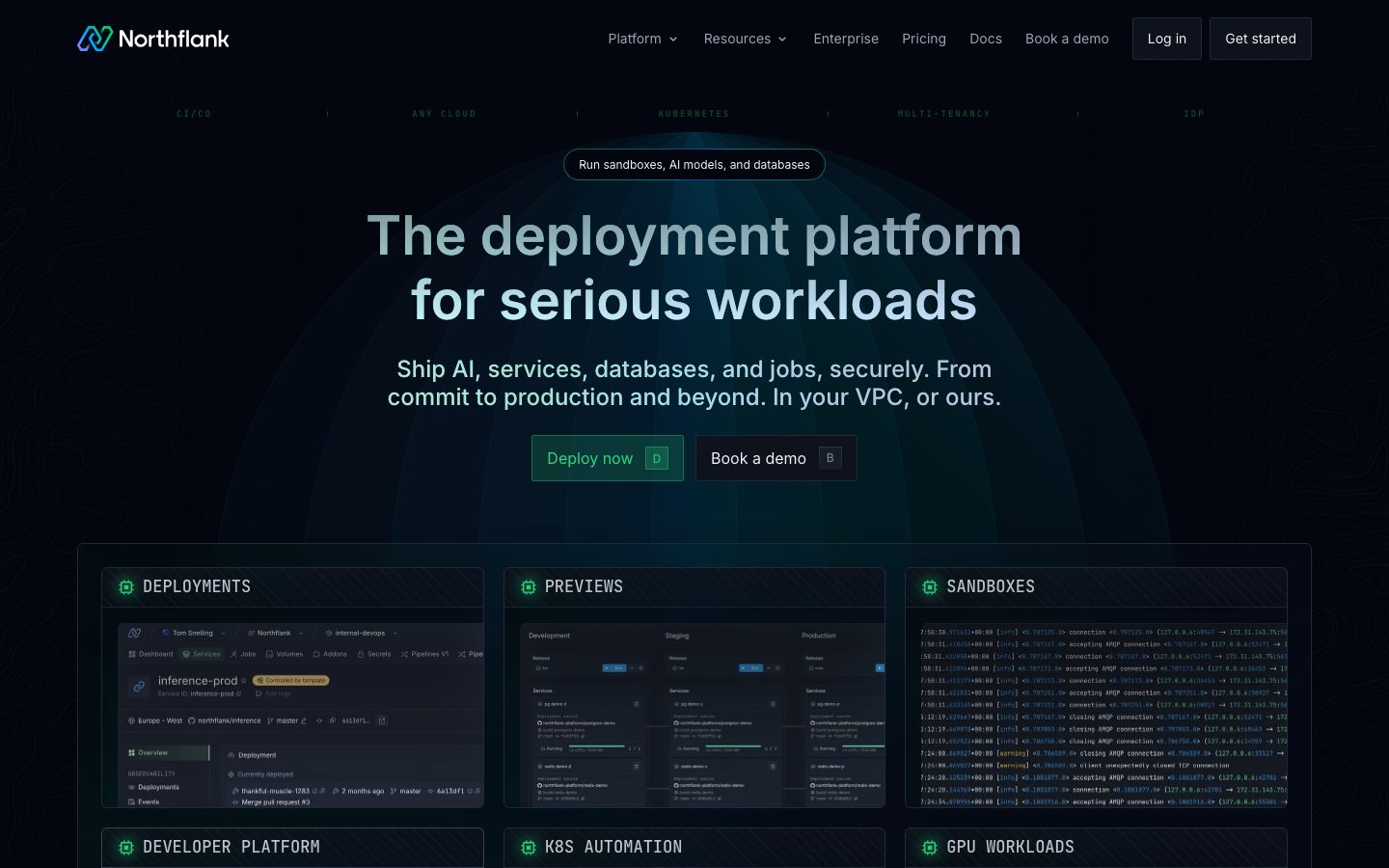
Northflank's marketing surface is a deep-space dark developer-platform interface — a near-black, slightly blue-tinted canvas (`{colors.canvas}` — #03060e) carrying bright-white headlines (`{colors.ink}` — #ffffff), low-contrast body text (`{colors.body}` — #cdd5df), and a single bright-green primary accent (`{colors.primary}` — #2dd881). The system reads as serious and engineering-first: every band shows real product UI fragments — deployment dashboards, multi-environment preview panels, scrolling log streams, pipeline diagrams — embedded directly inside bordered dark cards.
The type voice is the system's most distinctive signature. Headlines use **Inter** at weight 600 (h1 at 56px, h3 at 24px), but the **body copy runs in JetBrains Mono** at 17px / weight 500 — a monospace running-text choice that signals "developer tool" immediately. Small uppercase eyebrow labels (CI/CD · ANY CLOUD · KUBERNETES · MULTI-TENANCY) reinforce the terminal-adjacent voice.
Brand voltage comes from three places: the green CTA color (`{colors.primary}`), the monospace type, and the live product chrome shown in-card. Color is otherwise restrained — a small family of cyan (`{colors.accent-cyan}`), blue (`{colors.accent-blue}`), and green tones (`{colors.primary-alt}`, `{colors.primary-soft}`) appears mostly inside multi-hued glow shadows and product UI, never as decorative paint on marketing copy.
**Key Characteristics:**
- Near-black blue-tinted canvas (`{colors.canvas}` — #03060e) as the universal floor — there is no light mode in this system.
- Single bright-green primary accent (`{colors.primary}` — #2dd881) reserved for the "Deploy now" CTA and active product states.
- Monospace body copy (`{typography.body-mono}` — JetBrains Mono 17px) — an unusual, deliberately developer-coded reading voice.
- Real product UI fragments shown inside bordered dark cards (`{component.product-card}`) — deployment panels, log streams, pipeline diagrams. Northflank shows the actual product, not illustrations of it.
- Hairline borders in `{colors.border}` (#364152) / `{colors.border-soft}` (#4b5565) define card edges instead of heavy fills.
- Tight, small border radii — `{rounded.xs}` (2px) on buttons, `{rounded.lg}` (8px) on cards — the geometry stays sharp and technical rather than soft/consumer.
- A signature multi-hued glow shadow (blue + cyan + green at low alpha) used sparingly to lift the brand mark and a few hero artifacts.
- Keycap hint chips (`{component.keycap-hint}`) inside CTAs (the "D" and "B" keys) reinforce the keyboard-driven developer ergonomic.
## Colors
### Brand & Accent
- **Primary** (`{colors.primary}` — #2dd881): The bright-green CTA color. Used on the "Deploy now" button label, active tab-rail items, and "running"/success product states. This is the only high-voltage color in the system.
- **Primary Alt** (`{colors.primary-alt}` — #01c987) and **Primary Soft** (`{colors.primary-soft}` — #00c896): Slightly deeper green variants appearing in product UI status indicators and in the brand glow shadow.
- **Accent Cyan** (`{colors.accent-cyan}` — #01b2e1): Appears in the brand-mark gradient and the multi-hued glow shadow.
- **Accent Blue** (`{colors.accent-blue}` — #425aa3) and **Accent Blue Bright** (`{colors.accent-blue-bright}` — #1b75d0): Blue tones in the brand mark, the glow shadow, and product UI chrome.
- **Link** (`{colors.link}` — #0000ee): The default browser link blue, measured in raw anchor styling — appears on unstyled inline links.
### Surface
- **Canvas** (`{colors.canvas}` — #03060e): The universal page floor — near-black with a faint blue cast.
- **Canvas Black** (`{colors.canvas-black}` — #000000): Pure black, used inside code/log panels for maximum terminal contrast.
- **Surface** (`{colors.surface}` — #070915): The first raised tone — feature cards and pill badges.
- **Surface Deep** (`{colors.surface-deep}` — #0d121c): Product-card backgrounds and stat cards.
- **Surface Navy** (`{colors.surface-navy}` — #141c33): Feature chips and keycap hints — a bluer raised tone.
- **Surface Raised** (`{colors.surface-raised}` — #181c25): The most-raised surface — nav buttons (Log in / Get started) and active tab items.
### Borders
- **Border** (`{colors.border}` — #364152): The default 1px hairline tone defining card and panel edges.
- **Border Soft** (`{colors.border-soft}` — #4b5565): A slightly lighter hairline used on hover-adjacent / emphasized edges.
### Text
- **Ink** (`{colors.ink}` — #ffffff): Headlines (h3 and brightest display copy) — maximum contrast against the dark canvas.
- **Body** (`{colors.body}` — #cdd5df): The default low-contrast running-text color — the most frequently measured text tone.
- **On Primary** (`{colors.on-primary}` — #9aa4b2): Measured button label color — secondary/quieter button text and keycap hints.
- **Muted** (`{colors.muted}` — #697586): Eyebrow labels, footer text, logo-cloud captions — the quietest tier.
- **On Dark Light** (`{colors.on-dark-light}` — #eef2f6): A near-white used sparingly for high-contrast accents inside product UI.
## Typography
### Font Family
The system pairs **Inter** (display + headings + UI labels) with **JetBrains Mono** (body running-text). This split is unusual and intentional: most marketing sites reserve monospace for code, but Northflank uses JetBrains Mono at 17px / weight 500 for paragraph body copy, signalling its developer-tool identity from the first sentence. Inter handles the big display headline (56px / 600), the section headings (24px / 600), the small eyebrow labels (14px / 400), and button labels (14px / 400). Both families are open-source and ship as declared — there are no licensed/custom typefaces in this system.
### Hierarchy
| Token | Family | Size | Weight | Line Height | Use |
|---|---|---|---|---|---|
| `{typography.display}` | Inter | 56px | 600 | 1.2 | Hero h1 ("The deployment platform for serious workloads"), stat numbers |
| `{typography.heading}` | Inter | 24px | 600 | 1.2 | Section h3 ("Run containers on command", card titles) |
| `{typography.eyebrow}` | Inter | 14px | 400 | 1.41 | Uppercase eyebrow labels, captions, footer links, logo-cloud cells (measured as h2) |
| `{typography.body-mono}` | JetBrains Mono | 17px | 500 | 1.41 | Body running-text, log/code panels, terminal-voice copy |
| `{typography.button}` | Inter | 14px | 400 | 1.41 | Button labels, nav menu items |
### Principles
The Inter/JetBrains-Mono boundary is the brand voice. Headlines and labels stay Inter; running-text and anything terminal-adjacent stays mono. Display weight is 600 — never heavier — and `letterSpacing` was measured as `normal` across every role (Northflank does not apply negative tracking, unlike many SaaS systems). Keep eyebrow labels uppercase and quiet (`{colors.muted}`); keep the single 56px display headline as the only large type on any band.
### Note on Font Substitutes
No licensed or custom typefaces were detected (`fonts_licensed` is empty). Both Inter and JetBrains Mono are open-source and free to self-host — no substitution is required. If JetBrains Mono is unavailable, `ui-monospace` / system monospace preserves the terminal voice; if Inter is unavailable, any neutral grotesque sans at weight 600 approximates the display role.
## Layout
### Spacing System
- **Base unit:** 4px.
- **Tokens:** `{spacing.xxs}` 4px · `{spacing.xs}` 8px · `{spacing.sm}` 12px · `{spacing.md}` 16px · `{spacing.lg}` 20px · `{spacing.xl}` 24px · `{spacing.xxl}` 32px · `{spacing.xxxl}` 48px · `{spacing.section}` 64px · `{spacing.section-lg}` 80px.
- **Most frequent values:** 8px, 24px, and 4px dominate the measured spacing histogram — small, tight increments consistent with a dense developer-UI aesthetic.
- **Card internal padding:** `{spacing.xl}` (24px) for product cards and feature cards; `{spacing.xxl}` (32px) for stat cards.
- **Section rhythm:** `{spacing.section}` (64px) to `{spacing.section-lg}` (80px) between major editorial bands.
### Grid & Container
- **Hero:** centered single-column — eyebrow pill, 56px display headline, mono sub-copy, then a two-button CTA row.
- **Product-card grid:** 3-up at desktop (DEPLOYMENTS / PREVIEWS / SANDBOXES, then DEVELOPER PLATFORM / K8S AUTOMATION / GPU WORKLOADS), reducing on narrower viewports.
- **Logo cloud:** multi-row centered grid of customer logos in `{colors.muted}`.
- **Stat band:** 5-up row of stat cards (Millions / 130B+ / $24M+ / 80k+ / 330+).
- **Feature chip clusters:** wrapping rows of pill chips ("If you're building with AI…" / "…you still need these.").
### Whitespace Philosophy
The system is dense by SaaS standards — tight 8px/24px increments inside cards, hairline borders rather than wide padding gaps. Whitespace is used to separate major bands (64–80px) but inside product cards the layout deliberately packs information to mirror a real developer dashboard.
## Elevation & Depth
| Level | Treatment | Use |
|---|---|---|
| Flat | No shadow, hairline `{colors.border}` only | Most cards, nav, body bands |
| Card drop shadow | `rgba(3, 6, 14, 0.5) 0px 4px 7px 0px` | Product cards, raised panels (most frequent shadow) |
| Subtle micro-shadow | `rgba(0, 0, 0, 0.24) 0px 1.3px 2.5px 0px` | Small chips, keycaps |
| Brand glow (multi-hue) | `rgba(66,90,163,0.2) 1px -1px 1px, rgba(66,90,163,0.2) -1px 1px 1px, rgba(1,178,225,0.2) -1px -1px 1px, rgba(1,201,135,0.2) 1px 1px 1px` | The signature four-color glow (blue/cyan/green) on the brand mark and a few hero artifacts |
| Directional accent glow | `rgba(1, 178, 225, 0.1) -16px -16px 32px -8px` | A single cyan directional glow on one hero element |
| Heavy modal shadow | `rgba(0, 0, 0, 0.75) 0px 4px 24px 0px` | Deepest overlay shadow (modal/dropdown) |
The elevation philosophy is **dark-on-dark with hairline definition** — depth comes primarily from border tone shifts and the canvas/surface ladder (`{colors.canvas}` → `{colors.surface}` → `{colors.surface-deep}` → `{colors.surface-navy}` → `{colors.surface-raised}`), with shadows used sparingly. The multi-hued brand glow is the one expressive depth moment in the system.
### Decorative Depth
- The hero carries a faint radial/dome glow behind the headline — a subtle blue-cyan gradient rising from the lower center of the band.
- Product UI fragments inside cards carry their own internal chrome and status colors (green "running" dots, log-line syntax tints) — these are product content, not system tokens.
## Shapes
### Border Radius Scale
| Token | Value | Use |
|---|---|---|
| `{rounded.xs}` | 2px | Buttons (measured) — the sharpest, most-used radius |
| `{rounded.sm}` | 4px | Keycap hints, small inline elements |
| `{rounded.md}` | 6px | Nav buttons, tab-rail items |
| `{rounded.lg}` | 8px | Content cards, product panels, code panels |
| `{rounded.pill}` | 50px | Rounded pill elements |
| `{rounded.full}` | 9999px | Badge pills, feature chips, circular avatars/icons |
### Geometry Note
Radii stay small and technical — the most frequent measured radius is 2px, and cards top out at 8px. This sharp geometry reinforces the engineering-tool identity; the only fully-round shapes are pill badges and the circular brand-mark container.
## Components
### Navigation
**`top-nav`** — Dark nav bar on `{colors.canvas}`. Carries the Northflank wordmark + gradient brand mark at left, a horizontal menu (Platform, Resources, Enterprise, Pricing, Docs, Book a demo) center, and a right cluster with `{component.nav-button-login}` and `{component.nav-button-getstarted}`. Menu items in `{typography.button}` (Inter 14px / 400), text `{colors.body}`.
**`nav-button-login`** / **`nav-button-getstarted`** — Raised dark buttons on `{colors.surface-raised}` with `{colors.ink}` labels, rounded `{rounded.md}`, padding 8px × 16px. They read as quiet, equal-weight nav actions.
### Buttons
**`button-primary`** — The "Deploy now" CTA. Label in `{colors.primary}` (green), type `{typography.button}`, rounded `{rounded.xs}` (2px, measured), padding 8px × 0px (measured). Background fill is a subtle dark-green tint (not separately measured — see Known Gaps); declared as transparent in tokens. Carries a `{component.keycap-hint}` "D" chip on the right.
**`button-secondary`** — The "Book a demo" CTA. Label in `{colors.on-primary}` (#9aa4b2, the measured button color), type `{typography.button}`, rounded `{rounded.xs}`, same measured padding. Carries a "B" keycap hint.
**`keycap-hint`** — A small keyboard-key chip inside CTAs ("D", "B"). Background `{colors.surface-navy}`, text `{colors.on-primary}`, rounded `{rounded.sm}`, padding 4px × 6px. Reinforces the keyboard-driven developer ergonomic.
### Badges & Labels
**`badge-pill`** — The hero eyebrow pill ("Run sandboxes, AI models, and databases"). Background `{colors.surface}`, text `{colors.body}`, type `{typography.eyebrow}`, rounded `{rounded.full}`, padding 8px × 16px, with a hairline `{colors.border}` edge.
**`eyebrow-label`** — Uppercase mono-feeling section labels (CI/CD · ANY CLOUD · KUBERNETES, "WITH YOU AT EVERY STEP", "END-TO-END"). Transparent background, text `{colors.muted}`, type `{typography.eyebrow}`.
**`pill-feature-chip`** — Wrapping feature chips with a leading check icon ("Deploy and scale OSS models like Llama3, Deepseek", "Secrets and config management"). Background `{colors.surface-navy}`, text `{colors.body}`, rounded `{rounded.full}`, padding 8px × 16px.
### Cards & Containers
**`product-card`** — The system's signature container: a bordered dark card holding a real product UI fragment (deployment dashboard, multi-environment preview, GPU workload view). Background `{colors.surface-deep}`, hairline `{colors.border}`, rounded `{rounded.lg}` (8px), padding `{spacing.xl}` (24px). Carries a small green icon + uppercase title (`{typography.eyebrow}`) at top, then the embedded product chrome below. Uses the `rgba(3,6,14,0.5) 0 4px 7px` card shadow.
**`feature-card`** — A content card for editorial feature blocks. Background `{colors.surface}`, rounded `{rounded.lg}`, padding 24px. Title in `{typography.heading}` (Inter 24px / 600), supporting copy in `{typography.body-mono}`.
**`code-panel`** — A log/terminal panel showing live log streams or code. Background `{colors.canvas-black}` (pure black for maximum terminal contrast), monospace text `{typography.body-mono}`, rounded `{rounded.lg}`, padding `{spacing.lg}` (20px). Log lines carry product-native syntax tints (info/warning) that are content, not tokens.
**`stat-card`** — Big-number stat cells ("Millions of containers", "130B+ Requests processed", "$24M+ Raised in funding"). Background `{colors.surface-deep}`, the number in `{typography.display}` (56px) and `{colors.ink}`, the label in `{colors.body}`, rounded `{rounded.lg}`, padding `{spacing.xxl}` (32px).
**`logo-cloud-cell`** — A customer-logo cell ("Trusted by 2,000+ start-ups and enterprises"). Transparent background, monochrome logos rendered in `{colors.muted}`, type `{typography.eyebrow}` for any captions, padding `{spacing.md}` (16px).
### Tabs
**`tab-rail-item`** + **`tab-rail-item-active`** — A vertical tab rail (Run / Release / Scale / Observe / Secure) on the "operating system for your engineering team" band. Inactive: transparent background, `{colors.muted}` text. Active: `{colors.surface-raised}` background with `{colors.primary}` (green) text, rounded `{rounded.md}`, padding 8px × 12px. The active green label is the rail's selection signal.
### Footer
**`footer`** — Closing band on `{colors.canvas}` (the same dark floor — there is no surface inversion since the whole site is dark). Multi-column "Deploy in your preferred cloud" link list with AWS / GCP / Azure / Civo / Oracle / CoreWeave / GPU rows. Text `{colors.muted}`, type `{typography.eyebrow}`, vertical padding `{spacing.section}` (64px). The Northflank wordmark anchors the top-left.
## Do's and Don'ts
### Do
- Keep the canvas dark — `{colors.canvas}` (#03060e) is the universal floor; this system has no light mode.
- Reserve `{colors.primary}` (#2dd881 green) for the primary CTA, active tab states, and "running"/success product indicators. It is the only high-voltage color.
- Use `{typography.body-mono}` (JetBrains Mono) for running body copy — the monospace voice is the brand. Keep headlines and labels in Inter.
- Show real product UI inside `{component.product-card}` — deployment dashboards, log streams, pipeline diagrams. Northflank demonstrates the product, never illustrates around it.
- Define card edges with hairline `{colors.border}` (#364152) rather than heavy fills; use the surface ladder for depth.
- Keep radii small and technical — `{rounded.xs}` (2px) on buttons, `{rounded.lg}` (8px) on cards.
- Use keycap hints (`{component.keycap-hint}`) on hero CTAs to reinforce the keyboard-driven developer ergonomic.
- Reserve the multi-hued blue/cyan/green glow for the brand mark and a small number of hero artifacts.
### Don't
- Don't introduce a light surface — the dark-on-dark hairline system breaks if a white card appears.
- Don't apply negative letter-spacing; every measured role uses `normal` tracking.
- Don't paint headline or eyebrow copy in the accent colors — color voltage lives at the CTA and product-state layer only.
- Don't bold display weight beyond 600.
- Don't soften card radii past 8px — large radii read as consumer-app, not infrastructure tooling.
- Don't put body running-text in Inter — that erases the monospace brand voice.
- Don't add hover-state styling beyond default and active/pressed.
## Responsive Behavior
### Breakpoints
| Name | Width | Key Changes |
|---|---|---|
| Mobile | < 768px | Hamburger nav; hero display 56→~32px; product-card grid stacks 1-up; stat band wraps; feature-chip clusters wrap to fewer columns |
| Tablet | 768–1024px | Nav tightens; product cards 2-up; stat band 2–3 across; tab rail may move above content |
| Desktop | 1024–1440px | Full horizontal nav; product cards 3-up; stat band 5-up; vertical tab rail beside content |
| Wide | > 1440px | Same as desktop with more outer breathing room; content stays centered |
### Touch Targets
- `{component.nav-button-login}` / `{component.nav-button-getstarted}` at 8 × 16 padding — effective tap area near 36px.
- `{component.button-primary}` measured padding is 8px × 0px; effective tap height depends on line-box — pad to 40px+ minimum in implementation (see Known Gaps).
- `{component.tab-rail-item}` at 8 × 12 padding.
### Collapsing Strategy
- Top nav collapses to a hamburger on mobile; the Log in / Get started cluster moves into the opened sheet.
- The 3-up product-card grid reduces to 2-up then 1-up; cards keep their internal product chrome legible by retaining native aspect ratios.
- Stat cards wrap from a 5-up row down to 2-up / 1-up.
- The vertical tab rail reflows above its content panel on narrow viewports.
- Feature-chip clusters wrap fluidly — chips are pill-shaped and tolerate multi-row layout.
### Image Behavior
- Product UI fragments inside cards retain native aspect ratios; the surrounding card resizes.
- The brand-mark gradient and its glow scale proportionally.
## Iteration Guide
1. Focus on ONE component at a time. Reference its YAML key directly (`{component.product-card}`, `{component.tab-rail-item-active}`).
2. Variants of an existing component (`-active`, `-login`, `-getstarted`) live as separate entries in `components:`.
3. Use `{token.refs}` everywhere — never inline a hex in a component.
4. Never document hover. Default and Active/Pressed states only.
5. The canvas stays dark and the body stays monospace — those two decisions define the brand. Don't blur them.
6. Green (`{colors.primary}`) is scarce by design — add it only at the action and product-state layer.
7. When in doubt about emphasis: brighter text tier (`{colors.body}` → `{colors.ink}`) before bigger type.
## Known Gaps
- Only one component (`button-primary`) was captured by the measured component extractor, with `color #9aa4b2`, `radius 2px`, `padding 8px 0px`. All other component specs (nav buttons, cards, tabs, badges, code panels, stat cards, footer) are reconstructed from screenshot ground-truth plus the measured color/type/spacing/radius tokens — their exact backgrounds and paddings should be confirmed against source CSS.
- Button **background fills** were not measured. The "Deploy now" green-tinted fill and the secondary button fill are declared `transparent` in tokens; the visible dark-green/dark fills are derived from screenshots and need confirmation.
- The measured `button-primary` padding of `8px 0px` implies zero horizontal padding, which conflicts with the visibly padded CTAs in the screenshots — likely the measurement captured an inner text node. Treat horizontal padding as unconfirmed.
- The h2 role measured as Inter 14px / 400 (mapped to `{typography.eyebrow}`) is unusually small for a heading tag — it likely corresponds to uppercase eyebrow labels rather than true section headings.
- Spacing values 6px, 10px, 11px, and 15px appeared in the histogram but were not promoted to named tokens; the canonical scale uses the dominant 4 / 8 / 12 / 16 / 20 / 24 / 32 / 48 / 64 / 80 increments.
- Animation and transition timings (log-stream scroll, tab-rail switching, glow pulse) are out of scope.
- Form input, dropdown, and modal specs (text inputs, the pricing toggles, nav dropdown menus) were not extracted — the deepest measured shadow (`rgba(0,0,0,0.75) 0 4px 24px`) suggests an overlay surface that would need a dropdown/modal flow to confirm.
- The exact gradient stops of the Northflank brand mark and hero dome glow are not measured; only the multi-hued glow shadow alpha values are captured.
<!-- Documented by duply · real-world design systems as ready-to-use DESIGN.md for AI coding agents · https://duply.ai/northflank/design-md -->
Color Palette
Accent
Neutrals
Typography
display56px · 600 · 1.2
The quick brown fox jumpsheading24px · 600 · 1.2
The quick brown fox jumpseyebrow14px · 400 · 1.41
The quick brown fox jumpsbody-mono17px · 500 · 1.41
The quick brown fox jumpsbutton14px · 400 · 1.41
The quick brown fox jumpsSpacing & Shape
Spacing
| Name | Value | Preview |
|---|---|---|
| xxs | 4px | |
| xs | 8px | |
| sm | 12px | |
| md | 16px | |
| lg | 20px | |
| xl | 24px | |
| xxl | 32px | |
| xxxl | 48px | |
| section | 64px | |
| section-lg | 80px |
Border Radius
| Name | Value | Preview |
|---|---|---|
| xs | 2px | |
| sm | 4px | |
| md | 6px | |
| lg | 8px | |
| pill | 50px | |
| full | 9999px |
More like this


---
version: alpha
name: Northflank-design-analysis
description: A deep-space dark developer-platform interface built on a near-black blue-tinted canvas (#03060e) with a single bright-green primary accent (#2dd881) and a distinctive monospace body voice (JetBrains Mono). The system reads as a serious, engineering-first deployment product — real product UI panels (deployment dashboards, log streams, pipeline diagrams) shown directly inside bordered cards, monospace eyebrow labels, hairline borders, and a multi-hued cyan/blue/green glow used sparingly for depth. Brand voltage comes from the green CTA, the mono type, and the live product chrome rather than from decorative color.

colors:
  primary: "#2dd881"
  primary-alt: "#01c987"
  primary-soft: "#00c896"
  accent-cyan: "#01b2e1"
  accent-blue: "#425aa3"
  accent-blue-bright: "#1b75d0"
  link: "#0000ee"
  ink: "#ffffff"
  on-primary: "#9aa4b2"
  body: "#cdd5df"
  muted: "#697586"
  border: "#364152"
  border-soft: "#4b5565"
  canvas: "#03060e"
  canvas-black: "#000000"
  surface: "#070915"
  surface-deep: "#0d121c"
  surface-navy: "#141c33"
  surface-raised: "#181c25"
  on-dark-light: "#eef2f6"

typography:
  display:
    fontFamily: "Inter, sans-serif"
    fontSize: 56px
    fontWeight: 600
    lineHeight: 1.2
    letterSpacing: normal
  heading:
    fontFamily: "Inter, sans-serif"
    fontSize: 24px
    fontWeight: 600
    lineHeight: 1.2
    letterSpacing: normal
  eyebrow:
    fontFamily: "Inter, sans-serif"
    fontSize: 14px
    fontWeight: 400
    lineHeight: 1.41
    letterSpacing: normal
  body-mono:
    fontFamily: "JetBrains Mono, ui-monospace, monospace"
    fontSize: 17px
    fontWeight: 500
    lineHeight: 1.41
    letterSpacing: normal
  button:
    fontFamily: "Inter, sans-serif"
    fontSize: 14px
    fontWeight: 400
    lineHeight: 1.41
    letterSpacing: normal

rounded:
  xs: 2px
  sm: 4px
  md: 6px
  lg: 8px
  pill: 50px
  full: 9999px

spacing:
  xxs: 4px
  xs: 8px
  sm: 12px
  md: 16px
  lg: 20px
  xl: 24px
  xxl: 32px
  xxxl: 48px
  section: 64px
  section-lg: 80px

components:
  top-nav:
    backgroundColor: "{colors.canvas}"
    textColor: "{colors.body}"
    typography: "{typography.button}"
    padding: 16px 24px
  button-primary:
    backgroundColor: transparent
    textColor: "{colors.primary}"
    typography: "{typography.button}"
    rounded: "{rounded.xs}"
    padding: 8px 0px
  button-secondary:
    backgroundColor: transparent
    textColor: "{colors.on-primary}"
    typography: "{typography.button}"
    rounded: "{rounded.xs}"
    padding: 8px 0px
  nav-button-login:
    backgroundColor: "{colors.surface-raised}"
    textColor: "{colors.ink}"
    typography: "{typography.button}"
    rounded: "{rounded.md}"
    padding: 8px 16px
  nav-button-getstarted:
    backgroundColor: "{colors.surface-raised}"
    textColor: "{colors.ink}"
    typography: "{typography.button}"
    rounded: "{rounded.md}"
    padding: 8px 16px
  keycap-hint:
    backgroundColor: "{colors.surface-navy}"
    textColor: "{colors.on-primary}"
    typography: "{typography.button}"
    rounded: "{rounded.sm}"
    padding: 4px 6px
  badge-pill:
    backgroundColor: "{colors.surface}"
    textColor: "{colors.body}"
    typography: "{typography.eyebrow}"
    rounded: "{rounded.full}"
    padding: 8px 16px
  eyebrow-label:
    backgroundColor: transparent
    textColor: "{colors.muted}"
    typography: "{typography.eyebrow}"
  product-card:
    backgroundColor: "{colors.surface-deep}"
    textColor: "{colors.body}"
    typography: "{typography.eyebrow}"
    rounded: "{rounded.lg}"
    padding: 24px
  feature-card:
    backgroundColor: "{colors.surface}"
    textColor: "{colors.body}"
    typography: "{typography.heading}"
    rounded: "{rounded.lg}"
    padding: 24px
  pill-feature-chip:
    backgroundColor: "{colors.surface-navy}"
    textColor: "{colors.body}"
    typography: "{typography.eyebrow}"
    rounded: "{rounded.full}"
    padding: 8px 16px
  tab-rail-item:
    backgroundColor: transparent
    textColor: "{colors.muted}"
    typography: "{typography.button}"
    rounded: "{rounded.md}"
    padding: 8px 12px
  tab-rail-item-active:
    backgroundColor: "{colors.surface-raised}"
    textColor: "{colors.primary}"
    typography: "{typography.button}"
    rounded: "{rounded.md}"
    padding: 8px 12px
  code-panel:
    backgroundColor: "{colors.canvas-black}"
    textColor: "{colors.body}"
    typography: "{typography.body-mono}"
    rounded: "{rounded.lg}"
    padding: 20px
  stat-card:
    backgroundColor: "{colors.surface-deep}"
    textColor: "{colors.ink}"
    typography: "{typography.display}"
    rounded: "{rounded.lg}"
    padding: 32px
  logo-cloud-cell:
    backgroundColor: transparent
    textColor: "{colors.muted}"
    typography: "{typography.eyebrow}"
    padding: 16px
  footer:
    backgroundColor: "{colors.canvas}"
    textColor: "{colors.muted}"
    typography: "{typography.eyebrow}"
    padding: 64px
---

## Overview

Northflank's marketing surface is a deep-space dark developer-platform interface — a near-black, slightly blue-tinted canvas (`{colors.canvas}` — #03060e) carrying bright-white headlines (`{colors.ink}` — #ffffff), low-contrast body text (`{colors.body}` — #cdd5df), and a single bright-green primary accent (`{colors.primary}` — #2dd881). The system reads as serious and engineering-first: every band shows real product UI fragments — deployment dashboards, multi-environment preview panels, scrolling log streams, pipeline diagrams — embedded directly inside bordered dark cards.

The type voice is the system's most distinctive signature. Headlines use **Inter** at weight 600 (h1 at 56px, h3 at 24px), but the **body copy runs in JetBrains Mono** at 17px / weight 500 — a monospace running-text choice that signals "developer tool" immediately. Small uppercase eyebrow labels (CI/CD · ANY CLOUD · KUBERNETES · MULTI-TENANCY) reinforce the terminal-adjacent voice.

Brand voltage comes from three places: the green CTA color (`{colors.primary}`), the monospace type, and the live product chrome shown in-card. Color is otherwise restrained — a small family of cyan (`{colors.accent-cyan}`), blue (`{colors.accent-blue}`), and green tones (`{colors.primary-alt}`, `{colors.primary-soft}`) appears mostly inside multi-hued glow shadows and product UI, never as decorative paint on marketing copy.

**Key Characteristics:**
- Near-black blue-tinted canvas (`{colors.canvas}` — #03060e) as the universal floor — there is no light mode in this system.
- Single bright-green primary accent (`{colors.primary}` — #2dd881) reserved for the "Deploy now" CTA and active product states.
- Monospace body copy (`{typography.body-mono}` — JetBrains Mono 17px) — an unusual, deliberately developer-coded reading voice.
- Real product UI fragments shown inside bordered dark cards (`{component.product-card}`) — deployment panels, log streams, pipeline diagrams. Northflank shows the actual product, not illustrations of it.
- Hairline borders in `{colors.border}` (#364152) / `{colors.border-soft}` (#4b5565) define card edges instead of heavy fills.
- Tight, small border radii — `{rounded.xs}` (2px) on buttons, `{rounded.lg}` (8px) on cards — the geometry stays sharp and technical rather than soft/consumer.
- A signature multi-hued glow shadow (blue + cyan + green at low alpha) used sparingly to lift the brand mark and a few hero artifacts.
- Keycap hint chips (`{component.keycap-hint}`) inside CTAs (the "D" and "B" keys) reinforce the keyboard-driven developer ergonomic.

## Colors

### Brand & Accent
- **Primary** (`{colors.primary}` — #2dd881): The bright-green CTA color. Used on the "Deploy now" button label, active tab-rail items, and "running"/success product states. This is the only high-voltage color in the system.
- **Primary Alt** (`{colors.primary-alt}` — #01c987) and **Primary Soft** (`{colors.primary-soft}` — #00c896): Slightly deeper green variants appearing in product UI status indicators and in the brand glow shadow.
- **Accent Cyan** (`{colors.accent-cyan}` — #01b2e1): Appears in the brand-mark gradient and the multi-hued glow shadow.
- **Accent Blue** (`{colors.accent-blue}` — #425aa3) and **Accent Blue Bright** (`{colors.accent-blue-bright}` — #1b75d0): Blue tones in the brand mark, the glow shadow, and product UI chrome.
- **Link** (`{colors.link}` — #0000ee): The default browser link blue, measured in raw anchor styling — appears on unstyled inline links.

### Surface
- **Canvas** (`{colors.canvas}` — #03060e): The universal page floor — near-black with a faint blue cast.
- **Canvas Black** (`{colors.canvas-black}` — #000000): Pure black, used inside code/log panels for maximum terminal contrast.
- **Surface** (`{colors.surface}` — #070915): The first raised tone — feature cards and pill badges.
- **Surface Deep** (`{colors.surface-deep}` — #0d121c): Product-card backgrounds and stat cards.
- **Surface Navy** (`{colors.surface-navy}` — #141c33): Feature chips and keycap hints — a bluer raised tone.
- **Surface Raised** (`{colors.surface-raised}` — #181c25): The most-raised surface — nav buttons (Log in / Get started) and active tab items.

### Borders
- **Border** (`{colors.border}` — #364152): The default 1px hairline tone defining card and panel edges.
- **Border Soft** (`{colors.border-soft}` — #4b5565): A slightly lighter hairline used on hover-adjacent / emphasized edges.

### Text
- **Ink** (`{colors.ink}` — #ffffff): Headlines (h3 and brightest display copy) — maximum contrast against the dark canvas.
- **Body** (`{colors.body}` — #cdd5df): The default low-contrast running-text color — the most frequently measured text tone.
- **On Primary** (`{colors.on-primary}` — #9aa4b2): Measured button label color — secondary/quieter button text and keycap hints.
- **Muted** (`{colors.muted}` — #697586): Eyebrow labels, footer text, logo-cloud captions — the quietest tier.
- **On Dark Light** (`{colors.on-dark-light}` — #eef2f6): A near-white used sparingly for high-contrast accents inside product UI.

## Typography

### Font Family
The system pairs **Inter** (display + headings + UI labels) with **JetBrains Mono** (body running-text). This split is unusual and intentional: most marketing sites reserve monospace for code, but Northflank uses JetBrains Mono at 17px / weight 500 for paragraph body copy, signalling its developer-tool identity from the first sentence. Inter handles the big display headline (56px / 600), the section headings (24px / 600), the small eyebrow labels (14px / 400), and button labels (14px / 400). Both families are open-source and ship as declared — there are no licensed/custom typefaces in this system.

### Hierarchy

| Token | Family | Size | Weight | Line Height | Use |
|---|---|---|---|---|---|
| `{typography.display}` | Inter | 56px | 600 | 1.2 | Hero h1 ("The deployment platform for serious workloads"), stat numbers |
| `{typography.heading}` | Inter | 24px | 600 | 1.2 | Section h3 ("Run containers on command", card titles) |
| `{typography.eyebrow}` | Inter | 14px | 400 | 1.41 | Uppercase eyebrow labels, captions, footer links, logo-cloud cells (measured as h2) |
| `{typography.body-mono}` | JetBrains Mono | 17px | 500 | 1.41 | Body running-text, log/code panels, terminal-voice copy |
| `{typography.button}` | Inter | 14px | 400 | 1.41 | Button labels, nav menu items |

### Principles
The Inter/JetBrains-Mono boundary is the brand voice. Headlines and labels stay Inter; running-text and anything terminal-adjacent stays mono. Display weight is 600 — never heavier — and `letterSpacing` was measured as `normal` across every role (Northflank does not apply negative tracking, unlike many SaaS systems). Keep eyebrow labels uppercase and quiet (`{colors.muted}`); keep the single 56px display headline as the only large type on any band.

### Note on Font Substitutes
No licensed or custom typefaces were detected (`fonts_licensed` is empty). Both Inter and JetBrains Mono are open-source and free to self-host — no substitution is required. If JetBrains Mono is unavailable, `ui-monospace` / system monospace preserves the terminal voice; if Inter is unavailable, any neutral grotesque sans at weight 600 approximates the display role.

## Layout

### Spacing System
- **Base unit:** 4px.
- **Tokens:** `{spacing.xxs}` 4px · `{spacing.xs}` 8px · `{spacing.sm}` 12px · `{spacing.md}` 16px · `{spacing.lg}` 20px · `{spacing.xl}` 24px · `{spacing.xxl}` 32px · `{spacing.xxxl}` 48px · `{spacing.section}` 64px · `{spacing.section-lg}` 80px.
- **Most frequent values:** 8px, 24px, and 4px dominate the measured spacing histogram — small, tight increments consistent with a dense developer-UI aesthetic.
- **Card internal padding:** `{spacing.xl}` (24px) for product cards and feature cards; `{spacing.xxl}` (32px) for stat cards.
- **Section rhythm:** `{spacing.section}` (64px) to `{spacing.section-lg}` (80px) between major editorial bands.

### Grid & Container
- **Hero:** centered single-column — eyebrow pill, 56px display headline, mono sub-copy, then a two-button CTA row.
- **Product-card grid:** 3-up at desktop (DEPLOYMENTS / PREVIEWS / SANDBOXES, then DEVELOPER PLATFORM / K8S AUTOMATION / GPU WORKLOADS), reducing on narrower viewports.
- **Logo cloud:** multi-row centered grid of customer logos in `{colors.muted}`.
- **Stat band:** 5-up row of stat cards (Millions / 130B+ / $24M+ / 80k+ / 330+).
- **Feature chip clusters:** wrapping rows of pill chips ("If you're building with AI…" / "…you still need these.").

### Whitespace Philosophy
The system is dense by SaaS standards — tight 8px/24px increments inside cards, hairline borders rather than wide padding gaps. Whitespace is used to separate major bands (64–80px) but inside product cards the layout deliberately packs information to mirror a real developer dashboard.

## Elevation & Depth

| Level | Treatment | Use |
|---|---|---|
| Flat | No shadow, hairline `{colors.border}` only | Most cards, nav, body bands |
| Card drop shadow | `rgba(3, 6, 14, 0.5) 0px 4px 7px 0px` | Product cards, raised panels (most frequent shadow) |
| Subtle micro-shadow | `rgba(0, 0, 0, 0.24) 0px 1.3px 2.5px 0px` | Small chips, keycaps |
| Brand glow (multi-hue) | `rgba(66,90,163,0.2) 1px -1px 1px, rgba(66,90,163,0.2) -1px 1px 1px, rgba(1,178,225,0.2) -1px -1px 1px, rgba(1,201,135,0.2) 1px 1px 1px` | The signature four-color glow (blue/cyan/green) on the brand mark and a few hero artifacts |
| Directional accent glow | `rgba(1, 178, 225, 0.1) -16px -16px 32px -8px` | A single cyan directional glow on one hero element |
| Heavy modal shadow | `rgba(0, 0, 0, 0.75) 0px 4px 24px 0px` | Deepest overlay shadow (modal/dropdown) |

The elevation philosophy is **dark-on-dark with hairline definition** — depth comes primarily from border tone shifts and the canvas/surface ladder (`{colors.canvas}` → `{colors.surface}` → `{colors.surface-deep}` → `{colors.surface-navy}` → `{colors.surface-raised}`), with shadows used sparingly. The multi-hued brand glow is the one expressive depth moment in the system.

### Decorative Depth
- The hero carries a faint radial/dome glow behind the headline — a subtle blue-cyan gradient rising from the lower center of the band.
- Product UI fragments inside cards carry their own internal chrome and status colors (green "running" dots, log-line syntax tints) — these are product content, not system tokens.

## Shapes

### Border Radius Scale

| Token | Value | Use |
|---|---|---|
| `{rounded.xs}` | 2px | Buttons (measured) — the sharpest, most-used radius |
| `{rounded.sm}` | 4px | Keycap hints, small inline elements |
| `{rounded.md}` | 6px | Nav buttons, tab-rail items |
| `{rounded.lg}` | 8px | Content cards, product panels, code panels |
| `{rounded.pill}` | 50px | Rounded pill elements |
| `{rounded.full}` | 9999px | Badge pills, feature chips, circular avatars/icons |

### Geometry Note
Radii stay small and technical — the most frequent measured radius is 2px, and cards top out at 8px. This sharp geometry reinforces the engineering-tool identity; the only fully-round shapes are pill badges and the circular brand-mark container.

## Components

### Navigation

**`top-nav`** — Dark nav bar on `{colors.canvas}`. Carries the Northflank wordmark + gradient brand mark at left, a horizontal menu (Platform, Resources, Enterprise, Pricing, Docs, Book a demo) center, and a right cluster with `{component.nav-button-login}` and `{component.nav-button-getstarted}`. Menu items in `{typography.button}` (Inter 14px / 400), text `{colors.body}`.

**`nav-button-login`** / **`nav-button-getstarted`** — Raised dark buttons on `{colors.surface-raised}` with `{colors.ink}` labels, rounded `{rounded.md}`, padding 8px × 16px. They read as quiet, equal-weight nav actions.

### Buttons

**`button-primary`** — The "Deploy now" CTA. Label in `{colors.primary}` (green), type `{typography.button}`, rounded `{rounded.xs}` (2px, measured), padding 8px × 0px (measured). Background fill is a subtle dark-green tint (not separately measured — see Known Gaps); declared as transparent in tokens. Carries a `{component.keycap-hint}` "D" chip on the right.

**`button-secondary`** — The "Book a demo" CTA. Label in `{colors.on-primary}` (#9aa4b2, the measured button color), type `{typography.button}`, rounded `{rounded.xs}`, same measured padding. Carries a "B" keycap hint.

**`keycap-hint`** — A small keyboard-key chip inside CTAs ("D", "B"). Background `{colors.surface-navy}`, text `{colors.on-primary}`, rounded `{rounded.sm}`, padding 4px × 6px. Reinforces the keyboard-driven developer ergonomic.

### Badges & Labels

**`badge-pill`** — The hero eyebrow pill ("Run sandboxes, AI models, and databases"). Background `{colors.surface}`, text `{colors.body}`, type `{typography.eyebrow}`, rounded `{rounded.full}`, padding 8px × 16px, with a hairline `{colors.border}` edge.

**`eyebrow-label`** — Uppercase mono-feeling section labels (CI/CD · ANY CLOUD · KUBERNETES, "WITH YOU AT EVERY STEP", "END-TO-END"). Transparent background, text `{colors.muted}`, type `{typography.eyebrow}`.

**`pill-feature-chip`** — Wrapping feature chips with a leading check icon ("Deploy and scale OSS models like Llama3, Deepseek", "Secrets and config management"). Background `{colors.surface-navy}`, text `{colors.body}`, rounded `{rounded.full}`, padding 8px × 16px.

### Cards & Containers

**`product-card`** — The system's signature container: a bordered dark card holding a real product UI fragment (deployment dashboard, multi-environment preview, GPU workload view). Background `{colors.surface-deep}`, hairline `{colors.border}`, rounded `{rounded.lg}` (8px), padding `{spacing.xl}` (24px). Carries a small green icon + uppercase title (`{typography.eyebrow}`) at top, then the embedded product chrome below. Uses the `rgba(3,6,14,0.5) 0 4px 7px` card shadow.

**`feature-card`** — A content card for editorial feature blocks. Background `{colors.surface}`, rounded `{rounded.lg}`, padding 24px. Title in `{typography.heading}` (Inter 24px / 600), supporting copy in `{typography.body-mono}`.

**`code-panel`** — A log/terminal panel showing live log streams or code. Background `{colors.canvas-black}` (pure black for maximum terminal contrast), monospace text `{typography.body-mono}`, rounded `{rounded.lg}`, padding `{spacing.lg}` (20px). Log lines carry product-native syntax tints (info/warning) that are content, not tokens.

**`stat-card`** — Big-number stat cells ("Millions of containers", "130B+ Requests processed", "$24M+ Raised in funding"). Background `{colors.surface-deep}`, the number in `{typography.display}` (56px) and `{colors.ink}`, the label in `{colors.body}`, rounded `{rounded.lg}`, padding `{spacing.xxl}` (32px).

**`logo-cloud-cell`** — A customer-logo cell ("Trusted by 2,000+ start-ups and enterprises"). Transparent background, monochrome logos rendered in `{colors.muted}`, type `{typography.eyebrow}` for any captions, padding `{spacing.md}` (16px).

### Tabs

**`tab-rail-item`** + **`tab-rail-item-active`** — A vertical tab rail (Run / Release / Scale / Observe / Secure) on the "operating system for your engineering team" band. Inactive: transparent background, `{colors.muted}` text. Active: `{colors.surface-raised}` background with `{colors.primary}` (green) text, rounded `{rounded.md}`, padding 8px × 12px. The active green label is the rail's selection signal.

### Footer

**`footer`** — Closing band on `{colors.canvas}` (the same dark floor — there is no surface inversion since the whole site is dark). Multi-column "Deploy in your preferred cloud" link list with AWS / GCP / Azure / Civo / Oracle / CoreWeave / GPU rows. Text `{colors.muted}`, type `{typography.eyebrow}`, vertical padding `{spacing.section}` (64px). The Northflank wordmark anchors the top-left.

## Do's and Don'ts

### Do
- Keep the canvas dark — `{colors.canvas}` (#03060e) is the universal floor; this system has no light mode.
- Reserve `{colors.primary}` (#2dd881 green) for the primary CTA, active tab states, and "running"/success product indicators. It is the only high-voltage color.
- Use `{typography.body-mono}` (JetBrains Mono) for running body copy — the monospace voice is the brand. Keep headlines and labels in Inter.
- Show real product UI inside `{component.product-card}` — deployment dashboards, log streams, pipeline diagrams. Northflank demonstrates the product, never illustrates around it.
- Define card edges with hairline `{colors.border}` (#364152) rather than heavy fills; use the surface ladder for depth.
- Keep radii small and technical — `{rounded.xs}` (2px) on buttons, `{rounded.lg}` (8px) on cards.
- Use keycap hints (`{component.keycap-hint}`) on hero CTAs to reinforce the keyboard-driven developer ergonomic.
- Reserve the multi-hued blue/cyan/green glow for the brand mark and a small number of hero artifacts.

### Don't
- Don't introduce a light surface — the dark-on-dark hairline system breaks if a white card appears.
- Don't apply negative letter-spacing; every measured role uses `normal` tracking.
- Don't paint headline or eyebrow copy in the accent colors — color voltage lives at the CTA and product-state layer only.
- Don't bold display weight beyond 600.
- Don't soften card radii past 8px — large radii read as consumer-app, not infrastructure tooling.
- Don't put body running-text in Inter — that erases the monospace brand voice.
- Don't add hover-state styling beyond default and active/pressed.

## Responsive Behavior

### Breakpoints

| Name | Width | Key Changes |
|---|---|---|
| Mobile | < 768px | Hamburger nav; hero display 56→~32px; product-card grid stacks 1-up; stat band wraps; feature-chip clusters wrap to fewer columns |
| Tablet | 768–1024px | Nav tightens; product cards 2-up; stat band 2–3 across; tab rail may move above content |
| Desktop | 1024–1440px | Full horizontal nav; product cards 3-up; stat band 5-up; vertical tab rail beside content |
| Wide | > 1440px | Same as desktop with more outer breathing room; content stays centered |

### Touch Targets
- `{component.nav-button-login}` / `{component.nav-button-getstarted}` at 8 × 16 padding — effective tap area near 36px.
- `{component.button-primary}` measured padding is 8px × 0px; effective tap height depends on line-box — pad to 40px+ minimum in implementation (see Known Gaps).
- `{component.tab-rail-item}` at 8 × 12 padding.

### Collapsing Strategy
- Top nav collapses to a hamburger on mobile; the Log in / Get started cluster moves into the opened sheet.
- The 3-up product-card grid reduces to 2-up then 1-up; cards keep their internal product chrome legible by retaining native aspect ratios.
- Stat cards wrap from a 5-up row down to 2-up / 1-up.
- The vertical tab rail reflows above its content panel on narrow viewports.
- Feature-chip clusters wrap fluidly — chips are pill-shaped and tolerate multi-row layout.

### Image Behavior
- Product UI fragments inside cards retain native aspect ratios; the surrounding card resizes.
- The brand-mark gradient and its glow scale proportionally.

## Iteration Guide

1. Focus on ONE component at a time. Reference its YAML key directly (`{component.product-card}`, `{component.tab-rail-item-active}`).
2. Variants of an existing component (`-active`, `-login`, `-getstarted`) live as separate entries in `components:`.
3. Use `{token.refs}` everywhere — never inline a hex in a component.
4. Never document hover. Default and Active/Pressed states only.
5. The canvas stays dark and the body stays monospace — those two decisions define the brand. Don't blur them.
6. Green (`{colors.primary}`) is scarce by design — add it only at the action and product-state layer.
7. When in doubt about emphasis: brighter text tier (`{colors.body}` → `{colors.ink}`) before bigger type.

## Known Gaps

- Only one component (`button-primary`) was captured by the measured component extractor, with `color #9aa4b2`, `radius 2px`, `padding 8px 0px`. All other component specs (nav buttons, cards, tabs, badges, code panels, stat cards, footer) are reconstructed from screenshot ground-truth plus the measured color/type/spacing/radius tokens — their exact backgrounds and paddings should be confirmed against source CSS.
- Button **background fills** were not measured. The "Deploy now" green-tinted fill and the secondary button fill are declared `transparent` in tokens; the visible dark-green/dark fills are derived from screenshots and need confirmation.
- The measured `button-primary` padding of `8px 0px` implies zero horizontal padding, which conflicts with the visibly padded CTAs in the screenshots — likely the measurement captured an inner text node. Treat horizontal padding as unconfirmed.
- The h2 role measured as Inter 14px / 400 (mapped to `{typography.eyebrow}`) is unusually small for a heading tag — it likely corresponds to uppercase eyebrow labels rather than true section headings.
- Spacing values 6px, 10px, 11px, and 15px appeared in the histogram but were not promoted to named tokens; the canonical scale uses the dominant 4 / 8 / 12 / 16 / 20 / 24 / 32 / 48 / 64 / 80 increments.
- Animation and transition timings (log-stream scroll, tab-rail switching, glow pulse) are out of scope.
- Form input, dropdown, and modal specs (text inputs, the pricing toggles, nav dropdown menus) were not extracted — the deepest measured shadow (`rgba(0,0,0,0.75) 0 4px 24px`) suggests an overlay surface that would need a dropdown/modal flow to confirm.
- The exact gradient stops of the Northflank brand mark and hero dome glow are not measured; only the multi-hued glow shadow alpha values are captured.

<!-- Documented by duply · real-world design systems as ready-to-use DESIGN.md for AI coding agents · https://duply.ai/northflank/design-md -->