Spline
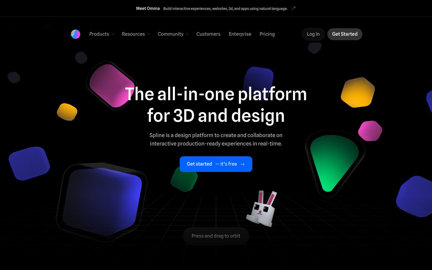
A dark-canvas, 3D-first product interface anchored on pure black (#000000) with a single saturated-blue primary CTA and floating gradient 3D primitives as the hero's entire visual payload. The system reads as a creative-tooling platform — near-black surfaces, pill-shaped buttons, soft 16px rounded cards, restrained white typography in Spline Sans, and a chromatic accent set that comes almost entirely from rendered 3D objects and code-editor syntax fragments rather than from UI chrome.
---
version: alpha
name: Spline-design-analysis
description: A dark-canvas, 3D-first product interface anchored on pure black (#000000) with a single saturated-blue primary CTA and floating gradient 3D primitives as the hero's entire visual payload. The system reads as a creative-tooling platform — near-black surfaces, pill-shaped buttons, soft 16px rounded cards, restrained white typography in Spline Sans, and a chromatic accent set that comes almost entirely from rendered 3D objects and code-editor syntax fragments rather than from UI chrome.

colors:
  ink: "#ffffff"
  canvas: "#000000"
  surface: "#191a1d"
  muted: "#888888"
  primary: "#0062ff"
  accent-periwinkle: "#96b3ff"
  accent-amber: "#ffbc70"
  accent-sky: "#569cd6"
  accent-blue: "#217ce5"
  accent-blue-soft: "#5797ff"
  accent-violet: "#915eff"
  accent-purple: "#7448d4"
  accent-lavender: "#a189ff"
  accent-indigo: "#5966f3"
  accent-magenta: "#d680ff"
  accent-emerald: "#38e2b3"
  accent-green: "#6a9955"
  accent-terracotta: "#ce9178"
  accent-red: "#fd585b"
  accent-yellow: "#ffb01f"
  on-primary: "#ffffff"

typography:
  display:
    fontFamily: "Spline Sans, sans-serif"
    fontSize: 58px
    fontWeight: 500
    lineHeight: 1.241
    letterSpacing: normal
  heading:
    fontFamily: "Spline Sans, sans-serif"
    fontSize: 36px
    fontWeight: 500
    lineHeight: 1.222
    letterSpacing: normal
  label:
    fontFamily: "Spline Sans, sans-serif"
    fontSize: 14px
    fontWeight: 500
    lineHeight: 1.714
    letterSpacing: normal
  label-sm:
    fontFamily: "Spline Sans, sans-serif"
    fontSize: 14px
    fontWeight: 500
    lineHeight: 1.429
    letterSpacing: normal
  body:
    fontFamily: "Spline Sans, sans-serif"
    fontSize: 12px
    fontWeight: 400
    lineHeight: 1.333
    letterSpacing: normal
  button:
    fontFamily: "Spline Sans, sans-serif"
    fontSize: 16px
    fontWeight: 400
    lineHeight: 1.15
    letterSpacing: normal

rounded:
  sm: 8px
  md: 12px
  lg: 16px
  xl: 24px
  xxl: 32px
  xxxl: 56px
  pill: 99px

spacing:
  xxs: 4px
  xs: 8px
  sm: 12px
  md: 16px
  lg: 24px
  xl: 32px
  xxl: 40px
  xxxl: 56px

components:
  top-banner:
    backgroundColor: "{colors.canvas}"
    textColor: "{colors.ink}"
    typography: "{typography.body}"
    padding: 8px 16px
  top-nav:
    backgroundColor: "{colors.canvas}"
    textColor: "{colors.ink}"
    typography: "{typography.label-sm}"
    padding: 16px 24px
  nav-link:
    backgroundColor: transparent
    textColor: "{colors.ink}"
    typography: "{typography.label-sm}"
  button-primary:
    backgroundColor: "{colors.primary}"
    textColor: "{colors.on-primary}"
    typography: "{typography.button}"
    rounded: "{rounded.pill}"
    padding: 16px 24px
  button-nav-cta:
    backgroundColor: "{colors.surface}"
    textColor: "{colors.ink}"
    typography: "{typography.label-sm}"
    rounded: "{rounded.pill}"
    padding: 10px 16px
  button-secondary:
    backgroundColor: "{colors.surface}"
    textColor: "{colors.ink}"
    typography: "{typography.label-sm}"
    rounded: "{rounded.pill}"
    padding: 10px 16px
  hint-pill:
    backgroundColor: "{colors.surface}"
    textColor: "{colors.muted}"
    typography: "{typography.body}"
    rounded: "{rounded.pill}"
    padding: 8px 16px
  remix-card:
    backgroundColor: "{colors.surface}"
    textColor: "{colors.ink}"
    typography: "{typography.label-sm}"
    rounded: "{rounded.lg}"
  feature-card:
    backgroundColor: "{colors.surface}"
    textColor: "{colors.ink}"
    typography: "{typography.label}"
    rounded: "{rounded.lg}"
    padding: 24px
  showcase-card:
    backgroundColor: "{colors.surface}"
    textColor: "{colors.ink}"
    rounded: "{rounded.lg}"
  badge-pill:
    backgroundColor: "{colors.surface}"
    textColor: "{colors.muted}"
    typography: "{typography.label-sm}"
    rounded: "{rounded.pill}"
    padding: 8px 12px
  testimonial:
    backgroundColor: "{colors.canvas}"
    textColor: "{colors.ink}"
    typography: "{typography.heading}"
  logo-wall:
    backgroundColor: "{colors.canvas}"
    textColor: "{colors.muted}"
    typography: "{typography.label-sm}"
---

## Overview

Spline's marketing surface is a dark-canvas, 3D-first product interface — pure black (`{colors.canvas}` — #000000) flooring the entire page, with floating gradient 3D primitives (cubes, cones, rounded blocks) doing nearly all of the visual work. The hero is not an illustration of the product; it IS a live 3D scene with an instruction pill ("Press and drag to orbit") inviting interaction. White headline type (`{colors.ink}` — #ffffff) in **Spline Sans** sits centered over the scene, with a single saturated-blue CTA (`{colors.primary}` — #0062ff) as the only chromatic UI element.

The chrome is intentionally near-monochrome: black canvas, a single near-black surface tone (`{colors.surface}` — #191a1d) for cards, nav buttons, and hint pills, and gray secondary text (`{colors.muted}` — #888888). All of the color in the system enters through two non-chrome channels — the rendered 3D objects (vivid blues, magentas, ambers, greens) and code-editor syntax fragments shown inside product screenshots (`{colors.accent-sky}` #569cd6, `{colors.accent-terracotta}` #ce9178, `{colors.accent-green}` #6a9955 are classic editor-token hues).

Type voice is single-family: **Spline Sans** at weight 500 for every heading and label, weight 400 for body and button text. There is no display/body split of typefaces — the brand leans on one face and lets the 3D content carry personality.

**Key Characteristics:**
- Pure-black canvas (`{colors.canvas}` — #000000) across the whole page — Spline never uses a light surface.
- A single near-black card/surface tone (`{colors.surface}` — #191a1d) for nav buttons, cards, hint pills, and feature blocks. Surface contrast against canvas is deliberately low.
- One saturated-blue primary CTA (`{colors.primary}` — #0062ff), pill-shaped (`{rounded.pill}`). It is the only chromatic UI control in the system.
- Spline Sans throughout, weight 500 for headings, weight 400 for body and buttons. No second typeface.
- 16px corner radius dominates (`{rounded.lg}`) — feature cards, remix cards, showcase tiles. Buttons go full pill.
- All vivid color comes from rendered 3D objects and code-syntax fragments, not from UI chrome.
- Centered hero composition: white headline over a live, draggable 3D scene with a `{component.hint-pill}` instruction.

## Colors

### Brand & Action
- **Primary** (`{colors.primary}` — #0062ff): The single saturated-blue CTA color, used on the "Get started — it's free" pill button. The only chromatic interactive element in the chrome.
- **On Primary** (`{colors.on-primary}` — #ffffff): Text on the blue CTA.

### Surface
- **Canvas** (`{colors.canvas}` — #000000): The page floor — pure black across every band.
- **Surface** (`{colors.surface}` — #191a1d): The single near-black surface tone for nav buttons (Log In / Get Started), hint pills, feature cards, remix cards, and showcase tiles. Low-contrast against canvas by design.

### Text
- **Ink** (`{colors.ink}` — #ffffff): All headlines and primary text — pure white on black.
- **Muted** (`{colors.muted}` — #888888): Secondary text — sub-headlines, hint-pill labels, logo-wall captions, fine print.

### 3D Object & Syntax Accents
These hues are NOT UI chrome — they enter through rendered 3D primitives in the hero and through code-editor syntax fragments shown inside product screenshots. Documented for completeness:
- **3D object hues:** `{colors.accent-violet}` (#915eff), `{colors.accent-purple}` (#7448d4), `{colors.accent-lavender}` (#a189ff), `{colors.accent-indigo}` (#5966f3), `{colors.accent-periwinkle}` (#96b3ff), `{colors.accent-blue}` (#217ce5), `{colors.accent-blue-soft}` (#5797ff), `{colors.accent-magenta}` (#d680ff), `{colors.accent-emerald}` (#38e2b3), `{colors.accent-amber}` (#ffbc70), `{colors.accent-yellow}` (#ffb01f), `{colors.accent-red}` (#fd585b).
- **Editor-syntax hues** (appear inside code/product screenshots): `{colors.accent-sky}` (#569cd6), `{colors.accent-terracotta}` (#ce9178), `{colors.accent-green}` (#6a9955).

These are observed pixel colors from rendered content; treat them as content, not as assignable UI tokens.

## Typography

### Font Family
The system runs a single typeface — **Spline Sans** — for every role: headings, labels, body, and buttons. There is no display/body family split. Headings use weight 500; body and button text use weight 400. Letter-spacing is `normal` (no tracking adjustment) at every measured size. A reasonable fallback stack is `Spline Sans, system-ui, -apple-system, sans-serif`.

Spline Sans is an open-source Google font, so no licensed-font substitution is required.

### Hierarchy

| Token | Size | Weight | Line Height | Letter Spacing | Use |
|---|---|---|---|---|---|
| `{typography.display}` | 58px | 500 | 1.241 | normal | Hero h1 ("The all-in-one platform for 3D and design") |
| `{typography.heading}` | 36px | 500 | 1.222 | normal | Section heads, testimonial pull-quotes |
| `{typography.label}` | 14px | 500 | 1.714 | normal | Card titles, list labels (h3) |
| `{typography.label-sm}` | 14px | 500 | 1.429 | normal | Nav links, nav-button labels, badge text (h4) |
| `{typography.body}` | 12px | 400 | 1.333 | normal | Running text, hint-pill labels, captions |
| `{typography.button}` | 16px | 400 | 1.15 | normal | Primary CTA label |

### Principles
Spline runs a one-typeface system — Spline Sans does everything. The hierarchy is built purely on size and the 500/400 weight pair, not on family contrast. Headlines stay at weight 500 (never 700) which keeps them friendly and engineered rather than loud. Body text is notably small (12px) — appropriate for a tool-maker audience comfortable with dense interfaces, but it is the lightest part of the hierarchy.

### Note on Font Substitutes
No licensed faces were flagged (`fonts_licensed` is empty). **Spline Sans** is freely available via Google Fonts, so it can be shipped directly. If it is ever unavailable, **Inter** or **IBM Plex Sans** at matching weights (500/400) are reasonable neutral substitutes.

## Layout

### Spacing System
- **Base unit:** 4px (the measured scale clusters on multiples of 4, with 12px and 16px the most frequent).
- **Tokens:** `{spacing.xxs}` 4px · `{spacing.xs}` 8px · `{spacing.sm}` 12px · `{spacing.md}` 16px · `{spacing.lg}` 24px · `{spacing.xl}` 32px · `{spacing.xxl}` 40px · `{spacing.xxxl}` 56px.
- **Dominant rhythm:** 12px (frequency 90) and 16px (frequency 60) are the workhorses — tight internal padding and gaps. 24px (frequency 30) and 40px (frequency 24) handle card spacing and band separation.
- **Card internal padding:** `{spacing.lg}` (24px) for feature cards.

### Grid & Container
- **Hero:** Single centered column — headline + sub-head + CTA stacked over the full-bleed 3D scene.
- **Remix strip:** Horizontal scrolling row of community remix cards beneath the hero.
- **Feature grid:** 2-up grid of `{component.feature-card}` blocks (Express your creativity / Layer-based materials / Interactivity & Motion / Variables & Data).
- **Showcase grid:** 3-column grid of `{component.showcase-card}` image tiles.
- **Logo wall:** Multi-column grid of partner logos (Google, Shopify, Accenture, Webflow, OpenAI, Microsoft, Meta, etc.) in `{colors.muted}`.

### Whitespace Philosophy
The dark canvas plus generous vertical gaps between bands creates a floating, gallery-like rhythm. Content sits in islands of `{colors.surface}` cards on a sea of black — the low surface-to-canvas contrast means whitespace and the glow of 3D objects do the separating work, not borders.

## Elevation & Depth

The analysis captured **no box-shadow tokens** (`shadows` is empty) and the measured card radius/shadow returned `none`. Depth in Spline is therefore not built from CSS drop shadows — it comes from rendered 3D content and color-block separation.

| Level | Treatment | Use |
|---|---|---|
| Flat | No shadow, no border | Nav, body bands, logo wall |
| Surface block | `{colors.surface}` (#191a1d) on `{colors.canvas}` (#000000) | Cards, hint pills, nav buttons — separated by tone, not shadow |
| Rendered depth | 3D objects with self-cast glow/shadow inside the WebGL scene (derived — internal to rendered content, not a system token) | Hero scene, feature-card 3D thumbnails |

The depth philosophy is **flat chrome + volumetric content**. The UI layer carries zero shadow; all sense of dimension is supplied by the 3D scenes Spline renders as its product.

## Shapes

### Border Radius Scale

| Token | Value | Use |
|---|---|---|
| `{rounded.sm}` | 8px | Small inner elements, tight chips |
| `{rounded.md}` | 12px | Secondary card corners, smaller tiles |
| `{rounded.lg}` | 16px | Dominant radius — feature cards, remix cards, showcase tiles |
| `{rounded.xl}` | 24px | Larger panels |
| `{rounded.xxl}` | 32px | Oversized containers |
| `{rounded.xxxl}` | 56px | Rare large-radius surface |
| `{rounded.pill}` | 99px | Buttons (primary CTA, nav buttons), hint pills, badges |

16px (`{rounded.lg}`, frequency 68) is overwhelmingly the dominant card radius; pill radius (99px) handles all buttons and small label chips. A 50px radius was also measured (frequency 2) — likely a mid-size pill on a specific element; it is rolled into the pill family here.

### Photography / Content Geometry
Showcase and remix tiles use `{rounded.lg}` (16px) corners holding product screenshots and community scenes. The 3D hero objects are themselves soft-cornered geometric primitives (rounded cubes, blobs, cones), echoing the UI's 16px-radius language in three dimensions.

## Components

### Top Banner & Navigation

**`top-banner`** — A thin announcement strip pinned above the nav ("Meet Omma — Build interactive experiences, websites, 3d, and apps using natural language ↗"). Background `{colors.canvas}`, mixed white/gray text in `{typography.body}`.

**`top-nav`** — Transparent-over-black nav bar. Carries the circular gradient Spline logo at left, a center menu (Products, Resources, Community, Customers, Enterprise, Pricing) with dropdown carets in `{typography.label-sm}`, and a right cluster with a `{component.button-secondary}` ("Log In") and `{component.button-nav-cta}` ("Get Started").

**`nav-link`** — Inline menu item, transparent background, `{colors.ink}` text, `{typography.label-sm}`.

### Buttons

**`button-primary`** — The signature blue CTA ("Get started — it's free →"). Background `{colors.primary}` (#0062ff), text `{colors.on-primary}`, type `{typography.button}` (Spline Sans 16px / 400), pill-shaped (`{rounded.pill}`). The only chromatic control in the system; appears once in the hero.

**`button-nav-cta`** — The "Get Started" button in the top-right nav. Background `{colors.surface}` (#191a1d), text `{colors.ink}`, pill radius, `{typography.label-sm}`. A quieter, dark-surface variant of the CTA used in the persistent nav.

**`button-secondary`** — The "Log In" nav button. Same dark `{colors.surface}` fill and pill radius as the nav CTA, distinguished only by label.

**`hint-pill`** — The "Press and drag to orbit" interaction prompt floating below the hero scene. Background `{colors.surface}`, muted text (`{colors.muted}`), `{typography.body}`, pill radius. Signals that the hero is a live, draggable 3D canvas.

### Cards & Containers

**`remix-card`** — Community remix tiles in the horizontal strip beneath the hero (Brand & Marketing, Gamified Experiences, 3D Mockups, 3D Logos, Animated Characters, etc.). Background `{colors.surface}`, `{rounded.lg}` (16px), holding a scene thumbnail with a small label + author below in `{typography.label-sm}`.

**`feature-card`** — The 2-up product-feature blocks ("Express your creativity in 3D", "Layer-based materials", "Interactivity & Motion", "Variables & Data"). Background `{colors.surface}`, `{rounded.lg}`, padding `{spacing.lg}` (24px). Carries a title in `{typography.label}`, a short description, a checkmark feature list, and a rendered 3D thumbnail inside.

**`showcase-card`** — Image tiles in the "Where ideas become production-ready experiences" 3-up grid. Background `{colors.surface}`, `{rounded.lg}`, holding full-bleed product screenshots.

### Tags / Badges

**`badge-pill`** — Small section-label chips ("3D Design", "Design") preceding section headings. Background `{colors.surface}`, muted text, pill radius, `{typography.label-sm}`, padding 8px × 12px.

### Social Proof

**`logo-wall`** — Partner-logo grid ("Empowering individuals and teams at world's leading organizations"). Background `{colors.canvas}`, logos rendered monochrome in `{colors.muted}` / `{colors.ink}`, caption in `{typography.label-sm}`.

**`testimonial`** — Customer pull-quote bands (Oscilar, Resend). Background `{colors.canvas}`, large white quote in `{typography.heading}`, with a small avatar + name + role beneath in `{typography.body}`.

## Do's and Don'ts

### Do
- Keep the canvas pure black (`{colors.canvas}` — #000000). Spline never uses a light surface.
- Reserve `{colors.primary}` (#0062ff) for the single hero CTA. It is the only chromatic UI control — keep it scarce.
- Use the one near-black surface tone (`{colors.surface}` — #191a1d) for all cards, nav buttons, and pills. Low contrast against canvas is intentional.
- Let 3D objects and product screenshots carry all the color. The chrome stays monochrome.
- Use Spline Sans everywhere — weight 500 for headings, 400 for body and buttons. Don't introduce a second typeface.
- Default card corners to `{rounded.lg}` (16px); default buttons and chips to `{rounded.pill}`.
- Pair the hero headline with a live, draggable 3D scene and a `{component.hint-pill}` prompt.

### Don't
- Don't add box-shadows to chrome — the system has none. Depth comes from rendered 3D content and tone separation.
- Don't add a second saturated UI color. The blue CTA is alone for a reason.
- Don't raise heading weight above 500 — it breaks the engineered-but-friendly voice.
- Don't put body copy in a face other than Spline Sans.
- Don't use radii larger than `{rounded.lg}` on standard content cards; oversize radii are reserved for special large surfaces.
- Don't surface the editor-syntax / 3D-object accent hues as assignable UI colors — they are content, not chrome.

## Responsive Behavior

| Name | Width | Key Changes |
|---|---|---|
| Mobile | < 768px | Nav collapses to logo + hamburger; hero h1 58→~32px (derived); feature grid 2-up → 1-up; showcase grid 3-up → 1-up; remix strip stays horizontally scrollable |
| Tablet | 768–1024px | Nav tightens; feature grid stays 2-up; showcase grid 2-up; logo wall reflows columns |
| Desktop | 1024–1440px | Full center nav with all menu items; 2-up feature grid; 3-up showcase grid |
| Wide | > 1440px | Same as desktop with more outer black breathing room |

### Touch Targets
- `{component.button-primary}` uses 16px × 24px padding around a 16px label — comfortably above 44px tall.
- `{component.button-nav-cta}` and `{component.button-secondary}` use ~10px × 16px padding; effective tap area is borderline and should be padded to 44px on touch.
- `{component.hint-pill}` is informational, not a primary tap target.

### Collapsing Strategy
- Top nav collapses to a hamburger sheet on mobile.
- The hero 3D scene scales proportionally and remains draggable; headline reflows to two/three lines.
- Feature and showcase grids reduce column count rather than shrinking cards.
- The remix strip remains a horizontal scroll region at all breakpoints.

### Image / Content Behavior
- 3D scenes are WebGL and re-render to fit their container at every breakpoint.
- Showcase and remix screenshots retain `{rounded.lg}` corners and crop to tile aspect ratios.

## Iteration Guide

1. Focus on ONE component at a time, referencing its YAML key (`{component.feature-card}`, `{component.button-primary}`).
2. Variants (`-secondary`, `-nav-cta`) live as separate entries in `components:`.
3. Use `{token.refs}` everywhere — never inline a hex in a component.
4. Document default and active/pressed states only — no hover.
5. Keep the chrome monochrome: black canvas, one surface tone, one blue CTA. New color belongs in rendered content, not UI.
6. Spline Sans is the whole type system — size and the 500/400 weight pair create hierarchy, not a second family.
7. When in doubt about emphasis: larger Spline Sans before heavier, and let a 3D object carry the color.

## Known Gaps

- The measured `button-primary` returned `radius: 0px` and `padding: 10px 5px 10px 10px` — these are almost certainly capture artifacts of an icon/label sub-element; the visible hero CTA is a full pill with balanced padding. The pill radius and padding documented here are reconciled from screenshot ground-truth, not the raw computed value.
- The measured `card` component returned `radius: 0px, shadow: none`; the dominant 16px radius (`{rounded.lg}`, frequency 68) from the radius scale is used for cards instead, matching the screenshots.
- No box-shadow tokens were captured (`shadows` is empty); all depth is rendered 3D content or tone separation. Any elevation values would need to be measured from a live capture.
- The accent palette is overwhelmingly rendered-content color (3D objects, code-editor syntax). Exact UI usage of these hues could not be confirmed and they are documented as content, not assignable chrome.
- A 50px and 56px radius were measured at low frequency; their precise element assignment is unconfirmed and they are folded into the pill / xxxl families.
- Animation/interaction timings (3D orbit, scene transitions, scroll reveals) are out of scope.
- Form, input, and validation states were not present on the captured landing/pricing surfaces and are not documented.
- Mobile hero headline size is derived (not directly measured) from the responsive screenshot.

<!-- Documented by duply · real-world design systems as ready-to-use DESIGN.md for AI coding agents · https://duply.ai/spline/design-md -->
Color Palette
Accent
Neutrals
Typography
display58px · 500 · 1.241
The quick brown fox jumpsheading36px · 500 · 1.222
The quick brown fox jumpslabel14px · 500 · 1.714
The quick brown fox jumpslabel-sm14px · 500 · 1.429
The quick brown fox jumpsbody12px · 400 · 1.333
The quick brown fox jumpsbutton16px · 400 · 1.15
The quick brown fox jumpsSpacing & Shape
Spacing
| Name | Value | Preview |
|---|---|---|
| xxs | 4px | |
| xs | 8px | |
| sm | 12px | |
| md | 16px | |
| lg | 24px | |
| xl | 32px | |
| xxl | 40px | |
| xxxl | 56px |
Border Radius
| Name | Value | Preview |
|---|---|---|
| sm | 8px | |
| md | 12px | |
| lg | 16px | |
| xl | 24px | |
| xxl | 32px | |
| xxxl | 56px | |
| pill | 99px |
More like this


---
version: alpha
name: Spline-design-analysis
description: A dark-canvas, 3D-first product interface anchored on pure black (#000000) with a single saturated-blue primary CTA and floating gradient 3D primitives as the hero's entire visual payload. The system reads as a creative-tooling platform — near-black surfaces, pill-shaped buttons, soft 16px rounded cards, restrained white typography in Spline Sans, and a chromatic accent set that comes almost entirely from rendered 3D objects and code-editor syntax fragments rather than from UI chrome.

colors:
  ink: "#ffffff"
  canvas: "#000000"
  surface: "#191a1d"
  muted: "#888888"
  primary: "#0062ff"
  accent-periwinkle: "#96b3ff"
  accent-amber: "#ffbc70"
  accent-sky: "#569cd6"
  accent-blue: "#217ce5"
  accent-blue-soft: "#5797ff"
  accent-violet: "#915eff"
  accent-purple: "#7448d4"
  accent-lavender: "#a189ff"
  accent-indigo: "#5966f3"
  accent-magenta: "#d680ff"
  accent-emerald: "#38e2b3"
  accent-green: "#6a9955"
  accent-terracotta: "#ce9178"
  accent-red: "#fd585b"
  accent-yellow: "#ffb01f"
  on-primary: "#ffffff"

typography:
  display:
    fontFamily: "Spline Sans, sans-serif"
    fontSize: 58px
    fontWeight: 500
    lineHeight: 1.241
    letterSpacing: normal
  heading:
    fontFamily: "Spline Sans, sans-serif"
    fontSize: 36px
    fontWeight: 500
    lineHeight: 1.222
    letterSpacing: normal
  label:
    fontFamily: "Spline Sans, sans-serif"
    fontSize: 14px
    fontWeight: 500
    lineHeight: 1.714
    letterSpacing: normal
  label-sm:
    fontFamily: "Spline Sans, sans-serif"
    fontSize: 14px
    fontWeight: 500
    lineHeight: 1.429
    letterSpacing: normal
  body:
    fontFamily: "Spline Sans, sans-serif"
    fontSize: 12px
    fontWeight: 400
    lineHeight: 1.333
    letterSpacing: normal
  button:
    fontFamily: "Spline Sans, sans-serif"
    fontSize: 16px
    fontWeight: 400
    lineHeight: 1.15
    letterSpacing: normal

rounded:
  sm: 8px
  md: 12px
  lg: 16px
  xl: 24px
  xxl: 32px
  xxxl: 56px
  pill: 99px

spacing:
  xxs: 4px
  xs: 8px
  sm: 12px
  md: 16px
  lg: 24px
  xl: 32px
  xxl: 40px
  xxxl: 56px

components:
  top-banner:
    backgroundColor: "{colors.canvas}"
    textColor: "{colors.ink}"
    typography: "{typography.body}"
    padding: 8px 16px
  top-nav:
    backgroundColor: "{colors.canvas}"
    textColor: "{colors.ink}"
    typography: "{typography.label-sm}"
    padding: 16px 24px
  nav-link:
    backgroundColor: transparent
    textColor: "{colors.ink}"
    typography: "{typography.label-sm}"
  button-primary:
    backgroundColor: "{colors.primary}"
    textColor: "{colors.on-primary}"
    typography: "{typography.button}"
    rounded: "{rounded.pill}"
    padding: 16px 24px
  button-nav-cta:
    backgroundColor: "{colors.surface}"
    textColor: "{colors.ink}"
    typography: "{typography.label-sm}"
    rounded: "{rounded.pill}"
    padding: 10px 16px
  button-secondary:
    backgroundColor: "{colors.surface}"
    textColor: "{colors.ink}"
    typography: "{typography.label-sm}"
    rounded: "{rounded.pill}"
    padding: 10px 16px
  hint-pill:
    backgroundColor: "{colors.surface}"
    textColor: "{colors.muted}"
    typography: "{typography.body}"
    rounded: "{rounded.pill}"
    padding: 8px 16px
  remix-card:
    backgroundColor: "{colors.surface}"
    textColor: "{colors.ink}"
    typography: "{typography.label-sm}"
    rounded: "{rounded.lg}"
  feature-card:
    backgroundColor: "{colors.surface}"
    textColor: "{colors.ink}"
    typography: "{typography.label}"
    rounded: "{rounded.lg}"
    padding: 24px
  showcase-card:
    backgroundColor: "{colors.surface}"
    textColor: "{colors.ink}"
    rounded: "{rounded.lg}"
  badge-pill:
    backgroundColor: "{colors.surface}"
    textColor: "{colors.muted}"
    typography: "{typography.label-sm}"
    rounded: "{rounded.pill}"
    padding: 8px 12px
  testimonial:
    backgroundColor: "{colors.canvas}"
    textColor: "{colors.ink}"
    typography: "{typography.heading}"
  logo-wall:
    backgroundColor: "{colors.canvas}"
    textColor: "{colors.muted}"
    typography: "{typography.label-sm}"
---

## Overview

Spline's marketing surface is a dark-canvas, 3D-first product interface — pure black (`{colors.canvas}` — #000000) flooring the entire page, with floating gradient 3D primitives (cubes, cones, rounded blocks) doing nearly all of the visual work. The hero is not an illustration of the product; it IS a live 3D scene with an instruction pill ("Press and drag to orbit") inviting interaction. White headline type (`{colors.ink}` — #ffffff) in **Spline Sans** sits centered over the scene, with a single saturated-blue CTA (`{colors.primary}` — #0062ff) as the only chromatic UI element.

The chrome is intentionally near-monochrome: black canvas, a single near-black surface tone (`{colors.surface}` — #191a1d) for cards, nav buttons, and hint pills, and gray secondary text (`{colors.muted}` — #888888). All of the color in the system enters through two non-chrome channels — the rendered 3D objects (vivid blues, magentas, ambers, greens) and code-editor syntax fragments shown inside product screenshots (`{colors.accent-sky}` #569cd6, `{colors.accent-terracotta}` #ce9178, `{colors.accent-green}` #6a9955 are classic editor-token hues).

Type voice is single-family: **Spline Sans** at weight 500 for every heading and label, weight 400 for body and button text. There is no display/body split of typefaces — the brand leans on one face and lets the 3D content carry personality.

**Key Characteristics:**
- Pure-black canvas (`{colors.canvas}` — #000000) across the whole page — Spline never uses a light surface.
- A single near-black card/surface tone (`{colors.surface}` — #191a1d) for nav buttons, cards, hint pills, and feature blocks. Surface contrast against canvas is deliberately low.
- One saturated-blue primary CTA (`{colors.primary}` — #0062ff), pill-shaped (`{rounded.pill}`). It is the only chromatic UI control in the system.
- Spline Sans throughout, weight 500 for headings, weight 400 for body and buttons. No second typeface.
- 16px corner radius dominates (`{rounded.lg}`) — feature cards, remix cards, showcase tiles. Buttons go full pill.
- All vivid color comes from rendered 3D objects and code-syntax fragments, not from UI chrome.
- Centered hero composition: white headline over a live, draggable 3D scene with a `{component.hint-pill}` instruction.

## Colors

### Brand & Action
- **Primary** (`{colors.primary}` — #0062ff): The single saturated-blue CTA color, used on the "Get started — it's free" pill button. The only chromatic interactive element in the chrome.
- **On Primary** (`{colors.on-primary}` — #ffffff): Text on the blue CTA.

### Surface
- **Canvas** (`{colors.canvas}` — #000000): The page floor — pure black across every band.
- **Surface** (`{colors.surface}` — #191a1d): The single near-black surface tone for nav buttons (Log In / Get Started), hint pills, feature cards, remix cards, and showcase tiles. Low-contrast against canvas by design.

### Text
- **Ink** (`{colors.ink}` — #ffffff): All headlines and primary text — pure white on black.
- **Muted** (`{colors.muted}` — #888888): Secondary text — sub-headlines, hint-pill labels, logo-wall captions, fine print.

### 3D Object & Syntax Accents
These hues are NOT UI chrome — they enter through rendered 3D primitives in the hero and through code-editor syntax fragments shown inside product screenshots. Documented for completeness:
- **3D object hues:** `{colors.accent-violet}` (#915eff), `{colors.accent-purple}` (#7448d4), `{colors.accent-lavender}` (#a189ff), `{colors.accent-indigo}` (#5966f3), `{colors.accent-periwinkle}` (#96b3ff), `{colors.accent-blue}` (#217ce5), `{colors.accent-blue-soft}` (#5797ff), `{colors.accent-magenta}` (#d680ff), `{colors.accent-emerald}` (#38e2b3), `{colors.accent-amber}` (#ffbc70), `{colors.accent-yellow}` (#ffb01f), `{colors.accent-red}` (#fd585b).
- **Editor-syntax hues** (appear inside code/product screenshots): `{colors.accent-sky}` (#569cd6), `{colors.accent-terracotta}` (#ce9178), `{colors.accent-green}` (#6a9955).

These are observed pixel colors from rendered content; treat them as content, not as assignable UI tokens.

## Typography

### Font Family
The system runs a single typeface — **Spline Sans** — for every role: headings, labels, body, and buttons. There is no display/body family split. Headings use weight 500; body and button text use weight 400. Letter-spacing is `normal` (no tracking adjustment) at every measured size. A reasonable fallback stack is `Spline Sans, system-ui, -apple-system, sans-serif`.

Spline Sans is an open-source Google font, so no licensed-font substitution is required.

### Hierarchy

| Token | Size | Weight | Line Height | Letter Spacing | Use |
|---|---|---|---|---|---|
| `{typography.display}` | 58px | 500 | 1.241 | normal | Hero h1 ("The all-in-one platform for 3D and design") |
| `{typography.heading}` | 36px | 500 | 1.222 | normal | Section heads, testimonial pull-quotes |
| `{typography.label}` | 14px | 500 | 1.714 | normal | Card titles, list labels (h3) |
| `{typography.label-sm}` | 14px | 500 | 1.429 | normal | Nav links, nav-button labels, badge text (h4) |
| `{typography.body}` | 12px | 400 | 1.333 | normal | Running text, hint-pill labels, captions |
| `{typography.button}` | 16px | 400 | 1.15 | normal | Primary CTA label |

### Principles
Spline runs a one-typeface system — Spline Sans does everything. The hierarchy is built purely on size and the 500/400 weight pair, not on family contrast. Headlines stay at weight 500 (never 700) which keeps them friendly and engineered rather than loud. Body text is notably small (12px) — appropriate for a tool-maker audience comfortable with dense interfaces, but it is the lightest part of the hierarchy.

### Note on Font Substitutes
No licensed faces were flagged (`fonts_licensed` is empty). **Spline Sans** is freely available via Google Fonts, so it can be shipped directly. If it is ever unavailable, **Inter** or **IBM Plex Sans** at matching weights (500/400) are reasonable neutral substitutes.

## Layout

### Spacing System
- **Base unit:** 4px (the measured scale clusters on multiples of 4, with 12px and 16px the most frequent).
- **Tokens:** `{spacing.xxs}` 4px · `{spacing.xs}` 8px · `{spacing.sm}` 12px · `{spacing.md}` 16px · `{spacing.lg}` 24px · `{spacing.xl}` 32px · `{spacing.xxl}` 40px · `{spacing.xxxl}` 56px.
- **Dominant rhythm:** 12px (frequency 90) and 16px (frequency 60) are the workhorses — tight internal padding and gaps. 24px (frequency 30) and 40px (frequency 24) handle card spacing and band separation.
- **Card internal padding:** `{spacing.lg}` (24px) for feature cards.

### Grid & Container
- **Hero:** Single centered column — headline + sub-head + CTA stacked over the full-bleed 3D scene.
- **Remix strip:** Horizontal scrolling row of community remix cards beneath the hero.
- **Feature grid:** 2-up grid of `{component.feature-card}` blocks (Express your creativity / Layer-based materials / Interactivity & Motion / Variables & Data).
- **Showcase grid:** 3-column grid of `{component.showcase-card}` image tiles.
- **Logo wall:** Multi-column grid of partner logos (Google, Shopify, Accenture, Webflow, OpenAI, Microsoft, Meta, etc.) in `{colors.muted}`.

### Whitespace Philosophy
The dark canvas plus generous vertical gaps between bands creates a floating, gallery-like rhythm. Content sits in islands of `{colors.surface}` cards on a sea of black — the low surface-to-canvas contrast means whitespace and the glow of 3D objects do the separating work, not borders.

## Elevation & Depth

The analysis captured **no box-shadow tokens** (`shadows` is empty) and the measured card radius/shadow returned `none`. Depth in Spline is therefore not built from CSS drop shadows — it comes from rendered 3D content and color-block separation.

| Level | Treatment | Use |
|---|---|---|
| Flat | No shadow, no border | Nav, body bands, logo wall |
| Surface block | `{colors.surface}` (#191a1d) on `{colors.canvas}` (#000000) | Cards, hint pills, nav buttons — separated by tone, not shadow |
| Rendered depth | 3D objects with self-cast glow/shadow inside the WebGL scene (derived — internal to rendered content, not a system token) | Hero scene, feature-card 3D thumbnails |

The depth philosophy is **flat chrome + volumetric content**. The UI layer carries zero shadow; all sense of dimension is supplied by the 3D scenes Spline renders as its product.

## Shapes

### Border Radius Scale

| Token | Value | Use |
|---|---|---|
| `{rounded.sm}` | 8px | Small inner elements, tight chips |
| `{rounded.md}` | 12px | Secondary card corners, smaller tiles |
| `{rounded.lg}` | 16px | Dominant radius — feature cards, remix cards, showcase tiles |
| `{rounded.xl}` | 24px | Larger panels |
| `{rounded.xxl}` | 32px | Oversized containers |
| `{rounded.xxxl}` | 56px | Rare large-radius surface |
| `{rounded.pill}` | 99px | Buttons (primary CTA, nav buttons), hint pills, badges |

16px (`{rounded.lg}`, frequency 68) is overwhelmingly the dominant card radius; pill radius (99px) handles all buttons and small label chips. A 50px radius was also measured (frequency 2) — likely a mid-size pill on a specific element; it is rolled into the pill family here.

### Photography / Content Geometry
Showcase and remix tiles use `{rounded.lg}` (16px) corners holding product screenshots and community scenes. The 3D hero objects are themselves soft-cornered geometric primitives (rounded cubes, blobs, cones), echoing the UI's 16px-radius language in three dimensions.

## Components

### Top Banner & Navigation

**`top-banner`** — A thin announcement strip pinned above the nav ("Meet Omma — Build interactive experiences, websites, 3d, and apps using natural language ↗"). Background `{colors.canvas}`, mixed white/gray text in `{typography.body}`.

**`top-nav`** — Transparent-over-black nav bar. Carries the circular gradient Spline logo at left, a center menu (Products, Resources, Community, Customers, Enterprise, Pricing) with dropdown carets in `{typography.label-sm}`, and a right cluster with a `{component.button-secondary}` ("Log In") and `{component.button-nav-cta}` ("Get Started").

**`nav-link`** — Inline menu item, transparent background, `{colors.ink}` text, `{typography.label-sm}`.

### Buttons

**`button-primary`** — The signature blue CTA ("Get started — it's free →"). Background `{colors.primary}` (#0062ff), text `{colors.on-primary}`, type `{typography.button}` (Spline Sans 16px / 400), pill-shaped (`{rounded.pill}`). The only chromatic control in the system; appears once in the hero.

**`button-nav-cta`** — The "Get Started" button in the top-right nav. Background `{colors.surface}` (#191a1d), text `{colors.ink}`, pill radius, `{typography.label-sm}`. A quieter, dark-surface variant of the CTA used in the persistent nav.

**`button-secondary`** — The "Log In" nav button. Same dark `{colors.surface}` fill and pill radius as the nav CTA, distinguished only by label.

**`hint-pill`** — The "Press and drag to orbit" interaction prompt floating below the hero scene. Background `{colors.surface}`, muted text (`{colors.muted}`), `{typography.body}`, pill radius. Signals that the hero is a live, draggable 3D canvas.

### Cards & Containers

**`remix-card`** — Community remix tiles in the horizontal strip beneath the hero (Brand & Marketing, Gamified Experiences, 3D Mockups, 3D Logos, Animated Characters, etc.). Background `{colors.surface}`, `{rounded.lg}` (16px), holding a scene thumbnail with a small label + author below in `{typography.label-sm}`.

**`feature-card`** — The 2-up product-feature blocks ("Express your creativity in 3D", "Layer-based materials", "Interactivity & Motion", "Variables & Data"). Background `{colors.surface}`, `{rounded.lg}`, padding `{spacing.lg}` (24px). Carries a title in `{typography.label}`, a short description, a checkmark feature list, and a rendered 3D thumbnail inside.

**`showcase-card`** — Image tiles in the "Where ideas become production-ready experiences" 3-up grid. Background `{colors.surface}`, `{rounded.lg}`, holding full-bleed product screenshots.

### Tags / Badges

**`badge-pill`** — Small section-label chips ("3D Design", "Design") preceding section headings. Background `{colors.surface}`, muted text, pill radius, `{typography.label-sm}`, padding 8px × 12px.

### Social Proof

**`logo-wall`** — Partner-logo grid ("Empowering individuals and teams at world's leading organizations"). Background `{colors.canvas}`, logos rendered monochrome in `{colors.muted}` / `{colors.ink}`, caption in `{typography.label-sm}`.

**`testimonial`** — Customer pull-quote bands (Oscilar, Resend). Background `{colors.canvas}`, large white quote in `{typography.heading}`, with a small avatar + name + role beneath in `{typography.body}`.

## Do's and Don'ts

### Do
- Keep the canvas pure black (`{colors.canvas}` — #000000). Spline never uses a light surface.
- Reserve `{colors.primary}` (#0062ff) for the single hero CTA. It is the only chromatic UI control — keep it scarce.
- Use the one near-black surface tone (`{colors.surface}` — #191a1d) for all cards, nav buttons, and pills. Low contrast against canvas is intentional.
- Let 3D objects and product screenshots carry all the color. The chrome stays monochrome.
- Use Spline Sans everywhere — weight 500 for headings, 400 for body and buttons. Don't introduce a second typeface.
- Default card corners to `{rounded.lg}` (16px); default buttons and chips to `{rounded.pill}`.
- Pair the hero headline with a live, draggable 3D scene and a `{component.hint-pill}` prompt.

### Don't
- Don't add box-shadows to chrome — the system has none. Depth comes from rendered 3D content and tone separation.
- Don't add a second saturated UI color. The blue CTA is alone for a reason.
- Don't raise heading weight above 500 — it breaks the engineered-but-friendly voice.
- Don't put body copy in a face other than Spline Sans.
- Don't use radii larger than `{rounded.lg}` on standard content cards; oversize radii are reserved for special large surfaces.
- Don't surface the editor-syntax / 3D-object accent hues as assignable UI colors — they are content, not chrome.

## Responsive Behavior

| Name | Width | Key Changes |
|---|---|---|
| Mobile | < 768px | Nav collapses to logo + hamburger; hero h1 58→~32px (derived); feature grid 2-up → 1-up; showcase grid 3-up → 1-up; remix strip stays horizontally scrollable |
| Tablet | 768–1024px | Nav tightens; feature grid stays 2-up; showcase grid 2-up; logo wall reflows columns |
| Desktop | 1024–1440px | Full center nav with all menu items; 2-up feature grid; 3-up showcase grid |
| Wide | > 1440px | Same as desktop with more outer black breathing room |

### Touch Targets
- `{component.button-primary}` uses 16px × 24px padding around a 16px label — comfortably above 44px tall.
- `{component.button-nav-cta}` and `{component.button-secondary}` use ~10px × 16px padding; effective tap area is borderline and should be padded to 44px on touch.
- `{component.hint-pill}` is informational, not a primary tap target.

### Collapsing Strategy
- Top nav collapses to a hamburger sheet on mobile.
- The hero 3D scene scales proportionally and remains draggable; headline reflows to two/three lines.
- Feature and showcase grids reduce column count rather than shrinking cards.
- The remix strip remains a horizontal scroll region at all breakpoints.

### Image / Content Behavior
- 3D scenes are WebGL and re-render to fit their container at every breakpoint.
- Showcase and remix screenshots retain `{rounded.lg}` corners and crop to tile aspect ratios.

## Iteration Guide

1. Focus on ONE component at a time, referencing its YAML key (`{component.feature-card}`, `{component.button-primary}`).
2. Variants (`-secondary`, `-nav-cta`) live as separate entries in `components:`.
3. Use `{token.refs}` everywhere — never inline a hex in a component.
4. Document default and active/pressed states only — no hover.
5. Keep the chrome monochrome: black canvas, one surface tone, one blue CTA. New color belongs in rendered content, not UI.
6. Spline Sans is the whole type system — size and the 500/400 weight pair create hierarchy, not a second family.
7. When in doubt about emphasis: larger Spline Sans before heavier, and let a 3D object carry the color.

## Known Gaps

- The measured `button-primary` returned `radius: 0px` and `padding: 10px 5px 10px 10px` — these are almost certainly capture artifacts of an icon/label sub-element; the visible hero CTA is a full pill with balanced padding. The pill radius and padding documented here are reconciled from screenshot ground-truth, not the raw computed value.
- The measured `card` component returned `radius: 0px, shadow: none`; the dominant 16px radius (`{rounded.lg}`, frequency 68) from the radius scale is used for cards instead, matching the screenshots.
- No box-shadow tokens were captured (`shadows` is empty); all depth is rendered 3D content or tone separation. Any elevation values would need to be measured from a live capture.
- The accent palette is overwhelmingly rendered-content color (3D objects, code-editor syntax). Exact UI usage of these hues could not be confirmed and they are documented as content, not assignable chrome.
- A 50px and 56px radius were measured at low frequency; their precise element assignment is unconfirmed and they are folded into the pill / xxxl families.
- Animation/interaction timings (3D orbit, scene transitions, scroll reveals) are out of scope.
- Form, input, and validation states were not present on the captured landing/pricing surfaces and are not documented.
- Mobile hero headline size is derived (not directly measured) from the responsive screenshot.

<!-- Documented by duply · real-world design systems as ready-to-use DESIGN.md for AI coding agents · https://duply.ai/spline/design-md -->