Formless
A pure-black, high-contrast Web3 marketing surface built on a #000000 canvas with white type and a single oversized FORMLESS wordmark anchoring the page. The system reads as confident crypto-infrastructure brand — Neue Haas Grotesk Display headlines at large sizes, Inter body copy, pill-shaped CTAs, hard-edged (zero-radius) flat cards, and depth supplied by a single 3D glass render plus soft radial glows rather than shadows or color.
---
version: alpha
name: Formless-design-analysis
description: "A pure-black, high-contrast Web3 marketing surface built on a #000000 canvas with white type and a single oversized FORMLESS wordmark anchoring the page. The system reads as confident crypto-infrastructure brand — Neue Haas Grotesk Display headlines at large sizes, Inter body copy, pill-shaped CTAs, hard-edged (zero-radius) flat cards, and depth supplied by a single 3D glass render plus soft radial glows rather than shadows or color."
colors:
canvas: "#000000"
ink: "#ffffff"
primary: "#ffffff"
on-primary: "#111827"
surface-raised: "#111827"
surface-elevated: "#1f2937"
hairline: "#374151"
hairline-strong: "#4b5563"
muted: "#9ca3af"
muted-soft: "#6b7280"
border-soft: "#d1d5db"
border-softer: "#e5e7eb"
border-softest: "#f3f4f6"
typography:
display-hero:
fontFamily: "Neue Haas Grotesk Display Pro, Archivo, Inter, sans-serif"
fontSize: 95px
fontWeight: 500
lineHeight: 1.0
letterSpacing: normal
display-xl:
fontFamily: "Neue Haas Grotesk Display Pro, Archivo, Inter, sans-serif"
fontSize: 60px
fontWeight: 500
lineHeight: 1.0
letterSpacing: 0.6px
title:
fontFamily: "Neue Haas Grotesk Display Pro, Archivo, Inter, sans-serif"
fontSize: 30px
fontWeight: 500
lineHeight: 1.0
letterSpacing: 0.3px
body:
fontFamily: "Inter, sans-serif"
fontSize: 20px
fontWeight: 400
lineHeight: 1.4
letterSpacing: 0.2px
button:
fontFamily: "Inter, sans-serif"
fontSize: 16px
fontWeight: 400
lineHeight: 1.5
letterSpacing: normal
rounded:
none: 0px
pill: 9999px
spacing:
xxs: 12px
xs: 16px
sm: 24px
md: 32px
lg: 40px
control: 44px
xl: 48px
xxl: 80px
section: 120px
components:
top-nav:
backgroundColor: transparent
textColor: "{colors.ink}"
typography: "{typography.button}"
padding: 32px
nav-link:
backgroundColor: transparent
textColor: "{colors.ink}"
typography: "{typography.button}"
logo-mark:
backgroundColor: transparent
textColor: "{colors.ink}"
button-primary:
backgroundColor: "{colors.primary}"
textColor: "{colors.on-primary}"
typography: "{typography.button}"
rounded: "{rounded.pill}"
height: 44px
padding: 16px
button-outline:
backgroundColor: transparent
textColor: "{colors.ink}"
typography: "{typography.button}"
rounded: "{rounded.pill}"
height: 44px
padding: 16px
hero-band:
backgroundColor: "{colors.canvas}"
textColor: "{colors.ink}"
typography: "{typography.display-xl}"
padding: 120px
wordmark-display:
backgroundColor: transparent
textColor: "{colors.ink}"
typography: "{typography.display-hero}"
section-number:
backgroundColor: transparent
textColor: "{colors.ink}"
typography: "{typography.display-hero}"
service-card:
backgroundColor: "{colors.canvas}"
textColor: "{colors.ink}"
typography: "{typography.body}"
rounded: "{rounded.none}"
padding: 24px
service-card-dark:
backgroundColor: "{colors.surface-raised}"
textColor: "{colors.ink}"
typography: "{typography.body}"
rounded: "{rounded.none}"
padding: 24px
text-link:
backgroundColor: transparent
textColor: "{colors.muted}"
typography: "{typography.button}"
footer:
backgroundColor: "{colors.canvas}"
textColor: "{colors.muted}"
typography: "{typography.button}"
padding: 48px
social-icon:
backgroundColor: transparent
textColor: "{colors.ink}"
---
## Overview
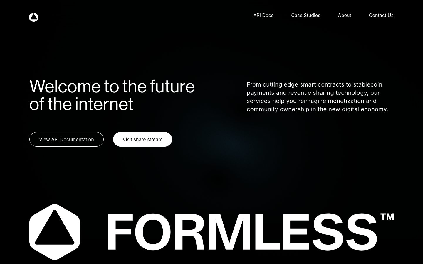
Formless is a pure-black Web3 infrastructure marketing surface. The entire system sits on a `{colors.canvas}` (#000000) floor with white ink (`{colors.ink}` — #ffffff) on top. There is no brand color in the chromatic sense — the palette is black, white, and a graduated ramp of cool grays (#111827 through #f3f4f6). Voltage comes from scale and contrast, not hue: an oversized **FORMLESS™** wordmark at `{typography.display-hero}` (95px) anchors the page top and bottom, and a single 3D glass-torus render carries all the visual texture the system needs.
Type voice splits into two roles: **Neue Haas Grotesk Display Pro** at weight 500 for every headline (the hero "Welcome to the future of the internet", the giant FORMLESS wordmark, the "01" section index, section titles) and **Inter** at weight 400 for body copy and button labels. The Neue Haas display work is precise, slightly tracked-out (0.3–0.6px positive letter-spacing), and confident; Inter handles the supporting prose at a comfortable 20px reading size.
Components are deliberately minimal. The two hero CTAs are pill-shaped (`{rounded.pill}` — 9999px) — one white-filled (`{component.button-primary}`), one transparent with a thin outline (`{component.button-outline}`). Everything else — service cards, image tiles, footer — is hard-edged with zero border radius (`{rounded.none}`) and no shadow. The system relies on a black-on-black layering, soft radial glows in the background, and one photoreal 3D object for depth.
**Key Characteristics:**
- Pure black canvas (`{colors.canvas}` — #000000) with white type — a true monochrome dark-mode brand. No accent hue anywhere.
- Two display typefaces: Neue Haas Grotesk Display Pro 500 for all headlines and the oversized wordmark; Inter 400 for body + buttons.
- The FORMLESS™ wordmark at `{typography.display-hero}` (95px) is the dominant brand element — it appears both at the top of the page and again in the footer, bracketing the scroll.
- Two pill CTAs (`{rounded.pill}`): a white-filled primary and a thin-outlined secondary, both ~44px tall.
- Flat, zero-radius cards (`{rounded.none}`) with no shadow (`box-shadow: none` measured) — the service tiles and image cards are crisp rectangles.
- Depth comes from a single 3D glass render and faint radial background glows, not from elevation tokens.
- Gray ramp (#9ca3af, #6b7280, #4b5563, #374151) used purely for secondary/tertiary text and hairlines on black.
## Colors
### Brand & Action
- **Primary** (`{colors.primary}` — #ffffff): The action color. The filled hero CTA ("Visit share.stream") uses white fill with `{colors.on-primary}` (#111827) dark text. In a monochrome system, white IS the brand.
- **On Primary** (`{colors.on-primary}` — #111827): Dark text used on the white-filled button — a near-black with a faint blue cast.
### Surface
- **Canvas** (`{colors.canvas}` — #000000): The universal page floor. Every band sits on pure black.
- **Surface Raised** (`{colors.surface-raised}` — #111827): Slightly lifted dark panels — the code-snippet service card and similar dark tiles read marginally above the black canvas.
- **Surface Elevated** (`{colors.surface-elevated}` — #1f2937): The next step up in the dark ramp, used for nested panels or borders on raised surfaces.
### Lines & Borders
- **Hairline** (`{colors.hairline}` — #374151): 1px dividers and the thin outline on `{component.button-outline}`.
- **Hairline Strong** (`{colors.hairline-strong}` — #4b5563): A slightly brighter divider for emphasis on black.
- **Border Soft / Softer / Softest** (`{colors.border-soft}` — #d1d5db, `{colors.border-softer}` — #e5e7eb, `{colors.border-softest}` — #f3f4f6): A light-gray ramp captured in the CSS, used sparingly for high-contrast hairlines, icon strokes, or fine UI detail.
### Text
- **Ink** (`{colors.ink}` — #ffffff): All headlines, primary body text, and the wordmark.
- **Muted** (`{colors.muted}` — #9ca3af): Secondary text — supporting captions, inline text-links ("View Documentation ↳"), footer body.
- **Muted Soft** (`{colors.muted-soft}` — #6b7280): Tertiary text — fine print, copyright, terms links in the footer.
## Typography
### Font Family
The system runs **Neue Haas Grotesk Display Pro** for all display + headline + wordmark roles and **Inter** for body copy and button labels. Neue Haas is a commercial/licensed typeface — it is not bundled here. Both run weight 500 (display) and 400 (Inter body/button). The Neue Haas display sizes carry a small positive letter-spacing (0.3–0.6px) that gives the headlines a clean, slightly airy precision; the giant 95px wordmark uses `normal` tracking.
The split is strict:
- Neue Haas Grotesk Display Pro (500) — hero headline, FORMLESS wordmark, the "01" section index, section titles
- Inter (400) — body paragraphs, CTA labels, nav links
### Hierarchy
| Token | Size | Weight | Line Height | Letter Spacing | Use |
|---|---|---|---|---|---|
| `{typography.display-hero}` | 95px | 500 | 1.0 | normal | The FORMLESS™ wordmark (top + footer) and the giant "01" section index — Neue Haas |
| `{typography.display-xl}` | 60px | 500 | 1.0 | 0.6px | Hero headline ("Welcome to the future of the internet") — Neue Haas |
| `{typography.title}` | 30px | 500 | 1.0 | 0.3px | Section titles ("SHARE Protocol and API") — Neue Haas |
| `{typography.body}` | 20px | 400 | 1.4 | 0.2px | Running body copy, supporting paragraphs — Inter |
| `{typography.button}` | 16px | 400 | 1.5 | normal | CTA labels, nav links, text-links, footer — Inter |
### Principles
Neue Haas Grotesk is the headline voice; Inter is the reading voice. The boundary is absolute — display never drops into Inter, body never climbs into Neue Haas. Display weight stays at 500 across every size; the system never bolds to 700. Hierarchy is driven by dramatic size jumps (95 → 60 → 30 → 20) rather than weight changes. The tight 1.0 line-height on all display roles keeps the big type compact and architectural.
### Note on Font Substitutes
**Neue Haas Grotesk Display Pro** is a licensed commercial typeface and is not shipped here. The closest open-source substitute is **Archivo** (weight 500) for the display roles — a grotesque with similar proportions and a clean display cut. **Inter** at weight 500 with slight positive tracking is a usable fallback that keeps the system to a single shipped family. Body and button roles already use Inter, which is open-source and shipped directly.
## Layout
### Spacing System
- **Base unit:** 4px (most measured values are multiples — 12, 16, 24, 32, 40, 48, 80, 120).
- **Tokens:** `{spacing.xxs}` 12px · `{spacing.xs}` 16px · `{spacing.sm}` 24px · `{spacing.md}` 32px · `{spacing.lg}` 40px · `{spacing.control}` 44px · `{spacing.xl}` 48px · `{spacing.xxl}` 80px · `{spacing.section}` 120px.
- **Control height:** `{spacing.control}` (44px) appeared most frequently (7×) and corresponds to the pill CTA height — a comfortable, WCAG-meeting tap target.
- **Section rhythm:** `{spacing.section}` (120px) is the largest measured gap — the vertical breathing room between the hero, the wordmark band, and the numbered service sections.
- **Card / cluster spacing:** `{spacing.sm}` (24px) and `{spacing.md}` (32px) handle internal card padding and gaps between grouped elements.
Note: the measurement also captured several off-grid odd values (13, 17, 60, 62, 67, 70, 82). These are documented in Known Gaps and were not promoted to tokens.
### Grid & Container
- **Hero band:** a two-column split — `{typography.display-xl}` headline on the left, a `{typography.body}` supporting paragraph on the right.
- **CTA row:** two pill buttons sit inline beneath the hero headline with `{spacing.sm}` (24px) between them.
- **Service sections:** a numbered editorial layout — large "01" index + 3D render on one side, title + body on the other.
- **Lower service grid:** a 3-up tile row (code-snippet dark card, share.stream image card, Consulting Services image card) at desktop.
- **Footer:** social-icon row, link list, and the repeated FORMLESS wordmark spanning the full width.
### Whitespace Philosophy
Formless uses very generous negative space — the page is mostly black, with large empty stretches between bands. The 120px section rhythm and the oversized type let single statements breathe. Density is intentionally low; each scroll position holds one idea.
## Elevation & Depth
| Level | Treatment | Use |
|---|---|---|
| Flat | No shadow, no border (`box-shadow: none` measured) | Default — every card, button, and band |
| Tonal lift | `{colors.surface-raised}` (#111827) panel on the #000000 canvas | The dark code-snippet service card reads marginally above the black floor |
| Tonal lift+ | `{colors.surface-elevated}` (#1f2937) | Nested panels / borders on raised surfaces |
| Render depth | A photoreal 3D glass-torus object | The single source of dimensional richness on the page |
| Background glow | Soft radial light pools behind the hero and lower sections | Ambient depth on the black canvas — not a token |
The elevation philosophy is **flat-with-atmosphere**: no drop shadows anywhere (the measured shadow is a transparent zero stack). Depth is created entirely by (1) tonal steps in the dark gray ramp, (2) a single 3D rendered object, and (3) faint radial glows baked into the background. There is no neumorphism, no glassmorphism in the UI chrome (only in the rendered art object).
### Decorative Depth
- The chrome/glass torus render in the "01" section is the marquee depth element — it carries refraction, caustics, and chromatic edges that contrast the otherwise matte-black surface.
- Subtle radial gradients behind the hero and footer wordmark lift the black from flat to atmospheric.
## Shapes
### Border Radius Scale
| Token | Value | Use |
|---|---|---|
| `{rounded.none}` | 0px | Everything except buttons — service cards, image tiles, panels are hard-edged rectangles (measured `radius: 0px`) |
| `{rounded.pill}` | 9999px | The two hero CTAs — fully rounded pill buttons (measured) |
The shape language is binary: pill CTAs against everything-else-square. The contrast between the soft pill buttons and the crisp zero-radius cards is the system's only geometric tension.
### Photography & Render Geometry
- Image cards (the share.stream portrait, the Consulting Services workspace photo) are zero-radius rectangles — crisp, full-bleed within their tile.
- The 3D glass render is a free-floating object with no container frame.
- The logo mark is a hexagonal badge enclosing a triangle — a custom geometric mark, rendered in white.
## Components
### Navigation
**`top-nav`** — Transparent bar pinned to the top of the page over the black canvas. Carries the hexagon `{component.logo-mark}` at far left and a right-aligned horizontal menu (API Docs, Case Studies, About, Contact Us) in `{typography.button}` (Inter 16px / 400), color `{colors.ink}`. No background fill, no border — it floats directly on the canvas.
**`nav-link`** — Individual menu item, transparent background, `{colors.ink}` text, `{typography.button}`.
**`logo-mark`** — The white hexagonal badge enclosing a triangle, displayed at top-left in the nav and again (larger) beside the footer wordmark.
### Buttons
**`button-primary`** — The filled hero CTA ("Visit share.stream"). Background `{colors.primary}` (#ffffff), text `{colors.on-primary}` (#111827), type `{typography.button}` (Inter 16px / 400), fully rounded `{rounded.pill}` (9999px), height ~44px (`{spacing.control}`).
**`button-outline`** — The transparent hero CTA ("View API Documentation"). Transparent background, `{colors.ink}` text, 1px `{colors.hairline}` outline, type `{typography.button}`, rounded `{rounded.pill}`, height ~44px. The outline/fill pairing is the system's primary/secondary CTA convention.
### Brand Type
**`wordmark-display`** — The oversized **FORMLESS™** wordmark in `{typography.display-hero}` (Neue Haas 95px / 500), `{colors.ink}`, sitting beside the logo mark. Appears once near the top of the page and again in the footer — it brackets the entire scroll.
**`section-number`** — The large numeric index ("01") in `{typography.display-hero}`, `{colors.ink}`, used to label each service section in the numbered editorial layout.
### Cards & Containers
**`hero-band`** — The opening band: `{typography.display-xl}` headline left, `{typography.body}` supporting copy right, two pill CTAs below. Background `{colors.canvas}`, vertical rhythm at `{spacing.section}` (120px).
**`service-card`** — Lower-grid content tile (e.g., share.stream image card, Consulting Services image card). Background `{colors.canvas}`, `{colors.ink}` title + `{colors.muted}` body, type `{typography.body}`, rounded `{rounded.none}` (0px), no shadow, padding `{spacing.sm}` (24px). Carries a title, short description, and a `{component.text-link}` CTA.
**`service-card-dark`** — The code-snippet variant tile, lifted onto `{colors.surface-raised}` (#111827) to separate it tonally from the black canvas. Same zero-radius, shadowless treatment.
**`text-link`** — Inline arrow CTA ("View Documentation ↳", "Visit share.stream ↳", "Schedule a Meeting ↳"). Transparent, `{colors.muted}` text, type `{typography.button}`, with a trailing arrow glyph.
### Footer
**`footer`** — Closing band on `{colors.canvas}`. Carries a social-icon row (X, LinkedIn, Instagram, Discord), the repeated `{component.wordmark-display}` FORMLESS™ at full width, and a fine-print row (© FORMLESS, Privacy Policy, Terms of Service) in `{typography.button}` color `{colors.muted-soft}`. Padding `{spacing.xl}` (48px).
**`social-icon`** — Transparent icon button in `{colors.ink}`, used in the footer social row.
## Do's and Don'ts
### Do
- Keep the canvas pure black (`{colors.canvas}` — #000000) and type white. The brand is monochrome; contrast is the system.
- Use Neue Haas Grotesk Display Pro (500) for every headline and the wordmark; use Inter (400) for body and buttons. Never blur the two.
- Drive hierarchy with size jumps (95 → 60 → 30 → 20), not weight changes. Display stays at 500.
- Pair the filled `{component.button-primary}` with the outlined `{component.button-outline}` for primary/secondary CTAs — both pill-shaped.
- Keep cards zero-radius (`{rounded.none}`) and shadowless. The square cards against pill buttons is the intended tension.
- Use the gray ramp (`{colors.muted}`, `{colors.muted-soft}`) only for secondary/tertiary text and hairlines — never as a fill color.
- Let single statements breathe on 120px section rhythm. Density stays low.
- Bracket the page with the FORMLESS wordmark — once near the top, once in the footer.
### Don't
- Don't introduce a chromatic accent color. The palette is black, white, and cool grays only.
- Don't bold display type beyond 500 or add a third typeface.
- Don't round cards or image tiles. Pill radius is reserved for buttons.
- Don't add drop shadows — depth comes from tonal steps, the 3D render, and background glows.
- Don't let the gray ramp creep onto buttons or headlines; it's a text-support and hairline ramp.
- Don't add hover-state styling beyond default + pressed.
## Responsive Behavior
### Breakpoints
The capture covered a single landing page at desktop width; breakpoint behavior below is inferred from the layout structure and should be validated.
| Name | Width | Key Changes (inferred) |
|---|---|---|
| Mobile | < 768px | Nav collapses to a menu; hero two-column split stacks (headline, then body, then CTAs); display-hero wordmark scales down to fit width; service grid → 1-up |
| Tablet | 768–1024px | Nav stays horizontal; hero stacks or tightens; service grid → 2-up |
| Desktop | 1024–1440px | Full layout as captured — two-column hero, 3-up service grid, full-width wordmark |
| Wide | > 1440px | Same as desktop with additional outer breathing room |
### Touch Targets
- `{component.button-primary}` and `{component.button-outline}` at ~44px height (`{spacing.control}`) meet WCAG's 44px minimum.
- `{component.nav-link}` and `{component.text-link}` rely on `{typography.button}` (16px) with surrounding padding for tap area.
- `{component.social-icon}` tap sizing was not measured.
### Collapsing Strategy
- The two-column hero collapses to a single column on narrow viewports.
- The oversized FORMLESS wordmark must scale fluidly to avoid horizontal overflow on small screens.
- The 3-up service tile row reduces columns rather than shrinking individual cards excessively.
### Image / Render Behavior
- Image tiles are zero-radius and should crop rather than distort on resize.
- The 3D glass render scales proportionally and remains the focal element of the "01" section.
## Iteration Guide
1. Focus on ONE component at a time. Reference its YAML key directly (`{component.button-primary}`, `{component.service-card-dark}`).
2. Variants of a component (`-dark`, `-outline`) live as separate entries in `components:`.
3. Use `{token.refs}` everywhere — never inline a hex in a component.
4. Never document hover. Default and Active/Pressed states only.
5. Headlines stay Neue Haas Grotesk Display 500; body stays Inter 400. The pairing does not blur.
6. The system is monochrome — when reaching for emphasis, scale up the type or step the dark gray ramp; never add a color.
7. Cards stay square (`{rounded.none}`); pills stay reserved for CTAs.
## Known Gaps
- **Neue Haas Grotesk Display Pro** is a licensed commercial typeface (not flagged in `fonts_licensed`, but commercial nonetheless); it is not shipped. Archivo / Inter substitutes are documented in the Typography section.
- `button-primary` was measured with `radius: 0px` and `padding: 0px` (the computed selector captured an inner element); the visible CTAs are clearly pill-shaped — the `9999px` radius token IS measured (frequency 2) and the height is derived from the 44px control spacing. Exact button padding could not be confirmed and is approximated from screenshot ground-truth.
- Several off-grid spacing values were measured (13, 17, 60, 62, 67, 70, 82px) and not promoted to tokens; they may represent one-off layout offsets or sub-pixel rounding.
- Only the landing page was captured — interior pages (API Docs, Case Studies, About, Contact) and their components are out of scope.
- Background radial glows and the 3D glass render are art assets, not system tokens; their exact gradients/lighting were not extracted.
- The light-gray border ramp (#d1d5db, #e5e7eb, #f3f4f6) was captured in CSS but its precise on-page usage (likely icon strokes or fine hairlines) could not be pinpointed from the landing capture.
- Responsive breakpoints, hover/focus states, form validation, and animation/transition timings were not measured and are inferred or out of scope.
<!-- Documented by duply · real-world design systems as ready-to-use DESIGN.md for AI coding agents · https://duply.ai/formless/design-md -->
Color Palette
Accent
Neutrals
Typography
display-hero95px · 500 · 1
The quick brown fox jumpsdisplay-xl60px · 500 · 1
The quick brown fox jumpstitle30px · 500 · 1
The quick brown fox jumpsbody20px · 400 · 1.4
The quick brown fox jumpsbutton16px · 400 · 1.5
The quick brown fox jumpsSpacing & Shape
Spacing
| Name | Value | Preview |
|---|---|---|
| xxs | 12px | |
| xs | 16px | |
| sm | 24px | |
| md | 32px | |
| lg | 40px | |
| control | 44px | |
| xl | 48px | |
| xxl | 80px | |
| section | 120px |
Border Radius
| Name | Value | Preview |
|---|---|---|
| none | 0px | |
| pill | 9999px |
More like this


---
version: alpha
name: Formless-design-analysis
description: "A pure-black, high-contrast Web3 marketing surface built on a #000000 canvas with white type and a single oversized FORMLESS wordmark anchoring the page. The system reads as confident crypto-infrastructure brand — Neue Haas Grotesk Display headlines at large sizes, Inter body copy, pill-shaped CTAs, hard-edged (zero-radius) flat cards, and depth supplied by a single 3D glass render plus soft radial glows rather than shadows or color."
colors:
  canvas: "#000000"
  ink: "#ffffff"
  primary: "#ffffff"
  on-primary: "#111827"
  surface-raised: "#111827"
  surface-elevated: "#1f2937"
  hairline: "#374151"
  hairline-strong: "#4b5563"
  muted: "#9ca3af"
  muted-soft: "#6b7280"
  border-soft: "#d1d5db"
  border-softer: "#e5e7eb"
  border-softest: "#f3f4f6"
typography:
  display-hero:
    fontFamily: "Neue Haas Grotesk Display Pro, Archivo, Inter, sans-serif"
    fontSize: 95px
    fontWeight: 500
    lineHeight: 1.0
    letterSpacing: normal
  display-xl:
    fontFamily: "Neue Haas Grotesk Display Pro, Archivo, Inter, sans-serif"
    fontSize: 60px
    fontWeight: 500
    lineHeight: 1.0
    letterSpacing: 0.6px
  title:
    fontFamily: "Neue Haas Grotesk Display Pro, Archivo, Inter, sans-serif"
    fontSize: 30px
    fontWeight: 500
    lineHeight: 1.0
    letterSpacing: 0.3px
  body:
    fontFamily: "Inter, sans-serif"
    fontSize: 20px
    fontWeight: 400
    lineHeight: 1.4
    letterSpacing: 0.2px
  button:
    fontFamily: "Inter, sans-serif"
    fontSize: 16px
    fontWeight: 400
    lineHeight: 1.5
    letterSpacing: normal
rounded:
  none: 0px
  pill: 9999px
spacing:
  xxs: 12px
  xs: 16px
  sm: 24px
  md: 32px
  lg: 40px
  control: 44px
  xl: 48px
  xxl: 80px
  section: 120px
components:
  top-nav:
    backgroundColor: transparent
    textColor: "{colors.ink}"
    typography: "{typography.button}"
    padding: 32px
  nav-link:
    backgroundColor: transparent
    textColor: "{colors.ink}"
    typography: "{typography.button}"
  logo-mark:
    backgroundColor: transparent
    textColor: "{colors.ink}"
  button-primary:
    backgroundColor: "{colors.primary}"
    textColor: "{colors.on-primary}"
    typography: "{typography.button}"
    rounded: "{rounded.pill}"
    height: 44px
    padding: 16px
  button-outline:
    backgroundColor: transparent
    textColor: "{colors.ink}"
    typography: "{typography.button}"
    rounded: "{rounded.pill}"
    height: 44px
    padding: 16px
  hero-band:
    backgroundColor: "{colors.canvas}"
    textColor: "{colors.ink}"
    typography: "{typography.display-xl}"
    padding: 120px
  wordmark-display:
    backgroundColor: transparent
    textColor: "{colors.ink}"
    typography: "{typography.display-hero}"
  section-number:
    backgroundColor: transparent
    textColor: "{colors.ink}"
    typography: "{typography.display-hero}"
  service-card:
    backgroundColor: "{colors.canvas}"
    textColor: "{colors.ink}"
    typography: "{typography.body}"
    rounded: "{rounded.none}"
    padding: 24px
  service-card-dark:
    backgroundColor: "{colors.surface-raised}"
    textColor: "{colors.ink}"
    typography: "{typography.body}"
    rounded: "{rounded.none}"
    padding: 24px
  text-link:
    backgroundColor: transparent
    textColor: "{colors.muted}"
    typography: "{typography.button}"
  footer:
    backgroundColor: "{colors.canvas}"
    textColor: "{colors.muted}"
    typography: "{typography.button}"
    padding: 48px
  social-icon:
    backgroundColor: transparent
    textColor: "{colors.ink}"
---

## Overview

Formless is a pure-black Web3 infrastructure marketing surface. The entire system sits on a `{colors.canvas}` (#000000) floor with white ink (`{colors.ink}` — #ffffff) on top. There is no brand color in the chromatic sense — the palette is black, white, and a graduated ramp of cool grays (#111827 through #f3f4f6). Voltage comes from scale and contrast, not hue: an oversized **FORMLESS™** wordmark at `{typography.display-hero}` (95px) anchors the page top and bottom, and a single 3D glass-torus render carries all the visual texture the system needs.

Type voice splits into two roles: **Neue Haas Grotesk Display Pro** at weight 500 for every headline (the hero "Welcome to the future of the internet", the giant FORMLESS wordmark, the "01" section index, section titles) and **Inter** at weight 400 for body copy and button labels. The Neue Haas display work is precise, slightly tracked-out (0.3–0.6px positive letter-spacing), and confident; Inter handles the supporting prose at a comfortable 20px reading size.

Components are deliberately minimal. The two hero CTAs are pill-shaped (`{rounded.pill}` — 9999px) — one white-filled (`{component.button-primary}`), one transparent with a thin outline (`{component.button-outline}`). Everything else — service cards, image tiles, footer — is hard-edged with zero border radius (`{rounded.none}`) and no shadow. The system relies on a black-on-black layering, soft radial glows in the background, and one photoreal 3D object for depth.

**Key Characteristics:**
- Pure black canvas (`{colors.canvas}` — #000000) with white type — a true monochrome dark-mode brand. No accent hue anywhere.
- Two display typefaces: Neue Haas Grotesk Display Pro 500 for all headlines and the oversized wordmark; Inter 400 for body + buttons.
- The FORMLESS™ wordmark at `{typography.display-hero}` (95px) is the dominant brand element — it appears both at the top of the page and again in the footer, bracketing the scroll.
- Two pill CTAs (`{rounded.pill}`): a white-filled primary and a thin-outlined secondary, both ~44px tall.
- Flat, zero-radius cards (`{rounded.none}`) with no shadow (`box-shadow: none` measured) — the service tiles and image cards are crisp rectangles.
- Depth comes from a single 3D glass render and faint radial background glows, not from elevation tokens.
- Gray ramp (#9ca3af, #6b7280, #4b5563, #374151) used purely for secondary/tertiary text and hairlines on black.

## Colors

### Brand & Action
- **Primary** (`{colors.primary}` — #ffffff): The action color. The filled hero CTA ("Visit share.stream") uses white fill with `{colors.on-primary}` (#111827) dark text. In a monochrome system, white IS the brand.
- **On Primary** (`{colors.on-primary}` — #111827): Dark text used on the white-filled button — a near-black with a faint blue cast.

### Surface
- **Canvas** (`{colors.canvas}` — #000000): The universal page floor. Every band sits on pure black.
- **Surface Raised** (`{colors.surface-raised}` — #111827): Slightly lifted dark panels — the code-snippet service card and similar dark tiles read marginally above the black canvas.
- **Surface Elevated** (`{colors.surface-elevated}` — #1f2937): The next step up in the dark ramp, used for nested panels or borders on raised surfaces.

### Lines & Borders
- **Hairline** (`{colors.hairline}` — #374151): 1px dividers and the thin outline on `{component.button-outline}`.
- **Hairline Strong** (`{colors.hairline-strong}` — #4b5563): A slightly brighter divider for emphasis on black.
- **Border Soft / Softer / Softest** (`{colors.border-soft}` — #d1d5db, `{colors.border-softer}` — #e5e7eb, `{colors.border-softest}` — #f3f4f6): A light-gray ramp captured in the CSS, used sparingly for high-contrast hairlines, icon strokes, or fine UI detail.

### Text
- **Ink** (`{colors.ink}` — #ffffff): All headlines, primary body text, and the wordmark.
- **Muted** (`{colors.muted}` — #9ca3af): Secondary text — supporting captions, inline text-links ("View Documentation ↳"), footer body.
- **Muted Soft** (`{colors.muted-soft}` — #6b7280): Tertiary text — fine print, copyright, terms links in the footer.

## Typography

### Font Family
The system runs **Neue Haas Grotesk Display Pro** for all display + headline + wordmark roles and **Inter** for body copy and button labels. Neue Haas is a commercial/licensed typeface — it is not bundled here. Both run weight 500 (display) and 400 (Inter body/button). The Neue Haas display sizes carry a small positive letter-spacing (0.3–0.6px) that gives the headlines a clean, slightly airy precision; the giant 95px wordmark uses `normal` tracking.

The split is strict:
- Neue Haas Grotesk Display Pro (500) — hero headline, FORMLESS wordmark, the "01" section index, section titles
- Inter (400) — body paragraphs, CTA labels, nav links

### Hierarchy

| Token | Size | Weight | Line Height | Letter Spacing | Use |
|---|---|---|---|---|---|
| `{typography.display-hero}` | 95px | 500 | 1.0 | normal | The FORMLESS™ wordmark (top + footer) and the giant "01" section index — Neue Haas |
| `{typography.display-xl}` | 60px | 500 | 1.0 | 0.6px | Hero headline ("Welcome to the future of the internet") — Neue Haas |
| `{typography.title}` | 30px | 500 | 1.0 | 0.3px | Section titles ("SHARE Protocol and API") — Neue Haas |
| `{typography.body}` | 20px | 400 | 1.4 | 0.2px | Running body copy, supporting paragraphs — Inter |
| `{typography.button}` | 16px | 400 | 1.5 | normal | CTA labels, nav links, text-links, footer — Inter |

### Principles
Neue Haas Grotesk is the headline voice; Inter is the reading voice. The boundary is absolute — display never drops into Inter, body never climbs into Neue Haas. Display weight stays at 500 across every size; the system never bolds to 700. Hierarchy is driven by dramatic size jumps (95 → 60 → 30 → 20) rather than weight changes. The tight 1.0 line-height on all display roles keeps the big type compact and architectural.

### Note on Font Substitutes
**Neue Haas Grotesk Display Pro** is a licensed commercial typeface and is not shipped here. The closest open-source substitute is **Archivo** (weight 500) for the display roles — a grotesque with similar proportions and a clean display cut. **Inter** at weight 500 with slight positive tracking is a usable fallback that keeps the system to a single shipped family. Body and button roles already use Inter, which is open-source and shipped directly.

## Layout

### Spacing System
- **Base unit:** 4px (most measured values are multiples — 12, 16, 24, 32, 40, 48, 80, 120).
- **Tokens:** `{spacing.xxs}` 12px · `{spacing.xs}` 16px · `{spacing.sm}` 24px · `{spacing.md}` 32px · `{spacing.lg}` 40px · `{spacing.control}` 44px · `{spacing.xl}` 48px · `{spacing.xxl}` 80px · `{spacing.section}` 120px.
- **Control height:** `{spacing.control}` (44px) appeared most frequently (7×) and corresponds to the pill CTA height — a comfortable, WCAG-meeting tap target.
- **Section rhythm:** `{spacing.section}` (120px) is the largest measured gap — the vertical breathing room between the hero, the wordmark band, and the numbered service sections.
- **Card / cluster spacing:** `{spacing.sm}` (24px) and `{spacing.md}` (32px) handle internal card padding and gaps between grouped elements.

Note: the measurement also captured several off-grid odd values (13, 17, 60, 62, 67, 70, 82). These are documented in Known Gaps and were not promoted to tokens.

### Grid & Container
- **Hero band:** a two-column split — `{typography.display-xl}` headline on the left, a `{typography.body}` supporting paragraph on the right.
- **CTA row:** two pill buttons sit inline beneath the hero headline with `{spacing.sm}` (24px) between them.
- **Service sections:** a numbered editorial layout — large "01" index + 3D render on one side, title + body on the other.
- **Lower service grid:** a 3-up tile row (code-snippet dark card, share.stream image card, Consulting Services image card) at desktop.
- **Footer:** social-icon row, link list, and the repeated FORMLESS wordmark spanning the full width.

### Whitespace Philosophy
Formless uses very generous negative space — the page is mostly black, with large empty stretches between bands. The 120px section rhythm and the oversized type let single statements breathe. Density is intentionally low; each scroll position holds one idea.

## Elevation & Depth

| Level | Treatment | Use |
|---|---|---|
| Flat | No shadow, no border (`box-shadow: none` measured) | Default — every card, button, and band |
| Tonal lift | `{colors.surface-raised}` (#111827) panel on the #000000 canvas | The dark code-snippet service card reads marginally above the black floor |
| Tonal lift+ | `{colors.surface-elevated}` (#1f2937) | Nested panels / borders on raised surfaces |
| Render depth | A photoreal 3D glass-torus object | The single source of dimensional richness on the page |
| Background glow | Soft radial light pools behind the hero and lower sections | Ambient depth on the black canvas — not a token |

The elevation philosophy is **flat-with-atmosphere**: no drop shadows anywhere (the measured shadow is a transparent zero stack). Depth is created entirely by (1) tonal steps in the dark gray ramp, (2) a single 3D rendered object, and (3) faint radial glows baked into the background. There is no neumorphism, no glassmorphism in the UI chrome (only in the rendered art object).

### Decorative Depth
- The chrome/glass torus render in the "01" section is the marquee depth element — it carries refraction, caustics, and chromatic edges that contrast the otherwise matte-black surface.
- Subtle radial gradients behind the hero and footer wordmark lift the black from flat to atmospheric.

## Shapes

### Border Radius Scale

| Token | Value | Use |
|---|---|---|
| `{rounded.none}` | 0px | Everything except buttons — service cards, image tiles, panels are hard-edged rectangles (measured `radius: 0px`) |
| `{rounded.pill}` | 9999px | The two hero CTAs — fully rounded pill buttons (measured) |

The shape language is binary: pill CTAs against everything-else-square. The contrast between the soft pill buttons and the crisp zero-radius cards is the system's only geometric tension.

### Photography & Render Geometry
- Image cards (the share.stream portrait, the Consulting Services workspace photo) are zero-radius rectangles — crisp, full-bleed within their tile.
- The 3D glass render is a free-floating object with no container frame.
- The logo mark is a hexagonal badge enclosing a triangle — a custom geometric mark, rendered in white.

## Components

### Navigation

**`top-nav`** — Transparent bar pinned to the top of the page over the black canvas. Carries the hexagon `{component.logo-mark}` at far left and a right-aligned horizontal menu (API Docs, Case Studies, About, Contact Us) in `{typography.button}` (Inter 16px / 400), color `{colors.ink}`. No background fill, no border — it floats directly on the canvas.

**`nav-link`** — Individual menu item, transparent background, `{colors.ink}` text, `{typography.button}`.

**`logo-mark`** — The white hexagonal badge enclosing a triangle, displayed at top-left in the nav and again (larger) beside the footer wordmark.

### Buttons

**`button-primary`** — The filled hero CTA ("Visit share.stream"). Background `{colors.primary}` (#ffffff), text `{colors.on-primary}` (#111827), type `{typography.button}` (Inter 16px / 400), fully rounded `{rounded.pill}` (9999px), height ~44px (`{spacing.control}`).

**`button-outline`** — The transparent hero CTA ("View API Documentation"). Transparent background, `{colors.ink}` text, 1px `{colors.hairline}` outline, type `{typography.button}`, rounded `{rounded.pill}`, height ~44px. The outline/fill pairing is the system's primary/secondary CTA convention.

### Brand Type

**`wordmark-display`** — The oversized **FORMLESS™** wordmark in `{typography.display-hero}` (Neue Haas 95px / 500), `{colors.ink}`, sitting beside the logo mark. Appears once near the top of the page and again in the footer — it brackets the entire scroll.

**`section-number`** — The large numeric index ("01") in `{typography.display-hero}`, `{colors.ink}`, used to label each service section in the numbered editorial layout.

### Cards & Containers

**`hero-band`** — The opening band: `{typography.display-xl}` headline left, `{typography.body}` supporting copy right, two pill CTAs below. Background `{colors.canvas}`, vertical rhythm at `{spacing.section}` (120px).

**`service-card`** — Lower-grid content tile (e.g., share.stream image card, Consulting Services image card). Background `{colors.canvas}`, `{colors.ink}` title + `{colors.muted}` body, type `{typography.body}`, rounded `{rounded.none}` (0px), no shadow, padding `{spacing.sm}` (24px). Carries a title, short description, and a `{component.text-link}` CTA.

**`service-card-dark`** — The code-snippet variant tile, lifted onto `{colors.surface-raised}` (#111827) to separate it tonally from the black canvas. Same zero-radius, shadowless treatment.

**`text-link`** — Inline arrow CTA ("View Documentation ↳", "Visit share.stream ↳", "Schedule a Meeting ↳"). Transparent, `{colors.muted}` text, type `{typography.button}`, with a trailing arrow glyph.

### Footer

**`footer`** — Closing band on `{colors.canvas}`. Carries a social-icon row (X, LinkedIn, Instagram, Discord), the repeated `{component.wordmark-display}` FORMLESS™ at full width, and a fine-print row (© FORMLESS, Privacy Policy, Terms of Service) in `{typography.button}` color `{colors.muted-soft}`. Padding `{spacing.xl}` (48px).

**`social-icon`** — Transparent icon button in `{colors.ink}`, used in the footer social row.

## Do's and Don'ts

### Do
- Keep the canvas pure black (`{colors.canvas}` — #000000) and type white. The brand is monochrome; contrast is the system.
- Use Neue Haas Grotesk Display Pro (500) for every headline and the wordmark; use Inter (400) for body and buttons. Never blur the two.
- Drive hierarchy with size jumps (95 → 60 → 30 → 20), not weight changes. Display stays at 500.
- Pair the filled `{component.button-primary}` with the outlined `{component.button-outline}` for primary/secondary CTAs — both pill-shaped.
- Keep cards zero-radius (`{rounded.none}`) and shadowless. The square cards against pill buttons is the intended tension.
- Use the gray ramp (`{colors.muted}`, `{colors.muted-soft}`) only for secondary/tertiary text and hairlines — never as a fill color.
- Let single statements breathe on 120px section rhythm. Density stays low.
- Bracket the page with the FORMLESS wordmark — once near the top, once in the footer.

### Don't
- Don't introduce a chromatic accent color. The palette is black, white, and cool grays only.
- Don't bold display type beyond 500 or add a third typeface.
- Don't round cards or image tiles. Pill radius is reserved for buttons.
- Don't add drop shadows — depth comes from tonal steps, the 3D render, and background glows.
- Don't let the gray ramp creep onto buttons or headlines; it's a text-support and hairline ramp.
- Don't add hover-state styling beyond default + pressed.

## Responsive Behavior

### Breakpoints
The capture covered a single landing page at desktop width; breakpoint behavior below is inferred from the layout structure and should be validated.

| Name | Width | Key Changes (inferred) |
|---|---|---|
| Mobile | < 768px | Nav collapses to a menu; hero two-column split stacks (headline, then body, then CTAs); display-hero wordmark scales down to fit width; service grid → 1-up |
| Tablet | 768–1024px | Nav stays horizontal; hero stacks or tightens; service grid → 2-up |
| Desktop | 1024–1440px | Full layout as captured — two-column hero, 3-up service grid, full-width wordmark |
| Wide | > 1440px | Same as desktop with additional outer breathing room |

### Touch Targets
- `{component.button-primary}` and `{component.button-outline}` at ~44px height (`{spacing.control}`) meet WCAG's 44px minimum.
- `{component.nav-link}` and `{component.text-link}` rely on `{typography.button}` (16px) with surrounding padding for tap area.
- `{component.social-icon}` tap sizing was not measured.

### Collapsing Strategy
- The two-column hero collapses to a single column on narrow viewports.
- The oversized FORMLESS wordmark must scale fluidly to avoid horizontal overflow on small screens.
- The 3-up service tile row reduces columns rather than shrinking individual cards excessively.

### Image / Render Behavior
- Image tiles are zero-radius and should crop rather than distort on resize.
- The 3D glass render scales proportionally and remains the focal element of the "01" section.

## Iteration Guide

1. Focus on ONE component at a time. Reference its YAML key directly (`{component.button-primary}`, `{component.service-card-dark}`).
2. Variants of a component (`-dark`, `-outline`) live as separate entries in `components:`.
3. Use `{token.refs}` everywhere — never inline a hex in a component.
4. Never document hover. Default and Active/Pressed states only.
5. Headlines stay Neue Haas Grotesk Display 500; body stays Inter 400. The pairing does not blur.
6. The system is monochrome — when reaching for emphasis, scale up the type or step the dark gray ramp; never add a color.
7. Cards stay square (`{rounded.none}`); pills stay reserved for CTAs.

## Known Gaps

- **Neue Haas Grotesk Display Pro** is a licensed commercial typeface (not flagged in `fonts_licensed`, but commercial nonetheless); it is not shipped. Archivo / Inter substitutes are documented in the Typography section.
- `button-primary` was measured with `radius: 0px` and `padding: 0px` (the computed selector captured an inner element); the visible CTAs are clearly pill-shaped — the `9999px` radius token IS measured (frequency 2) and the height is derived from the 44px control spacing. Exact button padding could not be confirmed and is approximated from screenshot ground-truth.
- Several off-grid spacing values were measured (13, 17, 60, 62, 67, 70, 82px) and not promoted to tokens; they may represent one-off layout offsets or sub-pixel rounding.
- Only the landing page was captured — interior pages (API Docs, Case Studies, About, Contact) and their components are out of scope.
- Background radial glows and the 3D glass render are art assets, not system tokens; their exact gradients/lighting were not extracted.
- The light-gray border ramp (#d1d5db, #e5e7eb, #f3f4f6) was captured in CSS but its precise on-page usage (likely icon strokes or fine hairlines) could not be pinpointed from the landing capture.
- Responsive breakpoints, hover/focus states, form validation, and animation/transition timings were not measured and are inferred or out of scope.

<!-- Documented by duply · real-world design systems as ready-to-use DESIGN.md for AI coding agents · https://duply.ai/formless/design-md -->