
Mercury
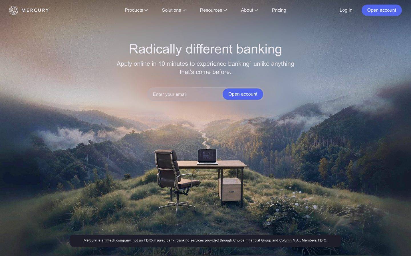
A dark, atmospheric fintech-banking interface built on near-black navy canvas (#171721) with soft near-white text (#ededf3), the custom Arcadia Display typeface for headlines, and a single periwinkle-indigo CTA. The system reads as calm, premium, and photographic — a full-bleed landscape hero, pill-shaped controls (40px radius), heavily rounded lavender-gray cards (32px), and restrained monochrome type. Brand voltage comes from the Arcadia display face and the indigo "Open account" pill set against muted, cinematic imagery.
Works withClaude CodeCursorCodexGemini CLICopilotv0LovableBoltWindsurfReplit
---
version: alpha
name: Mercury-design-analysis
description: "A dark, atmospheric fintech-banking interface built on near-black navy canvas (#171721) with soft near-white text (#ededf3), the custom Arcadia Display typeface for headlines, and a single periwinkle-indigo CTA. The system reads as calm, premium, and photographic — a full-bleed landscape hero, pill-shaped controls (40px radius), heavily rounded lavender-gray cards (32px), and restrained monochrome type. Brand voltage comes from the Arcadia display face and the indigo \"Open account\" pill set against muted, cinematic imagery."

colors:
  primary: "#5266eb"
  accent-periwinkle: "#9cb4e8"
  accent-periwinkle-soft: "#cdddff"
  accent-slate: "#415773"
  ink: "#ededf3"
  body: "#c3c3cc"
  muted: "#9d9da8"
  muted-soft: "#70707d"
  muted-deep: "#535461"
  on-primary: "#ededf3"
  canvas: "#171721"
  surface-dark: "#1e1e2a"
  surface-dark-elevated: "#272735"
  surface-line: "#363644"
  surface-card: "#afb2ce"
  surface-light: "#f4f5f9"
  surface-light-soft: "#fbfcfd"
  hairline-light: "#dddde5"
  neutral-black: "#000000"
  white: "#ffffff"

typography:
  display-xl:
    fontFamily: "Arcadia Display, Georgia, serif"
    fontSize: 49.35px
    fontWeight: 480
    lineHeight: 1.1
    letterSpacing: normal
  display-lg:
    fontFamily: "Arcadia Display, Georgia, serif"
    fontSize: 42px
    fontWeight: 480
    lineHeight: 1.15
    letterSpacing: 0.01em
  title:
    fontFamily: "Arcadia, Inter, sans-serif"
    fontSize: 16px
    fontWeight: 400
    lineHeight: 1.5
    letterSpacing: normal
  body:
    fontFamily: "Arcadia, Inter, sans-serif"
    fontSize: 16px
    fontWeight: 420
    lineHeight: 1.0
    letterSpacing: normal
  button:
    fontFamily: "Arcadia, Inter, sans-serif"
    fontSize: 16px
    fontWeight: 420
    lineHeight: 1.0
    letterSpacing: normal

rounded:
  xs: 4px
  sm: 8px
  md: 12px
  xl: 32px
  pill: 40px

spacing:
  xxs: 4px
  xs: 8px
  sm: 12px
  md: 16px
  ml: 20px
  lg: 24px
  xl: 32px
  xxl: 40px
  huge: 56px
  section: 72px
  section-lg: 112px
  section-xl: 128px

components:
  button-primary:
    backgroundColor: "{colors.primary}"
    textColor: "{colors.on-primary}"
    typography: "{typography.button}"
    rounded: "{rounded.pill}"
    padding: 0px 20px
  input:
    backgroundColor: "{colors.surface-dark}"
    textColor: "{colors.body}"
    typography: "{typography.body}"
    rounded: "{rounded.xl}"
    padding: 0px 20px
  card:
    backgroundColor: "{colors.surface-card}"
    textColor: "{colors.canvas}"
    typography: "{typography.body}"
    rounded: "{rounded.xl}"
  top-nav:
    backgroundColor: transparent
    textColor: "{colors.ink}"
    typography: "{typography.body}"
  hero-band:
    backgroundColor: "{colors.canvas}"
    textColor: "{colors.ink}"
    typography: "{typography.display-xl}"
    padding: 72px
  disclaimer-pill:
    backgroundColor: "{colors.surface-dark}"
    textColor: "{colors.muted}"
    typography: "{typography.body}"
    rounded: "{rounded.md}"
---

## Overview

Mercury's marketing surface is a calm, cinematic fintech-banking interface built on a near-black navy canvas (`{colors.canvas}` — #171721) with soft near-white text (`{colors.ink}` — #ededf3). The landing hero is a full-bleed photographic landscape — a lone desk-and-laptop composited into misty mountains — over which the headline, sub-copy, and a single email-capture control float. The mood is premium, understated, and confident: no loud color, no dense UI, just one indigo CTA against muted imagery.

Type voice is anchored on **Arcadia Display** — a custom serif-adjacent display face used for h1 and h2 at weight 480 with tight 1.1–1.15 line-height. The supporting text runs **Arcadia** (the text companion) at 16px, weight 400–420. The display / text split is the whole system: headlines get the display cut, everything else stays quiet at 16px.

Component voltage comes from a single **periwinkle-indigo pill** (`{colors.primary}` — #5266eb) — the "Open account" button repeated in the nav and the hero email form. Controls are heavily rounded: the primary button uses a 40px pill radius, the email input uses a 32px left-rounded radius so input and button read as one continuous capsule.

Content cards, where they appear, flip to a muted lavender-gray surface (`{colors.surface-card}` — #afb2ce) with a large 32px radius — a soft, tactile block against the dark canvas. The overall palette is monochrome-navy with a single indigo accent; the periwinkle family (`{colors.accent-periwinkle}`, `{colors.accent-periwinkle-soft}`) provides the only chromatic warmth.

**Key Characteristics:**
- Dark navy canvas (`{colors.canvas}` — #171721) with near-white text (`{colors.ink}` — #ededf3). The system is dark-first.
- Custom **Arcadia Display** headline face at weight 480 (substituted with a serif fallback here). Distinctive, editorial, low-contrast luxury.
- Single periwinkle-indigo CTA (`{colors.primary}` — #5266eb) rendered as a 40px pill. The only saturated color in the system.
- Email + button rendered as one capsule: `{component.input}` uses a 32px left-rounded radius, the `{component.button-primary}` pill sits flush inside it.
- Lavender-gray content cards (`{colors.surface-card}` — #afb2ce) with a large `{rounded.xl}` (32px) radius.
- Full-bleed cinematic hero photography rather than product screenshots or illustration.
- Soft, low-alpha shadows (rgba(28,28,35,0.02–0.04)) — depth is whisper-quiet, never heavy.
- A dark disclaimer pill (`{component.disclaimer-pill}`) anchored at the bottom of the hero carries the FDIC / fintech legal line.

## Colors

### Brand & Accent
- **Primary** (`{colors.primary}` — #5266eb): The single saturated accent. Powers the "Open account" pill in the nav and hero email form. This is Mercury's action color.
- **Accent Periwinkle** (`{colors.accent-periwinkle}` — #9cb4e8): A lighter periwinkle used for soft highlights and lighter button/gradient moments against the dark canvas.
- **Accent Periwinkle Soft** (`{colors.accent-periwinkle-soft}` — #cdddff): The palest periwinkle — subtle glows, tint fills.
- **Accent Slate** (`{colors.accent-slate}` — #415773): A muted blue-slate used in imagery-adjacent tints and secondary accents.

### Surface
- **Canvas** (`{colors.canvas}` — #171721): The default page floor — near-black navy. Everything sits on this.
- **Surface Dark** (`{colors.surface-dark}` — #1e1e2a): Slightly lifted dark surface — the email input field, the disclaimer pill.
- **Surface Dark Elevated** (`{colors.surface-dark-elevated}` — #272735): Nested dark blocks and hover-lifted panels.
- **Surface Line** (`{colors.surface-line}` — #363644): The hairline / divider tone on dark surfaces.
- **Surface Card** (`{colors.surface-card}` — #afb2ce): Lavender-gray content-card fill — the one light block type on the dark canvas.
- **Surface Light** (`{colors.surface-light}` — #f4f5f9) & **Surface Light Soft** (`{colors.surface-light-soft}` — #fbfcfd): Near-white surfaces used on light interior sections (e.g., pricing detail blocks).
- **Hairline Light** (`{colors.hairline-light}` — #dddde5): 1px divider tone on light surfaces.
- **Neutral Black** (`{colors.neutral-black}` — #000000) & **White** (`{colors.white}` — #ffffff): Structural extremes used for overlays and pure fills.

### Text
- **Ink** (`{colors.ink}` — #ededf3): Headlines and primary text on the dark canvas — a soft near-white, never pure #ffffff.
- **Body** (`{colors.body}` — #c3c3cc): Default running-text on dark surfaces.
- **Muted** (`{colors.muted}` — #9d9da8): Secondary text, captions.
- **Muted Soft** (`{colors.muted-soft}` — #70707d): Tertiary text, placeholder copy, fine print.
- **Muted Deep** (`{colors.muted-deep}` — #535461): The dimmest text tone — legal footnotes, disabled labels.
- **On Primary** (`{colors.on-primary}` — #ededf3): Text on the indigo primary button — the same soft near-white as ink.

## Typography

### Font Family
The system runs **Arcadia Display** for headlines and **Arcadia** (the text companion) for everything else. Both are custom typefaces in Mercury's brand system — Arcadia Display is an editorial, low-contrast display cut used at weight 480; Arcadia handles body, navigation, and buttons at weight 400–420. The unusual intermediate weights (480, 420) indicate a variable-font axis tuned between regular and medium.

The split is functional:
- Arcadia Display (weight 480, 1.1–1.15 line-height) — h1, h2
- Arcadia (weight 400–420, 16px) — h3/titles, body, buttons, nav

### Hierarchy

| Token | Size | Weight | Line Height | Letter Spacing | Use |
|---|---|---|---|---|---|
| `{typography.display-xl}` | 49.35px | 480 | 1.1 | normal | Homepage h1 ("Radically different banking") — Arcadia Display |
| `{typography.display-lg}` | 42px | 480 | 1.15 | 0.01em | Section heads — Arcadia Display |
| `{typography.title}` | 16px | 400 | 1.5 | normal | h3 / small section labels — Arcadia |
| `{typography.body}` | 16px | 420 | 1.0 | normal | Running text, sub-copy, nav items |
| `{typography.button}` | 16px | 420 | 1.0 | normal | Button labels |

### Principles
Arcadia Display is the brand voice — every headline uses it at weight 480 with tight line-height. The supporting text stays quiet at a single 16px size across titles, body, and buttons; hierarchy comes from the display face and spacing, not from a wide body-size scale. Never render body copy in the display face, and never bump display weight above the measured 480 — the intermediate weight is what gives Arcadia its low-contrast, luxury feel.

### Note on Font Substitutes
Arcadia and Arcadia Display are custom typefaces not distributed as public web fonts. For Arcadia Display, an editorial serif such as **Fraunces** (optical size low, weight ~450–500) or **Georgia** approximates the low-contrast display character. For Arcadia text, a neutral grotesque such as **Inter** at weight 420 (or the nearest 400/500 stops) is a usable substitute. These substitutions preserve the size and weight signature but not the exact letterforms.

## Layout

### Spacing System
- **Base unit:** 4px.
- **Tokens:** `{spacing.xxs}` 4px · `{spacing.xs}` 8px · `{spacing.sm}` 12px · `{spacing.md}` 16px · `{spacing.ml}` 20px · `{spacing.lg}` 24px · `{spacing.xl}` 32px · `{spacing.xxl}` 40px · `{spacing.huge}` 56px · `{spacing.section}` 72px · `{spacing.section-lg}` 112px · `{spacing.section-xl}` 128px.
- **Dominant rhythms:** 12px (49 occurrences) and 32px (70 occurrences) are the two most-used values — 12px for tight internal gaps, 32px for card padding and component separation.
- **Section padding:** `{spacing.section}` (72px), `{spacing.section-lg}` (112px), and `{spacing.section-xl}` (128px) handle major vertical band separation.

### Grid & Container
- **Hero:** Centered single column — headline, sub-copy, and email capsule stacked and centered over full-bleed photography.
- **Nav:** Horizontal row — logo left, primary menu center, "Log in" + "Open account" pill right.
- Detailed grid columns for interior content bands were not captured in this analysis (landing + pricing only) — see Known Gaps.

### Whitespace Philosophy
Mercury uses generous vertical rhythm (72–128px band separation) and lets the cinematic hero image carry most of the visual weight. Content floats over imagery with ample breathing room; the composition is calm and uncrowded, matching the premium-banking positioning.

## Elevation & Depth

| Level | Treatment | Use |
|---|---|---|
| Flat | No shadow | Body sections, transparent nav, hero text |
| Soft ambient | `rgba(28, 28, 35, 0.02) 0px 10px 16px` + `rgba(28, 28, 35, 0.04)` | Floating email capsule, lifted panels |
| Faint drop | `rgba(0, 0, 0, 0.05) 0px 0px 3px` + `rgba(0, 0, 0, 0.05) 0px 8px` | Subtle card / control separation |

The elevation philosophy is **whisper-quiet** — both measured shadows sit at 0.02–0.05 alpha. Depth is created primarily by the photographic hero and color contrast (dark canvas vs. light lavender cards), not by heavy shadows.

### Decorative Depth
- The full-bleed hero landscape provides atmospheric depth — fog, layered mountains, and a composited desk create real photographic perspective behind the floating UI.
- The lavender-gray card (`{colors.surface-card}`) reads as elevated purely through its light fill contrasting the dark canvas — no shadow needed.

## Shapes

### Border Radius Scale

| Token | Value | Use |
|---|---|---|
| `{rounded.xs}` | 4px | Most-frequent small radius (103 occurrences) — inline chips, small controls, image insets |
| `{rounded.sm}` | 8px | Small buttons, minor containers |
| `{rounded.md}` | 12px | Medium blocks, the disclaimer pill, mid-size containers |
| `{rounded.xl}` | 32px | Content cards, email input capsule |
| `{rounded.pill}` | 40px | Primary CTA pill ("Open account") |

### Photography Geometry
The hero image is full-bleed edge-to-edge with no radius. Interior cards and image insets use the rounded scale (4px for small insets, 32px for large cards). The email capsule combines a 32px left-rounded input with a 40px-radius pill button so the two controls form one continuous rounded capsule.

## Components

### Navigation

**`top-nav`** — Transparent nav overlaid on the hero image. Logo ("MERCURY" wordmark with brand mark) at left, primary menu (Products, Solutions, Resources, About, Pricing) center, "Log in" text-link + "Open account" `{component.button-primary}` pill at right. Menu items in `{typography.body}`, text color `{colors.ink}`. Background is transparent so the photographic hero shows through.

### Buttons

**`button-primary`** — The signature CTA ("Open account"). Text color `{colors.on-primary}` (#ededf3, measured), type `{typography.button}`, radius `{rounded.pill}` (40px), padding 0px × 20px. Background is the periwinkle-indigo `{colors.primary}` (#5266eb) — **derived** from the reference screenshots; the analyzer captured only the button's text color, not its fill. Appears in both the nav and the hero email capsule.

### Inputs & Forms

**`input`** — The hero email field ("Enter your email"). Radius measured as `32px 0px 0px 32px` — left-rounded only, mapped to `{rounded.xl}`, so the field's right edge sits flush against the primary button to form a single capsule. Background `{colors.surface-dark}`, placeholder/text in `{colors.body}`, type `{typography.body}`, padding 0px × 20px.

### Cards & Containers

**`card`** — Lavender-gray content card. Background `{colors.surface-card}` (#afb2ce), radius `{rounded.xl}` (32px), no shadow — the light fill against the dark canvas provides all the separation. Text renders in `{colors.canvas}` for contrast on the light surface.

**`hero-band`** — Full-bleed hero band. Background `{colors.canvas}` (behind the photographic image), headline in `{typography.display-xl}`, text `{colors.ink}`, vertical padding `{spacing.section}` (72px). Houses the centered headline, sub-copy, and email capsule.

**`disclaimer-pill`** — The dark legal-notice pill anchored at the bottom of the hero ("Mercury is a fintech company, not an FDIC-insured bank…"). Background `{colors.surface-dark}`, text `{colors.muted}`, type `{typography.body}`, radius `{rounded.md}` (12px).

## Do's and Don'ts

### Do
- Keep the canvas dark navy (`{colors.canvas}` — #171721) and text soft near-white (`{colors.ink}` — #ededf3). Never use pure black text or pure white text — the system is intentionally low-contrast.
- Reserve `{colors.primary}` (#5266eb) for the single "Open account" action. It is the only saturated color; keep it scarce.
- Use Arcadia Display at weight 480 for headlines and Arcadia at 16px for everything else. Don't blur the display/text boundary.
- Combine the input and button into one continuous capsule (32px left-rounded input + 40px pill button).
- Let cinematic photography carry the hero — Mercury shows atmosphere, not product screenshots.
- Use the lavender-gray card (`{colors.surface-card}`) as the light block on the dark canvas; let its fill provide elevation without heavy shadow.

### Don't
- Don't add saturated accent colors beyond the periwinkle/indigo family. The palette is monochrome-navy with one accent.
- Don't push display weight above the measured 480 — heavier weights break the low-contrast luxury tone.
- Don't apply heavy shadows. Elevation lives at 0.02–0.05 alpha; keep depth whisper-quiet.
- Don't render body/nav text larger than 16px — hierarchy comes from the display face, not a wide body-size scale.
- Don't document hover state styling beyond default and active/pressed.

## Responsive Behavior

### Breakpoints
Explicit breakpoint values were not captured in this analysis. From the two reference renders (desktop landing + a narrower capture), the observed behavior is:
- **Desktop:** Full horizontal nav with all menu items; centered hero headline at `{typography.display-xl}`; email capsule inline (input + button side by side).
- **Narrow:** Nav compresses; headline scales down; the hero image remains full-bleed and the content stack stays centered. Full mobile collapse (hamburger, capsule stacking) is not confirmed in the measured data — see Known Gaps.

### Touch Targets
- `{component.button-primary}` uses 0px × 20px padding on a pill; effective height was not measured, so target compliance is unconfirmed.
- `{component.input}` sits in the same capsule row as the button.

### Collapsing Strategy
- The hero image stays full-bleed at every width.
- The email capsule (input + button) is the primary interactive unit; its collapse behavior at mobile widths is not confirmed in the captured data.

## Iteration Guide

1. Focus on ONE component at a time. Reference its YAML key directly (`{component.button-primary}`, `{component.card}`).
2. Variants of an existing component (`-active`, `-disabled`, `-focused`) live as separate entries in `components:`.
3. Use `{token.refs}` everywhere — never inline hex.
4. Never document hover. Default and Active/Pressed states only.
5. Headlines stay Arcadia Display 480; body stays Arcadia 16px. The two-role split does not blur.
6. The indigo primary is the only saturated color — don't introduce competing accents.
7. When in doubt about emphasis: bigger Arcadia Display before louder color.

## Known Gaps

- Arcadia and Arcadia Display are custom Mercury typefaces not distributed publicly (`fonts_licensed` was empty in the analysis, but the families are proprietary); open-source substitutes are documented in the Typography section.
- The `{component.button-primary}` background color is **derived** from the reference screenshots (#5266eb) — the analyzer captured only the button's text color, not its fill. Active/pressed and disabled button states were not measured.
- Body line-height was measured as 1.0, which is unusually tight for running text; it may reflect a single-line button/label sample rather than paragraph copy.
- The pricing page was captured but no pricing-specific components (tier cards, tables, toggles) were extracted — those specs are unavailable.
- Interior content-band grid structure, column counts, and section layouts were not captured beyond the hero and nav.
- Explicit responsive breakpoints, mobile nav (hamburger) behavior, and email-capsule collapse behavior are not confirmed in the measured data.
- Animation and transition timings (hero parallax, button interactions) are out of scope.
- Component heights and precise touch-target dimensions were not measured, so WCAG target compliance is unconfirmed.

<!-- Documented by Duply · real-world design systems as ready-to-use DESIGN.md for AI coding agents · https://duply.ai/mercury/design-md -->
Color Palette
Accent
Neutrals
Typography
display-xl49.35px · 480 · 1.1
The quick brown fox jumpsdisplay-lg42px · 480 · 1.15
The quick brown fox jumpstitle16px · 400 · 1.5
The quick brown fox jumpsbody16px · 420 · 1
The quick brown fox jumpsbutton16px · 420 · 1
The quick brown fox jumpsSpacing & Shape
Spacing
| Name | Value | Preview |
|---|---|---|
| xxs | 4px | |
| xs | 8px | |
| sm | 12px | |
| md | 16px | |
| ml | 20px | |
| lg | 24px | |
| xl | 32px | |
| xxl | 40px | |
| huge | 56px | |
| section | 72px | |
| section-lg | 112px | |
| section-xl | 128px |
Border Radius
| Name | Value | Preview |
|---|---|---|
| xs | 4px | |
| sm | 8px | |
| md | 12px | |
| xl | 32px | |
| pill | 40px |
FAQ
- What colors does Mercury use?
- Mercury's core palette includes #5266eb, #9cb4e8, #cdddff, #415773, #ededf3. The full color set with usage roles (canvas, ink, surfaces, accent, semantic) is documented in the Mercury DESIGN.md.
- What font does Mercury use?
- Mercury's primary typeface is Arcadia Display. The complete type scale (sizes, weights, line-height and letter-spacing per role), with an open substitute where the original is licensed, is documented in the DESIGN.md.
- What is the Mercury design system?
- A dark, atmospheric fintech-banking interface built on near-black navy canvas (#171721) with soft near-white text (#ededf3), the custom Arcadia Display typeface for headlines, and a single periwinkle-indigo CTA. The system reads as calm, premium, and photographic — a full-bleed landscape hero
Get this as a working kit
Mercury Launch Kit + DESIGN.md
$299$225
One-time payment
- A complete production-stack template, styled like Mercury, fully built and wired.
- One-time payment and the codebase is yours. No platform fees, no subscription.
Open it with Claude Code, Cursor, or any coding agent and build in plain language, then ship a complete web app.
- Your private DESIGN.md
- Marketing pages, blog, SEO & legal
- Email capture, newsletter & contact
- Accept payments (Stripe)
- Analytics (GA4 + PostHog)
- One-click deploy
- Auth, login & roles
- A full app dashboard, when you grow
More like this
Marketing
FintechMinimalSequel Sans Book
Marketing
FintechMinimalAeonik
Marketing
ProductivityMinimalCal Sans UI Variable Light
Marketing
MinimalDesignPolySans
Marketing
CryptoBoldNeue Haas Grotesk Display Pro
Marketing
FintechMinimalCircular
---
version: alpha
name: Mercury-design-analysis
description: "A dark, atmospheric fintech-banking interface built on near-black navy canvas (#171721) with soft near-white text (#ededf3), the custom Arcadia Display typeface for headlines, and a single periwinkle-indigo CTA. The system reads as calm, premium, and photographic — a full-bleed landscape hero, pill-shaped controls (40px radius), heavily rounded lavender-gray cards (32px), and restrained monochrome type. Brand voltage comes from the Arcadia display face and the indigo \"Open account\" pill set against muted, cinematic imagery."

colors:
  primary: "#5266eb"
  accent-periwinkle: "#9cb4e8"
  accent-periwinkle-soft: "#cdddff"
  accent-slate: "#415773"
  ink: "#ededf3"
  body: "#c3c3cc"
  muted: "#9d9da8"
  muted-soft: "#70707d"
  muted-deep: "#535461"
  on-primary: "#ededf3"
  canvas: "#171721"
  surface-dark: "#1e1e2a"
  surface-dark-elevated: "#272735"
  surface-line: "#363644"
  surface-card: "#afb2ce"
  surface-light: "#f4f5f9"
  surface-light-soft: "#fbfcfd"
  hairline-light: "#dddde5"
  neutral-black: "#000000"
  white: "#ffffff"

typography:
  display-xl:
    fontFamily: "Arcadia Display, Georgia, serif"
    fontSize: 49.35px
    fontWeight: 480
    lineHeight: 1.1
    letterSpacing: normal
  display-lg:
    fontFamily: "Arcadia Display, Georgia, serif"
    fontSize: 42px
    fontWeight: 480
    lineHeight: 1.15
    letterSpacing: 0.01em
  title:
    fontFamily: "Arcadia, Inter, sans-serif"
    fontSize: 16px
    fontWeight: 400
    lineHeight: 1.5
    letterSpacing: normal
  body:
    fontFamily: "Arcadia, Inter, sans-serif"
    fontSize: 16px
    fontWeight: 420
    lineHeight: 1.0
    letterSpacing: normal
  button:
    fontFamily: "Arcadia, Inter, sans-serif"
    fontSize: 16px
    fontWeight: 420
    lineHeight: 1.0
    letterSpacing: normal

rounded:
  xs: 4px
  sm: 8px
  md: 12px
  xl: 32px
  pill: 40px

spacing:
  xxs: 4px
  xs: 8px
  sm: 12px
  md: 16px
  ml: 20px
  lg: 24px
  xl: 32px
  xxl: 40px
  huge: 56px
  section: 72px
  section-lg: 112px
  section-xl: 128px

components:
  button-primary:
    backgroundColor: "{colors.primary}"
    textColor: "{colors.on-primary}"
    typography: "{typography.button}"
    rounded: "{rounded.pill}"
    padding: 0px 20px
  input:
    backgroundColor: "{colors.surface-dark}"
    textColor: "{colors.body}"
    typography: "{typography.body}"
    rounded: "{rounded.xl}"
    padding: 0px 20px
  card:
    backgroundColor: "{colors.surface-card}"
    textColor: "{colors.canvas}"
    typography: "{typography.body}"
    rounded: "{rounded.xl}"
  top-nav:
    backgroundColor: transparent
    textColor: "{colors.ink}"
    typography: "{typography.body}"
  hero-band:
    backgroundColor: "{colors.canvas}"
    textColor: "{colors.ink}"
    typography: "{typography.display-xl}"
    padding: 72px
  disclaimer-pill:
    backgroundColor: "{colors.surface-dark}"
    textColor: "{colors.muted}"
    typography: "{typography.body}"
    rounded: "{rounded.md}"
---

## Overview

Mercury's marketing surface is a calm, cinematic fintech-banking interface built on a near-black navy canvas (`{colors.canvas}` — #171721) with soft near-white text (`{colors.ink}` — #ededf3). The landing hero is a full-bleed photographic landscape — a lone desk-and-laptop composited into misty mountains — over which the headline, sub-copy, and a single email-capture control float. The mood is premium, understated, and confident: no loud color, no dense UI, just one indigo CTA against muted imagery.

Type voice is anchored on **Arcadia Display** — a custom serif-adjacent display face used for h1 and h2 at weight 480 with tight 1.1–1.15 line-height. The supporting text runs **Arcadia** (the text companion) at 16px, weight 400–420. The display / text split is the whole system: headlines get the display cut, everything else stays quiet at 16px.

Component voltage comes from a single **periwinkle-indigo pill** (`{colors.primary}` — #5266eb) — the "Open account" button repeated in the nav and the hero email form. Controls are heavily rounded: the primary button uses a 40px pill radius, the email input uses a 32px left-rounded radius so input and button read as one continuous capsule.

Content cards, where they appear, flip to a muted lavender-gray surface (`{colors.surface-card}` — #afb2ce) with a large 32px radius — a soft, tactile block against the dark canvas. The overall palette is monochrome-navy with a single indigo accent; the periwinkle family (`{colors.accent-periwinkle}`, `{colors.accent-periwinkle-soft}`) provides the only chromatic warmth.

**Key Characteristics:**
- Dark navy canvas (`{colors.canvas}` — #171721) with near-white text (`{colors.ink}` — #ededf3). The system is dark-first.
- Custom **Arcadia Display** headline face at weight 480 (substituted with a serif fallback here). Distinctive, editorial, low-contrast luxury.
- Single periwinkle-indigo CTA (`{colors.primary}` — #5266eb) rendered as a 40px pill. The only saturated color in the system.
- Email + button rendered as one capsule: `{component.input}` uses a 32px left-rounded radius, the `{component.button-primary}` pill sits flush inside it.
- Lavender-gray content cards (`{colors.surface-card}` — #afb2ce) with a large `{rounded.xl}` (32px) radius.
- Full-bleed cinematic hero photography rather than product screenshots or illustration.
- Soft, low-alpha shadows (rgba(28,28,35,0.02–0.04)) — depth is whisper-quiet, never heavy.
- A dark disclaimer pill (`{component.disclaimer-pill}`) anchored at the bottom of the hero carries the FDIC / fintech legal line.

## Colors

### Brand & Accent
- **Primary** (`{colors.primary}` — #5266eb): The single saturated accent. Powers the "Open account" pill in the nav and hero email form. This is Mercury's action color.
- **Accent Periwinkle** (`{colors.accent-periwinkle}` — #9cb4e8): A lighter periwinkle used for soft highlights and lighter button/gradient moments against the dark canvas.
- **Accent Periwinkle Soft** (`{colors.accent-periwinkle-soft}` — #cdddff): The palest periwinkle — subtle glows, tint fills.
- **Accent Slate** (`{colors.accent-slate}` — #415773): A muted blue-slate used in imagery-adjacent tints and secondary accents.

### Surface
- **Canvas** (`{colors.canvas}` — #171721): The default page floor — near-black navy. Everything sits on this.
- **Surface Dark** (`{colors.surface-dark}` — #1e1e2a): Slightly lifted dark surface — the email input field, the disclaimer pill.
- **Surface Dark Elevated** (`{colors.surface-dark-elevated}` — #272735): Nested dark blocks and hover-lifted panels.
- **Surface Line** (`{colors.surface-line}` — #363644): The hairline / divider tone on dark surfaces.
- **Surface Card** (`{colors.surface-card}` — #afb2ce): Lavender-gray content-card fill — the one light block type on the dark canvas.
- **Surface Light** (`{colors.surface-light}` — #f4f5f9) & **Surface Light Soft** (`{colors.surface-light-soft}` — #fbfcfd): Near-white surfaces used on light interior sections (e.g., pricing detail blocks).
- **Hairline Light** (`{colors.hairline-light}` — #dddde5): 1px divider tone on light surfaces.
- **Neutral Black** (`{colors.neutral-black}` — #000000) & **White** (`{colors.white}` — #ffffff): Structural extremes used for overlays and pure fills.

### Text
- **Ink** (`{colors.ink}` — #ededf3): Headlines and primary text on the dark canvas — a soft near-white, never pure #ffffff.
- **Body** (`{colors.body}` — #c3c3cc): Default running-text on dark surfaces.
- **Muted** (`{colors.muted}` — #9d9da8): Secondary text, captions.
- **Muted Soft** (`{colors.muted-soft}` — #70707d): Tertiary text, placeholder copy, fine print.
- **Muted Deep** (`{colors.muted-deep}` — #535461): The dimmest text tone — legal footnotes, disabled labels.
- **On Primary** (`{colors.on-primary}` — #ededf3): Text on the indigo primary button — the same soft near-white as ink.

## Typography

### Font Family
The system runs **Arcadia Display** for headlines and **Arcadia** (the text companion) for everything else. Both are custom typefaces in Mercury's brand system — Arcadia Display is an editorial, low-contrast display cut used at weight 480; Arcadia handles body, navigation, and buttons at weight 400–420. The unusual intermediate weights (480, 420) indicate a variable-font axis tuned between regular and medium.

The split is functional:
- Arcadia Display (weight 480, 1.1–1.15 line-height) — h1, h2
- Arcadia (weight 400–420, 16px) — h3/titles, body, buttons, nav

### Hierarchy

| Token | Size | Weight | Line Height | Letter Spacing | Use |
|---|---|---|---|---|---|
| `{typography.display-xl}` | 49.35px | 480 | 1.1 | normal | Homepage h1 ("Radically different banking") — Arcadia Display |
| `{typography.display-lg}` | 42px | 480 | 1.15 | 0.01em | Section heads — Arcadia Display |
| `{typography.title}` | 16px | 400 | 1.5 | normal | h3 / small section labels — Arcadia |
| `{typography.body}` | 16px | 420 | 1.0 | normal | Running text, sub-copy, nav items |
| `{typography.button}` | 16px | 420 | 1.0 | normal | Button labels |

### Principles
Arcadia Display is the brand voice — every headline uses it at weight 480 with tight line-height. The supporting text stays quiet at a single 16px size across titles, body, and buttons; hierarchy comes from the display face and spacing, not from a wide body-size scale. Never render body copy in the display face, and never bump display weight above the measured 480 — the intermediate weight is what gives Arcadia its low-contrast, luxury feel.

### Note on Font Substitutes
Arcadia and Arcadia Display are custom typefaces not distributed as public web fonts. For Arcadia Display, an editorial serif such as **Fraunces** (optical size low, weight ~450–500) or **Georgia** approximates the low-contrast display character. For Arcadia text, a neutral grotesque such as **Inter** at weight 420 (or the nearest 400/500 stops) is a usable substitute. These substitutions preserve the size and weight signature but not the exact letterforms.

## Layout

### Spacing System
- **Base unit:** 4px.
- **Tokens:** `{spacing.xxs}` 4px · `{spacing.xs}` 8px · `{spacing.sm}` 12px · `{spacing.md}` 16px · `{spacing.ml}` 20px · `{spacing.lg}` 24px · `{spacing.xl}` 32px · `{spacing.xxl}` 40px · `{spacing.huge}` 56px · `{spacing.section}` 72px · `{spacing.section-lg}` 112px · `{spacing.section-xl}` 128px.
- **Dominant rhythms:** 12px (49 occurrences) and 32px (70 occurrences) are the two most-used values — 12px for tight internal gaps, 32px for card padding and component separation.
- **Section padding:** `{spacing.section}` (72px), `{spacing.section-lg}` (112px), and `{spacing.section-xl}` (128px) handle major vertical band separation.

### Grid & Container
- **Hero:** Centered single column — headline, sub-copy, and email capsule stacked and centered over full-bleed photography.
- **Nav:** Horizontal row — logo left, primary menu center, "Log in" + "Open account" pill right.
- Detailed grid columns for interior content bands were not captured in this analysis (landing + pricing only) — see Known Gaps.

### Whitespace Philosophy
Mercury uses generous vertical rhythm (72–128px band separation) and lets the cinematic hero image carry most of the visual weight. Content floats over imagery with ample breathing room; the composition is calm and uncrowded, matching the premium-banking positioning.

## Elevation & Depth

| Level | Treatment | Use |
|---|---|---|
| Flat | No shadow | Body sections, transparent nav, hero text |
| Soft ambient | `rgba(28, 28, 35, 0.02) 0px 10px 16px` + `rgba(28, 28, 35, 0.04)` | Floating email capsule, lifted panels |
| Faint drop | `rgba(0, 0, 0, 0.05) 0px 0px 3px` + `rgba(0, 0, 0, 0.05) 0px 8px` | Subtle card / control separation |

The elevation philosophy is **whisper-quiet** — both measured shadows sit at 0.02–0.05 alpha. Depth is created primarily by the photographic hero and color contrast (dark canvas vs. light lavender cards), not by heavy shadows.

### Decorative Depth
- The full-bleed hero landscape provides atmospheric depth — fog, layered mountains, and a composited desk create real photographic perspective behind the floating UI.
- The lavender-gray card (`{colors.surface-card}`) reads as elevated purely through its light fill contrasting the dark canvas — no shadow needed.

## Shapes

### Border Radius Scale

| Token | Value | Use |
|---|---|---|
| `{rounded.xs}` | 4px | Most-frequent small radius (103 occurrences) — inline chips, small controls, image insets |
| `{rounded.sm}` | 8px | Small buttons, minor containers |
| `{rounded.md}` | 12px | Medium blocks, the disclaimer pill, mid-size containers |
| `{rounded.xl}` | 32px | Content cards, email input capsule |
| `{rounded.pill}` | 40px | Primary CTA pill ("Open account") |

### Photography Geometry
The hero image is full-bleed edge-to-edge with no radius. Interior cards and image insets use the rounded scale (4px for small insets, 32px for large cards). The email capsule combines a 32px left-rounded input with a 40px-radius pill button so the two controls form one continuous rounded capsule.

## Components

### Navigation

**`top-nav`** — Transparent nav overlaid on the hero image. Logo ("MERCURY" wordmark with brand mark) at left, primary menu (Products, Solutions, Resources, About, Pricing) center, "Log in" text-link + "Open account" `{component.button-primary}` pill at right. Menu items in `{typography.body}`, text color `{colors.ink}`. Background is transparent so the photographic hero shows through.

### Buttons

**`button-primary`** — The signature CTA ("Open account"). Text color `{colors.on-primary}` (#ededf3, measured), type `{typography.button}`, radius `{rounded.pill}` (40px), padding 0px × 20px. Background is the periwinkle-indigo `{colors.primary}` (#5266eb) — **derived** from the reference screenshots; the analyzer captured only the button's text color, not its fill. Appears in both the nav and the hero email capsule.

### Inputs & Forms

**`input`** — The hero email field ("Enter your email"). Radius measured as `32px 0px 0px 32px` — left-rounded only, mapped to `{rounded.xl}`, so the field's right edge sits flush against the primary button to form a single capsule. Background `{colors.surface-dark}`, placeholder/text in `{colors.body}`, type `{typography.body}`, padding 0px × 20px.

### Cards & Containers

**`card`** — Lavender-gray content card. Background `{colors.surface-card}` (#afb2ce), radius `{rounded.xl}` (32px), no shadow — the light fill against the dark canvas provides all the separation. Text renders in `{colors.canvas}` for contrast on the light surface.

**`hero-band`** — Full-bleed hero band. Background `{colors.canvas}` (behind the photographic image), headline in `{typography.display-xl}`, text `{colors.ink}`, vertical padding `{spacing.section}` (72px). Houses the centered headline, sub-copy, and email capsule.

**`disclaimer-pill`** — The dark legal-notice pill anchored at the bottom of the hero ("Mercury is a fintech company, not an FDIC-insured bank…"). Background `{colors.surface-dark}`, text `{colors.muted}`, type `{typography.body}`, radius `{rounded.md}` (12px).

## Do's and Don'ts

### Do
- Keep the canvas dark navy (`{colors.canvas}` — #171721) and text soft near-white (`{colors.ink}` — #ededf3). Never use pure black text or pure white text — the system is intentionally low-contrast.
- Reserve `{colors.primary}` (#5266eb) for the single "Open account" action. It is the only saturated color; keep it scarce.
- Use Arcadia Display at weight 480 for headlines and Arcadia at 16px for everything else. Don't blur the display/text boundary.
- Combine the input and button into one continuous capsule (32px left-rounded input + 40px pill button).
- Let cinematic photography carry the hero — Mercury shows atmosphere, not product screenshots.
- Use the lavender-gray card (`{colors.surface-card}`) as the light block on the dark canvas; let its fill provide elevation without heavy shadow.

### Don't
- Don't add saturated accent colors beyond the periwinkle/indigo family. The palette is monochrome-navy with one accent.
- Don't push display weight above the measured 480 — heavier weights break the low-contrast luxury tone.
- Don't apply heavy shadows. Elevation lives at 0.02–0.05 alpha; keep depth whisper-quiet.
- Don't render body/nav text larger than 16px — hierarchy comes from the display face, not a wide body-size scale.
- Don't document hover state styling beyond default and active/pressed.

## Responsive Behavior

### Breakpoints
Explicit breakpoint values were not captured in this analysis. From the two reference renders (desktop landing + a narrower capture), the observed behavior is:
- **Desktop:** Full horizontal nav with all menu items; centered hero headline at `{typography.display-xl}`; email capsule inline (input + button side by side).
- **Narrow:** Nav compresses; headline scales down; the hero image remains full-bleed and the content stack stays centered. Full mobile collapse (hamburger, capsule stacking) is not confirmed in the measured data — see Known Gaps.

### Touch Targets
- `{component.button-primary}` uses 0px × 20px padding on a pill; effective height was not measured, so target compliance is unconfirmed.
- `{component.input}` sits in the same capsule row as the button.

### Collapsing Strategy
- The hero image stays full-bleed at every width.
- The email capsule (input + button) is the primary interactive unit; its collapse behavior at mobile widths is not confirmed in the captured data.

## Iteration Guide

1. Focus on ONE component at a time. Reference its YAML key directly (`{component.button-primary}`, `{component.card}`).
2. Variants of an existing component (`-active`, `-disabled`, `-focused`) live as separate entries in `components:`.
3. Use `{token.refs}` everywhere — never inline hex.
4. Never document hover. Default and Active/Pressed states only.
5. Headlines stay Arcadia Display 480; body stays Arcadia 16px. The two-role split does not blur.
6. The indigo primary is the only saturated color — don't introduce competing accents.
7. When in doubt about emphasis: bigger Arcadia Display before louder color.

## Known Gaps

- Arcadia and Arcadia Display are custom Mercury typefaces not distributed publicly (`fonts_licensed` was empty in the analysis, but the families are proprietary); open-source substitutes are documented in the Typography section.
- The `{component.button-primary}` background color is **derived** from the reference screenshots (#5266eb) — the analyzer captured only the button's text color, not its fill. Active/pressed and disabled button states were not measured.
- Body line-height was measured as 1.0, which is unusually tight for running text; it may reflect a single-line button/label sample rather than paragraph copy.
- The pricing page was captured but no pricing-specific components (tier cards, tables, toggles) were extracted — those specs are unavailable.
- Interior content-band grid structure, column counts, and section layouts were not captured beyond the hero and nav.
- Explicit responsive breakpoints, mobile nav (hamburger) behavior, and email-capsule collapse behavior are not confirmed in the measured data.
- Animation and transition timings (hero parallax, button interactions) are out of scope.
- Component heights and precise touch-target dimensions were not measured, so WCAG target compliance is unconfirmed.

<!-- Documented by Duply · real-world design systems as ready-to-use DESIGN.md for AI coding agents · https://duply.ai/mercury/design-md -->