Atlascard
A near-black, ultra-premium membership-card interface built on a pure black canvas (#000000) with off-white text, a single deep-blue action color, and cinematic full-bleed imagery. The system reads as quiet luxury — almost no chrome, enormous vertical breathing room, a metallic card hero floating in a violet-to-black gradient, and editorial photography (pools, dining rooms, motorsport) carrying the brand voltage instead of UI decoration. The only saturated element on the page is the blue "Request Invite" CTA.
---
version: alpha
name: Atlascard-design-analysis
description: A near-black, ultra-premium membership-card interface built on a pure black canvas (#000000) with off-white text, a single deep-blue action color, and cinematic full-bleed imagery. The system reads as quiet luxury — almost no chrome, enormous vertical breathing room, a metallic card hero floating in a violet-to-black gradient, and editorial photography (pools, dining rooms, motorsport) carrying the brand voltage instead of UI decoration. The only saturated element on the page is the blue "Request Invite" CTA.
colors:
ink: "#f8f8f8"
white: "#ffffff"
muted: "#808080"
canvas: "#000000"
surface: "#0e0e0e"
surface-raised: "#141414"
surface-elevated: "#1e1e1e"
surface-strong: "#272727"
link: "#001391"
link-active: "#001182"
accent-violet: "#9c97b8"
accent-navy: "#373c59"
typography:
button:
fontFamily: "Sequel Sans Book, Inter, sans-serif"
fontSize: 17px
fontWeight: 400
lineHeight: 1.235
letterSpacing: normal
rounded:
xs: 4px
sm: 8px
md: 12px
lg: 16px
xl: 18px
xxl: 24px
pill: 128px
full: 1440px
spacing:
xxs: 8px
xs: 12px
sm: 16px
md: 20px
lg: 24px
xl: 28px
xxl: 32px
section: 88px
section-lg: 104px
section-xl: 176px
components:
app-icon-badge:
backgroundColor: "{colors.link}"
textColor: "{colors.white}"
rounded: "{rounded.xl}"
button-primary:
backgroundColor: "{colors.link}"
textColor: "{colors.ink}"
typography: "{typography.button}"
rounded: "{rounded.lg}"
padding: 0px
button-primary-active:
backgroundColor: "{colors.link-active}"
textColor: "{colors.ink}"
rounded: "{rounded.lg}"
hero-band:
backgroundColor: "{colors.canvas}"
textColor: "{colors.muted}"
padding: 176px
intro-copy-block:
backgroundColor: "{colors.canvas}"
textColor: "{colors.muted}"
padding: 104px
editorial-image-block:
backgroundColor: "{colors.canvas}"
textColor: "{colors.ink}"
padding: 88px
image-card:
backgroundColor: "{colors.surface}"
textColor: "{colors.ink}"
rounded: "{rounded.xxl}"
footer-note:
backgroundColor: transparent
textColor: "{colors.muted}"
---
## Overview
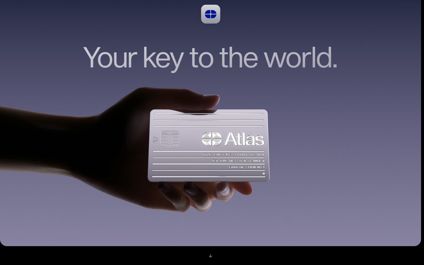
Atlas Card's marketing surface is an exercise in restraint: a **pure black canvas** (`{colors.canvas}` — #000000) with off-white text (`{colors.ink}` — #f8f8f8), enormous vertical spacing, and a single saturated action color — a deep royal blue (`{colors.link}` — #001391). The page reads as quiet luxury rather than feature-dense SaaS. There is almost no visible chrome: no nav bar in the captured landing page, no cards-with-borders, no badges. The product itself — a metallic membership card floating in a hand against a violet-to-black gradient — does all the talking.
Brand voltage comes from two places: the **cinematic full-bleed photography** (a hotel infinity pool at dusk, a richly patterned dining room, a motorsport car frozen at speed) and the **single blue CTA**. Everything else is monochrome — off-white headlines on black, muted-gray body copy, near-black surfaces that are barely distinguishable from the canvas. The hero headline ("Your key to the world.") renders in a soft muted gray (`{colors.muted}` — #808080) rather than full white, giving the type a recessive, premium tone that lets the card image dominate.
Only one typeface role was measured directly — the button label in **Sequel Sans Book** (17px / 400). The large display headline visible in the screenshots was not captured by the analyzer and is documented as a gap; the body copy and footnote sizes are likewise unmeasured.
**Key Characteristics:**
- Pure black canvas (`{colors.canvas}` — #000000) edge-to-edge. The page floor is black, not dark-gray. Near-black surfaces (`{colors.surface}` #0e0e0e through `{colors.surface-strong}` #272727) appear only as the faintest tonal shifts.
- Off-white text (`{colors.ink}` — #f8f8f8) for primary content; muted gray (`{colors.muted}` — #808080) for the recessive hero headline and secondary copy.
- A single deep-blue action color (`{colors.link}` — #001391) carries the lone "Request Invite" CTA and the rounded app-icon badge at the top of the page. The blue is the only saturated element on the page.
- Full-bleed cinematic photography is the primary visual content — the system shows experiences (pools, dining, motorsport), not UI illustrations.
- Generous vertical rhythm — section spacing runs at 88px, 104px, and 176px between bands, far larger than typical SaaS.
- Soft, large radii — the app-icon badge at `{rounded.xl}` (18px), the primary button at `{rounded.lg}` (16px), and image containers as large as `{rounded.xxl}` (24px). Pill-scale radii (`{rounded.pill}`, `{rounded.full}`) appear on fully-rounded elements.
- Sequel Sans Book (a licensed display/text face) is the typographic voice; an open substitute is documented in Typography.
## Colors
### Action & Accent
- **Link / CTA Blue** (`{colors.link}` — #001391): The only saturated color on the page. Carries the "Request Invite" button and the rounded Atlas app-icon badge at the top. Press state shifts to `{colors.link-active}` (#001182) — derived from the near-identical second blue measured in the palette.
- **Accent Violet** (`{colors.accent-violet}` — #9c97b8): A soft lavender that appears in the hero's violet-to-black background gradient and in the metallic-card highlights. Used as atmosphere, never on UI controls.
- **Accent Navy** (`{colors.accent-navy}` — #373c59): A muted blue-gray that appears in the gradient's mid-tones. Atmospheric, not an interface color.
### Surface
- **Canvas** (`{colors.canvas}` — #000000): The page floor — true black, used edge to edge under every band.
- **Surface** (`{colors.surface}` — #0e0e0e): The faintest raised tone — barely distinguishable from canvas, used on near-black image containers.
- **Surface Raised** (`{colors.surface-raised}` — #141414): A slightly lighter near-black for nested blocks.
- **Surface Elevated** (`{colors.surface-elevated}` — #1e1e1e): Used for the most-raised dark surfaces.
- **Surface Strong** (`{colors.surface-strong}` — #272727): The lightest of the near-blacks; the most visible tonal separation available in the system.
### Text
- **Ink** (`{colors.ink}` — #f8f8f8): Primary text and the button label — off-white, not pure white.
- **White** (`{colors.white}` — #ffffff): Reserved for the brightest accents (card metal highlights, icon glyphs).
- **Muted** (`{colors.muted}` — #808080): The recessive gray for the hero headline and secondary/intro body copy. Atlas deliberately keeps its biggest headline in muted gray rather than full white.
## Typography
### Font Family
Only one type role was captured directly: the button label renders in **Sequel Sans Book** at 17px, weight 400, line-height 1.235, normal letter-spacing. Sequel Sans is a commercial/licensed typeface — it is not freely redistributable as a web font — so a fallback stack walking `Inter, sans-serif` is declared, and an open substitute is documented below.
The large hero headline ("Your key to the world.") and the body/footnote copy visible in the screenshots were **not measured** by the analyzer; their sizes, weights, and exact family are listed in Known Gaps rather than guessed.
### Hierarchy
| Token | Size | Weight | Line Height | Letter Spacing | Use |
|---|---|---|---|---|---|
| `{typography.button}` | 17px | 400 | 1.235 | normal | "Request Invite" CTA label — Sequel Sans Book |
### Principles
The single measured role is a regular-weight (400) label at a comfortable 17px with relaxed 1.235 line-height — consistent with the brand's restrained, low-contrast voice. Atlas does not appear to use heavy weights for emphasis; size and surrounding whitespace carry hierarchy instead.
### Note on Font Substitutes
**Sequel Sans Book** is a licensed typeface and must not be shipped without a license. A usable open-source substitute is **Inter** at weight 400 (its neutral grotesk forms closely match Sequel Sans's proportions). **Hanken Grotesk** or **Geist Sans** at weight 400 are alternative open faces that preserve the clean, slightly humanist character. Whichever is chosen, keep weight at 400 and letter-spacing at normal to match the measured label.
## Layout
### Spacing System
- **Base unit:** 4px (values cluster on 8 / 16 / 24 / 32 multiples).
- **Tokens:** `{spacing.xxs}` 8px · `{spacing.xs}` 12px · `{spacing.sm}` 16px · `{spacing.md}` 20px · `{spacing.lg}` 24px · `{spacing.xl}` 28px · `{spacing.xxl}` 32px · `{spacing.section}` 88px · `{spacing.section-lg}` 104px · `{spacing.section-xl}` 176px.
- **Section rhythm:** Atlas runs unusually large vertical gaps — `{spacing.section}` (88px) is the common band separator, with `{spacing.section-lg}` (104px) and `{spacing.section-xl}` (176px) appearing around the hero and between full-bleed image blocks. This generous rhythm is core to the luxury feel.
- **Small detail spacing:** 8px (`{spacing.xxs}`) is the most frequent fine gap (icon/text padding), with 16px and 32px the next most common.
### Grid & Container
- **Single-column editorial flow:** The landing page stacks vertically — hero, intro copy block (center-aligned, narrow measure), then a sequence of full-bleed cinematic images.
- **Centered narrow text column:** The intro paragraph and CTA sit in a centered, comfortably narrow measure against the black canvas.
- **Full-bleed image bands:** Photography spans the full viewport width with large vertical spacing above and below.
### Whitespace Philosophy
Whitespace is the brand. Atlas leaves vast black gaps between content — the 88–176px section spacing and the black canvas create a gallery-like pacing where each image and the single CTA get room to breathe. Density is deliberately low; there is one message per band.
## Elevation & Depth
| Level | Treatment | Use |
|---|---|---|
| Flat | No shadow — black canvas | Default page floor, copy blocks |
| Tonal lift | Near-black surface shift (`{colors.surface}` → `{colors.surface-strong}`) | Barely-perceptible separation of dark blocks |
| Soft shadow | `rgba(0,0,0,0.04) 2px 4px 20px 0px` | The single measured shadow — a very faint, diffuse drop used on a raised element |
The one measured shadow is extremely low-alpha (0.04) and wide-blur (20px) — consistent with the system's quiet aesthetic. On a pure-black canvas, drop shadows do little work; depth instead comes from the gradient atmosphere behind the hero card and from the photography itself.
### Decorative Depth
- The hero's violet-to-black gradient (using `{colors.accent-violet}` and `{colors.accent-navy}` atmospherically) creates the sense of the metallic card floating in space — the primary depth cue on the page.
- The metallic membership card carries its own rendered highlights and reflections; these are photographic, not system tokens.
## Shapes
### Border Radius Scale
| Token | Value | Use |
|---|---|---|
| `{rounded.xs}` | 4px | Smallest detail rounding |
| `{rounded.sm}` | 8px | Small UI elements |
| `{rounded.md}` | 12px | Medium containers |
| `{rounded.lg}` | 16px | Primary button (`{component.button-primary}`) |
| `{rounded.xl}` | 18px | App-icon badge (`{component.app-icon-badge}`) |
| `{rounded.xxl}` | 24px | Large image containers |
| `{rounded.pill}` | 128px | Fully-rounded large elements |
| `{rounded.full}` | 1440px | Effectively pill/circular treatment on the largest elements |
### Photography Geometry
The full-bleed editorial images (pool, dining room, motorsport) span the viewport edge-to-edge. Where image containers are rounded, they use the larger radii (`{rounded.xxl}` 24px and up). The hero card is photographic content, not a styled container.
## Components
### Brand & Action
**`app-icon-badge`** — The rounded Atlas glyph badge centered at the top of the page. Background `{colors.link}` (#001391), white glyph (`{colors.white}`), rounded `{rounded.xl}` (18px). Functions as the brand mark at the head of the single-column flow.
**`button-primary`** — The sole CTA, "Request Invite." Background `{colors.link}` (#001391), label `{colors.ink}` (#f8f8f8), type `{typography.button}` (Sequel Sans Book 17px / 400), rounded `{rounded.lg}` (16px). The measured intrinsic padding was 0px (the analyzer captured a zero-padding element); the visible button has comfortable inset padding from surrounding layout — treat the inner padding as a known gap. Active state `button-primary-active` shifts the background to `{colors.link-active}` (#001182) — derived from the near-identical second blue in the palette.
### Bands & Content
**`hero-band`** — The opening band: app-icon badge, the muted-gray headline ("Your key to the world."), and the metallic card-in-hand image against a violet-to-black gradient. Background `{colors.canvas}`, headline color `{colors.muted}`, vertical padding `{spacing.section-xl}` (176px). The gradient itself is not a single token (see Known Gaps).
**`intro-copy-block`** — The centered narrow-measure paragraph ("With Atlas, you can finally get tables at the hardest-to-book restaurants…") followed by the `{component.button-primary}` and a fine-print footnote. Background `{colors.canvas}`, body text `{colors.muted}`, vertical padding `{spacing.section-lg}` (104px).
**`editorial-image-block`** — Full-bleed cinematic photography bands (hotel pool, dining room, motorsport). Background `{colors.canvas}`, vertical padding `{spacing.section}` (88px) separating each image from the next. These carry the brand experience.
**`image-card`** — A rounded image container variant for any non-full-bleed imagery. Background `{colors.surface}` (#0e0e0e), rounded `{rounded.xxl}` (24px).
**`footer-note`** — The fine-print line beneath the CTA ("Atlas membership is invite-only…"). Transparent background, `{colors.muted}` text. Exact type size unmeasured (see Known Gaps).
## Do's and Don'ts
### Do
- Keep the page floor pure black (`{colors.canvas}` — #000000). Atlas is not dark-gray; it's true black.
- Reserve the blue (`{colors.link}` — #001391) for the single CTA and the brand badge. One saturated element per view.
- Let full-bleed photography carry the brand. Show experiences (pools, dining, racing), not UI mockups.
- Use the large section spacing (88 / 104 / 176px) generously — the gallery pacing is the luxury signal.
- Keep the hero headline in muted gray (`{colors.muted}`) rather than full white — the recessive tone is intentional.
- Use off-white (`{colors.ink}` — #f8f8f8), not pure white, for primary text.
### Don't
- Don't add a second accent color. The palette is monochrome plus one blue.
- Don't tighten the vertical rhythm to typical SaaS density — the expansive spacing is core to the brand.
- Don't introduce visible card borders, badges, or chrome — the system avoids decorative UI almost entirely.
- Don't use pure white (#ffffff) for body copy; it's reserved for the brightest card/glyph highlights.
- Don't add hover styling beyond the documented press state (the CTA darkens to `{colors.link-active}`).
## Responsive Behavior
The analyzer captured only the desktop landing page, so responsive rules are inferred conservatively from the single-column layout.
### Breakpoints
| Name | Width | Key Changes |
|---|---|---|
| Mobile | < 768px | Single-column flow already; hero card and headline scale down; full-bleed images remain edge-to-edge; section spacing likely reduces from 176/104px toward 88px |
| Tablet | 768–1024px | Same single-column stack; intro copy measure widens slightly |
| Desktop | > 1024px | Captured layout — centered narrow copy column, full-bleed image bands, 88–176px section rhythm |
Exact breakpoint values and the mobile spacing scale were not measured (see Known Gaps).
### Touch Targets
- `{component.button-primary}` is the primary tap target; its rendered height/inner padding were not captured (measured padding read 0px), so confirm a ≥44px effective tap area when implementing.
### Collapsing Strategy
- The page is already a single vertical column, so there is little to collapse — content simply restacks and images stay full-bleed at every width.
### Image Behavior
- Full-bleed editorial photography spans the viewport width and should scale proportionally; crops favor the central subject (pool reflection, dining banquette, racing car).
- The hero card-in-hand image scales with the hero band; the violet-to-black gradient backs it at all widths.
## Iteration Guide
1. Focus on ONE component at a time. Reference its YAML key directly (`{component.button-primary}`, `{component.hero-band}`).
2. Variants of an existing component (`-active`) live as separate entries in `components:`.
3. Use `{token.refs}` everywhere — never inline hex.
4. Never document hover. Default and Active/Pressed states only (CTA darkens to `{colors.link-active}` on press).
5. Keep the page monochrome plus one blue. New saturated colors are off-brand.
6. Preserve the large vertical rhythm — when in doubt, add black space rather than fill it.
7. Photography is the content. Reach for a full-bleed image before reaching for a styled card.
## Known Gaps
- **Display headline typography was not measured.** The prominent hero headline ("Your key to the world.") and the section headlines are clearly larger than the captured 17px button, but the analyzer returned only the button role. Their font size, weight, family, and letter-spacing must be confirmed from CSS ground-truth before being tokenized — they are deliberately not guessed here.
- **Body and footnote type sizes** (intro paragraph, "Atlas membership is invite-only…" note) were not captured; only `{component.footer-note}`'s color is documented.
- **Sequel Sans Book is a licensed typeface** and cannot be shipped freely; open substitutes (Inter / Hanken Grotesk / Geist Sans at weight 400) are documented in Typography.
- **The hero gradient** (violet → navy → black) is rendered from `{colors.accent-violet}` and `{colors.accent-navy}` atmospherically but was not captured as a gradient token (stops, angle, and exact transition unknown).
- **Button inner padding** read as 0px from the analyzer, which conflicts with the visibly padded "Request Invite" button — confirm the true padding/height before implementing the tap target.
- **Spacing values 12px, 18px, 128px, and 418px** appeared at low frequency and were partly excluded from the named scale; 418px in particular is likely a one-off layout offset, not a reusable token.
- **Radii 128px and 1440px** are mapped to `{rounded.pill}` / `{rounded.full}` but their specific element usage was not isolated.
- **Only the landing page was captured.** No navigation, footer, form, modal, or authenticated app surface was analyzed; responsive breakpoints and mobile spacing are inferred, not measured.
- **Animation and transition timings** (scroll-driven image reveals, card float) are out of scope.
<!-- Documented by duply · real-world design systems as ready-to-use DESIGN.md for AI coding agents · https://duply.ai/atlascard/design-md -->
Color Palette
Accent
Neutrals
Typography
button17px · 400 · 1.235
The quick brown fox jumpsSpacing & Shape
Spacing
| Name | Value | Preview |
|---|---|---|
| xxs | 8px | |
| xs | 12px | |
| sm | 16px | |
| md | 20px | |
| lg | 24px | |
| xl | 28px | |
| xxl | 32px | |
| section | 88px | |
| section-lg | 104px | |
| section-xl | 176px |
Border Radius
| Name | Value | Preview |
|---|---|---|
| xs | 4px | |
| sm | 8px | |
| md | 12px | |
| lg | 16px | |
| xl | 18px | |
| xxl | 24px | |
| pill | 128px | |
| full | 1440px |
More like this


---
version: alpha
name: Atlascard-design-analysis
description: A near-black, ultra-premium membership-card interface built on a pure black canvas (#000000) with off-white text, a single deep-blue action color, and cinematic full-bleed imagery. The system reads as quiet luxury — almost no chrome, enormous vertical breathing room, a metallic card hero floating in a violet-to-black gradient, and editorial photography (pools, dining rooms, motorsport) carrying the brand voltage instead of UI decoration. The only saturated element on the page is the blue "Request Invite" CTA.
colors:
  ink: "#f8f8f8"
  white: "#ffffff"
  muted: "#808080"
  canvas: "#000000"
  surface: "#0e0e0e"
  surface-raised: "#141414"
  surface-elevated: "#1e1e1e"
  surface-strong: "#272727"
  link: "#001391"
  link-active: "#001182"
  accent-violet: "#9c97b8"
  accent-navy: "#373c59"
typography:
  button:
    fontFamily: "Sequel Sans Book, Inter, sans-serif"
    fontSize: 17px
    fontWeight: 400
    lineHeight: 1.235
    letterSpacing: normal
rounded:
  xs: 4px
  sm: 8px
  md: 12px
  lg: 16px
  xl: 18px
  xxl: 24px
  pill: 128px
  full: 1440px
spacing:
  xxs: 8px
  xs: 12px
  sm: 16px
  md: 20px
  lg: 24px
  xl: 28px
  xxl: 32px
  section: 88px
  section-lg: 104px
  section-xl: 176px
components:
  app-icon-badge:
    backgroundColor: "{colors.link}"
    textColor: "{colors.white}"
    rounded: "{rounded.xl}"
  button-primary:
    backgroundColor: "{colors.link}"
    textColor: "{colors.ink}"
    typography: "{typography.button}"
    rounded: "{rounded.lg}"
    padding: 0px
  button-primary-active:
    backgroundColor: "{colors.link-active}"
    textColor: "{colors.ink}"
    rounded: "{rounded.lg}"
  hero-band:
    backgroundColor: "{colors.canvas}"
    textColor: "{colors.muted}"
    padding: 176px
  intro-copy-block:
    backgroundColor: "{colors.canvas}"
    textColor: "{colors.muted}"
    padding: 104px
  editorial-image-block:
    backgroundColor: "{colors.canvas}"
    textColor: "{colors.ink}"
    padding: 88px
  image-card:
    backgroundColor: "{colors.surface}"
    textColor: "{colors.ink}"
    rounded: "{rounded.xxl}"
  footer-note:
    backgroundColor: transparent
    textColor: "{colors.muted}"
---

## Overview

Atlas Card's marketing surface is an exercise in restraint: a **pure black canvas** (`{colors.canvas}` — #000000) with off-white text (`{colors.ink}` — #f8f8f8), enormous vertical spacing, and a single saturated action color — a deep royal blue (`{colors.link}` — #001391). The page reads as quiet luxury rather than feature-dense SaaS. There is almost no visible chrome: no nav bar in the captured landing page, no cards-with-borders, no badges. The product itself — a metallic membership card floating in a hand against a violet-to-black gradient — does all the talking.

Brand voltage comes from two places: the **cinematic full-bleed photography** (a hotel infinity pool at dusk, a richly patterned dining room, a motorsport car frozen at speed) and the **single blue CTA**. Everything else is monochrome — off-white headlines on black, muted-gray body copy, near-black surfaces that are barely distinguishable from the canvas. The hero headline ("Your key to the world.") renders in a soft muted gray (`{colors.muted}` — #808080) rather than full white, giving the type a recessive, premium tone that lets the card image dominate.

Only one typeface role was measured directly — the button label in **Sequel Sans Book** (17px / 400). The large display headline visible in the screenshots was not captured by the analyzer and is documented as a gap; the body copy and footnote sizes are likewise unmeasured.

**Key Characteristics:**
- Pure black canvas (`{colors.canvas}` — #000000) edge-to-edge. The page floor is black, not dark-gray. Near-black surfaces (`{colors.surface}` #0e0e0e through `{colors.surface-strong}` #272727) appear only as the faintest tonal shifts.
- Off-white text (`{colors.ink}` — #f8f8f8) for primary content; muted gray (`{colors.muted}` — #808080) for the recessive hero headline and secondary copy.
- A single deep-blue action color (`{colors.link}` — #001391) carries the lone "Request Invite" CTA and the rounded app-icon badge at the top of the page. The blue is the only saturated element on the page.
- Full-bleed cinematic photography is the primary visual content — the system shows experiences (pools, dining, motorsport), not UI illustrations.
- Generous vertical rhythm — section spacing runs at 88px, 104px, and 176px between bands, far larger than typical SaaS.
- Soft, large radii — the app-icon badge at `{rounded.xl}` (18px), the primary button at `{rounded.lg}` (16px), and image containers as large as `{rounded.xxl}` (24px). Pill-scale radii (`{rounded.pill}`, `{rounded.full}`) appear on fully-rounded elements.
- Sequel Sans Book (a licensed display/text face) is the typographic voice; an open substitute is documented in Typography.

## Colors

### Action & Accent
- **Link / CTA Blue** (`{colors.link}` — #001391): The only saturated color on the page. Carries the "Request Invite" button and the rounded Atlas app-icon badge at the top. Press state shifts to `{colors.link-active}` (#001182) — derived from the near-identical second blue measured in the palette.
- **Accent Violet** (`{colors.accent-violet}` — #9c97b8): A soft lavender that appears in the hero's violet-to-black background gradient and in the metallic-card highlights. Used as atmosphere, never on UI controls.
- **Accent Navy** (`{colors.accent-navy}` — #373c59): A muted blue-gray that appears in the gradient's mid-tones. Atmospheric, not an interface color.

### Surface
- **Canvas** (`{colors.canvas}` — #000000): The page floor — true black, used edge to edge under every band.
- **Surface** (`{colors.surface}` — #0e0e0e): The faintest raised tone — barely distinguishable from canvas, used on near-black image containers.
- **Surface Raised** (`{colors.surface-raised}` — #141414): A slightly lighter near-black for nested blocks.
- **Surface Elevated** (`{colors.surface-elevated}` — #1e1e1e): Used for the most-raised dark surfaces.
- **Surface Strong** (`{colors.surface-strong}` — #272727): The lightest of the near-blacks; the most visible tonal separation available in the system.

### Text
- **Ink** (`{colors.ink}` — #f8f8f8): Primary text and the button label — off-white, not pure white.
- **White** (`{colors.white}` — #ffffff): Reserved for the brightest accents (card metal highlights, icon glyphs).
- **Muted** (`{colors.muted}` — #808080): The recessive gray for the hero headline and secondary/intro body copy. Atlas deliberately keeps its biggest headline in muted gray rather than full white.

## Typography

### Font Family
Only one type role was captured directly: the button label renders in **Sequel Sans Book** at 17px, weight 400, line-height 1.235, normal letter-spacing. Sequel Sans is a commercial/licensed typeface — it is not freely redistributable as a web font — so a fallback stack walking `Inter, sans-serif` is declared, and an open substitute is documented below.

The large hero headline ("Your key to the world.") and the body/footnote copy visible in the screenshots were **not measured** by the analyzer; their sizes, weights, and exact family are listed in Known Gaps rather than guessed.

### Hierarchy

| Token | Size | Weight | Line Height | Letter Spacing | Use |
|---|---|---|---|---|---|
| `{typography.button}` | 17px | 400 | 1.235 | normal | "Request Invite" CTA label — Sequel Sans Book |

### Principles
The single measured role is a regular-weight (400) label at a comfortable 17px with relaxed 1.235 line-height — consistent with the brand's restrained, low-contrast voice. Atlas does not appear to use heavy weights for emphasis; size and surrounding whitespace carry hierarchy instead.

### Note on Font Substitutes
**Sequel Sans Book** is a licensed typeface and must not be shipped without a license. A usable open-source substitute is **Inter** at weight 400 (its neutral grotesk forms closely match Sequel Sans's proportions). **Hanken Grotesk** or **Geist Sans** at weight 400 are alternative open faces that preserve the clean, slightly humanist character. Whichever is chosen, keep weight at 400 and letter-spacing at normal to match the measured label.

## Layout

### Spacing System
- **Base unit:** 4px (values cluster on 8 / 16 / 24 / 32 multiples).
- **Tokens:** `{spacing.xxs}` 8px · `{spacing.xs}` 12px · `{spacing.sm}` 16px · `{spacing.md}` 20px · `{spacing.lg}` 24px · `{spacing.xl}` 28px · `{spacing.xxl}` 32px · `{spacing.section}` 88px · `{spacing.section-lg}` 104px · `{spacing.section-xl}` 176px.
- **Section rhythm:** Atlas runs unusually large vertical gaps — `{spacing.section}` (88px) is the common band separator, with `{spacing.section-lg}` (104px) and `{spacing.section-xl}` (176px) appearing around the hero and between full-bleed image blocks. This generous rhythm is core to the luxury feel.
- **Small detail spacing:** 8px (`{spacing.xxs}`) is the most frequent fine gap (icon/text padding), with 16px and 32px the next most common.

### Grid & Container
- **Single-column editorial flow:** The landing page stacks vertically — hero, intro copy block (center-aligned, narrow measure), then a sequence of full-bleed cinematic images.
- **Centered narrow text column:** The intro paragraph and CTA sit in a centered, comfortably narrow measure against the black canvas.
- **Full-bleed image bands:** Photography spans the full viewport width with large vertical spacing above and below.

### Whitespace Philosophy
Whitespace is the brand. Atlas leaves vast black gaps between content — the 88–176px section spacing and the black canvas create a gallery-like pacing where each image and the single CTA get room to breathe. Density is deliberately low; there is one message per band.

## Elevation & Depth

| Level | Treatment | Use |
|---|---|---|
| Flat | No shadow — black canvas | Default page floor, copy blocks |
| Tonal lift | Near-black surface shift (`{colors.surface}` → `{colors.surface-strong}`) | Barely-perceptible separation of dark blocks |
| Soft shadow | `rgba(0,0,0,0.04) 2px 4px 20px 0px` | The single measured shadow — a very faint, diffuse drop used on a raised element |

The one measured shadow is extremely low-alpha (0.04) and wide-blur (20px) — consistent with the system's quiet aesthetic. On a pure-black canvas, drop shadows do little work; depth instead comes from the gradient atmosphere behind the hero card and from the photography itself.

### Decorative Depth
- The hero's violet-to-black gradient (using `{colors.accent-violet}` and `{colors.accent-navy}` atmospherically) creates the sense of the metallic card floating in space — the primary depth cue on the page.
- The metallic membership card carries its own rendered highlights and reflections; these are photographic, not system tokens.

## Shapes

### Border Radius Scale

| Token | Value | Use |
|---|---|---|
| `{rounded.xs}` | 4px | Smallest detail rounding |
| `{rounded.sm}` | 8px | Small UI elements |
| `{rounded.md}` | 12px | Medium containers |
| `{rounded.lg}` | 16px | Primary button (`{component.button-primary}`) |
| `{rounded.xl}` | 18px | App-icon badge (`{component.app-icon-badge}`) |
| `{rounded.xxl}` | 24px | Large image containers |
| `{rounded.pill}` | 128px | Fully-rounded large elements |
| `{rounded.full}` | 1440px | Effectively pill/circular treatment on the largest elements |

### Photography Geometry
The full-bleed editorial images (pool, dining room, motorsport) span the viewport edge-to-edge. Where image containers are rounded, they use the larger radii (`{rounded.xxl}` 24px and up). The hero card is photographic content, not a styled container.

## Components

### Brand & Action

**`app-icon-badge`** — The rounded Atlas glyph badge centered at the top of the page. Background `{colors.link}` (#001391), white glyph (`{colors.white}`), rounded `{rounded.xl}` (18px). Functions as the brand mark at the head of the single-column flow.

**`button-primary`** — The sole CTA, "Request Invite." Background `{colors.link}` (#001391), label `{colors.ink}` (#f8f8f8), type `{typography.button}` (Sequel Sans Book 17px / 400), rounded `{rounded.lg}` (16px). The measured intrinsic padding was 0px (the analyzer captured a zero-padding element); the visible button has comfortable inset padding from surrounding layout — treat the inner padding as a known gap. Active state `button-primary-active` shifts the background to `{colors.link-active}` (#001182) — derived from the near-identical second blue in the palette.

### Bands & Content

**`hero-band`** — The opening band: app-icon badge, the muted-gray headline ("Your key to the world."), and the metallic card-in-hand image against a violet-to-black gradient. Background `{colors.canvas}`, headline color `{colors.muted}`, vertical padding `{spacing.section-xl}` (176px). The gradient itself is not a single token (see Known Gaps).

**`intro-copy-block`** — The centered narrow-measure paragraph ("With Atlas, you can finally get tables at the hardest-to-book restaurants…") followed by the `{component.button-primary}` and a fine-print footnote. Background `{colors.canvas}`, body text `{colors.muted}`, vertical padding `{spacing.section-lg}` (104px).

**`editorial-image-block`** — Full-bleed cinematic photography bands (hotel pool, dining room, motorsport). Background `{colors.canvas}`, vertical padding `{spacing.section}` (88px) separating each image from the next. These carry the brand experience.

**`image-card`** — A rounded image container variant for any non-full-bleed imagery. Background `{colors.surface}` (#0e0e0e), rounded `{rounded.xxl}` (24px).

**`footer-note`** — The fine-print line beneath the CTA ("Atlas membership is invite-only…"). Transparent background, `{colors.muted}` text. Exact type size unmeasured (see Known Gaps).

## Do's and Don'ts

### Do
- Keep the page floor pure black (`{colors.canvas}` — #000000). Atlas is not dark-gray; it's true black.
- Reserve the blue (`{colors.link}` — #001391) for the single CTA and the brand badge. One saturated element per view.
- Let full-bleed photography carry the brand. Show experiences (pools, dining, racing), not UI mockups.
- Use the large section spacing (88 / 104 / 176px) generously — the gallery pacing is the luxury signal.
- Keep the hero headline in muted gray (`{colors.muted}`) rather than full white — the recessive tone is intentional.
- Use off-white (`{colors.ink}` — #f8f8f8), not pure white, for primary text.

### Don't
- Don't add a second accent color. The palette is monochrome plus one blue.
- Don't tighten the vertical rhythm to typical SaaS density — the expansive spacing is core to the brand.
- Don't introduce visible card borders, badges, or chrome — the system avoids decorative UI almost entirely.
- Don't use pure white (#ffffff) for body copy; it's reserved for the brightest card/glyph highlights.
- Don't add hover styling beyond the documented press state (the CTA darkens to `{colors.link-active}`).

## Responsive Behavior

The analyzer captured only the desktop landing page, so responsive rules are inferred conservatively from the single-column layout.

### Breakpoints

| Name | Width | Key Changes |
|---|---|---|
| Mobile | < 768px | Single-column flow already; hero card and headline scale down; full-bleed images remain edge-to-edge; section spacing likely reduces from 176/104px toward 88px |
| Tablet | 768–1024px | Same single-column stack; intro copy measure widens slightly |
| Desktop | > 1024px | Captured layout — centered narrow copy column, full-bleed image bands, 88–176px section rhythm |

Exact breakpoint values and the mobile spacing scale were not measured (see Known Gaps).

### Touch Targets
- `{component.button-primary}` is the primary tap target; its rendered height/inner padding were not captured (measured padding read 0px), so confirm a ≥44px effective tap area when implementing.

### Collapsing Strategy
- The page is already a single vertical column, so there is little to collapse — content simply restacks and images stay full-bleed at every width.

### Image Behavior
- Full-bleed editorial photography spans the viewport width and should scale proportionally; crops favor the central subject (pool reflection, dining banquette, racing car).
- The hero card-in-hand image scales with the hero band; the violet-to-black gradient backs it at all widths.

## Iteration Guide

1. Focus on ONE component at a time. Reference its YAML key directly (`{component.button-primary}`, `{component.hero-band}`).
2. Variants of an existing component (`-active`) live as separate entries in `components:`.
3. Use `{token.refs}` everywhere — never inline hex.
4. Never document hover. Default and Active/Pressed states only (CTA darkens to `{colors.link-active}` on press).
5. Keep the page monochrome plus one blue. New saturated colors are off-brand.
6. Preserve the large vertical rhythm — when in doubt, add black space rather than fill it.
7. Photography is the content. Reach for a full-bleed image before reaching for a styled card.

## Known Gaps

- **Display headline typography was not measured.** The prominent hero headline ("Your key to the world.") and the section headlines are clearly larger than the captured 17px button, but the analyzer returned only the button role. Their font size, weight, family, and letter-spacing must be confirmed from CSS ground-truth before being tokenized — they are deliberately not guessed here.
- **Body and footnote type sizes** (intro paragraph, "Atlas membership is invite-only…" note) were not captured; only `{component.footer-note}`'s color is documented.
- **Sequel Sans Book is a licensed typeface** and cannot be shipped freely; open substitutes (Inter / Hanken Grotesk / Geist Sans at weight 400) are documented in Typography.
- **The hero gradient** (violet → navy → black) is rendered from `{colors.accent-violet}` and `{colors.accent-navy}` atmospherically but was not captured as a gradient token (stops, angle, and exact transition unknown).
- **Button inner padding** read as 0px from the analyzer, which conflicts with the visibly padded "Request Invite" button — confirm the true padding/height before implementing the tap target.
- **Spacing values 12px, 18px, 128px, and 418px** appeared at low frequency and were partly excluded from the named scale; 418px in particular is likely a one-off layout offset, not a reusable token.
- **Radii 128px and 1440px** are mapped to `{rounded.pill}` / `{rounded.full}` but their specific element usage was not isolated.
- **Only the landing page was captured.** No navigation, footer, form, modal, or authenticated app surface was analyzed; responsive breakpoints and mobile spacing are inferred, not measured.
- **Animation and transition timings** (scroll-driven image reveals, card float) are out of scope.

<!-- Documented by duply · real-world design systems as ready-to-use DESIGN.md for AI coding agents · https://duply.ai/atlascard/design-md -->