BVNK
An enterprise-fintech marketing surface for stablecoin payments infrastructure — built on a cool blue-white canvas (#f9fbff) with deep-navy display headlines (#041536) and a single saturated blue CTA (#2c6ff2). The system reads as institutional-but-modern: large Circular display type with tight negative tracking, generously rounded white cards (16px) carrying soft low-alpha shadows, pale-blue tinted use-case tiles, and a deep-navy footer that closes the long-scroll page. Brand voltage comes from the blue primary button, the Circular display headline, and pale-blue surface tints rather than from loud color.
---
version: alpha
name: BVNK-design-analysis
description: "An enterprise-fintech marketing surface for stablecoin payments infrastructure — built on a cool blue-white canvas (#f9fbff) with deep-navy display headlines (#041536) and a single saturated blue CTA (#2c6ff2). The system reads as institutional-but-modern: large Circular display type with tight negative tracking, generously rounded white cards (16px) carrying soft low-alpha shadows, pale-blue tinted use-case tiles, and a deep-navy footer that closes the long-scroll page. Brand voltage comes from the blue primary button, the Circular display headline, and pale-blue surface tints rather than from loud color."
colors:
primary: "#2c6ff2"
primary-deep: "#0b3c9c"
ink: "#041536"
ink-blue: "#062259"
body: "#465068"
muted: "#516278"
muted-soft: "#b6bdc9"
link: "#333333"
neutral: "#000000"
on-primary: "#ffffff"
canvas: "#f9fbff"
surface: "#ffffff"
surface-soft: "#fbfcfe"
surface-tint: "#f4f5f8"
surface-blue: "#d4e2ff"
surface-blue-soft: "#e0e5ff"
surface-blue-faint: "#e2e9f8"
hairline: "#e9ebf1"
hairline-warm: "#ebe4e4"
accent-purple: "#8e41e8"
accent-teal: "#3bdaba"
typography:
h1:
fontFamily: "Circular, Inter, sans-serif"
fontSize: 56px
fontWeight: 700
lineHeight: 1.1
letterSpacing: -1.68px
h2:
fontFamily: "Circular, Inter, sans-serif"
fontSize: 32px
fontWeight: 700
lineHeight: 1.5
letterSpacing: -0.42px
h3:
fontFamily: "Circular, Inter, sans-serif"
fontSize: 24px
fontWeight: 500
lineHeight: 1.333
letterSpacing: 0
body:
fontFamily: "Circular, Inter, sans-serif"
fontSize: 20px
fontWeight: 400
lineHeight: 1.4
letterSpacing: -0.2px
button:
fontFamily: "Circular, Inter, sans-serif"
fontSize: 18px
fontWeight: 700
lineHeight: 1.4
letterSpacing: 0
rounded:
sm: 8px
md: 16px
lg: 24px
xl: 32px
spacing:
xxs: 4px
xs: 8px
sm: 12px
md: 16px
ml: 20px
lg: 24px
xl: 30px
xxl: 48px
huge: 88px
section: 112px
components:
top-nav:
backgroundColor: "{colors.surface}"
textColor: "{colors.ink}"
typography: "{typography.button}"
button-primary:
backgroundColor: "{colors.primary}"
textColor: "{colors.on-primary}"
typography: "{typography.button}"
rounded: "{rounded.sm}"
button-secondary:
backgroundColor: transparent
textColor: "{colors.ink}"
typography: "{typography.button}"
rounded: "{rounded.sm}"
button-learn-more:
backgroundColor: "{colors.surface}"
textColor: "{colors.ink}"
typography: "{typography.button}"
rounded: "{rounded.sm}"
hero-band:
backgroundColor: "{colors.canvas}"
textColor: "{colors.ink}"
typography: "{typography.h1}"
padding: 88px
section-card:
backgroundColor: "{colors.surface}"
textColor: "{colors.ink}"
typography: "{typography.h2}"
rounded: "{rounded.xl}"
padding: 48px
card:
backgroundColor: "{colors.surface}"
textColor: "{colors.ink}"
rounded: "{rounded.md}"
padding: 24px
use-case-card:
backgroundColor: "{colors.surface-blue-soft}"
textColor: "{colors.ink}"
typography: "{typography.h3}"
rounded: "{rounded.md}"
padding: 24px
tab-toggle:
backgroundColor: transparent
textColor: "{colors.muted}"
typography: "{typography.button}"
rounded: "{rounded.sm}"
padding: 8px 24px
tab-toggle-active:
backgroundColor: "{colors.ink-blue}"
textColor: "{colors.on-primary}"
typography: "{typography.button}"
rounded: "{rounded.sm}"
padding: 8px 24px
badge-pill:
backgroundColor: "{colors.surface}"
textColor: "{colors.ink}"
typography: "{typography.button}"
rounded: "{rounded.lg}"
padding: 8px 16px
partner-logo-row:
backgroundColor: transparent
textColor: "{colors.muted-soft}"
testimonial-block:
backgroundColor: "{colors.canvas}"
textColor: "{colors.ink}"
typography: "{typography.h3}"
padding: 48px
carousel-arrow:
backgroundColor: "{colors.surface}"
textColor: "{colors.ink}"
rounded: "{rounded.lg}"
size: 48px
footer:
backgroundColor: "{colors.ink}"
textColor: "{colors.muted-soft}"
typography: "{typography.body}"
padding: 88px
---
## Overview
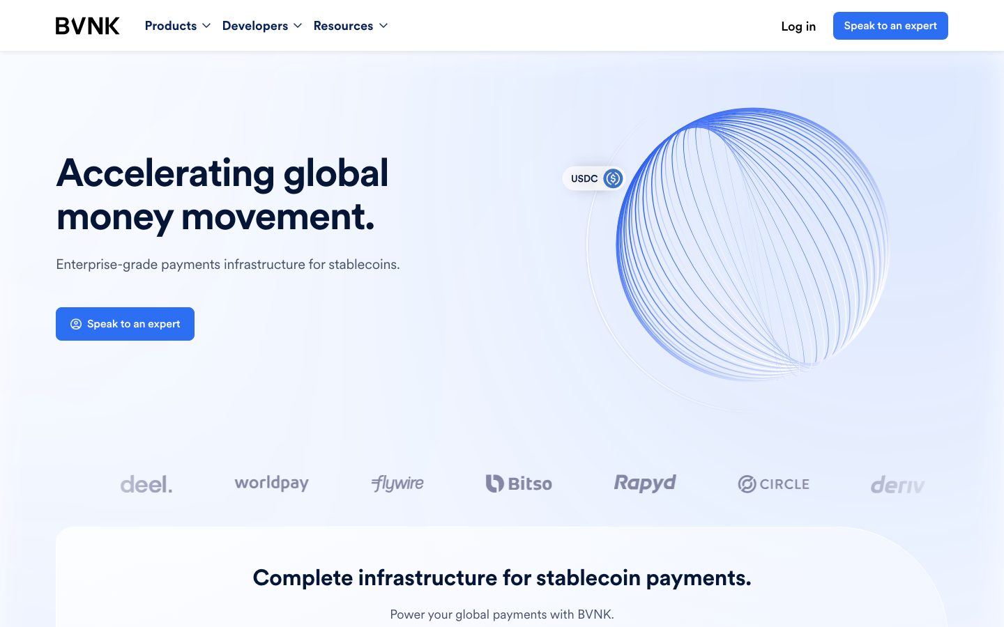
BVNK's landing page is an enterprise-fintech marketing surface for stablecoin payments infrastructure. It sits on a cool, almost-white blue canvas (`{colors.canvas}` — #f9fbff) with deep-navy display headlines (`{colors.ink}` — #041536) and a single saturated blue primary CTA (`{colors.primary}` — #2c6ff2). The result reads as institutional-but-modern: serious enough for a regulated payments company, but soft and contemporary in its rounded white cards and pale-blue tinted tiles.
The type voice is a single family — **Circular** — used at every level from the 56px hero headline down to the 18px button label. Circular's geometric forms carry tight negative letter-spacing at display sizes (-1.68px on h1, -0.42px on h2), which gives the headlines their confident, slightly compressed character. Body copy runs at a comparatively large 20px with -0.2px tracking.
Brand voltage comes from three places: the **blue primary button** (`{colors.primary}`), the **Circular display headline** in deep navy, and a family of **pale-blue surface tints** (`{colors.surface-blue}`, `{colors.surface-blue-soft}`) that lightly color the use-case tiles and the hero's wireframe-globe motif. Saturated accents (`{colors.accent-purple}` — #8e41e8, `{colors.accent-teal}` — #3bdaba) appear only sparingly, inside product/illustration moments.
The footer flips to the deep navy `{colors.ink}` (#041536), the only dark surface on the page — it visually closes the long-scroll layout.
**Key Characteristics:**
- Cool blue-white canvas (`{colors.canvas}` — #f9fbff) rather than pure white; pure white (`{colors.surface}`) is reserved for cards and elevated containers.
- A single blue primary CTA (`{colors.primary}` — #2c6ff2) with white label. There is one action color and the page leans on it consistently.
- Circular display typography with tight negative tracking — geometric, confident, used at every hierarchy level.
- Generously rounded white cards: `{rounded.md}` (16px) for content cards, `{rounded.xl}` (32px) for the large feature container.
- Soft, very low-alpha drop shadows tinted toward navy (`rgba(22, 22, 78, ...)`) — quiet elevation, never heavy.
- Pale-blue tinted use-case tiles (`{colors.surface-blue-soft}` — #e0e5ff) and a wireframe-globe hero illustration.
- A dark-navy pill toggle (`{colors.ink-blue}` — #062259) for the "Use cases / Delivery models" segmented control.
- A deep-navy footer (`{colors.ink}`) closes the page — the only dark surface in the system.
## Colors
### Brand & Accent
- **Primary** (`{colors.primary}` — #2c6ff2): The single action color. Powers the "Speak to an expert" CTA and active interactive accents. White label sits on top (`{colors.on-primary}`).
- **Primary Deep** (`{colors.primary-deep}` — #0b3c9c): A darker blue used for the hero globe wireframe lines and deeper accent moments.
- **Accent Purple** (`{colors.accent-purple}` — #8e41e8): A rare chromatic accent appearing in product/illustration fragments — never on CTAs.
- **Accent Teal** (`{colors.accent-teal}` — #3bdaba): A second rare accent, similarly confined to product/illustration moments.
### Surface
- **Canvas** (`{colors.canvas}` — #f9fbff): The default page floor — a barely-blue near-white.
- **Surface** (`{colors.surface}` — #ffffff): Pure white for cards, the large feature container, badges, and the top nav.
- **Surface Soft** (`{colors.surface-soft}` — #fbfcfe): An even softer off-white for subtle nested fills.
- **Surface Tint** (`{colors.surface-tint}` — #f4f5f8): A cool gray tint for section dividers and quiet panels.
- **Surface Blue** (`{colors.surface-blue}` — #d4e2ff): Pale blue used in the hero illustration zone and tinted accents.
- **Surface Blue Soft** (`{colors.surface-blue-soft}` — #e0e5ff): The fill of the use-case tiles ("Send / Receive / Convert / Store").
- **Surface Blue Faint** (`{colors.surface-blue-faint}` — #e2e9f8): A faint blue used for low-emphasis blocks.
- **Hairline** (`{colors.hairline}` — #e9ebf1): The 1px border/divider tone on light surfaces.
- **Hairline Warm** (`{colors.hairline-warm}` — #ebe4e4): A warmer divider variant observed in faint borders.
### Text
- **Ink** (`{colors.ink}` — #041536): Headlines, h1/h2 display type, and the dark footer surface.
- **Ink Blue** (`{colors.ink-blue}` — #062259): A navy used for button text and the active segmented-toggle pill background.
- **Body** (`{colors.body}` — #465068): The default running-text color — a muted blue-gray. This is the most frequently measured color on the page.
- **Muted** (`{colors.muted}` — #516278): Secondary text — sub-labels, inactive toggle text.
- **Muted Soft** (`{colors.muted-soft}` — #b6bdc9): Tertiary text — partner logos rendered as gray, footer body copy.
- **Link** (`{colors.link}` — #333333): Inline anchor text color.
- **Neutral** (`{colors.neutral}` — #000000): The BVNK wordmark and high-contrast marks.
- **On Primary** (`{colors.on-primary}` — #ffffff): Text on the blue CTA and within the dark navy toggle/footer.
## Typography
### Font Family
The system runs a single typeface — **Circular** — across all roles. Circular is a geometric sans (a commercially licensed face from Lineto, widely used by fintech brands). It carries the entire hierarchy from the 56px hero headline to the 18px button label, with weight shifting (700 for display + buttons, 500 for h3, 400 for body) to create hierarchy rather than introducing a second family.
The display character comes from tight negative letter-spacing: -1.68px on h1, -0.42px on h2. This compression is part of the brand voice — without it, Circular reads as generic.
### Hierarchy
| Token | Size | Weight | Line Height | Letter Spacing | Use |
|---|---|---|---|---|---|
| `{typography.h1}` | 56px | 700 | 1.1 | -1.68px | Hero headline ("Accelerating global money movement.") |
| `{typography.h2}` | 32px | 700 | 1.5 | -0.42px | Section heads ("Complete infrastructure for stablecoin payments.") |
| `{typography.h3}` | 24px | 500 | 1.333 | 0 | Sub-section heads, testimonial quote |
| `{typography.body}` | 20px | 400 | 1.4 | -0.2px | Default running-text, sub-headlines, footer body |
| `{typography.button}` | 18px | 700 | 1.4 | 0 | Button labels, nav links, tab toggles |
### Principles
Hierarchy is built from size + weight within one family. Display roles (h1, h2) use weight 700 with negative tracking; h3 softens to 500; body stays 400. The button label is heavy (700) and notably large (18px), which gives BVNK's CTAs a confident, deliberate weight.
### Note on Font Substitutes
Circular is a commercially licensed typeface and is **not** included for redistribution — it must not be self-hosted without a license. The closest open-source substitute is **Inter** (the declared fallback) at matching weights; **Geist** or **Mona Sans** are also acceptable geometric-leaning alternatives. When substituting, preserve the negative letter-spacing on display sizes (-1.68px / -0.42px) to retain the compressed display character — the tracking is more brand-defining than the exact letterforms.
## Layout
### Spacing System
- **Base unit:** 4px.
- **Tokens:** `{spacing.xxs}` 4px · `{spacing.xs}` 8px · `{spacing.sm}` 12px · `{spacing.md}` 16px · `{spacing.ml}` 20px · `{spacing.lg}` 24px · `{spacing.xl}` 30px · `{spacing.xxl}` 48px · `{spacing.huge}` 88px · `{spacing.section}` 112px.
- **Section rhythm:** The largest measured spacings — `{spacing.huge}` (88px) and `{spacing.section}` (112px) — set the vertical gaps between major editorial bands.
- **Card internal padding:** `{spacing.lg}` (24px) is the most common interior padding for cards; `{spacing.xxl}` (48px) for the large feature container.
- **Tight clusters:** `{spacing.xs}` (8px) is by far the most frequent micro-gap (icon-to-label, list-item spacing).
### Grid & Container
- **Hero band:** A two-column split — h1 + sub-head + CTA on the left, wireframe-globe illustration on the right.
- **Feature container:** A single large white `{component.section-card}` holding the segmented toggle and a 4-up row of `{component.use-case-card}` tiles ("Send / Receive / Convert / Store").
- **Partner logo row:** A single horizontal strip of grayed-out partner logos (deel, worldpay, flywire, Bitso, Rapyd, CIRCLE, deriv, Thunes).
- **Footer:** A 4-column link list (Platform / Developers / Company / Resources) over the deep-navy surface.
### Whitespace Philosophy
BVNK uses large vertical rhythm (88–112px between bands) and large interior padding to create an enterprise sense of calm and confidence. The hero gives the headline generous room to breathe; the feature container floats as a single rounded white panel inside the canvas. Density is low — every band carries a single clear message.
## Elevation & Depth
| Level | Treatment | Use |
|---|---|---|
| Flat | No shadow, on `{colors.canvas}` | Hero band, body sections, partner logo row |
| Soft card | `rgba(22, 22, 78, 0.06) 2px 4px 8px 0px` | Standard `{component.card}` |
| Subtle lift | `rgba(22, 22, 78, 0.08) 0px 1px 4px 0px` | Small elevated chips/badges |
| Floating | `rgba(22, 22, 78, 0.1) 0px 1px 8px 0px` | Higher-emphasis floating elements |
All shadows are tinted toward deep navy (`rgba(22, 22, 78, …)`) at very low alpha (0.06–0.1) — the elevation reads as quiet and modern, never heavy. There is no neumorphism or glassmorphism. Color contrast (the dark-navy toggle, the blue CTA, the navy footer) does as much elevation work as the shadows.
### Decorative Depth
- The hero's **wireframe globe** is a thin-line illustration in `{colors.primary}` / `{colors.primary-deep}` over the pale canvas — it provides depth without a solid shape.
- The "USDC" / "EUR" chip floating on the globe is a small white `{component.badge-pill}` with a subtle lift shadow, suggesting a live product token.
## Shapes
### Border Radius Scale
| Token | Value | Use |
|---|---|---|
| `{rounded.sm}` | 8px | Buttons, tab toggles |
| `{rounded.md}` | 16px | Content cards, use-case tiles |
| `{rounded.lg}` | 24px | Badge pills, carousel arrows |
| `{rounded.xl}` | 32px | The large feature/section container |
The radius scale climbs in line with element size — small interactive controls round at 8px, content cards at 16px, and the marquee feature container at 32px. The overall feel is consistently soft-cornered, signaling modern fintech rather than hard-edged enterprise.
### Illustration Geometry
The hero globe is a circular wireframe motif; partner logos sit as flat grayscale marks; use-case tiles are 16px-rounded pale-blue rectangles. There is no photography in the captured surface — illustration and product chrome carry the visual interest.
## Components
### Top Navigation
**`top-nav`** — White nav bar (`{colors.surface}`) pinned to the top of the page. Carries the BVNK wordmark at left (in `{colors.neutral}`), a three-item dropdown menu (Products, Developers, Resources) center-left, and a right cluster with a "Log in" `{component.button-secondary}` and a "Speak to an expert" `{component.button-primary}`. Menu items use `{typography.button}`.
### Buttons
**`button-primary`** — The signature CTA. Background `{colors.primary}` (#2c6ff2), label `{colors.on-primary}` (white), type `{typography.button}` (Circular 18px / 700), rounded `{rounded.sm}` (derived — the measured `border-radius: 0px` reflects an anchor wrapper, while the rendered button shows an 8px corner). Carries a small leading icon ("Speak to an expert").
**`button-secondary`** — Transparent "Log in" text button, label `{colors.ink}`, type `{typography.button}`.
**`button-learn-more`** — A white pill button ("Learn more") used inside the feature container. Background `{colors.surface}`, label `{colors.ink}`, rounded `{rounded.sm}`.
### Cards & Containers
**`hero-band`** — The top editorial band on `{colors.canvas}`, holding the h1 (`{typography.h1}`), a `{typography.body}` sub-headline, and the primary CTA on the left, with the wireframe-globe illustration on the right.
**`section-card`** — The large rounded white container ("Complete infrastructure for stablecoin payments."). Background `{colors.surface}`, rounded `{rounded.xl}` (32px), interior padding `{spacing.xxl}` (48px). Holds the section h2, the segmented toggle, and the use-case tile row.
**`card`** — Generic white content card. Background `{colors.surface}`, rounded `{rounded.md}` (16px), padding `{spacing.lg}` (24px), soft navy-tinted shadow (`rgba(22, 22, 78, 0.06) 2px 4px 8px 0px`).
**`use-case-card`** — Pale-blue tile in the 4-up "Send / Receive / Convert / Store" row. Background `{colors.surface-blue-soft}` (#e0e5ff), rounded `{rounded.md}`, padding `{spacing.lg}`. Carries an illustration zone at top, an `{typography.h3}` label, and a `{typography.body}`-scale description.
**`testimonial-block`** — The customer-quote band ("Our stablecoin payout service…"). Background `{colors.canvas}`, quote in `{typography.h3}`, with attribution (worldpay logo + name/role) below and `{component.carousel-arrow}` controls flanking.
### Controls
**`tab-toggle`** + **`tab-toggle-active`** — The segmented control between "Use cases" and "Delivery models". Inactive: transparent background, `{colors.muted}` label. Active: `{colors.ink-blue}` (#062259) navy pill background, `{colors.on-primary}` white label, rounded `{rounded.sm}`, padding 8px × 24px.
**`carousel-arrow`** — Circular/rounded navigation control (48px) flanking the testimonial. Background `{colors.surface}`, icon `{colors.ink}`, rounded `{rounded.lg}`.
### Tags / Badges
**`badge-pill`** — Small white floating chip (the "USDC" / "EUR" token on the hero globe). Background `{colors.surface}`, text `{colors.ink}`, type `{typography.button}`, rounded `{rounded.lg}`, subtle lift shadow.
### Partner Row
**`partner-logo-row`** — Horizontal strip of grayscale partner logos rendered in `{colors.muted-soft}` (#b6bdc9). Background transparent; logos sit directly on the canvas below the hero.
### Footer
**`footer`** — Deep-navy footer (`{colors.ink}` — #041536) that closes the page. Text in `{colors.muted-soft}`, type `{typography.body}`. Four columns (Platform / Developers / Company / Resources), a "Stay connected" block, the BVNK wordmark in `{colors.on-primary}`, and dense regulatory fine-print. The only dark surface on the page.
## Do's and Don'ts
### Do
- Reserve `{colors.primary}` (#2c6ff2) for the single primary CTA. BVNK is a one-action-color system — don't dilute the blue.
- Set headlines in Circular (or its substitute) at weight 700 with the measured negative tracking (-1.68px / -0.42px). The compression is the brand voice.
- Use `{colors.canvas}` (#f9fbff) as the page floor and reserve pure white (`{colors.surface}`) for cards and elevated containers — the slight tint difference is intentional.
- Tint use-case tiles with `{colors.surface-blue-soft}` (#e0e5ff) to set product surfaces apart from neutral content cards.
- Keep shadows quiet and navy-tinted (`rgba(22, 22, 78, …)` at 0.06–0.1 alpha). Elevation should whisper.
- Use the dark-navy pill (`{colors.ink-blue}`) only for the active segmented-toggle state.
- Close the page with the deep-navy `{component.footer}` — it's the deliberate dark anchor for the layout.
### Don't
- Don't use `{colors.accent-purple}` or `{colors.accent-teal}` on CTAs or large surfaces — they belong in product/illustration moments only.
- Don't introduce a second type family. Circular (or its substitute) does everything; build hierarchy with weight and size.
- Don't drop the negative letter-spacing on display headlines — without it the type reads generic.
- Don't add heavy or dark drop shadows; the system relies on low-alpha navy lifts and color contrast.
- Don't place dark surfaces anywhere but the footer and the active toggle pill. The dark surface is a scarce, deliberate signal.
- Don't add hover-state styling beyond default and pressed/active.
## Responsive Behavior
### Breakpoints
The capture covers the desktop landing page only; specific breakpoint values were not measured. The following describes observed desktop structure and the standard collapse pattern this layout implies (derived).
| Name | Width | Key Changes (derived) |
|---|---|---|
| Mobile | < 768px | Nav collapses to a menu trigger; hero stacks (headline + CTA above, globe illustration below); use-case tiles go 1-up; footer columns stack |
| Tablet | 768–1024px | Hero may stay two-column but tightens; use-case tiles 2-up; footer 2-up |
| Desktop | > 1024px | Full two-column hero; 4-up use-case row; 4-column footer |
### Touch Targets
- `{component.button-primary}` carries an 18px/700 label with generous padding, comfortably exceeding minimum tap size.
- `{component.tab-toggle}` uses 8px × 24px padding — the pill height provides an adequate tap target.
- `{component.carousel-arrow}` is sized at 48px — above the 44px minimum.
### Collapsing Strategy
- The hero's two-column split collapses to a single column on narrow viewports (headline + CTA first, illustration after).
- The 4-up use-case row reduces columns rather than shrinking the tiles below legibility.
- The partner logo row wraps to multiple rows on narrow viewports.
- The 4-column footer stacks to fewer columns; the regulatory fine-print reflows full-width.
## Iteration Guide
1. Focus on ONE component at a time. Reference its YAML key directly (`{component.use-case-card}`, `{component.section-card}`).
2. Variants (`-active`, `-secondary`) live as separate entries in `components:`.
3. Use `{token.refs}` everywhere — never inline a hex in a component.
4. Document default and active/pressed states only — never hover.
5. Headlines stay Circular 700 with negative tracking; body stays Circular 400. Keep the family singular.
6. The dark-navy footer is the only dark surface — don't add other dark blocks casually.
7. When emphasizing: lean on the blue CTA and bigger Circular display type before adding a new color.
## Known Gaps
- **`button-primary` radius and padding:** the analyzer measured `border-radius: 0px` and `padding: 0px` and `color: #062259` on the button node — these reflect an anchor wrapper rather than the rendered control. The screenshot shows a rounded (≈8px), padded blue button with a white label, so `{rounded.sm}` and `{colors.on-primary}` are documented as derived from screenshot ground-truth. Exact padding values were not reliably measured.
- **Circular licensing:** Circular is a commercial typeface; `fonts_licensed` was empty in the analysis but the family is not free to redistribute. A substitute (Inter / Geist / Mona Sans) is documented in Typography.
- Only the landing page was captured; interior pages (Products, Developers, Resources, FAQ) and their components are out of scope.
- Responsive breakpoints are inferred, not measured — the capture is desktop-only.
- The exact roles of accent colors `{colors.accent-purple}` (#8e41e8) and `{colors.accent-teal}` (#3bdaba) were measured by frequency but not tied to specific components; they appear to live in illustration/product chrome.
- Form inputs, dropdown menu panels, and FAQ accordion states were not present in the measured component set.
- Animation and transition timings (globe rotation, carousel slide, toggle switch) are not in scope.
- Several measured surface tints (`{colors.surface-soft}`, `{colors.surface-tint}`, `{colors.surface-blue-faint}`, `{colors.hairline-warm}`) were captured by frequency but not definitively mapped to a single component; they are retained as tokens for fidelity.
<!-- Documented by duply · real-world design systems as ready-to-use DESIGN.md for AI coding agents · https://duply.ai/bvnk/design-md -->
Color Palette
Accent
Neutrals
Typography
h156px · 700 · 1.1
The quick brown fox jumpsh232px · 700 · 1.5
The quick brown fox jumpsh324px · 500 · 1.333
The quick brown fox jumpsbody20px · 400 · 1.4
The quick brown fox jumpsbutton18px · 700 · 1.4
The quick brown fox jumpsSpacing & Shape
Spacing
| Name | Value | Preview |
|---|---|---|
| xxs | 4px | |
| xs | 8px | |
| sm | 12px | |
| md | 16px | |
| ml | 20px | |
| lg | 24px | |
| xl | 30px | |
| xxl | 48px | |
| huge | 88px | |
| section | 112px |
Border Radius
| Name | Value | Preview |
|---|---|---|
| sm | 8px | |
| md | 16px | |
| lg | 24px | |
| xl | 32px |
More like this


---
version: alpha
name: BVNK-design-analysis
description: "An enterprise-fintech marketing surface for stablecoin payments infrastructure — built on a cool blue-white canvas (#f9fbff) with deep-navy display headlines (#041536) and a single saturated blue CTA (#2c6ff2). The system reads as institutional-but-modern: large Circular display type with tight negative tracking, generously rounded white cards (16px) carrying soft low-alpha shadows, pale-blue tinted use-case tiles, and a deep-navy footer that closes the long-scroll page. Brand voltage comes from the blue primary button, the Circular display headline, and pale-blue surface tints rather than from loud color."

colors:
  primary: "#2c6ff2"
  primary-deep: "#0b3c9c"
  ink: "#041536"
  ink-blue: "#062259"
  body: "#465068"
  muted: "#516278"
  muted-soft: "#b6bdc9"
  link: "#333333"
  neutral: "#000000"
  on-primary: "#ffffff"
  canvas: "#f9fbff"
  surface: "#ffffff"
  surface-soft: "#fbfcfe"
  surface-tint: "#f4f5f8"
  surface-blue: "#d4e2ff"
  surface-blue-soft: "#e0e5ff"
  surface-blue-faint: "#e2e9f8"
  hairline: "#e9ebf1"
  hairline-warm: "#ebe4e4"
  accent-purple: "#8e41e8"
  accent-teal: "#3bdaba"

typography:
  h1:
    fontFamily: "Circular, Inter, sans-serif"
    fontSize: 56px
    fontWeight: 700
    lineHeight: 1.1
    letterSpacing: -1.68px
  h2:
    fontFamily: "Circular, Inter, sans-serif"
    fontSize: 32px
    fontWeight: 700
    lineHeight: 1.5
    letterSpacing: -0.42px
  h3:
    fontFamily: "Circular, Inter, sans-serif"
    fontSize: 24px
    fontWeight: 500
    lineHeight: 1.333
    letterSpacing: 0
  body:
    fontFamily: "Circular, Inter, sans-serif"
    fontSize: 20px
    fontWeight: 400
    lineHeight: 1.4
    letterSpacing: -0.2px
  button:
    fontFamily: "Circular, Inter, sans-serif"
    fontSize: 18px
    fontWeight: 700
    lineHeight: 1.4
    letterSpacing: 0

rounded:
  sm: 8px
  md: 16px
  lg: 24px
  xl: 32px

spacing:
  xxs: 4px
  xs: 8px
  sm: 12px
  md: 16px
  ml: 20px
  lg: 24px
  xl: 30px
  xxl: 48px
  huge: 88px
  section: 112px

components:
  top-nav:
    backgroundColor: "{colors.surface}"
    textColor: "{colors.ink}"
    typography: "{typography.button}"
  button-primary:
    backgroundColor: "{colors.primary}"
    textColor: "{colors.on-primary}"
    typography: "{typography.button}"
    rounded: "{rounded.sm}"
  button-secondary:
    backgroundColor: transparent
    textColor: "{colors.ink}"
    typography: "{typography.button}"
    rounded: "{rounded.sm}"
  button-learn-more:
    backgroundColor: "{colors.surface}"
    textColor: "{colors.ink}"
    typography: "{typography.button}"
    rounded: "{rounded.sm}"
  hero-band:
    backgroundColor: "{colors.canvas}"
    textColor: "{colors.ink}"
    typography: "{typography.h1}"
    padding: 88px
  section-card:
    backgroundColor: "{colors.surface}"
    textColor: "{colors.ink}"
    typography: "{typography.h2}"
    rounded: "{rounded.xl}"
    padding: 48px
  card:
    backgroundColor: "{colors.surface}"
    textColor: "{colors.ink}"
    rounded: "{rounded.md}"
    padding: 24px
  use-case-card:
    backgroundColor: "{colors.surface-blue-soft}"
    textColor: "{colors.ink}"
    typography: "{typography.h3}"
    rounded: "{rounded.md}"
    padding: 24px
  tab-toggle:
    backgroundColor: transparent
    textColor: "{colors.muted}"
    typography: "{typography.button}"
    rounded: "{rounded.sm}"
    padding: 8px 24px
  tab-toggle-active:
    backgroundColor: "{colors.ink-blue}"
    textColor: "{colors.on-primary}"
    typography: "{typography.button}"
    rounded: "{rounded.sm}"
    padding: 8px 24px
  badge-pill:
    backgroundColor: "{colors.surface}"
    textColor: "{colors.ink}"
    typography: "{typography.button}"
    rounded: "{rounded.lg}"
    padding: 8px 16px
  partner-logo-row:
    backgroundColor: transparent
    textColor: "{colors.muted-soft}"
  testimonial-block:
    backgroundColor: "{colors.canvas}"
    textColor: "{colors.ink}"
    typography: "{typography.h3}"
    padding: 48px
  carousel-arrow:
    backgroundColor: "{colors.surface}"
    textColor: "{colors.ink}"
    rounded: "{rounded.lg}"
    size: 48px
  footer:
    backgroundColor: "{colors.ink}"
    textColor: "{colors.muted-soft}"
    typography: "{typography.body}"
    padding: 88px
---

## Overview

BVNK's landing page is an enterprise-fintech marketing surface for stablecoin payments infrastructure. It sits on a cool, almost-white blue canvas (`{colors.canvas}` — #f9fbff) with deep-navy display headlines (`{colors.ink}` — #041536) and a single saturated blue primary CTA (`{colors.primary}` — #2c6ff2). The result reads as institutional-but-modern: serious enough for a regulated payments company, but soft and contemporary in its rounded white cards and pale-blue tinted tiles.

The type voice is a single family — **Circular** — used at every level from the 56px hero headline down to the 18px button label. Circular's geometric forms carry tight negative letter-spacing at display sizes (-1.68px on h1, -0.42px on h2), which gives the headlines their confident, slightly compressed character. Body copy runs at a comparatively large 20px with -0.2px tracking.

Brand voltage comes from three places: the **blue primary button** (`{colors.primary}`), the **Circular display headline** in deep navy, and a family of **pale-blue surface tints** (`{colors.surface-blue}`, `{colors.surface-blue-soft}`) that lightly color the use-case tiles and the hero's wireframe-globe motif. Saturated accents (`{colors.accent-purple}` — #8e41e8, `{colors.accent-teal}` — #3bdaba) appear only sparingly, inside product/illustration moments.

The footer flips to the deep navy `{colors.ink}` (#041536), the only dark surface on the page — it visually closes the long-scroll layout.

**Key Characteristics:**
- Cool blue-white canvas (`{colors.canvas}` — #f9fbff) rather than pure white; pure white (`{colors.surface}`) is reserved for cards and elevated containers.
- A single blue primary CTA (`{colors.primary}` — #2c6ff2) with white label. There is one action color and the page leans on it consistently.
- Circular display typography with tight negative tracking — geometric, confident, used at every hierarchy level.
- Generously rounded white cards: `{rounded.md}` (16px) for content cards, `{rounded.xl}` (32px) for the large feature container.
- Soft, very low-alpha drop shadows tinted toward navy (`rgba(22, 22, 78, ...)`) — quiet elevation, never heavy.
- Pale-blue tinted use-case tiles (`{colors.surface-blue-soft}` — #e0e5ff) and a wireframe-globe hero illustration.
- A dark-navy pill toggle (`{colors.ink-blue}` — #062259) for the "Use cases / Delivery models" segmented control.
- A deep-navy footer (`{colors.ink}`) closes the page — the only dark surface in the system.

## Colors

### Brand & Accent
- **Primary** (`{colors.primary}` — #2c6ff2): The single action color. Powers the "Speak to an expert" CTA and active interactive accents. White label sits on top (`{colors.on-primary}`).
- **Primary Deep** (`{colors.primary-deep}` — #0b3c9c): A darker blue used for the hero globe wireframe lines and deeper accent moments.
- **Accent Purple** (`{colors.accent-purple}` — #8e41e8): A rare chromatic accent appearing in product/illustration fragments — never on CTAs.
- **Accent Teal** (`{colors.accent-teal}` — #3bdaba): A second rare accent, similarly confined to product/illustration moments.

### Surface
- **Canvas** (`{colors.canvas}` — #f9fbff): The default page floor — a barely-blue near-white.
- **Surface** (`{colors.surface}` — #ffffff): Pure white for cards, the large feature container, badges, and the top nav.
- **Surface Soft** (`{colors.surface-soft}` — #fbfcfe): An even softer off-white for subtle nested fills.
- **Surface Tint** (`{colors.surface-tint}` — #f4f5f8): A cool gray tint for section dividers and quiet panels.
- **Surface Blue** (`{colors.surface-blue}` — #d4e2ff): Pale blue used in the hero illustration zone and tinted accents.
- **Surface Blue Soft** (`{colors.surface-blue-soft}` — #e0e5ff): The fill of the use-case tiles ("Send / Receive / Convert / Store").
- **Surface Blue Faint** (`{colors.surface-blue-faint}` — #e2e9f8): A faint blue used for low-emphasis blocks.
- **Hairline** (`{colors.hairline}` — #e9ebf1): The 1px border/divider tone on light surfaces.
- **Hairline Warm** (`{colors.hairline-warm}` — #ebe4e4): A warmer divider variant observed in faint borders.

### Text
- **Ink** (`{colors.ink}` — #041536): Headlines, h1/h2 display type, and the dark footer surface.
- **Ink Blue** (`{colors.ink-blue}` — #062259): A navy used for button text and the active segmented-toggle pill background.
- **Body** (`{colors.body}` — #465068): The default running-text color — a muted blue-gray. This is the most frequently measured color on the page.
- **Muted** (`{colors.muted}` — #516278): Secondary text — sub-labels, inactive toggle text.
- **Muted Soft** (`{colors.muted-soft}` — #b6bdc9): Tertiary text — partner logos rendered as gray, footer body copy.
- **Link** (`{colors.link}` — #333333): Inline anchor text color.
- **Neutral** (`{colors.neutral}` — #000000): The BVNK wordmark and high-contrast marks.
- **On Primary** (`{colors.on-primary}` — #ffffff): Text on the blue CTA and within the dark navy toggle/footer.

## Typography

### Font Family
The system runs a single typeface — **Circular** — across all roles. Circular is a geometric sans (a commercially licensed face from Lineto, widely used by fintech brands). It carries the entire hierarchy from the 56px hero headline to the 18px button label, with weight shifting (700 for display + buttons, 500 for h3, 400 for body) to create hierarchy rather than introducing a second family.

The display character comes from tight negative letter-spacing: -1.68px on h1, -0.42px on h2. This compression is part of the brand voice — without it, Circular reads as generic.

### Hierarchy

| Token | Size | Weight | Line Height | Letter Spacing | Use |
|---|---|---|---|---|---|
| `{typography.h1}` | 56px | 700 | 1.1 | -1.68px | Hero headline ("Accelerating global money movement.") |
| `{typography.h2}` | 32px | 700 | 1.5 | -0.42px | Section heads ("Complete infrastructure for stablecoin payments.") |
| `{typography.h3}` | 24px | 500 | 1.333 | 0 | Sub-section heads, testimonial quote |
| `{typography.body}` | 20px | 400 | 1.4 | -0.2px | Default running-text, sub-headlines, footer body |
| `{typography.button}` | 18px | 700 | 1.4 | 0 | Button labels, nav links, tab toggles |

### Principles
Hierarchy is built from size + weight within one family. Display roles (h1, h2) use weight 700 with negative tracking; h3 softens to 500; body stays 400. The button label is heavy (700) and notably large (18px), which gives BVNK's CTAs a confident, deliberate weight.

### Note on Font Substitutes
Circular is a commercially licensed typeface and is **not** included for redistribution — it must not be self-hosted without a license. The closest open-source substitute is **Inter** (the declared fallback) at matching weights; **Geist** or **Mona Sans** are also acceptable geometric-leaning alternatives. When substituting, preserve the negative letter-spacing on display sizes (-1.68px / -0.42px) to retain the compressed display character — the tracking is more brand-defining than the exact letterforms.

## Layout

### Spacing System
- **Base unit:** 4px.
- **Tokens:** `{spacing.xxs}` 4px · `{spacing.xs}` 8px · `{spacing.sm}` 12px · `{spacing.md}` 16px · `{spacing.ml}` 20px · `{spacing.lg}` 24px · `{spacing.xl}` 30px · `{spacing.xxl}` 48px · `{spacing.huge}` 88px · `{spacing.section}` 112px.
- **Section rhythm:** The largest measured spacings — `{spacing.huge}` (88px) and `{spacing.section}` (112px) — set the vertical gaps between major editorial bands.
- **Card internal padding:** `{spacing.lg}` (24px) is the most common interior padding for cards; `{spacing.xxl}` (48px) for the large feature container.
- **Tight clusters:** `{spacing.xs}` (8px) is by far the most frequent micro-gap (icon-to-label, list-item spacing).

### Grid & Container
- **Hero band:** A two-column split — h1 + sub-head + CTA on the left, wireframe-globe illustration on the right.
- **Feature container:** A single large white `{component.section-card}` holding the segmented toggle and a 4-up row of `{component.use-case-card}` tiles ("Send / Receive / Convert / Store").
- **Partner logo row:** A single horizontal strip of grayed-out partner logos (deel, worldpay, flywire, Bitso, Rapyd, CIRCLE, deriv, Thunes).
- **Footer:** A 4-column link list (Platform / Developers / Company / Resources) over the deep-navy surface.

### Whitespace Philosophy
BVNK uses large vertical rhythm (88–112px between bands) and large interior padding to create an enterprise sense of calm and confidence. The hero gives the headline generous room to breathe; the feature container floats as a single rounded white panel inside the canvas. Density is low — every band carries a single clear message.

## Elevation & Depth

| Level | Treatment | Use |
|---|---|---|
| Flat | No shadow, on `{colors.canvas}` | Hero band, body sections, partner logo row |
| Soft card | `rgba(22, 22, 78, 0.06) 2px 4px 8px 0px` | Standard `{component.card}` |
| Subtle lift | `rgba(22, 22, 78, 0.08) 0px 1px 4px 0px` | Small elevated chips/badges |
| Floating | `rgba(22, 22, 78, 0.1) 0px 1px 8px 0px` | Higher-emphasis floating elements |

All shadows are tinted toward deep navy (`rgba(22, 22, 78, …)`) at very low alpha (0.06–0.1) — the elevation reads as quiet and modern, never heavy. There is no neumorphism or glassmorphism. Color contrast (the dark-navy toggle, the blue CTA, the navy footer) does as much elevation work as the shadows.

### Decorative Depth
- The hero's **wireframe globe** is a thin-line illustration in `{colors.primary}` / `{colors.primary-deep}` over the pale canvas — it provides depth without a solid shape.
- The "USDC" / "EUR" chip floating on the globe is a small white `{component.badge-pill}` with a subtle lift shadow, suggesting a live product token.

## Shapes

### Border Radius Scale

| Token | Value | Use |
|---|---|---|
| `{rounded.sm}` | 8px | Buttons, tab toggles |
| `{rounded.md}` | 16px | Content cards, use-case tiles |
| `{rounded.lg}` | 24px | Badge pills, carousel arrows |
| `{rounded.xl}` | 32px | The large feature/section container |

The radius scale climbs in line with element size — small interactive controls round at 8px, content cards at 16px, and the marquee feature container at 32px. The overall feel is consistently soft-cornered, signaling modern fintech rather than hard-edged enterprise.

### Illustration Geometry
The hero globe is a circular wireframe motif; partner logos sit as flat grayscale marks; use-case tiles are 16px-rounded pale-blue rectangles. There is no photography in the captured surface — illustration and product chrome carry the visual interest.

## Components

### Top Navigation

**`top-nav`** — White nav bar (`{colors.surface}`) pinned to the top of the page. Carries the BVNK wordmark at left (in `{colors.neutral}`), a three-item dropdown menu (Products, Developers, Resources) center-left, and a right cluster with a "Log in" `{component.button-secondary}` and a "Speak to an expert" `{component.button-primary}`. Menu items use `{typography.button}`.

### Buttons

**`button-primary`** — The signature CTA. Background `{colors.primary}` (#2c6ff2), label `{colors.on-primary}` (white), type `{typography.button}` (Circular 18px / 700), rounded `{rounded.sm}` (derived — the measured `border-radius: 0px` reflects an anchor wrapper, while the rendered button shows an 8px corner). Carries a small leading icon ("Speak to an expert").

**`button-secondary`** — Transparent "Log in" text button, label `{colors.ink}`, type `{typography.button}`.

**`button-learn-more`** — A white pill button ("Learn more") used inside the feature container. Background `{colors.surface}`, label `{colors.ink}`, rounded `{rounded.sm}`.

### Cards & Containers

**`hero-band`** — The top editorial band on `{colors.canvas}`, holding the h1 (`{typography.h1}`), a `{typography.body}` sub-headline, and the primary CTA on the left, with the wireframe-globe illustration on the right.

**`section-card`** — The large rounded white container ("Complete infrastructure for stablecoin payments."). Background `{colors.surface}`, rounded `{rounded.xl}` (32px), interior padding `{spacing.xxl}` (48px). Holds the section h2, the segmented toggle, and the use-case tile row.

**`card`** — Generic white content card. Background `{colors.surface}`, rounded `{rounded.md}` (16px), padding `{spacing.lg}` (24px), soft navy-tinted shadow (`rgba(22, 22, 78, 0.06) 2px 4px 8px 0px`).

**`use-case-card`** — Pale-blue tile in the 4-up "Send / Receive / Convert / Store" row. Background `{colors.surface-blue-soft}` (#e0e5ff), rounded `{rounded.md}`, padding `{spacing.lg}`. Carries an illustration zone at top, an `{typography.h3}` label, and a `{typography.body}`-scale description.

**`testimonial-block`** — The customer-quote band ("Our stablecoin payout service…"). Background `{colors.canvas}`, quote in `{typography.h3}`, with attribution (worldpay logo + name/role) below and `{component.carousel-arrow}` controls flanking.

### Controls

**`tab-toggle`** + **`tab-toggle-active`** — The segmented control between "Use cases" and "Delivery models". Inactive: transparent background, `{colors.muted}` label. Active: `{colors.ink-blue}` (#062259) navy pill background, `{colors.on-primary}` white label, rounded `{rounded.sm}`, padding 8px × 24px.

**`carousel-arrow`** — Circular/rounded navigation control (48px) flanking the testimonial. Background `{colors.surface}`, icon `{colors.ink}`, rounded `{rounded.lg}`.

### Tags / Badges

**`badge-pill`** — Small white floating chip (the "USDC" / "EUR" token on the hero globe). Background `{colors.surface}`, text `{colors.ink}`, type `{typography.button}`, rounded `{rounded.lg}`, subtle lift shadow.

### Partner Row

**`partner-logo-row`** — Horizontal strip of grayscale partner logos rendered in `{colors.muted-soft}` (#b6bdc9). Background transparent; logos sit directly on the canvas below the hero.

### Footer

**`footer`** — Deep-navy footer (`{colors.ink}` — #041536) that closes the page. Text in `{colors.muted-soft}`, type `{typography.body}`. Four columns (Platform / Developers / Company / Resources), a "Stay connected" block, the BVNK wordmark in `{colors.on-primary}`, and dense regulatory fine-print. The only dark surface on the page.

## Do's and Don'ts

### Do
- Reserve `{colors.primary}` (#2c6ff2) for the single primary CTA. BVNK is a one-action-color system — don't dilute the blue.
- Set headlines in Circular (or its substitute) at weight 700 with the measured negative tracking (-1.68px / -0.42px). The compression is the brand voice.
- Use `{colors.canvas}` (#f9fbff) as the page floor and reserve pure white (`{colors.surface}`) for cards and elevated containers — the slight tint difference is intentional.
- Tint use-case tiles with `{colors.surface-blue-soft}` (#e0e5ff) to set product surfaces apart from neutral content cards.
- Keep shadows quiet and navy-tinted (`rgba(22, 22, 78, …)` at 0.06–0.1 alpha). Elevation should whisper.
- Use the dark-navy pill (`{colors.ink-blue}`) only for the active segmented-toggle state.
- Close the page with the deep-navy `{component.footer}` — it's the deliberate dark anchor for the layout.

### Don't
- Don't use `{colors.accent-purple}` or `{colors.accent-teal}` on CTAs or large surfaces — they belong in product/illustration moments only.
- Don't introduce a second type family. Circular (or its substitute) does everything; build hierarchy with weight and size.
- Don't drop the negative letter-spacing on display headlines — without it the type reads generic.
- Don't add heavy or dark drop shadows; the system relies on low-alpha navy lifts and color contrast.
- Don't place dark surfaces anywhere but the footer and the active toggle pill. The dark surface is a scarce, deliberate signal.
- Don't add hover-state styling beyond default and pressed/active.

## Responsive Behavior

### Breakpoints
The capture covers the desktop landing page only; specific breakpoint values were not measured. The following describes observed desktop structure and the standard collapse pattern this layout implies (derived).

| Name | Width | Key Changes (derived) |
|---|---|---|
| Mobile | < 768px | Nav collapses to a menu trigger; hero stacks (headline + CTA above, globe illustration below); use-case tiles go 1-up; footer columns stack |
| Tablet | 768–1024px | Hero may stay two-column but tightens; use-case tiles 2-up; footer 2-up |
| Desktop | > 1024px | Full two-column hero; 4-up use-case row; 4-column footer |

### Touch Targets
- `{component.button-primary}` carries an 18px/700 label with generous padding, comfortably exceeding minimum tap size.
- `{component.tab-toggle}` uses 8px × 24px padding — the pill height provides an adequate tap target.
- `{component.carousel-arrow}` is sized at 48px — above the 44px minimum.

### Collapsing Strategy
- The hero's two-column split collapses to a single column on narrow viewports (headline + CTA first, illustration after).
- The 4-up use-case row reduces columns rather than shrinking the tiles below legibility.
- The partner logo row wraps to multiple rows on narrow viewports.
- The 4-column footer stacks to fewer columns; the regulatory fine-print reflows full-width.

## Iteration Guide

1. Focus on ONE component at a time. Reference its YAML key directly (`{component.use-case-card}`, `{component.section-card}`).
2. Variants (`-active`, `-secondary`) live as separate entries in `components:`.
3. Use `{token.refs}` everywhere — never inline a hex in a component.
4. Document default and active/pressed states only — never hover.
5. Headlines stay Circular 700 with negative tracking; body stays Circular 400. Keep the family singular.
6. The dark-navy footer is the only dark surface — don't add other dark blocks casually.
7. When emphasizing: lean on the blue CTA and bigger Circular display type before adding a new color.

## Known Gaps

- **`button-primary` radius and padding:** the analyzer measured `border-radius: 0px` and `padding: 0px` and `color: #062259` on the button node — these reflect an anchor wrapper rather than the rendered control. The screenshot shows a rounded (≈8px), padded blue button with a white label, so `{rounded.sm}` and `{colors.on-primary}` are documented as derived from screenshot ground-truth. Exact padding values were not reliably measured.
- **Circular licensing:** Circular is a commercial typeface; `fonts_licensed` was empty in the analysis but the family is not free to redistribute. A substitute (Inter / Geist / Mona Sans) is documented in Typography.
- Only the landing page was captured; interior pages (Products, Developers, Resources, FAQ) and their components are out of scope.
- Responsive breakpoints are inferred, not measured — the capture is desktop-only.
- The exact roles of accent colors `{colors.accent-purple}` (#8e41e8) and `{colors.accent-teal}` (#3bdaba) were measured by frequency but not tied to specific components; they appear to live in illustration/product chrome.
- Form inputs, dropdown menu panels, and FAQ accordion states were not present in the measured component set.
- Animation and transition timings (globe rotation, carousel slide, toggle switch) are not in scope.
- Several measured surface tints (`{colors.surface-soft}`, `{colors.surface-tint}`, `{colors.surface-blue-faint}`, `{colors.hairline-warm}`) were captured by frequency but not definitively mapped to a single component; they are retained as tokens for fidelity.

<!-- Documented by duply · real-world design systems as ready-to-use DESIGN.md for AI coding agents · https://duply.ai/bvnk/design-md -->