Qonto
A confident European fintech interface for business banking — bright white canvas paired with deep near-black surfaces (#050505), the custom QontoSans typeface set very large and light, and generously rounded 24px cards. Brand voltage comes from oversized light-weight display headlines, immersive photographic/dark product bands, and a restrained pastel accent family (sky blue, soft violet, cream, mint) used inside product mockups and integration bubbles rather than on primary actions, which stay strictly black-and-white.
---
version: alpha
name: Qonto-design-analysis
description: A confident European fintech interface for business banking — bright white canvas paired with deep near-black surfaces (#050505), the custom QontoSans typeface set very large and light, and generously rounded 24px cards. Brand voltage comes from oversized light-weight display headlines, immersive photographic/dark product bands, and a restrained pastel accent family (sky blue, soft violet, cream, mint) used inside product mockups and integration bubbles rather than on primary actions, which stay strictly black-and-white.
colors:
canvas: "#ffffff"
ink: "#000000"
primary: "#000000"
surface-dark: "#050505"
surface-dark-elevated: "#1a1a1a"
surface-dark-soft: "#1d1d1b"
surface-soft: "#f5f5f5"
body: "#636360"
muted: "#8f8f8f"
border: "#cccccc"
border-strong: "#b8b8b8"
on-dark: "#ffffff"
accent-blue: "#0099cc"
accent-blue-bright: "#00b2ff"
accent-blue-deep: "#3275c4"
accent-violet: "#bfa6ea"
accent-violet-soft: "#d5c8ff"
accent-violet-deep: "#a585db"
accent-cream: "#fbf0df"
accent-sand: "#f3d5a3"
accent-mint: "#9be5da"
accent-lime: "#faffa4"
typography:
display-xl:
fontFamily: "QontoSans, Inter, sans-serif"
fontSize: 72px
fontWeight: 700
lineHeight: 1.111
letterSpacing: normal
display-lg:
fontFamily: "QontoSans, Inter, sans-serif"
fontSize: 56px
fontWeight: 600
lineHeight: 1.143
letterSpacing: normal
title:
fontFamily: "QontoSans, Inter, sans-serif"
fontSize: 24px
fontWeight: 600
lineHeight: 1.333
letterSpacing: normal
body:
fontFamily: "QontoSans, Inter, sans-serif"
fontSize: 18px
fontWeight: 300
lineHeight: 1.333
letterSpacing: normal
button:
fontFamily: "QontoSans, Inter, sans-serif"
fontSize: 18px
fontWeight: 400
lineHeight: 1.333
letterSpacing: normal
rounded:
sm: 6px
md: 8px
lg: 24px
spacing:
xxs: 4px
xs: 8px
sm: 12px
md: 16px
lg: 24px
xl: 32px
xxl: 48px
xxxl: 64px
section: 80px
components:
top-nav:
backgroundColor: "{colors.surface-dark}"
textColor: "{colors.on-dark}"
typography: "{typography.button}"
promo-banner:
backgroundColor: "{colors.surface-soft}"
textColor: "{colors.ink}"
typography: "{typography.body}"
padding: 16px 24px
badge-new:
backgroundColor: "{colors.accent-sand}"
textColor: "{colors.ink}"
typography: "{typography.body}"
rounded: "{rounded.md}"
padding: 4px 12px
button-primary:
backgroundColor: "{colors.primary}"
textColor: "{colors.on-dark}"
typography: "{typography.button}"
rounded: "{rounded.md}"
padding: 16px 24px
button-primary-on-dark:
backgroundColor: "{colors.canvas}"
textColor: "{colors.ink}"
typography: "{typography.button}"
rounded: "{rounded.md}"
padding: 16px 24px
button-secondary:
backgroundColor: transparent
textColor: "{colors.ink}"
borderColor: "{colors.ink}"
typography: "{typography.button}"
rounded: "{rounded.md}"
padding: 16px 24px
button-pill-discover:
backgroundColor: "{colors.canvas}"
textColor: "{colors.ink}"
borderColor: "{colors.border}"
typography: "{typography.button}"
rounded: "{rounded.md}"
padding: 8px 16px
card:
backgroundColor: "{colors.surface-soft}"
textColor: "{colors.ink}"
typography: "{typography.body}"
rounded: "{rounded.lg}"
padding: 24px
feature-card-dark:
backgroundColor: "{colors.surface-dark}"
textColor: "{colors.on-dark}"
typography: "{typography.body}"
rounded: "{rounded.lg}"
padding: 24px
feature-card-light:
backgroundColor: "{colors.surface-soft}"
textColor: "{colors.ink}"
typography: "{typography.body}"
rounded: "{rounded.lg}"
padding: 24px
stat-item:
backgroundColor: "{colors.canvas}"
textColor: "{colors.body}"
typography: "{typography.body}"
integration-bubble:
backgroundColor: "{colors.canvas}"
textColor: "{colors.ink}"
rounded: "{rounded.lg}"
footer:
backgroundColor: "{colors.surface-soft}"
textColor: "{colors.body}"
typography: "{typography.body}"
padding: 80px
---
## Overview
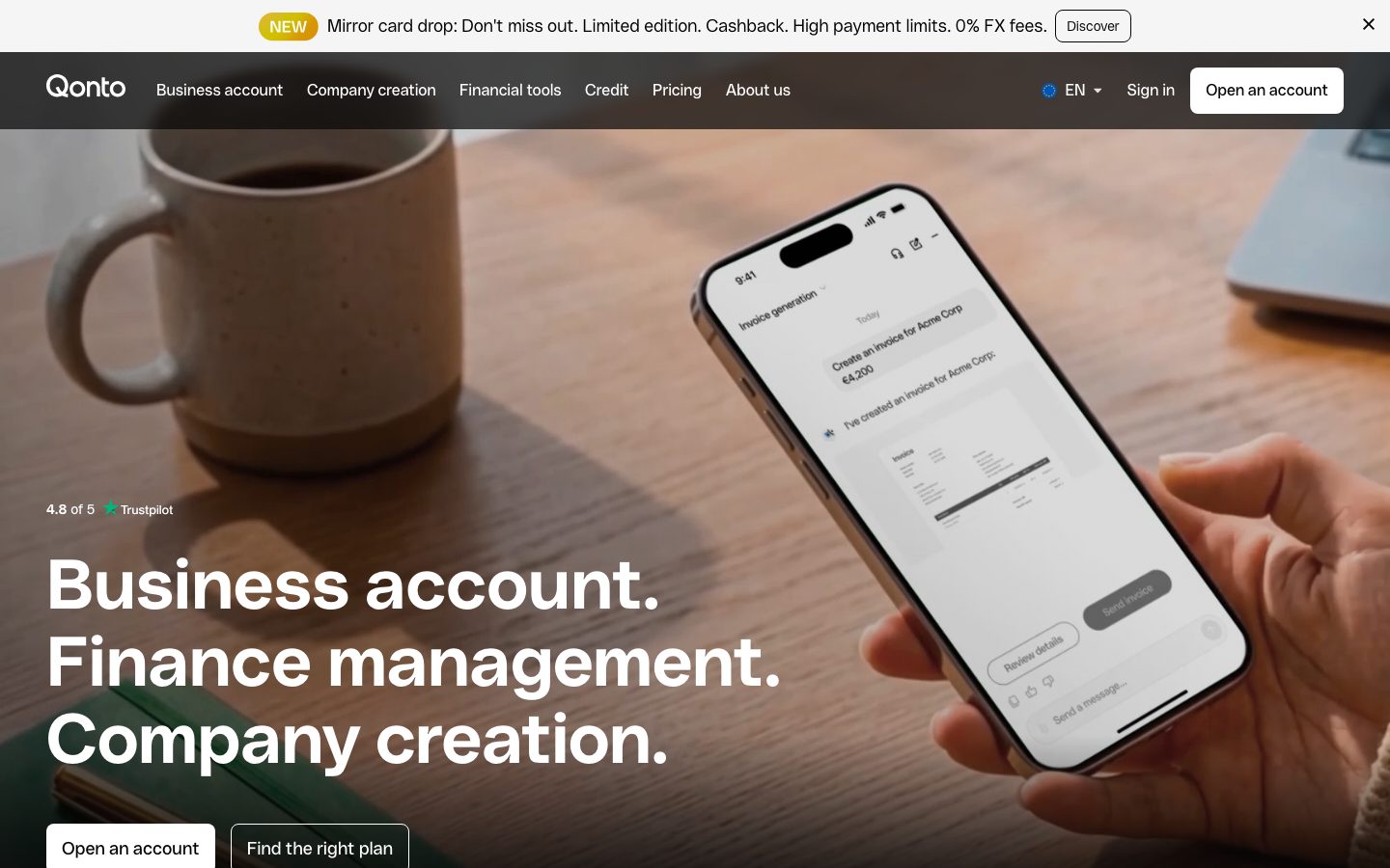
Qonto's marketing surface is a confident European fintech interface for business banking. The system alternates between two register modes: a bright white canvas (`{colors.canvas}` — #ffffff) for editorial copy and light feature cards, and deep near-black bands (`{colors.surface-dark}` — #050505) that wrap immersive product mockups, photographic heroes, and dark feature grids. The hero itself layers oversized headlines directly over a warm lifestyle photograph (a coffee mug, a phone showing the Qonto app).
The type voice is singular and distinctive: **QontoSans** at every level, but the brand character comes from scale and weight contrast. Display headlines run very large (72px / 56px) while body copy is set unusually **light at weight 300**. The result is editorial and airy — the headline shouts, the supporting text whispers, and the gap between them carries the brand's premium-but-approachable tone.
Action color is strictly monochrome: primary CTAs are black on white (`{colors.primary}` — #000000), or inverted to white-on-dark when sitting on photographic / dark hero bands. Qonto never colors its buttons. The pastel accent family — sky blue (`{colors.accent-blue}`), soft violet (`{colors.accent-violet}`), cream (`{colors.accent-cream}`), mint (`{colors.accent-mint}`), lime (`{colors.accent-lime}`) — lives almost entirely inside product UI fragments, integration bubbles, and small illustrative moments, never on the action layer.
**Key Characteristics:**
- White canvas with strictly black-and-white CTAs (`{colors.primary}` — #000000). On dark/photo bands the primary inverts to a white button with black text (`{component.button-primary-on-dark}`).
- Custom `QontoSans` typeface throughout — substituted with Inter here. Display headlines set huge (72px/56px) at weight 600–700; body set light at weight 300.
- Generously rounded 24px cards (`{rounded.lg}`) with flat (no-shadow) surfaces — the dominant container shape across all bands.
- Dual register: light bands (`{colors.surface-soft}` — #f5f5f5 cards) for editorial sections, and deep near-black bands (`{colors.surface-dark}` — #050505) for immersive product feature grids.
- Pastel accents (blue / violet / cream / mint / lime) reserved for product mockups and the circular integration-logo cluster — never on buttons.
- A persistent dismissible promo banner pinned above the nav (`{component.promo-banner}`) carrying a `{component.badge-new}` pill and a `{component.button-pill-discover}`.
- Spacing rhythm climbs in large steps to `{spacing.section}` (80px) between major bands.
- Two small radii (`{rounded.sm}` 6px, `{rounded.md}` 8px) for buttons and tight chrome; one large radius (`{rounded.lg}` 24px) for content cards.
## Colors
### Brand & Action
- **Ink / Primary** (`{colors.ink}` / `{colors.primary}` — #000000): The single action and headline color. All primary CTAs, all display type. Qonto's brand is monochrome at the action layer.
- **On Dark** (`{colors.on-dark}` — #ffffff): Text and inverted button fill on dark and photographic surfaces.
### Accent (product-fragment only)
Qonto's pastels appear inside product mockups, illustration moments, and the integration-bubble cluster — not on buttons:
- **Sky Blue** (`{colors.accent-blue}` — #0099cc), **Bright Blue** (`{colors.accent-blue-bright}` — #00b2ff), **Deep Blue** (`{colors.accent-blue-deep}` — #3275c4): the most frequent accent — link moments, product chart fills, app chrome.
- **Soft Violet** (`{colors.accent-violet}` — #bfa6ea), **Violet Soft** (`{colors.accent-violet-soft}` — #d5c8ff), **Violet Deep** (`{colors.accent-violet-deep}` — #a585db): illustration and integration-bubble fills.
- **Cream** (`{colors.accent-cream}` — #fbf0df), **Sand** (`{colors.accent-sand}` — #f3d5a3): warm card / badge tints.
- **Mint** (`{colors.accent-mint}` — #9be5da), **Lime** (`{colors.accent-lime}` — #faffa4): small chromatic flourishes in product UI.
### Surface
- **Canvas** (`{colors.canvas}` — #ffffff): The default page floor.
- **Surface Soft** (`{colors.surface-soft}` — #f5f5f5): Light feature cards, promo banner, footer.
- **Surface Dark** (`{colors.surface-dark}` — #050505): The near-black immersive bands and dark feature grids — the second register of the system.
- **Surface Dark Elevated** (`{colors.surface-dark-elevated}` — #1a1a1a): Nested cards inside dark bands.
- **Surface Dark Soft** (`{colors.surface-dark-soft}` — #1d1d1b): Alternate dark surface tone.
### Text
- **Ink** (`{colors.ink}` — #000000): Headlines and primary text.
- **Body** (`{colors.body}` — #636360): Default running-text color.
- **Muted** (`{colors.muted}` — #8f8f8f): Secondary text, captions, fine-print.
### Lines
- **Border** (`{colors.border}` — #cccccc): Hairline borders, outline buttons, dividers.
- **Border Strong** (`{colors.border-strong}` — #b8b8b8): A heavier divider / outline tone.
## Typography
### Font Family
The system runs **QontoSans** exclusively — a custom geometric sans used for headlines, body, buttons, and UI labels alike. The fallback stack walks `Inter, sans-serif`. QontoSans is proprietary to Qonto and not distributed as a public web font; see the substitute note below.
The brand character is built from **scale and weight contrast within one family**, not from pairing two typefaces:
- Display headlines: weight 600–700, very large (56–72px)
- Body copy: weight 300 (notably light) at 18px
- Buttons: weight 400 at 18px
### Hierarchy
| Token | Size | Weight | Line Height | Letter Spacing | Use |
|---|---|---|---|---|---|
| `{typography.display-xl}` | 72px | 700 | 1.111 | normal | Hero h1 ("Business account. Finance management. Company creation.") |
| `{typography.display-lg}` | 56px | 600 | 1.143 | normal | Section heads ("Your all-in-one business account", "Compliant invoicing, zero effort") |
| `{typography.title}` | 24px | 600 | 1.333 | normal | Card titles, sub-section heads |
| `{typography.body}` | 18px | 300 | 1.333 | normal | Default running-text — set light at weight 300 |
| `{typography.button}` | 18px | 400 | 1.333 | normal | Button labels, nav items |
### Principles
The light body weight (300) is a deliberate brand signature — never set body copy at 400+ or it reads as off-brand and loses the airy editorial feel. Display headlines stay at 600–700 and very large; the dramatic size jump from 72px headline to 18px light body IS the hierarchy. Letter-spacing stays `normal` at every level — QontoSans is drawn for this and needs no tracking adjustment.
### Note on Font Substitutes
QontoSans is a custom proprietary typeface and is **not** shipped here. The closest open-source substitute is **Inter** — set weight 600–700 for display and weight 300 for body to preserve the weight-contrast signature. **Mulish** (a geometric sans with a usable thin weight) is another close alternative. The `fonts_licensed` array came back empty in the measured analysis, but QontoSans is plainly proprietary — treat it as licensed and substitute accordingly.
## Layout
### Spacing System
- **Base unit:** 4px.
- **Tokens:** `{spacing.xxs}` 4px · `{spacing.xs}` 8px · `{spacing.sm}` 12px · `{spacing.md}` 16px · `{spacing.lg}` 24px · `{spacing.xl}` 32px · `{spacing.xxl}` 48px · `{spacing.xxxl}` 64px · `{spacing.section}` 80px.
- **Most frequent steps:** 16px and 24px dominate inner spacing (45 and 39 occurrences measured); 48px and 80px carry the band-level rhythm.
- **Section padding:** `{spacing.section}` (80px) between major editorial bands.
- **Card internal padding:** `{spacing.lg}` (24px) inside feature cards.
### Grid & Container
- **Editorial body:** Centered single column with full-bleed photographic and dark bands.
- **Hero:** Headline overlaid bottom-left on a full-bleed lifestyle photograph, with a phone product mockup floating right.
- **Feature grids:** Mixed-size card mosaics — a large dark band holds a 2×2-ish arrangement of cards of varying width (e.g., "Pay", "Get paid", "Financing and Pay later", "Mastercard debit and credit cards").
- **Stat row:** 3-up horizontal stat items ("Made in France", "600,000+ clients", "24/7 human support").
- **Integration cluster:** Circular logo bubbles orbiting a central Qonto mark.
- **Footer:** Multi-column link list on `{colors.surface-soft}`.
### Whitespace Philosophy
Qonto uses large, deliberate whitespace — 80px between bands and large headline sizes create an airy, premium feel. Light feature bands breathe against the heavy near-black product bands, and the alternation between the two registers paces the long-scroll page.
## Elevation & Depth
| Level | Treatment | Use |
|---|---|---|
| Flat | No shadow, no border | Cards (`{component.card}`), most surfaces — flat 24px-radius blocks |
| Hairline | 1px `{colors.border}` border | Outline buttons, dividers, pill chrome |
| Color-block | Dark band vs. light band | Depth is carried by surface contrast (#050505 vs #ffffff), not shadow |
| Dark-band glow | `rgba(255, 255, 255, 0.08) 0px 0px 20px 0px` | A faint white outer glow used to lift elements inside near-black bands |
The elevation philosophy is **flat and contrast-driven**. The only measured shadow is a subtle 20px white glow used on dark surfaces (a light bloom around dark-band product chrome). On light surfaces, cards carry no shadow at all — the `{colors.surface-soft}` fill and 24px radius do the separating work.
### Decorative Depth
- Photographic hero and lifestyle bands provide their own depth; headlines sit directly over the imagery in `{colors.on-dark}`.
- The integration-bubble cluster floats circular logo chips at varying scale around the central Qonto mark — perceived depth from overlap and size, not shadow.
## Shapes
### Border Radius Scale
| Token | Value | Use |
|---|---|---|
| `{rounded.sm}` | 6px | Tight chrome, small inline controls |
| `{rounded.md}` | 8px | Buttons, pills, badges, integration chips |
| `{rounded.lg}` | 24px | Content cards — the dominant container shape |
### Photography & Geometry
The 24px card radius is the system's signature shape — applied to every feature card and product-mockup container. Hero and full-bleed lifestyle photographs run edge-to-edge with no radius. Avatar and customer photos within testimonial bands crop to rounded rectangles. Integration logos sit in circular / rounded bubbles within the connectivity cluster.
## Components
### Navigation & Banners
**`top-nav`** — Dark bar (`{colors.surface-dark}`) pinned to the top of the page carrying the Qonto wordmark at left, the primary horizontal menu (Business account, Company creation, Financial tools, Credit, Pricing, About us), a language selector (EN), a "Sign in" text link, and a white "Open an account" button at right. Labels use `{typography.button}`.
**`promo-banner`** — A dismissible strip pinned above the nav on `{colors.surface-soft}` with ink text. Carries a `{component.badge-new}` pill, a one-line promotional message, and a `{component.button-pill-discover}`. Closeable via an ✕ at right.
**`badge-new`** — Small "NEW" pill on `{colors.accent-sand}` with ink text, `{typography.body}`, rounded `{rounded.md}`, padding 4px × 12px. (Fill is approximate — see Known Gaps.)
### Buttons
**`button-primary`** — The standard primary CTA on light surfaces. Background `{colors.primary}` (#000000), text `{colors.on-dark}`, type `{typography.button}` (QontoSans 18px / 400), rounded `{rounded.md}`, padding 16px × 24px.
**`button-primary-on-dark`** — The inverted primary used on dark and photographic hero bands (e.g., the hero "Open an account" and the nav button). Background `{colors.canvas}` (white), text `{colors.ink}`, same type / radius / padding as primary.
**`button-secondary`** — Outline button (e.g., "Find the right plan", "Discover our business account"). Transparent background, `{colors.ink}` text, 1px `{colors.ink}` border, rounded `{rounded.md}`, padding 16px × 24px.
**`button-pill-discover`** — Small white pill button used inside the promo banner ("Discover"). Background `{colors.canvas}`, `{colors.ink}` text, 1px `{colors.border}` border, rounded `{rounded.md}`, padding 8px × 16px.
### Cards & Containers
**`card`** — The base container. Background `{colors.surface-soft}`, ink text, rounded `{rounded.lg}` (24px), no shadow, internal padding `{spacing.lg}` (24px).
**`feature-card-dark`** — Feature cards inside the near-black product bands ("Pay", "Get paid", "Financing and Pay later", "Mastercard debit and credit cards"). Background `{colors.surface-dark}` (#050505), text `{colors.on-dark}`, rounded `{rounded.lg}`, padding `{spacing.lg}`. Holds product UI fragments and card imagery.
**`feature-card-light`** — Feature cards in light editorial bands ("Get ready for e-invoicing", "Create unlimited quotes & invoices", "Supplier invoices in one place"). Background `{colors.surface-soft}`, ink text, rounded `{rounded.lg}`, padding `{spacing.lg}`. Holds product UI fragments (invoice-matched chips, supplier-invoice lists).
**`stat-item`** — A horizontal stat block in the 3-up trust row. Transparent on canvas, body-color supporting text, with an icon/avatar and a short claim ("Made in France", "600,000+ clients", "24/7 human support").
**`integration-bubble`** — Circular / rounded logo chips in the connectivity cluster ("Keep all your tools connected"). Background `{colors.canvas}`, rounded `{rounded.lg}`, orbiting a central Qonto mark. Logos shown at native color.
### Footer
**`footer`** — Light footer on `{colors.surface-soft}` closing the page. Multi-column link list (Business account / Financing / Company / Financial tools), body text in `{colors.body}`, `{typography.body}`, vertical padding `{spacing.section}` (80px). Carries the Qonto wordmark and a Trustpilot rating.
## Do's and Don'ts
### Do
- Keep primary CTAs strictly black-and-white. Use `{component.button-primary}` (black on light) and `{component.button-primary-on-dark}` (white on dark) — never color a button.
- Set body copy at QontoSans weight 300. The light body weight is a core brand signature.
- Set display headlines very large (56–72px) at weight 600–700. Lean on the dramatic size jump to body for hierarchy.
- Use the 24px card radius (`{rounded.lg}`) for all content cards. It's the system's defining shape.
- Reserve pastel accents (blue / violet / cream / mint / lime) for product mockups, illustrations, and integration bubbles — never the action layer.
- Alternate light and near-black bands to pace the long-scroll page. The dual register is the rhythm.
- Keep cards flat — no shadow on light surfaces; only the subtle white glow on dark bands.
### Don't
- Don't introduce a colored primary button. Qonto's action layer is monochrome.
- Don't set body text at weight 400+ — it kills the airy editorial voice.
- Don't apply card shadows on light surfaces; depth comes from surface contrast.
- Don't mix radii on cards — 24px is the single content-card radius; 6–8px is for buttons and small chrome only.
- Don't claim to ship QontoSans — substitute with Inter (or Mulish) and preserve the weight contrast.
- Don't add hover state styling beyond what's documented — default and pressed only.
## Responsive Behavior
### Breakpoints
| Name | Width | Key Changes |
|---|---|---|
| Mobile | < 768px | Hamburger nav; hero h1 scales down from 72px; feature mosaics stack 1-up; stat row stacks; integration cluster simplifies; footer columns collapse |
| Tablet | 768–1024px | Nav tightens; feature card mosaics reduce to 2-up; hero photo + mockup reflow |
| Desktop | 1024–1440px | Full horizontal nav; multi-card dark feature mosaic; 3-up stat row |
| Wide | > 1440px | Same as desktop with more outer breathing room; centered max content width |
### Touch Targets
- `{component.button-primary}` carries 16px × 24px padding on 18px text, yielding a comfortable target above 44px.
- `{component.button-pill-discover}` in the promo banner uses 8px × 16px padding — smaller, but acceptable on a dismissible utility strip.
- Nav items use `{typography.button}` (18px) with generous spacing.
### Collapsing Strategy
- Top nav collapses to a hamburger menu on mobile.
- Hero headline reflows over the photograph; the floating phone mockup moves below the copy.
- Dark-band feature mosaics reduce columns rather than shrinking cards.
- The 3-up stat row stacks vertically on mobile.
- Footer link columns wrap to fewer columns at narrow widths.
### Image Behavior
- Full-bleed hero / lifestyle photographs scale and crop to viewport.
- Product UI fragments inside cards retain aspect ratio while the 24px-radius cards resize.
- Integration bubbles rescale and re-cluster around the central Qonto mark.
## Iteration Guide
1. Focus on ONE component at a time. Reference its YAML key directly (`{component.feature-card-dark}`, `{component.button-primary}`).
2. Variants (e.g., `-on-dark`, `-light`) live as separate entries in `components:`.
3. Use `{token.refs}` everywhere — never inline hex.
4. Never document hover. Default and Active/Pressed states only.
5. Keep the action layer monochrome; keep pastels inside product fragments.
6. Body stays QontoSans weight 300; display stays 600–700 and large. The weight contrast does not blur.
7. When in doubt about emphasis: bigger headline before colored anything.
## Known Gaps
- The measured `button-primary` component returned `radius: 0px` and `padding: 0px` — almost certainly a capture artifact (CTAs render as rounded buttons in screenshots). Button radius is documented as `{rounded.md}` (8px, a measured radius value) and padding as 16px × 24px (derived from screenshot ground-truth and the measured spacing ladder); confirm against production CSS.
- QontoSans is proprietary; `fonts_licensed` returned empty but the face is custom — open-source substitutes (Inter, Mulish) are documented in Typography. No QontoSans web font is shipped.
- The `{component.badge-new}` ("NEW") pill fill is approximate — its olive/gold tone falls between measured `{colors.accent-sand}` (#f3d5a3) and `{colors.accent-lime}` (#faffa4); the exact value was not isolated.
- Only one shadow was measured (the dark-band white glow). Light-surface elevation states, focus rings, and pressed-state shadows were not extracted.
- Active/pressed states for buttons were not measured; only default fills are documented.
- Form input, dropdown (language selector), and pricing-table component specs were not isolated from the captured pages.
- Animation and transition timings (testimonial carousel, integration-cluster motion, banner dismissal) are out of scope.
- The exact column structure and link grouping of the footer is inferred from screenshot ground-truth, not measured per-column.
<!-- Documented by duply · real-world design systems as ready-to-use DESIGN.md for AI coding agents · https://duply.ai/qonto/design-md -->
Color Palette
Accent
Neutrals
Typography
display-xl72px · 700 · 1.111
The quick brown fox jumpsdisplay-lg56px · 600 · 1.143
The quick brown fox jumpstitle24px · 600 · 1.333
The quick brown fox jumpsbody18px · 300 · 1.333
The quick brown fox jumpsbutton18px · 400 · 1.333
The quick brown fox jumpsSpacing & Shape
Spacing
| Name | Value | Preview |
|---|---|---|
| xxs | 4px | |
| xs | 8px | |
| sm | 12px | |
| md | 16px | |
| lg | 24px | |
| xl | 32px | |
| xxl | 48px | |
| xxxl | 64px | |
| section | 80px |
Border Radius
| Name | Value | Preview |
|---|---|---|
| sm | 6px | |
| md | 8px | |
| lg | 24px |
More like this


---
version: alpha
name: Qonto-design-analysis
description: A confident European fintech interface for business banking — bright white canvas paired with deep near-black surfaces (#050505), the custom QontoSans typeface set very large and light, and generously rounded 24px cards. Brand voltage comes from oversized light-weight display headlines, immersive photographic/dark product bands, and a restrained pastel accent family (sky blue, soft violet, cream, mint) used inside product mockups and integration bubbles rather than on primary actions, which stay strictly black-and-white.

colors:
  canvas: "#ffffff"
  ink: "#000000"
  primary: "#000000"
  surface-dark: "#050505"
  surface-dark-elevated: "#1a1a1a"
  surface-dark-soft: "#1d1d1b"
  surface-soft: "#f5f5f5"
  body: "#636360"
  muted: "#8f8f8f"
  border: "#cccccc"
  border-strong: "#b8b8b8"
  on-dark: "#ffffff"
  accent-blue: "#0099cc"
  accent-blue-bright: "#00b2ff"
  accent-blue-deep: "#3275c4"
  accent-violet: "#bfa6ea"
  accent-violet-soft: "#d5c8ff"
  accent-violet-deep: "#a585db"
  accent-cream: "#fbf0df"
  accent-sand: "#f3d5a3"
  accent-mint: "#9be5da"
  accent-lime: "#faffa4"

typography:
  display-xl:
    fontFamily: "QontoSans, Inter, sans-serif"
    fontSize: 72px
    fontWeight: 700
    lineHeight: 1.111
    letterSpacing: normal
  display-lg:
    fontFamily: "QontoSans, Inter, sans-serif"
    fontSize: 56px
    fontWeight: 600
    lineHeight: 1.143
    letterSpacing: normal
  title:
    fontFamily: "QontoSans, Inter, sans-serif"
    fontSize: 24px
    fontWeight: 600
    lineHeight: 1.333
    letterSpacing: normal
  body:
    fontFamily: "QontoSans, Inter, sans-serif"
    fontSize: 18px
    fontWeight: 300
    lineHeight: 1.333
    letterSpacing: normal
  button:
    fontFamily: "QontoSans, Inter, sans-serif"
    fontSize: 18px
    fontWeight: 400
    lineHeight: 1.333
    letterSpacing: normal

rounded:
  sm: 6px
  md: 8px
  lg: 24px

spacing:
  xxs: 4px
  xs: 8px
  sm: 12px
  md: 16px
  lg: 24px
  xl: 32px
  xxl: 48px
  xxxl: 64px
  section: 80px

components:
  top-nav:
    backgroundColor: "{colors.surface-dark}"
    textColor: "{colors.on-dark}"
    typography: "{typography.button}"
  promo-banner:
    backgroundColor: "{colors.surface-soft}"
    textColor: "{colors.ink}"
    typography: "{typography.body}"
    padding: 16px 24px
  badge-new:
    backgroundColor: "{colors.accent-sand}"
    textColor: "{colors.ink}"
    typography: "{typography.body}"
    rounded: "{rounded.md}"
    padding: 4px 12px
  button-primary:
    backgroundColor: "{colors.primary}"
    textColor: "{colors.on-dark}"
    typography: "{typography.button}"
    rounded: "{rounded.md}"
    padding: 16px 24px
  button-primary-on-dark:
    backgroundColor: "{colors.canvas}"
    textColor: "{colors.ink}"
    typography: "{typography.button}"
    rounded: "{rounded.md}"
    padding: 16px 24px
  button-secondary:
    backgroundColor: transparent
    textColor: "{colors.ink}"
    borderColor: "{colors.ink}"
    typography: "{typography.button}"
    rounded: "{rounded.md}"
    padding: 16px 24px
  button-pill-discover:
    backgroundColor: "{colors.canvas}"
    textColor: "{colors.ink}"
    borderColor: "{colors.border}"
    typography: "{typography.button}"
    rounded: "{rounded.md}"
    padding: 8px 16px
  card:
    backgroundColor: "{colors.surface-soft}"
    textColor: "{colors.ink}"
    typography: "{typography.body}"
    rounded: "{rounded.lg}"
    padding: 24px
  feature-card-dark:
    backgroundColor: "{colors.surface-dark}"
    textColor: "{colors.on-dark}"
    typography: "{typography.body}"
    rounded: "{rounded.lg}"
    padding: 24px
  feature-card-light:
    backgroundColor: "{colors.surface-soft}"
    textColor: "{colors.ink}"
    typography: "{typography.body}"
    rounded: "{rounded.lg}"
    padding: 24px
  stat-item:
    backgroundColor: "{colors.canvas}"
    textColor: "{colors.body}"
    typography: "{typography.body}"
  integration-bubble:
    backgroundColor: "{colors.canvas}"
    textColor: "{colors.ink}"
    rounded: "{rounded.lg}"
  footer:
    backgroundColor: "{colors.surface-soft}"
    textColor: "{colors.body}"
    typography: "{typography.body}"
    padding: 80px
---

## Overview

Qonto's marketing surface is a confident European fintech interface for business banking. The system alternates between two register modes: a bright white canvas (`{colors.canvas}` — #ffffff) for editorial copy and light feature cards, and deep near-black bands (`{colors.surface-dark}` — #050505) that wrap immersive product mockups, photographic heroes, and dark feature grids. The hero itself layers oversized headlines directly over a warm lifestyle photograph (a coffee mug, a phone showing the Qonto app).

The type voice is singular and distinctive: **QontoSans** at every level, but the brand character comes from scale and weight contrast. Display headlines run very large (72px / 56px) while body copy is set unusually **light at weight 300**. The result is editorial and airy — the headline shouts, the supporting text whispers, and the gap between them carries the brand's premium-but-approachable tone.

Action color is strictly monochrome: primary CTAs are black on white (`{colors.primary}` — #000000), or inverted to white-on-dark when sitting on photographic / dark hero bands. Qonto never colors its buttons. The pastel accent family — sky blue (`{colors.accent-blue}`), soft violet (`{colors.accent-violet}`), cream (`{colors.accent-cream}`), mint (`{colors.accent-mint}`), lime (`{colors.accent-lime}`) — lives almost entirely inside product UI fragments, integration bubbles, and small illustrative moments, never on the action layer.

**Key Characteristics:**
- White canvas with strictly black-and-white CTAs (`{colors.primary}` — #000000). On dark/photo bands the primary inverts to a white button with black text (`{component.button-primary-on-dark}`).
- Custom `QontoSans` typeface throughout — substituted with Inter here. Display headlines set huge (72px/56px) at weight 600–700; body set light at weight 300.
- Generously rounded 24px cards (`{rounded.lg}`) with flat (no-shadow) surfaces — the dominant container shape across all bands.
- Dual register: light bands (`{colors.surface-soft}` — #f5f5f5 cards) for editorial sections, and deep near-black bands (`{colors.surface-dark}` — #050505) for immersive product feature grids.
- Pastel accents (blue / violet / cream / mint / lime) reserved for product mockups and the circular integration-logo cluster — never on buttons.
- A persistent dismissible promo banner pinned above the nav (`{component.promo-banner}`) carrying a `{component.badge-new}` pill and a `{component.button-pill-discover}`.
- Spacing rhythm climbs in large steps to `{spacing.section}` (80px) between major bands.
- Two small radii (`{rounded.sm}` 6px, `{rounded.md}` 8px) for buttons and tight chrome; one large radius (`{rounded.lg}` 24px) for content cards.

## Colors

### Brand & Action
- **Ink / Primary** (`{colors.ink}` / `{colors.primary}` — #000000): The single action and headline color. All primary CTAs, all display type. Qonto's brand is monochrome at the action layer.
- **On Dark** (`{colors.on-dark}` — #ffffff): Text and inverted button fill on dark and photographic surfaces.

### Accent (product-fragment only)
Qonto's pastels appear inside product mockups, illustration moments, and the integration-bubble cluster — not on buttons:
- **Sky Blue** (`{colors.accent-blue}` — #0099cc), **Bright Blue** (`{colors.accent-blue-bright}` — #00b2ff), **Deep Blue** (`{colors.accent-blue-deep}` — #3275c4): the most frequent accent — link moments, product chart fills, app chrome.
- **Soft Violet** (`{colors.accent-violet}` — #bfa6ea), **Violet Soft** (`{colors.accent-violet-soft}` — #d5c8ff), **Violet Deep** (`{colors.accent-violet-deep}` — #a585db): illustration and integration-bubble fills.
- **Cream** (`{colors.accent-cream}` — #fbf0df), **Sand** (`{colors.accent-sand}` — #f3d5a3): warm card / badge tints.
- **Mint** (`{colors.accent-mint}` — #9be5da), **Lime** (`{colors.accent-lime}` — #faffa4): small chromatic flourishes in product UI.

### Surface
- **Canvas** (`{colors.canvas}` — #ffffff): The default page floor.
- **Surface Soft** (`{colors.surface-soft}` — #f5f5f5): Light feature cards, promo banner, footer.
- **Surface Dark** (`{colors.surface-dark}` — #050505): The near-black immersive bands and dark feature grids — the second register of the system.
- **Surface Dark Elevated** (`{colors.surface-dark-elevated}` — #1a1a1a): Nested cards inside dark bands.
- **Surface Dark Soft** (`{colors.surface-dark-soft}` — #1d1d1b): Alternate dark surface tone.

### Text
- **Ink** (`{colors.ink}` — #000000): Headlines and primary text.
- **Body** (`{colors.body}` — #636360): Default running-text color.
- **Muted** (`{colors.muted}` — #8f8f8f): Secondary text, captions, fine-print.

### Lines
- **Border** (`{colors.border}` — #cccccc): Hairline borders, outline buttons, dividers.
- **Border Strong** (`{colors.border-strong}` — #b8b8b8): A heavier divider / outline tone.

## Typography

### Font Family
The system runs **QontoSans** exclusively — a custom geometric sans used for headlines, body, buttons, and UI labels alike. The fallback stack walks `Inter, sans-serif`. QontoSans is proprietary to Qonto and not distributed as a public web font; see the substitute note below.

The brand character is built from **scale and weight contrast within one family**, not from pairing two typefaces:
- Display headlines: weight 600–700, very large (56–72px)
- Body copy: weight 300 (notably light) at 18px
- Buttons: weight 400 at 18px

### Hierarchy

| Token | Size | Weight | Line Height | Letter Spacing | Use |
|---|---|---|---|---|---|
| `{typography.display-xl}` | 72px | 700 | 1.111 | normal | Hero h1 ("Business account. Finance management. Company creation.") |
| `{typography.display-lg}` | 56px | 600 | 1.143 | normal | Section heads ("Your all-in-one business account", "Compliant invoicing, zero effort") |
| `{typography.title}` | 24px | 600 | 1.333 | normal | Card titles, sub-section heads |
| `{typography.body}` | 18px | 300 | 1.333 | normal | Default running-text — set light at weight 300 |
| `{typography.button}` | 18px | 400 | 1.333 | normal | Button labels, nav items |

### Principles
The light body weight (300) is a deliberate brand signature — never set body copy at 400+ or it reads as off-brand and loses the airy editorial feel. Display headlines stay at 600–700 and very large; the dramatic size jump from 72px headline to 18px light body IS the hierarchy. Letter-spacing stays `normal` at every level — QontoSans is drawn for this and needs no tracking adjustment.

### Note on Font Substitutes
QontoSans is a custom proprietary typeface and is **not** shipped here. The closest open-source substitute is **Inter** — set weight 600–700 for display and weight 300 for body to preserve the weight-contrast signature. **Mulish** (a geometric sans with a usable thin weight) is another close alternative. The `fonts_licensed` array came back empty in the measured analysis, but QontoSans is plainly proprietary — treat it as licensed and substitute accordingly.

## Layout

### Spacing System
- **Base unit:** 4px.
- **Tokens:** `{spacing.xxs}` 4px · `{spacing.xs}` 8px · `{spacing.sm}` 12px · `{spacing.md}` 16px · `{spacing.lg}` 24px · `{spacing.xl}` 32px · `{spacing.xxl}` 48px · `{spacing.xxxl}` 64px · `{spacing.section}` 80px.
- **Most frequent steps:** 16px and 24px dominate inner spacing (45 and 39 occurrences measured); 48px and 80px carry the band-level rhythm.
- **Section padding:** `{spacing.section}` (80px) between major editorial bands.
- **Card internal padding:** `{spacing.lg}` (24px) inside feature cards.

### Grid & Container
- **Editorial body:** Centered single column with full-bleed photographic and dark bands.
- **Hero:** Headline overlaid bottom-left on a full-bleed lifestyle photograph, with a phone product mockup floating right.
- **Feature grids:** Mixed-size card mosaics — a large dark band holds a 2×2-ish arrangement of cards of varying width (e.g., "Pay", "Get paid", "Financing and Pay later", "Mastercard debit and credit cards").
- **Stat row:** 3-up horizontal stat items ("Made in France", "600,000+ clients", "24/7 human support").
- **Integration cluster:** Circular logo bubbles orbiting a central Qonto mark.
- **Footer:** Multi-column link list on `{colors.surface-soft}`.

### Whitespace Philosophy
Qonto uses large, deliberate whitespace — 80px between bands and large headline sizes create an airy, premium feel. Light feature bands breathe against the heavy near-black product bands, and the alternation between the two registers paces the long-scroll page.

## Elevation & Depth

| Level | Treatment | Use |
|---|---|---|
| Flat | No shadow, no border | Cards (`{component.card}`), most surfaces — flat 24px-radius blocks |
| Hairline | 1px `{colors.border}` border | Outline buttons, dividers, pill chrome |
| Color-block | Dark band vs. light band | Depth is carried by surface contrast (#050505 vs #ffffff), not shadow |
| Dark-band glow | `rgba(255, 255, 255, 0.08) 0px 0px 20px 0px` | A faint white outer glow used to lift elements inside near-black bands |

The elevation philosophy is **flat and contrast-driven**. The only measured shadow is a subtle 20px white glow used on dark surfaces (a light bloom around dark-band product chrome). On light surfaces, cards carry no shadow at all — the `{colors.surface-soft}` fill and 24px radius do the separating work.

### Decorative Depth
- Photographic hero and lifestyle bands provide their own depth; headlines sit directly over the imagery in `{colors.on-dark}`.
- The integration-bubble cluster floats circular logo chips at varying scale around the central Qonto mark — perceived depth from overlap and size, not shadow.

## Shapes

### Border Radius Scale

| Token | Value | Use |
|---|---|---|
| `{rounded.sm}` | 6px | Tight chrome, small inline controls |
| `{rounded.md}` | 8px | Buttons, pills, badges, integration chips |
| `{rounded.lg}` | 24px | Content cards — the dominant container shape |

### Photography & Geometry
The 24px card radius is the system's signature shape — applied to every feature card and product-mockup container. Hero and full-bleed lifestyle photographs run edge-to-edge with no radius. Avatar and customer photos within testimonial bands crop to rounded rectangles. Integration logos sit in circular / rounded bubbles within the connectivity cluster.

## Components

### Navigation & Banners

**`top-nav`** — Dark bar (`{colors.surface-dark}`) pinned to the top of the page carrying the Qonto wordmark at left, the primary horizontal menu (Business account, Company creation, Financial tools, Credit, Pricing, About us), a language selector (EN), a "Sign in" text link, and a white "Open an account" button at right. Labels use `{typography.button}`.

**`promo-banner`** — A dismissible strip pinned above the nav on `{colors.surface-soft}` with ink text. Carries a `{component.badge-new}` pill, a one-line promotional message, and a `{component.button-pill-discover}`. Closeable via an ✕ at right.

**`badge-new`** — Small "NEW" pill on `{colors.accent-sand}` with ink text, `{typography.body}`, rounded `{rounded.md}`, padding 4px × 12px. (Fill is approximate — see Known Gaps.)

### Buttons

**`button-primary`** — The standard primary CTA on light surfaces. Background `{colors.primary}` (#000000), text `{colors.on-dark}`, type `{typography.button}` (QontoSans 18px / 400), rounded `{rounded.md}`, padding 16px × 24px.

**`button-primary-on-dark`** — The inverted primary used on dark and photographic hero bands (e.g., the hero "Open an account" and the nav button). Background `{colors.canvas}` (white), text `{colors.ink}`, same type / radius / padding as primary.

**`button-secondary`** — Outline button (e.g., "Find the right plan", "Discover our business account"). Transparent background, `{colors.ink}` text, 1px `{colors.ink}` border, rounded `{rounded.md}`, padding 16px × 24px.

**`button-pill-discover`** — Small white pill button used inside the promo banner ("Discover"). Background `{colors.canvas}`, `{colors.ink}` text, 1px `{colors.border}` border, rounded `{rounded.md}`, padding 8px × 16px.

### Cards & Containers

**`card`** — The base container. Background `{colors.surface-soft}`, ink text, rounded `{rounded.lg}` (24px), no shadow, internal padding `{spacing.lg}` (24px).

**`feature-card-dark`** — Feature cards inside the near-black product bands ("Pay", "Get paid", "Financing and Pay later", "Mastercard debit and credit cards"). Background `{colors.surface-dark}` (#050505), text `{colors.on-dark}`, rounded `{rounded.lg}`, padding `{spacing.lg}`. Holds product UI fragments and card imagery.

**`feature-card-light`** — Feature cards in light editorial bands ("Get ready for e-invoicing", "Create unlimited quotes & invoices", "Supplier invoices in one place"). Background `{colors.surface-soft}`, ink text, rounded `{rounded.lg}`, padding `{spacing.lg}`. Holds product UI fragments (invoice-matched chips, supplier-invoice lists).

**`stat-item`** — A horizontal stat block in the 3-up trust row. Transparent on canvas, body-color supporting text, with an icon/avatar and a short claim ("Made in France", "600,000+ clients", "24/7 human support").

**`integration-bubble`** — Circular / rounded logo chips in the connectivity cluster ("Keep all your tools connected"). Background `{colors.canvas}`, rounded `{rounded.lg}`, orbiting a central Qonto mark. Logos shown at native color.

### Footer

**`footer`** — Light footer on `{colors.surface-soft}` closing the page. Multi-column link list (Business account / Financing / Company / Financial tools), body text in `{colors.body}`, `{typography.body}`, vertical padding `{spacing.section}` (80px). Carries the Qonto wordmark and a Trustpilot rating.

## Do's and Don'ts

### Do
- Keep primary CTAs strictly black-and-white. Use `{component.button-primary}` (black on light) and `{component.button-primary-on-dark}` (white on dark) — never color a button.
- Set body copy at QontoSans weight 300. The light body weight is a core brand signature.
- Set display headlines very large (56–72px) at weight 600–700. Lean on the dramatic size jump to body for hierarchy.
- Use the 24px card radius (`{rounded.lg}`) for all content cards. It's the system's defining shape.
- Reserve pastel accents (blue / violet / cream / mint / lime) for product mockups, illustrations, and integration bubbles — never the action layer.
- Alternate light and near-black bands to pace the long-scroll page. The dual register is the rhythm.
- Keep cards flat — no shadow on light surfaces; only the subtle white glow on dark bands.

### Don't
- Don't introduce a colored primary button. Qonto's action layer is monochrome.
- Don't set body text at weight 400+ — it kills the airy editorial voice.
- Don't apply card shadows on light surfaces; depth comes from surface contrast.
- Don't mix radii on cards — 24px is the single content-card radius; 6–8px is for buttons and small chrome only.
- Don't claim to ship QontoSans — substitute with Inter (or Mulish) and preserve the weight contrast.
- Don't add hover state styling beyond what's documented — default and pressed only.

## Responsive Behavior

### Breakpoints

| Name | Width | Key Changes |
|---|---|---|
| Mobile | < 768px | Hamburger nav; hero h1 scales down from 72px; feature mosaics stack 1-up; stat row stacks; integration cluster simplifies; footer columns collapse |
| Tablet | 768–1024px | Nav tightens; feature card mosaics reduce to 2-up; hero photo + mockup reflow |
| Desktop | 1024–1440px | Full horizontal nav; multi-card dark feature mosaic; 3-up stat row |
| Wide | > 1440px | Same as desktop with more outer breathing room; centered max content width |

### Touch Targets
- `{component.button-primary}` carries 16px × 24px padding on 18px text, yielding a comfortable target above 44px.
- `{component.button-pill-discover}` in the promo banner uses 8px × 16px padding — smaller, but acceptable on a dismissible utility strip.
- Nav items use `{typography.button}` (18px) with generous spacing.

### Collapsing Strategy
- Top nav collapses to a hamburger menu on mobile.
- Hero headline reflows over the photograph; the floating phone mockup moves below the copy.
- Dark-band feature mosaics reduce columns rather than shrinking cards.
- The 3-up stat row stacks vertically on mobile.
- Footer link columns wrap to fewer columns at narrow widths.

### Image Behavior
- Full-bleed hero / lifestyle photographs scale and crop to viewport.
- Product UI fragments inside cards retain aspect ratio while the 24px-radius cards resize.
- Integration bubbles rescale and re-cluster around the central Qonto mark.

## Iteration Guide

1. Focus on ONE component at a time. Reference its YAML key directly (`{component.feature-card-dark}`, `{component.button-primary}`).
2. Variants (e.g., `-on-dark`, `-light`) live as separate entries in `components:`.
3. Use `{token.refs}` everywhere — never inline hex.
4. Never document hover. Default and Active/Pressed states only.
5. Keep the action layer monochrome; keep pastels inside product fragments.
6. Body stays QontoSans weight 300; display stays 600–700 and large. The weight contrast does not blur.
7. When in doubt about emphasis: bigger headline before colored anything.

## Known Gaps

- The measured `button-primary` component returned `radius: 0px` and `padding: 0px` — almost certainly a capture artifact (CTAs render as rounded buttons in screenshots). Button radius is documented as `{rounded.md}` (8px, a measured radius value) and padding as 16px × 24px (derived from screenshot ground-truth and the measured spacing ladder); confirm against production CSS.
- QontoSans is proprietary; `fonts_licensed` returned empty but the face is custom — open-source substitutes (Inter, Mulish) are documented in Typography. No QontoSans web font is shipped.
- The `{component.badge-new}` ("NEW") pill fill is approximate — its olive/gold tone falls between measured `{colors.accent-sand}` (#f3d5a3) and `{colors.accent-lime}` (#faffa4); the exact value was not isolated.
- Only one shadow was measured (the dark-band white glow). Light-surface elevation states, focus rings, and pressed-state shadows were not extracted.
- Active/pressed states for buttons were not measured; only default fills are documented.
- Form input, dropdown (language selector), and pricing-table component specs were not isolated from the captured pages.
- Animation and transition timings (testimonial carousel, integration-cluster motion, banner dismissal) are out of scope.
- The exact column structure and link grouping of the footer is inferred from screenshot ground-truth, not measured per-column.

<!-- Documented by duply · real-world design systems as ready-to-use DESIGN.md for AI coding agents · https://duply.ai/qonto/design-md -->