SequenceHQ
A minimal, monochrome modern-fintech marketing surface built on a pure white canvas with near-black pill CTAs and the custom TWK Lausanne neo-grotesque typeface. The system reads as quiet, engineered, and product-forward — generous whitespace, a single large light-gray media card floating in the hero, tiny 2px hairline radii on UI chrome contrasted against fully-pill buttons, and a soft cool gradient (sky-blue to violet) bleeding behind an otherwise restrained layout. Color voltage is reserved entirely for a small accent set (violet, cyan, sky) that appears in product artwork rather than on the marketing chrome.
---
version: alpha
name: SequenceHQ-design-analysis
description: A minimal, monochrome modern-fintech marketing surface built on a pure white canvas with near-black pill CTAs and the custom TWK Lausanne neo-grotesque typeface. The system reads as quiet, engineered, and product-forward — generous whitespace, a single large light-gray media card floating in the hero, tiny 2px hairline radii on UI chrome contrasted against fully-pill buttons, and a soft cool gradient (sky-blue to violet) bleeding behind an otherwise restrained layout. Color voltage is reserved entirely for a small accent set (violet, cyan, sky) that appears in product artwork rather than on the marketing chrome.
colors:
canvas: "#ffffff"
surface-soft: "#fafafa"
surface-muted: "#f7f7f8"
surface-muted-alt: "#f8f7f7"
surface-card: "#f2f2f2"
surface-dark: "#202120"
surface-darker: "#222222"
ink: "#1d1d20"
ink-strong: "#000000"
body: "#42424a"
muted: "#757575"
muted-soft: "#9ca3af"
on-primary: "#505050"
hairline: "#e5e7eb"
hairline-soft: "#dddddd"
hairline-strong: "#d8d8d8"
accent: "#716fff"
accent-violet: "#a565ff"
accent-cyan: "#77e8e9"
accent-sky: "#c0e6ff"
typography:
h3:
fontFamily: "TWK Lausanne, Inter, sans-serif"
fontSize: 12px
fontWeight: 400
lineHeight: 2.0
letterSpacing: normal
body:
fontFamily: "TWK Lausanne, Inter, sans-serif"
fontSize: 12px
fontWeight: 400
lineHeight: 2.0
letterSpacing: normal
button:
fontFamily: "TWK Lausanne, Inter, sans-serif"
fontSize: 14px
fontWeight: 400
lineHeight: 1.0
letterSpacing: normal
rounded:
xs: 2px
sm: 6px
lg: 20px
pill: 9999px
spacing:
xxs: 4px
xs: 8px
sm: 12px
md: 14px
lg: 16px
xl: 24px
xxl: 56px
section: 80px
components:
announcement-bar:
backgroundColor: "{colors.surface-soft}"
textColor: "{colors.ink}"
typography: "{typography.body}"
padding: 8px
top-nav:
backgroundColor: "{colors.canvas}"
textColor: "{colors.ink}"
typography: "{typography.button}"
padding: 16px 24px
nav-link:
backgroundColor: transparent
textColor: "{colors.muted}"
typography: "{typography.button}"
button-primary:
backgroundColor: "{colors.surface-dark}"
textColor: "{colors.on-primary}"
typography: "{typography.button}"
rounded: "{rounded.pill}"
padding: 0px 8px 0px 14px
button-signin:
backgroundColor: transparent
textColor: "{colors.muted}"
typography: "{typography.button}"
hero-media-card:
backgroundColor: "{colors.surface-muted}"
textColor: "{colors.ink}"
rounded: "{rounded.lg}"
footer:
backgroundColor: "{colors.canvas}"
textColor: "{colors.muted}"
typography: "{typography.body}"
padding: 56px
footer-heading:
backgroundColor: transparent
textColor: "{colors.ink}"
typography: "{typography.body}"
footer-link:
backgroundColor: transparent
textColor: "{colors.muted}"
typography: "{typography.body}"
logo-mark:
backgroundColor: transparent
textColor: "{colors.ink-strong}"
---
## Overview
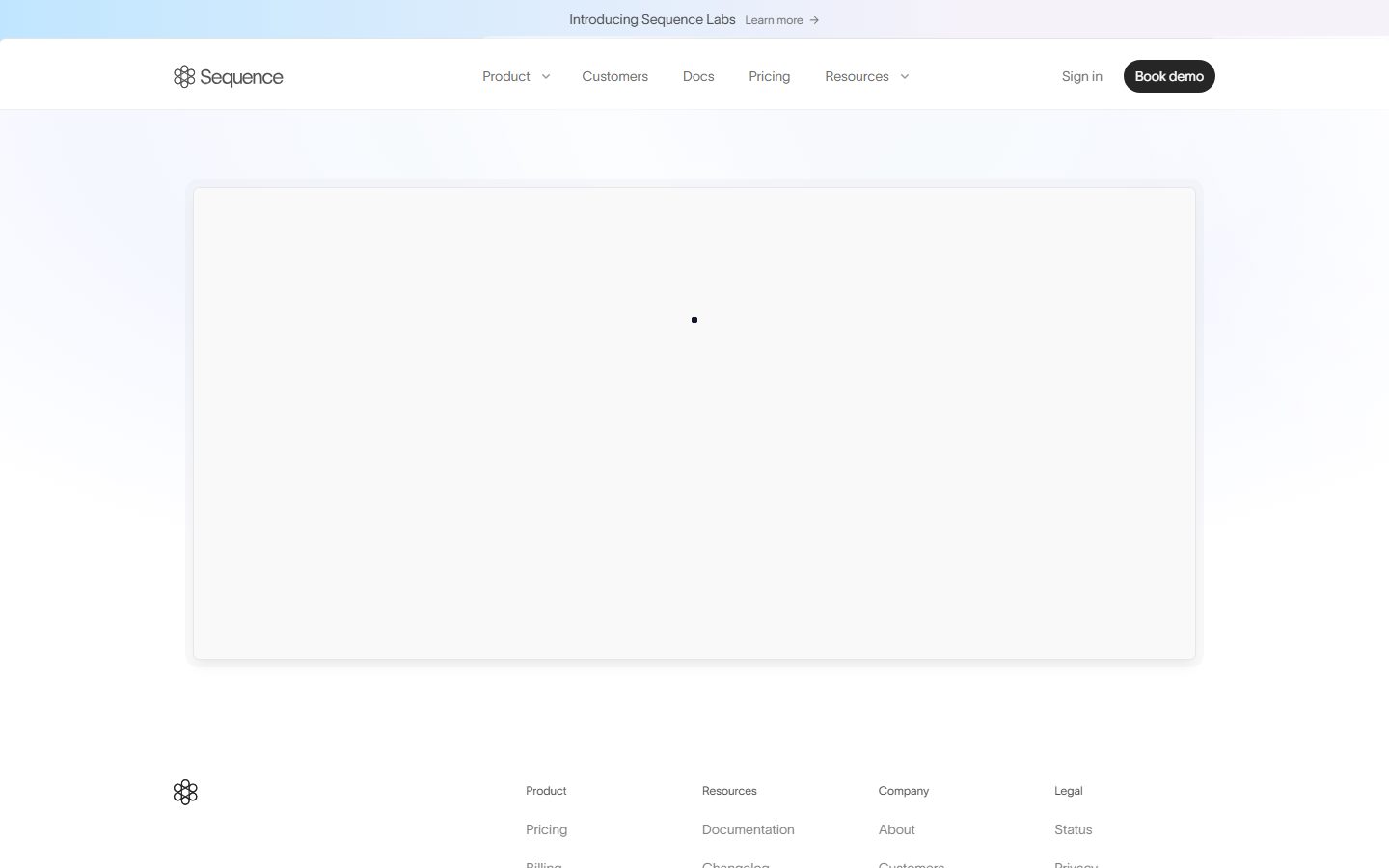
SequenceHQ's marketing surface is an extremely restrained, monochrome modern-fintech interface — a pure white canvas (`{colors.canvas}` — #ffffff) overlaid with a soft cool gradient wash, a near-black pill CTA, and the custom **TWK Lausanne** neo-grotesque typeface for all measured text. The captured pages render as quiet and engineered: a thin top nav, a single large light-gray hero media card floating mid-page, and a clean multi-column footer. There is almost no decorative chrome — the design lets the (deferred-loading) product media carry the visual weight.
The type voice is uniform: every measured role uses **TWK Lausanne** at weight 400. There is no display/body weight split in the captured data — hierarchy is carried through size (12px body/headings, 14px buttons) and generous 2.0 line-height rather than through bolding. This makes the surface read as soft and editorial rather than punchy.
Color voltage is held in reserve. The marketing chrome (nav, buttons, footer) is strictly monochrome — black, grays, and white. The accent family — violet (`{colors.accent}` — #716fff), a brighter violet (`{colors.accent-violet}` — #a565ff), cyan (`{colors.accent-cyan}` — #77e8e9), and sky-blue (`{colors.accent-sky}` — #c0e6ff) — appears in the gradient wash behind the layout and inside product artwork, never on a CTA.
**Key Characteristics:**
- Pure white canvas (`{colors.canvas}`) with a soft cool gradient (sky-blue → violet → faint pink) bleeding behind the top of the page.
- Near-black pill CTA ("Book demo") — fully rounded (`{rounded.pill}`), with asymmetric padding (`0px 8px 0px 14px`) to seat a trailing icon. Background tone is derived from the screenshot's dark pill.
- Custom **TWK Lausanne** typeface (a licensed neo-grotesque) used across headings, body, and buttons; substituted with Inter here.
- Tiny 2px corner radius (`{rounded.xs}`) is the dominant UI radius (24 occurrences) — used on small chrome — set against a 20px (`{rounded.lg}`) radius on the large hero media card.
- A single large light-gray media card (`{colors.surface-muted}` — #f7f7f8) anchors the hero, carrying a faint two-layer drop shadow.
- Minimal text-only "Sign in" affordance beside the dark "Book demo" pill — a quiet primary/secondary pairing.
- Generous whitespace driven by an 80px (`{spacing.section}`) section rhythm and a soft 2.0 line-height.
## Colors
### Accent
SequenceHQ keeps accents off the chrome entirely — they live in the background gradient and product artwork.
- **Accent / Violet** (`{colors.accent}` — #716fff): The dominant brand color, the most frequent accent (frequency 49). Appears in the gradient wash and product UI.
- **Accent Violet (bright)** (`{colors.accent-violet}` — #a565ff): A lighter, more saturated violet used in gradient transitions.
- **Accent Cyan** (`{colors.accent-cyan}` — #77e8e9): A cool aqua used in product artwork and gradient highlights.
- **Accent Sky** (`{colors.accent-sky}` — #c0e6ff): A pale sky-blue used at the top of the background gradient.
### Surface
- **Canvas** (`{colors.canvas}` — #ffffff): The dominant page floor (frequency 95).
- **Surface Soft** (`{colors.surface-soft}` — #fafafa): Faint off-white tint used on subtle bands such as the announcement bar.
- **Surface Muted** (`{colors.surface-muted}` — #f7f7f8): The hero media card fill.
- **Surface Muted Alt** (`{colors.surface-muted-alt}` — #f8f7f7): A near-identical warm off-white alternate surface tone.
- **Surface Card** (`{colors.surface-card}` — #f2f2f2): A slightly deeper gray card/divider tone.
- **Surface Dark** (`{colors.surface-dark}` — #202120): Near-black surface — used for the dark pill CTA (derived; see Components).
- **Surface Darker** (`{colors.surface-darker}` — #222222): A second near-black neutral.
### Text
- **Ink** (`{colors.ink}` — #1d1d20): Primary text / link color (measured from `a.color`). Headings and the wordmark.
- **Ink Strong** (`{colors.ink-strong}` — #000000): Pure black — logo mark and the strongest text.
- **Body** (`{colors.body}` — #42424a): Default running text.
- **Muted** (`{colors.muted}` — #757575): Secondary text — nav links, footer links, captions.
- **Muted Soft** (`{colors.muted-soft}` — #9ca3af): Tertiary / disabled text — the faded "Sign in" and pressed-state pill in the active screenshot.
- **On Primary** (`{colors.on-primary}` — #505050): Measured button text color.
### Hairline
- **Hairline** (`{colors.hairline}` — #e5e7eb): The 1px border tone used on cards and dividers.
- **Hairline Soft** (`{colors.hairline-soft}` — #dddddd): A softer divider tone.
- **Hairline Strong** (`{colors.hairline-strong}` — #d8d8d8): A slightly heavier border tone.
## Typography
### Font Family
The system runs **TWK Lausanne** across every measured role — a custom, licensed neo-grotesque sans by Weltkern. It is not freely available as a web font, so it must be substituted in any reproduction. The fallback stack here is `TWK Lausanne, Inter, sans-serif`.
All measured roles share weight 400. There is no measured bold/display weight — hierarchy is built from size and line-height, not weight.
### Hierarchy
| Token | Size | Weight | Line Height | Letter Spacing | Use |
|---|---|---|---|---|---|
| `{typography.h3}` | 12px | 400 | 2.0 | normal | Small headings (e.g. footer column labels) |
| `{typography.body}` | 12px | 400 | 2.0 | normal | Default running text, footer links |
| `{typography.button}` | 14px | 400 | 1.0 | normal | Button labels, nav links |
### Principles
The captured surface uses a single weight (400) and a tight size range (12–14px) with a notably generous 2.0 line-height on text roles. The effect is airy and editorial. Buttons drop to line-height 1.0 to sit tightly inside the pill. Keep all type in TWK Lausanne (or its substitute) — there is no secondary typeface in the captured data.
### Note on Font Substitutes
**TWK Lausanne** is a licensed/custom face and must not be shipped. The closest open-source substitute is **Inter** (or **Hanken Grotesk** / **Archivo** for a slightly more geometric neo-grotesque character). Use weight 400 to match the measured voice; preserve the generous 2.0 line-height on body and the tight 1.0 on buttons.
## Layout
### Spacing System
- **Base unit:** 2px (radius) / a loose 4–8px step on spacing.
- **Tokens:** `{spacing.xxs}` 4px · `{spacing.xs}` 8px · `{spacing.sm}` 12px · `{spacing.md}` 14px · `{spacing.lg}` 16px · `{spacing.xl}` 24px · `{spacing.xxl}` 56px · `{spacing.section}` 80px.
- **Most frequent steps:** 16px (`{spacing.lg}`, frequency 11), 14px (`{spacing.md}`, frequency 7), and 8px (`{spacing.xs}`, frequency 6) drive the small-gap rhythm.
- **Section rhythm:** 80px (`{spacing.section}`) and 56px (`{spacing.xxl}`) are the large vertical breaks between bands.
### Grid & Container
- **Top nav:** Single horizontal row — wordmark left, centered menu (Product, Customers, Docs, Pricing, Resources), right cluster ("Sign in" text + "Book demo" pill).
- **Hero:** A single centered large media card spanning most of the content width.
- **Footer:** 4-column link list (Product / Resources / Company / Legal) with the logo mark at far left.
### Whitespace Philosophy
The captured pages are unusually sparse — the hero is a single floating media card surrounded by wide margins, and the footer breathes with 2.0-line-height columns. The 80px section rhythm and the empty hero canvas signal a product-forward layout that expects rich media (deferred-loaded in these captures) to fill the space.
## Elevation & Depth
| Level | Treatment | Use |
|---|---|---|
| Flat | No shadow, no border | Page sections, top nav, footer |
| Soft hairline | 1px `{colors.hairline}` border | Card edges, dividers |
| Floating card | `rgba(0,0,0,0.05) 0px 10px 15px -3px, rgba(0,0,0,0.05) 0px 4px 6px -4px` | The hero media card |
The single measured shadow is a faint, two-layer soft drop shadow at 5% alpha — just enough to lift the hero media card off the white canvas. No heavy shadows, no neumorphism, no glassmorphism. Depth is otherwise carried by the soft background gradient rather than by stacked surfaces.
### Decorative Depth
- A soft cool gradient (sky-blue → violet, with a faint pink edge) washes behind the top of the page, providing ambient color without any solid color block.
## Shapes
### Border Radius Scale
| Token | Value | Use |
|---|---|---|
| `{rounded.xs}` | 2px | Dominant small-chrome radius (frequency 24) — small UI elements, inputs, tags |
| `{rounded.sm}` | 6px | Occasional slightly-softer element |
| `{rounded.lg}` | 20px | The large hero media card |
| `{rounded.pill}` | 9999px | The "Book demo" CTA and other fully-rounded pills (frequency 6) |
The system pairs a very tight 2px radius on small chrome with full pills on buttons and a single large 20px radius on the hero card — a deliberate contrast between crisp UI corners and soft container/CTA corners.
### Photography Geometry
The hero media card uses `{rounded.lg}` (20px) corners and a 16:9-ish landscape ratio. Product media (deferred in the captures) sits inside this rounded frame.
## Components
### Announcement Bar
**`announcement-bar`** — A thin full-width bar pinned above the nav ("Introducing Sequence Labs · Learn more →"). Background `{colors.surface-soft}` (the bar carries the top of the cool gradient — see Known Gaps), text `{colors.ink}`, type `{typography.body}`, padding `{spacing.xs}` (8px).
### Top Navigation
**`top-nav`** — White nav bar (`{colors.canvas}`) with the Sequence wordmark + flower logo at left, a centered menu in `{typography.button}` (14px), and a right-side cluster. Menu links render in `{colors.muted}`.
**`nav-link`** — Transparent background, `{colors.muted}` text, `{typography.button}`. Used for the centered menu items (Product, Customers, Docs, Pricing, Resources).
### Buttons
**`button-primary`** — The "Book demo" CTA. A fully-rounded pill (`{rounded.pill}`) with asymmetric padding `0px 8px 0px 14px` (room for a trailing icon). Background `{colors.surface-dark}` (derived — the screenshot shows a near-black pill; the dark background tone was not directly measured, so it derives from the measured `{colors.surface-dark}` neutral). Text `{colors.on-primary}` (measured button text color). In the active/pressed capture the pill fades toward `{colors.muted-soft}`.
**`button-signin`** — A quiet text-only "Sign in" affordance beside the pill. Transparent background, `{colors.muted}` text, `{typography.button}`. Fades to `{colors.muted-soft}` in the pressed-state capture.
### Cards & Containers
**`hero-media-card`** — The single large media card anchoring the hero. Background `{colors.surface-muted}` (#f7f7f8), rounded `{rounded.lg}` (20px), carrying the soft two-layer drop shadow. Holds product media (deferred in the captures).
### Footer
**`footer`** — White footer (`{colors.canvas}`) closing the page. Logo mark at far left, four link columns (Product / Resources / Company / Legal), and a bottom row ("© 2026 Sequence HQ" · "Built in London & New York"). Body text in `{colors.muted}`, type `{typography.body}`.
**`footer-heading`** — Column labels (Product, Resources, Company, Legal) in `{colors.ink}`, `{typography.body}`.
**`footer-link`** — Individual links (Pricing, Billing, Documentation, etc.) in `{colors.muted}`, `{typography.body}`.
**`logo-mark`** — The Sequence "flower" glyph + wordmark in `{colors.ink-strong}` (pure black). Transparent background.
## Do's and Don'ts
### Do
- Keep the marketing chrome strictly monochrome — black pill, gray text, white canvas. Accents stay in the gradient and product media.
- Use the `{colors.accent}` violet family for the ambient background gradient and product artwork only.
- Pair the dark "Book demo" pill (`{component.button-primary}`) with the quiet text-only "Sign in" (`{component.button-signin}`) — one solid primary, one text secondary.
- Hold type at weight 400 in TWK Lausanne (or its substitute), and preserve the generous 2.0 line-height on text.
- Use the tight 2px radius (`{rounded.xs}`) on small chrome and reserve the 20px radius (`{rounded.lg}`) for the large media card.
- Float the hero media card on white with the soft two-layer 5%-alpha shadow — nothing heavier.
### Don't
- Don't put accent color on a CTA — buttons stay near-black.
- Don't bold the type to create hierarchy; use size and whitespace instead (the captured system is single-weight).
- Don't apply heavy or high-contrast shadows; the system's only measured shadow is faint.
- Don't mix radius scales randomly — small chrome is 2px, CTAs are full pills, the media card is 20px.
- Don't ship TWK Lausanne; substitute Inter (or Hanken Grotesk / Archivo).
- Don't document hover states — primary fades on press; nothing else changes.
## Responsive Behavior
### Breakpoints
Breakpoint behavior was not directly measured. The following is inferred from the desktop captures and standard marketing-site practice:
| Name | Width | Key Changes (inferred) |
|---|---|---|
| Mobile | < 768px | Nav likely collapses to a hamburger; hero media card goes full-width; footer columns stack to 1–2 up |
| Tablet | 768–1024px | Centered nav tightens; footer 4 cols → 2 up |
| Desktop | 1024–1440px | Full horizontal nav; hero media card centered; 4-column footer |
| Wide | > 1440px | Same as desktop with wider outer margins |
### Touch Targets
- `{component.button-primary}` uses `0px 8px 0px 14px` padding on a pill; vertical height was not measured — confirm it meets a 44px tap target on touch.
- Nav links and footer links sit at 12–14px type; tap padding was not captured.
### Collapsing Strategy
- Footer 4-column list is the most likely candidate to collapse to 2-up / 1-up.
- The hero media card should scale proportionally and retain its 20px radius.
(All responsive specifics are inferred — see Known Gaps.)
## Iteration Guide
1. Focus on ONE component at a time and reference its YAML key directly (`{component.hero-media-card}`, `{component.button-primary}`).
2. Variants (`-active`, `-disabled`) live as separate entries in `components:` — the pressed pill (fading to `{colors.muted-soft}`) would be one such entry once measured.
3. Use `{token.refs}` everywhere — never inline a hex in a component.
4. Never document hover. Default and Active/Pressed only.
5. Keep type in TWK Lausanne (substitute) at weight 400 with 2.0 line-height on text — the single-weight voice is the brand.
6. Keep accents off the chrome; they belong in the gradient and product media.
7. When in doubt about emphasis, add whitespace before adding weight or color.
## Known Gaps
- The hero media (and most product UI) was deferred/lazy-loaded at capture time — the captures show an empty light-gray card, so in-card product chrome, headlines, and section copy are not measured.
- No headline/display type role was captured beyond `h3`/`body` at 12px and `button` at 14px; larger marketing headline sizes and any heavier weights are unmeasured.
- The dark "Book demo" pill's background color was not directly measured; the value references `{colors.surface-dark}` (#202120) as a derived approximation from the screenshot's near-black pill. The measured `button.color` (#505050) is recorded as `{colors.on-primary}`, but a #505050 label on a dark pill is inconsistent with the screenshot — the true text-on-pill color (likely white) needs re-measurement.
- The announcement bar / hero background gradient (sky-blue → violet → faint pink) is visible in screenshots but no gradient token was extracted; `{component.announcement-bar}` references `{colors.surface-soft}` as a flat stand-in.
- TWK Lausanne is a licensed/custom typeface and cannot be shipped; substitutes are documented in Typography.
- `letterSpacing` measured as `normal` for all roles — exact tracking (if any negative tracking is applied to headlines) is not captured.
- Responsive breakpoints, mobile nav behavior, and touch-target heights were not measured and are inferred.
- Pricing page was captured but its tier cards, toggles, and table styling are not represented in the extracted component/token set.
- Hover, focus, and form-input/validation states are not in scope or unmeasured.
<!-- Documented by duply · real-world design systems as ready-to-use DESIGN.md for AI coding agents · https://duply.ai/sequencehq/design-md -->
Color Palette
Accent
Neutrals
Typography
h312px · 400 · 2
The quick brown fox jumpsbody12px · 400 · 2
The quick brown fox jumpsbutton14px · 400 · 1
The quick brown fox jumpsSpacing & Shape
Spacing
| Name | Value | Preview |
|---|---|---|
| xxs | 4px | |
| xs | 8px | |
| sm | 12px | |
| md | 14px | |
| lg | 16px | |
| xl | 24px | |
| xxl | 56px | |
| section | 80px |
Border Radius
| Name | Value | Preview |
|---|---|---|
| xs | 2px | |
| sm | 6px | |
| lg | 20px | |
| pill | 9999px |
More like this


---
version: alpha
name: SequenceHQ-design-analysis
description: A minimal, monochrome modern-fintech marketing surface built on a pure white canvas with near-black pill CTAs and the custom TWK Lausanne neo-grotesque typeface. The system reads as quiet, engineered, and product-forward — generous whitespace, a single large light-gray media card floating in the hero, tiny 2px hairline radii on UI chrome contrasted against fully-pill buttons, and a soft cool gradient (sky-blue to violet) bleeding behind an otherwise restrained layout. Color voltage is reserved entirely for a small accent set (violet, cyan, sky) that appears in product artwork rather than on the marketing chrome.
colors:
  canvas: "#ffffff"
  surface-soft: "#fafafa"
  surface-muted: "#f7f7f8"
  surface-muted-alt: "#f8f7f7"
  surface-card: "#f2f2f2"
  surface-dark: "#202120"
  surface-darker: "#222222"
  ink: "#1d1d20"
  ink-strong: "#000000"
  body: "#42424a"
  muted: "#757575"
  muted-soft: "#9ca3af"
  on-primary: "#505050"
  hairline: "#e5e7eb"
  hairline-soft: "#dddddd"
  hairline-strong: "#d8d8d8"
  accent: "#716fff"
  accent-violet: "#a565ff"
  accent-cyan: "#77e8e9"
  accent-sky: "#c0e6ff"
typography:
  h3:
    fontFamily: "TWK Lausanne, Inter, sans-serif"
    fontSize: 12px
    fontWeight: 400
    lineHeight: 2.0
    letterSpacing: normal
  body:
    fontFamily: "TWK Lausanne, Inter, sans-serif"
    fontSize: 12px
    fontWeight: 400
    lineHeight: 2.0
    letterSpacing: normal
  button:
    fontFamily: "TWK Lausanne, Inter, sans-serif"
    fontSize: 14px
    fontWeight: 400
    lineHeight: 1.0
    letterSpacing: normal
rounded:
  xs: 2px
  sm: 6px
  lg: 20px
  pill: 9999px
spacing:
  xxs: 4px
  xs: 8px
  sm: 12px
  md: 14px
  lg: 16px
  xl: 24px
  xxl: 56px
  section: 80px
components:
  announcement-bar:
    backgroundColor: "{colors.surface-soft}"
    textColor: "{colors.ink}"
    typography: "{typography.body}"
    padding: 8px
  top-nav:
    backgroundColor: "{colors.canvas}"
    textColor: "{colors.ink}"
    typography: "{typography.button}"
    padding: 16px 24px
  nav-link:
    backgroundColor: transparent
    textColor: "{colors.muted}"
    typography: "{typography.button}"
  button-primary:
    backgroundColor: "{colors.surface-dark}"
    textColor: "{colors.on-primary}"
    typography: "{typography.button}"
    rounded: "{rounded.pill}"
    padding: 0px 8px 0px 14px
  button-signin:
    backgroundColor: transparent
    textColor: "{colors.muted}"
    typography: "{typography.button}"
  hero-media-card:
    backgroundColor: "{colors.surface-muted}"
    textColor: "{colors.ink}"
    rounded: "{rounded.lg}"
  footer:
    backgroundColor: "{colors.canvas}"
    textColor: "{colors.muted}"
    typography: "{typography.body}"
    padding: 56px
  footer-heading:
    backgroundColor: transparent
    textColor: "{colors.ink}"
    typography: "{typography.body}"
  footer-link:
    backgroundColor: transparent
    textColor: "{colors.muted}"
    typography: "{typography.body}"
  logo-mark:
    backgroundColor: transparent
    textColor: "{colors.ink-strong}"
---

## Overview

SequenceHQ's marketing surface is an extremely restrained, monochrome modern-fintech interface — a pure white canvas (`{colors.canvas}` — #ffffff) overlaid with a soft cool gradient wash, a near-black pill CTA, and the custom **TWK Lausanne** neo-grotesque typeface for all measured text. The captured pages render as quiet and engineered: a thin top nav, a single large light-gray hero media card floating mid-page, and a clean multi-column footer. There is almost no decorative chrome — the design lets the (deferred-loading) product media carry the visual weight.

The type voice is uniform: every measured role uses **TWK Lausanne** at weight 400. There is no display/body weight split in the captured data — hierarchy is carried through size (12px body/headings, 14px buttons) and generous 2.0 line-height rather than through bolding. This makes the surface read as soft and editorial rather than punchy.

Color voltage is held in reserve. The marketing chrome (nav, buttons, footer) is strictly monochrome — black, grays, and white. The accent family — violet (`{colors.accent}` — #716fff), a brighter violet (`{colors.accent-violet}` — #a565ff), cyan (`{colors.accent-cyan}` — #77e8e9), and sky-blue (`{colors.accent-sky}` — #c0e6ff) — appears in the gradient wash behind the layout and inside product artwork, never on a CTA.

**Key Characteristics:**
- Pure white canvas (`{colors.canvas}`) with a soft cool gradient (sky-blue → violet → faint pink) bleeding behind the top of the page.
- Near-black pill CTA ("Book demo") — fully rounded (`{rounded.pill}`), with asymmetric padding (`0px 8px 0px 14px`) to seat a trailing icon. Background tone is derived from the screenshot's dark pill.
- Custom **TWK Lausanne** typeface (a licensed neo-grotesque) used across headings, body, and buttons; substituted with Inter here.
- Tiny 2px corner radius (`{rounded.xs}`) is the dominant UI radius (24 occurrences) — used on small chrome — set against a 20px (`{rounded.lg}`) radius on the large hero media card.
- A single large light-gray media card (`{colors.surface-muted}` — #f7f7f8) anchors the hero, carrying a faint two-layer drop shadow.
- Minimal text-only "Sign in" affordance beside the dark "Book demo" pill — a quiet primary/secondary pairing.
- Generous whitespace driven by an 80px (`{spacing.section}`) section rhythm and a soft 2.0 line-height.

## Colors

### Accent
SequenceHQ keeps accents off the chrome entirely — they live in the background gradient and product artwork.
- **Accent / Violet** (`{colors.accent}` — #716fff): The dominant brand color, the most frequent accent (frequency 49). Appears in the gradient wash and product UI.
- **Accent Violet (bright)** (`{colors.accent-violet}` — #a565ff): A lighter, more saturated violet used in gradient transitions.
- **Accent Cyan** (`{colors.accent-cyan}` — #77e8e9): A cool aqua used in product artwork and gradient highlights.
- **Accent Sky** (`{colors.accent-sky}` — #c0e6ff): A pale sky-blue used at the top of the background gradient.

### Surface
- **Canvas** (`{colors.canvas}` — #ffffff): The dominant page floor (frequency 95).
- **Surface Soft** (`{colors.surface-soft}` — #fafafa): Faint off-white tint used on subtle bands such as the announcement bar.
- **Surface Muted** (`{colors.surface-muted}` — #f7f7f8): The hero media card fill.
- **Surface Muted Alt** (`{colors.surface-muted-alt}` — #f8f7f7): A near-identical warm off-white alternate surface tone.
- **Surface Card** (`{colors.surface-card}` — #f2f2f2): A slightly deeper gray card/divider tone.
- **Surface Dark** (`{colors.surface-dark}` — #202120): Near-black surface — used for the dark pill CTA (derived; see Components).
- **Surface Darker** (`{colors.surface-darker}` — #222222): A second near-black neutral.

### Text
- **Ink** (`{colors.ink}` — #1d1d20): Primary text / link color (measured from `a.color`). Headings and the wordmark.
- **Ink Strong** (`{colors.ink-strong}` — #000000): Pure black — logo mark and the strongest text.
- **Body** (`{colors.body}` — #42424a): Default running text.
- **Muted** (`{colors.muted}` — #757575): Secondary text — nav links, footer links, captions.
- **Muted Soft** (`{colors.muted-soft}` — #9ca3af): Tertiary / disabled text — the faded "Sign in" and pressed-state pill in the active screenshot.
- **On Primary** (`{colors.on-primary}` — #505050): Measured button text color.

### Hairline
- **Hairline** (`{colors.hairline}` — #e5e7eb): The 1px border tone used on cards and dividers.
- **Hairline Soft** (`{colors.hairline-soft}` — #dddddd): A softer divider tone.
- **Hairline Strong** (`{colors.hairline-strong}` — #d8d8d8): A slightly heavier border tone.

## Typography

### Font Family
The system runs **TWK Lausanne** across every measured role — a custom, licensed neo-grotesque sans by Weltkern. It is not freely available as a web font, so it must be substituted in any reproduction. The fallback stack here is `TWK Lausanne, Inter, sans-serif`.

All measured roles share weight 400. There is no measured bold/display weight — hierarchy is built from size and line-height, not weight.

### Hierarchy

| Token | Size | Weight | Line Height | Letter Spacing | Use |
|---|---|---|---|---|---|
| `{typography.h3}` | 12px | 400 | 2.0 | normal | Small headings (e.g. footer column labels) |
| `{typography.body}` | 12px | 400 | 2.0 | normal | Default running text, footer links |
| `{typography.button}` | 14px | 400 | 1.0 | normal | Button labels, nav links |

### Principles
The captured surface uses a single weight (400) and a tight size range (12–14px) with a notably generous 2.0 line-height on text roles. The effect is airy and editorial. Buttons drop to line-height 1.0 to sit tightly inside the pill. Keep all type in TWK Lausanne (or its substitute) — there is no secondary typeface in the captured data.

### Note on Font Substitutes
**TWK Lausanne** is a licensed/custom face and must not be shipped. The closest open-source substitute is **Inter** (or **Hanken Grotesk** / **Archivo** for a slightly more geometric neo-grotesque character). Use weight 400 to match the measured voice; preserve the generous 2.0 line-height on body and the tight 1.0 on buttons.

## Layout

### Spacing System
- **Base unit:** 2px (radius) / a loose 4–8px step on spacing.
- **Tokens:** `{spacing.xxs}` 4px · `{spacing.xs}` 8px · `{spacing.sm}` 12px · `{spacing.md}` 14px · `{spacing.lg}` 16px · `{spacing.xl}` 24px · `{spacing.xxl}` 56px · `{spacing.section}` 80px.
- **Most frequent steps:** 16px (`{spacing.lg}`, frequency 11), 14px (`{spacing.md}`, frequency 7), and 8px (`{spacing.xs}`, frequency 6) drive the small-gap rhythm.
- **Section rhythm:** 80px (`{spacing.section}`) and 56px (`{spacing.xxl}`) are the large vertical breaks between bands.

### Grid & Container
- **Top nav:** Single horizontal row — wordmark left, centered menu (Product, Customers, Docs, Pricing, Resources), right cluster ("Sign in" text + "Book demo" pill).
- **Hero:** A single centered large media card spanning most of the content width.
- **Footer:** 4-column link list (Product / Resources / Company / Legal) with the logo mark at far left.

### Whitespace Philosophy
The captured pages are unusually sparse — the hero is a single floating media card surrounded by wide margins, and the footer breathes with 2.0-line-height columns. The 80px section rhythm and the empty hero canvas signal a product-forward layout that expects rich media (deferred-loaded in these captures) to fill the space.

## Elevation & Depth

| Level | Treatment | Use |
|---|---|---|
| Flat | No shadow, no border | Page sections, top nav, footer |
| Soft hairline | 1px `{colors.hairline}` border | Card edges, dividers |
| Floating card | `rgba(0,0,0,0.05) 0px 10px 15px -3px, rgba(0,0,0,0.05) 0px 4px 6px -4px` | The hero media card |

The single measured shadow is a faint, two-layer soft drop shadow at 5% alpha — just enough to lift the hero media card off the white canvas. No heavy shadows, no neumorphism, no glassmorphism. Depth is otherwise carried by the soft background gradient rather than by stacked surfaces.

### Decorative Depth
- A soft cool gradient (sky-blue → violet, with a faint pink edge) washes behind the top of the page, providing ambient color without any solid color block.

## Shapes

### Border Radius Scale

| Token | Value | Use |
|---|---|---|
| `{rounded.xs}` | 2px | Dominant small-chrome radius (frequency 24) — small UI elements, inputs, tags |
| `{rounded.sm}` | 6px | Occasional slightly-softer element |
| `{rounded.lg}` | 20px | The large hero media card |
| `{rounded.pill}` | 9999px | The "Book demo" CTA and other fully-rounded pills (frequency 6) |

The system pairs a very tight 2px radius on small chrome with full pills on buttons and a single large 20px radius on the hero card — a deliberate contrast between crisp UI corners and soft container/CTA corners.

### Photography Geometry
The hero media card uses `{rounded.lg}` (20px) corners and a 16:9-ish landscape ratio. Product media (deferred in the captures) sits inside this rounded frame.

## Components

### Announcement Bar

**`announcement-bar`** — A thin full-width bar pinned above the nav ("Introducing Sequence Labs · Learn more →"). Background `{colors.surface-soft}` (the bar carries the top of the cool gradient — see Known Gaps), text `{colors.ink}`, type `{typography.body}`, padding `{spacing.xs}` (8px).

### Top Navigation

**`top-nav`** — White nav bar (`{colors.canvas}`) with the Sequence wordmark + flower logo at left, a centered menu in `{typography.button}` (14px), and a right-side cluster. Menu links render in `{colors.muted}`.

**`nav-link`** — Transparent background, `{colors.muted}` text, `{typography.button}`. Used for the centered menu items (Product, Customers, Docs, Pricing, Resources).

### Buttons

**`button-primary`** — The "Book demo" CTA. A fully-rounded pill (`{rounded.pill}`) with asymmetric padding `0px 8px 0px 14px` (room for a trailing icon). Background `{colors.surface-dark}` (derived — the screenshot shows a near-black pill; the dark background tone was not directly measured, so it derives from the measured `{colors.surface-dark}` neutral). Text `{colors.on-primary}` (measured button text color). In the active/pressed capture the pill fades toward `{colors.muted-soft}`.

**`button-signin`** — A quiet text-only "Sign in" affordance beside the pill. Transparent background, `{colors.muted}` text, `{typography.button}`. Fades to `{colors.muted-soft}` in the pressed-state capture.

### Cards & Containers

**`hero-media-card`** — The single large media card anchoring the hero. Background `{colors.surface-muted}` (#f7f7f8), rounded `{rounded.lg}` (20px), carrying the soft two-layer drop shadow. Holds product media (deferred in the captures).

### Footer

**`footer`** — White footer (`{colors.canvas}`) closing the page. Logo mark at far left, four link columns (Product / Resources / Company / Legal), and a bottom row ("© 2026 Sequence HQ" · "Built in London & New York"). Body text in `{colors.muted}`, type `{typography.body}`.

**`footer-heading`** — Column labels (Product, Resources, Company, Legal) in `{colors.ink}`, `{typography.body}`.

**`footer-link`** — Individual links (Pricing, Billing, Documentation, etc.) in `{colors.muted}`, `{typography.body}`.

**`logo-mark`** — The Sequence "flower" glyph + wordmark in `{colors.ink-strong}` (pure black). Transparent background.

## Do's and Don'ts

### Do
- Keep the marketing chrome strictly monochrome — black pill, gray text, white canvas. Accents stay in the gradient and product media.
- Use the `{colors.accent}` violet family for the ambient background gradient and product artwork only.
- Pair the dark "Book demo" pill (`{component.button-primary}`) with the quiet text-only "Sign in" (`{component.button-signin}`) — one solid primary, one text secondary.
- Hold type at weight 400 in TWK Lausanne (or its substitute), and preserve the generous 2.0 line-height on text.
- Use the tight 2px radius (`{rounded.xs}`) on small chrome and reserve the 20px radius (`{rounded.lg}`) for the large media card.
- Float the hero media card on white with the soft two-layer 5%-alpha shadow — nothing heavier.

### Don't
- Don't put accent color on a CTA — buttons stay near-black.
- Don't bold the type to create hierarchy; use size and whitespace instead (the captured system is single-weight).
- Don't apply heavy or high-contrast shadows; the system's only measured shadow is faint.
- Don't mix radius scales randomly — small chrome is 2px, CTAs are full pills, the media card is 20px.
- Don't ship TWK Lausanne; substitute Inter (or Hanken Grotesk / Archivo).
- Don't document hover states — primary fades on press; nothing else changes.

## Responsive Behavior

### Breakpoints
Breakpoint behavior was not directly measured. The following is inferred from the desktop captures and standard marketing-site practice:

| Name | Width | Key Changes (inferred) |
|---|---|---|
| Mobile | < 768px | Nav likely collapses to a hamburger; hero media card goes full-width; footer columns stack to 1–2 up |
| Tablet | 768–1024px | Centered nav tightens; footer 4 cols → 2 up |
| Desktop | 1024–1440px | Full horizontal nav; hero media card centered; 4-column footer |
| Wide | > 1440px | Same as desktop with wider outer margins |

### Touch Targets
- `{component.button-primary}` uses `0px 8px 0px 14px` padding on a pill; vertical height was not measured — confirm it meets a 44px tap target on touch.
- Nav links and footer links sit at 12–14px type; tap padding was not captured.

### Collapsing Strategy
- Footer 4-column list is the most likely candidate to collapse to 2-up / 1-up.
- The hero media card should scale proportionally and retain its 20px radius.

(All responsive specifics are inferred — see Known Gaps.)

## Iteration Guide

1. Focus on ONE component at a time and reference its YAML key directly (`{component.hero-media-card}`, `{component.button-primary}`).
2. Variants (`-active`, `-disabled`) live as separate entries in `components:` — the pressed pill (fading to `{colors.muted-soft}`) would be one such entry once measured.
3. Use `{token.refs}` everywhere — never inline a hex in a component.
4. Never document hover. Default and Active/Pressed only.
5. Keep type in TWK Lausanne (substitute) at weight 400 with 2.0 line-height on text — the single-weight voice is the brand.
6. Keep accents off the chrome; they belong in the gradient and product media.
7. When in doubt about emphasis, add whitespace before adding weight or color.

## Known Gaps

- The hero media (and most product UI) was deferred/lazy-loaded at capture time — the captures show an empty light-gray card, so in-card product chrome, headlines, and section copy are not measured.
- No headline/display type role was captured beyond `h3`/`body` at 12px and `button` at 14px; larger marketing headline sizes and any heavier weights are unmeasured.
- The dark "Book demo" pill's background color was not directly measured; the value references `{colors.surface-dark}` (#202120) as a derived approximation from the screenshot's near-black pill. The measured `button.color` (#505050) is recorded as `{colors.on-primary}`, but a #505050 label on a dark pill is inconsistent with the screenshot — the true text-on-pill color (likely white) needs re-measurement.
- The announcement bar / hero background gradient (sky-blue → violet → faint pink) is visible in screenshots but no gradient token was extracted; `{component.announcement-bar}` references `{colors.surface-soft}` as a flat stand-in.
- TWK Lausanne is a licensed/custom typeface and cannot be shipped; substitutes are documented in Typography.
- `letterSpacing` measured as `normal` for all roles — exact tracking (if any negative tracking is applied to headlines) is not captured.
- Responsive breakpoints, mobile nav behavior, and touch-target heights were not measured and are inferred.
- Pricing page was captured but its tier cards, toggles, and table styling are not represented in the extracted component/token set.
- Hover, focus, and form-input/validation states are not in scope or unmeasured.

<!-- Documented by duply · real-world design systems as ready-to-use DESIGN.md for AI coding agents · https://duply.ai/sequencehq/design-md -->