Shares.io
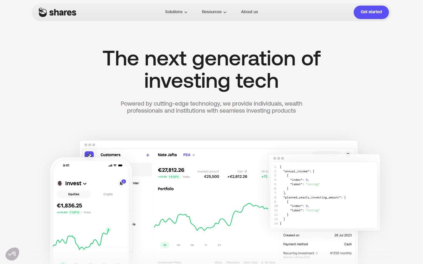
A precise, fintech-product interface built on a white canvas with light-gray panels and a single electric-violet accent for calls to action. The system reads as modern European fintech — large weight-500 Aeonik headlines, very generously rounded cards (24px) and pill-shaped controls (99px), real product UI (portfolio dashboards, mobile app screens, JSON snippets) shown floating inside soft-shadowed mockup cards, and a deep-black footer that closes the long-scroll landing page. Brand voltage comes almost entirely from the Aeonik display type and the violet CTA against an otherwise grayscale palette.
---
version: alpha
name: Shares.io-design-analysis
description: A precise, fintech-product interface built on a white canvas with light-gray panels and a single electric-violet accent for calls to action. The system reads as modern European fintech — large weight-500 Aeonik headlines, very generously rounded cards (24px) and pill-shaped controls (99px), real product UI (portfolio dashboards, mobile app screens, JSON snippets) shown floating inside soft-shadowed mockup cards, and a deep-black footer that closes the long-scroll landing page. Brand voltage comes almost entirely from the Aeonik display type and the violet CTA against an otherwise grayscale palette.

colors:
  primary: "#594ff4"
  accent-blue: "#3898ec"
  ink: "#1f1f1f"
  ink-strong: "#222222"
  ink-mid: "#252525"
  ink-darkest: "#20201f"
  black: "#000000"
  link: "#333333"
  body: "#5d5d5d"
  muted: "#888888"
  neutral: "#b0b0b0"
  border: "#cccccc"
  border-soft: "#c8c8c8"
  hairline: "#dddddd"
  hairline-soft: "#e7e7e7"
  hairline-softer: "#e2e2e2"
  surface: "#f6f6f6"
  surface-alt: "#fafafa"
  accent-cream: "#f2f2ec"
  canvas: "#ffffff"
  on-primary: "#ffffff"

typography:
  display-xl:
    fontFamily: "Aeonik, Inter, sans-serif"
    fontSize: 72px
    fontWeight: 500
    lineHeight: 1.05
    letterSpacing: normal
  display-lg:
    fontFamily: "Aeonik, Inter, sans-serif"
    fontSize: 56px
    fontWeight: 500
    lineHeight: 1.05
    letterSpacing: normal
  title-lg:
    fontFamily: "Aeonik, Inter, sans-serif"
    fontSize: 36px
    fontWeight: 500
    lineHeight: 1.15
    letterSpacing: normal
  title-md:
    fontFamily: "Aeonik, Inter, sans-serif"
    fontSize: 26px
    fontWeight: 500
    lineHeight: 1.15
    letterSpacing: normal
  body-lg:
    fontFamily: "Aeonik, Inter, sans-serif"
    fontSize: 20px
    fontWeight: 500
    lineHeight: 1.2
    letterSpacing: normal
  button:
    fontFamily: "Aeonik, Inter, sans-serif"
    fontSize: 14px
    fontWeight: 500
    lineHeight: 1.0
    letterSpacing: normal

rounded:
  none: 0px
  xs: 4px
  sm: 10px
  md: 16px
  lg: 24px
  xl: 30px
  xxl: 36px
  huge: 60px
  pill: 99px

spacing:
  xxs: 4px
  xs: 8px
  sm: 12px
  md: 16px
  ml: 20px
  lg: 24px
  lg-plus: 28px
  xl: 32px
  xxl: 48px
  xxl-plus: 52px
  section: 96px

components:
  top-nav:
    backgroundColor: "{colors.surface}"
    textColor: "{colors.ink}"
    typography: "{typography.button}"
    rounded: "{rounded.pill}"
    padding: 16px 24px
  button-primary:
    backgroundColor: "{colors.primary}"
    textColor: "{colors.on-primary}"
    typography: "{typography.button}"
    rounded: "{rounded.pill}"
    padding: 16px 24px
  button-text:
    backgroundColor: transparent
    textColor: "{colors.body}"
    typography: "{typography.button}"
    rounded: "{rounded.none}"
    padding: 16px 24px
  card:
    backgroundColor: "{colors.surface}"
    textColor: "{colors.ink}"
    typography: "{typography.body-lg}"
    rounded: "{rounded.lg}"
    padding: 32px
  product-mockup-card:
    backgroundColor: "{colors.canvas}"
    textColor: "{colors.ink}"
    rounded: "{rounded.md}"
    padding: 24px
  feature-icon-block:
    backgroundColor: "{colors.canvas}"
    textColor: "{colors.ink}"
    typography: "{typography.body-lg}"
    rounded: "{rounded.md}"
    padding: 24px
  tab-pill:
    backgroundColor: "{colors.surface}"
    textColor: "{colors.ink}"
    typography: "{typography.button}"
    rounded: "{rounded.pill}"
    padding: 12px 24px
  accordion-row:
    backgroundColor: "{colors.surface}"
    textColor: "{colors.ink}"
    typography: "{typography.body-lg}"
    rounded: "{rounded.md}"
    padding: 24px
  press-card:
    backgroundColor: "{colors.surface}"
    textColor: "{colors.ink}"
    typography: "{typography.body-lg}"
    rounded: "{rounded.lg}"
    padding: 24px
  partner-banner:
    backgroundColor: "{colors.surface}"
    textColor: "{colors.canvas}"
    typography: "{typography.title-md}"
    rounded: "{rounded.xxl}"
    padding: 48px
  footer:
    backgroundColor: "{colors.black}"
    textColor: "{colors.neutral}"
    typography: "{typography.button}"
    padding: 96px
---

## Overview

Shares.io's marketing surface is a precise, modern-fintech interface: a white canvas (`{colors.canvas}` — #ffffff) layered with light-gray panels (`{colors.surface}` — #f6f6f6), grayscale text, and a single electric-violet accent (`{colors.primary}` — #594ff4) reserved almost entirely for the "Get started" / "Learn more" CTAs. The page reads as confidently engineered, calm, and European-fintech-clean — large headlines, generous rounding, and real product UI shown directly inside floating mockup cards.

Type is the loudest element. Everything is set in **Aeonik** at weight 500 — from the 72px hero headline ("The next generation of investing tech") down to the 14px button labels. There is no second typeface and no heavier weight; the system gets its voice from scale, not from contrast in family or weight.

Brand voltage comes from two places: the Aeonik display type, and the **product UI fragments shown inside cards** — a portfolio dashboard, a mobile invest screen, a JSON API snippet, a wealth-management table. Shares.io doesn't illustrate the product; it floats the actual product chrome inside soft-shadowed white cards on a gray field. The violet accent is the only chromatic moment in an otherwise monochrome system.

The page closes with a deep-black footer (`{colors.black}` — #000000) — the only dark surface on the page, carrying the dense regulatory fine-print and link columns.

**Key Characteristics:**
- White-and-light-gray canvas with one violet accent (`{colors.primary}` — #594ff4) for CTAs. Everything else is grayscale.
- Single typeface: **Aeonik** at weight 500 across the entire scale (substituted with Inter here — see Typography).
- Very generous rounding: cards at `{rounded.lg}` (24px), banners at `{rounded.xxl}` (36px), and pill controls at `{rounded.pill}` (99px).
- Real product UI floated inside soft-shadowed white mockup cards (`{component.product-mockup-card}`) over a gray field — dashboards, mobile screens, JSON snippets.
- Pill-shaped navigation bar and pill CTAs — the rounded-everything treatment is the system's signature shape language.
- A single soft, wide shadow (`rgba(0,0,0,0.12) 0px 0px 60px -13px`) used to lift product mockups off the canvas.
- Deep-black footer (`{colors.black}`) closes the long-scroll landing page — the only dark surface in the system.

## Colors

### Brand & Accent
- **Primary** (`{colors.primary}` — #594ff4): Electric violet, the only saturated color in the system. Used on pill CTAs ("Get started", "Learn more", "About us") and the occasional small accent dot. This is the brand's single chromatic signal.
- **Accent Blue** (`{colors.accent-blue}` — #3898ec): A secondary blue appearing in small product-UI moments (action buttons inside the embedded app screens, e.g. the circular download control). Not used on marketing CTAs.
- **Accent Cream** (`{colors.accent-cream}` — #f2f2ec): A warm off-white seen in a small surface accent; rare.

### Surface
- **Canvas** (`{colors.canvas}` — #ffffff): The default page floor and the fill of floating product-mockup cards.
- **Surface** (`{colors.surface}` — #f6f6f6): The dominant panel color — feature cards, the nav-bar pill, accordion rows, press cards, tab pills.
- **Surface Alt** (`{colors.surface-alt}` — #fafafa): A near-white alternate panel for very soft section dividers.
- **Black** (`{colors.black}` — #000000): The footer background — the only dark surface on the page.

### Borders & Hairlines
- **Border** (`{colors.border}` — #cccccc) and **Border Soft** (`{colors.border-soft}` — #c8c8c8): 1px dividers and control outlines.
- **Hairline** (`{colors.hairline}` — #dddddd), **Hairline Soft** (`{colors.hairline-soft}` — #e7e7e7), **Hairline Softer** (`{colors.hairline-softer}` — #e2e2e2): Progressively fainter dividers between sections that share the white canvas.
- **Neutral** (`{colors.neutral}` — #b0b0b0): Mid-gray for fine UI detail and footer text.

### Text
- **Ink** (`{colors.ink}` — #1f1f1f): All headlines and primary text — the max-contrast tone against canvas.
- **Ink Strong / Mid / Darkest** (`{colors.ink-strong}` — #222222, `{colors.ink-mid}` — #252525, `{colors.ink-darkest}` — #20201f): Near-black variants used in product UI chrome and dense type.
- **Link** (`{colors.link}` — #333333): Default link / interactive text color.
- **Body** (`{colors.body}` — #5d5d5d): Mid-gray, the measured button-text color and secondary running text.
- **Muted** (`{colors.muted}` — #888888): Low-contrast body copy — sub-headlines, descriptions, captions.
- **On Primary** (`{colors.on-primary}` — #ffffff): White text on the violet CTA pills.

## Typography

### Font Family
The entire system runs on **Aeonik** — a geometric grotesque — at a single weight of **500** for every role from the 72px hero down to the 14px button. There is no secondary family and no weight contrast; hierarchy is driven purely by size and line-height. Letter-spacing is `normal` everywhere (no negative tracking was measured).

### Hierarchy

| Token | Size | Weight | Line Height | Letter Spacing | Use |
|---|---|---|---|---|---|
| `{typography.display-xl}` | 72px | 500 | 1.05 | normal | Hero h1 ("The next generation of investing tech") |
| `{typography.display-lg}` | 56px | 500 | 1.05 | normal | Section heads ("Serving the best financial institutions in the game") |
| `{typography.title-lg}` | 36px | 500 | 1.15 | normal | Sub-section / card headlines |
| `{typography.title-md}` | 26px | 500 | 1.15 | normal | Smaller card titles, banner headlines |
| `{typography.body-lg}` | 20px | 500 | 1.2 | normal | Default running text, descriptions, list labels |
| `{typography.button}` | 14px | 500 | 1.0 | normal | Button labels, nav links, footer links |

### Principles
The system is monoweight by design — weight 500 is the only voice. Hierarchy comes entirely from size jumps (72 → 56 → 36 → 26 → 20 → 14). Note that even body copy is set at weight 500, not 400; the type never goes light. Headlines pair `{colors.ink}` (#1f1f1f); supporting/body copy drops to `{colors.muted}` (#888888) for the low-contrast secondary tone.

### Note on Font Substitutes
**Aeonik** (by CoType Foundry) is a commercial typeface and cannot be shipped freely on the open web. Use **Inter** at weight 500 as the closest open-source substitute — it shares Aeonik's neutral grotesque proportions, though Aeonik's terminals are slightly more geometric. **General Sans** (Fontshare, free for commercial use) is an even closer geometric match. Keep the substitute at weight 500 with `normal` letter-spacing to preserve the monoweight signature.

## Layout

### Spacing System
- **Base unit:** 4px.
- **Tokens:** `{spacing.xxs}` 4px · `{spacing.xs}` 8px · `{spacing.sm}` 12px · `{spacing.md}` 16px · `{spacing.ml}` 20px · `{spacing.lg}` 24px · `{spacing.lg-plus}` 28px · `{spacing.xl}` 32px · `{spacing.xxl}` 48px · `{spacing.xxl-plus}` 52px · `{spacing.section}` 96px.
- **Dominant rhythm:** `{spacing.lg}` (24px) is the most-measured value by far — the workhorse gap inside cards and between grid items.
- **Section padding:** `{spacing.section}` (96px) sets the vertical rhythm between major editorial bands.
- **Card internal padding:** `{spacing.xl}` (32px) for feature cards; `{spacing.lg}` (24px) for tighter mockup and press cards.

### Grid & Container
- **Hero:** Single centered column — headline + sub-headline stacked over a wide product-mockup composition.
- **Feature rows:** 3-up icon blocks ("Made in France" / "Front-to-back" / "Scalable savings platform"); 2- and 3-up card grids for the solutions section.
- **Institution list:** 2-column expandable row list.
- **Press coverage:** 3-up card grid.
- **Footer:** Multi-column link list resolving over the black field.

### Whitespace Philosophy
The page leans on generous vertical air (96px section rhythm) and 24px internal gaps. Product mockups are given wide, uncrowded canvas space so the embedded UI reads clearly. The result is calm and product-forward — the marketing copy stays brief and the product chrome carries the weight.

## Elevation & Depth

| Level | Treatment | Use |
|---|---|---|
| Flat | No shadow, no border | Body sections, feature cards, accordion rows on the gray/white canvas |
| Hairline | 1px `{colors.hairline}` / `{colors.border}` | Dividers, list rows, control outlines |
| Surface panel | `{colors.surface}` (#f6f6f6) fill, no shadow | Feature cards, tab pills, press cards |
| Soft lift | `rgba(0, 0, 0, 0.12) 0px 0px 60px -13px` | Floating product-mockup cards lifted off the canvas |

The system uses exactly one shadow — a wide, soft, low-alpha glow (60px blur, -13px spread) — applied only to the floating product mockups in the hero and solutions bands. Everything else is flat or hairline-bordered. There is no neumorphism and no glassmorphism.

### Decorative Depth
- Product UI fragments (the mobile invest screen, the portfolio dashboard, the JSON snippet card) carry their own internal chrome and small native shadows — these are product artifacts shown as content, not system tokens.
- The single soft shadow is what makes the mockups appear to hover, reinforcing the "real product floating over the page" treatment.

## Shapes

### Border Radius Scale

| Token | Value | Use |
|---|---|---|
| `{rounded.none}` | 0px | Measured on a plain text/secondary button |
| `{rounded.xs}` | 4px | Small inline accents, tiny chips |
| `{rounded.sm}` | 10px | Small inner controls |
| `{rounded.md}` | 16px | Product-mockup cards, accordion rows, feature icon blocks |
| `{rounded.lg}` | 24px | Standard content cards (measured `card` radius) |
| `{rounded.xl}` | 30px | Larger panels |
| `{rounded.xxl}` | 36px | Banner / partnership image block |
| `{rounded.huge}` | 60px | Largest rounded container |
| `{rounded.pill}` | 99px | Nav bar, CTA buttons, tab pills — the signature shape |

### Geometry Notes
The system rounds aggressively — the most-used radii are `{rounded.pill}` (99px, on every nav element and CTA) and `{rounded.lg}` (24px, on cards). The partnership banner image uses `{rounded.xxl}` (36px). The pill-everything treatment for interactive controls is the dominant shape signature; rectangular cards stay softly rounded at 16–24px.

## Components

### Navigation

**`top-nav`** — A pill-shaped nav container floating at the top of the page. Background `{colors.surface}` (#f6f6f6), rounded `{rounded.pill}` (99px). Carries the "shares" wordmark + mark at left, center menu (Solutions ▾, Resources ▾, About us) in `{typography.button}` color `{colors.ink}`, and a `{component.button-primary}` "Get started" pill at right.

### Buttons

**`button-primary`** — The signature CTA. Background `{colors.primary}` (#594ff4), text `{colors.on-primary}` (#ffffff), type `{typography.button}` (Aeonik 14px / 500), padding 16px × 24px, rounded `{rounded.pill}` (99px). Used for "Get started", "Learn more", and "About us" actions. (The pill radius and violet fill are taken from screenshot ground-truth; the analyzer's measured `button` node returned radius 0px and text color `{colors.body}` — derived to a separate text-button entry below.)

**`button-text`** — A plain text/secondary button measured at radius 0px with mid-gray text `{colors.body}` (#5d5d5d), padding 16px × 24px, no background. Used for low-emphasis inline actions.

### Cards & Containers

**`card`** — The standard content card. Background `{colors.surface}` (#f6f6f6), rounded `{rounded.lg}` (24px), no shadow (measured). Internal padding `{spacing.xl}` (32px). Used for the solutions blocks ("Wealth Management", "Savings and pensions", "Retail investing"), each pairing a `{typography.title-lg}` heading, `{typography.body-lg}` copy, and a `{component.button-primary}`.

**`product-mockup-card`** — A white card displaying real Shares product UI (the portfolio dashboard, the mobile invest screen, the JSON API snippet, the "Dropbox €174.92" mobile card). Background `{colors.canvas}`, rounded `{rounded.md}` (16px), padding `{spacing.lg}` (24px), lifted with the soft `rgba(0,0,0,0.12) 0px 0px 60px -13px` shadow. These cards show the product, they don't decorate around it.

**`feature-icon-block`** — Used in the 3-up feature row ("Made in France" / "Front-to-back" / "Scalable savings platform"). Background `{colors.canvas}`, rounded `{rounded.md}`, padding `{spacing.lg}`. Carries a small icon, a `{typography.body-lg}` title in `{colors.ink}`, and a description in `{colors.muted}`.

**`press-card`** — Used in the 3-up "Press coverage" grid. Background `{colors.surface}`, rounded `{rounded.lg}`, padding `{spacing.lg}`. Carries a source logo + date, a headline in `{typography.body-lg}`, and a "Read article" pill.

**`partner-banner`** — The wide "Partner with a winning team" image banner. Rounded `{rounded.xxl}` (36px), padding `{spacing.xxl}` (48px), headline in `{typography.title-md}` reversed to `{colors.canvas}` over the photo, with an "About us" pill button.

### Tabs & Accordions

**`tab-pill`** — Pill-shaped filter tabs ("Multi-country regulation" / "Robust security" / "Protecting your assets"). Background `{colors.surface}`, text `{colors.ink}`, type `{typography.button}`, rounded `{rounded.pill}`, padding 12px × 24px.

**`accordion-row`** — Used in the institution list and "Shares FAQs" sections. Background `{colors.surface}`, rounded `{rounded.md}`, padding `{spacing.lg}`. Carries a `{typography.body-lg}` label and a chevron toggle; expands to reveal `{colors.muted}` body copy.

### Footer

**`footer`** — The deep-black band that closes the page. Background `{colors.black}` (#000000), text `{colors.neutral}` (#b0b0b0), type `{typography.button}`. Multi-column link list (Shares App / Shares Pro / About us, etc.) above a dense regulatory fine-print block. Vertical padding `{spacing.section}` (96px). The only dark surface on the page — the inversion visually closes the long-scroll layout.

## Do's and Don'ts

### Do
- Reserve `{colors.primary}` (#594ff4) for CTAs only. The violet is the single chromatic signal in a grayscale system.
- Set every type role in Aeonik (or Inter substitute) at weight 500. The monoweight voice is the brand.
- Build hierarchy with size jumps, not weight or family changes.
- Round interactive controls fully to `{rounded.pill}` (99px) — nav, CTAs, tabs. Round cards to `{rounded.lg}` (24px) or `{rounded.md}` (16px).
- Float real product UI inside `{component.product-mockup-card}` with the soft 60px-blur shadow. Show the product, don't illustrate it.
- Use `{colors.ink}` (#1f1f1f) for headlines and drop to `{colors.muted}` (#888888) for supporting copy.
- Close the page with the black `{component.footer}`.

### Don't
- Don't introduce a second accent color on CTAs. `{colors.accent-blue}` belongs inside product UI, not on marketing buttons.
- Don't use a heavier weight than 500 for emphasis — go bigger, not bolder.
- Don't apply the soft shadow to flat cards. It is reserved for floating product mockups.
- Don't add dark surfaces other than the footer. The black field is a scarce, deliberate closing signal.
- Don't sharpen the corners of interactive controls — the pill radius is signature.
- Don't document hover states; default and active/pressed only.

## Responsive Behavior

The two captured pages confirm a desktop layout and a full-page scroll; exact breakpoint values were not measured. The following describes observed structure and standard collapse behavior (collapse mechanics are derived, not measured).

### Breakpoints (derived)

| Name | Width | Key Changes |
|---|---|---|
| Mobile | < 768px | Pill nav collapses to a menu trigger; hero h1 scales down from 72px; feature/solution grids stack 1-up; footer columns stack |
| Tablet | 768–1024px | Feature rows 2-up; product mockups scale proportionally |
| Desktop | > 1024px | Full pill nav with all menu items; 3-up feature rows; floating mockup compositions at full scale |

### Touch Targets
- `{component.button-primary}` padding of 16px × 24px yields a comfortable tap target above 44px.
- `{component.tab-pill}` (12px × 24px) and `{component.accordion-row}` rows meet tap minimums with their full pill/row width.

### Image Behavior
- Product-mockup compositions scale proportionally so embedded UI (charts, time-pickers, JSON) stays legible.
- The partner banner photo crops within its `{rounded.xxl}` frame at narrower widths.

## Iteration Guide

1. Focus on ONE component at a time. Reference its YAML key directly (`{component.card}`, `{component.product-mockup-card}`).
2. Variants live as separate entries in `components:` (e.g. a future `button-primary-active`).
3. Use `{token.refs}` everywhere — never inline a hex in a component.
4. Never document hover. Default and Active/Pressed states only.
5. Keep type at Aeonik weight 500 — emphasis comes from size, not weight.
6. The violet `{colors.primary}` stays on CTAs only; everything else is grayscale.
7. The black footer is the only dark surface — don't add other dark cards.

## Known Gaps

- **Aeonik** is a commercial typeface (CoType Foundry); it cannot be shipped on the open web. Open-source substitutes (Inter, General Sans) are documented in Typography.
- The measured `button` node returned radius 0px and text color `{colors.body}` (#5d5d5d), which conflicts with the violet pill CTAs visible in screenshots. The pill radius and `{colors.primary}` fill on `button-primary` are therefore taken from screenshot ground-truth (derived); the measured node is recorded separately as `button-text`.
- Active/pressed and disabled button states were not captured — only default styling is documented.
- No active-state or focus styling was measured for tabs, accordions, or inputs; form-field styles (search, sign-up) were not present in the captured pages.
- Radius values 50px and 60px were measured but not clearly mapped to a component; `{rounded.huge}` (60px) is declared without a confirmed use.
- Breakpoint widths and responsive collapse mechanics are derived from layout structure, not measured.
- Several near-black neutrals (#222222, #252525, #20201f) and faint hairlines (#e2e2e2, #e7e7e7, #c8c8c8) were measured but appear primarily inside embedded product UI; their exact roles in the marketing system are uncertain.
- Animation, transition timings, and accordion expand behavior are out of scope.

<!-- Documented by duply · real-world design systems as ready-to-use DESIGN.md for AI coding agents · https://duply.ai/shares/design-md -->
Color Palette
Accent
Neutrals
Typography
display-xl72px · 500 · 1.05
The quick brown fox jumpsdisplay-lg56px · 500 · 1.05
The quick brown fox jumpstitle-lg36px · 500 · 1.15
The quick brown fox jumpstitle-md26px · 500 · 1.15
The quick brown fox jumpsbody-lg20px · 500 · 1.2
The quick brown fox jumpsbutton14px · 500 · 1
The quick brown fox jumpsSpacing & Shape
Spacing
| Name | Value | Preview |
|---|---|---|
| xxs | 4px | |
| xs | 8px | |
| sm | 12px | |
| md | 16px | |
| ml | 20px | |
| lg | 24px | |
| lg-plus | 28px | |
| xl | 32px | |
| xxl | 48px | |
| xxl-plus | 52px | |
| section | 96px |
Border Radius
| Name | Value | Preview |
|---|---|---|
| none | 0px | |
| xs | 4px | |
| sm | 10px | |
| md | 16px | |
| lg | 24px | |
| xl | 30px | |
| xxl | 36px | |
| huge | 60px | |
| pill | 99px |
More like this


---
version: alpha
name: Shares.io-design-analysis
description: A precise, fintech-product interface built on a white canvas with light-gray panels and a single electric-violet accent for calls to action. The system reads as modern European fintech — large weight-500 Aeonik headlines, very generously rounded cards (24px) and pill-shaped controls (99px), real product UI (portfolio dashboards, mobile app screens, JSON snippets) shown floating inside soft-shadowed mockup cards, and a deep-black footer that closes the long-scroll landing page. Brand voltage comes almost entirely from the Aeonik display type and the violet CTA against an otherwise grayscale palette.

colors:
  primary: "#594ff4"
  accent-blue: "#3898ec"
  ink: "#1f1f1f"
  ink-strong: "#222222"
  ink-mid: "#252525"
  ink-darkest: "#20201f"
  black: "#000000"
  link: "#333333"
  body: "#5d5d5d"
  muted: "#888888"
  neutral: "#b0b0b0"
  border: "#cccccc"
  border-soft: "#c8c8c8"
  hairline: "#dddddd"
  hairline-soft: "#e7e7e7"
  hairline-softer: "#e2e2e2"
  surface: "#f6f6f6"
  surface-alt: "#fafafa"
  accent-cream: "#f2f2ec"
  canvas: "#ffffff"
  on-primary: "#ffffff"

typography:
  display-xl:
    fontFamily: "Aeonik, Inter, sans-serif"
    fontSize: 72px
    fontWeight: 500
    lineHeight: 1.05
    letterSpacing: normal
  display-lg:
    fontFamily: "Aeonik, Inter, sans-serif"
    fontSize: 56px
    fontWeight: 500
    lineHeight: 1.05
    letterSpacing: normal
  title-lg:
    fontFamily: "Aeonik, Inter, sans-serif"
    fontSize: 36px
    fontWeight: 500
    lineHeight: 1.15
    letterSpacing: normal
  title-md:
    fontFamily: "Aeonik, Inter, sans-serif"
    fontSize: 26px
    fontWeight: 500
    lineHeight: 1.15
    letterSpacing: normal
  body-lg:
    fontFamily: "Aeonik, Inter, sans-serif"
    fontSize: 20px
    fontWeight: 500
    lineHeight: 1.2
    letterSpacing: normal
  button:
    fontFamily: "Aeonik, Inter, sans-serif"
    fontSize: 14px
    fontWeight: 500
    lineHeight: 1.0
    letterSpacing: normal

rounded:
  none: 0px
  xs: 4px
  sm: 10px
  md: 16px
  lg: 24px
  xl: 30px
  xxl: 36px
  huge: 60px
  pill: 99px

spacing:
  xxs: 4px
  xs: 8px
  sm: 12px
  md: 16px
  ml: 20px
  lg: 24px
  lg-plus: 28px
  xl: 32px
  xxl: 48px
  xxl-plus: 52px
  section: 96px

components:
  top-nav:
    backgroundColor: "{colors.surface}"
    textColor: "{colors.ink}"
    typography: "{typography.button}"
    rounded: "{rounded.pill}"
    padding: 16px 24px
  button-primary:
    backgroundColor: "{colors.primary}"
    textColor: "{colors.on-primary}"
    typography: "{typography.button}"
    rounded: "{rounded.pill}"
    padding: 16px 24px
  button-text:
    backgroundColor: transparent
    textColor: "{colors.body}"
    typography: "{typography.button}"
    rounded: "{rounded.none}"
    padding: 16px 24px
  card:
    backgroundColor: "{colors.surface}"
    textColor: "{colors.ink}"
    typography: "{typography.body-lg}"
    rounded: "{rounded.lg}"
    padding: 32px
  product-mockup-card:
    backgroundColor: "{colors.canvas}"
    textColor: "{colors.ink}"
    rounded: "{rounded.md}"
    padding: 24px
  feature-icon-block:
    backgroundColor: "{colors.canvas}"
    textColor: "{colors.ink}"
    typography: "{typography.body-lg}"
    rounded: "{rounded.md}"
    padding: 24px
  tab-pill:
    backgroundColor: "{colors.surface}"
    textColor: "{colors.ink}"
    typography: "{typography.button}"
    rounded: "{rounded.pill}"
    padding: 12px 24px
  accordion-row:
    backgroundColor: "{colors.surface}"
    textColor: "{colors.ink}"
    typography: "{typography.body-lg}"
    rounded: "{rounded.md}"
    padding: 24px
  press-card:
    backgroundColor: "{colors.surface}"
    textColor: "{colors.ink}"
    typography: "{typography.body-lg}"
    rounded: "{rounded.lg}"
    padding: 24px
  partner-banner:
    backgroundColor: "{colors.surface}"
    textColor: "{colors.canvas}"
    typography: "{typography.title-md}"
    rounded: "{rounded.xxl}"
    padding: 48px
  footer:
    backgroundColor: "{colors.black}"
    textColor: "{colors.neutral}"
    typography: "{typography.button}"
    padding: 96px
---

## Overview

Shares.io's marketing surface is a precise, modern-fintech interface: a white canvas (`{colors.canvas}` — #ffffff) layered with light-gray panels (`{colors.surface}` — #f6f6f6), grayscale text, and a single electric-violet accent (`{colors.primary}` — #594ff4) reserved almost entirely for the "Get started" / "Learn more" CTAs. The page reads as confidently engineered, calm, and European-fintech-clean — large headlines, generous rounding, and real product UI shown directly inside floating mockup cards.

Type is the loudest element. Everything is set in **Aeonik** at weight 500 — from the 72px hero headline ("The next generation of investing tech") down to the 14px button labels. There is no second typeface and no heavier weight; the system gets its voice from scale, not from contrast in family or weight.

Brand voltage comes from two places: the Aeonik display type, and the **product UI fragments shown inside cards** — a portfolio dashboard, a mobile invest screen, a JSON API snippet, a wealth-management table. Shares.io doesn't illustrate the product; it floats the actual product chrome inside soft-shadowed white cards on a gray field. The violet accent is the only chromatic moment in an otherwise monochrome system.

The page closes with a deep-black footer (`{colors.black}` — #000000) — the only dark surface on the page, carrying the dense regulatory fine-print and link columns.

**Key Characteristics:**
- White-and-light-gray canvas with one violet accent (`{colors.primary}` — #594ff4) for CTAs. Everything else is grayscale.
- Single typeface: **Aeonik** at weight 500 across the entire scale (substituted with Inter here — see Typography).
- Very generous rounding: cards at `{rounded.lg}` (24px), banners at `{rounded.xxl}` (36px), and pill controls at `{rounded.pill}` (99px).
- Real product UI floated inside soft-shadowed white mockup cards (`{component.product-mockup-card}`) over a gray field — dashboards, mobile screens, JSON snippets.
- Pill-shaped navigation bar and pill CTAs — the rounded-everything treatment is the system's signature shape language.
- A single soft, wide shadow (`rgba(0,0,0,0.12) 0px 0px 60px -13px`) used to lift product mockups off the canvas.
- Deep-black footer (`{colors.black}`) closes the long-scroll landing page — the only dark surface in the system.

## Colors

### Brand & Accent
- **Primary** (`{colors.primary}` — #594ff4): Electric violet, the only saturated color in the system. Used on pill CTAs ("Get started", "Learn more", "About us") and the occasional small accent dot. This is the brand's single chromatic signal.
- **Accent Blue** (`{colors.accent-blue}` — #3898ec): A secondary blue appearing in small product-UI moments (action buttons inside the embedded app screens, e.g. the circular download control). Not used on marketing CTAs.
- **Accent Cream** (`{colors.accent-cream}` — #f2f2ec): A warm off-white seen in a small surface accent; rare.

### Surface
- **Canvas** (`{colors.canvas}` — #ffffff): The default page floor and the fill of floating product-mockup cards.
- **Surface** (`{colors.surface}` — #f6f6f6): The dominant panel color — feature cards, the nav-bar pill, accordion rows, press cards, tab pills.
- **Surface Alt** (`{colors.surface-alt}` — #fafafa): A near-white alternate panel for very soft section dividers.
- **Black** (`{colors.black}` — #000000): The footer background — the only dark surface on the page.

### Borders & Hairlines
- **Border** (`{colors.border}` — #cccccc) and **Border Soft** (`{colors.border-soft}` — #c8c8c8): 1px dividers and control outlines.
- **Hairline** (`{colors.hairline}` — #dddddd), **Hairline Soft** (`{colors.hairline-soft}` — #e7e7e7), **Hairline Softer** (`{colors.hairline-softer}` — #e2e2e2): Progressively fainter dividers between sections that share the white canvas.
- **Neutral** (`{colors.neutral}` — #b0b0b0): Mid-gray for fine UI detail and footer text.

### Text
- **Ink** (`{colors.ink}` — #1f1f1f): All headlines and primary text — the max-contrast tone against canvas.
- **Ink Strong / Mid / Darkest** (`{colors.ink-strong}` — #222222, `{colors.ink-mid}` — #252525, `{colors.ink-darkest}` — #20201f): Near-black variants used in product UI chrome and dense type.
- **Link** (`{colors.link}` — #333333): Default link / interactive text color.
- **Body** (`{colors.body}` — #5d5d5d): Mid-gray, the measured button-text color and secondary running text.
- **Muted** (`{colors.muted}` — #888888): Low-contrast body copy — sub-headlines, descriptions, captions.
- **On Primary** (`{colors.on-primary}` — #ffffff): White text on the violet CTA pills.

## Typography

### Font Family
The entire system runs on **Aeonik** — a geometric grotesque — at a single weight of **500** for every role from the 72px hero down to the 14px button. There is no secondary family and no weight contrast; hierarchy is driven purely by size and line-height. Letter-spacing is `normal` everywhere (no negative tracking was measured).

### Hierarchy

| Token | Size | Weight | Line Height | Letter Spacing | Use |
|---|---|---|---|---|---|
| `{typography.display-xl}` | 72px | 500 | 1.05 | normal | Hero h1 ("The next generation of investing tech") |
| `{typography.display-lg}` | 56px | 500 | 1.05 | normal | Section heads ("Serving the best financial institutions in the game") |
| `{typography.title-lg}` | 36px | 500 | 1.15 | normal | Sub-section / card headlines |
| `{typography.title-md}` | 26px | 500 | 1.15 | normal | Smaller card titles, banner headlines |
| `{typography.body-lg}` | 20px | 500 | 1.2 | normal | Default running text, descriptions, list labels |
| `{typography.button}` | 14px | 500 | 1.0 | normal | Button labels, nav links, footer links |

### Principles
The system is monoweight by design — weight 500 is the only voice. Hierarchy comes entirely from size jumps (72 → 56 → 36 → 26 → 20 → 14). Note that even body copy is set at weight 500, not 400; the type never goes light. Headlines pair `{colors.ink}` (#1f1f1f); supporting/body copy drops to `{colors.muted}` (#888888) for the low-contrast secondary tone.

### Note on Font Substitutes
**Aeonik** (by CoType Foundry) is a commercial typeface and cannot be shipped freely on the open web. Use **Inter** at weight 500 as the closest open-source substitute — it shares Aeonik's neutral grotesque proportions, though Aeonik's terminals are slightly more geometric. **General Sans** (Fontshare, free for commercial use) is an even closer geometric match. Keep the substitute at weight 500 with `normal` letter-spacing to preserve the monoweight signature.

## Layout

### Spacing System
- **Base unit:** 4px.
- **Tokens:** `{spacing.xxs}` 4px · `{spacing.xs}` 8px · `{spacing.sm}` 12px · `{spacing.md}` 16px · `{spacing.ml}` 20px · `{spacing.lg}` 24px · `{spacing.lg-plus}` 28px · `{spacing.xl}` 32px · `{spacing.xxl}` 48px · `{spacing.xxl-plus}` 52px · `{spacing.section}` 96px.
- **Dominant rhythm:** `{spacing.lg}` (24px) is the most-measured value by far — the workhorse gap inside cards and between grid items.
- **Section padding:** `{spacing.section}` (96px) sets the vertical rhythm between major editorial bands.
- **Card internal padding:** `{spacing.xl}` (32px) for feature cards; `{spacing.lg}` (24px) for tighter mockup and press cards.

### Grid & Container
- **Hero:** Single centered column — headline + sub-headline stacked over a wide product-mockup composition.
- **Feature rows:** 3-up icon blocks ("Made in France" / "Front-to-back" / "Scalable savings platform"); 2- and 3-up card grids for the solutions section.
- **Institution list:** 2-column expandable row list.
- **Press coverage:** 3-up card grid.
- **Footer:** Multi-column link list resolving over the black field.

### Whitespace Philosophy
The page leans on generous vertical air (96px section rhythm) and 24px internal gaps. Product mockups are given wide, uncrowded canvas space so the embedded UI reads clearly. The result is calm and product-forward — the marketing copy stays brief and the product chrome carries the weight.

## Elevation & Depth

| Level | Treatment | Use |
|---|---|---|
| Flat | No shadow, no border | Body sections, feature cards, accordion rows on the gray/white canvas |
| Hairline | 1px `{colors.hairline}` / `{colors.border}` | Dividers, list rows, control outlines |
| Surface panel | `{colors.surface}` (#f6f6f6) fill, no shadow | Feature cards, tab pills, press cards |
| Soft lift | `rgba(0, 0, 0, 0.12) 0px 0px 60px -13px` | Floating product-mockup cards lifted off the canvas |

The system uses exactly one shadow — a wide, soft, low-alpha glow (60px blur, -13px spread) — applied only to the floating product mockups in the hero and solutions bands. Everything else is flat or hairline-bordered. There is no neumorphism and no glassmorphism.

### Decorative Depth
- Product UI fragments (the mobile invest screen, the portfolio dashboard, the JSON snippet card) carry their own internal chrome and small native shadows — these are product artifacts shown as content, not system tokens.
- The single soft shadow is what makes the mockups appear to hover, reinforcing the "real product floating over the page" treatment.

## Shapes

### Border Radius Scale

| Token | Value | Use |
|---|---|---|
| `{rounded.none}` | 0px | Measured on a plain text/secondary button |
| `{rounded.xs}` | 4px | Small inline accents, tiny chips |
| `{rounded.sm}` | 10px | Small inner controls |
| `{rounded.md}` | 16px | Product-mockup cards, accordion rows, feature icon blocks |
| `{rounded.lg}` | 24px | Standard content cards (measured `card` radius) |
| `{rounded.xl}` | 30px | Larger panels |
| `{rounded.xxl}` | 36px | Banner / partnership image block |
| `{rounded.huge}` | 60px | Largest rounded container |
| `{rounded.pill}` | 99px | Nav bar, CTA buttons, tab pills — the signature shape |

### Geometry Notes
The system rounds aggressively — the most-used radii are `{rounded.pill}` (99px, on every nav element and CTA) and `{rounded.lg}` (24px, on cards). The partnership banner image uses `{rounded.xxl}` (36px). The pill-everything treatment for interactive controls is the dominant shape signature; rectangular cards stay softly rounded at 16–24px.

## Components

### Navigation

**`top-nav`** — A pill-shaped nav container floating at the top of the page. Background `{colors.surface}` (#f6f6f6), rounded `{rounded.pill}` (99px). Carries the "shares" wordmark + mark at left, center menu (Solutions ▾, Resources ▾, About us) in `{typography.button}` color `{colors.ink}`, and a `{component.button-primary}` "Get started" pill at right.

### Buttons

**`button-primary`** — The signature CTA. Background `{colors.primary}` (#594ff4), text `{colors.on-primary}` (#ffffff), type `{typography.button}` (Aeonik 14px / 500), padding 16px × 24px, rounded `{rounded.pill}` (99px). Used for "Get started", "Learn more", and "About us" actions. (The pill radius and violet fill are taken from screenshot ground-truth; the analyzer's measured `button` node returned radius 0px and text color `{colors.body}` — derived to a separate text-button entry below.)

**`button-text`** — A plain text/secondary button measured at radius 0px with mid-gray text `{colors.body}` (#5d5d5d), padding 16px × 24px, no background. Used for low-emphasis inline actions.

### Cards & Containers

**`card`** — The standard content card. Background `{colors.surface}` (#f6f6f6), rounded `{rounded.lg}` (24px), no shadow (measured). Internal padding `{spacing.xl}` (32px). Used for the solutions blocks ("Wealth Management", "Savings and pensions", "Retail investing"), each pairing a `{typography.title-lg}` heading, `{typography.body-lg}` copy, and a `{component.button-primary}`.

**`product-mockup-card`** — A white card displaying real Shares product UI (the portfolio dashboard, the mobile invest screen, the JSON API snippet, the "Dropbox €174.92" mobile card). Background `{colors.canvas}`, rounded `{rounded.md}` (16px), padding `{spacing.lg}` (24px), lifted with the soft `rgba(0,0,0,0.12) 0px 0px 60px -13px` shadow. These cards show the product, they don't decorate around it.

**`feature-icon-block`** — Used in the 3-up feature row ("Made in France" / "Front-to-back" / "Scalable savings platform"). Background `{colors.canvas}`, rounded `{rounded.md}`, padding `{spacing.lg}`. Carries a small icon, a `{typography.body-lg}` title in `{colors.ink}`, and a description in `{colors.muted}`.

**`press-card`** — Used in the 3-up "Press coverage" grid. Background `{colors.surface}`, rounded `{rounded.lg}`, padding `{spacing.lg}`. Carries a source logo + date, a headline in `{typography.body-lg}`, and a "Read article" pill.

**`partner-banner`** — The wide "Partner with a winning team" image banner. Rounded `{rounded.xxl}` (36px), padding `{spacing.xxl}` (48px), headline in `{typography.title-md}` reversed to `{colors.canvas}` over the photo, with an "About us" pill button.

### Tabs & Accordions

**`tab-pill`** — Pill-shaped filter tabs ("Multi-country regulation" / "Robust security" / "Protecting your assets"). Background `{colors.surface}`, text `{colors.ink}`, type `{typography.button}`, rounded `{rounded.pill}`, padding 12px × 24px.

**`accordion-row`** — Used in the institution list and "Shares FAQs" sections. Background `{colors.surface}`, rounded `{rounded.md}`, padding `{spacing.lg}`. Carries a `{typography.body-lg}` label and a chevron toggle; expands to reveal `{colors.muted}` body copy.

### Footer

**`footer`** — The deep-black band that closes the page. Background `{colors.black}` (#000000), text `{colors.neutral}` (#b0b0b0), type `{typography.button}`. Multi-column link list (Shares App / Shares Pro / About us, etc.) above a dense regulatory fine-print block. Vertical padding `{spacing.section}` (96px). The only dark surface on the page — the inversion visually closes the long-scroll layout.

## Do's and Don'ts

### Do
- Reserve `{colors.primary}` (#594ff4) for CTAs only. The violet is the single chromatic signal in a grayscale system.
- Set every type role in Aeonik (or Inter substitute) at weight 500. The monoweight voice is the brand.
- Build hierarchy with size jumps, not weight or family changes.
- Round interactive controls fully to `{rounded.pill}` (99px) — nav, CTAs, tabs. Round cards to `{rounded.lg}` (24px) or `{rounded.md}` (16px).
- Float real product UI inside `{component.product-mockup-card}` with the soft 60px-blur shadow. Show the product, don't illustrate it.
- Use `{colors.ink}` (#1f1f1f) for headlines and drop to `{colors.muted}` (#888888) for supporting copy.
- Close the page with the black `{component.footer}`.

### Don't
- Don't introduce a second accent color on CTAs. `{colors.accent-blue}` belongs inside product UI, not on marketing buttons.
- Don't use a heavier weight than 500 for emphasis — go bigger, not bolder.
- Don't apply the soft shadow to flat cards. It is reserved for floating product mockups.
- Don't add dark surfaces other than the footer. The black field is a scarce, deliberate closing signal.
- Don't sharpen the corners of interactive controls — the pill radius is signature.
- Don't document hover states; default and active/pressed only.

## Responsive Behavior

The two captured pages confirm a desktop layout and a full-page scroll; exact breakpoint values were not measured. The following describes observed structure and standard collapse behavior (collapse mechanics are derived, not measured).

### Breakpoints (derived)

| Name | Width | Key Changes |
|---|---|---|
| Mobile | < 768px | Pill nav collapses to a menu trigger; hero h1 scales down from 72px; feature/solution grids stack 1-up; footer columns stack |
| Tablet | 768–1024px | Feature rows 2-up; product mockups scale proportionally |
| Desktop | > 1024px | Full pill nav with all menu items; 3-up feature rows; floating mockup compositions at full scale |

### Touch Targets
- `{component.button-primary}` padding of 16px × 24px yields a comfortable tap target above 44px.
- `{component.tab-pill}` (12px × 24px) and `{component.accordion-row}` rows meet tap minimums with their full pill/row width.

### Image Behavior
- Product-mockup compositions scale proportionally so embedded UI (charts, time-pickers, JSON) stays legible.
- The partner banner photo crops within its `{rounded.xxl}` frame at narrower widths.

## Iteration Guide

1. Focus on ONE component at a time. Reference its YAML key directly (`{component.card}`, `{component.product-mockup-card}`).
2. Variants live as separate entries in `components:` (e.g. a future `button-primary-active`).
3. Use `{token.refs}` everywhere — never inline a hex in a component.
4. Never document hover. Default and Active/Pressed states only.
5. Keep type at Aeonik weight 500 — emphasis comes from size, not weight.
6. The violet `{colors.primary}` stays on CTAs only; everything else is grayscale.
7. The black footer is the only dark surface — don't add other dark cards.

## Known Gaps

- **Aeonik** is a commercial typeface (CoType Foundry); it cannot be shipped on the open web. Open-source substitutes (Inter, General Sans) are documented in Typography.
- The measured `button` node returned radius 0px and text color `{colors.body}` (#5d5d5d), which conflicts with the violet pill CTAs visible in screenshots. The pill radius and `{colors.primary}` fill on `button-primary` are therefore taken from screenshot ground-truth (derived); the measured node is recorded separately as `button-text`.
- Active/pressed and disabled button states were not captured — only default styling is documented.
- No active-state or focus styling was measured for tabs, accordions, or inputs; form-field styles (search, sign-up) were not present in the captured pages.
- Radius values 50px and 60px were measured but not clearly mapped to a component; `{rounded.huge}` (60px) is declared without a confirmed use.
- Breakpoint widths and responsive collapse mechanics are derived from layout structure, not measured.
- Several near-black neutrals (#222222, #252525, #20201f) and faint hairlines (#e2e2e2, #e7e7e7, #c8c8c8) were measured but appear primarily inside embedded product UI; their exact roles in the marketing system are uncertain.
- Animation, transition timings, and accordion expand behavior are out of scope.

<!-- Documented by duply · real-world design systems as ready-to-use DESIGN.md for AI coding agents · https://duply.ai/shares/design-md -->