Cal.com
A clean, calendar-software-first marketing interface built on a soft off-white canvas (#f4f4f4) with near-black CTAs and the custom Cal Sans display typeface. The system reads as confident modern SaaS — large rounded white cards float over the canvas holding real product UI fragments (booking widgets, calendar grids, availability toggles), display headlines carry weight-600 Cal Sans, and body copy runs in a lighter Cal Sans UI Variable Light at weight 300. Brand voltage comes from the display type and embedded product chrome rather than from accent color.
---
version: alpha
name: Cal.com-design-analysis
description: A clean, calendar-software-first marketing interface built on a soft off-white canvas (#f4f4f4) with near-black CTAs and the custom Cal Sans display typeface. The system reads as confident modern SaaS — large rounded white cards float over the canvas holding real product UI fragments (booking widgets, calendar grids, availability toggles), display headlines carry weight-600 Cal Sans, and body copy runs in a lighter Cal Sans UI Variable Light at weight 300. Brand voltage comes from the display type and embedded product chrome rather than from accent color.
colors:
primary: "#111111"
primary-active: "#242424"
ink: "#000000"
ink-strong: "#141414"
muted: "#292929"
neutral: "#898989"
body: "#374151"
muted-cool: "#6b7280"
muted-cool-soft: "#9ca3af"
canvas: "#f4f4f4"
surface-card: "#ffffff"
surface-soft: "#f5f5f5"
surface-softer: "#f3f4f6"
hairline: "#e0e0e0"
hairline-soft: "#d3d3d3"
hairline-cool: "#e1e2e3"
border-gray: "#e5e7eb"
surface-dark: "#101010"
on-dark: "#ffffff"
link: "#0000ee"
accent-blue: "#0099ff"
typography:
display-xl:
fontFamily: "Cal Sans, Inter, sans-serif"
fontSize: 64px
fontWeight: 600
lineHeight: 1.1
letterSpacing: normal
display-lg:
fontFamily: "Cal Sans, Inter, sans-serif"
fontSize: 48px
fontWeight: 600
lineHeight: 1.1
letterSpacing: normal
title:
fontFamily: "Cal Sans UI Variable Light, Inter, sans-serif"
fontSize: 18px
fontWeight: 300
lineHeight: 1.3
letterSpacing: -0.2px
body:
fontFamily: "Cal Sans UI Variable Light, Inter, sans-serif"
fontSize: 14px
fontWeight: 300
lineHeight: 1.4
letterSpacing: normal
rounded:
xs: 2px
sm: 4px
md: 8px
lg: 12px
xl: 16px
xxl: 29px
pill: 100px
full: 9999px
spacing:
xxs: 4px
xs: 8px
sm: 10px
base: 12px
md: 16px
lg: 24px
xl: 32px
xxl: 48px
section: 96px
components:
top-nav:
backgroundColor: "{colors.canvas}"
textColor: "{colors.ink}"
typography: "{typography.body}"
button-primary:
backgroundColor: "{colors.primary}"
textColor: "{colors.on-dark}"
typography: "{typography.body}"
rounded: "{rounded.md}"
padding: 12px 24px
button-primary-active:
backgroundColor: "{colors.primary-active}"
textColor: "{colors.on-dark}"
rounded: "{rounded.md}"
button-secondary:
backgroundColor: "{colors.surface-soft}"
textColor: "{colors.ink}"
typography: "{typography.body}"
rounded: "{rounded.xxl}"
padding: 12px 24px
nav-link:
backgroundColor: transparent
textColor: "{colors.ink}"
typography: "{typography.body}"
text-link:
backgroundColor: transparent
textColor: "{colors.link}"
typography: "{typography.body}"
badge-pill:
backgroundColor: "{colors.surface-card}"
textColor: "{colors.ink}"
typography: "{typography.body}"
rounded: "{rounded.pill}"
padding: 8px 12px
hero-card:
backgroundColor: "{colors.surface-card}"
textColor: "{colors.ink}"
rounded: "{rounded.xl}"
padding: 24px
booking-widget-card:
backgroundColor: "{colors.surface-card}"
textColor: "{colors.ink}"
rounded: "{rounded.xl}"
padding: 24px
feature-card:
backgroundColor: "{colors.surface-card}"
textColor: "{colors.ink}"
typography: "{typography.title}"
rounded: "{rounded.lg}"
padding: 24px
feature-icon-card:
backgroundColor: "{colors.surface-card}"
textColor: "{colors.ink}"
typography: "{typography.title}"
rounded: "{rounded.lg}"
padding: 16px
testimonial-card:
backgroundColor: "{colors.surface-card}"
textColor: "{colors.ink}"
typography: "{typography.body}"
rounded: "{rounded.lg}"
padding: 24px
duration-pill:
backgroundColor: "{colors.surface-soft}"
textColor: "{colors.ink}"
typography: "{typography.body}"
rounded: "{rounded.md}"
padding: 8px 12px
calendar-day-selected:
backgroundColor: "{colors.primary-active}"
textColor: "{colors.on-dark}"
typography: "{typography.body}"
rounded: "{rounded.md}"
text-input:
backgroundColor: "{colors.surface-card}"
textColor: "{colors.ink}"
typography: "{typography.body}"
rounded: 0px
padding: 10px 12px
footer:
backgroundColor: "{colors.canvas}"
textColor: "{colors.muted}"
typography: "{typography.body}"
padding: 48px
---
## Overview
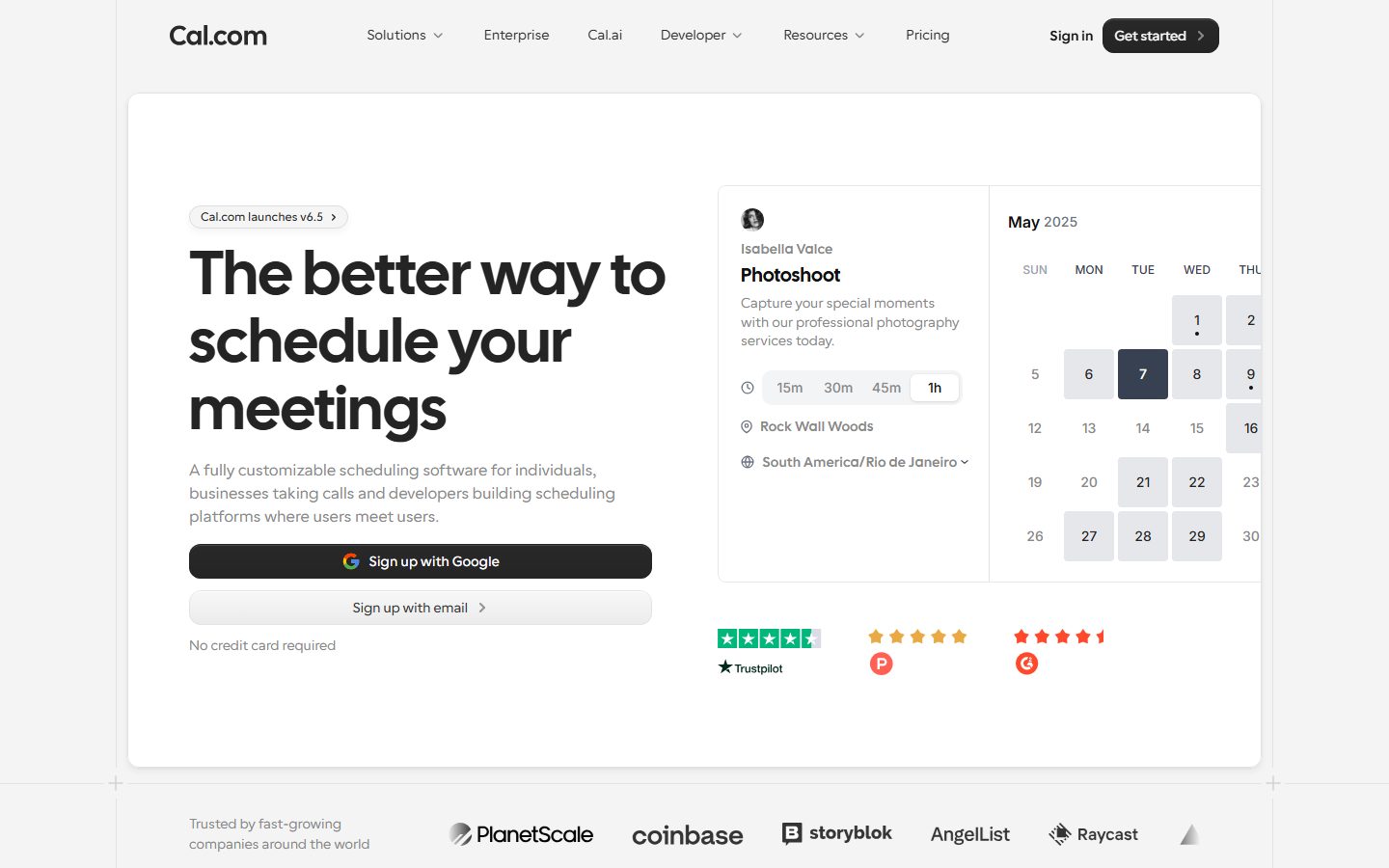
Cal.com's marketing surface is a calm, calendar-software-first interface built on a soft off-white canvas (`{colors.canvas}` — #f4f4f4) rather than pure white. Large rounded white cards (`{colors.surface-card}` — #ffffff) float over that canvas and carry the editorial content, so the page reads as a stack of "product panels" rather than full-bleed bands. The brand voice is confident modern SaaS — near-black CTAs (`{colors.primary}` — #111111), oversized Cal Sans display headlines, and generous whitespace.
Type splits cleanly into two roles measured on the page: **Cal Sans** at weight 600 for h1/h2 display headlines, and **Cal Sans UI Variable Light** at weight 300 for h3 titles and body copy. The lighter UI variable face at weight 300 is unusual and distinctly Cal.com — body text reads thin and airy rather than the typical weight-400 SaaS baseline.
Component voltage comes from **real product UI fragments shown inside the cards** — the hero's right panel is the actual Cal.com booking widget with a May 2025 calendar grid, time-slot duration pills (15m / 30m / 45m / 1h), and a selected day rendered in dark (`{colors.primary-active}` — #242424). Lower bands show availability toggle rows, booking-overlay calendars, and integration grids. Cal.com shows the product itself rather than illustrations of it.
The page is near-monochrome: the only chromatic accents measured are a default-link blue (`{colors.link}` — #0000ee) and a sparse bright blue (`{colors.accent-blue}` — #0099ff). Everything structural is ink, gray, and white over the off-white floor.
**Key Characteristics:**
- Soft off-white canvas (`{colors.canvas}` — #f4f4f4) instead of pure white; white cards (`{colors.surface-card}`) sit on top to create the panel-on-canvas rhythm.
- Near-black primary CTA (`{colors.primary}` — #111111) with a darker pressed state (`{colors.primary-active}` — #242424). CTAs use `{rounded.md}` (8px); the secondary "Sign up with email" button uses a larger `{rounded.xxl}` (29px) pill-ish radius.
- Custom **Cal Sans** display headlines at weight 600 (substituted with Inter here — see Typography).
- Body and h3 type run in **Cal Sans UI Variable Light** at weight 300 — light, airy, the system's signature reading weight.
- Real product UI fragments embedded in cards — booking widget, calendar grid, duration pills, availability toggles.
- Hierarchical radius: `{rounded.md}` (8px) for buttons + duration pills, `{rounded.lg}` (12px) for feature/testimonial cards, `{rounded.xl}` (16px) for the hero booking card, `{rounded.pill}` (100px) for badge pills, `{rounded.full}` for avatars.
- Soft inset and low-alpha drop shadows on floating cards — never heavy.
## Colors
### Brand & Action
- **Primary** (`{colors.primary}` — #111111): The dominant action color — "Sign up with Google", "Get started" CTAs, and the selected calendar day. Pressed state shifts to `{colors.primary-active}` (#242424).
- **Ink** (`{colors.ink}` — #000000): The maximum-contrast text tone — display headlines and primary text on the white cards.
- **Ink Strong** (`{colors.ink-strong}` — #141414): A near-black neutral used on dark UI chrome and dense interactive surfaces.
### Accent
- **Link** (`{colors.link}` — #0000ee): The measured anchor color — appears on raw inline links. Cal.com is near-monochrome, so this default-blue surfaces rarely and should be treated as a fallback link tone.
- **Accent Blue** (`{colors.accent-blue}` — #0099ff): A sparse bright blue (3 occurrences) used inside product UI fragments — small highlight moments, never on hero CTAs.
### Text
- **Ink** (`{colors.ink}` — #000000): Headlines, primary text.
- **Muted** (`{colors.muted}` — #292929): Low-contrast running text and secondary copy on cards.
- **Body** (`{colors.body}` — #374151): Default supporting body color.
- **Neutral** (`{colors.neutral}` — #898989): Tertiary text — captions, sub-labels, calendar weekday headers.
- **Muted Cool** (`{colors.muted-cool}` — #6b7280) and **Muted Cool Soft** (`{colors.muted-cool-soft}` — #9ca3af): Fine-print and disabled/dimmed calendar dates.
### Surface
- **Canvas** (`{colors.canvas}` — #f4f4f4): The page floor — a soft off-white, not pure white.
- **Surface Card** (`{colors.surface-card}` — #ffffff): The floating white panels — hero card, feature cards, testimonial cards, inputs.
- **Surface Soft** (`{colors.surface-soft}` — #f5f5f5): Secondary button fill, duration-pill background, soft inset zones.
- **Surface Softer** (`{colors.surface-softer}` — #f3f4f6): Barely-visible inner dividers.
- **Surface Dark** (`{colors.surface-dark}` — #101010): A deep near-black surface for dark UI chrome shown inside product fragments.
### Lines
- **Hairline** (`{colors.hairline}` — #e0e0e0): The 1px border tone on cards and dividers.
- **Hairline Soft** (`{colors.hairline-soft}` — #d3d3d3) and **Hairline Cool** (`{colors.hairline-cool}` — #e1e2e3): Alternate divider tones for nested chrome.
- **Border Gray** (`{colors.border-gray}` — #e5e7eb): Input and table border alternative.
### On-Dark
- **On Dark** (`{colors.on-dark}` — #ffffff): Text/icon color on near-black CTAs and the selected calendar day.
## Typography
### Font Family
The system runs two faces measured directly on the page: **Cal Sans** (the custom geometric display face, weight 600) for h1 + h2, and **Cal Sans UI Variable Light** (weight 300) for h3 titles and body copy. The light UI variable at weight 300 is the system's reading weight — body text feels thin and open rather than the typical weight-400 baseline.
The split is strict:
- Cal Sans 600 — h1 (64px), h2 (48px) display headlines
- Cal Sans UI Variable Light 300 — h3 (18px) titles, body (14px) copy
### Hierarchy
| Token | Size | Weight | Line Height | Letter Spacing | Use |
|---|---|---|---|---|---|
| `{typography.display-xl}` | 64px | 600 | 1.1 | normal | Homepage h1 ("The better way to schedule your meetings") — Cal Sans |
| `{typography.display-lg}` | 48px | 600 | 1.1 | normal | Section heads ("Your all-purpose scheduling app") — Cal Sans |
| `{typography.title}` | 18px | 300 | 1.3 | -0.2px | h3 card titles, sub-headings — Cal Sans UI Variable Light |
| `{typography.body}` | 14px | 300 | 1.4 | normal | Default running-text, button labels, nav links, captions — Cal Sans UI Variable Light |
### Principles
Cal Sans 600 is the brand voice for every display headline; the light UI variable at weight 300 carries everything supporting. The boundary is functional — never set body copy at display weight, never set a headline in the light variable. The thin weight-300 body is part of the system's airy, confident feel.
Only two distinct display sizes (64 / 48) and two supporting sizes (18 / 14) were measured. Intermediate roles (button vs. nav vs. caption) reuse the 14px body token; their exact weights were not separately measured (see Known Gaps).
### Note on Font Substitutes
**Cal Sans** is licensed to Cal.com and not available as a public web font (flagged in fonts_licensed). The documented substitute is **Inter** — use Inter weight 600 for the display roles. For the **Cal Sans UI Variable Light** body face, use **Inter at weight 300** as the open-source approximation. The fallback stack walks `Inter, sans-serif`. The substitution preserves the weight signature (heavy display / light body) even though Cal Sans's geometric character differs from Inter's humanist forms.
## Layout
### Spacing System
- **Base unit:** 2–4px grid; the most frequent measured step is 10px (`{spacing.sm}`), followed by 24px (`{spacing.lg}`) and 12px (`{spacing.base}`).
- **Tokens:** `{spacing.xxs}` 4px · `{spacing.xs}` 8px · `{spacing.sm}` 10px · `{spacing.base}` 12px · `{spacing.md}` 16px · `{spacing.lg}` 24px · `{spacing.xl}` 32px · `{spacing.xxl}` 48px · `{spacing.section}` 96px.
- **Card internal padding:** `{spacing.lg}` (24px) for hero, feature, and testimonial cards; `{spacing.md}` (16px) for smaller icon cards.
- **Section rhythm:** `{spacing.section}` (96px) is the largest measured step — used between major editorial bands; `{spacing.xxl}` (48px) for secondary gaps.
### Grid & Container
- **Editorial body:** Centered content with floating white cards over the off-white canvas.
- **Hero band:** Roughly 7/5 split — h1 + sub-head + button stack on the left, booking-widget card on the right.
- **Feature grids:** 3-up at desktop ("Connect your calendar / Set your availability / Choose how to meet"), reducing on smaller widths.
- **Icon-card grid:** 4-up ("…and so much more!" band).
- **Testimonial grid:** Multi-column quote cards.
### Whitespace Philosophy
The canvas-plus-floating-card model creates breathing room by separation: each white panel is inset within the off-white floor, so whitespace reads as margin around panels rather than padding inside one continuous band. Section padding reaches 96px at the largest rhythm step, keeping the long-scroll page calm.
## Elevation & Depth
| Level | Treatment | Use |
|---|---|---|
| Flat | No shadow — `{colors.canvas}` floor | Page background, top nav |
| Card surface | White panel with low-alpha drop shadow | Hero card, feature cards, testimonial cards |
| Subtle drop shadow | `rgba(34, 42, 53, 0.05) 0px 4px 8px 0px` plus a 1px ring `rgba(34, 42, 53, 0.08) 0px 0px 0px 1px` | Floating content cards (24 occurrences) |
| Soft inset | `rgba(0, 0, 0, 0.16) 0px 1px 1.9px 0px inset` | Inset controls / duration pills (64 occurrences — the most frequent shadow) |
| Bright inset highlight | `rgba(255, 255, 255, 0.15) 0px 2px 0px 0px inset` / `rgb(255, 255, 255) 0px 2px 0px 0px inset` | Top-edge highlight on dark CTAs to add a tactile lip |
The elevation language is **soft and tactile** — inset highlights on buttons, faint drop shadows with a 1px hairline ring on floating cards. No heavy shadows, no glassmorphism. The white-on-off-white panel separation does most of the depth work.
### Decorative Depth
- Embedded product fragments (calendar grid, availability toggles) carry their own internal chrome shadows — these are product UI, shown as content, not system tokens.
- The dark CTAs use the white inset-highlight shadow to read as a slightly raised, pressable surface.
## Shapes
### Border Radius Scale
| Token | Value | Use |
|---|---|---|
| `{rounded.xs}` | 2px | Smallest UI accents, inner chrome (35 occurrences) |
| `{rounded.sm}` | 4px | Small inline controls, tags (39 occurrences) |
| `{rounded.md}` | 8px | Primary CTA buttons, duration pills, calendar day cells (85 occurrences — the dominant radius) |
| `{rounded.lg}` | 12px | Content cards — feature cards, testimonial cards (63 occurrences) |
| `{rounded.xl}` | 16px | Hero booking-widget card (48 occurrences) |
| `{rounded.xxl}` | 29px | Larger pill-ish buttons (the "Sign up with email" secondary CTA) (32 occurrences) |
| `{rounded.pill}` | 100px | Badge pills ("Cal.com launches v6.5"), large rounded chips (61 occurrences) |
| `{rounded.full}` | 9999px | Avatars, fully-round icon buttons (7 occurrences) |
### Photography Geometry
Avatar photos (testimonial rows, booking-widget host) render as full circles (`{rounded.full}`). Product UI fragments inside cards retain their native chrome radii.
## Components
### Top Navigation
**`top-nav`** — Transparent-over-canvas nav bar. Background `{colors.canvas}`, text `{colors.ink}`, type `{typography.body}`. Carries the "Cal.com" wordmark at left, a horizontal menu (Solutions, Enterprise, Cal.ai, Developer, Resources, Pricing) center, and a right cluster with a "Sign in" text link plus the dark "Get started" `{component.button-primary}`.
**`nav-link`** — Inline nav menu items in `{colors.ink}`, type `{typography.body}`, transparent background.
### Buttons
**`button-primary`** — The signature near-black CTA ("Sign up with Google", "Get started"). Background `{colors.primary}` (#111111), text `{colors.on-dark}`, type `{typography.body}`, rounded `{rounded.md}` (8px), padding 12px × 24px (derived from measured spacing tokens). Carries a white inset-highlight shadow on its top edge for a tactile lip. Pressed state `button-primary-active` shifts to `{colors.primary-active}` (#242424).
**`button-secondary`** — The "Sign up with email" CTA. Background `{colors.surface-soft}` (#f5f5f5), text `{colors.ink}`, type `{typography.body}`, larger rounded `{rounded.xxl}` (29px), padding 12px × 24px.
**`text-link`** — Inline anchor links in `{colors.link}` (#0000ee), type `{typography.body}`, transparent background.
### Cards & Containers
**`hero-card`** — The large white panel that holds the entire hero band, floating over the canvas. Background `{colors.surface-card}`, rounded `{rounded.xl}` (16px), internal padding `{spacing.lg}` (24px), with the soft card drop shadow.
**`booking-widget-card`** — The hero's right-side artifact: the actual Cal.com booking widget showing a host avatar, event title ("Photoshoot"), duration pills, location, timezone selector, and a May 2025 calendar grid. Background `{colors.surface-card}`, rounded `{rounded.xl}`, padding `{spacing.lg}`. This is real product chrome shown as content, not an illustration.
**`feature-card`** — Used in the 3-up "appointment scheduling is easy" grid. Background `{colors.surface-card}`, rounded `{rounded.lg}` (12px), padding `{spacing.lg}` (24px). Carries an h3 title in `{typography.title}` and body copy in `{typography.body}`, plus an embedded product fragment.
**`feature-icon-card`** — The smaller 4-up cards in the "…and so much more!" band. Background `{colors.surface-card}`, rounded `{rounded.lg}`, padding `{spacing.md}` (16px). An icon over a short `{typography.title}` label.
**`testimonial-card`** — Customer-quote cards ("More elegant than Calendly…"). Background `{colors.surface-card}`, rounded `{rounded.lg}`, padding `{spacing.lg}`. Quote in `{typography.body}` over an avatar + name + role row.
### Tags / Badges
**`badge-pill`** — The "Cal.com launches v6.5" announcement chip above the h1. Background `{colors.surface-card}`, text `{colors.ink}`, type `{typography.body}`, rounded `{rounded.pill}` (100px), padding 8px × 12px. With a thin hairline border.
### Product-UI Fragments
**`duration-pill`** — The 15m / 30m / 45m / 1h selector inside the booking widget. Background `{colors.surface-soft}`, text `{colors.ink}`, type `{typography.body}`, rounded `{rounded.md}`, padding 8px × 12px. The selected pill flips to a white-fill chip with inset shadow.
**`calendar-day-selected`** — The active day in the booking widget's month grid. Background `{colors.primary-active}` (#242424), text `{colors.on-dark}`, rounded `{rounded.md}`. Inactive/dimmed dates use `{colors.muted-cool-soft}`.
### Inputs & Forms
**`text-input`** — Measured input control. Background `{colors.surface-card}` (#ffffff), text `{colors.ink}`, type `{typography.body}`, rounded 0px (measured — the raw input radius is square; styled form fields elsewhere likely apply a token radius), padding 10px × 12px (derived from measured spacing).
### Footer
**`footer`** — Light footer that closes the page on the same canvas tone. Background `{colors.canvas}`, text `{colors.muted}`, type `{typography.body}`, padding `{spacing.xxl}` (48px). Carries the "Cal.com" wordmark and column link lists (Solutions / Use Cases / Resources / Company). Cal.com keeps the footer light rather than inverting to dark.
## Do's and Don'ts
### Do
- Reserve `{colors.primary}` (#111111) for primary CTAs, with `{colors.primary-active}` (#242424) for the pressed state and the selected calendar day.
- Float white cards (`{colors.surface-card}`) over the off-white canvas (`{colors.canvas}`) — the panel-on-canvas separation is the system's signature layout.
- Use Cal Sans 600 for every display headline; use Cal Sans UI Variable Light 300 for h3 titles and body. Keep the heavy/light split strict.
- Embed real product UI fragments (booking widget, calendar grid, availability toggles) inside cards rather than drawing illustrations of the product.
- Apply the soft inset-highlight shadow on dark CTAs for the tactile pressable lip.
- Keep avatars as full circles (`{rounded.full}`).
- Use `{rounded.md}` (8px) as the workhorse radius for buttons and small controls; `{rounded.lg}` for content cards; `{rounded.xl}` for the hero booking card.
### Don't
- Don't set the page background to pure white — the canvas is deliberately off-white (#f4f4f4) so white cards read as floating panels.
- Don't bold the body copy beyond weight 300 (Cal Sans UI Variable Light) — the airy thin weight is intentional.
- Don't bold display headlines beyond 600.
- Don't use accent blue (`{colors.accent-blue}`, `{colors.link}`) on primary CTAs — the action layer is monochrome near-black.
- Don't apply heavy shadows; the system uses low-alpha drop shadows with a 1px hairline ring and subtle insets only.
- Don't add hover-state styling beyond the documented pressed state.
## Responsive Behavior
### Breakpoints
| Name | Width | Key Changes |
|---|---|---|
| Mobile | < 768px | Hamburger nav; hero h1 64→~32px (derived — exact mobile size not measured); booking-widget card stacks below content; feature grids 1-up; footer columns collapse to 1 |
| Tablet | 768–1024px | Top nav tightens; feature cards 2-up; icon-card grid wraps |
| Desktop | 1024–1440px | Full top-nav; 3-up feature cards; 4-up icon cards; hero 7/5 split |
| Wide | > 1440px | Same as desktop with more outer breathing room on the canvas |
### Touch Targets
- `{component.button-primary}` reaches a comfortable tap height with 12px vertical padding on the 14px label.
- `{component.duration-pill}` and `{component.calendar-day-selected}` are small inside the booking widget; their effective tap areas depend on the embedded product chrome.
- Exact measured heights for buttons and inputs were not captured (see Known Gaps).
### Collapsing Strategy
- Hero 7/5 split collapses to single column — h1 + sub-head + buttons first, then the booking-widget card below.
- Feature grids reduce columns (3 → 2 → 1) rather than scaling cards down.
- Floating white cards retain their radius and padding at every breakpoint; the canvas margin shrinks first.
### Image Behavior
- Product UI fragments inside cards keep native aspect ratios; the cards resize.
- Avatar photos crop to circles at every breakpoint.
## Iteration Guide
1. Focus on ONE component at a time. Reference its YAML key directly (`{component.feature-card}`, `{component.booking-widget-card}`).
2. Variants of an existing component (`-active`, `-disabled`) live as separate entries in `components:`.
3. Use `{token.refs}` everywhere — never inline hex in components.
4. Never document hover. Default and Active/Pressed states only.
5. Display stays Cal Sans 600; body stays Cal Sans UI Variable Light 300. The two-weight split does not blur.
6. The page floor stays off-white (`{colors.canvas}`); content stays on floating white cards (`{colors.surface-card}`).
7. When in doubt about emphasis: bigger Cal Sans before bolder.
## Known Gaps
- **Cal Sans** and **Cal Sans UI Variable Light** are licensed to Cal.com and not available as public web fonts; Inter (weight 600 for display, weight 300 for body) is documented as the substitute.
- Only four typographic roles were measured (h1 64, h2 48, h3 18, body 14). Distinct button, nav-link, and caption weights/sizes were not separately captured — components reuse the 14px body token as the best available match.
- Letter-spacing was measured as "normal" on h1/h2/body and -0.2px on h3 only; the display headlines' visual tracking may differ in the live custom font.
- Button and input heights were not measured; padding values (12px × 24px on buttons, 10px × 12px on inputs) are derived from the measured spacing scale.
- The measured `input` component reports a 0px radius — likely a raw, unstyled field; styled form fields on the pricing/booking flows may apply a token radius. Form focus/error/disabled states were not extracted.
- The browser-default link color (`{colors.link}` — #0000ee) and the sparse `{colors.accent-blue}` (#0099ff) appear at low frequency; their exact roles inside product fragments need a closer capture.
- Mobile display type sizes are derived, not measured.
- Animation and transition timings (calendar slot picker, availability toggles, integration grid reveals) are out of scope.
- The pricing and features-collective-events pages were captured but produced no page-specific component measurements beyond the shared system tokens.
<!-- Documented by duply · real-world design systems as ready-to-use DESIGN.md for AI coding agents · https://duply.ai/cal-com/design-md -->
Color Palette
Accent
Neutrals
Typography
display-xl64px · 600 · 1.1
The quick brown fox jumpsdisplay-lg48px · 600 · 1.1
The quick brown fox jumpstitle18px · 300 · 1.3
The quick brown fox jumpsbody14px · 300 · 1.4
The quick brown fox jumpsSpacing & Shape
Spacing
| Name | Value | Preview |
|---|---|---|
| xxs | 4px | |
| xs | 8px | |
| sm | 10px | |
| base | 12px | |
| md | 16px | |
| lg | 24px | |
| xl | 32px | |
| xxl | 48px | |
| section | 96px |
Border Radius
| Name | Value | Preview |
|---|---|---|
| xs | 2px | |
| sm | 4px | |
| md | 8px | |
| lg | 12px | |
| xl | 16px | |
| xxl | 29px | |
| pill | 100px | |
| full | 9999px |
More like this


---
version: alpha
name: Cal.com-design-analysis
description: A clean, calendar-software-first marketing interface built on a soft off-white canvas (#f4f4f4) with near-black CTAs and the custom Cal Sans display typeface. The system reads as confident modern SaaS — large rounded white cards float over the canvas holding real product UI fragments (booking widgets, calendar grids, availability toggles), display headlines carry weight-600 Cal Sans, and body copy runs in a lighter Cal Sans UI Variable Light at weight 300. Brand voltage comes from the display type and embedded product chrome rather than from accent color.

colors:
  primary: "#111111"
  primary-active: "#242424"
  ink: "#000000"
  ink-strong: "#141414"
  muted: "#292929"
  neutral: "#898989"
  body: "#374151"
  muted-cool: "#6b7280"
  muted-cool-soft: "#9ca3af"
  canvas: "#f4f4f4"
  surface-card: "#ffffff"
  surface-soft: "#f5f5f5"
  surface-softer: "#f3f4f6"
  hairline: "#e0e0e0"
  hairline-soft: "#d3d3d3"
  hairline-cool: "#e1e2e3"
  border-gray: "#e5e7eb"
  surface-dark: "#101010"
  on-dark: "#ffffff"
  link: "#0000ee"
  accent-blue: "#0099ff"

typography:
  display-xl:
    fontFamily: "Cal Sans, Inter, sans-serif"
    fontSize: 64px
    fontWeight: 600
    lineHeight: 1.1
    letterSpacing: normal
  display-lg:
    fontFamily: "Cal Sans, Inter, sans-serif"
    fontSize: 48px
    fontWeight: 600
    lineHeight: 1.1
    letterSpacing: normal
  title:
    fontFamily: "Cal Sans UI Variable Light, Inter, sans-serif"
    fontSize: 18px
    fontWeight: 300
    lineHeight: 1.3
    letterSpacing: -0.2px
  body:
    fontFamily: "Cal Sans UI Variable Light, Inter, sans-serif"
    fontSize: 14px
    fontWeight: 300
    lineHeight: 1.4
    letterSpacing: normal

rounded:
  xs: 2px
  sm: 4px
  md: 8px
  lg: 12px
  xl: 16px
  xxl: 29px
  pill: 100px
  full: 9999px

spacing:
  xxs: 4px
  xs: 8px
  sm: 10px
  base: 12px
  md: 16px
  lg: 24px
  xl: 32px
  xxl: 48px
  section: 96px

components:
  top-nav:
    backgroundColor: "{colors.canvas}"
    textColor: "{colors.ink}"
    typography: "{typography.body}"
  button-primary:
    backgroundColor: "{colors.primary}"
    textColor: "{colors.on-dark}"
    typography: "{typography.body}"
    rounded: "{rounded.md}"
    padding: 12px 24px
  button-primary-active:
    backgroundColor: "{colors.primary-active}"
    textColor: "{colors.on-dark}"
    rounded: "{rounded.md}"
  button-secondary:
    backgroundColor: "{colors.surface-soft}"
    textColor: "{colors.ink}"
    typography: "{typography.body}"
    rounded: "{rounded.xxl}"
    padding: 12px 24px
  nav-link:
    backgroundColor: transparent
    textColor: "{colors.ink}"
    typography: "{typography.body}"
  text-link:
    backgroundColor: transparent
    textColor: "{colors.link}"
    typography: "{typography.body}"
  badge-pill:
    backgroundColor: "{colors.surface-card}"
    textColor: "{colors.ink}"
    typography: "{typography.body}"
    rounded: "{rounded.pill}"
    padding: 8px 12px
  hero-card:
    backgroundColor: "{colors.surface-card}"
    textColor: "{colors.ink}"
    rounded: "{rounded.xl}"
    padding: 24px
  booking-widget-card:
    backgroundColor: "{colors.surface-card}"
    textColor: "{colors.ink}"
    rounded: "{rounded.xl}"
    padding: 24px
  feature-card:
    backgroundColor: "{colors.surface-card}"
    textColor: "{colors.ink}"
    typography: "{typography.title}"
    rounded: "{rounded.lg}"
    padding: 24px
  feature-icon-card:
    backgroundColor: "{colors.surface-card}"
    textColor: "{colors.ink}"
    typography: "{typography.title}"
    rounded: "{rounded.lg}"
    padding: 16px
  testimonial-card:
    backgroundColor: "{colors.surface-card}"
    textColor: "{colors.ink}"
    typography: "{typography.body}"
    rounded: "{rounded.lg}"
    padding: 24px
  duration-pill:
    backgroundColor: "{colors.surface-soft}"
    textColor: "{colors.ink}"
    typography: "{typography.body}"
    rounded: "{rounded.md}"
    padding: 8px 12px
  calendar-day-selected:
    backgroundColor: "{colors.primary-active}"
    textColor: "{colors.on-dark}"
    typography: "{typography.body}"
    rounded: "{rounded.md}"
  text-input:
    backgroundColor: "{colors.surface-card}"
    textColor: "{colors.ink}"
    typography: "{typography.body}"
    rounded: 0px
    padding: 10px 12px
  footer:
    backgroundColor: "{colors.canvas}"
    textColor: "{colors.muted}"
    typography: "{typography.body}"
    padding: 48px
---

## Overview

Cal.com's marketing surface is a calm, calendar-software-first interface built on a soft off-white canvas (`{colors.canvas}` — #f4f4f4) rather than pure white. Large rounded white cards (`{colors.surface-card}` — #ffffff) float over that canvas and carry the editorial content, so the page reads as a stack of "product panels" rather than full-bleed bands. The brand voice is confident modern SaaS — near-black CTAs (`{colors.primary}` — #111111), oversized Cal Sans display headlines, and generous whitespace.

Type splits cleanly into two roles measured on the page: **Cal Sans** at weight 600 for h1/h2 display headlines, and **Cal Sans UI Variable Light** at weight 300 for h3 titles and body copy. The lighter UI variable face at weight 300 is unusual and distinctly Cal.com — body text reads thin and airy rather than the typical weight-400 SaaS baseline.

Component voltage comes from **real product UI fragments shown inside the cards** — the hero's right panel is the actual Cal.com booking widget with a May 2025 calendar grid, time-slot duration pills (15m / 30m / 45m / 1h), and a selected day rendered in dark (`{colors.primary-active}` — #242424). Lower bands show availability toggle rows, booking-overlay calendars, and integration grids. Cal.com shows the product itself rather than illustrations of it.

The page is near-monochrome: the only chromatic accents measured are a default-link blue (`{colors.link}` — #0000ee) and a sparse bright blue (`{colors.accent-blue}` — #0099ff). Everything structural is ink, gray, and white over the off-white floor.

**Key Characteristics:**
- Soft off-white canvas (`{colors.canvas}` — #f4f4f4) instead of pure white; white cards (`{colors.surface-card}`) sit on top to create the panel-on-canvas rhythm.
- Near-black primary CTA (`{colors.primary}` — #111111) with a darker pressed state (`{colors.primary-active}` — #242424). CTAs use `{rounded.md}` (8px); the secondary "Sign up with email" button uses a larger `{rounded.xxl}` (29px) pill-ish radius.
- Custom **Cal Sans** display headlines at weight 600 (substituted with Inter here — see Typography).
- Body and h3 type run in **Cal Sans UI Variable Light** at weight 300 — light, airy, the system's signature reading weight.
- Real product UI fragments embedded in cards — booking widget, calendar grid, duration pills, availability toggles.
- Hierarchical radius: `{rounded.md}` (8px) for buttons + duration pills, `{rounded.lg}` (12px) for feature/testimonial cards, `{rounded.xl}` (16px) for the hero booking card, `{rounded.pill}` (100px) for badge pills, `{rounded.full}` for avatars.
- Soft inset and low-alpha drop shadows on floating cards — never heavy.

## Colors

### Brand & Action
- **Primary** (`{colors.primary}` — #111111): The dominant action color — "Sign up with Google", "Get started" CTAs, and the selected calendar day. Pressed state shifts to `{colors.primary-active}` (#242424).
- **Ink** (`{colors.ink}` — #000000): The maximum-contrast text tone — display headlines and primary text on the white cards.
- **Ink Strong** (`{colors.ink-strong}` — #141414): A near-black neutral used on dark UI chrome and dense interactive surfaces.

### Accent
- **Link** (`{colors.link}` — #0000ee): The measured anchor color — appears on raw inline links. Cal.com is near-monochrome, so this default-blue surfaces rarely and should be treated as a fallback link tone.
- **Accent Blue** (`{colors.accent-blue}` — #0099ff): A sparse bright blue (3 occurrences) used inside product UI fragments — small highlight moments, never on hero CTAs.

### Text
- **Ink** (`{colors.ink}` — #000000): Headlines, primary text.
- **Muted** (`{colors.muted}` — #292929): Low-contrast running text and secondary copy on cards.
- **Body** (`{colors.body}` — #374151): Default supporting body color.
- **Neutral** (`{colors.neutral}` — #898989): Tertiary text — captions, sub-labels, calendar weekday headers.
- **Muted Cool** (`{colors.muted-cool}` — #6b7280) and **Muted Cool Soft** (`{colors.muted-cool-soft}` — #9ca3af): Fine-print and disabled/dimmed calendar dates.

### Surface
- **Canvas** (`{colors.canvas}` — #f4f4f4): The page floor — a soft off-white, not pure white.
- **Surface Card** (`{colors.surface-card}` — #ffffff): The floating white panels — hero card, feature cards, testimonial cards, inputs.
- **Surface Soft** (`{colors.surface-soft}` — #f5f5f5): Secondary button fill, duration-pill background, soft inset zones.
- **Surface Softer** (`{colors.surface-softer}` — #f3f4f6): Barely-visible inner dividers.
- **Surface Dark** (`{colors.surface-dark}` — #101010): A deep near-black surface for dark UI chrome shown inside product fragments.

### Lines
- **Hairline** (`{colors.hairline}` — #e0e0e0): The 1px border tone on cards and dividers.
- **Hairline Soft** (`{colors.hairline-soft}` — #d3d3d3) and **Hairline Cool** (`{colors.hairline-cool}` — #e1e2e3): Alternate divider tones for nested chrome.
- **Border Gray** (`{colors.border-gray}` — #e5e7eb): Input and table border alternative.

### On-Dark
- **On Dark** (`{colors.on-dark}` — #ffffff): Text/icon color on near-black CTAs and the selected calendar day.

## Typography

### Font Family
The system runs two faces measured directly on the page: **Cal Sans** (the custom geometric display face, weight 600) for h1 + h2, and **Cal Sans UI Variable Light** (weight 300) for h3 titles and body copy. The light UI variable at weight 300 is the system's reading weight — body text feels thin and open rather than the typical weight-400 baseline.

The split is strict:
- Cal Sans 600 — h1 (64px), h2 (48px) display headlines
- Cal Sans UI Variable Light 300 — h3 (18px) titles, body (14px) copy

### Hierarchy

| Token | Size | Weight | Line Height | Letter Spacing | Use |
|---|---|---|---|---|---|
| `{typography.display-xl}` | 64px | 600 | 1.1 | normal | Homepage h1 ("The better way to schedule your meetings") — Cal Sans |
| `{typography.display-lg}` | 48px | 600 | 1.1 | normal | Section heads ("Your all-purpose scheduling app") — Cal Sans |
| `{typography.title}` | 18px | 300 | 1.3 | -0.2px | h3 card titles, sub-headings — Cal Sans UI Variable Light |
| `{typography.body}` | 14px | 300 | 1.4 | normal | Default running-text, button labels, nav links, captions — Cal Sans UI Variable Light |

### Principles
Cal Sans 600 is the brand voice for every display headline; the light UI variable at weight 300 carries everything supporting. The boundary is functional — never set body copy at display weight, never set a headline in the light variable. The thin weight-300 body is part of the system's airy, confident feel.

Only two distinct display sizes (64 / 48) and two supporting sizes (18 / 14) were measured. Intermediate roles (button vs. nav vs. caption) reuse the 14px body token; their exact weights were not separately measured (see Known Gaps).

### Note on Font Substitutes
**Cal Sans** is licensed to Cal.com and not available as a public web font (flagged in fonts_licensed). The documented substitute is **Inter** — use Inter weight 600 for the display roles. For the **Cal Sans UI Variable Light** body face, use **Inter at weight 300** as the open-source approximation. The fallback stack walks `Inter, sans-serif`. The substitution preserves the weight signature (heavy display / light body) even though Cal Sans's geometric character differs from Inter's humanist forms.

## Layout

### Spacing System
- **Base unit:** 2–4px grid; the most frequent measured step is 10px (`{spacing.sm}`), followed by 24px (`{spacing.lg}`) and 12px (`{spacing.base}`).
- **Tokens:** `{spacing.xxs}` 4px · `{spacing.xs}` 8px · `{spacing.sm}` 10px · `{spacing.base}` 12px · `{spacing.md}` 16px · `{spacing.lg}` 24px · `{spacing.xl}` 32px · `{spacing.xxl}` 48px · `{spacing.section}` 96px.
- **Card internal padding:** `{spacing.lg}` (24px) for hero, feature, and testimonial cards; `{spacing.md}` (16px) for smaller icon cards.
- **Section rhythm:** `{spacing.section}` (96px) is the largest measured step — used between major editorial bands; `{spacing.xxl}` (48px) for secondary gaps.

### Grid & Container
- **Editorial body:** Centered content with floating white cards over the off-white canvas.
- **Hero band:** Roughly 7/5 split — h1 + sub-head + button stack on the left, booking-widget card on the right.
- **Feature grids:** 3-up at desktop ("Connect your calendar / Set your availability / Choose how to meet"), reducing on smaller widths.
- **Icon-card grid:** 4-up ("…and so much more!" band).
- **Testimonial grid:** Multi-column quote cards.

### Whitespace Philosophy
The canvas-plus-floating-card model creates breathing room by separation: each white panel is inset within the off-white floor, so whitespace reads as margin around panels rather than padding inside one continuous band. Section padding reaches 96px at the largest rhythm step, keeping the long-scroll page calm.

## Elevation & Depth

| Level | Treatment | Use |
|---|---|---|
| Flat | No shadow — `{colors.canvas}` floor | Page background, top nav |
| Card surface | White panel with low-alpha drop shadow | Hero card, feature cards, testimonial cards |
| Subtle drop shadow | `rgba(34, 42, 53, 0.05) 0px 4px 8px 0px` plus a 1px ring `rgba(34, 42, 53, 0.08) 0px 0px 0px 1px` | Floating content cards (24 occurrences) |
| Soft inset | `rgba(0, 0, 0, 0.16) 0px 1px 1.9px 0px inset` | Inset controls / duration pills (64 occurrences — the most frequent shadow) |
| Bright inset highlight | `rgba(255, 255, 255, 0.15) 0px 2px 0px 0px inset` / `rgb(255, 255, 255) 0px 2px 0px 0px inset` | Top-edge highlight on dark CTAs to add a tactile lip |

The elevation language is **soft and tactile** — inset highlights on buttons, faint drop shadows with a 1px hairline ring on floating cards. No heavy shadows, no glassmorphism. The white-on-off-white panel separation does most of the depth work.

### Decorative Depth
- Embedded product fragments (calendar grid, availability toggles) carry their own internal chrome shadows — these are product UI, shown as content, not system tokens.
- The dark CTAs use the white inset-highlight shadow to read as a slightly raised, pressable surface.

## Shapes

### Border Radius Scale

| Token | Value | Use |
|---|---|---|
| `{rounded.xs}` | 2px | Smallest UI accents, inner chrome (35 occurrences) |
| `{rounded.sm}` | 4px | Small inline controls, tags (39 occurrences) |
| `{rounded.md}` | 8px | Primary CTA buttons, duration pills, calendar day cells (85 occurrences — the dominant radius) |
| `{rounded.lg}` | 12px | Content cards — feature cards, testimonial cards (63 occurrences) |
| `{rounded.xl}` | 16px | Hero booking-widget card (48 occurrences) |
| `{rounded.xxl}` | 29px | Larger pill-ish buttons (the "Sign up with email" secondary CTA) (32 occurrences) |
| `{rounded.pill}` | 100px | Badge pills ("Cal.com launches v6.5"), large rounded chips (61 occurrences) |
| `{rounded.full}` | 9999px | Avatars, fully-round icon buttons (7 occurrences) |

### Photography Geometry
Avatar photos (testimonial rows, booking-widget host) render as full circles (`{rounded.full}`). Product UI fragments inside cards retain their native chrome radii.

## Components

### Top Navigation

**`top-nav`** — Transparent-over-canvas nav bar. Background `{colors.canvas}`, text `{colors.ink}`, type `{typography.body}`. Carries the "Cal.com" wordmark at left, a horizontal menu (Solutions, Enterprise, Cal.ai, Developer, Resources, Pricing) center, and a right cluster with a "Sign in" text link plus the dark "Get started" `{component.button-primary}`.

**`nav-link`** — Inline nav menu items in `{colors.ink}`, type `{typography.body}`, transparent background.

### Buttons

**`button-primary`** — The signature near-black CTA ("Sign up with Google", "Get started"). Background `{colors.primary}` (#111111), text `{colors.on-dark}`, type `{typography.body}`, rounded `{rounded.md}` (8px), padding 12px × 24px (derived from measured spacing tokens). Carries a white inset-highlight shadow on its top edge for a tactile lip. Pressed state `button-primary-active` shifts to `{colors.primary-active}` (#242424).

**`button-secondary`** — The "Sign up with email" CTA. Background `{colors.surface-soft}` (#f5f5f5), text `{colors.ink}`, type `{typography.body}`, larger rounded `{rounded.xxl}` (29px), padding 12px × 24px.

**`text-link`** — Inline anchor links in `{colors.link}` (#0000ee), type `{typography.body}`, transparent background.

### Cards & Containers

**`hero-card`** — The large white panel that holds the entire hero band, floating over the canvas. Background `{colors.surface-card}`, rounded `{rounded.xl}` (16px), internal padding `{spacing.lg}` (24px), with the soft card drop shadow.

**`booking-widget-card`** — The hero's right-side artifact: the actual Cal.com booking widget showing a host avatar, event title ("Photoshoot"), duration pills, location, timezone selector, and a May 2025 calendar grid. Background `{colors.surface-card}`, rounded `{rounded.xl}`, padding `{spacing.lg}`. This is real product chrome shown as content, not an illustration.

**`feature-card`** — Used in the 3-up "appointment scheduling is easy" grid. Background `{colors.surface-card}`, rounded `{rounded.lg}` (12px), padding `{spacing.lg}` (24px). Carries an h3 title in `{typography.title}` and body copy in `{typography.body}`, plus an embedded product fragment.

**`feature-icon-card`** — The smaller 4-up cards in the "…and so much more!" band. Background `{colors.surface-card}`, rounded `{rounded.lg}`, padding `{spacing.md}` (16px). An icon over a short `{typography.title}` label.

**`testimonial-card`** — Customer-quote cards ("More elegant than Calendly…"). Background `{colors.surface-card}`, rounded `{rounded.lg}`, padding `{spacing.lg}`. Quote in `{typography.body}` over an avatar + name + role row.

### Tags / Badges

**`badge-pill`** — The "Cal.com launches v6.5" announcement chip above the h1. Background `{colors.surface-card}`, text `{colors.ink}`, type `{typography.body}`, rounded `{rounded.pill}` (100px), padding 8px × 12px. With a thin hairline border.

### Product-UI Fragments

**`duration-pill`** — The 15m / 30m / 45m / 1h selector inside the booking widget. Background `{colors.surface-soft}`, text `{colors.ink}`, type `{typography.body}`, rounded `{rounded.md}`, padding 8px × 12px. The selected pill flips to a white-fill chip with inset shadow.

**`calendar-day-selected`** — The active day in the booking widget's month grid. Background `{colors.primary-active}` (#242424), text `{colors.on-dark}`, rounded `{rounded.md}`. Inactive/dimmed dates use `{colors.muted-cool-soft}`.

### Inputs & Forms

**`text-input`** — Measured input control. Background `{colors.surface-card}` (#ffffff), text `{colors.ink}`, type `{typography.body}`, rounded 0px (measured — the raw input radius is square; styled form fields elsewhere likely apply a token radius), padding 10px × 12px (derived from measured spacing).

### Footer

**`footer`** — Light footer that closes the page on the same canvas tone. Background `{colors.canvas}`, text `{colors.muted}`, type `{typography.body}`, padding `{spacing.xxl}` (48px). Carries the "Cal.com" wordmark and column link lists (Solutions / Use Cases / Resources / Company). Cal.com keeps the footer light rather than inverting to dark.

## Do's and Don'ts

### Do
- Reserve `{colors.primary}` (#111111) for primary CTAs, with `{colors.primary-active}` (#242424) for the pressed state and the selected calendar day.
- Float white cards (`{colors.surface-card}`) over the off-white canvas (`{colors.canvas}`) — the panel-on-canvas separation is the system's signature layout.
- Use Cal Sans 600 for every display headline; use Cal Sans UI Variable Light 300 for h3 titles and body. Keep the heavy/light split strict.
- Embed real product UI fragments (booking widget, calendar grid, availability toggles) inside cards rather than drawing illustrations of the product.
- Apply the soft inset-highlight shadow on dark CTAs for the tactile pressable lip.
- Keep avatars as full circles (`{rounded.full}`).
- Use `{rounded.md}` (8px) as the workhorse radius for buttons and small controls; `{rounded.lg}` for content cards; `{rounded.xl}` for the hero booking card.

### Don't
- Don't set the page background to pure white — the canvas is deliberately off-white (#f4f4f4) so white cards read as floating panels.
- Don't bold the body copy beyond weight 300 (Cal Sans UI Variable Light) — the airy thin weight is intentional.
- Don't bold display headlines beyond 600.
- Don't use accent blue (`{colors.accent-blue}`, `{colors.link}`) on primary CTAs — the action layer is monochrome near-black.
- Don't apply heavy shadows; the system uses low-alpha drop shadows with a 1px hairline ring and subtle insets only.
- Don't add hover-state styling beyond the documented pressed state.

## Responsive Behavior

### Breakpoints

| Name | Width | Key Changes |
|---|---|---|
| Mobile | < 768px | Hamburger nav; hero h1 64→~32px (derived — exact mobile size not measured); booking-widget card stacks below content; feature grids 1-up; footer columns collapse to 1 |
| Tablet | 768–1024px | Top nav tightens; feature cards 2-up; icon-card grid wraps |
| Desktop | 1024–1440px | Full top-nav; 3-up feature cards; 4-up icon cards; hero 7/5 split |
| Wide | > 1440px | Same as desktop with more outer breathing room on the canvas |

### Touch Targets
- `{component.button-primary}` reaches a comfortable tap height with 12px vertical padding on the 14px label.
- `{component.duration-pill}` and `{component.calendar-day-selected}` are small inside the booking widget; their effective tap areas depend on the embedded product chrome.
- Exact measured heights for buttons and inputs were not captured (see Known Gaps).

### Collapsing Strategy
- Hero 7/5 split collapses to single column — h1 + sub-head + buttons first, then the booking-widget card below.
- Feature grids reduce columns (3 → 2 → 1) rather than scaling cards down.
- Floating white cards retain their radius and padding at every breakpoint; the canvas margin shrinks first.

### Image Behavior
- Product UI fragments inside cards keep native aspect ratios; the cards resize.
- Avatar photos crop to circles at every breakpoint.

## Iteration Guide

1. Focus on ONE component at a time. Reference its YAML key directly (`{component.feature-card}`, `{component.booking-widget-card}`).
2. Variants of an existing component (`-active`, `-disabled`) live as separate entries in `components:`.
3. Use `{token.refs}` everywhere — never inline hex in components.
4. Never document hover. Default and Active/Pressed states only.
5. Display stays Cal Sans 600; body stays Cal Sans UI Variable Light 300. The two-weight split does not blur.
6. The page floor stays off-white (`{colors.canvas}`); content stays on floating white cards (`{colors.surface-card}`).
7. When in doubt about emphasis: bigger Cal Sans before bolder.

## Known Gaps

- **Cal Sans** and **Cal Sans UI Variable Light** are licensed to Cal.com and not available as public web fonts; Inter (weight 600 for display, weight 300 for body) is documented as the substitute.
- Only four typographic roles were measured (h1 64, h2 48, h3 18, body 14). Distinct button, nav-link, and caption weights/sizes were not separately captured — components reuse the 14px body token as the best available match.
- Letter-spacing was measured as "normal" on h1/h2/body and -0.2px on h3 only; the display headlines' visual tracking may differ in the live custom font.
- Button and input heights were not measured; padding values (12px × 24px on buttons, 10px × 12px on inputs) are derived from the measured spacing scale.
- The measured `input` component reports a 0px radius — likely a raw, unstyled field; styled form fields on the pricing/booking flows may apply a token radius. Form focus/error/disabled states were not extracted.
- The browser-default link color (`{colors.link}` — #0000ee) and the sparse `{colors.accent-blue}` (#0099ff) appear at low frequency; their exact roles inside product fragments need a closer capture.
- Mobile display type sizes are derived, not measured.
- Animation and transition timings (calendar slot picker, availability toggles, integration grid reveals) are out of scope.
- The pricing and features-collective-events pages were captured but produced no page-specific component measurements beyond the shared system tokens.

<!-- Documented by duply · real-world design systems as ready-to-use DESIGN.md for AI coding agents · https://duply.ai/cal-com/design-md -->