Fabric
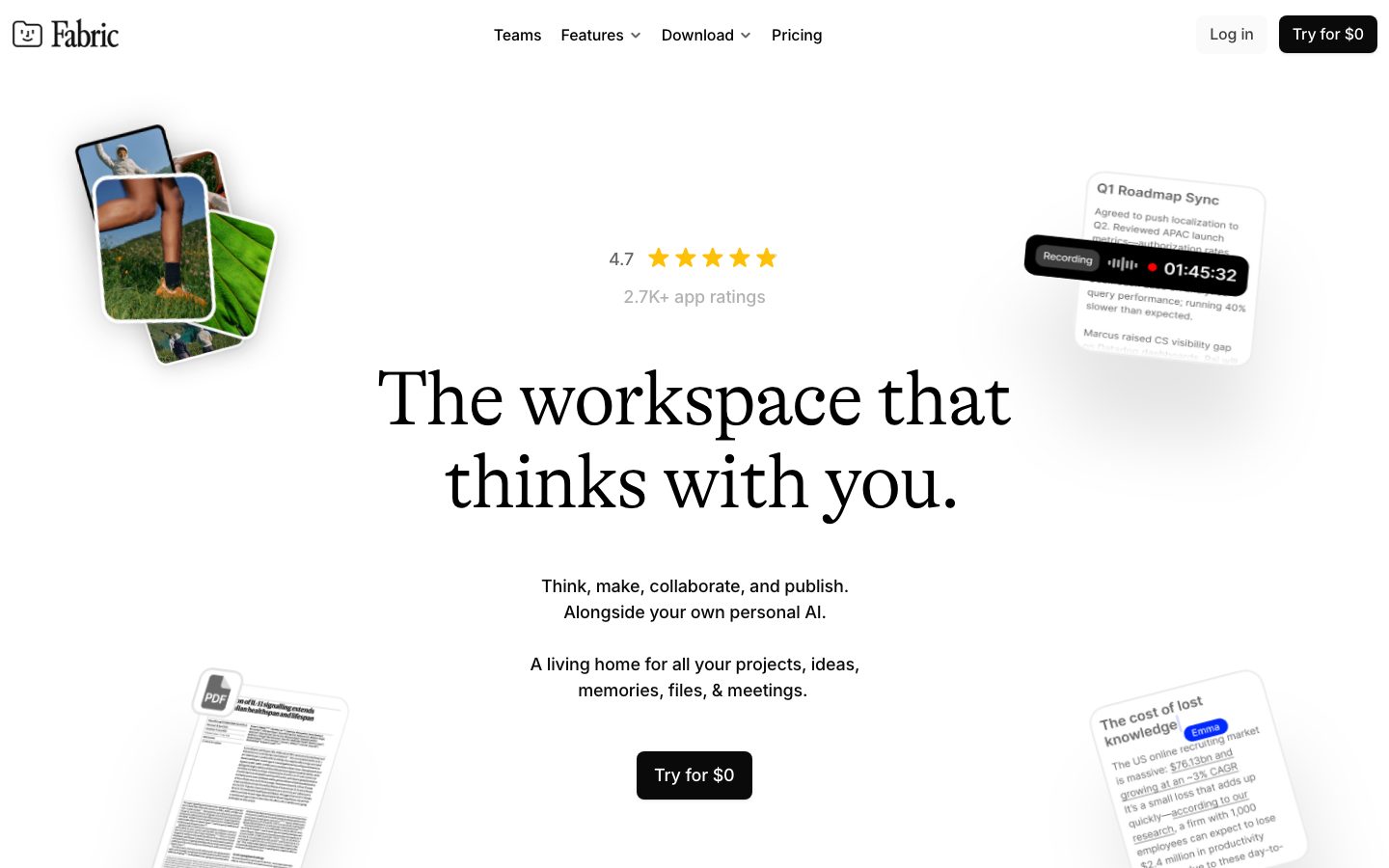
A calm, editorial productivity-app surface anchored on a pure-white canvas with a single high-contrast black CTA and a light, high-contrast GT Alpina serif for headlines. The system reads as quiet and intellectual — generous whitespace, near-monochrome palette, soft-rounded floating "note" cards that show real product chrome (calendars, transcripts, AI panels) drifting at the page edges, and Inter for all supporting UI text. Brand voltage comes almost entirely from the light-weight serif display type and from product UI fragments shown in-card rather than from color.
---
version: alpha
name: Fabric-design-analysis
description: "A calm, editorial productivity-app surface anchored on a pure-white canvas with a single high-contrast black CTA and a light, high-contrast GT Alpina serif for headlines. The system reads as quiet and intellectual — generous whitespace, near-monochrome palette, soft-rounded floating \"note\" cards that show real product chrome (calendars, transcripts, AI panels) drifting at the page edges, and Inter for all supporting UI text. Brand voltage comes almost entirely from the light-weight serif display type and from product UI fragments shown in-card rather than from color."

colors:
  ink: "#000000"
  ink-near: "#0a0a0a"
  body: "#333333"
  ink-soft: "#404040"
  muted: "#666666"
  muted-soft: "#737373"
  muted-mid: "#808080"
  link: "#0000ee"
  accent-blue: "#0004ff"
  accent-blue-alt: "#0028ff"
  accent-blue-alt2: "#0610ff"
  accent-deep: "#19154e"
  canvas: "#ffffff"
  surface-soft: "#fafafa"
  surface-soft-alt: "#f7f7f7"
  surface-card: "#f2f2f5"
  hairline: "#ededed"
  hairline-soft: "#e5e5e5"
  on-ink: "#ffffff"

typography:
  display-xl:
    fontFamily: "GT Alpina, Fraunces, Georgia, serif"
    fontSize: 80px
    fontWeight: 300
    lineHeight: 1.08
    letterSpacing: -1.6px
  display-lg:
    fontFamily: "GT Alpina, Fraunces, Georgia, serif"
    fontSize: 52px
    fontWeight: 300
    lineHeight: 1.08
    letterSpacing: -1.04px
  title:
    fontFamily: "Inter, sans-serif"
    fontSize: 18px
    fontWeight: 500
    lineHeight: 1.5
    letterSpacing: -0.18px
  body:
    fontFamily: "Inter, sans-serif"
    fontSize: 18px
    fontWeight: 500
    lineHeight: 1.2
    letterSpacing: -0.18px

rounded:
  xs: 4px
  sm: 8px
  md: 12px
  lg: 16px
  xl: 24px
  xxl: 40px

spacing:
  xxs: 4px
  xs: 8px
  sm: 10px
  md: 12px
  lg: 14px
  xl: 16px
  xxl: 20px
  xxxl: 24px
  section: 32px

components:
  top-nav:
    backgroundColor: "{colors.canvas}"
    textColor: "{colors.ink}"
    typography: "{typography.title}"
    padding: 24px
  button-primary:
    backgroundColor: "{colors.ink}"
    textColor: "{colors.on-ink}"
    typography: "{typography.body}"
    rounded: "{rounded.sm}"
    padding: 12px 20px
  button-primary-active:
    backgroundColor: "{colors.ink-near}"
    textColor: "{colors.on-ink}"
    rounded: "{rounded.sm}"
  button-text-link:
    backgroundColor: transparent
    textColor: "{colors.ink}"
    typography: "{typography.title}"
  text-link:
    backgroundColor: transparent
    textColor: "{colors.link}"
    typography: "{typography.body}"
  hero-band:
    backgroundColor: "{colors.canvas}"
    textColor: "{colors.ink}"
    typography: "{typography.display-xl}"
    padding: 32px
  floating-note-card:
    backgroundColor: "{colors.canvas}"
    textColor: "{colors.ink}"
    typography: "{typography.title}"
    rounded: "{rounded.xl}"
    padding: 16px
  product-mockup-card:
    backgroundColor: "{colors.canvas}"
    textColor: "{colors.ink}"
    rounded: "{rounded.lg}"
    padding: 16px
  feature-card:
    backgroundColor: "{colors.surface-card}"
    textColor: "{colors.ink}"
    typography: "{typography.title}"
    rounded: "{rounded.lg}"
    padding: 24px
  feature-card-soft:
    backgroundColor: "{colors.surface-soft}"
    textColor: "{colors.ink}"
    typography: "{typography.title}"
    rounded: "{rounded.lg}"
    padding: 24px
  ai-assistant-panel:
    backgroundColor: "{colors.canvas}"
    textColor: "{colors.ink}"
    typography: "{typography.title}"
    rounded: "{rounded.md}"
    padding: 12px
  platform-tile:
    backgroundColor: "{colors.canvas}"
    textColor: "{colors.ink}"
    typography: "{typography.title}"
    rounded: "{rounded.md}"
    padding: 16px
  task-pill:
    backgroundColor: "{colors.canvas}"
    textColor: "{colors.ink}"
    typography: "{typography.title}"
    rounded: "{rounded.xxl}"
    padding: 10px 14px
  status-chip-dark:
    backgroundColor: "{colors.ink-near}"
    textColor: "{colors.on-ink}"
    typography: "{typography.title}"
    rounded: "{rounded.xl}"
    padding: 8px 12px
  email-capture-input:
    backgroundColor: "{colors.canvas}"
    textColor: "{colors.muted}"
    typography: "{typography.body}"
    rounded: "{rounded.sm}"
    padding: 12px 14px
---

## Overview

Fabric's marketing surface is a calm, editorial productivity-app interface — a pure-white canvas (`{colors.canvas}` — #ffffff) carrying a single high-contrast black CTA (`{colors.ink}` — #000000) and a large, light-weight **GT Alpina** serif headline. The system reads as quiet and intellectual: it leans on whitespace and a near-monochrome palette rather than on color blocks, and the only consistently colorful moments are the product UI fragments that drift at the page edges.

Type voice splits cleanly into two roles: **GT Alpina Light** (the high-contrast serif display face — used for h1 and h2 at weight 300 with negative tracking) and **Inter** (used for everything else — h3, body, nav, buttons, captions). The serif headline ("The workspace that thinks with you.") is the brand's loudest signal — set at 80px, weight 300, with -1.6px letter-spacing it feels literary and considered, the opposite of a shouting SaaS hero.

Component voltage comes from **floating product-UI cards** — calendar notes, meeting transcripts, AI-assistant panels, task reminders — scattered around the hero and feature bands at slight rotations with soft drop shadows. Fabric shows the actual product chrome at small scale rather than painting marketing illustrations, and these card fragments are the only place real color (blue gradients, the deep-navy accent) appears.

**Key Characteristics:**
- Pure-white canvas with a single black CTA (`{colors.ink}` — #000000). The "Try for $0" button is the only filled action on the page — restrained, confident, near-pill rounded.
- Light-weight serif display type (GT Alpina, weight 300) for h1/h2 — a literary, high-contrast face with heavy negative tracking. The serif is the brand voice; substituted with Fraunces here.
- Inter at weight 500 for all supporting UI — h3, body, nav, buttons, captions. The boundary between serif display and sans body is strict.
- Near-monochrome palette: black ink graded through `{colors.body}` (#333333), `{colors.ink-soft}` (#404040), `{colors.muted}` (#666666) down to `{colors.muted-mid}` (#808080) for hierarchy. Color appears only inside product fragments.
- Floating note cards (`{component.floating-note-card}`) at the page edges — white surfaces with soft drop shadows, rounded `{rounded.xl}` (24px), tilted slightly, showing real product chrome.
- Light-gray feature cards (`{colors.surface-card}` — #f2f2f5, and `{colors.surface-soft}` — #fafafa) in the "Create." section, rounded `{rounded.lg}` (16px).
- Blue is reserved: the default link blue (`{colors.link}` — #0000ee), an electric accent family (`{colors.accent-blue}` — #0004ff) seen as glow/gradient inside AI and meeting cards, and a deep navy (`{colors.accent-deep}` — #19154e) used sparingly.
- Border radius is hierarchical: `{rounded.xs}` (4px) for small chrome, `{rounded.sm}` (8px) for buttons + inputs, `{rounded.md}` (12px) for inline panels, `{rounded.lg}` (16px) for feature cards, `{rounded.xl}` (24px) for floating note cards, `{rounded.xxl}` (40px) for pill task chips.

## Colors

### Brand & Accent
- **Ink** (`{colors.ink}` — #000000): The dominant action and headline color. The black CTA and serif headlines. Press state shifts to `{colors.ink-near}` (#0a0a0a).
- **Link** (`{colors.link}` — #0000ee): Browser-default link blue, observed on anchor text. Fabric leaves some inline links at this raw blue.
- **Accent Blue** (`{colors.accent-blue}` — #0004ff): An electric blue seen as glow and gradient fills inside the AI-assistant and meeting-note product cards. Near-siblings `{colors.accent-blue-alt}` (#0028ff) and `{colors.accent-blue-alt2}` (#0610ff) appear in the same gradient family.
- **Accent Deep** (`{colors.accent-deep}` — #19154e): A deep navy used sparingly for small accent moments inside product fragments.

### Surface
- **Canvas** (`{colors.canvas}` — #ffffff): The default page floor and the floating-card surface.
- **Surface Soft** (`{colors.surface-soft}` — #fafafa): Soft feature-card and section-band backgrounds.
- **Surface Soft Alt** (`{colors.surface-soft-alt}` — #f7f7f7): A barely-different soft band, used interchangeably with surface-soft.
- **Surface Card** (`{colors.surface-card}` — #f2f2f5): The light-gray card fill used in the "Create." feature grid.
- **Hairline** (`{colors.hairline}` — #ededed): 1px divider tone on light surfaces.
- **Hairline Soft** (`{colors.hairline-soft}` — #e5e5e5): A slightly stronger hairline for card outlines.

### Text
- **Ink** (`{colors.ink}` — #000000): Headlines and primary text.
- **Body** (`{colors.body}` — #333333): Default running-text color.
- **Ink Soft** (`{colors.ink-soft}` — #404040): Secondary dark text.
- **Muted** (`{colors.muted}` — #666666): Secondary/supporting text — sub-heads, captions.
- **Muted Soft** (`{colors.muted-soft}` — #737373): Tertiary text.
- **Muted Mid** (`{colors.muted-mid}` — #808080): Fine-print and the faint "2.7K+ app ratings" line.
- **On Ink** (`{colors.on-ink}` — #ffffff): Text on the black CTA and dark status chips.

## Typography

### Font Family
The system runs **GT Alpina Light** for serif display (h1 + h2) and **Inter** for everything else (h3, body, nav, buttons, captions). GT Alpina is a high-contrast literary serif used at weight 300 with heavy negative letter-spacing — it carries the entire brand voice. Inter handles the supporting UI at weight 500. The serif fallback stack walks `Fraunces, Georgia, serif`; Inter walks `sans-serif`.

The split is functional:
- GT Alpina (display serif, 300 weight, -1.04 to -1.6px tracking) — h1, h2
- Inter (UI sans, 500 weight, -0.18px tracking) — h3, body, nav, buttons

### Hierarchy

| Token | Size | Weight | Line Height | Letter Spacing | Use |
|---|---|---|---|---|---|
| `{typography.display-xl}` | 80px | 300 | 1.08 | -1.6px | Homepage h1 ("The workspace that thinks with you.") — GT Alpina |
| `{typography.display-lg}` | 52px | 300 | 1.08 | -1.04px | Section heads ("Create.", "Think, with your own personal AI.") — GT Alpina |
| `{typography.title}` | 18px | 500 | 1.5 | -0.18px | h3 card titles, nav links, button labels — Inter |
| `{typography.body}` | 18px | 500 | 1.2 | -0.18px | Running body copy, sub-headlines — Inter |

### Principles
GT Alpina is the brand voice — every display headline uses it at the light 300 weight. Inter handles all supporting type. The boundary is strict: never set body copy in GT Alpina, never set a display headline in Inter. The light weight + negative letter-spacing is the signature — GT Alpina at a heavy weight or zero tracking reads as off-brand.

Note that the measured h3 and body roles share the same Inter family, 18px size, weight 500, and -0.18px tracking; they differ only in line-height (1.5 for titles, 1.2 for tight body). Use the looser line-height for headings and the tighter one for dense paragraphs.

### Note on Font Substitutes
GT Alpina is a licensed commercial typeface (Grilli Type) and is not available as a public web font; this system documents an open-source substitute and never claims to ship GT Alpina. **Fraunces** (variable, set to a light optical weight with negative tracking) is the closest open substitute — it shares GT Alpina's high-contrast, literary character. **Spectral** or **Newsreader** at light weights are usable alternatives. Inter ships freely and needs no substitution.

## Layout

### Spacing System
- **Base unit:** ~2-4px; the system clusters tightly around 10px and 12px.
- **Tokens:** `{spacing.xxs}` 4px · `{spacing.xs}` 8px · `{spacing.sm}` 10px · `{spacing.md}` 12px · `{spacing.lg}` 14px · `{spacing.xl}` 16px · `{spacing.xxl}` 20px · `{spacing.xxxl}` 24px · `{spacing.section}` 32px.
- **Most common increments:** 10px (highest frequency) and 12px dominate internal padding/gap; 24px is the common card padding; 14px and 16px fill the middle.
- **Card internal padding:** `{spacing.xxxl}` (24px) for feature cards; `{spacing.xl}` (16px) for floating note cards; `{spacing.md}` (12px) for inline AI panels.

### Grid & Container
- **Editorial body:** Centered single-column hero — h1, sub-headline, and CTA all centered on the white canvas, with floating product cards anchored to the four corners of the band.
- **Feature grid ("Create."):** Alternating 2-column rows (text block on one side, product-mockup card on the other), each row a light-gray card.
- **Platform row:** 4-up tile row (Web / iOS / Android / Chrome).

### Whitespace Philosophy
Fabric is whitespace-forward — the hero gives the serif headline enormous room, and content bands breathe with large vertical gaps. Note that the analysis captured only up to 32px in measured spacing; the much larger inter-band gaps visible in the screenshots are not represented in tokens (see Known Gaps). The rhythm reads as calm, literary, and unhurried.

## Elevation & Depth

| Level | Treatment | Use |
|---|---|---|
| Flat | No shadow, no border | Body sections, top nav, hero text |
| Soft hairline | 1px `{colors.hairline}` / `{colors.hairline-soft}` border | Card outlines, dividers |
| Card surface | `{colors.surface-card}` / `{colors.surface-soft}` fill — no shadow | Feature cards |
| Soft drop shadow | `rgba(0,0,0,0.1) 0px 1px 1px, rgba(0,0,0,0.05) 0px 2px 4px` | Floating note cards, product-mockup cards (measured, 7 occurrences) |
| Ambient glow | `rgba(0,0,0,0.15) 0px 1px 142px` (large soft blur) | The hero product-mockup card's ambient lift (measured, 1 occurrence) |
| Blue glow | `rgb(17,0,255) 0px 1px 102px` | An electric-blue ambient glow under AI/meeting product fragments (measured, 1 occurrence) |

The elevation philosophy is **soft and atmospheric** — floating cards lift off the white canvas with very low-alpha drop shadows, and a few hero artifacts carry large-radius ambient glows (including one tinted electric blue). No heavy shadows, no neumorphism, no glassmorphism.

### Decorative Depth
- Floating note cards are rotated slightly and overlap the band edges, creating a sense of a desk strewn with documents.
- Product UI fragments inside cards carry their own internal chrome shadows — these are product, not system tokens.

## Shapes

### Border Radius Scale

| Token | Value | Use |
|---|---|---|
| `{rounded.xs}` | 4px | Small chrome, inline elements (highest-frequency radius) |
| `{rounded.sm}` | 8px | Buttons, text inputs |
| `{rounded.md}` | 12px | Inline AI panels, platform tiles |
| `{rounded.lg}` | 16px | Feature cards (highest-frequency card radius) |
| `{rounded.xl}` | 24px | Floating note cards, dark status chips |
| `{rounded.xxl}` | 40px | Pill task chips ("High priority", "Reminder") |

### Photography Geometry
The hero's stacked photo cards (the green-field / runner images) use a card radius in the `{rounded.lg}`–`{rounded.xl}` range and sit at slight rotations. Product UI fragments inside cards retain their native chrome radii. There are no full-circle avatar treatments measured at scale; small circular accents appear only inside product fragments.

## Components

### Top Navigation

**`top-nav`** — White nav bar at the top of every page. `{colors.canvas}` background, no shadow. Carries the Fabric wordmark + logo at left (the smiley-square mark with "Fabric"), a center menu (Teams, Features ▾, Download ▾, Pricing) in `{typography.title}` (Inter 18px / 500), and a right cluster with a "Log in" `{component.button-text-link}` and the "Try for $0" `{component.button-primary}`. Horizontal padding ~24px.

### Buttons

**`button-primary`** — The single filled CTA. Background `{colors.ink}` (#000000), text `{colors.on-ink}`, type `{typography.body}`, rounded `{rounded.sm}` (8px), padding ~12px × 20px. Used for "Try for $0" in both the nav and hero. Active state `button-primary-active` shifts to `{colors.ink-near}` (#0a0a0a).

**`button-text-link`** — Plain text button, no background, `{colors.ink}` label in `{typography.title}`. Used for "Log in" in the nav and "Learn more →" links in feature cards.

**`text-link`** — Inline anchor links left at browser-default `{colors.link}` (#0000ee), in `{typography.body}`.

### Cards & Containers

**`hero-band`** — Centered white-canvas hero carrying the GT Alpina h1 (`{typography.display-xl}`), a two-line Inter sub-headline in `{colors.body}`, and the primary CTA, with floating note cards anchored to the corners. Vertical padding `{spacing.section}` (32px) at the token scale.

**`floating-note-card`** — White product-fragment cards that drift around the hero ("Q1 Roadmap Sync" with a Recording timer, "The cost of lost knowledge" research note, the PDF document). Background `{colors.canvas}`, rounded `{rounded.xl}` (24px), soft drop shadow, tilted slightly. They show real product chrome at small scale.

**`product-mockup-card`** — Larger cards inside the "Create." band showing the actual Fabric app (the infinite canvas, the text editor, the meeting-transcript view). Background `{colors.canvas}`, rounded `{rounded.lg}` (16px), padding `{spacing.xl}` (16px). The product UI inside has its own chrome — these cards display the product rather than decorate around it.

**`feature-card`** — Light-gray cards in the "Create." grid. Background `{colors.surface-card}` (#f2f2f5), rounded `{rounded.lg}` (16px), internal padding `{spacing.xxxl}` (24px). Carries an h3 title in `{typography.title}` and supporting copy in `{colors.muted}`.

**`feature-card-soft`** — A softer card variant on `{colors.surface-soft}` (#fafafa), otherwise identical to `feature-card`. Used for lower-contrast band fills.

### AI & Product Panels

**`ai-assistant-panel`** — The inline AI sidebar shown inside hero and product mockups (the "Fabric assistant" panel with "Apply changes / Reject changes" rows). Background `{colors.canvas}`, rounded `{rounded.md}` (12px), padding `{spacing.md}` (12px). Internal accept/reject states use green/red product chrome (not system tokens — see Known Gaps).

**`platform-tile`** — Tiles in the "Trusted by" platform row (Web · Sign in, iOS · Get app, Android · Get app, Chrome · Get extension). Background `{colors.canvas}`, rounded `{rounded.md}` (12px), padding `{spacing.xl}` (16px), label in `{typography.title}` with a `{colors.muted}` sub-line.

### Tags / Chips

**`task-pill`** — Rounded task chips inside the "Create tasks with reminders" mockup ("High priority", "Medium priority"). Background `{colors.canvas}`, rounded `{rounded.xxl}` (40px), padding `{spacing.sm}` × `{spacing.lg}` (10px × 14px), label in `{typography.title}`.

**`status-chip-dark`** — Dark inline chips ("Reminder", "Recording 01:45:32") shown inside product fragments. Background `{colors.ink-near}` (#0a0a0a), text `{colors.on-ink}`, rounded `{rounded.xl}` (24px), padding `{spacing.xs}` × `{spacing.md}` (8px × 12px).

### Inputs

**`email-capture-input`** — The footer email field ("you@email.fabric.so"). Background `{colors.canvas}`, placeholder text `{colors.muted}`, type `{typography.body}`, rounded `{rounded.sm}` (8px), padding ~12px × 14px.

## Do's and Don'ts

### Do
- Reserve `{colors.ink}` (#000000) for the single primary CTA and for serif headlines. Fabric's button is pure black, never blue.
- Use GT Alpina Light (weight 300) for every display headline, paired with Inter for everything else. Never blur the boundary.
- Apply negative letter-spacing on display sizes (-1.04 to -1.6px). The light serif without negative tracking reads as off-brand.
- Keep the palette near-monochrome at the page level — grade hierarchy through `{colors.body}`, `{colors.muted}`, and `{colors.muted-mid}` rather than introducing color.
- Let real product UI fragments carry the color. Blue glows and accent moments belong inside `{component.floating-note-card}` and `{component.ai-assistant-panel}`, not on marketing chrome.
- Float note cards at slight rotations with the soft measured drop shadow. The scattered-desk feel is signature.
- Use `{colors.surface-card}` and `{colors.surface-soft}` for feature cards — the gray fills carry abstract feature claims, white cards show the real product.

### Don't
- Don't add a second filled CTA color. The black "Try for $0" is the only filled action.
- Don't set display headlines heavier than weight 300. GT Alpina's voice is the light, high-contrast serif.
- Don't put body copy or paragraphs in GT Alpina — Inter owns all UI and running text.
- Don't introduce heavy drop shadows. The system's lift is low-alpha and atmospheric (and occasionally a large soft glow).
- Don't scatter the electric blue (`{colors.accent-blue}`) onto buttons or headlines — it lives only as glow/gradient inside product fragments.
- Don't add hover-state styling beyond what's encoded — primary darkens to `{colors.ink-near}` on press; nothing else changes.

## Responsive Behavior

### Breakpoints

| Name | Width | Key Changes |
|---|---|---|
| Mobile | < 768px | Hamburger/collapsed nav; hero h1 80→~36px (derived); floating corner cards drop to fewer, smaller fragments; feature rows stack to 1-up |
| Tablet | 768–1024px | Nav tightens; feature grid 2-up text/mockup rows preserved but narrower |
| Desktop | 1024–1440px | Full horizontal nav; hero with all four floating corner cards; alternating 2-column feature rows |
| Wide | > 1440px | Same as desktop with more outer breathing room around the centered hero column |

### Touch Targets
- `{component.button-primary}` padding (~12px × 20px) yields a comfortable tap target above 40px.
- `{component.platform-tile}` tiles are large block targets in the platform row.
- `{component.email-capture-input}` height is comfortably tappable at ~12px vertical padding around 18px text.
- Exact pixel touch-target dimensions were not measured; the above is derived from padding tokens (derived).

### Collapsing Strategy
- The centered hero column stays centered at every breakpoint; floating corner cards reduce in count rather than crowding the headline on small screens.
- Feature bands collapse from alternating 2-column text/mockup rows to stacked single-column blocks.
- The 4-up platform tile row wraps to 2-up then 1-up.
- Product-mockup cards scale proportionally so internal chrome (calendars, transcripts) stays legible.

### Image Behavior
- Hero photo-stack cards and floating note cards retain their native aspect ratios and rotations; they crop or drop on narrow viewports.
- Product UI fragments inside cards keep native aspect ratios; the cards resize around them.

## Iteration Guide

1. Focus on ONE component at a time. Reference its YAML key directly (`{component.feature-card}`, `{component.floating-note-card}`).
2. Variants of an existing component (`-active`, `-soft`) live as separate entries in `components:`.
3. Use `{token.refs}` everywhere — never inline hex in components.
4. Never document hover. Default and Active/Pressed states only.
5. Display headlines stay GT Alpina Light (300) with negative letter-spacing. UI text stays Inter 500. The boundary does not blur.
6. Keep the page near-monochrome — color belongs to the product fragments, not the marketing chrome.
7. When in doubt about emphasis: bigger GT Alpina before heavier GT Alpina.

## Known Gaps

- The frequency analyzer captured `components: []` — no component styles were measured directly. All component entries are reconstructed from screenshot ground-truth plus the measured color, type, spacing, radius, and shadow tokens. Padding/height values on components are approximate.
- GT Alpina is a licensed commercial typeface and cannot be shipped; the Typography section documents Fraunces as the open substitute. The `fonts_licensed` array in the analysis was empty, but GT Alpina is treated as licensed.
- The gold/orange star rating glyphs ("4.7 ★★★★★") visible in the hero use a color that was NOT measured in the palette; no token was invented for it. A star/rating component is therefore omitted.
- The green/red "Accept / Reject change" states inside the AI-assistant product fragments use colors not present in the measured palette; they are product chrome, not documented system tokens.
- Measured spacing tops out at 32px; the large inter-band vertical gaps visible in the long-scroll screenshots are not represented, so `{spacing.section}` is set to the largest measured value rather than the true band rhythm.
- The blue accent family (`{colors.accent-blue}`, `-alt`, `-alt2`) and `{colors.accent-deep}` were measured at very low frequency; their exact application beyond product-fragment glows/gradients is inferred.
- Animation and transition timings (card float, AI panel reveal, recording timer) are not in scope.
- Mobile-specific type scales are derived, not measured; only desktop computed values were captured.

<!-- Documented by duply · real-world design systems as ready-to-use DESIGN.md for AI coding agents · https://duply.ai/fabric/design-md -->
Color Palette
Accent
Neutrals
Typography
display-xl80px · 300 · 1.08
The quick brown fox jumpsdisplay-lg52px · 300 · 1.08
The quick brown fox jumpstitle18px · 500 · 1.5
The quick brown fox jumpsbody18px · 500 · 1.2
The quick brown fox jumpsSpacing & Shape
Spacing
| Name | Value | Preview |
|---|---|---|
| xxs | 4px | |
| xs | 8px | |
| sm | 10px | |
| md | 12px | |
| lg | 14px | |
| xl | 16px | |
| xxl | 20px | |
| xxxl | 24px | |
| section | 32px |
Border Radius
| Name | Value | Preview |
|---|---|---|
| xs | 4px | |
| sm | 8px | |
| md | 12px | |
| lg | 16px | |
| xl | 24px | |
| xxl | 40px |
More like this


---
version: alpha
name: Fabric-design-analysis
description: "A calm, editorial productivity-app surface anchored on a pure-white canvas with a single high-contrast black CTA and a light, high-contrast GT Alpina serif for headlines. The system reads as quiet and intellectual — generous whitespace, near-monochrome palette, soft-rounded floating \"note\" cards that show real product chrome (calendars, transcripts, AI panels) drifting at the page edges, and Inter for all supporting UI text. Brand voltage comes almost entirely from the light-weight serif display type and from product UI fragments shown in-card rather than from color."

colors:
  ink: "#000000"
  ink-near: "#0a0a0a"
  body: "#333333"
  ink-soft: "#404040"
  muted: "#666666"
  muted-soft: "#737373"
  muted-mid: "#808080"
  link: "#0000ee"
  accent-blue: "#0004ff"
  accent-blue-alt: "#0028ff"
  accent-blue-alt2: "#0610ff"
  accent-deep: "#19154e"
  canvas: "#ffffff"
  surface-soft: "#fafafa"
  surface-soft-alt: "#f7f7f7"
  surface-card: "#f2f2f5"
  hairline: "#ededed"
  hairline-soft: "#e5e5e5"
  on-ink: "#ffffff"

typography:
  display-xl:
    fontFamily: "GT Alpina, Fraunces, Georgia, serif"
    fontSize: 80px
    fontWeight: 300
    lineHeight: 1.08
    letterSpacing: -1.6px
  display-lg:
    fontFamily: "GT Alpina, Fraunces, Georgia, serif"
    fontSize: 52px
    fontWeight: 300
    lineHeight: 1.08
    letterSpacing: -1.04px
  title:
    fontFamily: "Inter, sans-serif"
    fontSize: 18px
    fontWeight: 500
    lineHeight: 1.5
    letterSpacing: -0.18px
  body:
    fontFamily: "Inter, sans-serif"
    fontSize: 18px
    fontWeight: 500
    lineHeight: 1.2
    letterSpacing: -0.18px

rounded:
  xs: 4px
  sm: 8px
  md: 12px
  lg: 16px
  xl: 24px
  xxl: 40px

spacing:
  xxs: 4px
  xs: 8px
  sm: 10px
  md: 12px
  lg: 14px
  xl: 16px
  xxl: 20px
  xxxl: 24px
  section: 32px

components:
  top-nav:
    backgroundColor: "{colors.canvas}"
    textColor: "{colors.ink}"
    typography: "{typography.title}"
    padding: 24px
  button-primary:
    backgroundColor: "{colors.ink}"
    textColor: "{colors.on-ink}"
    typography: "{typography.body}"
    rounded: "{rounded.sm}"
    padding: 12px 20px
  button-primary-active:
    backgroundColor: "{colors.ink-near}"
    textColor: "{colors.on-ink}"
    rounded: "{rounded.sm}"
  button-text-link:
    backgroundColor: transparent
    textColor: "{colors.ink}"
    typography: "{typography.title}"
  text-link:
    backgroundColor: transparent
    textColor: "{colors.link}"
    typography: "{typography.body}"
  hero-band:
    backgroundColor: "{colors.canvas}"
    textColor: "{colors.ink}"
    typography: "{typography.display-xl}"
    padding: 32px
  floating-note-card:
    backgroundColor: "{colors.canvas}"
    textColor: "{colors.ink}"
    typography: "{typography.title}"
    rounded: "{rounded.xl}"
    padding: 16px
  product-mockup-card:
    backgroundColor: "{colors.canvas}"
    textColor: "{colors.ink}"
    rounded: "{rounded.lg}"
    padding: 16px
  feature-card:
    backgroundColor: "{colors.surface-card}"
    textColor: "{colors.ink}"
    typography: "{typography.title}"
    rounded: "{rounded.lg}"
    padding: 24px
  feature-card-soft:
    backgroundColor: "{colors.surface-soft}"
    textColor: "{colors.ink}"
    typography: "{typography.title}"
    rounded: "{rounded.lg}"
    padding: 24px
  ai-assistant-panel:
    backgroundColor: "{colors.canvas}"
    textColor: "{colors.ink}"
    typography: "{typography.title}"
    rounded: "{rounded.md}"
    padding: 12px
  platform-tile:
    backgroundColor: "{colors.canvas}"
    textColor: "{colors.ink}"
    typography: "{typography.title}"
    rounded: "{rounded.md}"
    padding: 16px
  task-pill:
    backgroundColor: "{colors.canvas}"
    textColor: "{colors.ink}"
    typography: "{typography.title}"
    rounded: "{rounded.xxl}"
    padding: 10px 14px
  status-chip-dark:
    backgroundColor: "{colors.ink-near}"
    textColor: "{colors.on-ink}"
    typography: "{typography.title}"
    rounded: "{rounded.xl}"
    padding: 8px 12px
  email-capture-input:
    backgroundColor: "{colors.canvas}"
    textColor: "{colors.muted}"
    typography: "{typography.body}"
    rounded: "{rounded.sm}"
    padding: 12px 14px
---

## Overview

Fabric's marketing surface is a calm, editorial productivity-app interface — a pure-white canvas (`{colors.canvas}` — #ffffff) carrying a single high-contrast black CTA (`{colors.ink}` — #000000) and a large, light-weight **GT Alpina** serif headline. The system reads as quiet and intellectual: it leans on whitespace and a near-monochrome palette rather than on color blocks, and the only consistently colorful moments are the product UI fragments that drift at the page edges.

Type voice splits cleanly into two roles: **GT Alpina Light** (the high-contrast serif display face — used for h1 and h2 at weight 300 with negative tracking) and **Inter** (used for everything else — h3, body, nav, buttons, captions). The serif headline ("The workspace that thinks with you.") is the brand's loudest signal — set at 80px, weight 300, with -1.6px letter-spacing it feels literary and considered, the opposite of a shouting SaaS hero.

Component voltage comes from **floating product-UI cards** — calendar notes, meeting transcripts, AI-assistant panels, task reminders — scattered around the hero and feature bands at slight rotations with soft drop shadows. Fabric shows the actual product chrome at small scale rather than painting marketing illustrations, and these card fragments are the only place real color (blue gradients, the deep-navy accent) appears.

**Key Characteristics:**
- Pure-white canvas with a single black CTA (`{colors.ink}` — #000000). The "Try for $0" button is the only filled action on the page — restrained, confident, near-pill rounded.
- Light-weight serif display type (GT Alpina, weight 300) for h1/h2 — a literary, high-contrast face with heavy negative tracking. The serif is the brand voice; substituted with Fraunces here.
- Inter at weight 500 for all supporting UI — h3, body, nav, buttons, captions. The boundary between serif display and sans body is strict.
- Near-monochrome palette: black ink graded through `{colors.body}` (#333333), `{colors.ink-soft}` (#404040), `{colors.muted}` (#666666) down to `{colors.muted-mid}` (#808080) for hierarchy. Color appears only inside product fragments.
- Floating note cards (`{component.floating-note-card}`) at the page edges — white surfaces with soft drop shadows, rounded `{rounded.xl}` (24px), tilted slightly, showing real product chrome.
- Light-gray feature cards (`{colors.surface-card}` — #f2f2f5, and `{colors.surface-soft}` — #fafafa) in the "Create." section, rounded `{rounded.lg}` (16px).
- Blue is reserved: the default link blue (`{colors.link}` — #0000ee), an electric accent family (`{colors.accent-blue}` — #0004ff) seen as glow/gradient inside AI and meeting cards, and a deep navy (`{colors.accent-deep}` — #19154e) used sparingly.
- Border radius is hierarchical: `{rounded.xs}` (4px) for small chrome, `{rounded.sm}` (8px) for buttons + inputs, `{rounded.md}` (12px) for inline panels, `{rounded.lg}` (16px) for feature cards, `{rounded.xl}` (24px) for floating note cards, `{rounded.xxl}` (40px) for pill task chips.

## Colors

### Brand & Accent
- **Ink** (`{colors.ink}` — #000000): The dominant action and headline color. The black CTA and serif headlines. Press state shifts to `{colors.ink-near}` (#0a0a0a).
- **Link** (`{colors.link}` — #0000ee): Browser-default link blue, observed on anchor text. Fabric leaves some inline links at this raw blue.
- **Accent Blue** (`{colors.accent-blue}` — #0004ff): An electric blue seen as glow and gradient fills inside the AI-assistant and meeting-note product cards. Near-siblings `{colors.accent-blue-alt}` (#0028ff) and `{colors.accent-blue-alt2}` (#0610ff) appear in the same gradient family.
- **Accent Deep** (`{colors.accent-deep}` — #19154e): A deep navy used sparingly for small accent moments inside product fragments.

### Surface
- **Canvas** (`{colors.canvas}` — #ffffff): The default page floor and the floating-card surface.
- **Surface Soft** (`{colors.surface-soft}` — #fafafa): Soft feature-card and section-band backgrounds.
- **Surface Soft Alt** (`{colors.surface-soft-alt}` — #f7f7f7): A barely-different soft band, used interchangeably with surface-soft.
- **Surface Card** (`{colors.surface-card}` — #f2f2f5): The light-gray card fill used in the "Create." feature grid.
- **Hairline** (`{colors.hairline}` — #ededed): 1px divider tone on light surfaces.
- **Hairline Soft** (`{colors.hairline-soft}` — #e5e5e5): A slightly stronger hairline for card outlines.

### Text
- **Ink** (`{colors.ink}` — #000000): Headlines and primary text.
- **Body** (`{colors.body}` — #333333): Default running-text color.
- **Ink Soft** (`{colors.ink-soft}` — #404040): Secondary dark text.
- **Muted** (`{colors.muted}` — #666666): Secondary/supporting text — sub-heads, captions.
- **Muted Soft** (`{colors.muted-soft}` — #737373): Tertiary text.
- **Muted Mid** (`{colors.muted-mid}` — #808080): Fine-print and the faint "2.7K+ app ratings" line.
- **On Ink** (`{colors.on-ink}` — #ffffff): Text on the black CTA and dark status chips.

## Typography

### Font Family
The system runs **GT Alpina Light** for serif display (h1 + h2) and **Inter** for everything else (h3, body, nav, buttons, captions). GT Alpina is a high-contrast literary serif used at weight 300 with heavy negative letter-spacing — it carries the entire brand voice. Inter handles the supporting UI at weight 500. The serif fallback stack walks `Fraunces, Georgia, serif`; Inter walks `sans-serif`.

The split is functional:
- GT Alpina (display serif, 300 weight, -1.04 to -1.6px tracking) — h1, h2
- Inter (UI sans, 500 weight, -0.18px tracking) — h3, body, nav, buttons

### Hierarchy

| Token | Size | Weight | Line Height | Letter Spacing | Use |
|---|---|---|---|---|---|
| `{typography.display-xl}` | 80px | 300 | 1.08 | -1.6px | Homepage h1 ("The workspace that thinks with you.") — GT Alpina |
| `{typography.display-lg}` | 52px | 300 | 1.08 | -1.04px | Section heads ("Create.", "Think, with your own personal AI.") — GT Alpina |
| `{typography.title}` | 18px | 500 | 1.5 | -0.18px | h3 card titles, nav links, button labels — Inter |
| `{typography.body}` | 18px | 500 | 1.2 | -0.18px | Running body copy, sub-headlines — Inter |

### Principles
GT Alpina is the brand voice — every display headline uses it at the light 300 weight. Inter handles all supporting type. The boundary is strict: never set body copy in GT Alpina, never set a display headline in Inter. The light weight + negative letter-spacing is the signature — GT Alpina at a heavy weight or zero tracking reads as off-brand.

Note that the measured h3 and body roles share the same Inter family, 18px size, weight 500, and -0.18px tracking; they differ only in line-height (1.5 for titles, 1.2 for tight body). Use the looser line-height for headings and the tighter one for dense paragraphs.

### Note on Font Substitutes
GT Alpina is a licensed commercial typeface (Grilli Type) and is not available as a public web font; this system documents an open-source substitute and never claims to ship GT Alpina. **Fraunces** (variable, set to a light optical weight with negative tracking) is the closest open substitute — it shares GT Alpina's high-contrast, literary character. **Spectral** or **Newsreader** at light weights are usable alternatives. Inter ships freely and needs no substitution.

## Layout

### Spacing System
- **Base unit:** ~2-4px; the system clusters tightly around 10px and 12px.
- **Tokens:** `{spacing.xxs}` 4px · `{spacing.xs}` 8px · `{spacing.sm}` 10px · `{spacing.md}` 12px · `{spacing.lg}` 14px · `{spacing.xl}` 16px · `{spacing.xxl}` 20px · `{spacing.xxxl}` 24px · `{spacing.section}` 32px.
- **Most common increments:** 10px (highest frequency) and 12px dominate internal padding/gap; 24px is the common card padding; 14px and 16px fill the middle.
- **Card internal padding:** `{spacing.xxxl}` (24px) for feature cards; `{spacing.xl}` (16px) for floating note cards; `{spacing.md}` (12px) for inline AI panels.

### Grid & Container
- **Editorial body:** Centered single-column hero — h1, sub-headline, and CTA all centered on the white canvas, with floating product cards anchored to the four corners of the band.
- **Feature grid ("Create."):** Alternating 2-column rows (text block on one side, product-mockup card on the other), each row a light-gray card.
- **Platform row:** 4-up tile row (Web / iOS / Android / Chrome).

### Whitespace Philosophy
Fabric is whitespace-forward — the hero gives the serif headline enormous room, and content bands breathe with large vertical gaps. Note that the analysis captured only up to 32px in measured spacing; the much larger inter-band gaps visible in the screenshots are not represented in tokens (see Known Gaps). The rhythm reads as calm, literary, and unhurried.

## Elevation & Depth

| Level | Treatment | Use |
|---|---|---|
| Flat | No shadow, no border | Body sections, top nav, hero text |
| Soft hairline | 1px `{colors.hairline}` / `{colors.hairline-soft}` border | Card outlines, dividers |
| Card surface | `{colors.surface-card}` / `{colors.surface-soft}` fill — no shadow | Feature cards |
| Soft drop shadow | `rgba(0,0,0,0.1) 0px 1px 1px, rgba(0,0,0,0.05) 0px 2px 4px` | Floating note cards, product-mockup cards (measured, 7 occurrences) |
| Ambient glow | `rgba(0,0,0,0.15) 0px 1px 142px` (large soft blur) | The hero product-mockup card's ambient lift (measured, 1 occurrence) |
| Blue glow | `rgb(17,0,255) 0px 1px 102px` | An electric-blue ambient glow under AI/meeting product fragments (measured, 1 occurrence) |

The elevation philosophy is **soft and atmospheric** — floating cards lift off the white canvas with very low-alpha drop shadows, and a few hero artifacts carry large-radius ambient glows (including one tinted electric blue). No heavy shadows, no neumorphism, no glassmorphism.

### Decorative Depth
- Floating note cards are rotated slightly and overlap the band edges, creating a sense of a desk strewn with documents.
- Product UI fragments inside cards carry their own internal chrome shadows — these are product, not system tokens.

## Shapes

### Border Radius Scale

| Token | Value | Use |
|---|---|---|
| `{rounded.xs}` | 4px | Small chrome, inline elements (highest-frequency radius) |
| `{rounded.sm}` | 8px | Buttons, text inputs |
| `{rounded.md}` | 12px | Inline AI panels, platform tiles |
| `{rounded.lg}` | 16px | Feature cards (highest-frequency card radius) |
| `{rounded.xl}` | 24px | Floating note cards, dark status chips |
| `{rounded.xxl}` | 40px | Pill task chips ("High priority", "Reminder") |

### Photography Geometry
The hero's stacked photo cards (the green-field / runner images) use a card radius in the `{rounded.lg}`–`{rounded.xl}` range and sit at slight rotations. Product UI fragments inside cards retain their native chrome radii. There are no full-circle avatar treatments measured at scale; small circular accents appear only inside product fragments.

## Components

### Top Navigation

**`top-nav`** — White nav bar at the top of every page. `{colors.canvas}` background, no shadow. Carries the Fabric wordmark + logo at left (the smiley-square mark with "Fabric"), a center menu (Teams, Features ▾, Download ▾, Pricing) in `{typography.title}` (Inter 18px / 500), and a right cluster with a "Log in" `{component.button-text-link}` and the "Try for $0" `{component.button-primary}`. Horizontal padding ~24px.

### Buttons

**`button-primary`** — The single filled CTA. Background `{colors.ink}` (#000000), text `{colors.on-ink}`, type `{typography.body}`, rounded `{rounded.sm}` (8px), padding ~12px × 20px. Used for "Try for $0" in both the nav and hero. Active state `button-primary-active` shifts to `{colors.ink-near}` (#0a0a0a).

**`button-text-link`** — Plain text button, no background, `{colors.ink}` label in `{typography.title}`. Used for "Log in" in the nav and "Learn more →" links in feature cards.

**`text-link`** — Inline anchor links left at browser-default `{colors.link}` (#0000ee), in `{typography.body}`.

### Cards & Containers

**`hero-band`** — Centered white-canvas hero carrying the GT Alpina h1 (`{typography.display-xl}`), a two-line Inter sub-headline in `{colors.body}`, and the primary CTA, with floating note cards anchored to the corners. Vertical padding `{spacing.section}` (32px) at the token scale.

**`floating-note-card`** — White product-fragment cards that drift around the hero ("Q1 Roadmap Sync" with a Recording timer, "The cost of lost knowledge" research note, the PDF document). Background `{colors.canvas}`, rounded `{rounded.xl}` (24px), soft drop shadow, tilted slightly. They show real product chrome at small scale.

**`product-mockup-card`** — Larger cards inside the "Create." band showing the actual Fabric app (the infinite canvas, the text editor, the meeting-transcript view). Background `{colors.canvas}`, rounded `{rounded.lg}` (16px), padding `{spacing.xl}` (16px). The product UI inside has its own chrome — these cards display the product rather than decorate around it.

**`feature-card`** — Light-gray cards in the "Create." grid. Background `{colors.surface-card}` (#f2f2f5), rounded `{rounded.lg}` (16px), internal padding `{spacing.xxxl}` (24px). Carries an h3 title in `{typography.title}` and supporting copy in `{colors.muted}`.

**`feature-card-soft`** — A softer card variant on `{colors.surface-soft}` (#fafafa), otherwise identical to `feature-card`. Used for lower-contrast band fills.

### AI & Product Panels

**`ai-assistant-panel`** — The inline AI sidebar shown inside hero and product mockups (the "Fabric assistant" panel with "Apply changes / Reject changes" rows). Background `{colors.canvas}`, rounded `{rounded.md}` (12px), padding `{spacing.md}` (12px). Internal accept/reject states use green/red product chrome (not system tokens — see Known Gaps).

**`platform-tile`** — Tiles in the "Trusted by" platform row (Web · Sign in, iOS · Get app, Android · Get app, Chrome · Get extension). Background `{colors.canvas}`, rounded `{rounded.md}` (12px), padding `{spacing.xl}` (16px), label in `{typography.title}` with a `{colors.muted}` sub-line.

### Tags / Chips

**`task-pill`** — Rounded task chips inside the "Create tasks with reminders" mockup ("High priority", "Medium priority"). Background `{colors.canvas}`, rounded `{rounded.xxl}` (40px), padding `{spacing.sm}` × `{spacing.lg}` (10px × 14px), label in `{typography.title}`.

**`status-chip-dark`** — Dark inline chips ("Reminder", "Recording 01:45:32") shown inside product fragments. Background `{colors.ink-near}` (#0a0a0a), text `{colors.on-ink}`, rounded `{rounded.xl}` (24px), padding `{spacing.xs}` × `{spacing.md}` (8px × 12px).

### Inputs

**`email-capture-input`** — The footer email field ("you@email.fabric.so"). Background `{colors.canvas}`, placeholder text `{colors.muted}`, type `{typography.body}`, rounded `{rounded.sm}` (8px), padding ~12px × 14px.

## Do's and Don'ts

### Do
- Reserve `{colors.ink}` (#000000) for the single primary CTA and for serif headlines. Fabric's button is pure black, never blue.
- Use GT Alpina Light (weight 300) for every display headline, paired with Inter for everything else. Never blur the boundary.
- Apply negative letter-spacing on display sizes (-1.04 to -1.6px). The light serif without negative tracking reads as off-brand.
- Keep the palette near-monochrome at the page level — grade hierarchy through `{colors.body}`, `{colors.muted}`, and `{colors.muted-mid}` rather than introducing color.
- Let real product UI fragments carry the color. Blue glows and accent moments belong inside `{component.floating-note-card}` and `{component.ai-assistant-panel}`, not on marketing chrome.
- Float note cards at slight rotations with the soft measured drop shadow. The scattered-desk feel is signature.
- Use `{colors.surface-card}` and `{colors.surface-soft}` for feature cards — the gray fills carry abstract feature claims, white cards show the real product.

### Don't
- Don't add a second filled CTA color. The black "Try for $0" is the only filled action.
- Don't set display headlines heavier than weight 300. GT Alpina's voice is the light, high-contrast serif.
- Don't put body copy or paragraphs in GT Alpina — Inter owns all UI and running text.
- Don't introduce heavy drop shadows. The system's lift is low-alpha and atmospheric (and occasionally a large soft glow).
- Don't scatter the electric blue (`{colors.accent-blue}`) onto buttons or headlines — it lives only as glow/gradient inside product fragments.
- Don't add hover-state styling beyond what's encoded — primary darkens to `{colors.ink-near}` on press; nothing else changes.

## Responsive Behavior

### Breakpoints

| Name | Width | Key Changes |
|---|---|---|
| Mobile | < 768px | Hamburger/collapsed nav; hero h1 80→~36px (derived); floating corner cards drop to fewer, smaller fragments; feature rows stack to 1-up |
| Tablet | 768–1024px | Nav tightens; feature grid 2-up text/mockup rows preserved but narrower |
| Desktop | 1024–1440px | Full horizontal nav; hero with all four floating corner cards; alternating 2-column feature rows |
| Wide | > 1440px | Same as desktop with more outer breathing room around the centered hero column |

### Touch Targets
- `{component.button-primary}` padding (~12px × 20px) yields a comfortable tap target above 40px.
- `{component.platform-tile}` tiles are large block targets in the platform row.
- `{component.email-capture-input}` height is comfortably tappable at ~12px vertical padding around 18px text.
- Exact pixel touch-target dimensions were not measured; the above is derived from padding tokens (derived).

### Collapsing Strategy
- The centered hero column stays centered at every breakpoint; floating corner cards reduce in count rather than crowding the headline on small screens.
- Feature bands collapse from alternating 2-column text/mockup rows to stacked single-column blocks.
- The 4-up platform tile row wraps to 2-up then 1-up.
- Product-mockup cards scale proportionally so internal chrome (calendars, transcripts) stays legible.

### Image Behavior
- Hero photo-stack cards and floating note cards retain their native aspect ratios and rotations; they crop or drop on narrow viewports.
- Product UI fragments inside cards keep native aspect ratios; the cards resize around them.

## Iteration Guide

1. Focus on ONE component at a time. Reference its YAML key directly (`{component.feature-card}`, `{component.floating-note-card}`).
2. Variants of an existing component (`-active`, `-soft`) live as separate entries in `components:`.
3. Use `{token.refs}` everywhere — never inline hex in components.
4. Never document hover. Default and Active/Pressed states only.
5. Display headlines stay GT Alpina Light (300) with negative letter-spacing. UI text stays Inter 500. The boundary does not blur.
6. Keep the page near-monochrome — color belongs to the product fragments, not the marketing chrome.
7. When in doubt about emphasis: bigger GT Alpina before heavier GT Alpina.

## Known Gaps

- The frequency analyzer captured `components: []` — no component styles were measured directly. All component entries are reconstructed from screenshot ground-truth plus the measured color, type, spacing, radius, and shadow tokens. Padding/height values on components are approximate.
- GT Alpina is a licensed commercial typeface and cannot be shipped; the Typography section documents Fraunces as the open substitute. The `fonts_licensed` array in the analysis was empty, but GT Alpina is treated as licensed.
- The gold/orange star rating glyphs ("4.7 ★★★★★") visible in the hero use a color that was NOT measured in the palette; no token was invented for it. A star/rating component is therefore omitted.
- The green/red "Accept / Reject change" states inside the AI-assistant product fragments use colors not present in the measured palette; they are product chrome, not documented system tokens.
- Measured spacing tops out at 32px; the large inter-band vertical gaps visible in the long-scroll screenshots are not represented, so `{spacing.section}` is set to the largest measured value rather than the true band rhythm.
- The blue accent family (`{colors.accent-blue}`, `-alt`, `-alt2`) and `{colors.accent-deep}` were measured at very low frequency; their exact application beyond product-fragment glows/gradients is inferred.
- Animation and transition timings (card float, AI panel reveal, recording timer) are not in scope.
- Mobile-specific type scales are derived, not measured; only desktop computed values were captured.

<!-- Documented by duply · real-world design systems as ready-to-use DESIGN.md for AI coding agents · https://duply.ai/fabric/design-md -->