Subframe
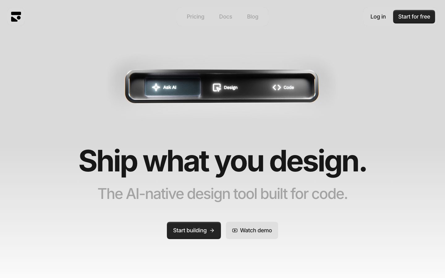
A stark, near-monochrome product-marketing surface for an AI-native design tool — light-gray canvas, oversized black Inter headlines with aggressive negative tracking, soft 24px cards with no shadow, and a single glossy dark "device" pill as the hero artifact. The voice is engineered-minimal: nearly all type and chrome is grayscale, the only true color is a blue focus ring, and brand voltage comes from scale (a 96px headline) and from one photoreal dark hardware-style hero element rather than from accent color.
---
version: alpha
name: Subframe-design-analysis
description: "A stark, near-monochrome product-marketing surface for an AI-native design tool — light-gray canvas, oversized black Inter headlines with aggressive negative tracking, soft 24px cards with no shadow, and a single glossy dark \"device\" pill as the hero artifact. The voice is engineered-minimal: nearly all type and chrome is grayscale, the only true color is a blue focus ring, and brand voltage comes from scale (a 96px headline) and from one photoreal dark hardware-style hero element rather than from accent color."

colors:
  primary: "#000000"
  ink: "#000000"
  ink-soft: "#171717"
  ink-darker: "#1c1c1c"
  surface-dark: "#242424"
  neutral-700: "#404040"
  body: "#5c5c5c"
  muted-strong: "#737373"
  muted: "#a3a3a3"
  muted-cool: "#9ca3af"
  hairline-cool-strong: "#d1d5db"
  hairline: "#d4d4d4"
  surface-soft: "#e6e6e6"
  hairline-soft: "#e5e5e5"
  hairline-cool: "#e5e7eb"
  surface: "#ededed"
  surface-card: "#f5f5f5"
  canvas-soft: "#fafafa"
  canvas: "#ffffff"
  slate: "#374151"
  ink-blue: "#111827"
  focus-ring: "#3e63dd"
  on-primary: "#ffffff"
  on-dark: "#ffffff"

typography:
  display:
    fontFamily: "Inter, sans-serif"
    fontSize: 96px
    fontWeight: 700
    lineHeight: 1.0
    letterSpacing: -4.8px
  subhead:
    fontFamily: "Inter, sans-serif"
    fontSize: 48px
    fontWeight: 500
    lineHeight: 1.125
    letterSpacing: -2.4px
  heading:
    fontFamily: "Inter, sans-serif"
    fontSize: 24px
    fontWeight: 700
    lineHeight: 1.167
    letterSpacing: -1.2px
  label:
    fontFamily: "Inter, sans-serif"
    fontSize: 12px
    fontWeight: 500
    lineHeight: 1.333
    letterSpacing: -0.06px
  button:
    fontFamily: "Inter, sans-serif"
    fontSize: 12px
    fontWeight: 500
    lineHeight: 1.333
    letterSpacing: -0.06px

rounded:
  xs: 3px
  sm: 4px
  lg: 16px
  xl: 24px
  pill: 9999px

spacing:
  xxs: 4px
  micro: 6px
  xs: 8px
  s: 12px
  sm: 16px
  ml: 20px
  md: 24px
  lg: 32px
  xl: 48px
  xxl: 64px
  huge: 96px
  section: 128px
  section-xl: 192px

components:
  button-primary:
    backgroundColor: "{colors.primary}"
    textColor: "{colors.on-primary}"
    typography: "{typography.button}"
    rounded: "{rounded.lg}"
    padding: 0px 16px
  button-secondary:
    backgroundColor: "{colors.surface-card}"
    textColor: "{colors.ink}"
    typography: "{typography.button}"
    rounded: "{rounded.lg}"
    padding: 0px 16px
  nav-bar:
    backgroundColor: transparent
    textColor: "{colors.muted}"
    typography: "{typography.label}"
  nav-pill-group:
    backgroundColor: "{colors.canvas-soft}"
    textColor: "{colors.muted}"
    typography: "{typography.label}"
    rounded: "{rounded.pill}"
    padding: 16px
  card:
    backgroundColor: "{colors.surface-card}"
    textColor: "{colors.ink}"
    rounded: "{rounded.xl}"
  hero-pill-device:
    backgroundColor: "{colors.ink-soft}"
    textColor: "{colors.on-dark}"
    rounded: "{rounded.pill}"
  logo-mark:
    backgroundColor: "{colors.canvas}"
    textColor: "{colors.ink}"
    rounded: "{rounded.lg}"
---

## Overview

Subframe's marketing surface is an engineered-minimal, near-monochrome interface for an "AI-native design tool built for code." The page sits on a light, faintly gradiented gray canvas (between `{colors.surface}` — #ededed and `{colors.canvas}` — #ffffff) and is driven almost entirely by grayscale: black ink headlines (`{colors.ink}` — #000000), gray secondary text (`{colors.muted}` — #a3a3a3), and soft-gray cards (`{colors.surface-card}` — #f5f5f5). There is no decorative accent color anywhere in the layout — the only chromatic moment measured is a blue focus ring (`{colors.focus-ring}` — #3e63dd, derived from a measured focus box-shadow).

The type voice is single-family: **Inter** for everything, used at extreme contrast of scale. The hero headline measures 96px / weight 700 with very aggressive **-4.8px** letter-spacing — tight, condensed, confident. The subhead is also large (48px / weight 500, -2.4px tracking). Below those two display tiers, the system drops sharply to a 12px label/nav/button tier — there is almost no mid-size body copy on the landing surface. Brand voltage is created entirely by this scale jump plus a single glossy dark "device pill" floating above the headline.

That hero pill — a black, hardware-styled bar showing three product modes ("Ask AI / Design / Code") — is the one place with real depth: it carries the only non-flat shadow in the system (a layered inset highlight/shadow that reads as physical material). Everything else is flat: cards have `shadow: none`, the nav is transparent, and depth is implied by tone, not elevation.

**Key Characteristics:**
- Light grayscale canvas with pure-black headlines and CTAs (`{colors.primary}` — #000000). The system is monochrome — no brand accent in the layout.
- Single typeface: **Inter** across all roles, weights 500 and 700 only.
- Extreme display scale + tracking: 96px / -4.8px headline, 48px / -2.4px subhead. Tight negative letter-spacing is the brand signature.
- Soft, generous rounding: `{rounded.xl}` (24px) on cards, `{rounded.lg}` (16px) on buttons, `{rounded.pill}` on the nav container and the hero device.
- Flat by default — cards and nav carry no shadow. The hero device pill is the lone exception with a glossy inset-material shadow.
- Black primary button (`{component.button-primary}`), light-gray secondary button (`{component.button-secondary}`) — both pill-soft at 16px radius.
- The brand mark is a small black logo glyph in a rounded white tile (`{component.logo-mark}`).

## Colors

Subframe is a grayscale system. The palette below is almost entirely neutral ramps; cool-gray tones (`#e5e7eb`, `#9ca3af`, `#d1d5db`, `#374151`, `#111827`) appear at low frequency and likely originate from embedded product-UI fragments rather than the marketing chrome itself.

### Ink & Text
- **Ink** (`{colors.ink}` — #000000): All display headlines, primary button text-on-light, the logo glyph. The dominant max-contrast color (measured highest frequency).
- **Ink Soft** (`{colors.ink-soft}` — #171717): Near-black surface for the hero device pill and dark chrome.
- **Body** (`{colors.body}` — #5c5c5c): Mid-gray running text.
- **Muted Strong** (`{colors.muted-strong}` — #737373): Secondary labels.
- **Muted** (`{colors.muted}` — #a3a3a3): The subhead "The AI-native design tool built for code." and inactive nav links — the system's signature low-contrast gray.
- **Muted Cool** (`{colors.muted-cool}` — #9ca3af): A cool-gray text tone seen in product fragments.

### Surface
- **Canvas** (`{colors.canvas}` — #ffffff): The base white the gradient resolves toward.
- **Canvas Soft** (`{colors.canvas-soft}` — #fafafa): Nav-pill container fill, barely-off-white panels.
- **Surface Card** (`{colors.surface-card}` — #f5f5f5): Card fills and the light secondary button.
- **Surface** (`{colors.surface}` — #ededed): The top-of-page gray the hero sits on.
- **Surface Soft** (`{colors.surface-soft}` — #e6e6e6): Mid-gray panel tone.
- **Surface Dark** (`{colors.surface-dark}` — #242424) / **Ink Darker** (`{colors.ink-darker}` — #1c1c1c): Dark chrome bands inside the hero device.
- **Neutral 700** (`{colors.neutral-700}` — #404040): Deep-gray detail tone.

### Hairlines
- **Hairline** (`{colors.hairline}` — #d4d4d4), **Hairline Soft** (`{colors.hairline-soft}` — #e5e5e5), **Hairline Cool** (`{colors.hairline-cool}` — #e5e7eb), **Hairline Cool Strong** (`{colors.hairline-cool-strong}` — #d1d5db): The 1px border/divider tones. The cool variants come from embedded product UI.

### Cool / Embedded
- **Slate** (`{colors.slate}` — #374151) and **Ink Blue** (`{colors.ink-blue}` — #111827): Low-frequency cool-gray-blue tones, flagged by the analyzer as "accent" but functionally near-neutral — almost certainly from product-UI fragments, not marketing chrome.

### Inverse & Accent
- **On Primary / On Dark** (`{colors.on-primary}` / `{colors.on-dark}` — #ffffff): Text on the black button and the dark hero device.
- **Focus Ring** (`{colors.focus-ring}` — #3e63dd): The only saturated color in the system. Derived from a measured focus box-shadow (`rgb(62, 99, 221)`); used as a 2px focus outline on interactive elements.

## Typography

### Font Family
The system runs **Inter** for every role — display, subhead, heading, label, and button. Inter is open-source, so it ships as-is with no substitution required; the fallback stack is `Inter, -apple-system, BlinkMacSystemFont, "Segoe UI", sans-serif`. Subframe uses only two weights: **500** (medium) and **700** (bold).

### Hierarchy

| Token | Size | Weight | Line Height | Letter Spacing | Use |
|---|---|---|---|---|---|
| `{typography.display}` | 96px | 700 | 1.0 | -4.8px | Hero headline ("Ship what you design.") |
| `{typography.subhead}` | 48px | 500 | 1.125 | -2.4px | Hero subhead ("The AI-native design tool built for code.") |
| `{typography.heading}` | 24px | 700 | 1.167 | -1.2px | Section / card headings |
| `{typography.label}` | 12px | 500 | 1.333 | -0.06px | Nav links, eyebrow labels |
| `{typography.button}` | 12px | 500 | 1.333 | -0.06px | Button labels |

### Principles
The defining trait is **aggressive negative letter-spacing that scales with size** — roughly -0.05em across the display range (96px → -4.8px, 48px → -2.4px, 24px → -1.2px). The larger the type, the tighter the tracking. Headlines read as condensed and architectural. Weight is binary: 700 for headlines/headings, 500 for everything supporting.

There is a deliberate scale chasm — the system jumps from a 48px subhead straight down to a 12px label/button tier with almost nothing in between on the landing surface. This makes the hero feel enormous and the UI chrome feel quiet.

### Note on Font Substitutes
Inter is open-source (SIL Open License) and ships directly — no substitution needed. If unavailable, the closest fallbacks are the system UI stack at matching weights with -0.05em tracking applied to the display tier to preserve the condensed signature.

## Layout

### Spacing System
- **Base unit:** 4px, with a frequent 8px step (the highest-frequency measured value).
- **Tokens:** `{spacing.xxs}` 4px · `{spacing.micro}` 6px · `{spacing.xs}` 8px · `{spacing.s}` 12px · `{spacing.sm}` 16px · `{spacing.ml}` 20px · `{spacing.md}` 24px · `{spacing.lg}` 32px · `{spacing.xl}` 48px · `{spacing.xxl}` 64px · `{spacing.huge}` 96px · `{spacing.section}` 128px · `{spacing.section-xl}` 192px.
- **Micro rhythm:** 6px and 8px dominate component-internal spacing (nav-pill padding, button gaps).
- **Section rhythm:** 96px / 128px / 192px carry the large vertical gaps between hero, logo strip, and content bands.

### Grid & Container
- Hero content is centered single-column: device pill → 96px headline → 48px subhead → button row, all axis-centered.
- A horizontal logo strip (Shopify, Octave, Gem, etc.) sits below the hero as a faint grayscale row.
- Lower bands present large centered `{component.card}` surfaces (24px radius) holding product artifacts.

### Whitespace Philosophy
Whitespace is abundant and used as the primary compositional tool. With section gaps reaching 128–192px and a near-empty grayscale canvas, the layout lets the single oversized headline and the one dark device pill carry the entire page. Restraint is the point: no competing color, no dense lists, generous air around the hero.

## Elevation & Depth

| Level | Treatment | Use |
|---|---|---|
| Flat | `box-shadow: none` | Cards, nav, buttons, page bands — the system default |
| Material pill | Layered inset highlight + shadow (`rgba(255,255,255,0.25) 0 4px 4px -2px inset`, `rgba(0,0,0,0.25) 0 -4px 4px -2px inset`, `rgba(255,255,255,0.1) -2px 0 2px`) | The hero device pill only — reads as glossy physical hardware |
| Focus | `0 0 0 2px {colors.focus-ring}` outline (derived from measured focus shadow) | Keyboard focus on interactive elements |

The elevation philosophy is **flat-with-one-exception**. Nearly everything is shadowless and relies on tone separation against the gray canvas. The single hero device pill breaks the rule with a rich inset-material shadow that simulates a beveled, lit hardware surface — making it the unmistakable focal point.

### Decorative Depth
- The hero pill's gloss/bevel is achieved entirely through the inset box-shadow stack above, not through imagery.
- The faint top-to-bottom canvas gradient (gray → white) provides subtle ambient depth behind the hero without any explicit shadow.

## Shapes

### Border Radius Scale

| Token | Value | Use |
|---|---|---|
| `{rounded.xs}` | 3px | Smallest detail elements (rare) |
| `{rounded.sm}` | 4px | Small inline chrome |
| `{rounded.lg}` | 16px | Buttons (primary + secondary), logo-mark tile |
| `{rounded.xl}` | 24px | Cards and large content surfaces |
| `{rounded.pill}` | 9999px | Nav-pill container, hero device pill |

Radius is bimodal: tiny (3–4px) detail values, then a jump to the generous 16/24px family that defines the soft modern look, plus full-pill for the nav wrapper and hero device. There is no measured mid-range (8–12px) radius.

### Photography / Artifact Geometry
The hero artifact is a horizontal pill (`{rounded.pill}`) rendered as a glossy dark device. Product-screenshot artifacts sit inside `{rounded.xl}` (24px) cards. The brand glyph occupies a small rounded white tile (`{rounded.lg}`).

## Components

### Navigation

**`nav-bar`** — Transparent top bar over the gray canvas. Center cluster ("Pricing / Docs / Blog") in `{typography.label}` (Inter 12px / 500) colored `{colors.muted}`; right cluster holds "Log in" and a "Start for free" `{component.button-primary}`. No background, no shadow.

**`nav-pill-group`** — A soft, near-white pill container (`{colors.canvas-soft}`, `{rounded.pill}`, 16px padding) wrapping the center nav links. The pill-wrapper around grouped links is a recurring Subframe motif (it reappears as the three-mode hero device).

**`logo-mark`** — The Subframe brand glyph: a black mark inside a rounded white tile, `{rounded.lg}` (16px), `{colors.canvas}` background, sits top-left.

### Buttons

**`button-primary`** — The black CTA ("Start for free", "Start building"). Background `{colors.primary}` (#000000), text `{colors.on-primary}`, type `{typography.button}` (Inter 12px / 500), rounded `{rounded.lg}` (16px), horizontal padding 16px (`padding: 0px 16px`; vertical height not measured — see Known Gaps).

**`button-secondary`** — The light gray CTA ("Watch demo", "Log in"). Background `{colors.surface-card}` (#f5f5f5), text `{colors.ink}`, type `{typography.button}`, rounded `{rounded.lg}`, padding 0px 16px. Often paired to the right of the primary button.

### Cards & Surfaces

**`card`** — The large rounded content surface holding product artifacts. Background `{colors.surface-card}` (#f5f5f5), rounded `{rounded.xl}` (24px), `shadow: none`. Used for centered product-screenshot blocks below the hero.

**`hero-pill-device`** — The signature hero artifact: a horizontal black device pill showing three product modes ("Ask AI / Design / Code"). Background `{colors.ink-soft}` (#171717), text `{colors.on-dark}`, rounded `{rounded.pill}`. Carries the only material shadow in the system (layered inset highlight + shadow that reads as glossy hardware). It is the page's focal element.

## Do's and Don'ts

### Do
- Keep the system grayscale. Reserve `{colors.primary}` (#000000) for headlines and the primary CTA; let gray (`{colors.muted}`) carry secondary text.
- Use Inter at only weight 500 and 700. The weight pairing is the whole type personality.
- Apply tight negative tracking that scales with size (~-0.05em): 96px → -4.8px, 48px → -2.4px, 24px → -1.2px. The condensed display is the brand signature.
- Lean on whitespace and scale for hierarchy — a 96px headline against a near-empty canvas does the work no accent color would.
- Keep cards flat (`shadow: none`); separate them from the canvas with tone, not elevation.
- Reserve the glossy inset shadow exclusively for the hero device pill. It earns its depth by being the only thing with depth.
- Use `{rounded.lg}` (16px) for buttons and `{rounded.xl}` (24px) for cards; `{rounded.pill}` for the nav wrapper and device.

### Don't
- Don't introduce a brand accent color into the marketing chrome — the only saturated value is the blue focus ring (`{colors.focus-ring}`), and it belongs to focus states only.
- Don't add shadows to cards or buttons. Flat is the default.
- Don't set display type without negative tracking — loose-tracked headlines read as off-brand.
- Don't introduce a third Inter weight. Stay at 500 / 700.
- Don't put body copy in the 96px or 48px tiers — those are display-only; supporting text lives at the 12px label tier (or a mid-size body that should be added — see Known Gaps).

## Responsive Behavior

### Breakpoints
Breakpoints were not directly measured. From the two captured renders (full-width landing and a narrow capture), the following behavior is inferred:

| Name | Width | Key Changes (inferred) |
|---|---|---|
| Mobile | < 768px | Hero display scales down from 96px; device pill shrinks but stays centered; buttons stack or stay inline; nav likely collapses |
| Tablet | 768–1024px | Centered single-column hero retained; logo strip wraps |
| Desktop | > 1024px | Full 96px headline, centered hero, horizontal logo strip |

### Touch Targets
- `{component.button-primary}` / `{component.button-secondary}` use 16px horizontal padding; total height was not measured, so WCAG 44px conformance is unverified (see Known Gaps).
- Nav links sit inside the `{component.nav-pill-group}` with 16px padding, which enlarges effective tap area.

### Collapsing Strategy
- The hero is already a centered single column, so it carries to mobile with minimal restructuring beyond scaling the display headline.
- The logo strip wraps / reduces logos on narrow widths.
- Large `{component.card}` surfaces resize while retaining their 24px radius.

## Iteration Guide

1. Focus on ONE component at a time. Reference its YAML key directly (`{component.button-primary}`, `{component.hero-pill-device}`).
2. Variants (`-active`, `-disabled`, `-focused`) belong as separate `components:` entries.
3. Use `{token.refs}` everywhere — never inline a hex into a component.
4. Never document hover. Default and Active/Pressed states only.
5. Keep the palette grayscale; the only saturated token is `{colors.focus-ring}` and it is for focus states.
6. Preserve the scale-driven hierarchy: bigger Inter before any added color.
7. The glossy inset shadow is reserved for the hero device — don't spread material depth to other surfaces.

## Known Gaps

- **Button height / vertical padding** is not captured — only horizontal padding (`0px 16px`) was measured. The 0px vertical value implies height is set by line-height or a fixed height not extracted; touch-target conformance is therefore unverified.
- **No mid-size body text token** was measured. The analyzer's "body" role resolved to the 48px subhead, not paragraph copy. A true reading-size body style (likely ~14–16px Inter) almost certainly exists but was not extracted; do not invent its values.
- **Active/pressed and disabled button states** were not captured — only default fills are documented.
- **Focus-ring color** (`#3e63dd`) is *derived* from a measured focus box-shadow (`rgb(62, 99, 221)`), not a directly catalogued color token; treat it as focus-only.
- **Cool-gray tones** (`#e5e7eb`, `#9ca3af`, `#d1d5db`, `#374151`, `#111827`) appear at low frequency and are likely from embedded product-UI fragments rather than the marketing system; their exact roles are unconfirmed.
- **Breakpoints, grid columns, and max content width** were not measured; responsive behavior is inferred from two screenshots.
- **The hero device's internal three-mode UI** ("Ask AI / Design / Code"), the logo-strip carousel, and any animation/transition timings are out of scope.
- **Secondary surface / footer specs** are not present in the captured data — the lower page bands resolved mostly as empty canvas in the narrow capture.

<!-- Documented by duply · real-world design systems as ready-to-use DESIGN.md for AI coding agents · https://duply.ai/subframe/design-md -->
Color Palette
Accent
Neutrals
Typography
display96px · 700 · 1
The quick brown fox jumpssubhead48px · 500 · 1.125
The quick brown fox jumpsheading24px · 700 · 1.167
The quick brown fox jumpslabel12px · 500 · 1.333
The quick brown fox jumpsbutton12px · 500 · 1.333
The quick brown fox jumpsSpacing & Shape
Spacing
| Name | Value | Preview |
|---|---|---|
| xxs | 4px | |
| micro | 6px | |
| xs | 8px | |
| s | 12px | |
| sm | 16px | |
| ml | 20px | |
| md | 24px | |
| lg | 32px | |
| xl | 48px | |
| xxl | 64px | |
| huge | 96px | |
| section | 128px | |
| section-xl | 192px |
Border Radius
| Name | Value | Preview |
|---|---|---|
| xs | 3px | |
| sm | 4px | |
| lg | 16px | |
| xl | 24px | |
| pill | 9999px |
More like this


---
version: alpha
name: Subframe-design-analysis
description: "A stark, near-monochrome product-marketing surface for an AI-native design tool — light-gray canvas, oversized black Inter headlines with aggressive negative tracking, soft 24px cards with no shadow, and a single glossy dark \"device\" pill as the hero artifact. The voice is engineered-minimal: nearly all type and chrome is grayscale, the only true color is a blue focus ring, and brand voltage comes from scale (a 96px headline) and from one photoreal dark hardware-style hero element rather than from accent color."

colors:
  primary: "#000000"
  ink: "#000000"
  ink-soft: "#171717"
  ink-darker: "#1c1c1c"
  surface-dark: "#242424"
  neutral-700: "#404040"
  body: "#5c5c5c"
  muted-strong: "#737373"
  muted: "#a3a3a3"
  muted-cool: "#9ca3af"
  hairline-cool-strong: "#d1d5db"
  hairline: "#d4d4d4"
  surface-soft: "#e6e6e6"
  hairline-soft: "#e5e5e5"
  hairline-cool: "#e5e7eb"
  surface: "#ededed"
  surface-card: "#f5f5f5"
  canvas-soft: "#fafafa"
  canvas: "#ffffff"
  slate: "#374151"
  ink-blue: "#111827"
  focus-ring: "#3e63dd"
  on-primary: "#ffffff"
  on-dark: "#ffffff"

typography:
  display:
    fontFamily: "Inter, sans-serif"
    fontSize: 96px
    fontWeight: 700
    lineHeight: 1.0
    letterSpacing: -4.8px
  subhead:
    fontFamily: "Inter, sans-serif"
    fontSize: 48px
    fontWeight: 500
    lineHeight: 1.125
    letterSpacing: -2.4px
  heading:
    fontFamily: "Inter, sans-serif"
    fontSize: 24px
    fontWeight: 700
    lineHeight: 1.167
    letterSpacing: -1.2px
  label:
    fontFamily: "Inter, sans-serif"
    fontSize: 12px
    fontWeight: 500
    lineHeight: 1.333
    letterSpacing: -0.06px
  button:
    fontFamily: "Inter, sans-serif"
    fontSize: 12px
    fontWeight: 500
    lineHeight: 1.333
    letterSpacing: -0.06px

rounded:
  xs: 3px
  sm: 4px
  lg: 16px
  xl: 24px
  pill: 9999px

spacing:
  xxs: 4px
  micro: 6px
  xs: 8px
  s: 12px
  sm: 16px
  ml: 20px
  md: 24px
  lg: 32px
  xl: 48px
  xxl: 64px
  huge: 96px
  section: 128px
  section-xl: 192px

components:
  button-primary:
    backgroundColor: "{colors.primary}"
    textColor: "{colors.on-primary}"
    typography: "{typography.button}"
    rounded: "{rounded.lg}"
    padding: 0px 16px
  button-secondary:
    backgroundColor: "{colors.surface-card}"
    textColor: "{colors.ink}"
    typography: "{typography.button}"
    rounded: "{rounded.lg}"
    padding: 0px 16px
  nav-bar:
    backgroundColor: transparent
    textColor: "{colors.muted}"
    typography: "{typography.label}"
  nav-pill-group:
    backgroundColor: "{colors.canvas-soft}"
    textColor: "{colors.muted}"
    typography: "{typography.label}"
    rounded: "{rounded.pill}"
    padding: 16px
  card:
    backgroundColor: "{colors.surface-card}"
    textColor: "{colors.ink}"
    rounded: "{rounded.xl}"
  hero-pill-device:
    backgroundColor: "{colors.ink-soft}"
    textColor: "{colors.on-dark}"
    rounded: "{rounded.pill}"
  logo-mark:
    backgroundColor: "{colors.canvas}"
    textColor: "{colors.ink}"
    rounded: "{rounded.lg}"
---

## Overview

Subframe's marketing surface is an engineered-minimal, near-monochrome interface for an "AI-native design tool built for code." The page sits on a light, faintly gradiented gray canvas (between `{colors.surface}` — #ededed and `{colors.canvas}` — #ffffff) and is driven almost entirely by grayscale: black ink headlines (`{colors.ink}` — #000000), gray secondary text (`{colors.muted}` — #a3a3a3), and soft-gray cards (`{colors.surface-card}` — #f5f5f5). There is no decorative accent color anywhere in the layout — the only chromatic moment measured is a blue focus ring (`{colors.focus-ring}` — #3e63dd, derived from a measured focus box-shadow).

The type voice is single-family: **Inter** for everything, used at extreme contrast of scale. The hero headline measures 96px / weight 700 with very aggressive **-4.8px** letter-spacing — tight, condensed, confident. The subhead is also large (48px / weight 500, -2.4px tracking). Below those two display tiers, the system drops sharply to a 12px label/nav/button tier — there is almost no mid-size body copy on the landing surface. Brand voltage is created entirely by this scale jump plus a single glossy dark "device pill" floating above the headline.

That hero pill — a black, hardware-styled bar showing three product modes ("Ask AI / Design / Code") — is the one place with real depth: it carries the only non-flat shadow in the system (a layered inset highlight/shadow that reads as physical material). Everything else is flat: cards have `shadow: none`, the nav is transparent, and depth is implied by tone, not elevation.

**Key Characteristics:**
- Light grayscale canvas with pure-black headlines and CTAs (`{colors.primary}` — #000000). The system is monochrome — no brand accent in the layout.
- Single typeface: **Inter** across all roles, weights 500 and 700 only.
- Extreme display scale + tracking: 96px / -4.8px headline, 48px / -2.4px subhead. Tight negative letter-spacing is the brand signature.
- Soft, generous rounding: `{rounded.xl}` (24px) on cards, `{rounded.lg}` (16px) on buttons, `{rounded.pill}` on the nav container and the hero device.
- Flat by default — cards and nav carry no shadow. The hero device pill is the lone exception with a glossy inset-material shadow.
- Black primary button (`{component.button-primary}`), light-gray secondary button (`{component.button-secondary}`) — both pill-soft at 16px radius.
- The brand mark is a small black logo glyph in a rounded white tile (`{component.logo-mark}`).

## Colors

Subframe is a grayscale system. The palette below is almost entirely neutral ramps; cool-gray tones (`#e5e7eb`, `#9ca3af`, `#d1d5db`, `#374151`, `#111827`) appear at low frequency and likely originate from embedded product-UI fragments rather than the marketing chrome itself.

### Ink & Text
- **Ink** (`{colors.ink}` — #000000): All display headlines, primary button text-on-light, the logo glyph. The dominant max-contrast color (measured highest frequency).
- **Ink Soft** (`{colors.ink-soft}` — #171717): Near-black surface for the hero device pill and dark chrome.
- **Body** (`{colors.body}` — #5c5c5c): Mid-gray running text.
- **Muted Strong** (`{colors.muted-strong}` — #737373): Secondary labels.
- **Muted** (`{colors.muted}` — #a3a3a3): The subhead "The AI-native design tool built for code." and inactive nav links — the system's signature low-contrast gray.
- **Muted Cool** (`{colors.muted-cool}` — #9ca3af): A cool-gray text tone seen in product fragments.

### Surface
- **Canvas** (`{colors.canvas}` — #ffffff): The base white the gradient resolves toward.
- **Canvas Soft** (`{colors.canvas-soft}` — #fafafa): Nav-pill container fill, barely-off-white panels.
- **Surface Card** (`{colors.surface-card}` — #f5f5f5): Card fills and the light secondary button.
- **Surface** (`{colors.surface}` — #ededed): The top-of-page gray the hero sits on.
- **Surface Soft** (`{colors.surface-soft}` — #e6e6e6): Mid-gray panel tone.
- **Surface Dark** (`{colors.surface-dark}` — #242424) / **Ink Darker** (`{colors.ink-darker}` — #1c1c1c): Dark chrome bands inside the hero device.
- **Neutral 700** (`{colors.neutral-700}` — #404040): Deep-gray detail tone.

### Hairlines
- **Hairline** (`{colors.hairline}` — #d4d4d4), **Hairline Soft** (`{colors.hairline-soft}` — #e5e5e5), **Hairline Cool** (`{colors.hairline-cool}` — #e5e7eb), **Hairline Cool Strong** (`{colors.hairline-cool-strong}` — #d1d5db): The 1px border/divider tones. The cool variants come from embedded product UI.

### Cool / Embedded
- **Slate** (`{colors.slate}` — #374151) and **Ink Blue** (`{colors.ink-blue}` — #111827): Low-frequency cool-gray-blue tones, flagged by the analyzer as "accent" but functionally near-neutral — almost certainly from product-UI fragments, not marketing chrome.

### Inverse & Accent
- **On Primary / On Dark** (`{colors.on-primary}` / `{colors.on-dark}` — #ffffff): Text on the black button and the dark hero device.
- **Focus Ring** (`{colors.focus-ring}` — #3e63dd): The only saturated color in the system. Derived from a measured focus box-shadow (`rgb(62, 99, 221)`); used as a 2px focus outline on interactive elements.

## Typography

### Font Family
The system runs **Inter** for every role — display, subhead, heading, label, and button. Inter is open-source, so it ships as-is with no substitution required; the fallback stack is `Inter, -apple-system, BlinkMacSystemFont, "Segoe UI", sans-serif`. Subframe uses only two weights: **500** (medium) and **700** (bold).

### Hierarchy

| Token | Size | Weight | Line Height | Letter Spacing | Use |
|---|---|---|---|---|---|
| `{typography.display}` | 96px | 700 | 1.0 | -4.8px | Hero headline ("Ship what you design.") |
| `{typography.subhead}` | 48px | 500 | 1.125 | -2.4px | Hero subhead ("The AI-native design tool built for code.") |
| `{typography.heading}` | 24px | 700 | 1.167 | -1.2px | Section / card headings |
| `{typography.label}` | 12px | 500 | 1.333 | -0.06px | Nav links, eyebrow labels |
| `{typography.button}` | 12px | 500 | 1.333 | -0.06px | Button labels |

### Principles
The defining trait is **aggressive negative letter-spacing that scales with size** — roughly -0.05em across the display range (96px → -4.8px, 48px → -2.4px, 24px → -1.2px). The larger the type, the tighter the tracking. Headlines read as condensed and architectural. Weight is binary: 700 for headlines/headings, 500 for everything supporting.

There is a deliberate scale chasm — the system jumps from a 48px subhead straight down to a 12px label/button tier with almost nothing in between on the landing surface. This makes the hero feel enormous and the UI chrome feel quiet.

### Note on Font Substitutes
Inter is open-source (SIL Open License) and ships directly — no substitution needed. If unavailable, the closest fallbacks are the system UI stack at matching weights with -0.05em tracking applied to the display tier to preserve the condensed signature.

## Layout

### Spacing System
- **Base unit:** 4px, with a frequent 8px step (the highest-frequency measured value).
- **Tokens:** `{spacing.xxs}` 4px · `{spacing.micro}` 6px · `{spacing.xs}` 8px · `{spacing.s}` 12px · `{spacing.sm}` 16px · `{spacing.ml}` 20px · `{spacing.md}` 24px · `{spacing.lg}` 32px · `{spacing.xl}` 48px · `{spacing.xxl}` 64px · `{spacing.huge}` 96px · `{spacing.section}` 128px · `{spacing.section-xl}` 192px.
- **Micro rhythm:** 6px and 8px dominate component-internal spacing (nav-pill padding, button gaps).
- **Section rhythm:** 96px / 128px / 192px carry the large vertical gaps between hero, logo strip, and content bands.

### Grid & Container
- Hero content is centered single-column: device pill → 96px headline → 48px subhead → button row, all axis-centered.
- A horizontal logo strip (Shopify, Octave, Gem, etc.) sits below the hero as a faint grayscale row.
- Lower bands present large centered `{component.card}` surfaces (24px radius) holding product artifacts.

### Whitespace Philosophy
Whitespace is abundant and used as the primary compositional tool. With section gaps reaching 128–192px and a near-empty grayscale canvas, the layout lets the single oversized headline and the one dark device pill carry the entire page. Restraint is the point: no competing color, no dense lists, generous air around the hero.

## Elevation & Depth

| Level | Treatment | Use |
|---|---|---|
| Flat | `box-shadow: none` | Cards, nav, buttons, page bands — the system default |
| Material pill | Layered inset highlight + shadow (`rgba(255,255,255,0.25) 0 4px 4px -2px inset`, `rgba(0,0,0,0.25) 0 -4px 4px -2px inset`, `rgba(255,255,255,0.1) -2px 0 2px`) | The hero device pill only — reads as glossy physical hardware |
| Focus | `0 0 0 2px {colors.focus-ring}` outline (derived from measured focus shadow) | Keyboard focus on interactive elements |

The elevation philosophy is **flat-with-one-exception**. Nearly everything is shadowless and relies on tone separation against the gray canvas. The single hero device pill breaks the rule with a rich inset-material shadow that simulates a beveled, lit hardware surface — making it the unmistakable focal point.

### Decorative Depth
- The hero pill's gloss/bevel is achieved entirely through the inset box-shadow stack above, not through imagery.
- The faint top-to-bottom canvas gradient (gray → white) provides subtle ambient depth behind the hero without any explicit shadow.

## Shapes

### Border Radius Scale

| Token | Value | Use |
|---|---|---|
| `{rounded.xs}` | 3px | Smallest detail elements (rare) |
| `{rounded.sm}` | 4px | Small inline chrome |
| `{rounded.lg}` | 16px | Buttons (primary + secondary), logo-mark tile |
| `{rounded.xl}` | 24px | Cards and large content surfaces |
| `{rounded.pill}` | 9999px | Nav-pill container, hero device pill |

Radius is bimodal: tiny (3–4px) detail values, then a jump to the generous 16/24px family that defines the soft modern look, plus full-pill for the nav wrapper and hero device. There is no measured mid-range (8–12px) radius.

### Photography / Artifact Geometry
The hero artifact is a horizontal pill (`{rounded.pill}`) rendered as a glossy dark device. Product-screenshot artifacts sit inside `{rounded.xl}` (24px) cards. The brand glyph occupies a small rounded white tile (`{rounded.lg}`).

## Components

### Navigation

**`nav-bar`** — Transparent top bar over the gray canvas. Center cluster ("Pricing / Docs / Blog") in `{typography.label}` (Inter 12px / 500) colored `{colors.muted}`; right cluster holds "Log in" and a "Start for free" `{component.button-primary}`. No background, no shadow.

**`nav-pill-group`** — A soft, near-white pill container (`{colors.canvas-soft}`, `{rounded.pill}`, 16px padding) wrapping the center nav links. The pill-wrapper around grouped links is a recurring Subframe motif (it reappears as the three-mode hero device).

**`logo-mark`** — The Subframe brand glyph: a black mark inside a rounded white tile, `{rounded.lg}` (16px), `{colors.canvas}` background, sits top-left.

### Buttons

**`button-primary`** — The black CTA ("Start for free", "Start building"). Background `{colors.primary}` (#000000), text `{colors.on-primary}`, type `{typography.button}` (Inter 12px / 500), rounded `{rounded.lg}` (16px), horizontal padding 16px (`padding: 0px 16px`; vertical height not measured — see Known Gaps).

**`button-secondary`** — The light gray CTA ("Watch demo", "Log in"). Background `{colors.surface-card}` (#f5f5f5), text `{colors.ink}`, type `{typography.button}`, rounded `{rounded.lg}`, padding 0px 16px. Often paired to the right of the primary button.

### Cards & Surfaces

**`card`** — The large rounded content surface holding product artifacts. Background `{colors.surface-card}` (#f5f5f5), rounded `{rounded.xl}` (24px), `shadow: none`. Used for centered product-screenshot blocks below the hero.

**`hero-pill-device`** — The signature hero artifact: a horizontal black device pill showing three product modes ("Ask AI / Design / Code"). Background `{colors.ink-soft}` (#171717), text `{colors.on-dark}`, rounded `{rounded.pill}`. Carries the only material shadow in the system (layered inset highlight + shadow that reads as glossy hardware). It is the page's focal element.

## Do's and Don'ts

### Do
- Keep the system grayscale. Reserve `{colors.primary}` (#000000) for headlines and the primary CTA; let gray (`{colors.muted}`) carry secondary text.
- Use Inter at only weight 500 and 700. The weight pairing is the whole type personality.
- Apply tight negative tracking that scales with size (~-0.05em): 96px → -4.8px, 48px → -2.4px, 24px → -1.2px. The condensed display is the brand signature.
- Lean on whitespace and scale for hierarchy — a 96px headline against a near-empty canvas does the work no accent color would.
- Keep cards flat (`shadow: none`); separate them from the canvas with tone, not elevation.
- Reserve the glossy inset shadow exclusively for the hero device pill. It earns its depth by being the only thing with depth.
- Use `{rounded.lg}` (16px) for buttons and `{rounded.xl}` (24px) for cards; `{rounded.pill}` for the nav wrapper and device.

### Don't
- Don't introduce a brand accent color into the marketing chrome — the only saturated value is the blue focus ring (`{colors.focus-ring}`), and it belongs to focus states only.
- Don't add shadows to cards or buttons. Flat is the default.
- Don't set display type without negative tracking — loose-tracked headlines read as off-brand.
- Don't introduce a third Inter weight. Stay at 500 / 700.
- Don't put body copy in the 96px or 48px tiers — those are display-only; supporting text lives at the 12px label tier (or a mid-size body that should be added — see Known Gaps).

## Responsive Behavior

### Breakpoints
Breakpoints were not directly measured. From the two captured renders (full-width landing and a narrow capture), the following behavior is inferred:

| Name | Width | Key Changes (inferred) |
|---|---|---|
| Mobile | < 768px | Hero display scales down from 96px; device pill shrinks but stays centered; buttons stack or stay inline; nav likely collapses |
| Tablet | 768–1024px | Centered single-column hero retained; logo strip wraps |
| Desktop | > 1024px | Full 96px headline, centered hero, horizontal logo strip |

### Touch Targets
- `{component.button-primary}` / `{component.button-secondary}` use 16px horizontal padding; total height was not measured, so WCAG 44px conformance is unverified (see Known Gaps).
- Nav links sit inside the `{component.nav-pill-group}` with 16px padding, which enlarges effective tap area.

### Collapsing Strategy
- The hero is already a centered single column, so it carries to mobile with minimal restructuring beyond scaling the display headline.
- The logo strip wraps / reduces logos on narrow widths.
- Large `{component.card}` surfaces resize while retaining their 24px radius.

## Iteration Guide

1. Focus on ONE component at a time. Reference its YAML key directly (`{component.button-primary}`, `{component.hero-pill-device}`).
2. Variants (`-active`, `-disabled`, `-focused`) belong as separate `components:` entries.
3. Use `{token.refs}` everywhere — never inline a hex into a component.
4. Never document hover. Default and Active/Pressed states only.
5. Keep the palette grayscale; the only saturated token is `{colors.focus-ring}` and it is for focus states.
6. Preserve the scale-driven hierarchy: bigger Inter before any added color.
7. The glossy inset shadow is reserved for the hero device — don't spread material depth to other surfaces.

## Known Gaps

- **Button height / vertical padding** is not captured — only horizontal padding (`0px 16px`) was measured. The 0px vertical value implies height is set by line-height or a fixed height not extracted; touch-target conformance is therefore unverified.
- **No mid-size body text token** was measured. The analyzer's "body" role resolved to the 48px subhead, not paragraph copy. A true reading-size body style (likely ~14–16px Inter) almost certainly exists but was not extracted; do not invent its values.
- **Active/pressed and disabled button states** were not captured — only default fills are documented.
- **Focus-ring color** (`#3e63dd`) is *derived* from a measured focus box-shadow (`rgb(62, 99, 221)`), not a directly catalogued color token; treat it as focus-only.
- **Cool-gray tones** (`#e5e7eb`, `#9ca3af`, `#d1d5db`, `#374151`, `#111827`) appear at low frequency and are likely from embedded product-UI fragments rather than the marketing system; their exact roles are unconfirmed.
- **Breakpoints, grid columns, and max content width** were not measured; responsive behavior is inferred from two screenshots.
- **The hero device's internal three-mode UI** ("Ask AI / Design / Code"), the logo-strip carousel, and any animation/transition timings are out of scope.
- **Secondary surface / footer specs** are not present in the captured data — the lower page bands resolved mostly as empty canvas in the narrow capture.

<!-- Documented by duply · real-world design systems as ready-to-use DESIGN.md for AI coding agents · https://duply.ai/subframe/design-md -->