SpherePay
A precise, fintech-infrastructure landing surface anchored on pure white canvas (#ffffff) with pure-black Inter display headlines and a single electric-blue (#2970ff) call-to-action color. The system reads as engineered-and-serious — oversized 96px hero type with tight negative tracking, hard-edged square content blocks (0px radius), a deep navy band (#1f2937) that acts as a chromatic divider, and a restrained near-monochrome palette where blue is the only voltage. Brand character comes from the enormous low-weight Inter headline and the geometric color-block grid rather than from decoration.
---
version: alpha
name: SpherePay-design-analysis
description: A precise, fintech-infrastructure landing surface anchored on pure white canvas (#ffffff) with pure-black Inter display headlines and a single electric-blue (#2970ff) call-to-action color. The system reads as engineered-and-serious — oversized 96px hero type with tight negative tracking, hard-edged square content blocks (0px radius), a deep navy band (#1f2937) that acts as a chromatic divider, and a restrained near-monochrome palette where blue is the only voltage. Brand character comes from the enormous low-weight Inter headline and the geometric color-block grid rather than from decoration.
colors:
primary: "#2970ff"
primary-soft: "#cad8ff"
primary-100: "#d1e0ff"
primary-50: "#eff4ff"
accent-blue: "#3898ec"
ink: "#000000"
ink-800: "#222222"
ink-700: "#333333"
body: "#4b5563"
muted: "#9ca3af"
muted-soft: "#999999"
slate: "#5d6c7b"
hairline: "#dddddd"
hairline-soft: "#cccccc"
hairline-faint: "#c8c8c8"
canvas: "#ffffff"
surface-soft: "#f9fafb"
surface-faint: "#fafafa"
surface-dark: "#1f2937"
surface-dark-strong: "#18181b"
on-primary: "#ffffff"
on-dark: "#ffffff"
typography:
display-xl:
fontFamily: "Inter, sans-serif"
fontSize: 96px
fontWeight: 400
lineHeight: 1.0
letterSpacing: "-2.88px"
display-lg:
fontFamily: "Inter, sans-serif"
fontSize: 60px
fontWeight: 500
lineHeight: 1.1
letterSpacing: "-1.8px"
label-sm:
fontFamily: "Inter, sans-serif"
fontSize: 14px
fontWeight: 600
lineHeight: 1.5
letterSpacing: "normal"
body:
fontFamily: "Helvetica, Arial, sans-serif"
fontSize: 16px
fontWeight: 400
lineHeight: 1.25
letterSpacing: "normal"
rounded:
none: 0px
xs: 2px
sm: 4px
md: 6px
lg: 8px
xl: 14px
xxl: 16px
full: 1440px
spacing:
xxs: 4px
xs: 8px
sm: 12px
md: 16px
lg: 24px
xl: 32px
xxl: 40px
xxxl: 48px
huge: 64px
section: 128px
components:
top-nav:
backgroundColor: "{colors.canvas}"
textColor: "{colors.ink}"
typography: "{typography.body}"
shadow: "rgba(0, 0, 0, 0.05) 0px 1px 2px 0px"
button-primary:
backgroundColor: "{colors.primary}"
textColor: "{colors.on-primary}"
typography: "{typography.label-sm}"
rounded: "{rounded.md}"
button-primary-active:
backgroundColor: "{colors.accent-blue}"
textColor: "{colors.on-primary}"
rounded: "{rounded.md}"
button-secondary:
backgroundColor: "{colors.canvas}"
textColor: "{colors.ink}"
typography: "{typography.label-sm}"
rounded: "{rounded.md}"
shadow: "rgba(0, 0, 0, 0.05) 0px 1px 2px 0px"
button-icon-circular:
backgroundColor: "{colors.ink}"
textColor: "{colors.on-primary}"
rounded: "{rounded.full}"
padding: 0px
nav-link:
backgroundColor: transparent
textColor: "{colors.ink}"
typography: "{typography.body}"
text-link:
backgroundColor: transparent
textColor: "{colors.primary}"
typography: "{typography.body}"
hero-band:
backgroundColor: "{colors.canvas}"
textColor: "{colors.ink}"
typography: "{typography.display-xl}"
padding: 128px
section-dark:
backgroundColor: "{colors.surface-dark}"
textColor: "{colors.on-dark}"
typography: "{typography.display-lg}"
padding: 128px
color-block-card:
backgroundColor: "{colors.surface-soft}"
textColor: "{colors.ink}"
rounded: "{rounded.none}"
shadow: none
color-block-card-blue:
backgroundColor: "{colors.primary-soft}"
textColor: "{colors.ink}"
rounded: "{rounded.none}"
shadow: none
color-block-card-dark:
backgroundColor: "{colors.surface-dark}"
textColor: "{colors.on-dark}"
rounded: "{rounded.none}"
shadow: none
partner-logo-row:
backgroundColor: "{colors.canvas}"
textColor: "{colors.muted}"
typography: "{typography.body}"
accordion-item:
backgroundColor: "{colors.canvas}"
textColor: "{colors.ink}"
typography: "{typography.display-lg}"
rounded: "{rounded.none}"
blog-card:
backgroundColor: "{colors.canvas}"
textColor: "{colors.ink}"
typography: "{typography.body}"
rounded: "{rounded.lg}"
shadow: "rgba(0, 0, 0, 0.05) 0px 1px 2px 0px"
blog-card-thumb:
backgroundColor: "{colors.surface-soft}"
textColor: "{colors.ink}"
rounded: "{rounded.lg}"
input:
backgroundColor: "{colors.canvas}"
textColor: "{colors.ink}"
typography: "{typography.body}"
rounded: "{rounded.none}"
footer:
backgroundColor: "{colors.surface-dark-strong}"
textColor: "{colors.muted}"
typography: "{typography.body}"
padding: 64px
---
## Overview
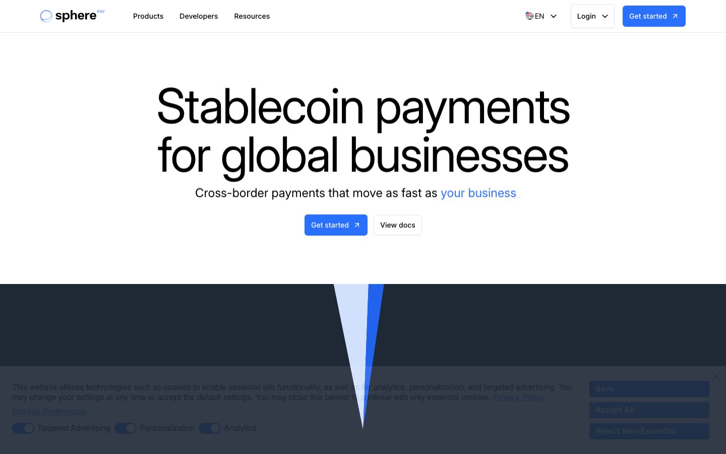
SpherePay's landing surface is a precise, fintech-infrastructure interface — pure white canvas (`{colors.canvas}` — #ffffff) carrying enormous black Inter display type (`{colors.ink}` — #000000) and a single electric-blue action color (`{colors.primary}` — #2970ff). The system reads as engineered and serious: oversized headlines, tight tracking, hard geometric edges, and a near-monochrome palette where blue is the only voltage.
The hero is the signature moment — a 96px Inter headline ("Stablecoin payments for global businesses") set at weight 400 with deeply negative letter-spacing (-2.88px). The low weight at giant size is the brand's voice: confident without shouting, technical rather than promotional. Section heads step down to a 60px Inter at weight 500 (-1.8px tracking).
Surface rhythm alternates white editorial bands with one deep navy band (`{colors.surface-dark}` — #1f2937) that slices the page near the hero and reappears behind a dotted world-map graphic lower down. Between these bands sits a hard-edged **color-block grid** — square (0px radius) quadrants in light blue (`{colors.primary-soft}` — #cad8ff), near-white (`{colors.surface-soft}` — #f9fafb), and navy. These geometric blocks, not photography, carry the visual structure.
Blue does all the action work: the primary "Get started" CTA, inline text links ("your business"), and small accent moments. Everything else is black, navy, white, and gray.
**Key Characteristics:**
- Pure white canvas with one electric-blue CTA color (`{colors.primary}` — #2970ff). The blue button is the only saturated element in the editorial flow.
- Oversized low-weight Inter display type — 96px at weight 400 with -2.88px tracking. The headline IS the design.
- Hard-edged geometry — content blocks and inputs measure 0px radius (`{rounded.none}`); the buttons soften only slightly to 6px (`{rounded.md}`).
- A single deep navy band (`{colors.surface-dark}` — #1f2937) used as a chromatic divider, with a darker near-black footer (`{colors.surface-dark-strong}` — #18181b).
- A square color-block grid in light-blue / near-white / navy quadrants — structure from geometry, not imagery.
- Restrained near-monochrome palette: black, navy, white, gray, and one blue.
- Subtle, single-level elevation — a faint `rgba(0, 0, 0, 0.05) 0px 1px 2px 0px` shadow on the nav, secondary button, and blog cards. No heavy depth.
## Colors
### Brand & Accent
- **Primary** (`{colors.primary}` — #2970ff): The single action color. The "Get started" CTA, inline text links, small accents. Sourced as the link color in the measured palette.
- **Accent Blue** (`{colors.accent-blue}` — #3898ec): A secondary blue used in interactive/embed contexts; treated as the press/alternate blue.
- **Primary Soft / 100 / 50** (`{colors.primary-soft}` — #cad8ff, `{colors.primary-100}` — #d1e0ff, `{colors.primary-50}` — #eff4ff): Pale blue fills used in the color-block grid quadrant and tinted backgrounds.
### Surface
- **Canvas** (`{colors.canvas}` — #ffffff): The dominant page floor (measured frequency 3007 — by far the most common surface).
- **Surface Soft** (`{colors.surface-soft}` — #f9fafb): Near-white block-grid quadrants and soft section fills.
- **Surface Faint** (`{colors.surface-faint}` — #fafafa): A second near-white tone used interchangeably with surface-soft.
- **Surface Dark** (`{colors.surface-dark}` — #1f2937): The deep navy divider band beneath the hero and behind the world-map graphic.
- **Surface Dark Strong** (`{colors.surface-dark-strong}` — #18181b): The near-black footer floor.
### Text
- **Ink** (`{colors.ink}` — #000000): All display headlines and primary text — max-contrast black against white.
- **Ink 800 / 700** (`{colors.ink-800}` — #222222, `{colors.ink-700}` — #333333): Slightly softened near-black tones for dense text.
- **Body** (`{colors.body}` — #4b5563): Default running-text gray.
- **Muted** (`{colors.muted}` — #9ca3af): Secondary text — sub-headings, the de-emphasized second line in section heads, footer links.
- **Muted Soft** (`{colors.muted-soft}` — #999999): Tertiary fine-print gray.
- **Slate** (`{colors.slate}` — #5d6c7b): A blue-gray used in caption / metadata contexts.
- **On Primary / On Dark** (`{colors.on-primary}` / `{colors.on-dark}` — #ffffff): Text on the blue CTA and on dark bands.
### Lines
- **Hairline** (`{colors.hairline}` — #dddddd): 1px dividers between accordion rows and table-like sections.
- **Hairline Soft** (`{colors.hairline-soft}` — #cccccc): Softer divider / faint border tone (also appears in the secondary `cccccc 0px 0px 2px 2px` glow shadow).
- **Hairline Faint** (`{colors.hairline-faint}` — #c8c8c8): The lightest border tone.
There are no measured success / warning / error semantic colors — see Known Gaps.
## Typography
### Font Family
The system runs **Inter** for all headings and a **Helvetica** stack for body copy (measured directly: `h1`/`h2`/`h3` resolve to Inter, body text resolves to Helvetica). No licensed/custom typefaces were flagged, so both are freely shippable — Inter via the open-source web font, Helvetica via the platform stack (`Helvetica, Arial, sans-serif`).
The voice lives in the display sizes: huge Inter at low weight with deep negative tracking. The boundary is functional — Inter for headlines and labels, Helvetica for running text.
### Hierarchy
| Token | Size | Weight | Line Height | Letter Spacing | Use |
|---|---|---|---|---|---|
| `{typography.display-xl}` | 96px | 400 | 1.0 | -2.88px | Hero h1 ("Stablecoin payments for global businesses") — Inter |
| `{typography.display-lg}` | 60px | 500 | 1.1 | -1.8px | Section heads ("Global by default, verifiable by design.", FAQ rows) — Inter |
| `{typography.label-sm}` | 14px | 600 | 1.5 | normal | Small bold labels, eyebrow text, button labels — Inter |
| `{typography.body}` | 16px | 400 | 1.25 | normal | Default running-text, nav, captions — Helvetica |
### Principles
The hero headline is intentionally LOW weight (400) at enormous size — the design relies on scale and tight tracking, not boldness, for impact. Section heads step up slightly to weight 500 at 60px with -1.8px tracking. Never bold the display sizes to 700 — the restraint is the point. Negative letter-spacing (-2.88px on h1, -1.8px on h2) is part of the voice; the headline reads as off-brand without it.
The second line of a section head is frequently set in `{colors.muted}` (#9ca3af) against the black first line — a two-tone heading treatment ("Global by default, verifiable by design." in black, the supporting sentence in gray).
### Note on Font Substitutes
No licensed fonts were detected. Inter is open-source and ships directly. The Helvetica body stack falls back gracefully to Arial and the system sans-serif; **Inter** at weight 400 is also a usable body substitute if a single-family stack is preferred.
## Layout
### Spacing System
- **Base unit:** 4px.
- **Tokens:** `{spacing.xxs}` 4px · `{spacing.xs}` 8px · `{spacing.sm}` 12px · `{spacing.md}` 16px · `{spacing.lg}` 24px · `{spacing.xl}` 32px · `{spacing.xxl}` 40px · `{spacing.xxxl}` 48px · `{spacing.huge}` 64px · `{spacing.section}` 128px.
- **Most frequent steps:** 12px (freq 64), 4px (freq 53), and 8px (freq 44) dominate the micro-spacing of buttons, nav items, and labels.
- **Section padding:** `{spacing.section}` (128px) — the large vertical rhythm between major bands.
- **Footer padding:** `{spacing.huge}` (64px).
### Grid & Container
- **Hero:** centered single-column with the headline spanning near full content width.
- **Color-block grid:** a 2×2 square quadrant grid of full-bleed blocks (light blue, near-white, navy).
- **Partner logos:** a single horizontal logo strip.
- **Accordion / FAQ:** full-width stacked rows separated by hairlines.
- **Blog row:** a label column on the left with two article cards on the right.
- **Footer:** a multi-column link grid (Products / Resources / Legal / Media) on the dark floor.
### Whitespace Philosophy
SpherePay uses large negative space — the 128px section rhythm and a generous hero give the giant headline room to breathe. The page is calm and deliberate: one idea per band, framed by whitespace, with the geometric color blocks providing the only dense visual mass.
## Elevation & Depth
| Level | Treatment | Use |
|---|---|---|
| Flat | No shadow, no border | Hero band, color-block grid, dark bands |
| Hairline | 1px `{colors.hairline}` (#dddddd) divider | Accordion rows, section separators |
| Subtle shadow | `rgba(0, 0, 0, 0.05) 0px 1px 2px 0px` | Top nav, secondary button, blog cards |
| Soft glow | `rgb(204, 204, 204) 0px 0px 2px 2px` | A single soft-glow treatment on one elevated element |
| Color-block contrast | Surface color does the work | The navy quadrant and dark bands separate by tone, not shadow |
The elevation philosophy is **minimal and flat** — a single faint drop shadow (`0px 1px 2px` at 0.05 alpha) does almost all the lifting. No heavy shadows, no layered depth. Color contrast (navy vs white) handles the larger structural separation.
### Decorative Depth
- A dotted world-map graphic sits inside the lower navy band — a textural element rather than a shadowed surface.
- The hero is bisected by a thin blue/light-blue angular shard graphic descending from the navy divider band — a flat geometric accent, not a depth effect.
## Shapes
### Border Radius Scale
| Token | Value | Use |
|---|---|---|
| `{rounded.none}` | 0px | Content cards, color blocks, inputs — the system's default hard edge |
| `{rounded.xs}` | 2px | Rare small accents |
| `{rounded.sm}` | 4px | Small inline elements |
| `{rounded.md}` | 6px | Buttons (dominant measured radius, freq 55) |
| `{rounded.lg}` | 8px | Blog cards, thumbnails (freq 16) |
| `{rounded.xl}` | 14px | Larger rounded accents |
| `{rounded.xxl}` | 16px | Largest rounded container accent |
| `{rounded.full}` | 1440px | Fully-round / circular icon buttons (measured 50% radius) |
The defining tension is **square content, soft buttons**: cards and inputs measure 0px radius while buttons round to 6px. This hard-edge content geometry is a signature — it reads as technical and infrastructural.
### Photography Geometry
Article thumbnails use `{rounded.lg}` (8px) corners. There is little photographic content overall; the color-block grid and dotted map carry the visual weight instead of imagery.
## Components
### Top Navigation
**`top-nav`** — White nav bar pinned to the top. Carries the lowercase "sphere" wordmark with a circular logo mark and a small "PAY" superscript at left, primary menu (Products, Developers, Resources) center-left, and a right cluster with a language selector ("EN"), a "Login" dropdown, and a blue "Get started" `{component.button-primary}`. Menu items in `{typography.body}`. Carries the subtle `rgba(0, 0, 0, 0.05) 0px 1px 2px 0px` shadow.
### Buttons
**`button-primary`** — The signature blue CTA ("Get started"). Background `{colors.primary}` (#2970ff), text `{colors.on-primary}`, label in `{typography.label-sm}`, rounded `{rounded.md}` (6px, derived from the dominant measured button radius). Often paired with a small up-right arrow glyph.
**`button-primary-active`** — Press state shifts toward `{colors.accent-blue}` (#3898ec).
**`button-secondary`** — White outline-style button ("View docs"). Background `{colors.canvas}`, text `{colors.ink}`, rounded `{rounded.md}`, carrying the faint `0px 1px 2px` shadow as its only border treatment.
**`button-icon-circular`** — A fully-round black icon button. Background `{colors.ink}` (measured #000000), rounded `{rounded.full}` (measured 50% radius), padding 0. Used for compact icon actions.
**`nav-link`** — Inline navigation text in `{colors.ink}`, no background, `{typography.body}`.
**`text-link`** — Inline body links in `{colors.primary}` (#2970ff) — e.g., "your business" in the hero sub-line and footer/legal links.
### Bands & Blocks
**`hero-band`** — White-canvas hero. Centered 96px `{typography.display-xl}` headline, a `{typography.body}` sub-line with a blue inline link, and a centered button row (`{component.button-primary}` + `{component.button-secondary}`). Vertical padding `{spacing.section}` (128px).
**`section-dark`** — The deep navy divider band (`{colors.surface-dark}` — #1f2937) that slices the page beneath the hero and reappears lower behind the dotted world map. Text inverts to `{colors.on-dark}`. Carries section heads in `{typography.display-lg}`.
**`color-block-card`** / **`color-block-card-blue`** / **`color-block-card-dark`** — The square (0px radius, no shadow) quadrants of the color-block grid. The light variant uses `{colors.surface-soft}` (#f9fafb), the blue variant `{colors.primary-soft}` (#cad8ff), and the dark variant `{colors.surface-dark}` (#1f2937). Geometry and color, not borders, define them.
### Content
**`partner-logo-row`** — A single horizontal strip of partner/customer logos (Keyrock, Maple, Helius, helium, latitude.sh) rendered in muted gray (`{colors.muted}`) on white.
**`accordion-item`** — Full-width FAQ rows ("Cash tied up in pre-funding?", "Losing margin to FX swings?") separated by `{colors.hairline}` dividers, with a "+" expander glyph at right. Row labels in `{typography.display-lg}` scale, 0px radius, white background.
**`blog-card`** — Article cards in the "Latest from Sphere" row. Background `{colors.canvas}`, rounded `{rounded.lg}` (8px), faint `0px 1px 2px` shadow. Carries a `{component.blog-card-thumb}` placeholder image, a metadata line ("Sphere Team • May 12, 2026") in `{typography.body}` / `{colors.slate}`, a bold title, and excerpt copy.
**`blog-card-thumb`** — The article thumbnail block — `{colors.surface-soft}` fill, rounded `{rounded.lg}`.
### Inputs
**`input`** — Standard text input. Background `{colors.canvas}`, text `{colors.ink}`, `{typography.body}`, rounded `{rounded.none}` (0px — measured) for a hard-edged field. Border tone from `{colors.hairline}`.
### Footer
**`footer`** — Near-black footer floor (`{colors.surface-dark-strong}` — #18181b) closing the page. A multi-column link grid (Products / Resources / Legal / Media) with link text in `{colors.muted}`, the copyright + address block at left, social icons, and an "All systems normal" status indicator. Vertical padding `{spacing.huge}` (64px).
## Do's and Don'ts
### Do
- Reserve `{colors.primary}` (#2970ff) for the single primary CTA and inline links. SpherePay's voltage is one blue, used sparingly.
- Set the hero headline in `{typography.display-xl}` (Inter 96px / weight 400 / -2.88px). Trust scale and tracking, not weight.
- Keep content blocks and inputs hard-edged (`{rounded.none}`). The square geometry is the signature.
- Use the navy band (`{colors.surface-dark}`) as a deliberate chromatic divider — it separates editorial chapters by tone.
- Apply the two-tone section head: black first line, `{colors.muted}` supporting line.
- Use the subtle `0px 1px 2px` 0.05-alpha shadow for the only elevation; let color contrast do the larger structural work.
- Keep the color-block grid to its measured tones — light blue (`{colors.primary-soft}`), near-white (`{colors.surface-soft}`), and navy.
### Don't
- Don't bold display type to 700 — the low-weight giant headline is the brand voice.
- Don't drop the negative letter-spacing on display sizes; it reads as off-brand without it.
- Don't round content cards or inputs — they are 0px by design. Only buttons soften (6px).
- Don't introduce a second saturated accent. Blue is the sole voltage; everything else is black/navy/white/gray.
- Don't add heavy or layered shadows. The system uses one faint shadow only.
- Don't document hover state — the primary darkens toward `{colors.accent-blue}` on press; nothing else changes.
## Responsive Behavior
The full-page screenshot shows a desktop composition; mobile/tablet breakpoints were not separately measured. The following reflects the observed desktop structure and standard collapsing patterns — exact breakpoint widths are a Known Gap.
### Observed Structure
- Centered single-column hero with the headline scaling to fill content width.
- 2×2 color-block grid at desktop.
- Horizontal partner-logo strip.
- Full-width stacked accordion rows.
- Label-left / cards-right blog row.
- Multi-column footer link grid.
### Likely Collapsing Strategy
- Top nav collapses to a hamburger at narrow widths; the blue "Get started" CTA likely persists.
- The 96px hero headline must scale down substantially on mobile (the measured 96px is a desktop value).
- The 2×2 color-block grid stacks to a single column.
- The footer link columns wrap to fewer columns.
### Touch Targets
- Button sizing/padding was not fully measured; the blue CTA and secondary button should meet a 44px minimum tap height — confirm against build. (Known Gap.)
## Iteration Guide
1. Focus on ONE component at a time. Reference its YAML key directly (`{component.button-primary}`, `{component.color-block-card-dark}`).
2. Variants of an existing component (`-active`, `-blue`, `-dark`) live as separate entries in `components:`.
3. Use `{token.refs}` everywhere — never inline hex.
4. Never document hover. Default and Active/Pressed states only.
5. Display type stays Inter at low-to-medium weight with negative tracking; body stays the Helvetica stack. The split does not blur.
6. Blue (`{colors.primary}`) is the only saturated color — don't add a second accent casually.
7. Content geometry stays hard-edged (0px). When in doubt about emphasis: bigger Inter before bolder Inter.
## Known Gaps
- The measured `button-primary` resolved to a black, fully-round (50% radius), zero-padding element — i.e., dembrandt captured a circular icon button rather than the visible blue "Get started" CTA. The blue CTA is documented from screenshot ground-truth, with its 6px radius **derived** from the dominant measured button radius (`{rounded.md}`, freq 55); its exact padding and height were not extracted.
- Button label typography is mapped to `{typography.label-sm}` (Inter 14px / 600) as the closest measured small-bold role; the precise button type spec was not captured.
- No semantic colors (success / warning / error) were measured — the "All systems normal" footer indicator implies a status-green that is not in the extracted palette.
- The `h3` role measured at 14.08px / weight 600 is documented as `{typography.label-sm}`; intermediate heading sizes (h4–h6) and any title tier between 16px body and 60px h2 were not captured.
- Only the landing page was captured; product, developer, and resources pages may introduce additional components and tokens.
- Responsive breakpoint widths, mobile type scaling, and touch-target dimensions were not measured.
- The `rgb(204, 204, 204) 0px 0px 2px 2px` soft-glow shadow appears once; the element it decorates was not isolated.
- Exact color-block-grid tones may vary across the four quadrants between `{colors.primary-soft}` (#cad8ff), `{colors.primary-100}` (#d1e0ff), `{colors.surface-soft}` (#f9fafb), and `{colors.surface-faint}` (#fafafa); the mapping is documented from observed fills.
- Animation, transition, and the hero shard/world-map graphic timings are out of scope.
<!-- Documented by duply · real-world design systems as ready-to-use DESIGN.md for AI coding agents · https://duply.ai/spherepay/design-md -->
Color Palette
Accent
Neutrals
Typography
display-xl96px · 400 · 1
The quick brown fox jumpsdisplay-lg60px · 500 · 1.1
The quick brown fox jumpslabel-sm14px · 600 · 1.5
The quick brown fox jumpsbody16px · 400 · 1.25
The quick brown fox jumpsSpacing & Shape
Spacing
| Name | Value | Preview |
|---|---|---|
| xxs | 4px | |
| xs | 8px | |
| sm | 12px | |
| md | 16px | |
| lg | 24px | |
| xl | 32px | |
| xxl | 40px | |
| xxxl | 48px | |
| huge | 64px | |
| section | 128px |
Border Radius
| Name | Value | Preview |
|---|---|---|
| none | 0px | |
| xs | 2px | |
| sm | 4px | |
| md | 6px | |
| lg | 8px | |
| xl | 14px | |
| xxl | 16px | |
| full | 1440px |
More like this


---
version: alpha
name: SpherePay-design-analysis
description: A precise, fintech-infrastructure landing surface anchored on pure white canvas (#ffffff) with pure-black Inter display headlines and a single electric-blue (#2970ff) call-to-action color. The system reads as engineered-and-serious — oversized 96px hero type with tight negative tracking, hard-edged square content blocks (0px radius), a deep navy band (#1f2937) that acts as a chromatic divider, and a restrained near-monochrome palette where blue is the only voltage. Brand character comes from the enormous low-weight Inter headline and the geometric color-block grid rather than from decoration.

colors:
  primary: "#2970ff"
  primary-soft: "#cad8ff"
  primary-100: "#d1e0ff"
  primary-50: "#eff4ff"
  accent-blue: "#3898ec"
  ink: "#000000"
  ink-800: "#222222"
  ink-700: "#333333"
  body: "#4b5563"
  muted: "#9ca3af"
  muted-soft: "#999999"
  slate: "#5d6c7b"
  hairline: "#dddddd"
  hairline-soft: "#cccccc"
  hairline-faint: "#c8c8c8"
  canvas: "#ffffff"
  surface-soft: "#f9fafb"
  surface-faint: "#fafafa"
  surface-dark: "#1f2937"
  surface-dark-strong: "#18181b"
  on-primary: "#ffffff"
  on-dark: "#ffffff"

typography:
  display-xl:
    fontFamily: "Inter, sans-serif"
    fontSize: 96px
    fontWeight: 400
    lineHeight: 1.0
    letterSpacing: "-2.88px"
  display-lg:
    fontFamily: "Inter, sans-serif"
    fontSize: 60px
    fontWeight: 500
    lineHeight: 1.1
    letterSpacing: "-1.8px"
  label-sm:
    fontFamily: "Inter, sans-serif"
    fontSize: 14px
    fontWeight: 600
    lineHeight: 1.5
    letterSpacing: "normal"
  body:
    fontFamily: "Helvetica, Arial, sans-serif"
    fontSize: 16px
    fontWeight: 400
    lineHeight: 1.25
    letterSpacing: "normal"

rounded:
  none: 0px
  xs: 2px
  sm: 4px
  md: 6px
  lg: 8px
  xl: 14px
  xxl: 16px
  full: 1440px

spacing:
  xxs: 4px
  xs: 8px
  sm: 12px
  md: 16px
  lg: 24px
  xl: 32px
  xxl: 40px
  xxxl: 48px
  huge: 64px
  section: 128px

components:
  top-nav:
    backgroundColor: "{colors.canvas}"
    textColor: "{colors.ink}"
    typography: "{typography.body}"
    shadow: "rgba(0, 0, 0, 0.05) 0px 1px 2px 0px"
  button-primary:
    backgroundColor: "{colors.primary}"
    textColor: "{colors.on-primary}"
    typography: "{typography.label-sm}"
    rounded: "{rounded.md}"
  button-primary-active:
    backgroundColor: "{colors.accent-blue}"
    textColor: "{colors.on-primary}"
    rounded: "{rounded.md}"
  button-secondary:
    backgroundColor: "{colors.canvas}"
    textColor: "{colors.ink}"
    typography: "{typography.label-sm}"
    rounded: "{rounded.md}"
    shadow: "rgba(0, 0, 0, 0.05) 0px 1px 2px 0px"
  button-icon-circular:
    backgroundColor: "{colors.ink}"
    textColor: "{colors.on-primary}"
    rounded: "{rounded.full}"
    padding: 0px
  nav-link:
    backgroundColor: transparent
    textColor: "{colors.ink}"
    typography: "{typography.body}"
  text-link:
    backgroundColor: transparent
    textColor: "{colors.primary}"
    typography: "{typography.body}"
  hero-band:
    backgroundColor: "{colors.canvas}"
    textColor: "{colors.ink}"
    typography: "{typography.display-xl}"
    padding: 128px
  section-dark:
    backgroundColor: "{colors.surface-dark}"
    textColor: "{colors.on-dark}"
    typography: "{typography.display-lg}"
    padding: 128px
  color-block-card:
    backgroundColor: "{colors.surface-soft}"
    textColor: "{colors.ink}"
    rounded: "{rounded.none}"
    shadow: none
  color-block-card-blue:
    backgroundColor: "{colors.primary-soft}"
    textColor: "{colors.ink}"
    rounded: "{rounded.none}"
    shadow: none
  color-block-card-dark:
    backgroundColor: "{colors.surface-dark}"
    textColor: "{colors.on-dark}"
    rounded: "{rounded.none}"
    shadow: none
  partner-logo-row:
    backgroundColor: "{colors.canvas}"
    textColor: "{colors.muted}"
    typography: "{typography.body}"
  accordion-item:
    backgroundColor: "{colors.canvas}"
    textColor: "{colors.ink}"
    typography: "{typography.display-lg}"
    rounded: "{rounded.none}"
  blog-card:
    backgroundColor: "{colors.canvas}"
    textColor: "{colors.ink}"
    typography: "{typography.body}"
    rounded: "{rounded.lg}"
    shadow: "rgba(0, 0, 0, 0.05) 0px 1px 2px 0px"
  blog-card-thumb:
    backgroundColor: "{colors.surface-soft}"
    textColor: "{colors.ink}"
    rounded: "{rounded.lg}"
  input:
    backgroundColor: "{colors.canvas}"
    textColor: "{colors.ink}"
    typography: "{typography.body}"
    rounded: "{rounded.none}"
  footer:
    backgroundColor: "{colors.surface-dark-strong}"
    textColor: "{colors.muted}"
    typography: "{typography.body}"
    padding: 64px
---

## Overview

SpherePay's landing surface is a precise, fintech-infrastructure interface — pure white canvas (`{colors.canvas}` — #ffffff) carrying enormous black Inter display type (`{colors.ink}` — #000000) and a single electric-blue action color (`{colors.primary}` — #2970ff). The system reads as engineered and serious: oversized headlines, tight tracking, hard geometric edges, and a near-monochrome palette where blue is the only voltage.

The hero is the signature moment — a 96px Inter headline ("Stablecoin payments for global businesses") set at weight 400 with deeply negative letter-spacing (-2.88px). The low weight at giant size is the brand's voice: confident without shouting, technical rather than promotional. Section heads step down to a 60px Inter at weight 500 (-1.8px tracking).

Surface rhythm alternates white editorial bands with one deep navy band (`{colors.surface-dark}` — #1f2937) that slices the page near the hero and reappears behind a dotted world-map graphic lower down. Between these bands sits a hard-edged **color-block grid** — square (0px radius) quadrants in light blue (`{colors.primary-soft}` — #cad8ff), near-white (`{colors.surface-soft}` — #f9fafb), and navy. These geometric blocks, not photography, carry the visual structure.

Blue does all the action work: the primary "Get started" CTA, inline text links ("your business"), and small accent moments. Everything else is black, navy, white, and gray.

**Key Characteristics:**
- Pure white canvas with one electric-blue CTA color (`{colors.primary}` — #2970ff). The blue button is the only saturated element in the editorial flow.
- Oversized low-weight Inter display type — 96px at weight 400 with -2.88px tracking. The headline IS the design.
- Hard-edged geometry — content blocks and inputs measure 0px radius (`{rounded.none}`); the buttons soften only slightly to 6px (`{rounded.md}`).
- A single deep navy band (`{colors.surface-dark}` — #1f2937) used as a chromatic divider, with a darker near-black footer (`{colors.surface-dark-strong}` — #18181b).
- A square color-block grid in light-blue / near-white / navy quadrants — structure from geometry, not imagery.
- Restrained near-monochrome palette: black, navy, white, gray, and one blue.
- Subtle, single-level elevation — a faint `rgba(0, 0, 0, 0.05) 0px 1px 2px 0px` shadow on the nav, secondary button, and blog cards. No heavy depth.

## Colors

### Brand & Accent
- **Primary** (`{colors.primary}` — #2970ff): The single action color. The "Get started" CTA, inline text links, small accents. Sourced as the link color in the measured palette.
- **Accent Blue** (`{colors.accent-blue}` — #3898ec): A secondary blue used in interactive/embed contexts; treated as the press/alternate blue.
- **Primary Soft / 100 / 50** (`{colors.primary-soft}` — #cad8ff, `{colors.primary-100}` — #d1e0ff, `{colors.primary-50}` — #eff4ff): Pale blue fills used in the color-block grid quadrant and tinted backgrounds.

### Surface
- **Canvas** (`{colors.canvas}` — #ffffff): The dominant page floor (measured frequency 3007 — by far the most common surface).
- **Surface Soft** (`{colors.surface-soft}` — #f9fafb): Near-white block-grid quadrants and soft section fills.
- **Surface Faint** (`{colors.surface-faint}` — #fafafa): A second near-white tone used interchangeably with surface-soft.
- **Surface Dark** (`{colors.surface-dark}` — #1f2937): The deep navy divider band beneath the hero and behind the world-map graphic.
- **Surface Dark Strong** (`{colors.surface-dark-strong}` — #18181b): The near-black footer floor.

### Text
- **Ink** (`{colors.ink}` — #000000): All display headlines and primary text — max-contrast black against white.
- **Ink 800 / 700** (`{colors.ink-800}` — #222222, `{colors.ink-700}` — #333333): Slightly softened near-black tones for dense text.
- **Body** (`{colors.body}` — #4b5563): Default running-text gray.
- **Muted** (`{colors.muted}` — #9ca3af): Secondary text — sub-headings, the de-emphasized second line in section heads, footer links.
- **Muted Soft** (`{colors.muted-soft}` — #999999): Tertiary fine-print gray.
- **Slate** (`{colors.slate}` — #5d6c7b): A blue-gray used in caption / metadata contexts.
- **On Primary / On Dark** (`{colors.on-primary}` / `{colors.on-dark}` — #ffffff): Text on the blue CTA and on dark bands.

### Lines
- **Hairline** (`{colors.hairline}` — #dddddd): 1px dividers between accordion rows and table-like sections.
- **Hairline Soft** (`{colors.hairline-soft}` — #cccccc): Softer divider / faint border tone (also appears in the secondary `cccccc 0px 0px 2px 2px` glow shadow).
- **Hairline Faint** (`{colors.hairline-faint}` — #c8c8c8): The lightest border tone.

There are no measured success / warning / error semantic colors — see Known Gaps.

## Typography

### Font Family
The system runs **Inter** for all headings and a **Helvetica** stack for body copy (measured directly: `h1`/`h2`/`h3` resolve to Inter, body text resolves to Helvetica). No licensed/custom typefaces were flagged, so both are freely shippable — Inter via the open-source web font, Helvetica via the platform stack (`Helvetica, Arial, sans-serif`).

The voice lives in the display sizes: huge Inter at low weight with deep negative tracking. The boundary is functional — Inter for headlines and labels, Helvetica for running text.

### Hierarchy

| Token | Size | Weight | Line Height | Letter Spacing | Use |
|---|---|---|---|---|---|
| `{typography.display-xl}` | 96px | 400 | 1.0 | -2.88px | Hero h1 ("Stablecoin payments for global businesses") — Inter |
| `{typography.display-lg}` | 60px | 500 | 1.1 | -1.8px | Section heads ("Global by default, verifiable by design.", FAQ rows) — Inter |
| `{typography.label-sm}` | 14px | 600 | 1.5 | normal | Small bold labels, eyebrow text, button labels — Inter |
| `{typography.body}` | 16px | 400 | 1.25 | normal | Default running-text, nav, captions — Helvetica |

### Principles
The hero headline is intentionally LOW weight (400) at enormous size — the design relies on scale and tight tracking, not boldness, for impact. Section heads step up slightly to weight 500 at 60px with -1.8px tracking. Never bold the display sizes to 700 — the restraint is the point. Negative letter-spacing (-2.88px on h1, -1.8px on h2) is part of the voice; the headline reads as off-brand without it.

The second line of a section head is frequently set in `{colors.muted}` (#9ca3af) against the black first line — a two-tone heading treatment ("Global by default, verifiable by design." in black, the supporting sentence in gray).

### Note on Font Substitutes
No licensed fonts were detected. Inter is open-source and ships directly. The Helvetica body stack falls back gracefully to Arial and the system sans-serif; **Inter** at weight 400 is also a usable body substitute if a single-family stack is preferred.

## Layout

### Spacing System
- **Base unit:** 4px.
- **Tokens:** `{spacing.xxs}` 4px · `{spacing.xs}` 8px · `{spacing.sm}` 12px · `{spacing.md}` 16px · `{spacing.lg}` 24px · `{spacing.xl}` 32px · `{spacing.xxl}` 40px · `{spacing.xxxl}` 48px · `{spacing.huge}` 64px · `{spacing.section}` 128px.
- **Most frequent steps:** 12px (freq 64), 4px (freq 53), and 8px (freq 44) dominate the micro-spacing of buttons, nav items, and labels.
- **Section padding:** `{spacing.section}` (128px) — the large vertical rhythm between major bands.
- **Footer padding:** `{spacing.huge}` (64px).

### Grid & Container
- **Hero:** centered single-column with the headline spanning near full content width.
- **Color-block grid:** a 2×2 square quadrant grid of full-bleed blocks (light blue, near-white, navy).
- **Partner logos:** a single horizontal logo strip.
- **Accordion / FAQ:** full-width stacked rows separated by hairlines.
- **Blog row:** a label column on the left with two article cards on the right.
- **Footer:** a multi-column link grid (Products / Resources / Legal / Media) on the dark floor.

### Whitespace Philosophy
SpherePay uses large negative space — the 128px section rhythm and a generous hero give the giant headline room to breathe. The page is calm and deliberate: one idea per band, framed by whitespace, with the geometric color blocks providing the only dense visual mass.

## Elevation & Depth

| Level | Treatment | Use |
|---|---|---|
| Flat | No shadow, no border | Hero band, color-block grid, dark bands |
| Hairline | 1px `{colors.hairline}` (#dddddd) divider | Accordion rows, section separators |
| Subtle shadow | `rgba(0, 0, 0, 0.05) 0px 1px 2px 0px` | Top nav, secondary button, blog cards |
| Soft glow | `rgb(204, 204, 204) 0px 0px 2px 2px` | A single soft-glow treatment on one elevated element |
| Color-block contrast | Surface color does the work | The navy quadrant and dark bands separate by tone, not shadow |

The elevation philosophy is **minimal and flat** — a single faint drop shadow (`0px 1px 2px` at 0.05 alpha) does almost all the lifting. No heavy shadows, no layered depth. Color contrast (navy vs white) handles the larger structural separation.

### Decorative Depth
- A dotted world-map graphic sits inside the lower navy band — a textural element rather than a shadowed surface.
- The hero is bisected by a thin blue/light-blue angular shard graphic descending from the navy divider band — a flat geometric accent, not a depth effect.

## Shapes

### Border Radius Scale

| Token | Value | Use |
|---|---|---|
| `{rounded.none}` | 0px | Content cards, color blocks, inputs — the system's default hard edge |
| `{rounded.xs}` | 2px | Rare small accents |
| `{rounded.sm}` | 4px | Small inline elements |
| `{rounded.md}` | 6px | Buttons (dominant measured radius, freq 55) |
| `{rounded.lg}` | 8px | Blog cards, thumbnails (freq 16) |
| `{rounded.xl}` | 14px | Larger rounded accents |
| `{rounded.xxl}` | 16px | Largest rounded container accent |
| `{rounded.full}` | 1440px | Fully-round / circular icon buttons (measured 50% radius) |

The defining tension is **square content, soft buttons**: cards and inputs measure 0px radius while buttons round to 6px. This hard-edge content geometry is a signature — it reads as technical and infrastructural.

### Photography Geometry
Article thumbnails use `{rounded.lg}` (8px) corners. There is little photographic content overall; the color-block grid and dotted map carry the visual weight instead of imagery.

## Components

### Top Navigation

**`top-nav`** — White nav bar pinned to the top. Carries the lowercase "sphere" wordmark with a circular logo mark and a small "PAY" superscript at left, primary menu (Products, Developers, Resources) center-left, and a right cluster with a language selector ("EN"), a "Login" dropdown, and a blue "Get started" `{component.button-primary}`. Menu items in `{typography.body}`. Carries the subtle `rgba(0, 0, 0, 0.05) 0px 1px 2px 0px` shadow.

### Buttons

**`button-primary`** — The signature blue CTA ("Get started"). Background `{colors.primary}` (#2970ff), text `{colors.on-primary}`, label in `{typography.label-sm}`, rounded `{rounded.md}` (6px, derived from the dominant measured button radius). Often paired with a small up-right arrow glyph.

**`button-primary-active`** — Press state shifts toward `{colors.accent-blue}` (#3898ec).

**`button-secondary`** — White outline-style button ("View docs"). Background `{colors.canvas}`, text `{colors.ink}`, rounded `{rounded.md}`, carrying the faint `0px 1px 2px` shadow as its only border treatment.

**`button-icon-circular`** — A fully-round black icon button. Background `{colors.ink}` (measured #000000), rounded `{rounded.full}` (measured 50% radius), padding 0. Used for compact icon actions.

**`nav-link`** — Inline navigation text in `{colors.ink}`, no background, `{typography.body}`.

**`text-link`** — Inline body links in `{colors.primary}` (#2970ff) — e.g., "your business" in the hero sub-line and footer/legal links.

### Bands & Blocks

**`hero-band`** — White-canvas hero. Centered 96px `{typography.display-xl}` headline, a `{typography.body}` sub-line with a blue inline link, and a centered button row (`{component.button-primary}` + `{component.button-secondary}`). Vertical padding `{spacing.section}` (128px).

**`section-dark`** — The deep navy divider band (`{colors.surface-dark}` — #1f2937) that slices the page beneath the hero and reappears lower behind the dotted world map. Text inverts to `{colors.on-dark}`. Carries section heads in `{typography.display-lg}`.

**`color-block-card`** / **`color-block-card-blue`** / **`color-block-card-dark`** — The square (0px radius, no shadow) quadrants of the color-block grid. The light variant uses `{colors.surface-soft}` (#f9fafb), the blue variant `{colors.primary-soft}` (#cad8ff), and the dark variant `{colors.surface-dark}` (#1f2937). Geometry and color, not borders, define them.

### Content

**`partner-logo-row`** — A single horizontal strip of partner/customer logos (Keyrock, Maple, Helius, helium, latitude.sh) rendered in muted gray (`{colors.muted}`) on white.

**`accordion-item`** — Full-width FAQ rows ("Cash tied up in pre-funding?", "Losing margin to FX swings?") separated by `{colors.hairline}` dividers, with a "+" expander glyph at right. Row labels in `{typography.display-lg}` scale, 0px radius, white background.

**`blog-card`** — Article cards in the "Latest from Sphere" row. Background `{colors.canvas}`, rounded `{rounded.lg}` (8px), faint `0px 1px 2px` shadow. Carries a `{component.blog-card-thumb}` placeholder image, a metadata line ("Sphere Team • May 12, 2026") in `{typography.body}` / `{colors.slate}`, a bold title, and excerpt copy.

**`blog-card-thumb`** — The article thumbnail block — `{colors.surface-soft}` fill, rounded `{rounded.lg}`.

### Inputs

**`input`** — Standard text input. Background `{colors.canvas}`, text `{colors.ink}`, `{typography.body}`, rounded `{rounded.none}` (0px — measured) for a hard-edged field. Border tone from `{colors.hairline}`.

### Footer

**`footer`** — Near-black footer floor (`{colors.surface-dark-strong}` — #18181b) closing the page. A multi-column link grid (Products / Resources / Legal / Media) with link text in `{colors.muted}`, the copyright + address block at left, social icons, and an "All systems normal" status indicator. Vertical padding `{spacing.huge}` (64px).

## Do's and Don'ts

### Do
- Reserve `{colors.primary}` (#2970ff) for the single primary CTA and inline links. SpherePay's voltage is one blue, used sparingly.
- Set the hero headline in `{typography.display-xl}` (Inter 96px / weight 400 / -2.88px). Trust scale and tracking, not weight.
- Keep content blocks and inputs hard-edged (`{rounded.none}`). The square geometry is the signature.
- Use the navy band (`{colors.surface-dark}`) as a deliberate chromatic divider — it separates editorial chapters by tone.
- Apply the two-tone section head: black first line, `{colors.muted}` supporting line.
- Use the subtle `0px 1px 2px` 0.05-alpha shadow for the only elevation; let color contrast do the larger structural work.
- Keep the color-block grid to its measured tones — light blue (`{colors.primary-soft}`), near-white (`{colors.surface-soft}`), and navy.

### Don't
- Don't bold display type to 700 — the low-weight giant headline is the brand voice.
- Don't drop the negative letter-spacing on display sizes; it reads as off-brand without it.
- Don't round content cards or inputs — they are 0px by design. Only buttons soften (6px).
- Don't introduce a second saturated accent. Blue is the sole voltage; everything else is black/navy/white/gray.
- Don't add heavy or layered shadows. The system uses one faint shadow only.
- Don't document hover state — the primary darkens toward `{colors.accent-blue}` on press; nothing else changes.

## Responsive Behavior

The full-page screenshot shows a desktop composition; mobile/tablet breakpoints were not separately measured. The following reflects the observed desktop structure and standard collapsing patterns — exact breakpoint widths are a Known Gap.

### Observed Structure
- Centered single-column hero with the headline scaling to fill content width.
- 2×2 color-block grid at desktop.
- Horizontal partner-logo strip.
- Full-width stacked accordion rows.
- Label-left / cards-right blog row.
- Multi-column footer link grid.

### Likely Collapsing Strategy
- Top nav collapses to a hamburger at narrow widths; the blue "Get started" CTA likely persists.
- The 96px hero headline must scale down substantially on mobile (the measured 96px is a desktop value).
- The 2×2 color-block grid stacks to a single column.
- The footer link columns wrap to fewer columns.

### Touch Targets
- Button sizing/padding was not fully measured; the blue CTA and secondary button should meet a 44px minimum tap height — confirm against build. (Known Gap.)

## Iteration Guide

1. Focus on ONE component at a time. Reference its YAML key directly (`{component.button-primary}`, `{component.color-block-card-dark}`).
2. Variants of an existing component (`-active`, `-blue`, `-dark`) live as separate entries in `components:`.
3. Use `{token.refs}` everywhere — never inline hex.
4. Never document hover. Default and Active/Pressed states only.
5. Display type stays Inter at low-to-medium weight with negative tracking; body stays the Helvetica stack. The split does not blur.
6. Blue (`{colors.primary}`) is the only saturated color — don't add a second accent casually.
7. Content geometry stays hard-edged (0px). When in doubt about emphasis: bigger Inter before bolder Inter.

## Known Gaps

- The measured `button-primary` resolved to a black, fully-round (50% radius), zero-padding element — i.e., dembrandt captured a circular icon button rather than the visible blue "Get started" CTA. The blue CTA is documented from screenshot ground-truth, with its 6px radius **derived** from the dominant measured button radius (`{rounded.md}`, freq 55); its exact padding and height were not extracted.
- Button label typography is mapped to `{typography.label-sm}` (Inter 14px / 600) as the closest measured small-bold role; the precise button type spec was not captured.
- No semantic colors (success / warning / error) were measured — the "All systems normal" footer indicator implies a status-green that is not in the extracted palette.
- The `h3` role measured at 14.08px / weight 600 is documented as `{typography.label-sm}`; intermediate heading sizes (h4–h6) and any title tier between 16px body and 60px h2 were not captured.
- Only the landing page was captured; product, developer, and resources pages may introduce additional components and tokens.
- Responsive breakpoint widths, mobile type scaling, and touch-target dimensions were not measured.
- The `rgb(204, 204, 204) 0px 0px 2px 2px` soft-glow shadow appears once; the element it decorates was not isolated.
- Exact color-block-grid tones may vary across the four quadrants between `{colors.primary-soft}` (#cad8ff), `{colors.primary-100}` (#d1e0ff), `{colors.surface-soft}` (#f9fafb), and `{colors.surface-faint}` (#fafafa); the mapping is documented from observed fills.
- Animation, transition, and the hero shard/world-map graphic timings are out of scope.

<!-- Documented by duply · real-world design systems as ready-to-use DESIGN.md for AI coding agents · https://duply.ai/spherepay/design-md -->