OneFootprint
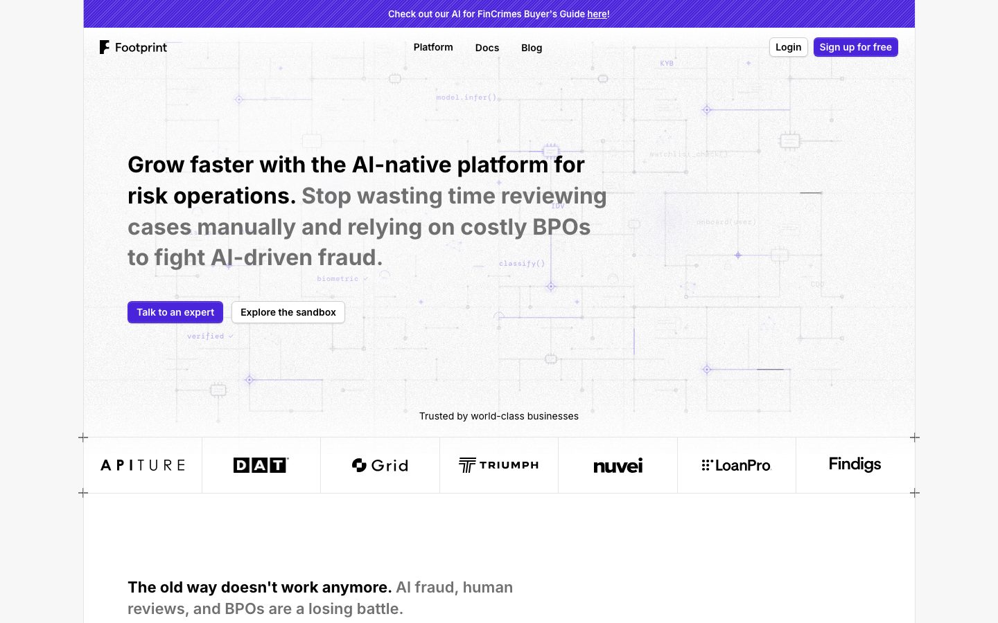
A precise, fintech-engineering interface for AI-native risk operations — white canvas, near-black ink headlines in Inter, and a single electric-violet brand accent (#4a24db) carried on the announcement bar and primary CTAs. The system reads as technical-and-trustworthy: a faint blueprint/code-schematic background behind the hero, tight small-radius cards (6px) with whisper-soft shadows, a monochrome partner logo strip, and a restrained palette where the only chromatic voltage is the violet accent plus a set of code-syntax highlight hues echoing the product's developer roots.
---
version: alpha
name: OneFootprint-design-analysis
description: "A precise, fintech-engineering interface for AI-native risk operations — white canvas, near-black ink headlines in Inter, and a single electric-violet brand accent (#4a24db) carried on the announcement bar and primary CTAs. The system reads as technical-and-trustworthy: a faint blueprint/code-schematic background behind the hero, tight small-radius cards (6px) with whisper-soft shadows, a monochrome partner logo strip, and a restrained palette where the only chromatic voltage is the violet accent plus a set of code-syntax highlight hues echoing the product's developer roots."

colors:
  primary: "#4a24db"
  primary-active: "#3a1caa"
  ink: "#000000"
  ink-soft: "#1a1a1a"
  ink-muted: "#2d2d2d"
  muted: "#707070"
  canvas: "#ffffff"
  surface-raised: "#fefefe"
  surface-soft: "#f7f7f7"
  hairline: "#e2e2e2"
  hairline-strong: "#d4d4d4"
  on-primary: "#ffffff"
  accent-blue: "#4078f2"
  code-navy: "#0e1438"
  code-blue: "#79c0ff"
  code-blue-soft: "#a5d6ff"
  code-red: "#ff7b72"
  code-red-strong: "#e45649"
  code-green: "#50a14f"
  code-amber: "#ffa657"
  code-gold: "#986801"

typography:
  heading-xl:
    fontFamily: "Inter, sans-serif"
    fontSize: 32px
    fontWeight: 700
    lineHeight: 1.4
    letterSpacing: normal
  heading-md:
    fontFamily: "Inter, sans-serif"
    fontSize: 22px
    fontWeight: 700
    lineHeight: 1.4
    letterSpacing: normal
  heading-sm:
    fontFamily: "Inter, sans-serif"
    fontSize: 15px
    fontWeight: 600
    lineHeight: 1.867
    letterSpacing: normal
  body:
    fontFamily: "Inter, sans-serif"
    fontSize: 14px
    fontWeight: 400
    lineHeight: 1.5
    letterSpacing: normal
  button:
    fontFamily: "Inter, sans-serif"
    fontSize: 16px
    fontWeight: 400
    lineHeight: 1.5
    letterSpacing: normal

rounded:
  sm: 4px
  md: 6px
  lg: 12px
  full: 9999px

spacing:
  xxs: 4px
  xs: 6px
  sm: 8px
  md: 12px
  lg: 16px
  xl: 20px
  xxl: 24px
  xxxl: 32px
  huge: 40px
  section: 64px

components:
  announcement-bar:
    backgroundColor: "{colors.primary}"
    textColor: "{colors.on-primary}"
    typography: "{typography.body}"
    padding: 12px 24px
  top-nav:
    backgroundColor: "{colors.canvas}"
    textColor: "{colors.ink}"
    typography: "{typography.body}"
    padding: 16px 24px
  nav-link:
    backgroundColor: transparent
    textColor: "{colors.ink}"
    typography: "{typography.body}"
  button-primary:
    backgroundColor: "{colors.primary}"
    textColor: "{colors.on-primary}"
    typography: "{typography.button}"
    rounded: "{rounded.md}"
    padding: 8px 16px
  button-primary-active:
    backgroundColor: "{colors.primary-active}"
    textColor: "{colors.on-primary}"
    rounded: "{rounded.md}"
  button-secondary:
    backgroundColor: "{colors.canvas}"
    textColor: "{colors.ink}"
    typography: "{typography.button}"
    rounded: "{rounded.md}"
    padding: 8px 16px
  hero-band:
    backgroundColor: "{colors.canvas}"
    textColor: "{colors.ink}"
    typography: "{typography.heading-xl}"
    padding: 64px 24px
  logo-strip:
    backgroundColor: "{colors.canvas}"
    textColor: "{colors.ink}"
    typography: "{typography.body}"
    padding: 24px
  feature-card:
    backgroundColor: "{colors.surface-soft}"
    textColor: "{colors.ink}"
    typography: "{typography.heading-sm}"
    rounded: "{rounded.md}"
    padding: 24px
    shadow: "0 1px 2px rgba(0,0,0,0.12)"
  card:
    backgroundColor: "{colors.surface-raised}"
    textColor: "{colors.ink}"
    rounded: "{rounded.md}"
    shadow: "0 1px 2px rgba(0,0,0,0.12)"
  icon-badge-circle:
    backgroundColor: "{colors.ink}"
    textColor: "{colors.on-primary}"
    rounded: "{rounded.full}"
    size: 40px
  footer:
    backgroundColor: "{colors.canvas}"
    textColor: "{colors.muted}"
    typography: "{typography.body}"
    padding: 40px 24px
---

## Overview

OneFootprint's marketing surface is a precise, engineering-credible fintech interface — white canvas (`{colors.canvas}` — #ffffff) with near-black ink headlines (`{colors.ink}` — #000000), Inter throughout, and a single electric-violet brand accent (`{colors.primary}` — #4a24db) that carries the announcement bar and primary CTAs. The page reads as technical-and-trustworthy: a faint blueprint / code-schematic motif sits behind the hero, the partner logo strip is fully monochrome, and content cards are small-radius (6px) with whisper-soft shadows.

Type voice is single-family and disciplined: **Inter** does everything — headlines at weight 700, sub-heads at 600, body at 400. There is no display face; hierarchy is built from size and weight alone. The hero headline uses a two-tone treatment — the lead clause in solid ink, the continuation in a muted gray (`{colors.muted}` — #707070) — to compress a long sentence into a single scannable block.

Chromatic voltage is deliberately scarce. The violet accent is the only saturated brand color on the action layer. A secondary set of code-syntax hues (`{colors.code-blue}`, `{colors.code-red}`, `{colors.code-green}`, `{colors.code-amber}` and friends) appears only inside the faint schematic background and product/code artifacts — an echo of the product's developer roots, never used on CTAs or chrome.

**Key Characteristics:**
- White canvas with a violet primary action color (`{colors.primary}` — #4a24db). Primary buttons are small-radius (`{rounded.md}` — 6px) with the violet fill; secondary buttons are white with a hairline outline.
- Inter-only typography. Headlines at 700, sub-heads at 600, body at 400 — hierarchy from size + weight, no display typeface.
- A faint engineering/blueprint background motif behind the hero (model.infer(), classify(), biometric ✓, KYB labels) — subtle gray code-schematic chrome that signals the technical product without distracting.
- Two-tone headline treatment: ink lead clause + `{colors.muted}` continuation clause inside one heading block.
- Monochrome partner logo strip ("Trusted by world-class businesses") rendered in `{colors.ink}` on white, framed by faint crosshair tick marks.
- Soft, low-radius cards (`{rounded.md}` — 6px) with a single whisper shadow `0 1px 2px rgba(0,0,0,0.12)` for problem/feature cards on `{colors.surface-soft}`.
- Black circular icon badges (`{component.icon-badge-circle}`) at 40px holding white glyphs at the top of feature cards.
- The violet announcement bar (`{component.announcement-bar}`) is the only full-bleed saturated band on the page; everything below stays white-with-light-gray-cards.

## Colors

### Brand & Accent
- **Primary** (`{colors.primary}` — #4a24db): The electric-violet brand color. Carries the top announcement bar, the "Talk to an expert" and "Sign up for free" CTAs. The single saturated color on the action layer.
- **Primary Active** (`{colors.primary-active}` — #3a1caa): The darker violet pressed/active state for primary buttons.
- **Accent Blue** (`{colors.accent-blue}` — #4078f2): A secondary blue observed in the schematic / link accents — used sparely.

### Code-Syntax Set
A set of syntax-highlight hues observed inside the faint code-schematic background motif and any embedded code artifacts. These are decorative/product-context colors — **never** used on chrome or CTAs:
- `{colors.code-navy}` (#0e1438), `{colors.code-blue}` (#79c0ff), `{colors.code-blue-soft}` (#a5d6ff), `{colors.code-red}` (#ff7b72), `{colors.code-red-strong}` (#e45649), `{colors.code-green}` (#50a14f), `{colors.code-amber}` (#ffa657), `{colors.code-gold}` (#986801).

### Surface
- **Canvas** (`{colors.canvas}` — #ffffff): The default page floor.
- **Surface Raised** (`{colors.surface-raised}` — #fefefe): A barely-off-white used on raised card surfaces.
- **Surface Soft** (`{colors.surface-soft}` — #f7f7f7): Feature/problem card backgrounds and soft section fills.
- **Hairline** (`{colors.hairline}` — #e2e2e2): The 1px divider/border tone on light surfaces.
- **Hairline Strong** (`{colors.hairline-strong}` — #d4d4d4): A slightly heavier divider tone.

### Text
- **Ink** (`{colors.ink}` — #000000): All headlines and primary text; also the black icon-badge fill.
- **Ink Soft** (`{colors.ink-soft}` — #1a1a1a): Near-black secondary text / strong labels.
- **Ink Muted** (`{colors.ink-muted}` — #2d2d2d): Darker body copy.
- **Muted** (`{colors.muted}` — #707070): The two-tone headline continuation clause, secondary body, captions, footer text.
- **On Primary** (`{colors.on-primary}` — #ffffff): Text on the violet announcement bar and primary buttons.

## Typography

### Font Family
The system runs **Inter** for everything — headlines, sub-heads, body, and buttons. There is no separate display typeface. Inter is open-source (SIL Open Font License), so the live site ships exactly what is documented here; no substitution is required. A reasonable fallback stack is `Inter, -apple-system, BlinkMacSystemFont, "Segoe UI", Roboto, sans-serif`.

Hierarchy is built from size and weight contrast alone — 700 for headlines, 600 for small section labels, 400 for body and buttons. Letter spacing is `normal` at every measured size.

### Hierarchy

| Token | Size | Weight | Line Height | Letter Spacing | Use |
|---|---|---|---|---|---|
| `{typography.heading-xl}` | 32px | 700 | 1.4 | normal | Hero h1 ("Grow faster with the AI-native platform for risk operations.") |
| `{typography.heading-md}` | 22px | 700 | 1.4 | normal | Section heads ("The old way doesn't work anymore.") |
| `{typography.heading-sm}` | 15px | 600 | 1.867 | normal | Feature-card titles ("Gen AI fraud", "Manual Review burden", "BPO dependency") |
| `{typography.body}` | 14px | 400 | 1.5 | normal | Default running text, nav links, card descriptions, footer |
| `{typography.button}` | 16px | 400 | 1.5 | normal | Button labels |

### Principles
Hierarchy comes from weight + size, not from a second typeface. Headlines are heavy (700) and near-black; body drops to 400 and frequently to `{colors.muted}` gray for the secondary clause. The two-tone headline (solid ink lead + muted continuation) is a signature device — keep the heading weight constant at 700 and let color carry the emphasis split.

Note the `heading-sm` line-height of 1.867 is unusually tall for a 15px label — it is the measured value and is what gives the small feature-card titles their airy stacking.

### Note on Font Substitutes
No licensed/custom typefaces are used (`fonts_licensed` is empty). Inter is openly licensed and ships directly. If Inter is unavailable, the system-UI stack above is an acceptable degradation.

## Layout

### Spacing System
- **Base unit:** 4px.
- **Tokens:** `{spacing.xxs}` 4px · `{spacing.xs}` 6px · `{spacing.sm}` 8px · `{spacing.md}` 12px · `{spacing.lg}` 16px · `{spacing.xl}` 20px · `{spacing.xxl}` 24px · `{spacing.xxxl}` 32px · `{spacing.huge}` 40px · `{spacing.section}` 64px.
- **Section rhythm:** `{spacing.section}` (64px) is the largest repeated step between major bands; `{spacing.huge}` (40px) was the single most frequent larger gap (frequency 9) and governs intra-band spacing.
- **Card internal padding:** `{spacing.xxl}` (24px) for feature cards.
- **Tight UI clusters:** `{spacing.sm}` (8px) and `{spacing.md}` (12px) dominate small element spacing (button padding, nav gaps).

### Grid & Container
- **Editorial body:** Centered single column with the hero copy occupying the left ~half against the schematic background.
- **Logo strip:** Horizontal 7-up monochrome partner row framed with crosshair ticks.
- **Feature grid:** 3-up at desktop ("Gen AI fraud" / "Manual Review burden" / "BPO dependency"), collapsing to 1-up on narrow viewports.
- **Footer:** Multi-column link list (Platform / Company / Developers / Resources) with the wordmark + copyright at left.

### Whitespace Philosophy
The page leans into generous vertical air — large empty stretches between the feature band and footer in the captured render. The rhythm prioritizes scannability: one heading, one supporting clause, one row of cards per band. Tight 4–12px spacing inside components, large 40–64px gaps between them.

## Elevation & Depth

| Level | Treatment | Use |
|---|---|---|
| Flat | No shadow, no border | Hero band, top nav, logo strip, body sections |
| Hairline | 1px `{colors.hairline}` border | Secondary button outline, dividers |
| Whisper shadow | `0 1px 2px rgba(0,0,0,0.12)` | Feature cards, raised cards |
| Whisper shadow + soft halo | `0 1px 2px rgba(0,0,0,0.12)` plus a faint `rgba(200,200,200,0.2)` ring (measured, truncated) | Slightly more lifted card variant |

The elevation philosophy is **flat-with-a-whisper** — the heaviest shadow measured is a single 1px/2px drop at 12% alpha. No heavy shadows, no glassmorphism. Depth is communicated primarily through the surface-soft card fill against white canvas.

### Decorative Depth
- The hero carries a faint gray code-schematic background (circuit nodes, function-call labels like `model.infer()`, `classify()`, `biometric ✓`) that creates a subtle technical texture without competing with the headline.
- Black circular icon badges (`{component.icon-badge-circle}`) sit at the top of feature cards, providing a small high-contrast focal point against the muted card surface.

## Shapes

### Border Radius Scale

| Token | Value | Use |
|---|---|---|
| `{rounded.sm}` | 4px | Smallest inline elements, tight chips |
| `{rounded.md}` | 6px | Standard cards, primary + secondary buttons |
| `{rounded.lg}` | 12px | Larger panels / nested product surfaces |
| `{rounded.full}` | 9999px | Circular icon badges, pill elements |

The radius vocabulary is small and tight — 6px is the workhorse for both cards and buttons, giving the system a crisp, engineered feel rather than a soft consumer-app roundness. The only fully-round shapes are the black icon badges.

### Photography / Logo Geometry
Partner logos in the trust strip are rendered as flat monochrome marks on white — no containers, no radius. The schematic background graphics are line art, not photography.

## Components

### Announcement & Navigation

**`announcement-bar`** — The full-bleed violet strip at the very top of the page. Background `{colors.primary}` (#4a24db), text `{colors.on-primary}`, type `{typography.body}` (Inter 14px / 400), centered ("Check out our AI for FinCrimes Buyer's Guide here!"). The only saturated full-width band on the page.

**`top-nav`** — White nav bar below the announcement strip. Background `{colors.canvas}`, ink text. Carries the Footprint wordmark + logo at left, primary menu (Platform, Docs, Blog) center, and a right cluster with a "Login" `{component.button-secondary}` and a "Sign up for free" `{component.button-primary}`. Links in `{typography.body}`.

**`nav-link`** — Inline top-nav menu item. Transparent background, `{colors.ink}` text, `{typography.body}`.

### Buttons

**`button-primary`** — The violet CTA ("Talk to an expert", "Sign up for free"). Background `{colors.primary}` (#4a24db), text `{colors.on-primary}`, type `{typography.button}` (Inter 16px / 400), rounded `{rounded.md}` (6px), padding ~8px × 16px. Active state `button-primary-active` shifts the fill to `{colors.primary-active}` (#3a1caa).

**`button-secondary`** — White outline button ("Login", "Explore the sandbox"). Background `{colors.canvas}`, text `{colors.ink}`, 1px `{colors.hairline}` border, same radius + padding as primary.

### Hero & Trust

**`hero-band`** — White-canvas hero with the schematic background motif. Left-aligned two-tone h1 in `{typography.heading-xl}` (ink lead clause + `{colors.muted}` continuation), followed by a button row (`{component.button-primary}` + `{component.button-secondary}`). Vertical padding ~`{spacing.section}` (64px).

**`logo-strip`** — "Trusted by world-class businesses" caption above a 7-up monochrome partner row (Apiture, DAT, Grid, Triumph, Nuvei, LoanPro, Findigs). Logos rendered in `{colors.ink}` on `{colors.canvas}`, framed by faint crosshair tick marks.

### Cards

**`feature-card`** — Used in the 3-up problem grid ("Gen AI fraud", "Manual Review burden", "BPO dependency"). Background `{colors.surface-soft}` (#f7f7f7), rounded `{rounded.md}` (6px), internal padding `{spacing.xxl}` (24px), whisper shadow `0 1px 2px rgba(0,0,0,0.12)`. Carries a black `{component.icon-badge-circle}` at top, a title in `{typography.heading-sm}`, and a description in `{typography.body}` (`{colors.muted}`).

**`card`** — Generic raised card primitive. Background `{colors.surface-raised}` (#fefefe), rounded `{rounded.md}` (6px), whisper shadow `0 1px 2px rgba(0,0,0,0.12)`.

**`icon-badge-circle`** — 40px black circle holding a white glyph, anchored at the top of each feature card. Background `{colors.ink}`, glyph `{colors.on-primary}`, rounded `{rounded.full}`.

### Footer

**`footer`** — White-canvas footer that closes the page. Background `{colors.canvas}`, text `{colors.muted}`, type `{typography.body}`. The Footprint wordmark + "© 2026 One Footprint Inc." + support email sit at left; multi-column link lists (Platform / Company / Developers / Resources) fill the right. Social icons (X, LinkedIn) sit under the wordmark. Vertical padding ~`{spacing.huge}` (40px). Unlike many SaaS sites, the footer stays light — there is no dark closing band.

## Do's and Don'ts

### Do
- Reserve `{colors.primary}` (#4a24db) for the announcement bar and primary CTAs. It is the only saturated brand color on the action layer.
- Build hierarchy with Inter weight + size only — 700 for headlines, 600 for small labels, 400 for body. No second typeface.
- Use the two-tone headline (ink lead + `{colors.muted}` continuation) for long hero sentences. Keep the weight constant; let color split the emphasis.
- Keep the partner logo strip fully monochrome (`{colors.ink}` on white). The trust comes from the marks, not from color.
- Use `{rounded.md}` (6px) for both cards and buttons — the tight radius is part of the engineered voice.
- Keep card elevation to the whisper shadow `0 1px 2px rgba(0,0,0,0.12)`. Don't escalate.
- Confine the code-syntax color set to the schematic background and product/code artifacts. Never on chrome.

### Don't
- Don't introduce a second saturated UI color. The system is white + ink + violet.
- Don't use the code-syntax hues (`{colors.code-blue}`, `{colors.code-red}`, etc.) on buttons, links, or badges.
- Don't round cards or buttons beyond `{rounded.md}` (6px) except for the deliberately-circular icon badges.
- Don't add heavy drop shadows — the heaviest measured shadow is a 1px/2px whisper.
- Don't put body copy in 700 weight; reserve heavy weight for headings.
- Don't add a dark footer — the captured page closes on white canvas.
- Don't add hover-state styling beyond the documented active/pressed states.

## Responsive Behavior

The capture is desktop-only (single landing page at desktop width), so most breakpoint behavior is inferred from layout structure rather than measured. Treat the following as design intent, not measurement.

### Breakpoints (inferred)

| Name | Width | Key Changes |
|---|---|---|
| Mobile | < 768px | Top nav likely collapses; hero headline + buttons stack; logo strip wraps/scrolls; feature grid 3-up → 1-up; footer columns stack |
| Tablet | 768–1024px | Nav tightens; feature grid may drop to 2-up; logo strip compresses |
| Desktop | > 1024px | Full nav, 3-up feature grid, 7-up logo strip, multi-column footer |

### Touch Targets
- Primary and secondary buttons use ~8px × 16px padding with 16px label text; effective tap height should be padded to meet 44px minimums on touch (not separately measured).

### Collapsing Strategy
- Feature cards reduce columns (3 → 1) rather than scaling text down.
- The monochrome logo strip is the most likely candidate to wrap or horizontally scroll on narrow viewports.

## Iteration Guide

1. Focus on ONE component at a time. Reference its YAML key directly (`{component.feature-card}`, `{component.button-primary}`).
2. Variants of an existing component (`-active`) live as separate entries in `components:`.
3. Use `{token.refs}` everywhere — never inline a hex in a component.
4. Never document hover. Default and Active/Pressed states only.
5. The system is monochrome + violet. Adding a new saturated color should be treated as a brand decision, not a component tweak.
6. Keep the whisper shadow as the single elevation unit; escalate with surface fill, not shadow.
7. When emphasis is needed in a headline, split with `{colors.muted}` color rather than changing weight.

## Known Gaps

- Only the **landing** page at **desktop width** was captured. All responsive breakpoints, mobile nav behavior, and tablet layouts are inferred, not measured.
- The measured `button-primary` component reported `color: #000000`, `radius: 0px`, and asymmetric `padding: 0px 16px 0px 0px` — this is inconsistent with the violet pill CTAs visible in the screenshots and is almost certainly a miscaptured link element. The button spec here is reconstructed from screenshot ground truth (violet fill, ~6px radius); the violet button fill and exact radius/padding should be re-measured against the live DOM.
- Three irregular large spacing values (113px, 123px, 176px, each frequency 1) were measured but appear to be one-off layout offsets rather than systematic tokens; they are excluded from the spacing scale.
- The code-syntax color set (`{colors.code-blue}`, `{colors.code-red}`, etc.) is assigned to the faint hero schematic background by inference from the frequency table; their exact usage surfaces (background motif vs. embedded code blocks) were not isolated.
- Exact pill/full-radius usage (radius 9999, frequency 3) could not be tied to specific elements; it is assumed to cover the circular icon badges.
- The second shadow value in the analysis is truncated in the source data; the soft halo ring (`rgba(200,200,200,0.2)`) is documented as observed but its full offset/blur could not be confirmed.
- Animation, transition timings, and form/input states are out of scope — no forms were captured on the landing page.
- The "Talk to an expert" vs "Sign up for free" vs "Login" button distinctions (filled violet vs outlined white) are read from screenshots; precise per-variant tokens beyond primary/secondary were not separately measured.

<!-- Documented by duply · real-world design systems as ready-to-use DESIGN.md for AI coding agents · https://duply.ai/onefootprint/design-md -->
Color Palette
Accent
Neutrals
Typography
heading-xl32px · 700 · 1.4
The quick brown fox jumpsheading-md22px · 700 · 1.4
The quick brown fox jumpsheading-sm15px · 600 · 1.867
The quick brown fox jumpsbody14px · 400 · 1.5
The quick brown fox jumpsbutton16px · 400 · 1.5
The quick brown fox jumpsSpacing & Shape
Spacing
| Name | Value | Preview |
|---|---|---|
| xxs | 4px | |
| xs | 6px | |
| sm | 8px | |
| md | 12px | |
| lg | 16px | |
| xl | 20px | |
| xxl | 24px | |
| xxxl | 32px | |
| huge | 40px | |
| section | 64px |
Border Radius
| Name | Value | Preview |
|---|---|---|
| sm | 4px | |
| md | 6px | |
| lg | 12px | |
| full | 9999px |
More like this


---
version: alpha
name: OneFootprint-design-analysis
description: "A precise, fintech-engineering interface for AI-native risk operations — white canvas, near-black ink headlines in Inter, and a single electric-violet brand accent (#4a24db) carried on the announcement bar and primary CTAs. The system reads as technical-and-trustworthy: a faint blueprint/code-schematic background behind the hero, tight small-radius cards (6px) with whisper-soft shadows, a monochrome partner logo strip, and a restrained palette where the only chromatic voltage is the violet accent plus a set of code-syntax highlight hues echoing the product's developer roots."

colors:
  primary: "#4a24db"
  primary-active: "#3a1caa"
  ink: "#000000"
  ink-soft: "#1a1a1a"
  ink-muted: "#2d2d2d"
  muted: "#707070"
  canvas: "#ffffff"
  surface-raised: "#fefefe"
  surface-soft: "#f7f7f7"
  hairline: "#e2e2e2"
  hairline-strong: "#d4d4d4"
  on-primary: "#ffffff"
  accent-blue: "#4078f2"
  code-navy: "#0e1438"
  code-blue: "#79c0ff"
  code-blue-soft: "#a5d6ff"
  code-red: "#ff7b72"
  code-red-strong: "#e45649"
  code-green: "#50a14f"
  code-amber: "#ffa657"
  code-gold: "#986801"

typography:
  heading-xl:
    fontFamily: "Inter, sans-serif"
    fontSize: 32px
    fontWeight: 700
    lineHeight: 1.4
    letterSpacing: normal
  heading-md:
    fontFamily: "Inter, sans-serif"
    fontSize: 22px
    fontWeight: 700
    lineHeight: 1.4
    letterSpacing: normal
  heading-sm:
    fontFamily: "Inter, sans-serif"
    fontSize: 15px
    fontWeight: 600
    lineHeight: 1.867
    letterSpacing: normal
  body:
    fontFamily: "Inter, sans-serif"
    fontSize: 14px
    fontWeight: 400
    lineHeight: 1.5
    letterSpacing: normal
  button:
    fontFamily: "Inter, sans-serif"
    fontSize: 16px
    fontWeight: 400
    lineHeight: 1.5
    letterSpacing: normal

rounded:
  sm: 4px
  md: 6px
  lg: 12px
  full: 9999px

spacing:
  xxs: 4px
  xs: 6px
  sm: 8px
  md: 12px
  lg: 16px
  xl: 20px
  xxl: 24px
  xxxl: 32px
  huge: 40px
  section: 64px

components:
  announcement-bar:
    backgroundColor: "{colors.primary}"
    textColor: "{colors.on-primary}"
    typography: "{typography.body}"
    padding: 12px 24px
  top-nav:
    backgroundColor: "{colors.canvas}"
    textColor: "{colors.ink}"
    typography: "{typography.body}"
    padding: 16px 24px
  nav-link:
    backgroundColor: transparent
    textColor: "{colors.ink}"
    typography: "{typography.body}"
  button-primary:
    backgroundColor: "{colors.primary}"
    textColor: "{colors.on-primary}"
    typography: "{typography.button}"
    rounded: "{rounded.md}"
    padding: 8px 16px
  button-primary-active:
    backgroundColor: "{colors.primary-active}"
    textColor: "{colors.on-primary}"
    rounded: "{rounded.md}"
  button-secondary:
    backgroundColor: "{colors.canvas}"
    textColor: "{colors.ink}"
    typography: "{typography.button}"
    rounded: "{rounded.md}"
    padding: 8px 16px
  hero-band:
    backgroundColor: "{colors.canvas}"
    textColor: "{colors.ink}"
    typography: "{typography.heading-xl}"
    padding: 64px 24px
  logo-strip:
    backgroundColor: "{colors.canvas}"
    textColor: "{colors.ink}"
    typography: "{typography.body}"
    padding: 24px
  feature-card:
    backgroundColor: "{colors.surface-soft}"
    textColor: "{colors.ink}"
    typography: "{typography.heading-sm}"
    rounded: "{rounded.md}"
    padding: 24px
    shadow: "0 1px 2px rgba(0,0,0,0.12)"
  card:
    backgroundColor: "{colors.surface-raised}"
    textColor: "{colors.ink}"
    rounded: "{rounded.md}"
    shadow: "0 1px 2px rgba(0,0,0,0.12)"
  icon-badge-circle:
    backgroundColor: "{colors.ink}"
    textColor: "{colors.on-primary}"
    rounded: "{rounded.full}"
    size: 40px
  footer:
    backgroundColor: "{colors.canvas}"
    textColor: "{colors.muted}"
    typography: "{typography.body}"
    padding: 40px 24px
---

## Overview

OneFootprint's marketing surface is a precise, engineering-credible fintech interface — white canvas (`{colors.canvas}` — #ffffff) with near-black ink headlines (`{colors.ink}` — #000000), Inter throughout, and a single electric-violet brand accent (`{colors.primary}` — #4a24db) that carries the announcement bar and primary CTAs. The page reads as technical-and-trustworthy: a faint blueprint / code-schematic motif sits behind the hero, the partner logo strip is fully monochrome, and content cards are small-radius (6px) with whisper-soft shadows.

Type voice is single-family and disciplined: **Inter** does everything — headlines at weight 700, sub-heads at 600, body at 400. There is no display face; hierarchy is built from size and weight alone. The hero headline uses a two-tone treatment — the lead clause in solid ink, the continuation in a muted gray (`{colors.muted}` — #707070) — to compress a long sentence into a single scannable block.

Chromatic voltage is deliberately scarce. The violet accent is the only saturated brand color on the action layer. A secondary set of code-syntax hues (`{colors.code-blue}`, `{colors.code-red}`, `{colors.code-green}`, `{colors.code-amber}` and friends) appears only inside the faint schematic background and product/code artifacts — an echo of the product's developer roots, never used on CTAs or chrome.

**Key Characteristics:**
- White canvas with a violet primary action color (`{colors.primary}` — #4a24db). Primary buttons are small-radius (`{rounded.md}` — 6px) with the violet fill; secondary buttons are white with a hairline outline.
- Inter-only typography. Headlines at 700, sub-heads at 600, body at 400 — hierarchy from size + weight, no display typeface.
- A faint engineering/blueprint background motif behind the hero (model.infer(), classify(), biometric ✓, KYB labels) — subtle gray code-schematic chrome that signals the technical product without distracting.
- Two-tone headline treatment: ink lead clause + `{colors.muted}` continuation clause inside one heading block.
- Monochrome partner logo strip ("Trusted by world-class businesses") rendered in `{colors.ink}` on white, framed by faint crosshair tick marks.
- Soft, low-radius cards (`{rounded.md}` — 6px) with a single whisper shadow `0 1px 2px rgba(0,0,0,0.12)` for problem/feature cards on `{colors.surface-soft}`.
- Black circular icon badges (`{component.icon-badge-circle}`) at 40px holding white glyphs at the top of feature cards.
- The violet announcement bar (`{component.announcement-bar}`) is the only full-bleed saturated band on the page; everything below stays white-with-light-gray-cards.

## Colors

### Brand & Accent
- **Primary** (`{colors.primary}` — #4a24db): The electric-violet brand color. Carries the top announcement bar, the "Talk to an expert" and "Sign up for free" CTAs. The single saturated color on the action layer.
- **Primary Active** (`{colors.primary-active}` — #3a1caa): The darker violet pressed/active state for primary buttons.
- **Accent Blue** (`{colors.accent-blue}` — #4078f2): A secondary blue observed in the schematic / link accents — used sparely.

### Code-Syntax Set
A set of syntax-highlight hues observed inside the faint code-schematic background motif and any embedded code artifacts. These are decorative/product-context colors — **never** used on chrome or CTAs:
- `{colors.code-navy}` (#0e1438), `{colors.code-blue}` (#79c0ff), `{colors.code-blue-soft}` (#a5d6ff), `{colors.code-red}` (#ff7b72), `{colors.code-red-strong}` (#e45649), `{colors.code-green}` (#50a14f), `{colors.code-amber}` (#ffa657), `{colors.code-gold}` (#986801).

### Surface
- **Canvas** (`{colors.canvas}` — #ffffff): The default page floor.
- **Surface Raised** (`{colors.surface-raised}` — #fefefe): A barely-off-white used on raised card surfaces.
- **Surface Soft** (`{colors.surface-soft}` — #f7f7f7): Feature/problem card backgrounds and soft section fills.
- **Hairline** (`{colors.hairline}` — #e2e2e2): The 1px divider/border tone on light surfaces.
- **Hairline Strong** (`{colors.hairline-strong}` — #d4d4d4): A slightly heavier divider tone.

### Text
- **Ink** (`{colors.ink}` — #000000): All headlines and primary text; also the black icon-badge fill.
- **Ink Soft** (`{colors.ink-soft}` — #1a1a1a): Near-black secondary text / strong labels.
- **Ink Muted** (`{colors.ink-muted}` — #2d2d2d): Darker body copy.
- **Muted** (`{colors.muted}` — #707070): The two-tone headline continuation clause, secondary body, captions, footer text.
- **On Primary** (`{colors.on-primary}` — #ffffff): Text on the violet announcement bar and primary buttons.

## Typography

### Font Family
The system runs **Inter** for everything — headlines, sub-heads, body, and buttons. There is no separate display typeface. Inter is open-source (SIL Open Font License), so the live site ships exactly what is documented here; no substitution is required. A reasonable fallback stack is `Inter, -apple-system, BlinkMacSystemFont, "Segoe UI", Roboto, sans-serif`.

Hierarchy is built from size and weight contrast alone — 700 for headlines, 600 for small section labels, 400 for body and buttons. Letter spacing is `normal` at every measured size.

### Hierarchy

| Token | Size | Weight | Line Height | Letter Spacing | Use |
|---|---|---|---|---|---|
| `{typography.heading-xl}` | 32px | 700 | 1.4 | normal | Hero h1 ("Grow faster with the AI-native platform for risk operations.") |
| `{typography.heading-md}` | 22px | 700 | 1.4 | normal | Section heads ("The old way doesn't work anymore.") |
| `{typography.heading-sm}` | 15px | 600 | 1.867 | normal | Feature-card titles ("Gen AI fraud", "Manual Review burden", "BPO dependency") |
| `{typography.body}` | 14px | 400 | 1.5 | normal | Default running text, nav links, card descriptions, footer |
| `{typography.button}` | 16px | 400 | 1.5 | normal | Button labels |

### Principles
Hierarchy comes from weight + size, not from a second typeface. Headlines are heavy (700) and near-black; body drops to 400 and frequently to `{colors.muted}` gray for the secondary clause. The two-tone headline (solid ink lead + muted continuation) is a signature device — keep the heading weight constant at 700 and let color carry the emphasis split.

Note the `heading-sm` line-height of 1.867 is unusually tall for a 15px label — it is the measured value and is what gives the small feature-card titles their airy stacking.

### Note on Font Substitutes
No licensed/custom typefaces are used (`fonts_licensed` is empty). Inter is openly licensed and ships directly. If Inter is unavailable, the system-UI stack above is an acceptable degradation.

## Layout

### Spacing System
- **Base unit:** 4px.
- **Tokens:** `{spacing.xxs}` 4px · `{spacing.xs}` 6px · `{spacing.sm}` 8px · `{spacing.md}` 12px · `{spacing.lg}` 16px · `{spacing.xl}` 20px · `{spacing.xxl}` 24px · `{spacing.xxxl}` 32px · `{spacing.huge}` 40px · `{spacing.section}` 64px.
- **Section rhythm:** `{spacing.section}` (64px) is the largest repeated step between major bands; `{spacing.huge}` (40px) was the single most frequent larger gap (frequency 9) and governs intra-band spacing.
- **Card internal padding:** `{spacing.xxl}` (24px) for feature cards.
- **Tight UI clusters:** `{spacing.sm}` (8px) and `{spacing.md}` (12px) dominate small element spacing (button padding, nav gaps).

### Grid & Container
- **Editorial body:** Centered single column with the hero copy occupying the left ~half against the schematic background.
- **Logo strip:** Horizontal 7-up monochrome partner row framed with crosshair ticks.
- **Feature grid:** 3-up at desktop ("Gen AI fraud" / "Manual Review burden" / "BPO dependency"), collapsing to 1-up on narrow viewports.
- **Footer:** Multi-column link list (Platform / Company / Developers / Resources) with the wordmark + copyright at left.

### Whitespace Philosophy
The page leans into generous vertical air — large empty stretches between the feature band and footer in the captured render. The rhythm prioritizes scannability: one heading, one supporting clause, one row of cards per band. Tight 4–12px spacing inside components, large 40–64px gaps between them.

## Elevation & Depth

| Level | Treatment | Use |
|---|---|---|
| Flat | No shadow, no border | Hero band, top nav, logo strip, body sections |
| Hairline | 1px `{colors.hairline}` border | Secondary button outline, dividers |
| Whisper shadow | `0 1px 2px rgba(0,0,0,0.12)` | Feature cards, raised cards |
| Whisper shadow + soft halo | `0 1px 2px rgba(0,0,0,0.12)` plus a faint `rgba(200,200,200,0.2)` ring (measured, truncated) | Slightly more lifted card variant |

The elevation philosophy is **flat-with-a-whisper** — the heaviest shadow measured is a single 1px/2px drop at 12% alpha. No heavy shadows, no glassmorphism. Depth is communicated primarily through the surface-soft card fill against white canvas.

### Decorative Depth
- The hero carries a faint gray code-schematic background (circuit nodes, function-call labels like `model.infer()`, `classify()`, `biometric ✓`) that creates a subtle technical texture without competing with the headline.
- Black circular icon badges (`{component.icon-badge-circle}`) sit at the top of feature cards, providing a small high-contrast focal point against the muted card surface.

## Shapes

### Border Radius Scale

| Token | Value | Use |
|---|---|---|
| `{rounded.sm}` | 4px | Smallest inline elements, tight chips |
| `{rounded.md}` | 6px | Standard cards, primary + secondary buttons |
| `{rounded.lg}` | 12px | Larger panels / nested product surfaces |
| `{rounded.full}` | 9999px | Circular icon badges, pill elements |

The radius vocabulary is small and tight — 6px is the workhorse for both cards and buttons, giving the system a crisp, engineered feel rather than a soft consumer-app roundness. The only fully-round shapes are the black icon badges.

### Photography / Logo Geometry
Partner logos in the trust strip are rendered as flat monochrome marks on white — no containers, no radius. The schematic background graphics are line art, not photography.

## Components

### Announcement & Navigation

**`announcement-bar`** — The full-bleed violet strip at the very top of the page. Background `{colors.primary}` (#4a24db), text `{colors.on-primary}`, type `{typography.body}` (Inter 14px / 400), centered ("Check out our AI for FinCrimes Buyer's Guide here!"). The only saturated full-width band on the page.

**`top-nav`** — White nav bar below the announcement strip. Background `{colors.canvas}`, ink text. Carries the Footprint wordmark + logo at left, primary menu (Platform, Docs, Blog) center, and a right cluster with a "Login" `{component.button-secondary}` and a "Sign up for free" `{component.button-primary}`. Links in `{typography.body}`.

**`nav-link`** — Inline top-nav menu item. Transparent background, `{colors.ink}` text, `{typography.body}`.

### Buttons

**`button-primary`** — The violet CTA ("Talk to an expert", "Sign up for free"). Background `{colors.primary}` (#4a24db), text `{colors.on-primary}`, type `{typography.button}` (Inter 16px / 400), rounded `{rounded.md}` (6px), padding ~8px × 16px. Active state `button-primary-active` shifts the fill to `{colors.primary-active}` (#3a1caa).

**`button-secondary`** — White outline button ("Login", "Explore the sandbox"). Background `{colors.canvas}`, text `{colors.ink}`, 1px `{colors.hairline}` border, same radius + padding as primary.

### Hero & Trust

**`hero-band`** — White-canvas hero with the schematic background motif. Left-aligned two-tone h1 in `{typography.heading-xl}` (ink lead clause + `{colors.muted}` continuation), followed by a button row (`{component.button-primary}` + `{component.button-secondary}`). Vertical padding ~`{spacing.section}` (64px).

**`logo-strip`** — "Trusted by world-class businesses" caption above a 7-up monochrome partner row (Apiture, DAT, Grid, Triumph, Nuvei, LoanPro, Findigs). Logos rendered in `{colors.ink}` on `{colors.canvas}`, framed by faint crosshair tick marks.

### Cards

**`feature-card`** — Used in the 3-up problem grid ("Gen AI fraud", "Manual Review burden", "BPO dependency"). Background `{colors.surface-soft}` (#f7f7f7), rounded `{rounded.md}` (6px), internal padding `{spacing.xxl}` (24px), whisper shadow `0 1px 2px rgba(0,0,0,0.12)`. Carries a black `{component.icon-badge-circle}` at top, a title in `{typography.heading-sm}`, and a description in `{typography.body}` (`{colors.muted}`).

**`card`** — Generic raised card primitive. Background `{colors.surface-raised}` (#fefefe), rounded `{rounded.md}` (6px), whisper shadow `0 1px 2px rgba(0,0,0,0.12)`.

**`icon-badge-circle`** — 40px black circle holding a white glyph, anchored at the top of each feature card. Background `{colors.ink}`, glyph `{colors.on-primary}`, rounded `{rounded.full}`.

### Footer

**`footer`** — White-canvas footer that closes the page. Background `{colors.canvas}`, text `{colors.muted}`, type `{typography.body}`. The Footprint wordmark + "© 2026 One Footprint Inc." + support email sit at left; multi-column link lists (Platform / Company / Developers / Resources) fill the right. Social icons (X, LinkedIn) sit under the wordmark. Vertical padding ~`{spacing.huge}` (40px). Unlike many SaaS sites, the footer stays light — there is no dark closing band.

## Do's and Don'ts

### Do
- Reserve `{colors.primary}` (#4a24db) for the announcement bar and primary CTAs. It is the only saturated brand color on the action layer.
- Build hierarchy with Inter weight + size only — 700 for headlines, 600 for small labels, 400 for body. No second typeface.
- Use the two-tone headline (ink lead + `{colors.muted}` continuation) for long hero sentences. Keep the weight constant; let color split the emphasis.
- Keep the partner logo strip fully monochrome (`{colors.ink}` on white). The trust comes from the marks, not from color.
- Use `{rounded.md}` (6px) for both cards and buttons — the tight radius is part of the engineered voice.
- Keep card elevation to the whisper shadow `0 1px 2px rgba(0,0,0,0.12)`. Don't escalate.
- Confine the code-syntax color set to the schematic background and product/code artifacts. Never on chrome.

### Don't
- Don't introduce a second saturated UI color. The system is white + ink + violet.
- Don't use the code-syntax hues (`{colors.code-blue}`, `{colors.code-red}`, etc.) on buttons, links, or badges.
- Don't round cards or buttons beyond `{rounded.md}` (6px) except for the deliberately-circular icon badges.
- Don't add heavy drop shadows — the heaviest measured shadow is a 1px/2px whisper.
- Don't put body copy in 700 weight; reserve heavy weight for headings.
- Don't add a dark footer — the captured page closes on white canvas.
- Don't add hover-state styling beyond the documented active/pressed states.

## Responsive Behavior

The capture is desktop-only (single landing page at desktop width), so most breakpoint behavior is inferred from layout structure rather than measured. Treat the following as design intent, not measurement.

### Breakpoints (inferred)

| Name | Width | Key Changes |
|---|---|---|
| Mobile | < 768px | Top nav likely collapses; hero headline + buttons stack; logo strip wraps/scrolls; feature grid 3-up → 1-up; footer columns stack |
| Tablet | 768–1024px | Nav tightens; feature grid may drop to 2-up; logo strip compresses |
| Desktop | > 1024px | Full nav, 3-up feature grid, 7-up logo strip, multi-column footer |

### Touch Targets
- Primary and secondary buttons use ~8px × 16px padding with 16px label text; effective tap height should be padded to meet 44px minimums on touch (not separately measured).

### Collapsing Strategy
- Feature cards reduce columns (3 → 1) rather than scaling text down.
- The monochrome logo strip is the most likely candidate to wrap or horizontally scroll on narrow viewports.

## Iteration Guide

1. Focus on ONE component at a time. Reference its YAML key directly (`{component.feature-card}`, `{component.button-primary}`).
2. Variants of an existing component (`-active`) live as separate entries in `components:`.
3. Use `{token.refs}` everywhere — never inline a hex in a component.
4. Never document hover. Default and Active/Pressed states only.
5. The system is monochrome + violet. Adding a new saturated color should be treated as a brand decision, not a component tweak.
6. Keep the whisper shadow as the single elevation unit; escalate with surface fill, not shadow.
7. When emphasis is needed in a headline, split with `{colors.muted}` color rather than changing weight.

## Known Gaps

- Only the **landing** page at **desktop width** was captured. All responsive breakpoints, mobile nav behavior, and tablet layouts are inferred, not measured.
- The measured `button-primary` component reported `color: #000000`, `radius: 0px`, and asymmetric `padding: 0px 16px 0px 0px` — this is inconsistent with the violet pill CTAs visible in the screenshots and is almost certainly a miscaptured link element. The button spec here is reconstructed from screenshot ground truth (violet fill, ~6px radius); the violet button fill and exact radius/padding should be re-measured against the live DOM.
- Three irregular large spacing values (113px, 123px, 176px, each frequency 1) were measured but appear to be one-off layout offsets rather than systematic tokens; they are excluded from the spacing scale.
- The code-syntax color set (`{colors.code-blue}`, `{colors.code-red}`, etc.) is assigned to the faint hero schematic background by inference from the frequency table; their exact usage surfaces (background motif vs. embedded code blocks) were not isolated.
- Exact pill/full-radius usage (radius 9999, frequency 3) could not be tied to specific elements; it is assumed to cover the circular icon badges.
- The second shadow value in the analysis is truncated in the source data; the soft halo ring (`rgba(200,200,200,0.2)`) is documented as observed but its full offset/blur could not be confirmed.
- Animation, transition timings, and form/input states are out of scope — no forms were captured on the landing page.
- The "Talk to an expert" vs "Sign up for free" vs "Login" button distinctions (filled violet vs outlined white) are read from screenshots; precise per-variant tokens beyond primary/secondary were not separately measured.

<!-- Documented by duply · real-world design systems as ready-to-use DESIGN.md for AI coding agents · https://duply.ai/onefootprint/design-md -->