Calendly
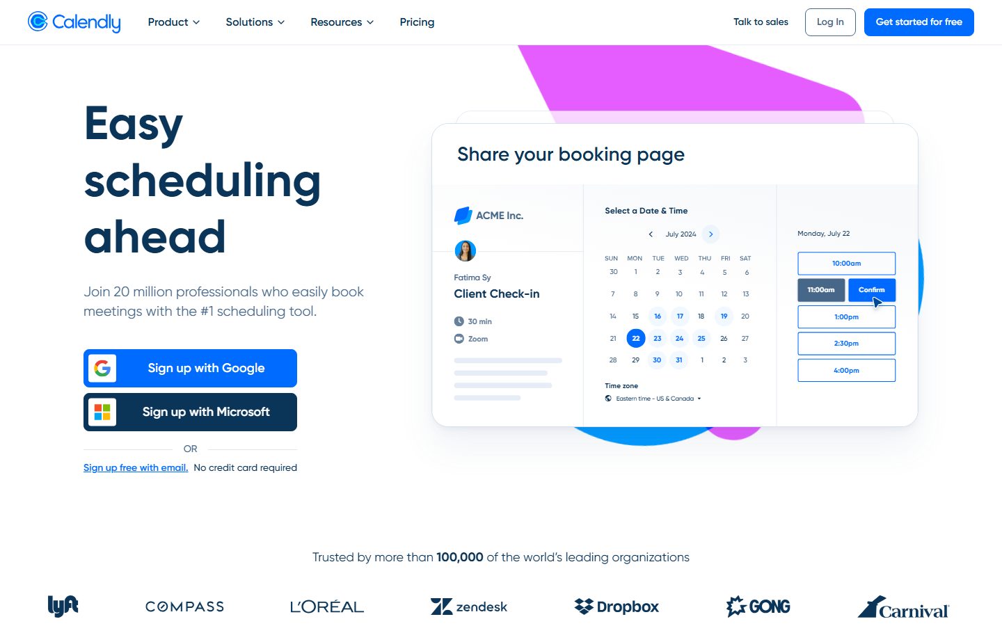
A trustworthy, scheduling-software interface built on a white canvas with a saturated brand-blue primary CTA and deep-navy Gilroy headlines. The system reads as friendly enterprise SaaS — soft blue-tinted surfaces, rounded cards (12–24px), low-spread blue-gray shadows, and a real product booking widget shown directly inside the hero. Brand voltage comes from the bold Gilroy display headline, the
---
version: alpha
name: Calendly-design-analysis
description: A trustworthy, scheduling-software interface built on a white canvas with a saturated brand-blue primary CTA and deep-navy Gilroy headlines. The system reads as friendly enterprise SaaS — soft blue-tinted surfaces, rounded cards (12–24px), low-spread blue-gray shadows, and a real product booking widget shown directly inside the hero. Brand voltage comes from the bold Gilroy display headline, the #006bff action color, and the in-hero booking mockup rather than from decorative imagery.

colors:
  primary: "#006bff"
  primary-active: "#004eba"
  ink: "#0a0a0a"
  heading: "#0b3558"
  body: "#476788"
  link: "#006bff"
  canvas: "#ffffff"
  surface-soft: "#f8f9fb"
  surface-tint: "#f4f8ff"
  surface-cream: "#fcfbf8"
  surface-alt: "#f0f3f8"
  surface-blue-soft: "#e7edf6"
  surface-blue: "#d4e0ed"
  neutral-soft: "#fafafa"
  hairline: "#a6bbd1"
  accent-navy-deep: "#071a31"
  accent-sky: "#6bb1ff"
  accent-sky-soft: "#c1defe"
  neutral: "#737373"
  badge-peach: "#fedfda"
  badge-rust: "#841f0e"
  on-primary: "#ffffff"

typography:
  display-xl:
    fontFamily: "Gilroy, Montserrat, sans-serif"
    fontSize: 68px
    fontWeight: 700
    lineHeight: 1.2
    letterSpacing: normal
  title-lg:
    fontFamily: "Gilroy, Montserrat, sans-serif"
    fontSize: 28px
    fontWeight: 600
    lineHeight: 1.4
    letterSpacing: normal
  body-lg:
    fontFamily: "Gilroy, Montserrat, sans-serif"
    fontSize: 20px
    fontWeight: 400
    lineHeight: 1.4
    letterSpacing: normal
  subhead:
    fontFamily: "Gilroy, Montserrat, sans-serif"
    fontSize: 18px
    fontWeight: 400
    lineHeight: 1.6
    letterSpacing: normal
  button:
    fontFamily: "Gilroy, Montserrat, sans-serif"
    fontSize: 16px
    fontWeight: 400
    lineHeight: 1.0
    letterSpacing: normal

rounded:
  xs: 4px
  sm: 8px
  md: 12px
  lg: 24px

spacing:
  xxs: 4px
  xs: 8px
  sm: 12px
  md: 16px
  lg: 24px
  xl: 32px
  xxl: 40px
  xxxl: 48px
  huge: 64px
  section: 96px

components:
  top-nav:
    backgroundColor: "{colors.canvas}"
    textColor: "{colors.heading}"
    typography: "{typography.button}"
    padding: 24px 32px
  button-primary:
    backgroundColor: "{colors.primary}"
    textColor: "{colors.on-primary}"
    typography: "{typography.button}"
    rounded: "{rounded.sm}"
    padding: 12px 24px
  button-primary-active:
    backgroundColor: "{colors.primary-active}"
    textColor: "{colors.on-primary}"
    typography: "{typography.button}"
    rounded: "{rounded.sm}"
  button-secondary:
    backgroundColor: "{colors.canvas}"
    textColor: "{colors.heading}"
    typography: "{typography.button}"
    rounded: "{rounded.sm}"
    padding: 12px 24px
  button-oauth-blue:
    backgroundColor: "{colors.primary}"
    textColor: "{colors.on-primary}"
    typography: "{typography.button}"
    rounded: "{rounded.sm}"
    padding: 16px 24px
  button-oauth-dark:
    backgroundColor: "{colors.accent-navy-deep}"
    textColor: "{colors.on-primary}"
    typography: "{typography.button}"
    rounded: "{rounded.sm}"
    padding: 16px 24px
  text-link:
    backgroundColor: transparent
    textColor: "{colors.link}"
    typography: "{typography.subhead}"
  booking-mockup-card:
    backgroundColor: "{colors.canvas}"
    textColor: "{colors.heading}"
    typography: "{typography.title-lg}"
    rounded: "{rounded.lg}"
    padding: 32px
  time-slot-button:
    backgroundColor: "{colors.canvas}"
    textColor: "{colors.primary}"
    typography: "{typography.button}"
    rounded: "{rounded.sm}"
    padding: 12px 24px
  time-slot-button-active:
    backgroundColor: "{colors.primary}"
    textColor: "{colors.on-primary}"
    typography: "{typography.button}"
    rounded: "{rounded.sm}"
    padding: 12px 24px
  logo-bar:
    backgroundColor: "{colors.canvas}"
    textColor: "{colors.heading}"
    typography: "{typography.subhead}"
    padding: 48px 32px
  footer:
    backgroundColor: "{colors.surface-soft}"
    textColor: "{colors.body}"
    typography: "{typography.subhead}"
    padding: 64px
---

## Overview

Calendly's marketing surface is a trustworthy, enterprise-friendly SaaS interface — a white canvas (`{colors.canvas}` — #ffffff) anchored by a saturated brand-blue primary CTA (`{colors.primary}` — #006bff) and deep-navy Gilroy headlines (`{colors.heading}` — #0b3558). The system reads as confident and approachable scheduling software: bold display type on the left, the actual booking product shown in a floating mockup card on the right, and a quiet logo bar of recognizable brands below.

Type voice is single-family: **Gilroy** carries everything — the 68px/700 hero headline, the 28px/600 section titles, the 20px body, and the 16px buttons. There is no secondary face. Hierarchy comes from size and weight contrast (700 display vs 400 body) rather than from mixing typefaces.

Component voltage comes from the **booking widget shown directly inside the hero** — a white floating card containing the ACME Inc. scheduling page with a real calendar grid, time-zone selector, and blue/navy time-slot buttons. Calendly doesn't illustrate the product; it shows the product chrome at full fidelity inside the marketing flow, set against a playful magenta + blue blob backdrop.

The palette leans on a family of **blue-tinted neutral surfaces** (`{colors.surface-soft}`, `{colors.surface-tint}`, `{colors.surface-blue-soft}`, `{colors.surface-blue}`) rather than pure grays, and shadows are tinted blue-gray (`rgba(71,103,136,...)`) — so even the "neutral" parts of the system read as cool and on-brand.

**Key Characteristics:**
- White canvas with a saturated blue primary CTA (`{colors.primary}` — #006bff), rounded `{rounded.sm}` (8px). Pressed state darkens to `{colors.primary-active}` (#004eba).
- Single-family Gilroy type system — bold 700 hero display, 600 titles, 400 body and buttons. (Gilroy is a commercial typeface; an open substitute is documented in Typography.)
- Deep-navy headline color (`{colors.heading}` — #0b3558) instead of true black — softer and more brand-aligned than pure ink.
- Blue-tinted neutral surfaces (`#f8f9fb`, `#f4f8ff`, `#e7edf6`, `#d4e0ed`) — the system avoids true grays almost everywhere.
- Real product booking widget rendered inside the hero as a floating `{component.booking-mockup-card}` — calendar grid, time slots, and a "Confirm" button shown at full fidelity.
- Blue-gray tinted soft shadows (`rgba(71,103,136,0.03–0.08)`) — low spread, multi-layer, never harsh.
- Hierarchical radius: `{rounded.xs}` (4px) and `{rounded.sm}` (8px) for buttons and chips, `{rounded.md}` (12px) for inner elements, `{rounded.lg}` (24px) for the floating mockup card.
- Quiet logo bar (Lyft, Compass, L'Oréal, Zendesk, Dropbox, Gong, Carnival) for social proof below the hero.

## Colors

### Brand & Action
- **Primary** (`{colors.primary}` — #006bff): The dominant action color. "Get started for free" nav CTA, OAuth sign-up buttons, time-slot outlines, and inline links. Press state shifts to `{colors.primary-active}` (#004eba).
- **Link** (`{colors.link}` — #006bff): Inline text links share the primary blue (e.g., "Sign up free with email").
- **Accent Sky** (`{colors.accent-sky}` — #6bb1ff) and **Accent Sky Soft** (`{colors.accent-sky-soft}` — #c1defe): Light blue tints used in the decorative blob backdrop behind the hero mockup and on selected calendar dates.

### Text
- **Heading** (`{colors.heading}` — #0b3558): Deep navy used for all display headlines and titles. The brand's "ink" reads navy, not black.
- **Ink** (`{colors.ink}` — #0a0a0a): The max-contrast text tone measured against canvas; used sparingly for dense UI text inside the product mockup.
- **Body** (`{colors.body}` — #476788): Default muted body / sub-headline color (e.g., "Join 20 million professionals…"). Also the footer link tone.
- **Neutral** (`{colors.neutral}` — #737373): Tertiary gray used for fine print and disabled product-UI text.
- **On Primary** (`{colors.on-primary}` — #ffffff): Text on blue and navy buttons.

### Surface
- **Canvas** (`{colors.canvas}` — #ffffff): The default page floor and the booking mockup card.
- **Surface Soft** (`{colors.surface-soft}` — #f8f9fb): Footer background and section dividers.
- **Surface Tint** (`{colors.surface-tint}` — #f4f8ff): Very-light-blue band background.
- **Surface Cream** (`{colors.surface-cream}` — #fcfbf8): A barely-warm off-white used on alternating bands.
- **Surface Alt** (`{colors.surface-alt}` — #f0f3f8): Light blue-gray panel fill.
- **Surface Blue Soft** (`{colors.surface-blue-soft}` — #e7edf6): Tinted blue panel / chip fill.
- **Surface Blue** (`{colors.surface-blue}` — #d4e0ed): Stronger blue-tinted surface for nested elements.
- **Neutral Soft** (`{colors.neutral-soft}` — #fafafa): Near-white neutral, used rarely.
- **Accent Navy Deep** (`{colors.accent-navy-deep}` — #071a31): The darkest brand navy — the "Sign up with Microsoft" OAuth button background.

### Lines
- **Hairline** (`{colors.hairline}` — #a6bbd1): Blue-gray 1px borders and dividers (e.g., booking-card column separators).

### Incidental / Decorative
- **Badge Peach** (`{colors.badge-peach}` — #fedfda) and **Badge Rust** (`{colors.badge-rust}` — #841f0e): A small warm pair observed in incidental badges/illustration accents — never on primary actions.

## Typography

### Font Family
The system runs a **single typeface: Gilroy** across every role — display, titles, body, and buttons. Gilroy is a geometric sans with a confident, rounded character; Calendly leans on weight and size contrast (700 → 600 → 400) for hierarchy rather than mixing families. The measured fallback resolves to a generic `sans-serif`; this entry pins `Montserrat` as the open substitute (see note below).

### Hierarchy

| Token | Size | Weight | Line Height | Letter Spacing | Use |
|---|---|---|---|---|---|
| `{typography.display-xl}` | 68px | 700 | 1.2 | normal | Hero h1 ("Easy scheduling ahead") |
| `{typography.title-lg}` | 28px | 600 | 1.4 | normal | Section titles, booking-card heading (h3/h4) |
| `{typography.body-lg}` | 20px | 400 | 1.4 | normal | Default running body text |
| `{typography.subhead}` | 18px | 400 | 1.6 | normal | Sub-headlines, footer links, supporting copy (h2) |
| `{typography.button}` | 16px | 400 | 1.0 | normal | Button labels, nav menu items |

### Principles
Hierarchy is driven by weight + size, not by family or color shifts. The hero headline is the only 700-weight element on the page — everything below it drops to 600 (titles) or 400 (body, buttons). Body text uses the muted navy-gray `{colors.body}` while headlines use the deep navy `{colors.heading}`; the two-tone navy split carries hierarchy quietly.

Note that the measured h2 role (18px / 400 / 1.6) functions as a sub-headline rather than a second-level heading — the visual h2-scale titles are the 28px/600 `{typography.title-lg}` role.

### Note on Font Substitutes
**Gilroy is a commercial/licensed typeface** (it was not flagged in `fonts_licensed`, but it is not an open web font and should not be assumed shippable). Use **Montserrat** (700 / 600 / 400) as the closest open-source substitute — it shares Gilroy's geometric proportions and rounded terminals. **Poppins** at matching weights is a secondary alternative. Do not claim to ship Gilroy unless a license is in hand.

## Layout

### Spacing System
- **Base unit:** 4px.
- **Tokens:** `{spacing.xxs}` 4px · `{spacing.xs}` 8px · `{spacing.sm}` 12px · `{spacing.md}` 16px · `{spacing.lg}` 24px · `{spacing.xl}` 32px · `{spacing.xxl}` 40px · `{spacing.xxxl}` 48px · `{spacing.huge}` 64px · `{spacing.section}` 96px.
- **Most-used rhythm:** 12px (`{spacing.sm}`) and 24px (`{spacing.lg}`) dominate the measured set, with 32px (`{spacing.xl}`) for card padding.
- **Section padding:** larger bands use `{spacing.huge}` (64px) to `{spacing.section}` (96px) of vertical rhythm.
- **Card internal padding:** `{spacing.xl}` (32px) inside the booking mockup card.

### Grid & Container
- **Hero band:** two-column split — h1 + sub-head + OAuth button stack on the left, floating `{component.booking-mockup-card}` on the right.
- **Logo bar:** single horizontal row of ~7 brand logos, evenly distributed.
- **Footer:** 5-column link list (Product / Integrations / Calendly / Resources / Company) over `{colors.surface-soft}`, with a downloads row beneath.

### Whitespace Philosophy
Calendly uses generous vertical whitespace with a tight internal rhythm. The hero gives the headline room to breathe at 68px, then stacks supporting copy and buttons in a compact 12–24px cadence. The page alternates white and faintly-blue-tinted bands to segment content without hard dividers.

## Elevation & Depth

| Level | Treatment | Use |
|---|---|---|
| Flat | No shadow | Body sections, top nav, logo bar |
| Card soft | `rgba(71,103,136,0.04) 0 4px 5px, rgba(71,103,136,0.03) 0 4px 10px, rgba(71,103,136,0.05) 0 10px 20px` | Default content cards, time-slot buttons (most common — 18 instances) |
| Card lifted | `rgba(71,103,136,0.04) 0 4px 5px, rgba(71,103,136,0.03) 0 8px 15px, rgba(71,103,136,0.06) 0 15px 30px` | Mid-elevation cards |
| Card floating | `rgba(71,103,136,0.04) 0 4px 5px, rgba(71,103,136,0.03) 0 8px 15px, rgba(71,103,136,0.08) 0 30px 50px` | The hero booking mockup card — the deepest, widest-spread shadow |

All shadows are **tinted blue-gray** (`rgba(71,103,136, …)`) rather than neutral black, and built from three stacked low-alpha layers — soft, diffuse, never harsh. The elevation philosophy is gentle and modern; depth scales with the third (widest) layer's alpha (0.05 → 0.06 → 0.08).

### Decorative Depth
- The hero sits over a playful **magenta + blue blob** backdrop (sky tints `{colors.accent-sky}` / `{colors.accent-sky-soft}` plus a bright magenta shape) that peeks from behind the booking card, adding chromatic energy behind the otherwise restrained palette.
- The booking widget inside the mockup carries its own internal product chrome (calendar grid lines, time-slot outlines) — these are content, not system tokens.

## Shapes

### Border Radius Scale

| Token | Value | Use |
|---|---|---|
| `{rounded.xs}` | 4px | Small chips, inner product-UI elements |
| `{rounded.sm}` | 8px | Buttons (primary, OAuth, secondary), time-slot buttons |
| `{rounded.md}` | 12px | Mid-size cards and panels |
| `{rounded.lg}` | 24px | The floating hero booking mockup card |

### Photography / Avatar Geometry
The booking mockup shows a circular avatar ("Fatima Sy") inside the product chrome. Brand logos in the trust bar are flat monochrome marks rendered in `{colors.heading}` navy. No marketing photography appears on the captured surfaces — the product mockup is the hero visual.

## Components

### Top Navigation

**`top-nav`** — White nav bar with the Calendly wordmark + circular logo at left, primary menu (Product, Solutions, Resources, Pricing) center, and a right-side cluster: "Talk to sales" text-link, "Log In" `{component.button-secondary}` (outlined), and "Get started for free" `{component.button-primary}` (blue fill). Menu items use `{typography.button}` (Gilroy 16px / 400).

### Buttons

**`button-primary`** — The signature blue CTA. Background `{colors.primary}` (#006bff), text `{colors.on-primary}`, type `{typography.button}`, rounded `{rounded.sm}` (8px). Padding ~12px × 24px (derived from the measured spacing scale — the analyzer's component capture returned a degenerate `0px` value). Pressed state `button-primary-active` shifts to `{colors.primary-active}` (#004eba).

**`button-secondary`** — Outlined "Log In" button. Background `{colors.canvas}`, text `{colors.heading}`, 1px `{colors.hairline}` border, same radius and padding as primary.

**`button-oauth-blue`** — Full-width "Sign up with Google" button in the hero. Background `{colors.primary}`, text `{colors.on-primary}`, rounded `{rounded.sm}`, with the Google glyph in a white chip at left. Padding ~16px × 24px (derived).

**`button-oauth-dark`** — Full-width "Sign up with Microsoft" button beneath the blue OAuth button. Background `{colors.accent-navy-deep}` (#071a31), text `{colors.on-primary}`, rounded `{rounded.sm}`.

**`text-link`** — Inline links in `{colors.link}` (#006bff), type `{typography.subhead}`. Used for "Sign up free with email" and footer "Learn more on our pricing page".

### Booking Mockup

**`booking-mockup-card`** — The hero's marquee artifact: a floating white card titled "Share your booking page" showing the actual Calendly booking flow. Background `{colors.canvas}`, rounded `{rounded.lg}` (24px), `{spacing.xl}` (32px) internal padding, and the deepest **card floating** shadow. Three internal columns separated by `{colors.hairline}` rules: event detail (organizer + duration + Zoom), a month calendar grid, and a time-slot column.

**`time-slot-button`** — Selectable time chips inside the booking card. Background `{colors.canvas}`, text `{colors.primary}`, 1px blue outline, rounded `{rounded.sm}`. The active/selected slot uses `time-slot-button-active` — filled `{colors.primary}` with `{colors.on-primary}` text (e.g., the "Confirm" / "11:00am" selected pair).

### Social Proof & Footer

**`logo-bar`** — "Trusted by more than 100,000 of the world's leading organizations" caption in `{typography.subhead}` over a single row of monochrome brand logos in `{colors.heading}`. Background `{colors.canvas}`, vertical padding `{spacing.xxxl}` (48px).

**`footer`** — Light footer over `{colors.surface-soft}` (#f8f9fb) with five link columns (Product, Integrations, Calendly, Resources, Company) in `{colors.body}`, a downloads row of app/extension badges, social icons, and the copyright line. Type in `{typography.subhead}`, vertical padding `{spacing.huge}` (64px). Calendly's footer stays light — there is no dark footer in the captured surfaces.

## Do's and Don'ts

### Do
- Reserve `{colors.primary}` (#006bff) for primary actions, OAuth sign-up buttons, links, and selected time slots. It is the single action color.
- Render headlines in deep navy `{colors.heading}` (#0b3558), not pure black — the navy-on-white pairing is the brand's signature.
- Use blue-tinted neutral surfaces (`{colors.surface-soft}`, `{colors.surface-tint}`, `{colors.surface-blue-soft}`) instead of true grays.
- Apply the tinted blue-gray shadow family — keep shadows soft, multi-layer, and low-alpha.
- Show the real product (the booking widget) inside the hero card rather than abstract illustration.
- Drive hierarchy with Gilroy weight contrast (700 hero, 600 titles, 400 body) — never mix in a second typeface.

### Don't
- Don't use pure neutral-black shadows; the system's shadows are navy-tinted `rgba(71,103,136,…)`.
- Don't introduce a second display typeface — Gilroy (or its substitute) carries every role.
- Don't put the warm peach/rust accents (`{colors.badge-peach}`, `{colors.badge-rust}`) on primary actions; they are incidental only.
- Don't use radius larger than `{rounded.lg}` (24px) — the floating card is the upper bound.
- Don't darken the footer; Calendly's footer is the light `{colors.surface-soft}` surface.
- Don't document hover states — default and active/pressed only (primary darkens to `{colors.primary-active}`).

## Responsive Behavior

### Breakpoints

| Name | Width | Key Changes |
|---|---|---|
| Mobile | < 768px | Nav collapses; hero h1 scales down from 68px; booking mockup card stacks below the copy + button stack; footer columns collapse toward 1-up |
| Tablet | 768–1024px | Top nav tightens; hero retains two-column split where space allows; footer columns reduce |
| Desktop | 1024–1440px | Full hero split (copy left, booking card right); full 5-column footer |
| Wide | > 1440px | Same as desktop with additional outer breathing room |

> Note: exact breakpoint values were not measured — these are derived conventions, refined against the captured desktop and narrow renders.

### Touch Targets
- OAuth buttons (`{component.button-oauth-blue}`, `{component.button-oauth-dark}`) are full-width with ~16px vertical padding — comfortably above 44px.
- `{component.button-primary}` and `{component.button-secondary}` at ~12px vertical padding meet target minimums with the 16px label.
- Time-slot buttons inside the booking card are product chrome shown at marketing scale; their live-product targets are larger.

### Collapsing Strategy
- The hero's two-column layout collapses to single-column on mobile — headline, sub-head, and OAuth stack first, booking mockup below.
- The logo bar wraps to multiple rows as width narrows.
- Footer link columns collapse from 5-up toward stacked single columns.

## Iteration Guide

1. Focus on ONE component at a time. Reference its YAML key directly (`{component.booking-mockup-card}`, `{component.button-oauth-blue}`).
2. Variants of an existing component (`-active`) live as separate entries in `components:`.
3. Use `{token.refs}` everywhere — never inline hex.
4. Never document hover. Default and Active/Pressed states only.
5. Headlines stay deep-navy Gilroy; body stays muted-navy Gilroy. Keep the two-tone navy split.
6. The action color is one blue (`{colors.primary}`); don't scatter additional accent colors onto interactive elements.
7. When emphasizing depth, scale the widest shadow layer's alpha (0.05 → 0.08) rather than adding hard borders.

## Known Gaps

- The component analyzer returned degenerate values for `button-primary` (`color #000000`, `radius 0px`, `padding 0px`) and `card` (`radius 0px`, `shadow none`) — Calendly renders most CTAs as styled `<a>`/composite elements the selector couldn't read. Button fills, radii, and padding are documented from screenshot ground-truth plus the measured radius and spacing scales; padding values are marked derived.
- **Gilroy is a commercial typeface** and was not flagged in `fonts_licensed`; it should not be assumed shippable. Montserrat is documented as the open substitute.
- Only landing/features/pricing were captured, and the features/pricing bodies rendered largely blank in the narrow capture — interior section components (feature cards, pricing tier cards, comparison tables) are not measured and are out of scope.
- The decorative magenta hero blob color was visible in screenshots but not isolated as a token in `analysis.json`; only the blue sky tints (`{colors.accent-sky}`, `{colors.accent-sky-soft}`) were measured.
- Hover, focus, and form-validation states are not extracted — only default and active/pressed are documented.
- Animation and transition timings (calendar slot selection, dropdown menus) are not in scope.
- The peach/rust pair (`{colors.badge-peach}`, `{colors.badge-rust}`) appeared at low frequency without a clear assigned surface; their precise usage is unconfirmed.

<!-- Documented by duply · real-world design systems as ready-to-use DESIGN.md for AI coding agents · https://duply.ai/calendly/design-md -->
Color Palette
Accent
Neutrals
Typography
display-xl68px · 700 · 1.2
The quick brown fox jumpstitle-lg28px · 600 · 1.4
The quick brown fox jumpsbody-lg20px · 400 · 1.4
The quick brown fox jumpssubhead18px · 400 · 1.6
The quick brown fox jumpsbutton16px · 400 · 1
The quick brown fox jumpsSpacing & Shape
Spacing
| Name | Value | Preview |
|---|---|---|
| xxs | 4px | |
| xs | 8px | |
| sm | 12px | |
| md | 16px | |
| lg | 24px | |
| xl | 32px | |
| xxl | 40px | |
| xxxl | 48px | |
| huge | 64px | |
| section | 96px |
Border Radius
| Name | Value | Preview |
|---|---|---|
| xs | 4px | |
| sm | 8px | |
| md | 12px | |
| lg | 24px |
More like this


---
version: alpha
name: Calendly-design-analysis
description: A trustworthy, scheduling-software interface built on a white canvas with a saturated brand-blue primary CTA and deep-navy Gilroy headlines. The system reads as friendly enterprise SaaS — soft blue-tinted surfaces, rounded cards (12–24px), low-spread blue-gray shadows, and a real product booking widget shown directly inside the hero. Brand voltage comes from the bold Gilroy display headline, the #006bff action color, and the in-hero booking mockup rather than from decorative imagery.

colors:
  primary: "#006bff"
  primary-active: "#004eba"
  ink: "#0a0a0a"
  heading: "#0b3558"
  body: "#476788"
  link: "#006bff"
  canvas: "#ffffff"
  surface-soft: "#f8f9fb"
  surface-tint: "#f4f8ff"
  surface-cream: "#fcfbf8"
  surface-alt: "#f0f3f8"
  surface-blue-soft: "#e7edf6"
  surface-blue: "#d4e0ed"
  neutral-soft: "#fafafa"
  hairline: "#a6bbd1"
  accent-navy-deep: "#071a31"
  accent-sky: "#6bb1ff"
  accent-sky-soft: "#c1defe"
  neutral: "#737373"
  badge-peach: "#fedfda"
  badge-rust: "#841f0e"
  on-primary: "#ffffff"

typography:
  display-xl:
    fontFamily: "Gilroy, Montserrat, sans-serif"
    fontSize: 68px
    fontWeight: 700
    lineHeight: 1.2
    letterSpacing: normal
  title-lg:
    fontFamily: "Gilroy, Montserrat, sans-serif"
    fontSize: 28px
    fontWeight: 600
    lineHeight: 1.4
    letterSpacing: normal
  body-lg:
    fontFamily: "Gilroy, Montserrat, sans-serif"
    fontSize: 20px
    fontWeight: 400
    lineHeight: 1.4
    letterSpacing: normal
  subhead:
    fontFamily: "Gilroy, Montserrat, sans-serif"
    fontSize: 18px
    fontWeight: 400
    lineHeight: 1.6
    letterSpacing: normal
  button:
    fontFamily: "Gilroy, Montserrat, sans-serif"
    fontSize: 16px
    fontWeight: 400
    lineHeight: 1.0
    letterSpacing: normal

rounded:
  xs: 4px
  sm: 8px
  md: 12px
  lg: 24px

spacing:
  xxs: 4px
  xs: 8px
  sm: 12px
  md: 16px
  lg: 24px
  xl: 32px
  xxl: 40px
  xxxl: 48px
  huge: 64px
  section: 96px

components:
  top-nav:
    backgroundColor: "{colors.canvas}"
    textColor: "{colors.heading}"
    typography: "{typography.button}"
    padding: 24px 32px
  button-primary:
    backgroundColor: "{colors.primary}"
    textColor: "{colors.on-primary}"
    typography: "{typography.button}"
    rounded: "{rounded.sm}"
    padding: 12px 24px
  button-primary-active:
    backgroundColor: "{colors.primary-active}"
    textColor: "{colors.on-primary}"
    typography: "{typography.button}"
    rounded: "{rounded.sm}"
  button-secondary:
    backgroundColor: "{colors.canvas}"
    textColor: "{colors.heading}"
    typography: "{typography.button}"
    rounded: "{rounded.sm}"
    padding: 12px 24px
  button-oauth-blue:
    backgroundColor: "{colors.primary}"
    textColor: "{colors.on-primary}"
    typography: "{typography.button}"
    rounded: "{rounded.sm}"
    padding: 16px 24px
  button-oauth-dark:
    backgroundColor: "{colors.accent-navy-deep}"
    textColor: "{colors.on-primary}"
    typography: "{typography.button}"
    rounded: "{rounded.sm}"
    padding: 16px 24px
  text-link:
    backgroundColor: transparent
    textColor: "{colors.link}"
    typography: "{typography.subhead}"
  booking-mockup-card:
    backgroundColor: "{colors.canvas}"
    textColor: "{colors.heading}"
    typography: "{typography.title-lg}"
    rounded: "{rounded.lg}"
    padding: 32px
  time-slot-button:
    backgroundColor: "{colors.canvas}"
    textColor: "{colors.primary}"
    typography: "{typography.button}"
    rounded: "{rounded.sm}"
    padding: 12px 24px
  time-slot-button-active:
    backgroundColor: "{colors.primary}"
    textColor: "{colors.on-primary}"
    typography: "{typography.button}"
    rounded: "{rounded.sm}"
    padding: 12px 24px
  logo-bar:
    backgroundColor: "{colors.canvas}"
    textColor: "{colors.heading}"
    typography: "{typography.subhead}"
    padding: 48px 32px
  footer:
    backgroundColor: "{colors.surface-soft}"
    textColor: "{colors.body}"
    typography: "{typography.subhead}"
    padding: 64px
---

## Overview

Calendly's marketing surface is a trustworthy, enterprise-friendly SaaS interface — a white canvas (`{colors.canvas}` — #ffffff) anchored by a saturated brand-blue primary CTA (`{colors.primary}` — #006bff) and deep-navy Gilroy headlines (`{colors.heading}` — #0b3558). The system reads as confident and approachable scheduling software: bold display type on the left, the actual booking product shown in a floating mockup card on the right, and a quiet logo bar of recognizable brands below.

Type voice is single-family: **Gilroy** carries everything — the 68px/700 hero headline, the 28px/600 section titles, the 20px body, and the 16px buttons. There is no secondary face. Hierarchy comes from size and weight contrast (700 display vs 400 body) rather than from mixing typefaces.

Component voltage comes from the **booking widget shown directly inside the hero** — a white floating card containing the ACME Inc. scheduling page with a real calendar grid, time-zone selector, and blue/navy time-slot buttons. Calendly doesn't illustrate the product; it shows the product chrome at full fidelity inside the marketing flow, set against a playful magenta + blue blob backdrop.

The palette leans on a family of **blue-tinted neutral surfaces** (`{colors.surface-soft}`, `{colors.surface-tint}`, `{colors.surface-blue-soft}`, `{colors.surface-blue}`) rather than pure grays, and shadows are tinted blue-gray (`rgba(71,103,136,...)`) — so even the "neutral" parts of the system read as cool and on-brand.

**Key Characteristics:**
- White canvas with a saturated blue primary CTA (`{colors.primary}` — #006bff), rounded `{rounded.sm}` (8px). Pressed state darkens to `{colors.primary-active}` (#004eba).
- Single-family Gilroy type system — bold 700 hero display, 600 titles, 400 body and buttons. (Gilroy is a commercial typeface; an open substitute is documented in Typography.)
- Deep-navy headline color (`{colors.heading}` — #0b3558) instead of true black — softer and more brand-aligned than pure ink.
- Blue-tinted neutral surfaces (`#f8f9fb`, `#f4f8ff`, `#e7edf6`, `#d4e0ed`) — the system avoids true grays almost everywhere.
- Real product booking widget rendered inside the hero as a floating `{component.booking-mockup-card}` — calendar grid, time slots, and a "Confirm" button shown at full fidelity.
- Blue-gray tinted soft shadows (`rgba(71,103,136,0.03–0.08)`) — low spread, multi-layer, never harsh.
- Hierarchical radius: `{rounded.xs}` (4px) and `{rounded.sm}` (8px) for buttons and chips, `{rounded.md}` (12px) for inner elements, `{rounded.lg}` (24px) for the floating mockup card.
- Quiet logo bar (Lyft, Compass, L'Oréal, Zendesk, Dropbox, Gong, Carnival) for social proof below the hero.

## Colors

### Brand & Action
- **Primary** (`{colors.primary}` — #006bff): The dominant action color. "Get started for free" nav CTA, OAuth sign-up buttons, time-slot outlines, and inline links. Press state shifts to `{colors.primary-active}` (#004eba).
- **Link** (`{colors.link}` — #006bff): Inline text links share the primary blue (e.g., "Sign up free with email").
- **Accent Sky** (`{colors.accent-sky}` — #6bb1ff) and **Accent Sky Soft** (`{colors.accent-sky-soft}` — #c1defe): Light blue tints used in the decorative blob backdrop behind the hero mockup and on selected calendar dates.

### Text
- **Heading** (`{colors.heading}` — #0b3558): Deep navy used for all display headlines and titles. The brand's "ink" reads navy, not black.
- **Ink** (`{colors.ink}` — #0a0a0a): The max-contrast text tone measured against canvas; used sparingly for dense UI text inside the product mockup.
- **Body** (`{colors.body}` — #476788): Default muted body / sub-headline color (e.g., "Join 20 million professionals…"). Also the footer link tone.
- **Neutral** (`{colors.neutral}` — #737373): Tertiary gray used for fine print and disabled product-UI text.
- **On Primary** (`{colors.on-primary}` — #ffffff): Text on blue and navy buttons.

### Surface
- **Canvas** (`{colors.canvas}` — #ffffff): The default page floor and the booking mockup card.
- **Surface Soft** (`{colors.surface-soft}` — #f8f9fb): Footer background and section dividers.
- **Surface Tint** (`{colors.surface-tint}` — #f4f8ff): Very-light-blue band background.
- **Surface Cream** (`{colors.surface-cream}` — #fcfbf8): A barely-warm off-white used on alternating bands.
- **Surface Alt** (`{colors.surface-alt}` — #f0f3f8): Light blue-gray panel fill.
- **Surface Blue Soft** (`{colors.surface-blue-soft}` — #e7edf6): Tinted blue panel / chip fill.
- **Surface Blue** (`{colors.surface-blue}` — #d4e0ed): Stronger blue-tinted surface for nested elements.
- **Neutral Soft** (`{colors.neutral-soft}` — #fafafa): Near-white neutral, used rarely.
- **Accent Navy Deep** (`{colors.accent-navy-deep}` — #071a31): The darkest brand navy — the "Sign up with Microsoft" OAuth button background.

### Lines
- **Hairline** (`{colors.hairline}` — #a6bbd1): Blue-gray 1px borders and dividers (e.g., booking-card column separators).

### Incidental / Decorative
- **Badge Peach** (`{colors.badge-peach}` — #fedfda) and **Badge Rust** (`{colors.badge-rust}` — #841f0e): A small warm pair observed in incidental badges/illustration accents — never on primary actions.

## Typography

### Font Family
The system runs a **single typeface: Gilroy** across every role — display, titles, body, and buttons. Gilroy is a geometric sans with a confident, rounded character; Calendly leans on weight and size contrast (700 → 600 → 400) for hierarchy rather than mixing families. The measured fallback resolves to a generic `sans-serif`; this entry pins `Montserrat` as the open substitute (see note below).

### Hierarchy

| Token | Size | Weight | Line Height | Letter Spacing | Use |
|---|---|---|---|---|---|
| `{typography.display-xl}` | 68px | 700 | 1.2 | normal | Hero h1 ("Easy scheduling ahead") |
| `{typography.title-lg}` | 28px | 600 | 1.4 | normal | Section titles, booking-card heading (h3/h4) |
| `{typography.body-lg}` | 20px | 400 | 1.4 | normal | Default running body text |
| `{typography.subhead}` | 18px | 400 | 1.6 | normal | Sub-headlines, footer links, supporting copy (h2) |
| `{typography.button}` | 16px | 400 | 1.0 | normal | Button labels, nav menu items |

### Principles
Hierarchy is driven by weight + size, not by family or color shifts. The hero headline is the only 700-weight element on the page — everything below it drops to 600 (titles) or 400 (body, buttons). Body text uses the muted navy-gray `{colors.body}` while headlines use the deep navy `{colors.heading}`; the two-tone navy split carries hierarchy quietly.

Note that the measured h2 role (18px / 400 / 1.6) functions as a sub-headline rather than a second-level heading — the visual h2-scale titles are the 28px/600 `{typography.title-lg}` role.

### Note on Font Substitutes
**Gilroy is a commercial/licensed typeface** (it was not flagged in `fonts_licensed`, but it is not an open web font and should not be assumed shippable). Use **Montserrat** (700 / 600 / 400) as the closest open-source substitute — it shares Gilroy's geometric proportions and rounded terminals. **Poppins** at matching weights is a secondary alternative. Do not claim to ship Gilroy unless a license is in hand.

## Layout

### Spacing System
- **Base unit:** 4px.
- **Tokens:** `{spacing.xxs}` 4px · `{spacing.xs}` 8px · `{spacing.sm}` 12px · `{spacing.md}` 16px · `{spacing.lg}` 24px · `{spacing.xl}` 32px · `{spacing.xxl}` 40px · `{spacing.xxxl}` 48px · `{spacing.huge}` 64px · `{spacing.section}` 96px.
- **Most-used rhythm:** 12px (`{spacing.sm}`) and 24px (`{spacing.lg}`) dominate the measured set, with 32px (`{spacing.xl}`) for card padding.
- **Section padding:** larger bands use `{spacing.huge}` (64px) to `{spacing.section}` (96px) of vertical rhythm.
- **Card internal padding:** `{spacing.xl}` (32px) inside the booking mockup card.

### Grid & Container
- **Hero band:** two-column split — h1 + sub-head + OAuth button stack on the left, floating `{component.booking-mockup-card}` on the right.
- **Logo bar:** single horizontal row of ~7 brand logos, evenly distributed.
- **Footer:** 5-column link list (Product / Integrations / Calendly / Resources / Company) over `{colors.surface-soft}`, with a downloads row beneath.

### Whitespace Philosophy
Calendly uses generous vertical whitespace with a tight internal rhythm. The hero gives the headline room to breathe at 68px, then stacks supporting copy and buttons in a compact 12–24px cadence. The page alternates white and faintly-blue-tinted bands to segment content without hard dividers.

## Elevation & Depth

| Level | Treatment | Use |
|---|---|---|
| Flat | No shadow | Body sections, top nav, logo bar |
| Card soft | `rgba(71,103,136,0.04) 0 4px 5px, rgba(71,103,136,0.03) 0 4px 10px, rgba(71,103,136,0.05) 0 10px 20px` | Default content cards, time-slot buttons (most common — 18 instances) |
| Card lifted | `rgba(71,103,136,0.04) 0 4px 5px, rgba(71,103,136,0.03) 0 8px 15px, rgba(71,103,136,0.06) 0 15px 30px` | Mid-elevation cards |
| Card floating | `rgba(71,103,136,0.04) 0 4px 5px, rgba(71,103,136,0.03) 0 8px 15px, rgba(71,103,136,0.08) 0 30px 50px` | The hero booking mockup card — the deepest, widest-spread shadow |

All shadows are **tinted blue-gray** (`rgba(71,103,136, …)`) rather than neutral black, and built from three stacked low-alpha layers — soft, diffuse, never harsh. The elevation philosophy is gentle and modern; depth scales with the third (widest) layer's alpha (0.05 → 0.06 → 0.08).

### Decorative Depth
- The hero sits over a playful **magenta + blue blob** backdrop (sky tints `{colors.accent-sky}` / `{colors.accent-sky-soft}` plus a bright magenta shape) that peeks from behind the booking card, adding chromatic energy behind the otherwise restrained palette.
- The booking widget inside the mockup carries its own internal product chrome (calendar grid lines, time-slot outlines) — these are content, not system tokens.

## Shapes

### Border Radius Scale

| Token | Value | Use |
|---|---|---|
| `{rounded.xs}` | 4px | Small chips, inner product-UI elements |
| `{rounded.sm}` | 8px | Buttons (primary, OAuth, secondary), time-slot buttons |
| `{rounded.md}` | 12px | Mid-size cards and panels |
| `{rounded.lg}` | 24px | The floating hero booking mockup card |

### Photography / Avatar Geometry
The booking mockup shows a circular avatar ("Fatima Sy") inside the product chrome. Brand logos in the trust bar are flat monochrome marks rendered in `{colors.heading}` navy. No marketing photography appears on the captured surfaces — the product mockup is the hero visual.

## Components

### Top Navigation

**`top-nav`** — White nav bar with the Calendly wordmark + circular logo at left, primary menu (Product, Solutions, Resources, Pricing) center, and a right-side cluster: "Talk to sales" text-link, "Log In" `{component.button-secondary}` (outlined), and "Get started for free" `{component.button-primary}` (blue fill). Menu items use `{typography.button}` (Gilroy 16px / 400).

### Buttons

**`button-primary`** — The signature blue CTA. Background `{colors.primary}` (#006bff), text `{colors.on-primary}`, type `{typography.button}`, rounded `{rounded.sm}` (8px). Padding ~12px × 24px (derived from the measured spacing scale — the analyzer's component capture returned a degenerate `0px` value). Pressed state `button-primary-active` shifts to `{colors.primary-active}` (#004eba).

**`button-secondary`** — Outlined "Log In" button. Background `{colors.canvas}`, text `{colors.heading}`, 1px `{colors.hairline}` border, same radius and padding as primary.

**`button-oauth-blue`** — Full-width "Sign up with Google" button in the hero. Background `{colors.primary}`, text `{colors.on-primary}`, rounded `{rounded.sm}`, with the Google glyph in a white chip at left. Padding ~16px × 24px (derived).

**`button-oauth-dark`** — Full-width "Sign up with Microsoft" button beneath the blue OAuth button. Background `{colors.accent-navy-deep}` (#071a31), text `{colors.on-primary}`, rounded `{rounded.sm}`.

**`text-link`** — Inline links in `{colors.link}` (#006bff), type `{typography.subhead}`. Used for "Sign up free with email" and footer "Learn more on our pricing page".

### Booking Mockup

**`booking-mockup-card`** — The hero's marquee artifact: a floating white card titled "Share your booking page" showing the actual Calendly booking flow. Background `{colors.canvas}`, rounded `{rounded.lg}` (24px), `{spacing.xl}` (32px) internal padding, and the deepest **card floating** shadow. Three internal columns separated by `{colors.hairline}` rules: event detail (organizer + duration + Zoom), a month calendar grid, and a time-slot column.

**`time-slot-button`** — Selectable time chips inside the booking card. Background `{colors.canvas}`, text `{colors.primary}`, 1px blue outline, rounded `{rounded.sm}`. The active/selected slot uses `time-slot-button-active` — filled `{colors.primary}` with `{colors.on-primary}` text (e.g., the "Confirm" / "11:00am" selected pair).

### Social Proof & Footer

**`logo-bar`** — "Trusted by more than 100,000 of the world's leading organizations" caption in `{typography.subhead}` over a single row of monochrome brand logos in `{colors.heading}`. Background `{colors.canvas}`, vertical padding `{spacing.xxxl}` (48px).

**`footer`** — Light footer over `{colors.surface-soft}` (#f8f9fb) with five link columns (Product, Integrations, Calendly, Resources, Company) in `{colors.body}`, a downloads row of app/extension badges, social icons, and the copyright line. Type in `{typography.subhead}`, vertical padding `{spacing.huge}` (64px). Calendly's footer stays light — there is no dark footer in the captured surfaces.

## Do's and Don'ts

### Do
- Reserve `{colors.primary}` (#006bff) for primary actions, OAuth sign-up buttons, links, and selected time slots. It is the single action color.
- Render headlines in deep navy `{colors.heading}` (#0b3558), not pure black — the navy-on-white pairing is the brand's signature.
- Use blue-tinted neutral surfaces (`{colors.surface-soft}`, `{colors.surface-tint}`, `{colors.surface-blue-soft}`) instead of true grays.
- Apply the tinted blue-gray shadow family — keep shadows soft, multi-layer, and low-alpha.
- Show the real product (the booking widget) inside the hero card rather than abstract illustration.
- Drive hierarchy with Gilroy weight contrast (700 hero, 600 titles, 400 body) — never mix in a second typeface.

### Don't
- Don't use pure neutral-black shadows; the system's shadows are navy-tinted `rgba(71,103,136,…)`.
- Don't introduce a second display typeface — Gilroy (or its substitute) carries every role.
- Don't put the warm peach/rust accents (`{colors.badge-peach}`, `{colors.badge-rust}`) on primary actions; they are incidental only.
- Don't use radius larger than `{rounded.lg}` (24px) — the floating card is the upper bound.
- Don't darken the footer; Calendly's footer is the light `{colors.surface-soft}` surface.
- Don't document hover states — default and active/pressed only (primary darkens to `{colors.primary-active}`).

## Responsive Behavior

### Breakpoints

| Name | Width | Key Changes |
|---|---|---|
| Mobile | < 768px | Nav collapses; hero h1 scales down from 68px; booking mockup card stacks below the copy + button stack; footer columns collapse toward 1-up |
| Tablet | 768–1024px | Top nav tightens; hero retains two-column split where space allows; footer columns reduce |
| Desktop | 1024–1440px | Full hero split (copy left, booking card right); full 5-column footer |
| Wide | > 1440px | Same as desktop with additional outer breathing room |

> Note: exact breakpoint values were not measured — these are derived conventions, refined against the captured desktop and narrow renders.

### Touch Targets
- OAuth buttons (`{component.button-oauth-blue}`, `{component.button-oauth-dark}`) are full-width with ~16px vertical padding — comfortably above 44px.
- `{component.button-primary}` and `{component.button-secondary}` at ~12px vertical padding meet target minimums with the 16px label.
- Time-slot buttons inside the booking card are product chrome shown at marketing scale; their live-product targets are larger.

### Collapsing Strategy
- The hero's two-column layout collapses to single-column on mobile — headline, sub-head, and OAuth stack first, booking mockup below.
- The logo bar wraps to multiple rows as width narrows.
- Footer link columns collapse from 5-up toward stacked single columns.

## Iteration Guide

1. Focus on ONE component at a time. Reference its YAML key directly (`{component.booking-mockup-card}`, `{component.button-oauth-blue}`).
2. Variants of an existing component (`-active`) live as separate entries in `components:`.
3. Use `{token.refs}` everywhere — never inline hex.
4. Never document hover. Default and Active/Pressed states only.
5. Headlines stay deep-navy Gilroy; body stays muted-navy Gilroy. Keep the two-tone navy split.
6. The action color is one blue (`{colors.primary}`); don't scatter additional accent colors onto interactive elements.
7. When emphasizing depth, scale the widest shadow layer's alpha (0.05 → 0.08) rather than adding hard borders.

## Known Gaps

- The component analyzer returned degenerate values for `button-primary` (`color #000000`, `radius 0px`, `padding 0px`) and `card` (`radius 0px`, `shadow none`) — Calendly renders most CTAs as styled `<a>`/composite elements the selector couldn't read. Button fills, radii, and padding are documented from screenshot ground-truth plus the measured radius and spacing scales; padding values are marked derived.
- **Gilroy is a commercial typeface** and was not flagged in `fonts_licensed`; it should not be assumed shippable. Montserrat is documented as the open substitute.
- Only landing/features/pricing were captured, and the features/pricing bodies rendered largely blank in the narrow capture — interior section components (feature cards, pricing tier cards, comparison tables) are not measured and are out of scope.
- The decorative magenta hero blob color was visible in screenshots but not isolated as a token in `analysis.json`; only the blue sky tints (`{colors.accent-sky}`, `{colors.accent-sky-soft}`) were measured.
- Hover, focus, and form-validation states are not extracted — only default and active/pressed are documented.
- Animation and transition timings (calendar slot selection, dropdown menus) are not in scope.
- The peach/rust pair (`{colors.badge-peach}`, `{colors.badge-rust}`) appeared at low frequency without a clear assigned surface; their precise usage is unconfirmed.

<!-- Documented by duply · real-world design systems as ready-to-use DESIGN.md for AI coding agents · https://duply.ai/calendly/design-md -->