
MinimalCollective
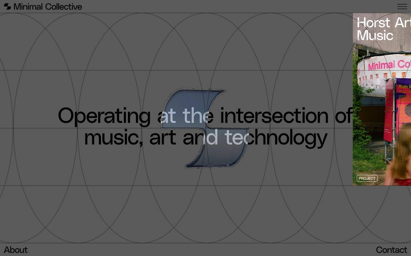
A stark, editorial black-canvas portfolio for a music/art/technology collective. The system is uncompromisingly monochrome — pure black (#000000) floor, pure white (#ffffff) type — set in the PolySans grotesque at very large display sizes with tight negative tracking. An overlaid elliptical grid, flat surfaces with no shadows, and near-zero rounding give it a technical, gallery-catalogue feel. Chromatic voltage comes almost entirely from full-bleed project imagery rather than from UI accent color.
Works withClaude CodeCursorCodexGemini CLICopilotv0LovableBoltWindsurfReplit
---
version: alpha
name: MinimalCollective-design-analysis
description: "A stark, editorial black-canvas portfolio for a music/art/technology collective. The system is uncompromisingly monochrome — pure black (#000000) floor, pure white (#ffffff) type — set in the PolySans grotesque at very large display sizes with tight negative tracking. An overlaid elliptical grid, flat surfaces with no shadows, and near-zero rounding give it a technical, gallery-catalogue feel. Chromatic voltage comes almost entirely from full-bleed project imagery rather than from UI accent color."

colors:
  canvas: "#000000"
  ink: "#ffffff"
  link: "#5a5a5a"
  muted: "#999999"
  neutral-light: "#dddddd"
  hairline: "#e6e6e6"
  surface-soft: "#fafafa"
  surface: "#f5f5f5"
  surface-strong: "#333333"
  surface-dark: "#222222"
  accent-blue: "#3898ec"
  accent-pink: "#ffdede"

typography:
  display:
    fontFamily: "PolySans, Space Grotesk, sans-serif"
    fontSize: 76.5px
    fontWeight: 400
    lineHeight: 1.0
    letterSpacing: -0.0294em
  heading-md:
    fontFamily: "PolySans, Space Grotesk, sans-serif"
    fontSize: 49.5px
    fontWeight: 400
    lineHeight: 0.9
    letterSpacing: -0.0202em
  button:
    fontFamily: "PolySans, Space Grotesk, sans-serif"
    fontSize: 27px
    fontWeight: 400
    lineHeight: 1.0
    letterSpacing: -0.037em
  body:
    fontFamily: "PolySans, Space Grotesk, sans-serif"
    fontSize: 18px
    fontWeight: 400
    lineHeight: 1.2
    letterSpacing: normal

rounded:
  none: 0px
  sm: 4px

spacing:
  xxs: 4px
  xs: 6px
  sm: 9px
  md: 14px
  lg: 18px
  xl: 45px
  xxl: 54px
  section: 144px
  section-lg: 216px
  gap-xxl: 500px

components:
  top-nav:
    backgroundColor: "{colors.canvas}"
    textColor: "{colors.ink}"
    typography: "{typography.body}"
    padding: 14px
  hero-band:
    backgroundColor: "{colors.canvas}"
    textColor: "{colors.ink}"
    typography: "{typography.display}"
    padding: 144px
  button-primary:
    backgroundColor: "{colors.ink}"
    textColor: "{colors.canvas}"
    typography: "{typography.button}"
    rounded: "{rounded.sm}"
    padding: 4.5px 18px 6.75px
  button-outline:
    backgroundColor: transparent
    textColor: "{colors.ink}"
    typography: "{typography.body}"
    rounded: "{rounded.sm}"
    padding: 4.5px 18px 6.75px
  input:
    backgroundColor: transparent
    textColor: "{colors.ink}"
    typography: "{typography.body}"
    rounded: "{rounded.none}"
    padding: 14px
  editorial-card:
    backgroundColor: "{colors.canvas}"
    textColor: "{colors.ink}"
    typography: "{typography.heading-md}"
    rounded: "{rounded.none}"
    padding: 18px
  pre-register-card:
    backgroundColor: "{colors.surface-dark}"
    textColor: "{colors.ink}"
    typography: "{typography.heading-md}"
    rounded: "{rounded.none}"
    padding: 18px
  project-tile:
    backgroundColor: "{colors.canvas}"
    textColor: "{colors.ink}"
    typography: "{typography.heading-md}"
    rounded: "{rounded.none}"
  badge-outline:
    backgroundColor: transparent
    textColor: "{colors.ink}"
    typography: "{typography.body}"
    rounded: "{rounded.sm}"
    padding: 4px 6px
  footer-nav:
    backgroundColor: "{colors.canvas}"
    textColor: "{colors.ink}"
    typography: "{typography.body}"
    padding: 14px
---

## Overview

Minimal Collective's landing page is an uncompromisingly monochrome, editorial black-canvas surface. The page floor is pure black (`{colors.canvas}` — #000000) and type is pure white (`{colors.ink}` — #ffffff) — the highest-contrast pairing possible. Everything else is a supporting neutral gray or an image. The result reads as a technical gallery catalogue crossed with a design-studio portfolio: precise, quiet, and confident.

The type voice is a single family — **PolySans**, a grotesque set at very large display sizes (76.5px headlines) with tight negative letter-spacing (-0.0294em) and 1.0 line-height. The collective's tagline ("Operating at the intersection of music, art and technology") is rendered as a full-width display headline that overlaps a translucent 3D glyph and an overlaid elliptical construction grid — a signature graphic gesture visible behind the hero.

There is no elevation system. The analyzer measured zero shadows, near-zero border radius (a single 4px value), and flat color-block surfaces throughout. Depth and interest come almost entirely from full-bleed project imagery (the pink-and-green "Horst Arts & Music" tile, editorial photos) rather than from UI chrome, gradients, or accent color.

**Key Characteristics:**
- Pure black canvas (`{colors.canvas}` — #000000) with pure white type (`{colors.ink}` — #ffffff). No mid-tone page backgrounds — the monochrome extremity is the brand.
- A single typeface (**PolySans**, substituted here) at weight 400 across every role — hierarchy comes from size (76.5 → 49.5 → 27 → 18px), not weight.
- Very tight negative letter-spacing on display and button type (-0.0294em / -0.037em) and compressed line-heights (0.9–1.0) — the type packs densely and reads as engineered.
- Almost no rounding — the only measured radius is 4px (`{rounded.sm}`); inputs are square-cornered (`{rounded.none}`, 0px).
- Flat surfaces, zero measured shadows — the system is entirely un-elevated.
- Full-bleed imagery as the only chromatic voltage; the small accent values (`{colors.accent-blue}`, `{colors.accent-pink}`) are near-invisible in the shipped UI.
- An overlaid elliptical/vesica construction grid behind the hero — a decorative geometry gesture rather than a layout grid.
- Generous vertical rhythm using large spacing steps (144px, 216px) between editorial bands.

## Colors

The palette is essentially two colors plus grays. The bulk of measured non-neutral values appear at tiny frequencies (1–5 hits) and are almost certainly image-sampled or framework defaults rather than intentional UI tokens — see Known Gaps.

### Brand & Accent
- **Accent Blue** (`{colors.accent-blue}` — #3898ec): The most frequent accent (frequency 36) — a Webflow-default interaction blue. Appears on focus/link affordances rather than as a painted brand color.
- **Accent Pink** (`{colors.accent-pink}` — #ffdede): A pale pink (frequency 5) surfacing in small accent moments. Echoes the pink signage in the "Horst Arts & Music" project image, but is used sparingly.

### Surface
- **Canvas** (`{colors.canvas}` — #000000): The default page floor for every band. The most frequent color in the system (frequency 538).
- **Surface Dark** (`{colors.surface-dark}` — #222222): The near-black used for the "Pre-register for future events / releases" panels — a barely-lighter block that separates them from the pure-black floor.
- **Surface Strong** (`{colors.surface-strong}` — #333333): A slightly lighter dark tone for nested blocks/dividers.
- **Surface** (`{colors.surface}` — #f5f5f5) / **Surface Soft** (`{colors.surface-soft}` — #fafafa): Light neutrals reserved for inverted contexts.
- **Hairline** (`{colors.hairline}` — #e6e6e6) / **Neutral Light** (`{colors.neutral-light}` — #dddddd): Thin border / divider tones.

### Text
- **Ink** (`{colors.ink}` — #ffffff): All headlines and primary text on the black canvas (frequency 192).
- **Muted** (`{colors.muted}` — #999999): Secondary / metadata text — dates, captions, category labels.
- **Link** (`{colors.link}` — #5a5a5a): Measured link color — a dark gray that intentionally recedes against black, used for de-emphasized inline links.

## Typography

### Font Family
The system runs a single typeface, **PolySans**, across every role. PolySans is a commercial grotesque (licensed from Gradient); it is not freely redistributable, so it must be paired with an open-source substitute for any implementation that cannot license it. Weight is a uniform **400** everywhere — the design never bolds; it scales.

### Hierarchy

| Token | Size | Weight | Line Height | Letter Spacing | Use |
|---|---|---|---|---|---|
| `{typography.display}` | 76.5px | 400 | 1.0 | -0.0294em | h1 / h2 — hero tagline, section heads ("Editorial", "Events", "Store", "Projects") |
| `{typography.heading-md}` | 49.5px | 400 | 0.9 | -0.0202em | h3 — card / article titles |
| `{typography.button}` | 27px | 400 | 1.0 | -0.037em | Button labels |
| `{typography.body}` | 18px | 400 | 1.2 | normal | Running text, metadata, nav links |

### Principles
Hierarchy is created exclusively through size and tracking, never weight — everything is PolySans 400. Display and heading sizes use tight negative letter-spacing (-0.0294em / -0.0202em / -0.037em) and compressed line-heights (0.9–1.0), so multi-line headlines pack densely. Body text relaxes to 1.2 line-height and normal tracking for legibility. Italic styling appears in editorial titles (e.g. "*How space shapes behaviour at MaHalla*") as a stylistic emphasis within the same family.

### Note on Font Substitutes
PolySans is a licensed commercial face and should never be claimed as shipped without a license. The closest open-source substitute is **Space Grotesk** (SIL Open Font License) — a grotesque with similar proportion and a technical character; set it at weight 400 with the measured negative tracking (~-0.03em on display) to approximate the PolySans signature. **Hanken Grotesk** is a secondary alternative. The fallback stack terminates in `sans-serif`.

## Layout

### Spacing System
- **Base rhythm:** small values cluster at 4px and 14px (the two highest-frequency steps); the odd intermediate values (6, 9, 45px) are consistent with a Webflow-scaled layout (derived observation).
- **Tokens:** `{spacing.xxs}` 4px · `{spacing.xs}` 6px · `{spacing.sm}` 9px · `{spacing.md}` 14px · `{spacing.lg}` 18px · `{spacing.xl}` 45px · `{spacing.xxl}` 54px · `{spacing.section}` 144px · `{spacing.section-lg}` 216px · `{spacing.gap-xxl}` 500px.
- **Micro padding:** `{spacing.md}` (14px) is the dominant component-internal step (nav, footer, inputs).
- **Section rhythm:** `{spacing.section}` (144px) and `{spacing.section-lg}` (216px) separate the major editorial bands (Editorial → Events → Store → Projects).
- **Large gaps:** `{spacing.gap-xxl}` (500px) appears as generous negative space between hero and the first content band.

### Grid & Container
- The hero uses a full-viewport layout: centered display headline with the project tile anchored to the top-right edge and nav pinned to the four corners (logo top-left, menu top-right, "About" bottom-left, "Contact" bottom-right).
- An overlaid **elliptical / vesica construction grid** runs behind the hero as decorative geometry — it is a graphic device, not a content grid.
- Content bands (Editorial, Events, Store) use section labels at large display size on the left with cards / lists arranged to the right, and full-bleed image tiles.

### Whitespace Philosophy
The page is deliberately sparse — large blank stretches of pure black separate content bands, and the hero floats a single sentence in an otherwise empty field. Whitespace is the primary compositional tool; the design uses emptiness to signal restraint and let imagery and large type carry the page.

## Elevation & Depth

The analyzer measured **zero shadows** — this is a completely flat system.

| Level | Treatment | Use |
|---|---|---|
| Flat canvas | Pure `{colors.canvas}` (#000000), no shadow, no border | All page bands, nav, footer |
| Tonal block | `{colors.surface-dark}` (#222222) / `{colors.surface-strong}` (#333333) | Pre-register panels — separated by a barely-lighter fill, not by shadow |
| Image tile | Full-bleed photograph | Project / editorial imagery — the only source of visual depth |

Depth is communicated by tonal contrast (near-black block on pure black) and by full-bleed imagery, never by drop shadows, blur, or glass effects. There is no neumorphism, no glassmorphism, no elevation layering.

### Decorative Depth
- The hero features a translucent 3D "S"-like glyph (a rendered ribbon form) sitting behind the tagline — a raytraced/3D artifact used as a graphic focal point.
- The elliptical construction grid overlaid on the hero adds a sense of blueprint depth without any actual z-layering in the token system.

## Shapes

### Border Radius Scale

| Token | Value | Use |
|---|---|---|
| `{rounded.none}` | 0px | Text inputs — square corners (measured) |
| `{rounded.sm}` | 4px | Buttons, small outlined badges (the only non-zero radius measured; button reports ~4.5px, rounded to the 4px token — derived) |

The system is essentially hard-edged. Cards and image tiles carry no measured radius; the 4px value applies only to buttons and small pill badges (e.g. the "PROJECT" tag).

### Photography Geometry
Project and editorial images run full-bleed with square corners. The top-right hero project tile bleeds off the viewport edge. Imagery keeps native rectangular framing — no rounded masks, no circular crops.

## Components

### Navigation

**`top-nav`** — Corner-anchored navigation on the black canvas. The logo + "Minimal Collective" wordmark sits top-left, a hamburger menu top-right. Background `{colors.canvas}`, text `{colors.ink}`, `{typography.body}` (PolySans 18px / 400), padding `{spacing.md}` (14px).

**`footer-nav`** — "About" (bottom-left) and "Contact" (bottom-right) links pinned to the lower corners of the hero viewport. Same treatment as the top nav — `{colors.canvas}` background, `{colors.ink}` text, `{typography.body}`.

### Buttons

**`button-primary`** — The filled action button. Text color measured at `{colors.canvas}` (#000000) sitting on an `{colors.ink}` (#ffffff) fill — an inverted white-on-black-page chip (background derived from the black-canvas/white-text inversion; only the label color was measured). Type `{typography.button}` (PolySans 27px / 400 / -0.037em), rounded `{rounded.sm}` (4px), padding 4.5px 18px 6.75px.

**`button-outline`** — Ghost/outlined button used for "All editorials", "All events", "Pre-register", "All projects" affordances — thin-stroke outline on the black canvas. Background transparent, text `{colors.ink}`, rounded `{rounded.sm}`, same padding as primary.

### Inputs & Forms

**`input`** — The email capture field ("Leave your email here") inside the pre-register panels. Square corners (`{rounded.none}`, 0px — measured), transparent fill, `{colors.ink}` text, `{typography.body}`, padding `{spacing.md}` (14px). Paired with an inline "Submit" `{component.button-outline}`.

### Cards & Tiles

**`editorial-card`** — Article card in the Editorial band. Background `{colors.canvas}`, image on top, then a category `{component.badge-outline}` row, a title in `{typography.heading-md}` (with italic emphasis on key phrases), and a `{typography.body}` description in `{colors.muted}`. Square corners, no shadow, padding `{spacing.lg}` (18px).

**`pre-register-card`** — The "Pre-register for future events / releases" panel. Background `{colors.surface-dark}` (#222222) — the one tonal block that lifts off pure black. Carries a `{typography.heading-md}` title, an inline `{component.input}`, and a "Submit" `{component.button-outline}`. Square corners, no shadow.

**`project-tile`** — Full-bleed image tile (e.g. "Horst Arts & Music", "De School", "ONE"). Image fills the frame with a title in `{typography.heading-md}` and a small `{component.badge-outline}` ("PROJECT") overlaid. Square corners; the imagery supplies all color.

**`badge-outline`** — Small outlined label ("PROJECT", "EDITORIAL", "INTERVIEW", "PREMIERE", "VISUAL") used for category tagging. Transparent fill, `{colors.ink}` text, `{typography.body}`, rounded `{rounded.sm}`, tight padding (~4px 6px).

## Do's and Don'ts

### Do
- Keep the canvas pure black (`{colors.canvas}` — #000000) and type pure white (`{colors.ink}` — #ffffff). The extreme monochrome contrast is the identity.
- Set everything in PolySans (or its substitute) at weight 400 — build hierarchy through size, not weight.
- Preserve tight negative letter-spacing on display and button type (-0.0294em / -0.037em). The dense packing is core to the voice.
- Let full-bleed imagery be the only real color in the layout.
- Use `{colors.surface-dark}` (#222222) sparingly for the pre-register blocks — it is the one permitted lift off pure black.
- Keep corners hard: `{rounded.none}` on inputs, `{rounded.sm}` only on buttons and small badges.
- Use generous vertical spacing (`{spacing.section}` 144px, `{spacing.section-lg}` 216px) between editorial bands.

### Don't
- Don't introduce mid-gray page backgrounds — the monochrome floor is binary black/white.
- Don't bold headlines to create emphasis; scale them up instead.
- Don't add drop shadows, gradients, or glass effects — the system measured zero shadows and should stay flat.
- Don't rely on `{colors.accent-blue}` or `{colors.accent-pink}` as brand color; they are near-invisible framework/image accents, not painted UI.
- Don't round card or image corners — imagery and content blocks stay square.
- Don't document hover states here — default and pressed/active only.

## Responsive Behavior

The site was captured at desktop and a tall full-page render; the following is partly inferred from the two captures (derived).

### Breakpoints

| Name | Width | Key Changes |
|---|---|---|
| Mobile | < 768px | Hero display type scales down substantially from 76.5px; corner nav consolidates; content bands stack single-column; project tiles go full-width |
| Tablet | 768–1024px | Hero tagline wraps to 2–3 lines; project tile shrinks; editorial cards go 1-up |
| Desktop | > 1024px | Full corner-anchored nav; hero tagline in `{typography.display}`; top-right project tile bleeds off-edge; multi-column editorial/events/store bands |

### Touch Targets
- `{component.button-primary}` and `{component.button-outline}` use compact padding (4.5px vertical); on touch these would need enlarged hit areas to meet a 44px minimum (not confirmed — see Known Gaps).
- The hamburger menu (`{component.top-nav}`) is the primary mobile nav affordance.

### Collapsing Strategy
- Corner-pinned nav (logo / menu / About / Contact) collapses toward a single top bar + hamburger on small screens.
- Multi-column editorial and events grids reduce to single column.
- Full-bleed project tiles remain full-width; display headlines re-flow to more lines rather than shrinking below legibility.

### Image Behavior
- Project imagery is full-bleed and crops to fill its tile at every breakpoint.
- The hero's off-edge top-right tile likely reflows inline on mobile (inferred).

## Iteration Guide

1. Focus on ONE component at a time. Reference its YAML key directly (`{component.editorial-card}`, `{component.pre-register-card}`).
2. Variants (`-active`, `-outline`, `-disabled`) live as separate entries in `components:`.
3. Use `{token.refs}` everywhere — never inline a hex.
4. Never document hover. Default and Active/Pressed states only.
5. Hierarchy is size, not weight — every role is PolySans 400. When something needs emphasis, make it bigger or add italic, never bolder.
6. Keep the palette binary: black canvas, white ink, images for color. Resist adding accent fills.
7. Stay flat — no shadows, no gradients. Depth is imagery and tonal blocks only.

## Known Gaps

- **PolySans is a licensed commercial typeface** and was not flagged in `fonts_licensed`, but it cannot be shipped without a license; Space Grotesk is documented as the open-source substitute.
- **Button background color is derived**, not measured — the analyzer captured only the label color (#000000); the white fill is inferred from the black-canvas/white-text inversion. Confirm against production CSS.
- **Button radius** reports ~4.5px in the component data but only a 4px radius token was measured; the button references `{rounded.sm}` (4px) as a derived rounding.
- Many measured colors (`#0082f3`, `#ffff00`, `#5d6c7b`, `#aaadb0`, `#c8c8c8`, `#666666`, `#e2e2e2`, `#cccccc`) appear at very low frequency (1–3) and are likely image-sampled pixels or framework defaults rather than intentional tokens; they are omitted from the palette.
- No shadow/elevation values were measured — the flat characterization is confirmed by absence, but any subtle image-embedded shadows are out of scope.
- Only the landing page was captured; interior templates (Editorial article, Store, Projects detail) are inferred from card fragments and not independently measured.
- Responsive breakpoints and touch-target sizing are inferred from two desktop captures; no mobile viewport was measured.
- Hover/transition/animation behavior (the hero 3D glyph motion, grid reveal) is not in scope.
- Form validation and focus states beyond the base `{component.input}` were not extracted.

<!-- Documented by Duply · real-world design systems as ready-to-use DESIGN.md for AI coding agents · https://duply.ai/minimalcollective/design-md -->
Color Palette
Accent
Neutrals
Typography
display76.5px · 400 · 1
The quick brown fox jumpsheading-md49.5px · 400 · 0.9
The quick brown fox jumpsbutton27px · 400 · 1
The quick brown fox jumpsbody18px · 400 · 1.2
The quick brown fox jumpsSpacing & Shape
Spacing
| Name | Value | Preview |
|---|---|---|
| xxs | 4px | |
| xs | 6px | |
| sm | 9px | |
| md | 14px | |
| lg | 18px | |
| xl | 45px | |
| xxl | 54px | |
| section | 144px | |
| section-lg | 216px | |
| gap-xxl | 500px |
Border Radius
| Name | Value | Preview |
|---|---|---|
| none | 0px | |
| sm | 4px |
FAQ
- What colors does MinimalCollective use?
- MinimalCollective's core palette includes #000000, #ffffff, #5a5a5a, #999999, #dddddd. The full color set with usage roles (canvas, ink, surfaces, accent, semantic) is documented in the MinimalCollective DESIGN.md.
- What font does MinimalCollective use?
- MinimalCollective's primary typeface is PolySans. The complete type scale (sizes, weights, line-height and letter-spacing per role), with an open substitute where the original is licensed, is documented in the DESIGN.md.
- What is the MinimalCollective design system?
- A stark, editorial black-canvas portfolio for a music/art/technology collective. The system is uncompromisingly monochrome — pure black (#000000) floor, pure white (#ffffff) type — set in the PolySans grotesque at very large display sizes with tight negative tracking. An overlaid elliptical grid
Get this as a working kit
MinimalCollective Launch Kit + DESIGN.md
$299$225
One-time payment
- A complete production-stack template, styled like MinimalCollective, fully built and wired.
- One-time payment and the codebase is yours. No platform fees, no subscription.
Open it with Claude Code, Cursor, or any coding agent and build in plain language, then ship a complete web app.
- Your private DESIGN.md
- Marketing pages, blog, SEO & legal
- Email capture, newsletter & contact
- Accept payments (Stripe)
- Analytics (GA4 + PostHog)
- One-click deploy
- Auth, login & roles
- A full app dashboard, when you grow
More like this

---
version: alpha
name: MinimalCollective-design-analysis
description: "A stark, editorial black-canvas portfolio for a music/art/technology collective. The system is uncompromisingly monochrome — pure black (#000000) floor, pure white (#ffffff) type — set in the PolySans grotesque at very large display sizes with tight negative tracking. An overlaid elliptical grid, flat surfaces with no shadows, and near-zero rounding give it a technical, gallery-catalogue feel. Chromatic voltage comes almost entirely from full-bleed project imagery rather than from UI accent color."

colors:
  canvas: "#000000"
  ink: "#ffffff"
  link: "#5a5a5a"
  muted: "#999999"
  neutral-light: "#dddddd"
  hairline: "#e6e6e6"
  surface-soft: "#fafafa"
  surface: "#f5f5f5"
  surface-strong: "#333333"
  surface-dark: "#222222"
  accent-blue: "#3898ec"
  accent-pink: "#ffdede"

typography:
  display:
    fontFamily: "PolySans, Space Grotesk, sans-serif"
    fontSize: 76.5px
    fontWeight: 400
    lineHeight: 1.0
    letterSpacing: -0.0294em
  heading-md:
    fontFamily: "PolySans, Space Grotesk, sans-serif"
    fontSize: 49.5px
    fontWeight: 400
    lineHeight: 0.9
    letterSpacing: -0.0202em
  button:
    fontFamily: "PolySans, Space Grotesk, sans-serif"
    fontSize: 27px
    fontWeight: 400
    lineHeight: 1.0
    letterSpacing: -0.037em
  body:
    fontFamily: "PolySans, Space Grotesk, sans-serif"
    fontSize: 18px
    fontWeight: 400
    lineHeight: 1.2
    letterSpacing: normal

rounded:
  none: 0px
  sm: 4px

spacing:
  xxs: 4px
  xs: 6px
  sm: 9px
  md: 14px
  lg: 18px
  xl: 45px
  xxl: 54px
  section: 144px
  section-lg: 216px
  gap-xxl: 500px

components:
  top-nav:
    backgroundColor: "{colors.canvas}"
    textColor: "{colors.ink}"
    typography: "{typography.body}"
    padding: 14px
  hero-band:
    backgroundColor: "{colors.canvas}"
    textColor: "{colors.ink}"
    typography: "{typography.display}"
    padding: 144px
  button-primary:
    backgroundColor: "{colors.ink}"
    textColor: "{colors.canvas}"
    typography: "{typography.button}"
    rounded: "{rounded.sm}"
    padding: 4.5px 18px 6.75px
  button-outline:
    backgroundColor: transparent
    textColor: "{colors.ink}"
    typography: "{typography.body}"
    rounded: "{rounded.sm}"
    padding: 4.5px 18px 6.75px
  input:
    backgroundColor: transparent
    textColor: "{colors.ink}"
    typography: "{typography.body}"
    rounded: "{rounded.none}"
    padding: 14px
  editorial-card:
    backgroundColor: "{colors.canvas}"
    textColor: "{colors.ink}"
    typography: "{typography.heading-md}"
    rounded: "{rounded.none}"
    padding: 18px
  pre-register-card:
    backgroundColor: "{colors.surface-dark}"
    textColor: "{colors.ink}"
    typography: "{typography.heading-md}"
    rounded: "{rounded.none}"
    padding: 18px
  project-tile:
    backgroundColor: "{colors.canvas}"
    textColor: "{colors.ink}"
    typography: "{typography.heading-md}"
    rounded: "{rounded.none}"
  badge-outline:
    backgroundColor: transparent
    textColor: "{colors.ink}"
    typography: "{typography.body}"
    rounded: "{rounded.sm}"
    padding: 4px 6px
  footer-nav:
    backgroundColor: "{colors.canvas}"
    textColor: "{colors.ink}"
    typography: "{typography.body}"
    padding: 14px
---

## Overview

Minimal Collective's landing page is an uncompromisingly monochrome, editorial black-canvas surface. The page floor is pure black (`{colors.canvas}` — #000000) and type is pure white (`{colors.ink}` — #ffffff) — the highest-contrast pairing possible. Everything else is a supporting neutral gray or an image. The result reads as a technical gallery catalogue crossed with a design-studio portfolio: precise, quiet, and confident.

The type voice is a single family — **PolySans**, a grotesque set at very large display sizes (76.5px headlines) with tight negative letter-spacing (-0.0294em) and 1.0 line-height. The collective's tagline ("Operating at the intersection of music, art and technology") is rendered as a full-width display headline that overlaps a translucent 3D glyph and an overlaid elliptical construction grid — a signature graphic gesture visible behind the hero.

There is no elevation system. The analyzer measured zero shadows, near-zero border radius (a single 4px value), and flat color-block surfaces throughout. Depth and interest come almost entirely from full-bleed project imagery (the pink-and-green "Horst Arts & Music" tile, editorial photos) rather than from UI chrome, gradients, or accent color.

**Key Characteristics:**
- Pure black canvas (`{colors.canvas}` — #000000) with pure white type (`{colors.ink}` — #ffffff). No mid-tone page backgrounds — the monochrome extremity is the brand.
- A single typeface (**PolySans**, substituted here) at weight 400 across every role — hierarchy comes from size (76.5 → 49.5 → 27 → 18px), not weight.
- Very tight negative letter-spacing on display and button type (-0.0294em / -0.037em) and compressed line-heights (0.9–1.0) — the type packs densely and reads as engineered.
- Almost no rounding — the only measured radius is 4px (`{rounded.sm}`); inputs are square-cornered (`{rounded.none}`, 0px).
- Flat surfaces, zero measured shadows — the system is entirely un-elevated.
- Full-bleed imagery as the only chromatic voltage; the small accent values (`{colors.accent-blue}`, `{colors.accent-pink}`) are near-invisible in the shipped UI.
- An overlaid elliptical/vesica construction grid behind the hero — a decorative geometry gesture rather than a layout grid.
- Generous vertical rhythm using large spacing steps (144px, 216px) between editorial bands.

## Colors

The palette is essentially two colors plus grays. The bulk of measured non-neutral values appear at tiny frequencies (1–5 hits) and are almost certainly image-sampled or framework defaults rather than intentional UI tokens — see Known Gaps.

### Brand & Accent
- **Accent Blue** (`{colors.accent-blue}` — #3898ec): The most frequent accent (frequency 36) — a Webflow-default interaction blue. Appears on focus/link affordances rather than as a painted brand color.
- **Accent Pink** (`{colors.accent-pink}` — #ffdede): A pale pink (frequency 5) surfacing in small accent moments. Echoes the pink signage in the "Horst Arts & Music" project image, but is used sparingly.

### Surface
- **Canvas** (`{colors.canvas}` — #000000): The default page floor for every band. The most frequent color in the system (frequency 538).
- **Surface Dark** (`{colors.surface-dark}` — #222222): The near-black used for the "Pre-register for future events / releases" panels — a barely-lighter block that separates them from the pure-black floor.
- **Surface Strong** (`{colors.surface-strong}` — #333333): A slightly lighter dark tone for nested blocks/dividers.
- **Surface** (`{colors.surface}` — #f5f5f5) / **Surface Soft** (`{colors.surface-soft}` — #fafafa): Light neutrals reserved for inverted contexts.
- **Hairline** (`{colors.hairline}` — #e6e6e6) / **Neutral Light** (`{colors.neutral-light}` — #dddddd): Thin border / divider tones.

### Text
- **Ink** (`{colors.ink}` — #ffffff): All headlines and primary text on the black canvas (frequency 192).
- **Muted** (`{colors.muted}` — #999999): Secondary / metadata text — dates, captions, category labels.
- **Link** (`{colors.link}` — #5a5a5a): Measured link color — a dark gray that intentionally recedes against black, used for de-emphasized inline links.

## Typography

### Font Family
The system runs a single typeface, **PolySans**, across every role. PolySans is a commercial grotesque (licensed from Gradient); it is not freely redistributable, so it must be paired with an open-source substitute for any implementation that cannot license it. Weight is a uniform **400** everywhere — the design never bolds; it scales.

### Hierarchy

| Token | Size | Weight | Line Height | Letter Spacing | Use |
|---|---|---|---|---|---|
| `{typography.display}` | 76.5px | 400 | 1.0 | -0.0294em | h1 / h2 — hero tagline, section heads ("Editorial", "Events", "Store", "Projects") |
| `{typography.heading-md}` | 49.5px | 400 | 0.9 | -0.0202em | h3 — card / article titles |
| `{typography.button}` | 27px | 400 | 1.0 | -0.037em | Button labels |
| `{typography.body}` | 18px | 400 | 1.2 | normal | Running text, metadata, nav links |

### Principles
Hierarchy is created exclusively through size and tracking, never weight — everything is PolySans 400. Display and heading sizes use tight negative letter-spacing (-0.0294em / -0.0202em / -0.037em) and compressed line-heights (0.9–1.0), so multi-line headlines pack densely. Body text relaxes to 1.2 line-height and normal tracking for legibility. Italic styling appears in editorial titles (e.g. "*How space shapes behaviour at MaHalla*") as a stylistic emphasis within the same family.

### Note on Font Substitutes
PolySans is a licensed commercial face and should never be claimed as shipped without a license. The closest open-source substitute is **Space Grotesk** (SIL Open Font License) — a grotesque with similar proportion and a technical character; set it at weight 400 with the measured negative tracking (~-0.03em on display) to approximate the PolySans signature. **Hanken Grotesk** is a secondary alternative. The fallback stack terminates in `sans-serif`.

## Layout

### Spacing System
- **Base rhythm:** small values cluster at 4px and 14px (the two highest-frequency steps); the odd intermediate values (6, 9, 45px) are consistent with a Webflow-scaled layout (derived observation).
- **Tokens:** `{spacing.xxs}` 4px · `{spacing.xs}` 6px · `{spacing.sm}` 9px · `{spacing.md}` 14px · `{spacing.lg}` 18px · `{spacing.xl}` 45px · `{spacing.xxl}` 54px · `{spacing.section}` 144px · `{spacing.section-lg}` 216px · `{spacing.gap-xxl}` 500px.
- **Micro padding:** `{spacing.md}` (14px) is the dominant component-internal step (nav, footer, inputs).
- **Section rhythm:** `{spacing.section}` (144px) and `{spacing.section-lg}` (216px) separate the major editorial bands (Editorial → Events → Store → Projects).
- **Large gaps:** `{spacing.gap-xxl}` (500px) appears as generous negative space between hero and the first content band.

### Grid & Container
- The hero uses a full-viewport layout: centered display headline with the project tile anchored to the top-right edge and nav pinned to the four corners (logo top-left, menu top-right, "About" bottom-left, "Contact" bottom-right).
- An overlaid **elliptical / vesica construction grid** runs behind the hero as decorative geometry — it is a graphic device, not a content grid.
- Content bands (Editorial, Events, Store) use section labels at large display size on the left with cards / lists arranged to the right, and full-bleed image tiles.

### Whitespace Philosophy
The page is deliberately sparse — large blank stretches of pure black separate content bands, and the hero floats a single sentence in an otherwise empty field. Whitespace is the primary compositional tool; the design uses emptiness to signal restraint and let imagery and large type carry the page.

## Elevation & Depth

The analyzer measured **zero shadows** — this is a completely flat system.

| Level | Treatment | Use |
|---|---|---|
| Flat canvas | Pure `{colors.canvas}` (#000000), no shadow, no border | All page bands, nav, footer |
| Tonal block | `{colors.surface-dark}` (#222222) / `{colors.surface-strong}` (#333333) | Pre-register panels — separated by a barely-lighter fill, not by shadow |
| Image tile | Full-bleed photograph | Project / editorial imagery — the only source of visual depth |

Depth is communicated by tonal contrast (near-black block on pure black) and by full-bleed imagery, never by drop shadows, blur, or glass effects. There is no neumorphism, no glassmorphism, no elevation layering.

### Decorative Depth
- The hero features a translucent 3D "S"-like glyph (a rendered ribbon form) sitting behind the tagline — a raytraced/3D artifact used as a graphic focal point.
- The elliptical construction grid overlaid on the hero adds a sense of blueprint depth without any actual z-layering in the token system.

## Shapes

### Border Radius Scale

| Token | Value | Use |
|---|---|---|
| `{rounded.none}` | 0px | Text inputs — square corners (measured) |
| `{rounded.sm}` | 4px | Buttons, small outlined badges (the only non-zero radius measured; button reports ~4.5px, rounded to the 4px token — derived) |

The system is essentially hard-edged. Cards and image tiles carry no measured radius; the 4px value applies only to buttons and small pill badges (e.g. the "PROJECT" tag).

### Photography Geometry
Project and editorial images run full-bleed with square corners. The top-right hero project tile bleeds off the viewport edge. Imagery keeps native rectangular framing — no rounded masks, no circular crops.

## Components

### Navigation

**`top-nav`** — Corner-anchored navigation on the black canvas. The logo + "Minimal Collective" wordmark sits top-left, a hamburger menu top-right. Background `{colors.canvas}`, text `{colors.ink}`, `{typography.body}` (PolySans 18px / 400), padding `{spacing.md}` (14px).

**`footer-nav`** — "About" (bottom-left) and "Contact" (bottom-right) links pinned to the lower corners of the hero viewport. Same treatment as the top nav — `{colors.canvas}` background, `{colors.ink}` text, `{typography.body}`.

### Buttons

**`button-primary`** — The filled action button. Text color measured at `{colors.canvas}` (#000000) sitting on an `{colors.ink}` (#ffffff) fill — an inverted white-on-black-page chip (background derived from the black-canvas/white-text inversion; only the label color was measured). Type `{typography.button}` (PolySans 27px / 400 / -0.037em), rounded `{rounded.sm}` (4px), padding 4.5px 18px 6.75px.

**`button-outline`** — Ghost/outlined button used for "All editorials", "All events", "Pre-register", "All projects" affordances — thin-stroke outline on the black canvas. Background transparent, text `{colors.ink}`, rounded `{rounded.sm}`, same padding as primary.

### Inputs & Forms

**`input`** — The email capture field ("Leave your email here") inside the pre-register panels. Square corners (`{rounded.none}`, 0px — measured), transparent fill, `{colors.ink}` text, `{typography.body}`, padding `{spacing.md}` (14px). Paired with an inline "Submit" `{component.button-outline}`.

### Cards & Tiles

**`editorial-card`** — Article card in the Editorial band. Background `{colors.canvas}`, image on top, then a category `{component.badge-outline}` row, a title in `{typography.heading-md}` (with italic emphasis on key phrases), and a `{typography.body}` description in `{colors.muted}`. Square corners, no shadow, padding `{spacing.lg}` (18px).

**`pre-register-card`** — The "Pre-register for future events / releases" panel. Background `{colors.surface-dark}` (#222222) — the one tonal block that lifts off pure black. Carries a `{typography.heading-md}` title, an inline `{component.input}`, and a "Submit" `{component.button-outline}`. Square corners, no shadow.

**`project-tile`** — Full-bleed image tile (e.g. "Horst Arts & Music", "De School", "ONE"). Image fills the frame with a title in `{typography.heading-md}` and a small `{component.badge-outline}` ("PROJECT") overlaid. Square corners; the imagery supplies all color.

**`badge-outline`** — Small outlined label ("PROJECT", "EDITORIAL", "INTERVIEW", "PREMIERE", "VISUAL") used for category tagging. Transparent fill, `{colors.ink}` text, `{typography.body}`, rounded `{rounded.sm}`, tight padding (~4px 6px).

## Do's and Don'ts

### Do
- Keep the canvas pure black (`{colors.canvas}` — #000000) and type pure white (`{colors.ink}` — #ffffff). The extreme monochrome contrast is the identity.
- Set everything in PolySans (or its substitute) at weight 400 — build hierarchy through size, not weight.
- Preserve tight negative letter-spacing on display and button type (-0.0294em / -0.037em). The dense packing is core to the voice.
- Let full-bleed imagery be the only real color in the layout.
- Use `{colors.surface-dark}` (#222222) sparingly for the pre-register blocks — it is the one permitted lift off pure black.
- Keep corners hard: `{rounded.none}` on inputs, `{rounded.sm}` only on buttons and small badges.
- Use generous vertical spacing (`{spacing.section}` 144px, `{spacing.section-lg}` 216px) between editorial bands.

### Don't
- Don't introduce mid-gray page backgrounds — the monochrome floor is binary black/white.
- Don't bold headlines to create emphasis; scale them up instead.
- Don't add drop shadows, gradients, or glass effects — the system measured zero shadows and should stay flat.
- Don't rely on `{colors.accent-blue}` or `{colors.accent-pink}` as brand color; they are near-invisible framework/image accents, not painted UI.
- Don't round card or image corners — imagery and content blocks stay square.
- Don't document hover states here — default and pressed/active only.

## Responsive Behavior

The site was captured at desktop and a tall full-page render; the following is partly inferred from the two captures (derived).

### Breakpoints

| Name | Width | Key Changes |
|---|---|---|
| Mobile | < 768px | Hero display type scales down substantially from 76.5px; corner nav consolidates; content bands stack single-column; project tiles go full-width |
| Tablet | 768–1024px | Hero tagline wraps to 2–3 lines; project tile shrinks; editorial cards go 1-up |
| Desktop | > 1024px | Full corner-anchored nav; hero tagline in `{typography.display}`; top-right project tile bleeds off-edge; multi-column editorial/events/store bands |

### Touch Targets
- `{component.button-primary}` and `{component.button-outline}` use compact padding (4.5px vertical); on touch these would need enlarged hit areas to meet a 44px minimum (not confirmed — see Known Gaps).
- The hamburger menu (`{component.top-nav}`) is the primary mobile nav affordance.

### Collapsing Strategy
- Corner-pinned nav (logo / menu / About / Contact) collapses toward a single top bar + hamburger on small screens.
- Multi-column editorial and events grids reduce to single column.
- Full-bleed project tiles remain full-width; display headlines re-flow to more lines rather than shrinking below legibility.

### Image Behavior
- Project imagery is full-bleed and crops to fill its tile at every breakpoint.
- The hero's off-edge top-right tile likely reflows inline on mobile (inferred).

## Iteration Guide

1. Focus on ONE component at a time. Reference its YAML key directly (`{component.editorial-card}`, `{component.pre-register-card}`).
2. Variants (`-active`, `-outline`, `-disabled`) live as separate entries in `components:`.
3. Use `{token.refs}` everywhere — never inline a hex.
4. Never document hover. Default and Active/Pressed states only.
5. Hierarchy is size, not weight — every role is PolySans 400. When something needs emphasis, make it bigger or add italic, never bolder.
6. Keep the palette binary: black canvas, white ink, images for color. Resist adding accent fills.
7. Stay flat — no shadows, no gradients. Depth is imagery and tonal blocks only.

## Known Gaps

- **PolySans is a licensed commercial typeface** and was not flagged in `fonts_licensed`, but it cannot be shipped without a license; Space Grotesk is documented as the open-source substitute.
- **Button background color is derived**, not measured — the analyzer captured only the label color (#000000); the white fill is inferred from the black-canvas/white-text inversion. Confirm against production CSS.
- **Button radius** reports ~4.5px in the component data but only a 4px radius token was measured; the button references `{rounded.sm}` (4px) as a derived rounding.
- Many measured colors (`#0082f3`, `#ffff00`, `#5d6c7b`, `#aaadb0`, `#c8c8c8`, `#666666`, `#e2e2e2`, `#cccccc`) appear at very low frequency (1–3) and are likely image-sampled pixels or framework defaults rather than intentional tokens; they are omitted from the palette.
- No shadow/elevation values were measured — the flat characterization is confirmed by absence, but any subtle image-embedded shadows are out of scope.
- Only the landing page was captured; interior templates (Editorial article, Store, Projects detail) are inferred from card fragments and not independently measured.
- Responsive breakpoints and touch-target sizing are inferred from two desktop captures; no mobile viewport was measured.
- Hover/transition/animation behavior (the hero 3D glyph motion, grid reveal) is not in scope.
- Form validation and focus states beyond the base `{component.input}` were not extracted.

<!-- Documented by Duply · real-world design systems as ready-to-use DESIGN.md for AI coding agents · https://duply.ai/minimalcollective/design-md -->