
Vividand
A dark, gallery-black creative-agency landing surface anchored on a near-black canvas (#101010) with warm off-white type (#fffdf9), oversized Neue Montreal display headlines, and a single muted slate-blue accent. The system reads as a confident portfolio site — cinematic negative space, one enormous editorial headline per view, a chromatic-aberration 3D graphic as the hero centerpiece, and rounded photo cards for team members. Brand voltage comes from scale (a 136px display headline against black) rather than from color.
Works withClaude CodeCursorCodexGemini CLICopilotv0LovableBoltWindsurfReplit
---
version: alpha
name: Vividand-design-analysis
description: "A dark, gallery-black creative-agency landing surface anchored on a near-black canvas (#101010) with warm off-white type (#fffdf9), oversized Neue Montreal display headlines, and a single muted slate-blue accent. The system reads as a confident portfolio site — cinematic negative space, one enormous editorial headline per view, a chromatic-aberration 3D graphic as the hero centerpiece, and rounded photo cards for team members. Brand voltage comes from scale (a 136px display headline against black) rather than from color."
colors:
  ink: "#fffdf9"
  accent-slate: "#6f879c"
  canvas: "#101010"
  neutral: "#000000"
typography:
  display-xl:
    fontFamily: "Neue Montreal, Space Grotesk, sans-serif"
    fontSize: 136px
    fontWeight: 400
    lineHeight: 1.0
    letterSpacing: -0.02em
  title-lg:
    fontFamily: "Neue Montreal, Space Grotesk, sans-serif"
    fontSize: 36px
    fontWeight: 700
    lineHeight: 1.5
    letterSpacing: 0
  heading-md:
    fontFamily: "Neue Montreal, Space Grotesk, sans-serif"
    fontSize: 32px
    fontWeight: 400
    lineHeight: 1.01
    letterSpacing: 0
  body-lg:
    fontFamily: "Neue Montreal, Space Grotesk, sans-serif"
    fontSize: 33px
    fontWeight: 400
    lineHeight: 1.2
    letterSpacing: -0.01em
  button:
    fontFamily: "Neue Montreal, Space Grotesk, sans-serif"
    fontSize: 18px
    fontWeight: 400
    lineHeight: 1.167
    letterSpacing: 0.02em
rounded:
  sm: 5px
  md: 15px
spacing:
  xxs: 5px
  xs: 7px
  sm: 11px
  md: 15px
  lg: 20px
  xl: 38px
  xxl: 64px
  huge: 318px
components:
  wordmark:
    backgroundColor: transparent
    textColor: "{colors.ink}"
    typography: "{typography.title-lg}"
  top-nav:
    backgroundColor: "{colors.canvas}"
    textColor: "{colors.ink}"
    typography: "{typography.button}"
    padding: 38px
  nav-link:
    backgroundColor: transparent
    textColor: "{colors.ink}"
    typography: "{typography.button}"
  button-contact:
    backgroundColor: transparent
    textColor: "{colors.ink}"
    typography: "{typography.button}"
    rounded: "{rounded.sm}"
    padding: 11px 20px
  button-primary:
    backgroundColor: transparent
    textColor: "{colors.ink}"
    typography: "{typography.button}"
  hero-band:
    backgroundColor: "{colors.canvas}"
    textColor: "{colors.ink}"
    typography: "{typography.display-xl}"
    padding: 64px
  display-heading:
    backgroundColor: transparent
    textColor: "{colors.ink}"
    typography: "{typography.display-xl}"
  body-text:
    backgroundColor: transparent
    textColor: "{colors.ink}"
    typography: "{typography.body-lg}"
  team-card:
    backgroundColor: "{colors.canvas}"
    textColor: "{colors.ink}"
    typography: "{typography.body-lg}"
    rounded: "{rounded.md}"
---

## Overview

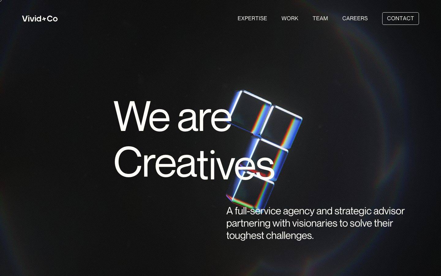
Vivid+Co's landing page is a dark, gallery-black creative-agency surface — a near-black canvas (`{colors.canvas}` — #101010) that fills the entire viewport, warm off-white type (`{colors.ink}` — #fffdf9) for every word on screen, and one enormous Neue Montreal display headline ("We are Creatives") anchoring the hero. The system reads as a confident portfolio: cinematic negative space, a single editorial statement per view, and a chromatic-aberration 3D cube graphic floating at the center as the only imagery in the fold.

Type voice is single-family and scale-driven. **Neue Montreal** carries everything — the giant 136px display headline (`{typography.display-xl}`), the 36px bold wordmark (`{typography.title-lg}`), the 33px body subhead (`{typography.body-lg}`), and the 18px nav/button labels (`{typography.button}`). There is no secondary typeface; hierarchy is built entirely from size and weight against the black field.

Color is nearly absent by design. The palette is a two-tone system — off-white ink on near-black canvas — with a single muted slate-blue accent (`{colors.accent-slate}` — #6f879c) that appears sparingly (measured at very low frequency). Brand voltage comes from the sheer scale of the display headline and from the prismatic 3D graphic, not from a color story.

The second captured viewport reveals scroll content: rounded photo cards (`{rounded.md}` — 15px) introducing team members ("Caitlin Kelly · Founder") against the same black canvas. The whole page stays on one surface — there is no light mode, no section inversion; the black canvas is the page.

**Key Characteristics:**
- Full-bleed near-black canvas (`{colors.canvas}` — #101010). Every band shares the same surface; there is no light section.
- Off-white ink (`{colors.ink}` — #fffdf9) for all type — a warm white, not pure #ffffff.
- Single typeface (Neue Montreal) doing all the work; hierarchy is scale + weight, not family contrast.
- Oversized display headline at `{typography.display-xl}` (136px, weight 400, -0.02em tracking) — the marquee gesture.
- Chromatic-aberration 3D cube graphic as the hero centerpiece — the only imagery in the fold, carrying prismatic red/green/blue edge fringing.
- Muted slate-blue accent (`{colors.accent-slate}` — #6f879c) used extremely sparingly.
- Outlined "CONTACT" button (`{component.button-contact}`) — transparent fill, ink text, subtle `{rounded.sm}` (5px) corner.
- Rounded photo cards (`{rounded.md}` — 15px) for team members lower on the page.
- Flat depth — no measured shadows; the black canvas and scale do the compositional work.

## Colors

### Brand & Accent
- **Ink** (`{colors.ink}` — #fffdf9): The dominant color on the page — a warm off-white used for every headline, body line, nav item, and the wordmark. This is the highest-frequency measured color (it is effectively the "foreground" of the whole site).
- **Accent Slate** (`{colors.accent-slate}` — #6f879c): A muted slate-blue used extremely sparingly (measured at very low frequency — 35 occurrences). Appears on small accent moments and secondary detail; never on a headline. The site is otherwise a two-tone monochrome.

### Surface
- **Canvas** (`{colors.canvas}` — #101010): The near-black page floor. Fills the entire viewport across every band; there is no alternate surface color.
- **Neutral** (`{colors.neutral}` — #000000): Pure black, measured at a single occurrence — likely a nested element or gradient anchor. Not a primary surface.

### Text
All text uses `{colors.ink}` (#fffdf9). There is no measured secondary or muted text tone; hierarchy between headline and body is achieved through size (136px vs 33px) rather than through a lighter text color. Any dimmed sub-labels (e.g. "· Founder") should be treated as a known gap — no separate muted-ink value was measured.

## Typography

### Font Family
The system runs **Neue Montreal** exclusively — a clean, slightly geometric grotesk used for display, headings, body, nav, and buttons alike. There is no second family; the entire hierarchy is one typeface expressed at different sizes and two weights (400 and 700). The fallback stack walks `Space Grotesk, sans-serif`.

The weight split is minimal:
- Weight 700 — the wordmark / `{typography.title-lg}` only.
- Weight 400 — everything else, including the giant display headline.

### Hierarchy

| Token | Size | Weight | Line Height | Letter Spacing | Use |
|---|---|---|---|---|---|
| `{typography.display-xl}` | 136px | 400 | 1.0 | -0.02em | Hero headline ("We are Creatives") — derived (measured 135.937px, rounded) |
| `{typography.title-lg}` | 36px | 700 | 1.5 | 0 | "Vivid+Co" wordmark / bold page title |
| `{typography.heading-md}` | 32px | 400 | 1.01 | 0 | Secondary headings — derived (measured 31.979px, rounded) |
| `{typography.body-lg}` | 33px | 400 | 1.2 | -0.01em | Hero subhead ("A full-service agency…") — derived (measured 33.474px, rounded) |
| `{typography.button}` | 18px | 400 | 1.167 | 0.02em | Nav items, CONTACT button, small labels |

### Principles
Hierarchy is scale-driven: the leap from 136px display to 33px body is enormous, and that gap — not color or family contrast — is what creates the editorial rhythm. The display headline sits at weight 400 (not bold), so its authority comes from size alone; the only bold in the system is the 36px wordmark.

Note the negative tracking on the two largest editorial roles (-0.02em on display, -0.01em on body) versus the positive tracking on the small button role (+0.02em) — tight display, slightly open UI labels.

### Note on Font Substitutes
Neue Montreal is a commercial typeface (Pangram Pangram Foundry) and is not documented as freely redistributable. If it is unavailable, **Space Grotesk** is the closest open-source substitute — a similarly proportioned geometric grotesk that preserves the clean, slightly technical character. **Archivo** at comparable weights is a second alternative. Ship the substitute unless a Neue Montreal license is in hand.

## Layout

### Spacing System
- **Base unit:** irregular; the measured ladder clusters around ~5–7px small increments and ~15px mid increments.
- **Tokens:** `{spacing.xxs}` 5px · `{spacing.xs}` 7px · `{spacing.sm}` 11px · `{spacing.md}` 15px · `{spacing.lg}` 20px · `{spacing.xl}` 38px · `{spacing.xxl}` 64px · `{spacing.huge}` 318px.
- **Nav / edge padding:** `{spacing.xl}` (38px, high frequency) frames the top nav and page edges.
- **Section rhythm:** `{spacing.xxl}` (64px) and 60px increments separate major bands; the very large 225px and 318px (`{spacing.huge}`) values reflect the cinematic vertical gaps between the hero and the scrolled team content.
- **Fine gaps:** `{spacing.md}` (15px, highest frequency) is the workhorse for tight internal spacing.

### Grid & Container
- **Hero:** off-center composition — the display headline anchors center-left, the 3D graphic sits center-right, and the body subhead tucks beneath the graphic on the lower-right.
- **Top nav:** wordmark left, horizontal menu (EXPERTISE / WORK / TEAM / CAREERS) center-right, outlined CONTACT button far right.
- **Team content:** rounded photo cards laid out along the page as the user scrolls, against continuous black.

### Whitespace Philosophy
Vivid+Co uses whitespace (black-space) as a primary compositional tool. The captured scroll height shows enormous vertical gaps (225px, 318px) between content clusters — the page breathes cinematically, letting a single headline or a single photo card own the viewport. This is portfolio pacing: one idea at a time, surrounded by black.

## Elevation & Depth

| Level | Treatment | Use |
|---|---|---|
| Flat | No shadow, no border | All bands — the black canvas is the base plane |
| Outline | 1px ink hairline | The CONTACT button (`{component.button-contact}`) |
| Rounded card | `{rounded.md}` corners, no measured shadow | Team photo cards |

No shadows were measured (`shadows: []`). Depth is created by two non-shadow means: (1) the chromatic-aberration 3D cube graphic, which carries its own prismatic red/green/blue edge fringing and glassy reflections as rendered imagery, and (2) scale + negative space, where the 136px headline floats forward simply by being enormous against emptiness.

### Decorative Depth
- The hero 3D cube graphic is the single decorative depth element — a rotating glass-block form with chromatic aberration along its edges. It is content/imagery, not a system token.
- Faint radial lens-flare glows around the viewport edges (visible in the screenshot) add atmospheric depth but were not captured as discrete tokens.

## Shapes

### Border Radius Scale

| Token | Value | Use |
|---|---|---|
| `{rounded.sm}` | 5px | The CONTACT button corner (measured once) |
| `{rounded.md}` | 15px | Team photo cards (measured five times) |

The radius vocabulary is minimal and functional: a barely-there 5px on the single outlined button, and a soft 15px on photo cards. Editorial type and the hero graphic carry no radius. The measured `{component.button-primary}` reports a 0px radius — square — so not every button is rounded; the CONTACT outline is the softened exception.

### Photography Geometry
Team member photos render in `{rounded.md}` (15px) rounded rectangles rather than circles — portrait crops with soft corners, set against the black canvas with a name + role label beneath ("Caitlin Kelly · Founder").

## Components

### Navigation

**`top-nav`** — Horizontal nav pinned to the top of the page on `{colors.canvas}`. Wordmark left, menu items center-right in `{typography.button}` (Neue Montreal 18px), outlined CONTACT button far right. Edge padding around `{spacing.xl}` (38px).

**`wordmark`** — "Vivid+Co" logotype at top-left, rendered in `{typography.title-lg}` (36px, weight 700) — the only bold text in the system. Text color `{colors.ink}`, transparent background.

**`nav-link`** — Individual top-nav item (EXPERTISE, WORK, TEAM, CAREERS). Transparent background, `{colors.ink}` text, `{typography.button}` (18px, +0.02em tracking, uppercase in the rendered page).

### Buttons

**`button-contact`** — The outlined CONTACT CTA at top-right. Transparent fill, `{colors.ink}` text, 1px ink hairline outline, `{rounded.sm}` (5px) corners, padding ~11px × 20px. The only bordered element in the nav.

**`button-primary`** — Measured button style: `{colors.ink}` text on transparent background, square (0px radius), minimal padding. Rendered as text-forward link-style CTAs rather than filled buttons. (Measured from `computed:button`.)

### Editorial

**`hero-band`** — The full-viewport opening band on `{colors.canvas}`. Holds the display headline, the 3D cube graphic, and the body subhead in an off-center composition. Vertical padding around `{spacing.xxl}` (64px), with large negative space below.

**`display-heading`** — The marquee headline ("We are Creatives" / "We are Market…"). `{typography.display-xl}` (136px, weight 400, -0.02em), `{colors.ink}` on transparent. The single largest gesture on the page.

**`body-text`** — The supporting subhead ("A full-service agency and strategic advisor partnering with visionaries to solve their toughest challenges."). `{typography.body-lg}` (33px, weight 400, -0.01em), `{colors.ink}`, tucked beneath the hero graphic.

### Content Cards

**`team-card`** — A rounded photo card introducing a team member, revealed on scroll. `{rounded.md}` (15px) corners, portrait crop, with a name + role caption beneath in `{typography.body-lg}`. Background `{colors.canvas}` (the card is the photo against the black page). No measured shadow.

## Do's and Don'ts

### Do
- Keep the entire page on `{colors.canvas}` (#101010). There is no light mode; the black is the brand.
- Use `{colors.ink}` (#fffdf9) — the warm off-white — for all type. Don't swap in pure #ffffff.
- Let the `{typography.display-xl}` headline dominate. Its authority is scale (136px), not weight (it stays at 400).
- Reserve weight 700 for the wordmark only. The rest of the system is weight 400.
- Use `{colors.accent-slate}` (#6f879c) only for tiny accent moments. It is a whisper, not a statement.
- Frame content with generous black negative space — one idea per viewport is the portfolio pacing.
- Keep the CONTACT button outlined (`{component.button-contact}`), transparent, with the subtle `{rounded.sm}` corner.
- Render team members as `{rounded.md}` (15px) photo cards against the black canvas.

### Don't
- Don't introduce a second typeface — Neue Montreal (or its substitute) carries the whole system.
- Don't add a light section or inverted band. The black canvas is continuous.
- Don't bold the display headline. Scale, not weight, does the work.
- Don't use the slate-blue accent on headlines or large surfaces — it is measured at very low frequency for a reason.
- Don't add drop shadows; the system is flat (no shadows were measured). Depth comes from the 3D graphic and negative space.
- Don't document hover states — default and active/pressed only.

## Responsive Behavior

### Breakpoints
The capture includes a desktop viewport and a narrow (mobile-proportion) scroll capture. Only two viewport widths were observed; exact breakpoint values were not measured.

| Name | Observed | Key Changes |
|---|---|---|
| Desktop | Wide capture | Full horizontal nav (all four menu items + CONTACT); off-center hero with 136px headline beside the 3D graphic |
| Narrow | Tall scroll capture | Headline scales down dramatically; nav compresses; content stacks single-column; team photo cards appear lower in the scroll |

### Touch Targets
- Nav items and the CONTACT button use `{typography.button}` (18px); the CONTACT button's ~11px × 20px padding gives it a comfortable tap area, though exact hit-box dimensions were not measured.
- Precise mobile touch-target sizes are a known gap — see below.

### Collapsing Strategy
- The hero's off-center composition (headline beside graphic) appears to stack on narrow viewports, with the headline scaling down and the subhead following beneath.
- Team photo cards flow vertically along the scroll rather than into a fixed grid.
- The black canvas and vertical negative-space rhythm are preserved at every width.

### Image Behavior
- The 3D cube graphic scales proportionally and remains the hero centerpiece across viewports.
- Team photos keep their `{rounded.md}` (15px) rounded-rectangle crop at every width.

## Iteration Guide

1. Focus on ONE component at a time. Reference its YAML key directly (`{component.display-heading}`, `{component.team-card}`).
2. Variants of an existing component (`-active`, `-outline`, `-disabled`) live as separate entries in `components:`.
3. Use `{token.refs}` everywhere — never inline hex.
4. Never document hover. Default and Active/Pressed states only.
5. The display headline stays Neue Montreal weight 400 at massive scale. The wordmark is the only 700. Don't blur that.
6. The page is one continuous black canvas — resist adding surfaces or inverted bands.
7. When in doubt about emphasis: make the headline bigger before making it bolder.

## Known Gaps

- Only the landing page was captured; interior pages (Expertise, Work, Team, Careers, Contact) were not analyzed and may introduce additional components, surfaces, or an accent-color story.
- Neue Montreal is a commercial typeface but was NOT flagged in `fonts_licensed` by the analyzer; its licensed status and an open-source substitute (Space Grotesk) are documented from foundry knowledge, not from measurement.
- Display, heading, and body font sizes are rounded from sub-pixel measured values (135.937 → 136px, 31.979 → 32px, 33.474 → 33px) and marked "derived" in the typography table.
- No muted/secondary text tone was measured — dimmed sub-labels (e.g. "· Founder") may use an opacity on `{colors.ink}` that was not captured. Treat as a gap.
- No shadows were measured; if elevated cards or hover-lift states exist, their shadow tokens are unknown.
- The chromatic-aberration 3D hero graphic and the edge lens-flare glows are rendered imagery/atmospheric effects, not extractable tokens — their exact colors and gradients are out of scope.
- Only `button-primary` was captured programmatically (transparent, ink text, 0px radius); the outlined CONTACT button and nav were reconstructed from screenshot ground-truth plus the measured 5px radius and 18px button type.
- Exact breakpoint widths, mobile touch-target dimensions, and animation/scroll-reveal timings were not extracted.
- The `{colors.neutral}` #000000 value was measured at a single occurrence; its precise role (gradient anchor vs. nested element) is unconfirmed.

<!-- Documented by Duply · real-world design systems as ready-to-use DESIGN.md for AI coding agents · https://duply.ai/vividand/design-md -->
Color Palette
Accent
Neutrals
Typography
display-xl136px · 400 · 1
The quick brown fox jumpstitle-lg36px · 700 · 1.5
The quick brown fox jumpsheading-md32px · 400 · 1.01
The quick brown fox jumpsbody-lg33px · 400 · 1.2
The quick brown fox jumpsbutton18px · 400 · 1.167
The quick brown fox jumpsSpacing & Shape
Spacing
| Name | Value | Preview |
|---|---|---|
| xxs | 5px | |
| xs | 7px | |
| sm | 11px | |
| md | 15px | |
| lg | 20px | |
| xl | 38px | |
| xxl | 64px | |
| huge | 318px |
Border Radius
| Name | Value | Preview |
|---|---|---|
| sm | 5px | |
| md | 15px |
FAQ
- What colors does Vividand use?
- Vividand's core palette includes #fffdf9, #6f879c, #101010, #000000. The full color set with usage roles (canvas, ink, surfaces, accent, semantic) is documented in the Vividand DESIGN.md.
- What font does Vividand use?
- Vividand's primary typeface is Neue Montreal. The complete type scale (sizes, weights, line-height and letter-spacing per role), with an open substitute where the original is licensed, is documented in the DESIGN.md.
- What is the Vividand design system?
- A dark, gallery-black creative-agency landing surface anchored on a near-black canvas (#101010) with warm off-white type (#fffdf9), oversized Neue Montreal display headlines, and a single muted slate-blue accent. The system reads as a confident portfolio site — cinematic negative space, one
Get this as a working kit
Vividand Launch Kit + DESIGN.md
$299$225
One-time payment
- A complete production-stack template, styled like Vividand, fully built and wired.
- One-time payment and the codebase is yours. No platform fees, no subscription.
Open it with Claude Code, Cursor, or any coding agent and build in plain language, then ship a complete web app.
- Your private DESIGN.md
- Marketing pages, blog, SEO & legal
- Email capture, newsletter & contact
- Accept payments (Stripe)
- Analytics (GA4 + PostHog)
- One-click deploy
- Auth, login & roles
- A full app dashboard, when you grow
More like this
---
version: alpha
name: Vividand-design-analysis
description: "A dark, gallery-black creative-agency landing surface anchored on a near-black canvas (#101010) with warm off-white type (#fffdf9), oversized Neue Montreal display headlines, and a single muted slate-blue accent. The system reads as a confident portfolio site — cinematic negative space, one enormous editorial headline per view, a chromatic-aberration 3D graphic as the hero centerpiece, and rounded photo cards for team members. Brand voltage comes from scale (a 136px display headline against black) rather than from color."
colors:
  ink: "#fffdf9"
  accent-slate: "#6f879c"
  canvas: "#101010"
  neutral: "#000000"
typography:
  display-xl:
    fontFamily: "Neue Montreal, Space Grotesk, sans-serif"
    fontSize: 136px
    fontWeight: 400
    lineHeight: 1.0
    letterSpacing: -0.02em
  title-lg:
    fontFamily: "Neue Montreal, Space Grotesk, sans-serif"
    fontSize: 36px
    fontWeight: 700
    lineHeight: 1.5
    letterSpacing: 0
  heading-md:
    fontFamily: "Neue Montreal, Space Grotesk, sans-serif"
    fontSize: 32px
    fontWeight: 400
    lineHeight: 1.01
    letterSpacing: 0
  body-lg:
    fontFamily: "Neue Montreal, Space Grotesk, sans-serif"
    fontSize: 33px
    fontWeight: 400
    lineHeight: 1.2
    letterSpacing: -0.01em
  button:
    fontFamily: "Neue Montreal, Space Grotesk, sans-serif"
    fontSize: 18px
    fontWeight: 400
    lineHeight: 1.167
    letterSpacing: 0.02em
rounded:
  sm: 5px
  md: 15px
spacing:
  xxs: 5px
  xs: 7px
  sm: 11px
  md: 15px
  lg: 20px
  xl: 38px
  xxl: 64px
  huge: 318px
components:
  wordmark:
    backgroundColor: transparent
    textColor: "{colors.ink}"
    typography: "{typography.title-lg}"
  top-nav:
    backgroundColor: "{colors.canvas}"
    textColor: "{colors.ink}"
    typography: "{typography.button}"
    padding: 38px
  nav-link:
    backgroundColor: transparent
    textColor: "{colors.ink}"
    typography: "{typography.button}"
  button-contact:
    backgroundColor: transparent
    textColor: "{colors.ink}"
    typography: "{typography.button}"
    rounded: "{rounded.sm}"
    padding: 11px 20px
  button-primary:
    backgroundColor: transparent
    textColor: "{colors.ink}"
    typography: "{typography.button}"
  hero-band:
    backgroundColor: "{colors.canvas}"
    textColor: "{colors.ink}"
    typography: "{typography.display-xl}"
    padding: 64px
  display-heading:
    backgroundColor: transparent
    textColor: "{colors.ink}"
    typography: "{typography.display-xl}"
  body-text:
    backgroundColor: transparent
    textColor: "{colors.ink}"
    typography: "{typography.body-lg}"
  team-card:
    backgroundColor: "{colors.canvas}"
    textColor: "{colors.ink}"
    typography: "{typography.body-lg}"
    rounded: "{rounded.md}"
---

## Overview

Vivid+Co's landing page is a dark, gallery-black creative-agency surface — a near-black canvas (`{colors.canvas}` — #101010) that fills the entire viewport, warm off-white type (`{colors.ink}` — #fffdf9) for every word on screen, and one enormous Neue Montreal display headline ("We are Creatives") anchoring the hero. The system reads as a confident portfolio: cinematic negative space, a single editorial statement per view, and a chromatic-aberration 3D cube graphic floating at the center as the only imagery in the fold.

Type voice is single-family and scale-driven. **Neue Montreal** carries everything — the giant 136px display headline (`{typography.display-xl}`), the 36px bold wordmark (`{typography.title-lg}`), the 33px body subhead (`{typography.body-lg}`), and the 18px nav/button labels (`{typography.button}`). There is no secondary typeface; hierarchy is built entirely from size and weight against the black field.

Color is nearly absent by design. The palette is a two-tone system — off-white ink on near-black canvas — with a single muted slate-blue accent (`{colors.accent-slate}` — #6f879c) that appears sparingly (measured at very low frequency). Brand voltage comes from the sheer scale of the display headline and from the prismatic 3D graphic, not from a color story.

The second captured viewport reveals scroll content: rounded photo cards (`{rounded.md}` — 15px) introducing team members ("Caitlin Kelly · Founder") against the same black canvas. The whole page stays on one surface — there is no light mode, no section inversion; the black canvas is the page.

**Key Characteristics:**
- Full-bleed near-black canvas (`{colors.canvas}` — #101010). Every band shares the same surface; there is no light section.
- Off-white ink (`{colors.ink}` — #fffdf9) for all type — a warm white, not pure #ffffff.
- Single typeface (Neue Montreal) doing all the work; hierarchy is scale + weight, not family contrast.
- Oversized display headline at `{typography.display-xl}` (136px, weight 400, -0.02em tracking) — the marquee gesture.
- Chromatic-aberration 3D cube graphic as the hero centerpiece — the only imagery in the fold, carrying prismatic red/green/blue edge fringing.
- Muted slate-blue accent (`{colors.accent-slate}` — #6f879c) used extremely sparingly.
- Outlined "CONTACT" button (`{component.button-contact}`) — transparent fill, ink text, subtle `{rounded.sm}` (5px) corner.
- Rounded photo cards (`{rounded.md}` — 15px) for team members lower on the page.
- Flat depth — no measured shadows; the black canvas and scale do the compositional work.

## Colors

### Brand & Accent
- **Ink** (`{colors.ink}` — #fffdf9): The dominant color on the page — a warm off-white used for every headline, body line, nav item, and the wordmark. This is the highest-frequency measured color (it is effectively the "foreground" of the whole site).
- **Accent Slate** (`{colors.accent-slate}` — #6f879c): A muted slate-blue used extremely sparingly (measured at very low frequency — 35 occurrences). Appears on small accent moments and secondary detail; never on a headline. The site is otherwise a two-tone monochrome.

### Surface
- **Canvas** (`{colors.canvas}` — #101010): The near-black page floor. Fills the entire viewport across every band; there is no alternate surface color.
- **Neutral** (`{colors.neutral}` — #000000): Pure black, measured at a single occurrence — likely a nested element or gradient anchor. Not a primary surface.

### Text
All text uses `{colors.ink}` (#fffdf9). There is no measured secondary or muted text tone; hierarchy between headline and body is achieved through size (136px vs 33px) rather than through a lighter text color. Any dimmed sub-labels (e.g. "· Founder") should be treated as a known gap — no separate muted-ink value was measured.

## Typography

### Font Family
The system runs **Neue Montreal** exclusively — a clean, slightly geometric grotesk used for display, headings, body, nav, and buttons alike. There is no second family; the entire hierarchy is one typeface expressed at different sizes and two weights (400 and 700). The fallback stack walks `Space Grotesk, sans-serif`.

The weight split is minimal:
- Weight 700 — the wordmark / `{typography.title-lg}` only.
- Weight 400 — everything else, including the giant display headline.

### Hierarchy

| Token | Size | Weight | Line Height | Letter Spacing | Use |
|---|---|---|---|---|---|
| `{typography.display-xl}` | 136px | 400 | 1.0 | -0.02em | Hero headline ("We are Creatives") — derived (measured 135.937px, rounded) |
| `{typography.title-lg}` | 36px | 700 | 1.5 | 0 | "Vivid+Co" wordmark / bold page title |
| `{typography.heading-md}` | 32px | 400 | 1.01 | 0 | Secondary headings — derived (measured 31.979px, rounded) |
| `{typography.body-lg}` | 33px | 400 | 1.2 | -0.01em | Hero subhead ("A full-service agency…") — derived (measured 33.474px, rounded) |
| `{typography.button}` | 18px | 400 | 1.167 | 0.02em | Nav items, CONTACT button, small labels |

### Principles
Hierarchy is scale-driven: the leap from 136px display to 33px body is enormous, and that gap — not color or family contrast — is what creates the editorial rhythm. The display headline sits at weight 400 (not bold), so its authority comes from size alone; the only bold in the system is the 36px wordmark.

Note the negative tracking on the two largest editorial roles (-0.02em on display, -0.01em on body) versus the positive tracking on the small button role (+0.02em) — tight display, slightly open UI labels.

### Note on Font Substitutes
Neue Montreal is a commercial typeface (Pangram Pangram Foundry) and is not documented as freely redistributable. If it is unavailable, **Space Grotesk** is the closest open-source substitute — a similarly proportioned geometric grotesk that preserves the clean, slightly technical character. **Archivo** at comparable weights is a second alternative. Ship the substitute unless a Neue Montreal license is in hand.

## Layout

### Spacing System
- **Base unit:** irregular; the measured ladder clusters around ~5–7px small increments and ~15px mid increments.
- **Tokens:** `{spacing.xxs}` 5px · `{spacing.xs}` 7px · `{spacing.sm}` 11px · `{spacing.md}` 15px · `{spacing.lg}` 20px · `{spacing.xl}` 38px · `{spacing.xxl}` 64px · `{spacing.huge}` 318px.
- **Nav / edge padding:** `{spacing.xl}` (38px, high frequency) frames the top nav and page edges.
- **Section rhythm:** `{spacing.xxl}` (64px) and 60px increments separate major bands; the very large 225px and 318px (`{spacing.huge}`) values reflect the cinematic vertical gaps between the hero and the scrolled team content.
- **Fine gaps:** `{spacing.md}` (15px, highest frequency) is the workhorse for tight internal spacing.

### Grid & Container
- **Hero:** off-center composition — the display headline anchors center-left, the 3D graphic sits center-right, and the body subhead tucks beneath the graphic on the lower-right.
- **Top nav:** wordmark left, horizontal menu (EXPERTISE / WORK / TEAM / CAREERS) center-right, outlined CONTACT button far right.
- **Team content:** rounded photo cards laid out along the page as the user scrolls, against continuous black.

### Whitespace Philosophy
Vivid+Co uses whitespace (black-space) as a primary compositional tool. The captured scroll height shows enormous vertical gaps (225px, 318px) between content clusters — the page breathes cinematically, letting a single headline or a single photo card own the viewport. This is portfolio pacing: one idea at a time, surrounded by black.

## Elevation & Depth

| Level | Treatment | Use |
|---|---|---|
| Flat | No shadow, no border | All bands — the black canvas is the base plane |
| Outline | 1px ink hairline | The CONTACT button (`{component.button-contact}`) |
| Rounded card | `{rounded.md}` corners, no measured shadow | Team photo cards |

No shadows were measured (`shadows: []`). Depth is created by two non-shadow means: (1) the chromatic-aberration 3D cube graphic, which carries its own prismatic red/green/blue edge fringing and glassy reflections as rendered imagery, and (2) scale + negative space, where the 136px headline floats forward simply by being enormous against emptiness.

### Decorative Depth
- The hero 3D cube graphic is the single decorative depth element — a rotating glass-block form with chromatic aberration along its edges. It is content/imagery, not a system token.
- Faint radial lens-flare glows around the viewport edges (visible in the screenshot) add atmospheric depth but were not captured as discrete tokens.

## Shapes

### Border Radius Scale

| Token | Value | Use |
|---|---|---|
| `{rounded.sm}` | 5px | The CONTACT button corner (measured once) |
| `{rounded.md}` | 15px | Team photo cards (measured five times) |

The radius vocabulary is minimal and functional: a barely-there 5px on the single outlined button, and a soft 15px on photo cards. Editorial type and the hero graphic carry no radius. The measured `{component.button-primary}` reports a 0px radius — square — so not every button is rounded; the CONTACT outline is the softened exception.

### Photography Geometry
Team member photos render in `{rounded.md}` (15px) rounded rectangles rather than circles — portrait crops with soft corners, set against the black canvas with a name + role label beneath ("Caitlin Kelly · Founder").

## Components

### Navigation

**`top-nav`** — Horizontal nav pinned to the top of the page on `{colors.canvas}`. Wordmark left, menu items center-right in `{typography.button}` (Neue Montreal 18px), outlined CONTACT button far right. Edge padding around `{spacing.xl}` (38px).

**`wordmark`** — "Vivid+Co" logotype at top-left, rendered in `{typography.title-lg}` (36px, weight 700) — the only bold text in the system. Text color `{colors.ink}`, transparent background.

**`nav-link`** — Individual top-nav item (EXPERTISE, WORK, TEAM, CAREERS). Transparent background, `{colors.ink}` text, `{typography.button}` (18px, +0.02em tracking, uppercase in the rendered page).

### Buttons

**`button-contact`** — The outlined CONTACT CTA at top-right. Transparent fill, `{colors.ink}` text, 1px ink hairline outline, `{rounded.sm}` (5px) corners, padding ~11px × 20px. The only bordered element in the nav.

**`button-primary`** — Measured button style: `{colors.ink}` text on transparent background, square (0px radius), minimal padding. Rendered as text-forward link-style CTAs rather than filled buttons. (Measured from `computed:button`.)

### Editorial

**`hero-band`** — The full-viewport opening band on `{colors.canvas}`. Holds the display headline, the 3D cube graphic, and the body subhead in an off-center composition. Vertical padding around `{spacing.xxl}` (64px), with large negative space below.

**`display-heading`** — The marquee headline ("We are Creatives" / "We are Market…"). `{typography.display-xl}` (136px, weight 400, -0.02em), `{colors.ink}` on transparent. The single largest gesture on the page.

**`body-text`** — The supporting subhead ("A full-service agency and strategic advisor partnering with visionaries to solve their toughest challenges."). `{typography.body-lg}` (33px, weight 400, -0.01em), `{colors.ink}`, tucked beneath the hero graphic.

### Content Cards

**`team-card`** — A rounded photo card introducing a team member, revealed on scroll. `{rounded.md}` (15px) corners, portrait crop, with a name + role caption beneath in `{typography.body-lg}`. Background `{colors.canvas}` (the card is the photo against the black page). No measured shadow.

## Do's and Don'ts

### Do
- Keep the entire page on `{colors.canvas}` (#101010). There is no light mode; the black is the brand.
- Use `{colors.ink}` (#fffdf9) — the warm off-white — for all type. Don't swap in pure #ffffff.
- Let the `{typography.display-xl}` headline dominate. Its authority is scale (136px), not weight (it stays at 400).
- Reserve weight 700 for the wordmark only. The rest of the system is weight 400.
- Use `{colors.accent-slate}` (#6f879c) only for tiny accent moments. It is a whisper, not a statement.
- Frame content with generous black negative space — one idea per viewport is the portfolio pacing.
- Keep the CONTACT button outlined (`{component.button-contact}`), transparent, with the subtle `{rounded.sm}` corner.
- Render team members as `{rounded.md}` (15px) photo cards against the black canvas.

### Don't
- Don't introduce a second typeface — Neue Montreal (or its substitute) carries the whole system.
- Don't add a light section or inverted band. The black canvas is continuous.
- Don't bold the display headline. Scale, not weight, does the work.
- Don't use the slate-blue accent on headlines or large surfaces — it is measured at very low frequency for a reason.
- Don't add drop shadows; the system is flat (no shadows were measured). Depth comes from the 3D graphic and negative space.
- Don't document hover states — default and active/pressed only.

## Responsive Behavior

### Breakpoints
The capture includes a desktop viewport and a narrow (mobile-proportion) scroll capture. Only two viewport widths were observed; exact breakpoint values were not measured.

| Name | Observed | Key Changes |
|---|---|---|
| Desktop | Wide capture | Full horizontal nav (all four menu items + CONTACT); off-center hero with 136px headline beside the 3D graphic |
| Narrow | Tall scroll capture | Headline scales down dramatically; nav compresses; content stacks single-column; team photo cards appear lower in the scroll |

### Touch Targets
- Nav items and the CONTACT button use `{typography.button}` (18px); the CONTACT button's ~11px × 20px padding gives it a comfortable tap area, though exact hit-box dimensions were not measured.
- Precise mobile touch-target sizes are a known gap — see below.

### Collapsing Strategy
- The hero's off-center composition (headline beside graphic) appears to stack on narrow viewports, with the headline scaling down and the subhead following beneath.
- Team photo cards flow vertically along the scroll rather than into a fixed grid.
- The black canvas and vertical negative-space rhythm are preserved at every width.

### Image Behavior
- The 3D cube graphic scales proportionally and remains the hero centerpiece across viewports.
- Team photos keep their `{rounded.md}` (15px) rounded-rectangle crop at every width.

## Iteration Guide

1. Focus on ONE component at a time. Reference its YAML key directly (`{component.display-heading}`, `{component.team-card}`).
2. Variants of an existing component (`-active`, `-outline`, `-disabled`) live as separate entries in `components:`.
3. Use `{token.refs}` everywhere — never inline hex.
4. Never document hover. Default and Active/Pressed states only.
5. The display headline stays Neue Montreal weight 400 at massive scale. The wordmark is the only 700. Don't blur that.
6. The page is one continuous black canvas — resist adding surfaces or inverted bands.
7. When in doubt about emphasis: make the headline bigger before making it bolder.

## Known Gaps

- Only the landing page was captured; interior pages (Expertise, Work, Team, Careers, Contact) were not analyzed and may introduce additional components, surfaces, or an accent-color story.
- Neue Montreal is a commercial typeface but was NOT flagged in `fonts_licensed` by the analyzer; its licensed status and an open-source substitute (Space Grotesk) are documented from foundry knowledge, not from measurement.
- Display, heading, and body font sizes are rounded from sub-pixel measured values (135.937 → 136px, 31.979 → 32px, 33.474 → 33px) and marked "derived" in the typography table.
- No muted/secondary text tone was measured — dimmed sub-labels (e.g. "· Founder") may use an opacity on `{colors.ink}` that was not captured. Treat as a gap.
- No shadows were measured; if elevated cards or hover-lift states exist, their shadow tokens are unknown.
- The chromatic-aberration 3D hero graphic and the edge lens-flare glows are rendered imagery/atmospheric effects, not extractable tokens — their exact colors and gradients are out of scope.
- Only `button-primary` was captured programmatically (transparent, ink text, 0px radius); the outlined CONTACT button and nav were reconstructed from screenshot ground-truth plus the measured 5px radius and 18px button type.
- Exact breakpoint widths, mobile touch-target dimensions, and animation/scroll-reveal timings were not extracted.
- The `{colors.neutral}` #000000 value was measured at a single occurrence; its precise role (gradient anchor vs. nested element) is unconfirmed.

<!-- Documented by Duply · real-world design systems as ready-to-use DESIGN.md for AI coding agents · https://duply.ai/vividand/design-md -->