
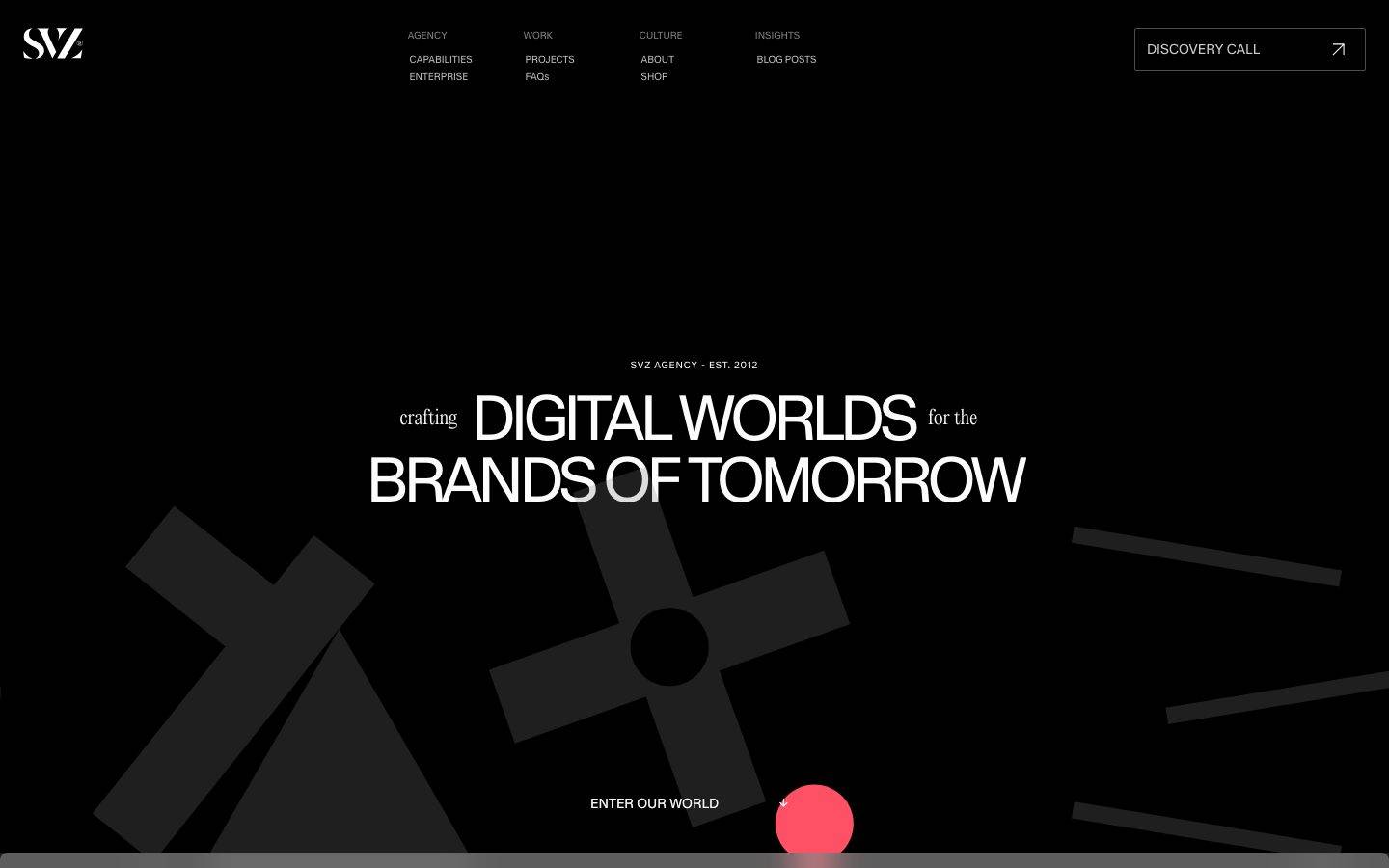
SVZ
A dark, high-contrast creative-agency interface built on a near-black canvas with oversized display typography set in the custom Kmr Waldenburg face. The system reads as confident, editorial, and cinematic — vast black bands, minimalist outlined controls, a single hot-red accent used as a scarce voltage moment (the "ENTER OUR WORLD" scroll orb), and occasional inverted light panels for section breaks. Brand voltage comes almost entirely from typographic scale and the black-on-black layering rather than from color.
Works withClaude CodeCursorCodexGemini CLICopilotv0LovableBoltWindsurfReplit
---
version: alpha
name: SVZ-design-analysis
description: "A dark, high-contrast creative-agency interface built on a near-black canvas with oversized display typography set in the custom Kmr Waldenburg face. The system reads as confident, editorial, and cinematic — vast black bands, minimalist outlined controls, a single hot-red accent used as a scarce voltage moment (the \"ENTER OUR WORLD\" scroll orb), and occasional inverted light panels for section breaks. Brand voltage comes almost entirely from typographic scale and the black-on-black layering rather than from color."
colors:
  ink: "#ffffff"
  canvas: "#080808"
  surface: "#0d0d0d"
  surface-raised: "#171617"
  surface-strong: "#262525"
  neutral-bright: "#fcfcfc"
  neutral-light: "#f3efef"
  neutral-soft: "#d4d2d2"
  muted: "#999999"
  hairline: "#373535"
  on-light: "#000000"
  accent-red: "#fe1e34"
  accent-red-pure: "#ff0000"
  accent-blue: "#3898ec"
typography:
  display-xxl:
    fontFamily: "Kmr Waldenburg, Georgia, serif"
    fontSize: 80px
    fontWeight: 400
    lineHeight: 1.05
    letterSpacing: -0.0375em
  display-xl:
    fontFamily: "Kmr Waldenburg, Georgia, serif"
    fontSize: 64px
    fontWeight: 400
    lineHeight: 1.0
    letterSpacing: -0.075em
  display-condensed:
    fontFamily: "Kmr Waldenburg, Georgia, serif"
    fontSize: 64px
    fontWeight: 400
    lineHeight: 0.9
    letterSpacing: -0.0469em
  heading:
    fontFamily: "Kmr Waldenburg, Georgia, serif"
    fontSize: 42px
    fontWeight: 400
    lineHeight: 1.05
    letterSpacing: -0.0381em
  body-lg:
    fontFamily: "Kmr Waldenburg, Georgia, serif"
    fontSize: 32px
    fontWeight: 400
    lineHeight: 1.1
    letterSpacing: -0.05em
  button:
    fontFamily: "Kmr Waldenburg, Georgia, serif"
    fontSize: 14px
    fontWeight: 400
    lineHeight: 1.0
    letterSpacing: normal
rounded:
  xs: 2px
  sm: 3px
  md: 4px
  lg: 8px
  xl: 14px
spacing:
  xxs: 8px
  xs: 9px
  sm: 12px
  md: 16px
  lg: 24px
  xl: 32px
  xxl: 48px
  section: 112px
components:
  button-primary:
    backgroundColor: transparent
    textColor: "{colors.ink}"
    typography: "{typography.button}"
    rounded: "{rounded.xs}"
    padding: 0px 12px
  card:
    backgroundColor: "{colors.surface}"
    textColor: "{colors.ink}"
    rounded: "{rounded.lg}"
    padding: 24px
  top-nav:
    backgroundColor: "{colors.canvas}"
    textColor: "{colors.ink}"
    typography: "{typography.button}"
  discovery-call-button:
    backgroundColor: transparent
    textColor: "{colors.ink}"
    typography: "{typography.button}"
    rounded: "{rounded.xs}"
    padding: 0px 12px
  hero-band:
    backgroundColor: "{colors.canvas}"
    textColor: "{colors.ink}"
    typography: "{typography.display-xl}"
    padding: 112px
  light-panel:
    backgroundColor: "{colors.neutral-light}"
    textColor: "{colors.on-light}"
    typography: "{typography.display-xxl}"
    padding: 48px
  scroll-orb:
    backgroundColor: "{colors.accent-red}"
    textColor: "{colors.ink}"
    rounded: "{rounded.xl}"
  section-label:
    backgroundColor: transparent
    textColor: "{colors.muted}"
    typography: "{typography.button}"
---

## Overview

SVZ's landing surface is a dark, cinematic creative-agency interface — a near-black canvas (`{colors.canvas}` — #080808) carrying oversized display typography set in the custom **Kmr Waldenburg** typeface. The system reads as confident and editorial: enormous headlines, black-on-black layering, minimalist outlined controls, and a single hot-red accent (`{colors.accent-red}` — #fe1e34) deployed as a scarce voltage moment.

The design's entire personality lives in **typographic scale**. Headlines run from 42px (`{typography.heading}`) up to 80px (`{typography.display-xxl}`), all in weight 400 with tight negative tracking (-0.0375em to -0.075em). Body copy itself is set large at 32px (`{typography.body-lg}`) — there is no small paragraph text on the landing surface; the type IS the layout.

Color is nearly absent by design. The palette is a graded ramp of near-blacks (`{colors.canvas}` #080808 → `{colors.surface}` #0d0d0d → `{colors.surface-raised}` #171617 → `{colors.surface-strong}` #262525) with white ink. The lone chromatic events are the red scroll orb (`{colors.accent-red}`) at "ENTER OUR WORLD" and a measured blue (`{colors.accent-blue}` — #3898ec) that appears rarely. The one inverted light panel (`{colors.neutral-light}` — #f3efef, the "WE ARE" band) provides a jarring, deliberate contrast break.

**Key Characteristics:**
- Near-black canvas (`{colors.canvas}` — #080808) with a graded black surface ramp for layered depth. No mid-tone backgrounds except the scarce light panel.
- Oversized Kmr Waldenburg display type (weight 400, tight negative tracking) carries all hierarchy. Substituted here with a serif fallback stack — see Typography.
- Minimalist outlined controls — the "DISCOVERY CALL" nav button is transparent with white text, hairline outline, and a tiny `{rounded.xs}` (2px) radius.
- Single hot-red accent (`{colors.accent-red}` — #fe1e34) used only as the scroll-cue orb. Red is voltage, not decoration.
- Nav-labels and small metadata in `{colors.muted}` (#999999) all-caps micro-type.
- Black geometric shapes (crosses, circles, bars) float faintly against the canvas as background texture at low contrast.
- Very small radius vocabulary — 2px on buttons, 8px on cards. Nothing rounds heavily; the system stays sharp and architectural.
- One inverted light section (`{colors.neutral-light}` — #f3efef) that breaks the darkness for a marquee "WE ARE" typographic moment.

## Colors

### Accent
- **Accent Red** (`{colors.accent-red}` — #fe1e34): The system's only real chromatic voltage — the round scroll-cue orb at "ENTER OUR WORLD" and small hover/interaction moments. Deployed sparingly against the black canvas so it reads as a beacon.
- **Accent Red Pure** (`{colors.accent-red-pure}` — #ff0000): A measured secondary red used in minor UI moments (a near-relative of the primary red; likely link/state emphasis).
- **Accent Blue** (`{colors.accent-blue}` — #3898ec): A measured blue appearing rarely — likely a default link or embedded-widget color. Not part of the visible brand palette on the hero.

### Surface
- **Canvas** (`{colors.canvas}` — #080808): The default page floor — a near-black that isn't pure black, giving the darkness a slightly warm depth.
- **Surface** (`{colors.surface}` — #0d0d0d): The card background — one step lighter than canvas so cards read as gentle lifts within the black.
- **Surface Raised** (`{colors.surface-raised}` — #171617): Nested panels, secondary containers within dark bands.
- **Surface Strong** (`{colors.surface-strong}` — #262525): The lightest of the dark ramp — used for the faint floating geometric shapes and higher-contrast dividers.
- **Neutral Light** (`{colors.neutral-light}` — #f3efef): The single inverted light panel background (the "WE ARE" band). The system's only large light surface.
- **Neutral Bright** (`{colors.neutral-bright}` — #fcfcfc): Bright off-white used within light-panel contexts.
- **Hairline** (`{colors.hairline}` — #373535): The 1px border tone for outlined controls and dividers on dark surfaces.

### Text
- **Ink** (`{colors.ink}` — #ffffff): All headlines and primary text on dark surfaces.
- **On Light** (`{colors.on-light}` — #000000): Text on the inverted light panel.
- **Muted** (`{colors.muted}` — #999999): Nav labels, section metadata ("SVZ AGENCY - EST. 2012"), and micro-type in all-caps.
- **Neutral Soft** (`{colors.neutral-soft}` — #d4d2d2): Softer secondary text on dark surfaces.

### Semantic
No dedicated success / warning / error tokens were measured on the landing surface. See Known Gaps.

## Typography

### Font Family
The system runs entirely on **Kmr Waldenburg** — a custom display typeface with high-contrast, condensed-feeling letterforms and tight negative tracking. Every measured role (h1 through h4, body, and buttons) uses this single family at weight 400. There is no secondary body face; SVZ commits fully to one display voice at every scale.

The tight negative letter-spacing (-0.0375em to -0.075em) is a load-bearing part of the voice — the headlines pack together densely, which is what gives the hero its cinematic, poster-like density.

### Hierarchy

| Token | Size | Weight | Line Height | Letter Spacing | Use |
|---|---|---|---|---|---|
| `{typography.display-xxl}` | 80px | 400 | 1.05 | -0.0375em | Marquee section headlines ("WE ARE") — the largest scale |
| `{typography.display-xl}` | 64px | 400 | 1.0 | -0.075em | Hero h1 ("crafting DIGITAL WORLDS for the...") |
| `{typography.display-condensed}` | 64px | 400 | 0.9 | -0.0469em | Section headers (h3) — tighter line height for stacked lines |
| `{typography.heading}` | 42px | 400 | 1.05 | -0.0381em | Sub-section heads (h4) |
| `{typography.body-lg}` | 32px | 400 | 1.1 | -0.05em | Body / lead copy — large by default |
| `{typography.button}` | 14px | 400 | 1.0 | normal | Button labels, nav links, section metadata |

### Principles
Kmr Waldenburg at weight 400 carries every level of the hierarchy — the system distinguishes levels by size and line-height, never by weight or family. Emphasis comes from bigger, not bolder. Body copy is deliberately large (32px), so paragraph text reads almost like a subhead in a conventional system.

The `{typography.button}` role at 14px is the only small type in the system, and it doubles as nav-link and metadata styling (all-caps, `{colors.muted}`).

### Note on Font Substitutes
**Kmr Waldenburg** is a custom/proprietary display face and is not available as a public web font; it must not be assumed to ship. A usable open-source approximation is a high-contrast serif such as **Playfair Display** (weight 400) for the condensed display character, or **Fraunces** (weight 400, optical size high) which offers similar high-contrast display forms with adjustable tracking. Apply -0.04em to -0.075em letter-spacing on large sizes to preserve the packed, poster-like signature. The generic fallback stack used here is `Georgia, serif`.

## Layout

### Spacing System
- **Base unit:** effectively ~8px, with a dense cluster of measured values around 8–9px, 12px, 24px, and 48px.
- **Tokens:** `{spacing.xxs}` 8px · `{spacing.xs}` 9px · `{spacing.sm}` 12px · `{spacing.md}` 16px · `{spacing.lg}` 24px · `{spacing.xl}` 32px · `{spacing.xxl}` 48px · `{spacing.section}` 112px.
- **Dominant rhythm:** the most frequent measured gaps are 48px (167×), 9px (162×), 24px (108×), and 12px (97×) — a tight micro-rhythm (9–12px) inside components paired with a 24–48px macro-rhythm between blocks.
- **Section padding:** `{spacing.section}` (112px, measured 2×) is the largest measured spacing and sets the vertical breathing between major bands.

### Grid & Container
- **Top nav:** logo left, three grouped link columns center (AGENCY / WORK / CULTURE / INSIGHTS with sub-items), outlined "DISCOVERY CALL" button pinned right.
- **Hero:** center-aligned single column — metadata label, then the huge two-line display headline, then a centered "ENTER OUR WORLD" cue with the red scroll orb.
- **Content bands:** full-bleed alternating dark bands, with one inverted light panel ("WE ARE") and a portfolio/hub grid ("THE HUB") lower on the page.
- Precise column counts and max content width were not extracted from the single captured page — see Known Gaps.

### Whitespace Philosophy
SVZ uses vast whitespace as a compositional tool — the hero headline sits in a large field of black with generous space above and below. The darkness itself functions as whitespace, letting the oversized type dominate without competing chrome. Micro-spacing (9–12px) keeps grouped nav links and metadata tight, while macro-spacing (48–112px) isolates each editorial moment.

## Elevation & Depth

| Level | Treatment | Use |
|---|---|---|
| Flat canvas | `{colors.canvas}` (#080808), no shadow | Hero band, body sections |
| Surface lift | `{colors.surface}` (#0d0d0d) — one step lighter, no shadow | Cards; contrast against canvas does the lifting |
| Raised panel | `{colors.surface-raised}` (#171617) | Nested containers |
| Inset highlight | `rgba(255,255,255,0.2) 0px 2px 5px 0px inset` | The measured inset white shadow (4×) — a subtle top-edge glow on select controls |

The elevation philosophy is **tonal, not shadow-based**. Depth is created by stepping through the near-black surface ramp (#080808 → #0d0d0d → #171617 → #262525) rather than drop shadows. The only measured shadow is an inset white highlight (`rgba(255,255,255,0.2) 0px 2px 5px 0px inset`) that gives a faint glassy top edge to a few controls.

### Decorative Depth
- Large black geometric shapes (crosses, a circle, bars) float faintly against the canvas at `{colors.surface-strong}` (#262525) contrast — barely visible texture that gives the hero background motion and depth without introducing color.
- The red scroll orb (`{colors.accent-red}`) sits above the geometric field as the single high-contrast focal point.

## Shapes

### Border Radius Scale

| Token | Value | Use |
|---|---|---|
| `{rounded.xs}` | 2px | Buttons (the measured "DISCOVERY CALL" control) — barely-rounded, architectural |
| `{rounded.sm}` | 3px | Small inline elements, minor controls |
| `{rounded.md}` | 4px | Common small-element radius (most frequent alongside 3px) |
| `{rounded.lg}` | 8px | Cards |
| `{rounded.xl}` | 14px | Largest measured radius — pill-ish elements, the scroll orb |

### Photography / Media Geometry
The portfolio grid ("THE HUB") shows near-square and rectangular media tiles with minimal rounding, consistent with the small-radius vocabulary. Precise media aspect ratios and tile radii were not individually extracted — see Known Gaps.

## Components

### Navigation

**`top-nav`** — Full-width nav on the `{colors.canvas}` floor. SVZ logo mark at top-left, three grouped label columns center (AGENCY / WORK / CULTURE / INSIGHTS, each with sub-links like CAPABILITIES, PROJECTS, ABOUT, BLOG POSTS), and the outlined "DISCOVERY CALL" button pinned right. Labels use `{typography.button}` (14px) in `{colors.muted}` for group headers and `{colors.ink}` for active items.

**`section-label`** — Small all-caps metadata ("SVZ AGENCY - EST. 2012"), transparent background, `{colors.muted}` text, `{typography.button}`. Sits above hero and section headlines as an eyebrow label.

### Buttons

**`button-primary`** / **`discovery-call-button`** — The measured control. Transparent background, `{colors.ink}` text, `{typography.button}` (14px), rounded `{rounded.xs}` (2px), padding 0px × 12px, with a hairline outline (`{colors.hairline}`). Carries an up-right arrow glyph. This is the system's only visible button — minimal, outlined, architectural.

### Cards & Containers

**`card`** — The measured card. Background `{colors.surface}` (#0d0d0d) — one step lighter than the canvas — rounded `{rounded.lg}` (8px), no shadow. Contrast against the darker canvas provides the lift. Used for portfolio tiles and content panels.

**`hero-band`** — Center-aligned hero on the `{colors.canvas}` floor. Carries the `{component.section-label}` eyebrow, the two-line `{typography.display-xl}` headline, and the "ENTER OUR WORLD" scroll cue. Vertical padding at `{spacing.section}` (112px) scale.

**`light-panel`** — The single inverted band ("WE ARE"). Background `{colors.neutral-light}` (#f3efef), text `{colors.on-light}` (#000000), marquee headline in `{typography.display-xxl}` (80px). The deliberate light break that punctuates the dark scroll.

### Accent Element

**`scroll-orb`** — The circular hot-red scroll cue at "ENTER OUR WORLD". Background `{colors.accent-red}` (#fe1e34), rounded to a circle (`{rounded.xl}` at small scale reads as fully round). The single high-saturation focal moment on the page — a beacon inviting the scroll.

## Do's and Don'ts

### Do
- Keep the canvas near-black (`{colors.canvas}` — #080808), not pure black. The slight warmth is intentional.
- Let typographic scale carry the hierarchy — go bigger, not bolder. Every headline is weight 400.
- Preserve the tight negative tracking (-0.0375em to -0.075em) on display sizes. Kmr Waldenburg loses its density without it.
- Reserve `{colors.accent-red}` (#fe1e34) for scarce voltage moments like the scroll orb. Red is a beacon, not a decoration.
- Build depth by stepping through the near-black surface ramp (#080808 → #0d0d0d → #171617 → #262525), not by adding drop shadows.
- Use the inverted `{component.light-panel}` sparingly — its power comes from being the only large light surface.
- Keep controls minimal and outlined — `{rounded.xs}` (2px), transparent background, hairline border.

### Don't
- Don't introduce mid-tone gray backgrounds between the darks and the light panel — the palette is binary (near-black or the one light band).
- Don't set body copy small; SVZ's "body" is 32px (`{typography.body-lg}`). Small paragraph text is off-brand.
- Don't add bold weights — the system is entirely weight 400. Emphasis is scale-driven.
- Don't scatter the red accent across multiple elements; it dilutes the beacon.
- Don't round elements heavily — nothing exceeds `{rounded.xl}` (14px). The system stays sharp.
- Don't add hover-state documentation here — default and pressed only.

## Responsive Behavior

The analysis captured a single desktop landing page, so responsive rules are inferred from layout structure rather than measured breakpoints.

### Breakpoints

| Name | Width | Key Changes (inferred) |
|---|---|---|
| Mobile | < 768px | Nav collapses to a menu trigger; hero headline scales down from its 64–80px desktop size; grouped nav columns stack |
| Tablet | 768–1024px | Nav tightens; portfolio/hub grid reduces column count |
| Desktop | 1024–1440px | Full nav with grouped link columns; hero at full display scale |
| Wide | > 1440px | Same as desktop with more outer black breathing room |

Exact breakpoint values, mobile type scaling, and grid collapse behavior were not measured — see Known Gaps.

### Touch Targets
- `{component.discovery-call-button}` measured padding is 0px × 12px with 14px type — the effective tap height depends on the control's line-box; verify against a 44px minimum on touch.
- Nav links use tight 9–12px spacing between grouped items; on touch these should expand to meet minimum target size.

### Image Behavior
- Portfolio/hub media tiles retain near-square/rectangular ratios; scaling behavior across breakpoints was not extracted.

## Iteration Guide

1. Focus on ONE component at a time. Reference its YAML key directly (`{component.card}`, `{component.discovery-call-button}`).
2. Variants of an existing component (`-active`, `-pressed`) live as separate entries in `components:`.
3. Use `{token.refs}` everywhere — never inline hex.
4. Never document hover. Default and Active/Pressed states only.
5. Headlines stay Kmr Waldenburg 400 with tight negative tracking. The type voice does not blur — go bigger, not bolder.
6. The red accent (`{colors.accent-red}`) is scarce voltage — don't multiply it.
7. The light panel is the only large light surface — protect its scarcity.

## Known Gaps

- Only a single desktop landing page was captured; all responsive breakpoints, mobile type scaling, and grid-collapse behavior are inferred, not measured.
- **Kmr Waldenburg** is a custom/proprietary display face (not flagged in `fonts_licensed`, but not a public web font); it must not be assumed to ship. Open-source substitutes are documented in the Typography section.
- Grid column counts, max content width, and container gutters were not extracted from the computed data.
- No small body / caption text was measured — the smallest measured role is `{typography.button}` (14px). A true caption / fine-print style may exist but was not captured.
- Semantic colors (success / warning / error) were not observed; the measured `{colors.accent-blue}` (#3898ec) is likely a default link or embedded-widget color rather than an intentional brand token.
- Only two components (`button-primary`, `card`) were directly measured; the nav, hero, light panel, section label, and scroll orb are documented from screenshot ground-truth using measured tokens.
- The exact fill/shape and radius of the red scroll orb, and the geometry of portfolio tiles, are inferred from screenshots; precise dimensions were not extracted.
- Animation and transition timings (scroll orb behavior, section reveals, "WE ARE" marquee) are out of scope.
- Form inputs, validation states, and footer styling were not present in the captured landing view.

<!-- Documented by Duply · real-world design systems as ready-to-use DESIGN.md for AI coding agents · https://duply.ai/svz/design-md -->
Color Palette
Accent
Neutrals
Typography
display-xxl80px · 400 · 1.05
The quick brown fox jumpsdisplay-xl64px · 400 · 1
The quick brown fox jumpsdisplay-condensed64px · 400 · 0.9
The quick brown fox jumpsheading42px · 400 · 1.05
The quick brown fox jumpsbody-lg32px · 400 · 1.1
The quick brown fox jumpsbutton14px · 400 · 1
The quick brown fox jumpsSpacing & Shape
Spacing
| Name | Value | Preview |
|---|---|---|
| xxs | 8px | |
| xs | 9px | |
| sm | 12px | |
| md | 16px | |
| lg | 24px | |
| xl | 32px | |
| xxl | 48px | |
| section | 112px |
Border Radius
| Name | Value | Preview |
|---|---|---|
| xs | 2px | |
| sm | 3px | |
| md | 4px | |
| lg | 8px | |
| xl | 14px |
FAQ
- What colors does SVZ use?
- SVZ's core palette includes #ffffff, #080808, #0d0d0d, #171617, #262525. The full color set with usage roles (canvas, ink, surfaces, accent, semantic) is documented in the SVZ DESIGN.md.
- What font does SVZ use?
- SVZ's primary typeface is Kmr Waldenburg. The complete type scale (sizes, weights, line-height and letter-spacing per role), with an open substitute where the original is licensed, is documented in the DESIGN.md.
- What is the SVZ design system?
- A dark, high-contrast creative-agency interface built on a near-black canvas with oversized display typography set in the custom Kmr Waldenburg face. The system reads as confident, editorial, and cinematic — vast black bands, minimalist outlined controls, a single hot-red accent used as a scarce
Get this as a working kit
SVZ Launch Kit + DESIGN.md
$299$225
One-time payment
- A complete production-stack template, styled like SVZ, fully built and wired.
- One-time payment and the codebase is yours. No platform fees, no subscription.
Open it with Claude Code, Cursor, or any coding agent and build in plain language, then ship a complete web app.
- Your private DESIGN.md
- Marketing pages, blog, SEO & legal
- Email capture, newsletter & contact
- Accept payments (Stripe)
- Analytics (GA4 + PostHog)
- One-click deploy
- Auth, login & roles
- A full app dashboard, when you grow
More like this
---
version: alpha
name: SVZ-design-analysis
description: "A dark, high-contrast creative-agency interface built on a near-black canvas with oversized display typography set in the custom Kmr Waldenburg face. The system reads as confident, editorial, and cinematic — vast black bands, minimalist outlined controls, a single hot-red accent used as a scarce voltage moment (the \"ENTER OUR WORLD\" scroll orb), and occasional inverted light panels for section breaks. Brand voltage comes almost entirely from typographic scale and the black-on-black layering rather than from color."
colors:
  ink: "#ffffff"
  canvas: "#080808"
  surface: "#0d0d0d"
  surface-raised: "#171617"
  surface-strong: "#262525"
  neutral-bright: "#fcfcfc"
  neutral-light: "#f3efef"
  neutral-soft: "#d4d2d2"
  muted: "#999999"
  hairline: "#373535"
  on-light: "#000000"
  accent-red: "#fe1e34"
  accent-red-pure: "#ff0000"
  accent-blue: "#3898ec"
typography:
  display-xxl:
    fontFamily: "Kmr Waldenburg, Georgia, serif"
    fontSize: 80px
    fontWeight: 400
    lineHeight: 1.05
    letterSpacing: -0.0375em
  display-xl:
    fontFamily: "Kmr Waldenburg, Georgia, serif"
    fontSize: 64px
    fontWeight: 400
    lineHeight: 1.0
    letterSpacing: -0.075em
  display-condensed:
    fontFamily: "Kmr Waldenburg, Georgia, serif"
    fontSize: 64px
    fontWeight: 400
    lineHeight: 0.9
    letterSpacing: -0.0469em
  heading:
    fontFamily: "Kmr Waldenburg, Georgia, serif"
    fontSize: 42px
    fontWeight: 400
    lineHeight: 1.05
    letterSpacing: -0.0381em
  body-lg:
    fontFamily: "Kmr Waldenburg, Georgia, serif"
    fontSize: 32px
    fontWeight: 400
    lineHeight: 1.1
    letterSpacing: -0.05em
  button:
    fontFamily: "Kmr Waldenburg, Georgia, serif"
    fontSize: 14px
    fontWeight: 400
    lineHeight: 1.0
    letterSpacing: normal
rounded:
  xs: 2px
  sm: 3px
  md: 4px
  lg: 8px
  xl: 14px
spacing:
  xxs: 8px
  xs: 9px
  sm: 12px
  md: 16px
  lg: 24px
  xl: 32px
  xxl: 48px
  section: 112px
components:
  button-primary:
    backgroundColor: transparent
    textColor: "{colors.ink}"
    typography: "{typography.button}"
    rounded: "{rounded.xs}"
    padding: 0px 12px
  card:
    backgroundColor: "{colors.surface}"
    textColor: "{colors.ink}"
    rounded: "{rounded.lg}"
    padding: 24px
  top-nav:
    backgroundColor: "{colors.canvas}"
    textColor: "{colors.ink}"
    typography: "{typography.button}"
  discovery-call-button:
    backgroundColor: transparent
    textColor: "{colors.ink}"
    typography: "{typography.button}"
    rounded: "{rounded.xs}"
    padding: 0px 12px
  hero-band:
    backgroundColor: "{colors.canvas}"
    textColor: "{colors.ink}"
    typography: "{typography.display-xl}"
    padding: 112px
  light-panel:
    backgroundColor: "{colors.neutral-light}"
    textColor: "{colors.on-light}"
    typography: "{typography.display-xxl}"
    padding: 48px
  scroll-orb:
    backgroundColor: "{colors.accent-red}"
    textColor: "{colors.ink}"
    rounded: "{rounded.xl}"
  section-label:
    backgroundColor: transparent
    textColor: "{colors.muted}"
    typography: "{typography.button}"
---

## Overview

SVZ's landing surface is a dark, cinematic creative-agency interface — a near-black canvas (`{colors.canvas}` — #080808) carrying oversized display typography set in the custom **Kmr Waldenburg** typeface. The system reads as confident and editorial: enormous headlines, black-on-black layering, minimalist outlined controls, and a single hot-red accent (`{colors.accent-red}` — #fe1e34) deployed as a scarce voltage moment.

The design's entire personality lives in **typographic scale**. Headlines run from 42px (`{typography.heading}`) up to 80px (`{typography.display-xxl}`), all in weight 400 with tight negative tracking (-0.0375em to -0.075em). Body copy itself is set large at 32px (`{typography.body-lg}`) — there is no small paragraph text on the landing surface; the type IS the layout.

Color is nearly absent by design. The palette is a graded ramp of near-blacks (`{colors.canvas}` #080808 → `{colors.surface}` #0d0d0d → `{colors.surface-raised}` #171617 → `{colors.surface-strong}` #262525) with white ink. The lone chromatic events are the red scroll orb (`{colors.accent-red}`) at "ENTER OUR WORLD" and a measured blue (`{colors.accent-blue}` — #3898ec) that appears rarely. The one inverted light panel (`{colors.neutral-light}` — #f3efef, the "WE ARE" band) provides a jarring, deliberate contrast break.

**Key Characteristics:**
- Near-black canvas (`{colors.canvas}` — #080808) with a graded black surface ramp for layered depth. No mid-tone backgrounds except the scarce light panel.
- Oversized Kmr Waldenburg display type (weight 400, tight negative tracking) carries all hierarchy. Substituted here with a serif fallback stack — see Typography.
- Minimalist outlined controls — the "DISCOVERY CALL" nav button is transparent with white text, hairline outline, and a tiny `{rounded.xs}` (2px) radius.
- Single hot-red accent (`{colors.accent-red}` — #fe1e34) used only as the scroll-cue orb. Red is voltage, not decoration.
- Nav-labels and small metadata in `{colors.muted}` (#999999) all-caps micro-type.
- Black geometric shapes (crosses, circles, bars) float faintly against the canvas as background texture at low contrast.
- Very small radius vocabulary — 2px on buttons, 8px on cards. Nothing rounds heavily; the system stays sharp and architectural.
- One inverted light section (`{colors.neutral-light}` — #f3efef) that breaks the darkness for a marquee "WE ARE" typographic moment.

## Colors

### Accent
- **Accent Red** (`{colors.accent-red}` — #fe1e34): The system's only real chromatic voltage — the round scroll-cue orb at "ENTER OUR WORLD" and small hover/interaction moments. Deployed sparingly against the black canvas so it reads as a beacon.
- **Accent Red Pure** (`{colors.accent-red-pure}` — #ff0000): A measured secondary red used in minor UI moments (a near-relative of the primary red; likely link/state emphasis).
- **Accent Blue** (`{colors.accent-blue}` — #3898ec): A measured blue appearing rarely — likely a default link or embedded-widget color. Not part of the visible brand palette on the hero.

### Surface
- **Canvas** (`{colors.canvas}` — #080808): The default page floor — a near-black that isn't pure black, giving the darkness a slightly warm depth.
- **Surface** (`{colors.surface}` — #0d0d0d): The card background — one step lighter than canvas so cards read as gentle lifts within the black.
- **Surface Raised** (`{colors.surface-raised}` — #171617): Nested panels, secondary containers within dark bands.
- **Surface Strong** (`{colors.surface-strong}` — #262525): The lightest of the dark ramp — used for the faint floating geometric shapes and higher-contrast dividers.
- **Neutral Light** (`{colors.neutral-light}` — #f3efef): The single inverted light panel background (the "WE ARE" band). The system's only large light surface.
- **Neutral Bright** (`{colors.neutral-bright}` — #fcfcfc): Bright off-white used within light-panel contexts.
- **Hairline** (`{colors.hairline}` — #373535): The 1px border tone for outlined controls and dividers on dark surfaces.

### Text
- **Ink** (`{colors.ink}` — #ffffff): All headlines and primary text on dark surfaces.
- **On Light** (`{colors.on-light}` — #000000): Text on the inverted light panel.
- **Muted** (`{colors.muted}` — #999999): Nav labels, section metadata ("SVZ AGENCY - EST. 2012"), and micro-type in all-caps.
- **Neutral Soft** (`{colors.neutral-soft}` — #d4d2d2): Softer secondary text on dark surfaces.

### Semantic
No dedicated success / warning / error tokens were measured on the landing surface. See Known Gaps.

## Typography

### Font Family
The system runs entirely on **Kmr Waldenburg** — a custom display typeface with high-contrast, condensed-feeling letterforms and tight negative tracking. Every measured role (h1 through h4, body, and buttons) uses this single family at weight 400. There is no secondary body face; SVZ commits fully to one display voice at every scale.

The tight negative letter-spacing (-0.0375em to -0.075em) is a load-bearing part of the voice — the headlines pack together densely, which is what gives the hero its cinematic, poster-like density.

### Hierarchy

| Token | Size | Weight | Line Height | Letter Spacing | Use |
|---|---|---|---|---|---|
| `{typography.display-xxl}` | 80px | 400 | 1.05 | -0.0375em | Marquee section headlines ("WE ARE") — the largest scale |
| `{typography.display-xl}` | 64px | 400 | 1.0 | -0.075em | Hero h1 ("crafting DIGITAL WORLDS for the...") |
| `{typography.display-condensed}` | 64px | 400 | 0.9 | -0.0469em | Section headers (h3) — tighter line height for stacked lines |
| `{typography.heading}` | 42px | 400 | 1.05 | -0.0381em | Sub-section heads (h4) |
| `{typography.body-lg}` | 32px | 400 | 1.1 | -0.05em | Body / lead copy — large by default |
| `{typography.button}` | 14px | 400 | 1.0 | normal | Button labels, nav links, section metadata |

### Principles
Kmr Waldenburg at weight 400 carries every level of the hierarchy — the system distinguishes levels by size and line-height, never by weight or family. Emphasis comes from bigger, not bolder. Body copy is deliberately large (32px), so paragraph text reads almost like a subhead in a conventional system.

The `{typography.button}` role at 14px is the only small type in the system, and it doubles as nav-link and metadata styling (all-caps, `{colors.muted}`).

### Note on Font Substitutes
**Kmr Waldenburg** is a custom/proprietary display face and is not available as a public web font; it must not be assumed to ship. A usable open-source approximation is a high-contrast serif such as **Playfair Display** (weight 400) for the condensed display character, or **Fraunces** (weight 400, optical size high) which offers similar high-contrast display forms with adjustable tracking. Apply -0.04em to -0.075em letter-spacing on large sizes to preserve the packed, poster-like signature. The generic fallback stack used here is `Georgia, serif`.

## Layout

### Spacing System
- **Base unit:** effectively ~8px, with a dense cluster of measured values around 8–9px, 12px, 24px, and 48px.
- **Tokens:** `{spacing.xxs}` 8px · `{spacing.xs}` 9px · `{spacing.sm}` 12px · `{spacing.md}` 16px · `{spacing.lg}` 24px · `{spacing.xl}` 32px · `{spacing.xxl}` 48px · `{spacing.section}` 112px.
- **Dominant rhythm:** the most frequent measured gaps are 48px (167×), 9px (162×), 24px (108×), and 12px (97×) — a tight micro-rhythm (9–12px) inside components paired with a 24–48px macro-rhythm between blocks.
- **Section padding:** `{spacing.section}` (112px, measured 2×) is the largest measured spacing and sets the vertical breathing between major bands.

### Grid & Container
- **Top nav:** logo left, three grouped link columns center (AGENCY / WORK / CULTURE / INSIGHTS with sub-items), outlined "DISCOVERY CALL" button pinned right.
- **Hero:** center-aligned single column — metadata label, then the huge two-line display headline, then a centered "ENTER OUR WORLD" cue with the red scroll orb.
- **Content bands:** full-bleed alternating dark bands, with one inverted light panel ("WE ARE") and a portfolio/hub grid ("THE HUB") lower on the page.
- Precise column counts and max content width were not extracted from the single captured page — see Known Gaps.

### Whitespace Philosophy
SVZ uses vast whitespace as a compositional tool — the hero headline sits in a large field of black with generous space above and below. The darkness itself functions as whitespace, letting the oversized type dominate without competing chrome. Micro-spacing (9–12px) keeps grouped nav links and metadata tight, while macro-spacing (48–112px) isolates each editorial moment.

## Elevation & Depth

| Level | Treatment | Use |
|---|---|---|
| Flat canvas | `{colors.canvas}` (#080808), no shadow | Hero band, body sections |
| Surface lift | `{colors.surface}` (#0d0d0d) — one step lighter, no shadow | Cards; contrast against canvas does the lifting |
| Raised panel | `{colors.surface-raised}` (#171617) | Nested containers |
| Inset highlight | `rgba(255,255,255,0.2) 0px 2px 5px 0px inset` | The measured inset white shadow (4×) — a subtle top-edge glow on select controls |

The elevation philosophy is **tonal, not shadow-based**. Depth is created by stepping through the near-black surface ramp (#080808 → #0d0d0d → #171617 → #262525) rather than drop shadows. The only measured shadow is an inset white highlight (`rgba(255,255,255,0.2) 0px 2px 5px 0px inset`) that gives a faint glassy top edge to a few controls.

### Decorative Depth
- Large black geometric shapes (crosses, a circle, bars) float faintly against the canvas at `{colors.surface-strong}` (#262525) contrast — barely visible texture that gives the hero background motion and depth without introducing color.
- The red scroll orb (`{colors.accent-red}`) sits above the geometric field as the single high-contrast focal point.

## Shapes

### Border Radius Scale

| Token | Value | Use |
|---|---|---|
| `{rounded.xs}` | 2px | Buttons (the measured "DISCOVERY CALL" control) — barely-rounded, architectural |
| `{rounded.sm}` | 3px | Small inline elements, minor controls |
| `{rounded.md}` | 4px | Common small-element radius (most frequent alongside 3px) |
| `{rounded.lg}` | 8px | Cards |
| `{rounded.xl}` | 14px | Largest measured radius — pill-ish elements, the scroll orb |

### Photography / Media Geometry
The portfolio grid ("THE HUB") shows near-square and rectangular media tiles with minimal rounding, consistent with the small-radius vocabulary. Precise media aspect ratios and tile radii were not individually extracted — see Known Gaps.

## Components

### Navigation

**`top-nav`** — Full-width nav on the `{colors.canvas}` floor. SVZ logo mark at top-left, three grouped label columns center (AGENCY / WORK / CULTURE / INSIGHTS, each with sub-links like CAPABILITIES, PROJECTS, ABOUT, BLOG POSTS), and the outlined "DISCOVERY CALL" button pinned right. Labels use `{typography.button}` (14px) in `{colors.muted}` for group headers and `{colors.ink}` for active items.

**`section-label`** — Small all-caps metadata ("SVZ AGENCY - EST. 2012"), transparent background, `{colors.muted}` text, `{typography.button}`. Sits above hero and section headlines as an eyebrow label.

### Buttons

**`button-primary`** / **`discovery-call-button`** — The measured control. Transparent background, `{colors.ink}` text, `{typography.button}` (14px), rounded `{rounded.xs}` (2px), padding 0px × 12px, with a hairline outline (`{colors.hairline}`). Carries an up-right arrow glyph. This is the system's only visible button — minimal, outlined, architectural.

### Cards & Containers

**`card`** — The measured card. Background `{colors.surface}` (#0d0d0d) — one step lighter than the canvas — rounded `{rounded.lg}` (8px), no shadow. Contrast against the darker canvas provides the lift. Used for portfolio tiles and content panels.

**`hero-band`** — Center-aligned hero on the `{colors.canvas}` floor. Carries the `{component.section-label}` eyebrow, the two-line `{typography.display-xl}` headline, and the "ENTER OUR WORLD" scroll cue. Vertical padding at `{spacing.section}` (112px) scale.

**`light-panel`** — The single inverted band ("WE ARE"). Background `{colors.neutral-light}` (#f3efef), text `{colors.on-light}` (#000000), marquee headline in `{typography.display-xxl}` (80px). The deliberate light break that punctuates the dark scroll.

### Accent Element

**`scroll-orb`** — The circular hot-red scroll cue at "ENTER OUR WORLD". Background `{colors.accent-red}` (#fe1e34), rounded to a circle (`{rounded.xl}` at small scale reads as fully round). The single high-saturation focal moment on the page — a beacon inviting the scroll.

## Do's and Don'ts

### Do
- Keep the canvas near-black (`{colors.canvas}` — #080808), not pure black. The slight warmth is intentional.
- Let typographic scale carry the hierarchy — go bigger, not bolder. Every headline is weight 400.
- Preserve the tight negative tracking (-0.0375em to -0.075em) on display sizes. Kmr Waldenburg loses its density without it.
- Reserve `{colors.accent-red}` (#fe1e34) for scarce voltage moments like the scroll orb. Red is a beacon, not a decoration.
- Build depth by stepping through the near-black surface ramp (#080808 → #0d0d0d → #171617 → #262525), not by adding drop shadows.
- Use the inverted `{component.light-panel}` sparingly — its power comes from being the only large light surface.
- Keep controls minimal and outlined — `{rounded.xs}` (2px), transparent background, hairline border.

### Don't
- Don't introduce mid-tone gray backgrounds between the darks and the light panel — the palette is binary (near-black or the one light band).
- Don't set body copy small; SVZ's "body" is 32px (`{typography.body-lg}`). Small paragraph text is off-brand.
- Don't add bold weights — the system is entirely weight 400. Emphasis is scale-driven.
- Don't scatter the red accent across multiple elements; it dilutes the beacon.
- Don't round elements heavily — nothing exceeds `{rounded.xl}` (14px). The system stays sharp.
- Don't add hover-state documentation here — default and pressed only.

## Responsive Behavior

The analysis captured a single desktop landing page, so responsive rules are inferred from layout structure rather than measured breakpoints.

### Breakpoints

| Name | Width | Key Changes (inferred) |
|---|---|---|
| Mobile | < 768px | Nav collapses to a menu trigger; hero headline scales down from its 64–80px desktop size; grouped nav columns stack |
| Tablet | 768–1024px | Nav tightens; portfolio/hub grid reduces column count |
| Desktop | 1024–1440px | Full nav with grouped link columns; hero at full display scale |
| Wide | > 1440px | Same as desktop with more outer black breathing room |

Exact breakpoint values, mobile type scaling, and grid collapse behavior were not measured — see Known Gaps.

### Touch Targets
- `{component.discovery-call-button}` measured padding is 0px × 12px with 14px type — the effective tap height depends on the control's line-box; verify against a 44px minimum on touch.
- Nav links use tight 9–12px spacing between grouped items; on touch these should expand to meet minimum target size.

### Image Behavior
- Portfolio/hub media tiles retain near-square/rectangular ratios; scaling behavior across breakpoints was not extracted.

## Iteration Guide

1. Focus on ONE component at a time. Reference its YAML key directly (`{component.card}`, `{component.discovery-call-button}`).
2. Variants of an existing component (`-active`, `-pressed`) live as separate entries in `components:`.
3. Use `{token.refs}` everywhere — never inline hex.
4. Never document hover. Default and Active/Pressed states only.
5. Headlines stay Kmr Waldenburg 400 with tight negative tracking. The type voice does not blur — go bigger, not bolder.
6. The red accent (`{colors.accent-red}`) is scarce voltage — don't multiply it.
7. The light panel is the only large light surface — protect its scarcity.

## Known Gaps

- Only a single desktop landing page was captured; all responsive breakpoints, mobile type scaling, and grid-collapse behavior are inferred, not measured.
- **Kmr Waldenburg** is a custom/proprietary display face (not flagged in `fonts_licensed`, but not a public web font); it must not be assumed to ship. Open-source substitutes are documented in the Typography section.
- Grid column counts, max content width, and container gutters were not extracted from the computed data.
- No small body / caption text was measured — the smallest measured role is `{typography.button}` (14px). A true caption / fine-print style may exist but was not captured.
- Semantic colors (success / warning / error) were not observed; the measured `{colors.accent-blue}` (#3898ec) is likely a default link or embedded-widget color rather than an intentional brand token.
- Only two components (`button-primary`, `card`) were directly measured; the nav, hero, light panel, section label, and scroll orb are documented from screenshot ground-truth using measured tokens.
- The exact fill/shape and radius of the red scroll orb, and the geometry of portfolio tiles, are inferred from screenshots; precise dimensions were not extracted.
- Animation and transition timings (scroll orb behavior, section reveals, "WE ARE" marquee) are out of scope.
- Form inputs, validation states, and footer styling were not present in the captured landing view.

<!-- Documented by Duply · real-world design systems as ready-to-use DESIGN.md for AI coding agents · https://duply.ai/svz/design-md -->