
Hyperstudio
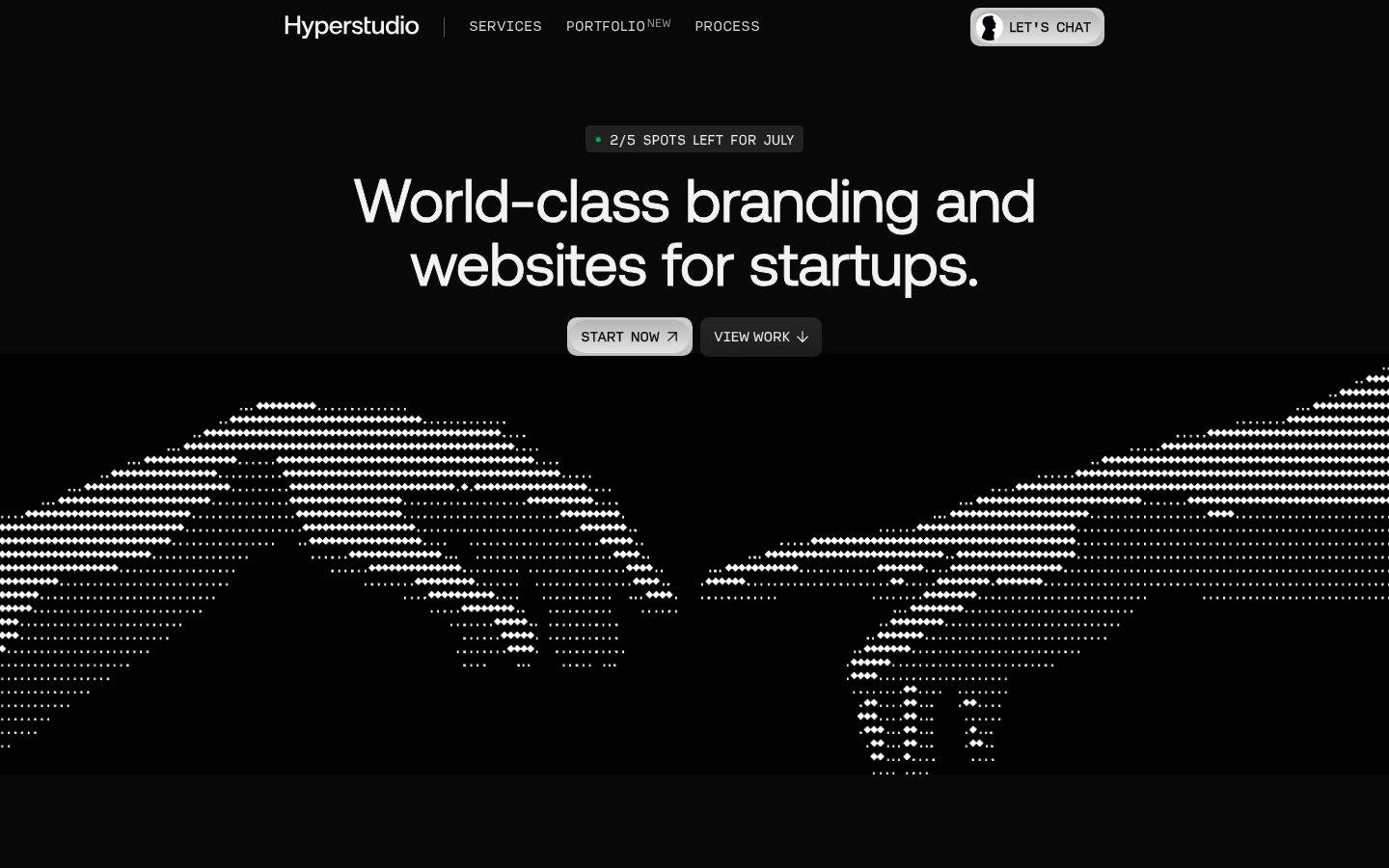
A dark, near-black studio portfolio for a branding-and-websites agency, built on a #080808 canvas with high-contrast off-white Aeonik display headlines and monospaced "Input" labels for technical/utility text. The system reads as confident, engineered, and gallery-dark — an ASCII-dotted world-map hero, thin-hairline service grids, and full-bleed portfolio panels floating on black. Brand voltage comes from the type pairing (a soft grotesque display against a mono UI voice) and from three sparse warm/cool accent hues rather than from color-heavy surfaces.
Works withClaude CodeCursorCodexGemini CLICopilotv0LovableBoltWindsurfReplit
---
version: alpha
name: Hyperstudio-design-analysis
description: "A dark, near-black studio portfolio for a branding-and-websites agency, built on a #080808 canvas with high-contrast off-white Aeonik display headlines and monospaced \"Input\" labels for technical/utility text. The system reads as confident, engineered, and gallery-dark — an ASCII-dotted world-map hero, thin-hairline service grids, and full-bleed portfolio panels floating on black. Brand voltage comes from the type pairing (a soft grotesque display against a mono UI voice) and from three sparse warm/cool accent hues rather than from color-heavy surfaces."
colors:
  canvas: "#080808"
  surface: "#101010"
  surface-raised: "#202020"
  surface-strong: "#222222"
  ink: "#f3f3f3"
  body: "#f2f2f2"
  muted-strong: "#888888"
  muted-mid: "#686868"
  muted: "#333333"
  hairline: "#424242"
  neutral-a3: "#a3a3a3"
  on-light: "#222222"
  surface-light: "#dadada"
  surface-light-soft: "#e4e4e4"
  white: "#ffffff"
  black: "#000000"
  accent-sand: "#e7c59a"
  accent-slate: "#a5b7bc"
  accent-coral: "#f74f39"
typography:
  display:
    fontFamily: "Aeonik, Inter, sans-serif"
    fontSize: 63px
    fontWeight: 400
    lineHeight: 1.048
    letterSpacing: "-0.0111em"
  title:
    fontFamily: "Aeonik, Inter, sans-serif"
    fontSize: 44px
    fontWeight: 400
    lineHeight: 1.068
    letterSpacing: "-0.0068em"
  subtitle:
    fontFamily: "Aeonik, Inter, sans-serif"
    fontSize: 23px
    fontWeight: 400
    lineHeight: 1.073
    letterSpacing: "0"
  body:
    fontFamily: "Aeonik, Inter, sans-serif"
    fontSize: 17px
    fontWeight: 400
    lineHeight: 1.347
    letterSpacing: "0"
  mono-label:
    fontFamily: "Input, 'JetBrains Mono', ui-monospace, monospace"
    fontSize: 17.5px
    fontWeight: 400
    lineHeight: 1.314
    letterSpacing: "0"
  button:
    fontFamily: "Aeonik, Inter, sans-serif"
    fontSize: 14px
    fontWeight: 400
    lineHeight: 1.429
    letterSpacing: "0"
rounded:
  xs: 4px
  sm: 8px
  md: 10px
  lg: 20px
  pill: 99px
spacing:
  xxs: 6px
  xs: 8px
  sm: 11px
  md: 16px
  lg: 20px
  xl: 24px
components:
  top-nav:
    backgroundColor: "{colors.canvas}"
    textColor: "{colors.ink}"
    typography: "{typography.mono-label}"
  nav-cta-pill:
    backgroundColor: "{colors.surface-light}"
    textColor: "{colors.on-light}"
    typography: "{typography.mono-label}"
    rounded: "{rounded.pill}"
  badge-pill:
    backgroundColor: "{colors.surface-raised}"
    textColor: "{colors.body}"
    typography: "{typography.mono-label}"
    rounded: "{rounded.pill}"
  button-primary:
    backgroundColor: "{colors.surface-light}"
    textColor: "{colors.muted}"
    typography: "{typography.button}"
    rounded: "{rounded.sm}"
    padding: 0px
  button-secondary:
    backgroundColor: "{colors.surface-raised}"
    textColor: "{colors.ink}"
    typography: "{typography.button}"
    rounded: "{rounded.sm}"
  section-label:
    backgroundColor: transparent
    textColor: "{colors.muted-strong}"
    typography: "{typography.mono-label}"
  service-item:
    backgroundColor: transparent
    textColor: "{colors.body}"
    typography: "{typography.mono-label}"
  portfolio-card:
    backgroundColor: "{colors.surface}"
    textColor: "{colors.ink}"
    typography: "{typography.title}"
    rounded: "{rounded.lg}"
---

## Overview

Hyperstudio is a dark, gallery-first agency portfolio. The entire surface floats on a near-black canvas (`{colors.canvas}` — #080808), and the type does almost all the work: an off-white Aeonik display headline ("World-class branding and websites for startups.") sits centered above a dotted ASCII-style world map, with a monospaced "Input" utility voice carrying labels like `// SERVICES`, `2/5 SPOTS LEFT FOR JULY`, and `QUANTUM COMPUTING`.

The type voice splits into two clear roles. **Aeonik** (a soft geometric grotesque, weight 400 with slightly negative tracking) carries the display headlines, section heads, and body copy — it feels modern, calm, and confident without shouting. **Input** (a monospaced typeface) carries technical/utility labels — nav items, tags, service captions, and portfolio metadata — giving the system its "engineering studio" register.

The palette is essentially monochrome: layered near-blacks (`{colors.canvas}` #080808 → `{colors.surface}` #101010 → `{colors.surface-raised}` #202020 → `{colors.surface-strong}` #222222) against high-contrast off-white text (`{colors.ink}` #f3f3f3, `{colors.body}` #f2f2f2). Chroma is scarce and intentional — three accent hues (`{colors.accent-sand}` #e7c59a, `{colors.accent-slate}` #a5b7bc, `{colors.accent-coral}` #f74f39) appear only in small portfolio-brand marks, never on primary chrome.

**Key Characteristics:**
- Near-black canvas (`{colors.canvas}` — #080808) with layered dark surfaces for depth instead of shadow. No measured shadows — depth is done with subtle surface-value steps and hairlines.
- Aeonik display headlines (63px / 44px, weight 400, negative tracking) — the calm, soft-grotesque brand voice.
- Monospaced "Input" labels for all utility/technical text — nav, tags, service captions, brand metadata.
- The primary CTA ("START NOW") is a light pill on black (`{colors.surface-light}` — #dadada) with dark text; the secondary CTA ("VIEW WORK") is a dark raised chip. A single light button is the loudest chrome moment on the page.
- Thin hairline grids (`{colors.hairline}` — #424242) frame the services block and portfolio cells — the layout reads as a technical spec sheet.
- Full-bleed portfolio panels (Vortex Quantics, Mixo, Garage Crew) stack down a long-scroll page, each on `{colors.surface}` with its own small brand mark.
- Rounded scale is hierarchical: `{rounded.sm}` (8px) for buttons, `{rounded.lg}` (20px) for panels, `{rounded.pill}` (99px) for the nav CTA and status badge.

## Colors

### Accent
Chroma is deliberately rare — accents appear only inside portfolio brand marks and micro-signals, never on primary chrome.
- **Accent Sand** (`{colors.accent-sand}` — #e7c59a): A warm tan highlight — the largest-frequency accent, used on small brand/detail marks.
- **Accent Slate** (`{colors.accent-slate}` — #a5b7bc): A cool blue-gray, seen on the app-development portfolio panel (Mixo).
- **Accent Coral** (`{colors.accent-coral}` — #f74f39): A hot red-orange, used on the Web3-incubator portfolio mark (Garage Crew).

### Surface
- **Canvas** (`{colors.canvas}` — #080808): The page floor — a near-black that all content sits on.
- **Surface** (`{colors.surface}` — #101010): Portfolio panels and section wells.
- **Surface Raised** (`{colors.surface-raised}` — #202020): Chips, secondary buttons, status badges.
- **Surface Strong** (`{colors.surface-strong}` — #222222): The strongest dark elevation step / darker chip fills.
- **Surface Light** (`{colors.surface-light}` — #dadada): The primary CTA fill — the only light block on the page.
- **Surface Light Soft** (`{colors.surface-light-soft}` — #e4e4e4): A slightly softer light variant on light chip states.
- **Hairline** (`{colors.hairline}` — #424242): The 1px grid/divider tone on dark surfaces — frames the service grid and portfolio cells.
- **White / Black** (`{colors.white}` #ffffff / `{colors.black}` #000000): The dotted world-map hero renders as white dots; pure black appears in map artwork.

### Text
- **Ink** (`{colors.ink}` — #f3f3f3): Display headlines and max-contrast text.
- **Body** (`{colors.body}` — #f2f2f2): Running paragraph text.
- **Muted Strong** (`{colors.muted-strong}` — #888888): Secondary labels, section-label overline.
- **Muted Mid** (`{colors.muted-mid}` — #686868): Tertiary captions and de-emphasized metadata.
- **Muted** (`{colors.muted}` — #333333): The lowest-contrast text tone (measured on `body.color`) and the dark label color on the light CTA.
- **Neutral A3** (`{colors.neutral-a3}` — #a3a3a3): A light gray used in dividers/de-emphasized UI.
- **On Light** (`{colors.on-light}` — #222222): Dark text on the light nav CTA pill.

## Typography

### Font Family
The system pairs **Aeonik** (a soft geometric grotesque) for display + body with **Input** (a monospaced typeface) for utility labels. Aeonik runs at weight 400 across all sizes with slightly negative tracking on the display sizes; Input carries the technical voice — nav items, tags, and portfolio metadata rendered in a monospace register.

- Aeonik (display + body, 400 weight, -0.0068 to -0.0111em on display) — h1, h2, h4, paragraphs, buttons
- Input (mono, 400 weight) — nav links, `// SECTION` overlines, service captions, brand metadata

### Hierarchy

| Token | Size | Weight | Line Height | Letter Spacing | Use |
|---|---|---|---|---|---|
| `{typography.display}` | 63px | 400 | 1.048 | -0.0111em | Homepage h1 ("World-class branding and websites for startups.") — Aeonik |
| `{typography.title}` | 44px | 400 | 1.068 | -0.0068em | Section heads ("Invest Today, Stand Out Tomorrow") — Aeonik |
| `{typography.subtitle}` | 23px | 400 | 1.073 | 0 | Sub-heads / smaller Aeonik headings (h4) |
| `{typography.body}` | 17px | 400 | 1.347 | 0 | Running paragraph copy — Aeonik |
| `{typography.mono-label}` | 17.5px | 400 | 1.314 | 0 | Nav links, section overlines, service captions, portfolio metadata — Input (mono) |
| `{typography.button}` | 14px | 400 | 1.429 | 0 | Button labels — Aeonik |

### Principles
Aeonik and Input never blur roles — Aeonik is the human, editorial voice; Input is the machine/utility voice. Even the small uppercase labels (`AWARD-WINNING LOGOS`, `QUANTUM COMPUTING`) sit in the mono face, which is what gives the studio its engineering register. Weight stays at 400 everywhere — the system never bolds; contrast comes from size and from the display/mono split, not from weight.

Note: the small mono labels read visually as uppercase-tracked captions, but the measured `letter-spacing` on the Input role is `normal` (0), so no tracked caption role is declared here — the uppercase effect comes from the copy itself and the monospace rhythm.

### Note on Font Substitutes
Both **Aeonik** and **Input** are commercial/licensed typefaces and are not shipped here. For Aeonik, substitute **Inter** (or **Space Grotesk**) at weight 400 with roughly -0.01em tracking on display sizes — it preserves the calm geometric-grotesque character. For Input, substitute **JetBrains Mono** or **IBM Plex Mono** at weight 400, or fall back to `ui-monospace, monospace`. The fallback stacks in the tokens reflect these substitutes.

## Layout

### Spacing System
- **Base unit:** effectively 4–5px, but the dominant measured step is `{spacing.lg}` (20px) — it appears far more than any other value (52 occurrences).
- **Tokens:** `{spacing.xxs}` 6px · `{spacing.xs}` 8px · `{spacing.sm}` 11px · `{spacing.md}` 16px · `{spacing.lg}` 20px · `{spacing.xl}` 24px.
- **Primary rhythm:** `{spacing.lg}` (20px) is the workhorse gap — grid gutters, chip padding, and inline spacing all snap to it.
- **Small chrome:** `{spacing.xs}` (8px) / `{spacing.sm}` (11px) inside buttons, badges, and label rows.

### Grid & Container
- Centered content on the dark canvas; hero headline + CTA row is centered above the full-bleed world-map artwork.
- The services block is a 2-column hairline grid of service items (Award-Winning Logos, Timeless Branding, Websites That Convert, 3D & Animations).
- Portfolio is a single vertical stack of full-bleed `{component.portfolio-card}` panels, each labelled with a brand name + mono category caption.
- Larger section-scale spacing values were not reliably captured (see Known Gaps).

### Whitespace Philosophy
The page uses vast negative space of pure black between and around content — the darkness itself is the whitespace. Content clusters (hero, service grid, each portfolio panel) are tightly set at ~20px internal rhythm, then separated by large black gaps that let each panel read as its own gallery frame.

## Elevation & Depth

| Level | Treatment | Use |
|---|---|---|
| Flat | No shadow (none measured) | Body sections, hero, nav |
| Surface step | `{colors.surface}` #101010 over `{colors.canvas}` #080808 | Portfolio panels, section wells |
| Raised step | `{colors.surface-raised}` #202020 / `{colors.surface-strong}` #222222 | Chips, badges, secondary buttons |
| Hairline frame | 1px `{colors.hairline}` #424242 | Service grid, portfolio cell borders |
| Light block | `{colors.surface-light}` #dadada | Primary CTA — inverts to light for maximum pop on black |

The elevation philosophy is **value-step, not shadow**. The analysis captured zero box-shadows — depth is expressed entirely through the layered near-black surface ramp (#080808 → #101010 → #202020 → #222222) and thin hairline borders. The single loudest "elevation" moment is the inverted light CTA against the black field.

## Shapes

### Border Radius Scale

| Token | Value | Use |
|---|---|---|
| `{rounded.xs}` | 4px | Smallest inline chips / icon tiles |
| `{rounded.sm}` | 8px | Buttons, small controls |
| `{rounded.md}` | 10px | Mid controls (9–10px cluster) |
| `{rounded.lg}` | 20px | Portfolio panels, large cards |
| `{rounded.pill}` | 99px | Nav CTA pill, status badge |

A 9px radius was also measured and sits between `{rounded.sm}` and `{rounded.md}` (treat as `{rounded.md}`, derived). The scale is compact — most chrome is lightly rounded (8–10px), panels get the softer 20px, and only the nav CTA + badge go fully pill.

### Artwork Geometry
The hero world map is rendered as a field of small square/diamond white dots (an ASCII/halftone treatment) on pure black — a signature decorative device rather than a photographic image. Portfolio panels are rectangular with `{rounded.lg}` corners.

## Components

### Navigation

**`top-nav`** — Transparent bar over `{colors.canvas}` carrying the "Hyperstudio" wordmark at left, mono nav links (SERVICES, PORTFOLIO, PROCESS) in `{typography.mono-label}` (`{colors.ink}`), and the `{component.nav-cta-pill}` at right. A small "NEW" superscript tag sits on the PORTFOLIO item.

**`nav-cta-pill`** — The "LET'S CHAT" button. Light fill (`{colors.surface-light}`), dark text (`{colors.on-light}`), `{typography.mono-label}`, fully rounded `{rounded.pill}`. Carries a small avatar chip at its left edge.

### Buttons

**`button-primary`** — The "START NOW" CTA. Light fill (`{colors.surface-light}` — #dadada), dark label (`{colors.muted}` — #333333, the measured text color), `{typography.button}` (Aeonik 14px / 400), rounded `{rounded.sm}` (derived from screenshot; see Known Gaps). Carries a small up-right arrow glyph. This is the single loudest element on the black page.

**`button-secondary`** — The "VIEW WORK" CTA. Dark raised fill (`{colors.surface-raised}`), light label (`{colors.ink}`), `{typography.button}`, rounded `{rounded.sm}`. Carries a downward arrow glyph. Sits directly beside the primary.

### Badges & Labels

**`badge-pill`** — The "2/5 SPOTS LEFT FOR JULY" availability badge above the hero headline. Dark raised fill (`{colors.surface-raised}`), text `{colors.body}`, `{typography.mono-label}`, rounded `{rounded.pill}`. Prefixed by a small status dot (color not measured).

**`section-label`** — The "// SERVICES" overline. Transparent background, `{colors.muted-strong}` text, `{typography.mono-label}` — the mono voice tags each section like a code comment.

### Content

**`service-item`** — A cell in the services grid (e.g., "AWARD-WINNING LOGOS"). Transparent background, small leading icon, an uppercase mono title in `{typography.mono-label}` (`{colors.body}`), and a short Aeonik description in `{typography.body}` (`{colors.muted-mid}`). Cells are separated by `{colors.hairline}` dividers.

**`portfolio-card`** — A full-bleed portfolio panel (Vortex Quantics, Mixo, Garage Crew). Background `{colors.surface}`, rounded `{rounded.lg}`, holding the project artwork plus a brand mark and a mono category caption (e.g., "QUANTUM COMPUTING", "APP DEVELOPMENT", "WEB3 INCUBATOR"). Each panel's small brand mark is where accent hues (`{colors.accent-sand}`, `{colors.accent-slate}`, `{colors.accent-coral}`) appear.

## Do's and Don'ts

### Do
- Keep the canvas near-black (`{colors.canvas}` — #080808) and build depth from the surface ramp, not shadows.
- Use Aeonik weight 400 for all headlines and body — let size and the display/mono split carry hierarchy.
- Reserve the mono "Input" face for utility/technical labels (nav, tags, `// SECTION` overlines, portfolio metadata).
- Keep the light `{component.button-primary}` as the single loudest chrome moment — one inverted light block per view.
- Confine accent hues to small portfolio brand marks. The system is monochrome at the chrome layer.
- Frame service and portfolio grids with `{colors.hairline}` (#424242) — the thin-line spec-sheet look is signature.
- Let large black gaps separate content clusters; the darkness is the whitespace.

### Don't
- Don't bold type to create emphasis — the system never leaves weight 400.
- Don't apply accent colors to buttons, nav, or badges — accents belong only to portfolio marks.
- Don't add drop shadows; no shadows were measured. Use surface value-steps instead.
- Don't put display copy in the mono face or utility labels in Aeonik — the two voices stay separate.
- Don't exceed `{rounded.lg}` (20px) on panels or use pill radius outside the nav CTA and status badge.
- Don't introduce a light-background section — the light block is a scarce, single-CTA signal.

## Responsive Behavior

The analysis captured a single landing page at desktop scale, so breakpoint behavior is inferred from the layout structure rather than measured.

### Breakpoints (inferred)

| Name | Width | Key Changes |
|---|---|---|
| Mobile | < 768px | Nav likely collapses; hero headline (63px) scales down; service grid 2-up → 1-up; portfolio panels stay 1-up full-bleed |
| Tablet | 768–1024px | Service grid stays 2-up; hero centered; CTA row wraps if needed |
| Desktop | > 1024px | Full centered hero over the world-map artwork; 2-up service grid; single-column portfolio stack |

### Touch Targets
- `{component.button-primary}` / `{component.button-secondary}` and `{component.nav-cta-pill}` are the primary tap targets; exact heights were not measured (button padding measured as 0px — see Known Gaps), so verify against a 44px minimum before shipping.

### Collapsing Strategy
- Service grid reduces columns (2 → 1) rather than shrinking type.
- Portfolio panels are already full-bleed single-column and should carry down unchanged.
- The dotted world-map hero should crop/scale rather than reflow.

## Iteration Guide

1. Focus on ONE component at a time and reference its YAML key directly (`{component.portfolio-card}`, `{component.button-primary}`).
2. Variants (`-active`, `-disabled`) live as separate entries in `components:`.
3. Use `{token.refs}` everywhere — never inline a hex in a component.
4. Never document hover; default + active/pressed only.
5. Keep the type discipline: Aeonik 400 for editorial, Input mono for utility. Bigger before bolder.
6. Depth is value-step + hairline, never shadow.
7. The light CTA is the only light block — don't multiply it.

## Known Gaps

- Only the landing page was captured; interior pages (PROCESS, full PORTFOLIO, contact/"Let's chat") are out of scope.
- The measured `button-primary` returned `color: #333333`, `radius: 0px`, `padding: 0px` — this almost certainly captured an inner text node, not the visible pill. Button fill (`{colors.surface-light}`), radius (`{rounded.sm}`), and padding are documented from screenshot ground-truth (derived) and should be re-measured on the styled element.
- **Aeonik** and **Input** are licensed/commercial typefaces (not present in `fonts_licensed`, but both are non-free); open-source substitutes are documented in the Typography section and are what actually ship here.
- The status-dot color on the "2/5 SPOTS LEFT" badge (a small green in the screenshot) was not captured in the color set.
- No box-shadows were measured; if the live site uses subtle glows/shadows they are not represented here.
- Section-scale vertical spacing (the large black gaps between panels) was not captured — the spacing scale tops out at 24px; larger rhythm values are unknown.
- Exact button/nav heights and touch-target sizes were not measured.
- Animation/transition timings (map reveal, panel scroll effects) are not in scope.

<!-- Documented by Duply · real-world design systems as ready-to-use DESIGN.md for AI coding agents · https://duply.ai/hyperstudio/design-md -->
Color Palette
Accent
Neutrals
Typography
display63px · 400 · 1.048
The quick brown fox jumpstitle44px · 400 · 1.068
The quick brown fox jumpssubtitle23px · 400 · 1.073
The quick brown fox jumpsbody17px · 400 · 1.347
The quick brown fox jumpsmono-label17.5px · 400 · 1.314
The quick brown fox jumpsbutton14px · 400 · 1.429
The quick brown fox jumpsSpacing & Shape
Spacing
| Name | Value | Preview |
|---|---|---|
| xxs | 6px | |
| xs | 8px | |
| sm | 11px | |
| md | 16px | |
| lg | 20px | |
| xl | 24px |
Border Radius
| Name | Value | Preview |
|---|---|---|
| xs | 4px | |
| sm | 8px | |
| md | 10px | |
| lg | 20px | |
| pill | 99px |
FAQ
- What colors does Hyperstudio use?
- Hyperstudio's core palette includes #080808, #101010, #202020, #222222, #f3f3f3. The full color set with usage roles (canvas, ink, surfaces, accent, semantic) is documented in the Hyperstudio DESIGN.md.
- What font does Hyperstudio use?
- Hyperstudio's primary typeface is Aeonik. The complete type scale (sizes, weights, line-height and letter-spacing per role), with an open substitute where the original is licensed, is documented in the DESIGN.md.
- What is the Hyperstudio design system?
- A dark, near-black studio portfolio for a branding-and-websites agency, built on a #080808 canvas with high-contrast off-white Aeonik display headlines and monospaced "Input" labels for technical/utility text. The system reads as confident, engineered, and gallery-dark — an ASCII-dotted world-map
Get this as a working kit
Hyperstudio Launch Kit + DESIGN.md
$299$225
One-time payment
- A complete production-stack template, styled like Hyperstudio, fully built and wired.
- One-time payment and the codebase is yours. No platform fees, no subscription.
Open it with Claude Code, Cursor, or any coding agent and build in plain language, then ship a complete web app.
- Your private DESIGN.md
- Marketing pages, blog, SEO & legal
- Email capture, newsletter & contact
- Accept payments (Stripe)
- Analytics (GA4 + PostHog)
- One-click deploy
- Auth, login & roles
- A full app dashboard, when you grow
More like this
---
version: alpha
name: Hyperstudio-design-analysis
description: "A dark, near-black studio portfolio for a branding-and-websites agency, built on a #080808 canvas with high-contrast off-white Aeonik display headlines and monospaced \"Input\" labels for technical/utility text. The system reads as confident, engineered, and gallery-dark — an ASCII-dotted world-map hero, thin-hairline service grids, and full-bleed portfolio panels floating on black. Brand voltage comes from the type pairing (a soft grotesque display against a mono UI voice) and from three sparse warm/cool accent hues rather than from color-heavy surfaces."
colors:
  canvas: "#080808"
  surface: "#101010"
  surface-raised: "#202020"
  surface-strong: "#222222"
  ink: "#f3f3f3"
  body: "#f2f2f2"
  muted-strong: "#888888"
  muted-mid: "#686868"
  muted: "#333333"
  hairline: "#424242"
  neutral-a3: "#a3a3a3"
  on-light: "#222222"
  surface-light: "#dadada"
  surface-light-soft: "#e4e4e4"
  white: "#ffffff"
  black: "#000000"
  accent-sand: "#e7c59a"
  accent-slate: "#a5b7bc"
  accent-coral: "#f74f39"
typography:
  display:
    fontFamily: "Aeonik, Inter, sans-serif"
    fontSize: 63px
    fontWeight: 400
    lineHeight: 1.048
    letterSpacing: "-0.0111em"
  title:
    fontFamily: "Aeonik, Inter, sans-serif"
    fontSize: 44px
    fontWeight: 400
    lineHeight: 1.068
    letterSpacing: "-0.0068em"
  subtitle:
    fontFamily: "Aeonik, Inter, sans-serif"
    fontSize: 23px
    fontWeight: 400
    lineHeight: 1.073
    letterSpacing: "0"
  body:
    fontFamily: "Aeonik, Inter, sans-serif"
    fontSize: 17px
    fontWeight: 400
    lineHeight: 1.347
    letterSpacing: "0"
  mono-label:
    fontFamily: "Input, 'JetBrains Mono', ui-monospace, monospace"
    fontSize: 17.5px
    fontWeight: 400
    lineHeight: 1.314
    letterSpacing: "0"
  button:
    fontFamily: "Aeonik, Inter, sans-serif"
    fontSize: 14px
    fontWeight: 400
    lineHeight: 1.429
    letterSpacing: "0"
rounded:
  xs: 4px
  sm: 8px
  md: 10px
  lg: 20px
  pill: 99px
spacing:
  xxs: 6px
  xs: 8px
  sm: 11px
  md: 16px
  lg: 20px
  xl: 24px
components:
  top-nav:
    backgroundColor: "{colors.canvas}"
    textColor: "{colors.ink}"
    typography: "{typography.mono-label}"
  nav-cta-pill:
    backgroundColor: "{colors.surface-light}"
    textColor: "{colors.on-light}"
    typography: "{typography.mono-label}"
    rounded: "{rounded.pill}"
  badge-pill:
    backgroundColor: "{colors.surface-raised}"
    textColor: "{colors.body}"
    typography: "{typography.mono-label}"
    rounded: "{rounded.pill}"
  button-primary:
    backgroundColor: "{colors.surface-light}"
    textColor: "{colors.muted}"
    typography: "{typography.button}"
    rounded: "{rounded.sm}"
    padding: 0px
  button-secondary:
    backgroundColor: "{colors.surface-raised}"
    textColor: "{colors.ink}"
    typography: "{typography.button}"
    rounded: "{rounded.sm}"
  section-label:
    backgroundColor: transparent
    textColor: "{colors.muted-strong}"
    typography: "{typography.mono-label}"
  service-item:
    backgroundColor: transparent
    textColor: "{colors.body}"
    typography: "{typography.mono-label}"
  portfolio-card:
    backgroundColor: "{colors.surface}"
    textColor: "{colors.ink}"
    typography: "{typography.title}"
    rounded: "{rounded.lg}"
---

## Overview

Hyperstudio is a dark, gallery-first agency portfolio. The entire surface floats on a near-black canvas (`{colors.canvas}` — #080808), and the type does almost all the work: an off-white Aeonik display headline ("World-class branding and websites for startups.") sits centered above a dotted ASCII-style world map, with a monospaced "Input" utility voice carrying labels like `// SERVICES`, `2/5 SPOTS LEFT FOR JULY`, and `QUANTUM COMPUTING`.

The type voice splits into two clear roles. **Aeonik** (a soft geometric grotesque, weight 400 with slightly negative tracking) carries the display headlines, section heads, and body copy — it feels modern, calm, and confident without shouting. **Input** (a monospaced typeface) carries technical/utility labels — nav items, tags, service captions, and portfolio metadata — giving the system its "engineering studio" register.

The palette is essentially monochrome: layered near-blacks (`{colors.canvas}` #080808 → `{colors.surface}` #101010 → `{colors.surface-raised}` #202020 → `{colors.surface-strong}` #222222) against high-contrast off-white text (`{colors.ink}` #f3f3f3, `{colors.body}` #f2f2f2). Chroma is scarce and intentional — three accent hues (`{colors.accent-sand}` #e7c59a, `{colors.accent-slate}` #a5b7bc, `{colors.accent-coral}` #f74f39) appear only in small portfolio-brand marks, never on primary chrome.

**Key Characteristics:**
- Near-black canvas (`{colors.canvas}` — #080808) with layered dark surfaces for depth instead of shadow. No measured shadows — depth is done with subtle surface-value steps and hairlines.
- Aeonik display headlines (63px / 44px, weight 400, negative tracking) — the calm, soft-grotesque brand voice.
- Monospaced "Input" labels for all utility/technical text — nav, tags, service captions, brand metadata.
- The primary CTA ("START NOW") is a light pill on black (`{colors.surface-light}` — #dadada) with dark text; the secondary CTA ("VIEW WORK") is a dark raised chip. A single light button is the loudest chrome moment on the page.
- Thin hairline grids (`{colors.hairline}` — #424242) frame the services block and portfolio cells — the layout reads as a technical spec sheet.
- Full-bleed portfolio panels (Vortex Quantics, Mixo, Garage Crew) stack down a long-scroll page, each on `{colors.surface}` with its own small brand mark.
- Rounded scale is hierarchical: `{rounded.sm}` (8px) for buttons, `{rounded.lg}` (20px) for panels, `{rounded.pill}` (99px) for the nav CTA and status badge.

## Colors

### Accent
Chroma is deliberately rare — accents appear only inside portfolio brand marks and micro-signals, never on primary chrome.
- **Accent Sand** (`{colors.accent-sand}` — #e7c59a): A warm tan highlight — the largest-frequency accent, used on small brand/detail marks.
- **Accent Slate** (`{colors.accent-slate}` — #a5b7bc): A cool blue-gray, seen on the app-development portfolio panel (Mixo).
- **Accent Coral** (`{colors.accent-coral}` — #f74f39): A hot red-orange, used on the Web3-incubator portfolio mark (Garage Crew).

### Surface
- **Canvas** (`{colors.canvas}` — #080808): The page floor — a near-black that all content sits on.
- **Surface** (`{colors.surface}` — #101010): Portfolio panels and section wells.
- **Surface Raised** (`{colors.surface-raised}` — #202020): Chips, secondary buttons, status badges.
- **Surface Strong** (`{colors.surface-strong}` — #222222): The strongest dark elevation step / darker chip fills.
- **Surface Light** (`{colors.surface-light}` — #dadada): The primary CTA fill — the only light block on the page.
- **Surface Light Soft** (`{colors.surface-light-soft}` — #e4e4e4): A slightly softer light variant on light chip states.
- **Hairline** (`{colors.hairline}` — #424242): The 1px grid/divider tone on dark surfaces — frames the service grid and portfolio cells.
- **White / Black** (`{colors.white}` #ffffff / `{colors.black}` #000000): The dotted world-map hero renders as white dots; pure black appears in map artwork.

### Text
- **Ink** (`{colors.ink}` — #f3f3f3): Display headlines and max-contrast text.
- **Body** (`{colors.body}` — #f2f2f2): Running paragraph text.
- **Muted Strong** (`{colors.muted-strong}` — #888888): Secondary labels, section-label overline.
- **Muted Mid** (`{colors.muted-mid}` — #686868): Tertiary captions and de-emphasized metadata.
- **Muted** (`{colors.muted}` — #333333): The lowest-contrast text tone (measured on `body.color`) and the dark label color on the light CTA.
- **Neutral A3** (`{colors.neutral-a3}` — #a3a3a3): A light gray used in dividers/de-emphasized UI.
- **On Light** (`{colors.on-light}` — #222222): Dark text on the light nav CTA pill.

## Typography

### Font Family
The system pairs **Aeonik** (a soft geometric grotesque) for display + body with **Input** (a monospaced typeface) for utility labels. Aeonik runs at weight 400 across all sizes with slightly negative tracking on the display sizes; Input carries the technical voice — nav items, tags, and portfolio metadata rendered in a monospace register.

- Aeonik (display + body, 400 weight, -0.0068 to -0.0111em on display) — h1, h2, h4, paragraphs, buttons
- Input (mono, 400 weight) — nav links, `// SECTION` overlines, service captions, brand metadata

### Hierarchy

| Token | Size | Weight | Line Height | Letter Spacing | Use |
|---|---|---|---|---|---|
| `{typography.display}` | 63px | 400 | 1.048 | -0.0111em | Homepage h1 ("World-class branding and websites for startups.") — Aeonik |
| `{typography.title}` | 44px | 400 | 1.068 | -0.0068em | Section heads ("Invest Today, Stand Out Tomorrow") — Aeonik |
| `{typography.subtitle}` | 23px | 400 | 1.073 | 0 | Sub-heads / smaller Aeonik headings (h4) |
| `{typography.body}` | 17px | 400 | 1.347 | 0 | Running paragraph copy — Aeonik |
| `{typography.mono-label}` | 17.5px | 400 | 1.314 | 0 | Nav links, section overlines, service captions, portfolio metadata — Input (mono) |
| `{typography.button}` | 14px | 400 | 1.429 | 0 | Button labels — Aeonik |

### Principles
Aeonik and Input never blur roles — Aeonik is the human, editorial voice; Input is the machine/utility voice. Even the small uppercase labels (`AWARD-WINNING LOGOS`, `QUANTUM COMPUTING`) sit in the mono face, which is what gives the studio its engineering register. Weight stays at 400 everywhere — the system never bolds; contrast comes from size and from the display/mono split, not from weight.

Note: the small mono labels read visually as uppercase-tracked captions, but the measured `letter-spacing` on the Input role is `normal` (0), so no tracked caption role is declared here — the uppercase effect comes from the copy itself and the monospace rhythm.

### Note on Font Substitutes
Both **Aeonik** and **Input** are commercial/licensed typefaces and are not shipped here. For Aeonik, substitute **Inter** (or **Space Grotesk**) at weight 400 with roughly -0.01em tracking on display sizes — it preserves the calm geometric-grotesque character. For Input, substitute **JetBrains Mono** or **IBM Plex Mono** at weight 400, or fall back to `ui-monospace, monospace`. The fallback stacks in the tokens reflect these substitutes.

## Layout

### Spacing System
- **Base unit:** effectively 4–5px, but the dominant measured step is `{spacing.lg}` (20px) — it appears far more than any other value (52 occurrences).
- **Tokens:** `{spacing.xxs}` 6px · `{spacing.xs}` 8px · `{spacing.sm}` 11px · `{spacing.md}` 16px · `{spacing.lg}` 20px · `{spacing.xl}` 24px.
- **Primary rhythm:** `{spacing.lg}` (20px) is the workhorse gap — grid gutters, chip padding, and inline spacing all snap to it.
- **Small chrome:** `{spacing.xs}` (8px) / `{spacing.sm}` (11px) inside buttons, badges, and label rows.

### Grid & Container
- Centered content on the dark canvas; hero headline + CTA row is centered above the full-bleed world-map artwork.
- The services block is a 2-column hairline grid of service items (Award-Winning Logos, Timeless Branding, Websites That Convert, 3D & Animations).
- Portfolio is a single vertical stack of full-bleed `{component.portfolio-card}` panels, each labelled with a brand name + mono category caption.
- Larger section-scale spacing values were not reliably captured (see Known Gaps).

### Whitespace Philosophy
The page uses vast negative space of pure black between and around content — the darkness itself is the whitespace. Content clusters (hero, service grid, each portfolio panel) are tightly set at ~20px internal rhythm, then separated by large black gaps that let each panel read as its own gallery frame.

## Elevation & Depth

| Level | Treatment | Use |
|---|---|---|
| Flat | No shadow (none measured) | Body sections, hero, nav |
| Surface step | `{colors.surface}` #101010 over `{colors.canvas}` #080808 | Portfolio panels, section wells |
| Raised step | `{colors.surface-raised}` #202020 / `{colors.surface-strong}` #222222 | Chips, badges, secondary buttons |
| Hairline frame | 1px `{colors.hairline}` #424242 | Service grid, portfolio cell borders |
| Light block | `{colors.surface-light}` #dadada | Primary CTA — inverts to light for maximum pop on black |

The elevation philosophy is **value-step, not shadow**. The analysis captured zero box-shadows — depth is expressed entirely through the layered near-black surface ramp (#080808 → #101010 → #202020 → #222222) and thin hairline borders. The single loudest "elevation" moment is the inverted light CTA against the black field.

## Shapes

### Border Radius Scale

| Token | Value | Use |
|---|---|---|
| `{rounded.xs}` | 4px | Smallest inline chips / icon tiles |
| `{rounded.sm}` | 8px | Buttons, small controls |
| `{rounded.md}` | 10px | Mid controls (9–10px cluster) |
| `{rounded.lg}` | 20px | Portfolio panels, large cards |
| `{rounded.pill}` | 99px | Nav CTA pill, status badge |

A 9px radius was also measured and sits between `{rounded.sm}` and `{rounded.md}` (treat as `{rounded.md}`, derived). The scale is compact — most chrome is lightly rounded (8–10px), panels get the softer 20px, and only the nav CTA + badge go fully pill.

### Artwork Geometry
The hero world map is rendered as a field of small square/diamond white dots (an ASCII/halftone treatment) on pure black — a signature decorative device rather than a photographic image. Portfolio panels are rectangular with `{rounded.lg}` corners.

## Components

### Navigation

**`top-nav`** — Transparent bar over `{colors.canvas}` carrying the "Hyperstudio" wordmark at left, mono nav links (SERVICES, PORTFOLIO, PROCESS) in `{typography.mono-label}` (`{colors.ink}`), and the `{component.nav-cta-pill}` at right. A small "NEW" superscript tag sits on the PORTFOLIO item.

**`nav-cta-pill`** — The "LET'S CHAT" button. Light fill (`{colors.surface-light}`), dark text (`{colors.on-light}`), `{typography.mono-label}`, fully rounded `{rounded.pill}`. Carries a small avatar chip at its left edge.

### Buttons

**`button-primary`** — The "START NOW" CTA. Light fill (`{colors.surface-light}` — #dadada), dark label (`{colors.muted}` — #333333, the measured text color), `{typography.button}` (Aeonik 14px / 400), rounded `{rounded.sm}` (derived from screenshot; see Known Gaps). Carries a small up-right arrow glyph. This is the single loudest element on the black page.

**`button-secondary`** — The "VIEW WORK" CTA. Dark raised fill (`{colors.surface-raised}`), light label (`{colors.ink}`), `{typography.button}`, rounded `{rounded.sm}`. Carries a downward arrow glyph. Sits directly beside the primary.

### Badges & Labels

**`badge-pill`** — The "2/5 SPOTS LEFT FOR JULY" availability badge above the hero headline. Dark raised fill (`{colors.surface-raised}`), text `{colors.body}`, `{typography.mono-label}`, rounded `{rounded.pill}`. Prefixed by a small status dot (color not measured).

**`section-label`** — The "// SERVICES" overline. Transparent background, `{colors.muted-strong}` text, `{typography.mono-label}` — the mono voice tags each section like a code comment.

### Content

**`service-item`** — A cell in the services grid (e.g., "AWARD-WINNING LOGOS"). Transparent background, small leading icon, an uppercase mono title in `{typography.mono-label}` (`{colors.body}`), and a short Aeonik description in `{typography.body}` (`{colors.muted-mid}`). Cells are separated by `{colors.hairline}` dividers.

**`portfolio-card`** — A full-bleed portfolio panel (Vortex Quantics, Mixo, Garage Crew). Background `{colors.surface}`, rounded `{rounded.lg}`, holding the project artwork plus a brand mark and a mono category caption (e.g., "QUANTUM COMPUTING", "APP DEVELOPMENT", "WEB3 INCUBATOR"). Each panel's small brand mark is where accent hues (`{colors.accent-sand}`, `{colors.accent-slate}`, `{colors.accent-coral}`) appear.

## Do's and Don'ts

### Do
- Keep the canvas near-black (`{colors.canvas}` — #080808) and build depth from the surface ramp, not shadows.
- Use Aeonik weight 400 for all headlines and body — let size and the display/mono split carry hierarchy.
- Reserve the mono "Input" face for utility/technical labels (nav, tags, `// SECTION` overlines, portfolio metadata).
- Keep the light `{component.button-primary}` as the single loudest chrome moment — one inverted light block per view.
- Confine accent hues to small portfolio brand marks. The system is monochrome at the chrome layer.
- Frame service and portfolio grids with `{colors.hairline}` (#424242) — the thin-line spec-sheet look is signature.
- Let large black gaps separate content clusters; the darkness is the whitespace.

### Don't
- Don't bold type to create emphasis — the system never leaves weight 400.
- Don't apply accent colors to buttons, nav, or badges — accents belong only to portfolio marks.
- Don't add drop shadows; no shadows were measured. Use surface value-steps instead.
- Don't put display copy in the mono face or utility labels in Aeonik — the two voices stay separate.
- Don't exceed `{rounded.lg}` (20px) on panels or use pill radius outside the nav CTA and status badge.
- Don't introduce a light-background section — the light block is a scarce, single-CTA signal.

## Responsive Behavior

The analysis captured a single landing page at desktop scale, so breakpoint behavior is inferred from the layout structure rather than measured.

### Breakpoints (inferred)

| Name | Width | Key Changes |
|---|---|---|
| Mobile | < 768px | Nav likely collapses; hero headline (63px) scales down; service grid 2-up → 1-up; portfolio panels stay 1-up full-bleed |
| Tablet | 768–1024px | Service grid stays 2-up; hero centered; CTA row wraps if needed |
| Desktop | > 1024px | Full centered hero over the world-map artwork; 2-up service grid; single-column portfolio stack |

### Touch Targets
- `{component.button-primary}` / `{component.button-secondary}` and `{component.nav-cta-pill}` are the primary tap targets; exact heights were not measured (button padding measured as 0px — see Known Gaps), so verify against a 44px minimum before shipping.

### Collapsing Strategy
- Service grid reduces columns (2 → 1) rather than shrinking type.
- Portfolio panels are already full-bleed single-column and should carry down unchanged.
- The dotted world-map hero should crop/scale rather than reflow.

## Iteration Guide

1. Focus on ONE component at a time and reference its YAML key directly (`{component.portfolio-card}`, `{component.button-primary}`).
2. Variants (`-active`, `-disabled`) live as separate entries in `components:`.
3. Use `{token.refs}` everywhere — never inline a hex in a component.
4. Never document hover; default + active/pressed only.
5. Keep the type discipline: Aeonik 400 for editorial, Input mono for utility. Bigger before bolder.
6. Depth is value-step + hairline, never shadow.
7. The light CTA is the only light block — don't multiply it.

## Known Gaps

- Only the landing page was captured; interior pages (PROCESS, full PORTFOLIO, contact/"Let's chat") are out of scope.
- The measured `button-primary` returned `color: #333333`, `radius: 0px`, `padding: 0px` — this almost certainly captured an inner text node, not the visible pill. Button fill (`{colors.surface-light}`), radius (`{rounded.sm}`), and padding are documented from screenshot ground-truth (derived) and should be re-measured on the styled element.
- **Aeonik** and **Input** are licensed/commercial typefaces (not present in `fonts_licensed`, but both are non-free); open-source substitutes are documented in the Typography section and are what actually ship here.
- The status-dot color on the "2/5 SPOTS LEFT" badge (a small green in the screenshot) was not captured in the color set.
- No box-shadows were measured; if the live site uses subtle glows/shadows they are not represented here.
- Section-scale vertical spacing (the large black gaps between panels) was not captured — the spacing scale tops out at 24px; larger rhythm values are unknown.
- Exact button/nav heights and touch-target sizes were not measured.
- Animation/transition timings (map reveal, panel scroll effects) are not in scope.

<!-- Documented by Duply · real-world design systems as ready-to-use DESIGN.md for AI coding agents · https://duply.ai/hyperstudio/design-md -->