Raycast
A dark, macOS-launcher-native marketing interface anchored on near-black canvas (#07080a) with a single off-white primary button and a signature red gradient hero. The system reads as precise developer-tool software — Inter throughout, heavily layered inset/outset box-shadows that mimic native macOS controls, soft-rounded cards (~20px), and a monochrome UI broken only by Raycast's red brand spectrum. Voltage comes from the red gradient artwork and from the meticulously shadowed control surfaces, not from accent color usage.
---
version: alpha
name: Raycast-design-analysis
description: A dark, macOS-launcher-native marketing interface anchored on near-black canvas (#07080a) with a single off-white primary button and a signature red gradient hero. The system reads as precise developer-tool software — Inter throughout, heavily layered inset/outset box-shadows that mimic native macOS controls, soft-rounded cards (~20px), and a monochrome UI broken only by Raycast's red brand spectrum. Voltage comes from the red gradient artwork and from the meticulously shadowed control surfaces, not from accent color usage.
colors:
ink: "#ffffff"
muted: "#6a6b6c"
link: "#9c9c9d"
hairline: "#434345"
neutral-strong: "#d9d9d9"
primary: "#e6e6e6"
on-primary: "#2f3031"
surface-input: "#ffffff"
canvas: "#07080a"
canvas-deep: "#08090c"
canvas-raised: "#0c0d0f"
canvas-elevated: "#111214"
pure-black: "#000000"
brand-red: "#ff6363"
brand-red-deep: "#ff2136"
brand-red-shadow: "#452324"
brand-red-shadow-soft: "#2c1617"
brand-red-mid: "#833637"
accent-blue: "#0294fe"
accent-sky: "#56c2ff"
accent-green: "#59d499"
typography:
display:
fontFamily: "Inter, sans-serif"
fontSize: 64px
fontWeight: 600
lineHeight: 1.1
letterSpacing: 0
title:
fontFamily: "Inter, sans-serif"
fontSize: 24px
fontWeight: 500
lineHeight: 1.6
letterSpacing: 0.2px
button:
fontFamily: "Inter, sans-serif"
fontSize: 14px
fontWeight: 500
lineHeight: 1.143
letterSpacing: 0.2px
rounded:
xxs: 2px
xs: 4px
sm: 6px
md: 8px
lg: 11px
xl: 12px
xxl: 16px
xxxl: 20px
spacing:
xxs: 4px
xs: 8px
sm: 12px
md: 14px
lg: 16px
xl: 24px
xxl: 32px
components:
button-primary:
backgroundColor: "{colors.primary}"
textColor: "{colors.on-primary}"
typography: "{typography.button}"
rounded: "{rounded.md}"
padding: 8px 12px
download-button:
backgroundColor: "{colors.primary}"
textColor: "{colors.on-primary}"
typography: "{typography.button}"
rounded: "{rounded.md}"
padding: 8px 12px
top-nav:
backgroundColor: "{colors.canvas-raised}"
textColor: "{colors.ink}"
typography: "{typography.button}"
rounded: "{rounded.xxl}"
nav-link:
backgroundColor: transparent
textColor: "{colors.link}"
typography: "{typography.button}"
card:
backgroundColor: "{colors.canvas-raised}"
textColor: "{colors.ink}"
rounded: "{rounded.xxxl}"
input:
backgroundColor: "{colors.surface-input}"
textColor: "{colors.on-primary}"
typography: "{typography.button}"
rounded: "{rounded.md}"
---
## Overview
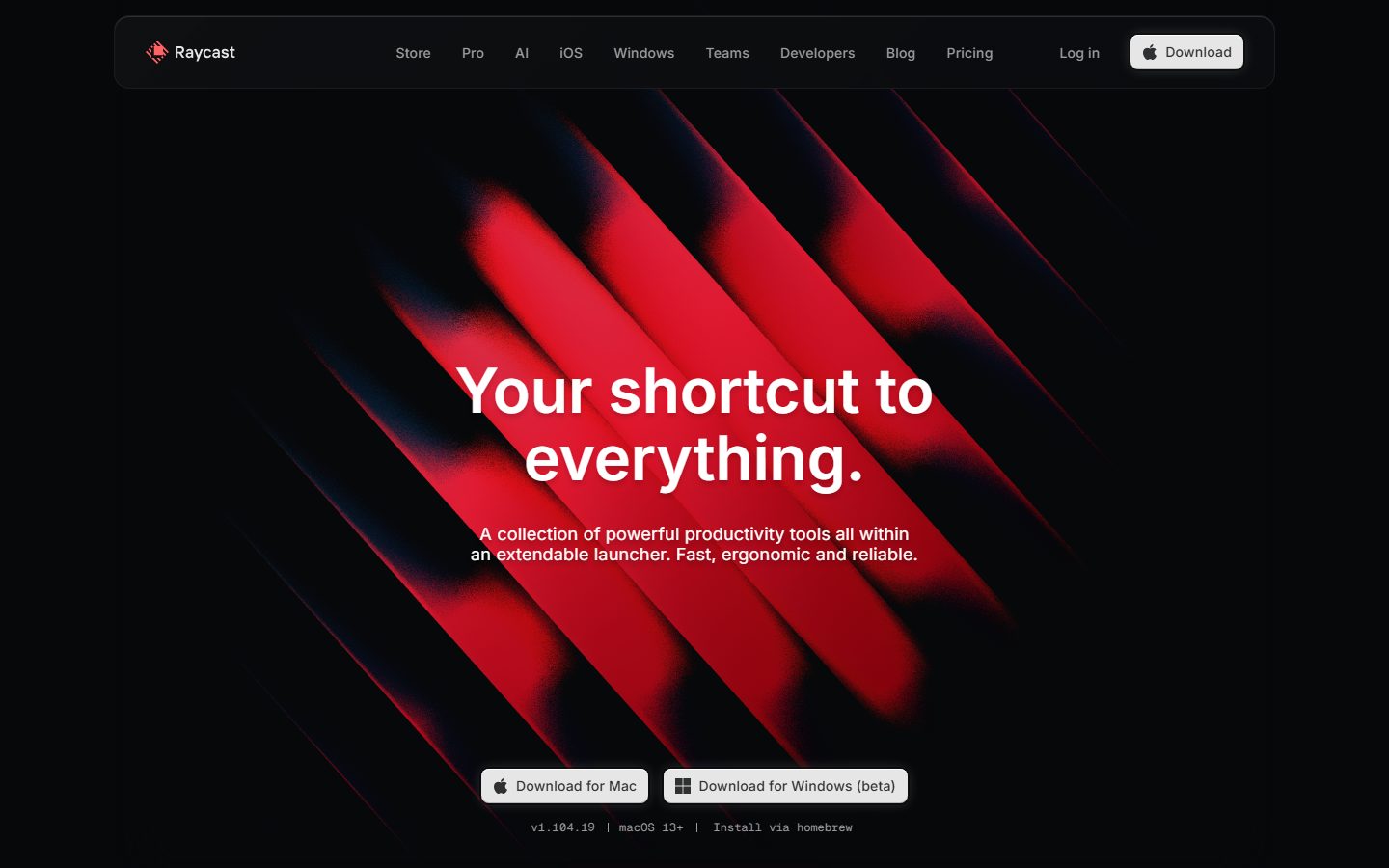
Raycast's marketing surface is a dark, developer-tool-native interface — near-black canvas (`{colors.canvas}` — #07080a) carrying a single off-white primary button (`{colors.primary}` — #e6e6e6 with `{colors.on-primary}` — #2f3031 text) and a dominant red gradient hero. The system reads as precise, engineered, and macOS-adjacent: every control surface mimics the layered light/shadow of native macOS UI, type is Inter throughout, and the only chromatic break in the otherwise-monochrome interface is Raycast's red brand spectrum (`{colors.brand-red}` — #ff6363) used in the hero artwork and logo.
The type system is minimal and measured: **Inter** at three observed roles — a 64px / weight 600 display headline ("Your shortcut to everything."), a 24px / weight 500 title, and a 14px / weight 500 button label. There is no second typeface; the whole system runs on Inter, which keeps the voice tightly utilitarian.
Component voltage comes from **box-shadow craft**, not color. Raycast's buttons, cards, and control chips use stacked inset-and-outset shadows (often four or five layers) to simulate the physically-lit surfaces of native macOS controls — a 1px white inset highlight on top, a dark inset at the bottom, a tight outline ring, and a soft drop. The result reads as "real software chrome" rather than flat web styling.
**Key Characteristics:**
- Near-black canvas (`{colors.canvas}` — #07080a) with stepped dark surfaces above it (`{colors.canvas-deep}` #08090c, `{colors.canvas-raised}` #0c0d0f, `{colors.canvas-elevated}` #111214).
- Single off-white primary button (`{colors.primary}` — #e6e6e6) with dark `{colors.on-primary}` (#2f3031) label, `{rounded.md}` (8px), padding 8px × 12px. The same treatment serves "Download" in the nav and the two hero download buttons.
- Inter everywhere — display (64px/600), title (24px/500), button (14px/500). No second family.
- Red brand spectrum reserved for the hero gradient artwork and logo: `{colors.brand-red}` (#ff6363), `{colors.brand-red-deep}` (#ff2136), and shadow-toned reds (`{colors.brand-red-shadow}` #452324, `{colors.brand-red-shadow-soft}` #2c1617, `{colors.brand-red-mid}` #833637).
- Heavily layered box-shadows on every control — inset highlights + dark inset + outline ring + drop shadow — emulating native macOS surfaces.
- Soft-rounded cards at `{rounded.xxxl}` (20px); controls and inputs at `{rounded.md}` (8px); pill-rounded nav container at `{rounded.xxl}` (16px).
- Muted link/label grays (`{colors.muted}` #6a6b6c, `{colors.link}` #9c9c9d) carry secondary text against the dark canvas.
## Colors
### Brand & Accent
- **Brand Red** (`{colors.brand-red}` — #ff6363): The primary brand hue — the logo and the lightest band of the hero gradient.
- **Brand Red Deep** (`{colors.brand-red-deep}` — #ff2136): The saturated core of the hero gradient.
- **Brand Red Shadow / Soft / Mid** (`{colors.brand-red-shadow}` — #452324, `{colors.brand-red-shadow-soft}` — #2c1617, `{colors.brand-red-mid}` — #833637): The darker reds where the gradient falls into the black canvas — used only inside the hero artwork, never as interface fills.
- **Accent Blue / Sky / Green** (`{colors.accent-blue}` — #0294fe, `{colors.accent-sky}` — #56c2ff, `{colors.accent-green}` — #59d499): Low-frequency accents (measured 7–10 occurrences each), appearing in product-UI fragments and icon glyphs rather than on marketing chrome.
### Surface
- **Canvas** (`{colors.canvas}` — #07080a): The default page floor — near-black.
- **Canvas Deep** (`{colors.canvas-deep}` — #08090c): A barely-distinct deeper tone used in stacked sections.
- **Canvas Raised** (`{colors.canvas-raised}` — #0c0d0f): The raised-surface tone for the nav container and cards.
- **Canvas Elevated** (`{colors.canvas-elevated}` — #111214): The top of the surface stack — elevated panels and chips.
- **Pure Black** (`{colors.pure-black}` — #000000): Used inside shadow rings and gradient edges.
- **Surface Input** (`{colors.surface-input}` — #ffffff): Measured input background — white, an inversion against the dark canvas.
### Action
- **Primary** (`{colors.primary}` — #e6e6e6): The single off-white button fill for all primary CTAs.
- **On Primary** (`{colors.on-primary}` — #2f3031): The dark label text on the primary button.
- **Neutral Strong** (`{colors.neutral-strong}` — #d9d9d9): A secondary near-white used on control surfaces and chip fills.
### Text
- **Ink** (`{colors.ink}` — #ffffff): All headlines and primary text — white on the dark canvas, the highest-frequency color (measured 2384).
- **Muted** (`{colors.muted}` — #6a6b6c): Secondary text and fine-print.
- **Link** (`{colors.link}` — #9c9c9d): Nav links and inline links — a light gray.
- **Hairline** (`{colors.hairline}` — #434345): The border / divider tone on dark surfaces.
## Typography
### Font Family
The system runs **Inter** for everything — display headlines, titles, and button labels. No second typeface was measured. Inter is open-source (SIL OFL), so the system ships exactly what it specifies; no substitute is required. The recommended fallback stack is `Inter, -apple-system, BlinkMacSystemFont, "Segoe UI", Roboto, sans-serif`.
### Hierarchy
| Token | Size | Weight | Line Height | Letter Spacing | Use |
|---|---|---|---|---|---|
| `{typography.display}` | 64px | 600 | 1.1 | 0 (measured "normal") | Hero h1 ("Your shortcut to everything.") |
| `{typography.title}` | 24px | 500 | 1.6 | 0.2px | Section sub-heads / h4-level titles |
| `{typography.button}` | 14px | 500 | 1.143 | 0.2px | Button labels, nav links |
### Principles
The voice is utilitarian and tight: a single family across all roles, mid-weights (500–600, never 700), and small positive tracking (0.2px) on the smaller roles. The display headline runs weight 600 with default ("normal") tracking — Raycast does not apply the negative letter-spacing common to other display systems; the headline is measured at `letter_spacing: normal`, rendered here as 0.
### Note on Font Substitutes
No licensed/custom typefaces were flagged (`fonts_licensed: []`). Inter is freely available, so no substitute is needed. If Inter must be swapped, **Roboto** or system-ui at matching weights preserves the neutral, geometric-humanist character.
## Layout
### Spacing System
- **Base unit:** ~4px, though the system's most frequent steps are 8px (measured 275×), 14px (159×) and 15px (159×), and 24px (150×).
- **Tokens:** `{spacing.xxs}` 4px · `{spacing.xs}` 8px · `{spacing.sm}` 12px · `{spacing.md}` 14px · `{spacing.lg}` 16px · `{spacing.xl}` 24px · `{spacing.xxl}` 32px.
- **Control padding:** the primary button measures 8px × 12px (`{spacing.xs}` × `{spacing.sm}`).
- **Section / card gutters:** 16px and 24px dominate the larger rhythm.
The 14/15px pair appearing at near-identical high frequency suggests a consistent ~14px micro-rhythm inside control rows (icon-to-label gaps, chip padding). Larger editorial band spacing was not isolated in the measurement — see Known Gaps.
### Grid & Container
- The top nav is a centered rounded container floating above the hero (visible in the landing screenshot), with the logo at left, a horizontal menu (Store, Pro, AI, iOS, Windows, Teams, Developers, Blog, Pricing) center, and "Log in" + "Download" at right.
- The hero centers a single display headline + supporting sub-copy + two download buttons over full-bleed red gradient artwork.
- Detailed column counts and max content width were not measured — see Known Gaps.
### Whitespace Philosophy
The hero is intentionally airy — a single large headline floats in a tall red-gradient field with generous vertical breathing room above the download buttons. The interface is sparse and focused: one primary action per band.
## Elevation & Depth
Raycast's depth language is its signature. Instead of flat web cards, controls carry **stacked multi-layer box-shadows** that emulate physically-lit native macOS surfaces. The measured shadows:
| Treatment | Measured value (abbreviated) | Use |
|---|---|---|
| Native control (high-freq, 159×) | `rgba(0,0,0,0.4) 0 1.5px 0.5px 2.5px, rgb(0,0,0) 0 0 0.5px 1px, rgba(0,0,0,0.25) 0 2px 1px 1px inset, rgba(255,255,255,0.2) 0 1px 1px 1px inset …` | Buttons / chips — outset drop + outline ring + dark inset bottom + white inset top |
| Outline ring (54×) | `rgb(27,28,30) 0 0 0 1px, rgb(7,8,10) 0 0 0 1px inset` | Hairline ring on dark panels |
| Warm glow (18×) | `rgba(215,201,175,0.05) 0 0 20px 5px, rgba(215,201,175,0.05) 0 0 16px -7px` | Soft ambient glow around feature surfaces |
| Soft drop (17×) | `rgba(0,0,0,0.28) 0 1.189px 2.377px` | Small floating elements |
| Beveled chip (17×) | `rgba(255,255,255,0.05) 0 1px 0 inset, rgba(255,255,255,0.25) 0 0 0 1px, rgba(0,0,0,0.2) 0 -1px 0 inset` | Pressed/segmented chips |
| Focus halo (7×) | `rgba(0,0,0,0.5) 0 0 0 2px, rgba(255,255,255,0.19) 0 0 14px, … inset highlights` | Focused control |
| Card (measured on card) | `rgba(255,255,255,0.1) 0 1px 0 inset, rgba(7,13,79,0.05) 0 0 20px 3px, rgba(7,13,79,0.05) 0 0 40px 20px, rgba(255,255,255,0.06) 0 0 0 1px inset` | Card surface — inset top highlight + soft blue-black bloom + inset hairline ring |
The philosophy is **simulated physical lighting**: a 1px white inset along the top edge reads as a highlight, a dark inset along the bottom reads as a recessed shadow, and a tight 1px ring defines the silhouette against the dark canvas. This is what makes Raycast's web controls feel like the native app.
### Decorative Depth
- The hero's red gradient artwork is the dominant decorative layer — diagonal red bands fading into black, carrying the full red spectrum (`{colors.brand-red}` → `{colors.brand-red-deep}` → `{colors.brand-red-shadow}`).
- The warm glow shadow (`rgba(215,201,175,0.05)`) adds subtle ambient lighting around feature surfaces.
## Shapes
### Border Radius Scale
| Token | Value | Use |
|---|---|---|
| `{rounded.xxs}` | 2px | Tiny inner accents (measured 11×) |
| `{rounded.xs}` | 4px | Small chips, inner elements (17×) |
| `{rounded.sm}` | 6px | Compact controls (63×) |
| `{rounded.md}` | 8px | Primary buttons, inputs (109× — dominant control radius) |
| `{rounded.lg}` | 11px | High-frequency control surfaces (159×) |
| `{rounded.xl}` | 12px | Mid-size panels (55×) |
| `{rounded.xxl}` | 16px | Nav container, larger panels (29×) |
| `{rounded.xxxl}` | 20px | Cards (35×) |
The two most-used radii are `{rounded.lg}` (11px, 159×) and `{rounded.md}` (8px, 109×) — the system's control surfaces cluster around 8–11px, while cards step up to 20px.
### Photography / Artwork Geometry
The hero artwork is a full-bleed red gradient; product-UI fragments and cards adopt the `{rounded.xxxl}` (20px) card corners. Larger one-off radii (31px, 36px, 43px) appear once each — likely pill-rounded badges or circular avatars, not part of the core scale.
## Components
### Navigation
**`top-nav`** — A floating rounded container above the hero. Background `{colors.canvas-raised}` (#0c0d0f), rounded `{rounded.xxl}` (16px, derived from the nav silhouette in the screenshot matched to the measured 16px radius). Holds the Raycast logo + wordmark at left, a horizontal menu center, and "Log in" + "Download" at right.
**`nav-link`** — Inline menu items in `{colors.link}` (#9c9c9d), type `{typography.button}` (Inter 14px / 500). No background.
### Buttons
**`button-primary`** — The single primary CTA style. Background `{colors.primary}` (#e6e6e6), label `{colors.on-primary}` (#2f3031), type `{typography.button}` (Inter 14px / 500), rounded `{rounded.md}` (8px), padding 8px × 12px. Carries the signature stacked native-control box-shadow (white inset top highlight + dark inset bottom + outline ring + soft drop).
**`download-button`** — The hero's "Download for Mac" / "Download for Windows (beta)" buttons and the nav "Download" share the `button-primary` treatment — off-white fill, dark label, leading platform glyph, `{rounded.md}`, 8px × 12px padding.
### Containers
**`card`** — Soft-rounded surface at `{rounded.xxxl}` (20px). Background `{colors.canvas-raised}` (#0c0d0f, derived — card background was not directly measured; the card's measured spec captured only radius + shadow). Carries the layered card shadow: 1px white inset top highlight, a soft blue-black bloom (`rgba(7,13,79,0.05)` at 20px and 40px spreads), and a 1px inset hairline ring (`rgba(255,255,255,0.06)`).
### Inputs
**`input`** — Text input with measured white background `{colors.surface-input}` (#ffffff) and `{rounded.md}` (8px) corners. Label/value text in `{colors.on-primary}` for legibility on the white fill. The white input inverts against the dark canvas.
## Do's and Don'ts
### Do
- Keep the canvas near-black (`{colors.canvas}` — #07080a) and step surfaces up through `{colors.canvas-deep}` → `{colors.canvas-raised}` → `{colors.canvas-elevated}` for layering.
- Use the single off-white `{colors.primary}` button for all primary actions — Raycast has exactly one button treatment.
- Apply the layered native-control box-shadows to interactive surfaces — the white-inset-top + dark-inset-bottom + outline-ring combination is the brand's depth signature.
- Reserve the red spectrum for the hero gradient artwork and logo. The interface stays monochrome.
- Run Inter at the three measured roles; keep weights at 500–600.
- Use `{rounded.md}` (8px) for controls and inputs, `{rounded.xxxl}` (20px) for cards.
### Don't
- Don't introduce a second typeface — the system is Inter-only.
- Don't fill buttons or chips with red; the red is artwork, not an action color.
- Don't flatten the controls — removing the inset/outset shadow layers strips the native-macOS character.
- Don't apply heavy negative letter-spacing to the display headline; it was measured at default tracking.
- Don't use the bright accent blue/sky/green outside product-UI fragments — they are scarce, low-frequency glyph accents.
- Don't document hover states — default and active/pressed only.
## Responsive Behavior
Responsive breakpoints were not captured in the measurement (only desktop landing + pricing were rendered). The following is the conventional collapse pattern for this layout and should be confirmed against live rendering:
| Name | Width | Likely Changes |
|---|---|---|
| Mobile | < 768px | Floating nav collapses to a compact bar / menu; hero display drops from 64px; download buttons stack vertically |
| Tablet | 768–1024px | Nav menu tightens; hero stays centered |
| Desktop | > 1024px | Full floating nav with all menu items; centered hero over full-bleed gradient |
### Touch Targets
- `{component.button-primary}` measures 8px × 12px padding around a 14px label — confirm the resulting tap area meets a 44px minimum on touch devices (the measured padding alone yields a sub-44px control).
### Collapsing Strategy
- Not measured — see Known Gaps. The floating rounded nav (`{component.top-nav}`) and the centered hero are the only layout structures confirmed from screenshots.
## Iteration Guide
1. Focus on ONE component at a time. Reference its YAML key directly (`{component.button-primary}`, `{component.card}`).
2. Variants live as separate entries in `components:` (`-active`, `-disabled`, etc.).
3. Use `{token.refs}` everywhere — never inline a hex in a component.
4. Never document hover. Default and active/pressed only.
5. Inter is the only family — do not introduce a second typeface.
6. The red spectrum is artwork; keep the interface monochrome.
7. Preserve the layered box-shadow depth model — it is the brand's defining visual signature.
## Known Gaps
- **Card background** was not directly measured — only the card's radius and shadow were captured. The `{colors.canvas-raised}` fill assigned to `{component.card}` is derived from the surface stack and should be confirmed.
- **Body / paragraph typography** was not isolated — only display (64px), title (24px), and button (14px) roles were measured. The hero sub-copy and running text sizes/weights are unknown.
- **Section / band spacing** (vertical rhythm between editorial sections) was not extracted; the spacing tokens reflect control-level padding/gap/margin frequencies. The 14px vs 15px pair at identical frequency may be sub-pixel rounding of a single value.
- **Responsive breakpoints and grid/container widths** were not captured — only desktop landing + pricing pages were rendered.
- **Hover, focus, disabled, and pressed states** beyond the measured focus-halo shadow are not documented per scope.
- **Accent blue/sky/green usage** is inferred to be product-UI / icon glyphs based on low frequency (7–10 each); exact placement was not isolated.
- **Pricing page components** (tier cards, feature tables) were captured as a page but not separated into distinct component specs.
- **Animation and transition timings** are out of scope.
<!-- Documented by duply · real-world design systems as ready-to-use DESIGN.md for AI coding agents · https://duply.ai/raycast/design-md -->
Color Palette
Accent
Neutrals
Typography
display64px · 600 · 1.1
The quick brown fox jumpstitle24px · 500 · 1.6
The quick brown fox jumpsbutton14px · 500 · 1.143
The quick brown fox jumpsSpacing & Shape
Spacing
| Name | Value | Preview |
|---|---|---|
| xxs | 4px | |
| xs | 8px | |
| sm | 12px | |
| md | 14px | |
| lg | 16px | |
| xl | 24px | |
| xxl | 32px |
Border Radius
| Name | Value | Preview |
|---|---|---|
| xxs | 2px | |
| xs | 4px | |
| sm | 6px | |
| md | 8px | |
| lg | 11px | |
| xl | 12px | |
| xxl | 16px | |
| xxxl | 20px |
More like this


---
version: alpha
name: Raycast-design-analysis
description: A dark, macOS-launcher-native marketing interface anchored on near-black canvas (#07080a) with a single off-white primary button and a signature red gradient hero. The system reads as precise developer-tool software — Inter throughout, heavily layered inset/outset box-shadows that mimic native macOS controls, soft-rounded cards (~20px), and a monochrome UI broken only by Raycast's red brand spectrum. Voltage comes from the red gradient artwork and from the meticulously shadowed control surfaces, not from accent color usage.
colors:
  ink: "#ffffff"
  muted: "#6a6b6c"
  link: "#9c9c9d"
  hairline: "#434345"
  neutral-strong: "#d9d9d9"
  primary: "#e6e6e6"
  on-primary: "#2f3031"
  surface-input: "#ffffff"
  canvas: "#07080a"
  canvas-deep: "#08090c"
  canvas-raised: "#0c0d0f"
  canvas-elevated: "#111214"
  pure-black: "#000000"
  brand-red: "#ff6363"
  brand-red-deep: "#ff2136"
  brand-red-shadow: "#452324"
  brand-red-shadow-soft: "#2c1617"
  brand-red-mid: "#833637"
  accent-blue: "#0294fe"
  accent-sky: "#56c2ff"
  accent-green: "#59d499"
typography:
  display:
    fontFamily: "Inter, sans-serif"
    fontSize: 64px
    fontWeight: 600
    lineHeight: 1.1
    letterSpacing: 0
  title:
    fontFamily: "Inter, sans-serif"
    fontSize: 24px
    fontWeight: 500
    lineHeight: 1.6
    letterSpacing: 0.2px
  button:
    fontFamily: "Inter, sans-serif"
    fontSize: 14px
    fontWeight: 500
    lineHeight: 1.143
    letterSpacing: 0.2px
rounded:
  xxs: 2px
  xs: 4px
  sm: 6px
  md: 8px
  lg: 11px
  xl: 12px
  xxl: 16px
  xxxl: 20px
spacing:
  xxs: 4px
  xs: 8px
  sm: 12px
  md: 14px
  lg: 16px
  xl: 24px
  xxl: 32px
components:
  button-primary:
    backgroundColor: "{colors.primary}"
    textColor: "{colors.on-primary}"
    typography: "{typography.button}"
    rounded: "{rounded.md}"
    padding: 8px 12px
  download-button:
    backgroundColor: "{colors.primary}"
    textColor: "{colors.on-primary}"
    typography: "{typography.button}"
    rounded: "{rounded.md}"
    padding: 8px 12px
  top-nav:
    backgroundColor: "{colors.canvas-raised}"
    textColor: "{colors.ink}"
    typography: "{typography.button}"
    rounded: "{rounded.xxl}"
  nav-link:
    backgroundColor: transparent
    textColor: "{colors.link}"
    typography: "{typography.button}"
  card:
    backgroundColor: "{colors.canvas-raised}"
    textColor: "{colors.ink}"
    rounded: "{rounded.xxxl}"
  input:
    backgroundColor: "{colors.surface-input}"
    textColor: "{colors.on-primary}"
    typography: "{typography.button}"
    rounded: "{rounded.md}"
---

## Overview

Raycast's marketing surface is a dark, developer-tool-native interface — near-black canvas (`{colors.canvas}` — #07080a) carrying a single off-white primary button (`{colors.primary}` — #e6e6e6 with `{colors.on-primary}` — #2f3031 text) and a dominant red gradient hero. The system reads as precise, engineered, and macOS-adjacent: every control surface mimics the layered light/shadow of native macOS UI, type is Inter throughout, and the only chromatic break in the otherwise-monochrome interface is Raycast's red brand spectrum (`{colors.brand-red}` — #ff6363) used in the hero artwork and logo.

The type system is minimal and measured: **Inter** at three observed roles — a 64px / weight 600 display headline ("Your shortcut to everything."), a 24px / weight 500 title, and a 14px / weight 500 button label. There is no second typeface; the whole system runs on Inter, which keeps the voice tightly utilitarian.

Component voltage comes from **box-shadow craft**, not color. Raycast's buttons, cards, and control chips use stacked inset-and-outset shadows (often four or five layers) to simulate the physically-lit surfaces of native macOS controls — a 1px white inset highlight on top, a dark inset at the bottom, a tight outline ring, and a soft drop. The result reads as "real software chrome" rather than flat web styling.

**Key Characteristics:**
- Near-black canvas (`{colors.canvas}` — #07080a) with stepped dark surfaces above it (`{colors.canvas-deep}` #08090c, `{colors.canvas-raised}` #0c0d0f, `{colors.canvas-elevated}` #111214).
- Single off-white primary button (`{colors.primary}` — #e6e6e6) with dark `{colors.on-primary}` (#2f3031) label, `{rounded.md}` (8px), padding 8px × 12px. The same treatment serves "Download" in the nav and the two hero download buttons.
- Inter everywhere — display (64px/600), title (24px/500), button (14px/500). No second family.
- Red brand spectrum reserved for the hero gradient artwork and logo: `{colors.brand-red}` (#ff6363), `{colors.brand-red-deep}` (#ff2136), and shadow-toned reds (`{colors.brand-red-shadow}` #452324, `{colors.brand-red-shadow-soft}` #2c1617, `{colors.brand-red-mid}` #833637).
- Heavily layered box-shadows on every control — inset highlights + dark inset + outline ring + drop shadow — emulating native macOS surfaces.
- Soft-rounded cards at `{rounded.xxxl}` (20px); controls and inputs at `{rounded.md}` (8px); pill-rounded nav container at `{rounded.xxl}` (16px).
- Muted link/label grays (`{colors.muted}` #6a6b6c, `{colors.link}` #9c9c9d) carry secondary text against the dark canvas.

## Colors

### Brand & Accent
- **Brand Red** (`{colors.brand-red}` — #ff6363): The primary brand hue — the logo and the lightest band of the hero gradient.
- **Brand Red Deep** (`{colors.brand-red-deep}` — #ff2136): The saturated core of the hero gradient.
- **Brand Red Shadow / Soft / Mid** (`{colors.brand-red-shadow}` — #452324, `{colors.brand-red-shadow-soft}` — #2c1617, `{colors.brand-red-mid}` — #833637): The darker reds where the gradient falls into the black canvas — used only inside the hero artwork, never as interface fills.
- **Accent Blue / Sky / Green** (`{colors.accent-blue}` — #0294fe, `{colors.accent-sky}` — #56c2ff, `{colors.accent-green}` — #59d499): Low-frequency accents (measured 7–10 occurrences each), appearing in product-UI fragments and icon glyphs rather than on marketing chrome.

### Surface
- **Canvas** (`{colors.canvas}` — #07080a): The default page floor — near-black.
- **Canvas Deep** (`{colors.canvas-deep}` — #08090c): A barely-distinct deeper tone used in stacked sections.
- **Canvas Raised** (`{colors.canvas-raised}` — #0c0d0f): The raised-surface tone for the nav container and cards.
- **Canvas Elevated** (`{colors.canvas-elevated}` — #111214): The top of the surface stack — elevated panels and chips.
- **Pure Black** (`{colors.pure-black}` — #000000): Used inside shadow rings and gradient edges.
- **Surface Input** (`{colors.surface-input}` — #ffffff): Measured input background — white, an inversion against the dark canvas.

### Action
- **Primary** (`{colors.primary}` — #e6e6e6): The single off-white button fill for all primary CTAs.
- **On Primary** (`{colors.on-primary}` — #2f3031): The dark label text on the primary button.
- **Neutral Strong** (`{colors.neutral-strong}` — #d9d9d9): A secondary near-white used on control surfaces and chip fills.

### Text
- **Ink** (`{colors.ink}` — #ffffff): All headlines and primary text — white on the dark canvas, the highest-frequency color (measured 2384).
- **Muted** (`{colors.muted}` — #6a6b6c): Secondary text and fine-print.
- **Link** (`{colors.link}` — #9c9c9d): Nav links and inline links — a light gray.
- **Hairline** (`{colors.hairline}` — #434345): The border / divider tone on dark surfaces.

## Typography

### Font Family
The system runs **Inter** for everything — display headlines, titles, and button labels. No second typeface was measured. Inter is open-source (SIL OFL), so the system ships exactly what it specifies; no substitute is required. The recommended fallback stack is `Inter, -apple-system, BlinkMacSystemFont, "Segoe UI", Roboto, sans-serif`.

### Hierarchy

| Token | Size | Weight | Line Height | Letter Spacing | Use |
|---|---|---|---|---|---|
| `{typography.display}` | 64px | 600 | 1.1 | 0 (measured "normal") | Hero h1 ("Your shortcut to everything.") |
| `{typography.title}` | 24px | 500 | 1.6 | 0.2px | Section sub-heads / h4-level titles |
| `{typography.button}` | 14px | 500 | 1.143 | 0.2px | Button labels, nav links |

### Principles
The voice is utilitarian and tight: a single family across all roles, mid-weights (500–600, never 700), and small positive tracking (0.2px) on the smaller roles. The display headline runs weight 600 with default ("normal") tracking — Raycast does not apply the negative letter-spacing common to other display systems; the headline is measured at `letter_spacing: normal`, rendered here as 0.

### Note on Font Substitutes
No licensed/custom typefaces were flagged (`fonts_licensed: []`). Inter is freely available, so no substitute is needed. If Inter must be swapped, **Roboto** or system-ui at matching weights preserves the neutral, geometric-humanist character.

## Layout

### Spacing System
- **Base unit:** ~4px, though the system's most frequent steps are 8px (measured 275×), 14px (159×) and 15px (159×), and 24px (150×).
- **Tokens:** `{spacing.xxs}` 4px · `{spacing.xs}` 8px · `{spacing.sm}` 12px · `{spacing.md}` 14px · `{spacing.lg}` 16px · `{spacing.xl}` 24px · `{spacing.xxl}` 32px.
- **Control padding:** the primary button measures 8px × 12px (`{spacing.xs}` × `{spacing.sm}`).
- **Section / card gutters:** 16px and 24px dominate the larger rhythm.

The 14/15px pair appearing at near-identical high frequency suggests a consistent ~14px micro-rhythm inside control rows (icon-to-label gaps, chip padding). Larger editorial band spacing was not isolated in the measurement — see Known Gaps.

### Grid & Container
- The top nav is a centered rounded container floating above the hero (visible in the landing screenshot), with the logo at left, a horizontal menu (Store, Pro, AI, iOS, Windows, Teams, Developers, Blog, Pricing) center, and "Log in" + "Download" at right.
- The hero centers a single display headline + supporting sub-copy + two download buttons over full-bleed red gradient artwork.
- Detailed column counts and max content width were not measured — see Known Gaps.

### Whitespace Philosophy
The hero is intentionally airy — a single large headline floats in a tall red-gradient field with generous vertical breathing room above the download buttons. The interface is sparse and focused: one primary action per band.

## Elevation & Depth

Raycast's depth language is its signature. Instead of flat web cards, controls carry **stacked multi-layer box-shadows** that emulate physically-lit native macOS surfaces. The measured shadows:

| Treatment | Measured value (abbreviated) | Use |
|---|---|---|
| Native control (high-freq, 159×) | `rgba(0,0,0,0.4) 0 1.5px 0.5px 2.5px, rgb(0,0,0) 0 0 0.5px 1px, rgba(0,0,0,0.25) 0 2px 1px 1px inset, rgba(255,255,255,0.2) 0 1px 1px 1px inset …` | Buttons / chips — outset drop + outline ring + dark inset bottom + white inset top |
| Outline ring (54×) | `rgb(27,28,30) 0 0 0 1px, rgb(7,8,10) 0 0 0 1px inset` | Hairline ring on dark panels |
| Warm glow (18×) | `rgba(215,201,175,0.05) 0 0 20px 5px, rgba(215,201,175,0.05) 0 0 16px -7px` | Soft ambient glow around feature surfaces |
| Soft drop (17×) | `rgba(0,0,0,0.28) 0 1.189px 2.377px` | Small floating elements |
| Beveled chip (17×) | `rgba(255,255,255,0.05) 0 1px 0 inset, rgba(255,255,255,0.25) 0 0 0 1px, rgba(0,0,0,0.2) 0 -1px 0 inset` | Pressed/segmented chips |
| Focus halo (7×) | `rgba(0,0,0,0.5) 0 0 0 2px, rgba(255,255,255,0.19) 0 0 14px, … inset highlights` | Focused control |
| Card (measured on card) | `rgba(255,255,255,0.1) 0 1px 0 inset, rgba(7,13,79,0.05) 0 0 20px 3px, rgba(7,13,79,0.05) 0 0 40px 20px, rgba(255,255,255,0.06) 0 0 0 1px inset` | Card surface — inset top highlight + soft blue-black bloom + inset hairline ring |

The philosophy is **simulated physical lighting**: a 1px white inset along the top edge reads as a highlight, a dark inset along the bottom reads as a recessed shadow, and a tight 1px ring defines the silhouette against the dark canvas. This is what makes Raycast's web controls feel like the native app.

### Decorative Depth
- The hero's red gradient artwork is the dominant decorative layer — diagonal red bands fading into black, carrying the full red spectrum (`{colors.brand-red}` → `{colors.brand-red-deep}` → `{colors.brand-red-shadow}`).
- The warm glow shadow (`rgba(215,201,175,0.05)`) adds subtle ambient lighting around feature surfaces.

## Shapes

### Border Radius Scale

| Token | Value | Use |
|---|---|---|
| `{rounded.xxs}` | 2px | Tiny inner accents (measured 11×) |
| `{rounded.xs}` | 4px | Small chips, inner elements (17×) |
| `{rounded.sm}` | 6px | Compact controls (63×) |
| `{rounded.md}` | 8px | Primary buttons, inputs (109× — dominant control radius) |
| `{rounded.lg}` | 11px | High-frequency control surfaces (159×) |
| `{rounded.xl}` | 12px | Mid-size panels (55×) |
| `{rounded.xxl}` | 16px | Nav container, larger panels (29×) |
| `{rounded.xxxl}` | 20px | Cards (35×) |

The two most-used radii are `{rounded.lg}` (11px, 159×) and `{rounded.md}` (8px, 109×) — the system's control surfaces cluster around 8–11px, while cards step up to 20px.

### Photography / Artwork Geometry
The hero artwork is a full-bleed red gradient; product-UI fragments and cards adopt the `{rounded.xxxl}` (20px) card corners. Larger one-off radii (31px, 36px, 43px) appear once each — likely pill-rounded badges or circular avatars, not part of the core scale.

## Components

### Navigation

**`top-nav`** — A floating rounded container above the hero. Background `{colors.canvas-raised}` (#0c0d0f), rounded `{rounded.xxl}` (16px, derived from the nav silhouette in the screenshot matched to the measured 16px radius). Holds the Raycast logo + wordmark at left, a horizontal menu center, and "Log in" + "Download" at right.

**`nav-link`** — Inline menu items in `{colors.link}` (#9c9c9d), type `{typography.button}` (Inter 14px / 500). No background.

### Buttons

**`button-primary`** — The single primary CTA style. Background `{colors.primary}` (#e6e6e6), label `{colors.on-primary}` (#2f3031), type `{typography.button}` (Inter 14px / 500), rounded `{rounded.md}` (8px), padding 8px × 12px. Carries the signature stacked native-control box-shadow (white inset top highlight + dark inset bottom + outline ring + soft drop).

**`download-button`** — The hero's "Download for Mac" / "Download for Windows (beta)" buttons and the nav "Download" share the `button-primary` treatment — off-white fill, dark label, leading platform glyph, `{rounded.md}`, 8px × 12px padding.

### Containers

**`card`** — Soft-rounded surface at `{rounded.xxxl}` (20px). Background `{colors.canvas-raised}` (#0c0d0f, derived — card background was not directly measured; the card's measured spec captured only radius + shadow). Carries the layered card shadow: 1px white inset top highlight, a soft blue-black bloom (`rgba(7,13,79,0.05)` at 20px and 40px spreads), and a 1px inset hairline ring (`rgba(255,255,255,0.06)`).

### Inputs

**`input`** — Text input with measured white background `{colors.surface-input}` (#ffffff) and `{rounded.md}` (8px) corners. Label/value text in `{colors.on-primary}` for legibility on the white fill. The white input inverts against the dark canvas.

## Do's and Don'ts

### Do
- Keep the canvas near-black (`{colors.canvas}` — #07080a) and step surfaces up through `{colors.canvas-deep}` → `{colors.canvas-raised}` → `{colors.canvas-elevated}` for layering.
- Use the single off-white `{colors.primary}` button for all primary actions — Raycast has exactly one button treatment.
- Apply the layered native-control box-shadows to interactive surfaces — the white-inset-top + dark-inset-bottom + outline-ring combination is the brand's depth signature.
- Reserve the red spectrum for the hero gradient artwork and logo. The interface stays monochrome.
- Run Inter at the three measured roles; keep weights at 500–600.
- Use `{rounded.md}` (8px) for controls and inputs, `{rounded.xxxl}` (20px) for cards.

### Don't
- Don't introduce a second typeface — the system is Inter-only.
- Don't fill buttons or chips with red; the red is artwork, not an action color.
- Don't flatten the controls — removing the inset/outset shadow layers strips the native-macOS character.
- Don't apply heavy negative letter-spacing to the display headline; it was measured at default tracking.
- Don't use the bright accent blue/sky/green outside product-UI fragments — they are scarce, low-frequency glyph accents.
- Don't document hover states — default and active/pressed only.

## Responsive Behavior

Responsive breakpoints were not captured in the measurement (only desktop landing + pricing were rendered). The following is the conventional collapse pattern for this layout and should be confirmed against live rendering:

| Name | Width | Likely Changes |
|---|---|---|
| Mobile | < 768px | Floating nav collapses to a compact bar / menu; hero display drops from 64px; download buttons stack vertically |
| Tablet | 768–1024px | Nav menu tightens; hero stays centered |
| Desktop | > 1024px | Full floating nav with all menu items; centered hero over full-bleed gradient |

### Touch Targets
- `{component.button-primary}` measures 8px × 12px padding around a 14px label — confirm the resulting tap area meets a 44px minimum on touch devices (the measured padding alone yields a sub-44px control).

### Collapsing Strategy
- Not measured — see Known Gaps. The floating rounded nav (`{component.top-nav}`) and the centered hero are the only layout structures confirmed from screenshots.

## Iteration Guide

1. Focus on ONE component at a time. Reference its YAML key directly (`{component.button-primary}`, `{component.card}`).
2. Variants live as separate entries in `components:` (`-active`, `-disabled`, etc.).
3. Use `{token.refs}` everywhere — never inline a hex in a component.
4. Never document hover. Default and active/pressed only.
5. Inter is the only family — do not introduce a second typeface.
6. The red spectrum is artwork; keep the interface monochrome.
7. Preserve the layered box-shadow depth model — it is the brand's defining visual signature.

## Known Gaps

- **Card background** was not directly measured — only the card's radius and shadow were captured. The `{colors.canvas-raised}` fill assigned to `{component.card}` is derived from the surface stack and should be confirmed.
- **Body / paragraph typography** was not isolated — only display (64px), title (24px), and button (14px) roles were measured. The hero sub-copy and running text sizes/weights are unknown.
- **Section / band spacing** (vertical rhythm between editorial sections) was not extracted; the spacing tokens reflect control-level padding/gap/margin frequencies. The 14px vs 15px pair at identical frequency may be sub-pixel rounding of a single value.
- **Responsive breakpoints and grid/container widths** were not captured — only desktop landing + pricing pages were rendered.
- **Hover, focus, disabled, and pressed states** beyond the measured focus-halo shadow are not documented per scope.
- **Accent blue/sky/green usage** is inferred to be product-UI / icon glyphs based on low frequency (7–10 each); exact placement was not isolated.
- **Pricing page components** (tier cards, feature tables) were captured as a page but not separated into distinct component specs.
- **Animation and transition timings** are out of scope.

<!-- Documented by duply · real-world design systems as ready-to-use DESIGN.md for AI coding agents · https://duply.ai/raycast/design-md -->