Last9
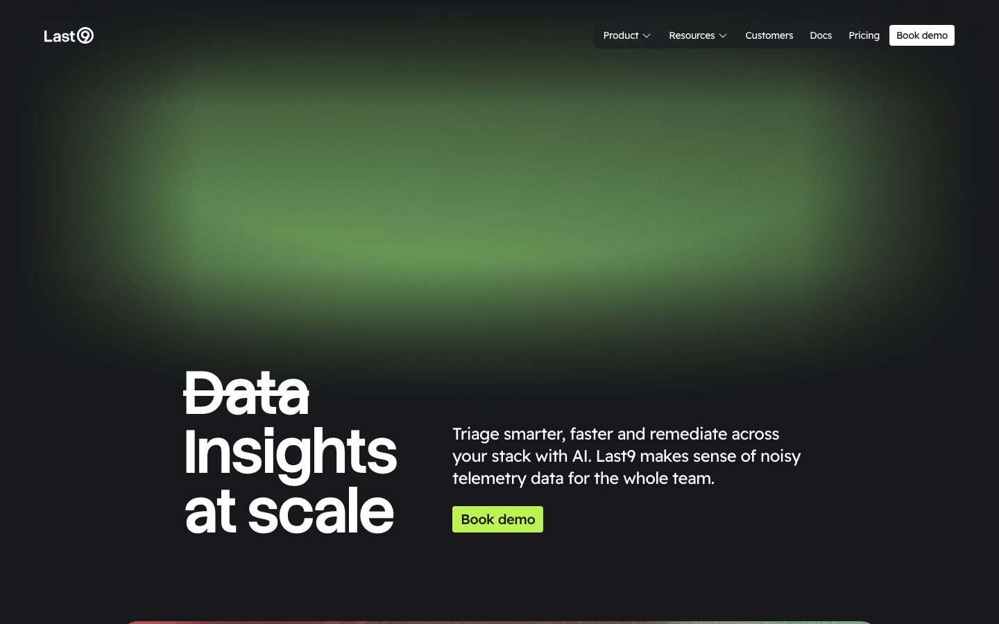
A dark, engineering-first observability platform interface built on a near-black canvas (#141414) with ambient green glow, oversized Stack Sans Headline display type, and Readex Pro running text. The system reads as confident developer-tooling — high-contrast white headlines on black, sharp-cornered (4px) cards and product-UI chrome shown directly inline, near-zero radius inputs, and a single bright accent CTA. Brand voltage comes from the huge struck-through "Data → Insights at scale" display headline and the green telemetry glow behind the hero, not from a broad color palette.
---
version: alpha
name: Last9-design-analysis
description: "A dark, engineering-first observability platform interface built on a near-black canvas (#141414) with ambient green glow, oversized Stack Sans Headline display type, and Readex Pro running text. The system reads as confident developer-tooling — high-contrast white headlines on black, sharp-cornered (4px) cards and product-UI chrome shown directly inline, near-zero radius inputs, and a single bright accent CTA. Brand voltage comes from the huge struck-through \"Data → Insights at scale\" display headline and the green telemetry glow behind the hero, not from a broad color palette."

colors:
  primary: "#ffffff"
  accent-green: "#26d7a0"
  accent-emerald: "#00bf84"
  accent-olive: "#76b462"
  accent-olive-soft: "#a0b477"
  accent-teal-soft: "#6fb194"
  accent-amber: "#ffaf20"
  accent-gold: "#e8b551"
  accent-blue: "#155dfc"
  accent-red: "#e50019"
  accent-cream: "#f7f3de"
  canvas: "#000000"
  surface: "#141414"
  surface-elevated: "#18181b"
  surface-strong: "#363636"
  hairline: "#393939"
  hairline-light: "#eeeeee"
  ink: "#ffffff"
  muted: "#9a9a9a"
  muted-cool: "#6a7282"
  muted-soft: "#797979"
  on-light: "#141414"

typography:
  display-xl:
    fontFamily: "Stack Sans Headline, Archivo, sans-serif"
    fontSize: 88px
    fontWeight: 600
    lineHeight: 1.5
    letterSpacing: -2.2px
  body-lg:
    fontFamily: "Readex Pro, sans-serif"
    fontSize: 24px
    fontWeight: 400
    lineHeight: 1.333
    letterSpacing: -0.6px
  button:
    fontFamily: "Readex Pro, sans-serif"
    fontSize: 20px
    fontWeight: 400
    lineHeight: 1.4
    letterSpacing: -0.5px
  heading-sm:
    fontFamily: "Readex Pro, sans-serif"
    fontSize: 16px
    fontWeight: 400
    lineHeight: 1.5
    letterSpacing: 0

rounded:
  none: 0px
  xs: 4px
  sm: 8px
  lg: 24px
  xl: 30px
  xxl: 32px

spacing:
  xxs: 4px
  xs: 8px
  sm: 12px
  md: 16px
  lg: 24px
  xl: 32px
  xxl: 48px
  section: 64px
  section-lg: 96px
  section-xl: 128px

components:
  button-primary:
    backgroundColor: "{colors.primary}"
    textColor: "{colors.on-light}"
    typography: "{typography.button}"
    rounded: "{rounded.xs}"
    padding: 8px 10px
  button-cta:
    backgroundColor: "{colors.accent-green}"
    textColor: "{colors.on-light}"
    typography: "{typography.button}"
    rounded: "{rounded.xs}"
    padding: 8px 10px
  button-text-link:
    backgroundColor: transparent
    textColor: "{colors.accent-green}"
    typography: "{typography.button}"
  top-nav:
    backgroundColor: "{colors.surface}"
    textColor: "{colors.ink}"
    typography: "{typography.heading-sm}"
  nav-link:
    backgroundColor: transparent
    textColor: "{colors.ink}"
    typography: "{typography.heading-sm}"
  hero-band:
    backgroundColor: "{colors.canvas}"
    textColor: "{colors.ink}"
    typography: "{typography.display-xl}"
    padding: 96px
  card:
    backgroundColor: "{colors.surface-elevated}"
    textColor: "{colors.ink}"
    rounded: "{rounded.xs}"
    padding: 24px
  product-mockup-card:
    backgroundColor: "{colors.surface}"
    textColor: "{colors.ink}"
    rounded: "{rounded.xs}"
    padding: 24px
  testimonial-card:
    backgroundColor: "{colors.surface}"
    textColor: "{colors.ink}"
    typography: "{typography.heading-sm}"
    rounded: "{rounded.xs}"
    padding: 24px
  feature-card:
    backgroundColor: "{colors.canvas}"
    textColor: "{colors.muted}"
    typography: "{typography.heading-sm}"
    rounded: "{rounded.xs}"
    padding: 24px
  input:
    backgroundColor: "{colors.surface}"
    textColor: "{colors.ink}"
    typography: "{typography.heading-sm}"
    rounded: "{rounded.none}"
    padding: 8px 12px
  tab-pill:
    backgroundColor: "{colors.surface-elevated}"
    textColor: "{colors.ink}"
    typography: "{typography.heading-sm}"
    rounded: "{rounded.xs}"
    padding: 8px 12px
  footer:
    backgroundColor: "{colors.canvas}"
    textColor: "{colors.muted}"
    typography: "{typography.heading-sm}"
    padding: 64px
---

## Overview

Last9's marketing surface is a dark, engineering-first observability interface — a near-black canvas (`{colors.canvas}` — #000000 / `{colors.surface}` — #141414) with a soft green telemetry glow behind the hero, oversized white display type, and a near-monochrome accent strategy. The system reads as confident developer-tooling: high contrast, sharp corners, and product UI chrome shown directly inline rather than illustrated.

Type voice splits into two roles: **Stack Sans Headline** (the brand's heavy display face — used at 88px for the hero "Data → Insights at scale" headline, weight 600, tight -2.2px tracking) and **Readex Pro** (everything else — body copy, buttons, navigation, captions). The split is strict — display is Stack Sans, supporting text is Readex Pro.

Component voltage comes from **product UI fragments shown directly inside cards** — the control-plane remapping table, agentic-DX terminal output, latency charts. Last9 doesn't paint marketing illustrations of the product; it embeds the actual product chrome at small scale in the editorial flow, sitting on dark surfaces with sharp 4px corners.

The accent palette is wide but used sparingly: a teal-green (`{colors.accent-green}` — #26d7a0), an emerald (`{colors.accent-emerald}` — #00bf84), amber/gold (`{colors.accent-amber}`, `{colors.accent-gold}`), and signal red (`{colors.accent-red}`). These appear almost entirely *inside* product UI fragments (alert badges, status chips, chart lines) — never on hero CTAs except the single bright lime "Book demo" button.

**Key Characteristics:**
- Near-black canvas with white text (`{colors.ink}` — #ffffff). The entire site is dark; there is no light mode in the captured surfaces.
- Custom `Stack Sans Headline` display face at a dramatic 88px / weight 600 / -2.2px tracking — the hero headline is the brand's loudest gesture. Substituted with Archivo here.
- Sharp corners everywhere: `{rounded.xs}` (4px) dominates cards and buttons; inputs are fully square (`{rounded.none}` — 0px). Larger `{rounded.xxl}` (32px) appears only on a few rounded container shapes.
- No shadows. The analyzer measured zero shadow tokens — elevation is done entirely with surface-color contrast against the black canvas.
- Product UI fragments embedded directly in dark cards — control-plane tables, terminal logs, telemetry charts shown as the actual product at small scale.
- Wide but scarce accent palette — teal/emerald greens, amber/gold, and signal red appear inside product chrome, not on marketing CTAs.
- Spacing rhythm runs large: `{spacing.section}` (64px) and `{spacing.section-lg}` (96px) between major bands, with outsized `{spacing.section-xl}` (128px) gaps in the long-scroll editorial.

## Colors

### Brand & Accent
- **Accent Green** (`{colors.accent-green}` — #26d7a0): The dominant accent — used on the hero CTA, inline "Customer stories →" / "All integrations →" links, and as the brightest chromatic moment on dark surfaces.
- **Accent Emerald** (`{colors.accent-emerald}` — #00bf84): A deeper green used in product-UI status chips and chart fills.
- **Accent Olive / Olive-soft / Teal-soft** (`{colors.accent-olive}` — #76b462, `{colors.accent-olive-soft}` — #a0b477, `{colors.accent-teal-soft}` — #6fb194): A small spread of muted greens observed in the ambient hero glow and chart gradients.
- **Accent Amber / Gold** (`{colors.accent-amber}` — #ffaf20, `{colors.accent-gold}` — #e8b551): Warning-tone accents inside telemetry product UI.
- **Accent Blue** (`{colors.accent-blue}` — #155dfc): Used rarely on links / product-UI highlights.
- **Accent Red** (`{colors.accent-red}` — #e50019): Signal red for alert/error states inside the product chrome.
- **Accent Cream** (`{colors.accent-cream}` — #f7f3de): A warm off-white observed on a small accent surface / partner logo zone.

### Surface
- **Canvas** (`{colors.canvas}` — #000000): The deepest page floor, behind the hero and footer.
- **Surface** (`{colors.surface}` — #141414): The default dark band surface and product-mockup-card background.
- **Surface Elevated** (`{colors.surface-elevated}` — #18181b): Slightly raised cards, tab pills, nested panels.
- **Surface Strong** (`{colors.surface-strong}` — #363636): The strongest neutral fill — used for dividers and pressed surfaces.
- **Hairline** (`{colors.hairline}` — #393939): The 1px border tone on dark surfaces — card outlines, table dividers.
- **Hairline Light** (`{colors.hairline-light}` — #eeeeee): A near-white tone observed on inverted / light fragments inside product UI.

### Text
- **Ink** (`{colors.ink}` — #ffffff): All headlines and primary text — the entire site runs white-on-black.
- **Muted** (`{colors.muted}` — #9a9a9a): Secondary text — sub-headings, body in feature grids.
- **Muted Cool** (`{colors.muted-cool}` — #6a7282): Cool-toned tertiary text in dense product-UI labels.
- **Muted Soft** (`{colors.muted-soft}` — #797979): Fine-print, captions, footer detail.
- **On Light** (`{colors.on-light}` — #141414): Dark text used on the white primary button and the lime CTA.

## Typography

### Font Family
The system runs **Stack Sans Headline** for the marquee display headline and **Readex Pro** for everything else — body copy, buttons, navigation, and the small heading roles. Stack Sans Headline is a heavy geometric display face; at 88px / weight 600 with -2.2px tracking it carries the entire brand voice in a single line ("Data → Insights at scale"). Readex Pro is a humanist sans handling all supporting text with slightly negative tracking (-0.6px on body, -0.5px on buttons).

The split is functional:
- Stack Sans Headline (display, 600 weight, -2.2px tracking) — hero h1
- Readex Pro (body + UI, 400 weight) — paragraphs, buttons, nav, captions

### Hierarchy

| Token | Size | Weight | Line Height | Letter Spacing | Use |
|---|---|---|---|---|---|
| `{typography.display-xl}` | 88px | 600 | 1.5 | -2.2px | Hero headline ("Data / Insights / at scale") — Stack Sans Headline |
| `{typography.body-lg}` | 24px | 400 | 1.333 | -0.6px | Hero sub-copy and section running text — Readex Pro |
| `{typography.button}` | 20px | 400 | 1.4 | -0.5px | Button labels, inline CTA links — Readex Pro |
| `{typography.heading-sm}` | 16px | 400 | 1.5 | 0 | h2 / h3 headings, nav links, captions, footer text — Readex Pro |

### Principles
Stack Sans Headline is reserved exclusively for the hero display gesture — its weight + extreme negative tracking is the brand signature. Readex Pro handles all supporting type at a calm 400 weight. The boundary is strict: never put body copy in Stack Sans, never put the hero headline in Readex Pro.

Note that the analyzer measured h2/h3 at 16px Readex Pro 400 — the large white section headings seen in the screenshots ("An adaptable platform that works for you", "Unified observability made fun & easy") are visually larger than the measured h2 token, suggesting these are styled via utility classes the analyzer mapped to a different role. Treat the large section heads as a derived display size pending re-measurement (see Known Gaps).

### Note on Font Substitutes
Stack Sans Headline is a proprietary/custom display face not available as a general open-source web font. **Archivo** (weight 600-700) is a usable substitute — it preserves the heavy geometric character and tolerates tight negative tracking. **Space Grotesk** is a second close alternative. For Readex Pro, the open-source **Readex Pro** Google Font is directly available and should be used as-is.

## Layout

### Spacing System
- **Base unit:** 4px (with a frequent 10px step also in use).
- **Tokens:** `{spacing.xxs}` 4px · `{spacing.xs}` 8px · `{spacing.sm}` 12px · `{spacing.md}` 16px · `{spacing.lg}` 24px · `{spacing.xl}` 32px · `{spacing.xxl}` 48px · `{spacing.section}` 64px · `{spacing.section-lg}` 96px · `{spacing.section-xl}` 128px.
- **Section padding:** `{spacing.section}` (64px) and `{spacing.section-lg}` (96px) are the dominant vertical band rhythms; the long-scroll editorial opens to `{spacing.section-xl}` (128px) gaps between feature zones.
- **Card internal padding:** `{spacing.lg}` (24px) is the common card padding.
- **Micro-spacing:** `{spacing.xs}` (8px) is by far the most frequent gap unit (button padding, inline clusters).

### Grid & Container
- **Editorial body:** Single centered column with a left-aligned hero — h1 left, sub-copy + CTA right, in a roughly 50/50 split at the top.
- **Feature card grids:** 4-up testimonial / feature rows at desktop, collapsing on smaller widths.
- **Product mockup zones:** Full-width dark cards holding the control-plane table and terminal fragments.
- **Footer / role grid:** Multi-column "Works for every role" section (Developers / SRE / Engineering Leaders).

### Whitespace Philosophy
Last9 uses generous vertical spacing — large 64-128px gaps let the dark canvas breathe and isolate each product fragment. The rhythm is calibrated to give the embedded product UI room to read, while the giant hero headline anchors the top with deliberate density.

## Elevation & Depth

| Level | Treatment | Use |
|---|---|---|
| Flat canvas | `{colors.canvas}` / `{colors.surface}`, no border, no shadow | Hero, footer, body bands |
| Surface card | `{colors.surface-elevated}` against the darker canvas | Feature cards, tab pills, nested panels |
| Hairline | 1px `{colors.hairline}` (#393939) border | Card outlines, product-UI table dividers |
| Ambient glow | Soft green radial glow behind the hero | The hero's only decorative depth cue |

The analyzer measured **zero shadow tokens** — Last9 does no drop-shadow elevation. Depth is created entirely by surface-color contrast (darker canvas vs. lighter card surfaces) and the single ambient green glow behind the hero. There is no neumorphism, no glassmorphism, and no soft drop shadows.

### Decorative Depth
- The hero carries a large soft **green radial glow** (built from the green accent spread — `{colors.accent-green}`, `{colors.accent-olive}`, `{colors.accent-teal-soft}`) bleeding from behind the headline. This is the system's signature atmospheric effect.
- Product UI fragments embedded in cards carry their own internal chrome (chart lines, status chips, terminal output) — these are product content, not system elevation tokens.

## Shapes

### Border Radius Scale

| Token | Value | Use |
|---|---|---|
| `{rounded.none}` | 0px | Inputs — fully square corners (measured) |
| `{rounded.xs}` | 4px | Dominant radius — buttons, cards, tab pills, product-mockup cards |
| `{rounded.sm}` | 8px | Occasional secondary cards |
| `{rounded.lg}` | 24px | Larger rounded containers (rare) |
| `{rounded.xl}` | 30px | A single rounded shape variant |
| `{rounded.xxl}` | 32px | Rounded pill-ish containers / larger feature shapes |

### Photography & Fragment Geometry
The system is corner-sharp by default — 4px is the house radius and inputs are perfectly square. Product UI fragments inside cards retain their native chrome radii. The handful of larger radii (24-32px) appear on isolated rounded shapes rather than as a general card treatment.

## Components

### Top Navigation

**`top-nav`** — Dark nav bar pinned to the top of every page. `{colors.surface}` background. Carries the "Last9" wordmark + brand mark at left, a horizontal menu (Product, Resources, Customers, Docs, Pricing) center-right with `{component.nav-link}` items in `{typography.heading-sm}`, and a white `{component.button-primary}` "Book demo" at the far right.

**`nav-link`** — Inline nav menu item. Transparent background, `{colors.ink}` text, `{typography.heading-sm}` (Readex Pro 16px / 400). Dropdown items (Product, Resources) carry a chevron.

### Buttons

**`button-primary`** — The white nav CTA. Background `{colors.primary}` (#ffffff), text `{colors.on-light}` (#141414), type `{typography.button}`, rounded `{rounded.xs}` (4px), padding 8px × 10px (measured). Used for "Book demo" in the top nav.

**`button-cta`** — The bright accent CTA used in the hero and pre-footer ("Book demo", "Customer stories"). Background `{colors.accent-green}` (a derived approximation — the captured lime hue read brightest among the measured green accents; see Known Gaps), dark `{colors.on-light}` text, same 4px radius + padding as the white button.

**`button-text-link`** — Inline accent link with a trailing arrow ("Customer stories →", "All integrations →"). Transparent background, `{colors.accent-green}` text, `{typography.button}`.

### Cards & Containers

**`hero-band`** — Near-black hero with the giant struck-through "Data → Insights at scale" headline in `{typography.display-xl}` at left, hero sub-copy in `{typography.body-lg}` + `{component.button-cta}` at right, over the green ambient glow. Vertical padding `{spacing.section-lg}` (96px).

**`product-mockup-card`** — A full-width dark card showing actual Last9 product UI — the control-plane remapping table (NAME / METHOD / SCOPE / FIELDS / ACTION rows), terminal log output, telemetry charts. Background `{colors.surface}`, rounded `{rounded.xs}` (4px), padding `{spacing.lg}` (24px). The product UI inside carries its own chrome and accent colors.

**`card`** — Generic content card. Background `{colors.surface-elevated}`, rounded `{rounded.xs}` (4px), no shadow (measured), padding `{spacing.lg}` (24px).

**`testimonial-card`** — Used in the 4-up customer-quote row. Background `{colors.surface}`, rounded `{rounded.xs}`, padding `{spacing.lg}`. Carries the quote in `{typography.heading-sm}`, a name + role, and a partner logo (Replit, Circle, CleverTap, Probo).

**`feature-card`** — Used in the lower feature grids ("AI-native triage", "Use your own stack", "Granular context", "Minutes to value"). Background `{colors.canvas}`, `{colors.muted}` body text in `{typography.heading-sm}`, a small accent icon, and a short title. Rounded `{rounded.xs}`, padding `{spacing.lg}`.

### Tabs / Filters

**`tab-pill`** — The product-view switcher beneath the hero mockup (Control plane / Agentic DX / Logs & traces / Dashboards / User monitoring / Alerting). Background `{colors.surface-elevated}`, `{colors.ink}` text, `{typography.heading-sm}`, rounded `{rounded.xs}`, padding 8px × 12px.

### Inputs & Forms

**`input`** — Standard text input. Background `{colors.surface}`, `{colors.ink}` text, type `{typography.heading-sm}`, rounded `{rounded.none}` (0px — fully square, measured), padding 8px × 12px. 1px `{colors.hairline}` border on dark surfaces.

### Footer

**`footer`** — Dark footer that closes every page. Background `{colors.canvas}` (#000000), `{colors.muted}` text, `{typography.heading-sm}`. Carries the role-based "Works for every role in the room" links (Developers / SRE & Platform Engineers / Engineering Leaders) and a final `{component.button-cta}`. Vertical padding `{spacing.section}` (64px).

## Do's and Don'ts

### Do
- Keep the entire surface dark — `{colors.canvas}` / `{colors.surface}` floors with `{colors.ink}` (white) text. There is no light mode.
- Reserve Stack Sans Headline for the single hero display gesture at 88px / 600 / -2.2px tracking. Everything else is Readex Pro.
- Use 4px (`{rounded.xs}`) as the default corner radius and keep inputs fully square (`{rounded.none}`).
- Build elevation from surface-color contrast — no drop shadows (the system measured none).
- Embed real product UI fragments inside dark cards. Last9 shows the actual control-plane table and terminal output, not marketing illustrations.
- Keep accent colors (green, amber, red) inside product chrome — alert chips, chart lines, status badges. The marketing layer stays near-monochrome.
- Use the bright accent CTA (`{component.button-cta}`) for the primary "Book demo" action; reserve the white `{component.button-primary}` for the nav.

### Don't
- Don't introduce drop shadows — elevation is color-contrast only.
- Don't round inputs; they are square (0px) by spec.
- Don't bold or restyle the hero headline beyond Stack Sans 600 with its -2.2px tracking — the tight tracking is the voice.
- Don't scatter the wide accent palette across CTAs. Greens, amber, and red belong inside product UI, not on marketing buttons.
- Don't repeat a flat black band and a black product card without surface-contrast separation — use `{colors.surface}` / `{colors.surface-elevated}` steps to keep fragments legible.
- Don't add hover-state styling beyond default + pressed.

## Responsive Behavior

### Breakpoints

| Name | Width | Key Changes |
|---|---|---|
| Mobile | < 768px | Hamburger / collapsed nav; hero headline scales down from 88px; hero copy + CTA stack below headline; feature grids collapse to 1-up; product-mockup cards scroll horizontally |
| Tablet | 768–1024px | Nav tightens but stays horizontal; tab-pill row may wrap; feature grids 2-up |
| Desktop | 1024–1440px | Full top-nav; 4-up testimonial/feature rows; full-width product-mockup cards |
| Wide | > 1440px | Same as desktop with more outer breathing room around the centered content column |

### Touch Targets
- `{component.button-primary}` and `{component.button-cta}` use 8px × 10px padding around a 20px label — effective tap area is comfortably above 44px with the type included.
- `{component.tab-pill}` uses 8px × 12px padding; the product-view switcher row is the densest interactive cluster.
- `{component.input}` uses square corners with 8px × 12px padding.

### Collapsing Strategy
- The hero's two-column split (headline left / copy + CTA right) collapses to single-column on mobile.
- Product-mockup cards (control-plane table, terminal logs) retain native chrome and scroll horizontally rather than reflowing on small screens.
- The tab-pill product switcher wraps to multiple rows on narrow widths.
- Feature and testimonial grids reduce columns (4 → 2 → 1) rather than scaling cards down.

### Image Behavior
- Product UI fragments keep native aspect ratios; their containing dark cards resize.
- The hero green ambient glow scales with the viewport, staying behind the headline.

## Iteration Guide

1. Focus on ONE component at a time. Reference its YAML key directly (`{component.product-mockup-card}`, `{component.button-cta}`).
2. Variants of an existing component (`-active`, `-disabled`, `-focused`) live as separate entries in `components:`.
3. Use `{token.refs}` everywhere — never inline a hex in a component.
4. Never document hover. Default and Active/Pressed states only.
5. The hero headline stays Stack Sans Headline 600 with -2.2px tracking; all other text stays Readex Pro 400. The boundary does not blur.
6. No shadows — build depth with surface-color steps (`{colors.canvas}` → `{colors.surface}` → `{colors.surface-elevated}`).
7. Keep corners sharp — 4px default, 0px for inputs.

## Known Gaps

- The hero "Book demo" CTA reads as a bright lime/chartreuse in the screenshots, but no exact hex for that lime was captured by the analyzer. `{component.button-cta}` references `{colors.accent-green}` (#26d7a0) as the closest measured green — this is a **derived** approximation and the true lime hue should be re-measured before production use.
- The large white section headings ("An adaptable platform that works for you", "Unified observability made fun & easy") appear far larger than the measured h2/h3 token (16px Readex Pro 400). The analyzer mapped these headings to the small role; a true mid/large display size for section heads was not extracted and is treated as a gap.
- Stack Sans Headline is a proprietary display face; substitutes (Archivo / Space Grotesk) are documented in the Typography section.
- The analyzer measured zero shadow tokens; if any subtle elevation exists on hover or focus, it was not captured.
- Button text color (`{colors.on-light}`) is inferred from the dark-on-light nav button observed in screenshots; the exact text hex was not measured.
- Input border, focus, and validation states beyond the square 0px radius were not extracted — a sign-up/booking flow would be needed to confirm them.
- Animation, transition timings, and the hero glow's exact gradient stops are out of scope.
- The captured surfaces (landing, pricing) are dark-only; no light-mode tokens were measured.

<!-- Documented by duply · real-world design systems as ready-to-use DESIGN.md for AI coding agents · https://duply.ai/last9/design-md -->
Color Palette
Accent
Neutrals
Typography
display-xl88px · 600 · 1.5
The quick brown fox jumpsbody-lg24px · 400 · 1.333
The quick brown fox jumpsbutton20px · 400 · 1.4
The quick brown fox jumpsheading-sm16px · 400 · 1.5
The quick brown fox jumpsSpacing & Shape
Spacing
| Name | Value | Preview |
|---|---|---|
| xxs | 4px | |
| xs | 8px | |
| sm | 12px | |
| md | 16px | |
| lg | 24px | |
| xl | 32px | |
| xxl | 48px | |
| section | 64px | |
| section-lg | 96px | |
| section-xl | 128px |
Border Radius
| Name | Value | Preview |
|---|---|---|
| none | 0px | |
| xs | 4px | |
| sm | 8px | |
| lg | 24px | |
| xl | 30px | |
| xxl | 32px |
More like this


---
version: alpha
name: Last9-design-analysis
description: "A dark, engineering-first observability platform interface built on a near-black canvas (#141414) with ambient green glow, oversized Stack Sans Headline display type, and Readex Pro running text. The system reads as confident developer-tooling — high-contrast white headlines on black, sharp-cornered (4px) cards and product-UI chrome shown directly inline, near-zero radius inputs, and a single bright accent CTA. Brand voltage comes from the huge struck-through \"Data → Insights at scale\" display headline and the green telemetry glow behind the hero, not from a broad color palette."

colors:
  primary: "#ffffff"
  accent-green: "#26d7a0"
  accent-emerald: "#00bf84"
  accent-olive: "#76b462"
  accent-olive-soft: "#a0b477"
  accent-teal-soft: "#6fb194"
  accent-amber: "#ffaf20"
  accent-gold: "#e8b551"
  accent-blue: "#155dfc"
  accent-red: "#e50019"
  accent-cream: "#f7f3de"
  canvas: "#000000"
  surface: "#141414"
  surface-elevated: "#18181b"
  surface-strong: "#363636"
  hairline: "#393939"
  hairline-light: "#eeeeee"
  ink: "#ffffff"
  muted: "#9a9a9a"
  muted-cool: "#6a7282"
  muted-soft: "#797979"
  on-light: "#141414"

typography:
  display-xl:
    fontFamily: "Stack Sans Headline, Archivo, sans-serif"
    fontSize: 88px
    fontWeight: 600
    lineHeight: 1.5
    letterSpacing: -2.2px
  body-lg:
    fontFamily: "Readex Pro, sans-serif"
    fontSize: 24px
    fontWeight: 400
    lineHeight: 1.333
    letterSpacing: -0.6px
  button:
    fontFamily: "Readex Pro, sans-serif"
    fontSize: 20px
    fontWeight: 400
    lineHeight: 1.4
    letterSpacing: -0.5px
  heading-sm:
    fontFamily: "Readex Pro, sans-serif"
    fontSize: 16px
    fontWeight: 400
    lineHeight: 1.5
    letterSpacing: 0

rounded:
  none: 0px
  xs: 4px
  sm: 8px
  lg: 24px
  xl: 30px
  xxl: 32px

spacing:
  xxs: 4px
  xs: 8px
  sm: 12px
  md: 16px
  lg: 24px
  xl: 32px
  xxl: 48px
  section: 64px
  section-lg: 96px
  section-xl: 128px

components:
  button-primary:
    backgroundColor: "{colors.primary}"
    textColor: "{colors.on-light}"
    typography: "{typography.button}"
    rounded: "{rounded.xs}"
    padding: 8px 10px
  button-cta:
    backgroundColor: "{colors.accent-green}"
    textColor: "{colors.on-light}"
    typography: "{typography.button}"
    rounded: "{rounded.xs}"
    padding: 8px 10px
  button-text-link:
    backgroundColor: transparent
    textColor: "{colors.accent-green}"
    typography: "{typography.button}"
  top-nav:
    backgroundColor: "{colors.surface}"
    textColor: "{colors.ink}"
    typography: "{typography.heading-sm}"
  nav-link:
    backgroundColor: transparent
    textColor: "{colors.ink}"
    typography: "{typography.heading-sm}"
  hero-band:
    backgroundColor: "{colors.canvas}"
    textColor: "{colors.ink}"
    typography: "{typography.display-xl}"
    padding: 96px
  card:
    backgroundColor: "{colors.surface-elevated}"
    textColor: "{colors.ink}"
    rounded: "{rounded.xs}"
    padding: 24px
  product-mockup-card:
    backgroundColor: "{colors.surface}"
    textColor: "{colors.ink}"
    rounded: "{rounded.xs}"
    padding: 24px
  testimonial-card:
    backgroundColor: "{colors.surface}"
    textColor: "{colors.ink}"
    typography: "{typography.heading-sm}"
    rounded: "{rounded.xs}"
    padding: 24px
  feature-card:
    backgroundColor: "{colors.canvas}"
    textColor: "{colors.muted}"
    typography: "{typography.heading-sm}"
    rounded: "{rounded.xs}"
    padding: 24px
  input:
    backgroundColor: "{colors.surface}"
    textColor: "{colors.ink}"
    typography: "{typography.heading-sm}"
    rounded: "{rounded.none}"
    padding: 8px 12px
  tab-pill:
    backgroundColor: "{colors.surface-elevated}"
    textColor: "{colors.ink}"
    typography: "{typography.heading-sm}"
    rounded: "{rounded.xs}"
    padding: 8px 12px
  footer:
    backgroundColor: "{colors.canvas}"
    textColor: "{colors.muted}"
    typography: "{typography.heading-sm}"
    padding: 64px
---

## Overview

Last9's marketing surface is a dark, engineering-first observability interface — a near-black canvas (`{colors.canvas}` — #000000 / `{colors.surface}` — #141414) with a soft green telemetry glow behind the hero, oversized white display type, and a near-monochrome accent strategy. The system reads as confident developer-tooling: high contrast, sharp corners, and product UI chrome shown directly inline rather than illustrated.

Type voice splits into two roles: **Stack Sans Headline** (the brand's heavy display face — used at 88px for the hero "Data → Insights at scale" headline, weight 600, tight -2.2px tracking) and **Readex Pro** (everything else — body copy, buttons, navigation, captions). The split is strict — display is Stack Sans, supporting text is Readex Pro.

Component voltage comes from **product UI fragments shown directly inside cards** — the control-plane remapping table, agentic-DX terminal output, latency charts. Last9 doesn't paint marketing illustrations of the product; it embeds the actual product chrome at small scale in the editorial flow, sitting on dark surfaces with sharp 4px corners.

The accent palette is wide but used sparingly: a teal-green (`{colors.accent-green}` — #26d7a0), an emerald (`{colors.accent-emerald}` — #00bf84), amber/gold (`{colors.accent-amber}`, `{colors.accent-gold}`), and signal red (`{colors.accent-red}`). These appear almost entirely *inside* product UI fragments (alert badges, status chips, chart lines) — never on hero CTAs except the single bright lime "Book demo" button.

**Key Characteristics:**
- Near-black canvas with white text (`{colors.ink}` — #ffffff). The entire site is dark; there is no light mode in the captured surfaces.
- Custom `Stack Sans Headline` display face at a dramatic 88px / weight 600 / -2.2px tracking — the hero headline is the brand's loudest gesture. Substituted with Archivo here.
- Sharp corners everywhere: `{rounded.xs}` (4px) dominates cards and buttons; inputs are fully square (`{rounded.none}` — 0px). Larger `{rounded.xxl}` (32px) appears only on a few rounded container shapes.
- No shadows. The analyzer measured zero shadow tokens — elevation is done entirely with surface-color contrast against the black canvas.
- Product UI fragments embedded directly in dark cards — control-plane tables, terminal logs, telemetry charts shown as the actual product at small scale.
- Wide but scarce accent palette — teal/emerald greens, amber/gold, and signal red appear inside product chrome, not on marketing CTAs.
- Spacing rhythm runs large: `{spacing.section}` (64px) and `{spacing.section-lg}` (96px) between major bands, with outsized `{spacing.section-xl}` (128px) gaps in the long-scroll editorial.

## Colors

### Brand & Accent
- **Accent Green** (`{colors.accent-green}` — #26d7a0): The dominant accent — used on the hero CTA, inline "Customer stories →" / "All integrations →" links, and as the brightest chromatic moment on dark surfaces.
- **Accent Emerald** (`{colors.accent-emerald}` — #00bf84): A deeper green used in product-UI status chips and chart fills.
- **Accent Olive / Olive-soft / Teal-soft** (`{colors.accent-olive}` — #76b462, `{colors.accent-olive-soft}` — #a0b477, `{colors.accent-teal-soft}` — #6fb194): A small spread of muted greens observed in the ambient hero glow and chart gradients.
- **Accent Amber / Gold** (`{colors.accent-amber}` — #ffaf20, `{colors.accent-gold}` — #e8b551): Warning-tone accents inside telemetry product UI.
- **Accent Blue** (`{colors.accent-blue}` — #155dfc): Used rarely on links / product-UI highlights.
- **Accent Red** (`{colors.accent-red}` — #e50019): Signal red for alert/error states inside the product chrome.
- **Accent Cream** (`{colors.accent-cream}` — #f7f3de): A warm off-white observed on a small accent surface / partner logo zone.

### Surface
- **Canvas** (`{colors.canvas}` — #000000): The deepest page floor, behind the hero and footer.
- **Surface** (`{colors.surface}` — #141414): The default dark band surface and product-mockup-card background.
- **Surface Elevated** (`{colors.surface-elevated}` — #18181b): Slightly raised cards, tab pills, nested panels.
- **Surface Strong** (`{colors.surface-strong}` — #363636): The strongest neutral fill — used for dividers and pressed surfaces.
- **Hairline** (`{colors.hairline}` — #393939): The 1px border tone on dark surfaces — card outlines, table dividers.
- **Hairline Light** (`{colors.hairline-light}` — #eeeeee): A near-white tone observed on inverted / light fragments inside product UI.

### Text
- **Ink** (`{colors.ink}` — #ffffff): All headlines and primary text — the entire site runs white-on-black.
- **Muted** (`{colors.muted}` — #9a9a9a): Secondary text — sub-headings, body in feature grids.
- **Muted Cool** (`{colors.muted-cool}` — #6a7282): Cool-toned tertiary text in dense product-UI labels.
- **Muted Soft** (`{colors.muted-soft}` — #797979): Fine-print, captions, footer detail.
- **On Light** (`{colors.on-light}` — #141414): Dark text used on the white primary button and the lime CTA.

## Typography

### Font Family
The system runs **Stack Sans Headline** for the marquee display headline and **Readex Pro** for everything else — body copy, buttons, navigation, and the small heading roles. Stack Sans Headline is a heavy geometric display face; at 88px / weight 600 with -2.2px tracking it carries the entire brand voice in a single line ("Data → Insights at scale"). Readex Pro is a humanist sans handling all supporting text with slightly negative tracking (-0.6px on body, -0.5px on buttons).

The split is functional:
- Stack Sans Headline (display, 600 weight, -2.2px tracking) — hero h1
- Readex Pro (body + UI, 400 weight) — paragraphs, buttons, nav, captions

### Hierarchy

| Token | Size | Weight | Line Height | Letter Spacing | Use |
|---|---|---|---|---|---|
| `{typography.display-xl}` | 88px | 600 | 1.5 | -2.2px | Hero headline ("Data / Insights / at scale") — Stack Sans Headline |
| `{typography.body-lg}` | 24px | 400 | 1.333 | -0.6px | Hero sub-copy and section running text — Readex Pro |
| `{typography.button}` | 20px | 400 | 1.4 | -0.5px | Button labels, inline CTA links — Readex Pro |
| `{typography.heading-sm}` | 16px | 400 | 1.5 | 0 | h2 / h3 headings, nav links, captions, footer text — Readex Pro |

### Principles
Stack Sans Headline is reserved exclusively for the hero display gesture — its weight + extreme negative tracking is the brand signature. Readex Pro handles all supporting type at a calm 400 weight. The boundary is strict: never put body copy in Stack Sans, never put the hero headline in Readex Pro.

Note that the analyzer measured h2/h3 at 16px Readex Pro 400 — the large white section headings seen in the screenshots ("An adaptable platform that works for you", "Unified observability made fun & easy") are visually larger than the measured h2 token, suggesting these are styled via utility classes the analyzer mapped to a different role. Treat the large section heads as a derived display size pending re-measurement (see Known Gaps).

### Note on Font Substitutes
Stack Sans Headline is a proprietary/custom display face not available as a general open-source web font. **Archivo** (weight 600-700) is a usable substitute — it preserves the heavy geometric character and tolerates tight negative tracking. **Space Grotesk** is a second close alternative. For Readex Pro, the open-source **Readex Pro** Google Font is directly available and should be used as-is.

## Layout

### Spacing System
- **Base unit:** 4px (with a frequent 10px step also in use).
- **Tokens:** `{spacing.xxs}` 4px · `{spacing.xs}` 8px · `{spacing.sm}` 12px · `{spacing.md}` 16px · `{spacing.lg}` 24px · `{spacing.xl}` 32px · `{spacing.xxl}` 48px · `{spacing.section}` 64px · `{spacing.section-lg}` 96px · `{spacing.section-xl}` 128px.
- **Section padding:** `{spacing.section}` (64px) and `{spacing.section-lg}` (96px) are the dominant vertical band rhythms; the long-scroll editorial opens to `{spacing.section-xl}` (128px) gaps between feature zones.
- **Card internal padding:** `{spacing.lg}` (24px) is the common card padding.
- **Micro-spacing:** `{spacing.xs}` (8px) is by far the most frequent gap unit (button padding, inline clusters).

### Grid & Container
- **Editorial body:** Single centered column with a left-aligned hero — h1 left, sub-copy + CTA right, in a roughly 50/50 split at the top.
- **Feature card grids:** 4-up testimonial / feature rows at desktop, collapsing on smaller widths.
- **Product mockup zones:** Full-width dark cards holding the control-plane table and terminal fragments.
- **Footer / role grid:** Multi-column "Works for every role" section (Developers / SRE / Engineering Leaders).

### Whitespace Philosophy
Last9 uses generous vertical spacing — large 64-128px gaps let the dark canvas breathe and isolate each product fragment. The rhythm is calibrated to give the embedded product UI room to read, while the giant hero headline anchors the top with deliberate density.

## Elevation & Depth

| Level | Treatment | Use |
|---|---|---|
| Flat canvas | `{colors.canvas}` / `{colors.surface}`, no border, no shadow | Hero, footer, body bands |
| Surface card | `{colors.surface-elevated}` against the darker canvas | Feature cards, tab pills, nested panels |
| Hairline | 1px `{colors.hairline}` (#393939) border | Card outlines, product-UI table dividers |
| Ambient glow | Soft green radial glow behind the hero | The hero's only decorative depth cue |

The analyzer measured **zero shadow tokens** — Last9 does no drop-shadow elevation. Depth is created entirely by surface-color contrast (darker canvas vs. lighter card surfaces) and the single ambient green glow behind the hero. There is no neumorphism, no glassmorphism, and no soft drop shadows.

### Decorative Depth
- The hero carries a large soft **green radial glow** (built from the green accent spread — `{colors.accent-green}`, `{colors.accent-olive}`, `{colors.accent-teal-soft}`) bleeding from behind the headline. This is the system's signature atmospheric effect.
- Product UI fragments embedded in cards carry their own internal chrome (chart lines, status chips, terminal output) — these are product content, not system elevation tokens.

## Shapes

### Border Radius Scale

| Token | Value | Use |
|---|---|---|
| `{rounded.none}` | 0px | Inputs — fully square corners (measured) |
| `{rounded.xs}` | 4px | Dominant radius — buttons, cards, tab pills, product-mockup cards |
| `{rounded.sm}` | 8px | Occasional secondary cards |
| `{rounded.lg}` | 24px | Larger rounded containers (rare) |
| `{rounded.xl}` | 30px | A single rounded shape variant |
| `{rounded.xxl}` | 32px | Rounded pill-ish containers / larger feature shapes |

### Photography & Fragment Geometry
The system is corner-sharp by default — 4px is the house radius and inputs are perfectly square. Product UI fragments inside cards retain their native chrome radii. The handful of larger radii (24-32px) appear on isolated rounded shapes rather than as a general card treatment.

## Components

### Top Navigation

**`top-nav`** — Dark nav bar pinned to the top of every page. `{colors.surface}` background. Carries the "Last9" wordmark + brand mark at left, a horizontal menu (Product, Resources, Customers, Docs, Pricing) center-right with `{component.nav-link}` items in `{typography.heading-sm}`, and a white `{component.button-primary}` "Book demo" at the far right.

**`nav-link`** — Inline nav menu item. Transparent background, `{colors.ink}` text, `{typography.heading-sm}` (Readex Pro 16px / 400). Dropdown items (Product, Resources) carry a chevron.

### Buttons

**`button-primary`** — The white nav CTA. Background `{colors.primary}` (#ffffff), text `{colors.on-light}` (#141414), type `{typography.button}`, rounded `{rounded.xs}` (4px), padding 8px × 10px (measured). Used for "Book demo" in the top nav.

**`button-cta`** — The bright accent CTA used in the hero and pre-footer ("Book demo", "Customer stories"). Background `{colors.accent-green}` (a derived approximation — the captured lime hue read brightest among the measured green accents; see Known Gaps), dark `{colors.on-light}` text, same 4px radius + padding as the white button.

**`button-text-link`** — Inline accent link with a trailing arrow ("Customer stories →", "All integrations →"). Transparent background, `{colors.accent-green}` text, `{typography.button}`.

### Cards & Containers

**`hero-band`** — Near-black hero with the giant struck-through "Data → Insights at scale" headline in `{typography.display-xl}` at left, hero sub-copy in `{typography.body-lg}` + `{component.button-cta}` at right, over the green ambient glow. Vertical padding `{spacing.section-lg}` (96px).

**`product-mockup-card`** — A full-width dark card showing actual Last9 product UI — the control-plane remapping table (NAME / METHOD / SCOPE / FIELDS / ACTION rows), terminal log output, telemetry charts. Background `{colors.surface}`, rounded `{rounded.xs}` (4px), padding `{spacing.lg}` (24px). The product UI inside carries its own chrome and accent colors.

**`card`** — Generic content card. Background `{colors.surface-elevated}`, rounded `{rounded.xs}` (4px), no shadow (measured), padding `{spacing.lg}` (24px).

**`testimonial-card`** — Used in the 4-up customer-quote row. Background `{colors.surface}`, rounded `{rounded.xs}`, padding `{spacing.lg}`. Carries the quote in `{typography.heading-sm}`, a name + role, and a partner logo (Replit, Circle, CleverTap, Probo).

**`feature-card`** — Used in the lower feature grids ("AI-native triage", "Use your own stack", "Granular context", "Minutes to value"). Background `{colors.canvas}`, `{colors.muted}` body text in `{typography.heading-sm}`, a small accent icon, and a short title. Rounded `{rounded.xs}`, padding `{spacing.lg}`.

### Tabs / Filters

**`tab-pill`** — The product-view switcher beneath the hero mockup (Control plane / Agentic DX / Logs & traces / Dashboards / User monitoring / Alerting). Background `{colors.surface-elevated}`, `{colors.ink}` text, `{typography.heading-sm}`, rounded `{rounded.xs}`, padding 8px × 12px.

### Inputs & Forms

**`input`** — Standard text input. Background `{colors.surface}`, `{colors.ink}` text, type `{typography.heading-sm}`, rounded `{rounded.none}` (0px — fully square, measured), padding 8px × 12px. 1px `{colors.hairline}` border on dark surfaces.

### Footer

**`footer`** — Dark footer that closes every page. Background `{colors.canvas}` (#000000), `{colors.muted}` text, `{typography.heading-sm}`. Carries the role-based "Works for every role in the room" links (Developers / SRE & Platform Engineers / Engineering Leaders) and a final `{component.button-cta}`. Vertical padding `{spacing.section}` (64px).

## Do's and Don'ts

### Do
- Keep the entire surface dark — `{colors.canvas}` / `{colors.surface}` floors with `{colors.ink}` (white) text. There is no light mode.
- Reserve Stack Sans Headline for the single hero display gesture at 88px / 600 / -2.2px tracking. Everything else is Readex Pro.
- Use 4px (`{rounded.xs}`) as the default corner radius and keep inputs fully square (`{rounded.none}`).
- Build elevation from surface-color contrast — no drop shadows (the system measured none).
- Embed real product UI fragments inside dark cards. Last9 shows the actual control-plane table and terminal output, not marketing illustrations.
- Keep accent colors (green, amber, red) inside product chrome — alert chips, chart lines, status badges. The marketing layer stays near-monochrome.
- Use the bright accent CTA (`{component.button-cta}`) for the primary "Book demo" action; reserve the white `{component.button-primary}` for the nav.

### Don't
- Don't introduce drop shadows — elevation is color-contrast only.
- Don't round inputs; they are square (0px) by spec.
- Don't bold or restyle the hero headline beyond Stack Sans 600 with its -2.2px tracking — the tight tracking is the voice.
- Don't scatter the wide accent palette across CTAs. Greens, amber, and red belong inside product UI, not on marketing buttons.
- Don't repeat a flat black band and a black product card without surface-contrast separation — use `{colors.surface}` / `{colors.surface-elevated}` steps to keep fragments legible.
- Don't add hover-state styling beyond default + pressed.

## Responsive Behavior

### Breakpoints

| Name | Width | Key Changes |
|---|---|---|
| Mobile | < 768px | Hamburger / collapsed nav; hero headline scales down from 88px; hero copy + CTA stack below headline; feature grids collapse to 1-up; product-mockup cards scroll horizontally |
| Tablet | 768–1024px | Nav tightens but stays horizontal; tab-pill row may wrap; feature grids 2-up |
| Desktop | 1024–1440px | Full top-nav; 4-up testimonial/feature rows; full-width product-mockup cards |
| Wide | > 1440px | Same as desktop with more outer breathing room around the centered content column |

### Touch Targets
- `{component.button-primary}` and `{component.button-cta}` use 8px × 10px padding around a 20px label — effective tap area is comfortably above 44px with the type included.
- `{component.tab-pill}` uses 8px × 12px padding; the product-view switcher row is the densest interactive cluster.
- `{component.input}` uses square corners with 8px × 12px padding.

### Collapsing Strategy
- The hero's two-column split (headline left / copy + CTA right) collapses to single-column on mobile.
- Product-mockup cards (control-plane table, terminal logs) retain native chrome and scroll horizontally rather than reflowing on small screens.
- The tab-pill product switcher wraps to multiple rows on narrow widths.
- Feature and testimonial grids reduce columns (4 → 2 → 1) rather than scaling cards down.

### Image Behavior
- Product UI fragments keep native aspect ratios; their containing dark cards resize.
- The hero green ambient glow scales with the viewport, staying behind the headline.

## Iteration Guide

1. Focus on ONE component at a time. Reference its YAML key directly (`{component.product-mockup-card}`, `{component.button-cta}`).
2. Variants of an existing component (`-active`, `-disabled`, `-focused`) live as separate entries in `components:`.
3. Use `{token.refs}` everywhere — never inline a hex in a component.
4. Never document hover. Default and Active/Pressed states only.
5. The hero headline stays Stack Sans Headline 600 with -2.2px tracking; all other text stays Readex Pro 400. The boundary does not blur.
6. No shadows — build depth with surface-color steps (`{colors.canvas}` → `{colors.surface}` → `{colors.surface-elevated}`).
7. Keep corners sharp — 4px default, 0px for inputs.

## Known Gaps

- The hero "Book demo" CTA reads as a bright lime/chartreuse in the screenshots, but no exact hex for that lime was captured by the analyzer. `{component.button-cta}` references `{colors.accent-green}` (#26d7a0) as the closest measured green — this is a **derived** approximation and the true lime hue should be re-measured before production use.
- The large white section headings ("An adaptable platform that works for you", "Unified observability made fun & easy") appear far larger than the measured h2/h3 token (16px Readex Pro 400). The analyzer mapped these headings to the small role; a true mid/large display size for section heads was not extracted and is treated as a gap.
- Stack Sans Headline is a proprietary display face; substitutes (Archivo / Space Grotesk) are documented in the Typography section.
- The analyzer measured zero shadow tokens; if any subtle elevation exists on hover or focus, it was not captured.
- Button text color (`{colors.on-light}`) is inferred from the dark-on-light nav button observed in screenshots; the exact text hex was not measured.
- Input border, focus, and validation states beyond the square 0px radius were not extracted — a sign-up/booking flow would be needed to confirm them.
- Animation, transition timings, and the hero glow's exact gradient stops are out of scope.
- The captured surfaces (landing, pricing) are dark-only; no light-mode tokens were measured.

<!-- Documented by duply · real-world design systems as ready-to-use DESIGN.md for AI coding agents · https://duply.ai/last9/design-md -->