Graphite
A dark, developer-tooling marketing interface for an AI code-review platform — near-black canvas, white Matter-style display headlines, and a tight 8px geometry. Brand voltage comes from a small set of saturated accents (yellow, blue, orange, cyan) used sparingly against deep neutral surfaces, plus glowing product mockups and a wireframe hexagon motif that echoes the Graphite logo.
---
version: alpha
name: Graphite-design-analysis
description: A dark, developer-tooling marketing interface for an AI code-review platform — near-black canvas, white Matter-style display headlines, and a tight 8px geometry. Brand voltage comes from a small set of saturated accents (yellow, blue, orange, cyan) used sparingly against deep neutral surfaces, plus glowing product mockups and a wireframe hexagon motif that echoes the Graphite logo.
colors:
accent-yellow: "#ffb931"
accent-blue: "#1061ff"
accent-orange: "#ff6231"
accent-orange-soft: "#ff8833"
accent-cyan: "#14c7ff"
accent-navy: "#101828"
canvas: "#0a0a0a"
surface: "#171717"
surface-elevated: "#262626"
surface-strong: "#404040"
on-dark: "#ffffff"
canvas-light: "#ffffff"
surface-light: "#fafafa"
surface-light-alt: "#f5f5f5"
hairline: "#e5e5e5"
hairline-strong: "#d4d4d4"
ink: "#000000"
muted: "#666666"
muted-mid: "#5e5e5e"
muted-soft: "#a1a1a1"
body-muted: "#737373"
typography:
display:
fontFamily: "Matter, Inter, sans-serif"
fontSize: 60px
fontWeight: 500
lineHeight: 1.0
letterSpacing: -1.5px
heading:
fontFamily: "Matter, Inter, sans-serif"
fontSize: 36px
fontWeight: 500
lineHeight: 1.111
letterSpacing: 0
subheading:
fontFamily: "Matter, Inter, sans-serif"
fontSize: 20px
fontWeight: 500
lineHeight: 1.4
letterSpacing: 0
body:
fontFamily: "Matter, Inter, sans-serif"
fontSize: 14px
fontWeight: 600
lineHeight: 1.25
letterSpacing: 0
button:
fontFamily: "Matter, Inter, sans-serif"
fontSize: 14px
fontWeight: 500
lineHeight: 1.429
letterSpacing: 0
rounded:
xs: 4px
sm: 8px
md: 10px
lg: 12px
xl: 16px
xxl: 20px
spacing:
xxs: 4px
xs: 8px
sm: 12px
md: 16px
lg: 24px
xl: 32px
xxl: 48px
section: 64px
section-lg: 80px
components:
announcement-bar:
backgroundColor: "{colors.canvas}"
textColor: "{colors.on-dark}"
typography: "{typography.body}"
padding: 8px 16px
top-nav:
backgroundColor: "{colors.canvas}"
textColor: "{colors.on-dark}"
typography: "{typography.button}"
padding: 16px 24px
button-primary:
backgroundColor: "{colors.canvas-light}"
textColor: "{colors.ink}"
typography: "{typography.button}"
rounded: "{rounded.sm}"
padding: 8px 16px
button-secondary:
backgroundColor: "{colors.surface-elevated}"
textColor: "{colors.on-dark}"
typography: "{typography.button}"
rounded: "{rounded.sm}"
padding: 8px 16px
nav-link:
backgroundColor: transparent
textColor: "{colors.on-dark}"
typography: "{typography.button}"
hero-band:
backgroundColor: "{colors.canvas}"
textColor: "{colors.on-dark}"
typography: "{typography.display}"
padding: 80px
logo-strip:
backgroundColor: transparent
textColor: "{colors.muted-soft}"
typography: "{typography.body}"
card:
backgroundColor: "{colors.surface}"
textColor: "{colors.on-dark}"
rounded: "{rounded.sm}"
padding: 24px
video-card:
backgroundColor: "{colors.canvas}"
textColor: "{colors.on-dark}"
rounded: "{rounded.lg}"
customer-card:
backgroundColor: "{colors.canvas-light}"
textColor: "{colors.ink}"
typography: "{typography.body}"
rounded: "{rounded.lg}"
feature-card:
backgroundColor: "{colors.surface}"
textColor: "{colors.on-dark}"
typography: "{typography.subheading}"
rounded: "{rounded.lg}"
padding: 24px
filter-chip:
backgroundColor: "{colors.surface-elevated}"
textColor: "{colors.on-dark}"
typography: "{typography.button}"
rounded: "{rounded.sm}"
padding: 8px 16px
footer:
backgroundColor: "{colors.canvas}"
textColor: "{colors.muted-soft}"
typography: "{typography.body}"
padding: 64px
---
## Overview
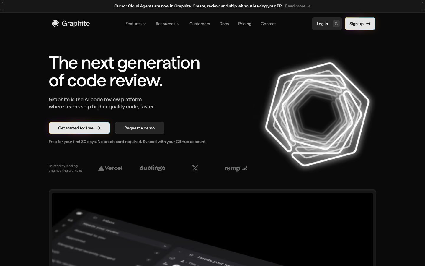
Graphite's marketing surface is a dark developer-tooling interface — a near-black canvas (`{colors.canvas}` — #0a0a0a) carrying white Matter-style display headlines, tight 8px-based geometry, and a small palette of saturated accents reserved for emphasis. It reads as confident, technical, and modern: the kind of surface a code-review platform uses to signal that it lives where engineers work.
Type runs on a single family (a Matter-style geometric sans) across all roles, distinguished by size and weight rather than typeface switching. The hero h1 lands at 60px / weight 500 with -1.5px letter-spacing — large, tight, and quiet rather than bombastic. Everything below it (h2 36px, h3 20px, body 14px, buttons 14px) walks down in the same family.
Brand voltage comes from three places: the wireframe-hexagon glow motif beside the hero (echoing the Graphite logo), the **accent set** (`{colors.accent-yellow}` #ffb931, `{colors.accent-blue}` #1061ff, `{colors.accent-orange}` #ff6231, `{colors.accent-cyan}` #14c7ff) used sparingly on chips, highlights and customer cards, and the glowing product mockups embedded directly in dark cards. The default action button inverts to a light fill (`{colors.canvas-light}` — #ffffff) with dark text, which pops against the black canvas.
**Key Characteristics:**
- Near-black canvas (`{colors.canvas}` — #0a0a0a) with layered dark surfaces (`{colors.surface}` #171717, `{colors.surface-elevated}` #262626) that build depth without leaving the dark theme.
- Light-fill primary buttons (`{component.button-primary}`) — white background, dark ink, `{rounded.sm}` (8px), compact 8×16 padding. The inverted button is the system's loudest interactive signal.
- A single geometric display family (Matter-style) across every type role; hierarchy is built from size + weight, not font switching.
- A small saturated accent set — yellow, blue, orange, cyan — appearing on customer cards, chips, and product-UI highlights, never on body text.
- Light customer cards (`{component.customer-card}`) injected into the dark flow for logo/testimonial moments — a deliberate light-on-dark inversion.
- Tight 8px spacing rhythm (8px and 16px dominate the measured spacing) with 64–80px between major bands.
- Border radius clusters at `{rounded.sm}` (8px) for buttons/cards and `{rounded.lg}` (12px) / `{rounded.xl}` (16px) for larger content surfaces.
## Colors
### Accent
- **Accent Yellow** (`{colors.accent-yellow}` — #ffb931): The most frequent accent — used on highlight chips, the ramp customer card, and product-UI accents.
- **Accent Blue** (`{colors.accent-blue}` — #1061ff): Link/action accent inside product fragments and interactive highlights.
- **Accent Orange** (`{colors.accent-orange}` — #ff6231) and **Accent Orange Soft** (`{colors.accent-orange-soft}` — #ff8833): Warm accents for status / emphasis moments.
- **Accent Cyan** (`{colors.accent-cyan}` — #14c7ff): Cool accent, paired with blue inside product mockups.
- **Accent Navy** (`{colors.accent-navy}` — #101828): A deep blue-black used as a tinted surface behind certain product UI.
These are scarce-by-design — they appear on chips, customer cards, and product chrome, never on running text or primary CTAs.
### Surface (dark theme)
- **Canvas** (`{colors.canvas}` — #0a0a0a): The page floor — announcement bar, nav, hero, footer.
- **Surface** (`{colors.surface}` — #171717): The default card surface on dark bands.
- **Surface Elevated** (`{colors.surface-elevated}` — #262626): Raised chips, secondary buttons, nested cards.
- **Surface Strong** (`{colors.surface-strong}` — #404040): Strongest dark elevation / border tone.
### Surface (light inversions)
- **Canvas Light** (`{colors.canvas-light}` — #ffffff): Primary-button fill and light customer cards inserted into the dark flow.
- **Surface Light** (`{colors.surface-light}` — #fafafa) and **Surface Light Alt** (`{colors.surface-light-alt}` — #f5f5f5): Soft light fills inside inverted cards.
- **Hairline** (`{colors.hairline}` — #e5e5e5) and **Hairline Strong** (`{colors.hairline-strong}` — #d4d4d4): 1px divider tones used inside light surfaces.
### Text
- **On Dark** (`{colors.on-dark}` — #ffffff): Headlines and primary text on the dark canvas.
- **Ink** (`{colors.ink}` — #000000): Text on light buttons and light customer cards; also the measured default link color.
- **Body Muted** (`{colors.body-muted}` — #737373), **Muted** (`{colors.muted}` — #666666), **Muted Mid** (`{colors.muted-mid}` — #5e5e5e), **Muted Soft** (`{colors.muted-soft}` — #a1a1a1): The graded secondary/tertiary text tones for sub-headlines, captions, logo-strip labels, and footer links.
## Typography
### Font Family
The system runs a single geometric sans — captured as `matterFont`, a Matter-style display face — across every type role. There is no secondary body family; the same typeface handles display, headings, body, and buttons. The declared fallback stack is `Matter, Inter, sans-serif`.
### Hierarchy
| Token | Size | Weight | Line Height | Letter Spacing | Use |
|---|---|---|---|---|---|
| `{typography.display}` | 60px | 500 | 1.0 | -1.5px | Hero h1 ("The next generation of code review.") |
| `{typography.heading}` | 36px | 500 | 1.111 | 0 | Section heads ("Everything you need to ship faster") |
| `{typography.subheading}` | 20px | 500 | 1.4 | 0 | Feature card titles, sub-section heads |
| `{typography.body}` | 14px | 600 | 1.25 | 0 | Running text, card descriptions, footer |
| `{typography.button}` | 14px | 500 | 1.429 | 0 | Button labels, nav links, chips |
### Principles
Hierarchy is built from scale, not typeface contrast. Display weight stays at 500 — the system never goes heavy; the size and the -1.5px tracking on the hero do the work. Body text is measured at weight 600, slightly heavier than the display weight, which keeps small 14px copy legible on the dark canvas. Keep the negative letter-spacing on the display size — at 60px it is part of the tight, technical voice; the smaller roles measure as `normal` (0) and should stay there.
### Note on Font Substitutes
Matter is a commercial typeface from Displaay and is not bundled here (no font was flagged in `fonts_licensed`, but the family name indicates a licensed face). If Matter is unavailable, **Inter** at weight 500 (with ~-0.02em tracking on the display size) is a serviceable substitute that preserves the geometric, modern character. **Geist** is another close open-source alternative well-suited to developer-tooling surfaces.
## Layout
### Spacing System
- **Base unit:** 4px; the rhythm is dominated by 8px (most frequent) and 16px.
- **Tokens:** `{spacing.xxs}` 4px · `{spacing.xs}` 8px · `{spacing.sm}` 12px · `{spacing.md}` 16px · `{spacing.lg}` 24px · `{spacing.xl}` 32px · `{spacing.xxl}` 48px · `{spacing.section}` 64px · `{spacing.section-lg}` 80px.
- **Component padding:** Buttons and chips use 8×16; cards use `{spacing.lg}` (24px) internal padding.
- **Section padding:** `{spacing.section}` (64px) to `{spacing.section-lg}` (80px) between major editorial bands.
### Grid & Container
- **Hero:** Two-column split — h1 + sub-head + CTA row at left, the glowing wireframe-hexagon motif at right.
- **Customer cards:** 3-up logo/testimonial row (Semgrep / Shopify / ramp) with a carousel control beneath.
- **Feature grid:** Mixed-size content cards on the "Everything you need to ship faster" band — full-width and half-width dark cards stacked into a modular layout.
- **Footer:** Multi-column link list on the dark canvas.
### Whitespace Philosophy
The geometry is tight rather than airy — 8px and 16px dominate inner spacing, giving the interface a dense, tool-like feel that matches its developer audience. Generous space is reserved for the hero and the dark gaps between bands, letting the glowing product mockups and the wireframe motif breathe against the black canvas.
## Elevation & Depth
| Level | Treatment | Use |
|---|---|---|
| Flat | No shadow; surface color shift only (`{colors.surface}`, `{colors.surface-elevated}`) | Nav, most dark cards, chips |
| Soft card | `rgba(0,0,0,0.1) 0px 1px 3px 0px, rgba(0,0,0,0.1) 0px 1px 2px -1px` | Default `{component.card}` lift |
| Drop shadow | `rgba(0,0,0,0.25) 0px 4px 4px 0px` (most frequent measured shadow) | Floating buttons, elevated panels |
| Heavy drop | `rgba(0,0,0,0.3) 0px 8px 10px 0px` | Strongly raised mockup panels |
| Inset glow | `rgba(101,129,128,0.15) 0px 0px 2px 2px inset, rgba(32,47,46,0.15) 0px 0px 4px 4px inset` | Subtle inner teal-tinted glow on certain product surfaces |
| Bloom | `rgb(0,0,0) 0px 0px 8px 8px` / `rgba(0,0,0,0.5) 0px 0px 8px 8px` | Soft black bloom around glowing/mockup elements |
The elevation philosophy is **dark-theme layering plus glow** — depth comes mostly from stacking near-black surface tones and from luminous product/motif elements, not from heavy cast shadows. The brightest depth cue in the system is the wireframe-hexagon's white glow against the canvas.
### Decorative Depth
- The hero's wireframe hexagon is a glowing line-art motif echoing the Graphite logo mark — pure light against black, no token shadow.
- Product mockups (inbox, PR page, review UI) are shown at an angle with their own internal chrome and a soft black bloom (`rgb(0,0,0) 0px 0px 8px 8px`).
## Shapes
### Border Radius Scale
| Token | Value | Use |
|---|---|---|
| `{rounded.xs}` | 4px | Small inline accents, tiny chips |
| `{rounded.sm}` | 8px | Buttons, chips, default cards (most common card radius) |
| `{rounded.md}` | 10px | Mid-size panels (frequently measured) |
| `{rounded.lg}` | 12px | Content cards, customer cards |
| `{rounded.xl}` | 16px | Larger mockup / video containers |
| `{rounded.xxl}` | 20px | Largest rounded surfaces |
The measured radius data clusters tightly at 8px, 10px, and 12px, with a long tail of 1px-off values (6, 7, 11, 13–19, 21) that read as rendering noise rather than distinct steps. The scale above normalizes them into a clean ladder.
### Logo & Motif Geometry
The Graphite mark is a hexagon/circle glyph; the hero's wireframe-hexagon motif repeats that geometry as glowing line art. Product mockups retain their native UI chrome inside rounded containers.
## Components
### Bars & Navigation
**`announcement-bar`** — A full-width top strip on `{colors.canvas}` carrying a single product announcement ("Cursor Cloud Agents are now in Graphite…") with a "Read more" link in `{typography.body}`. 8×16 padding.
**`top-nav`** — Dark nav on `{colors.canvas}`, white wordmark + hexagon logo at left, horizontal menu (Features, Resources, Customers, Docs, Pricing, Contact) center, and a right cluster of "Log in" (`{component.button-secondary}`) plus "Sign up" (`{component.button-primary}`). Menu items use `{component.nav-link}` in `{typography.button}`.
**`nav-link`** — Inline transparent menu item, `{colors.on-dark}` text, `{typography.button}` (14px / 500).
### Buttons
**`button-primary`** — The signature inverted CTA ("Get started for free", "Sign up"). Light fill `{colors.canvas-light}` (#ffffff), dark `{colors.ink}` text, `{typography.button}`, rounded `{rounded.sm}` (8px), padding 8×16. The light fill against the black canvas is the loudest action signal in the system.
**`button-secondary`** — Dark button ("Request a demo", "Log in"). Background `{colors.surface-elevated}` (#262626), `{colors.on-dark}` text, same `{rounded.sm}` radius and 8×16 padding.
### Cards & Containers
**`hero-band`** — Two-column hero on `{colors.canvas}`: `{typography.display}` h1, a muted sub-headline, a button row (`{component.button-primary}` + `{component.button-secondary}`), a fine-print line, and the logo strip below; the glowing wireframe hexagon sits at right. Vertical padding ~`{spacing.section-lg}` (80px).
**`logo-strip`** — "Trusted by leading engineering teams at" row with grayscale logos (Vercel, Duolingo, X, Ramp). Transparent background, `{colors.muted-soft}` labels.
**`card`** — The base dark content card. Background `{colors.surface}` (#171717), `{colors.on-dark}` text, rounded `{rounded.sm}` (8px), with the measured soft card shadow (`rgba(0,0,0,0.1) 0px 1px 3px 0px, rgba(0,0,0,0.1) 0px 1px 2px -1px`).
**`video-card`** — The large "Intro to Graphite" video panel with a centered play button and a row of feature filter chips beneath. Background `{colors.canvas}`, rounded `{rounded.lg}` (12px).
**`customer-card`** — Light card injected into the dark flow for customer stories (Semgrep, Shopify, ramp). Background `{colors.canvas-light}` (or an accent like `{colors.accent-yellow}` for the ramp card), `{colors.ink}` text, rounded `{rounded.lg}`. The light-on-dark inversion is a deliberate emphasis device.
**`feature-card`** — Dark modular cards in the "Everything you need to ship faster" grid ("Never wait on review again", "Smarter CI", "A review experience built for teams"). Background `{colors.surface}`, `{typography.subheading}` titles, rounded `{rounded.lg}`, padding `{spacing.lg}` (24px). Each carries an embedded product-UI fragment and a text-link CTA.
**`filter-chip`** — Small toggle chips beneath the video ("Stacked PRs", "PR page", "AI code review", "Chat", "Merge queue", "PR inbox", "Dev metrics"). Background `{colors.surface-elevated}`, `{colors.on-dark}` text, `{typography.button}`, rounded `{rounded.sm}`, padding 8×16.
### Footer
**`footer`** — Dark footer on `{colors.canvas}` with multi-column link lists in `{colors.muted-soft}` / `{typography.body}`. Padding ~`{spacing.section}` (64px). The footer stays on the same near-black canvas as the rest of the page — the dark theme runs end to end.
## Do's and Don'ts
### Do
- Keep the canvas near-black (`{colors.canvas}` — #0a0a0a) and build depth by layering `{colors.surface}` and `{colors.surface-elevated}`.
- Use `{component.button-primary}`'s light fill as the single loudest action; reserve `{component.button-secondary}`'s dark fill for the supporting action.
- Reserve the accent set (`{colors.accent-yellow}`, `{colors.accent-blue}`, `{colors.accent-orange}`, `{colors.accent-cyan}`) for chips, customer cards, and product-UI highlights — never running text.
- Keep all type in the single Matter-style family; build hierarchy with size and weight.
- Hold the -1.5px tracking on the 60px display size; let smaller roles stay at normal tracking.
- Embed real product UI (PR inbox, review page, chat) inside `{component.feature-card}` rather than illustrating it.
- Use the glowing wireframe-hexagon motif as the hero's focal point — it carries the brand.
### Don't
- Don't introduce a light page background; the system is dark end-to-end, with light surfaces used only as inset customer cards and button fills.
- Don't push display weight past 500 — the system never goes heavy.
- Don't scatter accents onto body text or primary CTAs; they are scarce emphasis colors.
- Don't exceed `{rounded.xxl}` (20px) on cards — the geometry is tight, not pill-soft.
- Don't add hover state styling beyond default and pressed/active.
## Responsive Behavior
### Breakpoints
The provided captures show a desktop layout and a long full-page composite; explicit breakpoint widths were not measured. The following is the inferred collapse behavior (derived).
| Name | Width | Key Changes |
|---|---|---|
| Mobile | < 768px | Nav collapses to a menu trigger; hero two-column stacks to single column with the hexagon motif above or below; display h1 scales down from 60px; feature/customer grids go 1-up |
| Tablet | 768–1024px | Nav tightens; customer cards 2-up; feature grid reduces columns |
| Desktop | > 1024px | Full nav, two-column hero, 3-up customer row, modular feature grid |
### Touch Targets
- `{component.button-primary}` / `{component.button-secondary}` measure 8×16 padding on a 14px label — comfortably tappable in row context.
- `{component.filter-chip}` shares the 8×16 padding; verify a minimum 44px effective tap height on mobile.
### Collapsing Strategy
- Hero collapses to single column; the glowing hexagon motif scales proportionally.
- Customer cards and feature cards reduce columns rather than shrinking type.
- The dark canvas and footer remain consistent across all widths.
## Iteration Guide
1. Focus on ONE component at a time and reference its YAML key directly (`{component.feature-card}`, `{component.button-primary}`).
2. Variants (`-secondary`, future `-active`/`-disabled`) live as separate entries in `components:`.
3. Use `{token.refs}` everywhere — never inline a hex in a component.
4. Document default and active/pressed states only — never hover.
5. Keep all type in the single display family; build emphasis with size before weight.
6. Light surfaces are scarce inversions (buttons, customer cards) on an otherwise dark canvas — don't multiply them.
7. When emphasis is needed, reach for scale or the inverted light button before reaching for an accent color.
## Known Gaps
- The Matter-style display family (`matterFont`) is a commercial typeface and is not bundled; an open-source substitute (Inter / Geist) is documented in Typography.
- Only `button-primary` and a generic `card` were captured by the component extractor; nav, chips, customer cards, feature cards, and footer are documented from screenshot ground-truth plus measured tokens.
- The radius scale was normalized from a noisy distribution (many 1px-off values: 6, 7, 11, 13–19, 21); the canonical ladder approximates the intended steps and exact per-component radii may vary.
- Spacing values of 50px, 56px, and 72px were measured but did not fit the 4/8-based ladder cleanly; they are treated as section-level outliers and not tokenized.
- The pricing and features-chat pages were captured but their distinct components (pricing tiers, chat UI) are not separately specified here.
- Exact responsive breakpoints, animation/transition timings, and form/input states were not measured and are out of scope.
- Accent usage frequency suggests yellow/blue/orange/cyan map to specific product features, but the precise semantic assignment of each accent was not measured.
<!-- Documented by duply · real-world design systems as ready-to-use DESIGN.md for AI coding agents · https://duply.ai/graphite/design-md -->
Color Palette
Accent
Neutrals
Typography
display60px · 500 · 1
The quick brown fox jumpsheading36px · 500 · 1.111
The quick brown fox jumpssubheading20px · 500 · 1.4
The quick brown fox jumpsbody14px · 600 · 1.25
The quick brown fox jumpsbutton14px · 500 · 1.429
The quick brown fox jumpsSpacing & Shape
Spacing
| Name | Value | Preview |
|---|---|---|
| xxs | 4px | |
| xs | 8px | |
| sm | 12px | |
| md | 16px | |
| lg | 24px | |
| xl | 32px | |
| xxl | 48px | |
| section | 64px | |
| section-lg | 80px |
Border Radius
| Name | Value | Preview |
|---|---|---|
| xs | 4px | |
| sm | 8px | |
| md | 10px | |
| lg | 12px | |
| xl | 16px | |
| xxl | 20px |
More like this


---
version: alpha
name: Graphite-design-analysis
description: A dark, developer-tooling marketing interface for an AI code-review platform — near-black canvas, white Matter-style display headlines, and a tight 8px geometry. Brand voltage comes from a small set of saturated accents (yellow, blue, orange, cyan) used sparingly against deep neutral surfaces, plus glowing product mockups and a wireframe hexagon motif that echoes the Graphite logo.
colors:
  accent-yellow: "#ffb931"
  accent-blue: "#1061ff"
  accent-orange: "#ff6231"
  accent-orange-soft: "#ff8833"
  accent-cyan: "#14c7ff"
  accent-navy: "#101828"
  canvas: "#0a0a0a"
  surface: "#171717"
  surface-elevated: "#262626"
  surface-strong: "#404040"
  on-dark: "#ffffff"
  canvas-light: "#ffffff"
  surface-light: "#fafafa"
  surface-light-alt: "#f5f5f5"
  hairline: "#e5e5e5"
  hairline-strong: "#d4d4d4"
  ink: "#000000"
  muted: "#666666"
  muted-mid: "#5e5e5e"
  muted-soft: "#a1a1a1"
  body-muted: "#737373"
typography:
  display:
    fontFamily: "Matter, Inter, sans-serif"
    fontSize: 60px
    fontWeight: 500
    lineHeight: 1.0
    letterSpacing: -1.5px
  heading:
    fontFamily: "Matter, Inter, sans-serif"
    fontSize: 36px
    fontWeight: 500
    lineHeight: 1.111
    letterSpacing: 0
  subheading:
    fontFamily: "Matter, Inter, sans-serif"
    fontSize: 20px
    fontWeight: 500
    lineHeight: 1.4
    letterSpacing: 0
  body:
    fontFamily: "Matter, Inter, sans-serif"
    fontSize: 14px
    fontWeight: 600
    lineHeight: 1.25
    letterSpacing: 0
  button:
    fontFamily: "Matter, Inter, sans-serif"
    fontSize: 14px
    fontWeight: 500
    lineHeight: 1.429
    letterSpacing: 0
rounded:
  xs: 4px
  sm: 8px
  md: 10px
  lg: 12px
  xl: 16px
  xxl: 20px
spacing:
  xxs: 4px
  xs: 8px
  sm: 12px
  md: 16px
  lg: 24px
  xl: 32px
  xxl: 48px
  section: 64px
  section-lg: 80px
components:
  announcement-bar:
    backgroundColor: "{colors.canvas}"
    textColor: "{colors.on-dark}"
    typography: "{typography.body}"
    padding: 8px 16px
  top-nav:
    backgroundColor: "{colors.canvas}"
    textColor: "{colors.on-dark}"
    typography: "{typography.button}"
    padding: 16px 24px
  button-primary:
    backgroundColor: "{colors.canvas-light}"
    textColor: "{colors.ink}"
    typography: "{typography.button}"
    rounded: "{rounded.sm}"
    padding: 8px 16px
  button-secondary:
    backgroundColor: "{colors.surface-elevated}"
    textColor: "{colors.on-dark}"
    typography: "{typography.button}"
    rounded: "{rounded.sm}"
    padding: 8px 16px
  nav-link:
    backgroundColor: transparent
    textColor: "{colors.on-dark}"
    typography: "{typography.button}"
  hero-band:
    backgroundColor: "{colors.canvas}"
    textColor: "{colors.on-dark}"
    typography: "{typography.display}"
    padding: 80px
  logo-strip:
    backgroundColor: transparent
    textColor: "{colors.muted-soft}"
    typography: "{typography.body}"
  card:
    backgroundColor: "{colors.surface}"
    textColor: "{colors.on-dark}"
    rounded: "{rounded.sm}"
    padding: 24px
  video-card:
    backgroundColor: "{colors.canvas}"
    textColor: "{colors.on-dark}"
    rounded: "{rounded.lg}"
  customer-card:
    backgroundColor: "{colors.canvas-light}"
    textColor: "{colors.ink}"
    typography: "{typography.body}"
    rounded: "{rounded.lg}"
  feature-card:
    backgroundColor: "{colors.surface}"
    textColor: "{colors.on-dark}"
    typography: "{typography.subheading}"
    rounded: "{rounded.lg}"
    padding: 24px
  filter-chip:
    backgroundColor: "{colors.surface-elevated}"
    textColor: "{colors.on-dark}"
    typography: "{typography.button}"
    rounded: "{rounded.sm}"
    padding: 8px 16px
  footer:
    backgroundColor: "{colors.canvas}"
    textColor: "{colors.muted-soft}"
    typography: "{typography.body}"
    padding: 64px
---

## Overview

Graphite's marketing surface is a dark developer-tooling interface — a near-black canvas (`{colors.canvas}` — #0a0a0a) carrying white Matter-style display headlines, tight 8px-based geometry, and a small palette of saturated accents reserved for emphasis. It reads as confident, technical, and modern: the kind of surface a code-review platform uses to signal that it lives where engineers work.

Type runs on a single family (a Matter-style geometric sans) across all roles, distinguished by size and weight rather than typeface switching. The hero h1 lands at 60px / weight 500 with -1.5px letter-spacing — large, tight, and quiet rather than bombastic. Everything below it (h2 36px, h3 20px, body 14px, buttons 14px) walks down in the same family.

Brand voltage comes from three places: the wireframe-hexagon glow motif beside the hero (echoing the Graphite logo), the **accent set** (`{colors.accent-yellow}` #ffb931, `{colors.accent-blue}` #1061ff, `{colors.accent-orange}` #ff6231, `{colors.accent-cyan}` #14c7ff) used sparingly on chips, highlights and customer cards, and the glowing product mockups embedded directly in dark cards. The default action button inverts to a light fill (`{colors.canvas-light}` — #ffffff) with dark text, which pops against the black canvas.

**Key Characteristics:**
- Near-black canvas (`{colors.canvas}` — #0a0a0a) with layered dark surfaces (`{colors.surface}` #171717, `{colors.surface-elevated}` #262626) that build depth without leaving the dark theme.
- Light-fill primary buttons (`{component.button-primary}`) — white background, dark ink, `{rounded.sm}` (8px), compact 8×16 padding. The inverted button is the system's loudest interactive signal.
- A single geometric display family (Matter-style) across every type role; hierarchy is built from size + weight, not font switching.
- A small saturated accent set — yellow, blue, orange, cyan — appearing on customer cards, chips, and product-UI highlights, never on body text.
- Light customer cards (`{component.customer-card}`) injected into the dark flow for logo/testimonial moments — a deliberate light-on-dark inversion.
- Tight 8px spacing rhythm (8px and 16px dominate the measured spacing) with 64–80px between major bands.
- Border radius clusters at `{rounded.sm}` (8px) for buttons/cards and `{rounded.lg}` (12px) / `{rounded.xl}` (16px) for larger content surfaces.

## Colors

### Accent
- **Accent Yellow** (`{colors.accent-yellow}` — #ffb931): The most frequent accent — used on highlight chips, the ramp customer card, and product-UI accents.
- **Accent Blue** (`{colors.accent-blue}` — #1061ff): Link/action accent inside product fragments and interactive highlights.
- **Accent Orange** (`{colors.accent-orange}` — #ff6231) and **Accent Orange Soft** (`{colors.accent-orange-soft}` — #ff8833): Warm accents for status / emphasis moments.
- **Accent Cyan** (`{colors.accent-cyan}` — #14c7ff): Cool accent, paired with blue inside product mockups.
- **Accent Navy** (`{colors.accent-navy}` — #101828): A deep blue-black used as a tinted surface behind certain product UI.

These are scarce-by-design — they appear on chips, customer cards, and product chrome, never on running text or primary CTAs.

### Surface (dark theme)
- **Canvas** (`{colors.canvas}` — #0a0a0a): The page floor — announcement bar, nav, hero, footer.
- **Surface** (`{colors.surface}` — #171717): The default card surface on dark bands.
- **Surface Elevated** (`{colors.surface-elevated}` — #262626): Raised chips, secondary buttons, nested cards.
- **Surface Strong** (`{colors.surface-strong}` — #404040): Strongest dark elevation / border tone.

### Surface (light inversions)
- **Canvas Light** (`{colors.canvas-light}` — #ffffff): Primary-button fill and light customer cards inserted into the dark flow.
- **Surface Light** (`{colors.surface-light}` — #fafafa) and **Surface Light Alt** (`{colors.surface-light-alt}` — #f5f5f5): Soft light fills inside inverted cards.
- **Hairline** (`{colors.hairline}` — #e5e5e5) and **Hairline Strong** (`{colors.hairline-strong}` — #d4d4d4): 1px divider tones used inside light surfaces.

### Text
- **On Dark** (`{colors.on-dark}` — #ffffff): Headlines and primary text on the dark canvas.
- **Ink** (`{colors.ink}` — #000000): Text on light buttons and light customer cards; also the measured default link color.
- **Body Muted** (`{colors.body-muted}` — #737373), **Muted** (`{colors.muted}` — #666666), **Muted Mid** (`{colors.muted-mid}` — #5e5e5e), **Muted Soft** (`{colors.muted-soft}` — #a1a1a1): The graded secondary/tertiary text tones for sub-headlines, captions, logo-strip labels, and footer links.

## Typography

### Font Family
The system runs a single geometric sans — captured as `matterFont`, a Matter-style display face — across every type role. There is no secondary body family; the same typeface handles display, headings, body, and buttons. The declared fallback stack is `Matter, Inter, sans-serif`.

### Hierarchy

| Token | Size | Weight | Line Height | Letter Spacing | Use |
|---|---|---|---|---|---|
| `{typography.display}` | 60px | 500 | 1.0 | -1.5px | Hero h1 ("The next generation of code review.") |
| `{typography.heading}` | 36px | 500 | 1.111 | 0 | Section heads ("Everything you need to ship faster") |
| `{typography.subheading}` | 20px | 500 | 1.4 | 0 | Feature card titles, sub-section heads |
| `{typography.body}` | 14px | 600 | 1.25 | 0 | Running text, card descriptions, footer |
| `{typography.button}` | 14px | 500 | 1.429 | 0 | Button labels, nav links, chips |

### Principles
Hierarchy is built from scale, not typeface contrast. Display weight stays at 500 — the system never goes heavy; the size and the -1.5px tracking on the hero do the work. Body text is measured at weight 600, slightly heavier than the display weight, which keeps small 14px copy legible on the dark canvas. Keep the negative letter-spacing on the display size — at 60px it is part of the tight, technical voice; the smaller roles measure as `normal` (0) and should stay there.

### Note on Font Substitutes
Matter is a commercial typeface from Displaay and is not bundled here (no font was flagged in `fonts_licensed`, but the family name indicates a licensed face). If Matter is unavailable, **Inter** at weight 500 (with ~-0.02em tracking on the display size) is a serviceable substitute that preserves the geometric, modern character. **Geist** is another close open-source alternative well-suited to developer-tooling surfaces.

## Layout

### Spacing System
- **Base unit:** 4px; the rhythm is dominated by 8px (most frequent) and 16px.
- **Tokens:** `{spacing.xxs}` 4px · `{spacing.xs}` 8px · `{spacing.sm}` 12px · `{spacing.md}` 16px · `{spacing.lg}` 24px · `{spacing.xl}` 32px · `{spacing.xxl}` 48px · `{spacing.section}` 64px · `{spacing.section-lg}` 80px.
- **Component padding:** Buttons and chips use 8×16; cards use `{spacing.lg}` (24px) internal padding.
- **Section padding:** `{spacing.section}` (64px) to `{spacing.section-lg}` (80px) between major editorial bands.

### Grid & Container
- **Hero:** Two-column split — h1 + sub-head + CTA row at left, the glowing wireframe-hexagon motif at right.
- **Customer cards:** 3-up logo/testimonial row (Semgrep / Shopify / ramp) with a carousel control beneath.
- **Feature grid:** Mixed-size content cards on the "Everything you need to ship faster" band — full-width and half-width dark cards stacked into a modular layout.
- **Footer:** Multi-column link list on the dark canvas.

### Whitespace Philosophy
The geometry is tight rather than airy — 8px and 16px dominate inner spacing, giving the interface a dense, tool-like feel that matches its developer audience. Generous space is reserved for the hero and the dark gaps between bands, letting the glowing product mockups and the wireframe motif breathe against the black canvas.

## Elevation & Depth

| Level | Treatment | Use |
|---|---|---|
| Flat | No shadow; surface color shift only (`{colors.surface}`, `{colors.surface-elevated}`) | Nav, most dark cards, chips |
| Soft card | `rgba(0,0,0,0.1) 0px 1px 3px 0px, rgba(0,0,0,0.1) 0px 1px 2px -1px` | Default `{component.card}` lift |
| Drop shadow | `rgba(0,0,0,0.25) 0px 4px 4px 0px` (most frequent measured shadow) | Floating buttons, elevated panels |
| Heavy drop | `rgba(0,0,0,0.3) 0px 8px 10px 0px` | Strongly raised mockup panels |
| Inset glow | `rgba(101,129,128,0.15) 0px 0px 2px 2px inset, rgba(32,47,46,0.15) 0px 0px 4px 4px inset` | Subtle inner teal-tinted glow on certain product surfaces |
| Bloom | `rgb(0,0,0) 0px 0px 8px 8px` / `rgba(0,0,0,0.5) 0px 0px 8px 8px` | Soft black bloom around glowing/mockup elements |

The elevation philosophy is **dark-theme layering plus glow** — depth comes mostly from stacking near-black surface tones and from luminous product/motif elements, not from heavy cast shadows. The brightest depth cue in the system is the wireframe-hexagon's white glow against the canvas.

### Decorative Depth
- The hero's wireframe hexagon is a glowing line-art motif echoing the Graphite logo mark — pure light against black, no token shadow.
- Product mockups (inbox, PR page, review UI) are shown at an angle with their own internal chrome and a soft black bloom (`rgb(0,0,0) 0px 0px 8px 8px`).

## Shapes

### Border Radius Scale

| Token | Value | Use |
|---|---|---|
| `{rounded.xs}` | 4px | Small inline accents, tiny chips |
| `{rounded.sm}` | 8px | Buttons, chips, default cards (most common card radius) |
| `{rounded.md}` | 10px | Mid-size panels (frequently measured) |
| `{rounded.lg}` | 12px | Content cards, customer cards |
| `{rounded.xl}` | 16px | Larger mockup / video containers |
| `{rounded.xxl}` | 20px | Largest rounded surfaces |

The measured radius data clusters tightly at 8px, 10px, and 12px, with a long tail of 1px-off values (6, 7, 11, 13–19, 21) that read as rendering noise rather than distinct steps. The scale above normalizes them into a clean ladder.

### Logo & Motif Geometry
The Graphite mark is a hexagon/circle glyph; the hero's wireframe-hexagon motif repeats that geometry as glowing line art. Product mockups retain their native UI chrome inside rounded containers.

## Components

### Bars & Navigation

**`announcement-bar`** — A full-width top strip on `{colors.canvas}` carrying a single product announcement ("Cursor Cloud Agents are now in Graphite…") with a "Read more" link in `{typography.body}`. 8×16 padding.

**`top-nav`** — Dark nav on `{colors.canvas}`, white wordmark + hexagon logo at left, horizontal menu (Features, Resources, Customers, Docs, Pricing, Contact) center, and a right cluster of "Log in" (`{component.button-secondary}`) plus "Sign up" (`{component.button-primary}`). Menu items use `{component.nav-link}` in `{typography.button}`.

**`nav-link`** — Inline transparent menu item, `{colors.on-dark}` text, `{typography.button}` (14px / 500).

### Buttons

**`button-primary`** — The signature inverted CTA ("Get started for free", "Sign up"). Light fill `{colors.canvas-light}` (#ffffff), dark `{colors.ink}` text, `{typography.button}`, rounded `{rounded.sm}` (8px), padding 8×16. The light fill against the black canvas is the loudest action signal in the system.

**`button-secondary`** — Dark button ("Request a demo", "Log in"). Background `{colors.surface-elevated}` (#262626), `{colors.on-dark}` text, same `{rounded.sm}` radius and 8×16 padding.

### Cards & Containers

**`hero-band`** — Two-column hero on `{colors.canvas}`: `{typography.display}` h1, a muted sub-headline, a button row (`{component.button-primary}` + `{component.button-secondary}`), a fine-print line, and the logo strip below; the glowing wireframe hexagon sits at right. Vertical padding ~`{spacing.section-lg}` (80px).

**`logo-strip`** — "Trusted by leading engineering teams at" row with grayscale logos (Vercel, Duolingo, X, Ramp). Transparent background, `{colors.muted-soft}` labels.

**`card`** — The base dark content card. Background `{colors.surface}` (#171717), `{colors.on-dark}` text, rounded `{rounded.sm}` (8px), with the measured soft card shadow (`rgba(0,0,0,0.1) 0px 1px 3px 0px, rgba(0,0,0,0.1) 0px 1px 2px -1px`).

**`video-card`** — The large "Intro to Graphite" video panel with a centered play button and a row of feature filter chips beneath. Background `{colors.canvas}`, rounded `{rounded.lg}` (12px).

**`customer-card`** — Light card injected into the dark flow for customer stories (Semgrep, Shopify, ramp). Background `{colors.canvas-light}` (or an accent like `{colors.accent-yellow}` for the ramp card), `{colors.ink}` text, rounded `{rounded.lg}`. The light-on-dark inversion is a deliberate emphasis device.

**`feature-card`** — Dark modular cards in the "Everything you need to ship faster" grid ("Never wait on review again", "Smarter CI", "A review experience built for teams"). Background `{colors.surface}`, `{typography.subheading}` titles, rounded `{rounded.lg}`, padding `{spacing.lg}` (24px). Each carries an embedded product-UI fragment and a text-link CTA.

**`filter-chip`** — Small toggle chips beneath the video ("Stacked PRs", "PR page", "AI code review", "Chat", "Merge queue", "PR inbox", "Dev metrics"). Background `{colors.surface-elevated}`, `{colors.on-dark}` text, `{typography.button}`, rounded `{rounded.sm}`, padding 8×16.

### Footer

**`footer`** — Dark footer on `{colors.canvas}` with multi-column link lists in `{colors.muted-soft}` / `{typography.body}`. Padding ~`{spacing.section}` (64px). The footer stays on the same near-black canvas as the rest of the page — the dark theme runs end to end.

## Do's and Don'ts

### Do
- Keep the canvas near-black (`{colors.canvas}` — #0a0a0a) and build depth by layering `{colors.surface}` and `{colors.surface-elevated}`.
- Use `{component.button-primary}`'s light fill as the single loudest action; reserve `{component.button-secondary}`'s dark fill for the supporting action.
- Reserve the accent set (`{colors.accent-yellow}`, `{colors.accent-blue}`, `{colors.accent-orange}`, `{colors.accent-cyan}`) for chips, customer cards, and product-UI highlights — never running text.
- Keep all type in the single Matter-style family; build hierarchy with size and weight.
- Hold the -1.5px tracking on the 60px display size; let smaller roles stay at normal tracking.
- Embed real product UI (PR inbox, review page, chat) inside `{component.feature-card}` rather than illustrating it.
- Use the glowing wireframe-hexagon motif as the hero's focal point — it carries the brand.

### Don't
- Don't introduce a light page background; the system is dark end-to-end, with light surfaces used only as inset customer cards and button fills.
- Don't push display weight past 500 — the system never goes heavy.
- Don't scatter accents onto body text or primary CTAs; they are scarce emphasis colors.
- Don't exceed `{rounded.xxl}` (20px) on cards — the geometry is tight, not pill-soft.
- Don't add hover state styling beyond default and pressed/active.

## Responsive Behavior

### Breakpoints
The provided captures show a desktop layout and a long full-page composite; explicit breakpoint widths were not measured. The following is the inferred collapse behavior (derived).

| Name | Width | Key Changes |
|---|---|---|
| Mobile | < 768px | Nav collapses to a menu trigger; hero two-column stacks to single column with the hexagon motif above or below; display h1 scales down from 60px; feature/customer grids go 1-up |
| Tablet | 768–1024px | Nav tightens; customer cards 2-up; feature grid reduces columns |
| Desktop | > 1024px | Full nav, two-column hero, 3-up customer row, modular feature grid |

### Touch Targets
- `{component.button-primary}` / `{component.button-secondary}` measure 8×16 padding on a 14px label — comfortably tappable in row context.
- `{component.filter-chip}` shares the 8×16 padding; verify a minimum 44px effective tap height on mobile.

### Collapsing Strategy
- Hero collapses to single column; the glowing hexagon motif scales proportionally.
- Customer cards and feature cards reduce columns rather than shrinking type.
- The dark canvas and footer remain consistent across all widths.

## Iteration Guide

1. Focus on ONE component at a time and reference its YAML key directly (`{component.feature-card}`, `{component.button-primary}`).
2. Variants (`-secondary`, future `-active`/`-disabled`) live as separate entries in `components:`.
3. Use `{token.refs}` everywhere — never inline a hex in a component.
4. Document default and active/pressed states only — never hover.
5. Keep all type in the single display family; build emphasis with size before weight.
6. Light surfaces are scarce inversions (buttons, customer cards) on an otherwise dark canvas — don't multiply them.
7. When emphasis is needed, reach for scale or the inverted light button before reaching for an accent color.

## Known Gaps

- The Matter-style display family (`matterFont`) is a commercial typeface and is not bundled; an open-source substitute (Inter / Geist) is documented in Typography.
- Only `button-primary` and a generic `card` were captured by the component extractor; nav, chips, customer cards, feature cards, and footer are documented from screenshot ground-truth plus measured tokens.
- The radius scale was normalized from a noisy distribution (many 1px-off values: 6, 7, 11, 13–19, 21); the canonical ladder approximates the intended steps and exact per-component radii may vary.
- Spacing values of 50px, 56px, and 72px were measured but did not fit the 4/8-based ladder cleanly; they are treated as section-level outliers and not tokenized.
- The pricing and features-chat pages were captured but their distinct components (pricing tiers, chat UI) are not separately specified here.
- Exact responsive breakpoints, animation/transition timings, and form/input states were not measured and are out of scope.
- Accent usage frequency suggests yellow/blue/orange/cyan map to specific product features, but the precise semantic assignment of each accent was not measured.

<!-- Documented by duply · real-world design systems as ready-to-use DESIGN.md for AI coding agents · https://duply.ai/graphite/design-md -->