Tensorlake
A developer-infrastructure interface built on a near-black warm-green canvas (#161715) with PP Neue Montreal display type set at very tight negative tracking, a green agentic accent system, and sharp near-zero-radius surfaces. The system reads as engineered terminal-tool aesthetic — full-bleed dark bands, code-block cards holding real Python/TypeScript/CLI fragments, hairline-divided sections, and a restrained mint-green CTA voltage drawn straight from a syntax palette.
---
version: alpha
name: Tensorlake-design-analysis
description: A developer-infrastructure interface built on a near-black warm-green canvas (#161715) with PP Neue Montreal display type set at very tight negative tracking, a green agentic accent system, and sharp near-zero-radius surfaces. The system reads as engineered terminal-tool aesthetic — full-bleed dark bands, code-block cards holding real Python/TypeScript/CLI fragments, hairline-divided sections, and a restrained mint-green CTA voltage drawn straight from a syntax palette.
colors:
ink: "#ffffff"
body: "#dddddd"
muted: "#989d9e"
muted-soft: "#c9c9c9"
canvas: "#161715"
surface: "#1e1f1c"
surface-green: "#232b23"
surface-green-deep: "#171e17"
surface-green-soft: "#273228"
hairline: "#393939"
hairline-soft: "#3e3e3e"
accent: "#82c38c"
accent-strong: "#0aa67d"
accent-deep: "#0e8a69"
accent-soft: "#a6c686"
accent-mint: "#a1ffe6"
syntax-yellow: "#e6c07b"
syntax-blue: "#82aaff"
syntax-indigo: "#4a5a9e"
syntax-orange: "#c05621"
typography:
h1:
fontFamily: "PP Neue Montreal, Inter, sans-serif"
fontSize: 92px
fontWeight: 500
lineHeight: 0.98
letterSpacing: -3.22px
h2:
fontFamily: "PP Neue Montreal, Inter, sans-serif"
fontSize: 51.84px
fontWeight: 500
lineHeight: 1.02
letterSpacing: -1.45px
h3:
fontFamily: "PP Neue Montreal, Inter, sans-serif"
fontSize: 26px
fontWeight: 500
lineHeight: 1.12
letterSpacing: -0.52px
h4:
fontFamily: "PP Neue Montreal, Inter, sans-serif"
fontSize: 22px
fontWeight: 500
lineHeight: 1.1
letterSpacing: -0.44px
body:
fontFamily: "PP Neue Montreal, Inter, sans-serif"
fontSize: 18px
fontWeight: 500
lineHeight: 1.45
letterSpacing: normal
rounded:
none: 0px
sm: 2px
md: 3px
lg: 8px
spacing:
xxs: 4px
xs: 6px
sm: 8px
md: 10px
lg: 14px
xl: 16px
xxl: 20px
xxxl: 24px
components:
top-nav:
backgroundColor: "{colors.canvas}"
textColor: "{colors.muted}"
typography: "{typography.body}"
rounded: "{rounded.none}"
button-primary:
backgroundColor: "{colors.accent-strong}"
textColor: "{colors.ink}"
typography: "{typography.body}"
rounded: "{rounded.sm}"
padding: 10px 14px
button-secondary:
backgroundColor: transparent
textColor: "{colors.ink}"
typography: "{typography.body}"
rounded: "{rounded.sm}"
padding: 10px 14px
button-nav-cta:
backgroundColor: "{colors.accent-strong}"
textColor: "{colors.ink}"
typography: "{typography.body}"
rounded: "{rounded.sm}"
padding: 10px 14px
hero-band:
backgroundColor: "{colors.canvas}"
textColor: "{colors.ink}"
typography: "{typography.h1}"
rounded: "{rounded.none}"
card:
backgroundColor: "{colors.canvas}"
textColor: "{colors.body}"
rounded: "{rounded.none}"
feature-card:
backgroundColor: "{colors.surface}"
textColor: "{colors.body}"
typography: "{typography.body}"
rounded: "{rounded.none}"
code-block-card:
backgroundColor: "{colors.surface}"
textColor: "{colors.muted-soft}"
typography: "{typography.body}"
rounded: "{rounded.none}"
code-tab:
backgroundColor: transparent
textColor: "{colors.muted}"
typography: "{typography.body}"
rounded: "{rounded.none}"
code-tab-active:
backgroundColor: "{colors.surface}"
textColor: "{colors.ink}"
typography: "{typography.body}"
rounded: "{rounded.none}"
status-badge:
backgroundColor: transparent
textColor: "{colors.accent}"
typography: "{typography.body}"
rounded: "{rounded.none}"
input:
backgroundColor: "{colors.surface}"
textColor: "{colors.ink}"
typography: "{typography.body}"
rounded: "{rounded.none}"
testimonial-card:
backgroundColor: "{colors.surface}"
textColor: "{colors.body}"
typography: "{typography.body}"
rounded: "{rounded.none}"
---
## Overview
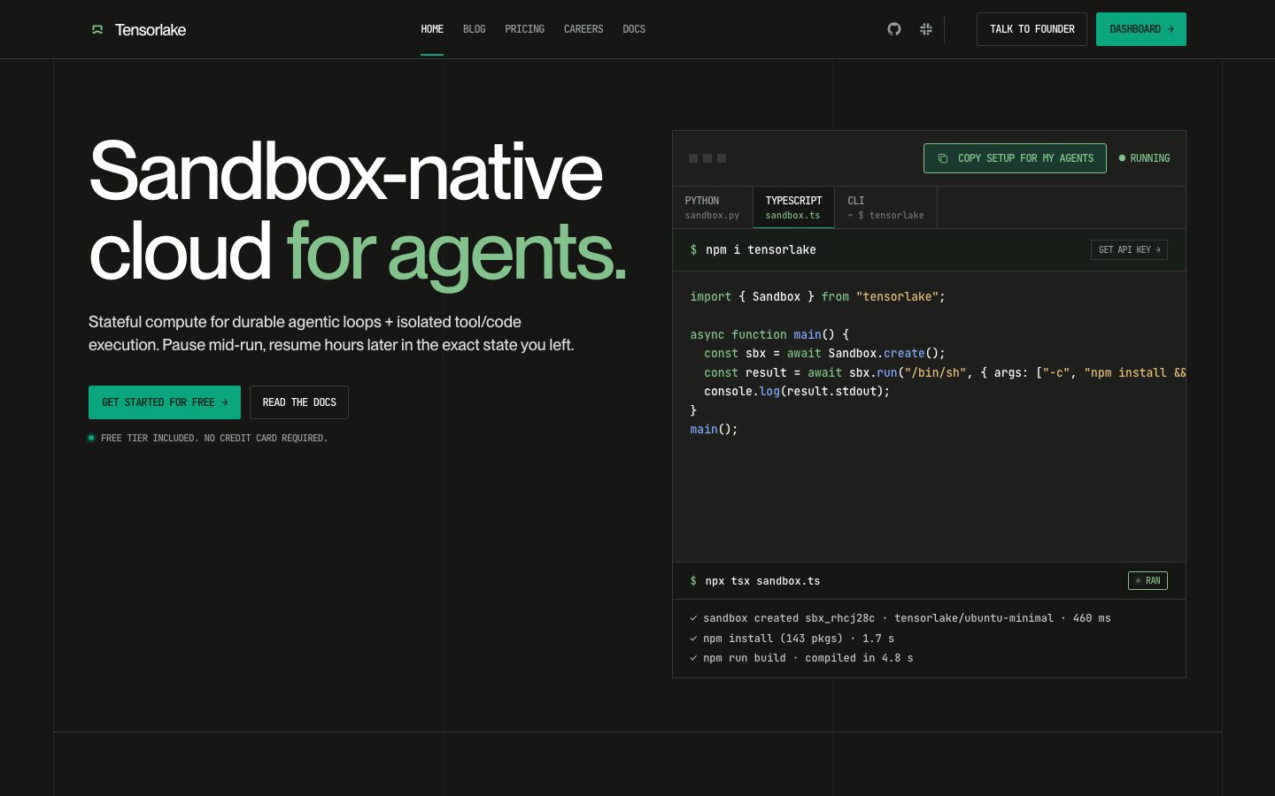
Tensorlake's marketing surface is a developer-infrastructure interface built almost entirely on a single warm near-black canvas (`{colors.canvas}` — #161715). It reads as a terminal-native engineering tool: full-bleed dark bands, hairline section dividers, oversized PP Neue Montreal headlines at aggressive negative tracking, and code-block cards holding real Python / TypeScript / CLI fragments rather than decorative illustration. The product *is* the visual — every band pairs a tight editorial claim with an actual sandbox session, benchmark chart, or code snippet.
The type voice is monolithic: **PP Neue Montreal** at weight 500 runs every role — from the 92px hero h1 down to 18px body. There is no second display family; hierarchy comes from size and letter-spacing alone. The h1 sits at a dramatic -3.22px tracking, condensing the headline into a dense, confident block.
Color voltage is a green accent system pulled directly from a code-syntax palette: a bright leaf-green (`{colors.accent}` — #82c38c) carries the headline highlight ("for agents."), and a deeper teal-green (`{colors.accent-strong}` — #0aa67d) drives CTAs, focus rings, and running-status indicators. Supporting syntax tones (yellow, blue, indigo, orange) appear only inside code blocks as token colors.
Geometry is sharp. Radius tops out at 8px and most surfaces — cards, inputs, code panels — sit at 0px. The combination of square corners, hairline borders, and monospaced code content gives the whole system its engineered, IDE-adjacent personality.
**Key Characteristics:**
- Single warm near-black canvas (`{colors.canvas}` — #161715) under the entire site; no light mode, no surface inversions.
- One typeface — PP Neue Montreal weight 500 — across all roles, with hierarchy expressed through size + tight negative letter-spacing.
- Green accent system from a syntax palette: leaf-green `{colors.accent}` for highlight text, teal-green `{colors.accent-strong}` for CTAs and focus.
- Code-block cards as the primary hero artifact — real Python/TS/CLI shown in-band, with language tabs and live "RUNNING / RAN" status badges.
- Sharp geometry: `{rounded.none}` (0px) on cards and inputs, `{rounded.sm}` (2px) on buttons. Nothing is soft.
- Hairline-divided sections (`{colors.hairline}` — #393939) separate editorial bands on the shared dark canvas.
- Numbered section eyebrows ("01 / 06", "BENCHMARK", "REMOTE DEV") set the documentation-style rhythm.
## Colors
### Accent / Brand
- **Accent** (`{colors.accent}` — #82c38c): The bright leaf-green headline highlight ("for agents."), accent icons, and the soft glow shadow. The most visible brand color.
- **Accent Strong** (`{colors.accent-strong}` — #0aa67d): The primary action green — CTA buttons, focus rings, "RUNNING" status dots, and the inset underline accent.
- **Accent Deep** (`{colors.accent-deep}` — #0e8a69): A darker green used for pressed/secondary green moments and deeper accent fills.
- **Accent Soft** (`{colors.accent-soft}` — #a6c686): A muted sage used for low-emphasis accent text inside code annotations.
- **Accent Mint** (`{colors.accent-mint}` — #a1ffe6): A bright mint highlight that appears sparingly inside code blocks and status text.
### Canvas & Surface
- **Canvas** (`{colors.canvas}` — #161715): The single page floor under every band; also the measured `card` background.
- **Surface** (`{colors.surface}` — #1e1f1c): Slightly lifted panels — feature cards, code-block cards, inputs.
- **Surface Green** (`{colors.surface-green}` — #232b23): Green-tinted panel fill behind active/accented sections.
- **Surface Green Deep** (`{colors.surface-green-deep}` — #171e17): A near-canvas green-black used for deep nested code zones.
- **Surface Green Soft** (`{colors.surface-green-soft}` — #273228): The softest green tint, used for subtle accent panel backgrounds.
- **Hairline** (`{colors.hairline}` — #393939): The 1px divider tone between sections and around cards.
- **Hairline Soft** (`{colors.hairline-soft}` — #3e3e3e): A slightly lighter divider for nested borders.
### Text
- **Ink** (`{colors.ink}` — #ffffff): All headlines and primary text.
- **Body** (`{colors.body}` — #dddddd): Default running-text color on dark.
- **Muted** (`{colors.muted}` — #989d9e): Secondary text — nav links, eyebrows, captions.
- **Muted Soft** (`{colors.muted-soft}` — #c9c9c9): Tertiary text and inactive code content.
### Syntax (code blocks only)
- **Syntax Yellow** (`{colors.syntax-yellow}` — #e6c07b): String literals in code fragments.
- **Syntax Blue** (`{colors.syntax-blue}` — #82aaff): Keywords / function names in code fragments.
- **Syntax Indigo** (`{colors.syntax-indigo}` — #4a5a9e): Dimmer code tokens / comments.
- **Syntax Orange** (`{colors.syntax-orange}` — #c05621): Numeric / constant tokens in code fragments.
These syntax tones appear only inside the code-block cards and should never be promoted to UI chrome.
## Typography
### Font Family
The entire system runs on **PP Neue Montreal** at weight 500 — a tight, modern grotesque used identically for display and body. There is no secondary brand face; the only typographic variation is size and letter-spacing. As headline sizes climb, tracking goes sharply negative (-3.22px at the h1), condensing the display into a dense block. Body copy releases tracking back to `normal`.
The fallback stack walks `Inter, sans-serif`.
### Hierarchy
| Token | Size | Weight | Line Height | Letter Spacing | Use |
|---|---|---|---|---|---|
| `{typography.h1}` | 92px | 500 | 0.98 | -3.22px | Hero headline ("Sandbox-native cloud for agents.") |
| `{typography.h2}` | 51.84px | 500 | 1.02 | -1.45px | Section heads ("The fastest sandbox file system.") |
| `{typography.h3}` | 26px | 500 | 1.12 | -0.52px | Sub-section / card titles |
| `{typography.h4}` | 22px | 500 | 1.1 | -0.44px | Small card titles, list labels |
| `{typography.body}` | 18px | 500 | 1.45 | normal | Running text, captions, button labels, nav |
### Principles
Hierarchy is created by scale, not weight — every role is weight 500. The negative letter-spacing is the brand signature; the larger the headline, the tighter the tracking. Body copy keeps comfortable 1.45 line-height for legibility on the dark canvas.
Note: monospaced code content fills the hero and feature cards, but no monospace role was captured in the measurement — see Known Gaps.
### Note on Font Substitutes
PP Neue Montreal is a commercial typeface (by Pangram Pangram) and was not flagged in `fonts_licensed`, but it is not freely redistributable — do not assume you can ship it. The closest open-source substitute is **Inter** at weight 500 with tightened tracking (approximately -0.035em on display sizes), or **Neue Haas Grotesk**-style alternatives like **Space Grotesk** for a slightly more geometric read. Any substitute must preserve the weight-500-only, heavy-negative-tracking signature.
## Layout
### Spacing System
- **Base unit:** ~2px; the measured scale clusters tightly at small values.
- **Tokens:** `{spacing.xxs}` 4px · `{spacing.xs}` 6px · `{spacing.sm}` 8px · `{spacing.md}` 10px · `{spacing.lg}` 14px · `{spacing.xl}` 16px · `{spacing.xxl}` 20px · `{spacing.xxxl}` 24px.
- The most frequently measured values were 14px (gap/padding), then 6px, 8px, and 10px — a tight, compact rhythm consistent with a dense, tool-like interface.
- Larger section-level vertical rhythm (the generous gaps between editorial bands visible in the screenshots) was not captured in the measured spacing set — see Known Gaps.
### Grid & Container
- **Hero band:** two-column split — h1 + sub-head + CTA row on the left, the code-block card on the right.
- **Feature bands:** editorial heading at left/top, then 2-up or 3-up feature columns paired with an adjacent code/terminal panel.
- **Testimonial band:** multi-column quote grid at the page foot.
### Whitespace Philosophy
Within components the spacing is compact (4–24px), giving cards and code panels a dense, information-rich feel. Between bands the canvas opens up with large vertical gaps and hairline dividers, letting each claim + artifact pairing breathe. The contrast — tight inside, generous between — is what keeps a dark, dense, code-heavy page scannable.
## Elevation & Depth
The system is overwhelmingly flat — surfaces are distinguished by subtle tonal shifts (`{colors.canvas}` → `{colors.surface}`) and hairline borders rather than shadow. A few measured shadow treatments do specialized work:
| Level | Treatment | Use |
|---|---|---|
| Flat | No shadow; tonal shift only | Editorial bands, most cards |
| Hairline | 1px `{colors.hairline}` border | Card and section outlines |
| Inset hairline ring | `rgba(0,0,0,0.1) 0px 0px 0px 1px inset` | Subtle interior framing on panels |
| Accent underline | `rgb(10,166,125) 0px -1px 0px 0px inset` | Active code-tab / link underline in `{colors.accent-strong}` |
| Focus ring | `rgba(10,166,125,0.2) 0px 0px 0px 3px` | Input / interactive focus halo in accent green |
| Accent glow | `rgb(130,195,140) 0px 0px 6px 0px` | Soft green glow on status/accent elements (close to `{colors.accent}`) |
| Floating panel | `rgba(0,0,0,0.7) 0px 30px 80px -20px, rgba(255,255,255,0.04) 0px 0px 0px 1px` | The hero code-block card lifted off the canvas |
The floating-panel shadow is the only true elevation in the system — it lifts the hero code-block card with a deep, soft black drop plus a 1px white hairline ring at 4% alpha.
## Shapes
### Border Radius Scale
| Token | Value | Use |
|---|---|---|
| `{rounded.none}` | 0px | Cards, code-block panels, inputs — the dominant treatment |
| `{rounded.sm}` | 2px | Buttons (primary, secondary, nav CTA) |
| `{rounded.md}` | 3px | Rare; small inline accents |
| `{rounded.lg}` | 8px | Single observed larger-radius element |
The system is deliberately sharp. The measured `card` and `input` both render at 0px radius, and buttons sit at just 2px. The square geometry is core to the engineered, terminal-tool character.
### Imagery Geometry
There is no marketing photography — the "imagery" is code-block cards and benchmark charts rendered in-band with square (0px) corners and hairline frames. Status indicators ("RUNNING", "RAN") render as small dot + uppercase-label pairs in accent green.
## Components
### Navigation
**`top-nav`** — Dark nav bar on `{colors.canvas}` carrying the Tensorlake wordmark + logo at left, a horizontal menu (HOME, BLOG, PRICING, CAREERS, DOCS) center in `{colors.muted}` body type, and a right cluster with GitHub/Slack icons, a "TALK TO FOUNDER" `{component.button-secondary}`, and a green "DASHBOARD" `{component.button-nav-cta}`. The active nav item carries an accent underline (`{colors.accent-strong}` inset shadow).
### Buttons
**`button-primary`** — The signature CTA ("GET STARTED FOR FREE"). Background `{colors.accent-strong}` (derived from the green CTA seen in the hero — only `color`, `radius`, and `padding` were measured), text `{colors.ink}`, rounded `{rounded.sm}` (2px), padding 10px × 14px. Labels render in uppercase body type with a trailing arrow.
**`button-secondary`** — Outlined dark button ("READ THE DOCS", "TALK TO FOUNDER"). Transparent background with hairline border, text `{colors.ink}`, same 2px radius and 10px × 14px padding. (Border/background derived from screenshots — not directly measured.)
**`button-nav-cta`** — The green "DASHBOARD →" button in the nav, sharing `button-primary`'s green fill and 2px radius.
### Cards & Containers
**`card`** — The base surface, measured at `{colors.canvas}` background, 0px radius, no shadow. The generic container behind content blocks.
**`feature-card`** — Feature columns in the editorial bands ("Isolated runtime", "Known starting state", etc.). Background `{colors.surface}`, square corners, hairline border, body text in `{colors.body}` with `{typography.h4}`/`{typography.h3}` titles.
**`code-block-card`** — The hero artifact and the recurring in-band panel. Background `{colors.surface}`, 0px radius, hairline frame, lifted by the floating-panel shadow in the hero. Holds real code with syntax-colored tokens (`{colors.syntax-yellow}`, `{colors.syntax-blue}`, `{colors.syntax-orange}`, `{colors.syntax-indigo}`) and command output.
**`code-tab`** / **`code-tab-active`** — Language switcher tabs (PYTHON, TYPESCRIPT, CLI) above the code body. Inactive: transparent with `{colors.muted}` text. Active: `{colors.surface}` panel with `{colors.ink}` text and the green accent underline.
**`status-badge`** — Small dot + uppercase label pair ("● RUNNING", "✸ RAN") in `{colors.accent}` over transparent, indicating live sandbox state inside code cards.
### Inputs
**`input`** — Text input measured at 0px radius. Background `{colors.surface}`, text `{colors.ink}`, body type. Focus is signaled by the accent green ring (`rgba(10,166,125,0.2) 0 0 0 3px`).
### Testimonials
**`testimonial-card`** — Customer-quote cards in the closing band. Background `{colors.surface}`, square corners, hairline border, quote in `{colors.body}` body type with name/role in `{colors.muted}`.
## Do's and Don'ts
### Do
- Keep the entire interface on the single warm near-black canvas (`{colors.canvas}` — #161715). There is no light mode.
- Use PP Neue Montreal (or its substitute) at weight 500 for everything; build hierarchy with size and negative tracking, not weight.
- Apply heavy negative letter-spacing on display sizes (down to -3.22px at h1) — it's the brand signature.
- Reserve the green accents for CTAs, focus, status, and the single headline highlight word. Keep them scarce.
- Show real code, terminal sessions, and benchmark charts in-band as the primary visual — never decorative illustration.
- Keep corners sharp: 0px on cards/inputs, 2px on buttons.
- Use hairline dividers (`{colors.hairline}`) to separate bands on the shared canvas.
### Don't
- Don't promote syntax token colors (`{colors.syntax-yellow}`, `{colors.syntax-blue}`, etc.) into UI chrome — they belong inside code blocks.
- Don't introduce a second typeface or other weights; the monolithic 500-weight type is intentional.
- Don't round corners beyond `{rounded.lg}` (8px) — soft cards read off-brand for this engineering tool.
- Don't add a light surface or invert the canvas; the system is single-mode dark.
- Don't overuse green — when more than a couple of accents compete, the CTA loses its voltage.
- Don't document hover states; default and active/pressed only.
## Responsive Behavior
### Breakpoints
Breakpoint widths were not directly measured; the following is inferred from the two captured pages (landing, pricing) and standard dark-SaaS layout behavior.
| Name | Width | Key Changes |
|---|---|---|
| Mobile | < 768px | Nav collapses to a menu; hero h1 scales down from 92px; code-block card stacks below the headline; feature bands go 1-up |
| Tablet | 768–1024px | Two-up feature columns; code panels narrow but stay legible |
| Desktop | 1024–1440px | Full hero two-column split; multi-up feature + code pairings |
| Wide | > 1440px | Same layout with more outer breathing room |
### Touch Targets
- `{component.button-primary}` padding is 10px × 14px — augment to a ~44px effective tap height on touch.
- Code-tab targets are compact; on touch they should expand to meet minimum tap sizing.
- Exact responsive type scaling and touch-target sizing were not captured — see Known Gaps.
### Collapsing Strategy
- The hero's two-column split collapses to single-column (headline + CTA first, code card below) on mobile.
- Feature bands reduce column count rather than shrinking cards.
- Code-block cards retain native content and scroll horizontally if the snippet exceeds the viewport (as already seen truncating on the desktop hero).
## Iteration Guide
1. Focus on ONE component at a time; reference its YAML key directly (`{component.code-block-card}`, `{component.button-primary}`).
2. Variants (`-active`, secondary, nav CTA) live as separate entries under `components:`.
3. Use `{token.refs}` everywhere — never inline a hex in a component.
4. Document only default and active/pressed states; never hover.
5. Headlines stay PP Neue Montreal 500 with heavy negative tracking. Body stays the same family at `normal` tracking. The family does not change.
6. Green is scarce by design — reach for size and contrast before reaching for more accent.
7. Keep corners sharp; if a new surface needs softening, `{rounded.lg}` (8px) is the ceiling.
## Known Gaps
- **Button backgrounds/borders are derived.** The measured `button-primary` only captured `color` (#ffffff text), `radius` (2px), and `padding` (10px × 14px). The green fill (`{colors.accent-strong}`) and the secondary button's outline are inferred from screenshots, not measured.
- **No monospace type role was captured.** The hero and feature cards are dense with monospaced code, but the measurement only recorded PP Neue Montreal across the five roles. The code-font family, size, and weight need extraction.
- **Section-level spacing not measured.** The captured spacing scale tops out at 24px (component-internal padding/gaps); the large vertical rhythm between editorial bands visible in the screenshots was not measured.
- **Responsive breakpoints and type-scaling are inferred,** not measured — the analysis captured desktop renders of landing + pricing only.
- **Syntax token color mapping is approximate.** The yellow/blue/indigo/orange tones were captured by frequency; their exact role assignment within the code highlighter (string vs keyword vs constant) is inferred.
- **Pricing-page-specific components** (plan tiers, comparison tables) were not surfaced in the measured component set despite the page being captured.
- **Animation and transition timings** (status-dot pulse, code "RUNNING → RAN" transitions, glow effects) are out of scope.
- **PP Neue Montreal licensing:** not flagged in `fonts_licensed`, but it is a commercial face; an open-source substitute is documented in Typography and should be used unless a license is held.
<!-- Documented by duply · real-world design systems as ready-to-use DESIGN.md for AI coding agents · https://duply.ai/tensorlake/design-md -->
Color Palette
Accent
Neutrals
Typography
h192px · 500 · 0.98
The quick brown fox jumpsh251.84px · 500 · 1.02
The quick brown fox jumpsh326px · 500 · 1.12
The quick brown fox jumpsh422px · 500 · 1.1
The quick brown fox jumpsbody18px · 500 · 1.45
The quick brown fox jumpsSpacing & Shape
Spacing
| Name | Value | Preview |
|---|---|---|
| xxs | 4px | |
| xs | 6px | |
| sm | 8px | |
| md | 10px | |
| lg | 14px | |
| xl | 16px | |
| xxl | 20px | |
| xxxl | 24px |
Border Radius
| Name | Value | Preview |
|---|---|---|
| none | 0px | |
| sm | 2px | |
| md | 3px | |
| lg | 8px |
More like this


---
version: alpha
name: Tensorlake-design-analysis
description: A developer-infrastructure interface built on a near-black warm-green canvas (#161715) with PP Neue Montreal display type set at very tight negative tracking, a green agentic accent system, and sharp near-zero-radius surfaces. The system reads as engineered terminal-tool aesthetic — full-bleed dark bands, code-block cards holding real Python/TypeScript/CLI fragments, hairline-divided sections, and a restrained mint-green CTA voltage drawn straight from a syntax palette.
colors:
  ink: "#ffffff"
  body: "#dddddd"
  muted: "#989d9e"
  muted-soft: "#c9c9c9"
  canvas: "#161715"
  surface: "#1e1f1c"
  surface-green: "#232b23"
  surface-green-deep: "#171e17"
  surface-green-soft: "#273228"
  hairline: "#393939"
  hairline-soft: "#3e3e3e"
  accent: "#82c38c"
  accent-strong: "#0aa67d"
  accent-deep: "#0e8a69"
  accent-soft: "#a6c686"
  accent-mint: "#a1ffe6"
  syntax-yellow: "#e6c07b"
  syntax-blue: "#82aaff"
  syntax-indigo: "#4a5a9e"
  syntax-orange: "#c05621"
typography:
  h1:
    fontFamily: "PP Neue Montreal, Inter, sans-serif"
    fontSize: 92px
    fontWeight: 500
    lineHeight: 0.98
    letterSpacing: -3.22px
  h2:
    fontFamily: "PP Neue Montreal, Inter, sans-serif"
    fontSize: 51.84px
    fontWeight: 500
    lineHeight: 1.02
    letterSpacing: -1.45px
  h3:
    fontFamily: "PP Neue Montreal, Inter, sans-serif"
    fontSize: 26px
    fontWeight: 500
    lineHeight: 1.12
    letterSpacing: -0.52px
  h4:
    fontFamily: "PP Neue Montreal, Inter, sans-serif"
    fontSize: 22px
    fontWeight: 500
    lineHeight: 1.1
    letterSpacing: -0.44px
  body:
    fontFamily: "PP Neue Montreal, Inter, sans-serif"
    fontSize: 18px
    fontWeight: 500
    lineHeight: 1.45
    letterSpacing: normal
rounded:
  none: 0px
  sm: 2px
  md: 3px
  lg: 8px
spacing:
  xxs: 4px
  xs: 6px
  sm: 8px
  md: 10px
  lg: 14px
  xl: 16px
  xxl: 20px
  xxxl: 24px
components:
  top-nav:
    backgroundColor: "{colors.canvas}"
    textColor: "{colors.muted}"
    typography: "{typography.body}"
    rounded: "{rounded.none}"
  button-primary:
    backgroundColor: "{colors.accent-strong}"
    textColor: "{colors.ink}"
    typography: "{typography.body}"
    rounded: "{rounded.sm}"
    padding: 10px 14px
  button-secondary:
    backgroundColor: transparent
    textColor: "{colors.ink}"
    typography: "{typography.body}"
    rounded: "{rounded.sm}"
    padding: 10px 14px
  button-nav-cta:
    backgroundColor: "{colors.accent-strong}"
    textColor: "{colors.ink}"
    typography: "{typography.body}"
    rounded: "{rounded.sm}"
    padding: 10px 14px
  hero-band:
    backgroundColor: "{colors.canvas}"
    textColor: "{colors.ink}"
    typography: "{typography.h1}"
    rounded: "{rounded.none}"
  card:
    backgroundColor: "{colors.canvas}"
    textColor: "{colors.body}"
    rounded: "{rounded.none}"
  feature-card:
    backgroundColor: "{colors.surface}"
    textColor: "{colors.body}"
    typography: "{typography.body}"
    rounded: "{rounded.none}"
  code-block-card:
    backgroundColor: "{colors.surface}"
    textColor: "{colors.muted-soft}"
    typography: "{typography.body}"
    rounded: "{rounded.none}"
  code-tab:
    backgroundColor: transparent
    textColor: "{colors.muted}"
    typography: "{typography.body}"
    rounded: "{rounded.none}"
  code-tab-active:
    backgroundColor: "{colors.surface}"
    textColor: "{colors.ink}"
    typography: "{typography.body}"
    rounded: "{rounded.none}"
  status-badge:
    backgroundColor: transparent
    textColor: "{colors.accent}"
    typography: "{typography.body}"
    rounded: "{rounded.none}"
  input:
    backgroundColor: "{colors.surface}"
    textColor: "{colors.ink}"
    typography: "{typography.body}"
    rounded: "{rounded.none}"
  testimonial-card:
    backgroundColor: "{colors.surface}"
    textColor: "{colors.body}"
    typography: "{typography.body}"
    rounded: "{rounded.none}"
---

## Overview

Tensorlake's marketing surface is a developer-infrastructure interface built almost entirely on a single warm near-black canvas (`{colors.canvas}` — #161715). It reads as a terminal-native engineering tool: full-bleed dark bands, hairline section dividers, oversized PP Neue Montreal headlines at aggressive negative tracking, and code-block cards holding real Python / TypeScript / CLI fragments rather than decorative illustration. The product *is* the visual — every band pairs a tight editorial claim with an actual sandbox session, benchmark chart, or code snippet.

The type voice is monolithic: **PP Neue Montreal** at weight 500 runs every role — from the 92px hero h1 down to 18px body. There is no second display family; hierarchy comes from size and letter-spacing alone. The h1 sits at a dramatic -3.22px tracking, condensing the headline into a dense, confident block.

Color voltage is a green accent system pulled directly from a code-syntax palette: a bright leaf-green (`{colors.accent}` — #82c38c) carries the headline highlight ("for agents."), and a deeper teal-green (`{colors.accent-strong}` — #0aa67d) drives CTAs, focus rings, and running-status indicators. Supporting syntax tones (yellow, blue, indigo, orange) appear only inside code blocks as token colors.

Geometry is sharp. Radius tops out at 8px and most surfaces — cards, inputs, code panels — sit at 0px. The combination of square corners, hairline borders, and monospaced code content gives the whole system its engineered, IDE-adjacent personality.

**Key Characteristics:**
- Single warm near-black canvas (`{colors.canvas}` — #161715) under the entire site; no light mode, no surface inversions.
- One typeface — PP Neue Montreal weight 500 — across all roles, with hierarchy expressed through size + tight negative letter-spacing.
- Green accent system from a syntax palette: leaf-green `{colors.accent}` for highlight text, teal-green `{colors.accent-strong}` for CTAs and focus.
- Code-block cards as the primary hero artifact — real Python/TS/CLI shown in-band, with language tabs and live "RUNNING / RAN" status badges.
- Sharp geometry: `{rounded.none}` (0px) on cards and inputs, `{rounded.sm}` (2px) on buttons. Nothing is soft.
- Hairline-divided sections (`{colors.hairline}` — #393939) separate editorial bands on the shared dark canvas.
- Numbered section eyebrows ("01 / 06", "BENCHMARK", "REMOTE DEV") set the documentation-style rhythm.

## Colors

### Accent / Brand
- **Accent** (`{colors.accent}` — #82c38c): The bright leaf-green headline highlight ("for agents."), accent icons, and the soft glow shadow. The most visible brand color.
- **Accent Strong** (`{colors.accent-strong}` — #0aa67d): The primary action green — CTA buttons, focus rings, "RUNNING" status dots, and the inset underline accent.
- **Accent Deep** (`{colors.accent-deep}` — #0e8a69): A darker green used for pressed/secondary green moments and deeper accent fills.
- **Accent Soft** (`{colors.accent-soft}` — #a6c686): A muted sage used for low-emphasis accent text inside code annotations.
- **Accent Mint** (`{colors.accent-mint}` — #a1ffe6): A bright mint highlight that appears sparingly inside code blocks and status text.

### Canvas & Surface
- **Canvas** (`{colors.canvas}` — #161715): The single page floor under every band; also the measured `card` background.
- **Surface** (`{colors.surface}` — #1e1f1c): Slightly lifted panels — feature cards, code-block cards, inputs.
- **Surface Green** (`{colors.surface-green}` — #232b23): Green-tinted panel fill behind active/accented sections.
- **Surface Green Deep** (`{colors.surface-green-deep}` — #171e17): A near-canvas green-black used for deep nested code zones.
- **Surface Green Soft** (`{colors.surface-green-soft}` — #273228): The softest green tint, used for subtle accent panel backgrounds.
- **Hairline** (`{colors.hairline}` — #393939): The 1px divider tone between sections and around cards.
- **Hairline Soft** (`{colors.hairline-soft}` — #3e3e3e): A slightly lighter divider for nested borders.

### Text
- **Ink** (`{colors.ink}` — #ffffff): All headlines and primary text.
- **Body** (`{colors.body}` — #dddddd): Default running-text color on dark.
- **Muted** (`{colors.muted}` — #989d9e): Secondary text — nav links, eyebrows, captions.
- **Muted Soft** (`{colors.muted-soft}` — #c9c9c9): Tertiary text and inactive code content.

### Syntax (code blocks only)
- **Syntax Yellow** (`{colors.syntax-yellow}` — #e6c07b): String literals in code fragments.
- **Syntax Blue** (`{colors.syntax-blue}` — #82aaff): Keywords / function names in code fragments.
- **Syntax Indigo** (`{colors.syntax-indigo}` — #4a5a9e): Dimmer code tokens / comments.
- **Syntax Orange** (`{colors.syntax-orange}` — #c05621): Numeric / constant tokens in code fragments.

These syntax tones appear only inside the code-block cards and should never be promoted to UI chrome.

## Typography

### Font Family
The entire system runs on **PP Neue Montreal** at weight 500 — a tight, modern grotesque used identically for display and body. There is no secondary brand face; the only typographic variation is size and letter-spacing. As headline sizes climb, tracking goes sharply negative (-3.22px at the h1), condensing the display into a dense block. Body copy releases tracking back to `normal`.

The fallback stack walks `Inter, sans-serif`.

### Hierarchy

| Token | Size | Weight | Line Height | Letter Spacing | Use |
|---|---|---|---|---|---|
| `{typography.h1}` | 92px | 500 | 0.98 | -3.22px | Hero headline ("Sandbox-native cloud for agents.") |
| `{typography.h2}` | 51.84px | 500 | 1.02 | -1.45px | Section heads ("The fastest sandbox file system.") |
| `{typography.h3}` | 26px | 500 | 1.12 | -0.52px | Sub-section / card titles |
| `{typography.h4}` | 22px | 500 | 1.1 | -0.44px | Small card titles, list labels |
| `{typography.body}` | 18px | 500 | 1.45 | normal | Running text, captions, button labels, nav |

### Principles
Hierarchy is created by scale, not weight — every role is weight 500. The negative letter-spacing is the brand signature; the larger the headline, the tighter the tracking. Body copy keeps comfortable 1.45 line-height for legibility on the dark canvas.

Note: monospaced code content fills the hero and feature cards, but no monospace role was captured in the measurement — see Known Gaps.

### Note on Font Substitutes
PP Neue Montreal is a commercial typeface (by Pangram Pangram) and was not flagged in `fonts_licensed`, but it is not freely redistributable — do not assume you can ship it. The closest open-source substitute is **Inter** at weight 500 with tightened tracking (approximately -0.035em on display sizes), or **Neue Haas Grotesk**-style alternatives like **Space Grotesk** for a slightly more geometric read. Any substitute must preserve the weight-500-only, heavy-negative-tracking signature.

## Layout

### Spacing System
- **Base unit:** ~2px; the measured scale clusters tightly at small values.
- **Tokens:** `{spacing.xxs}` 4px · `{spacing.xs}` 6px · `{spacing.sm}` 8px · `{spacing.md}` 10px · `{spacing.lg}` 14px · `{spacing.xl}` 16px · `{spacing.xxl}` 20px · `{spacing.xxxl}` 24px.
- The most frequently measured values were 14px (gap/padding), then 6px, 8px, and 10px — a tight, compact rhythm consistent with a dense, tool-like interface.
- Larger section-level vertical rhythm (the generous gaps between editorial bands visible in the screenshots) was not captured in the measured spacing set — see Known Gaps.

### Grid & Container
- **Hero band:** two-column split — h1 + sub-head + CTA row on the left, the code-block card on the right.
- **Feature bands:** editorial heading at left/top, then 2-up or 3-up feature columns paired with an adjacent code/terminal panel.
- **Testimonial band:** multi-column quote grid at the page foot.

### Whitespace Philosophy
Within components the spacing is compact (4–24px), giving cards and code panels a dense, information-rich feel. Between bands the canvas opens up with large vertical gaps and hairline dividers, letting each claim + artifact pairing breathe. The contrast — tight inside, generous between — is what keeps a dark, dense, code-heavy page scannable.

## Elevation & Depth

The system is overwhelmingly flat — surfaces are distinguished by subtle tonal shifts (`{colors.canvas}` → `{colors.surface}`) and hairline borders rather than shadow. A few measured shadow treatments do specialized work:

| Level | Treatment | Use |
|---|---|---|
| Flat | No shadow; tonal shift only | Editorial bands, most cards |
| Hairline | 1px `{colors.hairline}` border | Card and section outlines |
| Inset hairline ring | `rgba(0,0,0,0.1) 0px 0px 0px 1px inset` | Subtle interior framing on panels |
| Accent underline | `rgb(10,166,125) 0px -1px 0px 0px inset` | Active code-tab / link underline in `{colors.accent-strong}` |
| Focus ring | `rgba(10,166,125,0.2) 0px 0px 0px 3px` | Input / interactive focus halo in accent green |
| Accent glow | `rgb(130,195,140) 0px 0px 6px 0px` | Soft green glow on status/accent elements (close to `{colors.accent}`) |
| Floating panel | `rgba(0,0,0,0.7) 0px 30px 80px -20px, rgba(255,255,255,0.04) 0px 0px 0px 1px` | The hero code-block card lifted off the canvas |

The floating-panel shadow is the only true elevation in the system — it lifts the hero code-block card with a deep, soft black drop plus a 1px white hairline ring at 4% alpha.

## Shapes

### Border Radius Scale

| Token | Value | Use |
|---|---|---|
| `{rounded.none}` | 0px | Cards, code-block panels, inputs — the dominant treatment |
| `{rounded.sm}` | 2px | Buttons (primary, secondary, nav CTA) |
| `{rounded.md}` | 3px | Rare; small inline accents |
| `{rounded.lg}` | 8px | Single observed larger-radius element |

The system is deliberately sharp. The measured `card` and `input` both render at 0px radius, and buttons sit at just 2px. The square geometry is core to the engineered, terminal-tool character.

### Imagery Geometry
There is no marketing photography — the "imagery" is code-block cards and benchmark charts rendered in-band with square (0px) corners and hairline frames. Status indicators ("RUNNING", "RAN") render as small dot + uppercase-label pairs in accent green.

## Components

### Navigation

**`top-nav`** — Dark nav bar on `{colors.canvas}` carrying the Tensorlake wordmark + logo at left, a horizontal menu (HOME, BLOG, PRICING, CAREERS, DOCS) center in `{colors.muted}` body type, and a right cluster with GitHub/Slack icons, a "TALK TO FOUNDER" `{component.button-secondary}`, and a green "DASHBOARD" `{component.button-nav-cta}`. The active nav item carries an accent underline (`{colors.accent-strong}` inset shadow).

### Buttons

**`button-primary`** — The signature CTA ("GET STARTED FOR FREE"). Background `{colors.accent-strong}` (derived from the green CTA seen in the hero — only `color`, `radius`, and `padding` were measured), text `{colors.ink}`, rounded `{rounded.sm}` (2px), padding 10px × 14px. Labels render in uppercase body type with a trailing arrow.

**`button-secondary`** — Outlined dark button ("READ THE DOCS", "TALK TO FOUNDER"). Transparent background with hairline border, text `{colors.ink}`, same 2px radius and 10px × 14px padding. (Border/background derived from screenshots — not directly measured.)

**`button-nav-cta`** — The green "DASHBOARD →" button in the nav, sharing `button-primary`'s green fill and 2px radius.

### Cards & Containers

**`card`** — The base surface, measured at `{colors.canvas}` background, 0px radius, no shadow. The generic container behind content blocks.

**`feature-card`** — Feature columns in the editorial bands ("Isolated runtime", "Known starting state", etc.). Background `{colors.surface}`, square corners, hairline border, body text in `{colors.body}` with `{typography.h4}`/`{typography.h3}` titles.

**`code-block-card`** — The hero artifact and the recurring in-band panel. Background `{colors.surface}`, 0px radius, hairline frame, lifted by the floating-panel shadow in the hero. Holds real code with syntax-colored tokens (`{colors.syntax-yellow}`, `{colors.syntax-blue}`, `{colors.syntax-orange}`, `{colors.syntax-indigo}`) and command output.

**`code-tab`** / **`code-tab-active`** — Language switcher tabs (PYTHON, TYPESCRIPT, CLI) above the code body. Inactive: transparent with `{colors.muted}` text. Active: `{colors.surface}` panel with `{colors.ink}` text and the green accent underline.

**`status-badge`** — Small dot + uppercase label pair ("● RUNNING", "✸ RAN") in `{colors.accent}` over transparent, indicating live sandbox state inside code cards.

### Inputs

**`input`** — Text input measured at 0px radius. Background `{colors.surface}`, text `{colors.ink}`, body type. Focus is signaled by the accent green ring (`rgba(10,166,125,0.2) 0 0 0 3px`).

### Testimonials

**`testimonial-card`** — Customer-quote cards in the closing band. Background `{colors.surface}`, square corners, hairline border, quote in `{colors.body}` body type with name/role in `{colors.muted}`.

## Do's and Don'ts

### Do
- Keep the entire interface on the single warm near-black canvas (`{colors.canvas}` — #161715). There is no light mode.
- Use PP Neue Montreal (or its substitute) at weight 500 for everything; build hierarchy with size and negative tracking, not weight.
- Apply heavy negative letter-spacing on display sizes (down to -3.22px at h1) — it's the brand signature.
- Reserve the green accents for CTAs, focus, status, and the single headline highlight word. Keep them scarce.
- Show real code, terminal sessions, and benchmark charts in-band as the primary visual — never decorative illustration.
- Keep corners sharp: 0px on cards/inputs, 2px on buttons.
- Use hairline dividers (`{colors.hairline}`) to separate bands on the shared canvas.

### Don't
- Don't promote syntax token colors (`{colors.syntax-yellow}`, `{colors.syntax-blue}`, etc.) into UI chrome — they belong inside code blocks.
- Don't introduce a second typeface or other weights; the monolithic 500-weight type is intentional.
- Don't round corners beyond `{rounded.lg}` (8px) — soft cards read off-brand for this engineering tool.
- Don't add a light surface or invert the canvas; the system is single-mode dark.
- Don't overuse green — when more than a couple of accents compete, the CTA loses its voltage.
- Don't document hover states; default and active/pressed only.

## Responsive Behavior

### Breakpoints
Breakpoint widths were not directly measured; the following is inferred from the two captured pages (landing, pricing) and standard dark-SaaS layout behavior.

| Name | Width | Key Changes |
|---|---|---|
| Mobile | < 768px | Nav collapses to a menu; hero h1 scales down from 92px; code-block card stacks below the headline; feature bands go 1-up |
| Tablet | 768–1024px | Two-up feature columns; code panels narrow but stay legible |
| Desktop | 1024–1440px | Full hero two-column split; multi-up feature + code pairings |
| Wide | > 1440px | Same layout with more outer breathing room |

### Touch Targets
- `{component.button-primary}` padding is 10px × 14px — augment to a ~44px effective tap height on touch.
- Code-tab targets are compact; on touch they should expand to meet minimum tap sizing.
- Exact responsive type scaling and touch-target sizing were not captured — see Known Gaps.

### Collapsing Strategy
- The hero's two-column split collapses to single-column (headline + CTA first, code card below) on mobile.
- Feature bands reduce column count rather than shrinking cards.
- Code-block cards retain native content and scroll horizontally if the snippet exceeds the viewport (as already seen truncating on the desktop hero).

## Iteration Guide

1. Focus on ONE component at a time; reference its YAML key directly (`{component.code-block-card}`, `{component.button-primary}`).
2. Variants (`-active`, secondary, nav CTA) live as separate entries under `components:`.
3. Use `{token.refs}` everywhere — never inline a hex in a component.
4. Document only default and active/pressed states; never hover.
5. Headlines stay PP Neue Montreal 500 with heavy negative tracking. Body stays the same family at `normal` tracking. The family does not change.
6. Green is scarce by design — reach for size and contrast before reaching for more accent.
7. Keep corners sharp; if a new surface needs softening, `{rounded.lg}` (8px) is the ceiling.

## Known Gaps

- **Button backgrounds/borders are derived.** The measured `button-primary` only captured `color` (#ffffff text), `radius` (2px), and `padding` (10px × 14px). The green fill (`{colors.accent-strong}`) and the secondary button's outline are inferred from screenshots, not measured.
- **No monospace type role was captured.** The hero and feature cards are dense with monospaced code, but the measurement only recorded PP Neue Montreal across the five roles. The code-font family, size, and weight need extraction.
- **Section-level spacing not measured.** The captured spacing scale tops out at 24px (component-internal padding/gaps); the large vertical rhythm between editorial bands visible in the screenshots was not measured.
- **Responsive breakpoints and type-scaling are inferred,** not measured — the analysis captured desktop renders of landing + pricing only.
- **Syntax token color mapping is approximate.** The yellow/blue/indigo/orange tones were captured by frequency; their exact role assignment within the code highlighter (string vs keyword vs constant) is inferred.
- **Pricing-page-specific components** (plan tiers, comparison tables) were not surfaced in the measured component set despite the page being captured.
- **Animation and transition timings** (status-dot pulse, code "RUNNING → RAN" transitions, glow effects) are out of scope.
- **PP Neue Montreal licensing:** not flagged in `fonts_licensed`, but it is a commercial face; an open-source substitute is documented in Typography and should be used unless a license is held.

<!-- Documented by duply · real-world design systems as ready-to-use DESIGN.md for AI coding agents · https://duply.ai/tensorlake/design-md -->