---
version: alpha
name: Neon-design-analysis
description: A pitch-black, developer-first database interface anchored on a pure #000000 canvas with white Inter typography and neon-green (#00e599) brand voltage. The system reads as precise, technical, and modern-infra — large tight-tracked display headlines, near-black layered surfaces, pill-shaped buttons, spectrum-light hero imagery, and terminal/code fragments shown inline. Brand energy comes almost entirely from a single luminous green accent set against deep black, never from color saturation across the page.
colors:
canvas: "#000000"
ink: "#ffffff"
body: "#c9cbcf"
body-soft: "#afb1b6"
muted: "#94979e"
muted-soft: "#797d86"
neutral-faint: "#e4e5e7"
neutral-500: "#61646b"
neutral-600: "#494b50"
surface-100: "#1a1a1a"
surface-200: "#242628"
surface-300: "#262626"
surface-strong: "#303236"
surface-dark: "#18191b"
surface-darker: "#131415"
surface-darkest: "#0c0d0d"
hairline: "#303236"
accent: "#00e599"
accent-bright: "#34d59a"
accent-mid: "#00cc88"
accent-deep: "#2c6d4c"
typography:
display-xl:
fontFamily: "Inter, sans-serif"
fontSize: 68px
fontWeight: 400
lineHeight: 1.125
letterSpacing: -2.72px
display-lg:
fontFamily: "Inter, sans-serif"
fontSize: 48px
fontWeight: 400
lineHeight: 1.125
letterSpacing: -1.92px
lead:
fontFamily: "Inter, sans-serif"
fontSize: 24px
fontWeight: 500
lineHeight: 1.0
letterSpacing: -0.96px
title-sm:
fontFamily: "Inter, sans-serif"
fontSize: 18px
fontWeight: 400
lineHeight: 1.0
letterSpacing: -0.36px
label:
fontFamily: "Inter, sans-serif"
fontSize: 16px
fontWeight: 500
lineHeight: 1.5
letterSpacing: -0.4px
button:
fontFamily: "Inter, sans-serif"
fontSize: 15px
fontWeight: 400
lineHeight: 1.5
letterSpacing: -0.15px
rounded:
sm: 4px
full: 9999px
spacing:
xxs: 4px
xs: 8px
sm: 12px
md: 16px
lg: 20px
xl: 24px
xxl: 28px
xxxl: 32px
huge: 40px
components:
announcement-bar:
backgroundColor: "{colors.canvas}"
textColor: "{colors.ink}"
typography: "{typography.button}"
padding: 12px
top-nav:
backgroundColor: "{colors.canvas}"
textColor: "{colors.ink}"
typography: "{typography.button}"
padding: 12px 32px
nav-link:
backgroundColor: transparent
textColor: "{colors.ink}"
typography: "{typography.button}"
button-primary:
backgroundColor: "{colors.ink}"
textColor: "{colors.canvas}"
typography: "{typography.button}"
rounded: "{rounded.full}"
padding: 0px 14px
button-secondary:
backgroundColor: "{colors.surface-100}"
textColor: "{colors.ink}"
typography: "{typography.button}"
rounded: "{rounded.full}"
padding: 0px 14px
feature-column:
backgroundColor: "{colors.canvas}"
textColor: "{colors.body}"
typography: "{typography.label}"
padding: 20px
feature-column-title:
backgroundColor: transparent
textColor: "{colors.ink}"
typography: "{typography.label}"
badge-pill:
backgroundColor: transparent
textColor: "{colors.accent}"
typography: "{typography.button}"
rounded: "{rounded.sm}"
padding: 4px 8px
card:
backgroundColor: "{colors.ink}"
textColor: "{colors.canvas}"
rounded: "{rounded.full}"
shadow: none
surface-panel:
backgroundColor: "{colors.surface-darker}"
textColor: "{colors.body}"
typography: "{typography.label}"
rounded: "{rounded.sm}"
padding: 24px
code-snippet:
backgroundColor: "{colors.surface-100}"
textColor: "{colors.ink}"
typography: "{typography.button}"
rounded: "{rounded.sm}"
padding: 12px
elevated-mockup:
backgroundColor: "{colors.surface-darkest}"
textColor: "{colors.ink}"
rounded: "{rounded.sm}"
shadow: "0 8px 20px rgba(0,0,0,0.4)"
logo-row:
backgroundColor: "{colors.canvas}"
textColor: "{colors.muted}"
typography: "{typography.label}"
---
## Overview
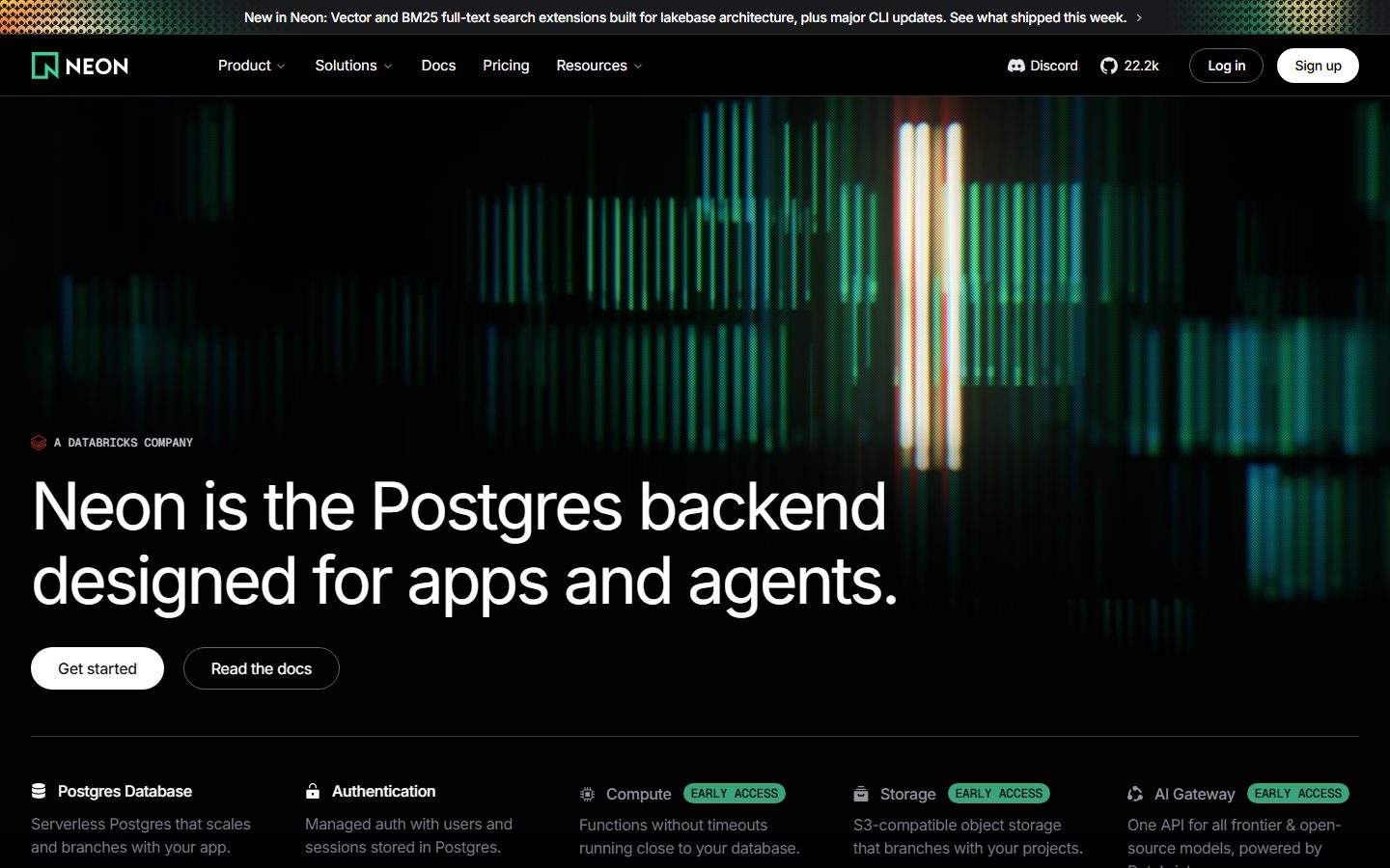
Neon's marketing surface is a pitch-black, developer-first interface — a pure `{colors.canvas}` (#000000) floor with white Inter type (`{colors.ink}` — #ffffff) and a single luminous neon-green accent (`{colors.accent}` — #00e599). The system reads as precise infrastructure tooling: large tight-tracked headlines, near-black layered surfaces that step almost imperceptibly above the black floor, pill-shaped buttons, and terminal/code fragments shown inline as proof-of-product.
The type voice is **Inter across every role** — there is no second typeface. Hierarchy is carried entirely by size and negative letter-spacing rather than weight changes; even the largest display headline sits at weight 400. The `{typography.display-xl}` headline ("Neon is the Postgres backend designed for apps and agents.") runs at 68px with a dramatic -2.72px tracking, which gives Neon its distinctive tight, engineered display look.
Brand voltage comes from **green-on-black** and almost nothing else. The neon green appears in the spectrum-light hero imagery, in "EARLY ACCESS" badge labels, in the brand mark, and in the deeper green tones (`{colors.accent-deep}` — #2c6d4c, `{colors.accent-mid}` — #00cc88, `{colors.accent-bright}` — #34d59a) used in data-viz and gradient washes. The rest of the palette is a long grayscale ramp from white through mid-grays (`{colors.body}`, `{colors.muted}`) down into a stack of near-black surfaces.
**Key Characteristics:**
- Pure black canvas (`{colors.canvas}` — #000000) with white display type. The contrast is maximal and the page never lightens except for a single pale-mint section break observed mid-page.
- Single typeface (Inter) carrying every role. Hierarchy is size + negative letter-spacing, not weight — most type is weight 400/500.
- Pill-shaped buttons (`{rounded.full}`, derived from the measured card radius). Primary is a white pill with black text; secondary is a dark pill with white text.
- Neon-green accent (`{colors.accent}` — #00e599) used sparingly: badges, brand mark, and spectrum-light hero imagery. Never as a button fill.
- Layered near-black surfaces (`{colors.surface-darkest}` #0c0d0d → `{colors.surface-strong}` #303236) for panels, code blocks, and elevated mockups.
- Inline terminal/code fragments (`$ npx neonctl init`) shown as product proof rather than decorative illustration.
- Tight radius system: a measured 4px (`{rounded.sm}`) on most rectangles, plus full pill rounding on buttons and capsule elements.
- A single low elevation token — `0 8px 20px rgba(0,0,0,0.4)` — used on the floating product mockup.
## Colors
### Brand & Accent
- **Accent** (`{colors.accent}` — #00e599): The signature neon green. Used on the brand mark, "EARLY ACCESS" badge text, and the brightest spectrum-light highlights in hero imagery. The single source of brand color.
- **Accent Bright** (`{colors.accent-bright}` — #34d59a): A slightly desaturated green used in gradient washes and data-visualization fills.
- **Accent Mid** (`{colors.accent-mid}` — #00cc88): A mid-tone green for secondary chart elements and hover-state-adjacent green moments.
- **Accent Deep** (`{colors.accent-deep}` — #2c6d4c): The darkest green — high-frequency in the analysis (1802 hits), it appears in the muted green gradients and dim spectrum-light tails against black.
### Surface
The system steps through a tight near-black ramp rather than using one flat surface:
- **Canvas** (`{colors.canvas}` — #000000): The page floor.
- **Surface Darkest** (`{colors.surface-darkest}` — #0c0d0d): The dimmest panel tone, used on elevated mockups.
- **Surface Darker** (`{colors.surface-darker}` — #131415): Section panels.
- **Surface Dark** (`{colors.surface-dark}` — #18191b): Nested panel backgrounds.
- **Surface 100 / 200 / 300** (`{colors.surface-100}` #1a1a1a · `{colors.surface-200}` #242628 · `{colors.surface-300}` #262626): Code blocks, dark pill buttons, and elevated chips.
- **Surface Strong** (`{colors.surface-strong}` — #303236): The strongest elevated gray, doubling as `{colors.hairline}` for 1px dividers.
### Text
- **Ink** (`{colors.ink}` — #ffffff): All headlines and primary text.
- **Body** (`{colors.body}` — #c9cbcf): Default running text on dark.
- **Body Soft** (`{colors.body-soft}` — #afb1b6): Secondary paragraph text.
- **Muted** (`{colors.muted}` — #94979e): Tertiary text, logo-row labels, captions.
- **Muted Soft** (`{colors.muted-soft}` — #797d86): The lowest-contrast text tone (measured on h2 secondary lines) — used for de-emphasized sentence fragments in two-tone headlines.
- **Neutral Faint** (`{colors.neutral-faint}` — #e4e5e7): Near-white used for hairline-light text or borders on dark.
- **Neutral 500 / 600** (`{colors.neutral-500}` #61646b · `{colors.neutral-600}` #494b50): Dim borders, disabled text, fine dividers.
### Note on Two-Tone Headlines
Neon's section headlines combine `{colors.ink}` (the active phrase, e.g. "Advanced autoscaling.") with `{colors.muted}` / `{colors.muted-soft}` (the trailing supporting clause). The brightness shift inside one sentence is the system's primary emphasis device.
## Typography
### Font Family
The entire system runs **Inter** — display, body, buttons, labels, and code-adjacent UI text all share the one family. No licensed or custom typeface was detected (`fonts_licensed` is empty). The fallback stack resolves to `Inter, sans-serif`.
Because there is only one family, hierarchy is built from **size and negative letter-spacing**, not weight contrast. Display sizes carry aggressive negative tracking (-2.72px at 68px), while supporting text sits closer to neutral.
### Hierarchy
| Token | Size | Weight | Line Height | Letter Spacing | Use |
|---|---|---|---|---|---|
| `{typography.display-xl}` | 68px | 400 | 1.125 | -2.72px | Hero h1 ("Neon is the Postgres backend designed for apps and agents.") |
| `{typography.display-lg}` | 48px | 400 | 1.125 | -1.92px | Section heads ("Cloud primitives for the AI Engineering era.") |
| `{typography.lead}` | 24px | 500 | 1.0 | -0.96px | Large lead/body emphasis lines |
| `{typography.title-sm}` | 18px | 400 | 1.0 | -0.36px | Sub-titles, small headers |
| `{typography.label}` | 16px | 500 | 1.5 | -0.4px | Feature column titles, body labels |
| `{typography.button}` | 15px | 400 | 1.5 | -0.15px | Button labels, nav links, code snippets, captions |
### Principles
The defining trait is **uniform weight with size-driven hierarchy**. Display headlines stay at weight 400 — Neon never bolds its biggest type. The visual weight comes from sheer size plus the tight negative tracking, which packs the characters into a dense, engineered block.
Negative letter-spacing scales with size: the larger the type, the tighter the tracking (-2.72px at 68px down to -0.15px at 15px). Removing the negative tracking would make Neon's headlines read as generic Inter — the tightness is part of the voice.
### Note on Font Substitutes
Inter is open-source (SIL Open Font License) and ships directly — no substitution is required. Where Inter is unavailable, the system-ui stack (`-apple-system, BlinkMacSystemFont, "Segoe UI", Roboto`) is an acceptable fallback, though the negative-tracking display look depends on Inter's geometry.
## Layout
### Spacing System
- **Base unit:** 4px (the most frequent measured value, and the GCD of the spacing set).
- **Tokens:** `{spacing.xxs}` 4px · `{spacing.xs}` 8px · `{spacing.sm}` 12px · `{spacing.md}` 16px · `{spacing.lg}` 20px · `{spacing.xl}` 24px · `{spacing.xxl}` 28px · `{spacing.xxxl}` 32px · `{spacing.huge}` 40px.
- **Dominant rhythm:** 12px (`{spacing.sm}`) is the highest-frequency gap (61 hits) — the standard inline gap between small elements (nav items, badge padding, button clusters). 32px (`{spacing.xxxl}`, 20 hits) is the standard block/section padding.
- **Card / panel padding:** `{spacing.xl}` (24px) on surface panels; `{spacing.sm}` (12px) inside code snippets and pill buttons.
### Grid & Container
- **Feature row:** A 5-up column grid at desktop ("Postgres Database / Authentication / Compute / Storage / AI Gateway"), each column a stacked icon + title + description.
- **Logo row:** A single horizontal band of partner/customer logos (Doordash, BCG, Retool, Meta, Bitso) in `{colors.muted}`.
- **Editorial bands:** Centered single-column headline blocks with left-aligned supporting clusters; section heads sit centered while sub-feature lists run in 3-up rows ("Copy-on-write / Anonymization / Ephemerality").
- **Max content width:** Not directly measured — documented from screenshot proportions as a centered wide container (see Known Gaps).
### Whitespace Philosophy
Neon uses heavy vertical whitespace between bands — entire viewport-height sections are given to a single headline + product mockup. The black canvas amplifies the emptiness, making each white headline land as a discrete statement. Feature density is reserved for the lower compliance/feature grids ("HIPAA and SOC2", "Private networking", etc.) where multi-column lists pack more text.
## Elevation & Depth
| Level | Treatment | Use |
|---|---|---|
| Flat | No shadow, no border — pure `{colors.canvas}` | Body sections, nav, hero text |
| Surface step | Near-black panel (`{colors.surface-darker}` / `{colors.surface-dark}`) one step above the black floor | Section panels, code blocks |
| Drop shadow | `0 8px 20px rgba(0,0,0,0.4)` | The floating product mockup (`{component.elevated-mockup}`) |
The elevation philosophy is **near-black layering plus glow**. On a pure-black canvas, depth is created by stepping surfaces up through the gray ramp rather than by shadow — a #0c0d0d panel reads as "above" the #000000 floor. The single measured drop shadow is soft and dark (40% black, 20px blur), used to lift the hero product mockup off the page.
### Decorative Depth
- The hero's spectrum-light imagery (vertical green/white light bars against black) provides the page's primary visual energy — it is photographic/rendered content, not a token.
- Gradient washes blending `{colors.accent-deep}` and `{colors.accent-bright}` into black create soft luminous halos behind some panels.
## Shapes
### Border Radius Scale
| Token | Value | Use |
|---|---|---|
| `{rounded.sm}` | 4px | The dominant measured radius (62 hits) — code blocks, panels, badge pills, input rectangles |
| `{rounded.full}` | 9999px | Buttons and capsule elements — **derived** from the measured card radius (~3.35e7px, an effectively-infinite value that renders as a full pill) |
The shape language is minimal: almost everything is either a tight 4px rectangle or a full pill. There is no mid-range radius in the measured data. The 4px corner gives panels and code blocks a crisp, technical edge consistent with the developer-tooling tone.
### Photography & Imagery Geometry
- Hero imagery (spectrum lights) bleeds full-width behind the nav and headline with no corner rounding.
- The product mockup card uses the 4px (`{rounded.sm}`) corner plus its drop shadow.
- Partner logos render as flat monochrome marks in `{colors.muted}` with no container.
## Components
### Top Navigation & Announcement
**`announcement-bar`** — A full-width banner pinned above the nav on `{colors.canvas}`, carrying a single product-update line ("New in Neon: Vector and BM25 full-text search extensions...") in `{colors.ink}` at `{typography.button}` size with a trailing chevron. Padding `{spacing.sm}` (12px). The bar carries a faint green-dotted gradient texture at its edges.
**`top-nav`** — Black nav bar with the NEON wordmark + green logo mark at left, primary menu (Product, Solutions, Docs, Pricing, Resources) center-left, and a right cluster with Discord, a GitHub star count ("22.2k"), `{component.button-secondary}` ("Log in"), and `{component.button-primary}` ("Sign up"). Menu items use `{typography.button}` in `{colors.ink}`.
**`nav-link`** — Inline nav text, transparent background, `{colors.ink}`, `{typography.button}`. Dropdown items (Product, Solutions, Resources) carry a chevron affordance.
### Buttons
**`button-primary`** — The white pill CTA ("Get started", "Sign up"). Background `{colors.ink}` (#ffffff), text `{colors.canvas}` (#000000), type `{typography.button}` (Inter 15px / 400), padding `0 14px` (measured), rounded `{rounded.full}`. The highest-emphasis action.
**`button-secondary`** — The dark pill CTA ("Read the docs", "Log in", "I'm building an agent"). Background steps up to `{colors.surface-100}`, text `{colors.ink}`, same padding + radius as primary. Used as the lower-emphasis paired action beside primary.
### Content & Surfaces
**`feature-column`** — Used in the 5-up product-capability row. Each column carries a small icon, a `{component.feature-column-title}` in `{colors.ink}`, and a description in `{colors.body}` at `{typography.label}`. Background `{colors.canvas}`, padding `{spacing.lg}` (20px).
**`feature-column-title`** — The bold-feeling capability label ("Postgres Database", "Authentication", "Compute"). Transparent background, `{colors.ink}`, `{typography.label}`. Frequently paired with a `{component.badge-pill}` ("EARLY ACCESS").
**`badge-pill`** — Small green-text capsule used for "EARLY ACCESS" tags and "A DATABRICKS COMPANY" / "AGENT PLATFORM" eyebrow labels. Transparent background, text `{colors.accent}` (#00e599), `{typography.button}`, rounded `{rounded.sm}`, padding 4px × 8px. The badge is the most frequent place green text appears in the layout.
**`surface-panel`** — A near-black content panel for feature mid-sections and data-viz blocks. Background `{colors.surface-darker}` (#131415), text `{colors.body}`, rounded `{rounded.sm}`, padding `{spacing.xl}` (24px).
**`code-snippet`** — Inline terminal/command chip ("$ npx neonctl init"). Background `{colors.surface-100}`, text `{colors.ink}`, `{typography.button}`, rounded `{rounded.sm}`, padding `{spacing.sm}` (12px). Shown as product proof beside CTAs.
**`elevated-mockup`** — The floating product-UI mockup in the "Cloud primitives for the AI Engineering era" band. Background `{colors.surface-darkest}` (#0c0d0d), rounded `{rounded.sm}`, with the system's only drop shadow `0 8px 20px rgba(0,0,0,0.4)`. Lifts the product screenshot off the black floor.
**`card`** — Measured as a white-fill, full-radius capsule element (`{colors.ink}` background, `{rounded.full}`, no shadow). Note this corresponds to the white pill / capsule shapes in the layout rather than a large content card (see Known Gaps).
**`logo-row`** — Horizontal band of partner/customer logos. Background `{colors.canvas}`, logos rendered in `{colors.muted}` (#94979e) monochrome at `{typography.label}` scale.
## Do's and Don'ts
### Do
- Keep the canvas pure black (`{colors.canvas}` — #000000). Neon's identity depends on maximal black-and-white contrast.
- Build hierarchy from size + negative letter-spacing, not weight. Display type stays at weight 400.
- Reserve the neon green (`{colors.accent}`) for badges, the brand mark, and imagery highlights. Keep it scarce.
- Use two-tone headlines — `{colors.ink}` for the active phrase, `{colors.muted}` for the trailing clause.
- Step surfaces up through the near-black ramp (#0c0d0d → #303236) to create depth instead of relying on borders.
- Show real product proof — terminal commands (`{component.code-snippet}`) and product mockups — instead of decorative illustration.
- Use full pill (`{rounded.full}`) buttons and 4px (`{rounded.sm}`) rectangles. There is no mid-radius.
### Don't
- Don't fill buttons with the neon green. Primary CTAs are white pills; green is for accents only.
- Don't bold display headlines beyond weight 400 — the tightness, not the weight, carries the impact.
- Don't introduce a second typeface. The whole system is Inter.
- Don't add light/white section backgrounds casually — the page stays black except for deliberate, rare contrast breaks.
- Don't drop the negative letter-spacing on display type. Neutral-tracked Inter reads as off-brand.
- Don't over-shadow. The system uses one soft dark drop shadow; layering is done with surface color, not heavy shadow.
## Responsive Behavior
### Breakpoints
| Name | Width | Key Changes |
|---|---|---|
| Mobile | < 768px | Hamburger nav; hero h1 scales down from 68px; 5-up feature row stacks to 1-up; logo row wraps; CTA buttons stack |
| Tablet | 768–1024px | Nav tightens; feature row collapses to 2–3 up; product mockups scale proportionally |
| Desktop | 1024–1440px | Full horizontal nav; 5-up feature row; centered display headlines |
| Wide | > 1440px | Same as desktop with additional outer black breathing room |
*Breakpoint values are inferred from layout structure, not directly measured — see Known Gaps.*
### Touch Targets
- `{component.button-primary}` and `{component.button-secondary}` use 14px horizontal padding measured; effective tap height depends on line-height + vertical padding not fully captured (see Known Gaps).
- `{component.nav-link}` items sit in the 12px-gap nav cluster.
### Collapsing Strategy
- Top nav collapses to a hamburger on mobile; the announcement bar text truncates with its chevron.
- The 5-up feature row reduces column count rather than shrinking text below legibility.
- Hero spectrum-light imagery crops/scales to maintain the green light bars in frame.
- Lower compliance/feature grids ("HIPAA and SOC2" etc.) collapse multi-column lists to single column.
### Image Behavior
- Hero spectrum imagery bleeds full-width and crops on narrow viewports.
- Product mockups (`{component.elevated-mockup}`) scale proportionally, retaining the 4px corner and drop shadow.
- Partner logos wrap to multiple rows on narrow screens.
## Iteration Guide
1. Focus on ONE component at a time. Reference its YAML key directly (`{component.feature-column}`, `{component.elevated-mockup}`).
2. Variants of an existing component (`-active`, `-disabled`) live as separate entries in `components:`.
3. Use `{token.refs}` everywhere — never inline a hex in a component.
4. Never document hover. Default and Active/Pressed states only.
5. Keep the canvas black and type white — the contrast is the system.
6. Green is scarce. Add it to badges and brand marks before anything else.
7. When in doubt about emphasis: larger Inter with tighter tracking, never heavier Inter.
## Known Gaps
- **Single page captured.** Only the landing page was analyzed; footer, pricing tables, docs chrome, and form/input states are not in scope.
- **Button geometry ambiguity.** The analysis measured one `button-primary` with `color: #ffffff`, `radius: 4px`, `padding: 0 14px`. Screenshots clearly show two distinct pill buttons — a white-fill/black-text primary and a dark-fill/white-text secondary — and both render as full pills. The pill radius is documented as `{rounded.full}` derived from the measured `card` radius (~3.35e7px); the literal 4px button radius measurement is preserved as `{rounded.sm}` but appears to apply to rectangles, not these pills. Button height was not measured.
- **Card token.** The measured `card` reports a white background and an effectively-infinite radius (3.35544e+07px), which indicates a capsule/pill element rather than a large content card. Documented as measured; larger dark content cards visible in screenshots were not individually extracted.
- **Body/lead line-height.** The measured `body` (24px) and `title-sm` (18px) report `line-height: 1.0`, which is unusually tight for running text — likely captured on single-line elements. Multi-line paragraph line-heights were not measured.
- **Green accent roles.** Four green tones were measured (#00e599, #34d59a, #00cc88, #2c6d4c) but exact role assignment (UI vs. imagery vs. data-viz) is inferred from screenshots; precise usage may vary by component.
- **Spacing scale** has fine-grained measured values (10, 14, 18, 22, 25, 36px) collapsed into the documented token set; some one-off values were omitted as outliers.
- **Breakpoints, container max-width, and animation/transition timings** were not measured and are documented from screenshot inference only.
<!-- Documented by duply · real-world design systems as ready-to-use DESIGN.md for AI coding agents · https://duply.ai/neon/design-md -->
Color Palette
Accent
Neutrals
Typography
display-xl68px · 400 · 1.125
The quick brown fox jumpsdisplay-lg48px · 400 · 1.125
The quick brown fox jumpslead24px · 500 · 1
The quick brown fox jumpstitle-sm18px · 400 · 1
The quick brown fox jumpslabel16px · 500 · 1.5
The quick brown fox jumpsbutton15px · 400 · 1.5
The quick brown fox jumpsSpacing & Shape
Spacing
| Name | Value | Preview |
|---|---|---|
| xxs | 4px | |
| xs | 8px | |
| sm | 12px | |
| md | 16px | |
| lg | 20px | |
| xl | 24px | |
| xxl | 28px | |
| xxxl | 32px | |
| huge | 40px |
Border Radius
| Name | Value | Preview |
|---|---|---|
| sm | 4px | |
| full | 9999px |
More like this


---
version: alpha
name: Neon-design-analysis
description: A pitch-black, developer-first database interface anchored on a pure #000000 canvas with white Inter typography and neon-green (#00e599) brand voltage. The system reads as precise, technical, and modern-infra — large tight-tracked display headlines, near-black layered surfaces, pill-shaped buttons, spectrum-light hero imagery, and terminal/code fragments shown inline. Brand energy comes almost entirely from a single luminous green accent set against deep black, never from color saturation across the page.

colors:
  canvas: "#000000"
  ink: "#ffffff"
  body: "#c9cbcf"
  body-soft: "#afb1b6"
  muted: "#94979e"
  muted-soft: "#797d86"
  neutral-faint: "#e4e5e7"
  neutral-500: "#61646b"
  neutral-600: "#494b50"
  surface-100: "#1a1a1a"
  surface-200: "#242628"
  surface-300: "#262626"
  surface-strong: "#303236"
  surface-dark: "#18191b"
  surface-darker: "#131415"
  surface-darkest: "#0c0d0d"
  hairline: "#303236"
  accent: "#00e599"
  accent-bright: "#34d59a"
  accent-mid: "#00cc88"
  accent-deep: "#2c6d4c"

typography:
  display-xl:
    fontFamily: "Inter, sans-serif"
    fontSize: 68px
    fontWeight: 400
    lineHeight: 1.125
    letterSpacing: -2.72px
  display-lg:
    fontFamily: "Inter, sans-serif"
    fontSize: 48px
    fontWeight: 400
    lineHeight: 1.125
    letterSpacing: -1.92px
  lead:
    fontFamily: "Inter, sans-serif"
    fontSize: 24px
    fontWeight: 500
    lineHeight: 1.0
    letterSpacing: -0.96px
  title-sm:
    fontFamily: "Inter, sans-serif"
    fontSize: 18px
    fontWeight: 400
    lineHeight: 1.0
    letterSpacing: -0.36px
  label:
    fontFamily: "Inter, sans-serif"
    fontSize: 16px
    fontWeight: 500
    lineHeight: 1.5
    letterSpacing: -0.4px
  button:
    fontFamily: "Inter, sans-serif"
    fontSize: 15px
    fontWeight: 400
    lineHeight: 1.5
    letterSpacing: -0.15px

rounded:
  sm: 4px
  full: 9999px

spacing:
  xxs: 4px
  xs: 8px
  sm: 12px
  md: 16px
  lg: 20px
  xl: 24px
  xxl: 28px
  xxxl: 32px
  huge: 40px

components:
  announcement-bar:
    backgroundColor: "{colors.canvas}"
    textColor: "{colors.ink}"
    typography: "{typography.button}"
    padding: 12px
  top-nav:
    backgroundColor: "{colors.canvas}"
    textColor: "{colors.ink}"
    typography: "{typography.button}"
    padding: 12px 32px
  nav-link:
    backgroundColor: transparent
    textColor: "{colors.ink}"
    typography: "{typography.button}"
  button-primary:
    backgroundColor: "{colors.ink}"
    textColor: "{colors.canvas}"
    typography: "{typography.button}"
    rounded: "{rounded.full}"
    padding: 0px 14px
  button-secondary:
    backgroundColor: "{colors.surface-100}"
    textColor: "{colors.ink}"
    typography: "{typography.button}"
    rounded: "{rounded.full}"
    padding: 0px 14px
  feature-column:
    backgroundColor: "{colors.canvas}"
    textColor: "{colors.body}"
    typography: "{typography.label}"
    padding: 20px
  feature-column-title:
    backgroundColor: transparent
    textColor: "{colors.ink}"
    typography: "{typography.label}"
  badge-pill:
    backgroundColor: transparent
    textColor: "{colors.accent}"
    typography: "{typography.button}"
    rounded: "{rounded.sm}"
    padding: 4px 8px
  card:
    backgroundColor: "{colors.ink}"
    textColor: "{colors.canvas}"
    rounded: "{rounded.full}"
    shadow: none
  surface-panel:
    backgroundColor: "{colors.surface-darker}"
    textColor: "{colors.body}"
    typography: "{typography.label}"
    rounded: "{rounded.sm}"
    padding: 24px
  code-snippet:
    backgroundColor: "{colors.surface-100}"
    textColor: "{colors.ink}"
    typography: "{typography.button}"
    rounded: "{rounded.sm}"
    padding: 12px
  elevated-mockup:
    backgroundColor: "{colors.surface-darkest}"
    textColor: "{colors.ink}"
    rounded: "{rounded.sm}"
    shadow: "0 8px 20px rgba(0,0,0,0.4)"
  logo-row:
    backgroundColor: "{colors.canvas}"
    textColor: "{colors.muted}"
    typography: "{typography.label}"
---

## Overview

Neon's marketing surface is a pitch-black, developer-first interface — a pure `{colors.canvas}` (#000000) floor with white Inter type (`{colors.ink}` — #ffffff) and a single luminous neon-green accent (`{colors.accent}` — #00e599). The system reads as precise infrastructure tooling: large tight-tracked headlines, near-black layered surfaces that step almost imperceptibly above the black floor, pill-shaped buttons, and terminal/code fragments shown inline as proof-of-product.

The type voice is **Inter across every role** — there is no second typeface. Hierarchy is carried entirely by size and negative letter-spacing rather than weight changes; even the largest display headline sits at weight 400. The `{typography.display-xl}` headline ("Neon is the Postgres backend designed for apps and agents.") runs at 68px with a dramatic -2.72px tracking, which gives Neon its distinctive tight, engineered display look.

Brand voltage comes from **green-on-black** and almost nothing else. The neon green appears in the spectrum-light hero imagery, in "EARLY ACCESS" badge labels, in the brand mark, and in the deeper green tones (`{colors.accent-deep}` — #2c6d4c, `{colors.accent-mid}` — #00cc88, `{colors.accent-bright}` — #34d59a) used in data-viz and gradient washes. The rest of the palette is a long grayscale ramp from white through mid-grays (`{colors.body}`, `{colors.muted}`) down into a stack of near-black surfaces.

**Key Characteristics:**
- Pure black canvas (`{colors.canvas}` — #000000) with white display type. The contrast is maximal and the page never lightens except for a single pale-mint section break observed mid-page.
- Single typeface (Inter) carrying every role. Hierarchy is size + negative letter-spacing, not weight — most type is weight 400/500.
- Pill-shaped buttons (`{rounded.full}`, derived from the measured card radius). Primary is a white pill with black text; secondary is a dark pill with white text.
- Neon-green accent (`{colors.accent}` — #00e599) used sparingly: badges, brand mark, and spectrum-light hero imagery. Never as a button fill.
- Layered near-black surfaces (`{colors.surface-darkest}` #0c0d0d → `{colors.surface-strong}` #303236) for panels, code blocks, and elevated mockups.
- Inline terminal/code fragments (`$ npx neonctl init`) shown as product proof rather than decorative illustration.
- Tight radius system: a measured 4px (`{rounded.sm}`) on most rectangles, plus full pill rounding on buttons and capsule elements.
- A single low elevation token — `0 8px 20px rgba(0,0,0,0.4)` — used on the floating product mockup.

## Colors

### Brand & Accent
- **Accent** (`{colors.accent}` — #00e599): The signature neon green. Used on the brand mark, "EARLY ACCESS" badge text, and the brightest spectrum-light highlights in hero imagery. The single source of brand color.
- **Accent Bright** (`{colors.accent-bright}` — #34d59a): A slightly desaturated green used in gradient washes and data-visualization fills.
- **Accent Mid** (`{colors.accent-mid}` — #00cc88): A mid-tone green for secondary chart elements and hover-state-adjacent green moments.
- **Accent Deep** (`{colors.accent-deep}` — #2c6d4c): The darkest green — high-frequency in the analysis (1802 hits), it appears in the muted green gradients and dim spectrum-light tails against black.

### Surface
The system steps through a tight near-black ramp rather than using one flat surface:
- **Canvas** (`{colors.canvas}` — #000000): The page floor.
- **Surface Darkest** (`{colors.surface-darkest}` — #0c0d0d): The dimmest panel tone, used on elevated mockups.
- **Surface Darker** (`{colors.surface-darker}` — #131415): Section panels.
- **Surface Dark** (`{colors.surface-dark}` — #18191b): Nested panel backgrounds.
- **Surface 100 / 200 / 300** (`{colors.surface-100}` #1a1a1a · `{colors.surface-200}` #242628 · `{colors.surface-300}` #262626): Code blocks, dark pill buttons, and elevated chips.
- **Surface Strong** (`{colors.surface-strong}` — #303236): The strongest elevated gray, doubling as `{colors.hairline}` for 1px dividers.

### Text
- **Ink** (`{colors.ink}` — #ffffff): All headlines and primary text.
- **Body** (`{colors.body}` — #c9cbcf): Default running text on dark.
- **Body Soft** (`{colors.body-soft}` — #afb1b6): Secondary paragraph text.
- **Muted** (`{colors.muted}` — #94979e): Tertiary text, logo-row labels, captions.
- **Muted Soft** (`{colors.muted-soft}` — #797d86): The lowest-contrast text tone (measured on h2 secondary lines) — used for de-emphasized sentence fragments in two-tone headlines.
- **Neutral Faint** (`{colors.neutral-faint}` — #e4e5e7): Near-white used for hairline-light text or borders on dark.
- **Neutral 500 / 600** (`{colors.neutral-500}` #61646b · `{colors.neutral-600}` #494b50): Dim borders, disabled text, fine dividers.

### Note on Two-Tone Headlines
Neon's section headlines combine `{colors.ink}` (the active phrase, e.g. "Advanced autoscaling.") with `{colors.muted}` / `{colors.muted-soft}` (the trailing supporting clause). The brightness shift inside one sentence is the system's primary emphasis device.

## Typography

### Font Family
The entire system runs **Inter** — display, body, buttons, labels, and code-adjacent UI text all share the one family. No licensed or custom typeface was detected (`fonts_licensed` is empty). The fallback stack resolves to `Inter, sans-serif`.

Because there is only one family, hierarchy is built from **size and negative letter-spacing**, not weight contrast. Display sizes carry aggressive negative tracking (-2.72px at 68px), while supporting text sits closer to neutral.

### Hierarchy

| Token | Size | Weight | Line Height | Letter Spacing | Use |
|---|---|---|---|---|---|
| `{typography.display-xl}` | 68px | 400 | 1.125 | -2.72px | Hero h1 ("Neon is the Postgres backend designed for apps and agents.") |
| `{typography.display-lg}` | 48px | 400 | 1.125 | -1.92px | Section heads ("Cloud primitives for the AI Engineering era.") |
| `{typography.lead}` | 24px | 500 | 1.0 | -0.96px | Large lead/body emphasis lines |
| `{typography.title-sm}` | 18px | 400 | 1.0 | -0.36px | Sub-titles, small headers |
| `{typography.label}` | 16px | 500 | 1.5 | -0.4px | Feature column titles, body labels |
| `{typography.button}` | 15px | 400 | 1.5 | -0.15px | Button labels, nav links, code snippets, captions |

### Principles
The defining trait is **uniform weight with size-driven hierarchy**. Display headlines stay at weight 400 — Neon never bolds its biggest type. The visual weight comes from sheer size plus the tight negative tracking, which packs the characters into a dense, engineered block.

Negative letter-spacing scales with size: the larger the type, the tighter the tracking (-2.72px at 68px down to -0.15px at 15px). Removing the negative tracking would make Neon's headlines read as generic Inter — the tightness is part of the voice.

### Note on Font Substitutes
Inter is open-source (SIL Open Font License) and ships directly — no substitution is required. Where Inter is unavailable, the system-ui stack (`-apple-system, BlinkMacSystemFont, "Segoe UI", Roboto`) is an acceptable fallback, though the negative-tracking display look depends on Inter's geometry.

## Layout

### Spacing System
- **Base unit:** 4px (the most frequent measured value, and the GCD of the spacing set).
- **Tokens:** `{spacing.xxs}` 4px · `{spacing.xs}` 8px · `{spacing.sm}` 12px · `{spacing.md}` 16px · `{spacing.lg}` 20px · `{spacing.xl}` 24px · `{spacing.xxl}` 28px · `{spacing.xxxl}` 32px · `{spacing.huge}` 40px.
- **Dominant rhythm:** 12px (`{spacing.sm}`) is the highest-frequency gap (61 hits) — the standard inline gap between small elements (nav items, badge padding, button clusters). 32px (`{spacing.xxxl}`, 20 hits) is the standard block/section padding.
- **Card / panel padding:** `{spacing.xl}` (24px) on surface panels; `{spacing.sm}` (12px) inside code snippets and pill buttons.

### Grid & Container
- **Feature row:** A 5-up column grid at desktop ("Postgres Database / Authentication / Compute / Storage / AI Gateway"), each column a stacked icon + title + description.
- **Logo row:** A single horizontal band of partner/customer logos (Doordash, BCG, Retool, Meta, Bitso) in `{colors.muted}`.
- **Editorial bands:** Centered single-column headline blocks with left-aligned supporting clusters; section heads sit centered while sub-feature lists run in 3-up rows ("Copy-on-write / Anonymization / Ephemerality").
- **Max content width:** Not directly measured — documented from screenshot proportions as a centered wide container (see Known Gaps).

### Whitespace Philosophy
Neon uses heavy vertical whitespace between bands — entire viewport-height sections are given to a single headline + product mockup. The black canvas amplifies the emptiness, making each white headline land as a discrete statement. Feature density is reserved for the lower compliance/feature grids ("HIPAA and SOC2", "Private networking", etc.) where multi-column lists pack more text.

## Elevation & Depth

| Level | Treatment | Use |
|---|---|---|
| Flat | No shadow, no border — pure `{colors.canvas}` | Body sections, nav, hero text |
| Surface step | Near-black panel (`{colors.surface-darker}` / `{colors.surface-dark}`) one step above the black floor | Section panels, code blocks |
| Drop shadow | `0 8px 20px rgba(0,0,0,0.4)` | The floating product mockup (`{component.elevated-mockup}`) |

The elevation philosophy is **near-black layering plus glow**. On a pure-black canvas, depth is created by stepping surfaces up through the gray ramp rather than by shadow — a #0c0d0d panel reads as "above" the #000000 floor. The single measured drop shadow is soft and dark (40% black, 20px blur), used to lift the hero product mockup off the page.

### Decorative Depth
- The hero's spectrum-light imagery (vertical green/white light bars against black) provides the page's primary visual energy — it is photographic/rendered content, not a token.
- Gradient washes blending `{colors.accent-deep}` and `{colors.accent-bright}` into black create soft luminous halos behind some panels.

## Shapes

### Border Radius Scale

| Token | Value | Use |
|---|---|---|
| `{rounded.sm}` | 4px | The dominant measured radius (62 hits) — code blocks, panels, badge pills, input rectangles |
| `{rounded.full}` | 9999px | Buttons and capsule elements — **derived** from the measured card radius (~3.35e7px, an effectively-infinite value that renders as a full pill) |

The shape language is minimal: almost everything is either a tight 4px rectangle or a full pill. There is no mid-range radius in the measured data. The 4px corner gives panels and code blocks a crisp, technical edge consistent with the developer-tooling tone.

### Photography & Imagery Geometry
- Hero imagery (spectrum lights) bleeds full-width behind the nav and headline with no corner rounding.
- The product mockup card uses the 4px (`{rounded.sm}`) corner plus its drop shadow.
- Partner logos render as flat monochrome marks in `{colors.muted}` with no container.

## Components

### Top Navigation & Announcement

**`announcement-bar`** — A full-width banner pinned above the nav on `{colors.canvas}`, carrying a single product-update line ("New in Neon: Vector and BM25 full-text search extensions...") in `{colors.ink}` at `{typography.button}` size with a trailing chevron. Padding `{spacing.sm}` (12px). The bar carries a faint green-dotted gradient texture at its edges.

**`top-nav`** — Black nav bar with the NEON wordmark + green logo mark at left, primary menu (Product, Solutions, Docs, Pricing, Resources) center-left, and a right cluster with Discord, a GitHub star count ("22.2k"), `{component.button-secondary}` ("Log in"), and `{component.button-primary}` ("Sign up"). Menu items use `{typography.button}` in `{colors.ink}`.

**`nav-link`** — Inline nav text, transparent background, `{colors.ink}`, `{typography.button}`. Dropdown items (Product, Solutions, Resources) carry a chevron affordance.

### Buttons

**`button-primary`** — The white pill CTA ("Get started", "Sign up"). Background `{colors.ink}` (#ffffff), text `{colors.canvas}` (#000000), type `{typography.button}` (Inter 15px / 400), padding `0 14px` (measured), rounded `{rounded.full}`. The highest-emphasis action.

**`button-secondary`** — The dark pill CTA ("Read the docs", "Log in", "I'm building an agent"). Background steps up to `{colors.surface-100}`, text `{colors.ink}`, same padding + radius as primary. Used as the lower-emphasis paired action beside primary.

### Content & Surfaces

**`feature-column`** — Used in the 5-up product-capability row. Each column carries a small icon, a `{component.feature-column-title}` in `{colors.ink}`, and a description in `{colors.body}` at `{typography.label}`. Background `{colors.canvas}`, padding `{spacing.lg}` (20px).

**`feature-column-title`** — The bold-feeling capability label ("Postgres Database", "Authentication", "Compute"). Transparent background, `{colors.ink}`, `{typography.label}`. Frequently paired with a `{component.badge-pill}` ("EARLY ACCESS").

**`badge-pill`** — Small green-text capsule used for "EARLY ACCESS" tags and "A DATABRICKS COMPANY" / "AGENT PLATFORM" eyebrow labels. Transparent background, text `{colors.accent}` (#00e599), `{typography.button}`, rounded `{rounded.sm}`, padding 4px × 8px. The badge is the most frequent place green text appears in the layout.

**`surface-panel`** — A near-black content panel for feature mid-sections and data-viz blocks. Background `{colors.surface-darker}` (#131415), text `{colors.body}`, rounded `{rounded.sm}`, padding `{spacing.xl}` (24px).

**`code-snippet`** — Inline terminal/command chip ("$ npx neonctl init"). Background `{colors.surface-100}`, text `{colors.ink}`, `{typography.button}`, rounded `{rounded.sm}`, padding `{spacing.sm}` (12px). Shown as product proof beside CTAs.

**`elevated-mockup`** — The floating product-UI mockup in the "Cloud primitives for the AI Engineering era" band. Background `{colors.surface-darkest}` (#0c0d0d), rounded `{rounded.sm}`, with the system's only drop shadow `0 8px 20px rgba(0,0,0,0.4)`. Lifts the product screenshot off the black floor.

**`card`** — Measured as a white-fill, full-radius capsule element (`{colors.ink}` background, `{rounded.full}`, no shadow). Note this corresponds to the white pill / capsule shapes in the layout rather than a large content card (see Known Gaps).

**`logo-row`** — Horizontal band of partner/customer logos. Background `{colors.canvas}`, logos rendered in `{colors.muted}` (#94979e) monochrome at `{typography.label}` scale.

## Do's and Don'ts

### Do
- Keep the canvas pure black (`{colors.canvas}` — #000000). Neon's identity depends on maximal black-and-white contrast.
- Build hierarchy from size + negative letter-spacing, not weight. Display type stays at weight 400.
- Reserve the neon green (`{colors.accent}`) for badges, the brand mark, and imagery highlights. Keep it scarce.
- Use two-tone headlines — `{colors.ink}` for the active phrase, `{colors.muted}` for the trailing clause.
- Step surfaces up through the near-black ramp (#0c0d0d → #303236) to create depth instead of relying on borders.
- Show real product proof — terminal commands (`{component.code-snippet}`) and product mockups — instead of decorative illustration.
- Use full pill (`{rounded.full}`) buttons and 4px (`{rounded.sm}`) rectangles. There is no mid-radius.

### Don't
- Don't fill buttons with the neon green. Primary CTAs are white pills; green is for accents only.
- Don't bold display headlines beyond weight 400 — the tightness, not the weight, carries the impact.
- Don't introduce a second typeface. The whole system is Inter.
- Don't add light/white section backgrounds casually — the page stays black except for deliberate, rare contrast breaks.
- Don't drop the negative letter-spacing on display type. Neutral-tracked Inter reads as off-brand.
- Don't over-shadow. The system uses one soft dark drop shadow; layering is done with surface color, not heavy shadow.

## Responsive Behavior

### Breakpoints

| Name | Width | Key Changes |
|---|---|---|
| Mobile | < 768px | Hamburger nav; hero h1 scales down from 68px; 5-up feature row stacks to 1-up; logo row wraps; CTA buttons stack |
| Tablet | 768–1024px | Nav tightens; feature row collapses to 2–3 up; product mockups scale proportionally |
| Desktop | 1024–1440px | Full horizontal nav; 5-up feature row; centered display headlines |
| Wide | > 1440px | Same as desktop with additional outer black breathing room |

*Breakpoint values are inferred from layout structure, not directly measured — see Known Gaps.*

### Touch Targets
- `{component.button-primary}` and `{component.button-secondary}` use 14px horizontal padding measured; effective tap height depends on line-height + vertical padding not fully captured (see Known Gaps).
- `{component.nav-link}` items sit in the 12px-gap nav cluster.

### Collapsing Strategy
- Top nav collapses to a hamburger on mobile; the announcement bar text truncates with its chevron.
- The 5-up feature row reduces column count rather than shrinking text below legibility.
- Hero spectrum-light imagery crops/scales to maintain the green light bars in frame.
- Lower compliance/feature grids ("HIPAA and SOC2" etc.) collapse multi-column lists to single column.

### Image Behavior
- Hero spectrum imagery bleeds full-width and crops on narrow viewports.
- Product mockups (`{component.elevated-mockup}`) scale proportionally, retaining the 4px corner and drop shadow.
- Partner logos wrap to multiple rows on narrow screens.

## Iteration Guide

1. Focus on ONE component at a time. Reference its YAML key directly (`{component.feature-column}`, `{component.elevated-mockup}`).
2. Variants of an existing component (`-active`, `-disabled`) live as separate entries in `components:`.
3. Use `{token.refs}` everywhere — never inline a hex in a component.
4. Never document hover. Default and Active/Pressed states only.
5. Keep the canvas black and type white — the contrast is the system.
6. Green is scarce. Add it to badges and brand marks before anything else.
7. When in doubt about emphasis: larger Inter with tighter tracking, never heavier Inter.

## Known Gaps

- **Single page captured.** Only the landing page was analyzed; footer, pricing tables, docs chrome, and form/input states are not in scope.
- **Button geometry ambiguity.** The analysis measured one `button-primary` with `color: #ffffff`, `radius: 4px`, `padding: 0 14px`. Screenshots clearly show two distinct pill buttons — a white-fill/black-text primary and a dark-fill/white-text secondary — and both render as full pills. The pill radius is documented as `{rounded.full}` derived from the measured `card` radius (~3.35e7px); the literal 4px button radius measurement is preserved as `{rounded.sm}` but appears to apply to rectangles, not these pills. Button height was not measured.
- **Card token.** The measured `card` reports a white background and an effectively-infinite radius (3.35544e+07px), which indicates a capsule/pill element rather than a large content card. Documented as measured; larger dark content cards visible in screenshots were not individually extracted.
- **Body/lead line-height.** The measured `body` (24px) and `title-sm` (18px) report `line-height: 1.0`, which is unusually tight for running text — likely captured on single-line elements. Multi-line paragraph line-heights were not measured.
- **Green accent roles.** Four green tones were measured (#00e599, #34d59a, #00cc88, #2c6d4c) but exact role assignment (UI vs. imagery vs. data-viz) is inferred from screenshots; precise usage may vary by component.
- **Spacing scale** has fine-grained measured values (10, 14, 18, 22, 25, 36px) collapsed into the documented token set; some one-off values were omitted as outliers.
- **Breakpoints, container max-width, and animation/transition timings** were not measured and are documented from screenshot inference only.

<!-- Documented by duply · real-world design systems as ready-to-use DESIGN.md for AI coding agents · https://duply.ai/neon/design-md -->