Upstash
A serverless-database developer brand built on a near-white mint canvas with deep forest-green ink and emerald CTAs. The system reads as confident modern infrastructure-SaaS — oversized Inter Tight display headlines (frequently rendered with a green-to-olive gradient), white rounded panels floating over a soft mint-gradient background, dark terminal code blocks shown inline as proof, and pill-shaped tabs and buttons throughout. Brand voltage comes from the green type and the embedded product/code surfaces rather than decorative color.
---
version: alpha
name: Upstash-design-analysis
description: "A serverless-database developer brand built on a near-white mint canvas with deep forest-green ink and emerald CTAs. The system reads as confident modern infrastructure-SaaS — oversized Inter Tight display headlines (frequently rendered with a green-to-olive gradient), white rounded panels floating over a soft mint-gradient background, dark terminal code blocks shown inline as proof, and pill-shaped tabs and buttons throughout. Brand voltage comes from the green type and the embedded product/code surfaces rather than decorative color."
colors:
ink: "#022c22"
ink-strong: "#000000"
body: "#374151"
muted: "#9ca3af"
muted-warm: "#a8a29e"
neutral-warm: "#44403c"
canvas: "#ffffff"
primary: "#047857"
emerald: "#10b981"
mint: "#34d399"
mint-soft: "#6ee7b7"
on-primary: "#e4e4e7"
surface-dark: "#09090b"
surface-dark-alt: "#111827"
hairline: "#e5e7eb"
hairline-strong: "#d1d5db"
accent-violet: "#e9d5ff"
error: "#dc2626"
typography:
display-xl:
fontFamily: "Inter Tight, Inter, sans-serif"
fontSize: 128px
fontWeight: 700
lineHeight: 1.0
letterSpacing: -3.2px
display-lg:
fontFamily: "Inter Tight, Inter, sans-serif"
fontSize: 48px
fontWeight: 600
lineHeight: 1.0
letterSpacing: 0
title-md:
fontFamily: "Inter Tight, Inter, sans-serif"
fontSize: 24px
fontWeight: 600
lineHeight: 1.333
letterSpacing: 0
subtitle:
fontFamily: "Inter, sans-serif"
fontSize: 24px
fontWeight: 400
lineHeight: 1.333
letterSpacing: 0
body-md:
fontFamily: "Inter, sans-serif"
fontSize: 16px
fontWeight: 400
lineHeight: 1.5
letterSpacing: 0
button:
fontFamily: "Inter, sans-serif"
fontSize: 14px
fontWeight: 400
lineHeight: 1.429
letterSpacing: 0
rounded:
sm: 6px
md: 8px
lg: 12px
xl: 16px
xxl: 35px
pill: 9999px
spacing:
xxs: 4px
xs: 8px
sm: 12px
md: 16px
lg: 24px
xl: 32px
xxl: 40px
huge: 64px
section: 96px
section-xl: 128px
components:
top-nav:
backgroundColor: "{colors.canvas}"
textColor: "{colors.ink}"
typography: "{typography.button}"
padding: 16px 32px
announcement-bar:
backgroundColor: "{colors.surface-dark}"
textColor: "{colors.on-primary}"
typography: "{typography.button}"
padding: 12px 16px
button-primary:
backgroundColor: "{colors.emerald}"
textColor: "{colors.on-primary}"
typography: "{typography.button}"
rounded: "{rounded.md}"
padding: 16px 32px
button-primary-active:
backgroundColor: "{colors.primary}"
textColor: "{colors.on-primary}"
rounded: "{rounded.md}"
button-pill:
backgroundColor: "{colors.canvas}"
textColor: "{colors.primary}"
typography: "{typography.button}"
rounded: "{rounded.pill}"
padding: 8px 16px
product-tab:
backgroundColor: "transparent"
textColor: "{colors.ink}"
typography: "{typography.button}"
rounded: "{rounded.lg}"
padding: 16px 24px
product-tab-active:
backgroundColor: "{colors.canvas}"
textColor: "{colors.ink}"
typography: "{typography.button}"
rounded: "{rounded.lg}"
padding: 16px 24px
hero-panel:
backgroundColor: "{colors.canvas}"
textColor: "{colors.ink}"
rounded: "{rounded.xxl}"
padding: 40px
feature-card:
backgroundColor: "{colors.canvas}"
textColor: "{colors.ink}"
typography: "{typography.title-md}"
rounded: "{rounded.xl}"
padding: 32px
community-card:
backgroundColor: "{colors.canvas}"
textColor: "{colors.ink}"
typography: "{typography.body-md}"
rounded: "{rounded.xl}"
padding: 32px
testimonial-card:
backgroundColor: "{colors.canvas}"
textColor: "{colors.ink}"
typography: "{typography.body-md}"
rounded: "{rounded.xl}"
padding: 40px
logo-pill:
backgroundColor: "{colors.canvas}"
textColor: "{colors.body}"
typography: "{typography.button}"
rounded: "{rounded.pill}"
padding: 12px 24px
stat-block:
backgroundColor: "transparent"
textColor: "{colors.primary}"
typography: "{typography.display-lg}"
code-block:
backgroundColor: "{colors.surface-dark}"
textColor: "{colors.mint-soft}"
typography: "{typography.button}"
rounded: "{rounded.lg}"
padding: 24px
command-pill:
backgroundColor: "{colors.canvas}"
textColor: "{colors.ink}"
typography: "{typography.button}"
rounded: "{rounded.pill}"
padding: 12px 24px
input:
backgroundColor: "{colors.canvas}"
textColor: "{colors.ink}"
typography: "{typography.body-md}"
rounded: "{rounded.md}"
padding: 12px 16px
footer:
backgroundColor: "{colors.canvas}"
textColor: "{colors.muted}"
typography: "{typography.body-md}"
padding: 64px
---
## Overview
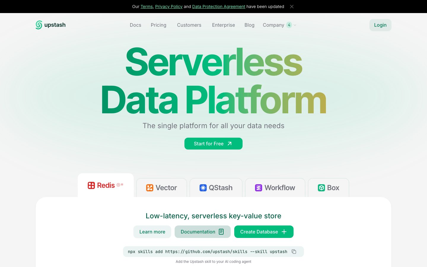
Upstash's marketing surface is a clean, developer-first infrastructure-SaaS interface — a near-white mint canvas with deep forest-green ink (`{colors.ink}` — #022c22), emerald CTAs (`{colors.emerald}` — #10b981), and white rounded panels (`{component.hero-panel}`) floating over a soft mint gradient. The system reads as confident, technical, and friendly: oversized headlines, generous breathing room, and product/code artifacts shown inline as proof.
Type voice is anchored on **Inter Tight** for display (h1, h3, h4) and **Inter** for everything else (body, sub-headlines, buttons, nav). The hero h1 ("Serverless Data Platform") runs at a measured 128px / weight 700 with aggressive -3.2px letter-spacing, frequently filled with a green-to-olive gradient that gives the headline its signature brand glow. Both faces are open-source, so no substitution is required.
Component voltage comes from **embedded product and code surfaces** — dark terminal `{component.code-block}` panels showing real TypeScript/Python SDK snippets, product-mode tabs (Redis / Vector / QStash / Workflow / Box), and stat blocks (160B Redis Commands, 210M QStash Messages). Upstash shows the actual developer experience inline rather than illustrating around it.
**Key Characteristics:**
- Mint-white canvas (`{colors.canvas}` — #ffffff) with deep-green ink (`{colors.ink}` — #022c22) and emerald action color (`{colors.emerald}` — #10b981).
- Oversized Inter Tight display headlines (128px / 700 / -3.2px tracking) — often gradient-filled green-to-olive.
- White rounded content panels with very large corner radii (`{rounded.xxl}` — 35px) floating over the soft mint background.
- Pill-shaped buttons, tabs, and logo chips (`{rounded.pill}` — 9999px) appear throughout — the dominant interactive shape (measured 93 occurrences).
- Dark terminal code blocks (`{colors.surface-dark}` — #09090b) with mint-soft syntax text (`{colors.mint-soft}` — #6ee7b7) shown inline as product proof.
- Soft, low-contrast elevation — a faint `0 1px 2px rgba(0,0,0,0.05)` shadow plus one signature emerald glow (`rgba(16,185,129,0.3) 0 0 80px`) used to halo brand moments.
- Spacing rhythm runs deep — `{spacing.huge}` (64px) and `{spacing.section}` (96px) between major bands, with `{spacing.section-xl}` (128px) reserved for the largest gaps.
## Colors
### Brand & Accent
- **Ink** (`{colors.ink}` — #022c22): The dominant text and headline color — a very dark forest green that reads almost black but carries the brand's green undertone. By far the most frequent text color (498 occurrences).
- **Primary** (`{colors.primary}` — #047857): The core brand green. Used on solid-green headline fills, link/icon accents, and as the pressed state of the emerald CTA.
- **Emerald** (`{colors.emerald}` — #10b981): The brighter action green on primary CTAs ("Start for Free", "Create Database"). Also the source of the signature glow shadow.
- **Mint** (`{colors.mint}` — #34d399): A lighter green used in accent marks, the lower portion of gradient headlines, and small UI dots.
- **Mint Soft** (`{colors.mint-soft}` — #6ee7b7): Link color and syntax text inside the dark code blocks.
- **Accent Violet** (`{colors.accent-violet}` — #e9d5ff): A pale lilac that appears sparingly inside product UI fragments and tag accents — the one non-green accent in the palette.
### Surface
- **Canvas** (`{colors.canvas}` — #ffffff): The white panels, cards, nav, and pills. The page floor itself is a soft mint gradient that the white panels float over.
- **Surface Dark** (`{colors.surface-dark}` — #09090b): The announcement bar and terminal code-block background.
- **Surface Dark Alt** (`{colors.surface-dark-alt}` — #111827): Secondary dark tone used for nested code-block chrome and inactive terminal rows.
### Text
- **Ink** (`{colors.ink}` — #022c22): Headlines and primary text.
- **Body** (`{colors.body}` — #374151): Default running-text and secondary labels.
- **Muted** (`{colors.muted}` — #9ca3af): Sub-headings, captions, footer body.
- **Muted Warm** (`{colors.muted-warm}` — #a8a29e): Tertiary warm-gray text — fine print, footnotes (the `*` weekly-average / trademark lines).
- **Neutral Warm** (`{colors.neutral-warm}` — #44403c): Occasional warm dark-gray text inside light panels.
- **On Primary** (`{colors.on-primary}` — #e4e4e7): Button label text on emerald CTAs and text on the dark announcement bar (measured from `button.color`).
### Borders & Semantic
- **Hairline** (`{colors.hairline}` — #e5e7eb): The 1px divider tone on light surfaces — panel outlines, table rules.
- **Hairline Strong** (`{colors.hairline-strong}` — #d1d5db): A slightly stronger border used on inputs and pill outlines.
- **Error** (`{colors.error}` — #dc2626): Validation and destructive states.
## Typography
### Font Family
The system runs **Inter Tight** for display headlines and **Inter** for body, sub-headlines, buttons, and navigation. Both are open-source (the `__Inter_Tight_*` / `__Inter_*` names are Next.js font-module hashes), so no licensed substitute is required. The boundary is functional: Inter Tight carries the big-impact headlines (h1, h3, h4) with tight tracking, while Inter handles everything that needs to read calmly at small sizes.
- Inter Tight (display, 600–700, negative tracking on the largest size) — h1, h3, h4
- Inter (body + UI, 400) — paragraphs, sub-headlines, labels, buttons, nav
### Hierarchy
| Token | Size | Weight | Line Height | Letter Spacing | Use |
|---|---|---|---|---|---|
| `{typography.display-xl}` | 128px | 700 | 1.0 | -3.2px | Hero h1 ("Serverless / Data Platform") — Inter Tight, gradient-filled |
| `{typography.display-lg}` | 48px | 600 | 1.0 | 0 | Section heads ("Fast Anywhere", "Meet our Customers"), stat numbers — Inter Tight |
| `{typography.title-md}` | 24px | 600 | 1.333 | 0 | Card titles, feature panel heads — Inter Tight |
| `{typography.subtitle}` | 24px | 400 | 1.333 | 0 | Hero sub-headline ("The single platform for all your data needs") — Inter, light weight |
| `{typography.body-md}` | 16px | 400 | 1.5 | 0 | Default running-text, card descriptions |
| `{typography.button}` | 14px | 400 | 1.429 | 0 | Button labels, nav links, tab labels |
### Principles
Inter Tight is the impact voice — the 128px hero uses heavy -3.2px tracking to compress the letterforms into a single dense block; the gradient fill (green-to-olive) is what makes it unmistakably Upstash. Smaller Inter Tight roles (48px / 24px) drop the negative tracking back to normal and use weight 600.
Note the unusual split at 24px: `{typography.title-md}` (Inter Tight, 600) is a true heading, while `{typography.subtitle}` (Inter, 400) is the same size at light weight for hero supporting copy. Keep weight, not size, as the hierarchy signal here.
Button and nav text run a notably light weight 400 at 14px — Upstash does not bold its UI labels, which keeps the chrome quiet against the loud headlines.
### Note on Font Substitutes
No licensed typefaces are used; `fonts_licensed` is empty. Inter Tight and Inter are both freely available via Google Fonts and `@fontsource`. If unavailable, the system fallback stack (`-apple-system, BlinkMacSystemFont, "Segoe UI", Roboto, sans-serif`) preserves the humanist-sans feel, though the tight headline compression of Inter Tight will be lost.
## Layout
### Spacing System
- **Base unit:** 4px (`{spacing.xxs}`).
- **Tokens:** `{spacing.xxs}` 4px · `{spacing.xs}` 8px · `{spacing.sm}` 12px · `{spacing.md}` 16px · `{spacing.lg}` 24px · `{spacing.xl}` 32px · `{spacing.xxl}` 40px · `{spacing.huge}` 64px · `{spacing.section}` 96px · `{spacing.section-xl}` 128px.
- **Most frequent units:** 8px (72×) and 16px (42×) dominate inline gaps and padding; 32px (36×) and 40px (22×) handle card internal padding; 64px (15×) sets the major band rhythm.
- **Card internal padding:** `{spacing.xl}` (32px) to `{spacing.xxl}` (40px) on feature/testimonial panels.
### Grid & Container
- **Max content width:** ~1200px centered on marketing pages.
- **Hero:** single centered column — oversized h1, sub-headline, single CTA, then a floating white panel below holding product tabs + code.
- **Feature grids:** 3-up ("Highly Available", "Global Low Latency", "Durable, Persistent Storage") at desktop, collapsing down at narrower widths.
- **Community grid:** 4-up (Blog / Discord / X / Github) at desktop.
- **Logo wall:** 5-up pill grid for customer logos.
### Whitespace Philosophy
Upstash uses deep vertical rhythm — major bands separated by `{spacing.huge}` (64px) to `{spacing.section}` (96px), with the largest gap (`{spacing.section-xl}` — 128px) reserved for the transition into the "Fast Anywhere" globe band. The white panels are intentionally generous internally (32–40px padding) so embedded code and stats never feel cramped.
## Elevation & Depth
| Level | Treatment | Use |
|---|---|---|
| Flat | No shadow | Page background (soft mint gradient), section headings |
| Soft hairline shadow | `rgba(0,0,0,0.05) 0px 1px 2px` | Default white panels, cards, pills (27 occurrences — the workhorse shadow) |
| Raised card | `rgba(0,0,0,0.1) 0px 1px 3px, rgba(0,0,0,0.1) 0px 1px 2px -1px` | Slightly lifted cards |
| Floating card | `rgba(0,0,0,0.1) 0px 4px 6px -1px, rgba(0,0,0,0.1) 0px 2px 4px -2px` | Elevated panels / popovers |
| Brand glow | `rgba(16,185,129,0.3) 0px 0px 80px` | A single signature emerald halo used to spotlight a brand/product moment |
The elevation philosophy is **soft and minimal** — most surfaces carry only the faint 5%-alpha 1px shadow, letting the white-on-mint contrast do the layering work. The emerald glow is the one expressive shadow, used once.
### Decorative Depth
- The hero headline's green-to-olive gradient fill (a text treatment, not a token-able fill) is the primary decorative device.
- The "Fast Anywhere" band sits over a dotted half-globe illustration — product-context decoration, not a system token.
## Shapes
### Border Radius Scale
| Token | Value | Use |
|---|---|---|
| `{rounded.sm}` | 6px | Small inline chips, tight controls |
| `{rounded.md}` | 8px | Primary CTA buttons, inputs |
| `{rounded.lg}` | 12px | Product tabs, code blocks (most common non-pill radius — 18×) |
| `{rounded.xl}` | 16px | Feature cards, community cards, testimonial panels |
| `{rounded.xxl}` | 35px | Large floating white panels (hero product panel) — the signature oversized panel radius (28×) |
| `{rounded.pill}` | 9999px | Buttons, tabs, logo chips, command pills, badges — the dominant shape (93×) |
### Photography & Geometry
The pill (`{rounded.pill}`) is the system's signature shape — applied to login buttons, tab toggles, customer-logo chips, and command-copy pills. Content panels step up through `{rounded.xl}` (16px) for standard cards to `{rounded.xxl}` (35px) for the large floating hero panel. Customer logos sit inside pill-shaped white chips rather than bare on the canvas.
## Components
### Navigation
**`top-nav`** — White, transparent-over-mint nav pinned at the top. Carries the Upstash spiral logo + wordmark at left, a horizontal menu (Docs, Pricing, Customers, Enterprise, Blog, Company) center, and a pill-shaped "Login" button at right. Menu items use `{typography.button}` (Inter 14px / 400). Padding `{spacing.md}` × `{spacing.xl}`.
**`announcement-bar`** — Full-width dark bar at the very top (`{colors.surface-dark}` — #09090b) with light text (`{colors.on-primary}`) and underlined inline links ("Terms, Privacy Policy and Data Protection Agreement have been updated") plus a dismiss ✕. The only dark band above the fold.
### Buttons
**`button-primary`** — The signature emerald CTA ("Start for Free", "Create Database"). Background `{colors.emerald}` (#10b981), label `{colors.on-primary}`, type `{typography.button}`, rounded `{rounded.md}`, padding `{spacing.md}` × `{spacing.xl}`. Often carries a trailing ↗ or + icon. Active/pressed state `button-primary-active` deepens to `{colors.primary}` (#047857). (Button padding and radius derived from screenshot ground-truth — see Known Gaps.)
**`button-pill`** — Pill-shaped quieter action ("Login", "Learn more"). Background `{colors.canvas}`, text `{colors.primary}`, rounded `{rounded.pill}`, padding `{spacing.xs}` × `{spacing.md}`.
### Tabs
**`product-tab`** + **`product-tab-active`** — The product-mode switcher (Redis / Vector / QStash / Workflow / Box) below the hero. Inactive: transparent background, `{colors.ink}` text. Active: `{colors.canvas}` background that visually connects to the white panel below it, rounded `{rounded.lg}`, padding `{spacing.md}` × `{spacing.lg}`. The active tab merges with the `{component.hero-panel}` to form a continuous surface.
### Cards & Panels
**`hero-panel`** — The large white panel floating beneath the hero that holds the active product tab's content (heading, action buttons, command pill). Background `{colors.canvas}`, rounded `{rounded.xxl}` (35px — the system's largest radius), padding `{spacing.xxl}` (40px), soft 5%-alpha shadow.
**`feature-card`** — Used in the 3-up benefit grid ("Highly Available, Infinitely Scalable" / "Global Low Latency" / "Durable, Persistent Storage"). Background `{colors.canvas}`, rounded `{rounded.xl}` (16px), padding `{spacing.xl}` (32px). Title in `{typography.title-md}`, checklist items in `{typography.body-md}` with emerald icon marks.
**`community-card`** — The 4-up Community grid (Blog / Discord / X / Github). Background `{colors.canvas}`, rounded `{rounded.xl}`, padding `{spacing.xl}`. Carries an icon, a `{typography.title-md}` label, a `{typography.body-md}` description, and a pill text-link ("Read ↗", "Join ↗").
**`testimonial-card`** — Customer-quote panel with a handwritten signature ("Paul Smith"). Background `{colors.canvas}`, rounded `{rounded.xl}`, padding `{spacing.xxl}` (40px), quote in `{typography.body-md}`. Carousel dots sit below.
**`logo-pill`** — Customer-logo chip (Vercel, supabase, Midjourney, Fly.io, etc.). Pill-shaped white container, `{rounded.pill}`, padding `{spacing.sm}` × `{spacing.lg}`, logo mark in `{colors.body}`.
### Data & Code
**`stat-block`** — Large metric numbers in the "Fast Anywhere" band (160B / 210M / 15M / >99.99%). Number rendered in `{typography.display-lg}` colored `{colors.primary}`, with a `{colors.muted}` caption beneath in `{typography.body-md}`.
**`code-block`** — Dark inline terminal showing real SDK snippets (TypeScript / Python). Background `{colors.surface-dark}` (#09090b), syntax text `{colors.mint-soft}` (#6ee7b7), monospace rendered at `{typography.button}` size, rounded `{rounded.lg}`, padding `{spacing.lg}` (24px). Carries a left sidebar of examples (Caching, Session Management, Rate Limiting, Leaderboards, Chat) and a language toggle.
**`command-pill`** — The copy-to-clipboard install command ("npx skills add …"). White pill, `{rounded.pill}`, monospace label in `{colors.ink}`, trailing copy icon, padding `{spacing.sm}` × `{spacing.lg}`.
### Inputs & Forms
**`input`** — Standard text field. Background `{colors.canvas}`, text `{colors.ink}`, type `{typography.body-md}`, rounded `{rounded.md}`, padding `{spacing.sm}` × `{spacing.md}`, 1px `{colors.hairline-strong}` border. (Measured radius reported 0px — see Known Gaps.)
### Footer
**`footer`** — Light footer closing the page on the white canvas. Background `{colors.canvas}`, muted text (`{colors.muted}`), centered Upstash wordmark, copyright ("© 2026 Upstash, Inc. Based in California."), and a row of links (Contact Us, Privacy Policy, Terms of Service). Live Status / Latency pill indicators sit above the trademark fine print in `{colors.muted-warm}`. Padding `{spacing.huge}` (64px).
## Do's and Don'ts
### Do
- Reserve `{colors.emerald}` (#10b981) for primary CTAs and `{colors.primary}` (#047857) for headline fills and accents. Upstash's action color is green, not blue.
- Use deep forest `{colors.ink}` (#022c22) for body and headline text — it reads near-black but carries the brand undertone. Never substitute pure black for ink.
- Use Inter Tight for big display headlines and Inter for everything else. Keep the -3.2px tracking only on the largest hero size.
- Float white panels (`{component.hero-panel}`, `{component.feature-card}`) over the soft mint canvas. White-on-mint contrast carries the layering.
- Reach for the pill shape (`{rounded.pill}`) on buttons, tabs, and logo chips — it is the system's dominant interactive geometry.
- Show real product/code surfaces inline. Dark `{component.code-block}` panels with mint-soft syntax are the proof, not decoration.
- Keep UI labels at weight 400 — Upstash does not bold its chrome.
### Don't
- Don't bold or recolor UI labels to compete with the headlines — the contrast is loud-display vs. quiet-chrome.
- Don't overuse the emerald glow shadow; it is a single, scarce spotlight moment.
- Don't introduce dark card surfaces beyond the announcement bar and code blocks — the body stays white-on-mint.
- Don't use `{colors.accent-violet}` (#e9d5ff) on CTAs; it is a sparing product-UI accent only.
- Don't drop the gradient/green fill from the hero headline — solid-black h1 reads off-brand.
- Don't document hover states — default and active/pressed only (primary deepens emerald → `{colors.primary}` on press).
## Responsive Behavior
### Breakpoints
| Name | Width | Key Changes |
|---|---|---|
| Mobile | < 768px | Hamburger nav; hero h1 scales down dramatically from 128px; product tabs scroll/wrap; feature grid 1-up; community grid 1–2 up; logo wall stacks |
| Tablet | 768–1024px | Nav tightens but stays horizontal; feature cards 2-up; community 2-up |
| Desktop | 1024–1440px | Full horizontal nav; 3-up feature grid; 4-up community grid; 5-up logo wall |
| Wide | > 1440px | Same as desktop; content max-width caps ~1200px with added outer margin |
### Touch Targets
- `{component.button-primary}` padded `{spacing.md}` × `{spacing.xl}` clears comfortable tap size.
- `{component.button-pill}` and `{component.product-tab}` carry generous pill padding meeting 44px+ effective targets.
- `{component.command-pill}` copy control includes a trailing icon hit area.
### Collapsing Strategy
- Top nav collapses to a hamburger on mobile; the desktop menu becomes a sheet.
- The 128px hero headline scales down substantially on small screens (exact mobile size not measured).
- Product tabs (Redis / Vector / QStash / Workflow / Box) wrap or horizontally scroll when they exceed viewport width.
- Feature, community, and logo grids reduce column count rather than shrinking cards.
- Code blocks scroll horizontally rather than reflowing, preserving snippet integrity.
### Image Behavior
- Customer logos sit inside fixed pill chips that resize as a grid.
- The "Fast Anywhere" dotted-globe illustration scales proportionally behind the stat blocks.
## Iteration Guide
1. Focus on ONE component at a time. Reference its YAML key directly (`{component.feature-card}`, `{component.code-block}`).
2. Variants of an existing component (`-active`, `-pressed`) live as separate entries in `components:`.
3. Use `{token.refs}` everywhere — never inline a hex.
4. Never document hover. Default and Active/Pressed states only.
5. Display headlines stay Inter Tight; body and UI stay Inter weight 400. The split does not blur.
6. The pill is the default interactive shape; reach for larger radii (`{rounded.xxl}`) only on the big floating panels.
7. When in doubt about emphasis: bigger Inter Tight before bolder, and let the green gradient carry hero impact.
## Known Gaps
- The `button-primary` component was measured with `radius: 0px` and `padding: 0px`, and `input` with `radius: 0px` — these are almost certainly mis-captured (the dembrandt selector hit a wrapper rather than the rendered control). Button/input radius and padding are documented from screenshot ground-truth using measured spacing/radius tokens; treat them as derived.
- The `card` component reported `radius: 100%` — an artifact of capturing the circular logo mark, not a content card. The real card radii (`{rounded.xl}`, `{rounded.xxl}`) are documented from the radius distribution.
- The emerald CTA background hex was not directly measured (only the button text color `#e4e4e7` was captured); `{colors.emerald}` (#10b981) is assigned from the measured palette + screenshot ground-truth as the CTA fill — derived.
- The hero headline's green-to-olive gradient fill is a text treatment, not a single token; its stops are not measured.
- The soft mint page-background gradient (visible behind all white panels) was not captured as a discrete color token.
- Light-mint secondary button surfaces (e.g. the pale "Documentation" pill) were not measured as a distinct hex; documented as `{colors.canvas}`-based.
- Mobile type scale for the 128px hero is not measured; only the desktop value is confirmed.
- Animation/transition timings (tab switching, carousel rotation, copy feedback) are out of scope.
- Pricing and docs page-specific components were captured in the page list but not separately tokenized here.
<!-- Documented by duply · real-world design systems as ready-to-use DESIGN.md for AI coding agents · https://duply.ai/upstash/design-md -->
Color Palette
Accent
Neutrals
Typography
display-xl128px · 700 · 1
The quick brown fox jumpsdisplay-lg48px · 600 · 1
The quick brown fox jumpstitle-md24px · 600 · 1.333
The quick brown fox jumpssubtitle24px · 400 · 1.333
The quick brown fox jumpsbody-md16px · 400 · 1.5
The quick brown fox jumpsbutton14px · 400 · 1.429
The quick brown fox jumpsSpacing & Shape
Spacing
| Name | Value | Preview |
|---|---|---|
| xxs | 4px | |
| xs | 8px | |
| sm | 12px | |
| md | 16px | |
| lg | 24px | |
| xl | 32px | |
| xxl | 40px | |
| huge | 64px | |
| section | 96px | |
| section-xl | 128px |
Border Radius
| Name | Value | Preview |
|---|---|---|
| sm | 6px | |
| md | 8px | |
| lg | 12px | |
| xl | 16px | |
| xxl | 35px | |
| pill | 9999px |
More like this


---
version: alpha
name: Upstash-design-analysis
description: "A serverless-database developer brand built on a near-white mint canvas with deep forest-green ink and emerald CTAs. The system reads as confident modern infrastructure-SaaS — oversized Inter Tight display headlines (frequently rendered with a green-to-olive gradient), white rounded panels floating over a soft mint-gradient background, dark terminal code blocks shown inline as proof, and pill-shaped tabs and buttons throughout. Brand voltage comes from the green type and the embedded product/code surfaces rather than decorative color."

colors:
  ink: "#022c22"
  ink-strong: "#000000"
  body: "#374151"
  muted: "#9ca3af"
  muted-warm: "#a8a29e"
  neutral-warm: "#44403c"
  canvas: "#ffffff"
  primary: "#047857"
  emerald: "#10b981"
  mint: "#34d399"
  mint-soft: "#6ee7b7"
  on-primary: "#e4e4e7"
  surface-dark: "#09090b"
  surface-dark-alt: "#111827"
  hairline: "#e5e7eb"
  hairline-strong: "#d1d5db"
  accent-violet: "#e9d5ff"
  error: "#dc2626"

typography:
  display-xl:
    fontFamily: "Inter Tight, Inter, sans-serif"
    fontSize: 128px
    fontWeight: 700
    lineHeight: 1.0
    letterSpacing: -3.2px
  display-lg:
    fontFamily: "Inter Tight, Inter, sans-serif"
    fontSize: 48px
    fontWeight: 600
    lineHeight: 1.0
    letterSpacing: 0
  title-md:
    fontFamily: "Inter Tight, Inter, sans-serif"
    fontSize: 24px
    fontWeight: 600
    lineHeight: 1.333
    letterSpacing: 0
  subtitle:
    fontFamily: "Inter, sans-serif"
    fontSize: 24px
    fontWeight: 400
    lineHeight: 1.333
    letterSpacing: 0
  body-md:
    fontFamily: "Inter, sans-serif"
    fontSize: 16px
    fontWeight: 400
    lineHeight: 1.5
    letterSpacing: 0
  button:
    fontFamily: "Inter, sans-serif"
    fontSize: 14px
    fontWeight: 400
    lineHeight: 1.429
    letterSpacing: 0

rounded:
  sm: 6px
  md: 8px
  lg: 12px
  xl: 16px
  xxl: 35px
  pill: 9999px

spacing:
  xxs: 4px
  xs: 8px
  sm: 12px
  md: 16px
  lg: 24px
  xl: 32px
  xxl: 40px
  huge: 64px
  section: 96px
  section-xl: 128px

components:
  top-nav:
    backgroundColor: "{colors.canvas}"
    textColor: "{colors.ink}"
    typography: "{typography.button}"
    padding: 16px 32px
  announcement-bar:
    backgroundColor: "{colors.surface-dark}"
    textColor: "{colors.on-primary}"
    typography: "{typography.button}"
    padding: 12px 16px
  button-primary:
    backgroundColor: "{colors.emerald}"
    textColor: "{colors.on-primary}"
    typography: "{typography.button}"
    rounded: "{rounded.md}"
    padding: 16px 32px
  button-primary-active:
    backgroundColor: "{colors.primary}"
    textColor: "{colors.on-primary}"
    rounded: "{rounded.md}"
  button-pill:
    backgroundColor: "{colors.canvas}"
    textColor: "{colors.primary}"
    typography: "{typography.button}"
    rounded: "{rounded.pill}"
    padding: 8px 16px
  product-tab:
    backgroundColor: "transparent"
    textColor: "{colors.ink}"
    typography: "{typography.button}"
    rounded: "{rounded.lg}"
    padding: 16px 24px
  product-tab-active:
    backgroundColor: "{colors.canvas}"
    textColor: "{colors.ink}"
    typography: "{typography.button}"
    rounded: "{rounded.lg}"
    padding: 16px 24px
  hero-panel:
    backgroundColor: "{colors.canvas}"
    textColor: "{colors.ink}"
    rounded: "{rounded.xxl}"
    padding: 40px
  feature-card:
    backgroundColor: "{colors.canvas}"
    textColor: "{colors.ink}"
    typography: "{typography.title-md}"
    rounded: "{rounded.xl}"
    padding: 32px
  community-card:
    backgroundColor: "{colors.canvas}"
    textColor: "{colors.ink}"
    typography: "{typography.body-md}"
    rounded: "{rounded.xl}"
    padding: 32px
  testimonial-card:
    backgroundColor: "{colors.canvas}"
    textColor: "{colors.ink}"
    typography: "{typography.body-md}"
    rounded: "{rounded.xl}"
    padding: 40px
  logo-pill:
    backgroundColor: "{colors.canvas}"
    textColor: "{colors.body}"
    typography: "{typography.button}"
    rounded: "{rounded.pill}"
    padding: 12px 24px
  stat-block:
    backgroundColor: "transparent"
    textColor: "{colors.primary}"
    typography: "{typography.display-lg}"
  code-block:
    backgroundColor: "{colors.surface-dark}"
    textColor: "{colors.mint-soft}"
    typography: "{typography.button}"
    rounded: "{rounded.lg}"
    padding: 24px
  command-pill:
    backgroundColor: "{colors.canvas}"
    textColor: "{colors.ink}"
    typography: "{typography.button}"
    rounded: "{rounded.pill}"
    padding: 12px 24px
  input:
    backgroundColor: "{colors.canvas}"
    textColor: "{colors.ink}"
    typography: "{typography.body-md}"
    rounded: "{rounded.md}"
    padding: 12px 16px
  footer:
    backgroundColor: "{colors.canvas}"
    textColor: "{colors.muted}"
    typography: "{typography.body-md}"
    padding: 64px
---

## Overview

Upstash's marketing surface is a clean, developer-first infrastructure-SaaS interface — a near-white mint canvas with deep forest-green ink (`{colors.ink}` — #022c22), emerald CTAs (`{colors.emerald}` — #10b981), and white rounded panels (`{component.hero-panel}`) floating over a soft mint gradient. The system reads as confident, technical, and friendly: oversized headlines, generous breathing room, and product/code artifacts shown inline as proof.

Type voice is anchored on **Inter Tight** for display (h1, h3, h4) and **Inter** for everything else (body, sub-headlines, buttons, nav). The hero h1 ("Serverless Data Platform") runs at a measured 128px / weight 700 with aggressive -3.2px letter-spacing, frequently filled with a green-to-olive gradient that gives the headline its signature brand glow. Both faces are open-source, so no substitution is required.

Component voltage comes from **embedded product and code surfaces** — dark terminal `{component.code-block}` panels showing real TypeScript/Python SDK snippets, product-mode tabs (Redis / Vector / QStash / Workflow / Box), and stat blocks (160B Redis Commands, 210M QStash Messages). Upstash shows the actual developer experience inline rather than illustrating around it.

**Key Characteristics:**
- Mint-white canvas (`{colors.canvas}` — #ffffff) with deep-green ink (`{colors.ink}` — #022c22) and emerald action color (`{colors.emerald}` — #10b981).
- Oversized Inter Tight display headlines (128px / 700 / -3.2px tracking) — often gradient-filled green-to-olive.
- White rounded content panels with very large corner radii (`{rounded.xxl}` — 35px) floating over the soft mint background.
- Pill-shaped buttons, tabs, and logo chips (`{rounded.pill}` — 9999px) appear throughout — the dominant interactive shape (measured 93 occurrences).
- Dark terminal code blocks (`{colors.surface-dark}` — #09090b) with mint-soft syntax text (`{colors.mint-soft}` — #6ee7b7) shown inline as product proof.
- Soft, low-contrast elevation — a faint `0 1px 2px rgba(0,0,0,0.05)` shadow plus one signature emerald glow (`rgba(16,185,129,0.3) 0 0 80px`) used to halo brand moments.
- Spacing rhythm runs deep — `{spacing.huge}` (64px) and `{spacing.section}` (96px) between major bands, with `{spacing.section-xl}` (128px) reserved for the largest gaps.

## Colors

### Brand & Accent
- **Ink** (`{colors.ink}` — #022c22): The dominant text and headline color — a very dark forest green that reads almost black but carries the brand's green undertone. By far the most frequent text color (498 occurrences).
- **Primary** (`{colors.primary}` — #047857): The core brand green. Used on solid-green headline fills, link/icon accents, and as the pressed state of the emerald CTA.
- **Emerald** (`{colors.emerald}` — #10b981): The brighter action green on primary CTAs ("Start for Free", "Create Database"). Also the source of the signature glow shadow.
- **Mint** (`{colors.mint}` — #34d399): A lighter green used in accent marks, the lower portion of gradient headlines, and small UI dots.
- **Mint Soft** (`{colors.mint-soft}` — #6ee7b7): Link color and syntax text inside the dark code blocks.
- **Accent Violet** (`{colors.accent-violet}` — #e9d5ff): A pale lilac that appears sparingly inside product UI fragments and tag accents — the one non-green accent in the palette.

### Surface
- **Canvas** (`{colors.canvas}` — #ffffff): The white panels, cards, nav, and pills. The page floor itself is a soft mint gradient that the white panels float over.
- **Surface Dark** (`{colors.surface-dark}` — #09090b): The announcement bar and terminal code-block background.
- **Surface Dark Alt** (`{colors.surface-dark-alt}` — #111827): Secondary dark tone used for nested code-block chrome and inactive terminal rows.

### Text
- **Ink** (`{colors.ink}` — #022c22): Headlines and primary text.
- **Body** (`{colors.body}` — #374151): Default running-text and secondary labels.
- **Muted** (`{colors.muted}` — #9ca3af): Sub-headings, captions, footer body.
- **Muted Warm** (`{colors.muted-warm}` — #a8a29e): Tertiary warm-gray text — fine print, footnotes (the `*` weekly-average / trademark lines).
- **Neutral Warm** (`{colors.neutral-warm}` — #44403c): Occasional warm dark-gray text inside light panels.
- **On Primary** (`{colors.on-primary}` — #e4e4e7): Button label text on emerald CTAs and text on the dark announcement bar (measured from `button.color`).

### Borders & Semantic
- **Hairline** (`{colors.hairline}` — #e5e7eb): The 1px divider tone on light surfaces — panel outlines, table rules.
- **Hairline Strong** (`{colors.hairline-strong}` — #d1d5db): A slightly stronger border used on inputs and pill outlines.
- **Error** (`{colors.error}` — #dc2626): Validation and destructive states.

## Typography

### Font Family
The system runs **Inter Tight** for display headlines and **Inter** for body, sub-headlines, buttons, and navigation. Both are open-source (the `__Inter_Tight_*` / `__Inter_*` names are Next.js font-module hashes), so no licensed substitute is required. The boundary is functional: Inter Tight carries the big-impact headlines (h1, h3, h4) with tight tracking, while Inter handles everything that needs to read calmly at small sizes.

- Inter Tight (display, 600–700, negative tracking on the largest size) — h1, h3, h4
- Inter (body + UI, 400) — paragraphs, sub-headlines, labels, buttons, nav

### Hierarchy

| Token | Size | Weight | Line Height | Letter Spacing | Use |
|---|---|---|---|---|---|
| `{typography.display-xl}` | 128px | 700 | 1.0 | -3.2px | Hero h1 ("Serverless / Data Platform") — Inter Tight, gradient-filled |
| `{typography.display-lg}` | 48px | 600 | 1.0 | 0 | Section heads ("Fast Anywhere", "Meet our Customers"), stat numbers — Inter Tight |
| `{typography.title-md}` | 24px | 600 | 1.333 | 0 | Card titles, feature panel heads — Inter Tight |
| `{typography.subtitle}` | 24px | 400 | 1.333 | 0 | Hero sub-headline ("The single platform for all your data needs") — Inter, light weight |
| `{typography.body-md}` | 16px | 400 | 1.5 | 0 | Default running-text, card descriptions |
| `{typography.button}` | 14px | 400 | 1.429 | 0 | Button labels, nav links, tab labels |

### Principles
Inter Tight is the impact voice — the 128px hero uses heavy -3.2px tracking to compress the letterforms into a single dense block; the gradient fill (green-to-olive) is what makes it unmistakably Upstash. Smaller Inter Tight roles (48px / 24px) drop the negative tracking back to normal and use weight 600.

Note the unusual split at 24px: `{typography.title-md}` (Inter Tight, 600) is a true heading, while `{typography.subtitle}` (Inter, 400) is the same size at light weight for hero supporting copy. Keep weight, not size, as the hierarchy signal here.

Button and nav text run a notably light weight 400 at 14px — Upstash does not bold its UI labels, which keeps the chrome quiet against the loud headlines.

### Note on Font Substitutes
No licensed typefaces are used; `fonts_licensed` is empty. Inter Tight and Inter are both freely available via Google Fonts and `@fontsource`. If unavailable, the system fallback stack (`-apple-system, BlinkMacSystemFont, "Segoe UI", Roboto, sans-serif`) preserves the humanist-sans feel, though the tight headline compression of Inter Tight will be lost.

## Layout

### Spacing System
- **Base unit:** 4px (`{spacing.xxs}`).
- **Tokens:** `{spacing.xxs}` 4px · `{spacing.xs}` 8px · `{spacing.sm}` 12px · `{spacing.md}` 16px · `{spacing.lg}` 24px · `{spacing.xl}` 32px · `{spacing.xxl}` 40px · `{spacing.huge}` 64px · `{spacing.section}` 96px · `{spacing.section-xl}` 128px.
- **Most frequent units:** 8px (72×) and 16px (42×) dominate inline gaps and padding; 32px (36×) and 40px (22×) handle card internal padding; 64px (15×) sets the major band rhythm.
- **Card internal padding:** `{spacing.xl}` (32px) to `{spacing.xxl}` (40px) on feature/testimonial panels.

### Grid & Container
- **Max content width:** ~1200px centered on marketing pages.
- **Hero:** single centered column — oversized h1, sub-headline, single CTA, then a floating white panel below holding product tabs + code.
- **Feature grids:** 3-up ("Highly Available", "Global Low Latency", "Durable, Persistent Storage") at desktop, collapsing down at narrower widths.
- **Community grid:** 4-up (Blog / Discord / X / Github) at desktop.
- **Logo wall:** 5-up pill grid for customer logos.

### Whitespace Philosophy
Upstash uses deep vertical rhythm — major bands separated by `{spacing.huge}` (64px) to `{spacing.section}` (96px), with the largest gap (`{spacing.section-xl}` — 128px) reserved for the transition into the "Fast Anywhere" globe band. The white panels are intentionally generous internally (32–40px padding) so embedded code and stats never feel cramped.

## Elevation & Depth

| Level | Treatment | Use |
|---|---|---|
| Flat | No shadow | Page background (soft mint gradient), section headings |
| Soft hairline shadow | `rgba(0,0,0,0.05) 0px 1px 2px` | Default white panels, cards, pills (27 occurrences — the workhorse shadow) |
| Raised card | `rgba(0,0,0,0.1) 0px 1px 3px, rgba(0,0,0,0.1) 0px 1px 2px -1px` | Slightly lifted cards |
| Floating card | `rgba(0,0,0,0.1) 0px 4px 6px -1px, rgba(0,0,0,0.1) 0px 2px 4px -2px` | Elevated panels / popovers |
| Brand glow | `rgba(16,185,129,0.3) 0px 0px 80px` | A single signature emerald halo used to spotlight a brand/product moment |

The elevation philosophy is **soft and minimal** — most surfaces carry only the faint 5%-alpha 1px shadow, letting the white-on-mint contrast do the layering work. The emerald glow is the one expressive shadow, used once.

### Decorative Depth
- The hero headline's green-to-olive gradient fill (a text treatment, not a token-able fill) is the primary decorative device.
- The "Fast Anywhere" band sits over a dotted half-globe illustration — product-context decoration, not a system token.

## Shapes

### Border Radius Scale

| Token | Value | Use |
|---|---|---|
| `{rounded.sm}` | 6px | Small inline chips, tight controls |
| `{rounded.md}` | 8px | Primary CTA buttons, inputs |
| `{rounded.lg}` | 12px | Product tabs, code blocks (most common non-pill radius — 18×) |
| `{rounded.xl}` | 16px | Feature cards, community cards, testimonial panels |
| `{rounded.xxl}` | 35px | Large floating white panels (hero product panel) — the signature oversized panel radius (28×) |
| `{rounded.pill}` | 9999px | Buttons, tabs, logo chips, command pills, badges — the dominant shape (93×) |

### Photography & Geometry
The pill (`{rounded.pill}`) is the system's signature shape — applied to login buttons, tab toggles, customer-logo chips, and command-copy pills. Content panels step up through `{rounded.xl}` (16px) for standard cards to `{rounded.xxl}` (35px) for the large floating hero panel. Customer logos sit inside pill-shaped white chips rather than bare on the canvas.

## Components

### Navigation

**`top-nav`** — White, transparent-over-mint nav pinned at the top. Carries the Upstash spiral logo + wordmark at left, a horizontal menu (Docs, Pricing, Customers, Enterprise, Blog, Company) center, and a pill-shaped "Login" button at right. Menu items use `{typography.button}` (Inter 14px / 400). Padding `{spacing.md}` × `{spacing.xl}`.

**`announcement-bar`** — Full-width dark bar at the very top (`{colors.surface-dark}` — #09090b) with light text (`{colors.on-primary}`) and underlined inline links ("Terms, Privacy Policy and Data Protection Agreement have been updated") plus a dismiss ✕. The only dark band above the fold.

### Buttons

**`button-primary`** — The signature emerald CTA ("Start for Free", "Create Database"). Background `{colors.emerald}` (#10b981), label `{colors.on-primary}`, type `{typography.button}`, rounded `{rounded.md}`, padding `{spacing.md}` × `{spacing.xl}`. Often carries a trailing ↗ or + icon. Active/pressed state `button-primary-active` deepens to `{colors.primary}` (#047857). (Button padding and radius derived from screenshot ground-truth — see Known Gaps.)

**`button-pill`** — Pill-shaped quieter action ("Login", "Learn more"). Background `{colors.canvas}`, text `{colors.primary}`, rounded `{rounded.pill}`, padding `{spacing.xs}` × `{spacing.md}`.

### Tabs

**`product-tab`** + **`product-tab-active`** — The product-mode switcher (Redis / Vector / QStash / Workflow / Box) below the hero. Inactive: transparent background, `{colors.ink}` text. Active: `{colors.canvas}` background that visually connects to the white panel below it, rounded `{rounded.lg}`, padding `{spacing.md}` × `{spacing.lg}`. The active tab merges with the `{component.hero-panel}` to form a continuous surface.

### Cards & Panels

**`hero-panel`** — The large white panel floating beneath the hero that holds the active product tab's content (heading, action buttons, command pill). Background `{colors.canvas}`, rounded `{rounded.xxl}` (35px — the system's largest radius), padding `{spacing.xxl}` (40px), soft 5%-alpha shadow.

**`feature-card`** — Used in the 3-up benefit grid ("Highly Available, Infinitely Scalable" / "Global Low Latency" / "Durable, Persistent Storage"). Background `{colors.canvas}`, rounded `{rounded.xl}` (16px), padding `{spacing.xl}` (32px). Title in `{typography.title-md}`, checklist items in `{typography.body-md}` with emerald icon marks.

**`community-card`** — The 4-up Community grid (Blog / Discord / X / Github). Background `{colors.canvas}`, rounded `{rounded.xl}`, padding `{spacing.xl}`. Carries an icon, a `{typography.title-md}` label, a `{typography.body-md}` description, and a pill text-link ("Read ↗", "Join ↗").

**`testimonial-card`** — Customer-quote panel with a handwritten signature ("Paul Smith"). Background `{colors.canvas}`, rounded `{rounded.xl}`, padding `{spacing.xxl}` (40px), quote in `{typography.body-md}`. Carousel dots sit below.

**`logo-pill`** — Customer-logo chip (Vercel, supabase, Midjourney, Fly.io, etc.). Pill-shaped white container, `{rounded.pill}`, padding `{spacing.sm}` × `{spacing.lg}`, logo mark in `{colors.body}`.

### Data & Code

**`stat-block`** — Large metric numbers in the "Fast Anywhere" band (160B / 210M / 15M / >99.99%). Number rendered in `{typography.display-lg}` colored `{colors.primary}`, with a `{colors.muted}` caption beneath in `{typography.body-md}`.

**`code-block`** — Dark inline terminal showing real SDK snippets (TypeScript / Python). Background `{colors.surface-dark}` (#09090b), syntax text `{colors.mint-soft}` (#6ee7b7), monospace rendered at `{typography.button}` size, rounded `{rounded.lg}`, padding `{spacing.lg}` (24px). Carries a left sidebar of examples (Caching, Session Management, Rate Limiting, Leaderboards, Chat) and a language toggle.

**`command-pill`** — The copy-to-clipboard install command ("npx skills add …"). White pill, `{rounded.pill}`, monospace label in `{colors.ink}`, trailing copy icon, padding `{spacing.sm}` × `{spacing.lg}`.

### Inputs & Forms

**`input`** — Standard text field. Background `{colors.canvas}`, text `{colors.ink}`, type `{typography.body-md}`, rounded `{rounded.md}`, padding `{spacing.sm}` × `{spacing.md}`, 1px `{colors.hairline-strong}` border. (Measured radius reported 0px — see Known Gaps.)

### Footer

**`footer`** — Light footer closing the page on the white canvas. Background `{colors.canvas}`, muted text (`{colors.muted}`), centered Upstash wordmark, copyright ("© 2026 Upstash, Inc. Based in California."), and a row of links (Contact Us, Privacy Policy, Terms of Service). Live Status / Latency pill indicators sit above the trademark fine print in `{colors.muted-warm}`. Padding `{spacing.huge}` (64px).

## Do's and Don'ts

### Do
- Reserve `{colors.emerald}` (#10b981) for primary CTAs and `{colors.primary}` (#047857) for headline fills and accents. Upstash's action color is green, not blue.
- Use deep forest `{colors.ink}` (#022c22) for body and headline text — it reads near-black but carries the brand undertone. Never substitute pure black for ink.
- Use Inter Tight for big display headlines and Inter for everything else. Keep the -3.2px tracking only on the largest hero size.
- Float white panels (`{component.hero-panel}`, `{component.feature-card}`) over the soft mint canvas. White-on-mint contrast carries the layering.
- Reach for the pill shape (`{rounded.pill}`) on buttons, tabs, and logo chips — it is the system's dominant interactive geometry.
- Show real product/code surfaces inline. Dark `{component.code-block}` panels with mint-soft syntax are the proof, not decoration.
- Keep UI labels at weight 400 — Upstash does not bold its chrome.

### Don't
- Don't bold or recolor UI labels to compete with the headlines — the contrast is loud-display vs. quiet-chrome.
- Don't overuse the emerald glow shadow; it is a single, scarce spotlight moment.
- Don't introduce dark card surfaces beyond the announcement bar and code blocks — the body stays white-on-mint.
- Don't use `{colors.accent-violet}` (#e9d5ff) on CTAs; it is a sparing product-UI accent only.
- Don't drop the gradient/green fill from the hero headline — solid-black h1 reads off-brand.
- Don't document hover states — default and active/pressed only (primary deepens emerald → `{colors.primary}` on press).

## Responsive Behavior

### Breakpoints

| Name | Width | Key Changes |
|---|---|---|
| Mobile | < 768px | Hamburger nav; hero h1 scales down dramatically from 128px; product tabs scroll/wrap; feature grid 1-up; community grid 1–2 up; logo wall stacks |
| Tablet | 768–1024px | Nav tightens but stays horizontal; feature cards 2-up; community 2-up |
| Desktop | 1024–1440px | Full horizontal nav; 3-up feature grid; 4-up community grid; 5-up logo wall |
| Wide | > 1440px | Same as desktop; content max-width caps ~1200px with added outer margin |

### Touch Targets
- `{component.button-primary}` padded `{spacing.md}` × `{spacing.xl}` clears comfortable tap size.
- `{component.button-pill}` and `{component.product-tab}` carry generous pill padding meeting 44px+ effective targets.
- `{component.command-pill}` copy control includes a trailing icon hit area.

### Collapsing Strategy
- Top nav collapses to a hamburger on mobile; the desktop menu becomes a sheet.
- The 128px hero headline scales down substantially on small screens (exact mobile size not measured).
- Product tabs (Redis / Vector / QStash / Workflow / Box) wrap or horizontally scroll when they exceed viewport width.
- Feature, community, and logo grids reduce column count rather than shrinking cards.
- Code blocks scroll horizontally rather than reflowing, preserving snippet integrity.

### Image Behavior
- Customer logos sit inside fixed pill chips that resize as a grid.
- The "Fast Anywhere" dotted-globe illustration scales proportionally behind the stat blocks.

## Iteration Guide

1. Focus on ONE component at a time. Reference its YAML key directly (`{component.feature-card}`, `{component.code-block}`).
2. Variants of an existing component (`-active`, `-pressed`) live as separate entries in `components:`.
3. Use `{token.refs}` everywhere — never inline a hex.
4. Never document hover. Default and Active/Pressed states only.
5. Display headlines stay Inter Tight; body and UI stay Inter weight 400. The split does not blur.
6. The pill is the default interactive shape; reach for larger radii (`{rounded.xxl}`) only on the big floating panels.
7. When in doubt about emphasis: bigger Inter Tight before bolder, and let the green gradient carry hero impact.

## Known Gaps

- The `button-primary` component was measured with `radius: 0px` and `padding: 0px`, and `input` with `radius: 0px` — these are almost certainly mis-captured (the dembrandt selector hit a wrapper rather than the rendered control). Button/input radius and padding are documented from screenshot ground-truth using measured spacing/radius tokens; treat them as derived.
- The `card` component reported `radius: 100%` — an artifact of capturing the circular logo mark, not a content card. The real card radii (`{rounded.xl}`, `{rounded.xxl}`) are documented from the radius distribution.
- The emerald CTA background hex was not directly measured (only the button text color `#e4e4e7` was captured); `{colors.emerald}` (#10b981) is assigned from the measured palette + screenshot ground-truth as the CTA fill — derived.
- The hero headline's green-to-olive gradient fill is a text treatment, not a single token; its stops are not measured.
- The soft mint page-background gradient (visible behind all white panels) was not captured as a discrete color token.
- Light-mint secondary button surfaces (e.g. the pale "Documentation" pill) were not measured as a distinct hex; documented as `{colors.canvas}`-based.
- Mobile type scale for the 128px hero is not measured; only the desktop value is confirmed.
- Animation/transition timings (tab switching, carousel rotation, copy feedback) are out of scope.
- Pricing and docs page-specific components were captured in the page list but not separately tokenized here.

<!-- Documented by duply · real-world design systems as ready-to-use DESIGN.md for AI coding agents · https://duply.ai/upstash/design-md -->