Tinybird
A dark, terminal-flavored developer-infrastructure interface built on a near-black canvas (#0a0a0a) with a single high-voltage neon-green accent (#27f795) and a deliberately monospace-led type voice. The system reads as engineered-for-engineers — Roboto for the large light-weight display headlines, Roboto Mono for all body, button, and label text, hard square corners on actions, 4px-radius panels, and no shadows anywhere. Brand voltage comes from the neon-green CTA and from real code/diagram chrome (terminals, syntax-colored diff blocks, architecture maps) shown directly in the marketing flow.
---
version: alpha
name: Tinybird-design-analysis
description: A dark, terminal-flavored developer-infrastructure interface built on a near-black canvas (#0a0a0a) with a single high-voltage neon-green accent (#27f795) and a deliberately monospace-led type voice. The system reads as engineered-for-engineers — Roboto for the large light-weight display headlines, Roboto Mono for all body, button, and label text, hard square corners on actions, 4px-radius panels, and no shadows anywhere. Brand voltage comes from the neon-green CTA and from real code/diagram chrome (terminals, syntax-colored diff blocks, architecture maps) shown directly in the marketing flow.
colors:
primary: "#27f795"
primary-deep: "#008060"
ink: "#ffffff"
muted: "#8d8d8d"
muted-soft: "#999999"
canvas: "#0a0a0a"
surface-deep: "#000000"
surface: "#151515"
surface-strong: "#202020"
surface-elevated: "#262626"
hairline: "#3c3c3c"
panel-blue: "#303347"
syntax-green: "#61c454"
syntax-green-bright: "#00ff00"
syntax-red: "#ec6d62"
syntax-red-soft: "#ff8389"
syntax-red-deep: "#800000"
syntax-yellow: "#f5c451"
syntax-amber: "#f8ac49"
syntax-blue: "#00c1ff"
typography:
display:
fontFamily: "Roboto, sans-serif"
fontSize: 64px
fontWeight: 400
lineHeight: 1.125
letterSpacing: -1.28px
heading:
fontFamily: "Roboto, sans-serif"
fontSize: 40px
fontWeight: 400
lineHeight: 1.2
letterSpacing: 0.4px
body:
fontFamily: "Roboto Mono, ui-monospace, monospace"
fontSize: 14px
fontWeight: 400
lineHeight: 1.571
letterSpacing: normal
button:
fontFamily: "Roboto Mono, ui-monospace, monospace"
fontSize: 16px
fontWeight: 400
lineHeight: 1.5
letterSpacing: normal
rounded:
none: 0px
sm: 4px
md: 8px
spacing:
xxs: 4px
xs: 8px
sm: 12px
md: 16px
lg: 20px
xl: 24px
xxl: 32px
xxxl: 40px
huge: 48px
giant: 72px
section: 152px
components:
top-nav:
backgroundColor: "{colors.canvas}"
textColor: "{colors.ink}"
typography: "{typography.button}"
nav-link:
backgroundColor: transparent
textColor: "{colors.ink}"
typography: "{typography.button}"
button-primary:
backgroundColor: "{colors.primary}"
textColor: "{colors.canvas}"
typography: "{typography.button}"
rounded: "{rounded.none}"
padding: 0px
button-secondary:
backgroundColor: transparent
textColor: "{colors.ink}"
typography: "{typography.button}"
rounded: "{rounded.none}"
text-link-accent:
backgroundColor: transparent
textColor: "{colors.primary}"
typography: "{typography.body}"
card:
backgroundColor: "{colors.surface}"
textColor: "{colors.ink}"
typography: "{typography.body}"
rounded: "{rounded.sm}"
feature-card:
backgroundColor: "{colors.surface}"
textColor: "{colors.ink}"
typography: "{typography.body}"
rounded: "{rounded.sm}"
padding: 24px
testimonial-card:
backgroundColor: "{colors.surface}"
textColor: "{colors.muted}"
typography: "{typography.body}"
rounded: "{rounded.sm}"
padding: 20px
code-block:
backgroundColor: "{colors.surface-deep}"
textColor: "{colors.ink}"
typography: "{typography.body}"
rounded: "{rounded.md}"
padding: 24px
tag-pill:
backgroundColor: transparent
textColor: "{colors.muted}"
typography: "{typography.body}"
rounded: "{rounded.sm}"
padding: 4px 12px
status-pill:
backgroundColor: "{colors.surface-strong}"
textColor: "{colors.ink}"
typography: "{typography.body}"
rounded: "{rounded.sm}"
padding: 8px 16px
stat-figure:
backgroundColor: transparent
textColor: "{colors.primary}"
typography: "{typography.heading}"
footer:
backgroundColor: "{colors.canvas}"
textColor: "{colors.muted}"
typography: "{typography.body}"
padding: 40px
---
## Overview
Tinybird's marketing surface is a dark, terminal-flavored developer-infrastructure interface — a near-black canvas (`{colors.canvas}` — #0a0a0a) carrying light-weight Roboto display headlines, Roboto Mono everywhere else, and a single neon-green accent (`{colors.primary}` — #27f795) reserved for primary actions and inline emphasis. The system speaks directly to engineers: it doesn't decorate the product, it shows the product chrome — terminals, syntax-colored diff blocks, architecture diagrams — inline in the editorial flow.
The type voice is the system's most distinctive trait. Headlines run **Roboto at weight 400** (not bold) at 64px with negative tracking (-1.28px), giving a quiet, precise, almost-thin display feel. Everything else — body copy, button labels, nav links, captions, stats — runs **Roboto Mono**, which is what makes the whole site read as a developer tool rather than generic SaaS. The monospace body is intentional brand voltage.
Color is near-monochrome at the structural layer (black canvas, white text, gray muted text, dark-gray panels) with neon green doing all the work at the action layer. A secondary palette of syntax colors (`{colors.syntax-red}`, `{colors.syntax-green}`, `{colors.syntax-yellow}`, `{colors.syntax-blue}`) appears only inside code/diff blocks and the architecture diagram — they are content chrome, not UI accents.
The system is flat — the analysis captured **zero shadows**. Depth comes entirely from layered dark surfaces (canvas → surface → surface-elevated) and 1px hairline borders (`{colors.hairline}` — #3c3c3c). Corners are tight: 4px on panels and cards, square (0px) on primary buttons.
**Key Characteristics:**
- Dark near-black canvas (`{colors.canvas}` — #0a0a0a) across all pages — there is no light mode in scope.
- A single neon-green accent (`{colors.primary}` — #27f795) for primary CTAs, inline links, stat figures, and the "All systems operational" status indicator.
- Monospace-led type: Roboto Mono for body/button/label text, Roboto weight-400 for display headlines. The mono body is the signature voice.
- Light-weight display headlines — weight 400, not bold, with negative tracking. Quiet confidence over shout.
- Real code/terminal/diagram chrome shown inline: setup-plan diff blocks (red self-hosting column vs green Tinybird column), terminal command panels, and the ingest→build→query architecture map.
- Flat — no shadows. Depth is built from stacked dark surfaces and 1px `{colors.hairline}` borders.
- Tight radii: `{rounded.sm}` (4px) on cards/panels, `{rounded.md}` (8px) on code blocks, `{rounded.none}` (0px / square) on the primary button as measured.
- Generous vertical rhythm — section gaps reach `{spacing.section}` (152px) between major bands.
## Colors
### Brand & Accent
- **Primary** (`{colors.primary}` — #27f795): The neon-green brand accent and the system's only high-voltage color. Used on the "Sign up" / "Try for free" CTAs, inline `{component.text-link-accent}` links, large stat figures (2.7B, 24.2TB, 15M+), and the "All systems operational" status glyph. Frequency 57 — used sparingly but consistently.
- **Primary Deep** (`{colors.primary-deep}` — #008060): A darker green companion tone, used for secondary green accents and the positive ("Tinybird") column treatment in comparison blocks.
### Surface
- **Canvas** (`{colors.canvas}` — #0a0a0a): The default page floor for every captured page.
- **Surface Deep** (`{colors.surface-deep}` — #000000): True-black panels — used for code/terminal blocks where maximum contrast against syntax colors is wanted.
- **Surface** (`{colors.surface}` — #151515): Card and panel fill — feature cards, testimonial cards, the embedded product-fragment cards.
- **Surface Strong** (`{colors.surface-strong}` — #202020): Slightly lighter panel tone for nested/elevated chips like the status pill.
- **Surface Elevated** (`{colors.surface-elevated}` — #262626): The top layer in the dark-surface stack — buttons-in-panels, hovered chrome.
- **Hairline** (`{colors.hairline}` — #3c3c3c): The 1px border tone that separates dark surfaces — does the work shadows would in a light system.
- **Panel Blue** (`{colors.panel-blue}` — #303347): A muted blue-gray used inside the architecture diagram tiles.
### Text
- **Ink** (`{colors.ink}` — #ffffff): All headlines and primary text — the highest-frequency color (491) since most text sits on dark canvas.
- **Muted** (`{colors.muted}` — #8d8d8d): The default low-contrast body/secondary text tone.
- **Muted Soft** (`{colors.muted-soft}` — #999999): A slightly brighter tertiary text tone for captions and fine print.
### Syntax / Code Chrome
These appear only inside code blocks, diff panels, and the architecture diagram — they are content, never UI accents:
- **Syntax Green** (`{colors.syntax-green}` — #61c454) and **Syntax Green Bright** (`{colors.syntax-green-bright}` — #00ff00): added-line / success tones in diff blocks.
- **Syntax Red** (`{colors.syntax-red}` — #ec6d62), **Syntax Red Soft** (`{colors.syntax-red-soft}` — #ff8389), **Syntax Red Deep** (`{colors.syntax-red-deep}` — #800000): removed-line / "self-hosting" negative-column tones.
- **Syntax Yellow** (`{colors.syntax-yellow}` — #f5c451) and **Syntax Amber** (`{colors.syntax-amber}` — #f8ac49): warning / token highlights.
- **Syntax Blue** (`{colors.syntax-blue}` — #00c1ff): keyword / link highlights in code.
## Typography
### Font Family
The system runs two open-source Google fonts, both freely available — no licensed typefaces were flagged (`fonts_licensed` is empty):
- **Roboto** — display headlines (h1, h2, h3) at weight 400.
- **Roboto Mono** — all body text, button labels, nav links, captions, stats, and code.
The defining choice is that **everything that isn't a big headline is monospace**. This is the brand voice: Tinybird reads as a developer tool because its running text is set in Roboto Mono.
### Hierarchy
| Token | Family | Size | Weight | Line Height | Letter Spacing | Use |
|---|---|---|---|---|---|---|
| `{typography.display}` | Roboto | 64px | 400 | 1.125 | -1.28px | Hero h1 + section h2 ("Ship fast over a Managed ClickHouse", "Here's how you work with Tinybird") |
| `{typography.heading}` | Roboto | 40px | 400 | 1.2 | 0.4px | Sub-section h3 ("ClickHouse performance + Vercel-level developer experience") |
| `{typography.body}` | Roboto Mono | 14px | 400 | 1.571 | normal | All running text, captions, nav labels, testimonials, footer |
| `{typography.button}` | Roboto Mono | 16px | 400 | 1.5 | normal | Button labels, top-nav links |
### Principles
Display headlines stay at **weight 400** — never bold. The quiet, light-weight headline combined with negative tracking (-1.28px on display) is the brand's restraint; bolding the headline would break the voice. Note that h1 and h2 share identical specs (the analysis measured both at 64px / 400 / -1.28px) — they are one display role used in two structural positions.
Body and UI text are monospace by deliberate choice. Never substitute a proportional font for body copy — the monospace rhythm is core to the identity.
### Note on Font Substitutes
No licensed/custom typefaces are used. Both **Roboto** and **Roboto Mono** are open-source (Apache 2.0) and shippable directly via Google Fonts — no substitution needed. If a system font fallback is required, use `sans-serif` for Roboto and `ui-monospace, monospace` for Roboto Mono.
## Layout
### Spacing System
- **Base unit:** 4px.
- **Tokens:** `{spacing.xxs}` 4px · `{spacing.xs}` 8px · `{spacing.sm}` 12px · `{spacing.md}` 16px · `{spacing.lg}` 20px · `{spacing.xl}` 24px · `{spacing.xxl}` 32px · `{spacing.xxxl}` 40px · `{spacing.huge}` 48px · `{spacing.giant}` 72px · `{spacing.section}` 152px.
- **Most-used increments:** 8px (freq 46), 12px (44), 24px (41), 16px (40) — the dense mid-range drives in-card spacing.
- **Section padding:** `{spacing.section}` (152px) appears 6 times — the large gap between major editorial bands.
- **Card internal padding:** `{spacing.xl}` (24px) for feature cards and code blocks; `{spacing.lg}` (20px) for testimonial cards.
### Grid & Container
- **Editorial body:** centered single-column hero with content stacked vertically; supporting bands use multi-up card grids.
- **Feature/compliance grids:** 3-up at desktop (e.g., the "Enterprise-ready" SOC 2 / SSO / Dedicated-clusters grid).
- **Testimonial grids:** 3-up masonry-style columns at desktop.
- **Footer:** multi-column link list (Company / Product / Resources / Integrations / Use-cases) across the full width.
### Whitespace Philosophy
The layout is generous vertically — 152px section breaks let each band (hero, workflow video, coding-agent terminal, architecture diagram, comparison diff, enterprise grid, testimonials) stand alone. Inside cards the rhythm tightens to the 8–24px range. The combination reads as confident and uncluttered despite the dense technical content.
## Elevation & Depth
| Level | Treatment | Use |
|---|---|---|
| Base | `{colors.canvas}` (#0a0a0a), no border | Page floor, hero, body bands |
| Panel | `{colors.surface}` (#151515) fill, optional 1px `{colors.hairline}` border | Cards, feature tiles, testimonial cards |
| Elevated | `{colors.surface-strong}` / `{colors.surface-elevated}` fill | Status pills, nested chips, in-panel buttons |
| Code surface | `{colors.surface-deep}` (#000000) fill, `{rounded.md}` corners | Terminal / code / diff blocks |
The analysis captured **no shadows** — the system is entirely flat. Depth is communicated by stacking progressively lighter dark surfaces and by 1px `{colors.hairline}` borders. There is no drop-shadow, no glow, no glassmorphism. The only "glow"-like moment is the neon-green accent itself, which reads as emissive against the black canvas.
### Decorative Depth
- Code and diff blocks (the "clickhouse-setup-plan.md" red-vs-green comparison) carry their own internal syntax coloring as content chrome.
- The ingest→build→query architecture diagram uses small product-logo tiles on `{colors.panel-blue}` backgrounds connected by hairline routing lines.
- The oversized "tinybird" wordmark watermark behind the footer is a flat white silhouette bleeding off the canvas — a graphic device, not an elevation effect.
## Shapes
### Border Radius Scale
| Token | Value | Use |
|---|---|---|
| `{rounded.none}` | 0px | Primary button (square corners, as measured) |
| `{rounded.sm}` | 4px | Cards, feature tiles, tag pills, status pills — the dominant radius (freq 29) |
| `{rounded.md}` | 8px | Code/terminal blocks and larger panels (freq 10) |
Radius is intentionally tight — Tinybird never exceeds 8px. The square-cornered primary button and 4px panels reinforce the precise, engineered tone.
### Photography Geometry
The site uses essentially no photography — avatars in testimonial rows are small circular profile images, and the rest of the visual field is code chrome, product diagrams, and the large wordmark watermark. Product fragments (terminals, diffs, diagrams) retain their native rectangular geometry inside 4–8px-radius containers.
## Components
### Top Navigation
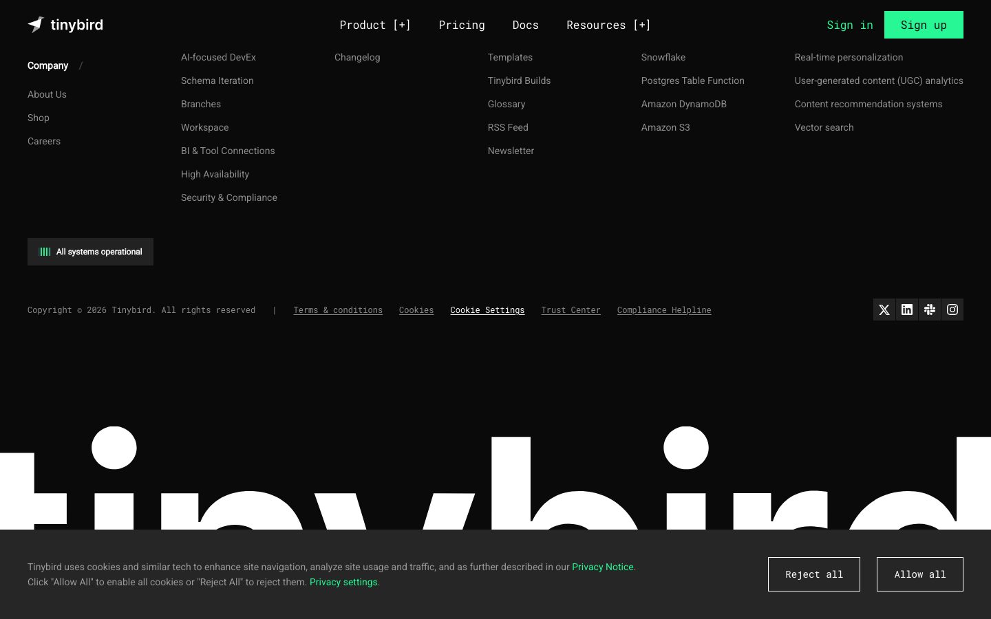
**`top-nav`** — A transparent-over-canvas bar carrying the "tinybird" wordmark + jet glyph at left, primary menu (Product [+], Pricing, Docs, Resources [+]) center, and a right cluster of "Sign in" `{component.nav-link}` + "Sign up" `{component.button-primary}`. Labels in `{typography.button}` (Roboto Mono 16px / 400). The `[+]` affordance on expandable items is itself rendered in monospace, reinforcing the developer-tool voice.
**`nav-link`** — Plain text nav item, transparent background, `{colors.ink}` text, `{typography.button}`.
### Buttons
**`button-primary`** — The neon-green CTA ("Sign up", "Try for free"). Background `{colors.primary}` (#27f795) with dark `{colors.canvas}` text (derived from screenshots — the green-on-dark CTA carries near-black label text; the analyzer measured the label color as #ffffff which conflicts with the rendered dark label — see Known Gaps). Label in `{typography.button}`. Measured radius is `{rounded.none}` (0px) and measured padding 0px — see Known Gaps regarding the button measurement.
**`button-secondary`** — Lower-emphasis action ("Contact sales", "Compare us", "Check out our GitHub"). Transparent background, `{colors.ink}` text, `{typography.button}`.
**`text-link-accent`** — Inline green link ("Privacy Notice", "Privacy settings", "Start with your AI coding agent"). Transparent background, `{colors.primary}` text, `{typography.body}`.
### Cards & Containers
**`card`** — The base measured card: `{colors.surface}` fill, `{rounded.sm}` (4px), shadow none. The structural primitive behind feature, testimonial, and product-fragment cards.
**`feature-card`** — Used in the "Enterprise-ready" 3-up grid (SOC 2 / SSO / Dedicated clusters / Compute-compute separation / Bottomless storage / Dedicated engineering support). Background `{colors.surface}`, `{rounded.sm}`, padding `{spacing.xl}` (24px). Carries a small monochrome icon, a `{typography.body}`-set title, and a muted description in `{colors.muted}`.
**`testimonial-card`** — Used in the "See who's shipping faster" 3-up testimonial columns. Background `{colors.surface}`, `{rounded.sm}`, padding `{spacing.lg}` (20px). Top row carries a circular avatar + name + role; quote body sits below in `{colors.muted}` `{typography.body}`.
**`code-block`** — Terminal and diff panels (the coding-agent `npx skills` terminal, the red-vs-green `clickhouse-setup-plan.md` comparison). Background `{colors.surface-deep}` (#000000), `{rounded.md}` (8px), padding `{spacing.xl}` (24px). Carries mac-style window dots, line numbers, and syntax-colored content (`{colors.syntax-red}` removed lines, `{colors.syntax-green}` added lines). The product chrome IS the content.
### Tags / Status
**`tag-pill`** — Bracketed category filter chips in the hero ("[SaaS / Dashboards]", "[Observability]", "[AI Analytics]", "[Crypto / Finance]", "[Real-Time Analytics]") and the workflow-step row ("[Get Started]", "[Develop]", "[Ingest]"). Transparent fill, `{colors.muted}` text, `{rounded.sm}`, padding 4px × 12px, `{typography.body}`.
**`status-pill`** — The footer "All systems operational" indicator. Background `{colors.surface-strong}`, `{colors.ink}` text, `{rounded.sm}`, padding `{spacing.xs}` × `{spacing.md}`, with a small animated `{colors.primary}` bar glyph at left.
**`stat-figure`** — Large neon-green metrics in the social-proof card (2.7B events/day, 24.2TB Kafka ingest/mo, 15M+ active users). Transparent, `{colors.primary}` text, `{typography.heading}`-scale numerals over small `{colors.muted}` labels.
### Footer
**`footer`** — Multi-column link list on `{colors.canvas}` (Company / Product / Resources / Integrations / Use-cases columns) with `{colors.muted}` link text in `{typography.body}`, a copyright + legal row, and social icons (X, LinkedIn, Slack, Instagram) at right. The oversized white "tinybird" wordmark watermark sits beneath, bleeding off both edges. Padding `{spacing.xxxl}` (40px).
## Do's and Don'ts
### Do
- Keep the page on `{colors.canvas}` (#0a0a0a). The dark canvas is the system — there is no light variant.
- Reserve `{colors.primary}` (#27f795) for primary CTAs, inline links, stat figures, and the status indicator. The green is scarce and high-voltage.
- Set all body, button, nav, and label text in Roboto Mono (`{typography.body}` / `{typography.button}`). The monospace running text is the brand voice.
- Keep display headlines at weight 400 with negative tracking. Light-weight Roboto is the intended restraint.
- Build depth from stacked dark surfaces (`{colors.canvas}` → `{colors.surface}` → `{colors.surface-elevated}`) and 1px `{colors.hairline}` borders — not shadows.
- Show real product chrome — terminals, diffs, architecture diagrams — inside `{component.code-block}` rather than illustrating around the product.
- Use bracketed `[label]` monospace tag pills for category and workflow-step chips. The bracket notation is signature.
- Keep radii at or below 8px. The tight corners reinforce the engineered tone.
### Don't
- Don't bold the display headlines. Roboto 400 is deliberate; 700 breaks the quiet-confidence voice.
- Don't set body copy in a proportional font. Roboto Mono everywhere-but-headlines is the identity.
- Don't add drop shadows or glows. The analysis captured zero shadows — the system is flat.
- Don't introduce additional accent colors at the UI layer. The syntax palette (`{colors.syntax-red}`, `{colors.syntax-yellow}`, etc.) belongs inside code/diagram chrome only, never on buttons or links.
- Don't round the primary button. It is measured square (`{rounded.none}`).
- Don't crowd the section rhythm — the 152px band gaps are part of the composure.
## Responsive Behavior
The analysis captured desktop renders only; the following is partially derived from common dark-SaaS patterns and the captured structure — treat exact breakpoints as unconfirmed (see Known Gaps).
### Breakpoints (derived)
| Name | Width | Key Changes |
|---|---|---|
| Mobile | < 768px | Hamburger nav; hero display scales down from 64px; feature/testimonial grids collapse to 1-up; footer columns stack |
| Tablet | 768–1024px | Tightened horizontal nav; feature grids 2-up; testimonial columns 2-up |
| Desktop | > 1024px | Full top-nav; 3-up feature + testimonial grids; full architecture diagram |
### Touch Targets
- `{component.button-primary}` and `{component.nav-link}` label sizing measured at `{typography.button}` (16px) — touch sizing was not captured, so minimum tap-area compliance is unverified.
### Collapsing Strategy (derived)
- The hero's stacked single-column layout already reads top-to-bottom and needs little reflow on mobile.
- The wide architecture diagram (ingest → build → query) likely becomes horizontally scrollable or stacks into vertical stages on narrow viewports.
- The red-vs-green `{component.code-block}` comparison likely stacks the two diff columns vertically on mobile.
## Iteration Guide
1. Focus on ONE component at a time. Reference its YAML key directly (`{component.feature-card}`, `{component.code-block}`).
2. Variants of an existing component live as separate entries in `components:`.
3. Use `{token.refs}` everywhere — never inline a hex in a component.
4. Never document hover. Default and Active/Pressed states only.
5. Keep the canvas dark and the green scarce — `{colors.primary}` earns its voltage by being rare.
6. Headlines stay Roboto 400; everything else stays Roboto Mono. The two-font split does not blur.
7. Stay flat — depth comes from surface layering and hairlines, not shadows.
8. When in doubt about emphasis: bigger Roboto display before any color or weight change.
## Known Gaps
- **Button measurement conflict:** the analyzer reported `button-primary` with `color: #ffffff`, `radius: 0px`, `padding: 0px`, but the screenshots clearly show a neon-green fill with dark label text and a subtle radius on the "Sign up" / "Try for free" CTAs. The `backgroundColor` (`{colors.primary}`) and dark `textColor` (`{colors.canvas}`) are derived from screenshot ground-truth; the measured 0px radius/padding likely reflect a wrapper element rather than the rendered button. Confirm against the live CSS.
- **On-primary text color** (label color on the green button) is derived, not cleanly measured — documented as `{colors.canvas}`.
- Only two components (`button-primary`, `card`) were measured directly; `top-nav`, `feature-card`, `testimonial-card`, `code-block`, `tag-pill`, `status-pill`, `stat-figure`, and `footer` are documented from screenshot ground-truth using only declared tokens.
- No shadow tokens were captured (`shadows: []`); the flat-depth model is asserted from this absence plus screenshot evidence.
- Responsive breakpoints and touch-target sizes were not measured — desktop renders only. The Responsive Behavior section is partially derived.
- The exact background color of `tag-pill` (bracketed chips) was not measured; documented as transparent based on screenshot appearance.
- Hover, focus, and form-validation states were not captured.
- Animation/transition timings (status-pill bar animation, video player, diagram reveals) are out of scope.
- The syntax-color palette (`{colors.syntax-*}`) is mapped from frequency data inside code/diagram chrome; exact role assignments (which red = removed line, which green = added line) are inferred from the comparison-block screenshot.
<!-- Documented by duply · real-world design systems as ready-to-use DESIGN.md for AI coding agents · https://duply.ai/tinybird/design-md -->
Color Palette
Accent
Neutrals
Typography
display64px · 400 · 1.125
The quick brown fox jumpsheading40px · 400 · 1.2
The quick brown fox jumpsbody14px · 400 · 1.571
The quick brown fox jumpsbutton16px · 400 · 1.5
The quick brown fox jumpsSpacing & Shape
Spacing
| Name | Value | Preview |
|---|---|---|
| xxs | 4px | |
| xs | 8px | |
| sm | 12px | |
| md | 16px | |
| lg | 20px | |
| xl | 24px | |
| xxl | 32px | |
| xxxl | 40px | |
| huge | 48px | |
| giant | 72px | |
| section | 152px |
Border Radius
| Name | Value | Preview |
|---|---|---|
| none | 0px | |
| sm | 4px | |
| md | 8px |
More like this


---
version: alpha
name: Tinybird-design-analysis
description: A dark, terminal-flavored developer-infrastructure interface built on a near-black canvas (#0a0a0a) with a single high-voltage neon-green accent (#27f795) and a deliberately monospace-led type voice. The system reads as engineered-for-engineers — Roboto for the large light-weight display headlines, Roboto Mono for all body, button, and label text, hard square corners on actions, 4px-radius panels, and no shadows anywhere. Brand voltage comes from the neon-green CTA and from real code/diagram chrome (terminals, syntax-colored diff blocks, architecture maps) shown directly in the marketing flow.

colors:
  primary: "#27f795"
  primary-deep: "#008060"
  ink: "#ffffff"
  muted: "#8d8d8d"
  muted-soft: "#999999"
  canvas: "#0a0a0a"
  surface-deep: "#000000"
  surface: "#151515"
  surface-strong: "#202020"
  surface-elevated: "#262626"
  hairline: "#3c3c3c"
  panel-blue: "#303347"
  syntax-green: "#61c454"
  syntax-green-bright: "#00ff00"
  syntax-red: "#ec6d62"
  syntax-red-soft: "#ff8389"
  syntax-red-deep: "#800000"
  syntax-yellow: "#f5c451"
  syntax-amber: "#f8ac49"
  syntax-blue: "#00c1ff"

typography:
  display:
    fontFamily: "Roboto, sans-serif"
    fontSize: 64px
    fontWeight: 400
    lineHeight: 1.125
    letterSpacing: -1.28px
  heading:
    fontFamily: "Roboto, sans-serif"
    fontSize: 40px
    fontWeight: 400
    lineHeight: 1.2
    letterSpacing: 0.4px
  body:
    fontFamily: "Roboto Mono, ui-monospace, monospace"
    fontSize: 14px
    fontWeight: 400
    lineHeight: 1.571
    letterSpacing: normal
  button:
    fontFamily: "Roboto Mono, ui-monospace, monospace"
    fontSize: 16px
    fontWeight: 400
    lineHeight: 1.5
    letterSpacing: normal

rounded:
  none: 0px
  sm: 4px
  md: 8px

spacing:
  xxs: 4px
  xs: 8px
  sm: 12px
  md: 16px
  lg: 20px
  xl: 24px
  xxl: 32px
  xxxl: 40px
  huge: 48px
  giant: 72px
  section: 152px

components:
  top-nav:
    backgroundColor: "{colors.canvas}"
    textColor: "{colors.ink}"
    typography: "{typography.button}"
  nav-link:
    backgroundColor: transparent
    textColor: "{colors.ink}"
    typography: "{typography.button}"
  button-primary:
    backgroundColor: "{colors.primary}"
    textColor: "{colors.canvas}"
    typography: "{typography.button}"
    rounded: "{rounded.none}"
    padding: 0px
  button-secondary:
    backgroundColor: transparent
    textColor: "{colors.ink}"
    typography: "{typography.button}"
    rounded: "{rounded.none}"
  text-link-accent:
    backgroundColor: transparent
    textColor: "{colors.primary}"
    typography: "{typography.body}"
  card:
    backgroundColor: "{colors.surface}"
    textColor: "{colors.ink}"
    typography: "{typography.body}"
    rounded: "{rounded.sm}"
  feature-card:
    backgroundColor: "{colors.surface}"
    textColor: "{colors.ink}"
    typography: "{typography.body}"
    rounded: "{rounded.sm}"
    padding: 24px
  testimonial-card:
    backgroundColor: "{colors.surface}"
    textColor: "{colors.muted}"
    typography: "{typography.body}"
    rounded: "{rounded.sm}"
    padding: 20px
  code-block:
    backgroundColor: "{colors.surface-deep}"
    textColor: "{colors.ink}"
    typography: "{typography.body}"
    rounded: "{rounded.md}"
    padding: 24px
  tag-pill:
    backgroundColor: transparent
    textColor: "{colors.muted}"
    typography: "{typography.body}"
    rounded: "{rounded.sm}"
    padding: 4px 12px
  status-pill:
    backgroundColor: "{colors.surface-strong}"
    textColor: "{colors.ink}"
    typography: "{typography.body}"
    rounded: "{rounded.sm}"
    padding: 8px 16px
  stat-figure:
    backgroundColor: transparent
    textColor: "{colors.primary}"
    typography: "{typography.heading}"
  footer:
    backgroundColor: "{colors.canvas}"
    textColor: "{colors.muted}"
    typography: "{typography.body}"
    padding: 40px
---

## Overview

Tinybird's marketing surface is a dark, terminal-flavored developer-infrastructure interface — a near-black canvas (`{colors.canvas}` — #0a0a0a) carrying light-weight Roboto display headlines, Roboto Mono everywhere else, and a single neon-green accent (`{colors.primary}` — #27f795) reserved for primary actions and inline emphasis. The system speaks directly to engineers: it doesn't decorate the product, it shows the product chrome — terminals, syntax-colored diff blocks, architecture diagrams — inline in the editorial flow.

The type voice is the system's most distinctive trait. Headlines run **Roboto at weight 400** (not bold) at 64px with negative tracking (-1.28px), giving a quiet, precise, almost-thin display feel. Everything else — body copy, button labels, nav links, captions, stats — runs **Roboto Mono**, which is what makes the whole site read as a developer tool rather than generic SaaS. The monospace body is intentional brand voltage.

Color is near-monochrome at the structural layer (black canvas, white text, gray muted text, dark-gray panels) with neon green doing all the work at the action layer. A secondary palette of syntax colors (`{colors.syntax-red}`, `{colors.syntax-green}`, `{colors.syntax-yellow}`, `{colors.syntax-blue}`) appears only inside code/diff blocks and the architecture diagram — they are content chrome, not UI accents.

The system is flat — the analysis captured **zero shadows**. Depth comes entirely from layered dark surfaces (canvas → surface → surface-elevated) and 1px hairline borders (`{colors.hairline}` — #3c3c3c). Corners are tight: 4px on panels and cards, square (0px) on primary buttons.

**Key Characteristics:**
- Dark near-black canvas (`{colors.canvas}` — #0a0a0a) across all pages — there is no light mode in scope.
- A single neon-green accent (`{colors.primary}` — #27f795) for primary CTAs, inline links, stat figures, and the "All systems operational" status indicator.
- Monospace-led type: Roboto Mono for body/button/label text, Roboto weight-400 for display headlines. The mono body is the signature voice.
- Light-weight display headlines — weight 400, not bold, with negative tracking. Quiet confidence over shout.
- Real code/terminal/diagram chrome shown inline: setup-plan diff blocks (red self-hosting column vs green Tinybird column), terminal command panels, and the ingest→build→query architecture map.
- Flat — no shadows. Depth is built from stacked dark surfaces and 1px `{colors.hairline}` borders.
- Tight radii: `{rounded.sm}` (4px) on cards/panels, `{rounded.md}` (8px) on code blocks, `{rounded.none}` (0px / square) on the primary button as measured.
- Generous vertical rhythm — section gaps reach `{spacing.section}` (152px) between major bands.

## Colors

### Brand & Accent
- **Primary** (`{colors.primary}` — #27f795): The neon-green brand accent and the system's only high-voltage color. Used on the "Sign up" / "Try for free" CTAs, inline `{component.text-link-accent}` links, large stat figures (2.7B, 24.2TB, 15M+), and the "All systems operational" status glyph. Frequency 57 — used sparingly but consistently.
- **Primary Deep** (`{colors.primary-deep}` — #008060): A darker green companion tone, used for secondary green accents and the positive ("Tinybird") column treatment in comparison blocks.

### Surface
- **Canvas** (`{colors.canvas}` — #0a0a0a): The default page floor for every captured page.
- **Surface Deep** (`{colors.surface-deep}` — #000000): True-black panels — used for code/terminal blocks where maximum contrast against syntax colors is wanted.
- **Surface** (`{colors.surface}` — #151515): Card and panel fill — feature cards, testimonial cards, the embedded product-fragment cards.
- **Surface Strong** (`{colors.surface-strong}` — #202020): Slightly lighter panel tone for nested/elevated chips like the status pill.
- **Surface Elevated** (`{colors.surface-elevated}` — #262626): The top layer in the dark-surface stack — buttons-in-panels, hovered chrome.
- **Hairline** (`{colors.hairline}` — #3c3c3c): The 1px border tone that separates dark surfaces — does the work shadows would in a light system.
- **Panel Blue** (`{colors.panel-blue}` — #303347): A muted blue-gray used inside the architecture diagram tiles.

### Text
- **Ink** (`{colors.ink}` — #ffffff): All headlines and primary text — the highest-frequency color (491) since most text sits on dark canvas.
- **Muted** (`{colors.muted}` — #8d8d8d): The default low-contrast body/secondary text tone.
- **Muted Soft** (`{colors.muted-soft}` — #999999): A slightly brighter tertiary text tone for captions and fine print.

### Syntax / Code Chrome
These appear only inside code blocks, diff panels, and the architecture diagram — they are content, never UI accents:
- **Syntax Green** (`{colors.syntax-green}` — #61c454) and **Syntax Green Bright** (`{colors.syntax-green-bright}` — #00ff00): added-line / success tones in diff blocks.
- **Syntax Red** (`{colors.syntax-red}` — #ec6d62), **Syntax Red Soft** (`{colors.syntax-red-soft}` — #ff8389), **Syntax Red Deep** (`{colors.syntax-red-deep}` — #800000): removed-line / "self-hosting" negative-column tones.
- **Syntax Yellow** (`{colors.syntax-yellow}` — #f5c451) and **Syntax Amber** (`{colors.syntax-amber}` — #f8ac49): warning / token highlights.
- **Syntax Blue** (`{colors.syntax-blue}` — #00c1ff): keyword / link highlights in code.

## Typography

### Font Family
The system runs two open-source Google fonts, both freely available — no licensed typefaces were flagged (`fonts_licensed` is empty):
- **Roboto** — display headlines (h1, h2, h3) at weight 400.
- **Roboto Mono** — all body text, button labels, nav links, captions, stats, and code.

The defining choice is that **everything that isn't a big headline is monospace**. This is the brand voice: Tinybird reads as a developer tool because its running text is set in Roboto Mono.

### Hierarchy

| Token | Family | Size | Weight | Line Height | Letter Spacing | Use |
|---|---|---|---|---|---|---|
| `{typography.display}` | Roboto | 64px | 400 | 1.125 | -1.28px | Hero h1 + section h2 ("Ship fast over a Managed ClickHouse", "Here's how you work with Tinybird") |
| `{typography.heading}` | Roboto | 40px | 400 | 1.2 | 0.4px | Sub-section h3 ("ClickHouse performance + Vercel-level developer experience") |
| `{typography.body}` | Roboto Mono | 14px | 400 | 1.571 | normal | All running text, captions, nav labels, testimonials, footer |
| `{typography.button}` | Roboto Mono | 16px | 400 | 1.5 | normal | Button labels, top-nav links |

### Principles
Display headlines stay at **weight 400** — never bold. The quiet, light-weight headline combined with negative tracking (-1.28px on display) is the brand's restraint; bolding the headline would break the voice. Note that h1 and h2 share identical specs (the analysis measured both at 64px / 400 / -1.28px) — they are one display role used in two structural positions.

Body and UI text are monospace by deliberate choice. Never substitute a proportional font for body copy — the monospace rhythm is core to the identity.

### Note on Font Substitutes
No licensed/custom typefaces are used. Both **Roboto** and **Roboto Mono** are open-source (Apache 2.0) and shippable directly via Google Fonts — no substitution needed. If a system font fallback is required, use `sans-serif` for Roboto and `ui-monospace, monospace` for Roboto Mono.

## Layout

### Spacing System
- **Base unit:** 4px.
- **Tokens:** `{spacing.xxs}` 4px · `{spacing.xs}` 8px · `{spacing.sm}` 12px · `{spacing.md}` 16px · `{spacing.lg}` 20px · `{spacing.xl}` 24px · `{spacing.xxl}` 32px · `{spacing.xxxl}` 40px · `{spacing.huge}` 48px · `{spacing.giant}` 72px · `{spacing.section}` 152px.
- **Most-used increments:** 8px (freq 46), 12px (44), 24px (41), 16px (40) — the dense mid-range drives in-card spacing.
- **Section padding:** `{spacing.section}` (152px) appears 6 times — the large gap between major editorial bands.
- **Card internal padding:** `{spacing.xl}` (24px) for feature cards and code blocks; `{spacing.lg}` (20px) for testimonial cards.

### Grid & Container
- **Editorial body:** centered single-column hero with content stacked vertically; supporting bands use multi-up card grids.
- **Feature/compliance grids:** 3-up at desktop (e.g., the "Enterprise-ready" SOC 2 / SSO / Dedicated-clusters grid).
- **Testimonial grids:** 3-up masonry-style columns at desktop.
- **Footer:** multi-column link list (Company / Product / Resources / Integrations / Use-cases) across the full width.

### Whitespace Philosophy
The layout is generous vertically — 152px section breaks let each band (hero, workflow video, coding-agent terminal, architecture diagram, comparison diff, enterprise grid, testimonials) stand alone. Inside cards the rhythm tightens to the 8–24px range. The combination reads as confident and uncluttered despite the dense technical content.

## Elevation & Depth

| Level | Treatment | Use |
|---|---|---|
| Base | `{colors.canvas}` (#0a0a0a), no border | Page floor, hero, body bands |
| Panel | `{colors.surface}` (#151515) fill, optional 1px `{colors.hairline}` border | Cards, feature tiles, testimonial cards |
| Elevated | `{colors.surface-strong}` / `{colors.surface-elevated}` fill | Status pills, nested chips, in-panel buttons |
| Code surface | `{colors.surface-deep}` (#000000) fill, `{rounded.md}` corners | Terminal / code / diff blocks |

The analysis captured **no shadows** — the system is entirely flat. Depth is communicated by stacking progressively lighter dark surfaces and by 1px `{colors.hairline}` borders. There is no drop-shadow, no glow, no glassmorphism. The only "glow"-like moment is the neon-green accent itself, which reads as emissive against the black canvas.

### Decorative Depth
- Code and diff blocks (the "clickhouse-setup-plan.md" red-vs-green comparison) carry their own internal syntax coloring as content chrome.
- The ingest→build→query architecture diagram uses small product-logo tiles on `{colors.panel-blue}` backgrounds connected by hairline routing lines.
- The oversized "tinybird" wordmark watermark behind the footer is a flat white silhouette bleeding off the canvas — a graphic device, not an elevation effect.

## Shapes

### Border Radius Scale

| Token | Value | Use |
|---|---|---|
| `{rounded.none}` | 0px | Primary button (square corners, as measured) |
| `{rounded.sm}` | 4px | Cards, feature tiles, tag pills, status pills — the dominant radius (freq 29) |
| `{rounded.md}` | 8px | Code/terminal blocks and larger panels (freq 10) |

Radius is intentionally tight — Tinybird never exceeds 8px. The square-cornered primary button and 4px panels reinforce the precise, engineered tone.

### Photography Geometry
The site uses essentially no photography — avatars in testimonial rows are small circular profile images, and the rest of the visual field is code chrome, product diagrams, and the large wordmark watermark. Product fragments (terminals, diffs, diagrams) retain their native rectangular geometry inside 4–8px-radius containers.

## Components

### Top Navigation

**`top-nav`** — A transparent-over-canvas bar carrying the "tinybird" wordmark + jet glyph at left, primary menu (Product [+], Pricing, Docs, Resources [+]) center, and a right cluster of "Sign in" `{component.nav-link}` + "Sign up" `{component.button-primary}`. Labels in `{typography.button}` (Roboto Mono 16px / 400). The `[+]` affordance on expandable items is itself rendered in monospace, reinforcing the developer-tool voice.

**`nav-link`** — Plain text nav item, transparent background, `{colors.ink}` text, `{typography.button}`.

### Buttons

**`button-primary`** — The neon-green CTA ("Sign up", "Try for free"). Background `{colors.primary}` (#27f795) with dark `{colors.canvas}` text (derived from screenshots — the green-on-dark CTA carries near-black label text; the analyzer measured the label color as #ffffff which conflicts with the rendered dark label — see Known Gaps). Label in `{typography.button}`. Measured radius is `{rounded.none}` (0px) and measured padding 0px — see Known Gaps regarding the button measurement.

**`button-secondary`** — Lower-emphasis action ("Contact sales", "Compare us", "Check out our GitHub"). Transparent background, `{colors.ink}` text, `{typography.button}`.

**`text-link-accent`** — Inline green link ("Privacy Notice", "Privacy settings", "Start with your AI coding agent"). Transparent background, `{colors.primary}` text, `{typography.body}`.

### Cards & Containers

**`card`** — The base measured card: `{colors.surface}` fill, `{rounded.sm}` (4px), shadow none. The structural primitive behind feature, testimonial, and product-fragment cards.

**`feature-card`** — Used in the "Enterprise-ready" 3-up grid (SOC 2 / SSO / Dedicated clusters / Compute-compute separation / Bottomless storage / Dedicated engineering support). Background `{colors.surface}`, `{rounded.sm}`, padding `{spacing.xl}` (24px). Carries a small monochrome icon, a `{typography.body}`-set title, and a muted description in `{colors.muted}`.

**`testimonial-card`** — Used in the "See who's shipping faster" 3-up testimonial columns. Background `{colors.surface}`, `{rounded.sm}`, padding `{spacing.lg}` (20px). Top row carries a circular avatar + name + role; quote body sits below in `{colors.muted}` `{typography.body}`.

**`code-block`** — Terminal and diff panels (the coding-agent `npx skills` terminal, the red-vs-green `clickhouse-setup-plan.md` comparison). Background `{colors.surface-deep}` (#000000), `{rounded.md}` (8px), padding `{spacing.xl}` (24px). Carries mac-style window dots, line numbers, and syntax-colored content (`{colors.syntax-red}` removed lines, `{colors.syntax-green}` added lines). The product chrome IS the content.

### Tags / Status

**`tag-pill`** — Bracketed category filter chips in the hero ("[SaaS / Dashboards]", "[Observability]", "[AI Analytics]", "[Crypto / Finance]", "[Real-Time Analytics]") and the workflow-step row ("[Get Started]", "[Develop]", "[Ingest]"). Transparent fill, `{colors.muted}` text, `{rounded.sm}`, padding 4px × 12px, `{typography.body}`.

**`status-pill`** — The footer "All systems operational" indicator. Background `{colors.surface-strong}`, `{colors.ink}` text, `{rounded.sm}`, padding `{spacing.xs}` × `{spacing.md}`, with a small animated `{colors.primary}` bar glyph at left.

**`stat-figure`** — Large neon-green metrics in the social-proof card (2.7B events/day, 24.2TB Kafka ingest/mo, 15M+ active users). Transparent, `{colors.primary}` text, `{typography.heading}`-scale numerals over small `{colors.muted}` labels.

### Footer

**`footer`** — Multi-column link list on `{colors.canvas}` (Company / Product / Resources / Integrations / Use-cases columns) with `{colors.muted}` link text in `{typography.body}`, a copyright + legal row, and social icons (X, LinkedIn, Slack, Instagram) at right. The oversized white "tinybird" wordmark watermark sits beneath, bleeding off both edges. Padding `{spacing.xxxl}` (40px).

## Do's and Don'ts

### Do
- Keep the page on `{colors.canvas}` (#0a0a0a). The dark canvas is the system — there is no light variant.
- Reserve `{colors.primary}` (#27f795) for primary CTAs, inline links, stat figures, and the status indicator. The green is scarce and high-voltage.
- Set all body, button, nav, and label text in Roboto Mono (`{typography.body}` / `{typography.button}`). The monospace running text is the brand voice.
- Keep display headlines at weight 400 with negative tracking. Light-weight Roboto is the intended restraint.
- Build depth from stacked dark surfaces (`{colors.canvas}` → `{colors.surface}` → `{colors.surface-elevated}`) and 1px `{colors.hairline}` borders — not shadows.
- Show real product chrome — terminals, diffs, architecture diagrams — inside `{component.code-block}` rather than illustrating around the product.
- Use bracketed `[label]` monospace tag pills for category and workflow-step chips. The bracket notation is signature.
- Keep radii at or below 8px. The tight corners reinforce the engineered tone.

### Don't
- Don't bold the display headlines. Roboto 400 is deliberate; 700 breaks the quiet-confidence voice.
- Don't set body copy in a proportional font. Roboto Mono everywhere-but-headlines is the identity.
- Don't add drop shadows or glows. The analysis captured zero shadows — the system is flat.
- Don't introduce additional accent colors at the UI layer. The syntax palette (`{colors.syntax-red}`, `{colors.syntax-yellow}`, etc.) belongs inside code/diagram chrome only, never on buttons or links.
- Don't round the primary button. It is measured square (`{rounded.none}`).
- Don't crowd the section rhythm — the 152px band gaps are part of the composure.

## Responsive Behavior

The analysis captured desktop renders only; the following is partially derived from common dark-SaaS patterns and the captured structure — treat exact breakpoints as unconfirmed (see Known Gaps).

### Breakpoints (derived)

| Name | Width | Key Changes |
|---|---|---|
| Mobile | < 768px | Hamburger nav; hero display scales down from 64px; feature/testimonial grids collapse to 1-up; footer columns stack |
| Tablet | 768–1024px | Tightened horizontal nav; feature grids 2-up; testimonial columns 2-up |
| Desktop | > 1024px | Full top-nav; 3-up feature + testimonial grids; full architecture diagram |

### Touch Targets
- `{component.button-primary}` and `{component.nav-link}` label sizing measured at `{typography.button}` (16px) — touch sizing was not captured, so minimum tap-area compliance is unverified.

### Collapsing Strategy (derived)
- The hero's stacked single-column layout already reads top-to-bottom and needs little reflow on mobile.
- The wide architecture diagram (ingest → build → query) likely becomes horizontally scrollable or stacks into vertical stages on narrow viewports.
- The red-vs-green `{component.code-block}` comparison likely stacks the two diff columns vertically on mobile.

## Iteration Guide

1. Focus on ONE component at a time. Reference its YAML key directly (`{component.feature-card}`, `{component.code-block}`).
2. Variants of an existing component live as separate entries in `components:`.
3. Use `{token.refs}` everywhere — never inline a hex in a component.
4. Never document hover. Default and Active/Pressed states only.
5. Keep the canvas dark and the green scarce — `{colors.primary}` earns its voltage by being rare.
6. Headlines stay Roboto 400; everything else stays Roboto Mono. The two-font split does not blur.
7. Stay flat — depth comes from surface layering and hairlines, not shadows.
8. When in doubt about emphasis: bigger Roboto display before any color or weight change.

## Known Gaps

- **Button measurement conflict:** the analyzer reported `button-primary` with `color: #ffffff`, `radius: 0px`, `padding: 0px`, but the screenshots clearly show a neon-green fill with dark label text and a subtle radius on the "Sign up" / "Try for free" CTAs. The `backgroundColor` (`{colors.primary}`) and dark `textColor` (`{colors.canvas}`) are derived from screenshot ground-truth; the measured 0px radius/padding likely reflect a wrapper element rather than the rendered button. Confirm against the live CSS.
- **On-primary text color** (label color on the green button) is derived, not cleanly measured — documented as `{colors.canvas}`.
- Only two components (`button-primary`, `card`) were measured directly; `top-nav`, `feature-card`, `testimonial-card`, `code-block`, `tag-pill`, `status-pill`, `stat-figure`, and `footer` are documented from screenshot ground-truth using only declared tokens.
- No shadow tokens were captured (`shadows: []`); the flat-depth model is asserted from this absence plus screenshot evidence.
- Responsive breakpoints and touch-target sizes were not measured — desktop renders only. The Responsive Behavior section is partially derived.
- The exact background color of `tag-pill` (bracketed chips) was not measured; documented as transparent based on screenshot appearance.
- Hover, focus, and form-validation states were not captured.
- Animation/transition timings (status-pill bar animation, video player, diagram reveals) are out of scope.
- The syntax-color palette (`{colors.syntax-*}`) is mapped from frequency data inside code/diagram chrome; exact role assignments (which red = removed line, which green = added line) are inferred from the comparison-block screenshot.

<!-- Documented by duply · real-world design systems as ready-to-use DESIGN.md for AI coding agents · https://duply.ai/tinybird/design-md -->