
Sequel
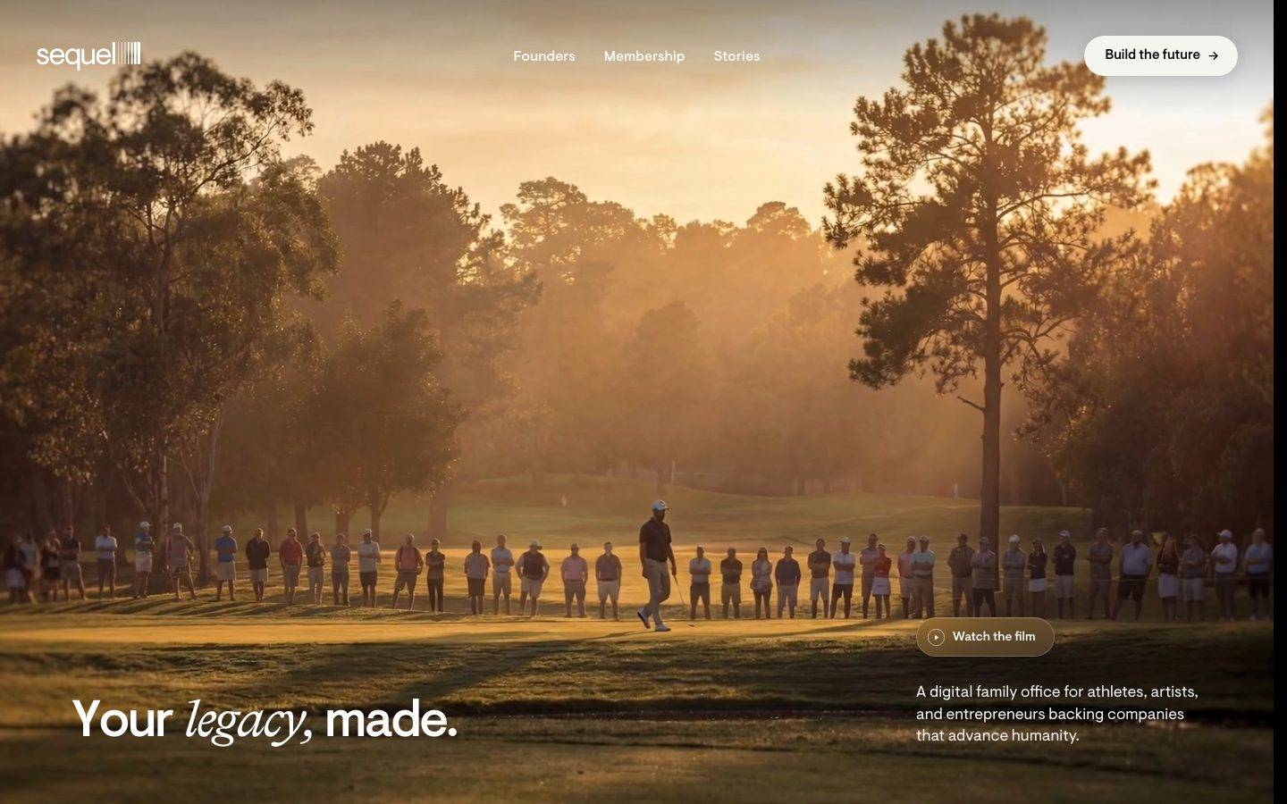
A cinematic, near-monochrome dark interface for a members-only investment brand — pure black canvas, white VisueltPro type, and a single cream pill CTA. The system reads as premium and editorial: full-bleed golden-hour photography, softly-rounded content cards over a black floor, pill-shaped buttons throughout, and generous negative space that lets large photographic hero imagery carry the emotional weight. Brand voltage comes from the black-and-cream contrast, italic serif accent words inside otherwise sans display headlines, and photography rather than from accent color.
Works withClaude CodeCursorCodexGemini CLICopilotv0LovableBoltWindsurfReplit
---
version: alpha
name: Sequel-design-analysis
description: "A cinematic, near-monochrome dark interface for a members-only investment brand — pure black canvas, white VisueltPro type, and a single cream pill CTA. The system reads as premium and editorial: full-bleed golden-hour photography, softly-rounded content cards over a black floor, pill-shaped buttons throughout, and generous negative space that lets large photographic hero imagery carry the emotional weight. Brand voltage comes from the black-and-cream contrast, italic serif accent words inside otherwise sans display headlines, and photography rather than from accent color."
colors:
  ink: "#ffffff"
  canvas: "#000000"
  surface-dark: "#0d0d0d"
  surface-elevated: "#202020"
  hairline: "#2c2c2c"
  primary: "#f5f5f0"
  on-primary: "#000000"
  muted: "#c8c8c8"
  muted-soft: "#9ca3af"
  muted-strong: "#6b7280"
  accent-blue: "#2563eb"
  accent-coral: "#ff747c"
typography:
  display:
    fontFamily: "VisueltPro, Inter, sans-serif"
    fontSize: 57.6px
    fontWeight: 500
    lineHeight: 1.0
    letterSpacing: -0.05em
  subtitle:
    fontFamily: "VisueltPro, Inter, sans-serif"
    fontSize: 30px
    fontWeight: 300
    lineHeight: 1.2
    letterSpacing: -0.025em
  title:
    fontFamily: "VisueltPro, Inter, sans-serif"
    fontSize: 21.6px
    fontWeight: 500
    lineHeight: 1.2
    letterSpacing: -0.02em
  button:
    fontFamily: "VisueltPro, Inter, sans-serif"
    fontSize: 16px
    fontWeight: 500
    lineHeight: 1.5
    letterSpacing: normal
  body:
    fontFamily: "VisueltPro, Inter, sans-serif"
    fontSize: 12.96px
    fontWeight: 400
    lineHeight: 1.4
    letterSpacing: normal
rounded:
  md: 10px
  pill: 9999px
  full: 9999px
spacing:
  xxs: 4px
  xs: 8px
  sm: 12px
  md: 16px
  lg: 20px
  xl: 24px
  xxl: 32px
  section: 64px
components:
  top-nav:
    backgroundColor: transparent
    textColor: "{colors.ink}"
    typography: "{typography.button}"
  nav-link:
    backgroundColor: transparent
    textColor: "{colors.ink}"
    typography: "{typography.button}"
  button-primary:
    backgroundColor: "{colors.primary}"
    textColor: "{colors.on-primary}"
    typography: "{typography.button}"
    rounded: "{rounded.full}"
    padding: 0px 24px
  button-secondary-dark:
    backgroundColor: "{colors.surface-elevated}"
    textColor: "{colors.ink}"
    typography: "{typography.button}"
    rounded: "{rounded.full}"
    padding: 0px 24px
  hero-band:
    backgroundColor: "{colors.canvas}"
    textColor: "{colors.ink}"
    typography: "{typography.display}"
    padding: 64px
  content-card:
    backgroundColor: "{colors.surface-dark}"
    textColor: "{colors.ink}"
    typography: "{typography.title}"
    rounded: "{rounded.md}"
    padding: 24px
  label-badge:
    backgroundColor: "{colors.surface-elevated}"
    textColor: "{colors.ink}"
    typography: "{typography.body}"
    rounded: "{rounded.full}"
    padding: 4px 12px
  belief-band:
    backgroundColor: "{colors.canvas}"
    textColor: "{colors.ink}"
    typography: "{typography.subtitle}"
    rounded: "{rounded.md}"
    padding: 64px
---

## Overview

Sequel's landing surface is a cinematic, near-monochrome dark interface for a members-only "digital family office" brand. The floor is pure black (`{colors.canvas}` — #000000), all text is white (`{colors.ink}` — #ffffff), and the only chromatic warmth comes from full-bleed photography (a golden-hour golf scene in the hero) rather than from paint. The system reads as premium, editorial, and confident — the kind of restraint that signals exclusivity.

The single loud element is the CTA: a **cream pill button** (`{colors.primary}` — #f5f5f0) with black text (`{colors.on-primary}`), used for the marquee actions ("Build the future →"). Every button in the system is fully pill-shaped (`{rounded.full}` — 9999px); content cards use a soft 10px radius (`{rounded.md}`). The black-vs-cream contrast is the brand's entire action language.

Type runs entirely on **VisueltPro** — a commercial geometric grotesque (substituted with Inter here). The display headline is large (57.6px), weight 500, with aggressive negative tracking (-0.05em). A recurring editorial flourish appears inside headlines: a single word set in italic serif ("Your *legacy*, made.", "Backing founders who *bend reality*.") — a display accent that the measured token set does not capture (see Known Gaps).

Content sits in dark cards (`{colors.surface-dark}` — #0d0d0d) layered over the black canvas, each carrying a photographic top, a small uppercase label badge, a title, body copy, and a pill CTA. Elevation is expressed through soft drop shadows with a faint inset white top-highlight — a subtle "lit from above" treatment against the dark ground.

**Key Characteristics:**
- Pure black canvas (`{colors.canvas}` — #000000) with white text — a dark-first, cinematic system.
- Single cream pill CTA (`{component.button-primary}` — #f5f5f0 on black text), fully pill-radius (`{rounded.full}`).
- VisueltPro throughout; large negative-tracked display headlines (57.6px, weight 500, -0.05em).
- Italic serif accent words embedded inside sans display headlines (unmeasured — documented as a gap).
- Full-bleed photography carries all warmth; the palette itself is monochrome.
- Dark content cards (`{colors.surface-dark}`) with 10px radius, soft shadow, and a faint inset white top-highlight.
- Small uppercase label badges (`{component.label-badge}`) sit at the top of cards and belief bands.
- Section rhythm anchored on `{spacing.section}` (64px); base unit is 4/8px.

## Colors

### Brand & Action
- **Primary** (`{colors.primary}` — #f5f5f0): The cream/off-white pill CTA background — the system's single loud action color. Text on it is `{colors.on-primary}` (#000000).
- **On Primary** (`{colors.on-primary}` — #000000): Black label text inside cream buttons.

### Surface
- **Canvas** (`{colors.canvas}` — #000000): The universal page floor. Every band sits on pure black.
- **Surface Dark** (`{colors.surface-dark}` — #0d0d0d): Content-card backgrounds, layered barely-above black.
- **Surface Elevated** (`{colors.surface-elevated}` — #202020): Dark translucent pill buttons ("Watch the film", "Read our manifesto") and label badges over photography.
- **Hairline** (`{colors.hairline}` — #2c2c2c): 1px dividers and the measured inset bottom-border tone (`rgb(44,44,44)`).

### Text
- **Ink** (`{colors.ink}` — #ffffff): All headlines and primary text.
- **Muted** (`{colors.muted}` — #c8c8c8): Secondary body copy on dark surfaces.
- **Muted Soft** (`{colors.muted-soft}` — #9ca3af): Tertiary text, fine print.
- **Muted Strong** (`{colors.muted-strong}` — #6b7280): Lowest-emphasis text and disabled labels.

### Accent
- **Accent Blue** (`{colors.accent-blue}` — #2563eb): A low-frequency accent (measured 4×) — appears on incidental link/interactive states, not on hero CTAs.
- **Accent Coral** (`{colors.accent-coral}` — #ff747c): A rare warm accent (measured 2×) — small chromatic flourish only.

Both accents are scarce; Sequel is functionally a black-white-cream brand. A cluster of additional neutral grays (#374151, #4b5563, #d1d5db, #e5e7eb, #e9e9e9, #111827, #1f2937) was measured at very low frequency and appears to be framework-default tone; those are noted in Known Gaps rather than promoted to roles.

## Typography

### Font Family
The entire system runs on **VisueltPro** — a commercial geometric grotesque by Colophon Foundry. It is not a free web font; the fallback stack here substitutes **Inter** (a close humanist-geometric match at the same weights and negative tracking). The measured `fonts_licensed` array was empty, but VisueltPro is a licensed typeface — treat it as ship-restricted and use the substitute for any non-licensed deployment.

The type voice is a single family across display, titles, body, and buttons, differentiated by size, weight (300 / 400 / 500), and negative letter-spacing on the larger sizes.

### Hierarchy

| Token | Size | Weight | Line Height | Letter Spacing | Use |
|---|---|---|---|---|---|
| `{typography.display}` | 57.6px | 500 | 1.0 | -0.05em | Hero h1 ("Your legacy, made.") |
| `{typography.subtitle}` | 30px | 300 | 1.2 | -0.025em | Belief-band headline ("Backing founders who bend reality.") — light weight |
| `{typography.title}` | 21.6px | 500 | 1.2 | -0.02em | Card titles ("Not just another VC", "Invest with the best") |
| `{typography.button}` | 16px | 500 | 1.5 | normal | Button labels, nav links |
| `{typography.body}` | 12.96px | 400 | 1.4 | normal | Card body copy, hero sub-copy, label badges |

### Principles
Display type is large and tightly tracked (-0.05em) — the negative spacing is part of the voice; VisueltPro at default tracking reads as generic. Note the deliberate weight inversion: the h1 display uses weight 500 while the larger-feeling belief-band headline (`{typography.subtitle}`, 30px) drops to weight **300** — a lighter, more elegant editorial voice for the manifesto moment. Body copy is unusually small (12.96px), keeping supporting text quiet so photography and headlines dominate.

### Note on Font Substitutes
If VisueltPro is unavailable, **Inter** at the matching weights with the measured negative tracking (-0.02 to -0.05em) is a usable approximation. **Neue Haas Grotesk** or **Söhne** are closer commercial matches; **Manrope** is another free alternative that preserves the geometric-grotesque character.

## Layout

### Spacing System
- **Base unit:** 4px (with frequent 8px and 16px steps).
- **Tokens:** `{spacing.xxs}` 4px · `{spacing.xs}` 8px · `{spacing.sm}` 12px · `{spacing.md}` 16px · `{spacing.lg}` 20px · `{spacing.xl}` 24px · `{spacing.xxl}` 32px · `{spacing.section}` 64px.
- **Most frequent measured steps:** 16px (39×) and 8px (19×) dominate — the workhorse gaps. 32px (16×) and 24px (11×) handle card and section internal padding.
- **Section padding:** `{spacing.section}` (64px) — the top-level band rhythm.
- **Card internal padding:** `{spacing.xl}` (24px) around card content.

### Grid & Container
- **Hero:** full-bleed photographic band; headline anchored bottom-left, sub-copy bottom-right.
- **Card row:** 2-up content cards side by side beneath the hero.
- **Belief band:** full-width photographic panel with centered headline + CTA.

### Whitespace Philosophy
Sequel uses very generous negative space — long stretches of pure black separate bands, letting each photographic moment breathe. The layout is calm and unhurried; density is deliberately low so the premium tone reads as confidence rather than information overload.

## Elevation & Depth

| Level | Treatment | Use |
|---|---|---|
| Flat | Pure black, no shadow | Body sections, transparent nav |
| Card | `rgba(0,0,0,0.35) 0px 10px 30px` + `rgba(255,255,255,0.08) 0px 1px 0px inset` | Content cards over black — the signature "lit from above" dark elevation (measured 15×) |
| Soft | `rgba(0,0,0,0.15) 0px 4px 20px` | Lighter drop for secondary elements (measured 5×) |
| Inset border | `rgb(44,44,44) 0px 2px 0px inset` | A 2px inset bottom edge on a pressed/active control (measured 1×) |

The signature depth treatment is the card shadow paired with a **1px inset white top-highlight at 8% alpha** — against a black floor this reads as a soft edge of light catching the top of each card, giving the dark surfaces dimension without any visible border.

### Decorative Depth
- Full-bleed photography carries its own atmospheric depth (haze, backlight) — this is content, not a system shadow token.
- The cream pill CTAs pop off the black ground purely through value contrast; no shadow required.

## Shapes

### Border Radius Scale

| Token | Value | Use |
|---|---|---|
| `{rounded.md}` | 10px | Content cards, belief-band panels (measured 11×) |
| `{rounded.pill}` / `{rounded.full}` | 9999px | All buttons, label badges, "Watch the film" pill (measured 22×) |

The system is binary: a soft 10px on rectangular content surfaces, and full pill radius on every interactive control and label. There is no small/large radius ladder — the pill is the dominant shape signal.

### Photography Geometry
Full-bleed hero and belief-band imagery run edge-to-edge with no radius. Card-top imagery inherits the card's 10px corner. Photography is warm, cinematic, and shot in natural light — it is the single source of color in an otherwise monochrome system.

## Components

### Navigation

**`top-nav`** — Transparent bar over the hero photograph. Carries the "sequel" wordmark at left, center menu ("Founders", "Membership", "Stories") in `{typography.button}` (16px / 500) white, and a cream `{component.button-primary}` ("Build the future →") at the right. No background fill — it floats over the imagery.

**`nav-link`** — Transparent inline menu items in `{colors.ink}`, `{typography.button}`.

### Buttons

**`button-primary`** — The signature cream pill CTA. Background `{colors.primary}` (#f5f5f0), text `{colors.on-primary}` (#000000), type `{typography.button}` (16px / 500), fully pill-shaped (`{rounded.full}`), horizontal padding 24px. Used for "Build the future", "For founders", "For members".

**`button-secondary-dark`** — Dark translucent pill used over photography ("Watch the film" with a play glyph, "Read our manifesto"). Background `{colors.surface-elevated}` (#202020 — approximates the semi-opaque dark fill), text `{colors.ink}`, `{typography.button}`, `{rounded.full}`, padding 24px.

### Cards & Bands

**`hero-band`** — Full-bleed photographic hero on `{colors.canvas}`. Display headline (`{typography.display}`) anchored bottom-left, short sub-copy in `{typography.body}` bottom-right, a `{component.button-secondary-dark}` ("Watch the film") mid-right. Vertical rhythm `{spacing.section}` (64px).

**`content-card`** — The 2-up feature cards ("Not just another VC" / "Invest with the best"). Background `{colors.surface-dark}` (#0d0d0d), rounded `{rounded.md}` (10px), padding `{spacing.xl}` (24px), signature dark card shadow + inset top-highlight. Composition: photographic top zone, a `{component.label-badge}` (e.g. "FOUNDERS"), a `{typography.title}` heading, `{typography.body}` description, and a `{component.button-primary}` at the bottom.

**`belief-band`** — Full-width photographic manifesto panel (the robotic-hand image). Background `{colors.canvas}`, rounded `{rounded.md}`. Carries a small uppercase label ("WE BELIEVE IN"), a centered `{typography.subtitle}` headline (30px / weight 300, with an italic serif accent word), and a `{component.button-secondary-dark}` ("Read our manifesto"). Padding `{spacing.section}`.

### Labels

**`label-badge`** — Small pill label sitting at the top of cards and bands ("FOUNDERS", "ATHLETES, ARTISTS & ENTREPRENEURS", "WE BELIEVE IN"). Background `{colors.surface-elevated}`, text `{colors.ink}`, `{typography.body}`, `{rounded.full}`, padding 4px 12px. Rendered in uppercase (letter-spacing not captured — see Known Gaps).

## Do's and Don'ts

### Do
- Keep the floor pure black (`{colors.canvas}`) and let photography supply all warmth and color.
- Reserve the cream pill (`{colors.primary}`) for primary actions only — it is the single loud element.
- Use full pill radius (`{rounded.full}`) on every button and badge; 10px (`{rounded.md}`) on content surfaces.
- Apply negative tracking on display headlines (-0.05em) — VisueltPro at default spacing reads as off-brand.
- Use weight 300 for the elegant belief-band headline and weight 500 for the punchier hero display — the weight contrast is intentional.
- Layer content cards with the shadow + inset white top-highlight to build dark-on-dark depth without borders.
- Let bands breathe — generous black negative space between sections is the premium tone.

### Don't
- Don't introduce additional bright fills; the accents (`{colors.accent-blue}`, `{colors.accent-coral}`) are scarce and never appear on CTAs.
- Don't put the cream fill anywhere except pill buttons — it is the action signal.
- Don't add radius ladders; the system is binary (10px cards / pill controls).
- Don't enlarge body copy — the small 12.96px body keeps headlines and photography dominant.
- Don't place content cards on anything other than the black canvas — the dark-on-dark layering is the intended depth.
- Don't document hover states — default and active/pressed only.

## Responsive Behavior

### Breakpoints
Only a desktop landing capture was measured, so breakpoints below are inferred structural guidance, not measured values.

| Name | Width | Key Changes (inferred) |
|---|---|---|
| Mobile | < 768px | Nav collapses to a menu control; hero headline scales down from 57.6px; 2-up content cards stack 1-up; belief band headline recenters |
| Tablet | 768–1024px | Nav stays horizontal; content cards may hold 2-up or stack; padding tightens |
| Desktop | > 1024px | Full transparent nav; 2-up content cards; full-bleed hero and belief bands |

### Touch Targets
- `{component.button-primary}` and `{component.button-secondary-dark}` use 24px horizontal padding — measured height was not captured; verify the ≥44px tap target on implementation.
- Nav links in `{typography.button}` (16px) should carry sufficient surrounding padding to meet touch minimums.

### Collapsing Strategy
- Hero headline (bottom-left) and sub-copy (bottom-right) likely stack vertically on mobile.
- The 2-up `{component.content-card}` row collapses to a single column.
- Full-bleed photography reflows edge-to-edge at every width.

## Iteration Guide

1. Focus on ONE component at a time. Reference its YAML key directly (`{component.content-card}`, `{component.button-primary}`).
2. Variants (`-active`, `-disabled`) live as separate entries in `components:`.
3. Use `{token.refs}` everywhere — never inline a hex.
4. Never document hover. Default and active/pressed states only.
5. Keep the palette monochrome: black canvas, white ink, cream CTA. Photography supplies warmth.
6. Preserve the display weight/tracking signature (500 + -0.05em for hero, 300 for belief-band).
7. When in doubt about emphasis: bigger photography or bigger VisueltPro before adding color.

## Known Gaps

- **Italic serif accent words** ("*legacy*", "*bend reality*") appear inside sans display headlines on the reference screenshots but were not captured as a distinct typography role — the analysis measured only VisueltPro. This accent face (a serif italic) needs a dedicated capture before it can be tokenized.
- **VisueltPro is a licensed commercial typeface** (the `fonts_licensed` array was empty, but the family is not free). A substitute (Inter) is documented; do not ship VisueltPro without a license.
- **caption-uppercase not measured** — label badges ("FOUNDERS", "WE BELIEVE IN") render in uppercase, but no positive letter-spacing was measured on a small caption, so no `caption-uppercase` role was added. Their tracking should be captured before formalizing.
- **Button height** was not measured (only padding 0px 24px); tap-target compliance needs verification.
- **Accent usage** — `{colors.accent-blue}` (#2563eb) and `{colors.accent-coral}` (#ff747c) were measured at low frequency; their exact application context is unconfirmed.
- **Low-frequency neutral grays** (#374151, #4b5563, #d1d5db, #e5e7eb, #e9e9e9, #a9a9a9, #111827, #1f2937) were measured 1–4× and appear to be framework-default tone; they were not promoted to named roles.
- **Only the landing page (desktop) was captured** — responsive breakpoints, footer, interior pages, and form/input states are out of scope and inferred where noted.
- **Animation and transition timings** (hero film reveal, card hover-reveal) are not in scope.

<!-- Documented by Duply · real-world design systems as ready-to-use DESIGN.md for AI coding agents · https://duply.ai/sequel/design-md -->
Color Palette
Accent
Neutrals
Typography
display57.6px · 500 · 1
The quick brown fox jumpssubtitle30px · 300 · 1.2
The quick brown fox jumpstitle21.6px · 500 · 1.2
The quick brown fox jumpsbutton16px · 500 · 1.5
The quick brown fox jumpsbody12.96px · 400 · 1.4
The quick brown fox jumpsSpacing & Shape
Spacing
| Name | Value | Preview |
|---|---|---|
| xxs | 4px | |
| xs | 8px | |
| sm | 12px | |
| md | 16px | |
| lg | 20px | |
| xl | 24px | |
| xxl | 32px | |
| section | 64px |
Border Radius
| Name | Value | Preview |
|---|---|---|
| md | 10px | |
| pill | 9999px | |
| full | 9999px |
FAQ
- What colors does Sequel use?
- Sequel's core palette includes #ffffff, #000000, #0d0d0d, #202020, #2c2c2c. The full color set with usage roles (canvas, ink, surfaces, accent, semantic) is documented in the Sequel DESIGN.md.
- What font does Sequel use?
- Sequel's primary typeface is VisueltPro. The complete type scale (sizes, weights, line-height and letter-spacing per role), with an open substitute where the original is licensed, is documented in the DESIGN.md.
- What is the Sequel design system?
- A cinematic, near-monochrome dark interface for a members-only investment brand — pure black canvas, white VisueltPro type, and a single cream pill CTA. The system reads as premium and editorial: full-bleed golden-hour photography, softly-rounded content cards over a black floor, pill-shaped
Get this as a working kit
Sequel Launch Kit + DESIGN.md
$299$225
One-time payment
- A complete production-stack template, styled like Sequel, fully built and wired.
- One-time payment and the codebase is yours. No platform fees, no subscription.
Open it with Claude Code, Cursor, or any coding agent and build in plain language, then ship a complete web app.
- Your private DESIGN.md
- Marketing pages, blog, SEO & legal
- Email capture, newsletter & contact
- Accept payments (Stripe)
- Analytics (GA4 + PostHog)
- One-click deploy
- Auth, login & roles
- A full app dashboard, when you grow
More like this
---
version: alpha
name: Sequel-design-analysis
description: "A cinematic, near-monochrome dark interface for a members-only investment brand — pure black canvas, white VisueltPro type, and a single cream pill CTA. The system reads as premium and editorial: full-bleed golden-hour photography, softly-rounded content cards over a black floor, pill-shaped buttons throughout, and generous negative space that lets large photographic hero imagery carry the emotional weight. Brand voltage comes from the black-and-cream contrast, italic serif accent words inside otherwise sans display headlines, and photography rather than from accent color."
colors:
  ink: "#ffffff"
  canvas: "#000000"
  surface-dark: "#0d0d0d"
  surface-elevated: "#202020"
  hairline: "#2c2c2c"
  primary: "#f5f5f0"
  on-primary: "#000000"
  muted: "#c8c8c8"
  muted-soft: "#9ca3af"
  muted-strong: "#6b7280"
  accent-blue: "#2563eb"
  accent-coral: "#ff747c"
typography:
  display:
    fontFamily: "VisueltPro, Inter, sans-serif"
    fontSize: 57.6px
    fontWeight: 500
    lineHeight: 1.0
    letterSpacing: -0.05em
  subtitle:
    fontFamily: "VisueltPro, Inter, sans-serif"
    fontSize: 30px
    fontWeight: 300
    lineHeight: 1.2
    letterSpacing: -0.025em
  title:
    fontFamily: "VisueltPro, Inter, sans-serif"
    fontSize: 21.6px
    fontWeight: 500
    lineHeight: 1.2
    letterSpacing: -0.02em
  button:
    fontFamily: "VisueltPro, Inter, sans-serif"
    fontSize: 16px
    fontWeight: 500
    lineHeight: 1.5
    letterSpacing: normal
  body:
    fontFamily: "VisueltPro, Inter, sans-serif"
    fontSize: 12.96px
    fontWeight: 400
    lineHeight: 1.4
    letterSpacing: normal
rounded:
  md: 10px
  pill: 9999px
  full: 9999px
spacing:
  xxs: 4px
  xs: 8px
  sm: 12px
  md: 16px
  lg: 20px
  xl: 24px
  xxl: 32px
  section: 64px
components:
  top-nav:
    backgroundColor: transparent
    textColor: "{colors.ink}"
    typography: "{typography.button}"
  nav-link:
    backgroundColor: transparent
    textColor: "{colors.ink}"
    typography: "{typography.button}"
  button-primary:
    backgroundColor: "{colors.primary}"
    textColor: "{colors.on-primary}"
    typography: "{typography.button}"
    rounded: "{rounded.full}"
    padding: 0px 24px
  button-secondary-dark:
    backgroundColor: "{colors.surface-elevated}"
    textColor: "{colors.ink}"
    typography: "{typography.button}"
    rounded: "{rounded.full}"
    padding: 0px 24px
  hero-band:
    backgroundColor: "{colors.canvas}"
    textColor: "{colors.ink}"
    typography: "{typography.display}"
    padding: 64px
  content-card:
    backgroundColor: "{colors.surface-dark}"
    textColor: "{colors.ink}"
    typography: "{typography.title}"
    rounded: "{rounded.md}"
    padding: 24px
  label-badge:
    backgroundColor: "{colors.surface-elevated}"
    textColor: "{colors.ink}"
    typography: "{typography.body}"
    rounded: "{rounded.full}"
    padding: 4px 12px
  belief-band:
    backgroundColor: "{colors.canvas}"
    textColor: "{colors.ink}"
    typography: "{typography.subtitle}"
    rounded: "{rounded.md}"
    padding: 64px
---

## Overview

Sequel's landing surface is a cinematic, near-monochrome dark interface for a members-only "digital family office" brand. The floor is pure black (`{colors.canvas}` — #000000), all text is white (`{colors.ink}` — #ffffff), and the only chromatic warmth comes from full-bleed photography (a golden-hour golf scene in the hero) rather than from paint. The system reads as premium, editorial, and confident — the kind of restraint that signals exclusivity.

The single loud element is the CTA: a **cream pill button** (`{colors.primary}` — #f5f5f0) with black text (`{colors.on-primary}`), used for the marquee actions ("Build the future →"). Every button in the system is fully pill-shaped (`{rounded.full}` — 9999px); content cards use a soft 10px radius (`{rounded.md}`). The black-vs-cream contrast is the brand's entire action language.

Type runs entirely on **VisueltPro** — a commercial geometric grotesque (substituted with Inter here). The display headline is large (57.6px), weight 500, with aggressive negative tracking (-0.05em). A recurring editorial flourish appears inside headlines: a single word set in italic serif ("Your *legacy*, made.", "Backing founders who *bend reality*.") — a display accent that the measured token set does not capture (see Known Gaps).

Content sits in dark cards (`{colors.surface-dark}` — #0d0d0d) layered over the black canvas, each carrying a photographic top, a small uppercase label badge, a title, body copy, and a pill CTA. Elevation is expressed through soft drop shadows with a faint inset white top-highlight — a subtle "lit from above" treatment against the dark ground.

**Key Characteristics:**
- Pure black canvas (`{colors.canvas}` — #000000) with white text — a dark-first, cinematic system.
- Single cream pill CTA (`{component.button-primary}` — #f5f5f0 on black text), fully pill-radius (`{rounded.full}`).
- VisueltPro throughout; large negative-tracked display headlines (57.6px, weight 500, -0.05em).
- Italic serif accent words embedded inside sans display headlines (unmeasured — documented as a gap).
- Full-bleed photography carries all warmth; the palette itself is monochrome.
- Dark content cards (`{colors.surface-dark}`) with 10px radius, soft shadow, and a faint inset white top-highlight.
- Small uppercase label badges (`{component.label-badge}`) sit at the top of cards and belief bands.
- Section rhythm anchored on `{spacing.section}` (64px); base unit is 4/8px.

## Colors

### Brand & Action
- **Primary** (`{colors.primary}` — #f5f5f0): The cream/off-white pill CTA background — the system's single loud action color. Text on it is `{colors.on-primary}` (#000000).
- **On Primary** (`{colors.on-primary}` — #000000): Black label text inside cream buttons.

### Surface
- **Canvas** (`{colors.canvas}` — #000000): The universal page floor. Every band sits on pure black.
- **Surface Dark** (`{colors.surface-dark}` — #0d0d0d): Content-card backgrounds, layered barely-above black.
- **Surface Elevated** (`{colors.surface-elevated}` — #202020): Dark translucent pill buttons ("Watch the film", "Read our manifesto") and label badges over photography.
- **Hairline** (`{colors.hairline}` — #2c2c2c): 1px dividers and the measured inset bottom-border tone (`rgb(44,44,44)`).

### Text
- **Ink** (`{colors.ink}` — #ffffff): All headlines and primary text.
- **Muted** (`{colors.muted}` — #c8c8c8): Secondary body copy on dark surfaces.
- **Muted Soft** (`{colors.muted-soft}` — #9ca3af): Tertiary text, fine print.
- **Muted Strong** (`{colors.muted-strong}` — #6b7280): Lowest-emphasis text and disabled labels.

### Accent
- **Accent Blue** (`{colors.accent-blue}` — #2563eb): A low-frequency accent (measured 4×) — appears on incidental link/interactive states, not on hero CTAs.
- **Accent Coral** (`{colors.accent-coral}` — #ff747c): A rare warm accent (measured 2×) — small chromatic flourish only.

Both accents are scarce; Sequel is functionally a black-white-cream brand. A cluster of additional neutral grays (#374151, #4b5563, #d1d5db, #e5e7eb, #e9e9e9, #111827, #1f2937) was measured at very low frequency and appears to be framework-default tone; those are noted in Known Gaps rather than promoted to roles.

## Typography

### Font Family
The entire system runs on **VisueltPro** — a commercial geometric grotesque by Colophon Foundry. It is not a free web font; the fallback stack here substitutes **Inter** (a close humanist-geometric match at the same weights and negative tracking). The measured `fonts_licensed` array was empty, but VisueltPro is a licensed typeface — treat it as ship-restricted and use the substitute for any non-licensed deployment.

The type voice is a single family across display, titles, body, and buttons, differentiated by size, weight (300 / 400 / 500), and negative letter-spacing on the larger sizes.

### Hierarchy

| Token | Size | Weight | Line Height | Letter Spacing | Use |
|---|---|---|---|---|---|
| `{typography.display}` | 57.6px | 500 | 1.0 | -0.05em | Hero h1 ("Your legacy, made.") |
| `{typography.subtitle}` | 30px | 300 | 1.2 | -0.025em | Belief-band headline ("Backing founders who bend reality.") — light weight |
| `{typography.title}` | 21.6px | 500 | 1.2 | -0.02em | Card titles ("Not just another VC", "Invest with the best") |
| `{typography.button}` | 16px | 500 | 1.5 | normal | Button labels, nav links |
| `{typography.body}` | 12.96px | 400 | 1.4 | normal | Card body copy, hero sub-copy, label badges |

### Principles
Display type is large and tightly tracked (-0.05em) — the negative spacing is part of the voice; VisueltPro at default tracking reads as generic. Note the deliberate weight inversion: the h1 display uses weight 500 while the larger-feeling belief-band headline (`{typography.subtitle}`, 30px) drops to weight **300** — a lighter, more elegant editorial voice for the manifesto moment. Body copy is unusually small (12.96px), keeping supporting text quiet so photography and headlines dominate.

### Note on Font Substitutes
If VisueltPro is unavailable, **Inter** at the matching weights with the measured negative tracking (-0.02 to -0.05em) is a usable approximation. **Neue Haas Grotesk** or **Söhne** are closer commercial matches; **Manrope** is another free alternative that preserves the geometric-grotesque character.

## Layout

### Spacing System
- **Base unit:** 4px (with frequent 8px and 16px steps).
- **Tokens:** `{spacing.xxs}` 4px · `{spacing.xs}` 8px · `{spacing.sm}` 12px · `{spacing.md}` 16px · `{spacing.lg}` 20px · `{spacing.xl}` 24px · `{spacing.xxl}` 32px · `{spacing.section}` 64px.
- **Most frequent measured steps:** 16px (39×) and 8px (19×) dominate — the workhorse gaps. 32px (16×) and 24px (11×) handle card and section internal padding.
- **Section padding:** `{spacing.section}` (64px) — the top-level band rhythm.
- **Card internal padding:** `{spacing.xl}` (24px) around card content.

### Grid & Container
- **Hero:** full-bleed photographic band; headline anchored bottom-left, sub-copy bottom-right.
- **Card row:** 2-up content cards side by side beneath the hero.
- **Belief band:** full-width photographic panel with centered headline + CTA.

### Whitespace Philosophy
Sequel uses very generous negative space — long stretches of pure black separate bands, letting each photographic moment breathe. The layout is calm and unhurried; density is deliberately low so the premium tone reads as confidence rather than information overload.

## Elevation & Depth

| Level | Treatment | Use |
|---|---|---|
| Flat | Pure black, no shadow | Body sections, transparent nav |
| Card | `rgba(0,0,0,0.35) 0px 10px 30px` + `rgba(255,255,255,0.08) 0px 1px 0px inset` | Content cards over black — the signature "lit from above" dark elevation (measured 15×) |
| Soft | `rgba(0,0,0,0.15) 0px 4px 20px` | Lighter drop for secondary elements (measured 5×) |
| Inset border | `rgb(44,44,44) 0px 2px 0px inset` | A 2px inset bottom edge on a pressed/active control (measured 1×) |

The signature depth treatment is the card shadow paired with a **1px inset white top-highlight at 8% alpha** — against a black floor this reads as a soft edge of light catching the top of each card, giving the dark surfaces dimension without any visible border.

### Decorative Depth
- Full-bleed photography carries its own atmospheric depth (haze, backlight) — this is content, not a system shadow token.
- The cream pill CTAs pop off the black ground purely through value contrast; no shadow required.

## Shapes

### Border Radius Scale

| Token | Value | Use |
|---|---|---|
| `{rounded.md}` | 10px | Content cards, belief-band panels (measured 11×) |
| `{rounded.pill}` / `{rounded.full}` | 9999px | All buttons, label badges, "Watch the film" pill (measured 22×) |

The system is binary: a soft 10px on rectangular content surfaces, and full pill radius on every interactive control and label. There is no small/large radius ladder — the pill is the dominant shape signal.

### Photography Geometry
Full-bleed hero and belief-band imagery run edge-to-edge with no radius. Card-top imagery inherits the card's 10px corner. Photography is warm, cinematic, and shot in natural light — it is the single source of color in an otherwise monochrome system.

## Components

### Navigation

**`top-nav`** — Transparent bar over the hero photograph. Carries the "sequel" wordmark at left, center menu ("Founders", "Membership", "Stories") in `{typography.button}` (16px / 500) white, and a cream `{component.button-primary}` ("Build the future →") at the right. No background fill — it floats over the imagery.

**`nav-link`** — Transparent inline menu items in `{colors.ink}`, `{typography.button}`.

### Buttons

**`button-primary`** — The signature cream pill CTA. Background `{colors.primary}` (#f5f5f0), text `{colors.on-primary}` (#000000), type `{typography.button}` (16px / 500), fully pill-shaped (`{rounded.full}`), horizontal padding 24px. Used for "Build the future", "For founders", "For members".

**`button-secondary-dark`** — Dark translucent pill used over photography ("Watch the film" with a play glyph, "Read our manifesto"). Background `{colors.surface-elevated}` (#202020 — approximates the semi-opaque dark fill), text `{colors.ink}`, `{typography.button}`, `{rounded.full}`, padding 24px.

### Cards & Bands

**`hero-band`** — Full-bleed photographic hero on `{colors.canvas}`. Display headline (`{typography.display}`) anchored bottom-left, short sub-copy in `{typography.body}` bottom-right, a `{component.button-secondary-dark}` ("Watch the film") mid-right. Vertical rhythm `{spacing.section}` (64px).

**`content-card`** — The 2-up feature cards ("Not just another VC" / "Invest with the best"). Background `{colors.surface-dark}` (#0d0d0d), rounded `{rounded.md}` (10px), padding `{spacing.xl}` (24px), signature dark card shadow + inset top-highlight. Composition: photographic top zone, a `{component.label-badge}` (e.g. "FOUNDERS"), a `{typography.title}` heading, `{typography.body}` description, and a `{component.button-primary}` at the bottom.

**`belief-band`** — Full-width photographic manifesto panel (the robotic-hand image). Background `{colors.canvas}`, rounded `{rounded.md}`. Carries a small uppercase label ("WE BELIEVE IN"), a centered `{typography.subtitle}` headline (30px / weight 300, with an italic serif accent word), and a `{component.button-secondary-dark}` ("Read our manifesto"). Padding `{spacing.section}`.

### Labels

**`label-badge`** — Small pill label sitting at the top of cards and bands ("FOUNDERS", "ATHLETES, ARTISTS & ENTREPRENEURS", "WE BELIEVE IN"). Background `{colors.surface-elevated}`, text `{colors.ink}`, `{typography.body}`, `{rounded.full}`, padding 4px 12px. Rendered in uppercase (letter-spacing not captured — see Known Gaps).

## Do's and Don'ts

### Do
- Keep the floor pure black (`{colors.canvas}`) and let photography supply all warmth and color.
- Reserve the cream pill (`{colors.primary}`) for primary actions only — it is the single loud element.
- Use full pill radius (`{rounded.full}`) on every button and badge; 10px (`{rounded.md}`) on content surfaces.
- Apply negative tracking on display headlines (-0.05em) — VisueltPro at default spacing reads as off-brand.
- Use weight 300 for the elegant belief-band headline and weight 500 for the punchier hero display — the weight contrast is intentional.
- Layer content cards with the shadow + inset white top-highlight to build dark-on-dark depth without borders.
- Let bands breathe — generous black negative space between sections is the premium tone.

### Don't
- Don't introduce additional bright fills; the accents (`{colors.accent-blue}`, `{colors.accent-coral}`) are scarce and never appear on CTAs.
- Don't put the cream fill anywhere except pill buttons — it is the action signal.
- Don't add radius ladders; the system is binary (10px cards / pill controls).
- Don't enlarge body copy — the small 12.96px body keeps headlines and photography dominant.
- Don't place content cards on anything other than the black canvas — the dark-on-dark layering is the intended depth.
- Don't document hover states — default and active/pressed only.

## Responsive Behavior

### Breakpoints
Only a desktop landing capture was measured, so breakpoints below are inferred structural guidance, not measured values.

| Name | Width | Key Changes (inferred) |
|---|---|---|
| Mobile | < 768px | Nav collapses to a menu control; hero headline scales down from 57.6px; 2-up content cards stack 1-up; belief band headline recenters |
| Tablet | 768–1024px | Nav stays horizontal; content cards may hold 2-up or stack; padding tightens |
| Desktop | > 1024px | Full transparent nav; 2-up content cards; full-bleed hero and belief bands |

### Touch Targets
- `{component.button-primary}` and `{component.button-secondary-dark}` use 24px horizontal padding — measured height was not captured; verify the ≥44px tap target on implementation.
- Nav links in `{typography.button}` (16px) should carry sufficient surrounding padding to meet touch minimums.

### Collapsing Strategy
- Hero headline (bottom-left) and sub-copy (bottom-right) likely stack vertically on mobile.
- The 2-up `{component.content-card}` row collapses to a single column.
- Full-bleed photography reflows edge-to-edge at every width.

## Iteration Guide

1. Focus on ONE component at a time. Reference its YAML key directly (`{component.content-card}`, `{component.button-primary}`).
2. Variants (`-active`, `-disabled`) live as separate entries in `components:`.
3. Use `{token.refs}` everywhere — never inline a hex.
4. Never document hover. Default and active/pressed states only.
5. Keep the palette monochrome: black canvas, white ink, cream CTA. Photography supplies warmth.
6. Preserve the display weight/tracking signature (500 + -0.05em for hero, 300 for belief-band).
7. When in doubt about emphasis: bigger photography or bigger VisueltPro before adding color.

## Known Gaps

- **Italic serif accent words** ("*legacy*", "*bend reality*") appear inside sans display headlines on the reference screenshots but were not captured as a distinct typography role — the analysis measured only VisueltPro. This accent face (a serif italic) needs a dedicated capture before it can be tokenized.
- **VisueltPro is a licensed commercial typeface** (the `fonts_licensed` array was empty, but the family is not free). A substitute (Inter) is documented; do not ship VisueltPro without a license.
- **caption-uppercase not measured** — label badges ("FOUNDERS", "WE BELIEVE IN") render in uppercase, but no positive letter-spacing was measured on a small caption, so no `caption-uppercase` role was added. Their tracking should be captured before formalizing.
- **Button height** was not measured (only padding 0px 24px); tap-target compliance needs verification.
- **Accent usage** — `{colors.accent-blue}` (#2563eb) and `{colors.accent-coral}` (#ff747c) were measured at low frequency; their exact application context is unconfirmed.
- **Low-frequency neutral grays** (#374151, #4b5563, #d1d5db, #e5e7eb, #e9e9e9, #a9a9a9, #111827, #1f2937) were measured 1–4× and appear to be framework-default tone; they were not promoted to named roles.
- **Only the landing page (desktop) was captured** — responsive breakpoints, footer, interior pages, and form/input states are out of scope and inferred where noted.
- **Animation and transition timings** (hero film reveal, card hover-reveal) are not in scope.

<!-- Documented by Duply · real-world design systems as ready-to-use DESIGN.md for AI coding agents · https://duply.ai/sequel/design-md -->