Claude
A warm, editorial AI-product interface built on a cream canvas (#faf9f5) with near-black ink, a single burnt-orange brand accent, and Anthropic's custom serif display face. The system reads calm, literary and confident — large serif headlines, generous whitespace, soft-rounded white cards floating on cream, and a quiet near-black footer. Brand voltage comes almost entirely from the serif typography and the lone orange asterisk mark rather than from color saturation.
---
version: alpha
name: Claude-design-analysis
description: A warm, editorial AI-product interface built on a cream canvas (#faf9f5) with near-black ink, a single burnt-orange brand accent, and Anthropic's custom serif display face. The system reads calm, literary and confident — large serif headlines, generous whitespace, soft-rounded white cards floating on cream, and a quiet near-black footer. Brand voltage comes almost entirely from the serif typography and the lone orange asterisk mark rather than from color saturation.
colors:
ink: "#141413"
ink-pure: "#000000"
ink-soft: "#0b0b0b"
body: "#3d3d3a"
muted: "#73726c"
muted-soft: "#9c9a92"
hairline: "#c2c0b6"
canvas: "#faf9f5"
surface-card: "#ffffff"
surface-dark: "#0b0b0b"
surface-dark-elevated: "#1e1e1e"
on-dark: "#ffffff"
on-dark-muted: "#98989d"
brand-orange: "#d97757"
accent-sage: "#bcd1ca"
syntax-blue: "#3f9fff"
syntax-green: "#6a8759"
syntax-red: "#cc6666"
syntax-steel: "#a9b7c6"
typography:
display:
fontFamily: "Anthropic Serif, Georgia, serif"
fontSize: 56px
fontWeight: 330
lineHeight: 1.2
letterSpacing: normal
heading:
fontFamily: "Anthropic Serif, Georgia, serif"
fontSize: 18px
fontWeight: 430
lineHeight: 1.375
letterSpacing: normal
body:
fontFamily: "Anthropic Sans, Inter, sans-serif"
fontSize: 12px
fontWeight: 400
lineHeight: 1.333
letterSpacing: normal
button:
fontFamily: "Anthropic Sans, Inter, sans-serif"
fontSize: 15px
fontWeight: 400
lineHeight: 1.5
letterSpacing: normal
rounded:
sm: 8px
md: 10px
lg: 16px
xl: 24px
xxl: 32px
spacing:
xxs: 4px
micro: 6px
xs: 8px
sm: 12px
md: 16px
lg: 20px
xl: 24px
xxl: 32px
huge: 48px
section: 96px
components:
logo-wordmark:
backgroundColor: transparent
textColor: "{colors.ink}"
typography: "{typography.heading}"
brand-mark:
backgroundColor: transparent
textColor: "{colors.brand-orange}"
button-primary:
backgroundColor: "{colors.ink}"
textColor: "{colors.on-dark}"
typography: "{typography.button}"
rounded: "{rounded.sm}"
padding: 12px 20px
button-secondary:
backgroundColor: "{colors.surface-card}"
textColor: "{colors.ink}"
typography: "{typography.button}"
rounded: "{rounded.sm}"
padding: 12px 20px
text-input:
backgroundColor: "{colors.surface-card}"
textColor: "{colors.ink}"
typography: "{typography.button}"
rounded: "{rounded.md}"
padding: 12px 16px
text-link:
backgroundColor: transparent
textColor: "{colors.ink}"
typography: "{typography.body}"
auth-card:
backgroundColor: "{colors.canvas}"
textColor: "{colors.ink}"
rounded: "{rounded.xxl}"
padding: 24px
product-preview-frame:
backgroundColor: "{colors.canvas}"
textColor: "{colors.ink}"
rounded: "{rounded.xxl}"
pricing-card:
backgroundColor: "{colors.surface-card}"
textColor: "{colors.ink}"
typography: "{typography.body}"
rounded: "{rounded.lg}"
padding: 32px
plan-toggle:
backgroundColor: "{colors.canvas}"
textColor: "{colors.body}"
typography: "{typography.button}"
rounded: "{rounded.sm}"
padding: 6px
plan-toggle-active:
backgroundColor: "{colors.surface-card}"
textColor: "{colors.ink}"
typography: "{typography.button}"
rounded: "{rounded.sm}"
faq-item:
backgroundColor: transparent
textColor: "{colors.ink}"
typography: "{typography.heading}"
footer:
backgroundColor: "{colors.surface-dark}"
textColor: "{colors.on-dark-muted}"
typography: "{typography.body}"
padding: 48px
---
## Overview
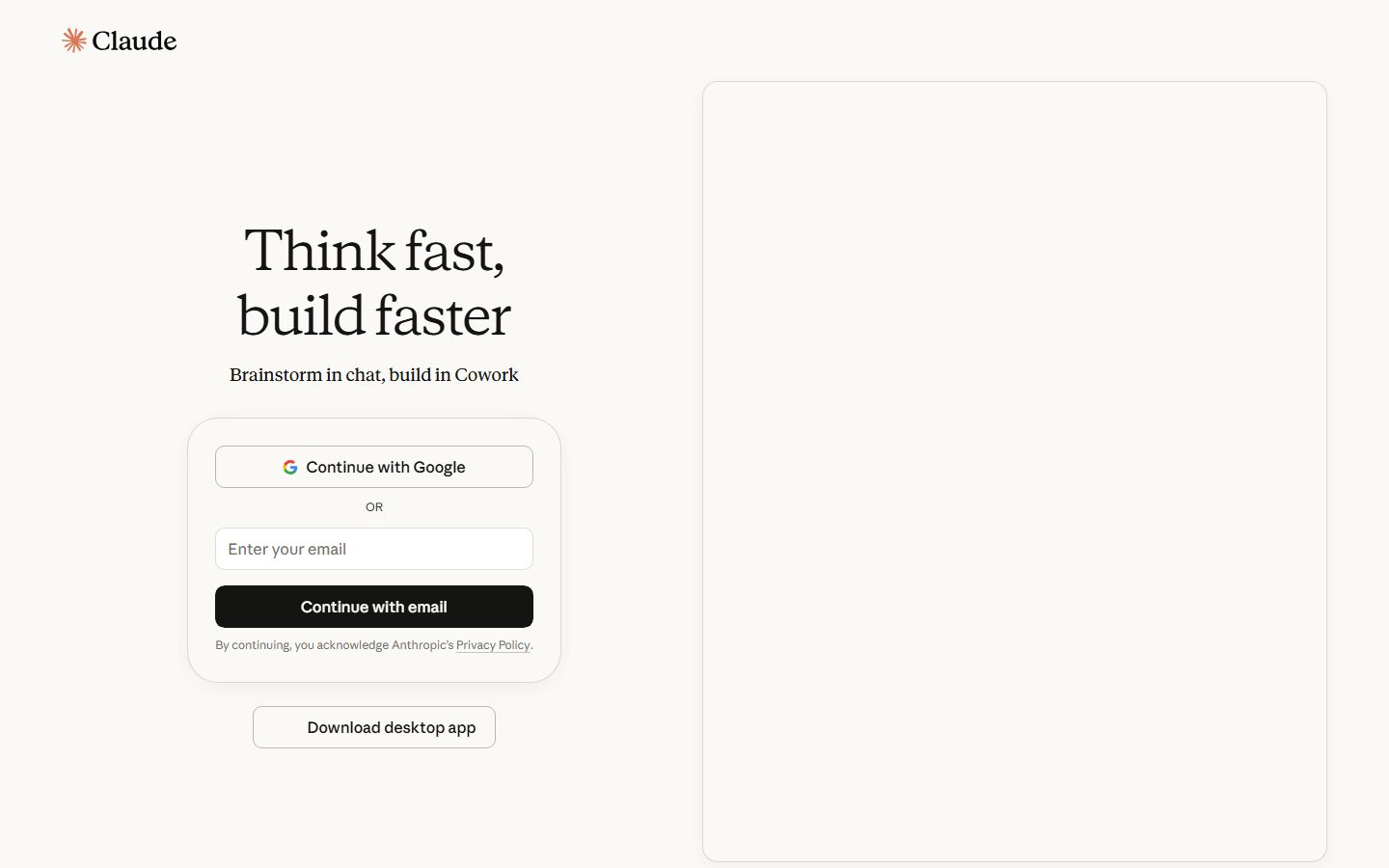
Claude's marketing/auth surface is warm, literary and quiet. The page floor is a cream canvas (`{colors.canvas}` — #faf9f5) rather than pure white, and almost all text is near-black ink (`{colors.ink}` — #141413). The single moment of color is the burnt-orange asterisk brand mark (`{colors.brand-orange}` — #d97757) in the wordmark. The result reads more like a printed editorial page than a typical SaaS dashboard — confident, calm, and built around typography rather than color.
The type voice is the brand. Headlines run in **Anthropic Serif** — a custom serif with unusually light display weights (330 for the 56px hero "Think fast, build faster") — paired with **Anthropic Sans** for body, buttons and fine print. The serif at a light weight gives the surface its bookish, considered feel; the sans keeps the interactive layer plain and legible.
Structurally the landing page is split: a left editorial column (serif hero + sub-line + an auth card with Google/email options) and a large soft-cornered preview frame on the right (`{component.product-preview-frame}`) that houses the Cowork product canvas. Below the fold, a three-up pricing grid of white cards (`{component.pricing-card}`) sits on the cream, followed by a serif FAQ list, and the page closes on a near-black footer (`{colors.surface-dark}`) with multi-column link lists.
**Key Characteristics:**
- Cream canvas (`{colors.canvas}` — #faf9f5), not white. White (`{colors.surface-card}` — #ffffff) is reserved for cards and inputs that need to lift off the cream.
- Near-black primary action (`{component.button-primary}` on `{colors.ink}`) with white label — "Continue with email", "Try Claude".
- Custom **Anthropic Serif** headlines at light display weights (330–430) — the system's defining signature.
- One brand accent only: the burnt-orange asterisk (`{colors.brand-orange}`). No saturated UI accents anywhere on the marketing surface.
- Soft, hierarchical radii: cards at `{rounded.lg}` (16px), the auth card and product frame at `{rounded.xxl}` (32px), inputs at `{rounded.md}` (10px).
- Extremely subtle elevation — shadows measured at 1.6–4% black alpha. Cards mostly rely on a 1px hairline (`{colors.hairline}`) plus the cream/white contrast rather than drop shadow.
- A near-black footer (`{colors.surface-dark}` — #0b0b0b) closes the page, the only dark surface in the system.
## Colors
### Brand & Accent
- **Brand Orange** (`{colors.brand-orange}` — #d97757): The lone brand accent — the asterisk in the Claude wordmark. It appears nowhere else of significance on the captured surface; the brand is otherwise monochrome.
- **Accent Sage** (`{colors.accent-sage}` — #bcd1ca): A pale desaturated green observed at low frequency; a quiet secondary accent used in product/illustration moments rather than on UI controls.
### Surface
- **Canvas** (`{colors.canvas}` — #faf9f5): The default cream page floor. This is the most distinctive surface choice — warm rather than clinical white.
- **Surface Card** (`{colors.surface-card}` — #ffffff): Pure white, used for pricing cards, text inputs, and the secondary buttons that need to lift off the cream.
- **Surface Dark** (`{colors.surface-dark}` — #0b0b0b): The footer background — the only dark surface on the page.
- **Surface Dark Elevated** (`{colors.surface-dark-elevated}` — #1e1e1e): A slightly lifted dark tone for nested blocks within dark contexts.
### Text
- **Ink** (`{colors.ink}` — #141413): All headlines, links, and primary text. Used as the primary-button fill.
- **Ink Pure / Ink Soft** (`{colors.ink-pure}` — #000000 / `{colors.ink-soft}` — #0b0b0b): True-black tones used for the heaviest text and the footer surface.
- **Body** (`{colors.body}` — #3d3d3a): Default running-text color and the measured button/label text tone.
- **Muted** (`{colors.muted}` — #73726c): Secondary text — captions, sub-labels.
- **Muted Soft** (`{colors.muted-soft}` — #9c9a92): Tertiary text — fine print, "By continuing…" disclaimers, "OR" dividers.
- **On Dark** (`{colors.on-dark}` — #ffffff): Text on primary buttons and in the footer headings.
- **On Dark Muted** (`{colors.on-dark-muted}` — #98989d): Footer link-row body text.
### Lines
- **Hairline** (`{colors.hairline}` — #c2c0b6): The 1px border tone — card outlines, input borders, the product-preview frame, and the secondary-button outline. It does most of the separation work in place of shadow.
### Code / Syntax Accents
- A cluster of saturated colors — `{colors.syntax-blue}` (#3f9fff), `{colors.syntax-green}` (#6a8759), `{colors.syntax-red}` (#cc6666), `{colors.syntax-steel}` (#a9b7c6) — were measured at low frequency. These read as code-editor syntax highlighting shown inside a product mockup, not as marketing UI tokens. They should never appear on marketing controls.
## Typography
### Font Family
The system runs two custom Anthropic typefaces: **Anthropic Serif** for headlines and **Anthropic Sans** for body, buttons, nav, and fine print. The serif carries the brand voice — it is used at notably light display weights (330 for the hero, 430 for sub-heads). The sans keeps the interactive and dense layers plain.
The split is strict:
- Anthropic Serif (light, 330–430) — hero headline, section heads, FAQ questions
- Anthropic Sans (400) — body copy, buttons, labels, fine print, footer links
### Hierarchy
| Token | Size | Weight | Line Height | Letter Spacing | Use |
|---|---|---|---|---|---|
| `{typography.display}` | 56px | 330 | 1.2 | normal | Hero headline ("Think fast, build faster") — Anthropic Serif |
| `{typography.heading}` | 18px | 430 | 1.375 | normal | Sub-heads, FAQ questions, wordmark — Anthropic Serif |
| `{typography.body}` | 12px | 400 | 1.333 | normal | Fine print, footer links, disclaimers — Anthropic Sans |
| `{typography.button}` | 15px | 400 | 1.5 | normal | Button labels, input text — Anthropic Sans |
### Principles
The serif headline at light weight (330) is the entire personality of the system — large, calm, and unusually thin for a display face. Never set the hero in the sans, and never thicken the serif into a bold weight; the lightness is the point. Body and interactive copy stay in Anthropic Sans at 400.
### Note on Font Substitutes
**Anthropic Serif** and **Anthropic Sans** are custom Anthropic typefaces and are not available as public web fonts (the analyzer's `fonts_licensed` array was empty, but these faces are proprietary and should be treated as licensed). For Anthropic Serif, **Tiempos Text** or, as an open fallback, **Source Serif 4** / **Georgia** at a light weight approximate the literary tone. For Anthropic Sans, **Inter** or the system UI stack is the closest open substitute. Never claim to ship the Anthropic faces.
## Layout
### Spacing System
- **Base unit:** 4px.
- **Tokens:** `{spacing.xxs}` 4px · `{spacing.micro}` 6px · `{spacing.xs}` 8px · `{spacing.sm}` 12px · `{spacing.md}` 16px · `{spacing.lg}` 20px · `{spacing.xl}` 24px · `{spacing.xxl}` 32px · `{spacing.huge}` 48px · `{spacing.section}` 96px.
- **Section rhythm:** `{spacing.section}` (96px) is the largest measured value — the vertical breathing room between major bands (hero → pricing → FAQ → footer).
- **Card internal padding:** `{spacing.xxl}` (32px) for pricing cards; `{spacing.xl}` (24px) for the auth card.
- **Control padding:** `{spacing.sm}`–`{spacing.lg}` (12–20px) inside buttons and inputs.
### Grid & Container
- **Hero split:** Two-column — editorial left (headline + sub-line + auth card) and a tall product-preview frame on the right.
- **Pricing grid:** 3-up at desktop (Free / Pro / Max).
- **Footer:** Multi-column link lists (Products / Solutions / Resources / Help & security, with Features / Claude Platform / Company sub-blocks).
### Whitespace Philosophy
Whitespace is generous and editorial. The cream canvas plus light serif headlines create a printed-page calm — content is given room rather than packed. Section gaps reach 96px and the hero leaves a large empty preview frame, signaling product-canvas space rather than cramming marketing imagery.
## Elevation & Depth
| Level | Treatment | Use |
|---|---|---|
| Flat | No shadow, no border | Body sections on cream canvas |
| Hairline | 1px `{colors.hairline}` border | Product-preview frame, secondary buttons, inputs, pricing-card outlines |
| Whisper shadow | `rgba(0,0,0,0.016) 0px 4px 24px` | The auth card — barely-there lift off the cream |
| Soft shadow | `rgba(0,0,0,0.04) 0px 4px 20px` | Slightly more lifted cards |
| Tinted shadow | `oklab(0.508 -0.041 -0.133 / 0.1) 0px 4px 24px` | A faintly cool-tinted shadow variant observed on a lifted surface |
The elevation philosophy is **near-flat**. The strongest measured shadow sits at only 4% black alpha; most separation comes from the cream-vs-white contrast and the 1px hairline. No heavy shadows, no glass, no neumorphism.
## Shapes
### Border Radius Scale
| Token | Value | Use |
|---|---|---|
| `{rounded.sm}` | 8px | Primary + secondary buttons, plan toggle segments |
| `{rounded.md}` | 10px | Text inputs (measured 9.6px) |
| `{rounded.lg}` | 16px | Pricing cards |
| `{rounded.xl}` | 24px | Mid-size containers |
| `{rounded.xxl}` | 32px | Auth card and the large product-preview frame |
### Geometry
Corners are consistently soft and grow with the size of the element — small controls at 8–10px, content cards at 16px, and the largest canvases (auth card, product frame) at 32px. The orange brand asterisk is the only non-rectilinear shape on the surface.
## Components
### Brand & Navigation
**`logo-wordmark`** — "Claude" set in Anthropic Serif at `{typography.heading}`, in `{colors.ink}`, top-left. Preceded by `{component.brand-mark}`.
**`brand-mark`** — The burnt-orange asterisk in `{colors.brand-orange}`. The single chromatic moment in the entire system.
### Buttons
**`button-primary`** — The signature dark CTA ("Continue with email", "Try Claude"). Background `{colors.ink}`, white label (`{colors.on-dark}`), type `{typography.button}` (Anthropic Sans 15px), rounded `{rounded.sm}` (8px), padding ~12px × 20px. The measured component reported `radius: 0px / padding: 0px`, which is a capture artifact; spec is taken from screenshot ground-truth.
**`button-secondary`** — White outlined button ("Continue with Google", "Download desktop app"). Background `{colors.surface-card}`, text `{colors.ink}`, 1px `{colors.hairline}` border, same radius and padding as primary.
**`text-link`** — Inline link in `{colors.ink}` (e.g. "Privacy Policy"), type `{typography.body}`, underlined.
### Inputs & Forms
**`text-input`** — Email field ("Enter your email"). Background `{colors.surface-card}` (#ffffff), text `{colors.ink}`, placeholder in `{colors.muted-soft}`, rounded `{rounded.md}` (measured 9.6px), 1px `{colors.hairline}` border, padding ~12px × 16px.
**`auth-card`** — The hero's sign-in container holding the Google button, an "OR" divider, the email input, the primary button, and a fine-print disclaimer. Background `{colors.canvas}`, rounded `{rounded.xxl}` (32px), padding `{spacing.xl}` (24px), lifted by the whisper-level shadow.
### Cards & Containers
**`product-preview-frame`** — The tall soft-cornered frame on the hero's right that houses the Cowork product canvas. Background `{colors.canvas}`, 1px `{colors.hairline}` border, rounded `{rounded.xxl}` (32px). Holds live product UI rather than a marketing illustration.
**`pricing-card`** — Used in the 3-up plan grid (Free / Pro / Max). Background `{colors.surface-card}` (white, lifting off the cream), rounded `{rounded.lg}` (16px), padding `{spacing.xxl}` (32px). Each card carries a small line-art icon, a serif plan name (`{typography.heading}`), price, a `{component.button-primary}`, and a checklist in `{typography.body}`.
**`plan-toggle`** / **`plan-toggle-active`** — The "Individual / Team and Enterprise" segmented switch above the pricing grid. Inactive segment: `{colors.canvas}` background, `{colors.body}` text. Active segment: `{colors.surface-card}` background, `{colors.ink}` text. Both rounded `{rounded.sm}`, with `{spacing.micro}` (6px) internal padding.
### FAQ
**`faq-item`** — Accordion rows ("What is Claude and how does it work?"). Question set in Anthropic Serif (`{typography.heading}`) in `{colors.ink}`, with a `+` expander glyph at the right. Transparent background on the cream canvas.
### Footer
**`footer`** — Near-black footer that closes the page. Background `{colors.surface-dark}` (#0b0b0b), link rows in `{colors.on-dark-muted}`, type `{typography.body}`. Multi-column link lists (Products / Solutions / Resources / Help & security plus Features / Claude Platform / Company), the Claude wordmark top-left, and a "BY ANTHROPIC / © 2026 ANTHROPIC PBC" line with social icons at the bottom. The only dark surface on the page.
## Do's and Don'ts
### Do
- Build on the cream canvas (`{colors.canvas}` — #faf9f5). Reserve pure white (`{colors.surface-card}`) for cards and inputs that should lift off it.
- Set every headline in Anthropic Serif at its light weight (330–430). The lightness is the signature.
- Keep the brand orange (`{colors.brand-orange}`) scarce — ideally just the asterisk mark.
- Use `{component.button-primary}` on `{colors.ink}` for the single primary action per band; secondary actions take the white outlined `{component.button-secondary}`.
- Lean on the 1px hairline (`{colors.hairline}`) and cream/white contrast for separation before reaching for shadow.
- Let the product-preview frame hold real product UI rather than marketing illustration.
- Close pages on the near-black footer — it is the system's only dark surface and the deliberate page-end signal.
### Don't
- Don't introduce saturated UI accents. The syntax colors (`{colors.syntax-blue}`, `{colors.syntax-green}`, etc.) belong to code mockups only, never to controls.
- Don't set the hero or section heads in the sans, and don't bold the serif into a heavy weight.
- Don't use pure white as the page floor — the cream is intentional.
- Don't add heavy drop shadows; the system's deepest measured shadow is 4% black alpha.
- Don't place dark surfaces anywhere except the footer.
- Don't document hover states — default and active/pressed only.
## Responsive Behavior
### Breakpoints
The capture is desktop-only (landing page). The following is inferred from the layout structure and must be confirmed against live breakpoints.
| Name | Width | Key Changes (inferred) |
|---|---|---|
| Mobile | < 768px | Hero collapses to single column; product-preview frame moves below the editorial column; auth card spans full width; pricing 3-up → 1-up; footer columns stack |
| Tablet | 768–1024px | Hero split tightens; pricing 3-up → 2-up; footer reduces columns |
| Desktop | > 1024px | Full two-column hero with tall product-preview frame; 3-up pricing grid; multi-column footer |
### Touch Targets
- `{component.button-primary}` and `{component.button-secondary}` read as comfortably tall (~44px); exact heights were not measured.
- `{component.text-input}` height was not measured but visually matches the button row.
### Collapsing Strategy (inferred)
- The hero's two-column split collapses to a single stack on narrow viewports.
- The pricing grid reduces column count rather than shrinking card content.
- The footer's multi-column link lists wrap to fewer columns, then a single stack on mobile.
## Iteration Guide
1. Work on ONE component at a time and reference its YAML key directly (`{component.pricing-card}`, `{component.auth-card}`).
2. Variants (`-active`, `-disabled`, `-focused`) live as separate entries in `components:`.
3. Use `{token.refs}` everywhere — never inline a hex in a component.
4. Document only default and active/pressed states — never hover.
5. Headlines stay Anthropic Serif at light weight; body and controls stay Anthropic Sans 400. The split does not blur.
6. Keep the cream canvas and the scarce orange accent intact — they define the brand.
7. When adding emphasis, prefer larger serif over heavier serif or added color.
## Known Gaps
- Only the desktop landing page was captured; all responsive breakpoints, touch-target heights, and collapsing behavior are inferred and need live confirmation.
- The measured `button-primary` reported `radius: 0px` and `padding: 0px` — a capture artifact. Button radius (8px) and padding are taken from screenshot ground-truth and should be verified against source CSS.
- Typography was measured at only four roles (56px serif, 18px serif, 12px sans, 15px sans). Intermediate sizes clearly present in the screenshots — the "Brainstorm in chat, build in Cowork" sub-line, pricing prices ("$0", "$17", "From $100"), plan names, and pricing checklist body — were not individually measured and would need extraction before they can be tokenized.
- **Anthropic Serif** and **Anthropic Sans** are proprietary; the `fonts_licensed` array was empty but these are not public web fonts. Open substitutes are documented in Typography.
- The burnt-orange (`{colors.brand-orange}`) and sage (`{colors.accent-sage}`) appeared at low frequency; their full usage range beyond the brand mark is unconfirmed.
- The saturated syntax colors are assumed to originate from a code-editor product mockup; their exact placement was not captured.
- Animation, transition timings, and accordion expand behavior on the FAQ are out of scope.
- Exact footer background hex (#0b0b0b vs #000000) and on-dark text tones should be confirmed; both near-black values were measured.
<!-- Documented by duply · real-world design systems as ready-to-use DESIGN.md for AI coding agents · https://duply.ai/claude/design-md -->
Color Palette
Accent
Neutrals
Typography
display56px · 330 · 1.2
The quick brown fox jumpsheading18px · 430 · 1.375
The quick brown fox jumpsbody12px · 400 · 1.333
The quick brown fox jumpsbutton15px · 400 · 1.5
The quick brown fox jumpsSpacing & Shape
Spacing
| Name | Value | Preview |
|---|---|---|
| xxs | 4px | |
| micro | 6px | |
| xs | 8px | |
| sm | 12px | |
| md | 16px | |
| lg | 20px | |
| xl | 24px | |
| xxl | 32px | |
| huge | 48px | |
| section | 96px |
Border Radius
| Name | Value | Preview |
|---|---|---|
| sm | 8px | |
| md | 10px | |
| lg | 16px | |
| xl | 24px | |
| xxl | 32px |
More like this


---
version: alpha
name: Claude-design-analysis
description: A warm, editorial AI-product interface built on a cream canvas (#faf9f5) with near-black ink, a single burnt-orange brand accent, and Anthropic's custom serif display face. The system reads calm, literary and confident — large serif headlines, generous whitespace, soft-rounded white cards floating on cream, and a quiet near-black footer. Brand voltage comes almost entirely from the serif typography and the lone orange asterisk mark rather than from color saturation.

colors:
  ink: "#141413"
  ink-pure: "#000000"
  ink-soft: "#0b0b0b"
  body: "#3d3d3a"
  muted: "#73726c"
  muted-soft: "#9c9a92"
  hairline: "#c2c0b6"
  canvas: "#faf9f5"
  surface-card: "#ffffff"
  surface-dark: "#0b0b0b"
  surface-dark-elevated: "#1e1e1e"
  on-dark: "#ffffff"
  on-dark-muted: "#98989d"
  brand-orange: "#d97757"
  accent-sage: "#bcd1ca"
  syntax-blue: "#3f9fff"
  syntax-green: "#6a8759"
  syntax-red: "#cc6666"
  syntax-steel: "#a9b7c6"

typography:
  display:
    fontFamily: "Anthropic Serif, Georgia, serif"
    fontSize: 56px
    fontWeight: 330
    lineHeight: 1.2
    letterSpacing: normal
  heading:
    fontFamily: "Anthropic Serif, Georgia, serif"
    fontSize: 18px
    fontWeight: 430
    lineHeight: 1.375
    letterSpacing: normal
  body:
    fontFamily: "Anthropic Sans, Inter, sans-serif"
    fontSize: 12px
    fontWeight: 400
    lineHeight: 1.333
    letterSpacing: normal
  button:
    fontFamily: "Anthropic Sans, Inter, sans-serif"
    fontSize: 15px
    fontWeight: 400
    lineHeight: 1.5
    letterSpacing: normal

rounded:
  sm: 8px
  md: 10px
  lg: 16px
  xl: 24px
  xxl: 32px

spacing:
  xxs: 4px
  micro: 6px
  xs: 8px
  sm: 12px
  md: 16px
  lg: 20px
  xl: 24px
  xxl: 32px
  huge: 48px
  section: 96px

components:
  logo-wordmark:
    backgroundColor: transparent
    textColor: "{colors.ink}"
    typography: "{typography.heading}"
  brand-mark:
    backgroundColor: transparent
    textColor: "{colors.brand-orange}"
  button-primary:
    backgroundColor: "{colors.ink}"
    textColor: "{colors.on-dark}"
    typography: "{typography.button}"
    rounded: "{rounded.sm}"
    padding: 12px 20px
  button-secondary:
    backgroundColor: "{colors.surface-card}"
    textColor: "{colors.ink}"
    typography: "{typography.button}"
    rounded: "{rounded.sm}"
    padding: 12px 20px
  text-input:
    backgroundColor: "{colors.surface-card}"
    textColor: "{colors.ink}"
    typography: "{typography.button}"
    rounded: "{rounded.md}"
    padding: 12px 16px
  text-link:
    backgroundColor: transparent
    textColor: "{colors.ink}"
    typography: "{typography.body}"
  auth-card:
    backgroundColor: "{colors.canvas}"
    textColor: "{colors.ink}"
    rounded: "{rounded.xxl}"
    padding: 24px
  product-preview-frame:
    backgroundColor: "{colors.canvas}"
    textColor: "{colors.ink}"
    rounded: "{rounded.xxl}"
  pricing-card:
    backgroundColor: "{colors.surface-card}"
    textColor: "{colors.ink}"
    typography: "{typography.body}"
    rounded: "{rounded.lg}"
    padding: 32px
  plan-toggle:
    backgroundColor: "{colors.canvas}"
    textColor: "{colors.body}"
    typography: "{typography.button}"
    rounded: "{rounded.sm}"
    padding: 6px
  plan-toggle-active:
    backgroundColor: "{colors.surface-card}"
    textColor: "{colors.ink}"
    typography: "{typography.button}"
    rounded: "{rounded.sm}"
  faq-item:
    backgroundColor: transparent
    textColor: "{colors.ink}"
    typography: "{typography.heading}"
  footer:
    backgroundColor: "{colors.surface-dark}"
    textColor: "{colors.on-dark-muted}"
    typography: "{typography.body}"
    padding: 48px
---

## Overview

Claude's marketing/auth surface is warm, literary and quiet. The page floor is a cream canvas (`{colors.canvas}` — #faf9f5) rather than pure white, and almost all text is near-black ink (`{colors.ink}` — #141413). The single moment of color is the burnt-orange asterisk brand mark (`{colors.brand-orange}` — #d97757) in the wordmark. The result reads more like a printed editorial page than a typical SaaS dashboard — confident, calm, and built around typography rather than color.

The type voice is the brand. Headlines run in **Anthropic Serif** — a custom serif with unusually light display weights (330 for the 56px hero "Think fast, build faster") — paired with **Anthropic Sans** for body, buttons and fine print. The serif at a light weight gives the surface its bookish, considered feel; the sans keeps the interactive layer plain and legible.

Structurally the landing page is split: a left editorial column (serif hero + sub-line + an auth card with Google/email options) and a large soft-cornered preview frame on the right (`{component.product-preview-frame}`) that houses the Cowork product canvas. Below the fold, a three-up pricing grid of white cards (`{component.pricing-card}`) sits on the cream, followed by a serif FAQ list, and the page closes on a near-black footer (`{colors.surface-dark}`) with multi-column link lists.

**Key Characteristics:**
- Cream canvas (`{colors.canvas}` — #faf9f5), not white. White (`{colors.surface-card}` — #ffffff) is reserved for cards and inputs that need to lift off the cream.
- Near-black primary action (`{component.button-primary}` on `{colors.ink}`) with white label — "Continue with email", "Try Claude".
- Custom **Anthropic Serif** headlines at light display weights (330–430) — the system's defining signature.
- One brand accent only: the burnt-orange asterisk (`{colors.brand-orange}`). No saturated UI accents anywhere on the marketing surface.
- Soft, hierarchical radii: cards at `{rounded.lg}` (16px), the auth card and product frame at `{rounded.xxl}` (32px), inputs at `{rounded.md}` (10px).
- Extremely subtle elevation — shadows measured at 1.6–4% black alpha. Cards mostly rely on a 1px hairline (`{colors.hairline}`) plus the cream/white contrast rather than drop shadow.
- A near-black footer (`{colors.surface-dark}` — #0b0b0b) closes the page, the only dark surface in the system.

## Colors

### Brand & Accent
- **Brand Orange** (`{colors.brand-orange}` — #d97757): The lone brand accent — the asterisk in the Claude wordmark. It appears nowhere else of significance on the captured surface; the brand is otherwise monochrome.
- **Accent Sage** (`{colors.accent-sage}` — #bcd1ca): A pale desaturated green observed at low frequency; a quiet secondary accent used in product/illustration moments rather than on UI controls.

### Surface
- **Canvas** (`{colors.canvas}` — #faf9f5): The default cream page floor. This is the most distinctive surface choice — warm rather than clinical white.
- **Surface Card** (`{colors.surface-card}` — #ffffff): Pure white, used for pricing cards, text inputs, and the secondary buttons that need to lift off the cream.
- **Surface Dark** (`{colors.surface-dark}` — #0b0b0b): The footer background — the only dark surface on the page.
- **Surface Dark Elevated** (`{colors.surface-dark-elevated}` — #1e1e1e): A slightly lifted dark tone for nested blocks within dark contexts.

### Text
- **Ink** (`{colors.ink}` — #141413): All headlines, links, and primary text. Used as the primary-button fill.
- **Ink Pure / Ink Soft** (`{colors.ink-pure}` — #000000 / `{colors.ink-soft}` — #0b0b0b): True-black tones used for the heaviest text and the footer surface.
- **Body** (`{colors.body}` — #3d3d3a): Default running-text color and the measured button/label text tone.
- **Muted** (`{colors.muted}` — #73726c): Secondary text — captions, sub-labels.
- **Muted Soft** (`{colors.muted-soft}` — #9c9a92): Tertiary text — fine print, "By continuing…" disclaimers, "OR" dividers.
- **On Dark** (`{colors.on-dark}` — #ffffff): Text on primary buttons and in the footer headings.
- **On Dark Muted** (`{colors.on-dark-muted}` — #98989d): Footer link-row body text.

### Lines
- **Hairline** (`{colors.hairline}` — #c2c0b6): The 1px border tone — card outlines, input borders, the product-preview frame, and the secondary-button outline. It does most of the separation work in place of shadow.

### Code / Syntax Accents
- A cluster of saturated colors — `{colors.syntax-blue}` (#3f9fff), `{colors.syntax-green}` (#6a8759), `{colors.syntax-red}` (#cc6666), `{colors.syntax-steel}` (#a9b7c6) — were measured at low frequency. These read as code-editor syntax highlighting shown inside a product mockup, not as marketing UI tokens. They should never appear on marketing controls.

## Typography

### Font Family
The system runs two custom Anthropic typefaces: **Anthropic Serif** for headlines and **Anthropic Sans** for body, buttons, nav, and fine print. The serif carries the brand voice — it is used at notably light display weights (330 for the hero, 430 for sub-heads). The sans keeps the interactive and dense layers plain.

The split is strict:
- Anthropic Serif (light, 330–430) — hero headline, section heads, FAQ questions
- Anthropic Sans (400) — body copy, buttons, labels, fine print, footer links

### Hierarchy

| Token | Size | Weight | Line Height | Letter Spacing | Use |
|---|---|---|---|---|---|
| `{typography.display}` | 56px | 330 | 1.2 | normal | Hero headline ("Think fast, build faster") — Anthropic Serif |
| `{typography.heading}` | 18px | 430 | 1.375 | normal | Sub-heads, FAQ questions, wordmark — Anthropic Serif |
| `{typography.body}` | 12px | 400 | 1.333 | normal | Fine print, footer links, disclaimers — Anthropic Sans |
| `{typography.button}` | 15px | 400 | 1.5 | normal | Button labels, input text — Anthropic Sans |

### Principles
The serif headline at light weight (330) is the entire personality of the system — large, calm, and unusually thin for a display face. Never set the hero in the sans, and never thicken the serif into a bold weight; the lightness is the point. Body and interactive copy stay in Anthropic Sans at 400.

### Note on Font Substitutes
**Anthropic Serif** and **Anthropic Sans** are custom Anthropic typefaces and are not available as public web fonts (the analyzer's `fonts_licensed` array was empty, but these faces are proprietary and should be treated as licensed). For Anthropic Serif, **Tiempos Text** or, as an open fallback, **Source Serif 4** / **Georgia** at a light weight approximate the literary tone. For Anthropic Sans, **Inter** or the system UI stack is the closest open substitute. Never claim to ship the Anthropic faces.

## Layout

### Spacing System
- **Base unit:** 4px.
- **Tokens:** `{spacing.xxs}` 4px · `{spacing.micro}` 6px · `{spacing.xs}` 8px · `{spacing.sm}` 12px · `{spacing.md}` 16px · `{spacing.lg}` 20px · `{spacing.xl}` 24px · `{spacing.xxl}` 32px · `{spacing.huge}` 48px · `{spacing.section}` 96px.
- **Section rhythm:** `{spacing.section}` (96px) is the largest measured value — the vertical breathing room between major bands (hero → pricing → FAQ → footer).
- **Card internal padding:** `{spacing.xxl}` (32px) for pricing cards; `{spacing.xl}` (24px) for the auth card.
- **Control padding:** `{spacing.sm}`–`{spacing.lg}` (12–20px) inside buttons and inputs.

### Grid & Container
- **Hero split:** Two-column — editorial left (headline + sub-line + auth card) and a tall product-preview frame on the right.
- **Pricing grid:** 3-up at desktop (Free / Pro / Max).
- **Footer:** Multi-column link lists (Products / Solutions / Resources / Help & security, with Features / Claude Platform / Company sub-blocks).

### Whitespace Philosophy
Whitespace is generous and editorial. The cream canvas plus light serif headlines create a printed-page calm — content is given room rather than packed. Section gaps reach 96px and the hero leaves a large empty preview frame, signaling product-canvas space rather than cramming marketing imagery.

## Elevation & Depth

| Level | Treatment | Use |
|---|---|---|
| Flat | No shadow, no border | Body sections on cream canvas |
| Hairline | 1px `{colors.hairline}` border | Product-preview frame, secondary buttons, inputs, pricing-card outlines |
| Whisper shadow | `rgba(0,0,0,0.016) 0px 4px 24px` | The auth card — barely-there lift off the cream |
| Soft shadow | `rgba(0,0,0,0.04) 0px 4px 20px` | Slightly more lifted cards |
| Tinted shadow | `oklab(0.508 -0.041 -0.133 / 0.1) 0px 4px 24px` | A faintly cool-tinted shadow variant observed on a lifted surface |

The elevation philosophy is **near-flat**. The strongest measured shadow sits at only 4% black alpha; most separation comes from the cream-vs-white contrast and the 1px hairline. No heavy shadows, no glass, no neumorphism.

## Shapes

### Border Radius Scale

| Token | Value | Use |
|---|---|---|
| `{rounded.sm}` | 8px | Primary + secondary buttons, plan toggle segments |
| `{rounded.md}` | 10px | Text inputs (measured 9.6px) |
| `{rounded.lg}` | 16px | Pricing cards |
| `{rounded.xl}` | 24px | Mid-size containers |
| `{rounded.xxl}` | 32px | Auth card and the large product-preview frame |

### Geometry
Corners are consistently soft and grow with the size of the element — small controls at 8–10px, content cards at 16px, and the largest canvases (auth card, product frame) at 32px. The orange brand asterisk is the only non-rectilinear shape on the surface.

## Components

### Brand & Navigation

**`logo-wordmark`** — "Claude" set in Anthropic Serif at `{typography.heading}`, in `{colors.ink}`, top-left. Preceded by `{component.brand-mark}`.

**`brand-mark`** — The burnt-orange asterisk in `{colors.brand-orange}`. The single chromatic moment in the entire system.

### Buttons

**`button-primary`** — The signature dark CTA ("Continue with email", "Try Claude"). Background `{colors.ink}`, white label (`{colors.on-dark}`), type `{typography.button}` (Anthropic Sans 15px), rounded `{rounded.sm}` (8px), padding ~12px × 20px. The measured component reported `radius: 0px / padding: 0px`, which is a capture artifact; spec is taken from screenshot ground-truth.

**`button-secondary`** — White outlined button ("Continue with Google", "Download desktop app"). Background `{colors.surface-card}`, text `{colors.ink}`, 1px `{colors.hairline}` border, same radius and padding as primary.

**`text-link`** — Inline link in `{colors.ink}` (e.g. "Privacy Policy"), type `{typography.body}`, underlined.

### Inputs & Forms

**`text-input`** — Email field ("Enter your email"). Background `{colors.surface-card}` (#ffffff), text `{colors.ink}`, placeholder in `{colors.muted-soft}`, rounded `{rounded.md}` (measured 9.6px), 1px `{colors.hairline}` border, padding ~12px × 16px.

**`auth-card`** — The hero's sign-in container holding the Google button, an "OR" divider, the email input, the primary button, and a fine-print disclaimer. Background `{colors.canvas}`, rounded `{rounded.xxl}` (32px), padding `{spacing.xl}` (24px), lifted by the whisper-level shadow.

### Cards & Containers

**`product-preview-frame`** — The tall soft-cornered frame on the hero's right that houses the Cowork product canvas. Background `{colors.canvas}`, 1px `{colors.hairline}` border, rounded `{rounded.xxl}` (32px). Holds live product UI rather than a marketing illustration.

**`pricing-card`** — Used in the 3-up plan grid (Free / Pro / Max). Background `{colors.surface-card}` (white, lifting off the cream), rounded `{rounded.lg}` (16px), padding `{spacing.xxl}` (32px). Each card carries a small line-art icon, a serif plan name (`{typography.heading}`), price, a `{component.button-primary}`, and a checklist in `{typography.body}`.

**`plan-toggle`** / **`plan-toggle-active`** — The "Individual / Team and Enterprise" segmented switch above the pricing grid. Inactive segment: `{colors.canvas}` background, `{colors.body}` text. Active segment: `{colors.surface-card}` background, `{colors.ink}` text. Both rounded `{rounded.sm}`, with `{spacing.micro}` (6px) internal padding.

### FAQ

**`faq-item`** — Accordion rows ("What is Claude and how does it work?"). Question set in Anthropic Serif (`{typography.heading}`) in `{colors.ink}`, with a `+` expander glyph at the right. Transparent background on the cream canvas.

### Footer

**`footer`** — Near-black footer that closes the page. Background `{colors.surface-dark}` (#0b0b0b), link rows in `{colors.on-dark-muted}`, type `{typography.body}`. Multi-column link lists (Products / Solutions / Resources / Help & security plus Features / Claude Platform / Company), the Claude wordmark top-left, and a "BY ANTHROPIC / © 2026 ANTHROPIC PBC" line with social icons at the bottom. The only dark surface on the page.

## Do's and Don'ts

### Do
- Build on the cream canvas (`{colors.canvas}` — #faf9f5). Reserve pure white (`{colors.surface-card}`) for cards and inputs that should lift off it.
- Set every headline in Anthropic Serif at its light weight (330–430). The lightness is the signature.
- Keep the brand orange (`{colors.brand-orange}`) scarce — ideally just the asterisk mark.
- Use `{component.button-primary}` on `{colors.ink}` for the single primary action per band; secondary actions take the white outlined `{component.button-secondary}`.
- Lean on the 1px hairline (`{colors.hairline}`) and cream/white contrast for separation before reaching for shadow.
- Let the product-preview frame hold real product UI rather than marketing illustration.
- Close pages on the near-black footer — it is the system's only dark surface and the deliberate page-end signal.

### Don't
- Don't introduce saturated UI accents. The syntax colors (`{colors.syntax-blue}`, `{colors.syntax-green}`, etc.) belong to code mockups only, never to controls.
- Don't set the hero or section heads in the sans, and don't bold the serif into a heavy weight.
- Don't use pure white as the page floor — the cream is intentional.
- Don't add heavy drop shadows; the system's deepest measured shadow is 4% black alpha.
- Don't place dark surfaces anywhere except the footer.
- Don't document hover states — default and active/pressed only.

## Responsive Behavior

### Breakpoints
The capture is desktop-only (landing page). The following is inferred from the layout structure and must be confirmed against live breakpoints.

| Name | Width | Key Changes (inferred) |
|---|---|---|
| Mobile | < 768px | Hero collapses to single column; product-preview frame moves below the editorial column; auth card spans full width; pricing 3-up → 1-up; footer columns stack |
| Tablet | 768–1024px | Hero split tightens; pricing 3-up → 2-up; footer reduces columns |
| Desktop | > 1024px | Full two-column hero with tall product-preview frame; 3-up pricing grid; multi-column footer |

### Touch Targets
- `{component.button-primary}` and `{component.button-secondary}` read as comfortably tall (~44px); exact heights were not measured.
- `{component.text-input}` height was not measured but visually matches the button row.

### Collapsing Strategy (inferred)
- The hero's two-column split collapses to a single stack on narrow viewports.
- The pricing grid reduces column count rather than shrinking card content.
- The footer's multi-column link lists wrap to fewer columns, then a single stack on mobile.

## Iteration Guide

1. Work on ONE component at a time and reference its YAML key directly (`{component.pricing-card}`, `{component.auth-card}`).
2. Variants (`-active`, `-disabled`, `-focused`) live as separate entries in `components:`.
3. Use `{token.refs}` everywhere — never inline a hex in a component.
4. Document only default and active/pressed states — never hover.
5. Headlines stay Anthropic Serif at light weight; body and controls stay Anthropic Sans 400. The split does not blur.
6. Keep the cream canvas and the scarce orange accent intact — they define the brand.
7. When adding emphasis, prefer larger serif over heavier serif or added color.

## Known Gaps

- Only the desktop landing page was captured; all responsive breakpoints, touch-target heights, and collapsing behavior are inferred and need live confirmation.
- The measured `button-primary` reported `radius: 0px` and `padding: 0px` — a capture artifact. Button radius (8px) and padding are taken from screenshot ground-truth and should be verified against source CSS.
- Typography was measured at only four roles (56px serif, 18px serif, 12px sans, 15px sans). Intermediate sizes clearly present in the screenshots — the "Brainstorm in chat, build in Cowork" sub-line, pricing prices ("$0", "$17", "From $100"), plan names, and pricing checklist body — were not individually measured and would need extraction before they can be tokenized.
- **Anthropic Serif** and **Anthropic Sans** are proprietary; the `fonts_licensed` array was empty but these are not public web fonts. Open substitutes are documented in Typography.
- The burnt-orange (`{colors.brand-orange}`) and sage (`{colors.accent-sage}`) appeared at low frequency; their full usage range beyond the brand mark is unconfirmed.
- The saturated syntax colors are assumed to originate from a code-editor product mockup; their exact placement was not captured.
- Animation, transition timings, and accordion expand behavior on the FAQ are out of scope.
- Exact footer background hex (#0b0b0b vs #000000) and on-dark text tones should be confirmed; both near-black values were measured.

<!-- Documented by duply · real-world design systems as ready-to-use DESIGN.md for AI coding agents · https://duply.ai/claude/design-md -->