Coval
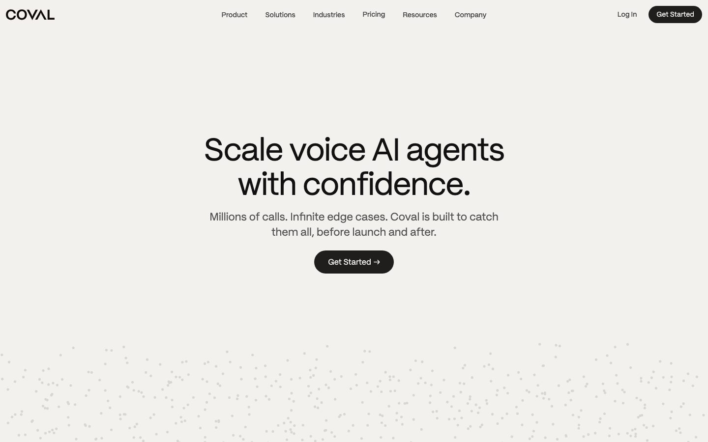
A warm-editorial, near-monochrome interface for a voice-AI evaluation platform, built on a soft off-white paper canvas (#f2f1ee) with slightly warmer card surfaces (#fdfcf8), near-black pill CTAs, and a single geometric grotesque (PP Mori) carrying everything from oversized display headlines down to body copy. The system reads as calm, technical, and confident — generous vertical whitespace, low-chroma neutrals, product dashboard fragments shown inside soft-shadowed cards, and a stippled dot field as the only decorative texture. Brand voltage comes from the huge weight-400 display type and the warm paper palette rather than from accent color.
---
version: alpha
name: Coval-design-analysis
description: "A warm-editorial, near-monochrome interface for a voice-AI evaluation platform, built on a soft off-white paper canvas (#f2f1ee) with slightly warmer card surfaces (#fdfcf8), near-black pill CTAs, and a single geometric grotesque (PP Mori) carrying everything from oversized display headlines down to body copy. The system reads as calm, technical, and confident — generous vertical whitespace, low-chroma neutrals, product dashboard fragments shown inside soft-shadowed cards, and a stippled dot field as the only decorative texture. Brand voltage comes from the huge weight-400 display type and the warm paper palette rather than from accent color."

colors:
  primary: "#1c1824"
  ink: "#111111"
  ink-deep: "#0a0a0a"
  near-black: "#141413"
  body: "#515151"
  muted-strong: "#555555"
  muted: "#999999"
  neutral-strong: "#333333"
  hairline: "#cccccc"
  canvas: "#f2f1ee"
  surface: "#fdfcf8"
  surface-input: "#f5f4f0"
  surface-alt: "#e8e6e0"
  button-text: "#444444"
  on-primary: "#ffffff"

typography:
  display-xl:
    fontFamily: "PP Mori, Hanken Grotesk, sans-serif"
    fontSize: 64px
    fontWeight: 400
    lineHeight: 1.1
    letterSpacing: -1.28px
  display-lg:
    fontFamily: "PP Mori, Hanken Grotesk, sans-serif"
    fontSize: 43.2px
    fontWeight: 400
    lineHeight: 1.1
    letterSpacing: -0.432px
  heading:
    fontFamily: "PP Mori, Hanken Grotesk, sans-serif"
    fontSize: 21.6px
    fontWeight: 600
    lineHeight: 1.25
    letterSpacing: 0
  body:
    fontFamily: "PP Mori, Hanken Grotesk, sans-serif"
    fontSize: 22px
    fontWeight: 400
    lineHeight: 1.4
    letterSpacing: 0
  nav-link:
    fontFamily: "PP Mori, Hanken Grotesk, sans-serif"
    fontSize: 16px
    fontWeight: 400
    lineHeight: 1.4
    letterSpacing: 0
  button:
    fontFamily: "PP Mori, Hanken Grotesk, sans-serif"
    fontSize: 16px
    fontWeight: 400
    lineHeight: 1.4
    letterSpacing: 0

rounded:
  xs: 2px
  sm: 6px
  md: 8px
  lg: 12px
  xl: 16px
  xxl: 18px
  pill: 100px

spacing:
  xxs: 4px
  xs: 8px
  sm: 12px
  md: 16px
  lg: 24px
  xl: 32px
  xxl: 40px

components:
  top-nav:
    backgroundColor: "{colors.canvas}"
    textColor: "{colors.ink}"
    typography: "{typography.nav-link}"
  button-primary:
    backgroundColor: "{colors.primary}"
    textColor: "{colors.on-primary}"
    typography: "{typography.button}"
    rounded: "{rounded.pill}"
    padding: 8px 16px
  button-secondary:
    backgroundColor: "{colors.surface-input}"
    textColor: "{colors.button-text}"
    typography: "{typography.button}"
    rounded: "{rounded.sm}"
    padding: 8px 16px
  card:
    backgroundColor: "{colors.surface}"
    textColor: "{colors.ink}"
    typography: "{typography.body}"
    rounded: "{rounded.lg}"
    padding: 32px
  dashboard-card:
    backgroundColor: "{colors.surface}"
    textColor: "{colors.ink}"
    rounded: "{rounded.lg}"
    padding: 24px
  input:
    backgroundColor: "{colors.surface-input}"
    textColor: "{colors.ink}"
    typography: "{typography.body}"
    rounded: "{rounded.sm}"
    padding: 8px 16px
  stat-row:
    backgroundColor: transparent
    textColor: "{colors.ink}"
    typography: "{typography.display-lg}"
  lifecycle-step:
    backgroundColor: transparent
    textColor: "{colors.muted}"
    typography: "{typography.heading}"
  feature-panel:
    backgroundColor: "{colors.surface-alt}"
    textColor: "{colors.ink}"
    rounded: "{rounded.xl}"
    padding: 32px
---

## Overview

Coval's marketing surface is a calm, warm-editorial interface for a voice-AI evaluation platform. Instead of the usual white-canvas SaaS look, Coval sits on a soft off-white paper tone (`{colors.canvas}` — #f2f1ee) with cards rendered in a slightly warmer near-white (`{colors.surface}` — #fdfcf8). The whole palette is near-monochrome and low-chroma — warm grays, near-blacks, and paper tones — which lets the oversized display type and the product dashboard fragments carry the page.

The type system is single-family: **PP Mori**, a geometric grotesque, runs from the 64px hero headline down to 22px body copy. The hero ("Scale voice AI agents with confidence.") is set at weight 400 with tight negative tracking (-1.28px), giving an oversized-but-quiet, technical confidence. There is no second typeface in the measured set — hierarchy comes from size and tracking, not from family contrast.

Component voltage comes from **real product dashboard fragments shown inside soft-shadowed cards** — compliance-adherence tables, latency/escalation metrics, per-agent score grids. Coval shows the actual evaluation UI at small scale inside the marketing flow rather than illustrating it. The only decorative texture on the page is a faint stippled dot field that fills the lower hero band.

**Key Characteristics:**
- Warm paper canvas (`{colors.canvas}` — #f2f1ee) with warmer card surfaces (`{colors.surface}` — #fdfcf8). No pure white page floor.
- Near-black pill CTA (`{colors.primary}` — #1c1824) with full `{rounded.pill}` (100px) radius — the signature interactive element.
- Single geometric grotesque (PP Mori) across all roles; oversized weight-400 display headlines with negative letter-spacing.
- Product dashboard fragments embedded directly in soft-shadowed cards — Coval shows the real evaluation UI, not marketing illustrations.
- Low-chroma, near-monochrome palette — warm grays from `{colors.muted}` (#999999) to `{colors.ink}` (#111111), with paper-tone surfaces.
- Soft, wide, low-alpha shadows on elevated dashboard cards — gentle floating rather than hard elevation.
- Hierarchical radius: `{rounded.sm}` (6px) inputs, `{rounded.lg}` (12px) content cards, `{rounded.xl}` (16px) feature panels, `{rounded.pill}` (100px) buttons.

## Colors

### Brand & Primary
- **Primary** (`{colors.primary}` — #1c1824): The near-black plum-tinted action color used on the "Get Started" pill CTA and the dark nav button. The only strong dark mass on the page.
- **Ink** (`{colors.ink}` — #111111): Display headlines and max-contrast text against the paper canvas.
- **Ink Deep / Near Black** (`{colors.ink-deep}` — #0a0a0a, `{colors.near-black}` — #141413): Deepest neutrals measured; used on logo lettering and dense dark fills.

### Surface
- **Canvas** (`{colors.canvas}` — #f2f1ee): The warm off-white paper page floor — the default background for every band.
- **Surface** (`{colors.surface}` — #fdfcf8): Warmer near-white card background for content and dashboard cards.
- **Surface Input** (`{colors.surface-input}` — #f5f4f0): Input field fill and soft secondary-button backgrounds.
- **Surface Alt** (`{colors.surface-alt}` — #e8e6e0): A slightly deeper warm gray used for full-bleed feature panels and section dividers.
- **Hairline** (`{colors.hairline}` — #cccccc): The faint divider/border tone on light surfaces; also the dot-field stipple tone.

### Text
- **Ink** (`{colors.ink}` — #111111): Headlines and primary text.
- **Body** (`{colors.body}` — #515151): Default running-text color (the most frequent text tone measured).
- **Muted Strong** (`{colors.muted-strong}` — #555555) and **Neutral Strong** (`{colors.neutral-strong}` — #333333): Secondary text and slightly darker labels.
- **Muted** (`{colors.muted}` — #999999): Tertiary text — inactive lifecycle steps, captions, eyebrow labels.
- **Button Text** (`{colors.button-text}` — #444444): The measured text color on secondary/text buttons (e.g., "Learn more").
- **On Primary** (`{colors.on-primary}` — #ffffff): Text on the dark pill CTA.

> No semantic success/warning/error tokens were measured at the page level. The colored bars inside dashboard fragments (teal, coral, red score chips) are product chrome shown as content, not system tokens — see Known Gaps.

## Typography

### Font Family
The system runs a **single typeface — PP Mori** — across every role from the 64px hero down to 22px body. PP Mori is a geometric grotesque with a clean, slightly technical character. There is no secondary family in the measured set; hierarchy is built entirely from size, weight (400 vs 600), and negative tracking on the display sizes.

PP Mori is a **commercially licensed typeface** (Pangram Pangram) and cannot be shipped as a free web font. Although `fonts_licensed` was empty in the analysis, the family is licensed by name — document and ship an open-source substitute. **Hanken Grotesk** (weight 400/600) is the closest free approximation of PP Mori's geometric grotesque proportions; **Schibsted Grotesk** or **Space Grotesk** are alternatives. Apply -0.02em to -0.04em tracking on display sizes to preserve the headline signature. Never claim to ship PP Mori itself.

### Hierarchy

| Token | Size | Weight | Line Height | Letter Spacing | Use |
|---|---|---|---|---|---|
| `{typography.display-xl}` | 64px | 400 | 1.1 | -1.28px | Hero h1 ("Scale voice AI agents with confidence.") |
| `{typography.display-lg}` | 43.2px | 400 | 1.1 | -0.432px | Section heads ("Full visibility everywhere it matters."), large stat numbers |
| `{typography.heading}` | 21.6px | 600 | 1.25 | 0 | h3 subheads, lifecycle step labels, card titles |
| `{typography.body}` | 22px | 400 | 1.4 | 0 | Default running-text and sub-headlines |
| `{typography.nav-link}` | 16px | 400 | 1.4 | 0 | Top-nav menu items — derived (not directly measured; sized down from body to match screenshot nav scale) |
| `{typography.button}` | 16px | 400 | 1.4 | 0 | Button labels — derived (sized from body to match the pill CTA label) |

### Principles
Because the system is single-family, the only levers are size and tracking. Display sizes stay at weight **400** — the oversized-light look is the brand voice; do not bold the hero. The h3 role is the only place weight **600** appears, used to separate small subheads from the lighter body. Negative letter-spacing belongs only on the display sizes; body and headings sit at normal tracking.

## Layout

### Spacing System
- **Base unit:** 4px.
- **Tokens:** `{spacing.xxs}` 4px · `{spacing.xs}` 8px · `{spacing.sm}` 12px · `{spacing.md}` 16px · `{spacing.lg}` 24px · `{spacing.xl}` 32px · `{spacing.xxl}` 40px.
- **Most frequent steps measured:** 6px, 8px, 16px, 32px, and 40px — the system leans on 16/32 for card and gutter rhythm.
- **Card internal padding:** `{spacing.xl}` (32px) for content cards; `{spacing.lg}` (24px) for dashboard cards.
- **Button padding:** 8px × 16px on the pill CTA.

### Grid & Container
- **Editorial body:** Centered single-column hero with headline + sub-line + CTA stacked and centered.
- **Stat band:** Two-column split — section label/heading at left, stacked large-number stat rows at right.
- **Lifecycle band:** Two-column — stepped vertical list (Simulate / Observe / Review) at left, a full-color feature panel at right.
- **Dashboard band:** Full-width soft-shadowed card holding the product UI fragment.

### Whitespace Philosophy
Coval uses very generous vertical whitespace — large empty bands separate the hero, dashboard, stats, and lifecycle sections. The page breathes; content density lives inside the embedded dashboard fragments, not in the marketing layout itself.

## Elevation & Depth

| Level | Treatment | Use |
|---|---|---|
| Flat | No shadow — sits directly on `{colors.canvas}` | Hero band, body sections, top nav |
| Soft hairline lift | `rgba(0,0,0,0.12) 0px 1px 4px` | Small chips, low buttons, subtle card lift |
| Floating card | `rgba(0,0,0,0.07) 0px 2px 40px, rgba(0,0,0,0.04) 0px 1px 8px` | Dashboard fragment cards — wide, low-alpha, diffuse |
| Elevated card | `rgba(0,0,0,0.1) 0px 4px 32px` / `rgba(0,0,0,0.1) 0px 4px 16px, rgba(0,0,0,0.06) 0px 1px 4px` | Hover-lifted or stacked product cards |
| Deep float | `rgba(0,0,0,0.18) 0px 8px 60px` | The marquee dashboard fragment / modal-weight surfaces |

The elevation philosophy is **soft and diffuse** — wide blur radii (32–60px) at low alpha, so cards appear to float gently above the warm paper rather than snapping forward with hard shadows. No neumorphism, no glass.

### Decorative Depth
- A faint stippled **dot field** (in `{colors.hairline}` tone) fills the lower hero band — the only decorative texture in the system. It reads as ambient call-data noise, not a content element.
- Dashboard fragments carry their own internal chrome (table rows, score bars) — these shadows are product UI, not system tokens.

## Shapes

### Border Radius Scale

| Token | Value | Use |
|---|---|---|
| `{rounded.xs}` | 2px | Tiny chips, score-bar fills inside dashboards |
| `{rounded.sm}` | 6px | Inputs, soft secondary buttons |
| `{rounded.md}` | 8px | Small inline cards, dropdown items |
| `{rounded.lg}` | 12px | Content cards and dashboard cards |
| `{rounded.xl}` | 16px | Full-color feature panels |
| `{rounded.xxl}` | 18px | Larger panel corners |
| `{rounded.pill}` | 100px | Primary CTA pill, nav button |

### Geometry
The pill CTA (`{rounded.pill}`) is the most distinctive shape — fully rounded against an otherwise softly-squared card system. Content cards sit at a calm `{rounded.lg}` (12px); the larger feature panel steps up to `{rounded.xl}` (16px). The warm paper canvas keeps everything feeling soft and editorial rather than sharp and technical.

## Components

### Top Navigation

**`top-nav`** — Transparent-over-paper nav pinned to the top of every page. Background `{colors.canvas}`, "COVAL" wordmark at left in `{colors.ink}`, center menu (Product, Solutions, Industries, Pricing, Resources, Company) in `{typography.nav-link}`, and a right cluster with a "Log In" text link plus the dark "Get Started" `{component.button-primary}`. No bottom border — the nav floats on the paper.

### Buttons

**`button-primary`** — The signature pill CTA. Background `{colors.primary}` (#1c1824), text `{colors.on-primary}` (#ffffff), label in `{typography.button}`, padding 8px × 16px, fully rounded `{rounded.pill}` (100px). Often carries a trailing arrow ("Get Started →"). The only strong dark mass on the page.

**`button-secondary`** — Soft, low-contrast text button (e.g., "Learn more →"). Background `{colors.surface-input}`, text `{colors.button-text}` (#444444), `{rounded.sm}` (6px), padding 8px × 16px. Used inside lifecycle cards for tertiary navigation.

### Cards & Containers

**`card`** — Standard content card. Background `{colors.surface}` (#fdfcf8), `{rounded.lg}` (12px), internal padding `{spacing.xl}` (32px). Per the measured component, the card itself carries no shadow — it sits flat on the paper unless promoted to a dashboard surface.

**`dashboard-card`** — A floating card holding a real product UI fragment (compliance table, latency/escalation metrics, per-agent score grid). Background `{colors.surface}`, `{rounded.lg}`, padding `{spacing.lg}` (24px), with a soft diffuse shadow (see Elevation). The embedded dashboard chrome supplies its own internal rows, bars, and color chips.

**`feature-panel`** — Full-color panel used at the right of the lifecycle band (the lavender block in the screenshot). Background `{colors.surface-alt}` (the deeper warm gray; the live panel renders a soft tinted fill that is product art, not a system token — see Known Gaps), `{rounded.xl}` (16px), padding `{spacing.xl}` (32px).

### Inputs

**`input`** — Text input. Background `{colors.surface-input}` (#f5f4f0), text `{colors.ink}`, type `{typography.body}`, `{rounded.sm}` (6px). Sits softly against the warmer card surface rather than using a hard border.

### Editorial Blocks

**`stat-row`** — Large-number stat used in the results band ("0%", "0.1M", "<15m"). Transparent background, number in `{typography.display-lg}` (`{colors.ink}`), caption below in `{colors.muted-strong}`. Rows are separated by `{colors.hairline}` dividers.

**`lifecycle-step`** — A stepped vertical list item (Simulate / Observe / Review). Active step label in `{typography.heading}` `{colors.ink}`; inactive steps drop to `{colors.muted}` (#999999). A small numbered chip sits at the left of the active step.

## Do's and Don'ts

### Do
- Keep the page on warm paper (`{colors.canvas}` — #f2f1ee) with warmer cards (`{colors.surface}` — #fdfcf8). Never drop to pure white as the page floor.
- Reserve `{colors.primary}` (#1c1824) for the pill CTA — it is the only strong dark mass and should stay scarce.
- Set every headline in PP Mori (or the Hanken Grotesk substitute) at weight 400 with negative tracking. The oversized-light look is the voice.
- Embed real dashboard fragments inside `{component.dashboard-card}` with soft diffuse shadows. Show the product, don't illustrate it.
- Use the dot-field stipple sparingly as ambient texture in the hero only.
- Keep shadows wide and low-alpha (32–60px blur). Floating, not stamping.

### Don't
- Don't bold the hero. PP Mori at 600+ on display sizes breaks the calm-confident tone — 600 is reserved for the small h3 role.
- Don't introduce a second typeface; hierarchy comes from size and tracking.
- Don't use hard, tight drop shadows — the elevation system is diffuse and warm.
- Don't add saturated accent colors to the marketing layout; chroma lives only inside product dashboard chrome.
- Don't square off the CTA — the pill (`{rounded.pill}`) is signature.
- Don't document hover states; default and active/pressed only.

## Responsive Behavior

### Breakpoints

| Name | Width | Key Changes |
|---|---|---|
| Mobile | < 768px | Nav collapses to a compact bar; hero h1 scales down from 64px; stat band and lifecycle band stack to single column; dashboard card scrolls horizontally to preserve fragment legibility |
| Tablet | 768–1024px | Two-column stat/lifecycle bands tighten; dashboard card spans near-full width |
| Desktop | 1024–1440px | Full nav menu; centered hero; two-column stat and lifecycle bands at intended proportions |
| Wide | > 1440px | Same as desktop with more outer paper margin; content stays centered |

### Touch Targets
- `{component.button-primary}` padding (8px × 16px) yields a compact pill; ensure effective tap height meets 40px+ on touch by increasing vertical padding.
- Nav links and `{component.button-secondary}` should expand hit areas on mobile beyond their measured padding.

### Collapsing Strategy
- The centered hero stays centered and single-column at every breakpoint; only the headline size scales.
- Stat rows stack with their `{colors.hairline}` dividers preserved.
- The lifecycle two-column (steps + `{component.feature-panel}`) collapses to steps-then-panel on mobile.
- Dashboard fragments retain native aspect ratio and scroll horizontally rather than scaling text below legibility.

### Image / Texture Behavior
- The dot-field stipple thins or crops on narrow viewports rather than rescaling each dot.
- Dashboard fragments keep their internal chrome proportions; the card resizes around them.

## Iteration Guide

1. Focus on ONE component at a time. Reference its YAML key directly (`{component.dashboard-card}`, `{component.button-primary}`).
2. Variants of an existing component (`-active`, `-disabled`) live as separate entries in `components:`.
3. Use `{token.refs}` everywhere — never inline a hex in a component.
4. Never document hover. Default and active/pressed states only.
5. Keep the single-family discipline: PP Mori (or Hanken Grotesk substitute) everywhere; vary size and tracking, not family.
6. The dark pill CTA is the only strong dark mass — don't add other near-black blocks casually.
7. When in doubt about emphasis: bigger PP Mori at weight 400 before heavier weight.

## Known Gaps

- The measured `button-primary` returned `color: #444444` with no captured background — but the visible "Get Started" CTA is a near-black pill with white text. The button background is documented as `{colors.primary}` (#1c1824, the measured dark accent) and `#444444` is documented separately as `{component.button-secondary}` text; the exact CTA background hex was not directly captured and may differ.
- **PP Mori is a commercial licensed typeface** (not flagged in `fonts_licensed`, but licensed by name). An open-source substitute (Hanken Grotesk) is documented; the geometric proportions differ slightly.
- `nav-link` and `button` typography roles are **derived** (sized down from the measured body role to match screenshot scale); their exact px/weight were not individually measured.
- No semantic success/warning/error tokens were measured. The teal/coral/red score chips and bars are product dashboard chrome shown as content, not system tokens.
- The lavender feature panel fill is product art; its exact hex was not measured. `{component.feature-panel}` is documented against the nearest measured warm-gray surface (`{colors.surface-alt}`).
- The stippled dot-field texture color is approximated to `{colors.hairline}`; its true tone/opacity was not separately extracted.
- Animation and transition timings (lifecycle step reveal, dashboard hover lift) are out of scope.
- Only landing and pricing pages were captured; deeper product, form, and validation states were not extracted.

<!-- Documented by duply · real-world design systems as ready-to-use DESIGN.md for AI coding agents · https://duply.ai/coval/design-md -->
Color Palette
Accent
Neutrals
Typography
display-xl64px · 400 · 1.1
The quick brown fox jumpsdisplay-lg43.2px · 400 · 1.1
The quick brown fox jumpsheading21.6px · 600 · 1.25
The quick brown fox jumpsbody22px · 400 · 1.4
The quick brown fox jumpsnav-link16px · 400 · 1.4
The quick brown fox jumpsbutton16px · 400 · 1.4
The quick brown fox jumpsSpacing & Shape
Spacing
| Name | Value | Preview |
|---|---|---|
| xxs | 4px | |
| xs | 8px | |
| sm | 12px | |
| md | 16px | |
| lg | 24px | |
| xl | 32px | |
| xxl | 40px |
Border Radius
| Name | Value | Preview |
|---|---|---|
| xs | 2px | |
| sm | 6px | |
| md | 8px | |
| lg | 12px | |
| xl | 16px | |
| xxl | 18px | |
| pill | 100px |
More like this


---
version: alpha
name: Coval-design-analysis
description: "A warm-editorial, near-monochrome interface for a voice-AI evaluation platform, built on a soft off-white paper canvas (#f2f1ee) with slightly warmer card surfaces (#fdfcf8), near-black pill CTAs, and a single geometric grotesque (PP Mori) carrying everything from oversized display headlines down to body copy. The system reads as calm, technical, and confident — generous vertical whitespace, low-chroma neutrals, product dashboard fragments shown inside soft-shadowed cards, and a stippled dot field as the only decorative texture. Brand voltage comes from the huge weight-400 display type and the warm paper palette rather than from accent color."

colors:
  primary: "#1c1824"
  ink: "#111111"
  ink-deep: "#0a0a0a"
  near-black: "#141413"
  body: "#515151"
  muted-strong: "#555555"
  muted: "#999999"
  neutral-strong: "#333333"
  hairline: "#cccccc"
  canvas: "#f2f1ee"
  surface: "#fdfcf8"
  surface-input: "#f5f4f0"
  surface-alt: "#e8e6e0"
  button-text: "#444444"
  on-primary: "#ffffff"

typography:
  display-xl:
    fontFamily: "PP Mori, Hanken Grotesk, sans-serif"
    fontSize: 64px
    fontWeight: 400
    lineHeight: 1.1
    letterSpacing: -1.28px
  display-lg:
    fontFamily: "PP Mori, Hanken Grotesk, sans-serif"
    fontSize: 43.2px
    fontWeight: 400
    lineHeight: 1.1
    letterSpacing: -0.432px
  heading:
    fontFamily: "PP Mori, Hanken Grotesk, sans-serif"
    fontSize: 21.6px
    fontWeight: 600
    lineHeight: 1.25
    letterSpacing: 0
  body:
    fontFamily: "PP Mori, Hanken Grotesk, sans-serif"
    fontSize: 22px
    fontWeight: 400
    lineHeight: 1.4
    letterSpacing: 0
  nav-link:
    fontFamily: "PP Mori, Hanken Grotesk, sans-serif"
    fontSize: 16px
    fontWeight: 400
    lineHeight: 1.4
    letterSpacing: 0
  button:
    fontFamily: "PP Mori, Hanken Grotesk, sans-serif"
    fontSize: 16px
    fontWeight: 400
    lineHeight: 1.4
    letterSpacing: 0

rounded:
  xs: 2px
  sm: 6px
  md: 8px
  lg: 12px
  xl: 16px
  xxl: 18px
  pill: 100px

spacing:
  xxs: 4px
  xs: 8px
  sm: 12px
  md: 16px
  lg: 24px
  xl: 32px
  xxl: 40px

components:
  top-nav:
    backgroundColor: "{colors.canvas}"
    textColor: "{colors.ink}"
    typography: "{typography.nav-link}"
  button-primary:
    backgroundColor: "{colors.primary}"
    textColor: "{colors.on-primary}"
    typography: "{typography.button}"
    rounded: "{rounded.pill}"
    padding: 8px 16px
  button-secondary:
    backgroundColor: "{colors.surface-input}"
    textColor: "{colors.button-text}"
    typography: "{typography.button}"
    rounded: "{rounded.sm}"
    padding: 8px 16px
  card:
    backgroundColor: "{colors.surface}"
    textColor: "{colors.ink}"
    typography: "{typography.body}"
    rounded: "{rounded.lg}"
    padding: 32px
  dashboard-card:
    backgroundColor: "{colors.surface}"
    textColor: "{colors.ink}"
    rounded: "{rounded.lg}"
    padding: 24px
  input:
    backgroundColor: "{colors.surface-input}"
    textColor: "{colors.ink}"
    typography: "{typography.body}"
    rounded: "{rounded.sm}"
    padding: 8px 16px
  stat-row:
    backgroundColor: transparent
    textColor: "{colors.ink}"
    typography: "{typography.display-lg}"
  lifecycle-step:
    backgroundColor: transparent
    textColor: "{colors.muted}"
    typography: "{typography.heading}"
  feature-panel:
    backgroundColor: "{colors.surface-alt}"
    textColor: "{colors.ink}"
    rounded: "{rounded.xl}"
    padding: 32px
---

## Overview

Coval's marketing surface is a calm, warm-editorial interface for a voice-AI evaluation platform. Instead of the usual white-canvas SaaS look, Coval sits on a soft off-white paper tone (`{colors.canvas}` — #f2f1ee) with cards rendered in a slightly warmer near-white (`{colors.surface}` — #fdfcf8). The whole palette is near-monochrome and low-chroma — warm grays, near-blacks, and paper tones — which lets the oversized display type and the product dashboard fragments carry the page.

The type system is single-family: **PP Mori**, a geometric grotesque, runs from the 64px hero headline down to 22px body copy. The hero ("Scale voice AI agents with confidence.") is set at weight 400 with tight negative tracking (-1.28px), giving an oversized-but-quiet, technical confidence. There is no second typeface in the measured set — hierarchy comes from size and tracking, not from family contrast.

Component voltage comes from **real product dashboard fragments shown inside soft-shadowed cards** — compliance-adherence tables, latency/escalation metrics, per-agent score grids. Coval shows the actual evaluation UI at small scale inside the marketing flow rather than illustrating it. The only decorative texture on the page is a faint stippled dot field that fills the lower hero band.

**Key Characteristics:**
- Warm paper canvas (`{colors.canvas}` — #f2f1ee) with warmer card surfaces (`{colors.surface}` — #fdfcf8). No pure white page floor.
- Near-black pill CTA (`{colors.primary}` — #1c1824) with full `{rounded.pill}` (100px) radius — the signature interactive element.
- Single geometric grotesque (PP Mori) across all roles; oversized weight-400 display headlines with negative letter-spacing.
- Product dashboard fragments embedded directly in soft-shadowed cards — Coval shows the real evaluation UI, not marketing illustrations.
- Low-chroma, near-monochrome palette — warm grays from `{colors.muted}` (#999999) to `{colors.ink}` (#111111), with paper-tone surfaces.
- Soft, wide, low-alpha shadows on elevated dashboard cards — gentle floating rather than hard elevation.
- Hierarchical radius: `{rounded.sm}` (6px) inputs, `{rounded.lg}` (12px) content cards, `{rounded.xl}` (16px) feature panels, `{rounded.pill}` (100px) buttons.

## Colors

### Brand & Primary
- **Primary** (`{colors.primary}` — #1c1824): The near-black plum-tinted action color used on the "Get Started" pill CTA and the dark nav button. The only strong dark mass on the page.
- **Ink** (`{colors.ink}` — #111111): Display headlines and max-contrast text against the paper canvas.
- **Ink Deep / Near Black** (`{colors.ink-deep}` — #0a0a0a, `{colors.near-black}` — #141413): Deepest neutrals measured; used on logo lettering and dense dark fills.

### Surface
- **Canvas** (`{colors.canvas}` — #f2f1ee): The warm off-white paper page floor — the default background for every band.
- **Surface** (`{colors.surface}` — #fdfcf8): Warmer near-white card background for content and dashboard cards.
- **Surface Input** (`{colors.surface-input}` — #f5f4f0): Input field fill and soft secondary-button backgrounds.
- **Surface Alt** (`{colors.surface-alt}` — #e8e6e0): A slightly deeper warm gray used for full-bleed feature panels and section dividers.
- **Hairline** (`{colors.hairline}` — #cccccc): The faint divider/border tone on light surfaces; also the dot-field stipple tone.

### Text
- **Ink** (`{colors.ink}` — #111111): Headlines and primary text.
- **Body** (`{colors.body}` — #515151): Default running-text color (the most frequent text tone measured).
- **Muted Strong** (`{colors.muted-strong}` — #555555) and **Neutral Strong** (`{colors.neutral-strong}` — #333333): Secondary text and slightly darker labels.
- **Muted** (`{colors.muted}` — #999999): Tertiary text — inactive lifecycle steps, captions, eyebrow labels.
- **Button Text** (`{colors.button-text}` — #444444): The measured text color on secondary/text buttons (e.g., "Learn more").
- **On Primary** (`{colors.on-primary}` — #ffffff): Text on the dark pill CTA.

> No semantic success/warning/error tokens were measured at the page level. The colored bars inside dashboard fragments (teal, coral, red score chips) are product chrome shown as content, not system tokens — see Known Gaps.

## Typography

### Font Family
The system runs a **single typeface — PP Mori** — across every role from the 64px hero down to 22px body. PP Mori is a geometric grotesque with a clean, slightly technical character. There is no secondary family in the measured set; hierarchy is built entirely from size, weight (400 vs 600), and negative tracking on the display sizes.

PP Mori is a **commercially licensed typeface** (Pangram Pangram) and cannot be shipped as a free web font. Although `fonts_licensed` was empty in the analysis, the family is licensed by name — document and ship an open-source substitute. **Hanken Grotesk** (weight 400/600) is the closest free approximation of PP Mori's geometric grotesque proportions; **Schibsted Grotesk** or **Space Grotesk** are alternatives. Apply -0.02em to -0.04em tracking on display sizes to preserve the headline signature. Never claim to ship PP Mori itself.

### Hierarchy

| Token | Size | Weight | Line Height | Letter Spacing | Use |
|---|---|---|---|---|---|
| `{typography.display-xl}` | 64px | 400 | 1.1 | -1.28px | Hero h1 ("Scale voice AI agents with confidence.") |
| `{typography.display-lg}` | 43.2px | 400 | 1.1 | -0.432px | Section heads ("Full visibility everywhere it matters."), large stat numbers |
| `{typography.heading}` | 21.6px | 600 | 1.25 | 0 | h3 subheads, lifecycle step labels, card titles |
| `{typography.body}` | 22px | 400 | 1.4 | 0 | Default running-text and sub-headlines |
| `{typography.nav-link}` | 16px | 400 | 1.4 | 0 | Top-nav menu items — derived (not directly measured; sized down from body to match screenshot nav scale) |
| `{typography.button}` | 16px | 400 | 1.4 | 0 | Button labels — derived (sized from body to match the pill CTA label) |

### Principles
Because the system is single-family, the only levers are size and tracking. Display sizes stay at weight **400** — the oversized-light look is the brand voice; do not bold the hero. The h3 role is the only place weight **600** appears, used to separate small subheads from the lighter body. Negative letter-spacing belongs only on the display sizes; body and headings sit at normal tracking.

## Layout

### Spacing System
- **Base unit:** 4px.
- **Tokens:** `{spacing.xxs}` 4px · `{spacing.xs}` 8px · `{spacing.sm}` 12px · `{spacing.md}` 16px · `{spacing.lg}` 24px · `{spacing.xl}` 32px · `{spacing.xxl}` 40px.
- **Most frequent steps measured:** 6px, 8px, 16px, 32px, and 40px — the system leans on 16/32 for card and gutter rhythm.
- **Card internal padding:** `{spacing.xl}` (32px) for content cards; `{spacing.lg}` (24px) for dashboard cards.
- **Button padding:** 8px × 16px on the pill CTA.

### Grid & Container
- **Editorial body:** Centered single-column hero with headline + sub-line + CTA stacked and centered.
- **Stat band:** Two-column split — section label/heading at left, stacked large-number stat rows at right.
- **Lifecycle band:** Two-column — stepped vertical list (Simulate / Observe / Review) at left, a full-color feature panel at right.
- **Dashboard band:** Full-width soft-shadowed card holding the product UI fragment.

### Whitespace Philosophy
Coval uses very generous vertical whitespace — large empty bands separate the hero, dashboard, stats, and lifecycle sections. The page breathes; content density lives inside the embedded dashboard fragments, not in the marketing layout itself.

## Elevation & Depth

| Level | Treatment | Use |
|---|---|---|
| Flat | No shadow — sits directly on `{colors.canvas}` | Hero band, body sections, top nav |
| Soft hairline lift | `rgba(0,0,0,0.12) 0px 1px 4px` | Small chips, low buttons, subtle card lift |
| Floating card | `rgba(0,0,0,0.07) 0px 2px 40px, rgba(0,0,0,0.04) 0px 1px 8px` | Dashboard fragment cards — wide, low-alpha, diffuse |
| Elevated card | `rgba(0,0,0,0.1) 0px 4px 32px` / `rgba(0,0,0,0.1) 0px 4px 16px, rgba(0,0,0,0.06) 0px 1px 4px` | Hover-lifted or stacked product cards |
| Deep float | `rgba(0,0,0,0.18) 0px 8px 60px` | The marquee dashboard fragment / modal-weight surfaces |

The elevation philosophy is **soft and diffuse** — wide blur radii (32–60px) at low alpha, so cards appear to float gently above the warm paper rather than snapping forward with hard shadows. No neumorphism, no glass.

### Decorative Depth
- A faint stippled **dot field** (in `{colors.hairline}` tone) fills the lower hero band — the only decorative texture in the system. It reads as ambient call-data noise, not a content element.
- Dashboard fragments carry their own internal chrome (table rows, score bars) — these shadows are product UI, not system tokens.

## Shapes

### Border Radius Scale

| Token | Value | Use |
|---|---|---|
| `{rounded.xs}` | 2px | Tiny chips, score-bar fills inside dashboards |
| `{rounded.sm}` | 6px | Inputs, soft secondary buttons |
| `{rounded.md}` | 8px | Small inline cards, dropdown items |
| `{rounded.lg}` | 12px | Content cards and dashboard cards |
| `{rounded.xl}` | 16px | Full-color feature panels |
| `{rounded.xxl}` | 18px | Larger panel corners |
| `{rounded.pill}` | 100px | Primary CTA pill, nav button |

### Geometry
The pill CTA (`{rounded.pill}`) is the most distinctive shape — fully rounded against an otherwise softly-squared card system. Content cards sit at a calm `{rounded.lg}` (12px); the larger feature panel steps up to `{rounded.xl}` (16px). The warm paper canvas keeps everything feeling soft and editorial rather than sharp and technical.

## Components

### Top Navigation

**`top-nav`** — Transparent-over-paper nav pinned to the top of every page. Background `{colors.canvas}`, "COVAL" wordmark at left in `{colors.ink}`, center menu (Product, Solutions, Industries, Pricing, Resources, Company) in `{typography.nav-link}`, and a right cluster with a "Log In" text link plus the dark "Get Started" `{component.button-primary}`. No bottom border — the nav floats on the paper.

### Buttons

**`button-primary`** — The signature pill CTA. Background `{colors.primary}` (#1c1824), text `{colors.on-primary}` (#ffffff), label in `{typography.button}`, padding 8px × 16px, fully rounded `{rounded.pill}` (100px). Often carries a trailing arrow ("Get Started →"). The only strong dark mass on the page.

**`button-secondary`** — Soft, low-contrast text button (e.g., "Learn more →"). Background `{colors.surface-input}`, text `{colors.button-text}` (#444444), `{rounded.sm}` (6px), padding 8px × 16px. Used inside lifecycle cards for tertiary navigation.

### Cards & Containers

**`card`** — Standard content card. Background `{colors.surface}` (#fdfcf8), `{rounded.lg}` (12px), internal padding `{spacing.xl}` (32px). Per the measured component, the card itself carries no shadow — it sits flat on the paper unless promoted to a dashboard surface.

**`dashboard-card`** — A floating card holding a real product UI fragment (compliance table, latency/escalation metrics, per-agent score grid). Background `{colors.surface}`, `{rounded.lg}`, padding `{spacing.lg}` (24px), with a soft diffuse shadow (see Elevation). The embedded dashboard chrome supplies its own internal rows, bars, and color chips.

**`feature-panel`** — Full-color panel used at the right of the lifecycle band (the lavender block in the screenshot). Background `{colors.surface-alt}` (the deeper warm gray; the live panel renders a soft tinted fill that is product art, not a system token — see Known Gaps), `{rounded.xl}` (16px), padding `{spacing.xl}` (32px).

### Inputs

**`input`** — Text input. Background `{colors.surface-input}` (#f5f4f0), text `{colors.ink}`, type `{typography.body}`, `{rounded.sm}` (6px). Sits softly against the warmer card surface rather than using a hard border.

### Editorial Blocks

**`stat-row`** — Large-number stat used in the results band ("0%", "0.1M", "<15m"). Transparent background, number in `{typography.display-lg}` (`{colors.ink}`), caption below in `{colors.muted-strong}`. Rows are separated by `{colors.hairline}` dividers.

**`lifecycle-step`** — A stepped vertical list item (Simulate / Observe / Review). Active step label in `{typography.heading}` `{colors.ink}`; inactive steps drop to `{colors.muted}` (#999999). A small numbered chip sits at the left of the active step.

## Do's and Don'ts

### Do
- Keep the page on warm paper (`{colors.canvas}` — #f2f1ee) with warmer cards (`{colors.surface}` — #fdfcf8). Never drop to pure white as the page floor.
- Reserve `{colors.primary}` (#1c1824) for the pill CTA — it is the only strong dark mass and should stay scarce.
- Set every headline in PP Mori (or the Hanken Grotesk substitute) at weight 400 with negative tracking. The oversized-light look is the voice.
- Embed real dashboard fragments inside `{component.dashboard-card}` with soft diffuse shadows. Show the product, don't illustrate it.
- Use the dot-field stipple sparingly as ambient texture in the hero only.
- Keep shadows wide and low-alpha (32–60px blur). Floating, not stamping.

### Don't
- Don't bold the hero. PP Mori at 600+ on display sizes breaks the calm-confident tone — 600 is reserved for the small h3 role.
- Don't introduce a second typeface; hierarchy comes from size and tracking.
- Don't use hard, tight drop shadows — the elevation system is diffuse and warm.
- Don't add saturated accent colors to the marketing layout; chroma lives only inside product dashboard chrome.
- Don't square off the CTA — the pill (`{rounded.pill}`) is signature.
- Don't document hover states; default and active/pressed only.

## Responsive Behavior

### Breakpoints

| Name | Width | Key Changes |
|---|---|---|
| Mobile | < 768px | Nav collapses to a compact bar; hero h1 scales down from 64px; stat band and lifecycle band stack to single column; dashboard card scrolls horizontally to preserve fragment legibility |
| Tablet | 768–1024px | Two-column stat/lifecycle bands tighten; dashboard card spans near-full width |
| Desktop | 1024–1440px | Full nav menu; centered hero; two-column stat and lifecycle bands at intended proportions |
| Wide | > 1440px | Same as desktop with more outer paper margin; content stays centered |

### Touch Targets
- `{component.button-primary}` padding (8px × 16px) yields a compact pill; ensure effective tap height meets 40px+ on touch by increasing vertical padding.
- Nav links and `{component.button-secondary}` should expand hit areas on mobile beyond their measured padding.

### Collapsing Strategy
- The centered hero stays centered and single-column at every breakpoint; only the headline size scales.
- Stat rows stack with their `{colors.hairline}` dividers preserved.
- The lifecycle two-column (steps + `{component.feature-panel}`) collapses to steps-then-panel on mobile.
- Dashboard fragments retain native aspect ratio and scroll horizontally rather than scaling text below legibility.

### Image / Texture Behavior
- The dot-field stipple thins or crops on narrow viewports rather than rescaling each dot.
- Dashboard fragments keep their internal chrome proportions; the card resizes around them.

## Iteration Guide

1. Focus on ONE component at a time. Reference its YAML key directly (`{component.dashboard-card}`, `{component.button-primary}`).
2. Variants of an existing component (`-active`, `-disabled`) live as separate entries in `components:`.
3. Use `{token.refs}` everywhere — never inline a hex in a component.
4. Never document hover. Default and active/pressed states only.
5. Keep the single-family discipline: PP Mori (or Hanken Grotesk substitute) everywhere; vary size and tracking, not family.
6. The dark pill CTA is the only strong dark mass — don't add other near-black blocks casually.
7. When in doubt about emphasis: bigger PP Mori at weight 400 before heavier weight.

## Known Gaps

- The measured `button-primary` returned `color: #444444` with no captured background — but the visible "Get Started" CTA is a near-black pill with white text. The button background is documented as `{colors.primary}` (#1c1824, the measured dark accent) and `#444444` is documented separately as `{component.button-secondary}` text; the exact CTA background hex was not directly captured and may differ.
- **PP Mori is a commercial licensed typeface** (not flagged in `fonts_licensed`, but licensed by name). An open-source substitute (Hanken Grotesk) is documented; the geometric proportions differ slightly.
- `nav-link` and `button` typography roles are **derived** (sized down from the measured body role to match screenshot scale); their exact px/weight were not individually measured.
- No semantic success/warning/error tokens were measured. The teal/coral/red score chips and bars are product dashboard chrome shown as content, not system tokens.
- The lavender feature panel fill is product art; its exact hex was not measured. `{component.feature-panel}` is documented against the nearest measured warm-gray surface (`{colors.surface-alt}`).
- The stippled dot-field texture color is approximated to `{colors.hairline}`; its true tone/opacity was not separately extracted.
- Animation and transition timings (lifecycle step reveal, dashboard hover lift) are out of scope.
- Only landing and pricing pages were captured; deeper product, form, and validation states were not extracted.

<!-- Documented by duply · real-world design systems as ready-to-use DESIGN.md for AI coding agents · https://duply.ai/coval/design-md -->