
rokumaruichi
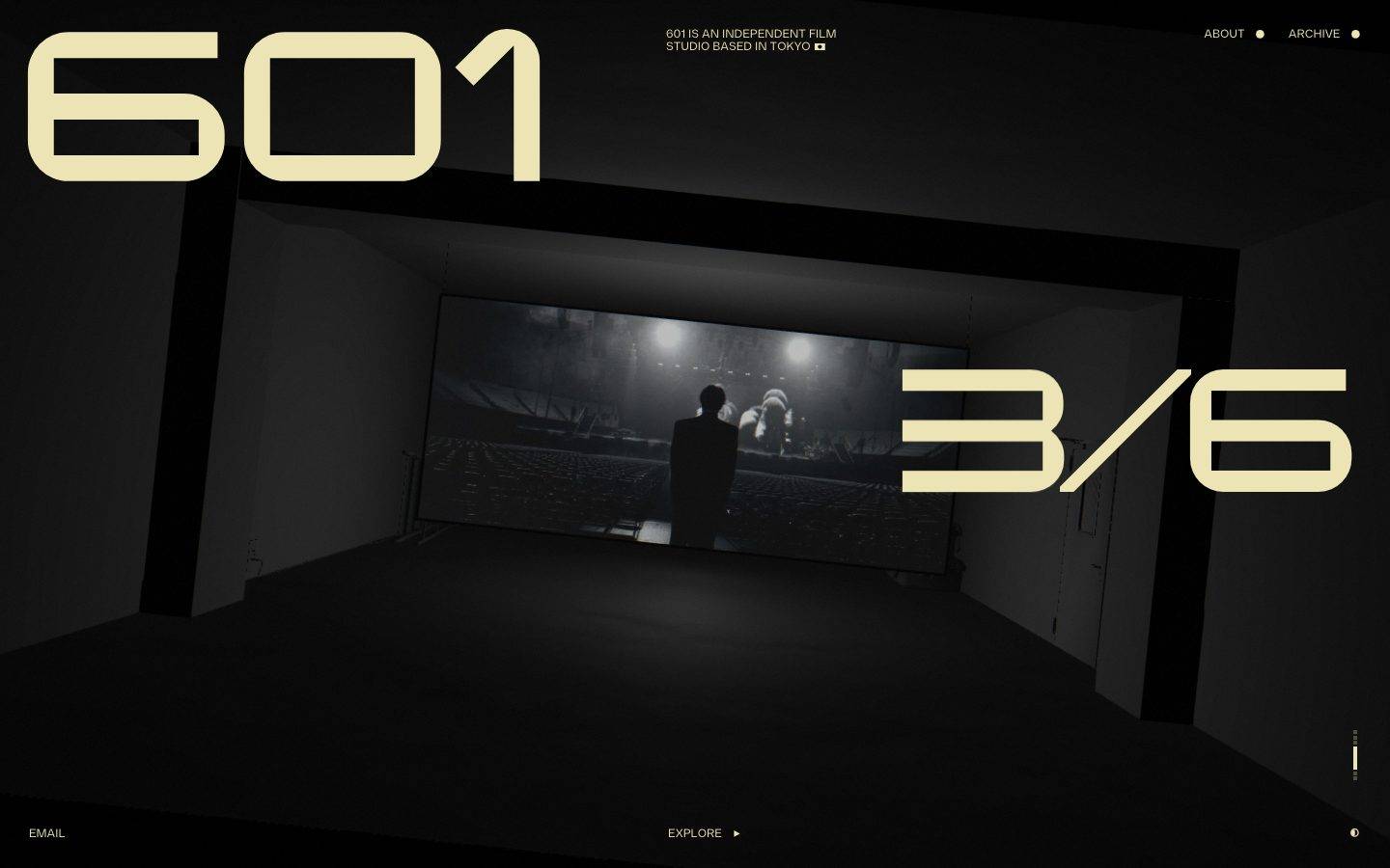
A dark, cinematic single-screen portfolio for the "601" independent film studio in Tokyo, built on a near-black canvas with oversized pale-cream display numerals set in a wide geometric face (Diagramm). The identity is severe and editorial — a full-bleed black-and-white film still framed by giant type, minimal chrome, and monochrome cream text acting as the sole chromatic voice. Everything reads as a projection room: dark, quiet, high-contrast.
Works withClaude CodeCursorCodexGemini CLICopilotv0LovableBoltWindsurfReplit
---
version: alpha
name: rokumaruichi-design-analysis
description: "A dark, cinematic single-screen portfolio for the \"601\" independent film studio in Tokyo, built on a near-black canvas with oversized pale-cream display numerals set in a wide geometric face (Diagramm). The identity is severe and editorial — a full-bleed black-and-white film still framed by giant type, minimal chrome, and monochrome cream text acting as the sole chromatic voice. Everything reads as a projection room: dark, quiet, high-contrast."

colors:
  link: "#ece4b4"
  accent: "#4f4d3c"

typography:
  label:
    fontFamily: "diagramm, Michroma, sans-serif"
    fontSize: 12px
    fontWeight: 700
    lineHeight: 1.7
    letterSpacing: normal

rounded:
  md: 12px

spacing:
  xxs: 5px
  xs: 6px
  sm: 12px
  md: 21px
  lg: 24px
  xl: 30px

components:
  top-nav:
    backgroundColor: transparent
    textColor: "{colors.link}"
    typography: "{typography.label}"
  nav-link:
    backgroundColor: transparent
    textColor: "{colors.link}"
    typography: "{typography.label}"
  intro-caption:
    backgroundColor: transparent
    textColor: "{colors.link}"
    typography: "{typography.label}"
  footer-link:
    backgroundColor: transparent
    textColor: "{colors.link}"
    typography: "{typography.label}"
  media-frame:
    backgroundColor: transparent
    textColor: "{colors.link}"
    rounded: "{rounded.md}"
---

## Overview

rokumaruichi (the site for the "601" independent film studio, Tokyo) is a single-screen, cinematic landing surface. The mood is a darkened projection room: a full-bleed black-and-white film still sits at the center of the frame, and everything around it is near-black. The only chromatic voice is a pale cream (`{colors.link}` — #ece4b4), which carries every piece of text — the giant "601" wordmark, the "3/6" counter, the nav, and the footer labels.

The type voice is a wide geometric face measured as **Diagramm** (`{typography.label}`), rendered here at weight 700. In the measured DOM the tagged headings (`h1`, `h3`) resolve to a small 12px label size with a generous 1.7 line-height — these are the studio caption and nav labels. The enormous "601" and "3/6" numerals visible in the screenshots are display-scale renderings of the same face; their exact display sizes were not captured by the analyzer (see Known Gaps), so this entry documents the measured 12px label role and treats the giant numerals as scaled applications of it.

Chrome is deliberately minimal. A one-line studio descriptor ("601 IS AN INDEPENDENT FILM STUDIO BASED IN TOKYO") sits centered at top, two nav links (ABOUT, ARCHIVE) at right, and a footer row (EMAIL … EXPLORE ▶) pins the bottom. There is no card system, no shadow language, no elevation — depth comes entirely from the photographic film still and the darkness surrounding it.

**Key Characteristics:**
- Near-black cinematic canvas (exact hex not measured — see Known Gaps) with a single full-bleed monochrome film still as the focal image.
- Pale cream (`{colors.link}` — #ece4b4) is the only text color — used for the giant display numerals, nav, caption, and footer alike.
- A muted olive accent (`{colors.accent}` — #4f4d3c) appears sparingly (measured frequency 7) — a low-voltage secondary tone.
- Wide geometric display type (Diagramm, weight 700) drives the identity through scale — "601" spans the top-left, "3/6" the mid-right.
- Chrome is minimal and edge-anchored: caption top-center, nav top-right, footer labels bottom-left and bottom-center.
- The only measured radius is `{rounded.md}` (12px), applied to a single rounded element (likely the media frame or a toggle control).

## Colors

The measured palette is intentionally tiny — two colors carry the entire surface.

### Text & Brand
- **Link / Cream** (`{colors.link}` — #ece4b4): The dominant color by a wide margin (measured frequency 324, sourced from `a.color`). It carries all visible text: the "601" wordmark, the "3/6" counter, the top caption, the ABOUT/ARCHIVE nav, and the footer labels. On the dark canvas this pale cream is the single chromatic voice of the brand.

### Accent
- **Accent / Olive** (`{colors.accent}` — #4f4d3c): A muted dark-olive tone measured at low frequency (7). It functions as a secondary, low-voltage accent — likely used on subtle UI marks or divider states rather than primary text.

### Surface
The near-black page background is clearly present in the screenshots but was **not captured as a measured token** — it is documented in Known Gaps rather than guessed. Components in this entry therefore use `transparent` backgrounds and let the (unmeasured) dark canvas show through.

## Typography

### Font Family
The system runs a single wide geometric face measured as **Diagramm** at weight 700. Diagramm is a commercial/custom display typeface and is not a public web font — it should be treated as licensed. For open-source substitution, **Michroma** (a wide, geometric, monoline sans) is the closest match for the display numerals; **Saira** or **Chakra Petch** are usable alternatives where a slightly narrower feel is acceptable. Never claim to ship Diagramm itself — always ship a substitute unless the license is held.

### Hierarchy

| Token | Size | Weight | Line Height | Letter Spacing | Use |
|---|---|---|---|---|---|
| `{typography.label}` | 12px | 700 | 1.7 | normal | Studio caption, nav links (ABOUT / ARCHIVE), footer labels (EMAIL / EXPLORE) — measured from `h1`/`h3` |

### Principles
Only one type role was measured, and both tagged headings (`h1`, `h3`) resolve to the identical 12px / 700 / 1.7 specification — indicating a system that uses semantic heading tags for small all-purpose labels while achieving visual hierarchy through **scale of the same face** rather than through a graded type ramp. The giant "601" and "3/6" numerals are the same Diagramm weight-700 forms rendered at display scale (their exact px sizes were not measured — see Known Gaps). The design logic is single-face, single-weight, hierarchy-by-scale.

### Note on Font Substitute
Diagramm should be assumed licensed. Ship **Michroma** (Google Fonts) at the display sizes to preserve the wide, geometric, monoline numeral character; fall back to a generic `sans-serif`. The `{typography.label}` fontFamily stack already lists `Michroma` after `diagramm` for this reason.

## Layout

### Spacing System
The measured spacing values are small and tightly clustered — consistent with a minimal, edge-anchored layout rather than a card-and-grid system.
- **Tokens:** `{spacing.xxs}` 5px · `{spacing.xs}` 6px · `{spacing.sm}` 12px · `{spacing.md}` 21px · `{spacing.lg}` 24px · `{spacing.xl}` 30px.
- The most frequently measured value is `{spacing.sm}` (12px, frequency 6) — the workhorse gap for inline label groups (nav items, caption lines, footer row).
- `{spacing.xl}` (30px) and `{spacing.lg}` (24px) handle the larger internal offsets.

No section-scale spacing token was measured — the page is a single viewport-height composition rather than a long-scroll stack of bands.

### Grid & Container
- The composition is a **full-viewport single screen**: display type anchored to the corners (601 top-left, 3/6 mid-right), a centered media still, and edge-pinned chrome.
- No multi-column content grid was measured; the layout is positional/absolute rather than flow-grid.

### Whitespace Philosophy
Negative space is the darkness itself. The film still is framed by wide margins of near-black, and the giant numerals sit in that void. The layout trusts scale and emptiness — a cinematic letterbox feel where the darkness carries as much weight as the type.

## Elevation & Depth

No shadow tokens were measured (`shadows: []`), and there is no card or elevation system. Depth is entirely **photographic and atmospheric**:

| Level | Treatment | Use |
|---|---|---|
| Flat chrome | No shadow, no border | Nav, caption, footer labels — sit directly on the dark canvas |
| Photographic depth | The full-bleed black-and-white film still (a person facing a lit screen inside a dark room) | Supplies the entire sense of three-dimensional space |

The film still — a figure standing before a bright projection inside a dark hall — does all the depth work. The surrounding UI stays resolutely flat.

## Shapes

### Border Radius Scale

| Token | Value | Use |
|---|---|---|
| `{rounded.md}` | 12px | The single measured radius (frequency 1) — applied to one rounded element, likely a media frame corner or a small toggle/indicator control |

Only one radius was measured, so the system's rounding vocabulary is minimal. Most of the surface — the giant numerals, the film still, the chrome — reads as hard-edged and rectilinear, consistent with the severe, geometric identity.

### Photography Geometry
The hero image is a full-bleed 16:9-ish black-and-white film still, presented edge-to-edge with no visible frame chrome in the screenshots. If a framed presentation is used elsewhere, `{rounded.md}` (12px) is the only measured corner value available.

## Components

No components were extracted programmatically (`components: []`); the entries below are documented from screenshot ground-truth combined with the measured `{colors.link}` text color and `{typography.label}` type role. All use transparent backgrounds because the dark canvas color was not measured.

### Navigation

**`top-nav`** — Top-right nav cluster carrying "ABOUT ●" and "ARCHIVE ●" in `{typography.label}` (12px / 700), color `{colors.link}`. Each item pairs a label with a small dot marker. Transparent background over the dark canvas.

**`nav-link`** — Individual nav item (ABOUT, ARCHIVE). Cream text (`{colors.link}`), `{typography.label}`, transparent background. Inline items separated by `{spacing.sm}` (12px)-scale gaps.

### Text / Labels

**`intro-caption`** — The centered top descriptor "601 IS AN INDEPENDENT FILM STUDIO BASED IN TOKYO 🇯🇵" set in `{typography.label}`, color `{colors.link}`, across two tight lines (1.7 line-height). Transparent background.

**`footer-link`** — Bottom-edge labels: "EMAIL" (bottom-left) and "EXPLORE ▶" (bottom-center), plus a small mode-toggle mark at bottom-right. `{typography.label}`, `{colors.link}`, transparent background.

### Media

**`media-frame`** — The full-bleed black-and-white film still at the center of the composition. Transparent/no chrome in the captured state; `{rounded.md}` (12px) is the only measured corner radius available should a framed treatment be applied. Text overlays (`{colors.link}`) may sit above it.

## Do's and Don'ts

### Do
- Keep the canvas dark and let a single monochrome film still carry the depth. The darkness is the design.
- Use `{colors.link}` (#ece4b4) as the sole text color — cream on near-black is the entire chromatic identity.
- Drive hierarchy through **scale** of the Diagramm face, not through many type sizes or weights. The measured system is single-face, single-weight (700).
- Keep chrome minimal and edge-anchored: caption top-center, nav top-right, footer bottom.
- Substitute Diagramm with Michroma (or Saira / Chakra Petch) when the licensed face is unavailable — preserve the wide, geometric, monoline numeral character.

### Don't
- Don't introduce additional colors. The measured palette is exactly two tones (cream + olive accent); anything more breaks the severe monochrome mood.
- Don't add shadows or elevation. No shadow tokens were measured — depth belongs to the photograph.
- Don't overuse `{colors.accent}` (#4f4d3c) — it was measured at very low frequency (7) and should stay a quiet secondary tone.
- Don't ship the Diagramm font as if licensed to you — always use the documented open-source substitute unless the license is held.
- Don't build a card system or dense grid — the layout is a single positional composition, not a stacked band system.

## Responsive Behavior

No breakpoint data was measured; the following is inferred from the single-screen composition and should be validated against live behavior.

### Breakpoints

| Name | Width | Key Changes (inferred) |
|---|---|---|
| Mobile | < 768px | Giant "601" / "3/6" numerals likely scale down substantially; nav may collapse; caption wraps to more lines |
| Tablet | 768–1024px | Corner-anchored numerals tighten toward the center still |
| Desktop | > 1024px | Full composition as captured — 601 top-left, 3/6 mid-right, centered film still |

### Touch Targets
- `{component.nav-link}` and `{component.footer-link}` are small 12px labels; on touch they would need padding beyond the measured `{spacing.sm}` (12px) to reach comfortable tap sizes. Not confirmed in the capture.

### Collapsing Strategy
- The single-screen, position-anchored layout would need the display numerals to reflow or shrink on narrow viewports; exact behavior is unmeasured.

### Image Behavior
- The central film still is full-bleed and would scale proportionally; crop behavior on narrow screens is unmeasured.

## Iteration Guide

1. Focus on ONE component at a time and reference its YAML key directly (`{component.top-nav}`, `{component.media-frame}`).
2. Variants live as separate entries in `components:` — no inline hex, always `{colors.*}` refs or `transparent`.
3. Never document hover; default and active/pressed states only.
4. Preserve the two-color discipline: `{colors.link}` for all text, `{colors.accent}` sparingly.
5. Hierarchy comes from scaling the Diagramm face — when in doubt, bigger numerals before new type styles.
6. Treat the dark canvas as intentional void; do not add cards, borders, or shadows.

## Known Gaps

- **Canvas / background color not measured.** The near-black page background is obvious in the screenshots but absent from the analysis JSON, so it is not declared as a token. Components use `transparent` and rely on the (unmeasured) dark surface. This value must be sampled before shipping.
- **Display type sizes not captured.** The giant "601" and "3/6" numerals are clearly display-scale, but the analyzer only measured the 12px `h1`/`h3` label role. A dedicated display token (fontSize) needs to be measured from the live DOM.
- **Diagramm is treated as licensed.** It was not flagged in `fonts_licensed`, but it is not a public web font; an open-source substitute (Michroma) is documented in Typography. Confirm licensing before deploying the real face.
- **letterSpacing measured as `normal`.** No numeric tracking value was captured; the display numerals may use tighter or wider tracking that is not reflected here.
- **Only one accent usage.** `{colors.accent}` (#4f4d3c) has a frequency of 7 with no confirmed placement — its exact role (divider, mark, hover) is unconfirmed.
- **No components extracted.** All component entries are reconstructed from screenshot ground-truth; padding, heights, and exact backgrounds are not measured.
- **Single page captured.** Only the landing screen was analyzed; ABOUT and ARCHIVE routes, the film-archive gallery, and any motion/scroll behavior are out of scope.
- **Motion/interaction unmeasured.** The site is clearly cinematic (film-still projection, likely transitions on EXPLORE/ARCHIVE); no animation or transition timings were captured.

<!-- Documented by Duply · real-world design systems as ready-to-use DESIGN.md for AI coding agents · https://duply.ai/rokumaruichi/design-md -->
Color Palette
Typography
label12px · 700 · 1.7
The quick brown fox jumpsSpacing & Shape
Spacing
| Name | Value | Preview |
|---|---|---|
| xxs | 5px | |
| xs | 6px | |
| sm | 12px | |
| md | 21px | |
| lg | 24px | |
| xl | 30px |
Border Radius
| Name | Value | Preview |
|---|---|---|
| md | 12px |
FAQ
- What colors does rokumaruichi use?
- rokumaruichi's core palette includes #ece4b4, #4f4d3c. The full color set with usage roles (canvas, ink, surfaces, accent, semantic) is documented in the rokumaruichi DESIGN.md.
- What font does rokumaruichi use?
- rokumaruichi's primary typeface is diagramm. The complete type scale (sizes, weights, line-height and letter-spacing per role), with an open substitute where the original is licensed, is documented in the DESIGN.md.
- What is the rokumaruichi design system?
- A dark, cinematic single-screen portfolio for the "601" independent film studio in Tokyo, built on a near-black canvas with oversized pale-cream display numerals set in a wide geometric face (Diagramm). The identity is severe and editorial — a full-bleed black-and-white film still framed by giant
Get this as a working kit
rokumaruichi Launch Kit + DESIGN.md
$299$225
One-time payment
- A complete production-stack template, styled like rokumaruichi, fully built and wired.
- One-time payment and the codebase is yours. No platform fees, no subscription.
Open it with Claude Code, Cursor, or any coding agent and build in plain language, then ship a complete web app.
- Your private DESIGN.md
- Marketing pages, blog, SEO & legal
- Email capture, newsletter & contact
- Accept payments (Stripe)
- Analytics (GA4 + PostHog)
- One-click deploy
- Auth, login & roles
- A full app dashboard, when you grow
More like this

---
version: alpha
name: rokumaruichi-design-analysis
description: "A dark, cinematic single-screen portfolio for the \"601\" independent film studio in Tokyo, built on a near-black canvas with oversized pale-cream display numerals set in a wide geometric face (Diagramm). The identity is severe and editorial — a full-bleed black-and-white film still framed by giant type, minimal chrome, and monochrome cream text acting as the sole chromatic voice. Everything reads as a projection room: dark, quiet, high-contrast."

colors:
  link: "#ece4b4"
  accent: "#4f4d3c"

typography:
  label:
    fontFamily: "diagramm, Michroma, sans-serif"
    fontSize: 12px
    fontWeight: 700
    lineHeight: 1.7
    letterSpacing: normal

rounded:
  md: 12px

spacing:
  xxs: 5px
  xs: 6px
  sm: 12px
  md: 21px
  lg: 24px
  xl: 30px

components:
  top-nav:
    backgroundColor: transparent
    textColor: "{colors.link}"
    typography: "{typography.label}"
  nav-link:
    backgroundColor: transparent
    textColor: "{colors.link}"
    typography: "{typography.label}"
  intro-caption:
    backgroundColor: transparent
    textColor: "{colors.link}"
    typography: "{typography.label}"
  footer-link:
    backgroundColor: transparent
    textColor: "{colors.link}"
    typography: "{typography.label}"
  media-frame:
    backgroundColor: transparent
    textColor: "{colors.link}"
    rounded: "{rounded.md}"
---

## Overview

rokumaruichi (the site for the "601" independent film studio, Tokyo) is a single-screen, cinematic landing surface. The mood is a darkened projection room: a full-bleed black-and-white film still sits at the center of the frame, and everything around it is near-black. The only chromatic voice is a pale cream (`{colors.link}` — #ece4b4), which carries every piece of text — the giant "601" wordmark, the "3/6" counter, the nav, and the footer labels.

The type voice is a wide geometric face measured as **Diagramm** (`{typography.label}`), rendered here at weight 700. In the measured DOM the tagged headings (`h1`, `h3`) resolve to a small 12px label size with a generous 1.7 line-height — these are the studio caption and nav labels. The enormous "601" and "3/6" numerals visible in the screenshots are display-scale renderings of the same face; their exact display sizes were not captured by the analyzer (see Known Gaps), so this entry documents the measured 12px label role and treats the giant numerals as scaled applications of it.

Chrome is deliberately minimal. A one-line studio descriptor ("601 IS AN INDEPENDENT FILM STUDIO BASED IN TOKYO") sits centered at top, two nav links (ABOUT, ARCHIVE) at right, and a footer row (EMAIL … EXPLORE ▶) pins the bottom. There is no card system, no shadow language, no elevation — depth comes entirely from the photographic film still and the darkness surrounding it.

**Key Characteristics:**
- Near-black cinematic canvas (exact hex not measured — see Known Gaps) with a single full-bleed monochrome film still as the focal image.
- Pale cream (`{colors.link}` — #ece4b4) is the only text color — used for the giant display numerals, nav, caption, and footer alike.
- A muted olive accent (`{colors.accent}` — #4f4d3c) appears sparingly (measured frequency 7) — a low-voltage secondary tone.
- Wide geometric display type (Diagramm, weight 700) drives the identity through scale — "601" spans the top-left, "3/6" the mid-right.
- Chrome is minimal and edge-anchored: caption top-center, nav top-right, footer labels bottom-left and bottom-center.
- The only measured radius is `{rounded.md}` (12px), applied to a single rounded element (likely the media frame or a toggle control).

## Colors

The measured palette is intentionally tiny — two colors carry the entire surface.

### Text & Brand
- **Link / Cream** (`{colors.link}` — #ece4b4): The dominant color by a wide margin (measured frequency 324, sourced from `a.color`). It carries all visible text: the "601" wordmark, the "3/6" counter, the top caption, the ABOUT/ARCHIVE nav, and the footer labels. On the dark canvas this pale cream is the single chromatic voice of the brand.

### Accent
- **Accent / Olive** (`{colors.accent}` — #4f4d3c): A muted dark-olive tone measured at low frequency (7). It functions as a secondary, low-voltage accent — likely used on subtle UI marks or divider states rather than primary text.

### Surface
The near-black page background is clearly present in the screenshots but was **not captured as a measured token** — it is documented in Known Gaps rather than guessed. Components in this entry therefore use `transparent` backgrounds and let the (unmeasured) dark canvas show through.

## Typography

### Font Family
The system runs a single wide geometric face measured as **Diagramm** at weight 700. Diagramm is a commercial/custom display typeface and is not a public web font — it should be treated as licensed. For open-source substitution, **Michroma** (a wide, geometric, monoline sans) is the closest match for the display numerals; **Saira** or **Chakra Petch** are usable alternatives where a slightly narrower feel is acceptable. Never claim to ship Diagramm itself — always ship a substitute unless the license is held.

### Hierarchy

| Token | Size | Weight | Line Height | Letter Spacing | Use |
|---|---|---|---|---|---|
| `{typography.label}` | 12px | 700 | 1.7 | normal | Studio caption, nav links (ABOUT / ARCHIVE), footer labels (EMAIL / EXPLORE) — measured from `h1`/`h3` |

### Principles
Only one type role was measured, and both tagged headings (`h1`, `h3`) resolve to the identical 12px / 700 / 1.7 specification — indicating a system that uses semantic heading tags for small all-purpose labels while achieving visual hierarchy through **scale of the same face** rather than through a graded type ramp. The giant "601" and "3/6" numerals are the same Diagramm weight-700 forms rendered at display scale (their exact px sizes were not measured — see Known Gaps). The design logic is single-face, single-weight, hierarchy-by-scale.

### Note on Font Substitute
Diagramm should be assumed licensed. Ship **Michroma** (Google Fonts) at the display sizes to preserve the wide, geometric, monoline numeral character; fall back to a generic `sans-serif`. The `{typography.label}` fontFamily stack already lists `Michroma` after `diagramm` for this reason.

## Layout

### Spacing System
The measured spacing values are small and tightly clustered — consistent with a minimal, edge-anchored layout rather than a card-and-grid system.
- **Tokens:** `{spacing.xxs}` 5px · `{spacing.xs}` 6px · `{spacing.sm}` 12px · `{spacing.md}` 21px · `{spacing.lg}` 24px · `{spacing.xl}` 30px.
- The most frequently measured value is `{spacing.sm}` (12px, frequency 6) — the workhorse gap for inline label groups (nav items, caption lines, footer row).
- `{spacing.xl}` (30px) and `{spacing.lg}` (24px) handle the larger internal offsets.

No section-scale spacing token was measured — the page is a single viewport-height composition rather than a long-scroll stack of bands.

### Grid & Container
- The composition is a **full-viewport single screen**: display type anchored to the corners (601 top-left, 3/6 mid-right), a centered media still, and edge-pinned chrome.
- No multi-column content grid was measured; the layout is positional/absolute rather than flow-grid.

### Whitespace Philosophy
Negative space is the darkness itself. The film still is framed by wide margins of near-black, and the giant numerals sit in that void. The layout trusts scale and emptiness — a cinematic letterbox feel where the darkness carries as much weight as the type.

## Elevation & Depth

No shadow tokens were measured (`shadows: []`), and there is no card or elevation system. Depth is entirely **photographic and atmospheric**:

| Level | Treatment | Use |
|---|---|---|
| Flat chrome | No shadow, no border | Nav, caption, footer labels — sit directly on the dark canvas |
| Photographic depth | The full-bleed black-and-white film still (a person facing a lit screen inside a dark room) | Supplies the entire sense of three-dimensional space |

The film still — a figure standing before a bright projection inside a dark hall — does all the depth work. The surrounding UI stays resolutely flat.

## Shapes

### Border Radius Scale

| Token | Value | Use |
|---|---|---|
| `{rounded.md}` | 12px | The single measured radius (frequency 1) — applied to one rounded element, likely a media frame corner or a small toggle/indicator control |

Only one radius was measured, so the system's rounding vocabulary is minimal. Most of the surface — the giant numerals, the film still, the chrome — reads as hard-edged and rectilinear, consistent with the severe, geometric identity.

### Photography Geometry
The hero image is a full-bleed 16:9-ish black-and-white film still, presented edge-to-edge with no visible frame chrome in the screenshots. If a framed presentation is used elsewhere, `{rounded.md}` (12px) is the only measured corner value available.

## Components

No components were extracted programmatically (`components: []`); the entries below are documented from screenshot ground-truth combined with the measured `{colors.link}` text color and `{typography.label}` type role. All use transparent backgrounds because the dark canvas color was not measured.

### Navigation

**`top-nav`** — Top-right nav cluster carrying "ABOUT ●" and "ARCHIVE ●" in `{typography.label}` (12px / 700), color `{colors.link}`. Each item pairs a label with a small dot marker. Transparent background over the dark canvas.

**`nav-link`** — Individual nav item (ABOUT, ARCHIVE). Cream text (`{colors.link}`), `{typography.label}`, transparent background. Inline items separated by `{spacing.sm}` (12px)-scale gaps.

### Text / Labels

**`intro-caption`** — The centered top descriptor "601 IS AN INDEPENDENT FILM STUDIO BASED IN TOKYO 🇯🇵" set in `{typography.label}`, color `{colors.link}`, across two tight lines (1.7 line-height). Transparent background.

**`footer-link`** — Bottom-edge labels: "EMAIL" (bottom-left) and "EXPLORE ▶" (bottom-center), plus a small mode-toggle mark at bottom-right. `{typography.label}`, `{colors.link}`, transparent background.

### Media

**`media-frame`** — The full-bleed black-and-white film still at the center of the composition. Transparent/no chrome in the captured state; `{rounded.md}` (12px) is the only measured corner radius available should a framed treatment be applied. Text overlays (`{colors.link}`) may sit above it.

## Do's and Don'ts

### Do
- Keep the canvas dark and let a single monochrome film still carry the depth. The darkness is the design.
- Use `{colors.link}` (#ece4b4) as the sole text color — cream on near-black is the entire chromatic identity.
- Drive hierarchy through **scale** of the Diagramm face, not through many type sizes or weights. The measured system is single-face, single-weight (700).
- Keep chrome minimal and edge-anchored: caption top-center, nav top-right, footer bottom.
- Substitute Diagramm with Michroma (or Saira / Chakra Petch) when the licensed face is unavailable — preserve the wide, geometric, monoline numeral character.

### Don't
- Don't introduce additional colors. The measured palette is exactly two tones (cream + olive accent); anything more breaks the severe monochrome mood.
- Don't add shadows or elevation. No shadow tokens were measured — depth belongs to the photograph.
- Don't overuse `{colors.accent}` (#4f4d3c) — it was measured at very low frequency (7) and should stay a quiet secondary tone.
- Don't ship the Diagramm font as if licensed to you — always use the documented open-source substitute unless the license is held.
- Don't build a card system or dense grid — the layout is a single positional composition, not a stacked band system.

## Responsive Behavior

No breakpoint data was measured; the following is inferred from the single-screen composition and should be validated against live behavior.

### Breakpoints

| Name | Width | Key Changes (inferred) |
|---|---|---|
| Mobile | < 768px | Giant "601" / "3/6" numerals likely scale down substantially; nav may collapse; caption wraps to more lines |
| Tablet | 768–1024px | Corner-anchored numerals tighten toward the center still |
| Desktop | > 1024px | Full composition as captured — 601 top-left, 3/6 mid-right, centered film still |

### Touch Targets
- `{component.nav-link}` and `{component.footer-link}` are small 12px labels; on touch they would need padding beyond the measured `{spacing.sm}` (12px) to reach comfortable tap sizes. Not confirmed in the capture.

### Collapsing Strategy
- The single-screen, position-anchored layout would need the display numerals to reflow or shrink on narrow viewports; exact behavior is unmeasured.

### Image Behavior
- The central film still is full-bleed and would scale proportionally; crop behavior on narrow screens is unmeasured.

## Iteration Guide

1. Focus on ONE component at a time and reference its YAML key directly (`{component.top-nav}`, `{component.media-frame}`).
2. Variants live as separate entries in `components:` — no inline hex, always `{colors.*}` refs or `transparent`.
3. Never document hover; default and active/pressed states only.
4. Preserve the two-color discipline: `{colors.link}` for all text, `{colors.accent}` sparingly.
5. Hierarchy comes from scaling the Diagramm face — when in doubt, bigger numerals before new type styles.
6. Treat the dark canvas as intentional void; do not add cards, borders, or shadows.

## Known Gaps

- **Canvas / background color not measured.** The near-black page background is obvious in the screenshots but absent from the analysis JSON, so it is not declared as a token. Components use `transparent` and rely on the (unmeasured) dark surface. This value must be sampled before shipping.
- **Display type sizes not captured.** The giant "601" and "3/6" numerals are clearly display-scale, but the analyzer only measured the 12px `h1`/`h3` label role. A dedicated display token (fontSize) needs to be measured from the live DOM.
- **Diagramm is treated as licensed.** It was not flagged in `fonts_licensed`, but it is not a public web font; an open-source substitute (Michroma) is documented in Typography. Confirm licensing before deploying the real face.
- **letterSpacing measured as `normal`.** No numeric tracking value was captured; the display numerals may use tighter or wider tracking that is not reflected here.
- **Only one accent usage.** `{colors.accent}` (#4f4d3c) has a frequency of 7 with no confirmed placement — its exact role (divider, mark, hover) is unconfirmed.
- **No components extracted.** All component entries are reconstructed from screenshot ground-truth; padding, heights, and exact backgrounds are not measured.
- **Single page captured.** Only the landing screen was analyzed; ABOUT and ARCHIVE routes, the film-archive gallery, and any motion/scroll behavior are out of scope.
- **Motion/interaction unmeasured.** The site is clearly cinematic (film-still projection, likely transitions on EXPLORE/ARCHIVE); no animation or transition timings were captured.

<!-- Documented by Duply · real-world design systems as ready-to-use DESIGN.md for AI coding agents · https://duply.ai/rokumaruichi/design-md -->