Fontshare
An editorial, type-foundry-first interface built on a warm cream canvas (#ffffe3) with near-black ink (#10100e) and large in-page typographic specimens as the primary visual content. The system reads as a tool for designers — flat surfaces with zero elevation, sharp-cornered inputs and dividers contrasted against pill-radius toggle controls, muted sage-olive secondary text, and a small palette of pastel swatch accents. Brand voltage comes entirely from the type specimens themselves shown at large display sizes, not from color or decoration.
---
version: alpha
name: Fontshare-design-analysis
description: "An editorial, type-foundry-first interface built on a warm cream canvas (#ffffe3) with near-black ink (#10100e) and large in-page typographic specimens as the primary visual content. The system reads as a tool for designers — flat surfaces with zero elevation, sharp-cornered inputs and dividers contrasted against pill-radius toggle controls, muted sage-olive secondary text, and a small palette of pastel swatch accents. Brand voltage comes entirely from the type specimens themselves shown at large display sizes, not from color or decoration."
colors:
primary: "#10100e"
ink: "#000000"
ink-soft: "#191815"
ink-alt: "#0e100e"
body: "#30302b"
muted: "#606055"
muted-soft: "#c0c0ab"
canvas: "#ffffe3"
surface-cream: "#e8e8cf"
surface-cream-soft: "#f8f8dd"
highlight-yellow: "#fff1b5"
neutral-gray: "#a1a1aa"
on-primary: "#ffffff"
accent-red: "#f0113a"
swatch-green: "#e2fde6"
swatch-green-strong: "#c4fdc7"
swatch-cyan: "#e2fcfc"
swatch-cyan-strong: "#bafbff"
swatch-pink: "#fcecec"
swatch-pink-strong: "#ffcfcf"
typography:
display-specimen:
fontFamily: "Satoshi, Inter, sans-serif"
fontSize: 120px
fontWeight: 400
lineHeight: 1.0
letterSpacing: -2px
wordmark:
fontFamily: "Clash Display, Satoshi, sans-serif"
fontSize: 28px
fontWeight: 600
lineHeight: 1.1
letterSpacing: -0.5px
nav-link:
fontFamily: "Satoshi, Inter, sans-serif"
fontSize: 16px
fontWeight: 500
lineHeight: 1.3
letterSpacing: 0
filter-label:
fontFamily: "Satoshi, Inter, sans-serif"
fontSize: 15px
fontWeight: 400
lineHeight: 1.4
letterSpacing: 0
body:
fontFamily: "Satoshi, Inter, sans-serif"
fontSize: 15px
fontWeight: 400
lineHeight: 1.5
letterSpacing: 0
caption:
fontFamily: "Satoshi, Inter, sans-serif"
fontSize: 12px
fontWeight: 500
lineHeight: 1.3
letterSpacing: 0
rounded:
none: 0px
pill: 9999px
full: 9999px
spacing:
xxs: 5px
xs: 6px
sm: 10px
md: 15px
lg: 20px
xl: 25px
xxl: 40px
huge: 60px
mega: 100px
components:
top-nav:
backgroundColor: "{colors.canvas}"
textColor: "{colors.primary}"
typography: "{typography.nav-link}"
rounded: "{rounded.none}"
nav-tab-active:
backgroundColor: "{colors.primary}"
textColor: "{colors.on-primary}"
typography: "{typography.nav-link}"
rounded: "{rounded.none}"
wordmark:
backgroundColor: transparent
textColor: "{colors.primary}"
typography: "{typography.wordmark}"
search-input:
backgroundColor: transparent
textColor: "{colors.primary}"
typography: "{typography.filter-label}"
rounded: "{rounded.none}"
input:
backgroundColor: transparent
textColor: "{colors.primary}"
typography: "{typography.filter-label}"
rounded: "{rounded.none}"
filter-link:
backgroundColor: transparent
textColor: "{colors.muted}"
typography: "{typography.filter-label}"
rounded: "{rounded.none}"
filter-link-active:
backgroundColor: transparent
textColor: "{colors.primary}"
typography: "{typography.filter-label}"
rounded: "{rounded.none}"
view-toggle:
backgroundColor: transparent
textColor: "{colors.muted}"
typography: "{typography.caption}"
rounded: "{rounded.none}"
size-slider-knob:
backgroundColor: "{colors.primary}"
textColor: "{colors.primary}"
rounded: "{rounded.full}"
mode-toggle-icon:
backgroundColor: transparent
textColor: "{colors.primary}"
rounded: "{rounded.full}"
specimen-card:
backgroundColor: "{colors.canvas}"
textColor: "{colors.primary}"
typography: "{typography.display-specimen}"
rounded: "{rounded.none}"
specimen-meta:
backgroundColor: transparent
textColor: "{colors.muted}"
typography: "{typography.caption}"
count-badge:
backgroundColor: transparent
textColor: "{colors.primary}"
typography: "{typography.caption}"
reset-link:
backgroundColor: transparent
textColor: "{colors.primary}"
typography: "{typography.filter-label}"
---
## Overview
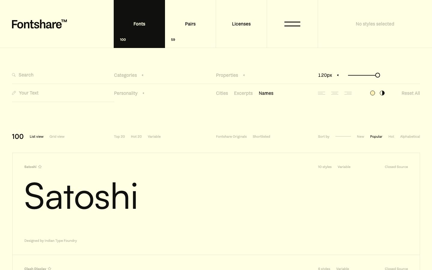
Fontshare's landing surface is a working tool for browsing type — an editorial, foundry-first interface where the actual font specimens are the hero content. The canvas is a warm pale cream (`{colors.canvas}` — #ffffe3) rather than white, and the dominant ink is a near-black warm charcoal (`{colors.primary}` — #10100e). There are no marketing illustrations, no cards-with-shadows, no color blocks selling features — the page shows fonts at large display sizes and lets the type do the work.
The voltage is entirely typographic. The "Satoshi" specimen renders at ~120px (the size-slider default seen in the toolbar), and the page is a vertically stacked list of these large specimens separated by thin hairline rules. The chrome around them — nav, filters, sort controls — stays small, quiet, and recedes into `{colors.muted}` (#606055) and `{colors.muted-soft}` (#c0c0ab) sage-olive tones.
The system has a distinctive shape language: **sharp zero-radius corners** on inputs, dividers, the nav, and the active nav tab (`{rounded.none}` — confirmed by the measured input radius of 0px), contrasted against **fully-pilled** toggle controls and slider knobs (`{rounded.pill}` / `{rounded.full}` — 9999px, the only radius value measured at scale). The active nav tab inverts to a solid near-black block (`{colors.primary}`) with white text — the single strongest contrast moment on the page.
**Key Characteristics:**
- Warm cream canvas (`{colors.canvas}` — #ffffe3) instead of white — the whole page sits on a soft yellow paper tone.
- Near-black warm ink (`{colors.primary}` — #10100e) for all specimens, the wordmark, and the active nav block.
- Completely flat — no measured shadows. Hierarchy comes from type scale and thin hairline rules, never elevation.
- Dual shape language: zero-radius (`{rounded.none}`) for inputs/nav/dividers, full-pill (`{rounded.full}`) for toggle icons and the size-slider knob.
- Muted sage-olive secondary text (`{colors.muted}` — #606055, `{colors.muted-soft}` — #c0c0ab) keeps the chrome quiet so the specimens dominate.
- A small set of pastel swatch accents (green / cyan / pink / yellow) plus one hot red (`{colors.accent-red}` — #f0113a) appear only as small UI signals, never as backgrounds.
- The active nav tab inverts to a solid `{colors.primary}` block with `{colors.on-primary}` text — the page's only filled emphasis surface.
## Colors
### Brand & Ink
- **Primary** (`{colors.primary}` — #10100e): The dominant ink. All type specimens, the wordmark, and the active nav tab background. This warm near-black appears at the highest frequency in the analysis.
- **Ink** (`{colors.ink}` — #000000): Maximum-contrast text against the cream canvas, used sparingly.
- **Ink Soft** (`{colors.ink-soft}` — #191815) and **Ink Alt** (`{colors.ink-alt}` — #0e100e): Near-black variants observed at low frequency; effectively interchangeable with primary for dense text.
### Text
- **Body** (`{colors.body}` — #30302b): Default running-text / secondary heading tone.
- **Muted** (`{colors.muted}` — #606055): Secondary labels — filter group names, sort options, meta lines.
- **Muted Soft** (`{colors.muted-soft}` — #c0c0ab): The second-most-frequent color in the system — sage-olive placeholder text, inactive filter chips, "No styles selected", and de-emphasized specimen labels.
- **Neutral Gray** (`{colors.neutral-gray}` — #a1a1aa): A cool gray used in a few low-frequency UI spots.
- **On Primary** (`{colors.on-primary}` — #ffffff): Text on the active dark nav tab.
### Surface
- **Canvas** (`{colors.canvas}` — #ffffe3): The pale cream page floor.
- **Surface Cream** (`{colors.surface-cream}` — #e8e8cf) and **Surface Cream Soft** (`{colors.surface-cream-soft}` — #f8f8dd): Slightly deeper / lighter cream tones for subtle banding and hover-fill regions.
- **Highlight Yellow** (`{colors.highlight-yellow}` — #fff1b5): A warmer yellow used as a highlight tint.
### Accent & Swatches
- **Accent Red** (`{colors.accent-red}` — #f0113a): The single hot accent — used for active/alert signals. Appears at very low frequency.
- **Swatch set** — pastel preview chips that appear in the font-preview color controls, never as page backgrounds: `{colors.swatch-green}` (#e2fde6) / `{colors.swatch-green-strong}` (#c4fdc7), `{colors.swatch-cyan}` (#e2fcfc) / `{colors.swatch-cyan-strong}` (#bafbff), `{colors.swatch-pink}` (#fcecec) / `{colors.swatch-pink-strong}` (#ffcfcf). These are the page's only chromatic flourishes.
## Typography
### Font Family
Fontshare is the distribution home of **Satoshi** (a neo-grotesque sans, used for UI and the bulk of specimen rendering) and **Clash Display** (a display sans used in the wordmark). Both are Fontshare's own freely-downloadable typefaces — they are not restricted licensed faces (the analysis reported no licensed fonts), so they can be shipped directly from Fontshare. A safe fallback stack is `Inter, sans-serif`.
> Note: the analysis captured **no typography measurements** (the `typography` array was empty). Every value in this section is **derived** from the reference screenshots and the visible toolbar (the size slider reads "120px"). Treat all sizes/weights as approximate until confirmed — see Known Gaps.
### Hierarchy
| Token | Size | Weight | Line Height | Letter Spacing | Use |
|---|---|---|---|---|---|
| `{typography.display-specimen}` | 120px | 400 | 1.0 | -2px | Large in-list font specimens ("Satoshi") — size driven by the slider, derived |
| `{typography.wordmark}` | 28px | 600 | 1.1 | -0.5px | "Fontshare™" wordmark — derived |
| `{typography.nav-link}` | 16px | 500 | 1.3 | 0 | Top-nav items (Fonts / Pairs / Licenses) — derived |
| `{typography.filter-label}` | 15px | 400 | 1.4 | 0 | Filter group labels, search field, sort options — derived |
| `{typography.body}` | 15px | 400 | 1.5 | 0 | Running text / meta descriptions — derived |
| `{typography.caption}` | 12px | 500 | 1.3 | 0 | Counts ("100", "59"), style counts, "Closed Source" tags — derived |
### Principles
The specimen is the headline. The supporting UI type stays small (12–16px) and quiet so the large type samples carry the page. The display-specimen size is user-controlled via the size slider, so the 120px figure is the captured default, not a fixed token.
### Note on Font Substitutes
No substitute is required: Satoshi and Clash Display are freely available from Fontshare itself. If they cannot be loaded, **Inter** (for Satoshi's UI role) is the documented fallback in the family stack.
## Layout
### Spacing System
- **Base unit:** 5px (the analysis shows a 5px-multiple rhythm: 5, 10, 15, 20, 25, 40).
- **Tokens:** `{spacing.xxs}` 5px · `{spacing.xs}` 6px · `{spacing.sm}` 10px · `{spacing.md}` 15px · `{spacing.lg}` 20px · `{spacing.xl}` 25px · `{spacing.xxl}` 40px · `{spacing.huge}` 60px · `{spacing.mega}` 100px.
- **Most frequent steps:** 10px (122 occurrences) and 5px (80) dominate — the UI is tightly packed at small scale, with 20px and 40px handling larger gaps between toolbar rows and specimen blocks.
- The two large values (`{spacing.huge}` 60px, `{spacing.mega}` 100px) appear once each — reserved for major section offsets.
### Grid & Container
- The toolbar is laid out on a wide multi-column grid: search + "Your Text" on the left, Categories / Personality in the second column, Properties / filter chips in the third, size-slider + view-mode toggles on the right.
- The nav is a full-width horizontal bar split into evenly-sized tab cells (Fonts, Pairs, Licenses, an icon cell, and a status cell).
- Specimen list items run full content width, each separated by a thin hairline rule, with meta data (style count, "Variable", "Closed Source") right-aligned.
### Whitespace Philosophy
Dense at the control layer, generous around the specimens. The toolbar packs many controls into tight 5–10px rhythms, but each font specimen gets large vertical breathing room so the type can be read at display size. The result feels like a precise instrument, not a marketing page.
## Elevation & Depth
| Level | Treatment | Use |
|---|---|---|
| Flat | No shadow, no border | Entire page — nav, toolbar, specimen list |
| Hairline divider | 1px rule in `{colors.muted-soft}` / `{colors.surface-cream}` | Separators between specimen rows and toolbar bands |
| Inverted block | Solid `{colors.primary}` fill, `{colors.on-primary}` text | The active nav tab — the only filled emphasis surface |
The analysis captured **no shadows**. The system is deliberately flat: hierarchy is built from type scale, hairline rules, and a single inverted dark block. There is no neumorphism, no glassmorphism, no drop shadows.
## Shapes
### Border Radius Scale
| Token | Value | Use |
|---|---|---|
| `{rounded.none}` | 0px | Inputs (measured), nav cells, active nav tab, dividers, specimen containers — sharp corners everywhere structural |
| `{rounded.pill}` | 9999px | Pill-shaped toggle controls |
| `{rounded.full}` | 9999px | Size-slider knob, the circular alignment/contrast mode icons in the toolbar |
The only two radius values in the system are 0px and 9999px — there is no middle ground. Structural surfaces are razor-sharp; interactive toggle affordances are fully round. The 9999px radius is the single most frequent radius value (97 occurrences); the input's 0px radius was measured directly.
### Photography Geometry
There is no photography. The visual content is rendered type. Font specimens are typeset directly on the cream canvas with no frame, no rounding, no border.
## Components
### Navigation
**`top-nav`** — Full-width horizontal bar on the cream canvas (`{colors.canvas}`), holding the "Fontshare™" wordmark at far left and a row of evenly-divided tab cells. Type in `{typography.nav-link}`. Zero radius — cells are hard-edged rectangles.
**`nav-tab-active`** — The selected tab ("Fonts") inverts to a solid `{colors.primary}` (#10100e) block with `{colors.on-primary}` (#ffffff) label and a small count caption ("100") below in white. This is the page's strongest contrast element and the only filled emphasis surface.
**`wordmark`** — "Fontshare™" set in `{typography.wordmark}` (`{colors.primary}`), with a small superscript trademark mark. Sits at the top-left of the nav.
### Inputs & Filters
**`input`** — Base text input. Transparent background, `{colors.primary}` text, `{rounded.none}` (0px — measured). Underlined by a thin hairline rather than boxed.
**`search-input`** — The "Search" field with a magnifier glyph; transparent, hairline-underlined, `{typography.filter-label}` placeholder in `{colors.muted-soft}`. The companion "Your Text" field shares the same treatment.
**`filter-link`** / **`filter-link-active`** — Inline toggle words used for filter groups (Categories, Personality, Properties) and chip rows (Cities, Excerpts, Names, Top 20, Hot 20, Variable, New, Popular, Hot, Alphabetical). Inactive renders in `{colors.muted}`; active renders in `{colors.primary}` (e.g. "Names" and "Popular" in the reference). No background, no radius — emphasis is purely color/weight.
**`reset-link`** — "Reset All" inline text link in `{colors.primary}`, top-right of the toolbar.
### Controls
**`size-slider-knob`** — The circular draggable knob on the "120px" size slider. Solid `{colors.primary}` fill, `{rounded.full}`. Sets the display size of every specimen in the list.
**`mode-toggle-icon`** — Small circular alignment / light-dark contrast toggle icons in the toolbar (`{rounded.full}`), `{colors.primary}` strokes on transparent.
**`view-toggle`** — "List view" / "Grid view" text toggles in `{typography.caption}`; active in `{colors.primary}`, inactive in `{colors.muted-soft}`.
### Specimen List
**`specimen-card`** — A full-width row rendering one font at display size. Background `{colors.canvas}`, type in `{colors.primary}` via `{typography.display-specimen}` (size controlled by the slider). Zero radius, separated from neighbors by hairline rules. The font name and a small star (favorite) sit at the top-left in `{colors.muted-soft}`.
**`specimen-meta`** — Right-aligned meta row per specimen ("10 styles", "Variable", "Closed Source", "Designed by Indian Type Foundry") in `{typography.caption}` / `{colors.muted}`.
**`count-badge`** — Small numeric counts ("100", "59") shown under nav tabs and beside the list header, in `{typography.caption}` / `{colors.primary}`.
## Do's and Don'ts
### Do
- Keep the canvas warm cream (`{colors.canvas}` — #ffffe3). The off-white paper tone is core to the brand; do not substitute pure white.
- Let type specimens be the hero. Render fonts at large display sizes and keep the surrounding UI small and quiet.
- Use the dual shape language deliberately: `{rounded.none}` for structural surfaces and inputs, `{rounded.full}` only for round toggle/slider affordances.
- Keep chrome text in `{colors.muted}` / `{colors.muted-soft}` so the specimens dominate.
- Use the inverted `{colors.primary}` block (`{component.nav-tab-active}`) as the single strongest emphasis — reserve it for the active nav state.
- Keep the layout flat. Use hairline rules for separation, never shadows.
### Don't
- Don't add drop shadows or elevated cards — the analysis shows zero shadows; the system is intentionally flat.
- Don't round inputs or structural panels. The measured input radius is 0px; sharp corners are part of the voice.
- Don't use the pastel swatches (`{colors.swatch-*}`) as section backgrounds — they are small preview-control accents only.
- Don't overuse `{colors.accent-red}` (#f0113a); it is a rare alert/active signal, not a brand fill.
- Don't introduce a mid-range border radius. The system is binary: 0px or full-pill.
## Responsive Behavior
> No breakpoint data was measured. The notes below are **derived** from the desktop reference and standard practice — confirm before implementation.
### Breakpoints (derived)
| Name | Width | Likely Changes |
|---|---|---|
| Mobile | < 768px | Toolbar columns stack vertically; nav tabs collapse or scroll horizontally; specimen display size reduces from the 120px default |
| Tablet | 768–1024px | Toolbar compresses to two columns; specimen list stays single-column |
| Desktop | > 1024px | Full multi-column toolbar with size slider + mode toggles at right, as captured |
### Touch Targets
- Filter links and toggle words are small inline text — on touch they would need expanded hit areas (not measured).
- The `{component.size-slider-knob}` and `{component.mode-toggle-icon}` are round controls; tap sizing is not captured.
### Collapsing Strategy (derived)
- The wide toolbar (search / filters / properties / size) most plausibly collapses into stacked rows or a filter drawer on narrow viewports.
- Specimen rows remain full-width and simply reduce display size via the slider default.
## Iteration Guide
1. Focus on ONE component at a time, referencing its YAML key (`{component.specimen-card}`, `{component.nav-tab-active}`).
2. Variants of an existing component live as separate entries (`-active`).
3. Use `{token.refs}` everywhere — never inline a hex.
4. Document default and active/pressed states only — no hover.
5. Keep the binary radius discipline: structural = `{rounded.none}`, round affordances = `{rounded.full}`.
6. The inverted dark nav tab is the only filled emphasis — don't add other solid blocks casually.
7. When in doubt about emphasis: change type weight/color before adding a surface.
## Known Gaps
- **No typography was measured** — the analysis `typography` array was empty. Every type token (family, size, weight, line-height, letter-spacing) is derived from screenshots and the visible "120px" slider value. Real font sizes, weights, and the exact Satoshi/Clash Display roles need DOM confirmation.
- The display-specimen size (120px) is the captured slider default, not a fixed token — actual rendered size is user-controlled.
- Only one component (`input`, radius 0px) was measured directly; nav, filters, toggles, sliders, and specimen rows are reconstructed from screenshots and may differ in exact padding, height, and border treatment.
- No shadows were captured; the flat treatment is asserted as intentional but unconfirmed for hover/focus states.
- Hairline divider colors are inferred from the cream/olive palette (`{colors.surface-cream}` / `{colors.muted-soft}`); exact border tone and width were not measured.
- The pastel swatch set (green/cyan/pink/yellow) is documented from low-frequency color captures; their exact usage in the font-preview color picker is inferred.
- No breakpoints, touch-target sizes, or responsive rules were measured — the Responsive section is derived.
- Animation/transition timings (size-slider drag, filter toggles, list re-sort) are out of scope.
- Secondary pages (Pairs, Licenses, individual font detail pages) were not captured; only the Fonts landing list is analyzed.
<!-- Documented by duply · real-world design systems as ready-to-use DESIGN.md for AI coding agents · https://duply.ai/fontshare/design-md -->
Color Palette
Accent
Neutrals
Typography
display-specimen120px · 400 · 1
The quick brown fox jumpswordmark28px · 600 · 1.1
The quick brown fox jumpsnav-link16px · 500 · 1.3
The quick brown fox jumpsfilter-label15px · 400 · 1.4
The quick brown fox jumpsbody15px · 400 · 1.5
The quick brown fox jumpscaption12px · 500 · 1.3
The quick brown fox jumpsSpacing & Shape
Spacing
| Name | Value | Preview |
|---|---|---|
| xxs | 5px | |
| xs | 6px | |
| sm | 10px | |
| md | 15px | |
| lg | 20px | |
| xl | 25px | |
| xxl | 40px | |
| huge | 60px | |
| mega | 100px |
Border Radius
| Name | Value | Preview |
|---|---|---|
| none | 0px | |
| pill | 9999px | |
| full | 9999px |
More like this


---
version: alpha
name: Fontshare-design-analysis
description: "An editorial, type-foundry-first interface built on a warm cream canvas (#ffffe3) with near-black ink (#10100e) and large in-page typographic specimens as the primary visual content. The system reads as a tool for designers — flat surfaces with zero elevation, sharp-cornered inputs and dividers contrasted against pill-radius toggle controls, muted sage-olive secondary text, and a small palette of pastel swatch accents. Brand voltage comes entirely from the type specimens themselves shown at large display sizes, not from color or decoration."
colors:
  primary: "#10100e"
  ink: "#000000"
  ink-soft: "#191815"
  ink-alt: "#0e100e"
  body: "#30302b"
  muted: "#606055"
  muted-soft: "#c0c0ab"
  canvas: "#ffffe3"
  surface-cream: "#e8e8cf"
  surface-cream-soft: "#f8f8dd"
  highlight-yellow: "#fff1b5"
  neutral-gray: "#a1a1aa"
  on-primary: "#ffffff"
  accent-red: "#f0113a"
  swatch-green: "#e2fde6"
  swatch-green-strong: "#c4fdc7"
  swatch-cyan: "#e2fcfc"
  swatch-cyan-strong: "#bafbff"
  swatch-pink: "#fcecec"
  swatch-pink-strong: "#ffcfcf"
typography:
  display-specimen:
    fontFamily: "Satoshi, Inter, sans-serif"
    fontSize: 120px
    fontWeight: 400
    lineHeight: 1.0
    letterSpacing: -2px
  wordmark:
    fontFamily: "Clash Display, Satoshi, sans-serif"
    fontSize: 28px
    fontWeight: 600
    lineHeight: 1.1
    letterSpacing: -0.5px
  nav-link:
    fontFamily: "Satoshi, Inter, sans-serif"
    fontSize: 16px
    fontWeight: 500
    lineHeight: 1.3
    letterSpacing: 0
  filter-label:
    fontFamily: "Satoshi, Inter, sans-serif"
    fontSize: 15px
    fontWeight: 400
    lineHeight: 1.4
    letterSpacing: 0
  body:
    fontFamily: "Satoshi, Inter, sans-serif"
    fontSize: 15px
    fontWeight: 400
    lineHeight: 1.5
    letterSpacing: 0
  caption:
    fontFamily: "Satoshi, Inter, sans-serif"
    fontSize: 12px
    fontWeight: 500
    lineHeight: 1.3
    letterSpacing: 0
rounded:
  none: 0px
  pill: 9999px
  full: 9999px
spacing:
  xxs: 5px
  xs: 6px
  sm: 10px
  md: 15px
  lg: 20px
  xl: 25px
  xxl: 40px
  huge: 60px
  mega: 100px
components:
  top-nav:
    backgroundColor: "{colors.canvas}"
    textColor: "{colors.primary}"
    typography: "{typography.nav-link}"
    rounded: "{rounded.none}"
  nav-tab-active:
    backgroundColor: "{colors.primary}"
    textColor: "{colors.on-primary}"
    typography: "{typography.nav-link}"
    rounded: "{rounded.none}"
  wordmark:
    backgroundColor: transparent
    textColor: "{colors.primary}"
    typography: "{typography.wordmark}"
  search-input:
    backgroundColor: transparent
    textColor: "{colors.primary}"
    typography: "{typography.filter-label}"
    rounded: "{rounded.none}"
  input:
    backgroundColor: transparent
    textColor: "{colors.primary}"
    typography: "{typography.filter-label}"
    rounded: "{rounded.none}"
  filter-link:
    backgroundColor: transparent
    textColor: "{colors.muted}"
    typography: "{typography.filter-label}"
    rounded: "{rounded.none}"
  filter-link-active:
    backgroundColor: transparent
    textColor: "{colors.primary}"
    typography: "{typography.filter-label}"
    rounded: "{rounded.none}"
  view-toggle:
    backgroundColor: transparent
    textColor: "{colors.muted}"
    typography: "{typography.caption}"
    rounded: "{rounded.none}"
  size-slider-knob:
    backgroundColor: "{colors.primary}"
    textColor: "{colors.primary}"
    rounded: "{rounded.full}"
  mode-toggle-icon:
    backgroundColor: transparent
    textColor: "{colors.primary}"
    rounded: "{rounded.full}"
  specimen-card:
    backgroundColor: "{colors.canvas}"
    textColor: "{colors.primary}"
    typography: "{typography.display-specimen}"
    rounded: "{rounded.none}"
  specimen-meta:
    backgroundColor: transparent
    textColor: "{colors.muted}"
    typography: "{typography.caption}"
  count-badge:
    backgroundColor: transparent
    textColor: "{colors.primary}"
    typography: "{typography.caption}"
  reset-link:
    backgroundColor: transparent
    textColor: "{colors.primary}"
    typography: "{typography.filter-label}"
---

## Overview

Fontshare's landing surface is a working tool for browsing type — an editorial, foundry-first interface where the actual font specimens are the hero content. The canvas is a warm pale cream (`{colors.canvas}` — #ffffe3) rather than white, and the dominant ink is a near-black warm charcoal (`{colors.primary}` — #10100e). There are no marketing illustrations, no cards-with-shadows, no color blocks selling features — the page shows fonts at large display sizes and lets the type do the work.

The voltage is entirely typographic. The "Satoshi" specimen renders at ~120px (the size-slider default seen in the toolbar), and the page is a vertically stacked list of these large specimens separated by thin hairline rules. The chrome around them — nav, filters, sort controls — stays small, quiet, and recedes into `{colors.muted}` (#606055) and `{colors.muted-soft}` (#c0c0ab) sage-olive tones.

The system has a distinctive shape language: **sharp zero-radius corners** on inputs, dividers, the nav, and the active nav tab (`{rounded.none}` — confirmed by the measured input radius of 0px), contrasted against **fully-pilled** toggle controls and slider knobs (`{rounded.pill}` / `{rounded.full}` — 9999px, the only radius value measured at scale). The active nav tab inverts to a solid near-black block (`{colors.primary}`) with white text — the single strongest contrast moment on the page.

**Key Characteristics:**
- Warm cream canvas (`{colors.canvas}` — #ffffe3) instead of white — the whole page sits on a soft yellow paper tone.
- Near-black warm ink (`{colors.primary}` — #10100e) for all specimens, the wordmark, and the active nav block.
- Completely flat — no measured shadows. Hierarchy comes from type scale and thin hairline rules, never elevation.
- Dual shape language: zero-radius (`{rounded.none}`) for inputs/nav/dividers, full-pill (`{rounded.full}`) for toggle icons and the size-slider knob.
- Muted sage-olive secondary text (`{colors.muted}` — #606055, `{colors.muted-soft}` — #c0c0ab) keeps the chrome quiet so the specimens dominate.
- A small set of pastel swatch accents (green / cyan / pink / yellow) plus one hot red (`{colors.accent-red}` — #f0113a) appear only as small UI signals, never as backgrounds.
- The active nav tab inverts to a solid `{colors.primary}` block with `{colors.on-primary}` text — the page's only filled emphasis surface.

## Colors

### Brand & Ink
- **Primary** (`{colors.primary}` — #10100e): The dominant ink. All type specimens, the wordmark, and the active nav tab background. This warm near-black appears at the highest frequency in the analysis.
- **Ink** (`{colors.ink}` — #000000): Maximum-contrast text against the cream canvas, used sparingly.
- **Ink Soft** (`{colors.ink-soft}` — #191815) and **Ink Alt** (`{colors.ink-alt}` — #0e100e): Near-black variants observed at low frequency; effectively interchangeable with primary for dense text.

### Text
- **Body** (`{colors.body}` — #30302b): Default running-text / secondary heading tone.
- **Muted** (`{colors.muted}` — #606055): Secondary labels — filter group names, sort options, meta lines.
- **Muted Soft** (`{colors.muted-soft}` — #c0c0ab): The second-most-frequent color in the system — sage-olive placeholder text, inactive filter chips, "No styles selected", and de-emphasized specimen labels.
- **Neutral Gray** (`{colors.neutral-gray}` — #a1a1aa): A cool gray used in a few low-frequency UI spots.
- **On Primary** (`{colors.on-primary}` — #ffffff): Text on the active dark nav tab.

### Surface
- **Canvas** (`{colors.canvas}` — #ffffe3): The pale cream page floor.
- **Surface Cream** (`{colors.surface-cream}` — #e8e8cf) and **Surface Cream Soft** (`{colors.surface-cream-soft}` — #f8f8dd): Slightly deeper / lighter cream tones for subtle banding and hover-fill regions.
- **Highlight Yellow** (`{colors.highlight-yellow}` — #fff1b5): A warmer yellow used as a highlight tint.

### Accent & Swatches
- **Accent Red** (`{colors.accent-red}` — #f0113a): The single hot accent — used for active/alert signals. Appears at very low frequency.
- **Swatch set** — pastel preview chips that appear in the font-preview color controls, never as page backgrounds: `{colors.swatch-green}` (#e2fde6) / `{colors.swatch-green-strong}` (#c4fdc7), `{colors.swatch-cyan}` (#e2fcfc) / `{colors.swatch-cyan-strong}` (#bafbff), `{colors.swatch-pink}` (#fcecec) / `{colors.swatch-pink-strong}` (#ffcfcf). These are the page's only chromatic flourishes.

## Typography

### Font Family
Fontshare is the distribution home of **Satoshi** (a neo-grotesque sans, used for UI and the bulk of specimen rendering) and **Clash Display** (a display sans used in the wordmark). Both are Fontshare's own freely-downloadable typefaces — they are not restricted licensed faces (the analysis reported no licensed fonts), so they can be shipped directly from Fontshare. A safe fallback stack is `Inter, sans-serif`.

> Note: the analysis captured **no typography measurements** (the `typography` array was empty). Every value in this section is **derived** from the reference screenshots and the visible toolbar (the size slider reads "120px"). Treat all sizes/weights as approximate until confirmed — see Known Gaps.

### Hierarchy

| Token | Size | Weight | Line Height | Letter Spacing | Use |
|---|---|---|---|---|---|
| `{typography.display-specimen}` | 120px | 400 | 1.0 | -2px | Large in-list font specimens ("Satoshi") — size driven by the slider, derived |
| `{typography.wordmark}` | 28px | 600 | 1.1 | -0.5px | "Fontshare™" wordmark — derived |
| `{typography.nav-link}` | 16px | 500 | 1.3 | 0 | Top-nav items (Fonts / Pairs / Licenses) — derived |
| `{typography.filter-label}` | 15px | 400 | 1.4 | 0 | Filter group labels, search field, sort options — derived |
| `{typography.body}` | 15px | 400 | 1.5 | 0 | Running text / meta descriptions — derived |
| `{typography.caption}` | 12px | 500 | 1.3 | 0 | Counts ("100", "59"), style counts, "Closed Source" tags — derived |

### Principles
The specimen is the headline. The supporting UI type stays small (12–16px) and quiet so the large type samples carry the page. The display-specimen size is user-controlled via the size slider, so the 120px figure is the captured default, not a fixed token.

### Note on Font Substitutes
No substitute is required: Satoshi and Clash Display are freely available from Fontshare itself. If they cannot be loaded, **Inter** (for Satoshi's UI role) is the documented fallback in the family stack.

## Layout

### Spacing System
- **Base unit:** 5px (the analysis shows a 5px-multiple rhythm: 5, 10, 15, 20, 25, 40).
- **Tokens:** `{spacing.xxs}` 5px · `{spacing.xs}` 6px · `{spacing.sm}` 10px · `{spacing.md}` 15px · `{spacing.lg}` 20px · `{spacing.xl}` 25px · `{spacing.xxl}` 40px · `{spacing.huge}` 60px · `{spacing.mega}` 100px.
- **Most frequent steps:** 10px (122 occurrences) and 5px (80) dominate — the UI is tightly packed at small scale, with 20px and 40px handling larger gaps between toolbar rows and specimen blocks.
- The two large values (`{spacing.huge}` 60px, `{spacing.mega}` 100px) appear once each — reserved for major section offsets.

### Grid & Container
- The toolbar is laid out on a wide multi-column grid: search + "Your Text" on the left, Categories / Personality in the second column, Properties / filter chips in the third, size-slider + view-mode toggles on the right.
- The nav is a full-width horizontal bar split into evenly-sized tab cells (Fonts, Pairs, Licenses, an icon cell, and a status cell).
- Specimen list items run full content width, each separated by a thin hairline rule, with meta data (style count, "Variable", "Closed Source") right-aligned.

### Whitespace Philosophy
Dense at the control layer, generous around the specimens. The toolbar packs many controls into tight 5–10px rhythms, but each font specimen gets large vertical breathing room so the type can be read at display size. The result feels like a precise instrument, not a marketing page.

## Elevation & Depth

| Level | Treatment | Use |
|---|---|---|
| Flat | No shadow, no border | Entire page — nav, toolbar, specimen list |
| Hairline divider | 1px rule in `{colors.muted-soft}` / `{colors.surface-cream}` | Separators between specimen rows and toolbar bands |
| Inverted block | Solid `{colors.primary}` fill, `{colors.on-primary}` text | The active nav tab — the only filled emphasis surface |

The analysis captured **no shadows**. The system is deliberately flat: hierarchy is built from type scale, hairline rules, and a single inverted dark block. There is no neumorphism, no glassmorphism, no drop shadows.

## Shapes

### Border Radius Scale

| Token | Value | Use |
|---|---|---|
| `{rounded.none}` | 0px | Inputs (measured), nav cells, active nav tab, dividers, specimen containers — sharp corners everywhere structural |
| `{rounded.pill}` | 9999px | Pill-shaped toggle controls |
| `{rounded.full}` | 9999px | Size-slider knob, the circular alignment/contrast mode icons in the toolbar |

The only two radius values in the system are 0px and 9999px — there is no middle ground. Structural surfaces are razor-sharp; interactive toggle affordances are fully round. The 9999px radius is the single most frequent radius value (97 occurrences); the input's 0px radius was measured directly.

### Photography Geometry
There is no photography. The visual content is rendered type. Font specimens are typeset directly on the cream canvas with no frame, no rounding, no border.

## Components

### Navigation

**`top-nav`** — Full-width horizontal bar on the cream canvas (`{colors.canvas}`), holding the "Fontshare™" wordmark at far left and a row of evenly-divided tab cells. Type in `{typography.nav-link}`. Zero radius — cells are hard-edged rectangles.

**`nav-tab-active`** — The selected tab ("Fonts") inverts to a solid `{colors.primary}` (#10100e) block with `{colors.on-primary}` (#ffffff) label and a small count caption ("100") below in white. This is the page's strongest contrast element and the only filled emphasis surface.

**`wordmark`** — "Fontshare™" set in `{typography.wordmark}` (`{colors.primary}`), with a small superscript trademark mark. Sits at the top-left of the nav.

### Inputs & Filters

**`input`** — Base text input. Transparent background, `{colors.primary}` text, `{rounded.none}` (0px — measured). Underlined by a thin hairline rather than boxed.

**`search-input`** — The "Search" field with a magnifier glyph; transparent, hairline-underlined, `{typography.filter-label}` placeholder in `{colors.muted-soft}`. The companion "Your Text" field shares the same treatment.

**`filter-link`** / **`filter-link-active`** — Inline toggle words used for filter groups (Categories, Personality, Properties) and chip rows (Cities, Excerpts, Names, Top 20, Hot 20, Variable, New, Popular, Hot, Alphabetical). Inactive renders in `{colors.muted}`; active renders in `{colors.primary}` (e.g. "Names" and "Popular" in the reference). No background, no radius — emphasis is purely color/weight.

**`reset-link`** — "Reset All" inline text link in `{colors.primary}`, top-right of the toolbar.

### Controls

**`size-slider-knob`** — The circular draggable knob on the "120px" size slider. Solid `{colors.primary}` fill, `{rounded.full}`. Sets the display size of every specimen in the list.

**`mode-toggle-icon`** — Small circular alignment / light-dark contrast toggle icons in the toolbar (`{rounded.full}`), `{colors.primary}` strokes on transparent.

**`view-toggle`** — "List view" / "Grid view" text toggles in `{typography.caption}`; active in `{colors.primary}`, inactive in `{colors.muted-soft}`.

### Specimen List

**`specimen-card`** — A full-width row rendering one font at display size. Background `{colors.canvas}`, type in `{colors.primary}` via `{typography.display-specimen}` (size controlled by the slider). Zero radius, separated from neighbors by hairline rules. The font name and a small star (favorite) sit at the top-left in `{colors.muted-soft}`.

**`specimen-meta`** — Right-aligned meta row per specimen ("10 styles", "Variable", "Closed Source", "Designed by Indian Type Foundry") in `{typography.caption}` / `{colors.muted}`.

**`count-badge`** — Small numeric counts ("100", "59") shown under nav tabs and beside the list header, in `{typography.caption}` / `{colors.primary}`.

## Do's and Don'ts

### Do
- Keep the canvas warm cream (`{colors.canvas}` — #ffffe3). The off-white paper tone is core to the brand; do not substitute pure white.
- Let type specimens be the hero. Render fonts at large display sizes and keep the surrounding UI small and quiet.
- Use the dual shape language deliberately: `{rounded.none}` for structural surfaces and inputs, `{rounded.full}` only for round toggle/slider affordances.
- Keep chrome text in `{colors.muted}` / `{colors.muted-soft}` so the specimens dominate.
- Use the inverted `{colors.primary}` block (`{component.nav-tab-active}`) as the single strongest emphasis — reserve it for the active nav state.
- Keep the layout flat. Use hairline rules for separation, never shadows.

### Don't
- Don't add drop shadows or elevated cards — the analysis shows zero shadows; the system is intentionally flat.
- Don't round inputs or structural panels. The measured input radius is 0px; sharp corners are part of the voice.
- Don't use the pastel swatches (`{colors.swatch-*}`) as section backgrounds — they are small preview-control accents only.
- Don't overuse `{colors.accent-red}` (#f0113a); it is a rare alert/active signal, not a brand fill.
- Don't introduce a mid-range border radius. The system is binary: 0px or full-pill.

## Responsive Behavior

> No breakpoint data was measured. The notes below are **derived** from the desktop reference and standard practice — confirm before implementation.

### Breakpoints (derived)

| Name | Width | Likely Changes |
|---|---|---|
| Mobile | < 768px | Toolbar columns stack vertically; nav tabs collapse or scroll horizontally; specimen display size reduces from the 120px default |
| Tablet | 768–1024px | Toolbar compresses to two columns; specimen list stays single-column |
| Desktop | > 1024px | Full multi-column toolbar with size slider + mode toggles at right, as captured |

### Touch Targets
- Filter links and toggle words are small inline text — on touch they would need expanded hit areas (not measured).
- The `{component.size-slider-knob}` and `{component.mode-toggle-icon}` are round controls; tap sizing is not captured.

### Collapsing Strategy (derived)
- The wide toolbar (search / filters / properties / size) most plausibly collapses into stacked rows or a filter drawer on narrow viewports.
- Specimen rows remain full-width and simply reduce display size via the slider default.

## Iteration Guide

1. Focus on ONE component at a time, referencing its YAML key (`{component.specimen-card}`, `{component.nav-tab-active}`).
2. Variants of an existing component live as separate entries (`-active`).
3. Use `{token.refs}` everywhere — never inline a hex.
4. Document default and active/pressed states only — no hover.
5. Keep the binary radius discipline: structural = `{rounded.none}`, round affordances = `{rounded.full}`.
6. The inverted dark nav tab is the only filled emphasis — don't add other solid blocks casually.
7. When in doubt about emphasis: change type weight/color before adding a surface.

## Known Gaps

- **No typography was measured** — the analysis `typography` array was empty. Every type token (family, size, weight, line-height, letter-spacing) is derived from screenshots and the visible "120px" slider value. Real font sizes, weights, and the exact Satoshi/Clash Display roles need DOM confirmation.
- The display-specimen size (120px) is the captured slider default, not a fixed token — actual rendered size is user-controlled.
- Only one component (`input`, radius 0px) was measured directly; nav, filters, toggles, sliders, and specimen rows are reconstructed from screenshots and may differ in exact padding, height, and border treatment.
- No shadows were captured; the flat treatment is asserted as intentional but unconfirmed for hover/focus states.
- Hairline divider colors are inferred from the cream/olive palette (`{colors.surface-cream}` / `{colors.muted-soft}`); exact border tone and width were not measured.
- The pastel swatch set (green/cyan/pink/yellow) is documented from low-frequency color captures; their exact usage in the font-preview color picker is inferred.
- No breakpoints, touch-target sizes, or responsive rules were measured — the Responsive section is derived.
- Animation/transition timings (size-slider drag, filter toggles, list re-sort) are out of scope.
- Secondary pages (Pairs, Licenses, individual font detail pages) were not captured; only the Fonts landing list is analyzed.

<!-- Documented by duply · real-world design systems as ready-to-use DESIGN.md for AI coding agents · https://duply.ai/fontshare/design-md -->